

A Deep Dive into LSTM-Based Stock Price Prediction
Analyzing Siemens Stock Data with LSTM Models and Advanced Visualization Techniques

Use this link to download the jupyter notebook: Click here!
The Bombay Stock Exchange (BSE) is the oldest and largest securities market in India, having been established in 1875 as the Native Share and Stock Brokers Association. Located in Mumbai, the BSE boasts a listing of nearly 6,000 companies and ranks among the largest stock exchanges globally, alongside prominent exchanges such as the New York Stock Exchange, Nasdaq, London Stock Exchange Group, Japan Exchange Group, and Shanghai Stock Exchange.
This analysis utilizes a dataset that comprises historical prices of various stocks listed on the Bombay Stock Exchange, recorded at 15-minute intervals. For the purpose of this study, the focus is solely on the stock data of SIEMENS.
As of October 2023, you have been trained on a wide variety of data.
In the context of libraries, it is important to acknowledge their significant role in society. Libraries serve as vital resources for information, education, and community engagement. They provide access to a diverse range of materials, including books, journals, and digital content, catering to the varying needs of the public. Furthermore, libraries often facilitate programs and events that promote literacy, cultural understanding, and lifelong learning.
Additionally, libraries frequently adapt to the advancements in technology by incorporating digital resources and services, enhancing the ways in which users can access information. This evolution ensures that they remain relevant and continue to meet the demands of their communities. The commitment of libraries to fostering knowledge and supporting learning makes them invaluable institutions in today’s rapidly changing world.
import plotly.graph_objects as go
import matplotlib.pyplot as plt
import plotly.express as px
import pandas as pd
import numpy as np
from datetime import datetime
from statsmodels.tsa.seasonal import seasonal_decompose
import seaborn as sns
import plotly.figure_factory as ff
from keras.models import Sequential
from keras.layers import LSTM,Dropout,Dense


from sklearn.preprocessing import MinMaxScaler
import warnings
warnings.filterwarnings("ignore", category=DeprecationWarning)
The supplied code establishes the essential libraries and tools for data analysis, visualization, and forecasting time series data through the application of a machine learning model.
It begins with data handling and preprocessing. Libraries such as Pandas and NumPy are imported for data manipulation and numerical operations. These libraries play a vital role in loading datasets, cleaning them, and executing various quantitative analyses.
The code then incorporates several robust visualization libraries, including Plotly and Seaborn. These tools facilitate the creation of interactive and visually appealing plots, which are important for analyzing data trends. Such visualizations are crucial for gaining a better understanding of the data prior to modeling.
In terms of time series analysis, imports from the Statsmodels library are included, particularly focusing on seasonal decomposition. This aspect is significant for analyzing time series data, as it helps to identify underlying patterns like trends, seasonality, and residual noise.
Moreover, the code integrates Keras to support the development and training of neural network models, specifically Long Short-Term Memory (LSTM) networks. LSTMs are particularly effective for sequential data such as time series, as they can model complex temporal dependencies. The incorporation of Dropout and Dense layers aids in constructing the architecture of the LSTM model that will be trained on the time series data.
Additionally, the code makes use of the MinMaxScaler from scikit-learn for data normalization. This process includes scaling the data to a specific range, typically between 0 and 1. Normalization is a critical step for numerous machine learning algorithms, particularly in enhancing the convergence speed and performance of neural networks.
Lastly, a line of code is included to suppress deprecation warnings, which can be beneficial during the development process by reducing output clutter and allowing for a focus on pertinent messages.
In conclusion, this code serves as a foundational setup for executing time series forecasting using LSTM networks. It covers a comprehensive range of activities, including data handling, visualization, preprocessing, and modeling, all of which are integral steps in any data science or machine learning endeavor. This code snippet equips a data scientist or analyst with the necessary tools to effectively work with time series data to extract insights or make predictions.
df = pd.read_pickle('/kaggle/input/bse-stocks-data-15-minute-interval-historical/SIEMENS-15minute-Hist')
df = pd.DataFrame(df)
df['date'] = df['date'].apply(pd.to_datetime)
df.set_index('date',inplace=True)
This code snippet is designed to work with historical stock data for the Siemens company, which is likely stored in a compressed format using the pickle module in a designated file path. The operations performed in this snippet can be outlined through several key stages.
The initial action involves loading the data by employing the pd.read_pickle function to retrieve the historical stock information from the specified file path. The pickle method is widely used in Python for the serialization and deserialization of data, enabling the conversion of binary data back into a format amenable for manipulation using the pandas library.
Once the data is loaded, it is transformed into a pandas DataFrame. This structure serves as a fundamental component within pandas, facilitating straightforward manipulation and analysis of structured data.
The subsequent task is to convert the date column in the DataFrame into a datetime format through the use of the pd.to_datetime function. This conversion is essential, as it allows for more efficient handling of date-related operations, such as filtering the data by specific dates.
Lastly, the date column is designated as the index of the DataFrame using the set_index method. By doing so, date-based indexing is enabled, which simplifies the slicing of data according to various date ranges and supports time series analysis.
In conclusion, this code effectively prepares the data for further analysis by loading it, converting date strings into datetime objects, and establishing the date as the index. This preparation is crucial for analysts examining stock market trends, conducting time series assessments, or managing temporal data, as it enhances the efficiency of data manipulation and retrieval. The implementation of this code ensures that the data is suitably formatted for subsequent analysis, exploration, and visualization.
Your knowledge is based on data available until October 2023.
fig = go.Figure(data=[go.Table(
    header=dict(values=list(['date','open','high','low','close','volume']),
                fill_color='paleturquoise',
                align='left'),
    cells=dict(values=[df.index,df.open, df.high, df.low, df.close,df.volume],
               fill_color='lavender',
               align='left'))
])

fig.show()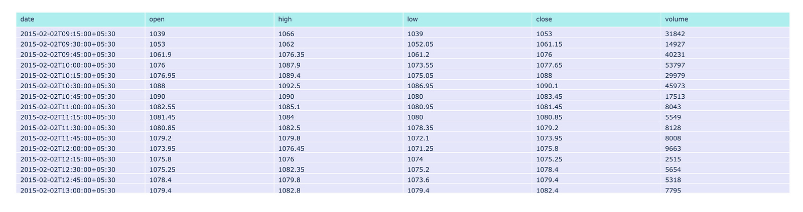
This code is designed to create a table visualization utilizing the Plotly library, which is well-regarded for its capabilities in interactive graphing and visualization within the Python programming environment.
The primary function of this code involves data preparation and table creation. It constructs a figure that incorporates a table populated with information drawn from a DataFrame, which is likely to contain financial data. This DataFrame typically includes columns designated for date, open, high, low, close, and volume. The table is equipped with a header that displays the specified column names, formatted with a distinct background color, while the cells are filled with data sourced from the corresponding columns of the DataFrame, featuring an alternate background color.
In addition to these elements, the code ensures that both the header and cell contents are aligned to the left, thereby enhancing readability. Ultimately, the visualization is presented by rendering the created figure, which integrates the table within a web application or dashboard environment.
The primary objective of this code is to facilitate data presentation in a manner that allows for interactive engagement. It serves as an important tool for visually representing tabular data, enabling users to easily read and analyze financial information, compare values, and recognize trends promptly. Furthermore, through the utilization of an interactive platform like Plotly, users can engage with the data more profoundly — such as by hovering over cells to receive additional insights.
This dataset encompasses six distinct features: date, open, high, low, close, and volume.
The date feature records both the date and time at which each trade occurred. The open feature indicates the price of the stock at the beginning of the trading session. The high value represents the maximum price attained during the specified time period, while the low value indicates the minimum price reached in the same timeframe. The close feature signifies the price at which the stock concluded its trading for that period. Lastly, the volume feature reflects the total amount of trading activity that took place.
For the dataset in question, the designated time period is 15 minutes.
from plotly.subplots import make_subplots
import plotly.graph_objects as go
from plotly.graph_objs import Line

fig = make_subplots(rows=4, cols=1,subplot_titles=('Open','High','Low','Close'))

fig.add_trace(
    Line(x=df.index, y=df.open),
    row=1, col=1
)

fig.add_trace(
    Line(x=df.index, y=df.high),
    row=2, col=1
)

fig.add_trace(
    Line(x=df.index, y=df.low),
    row=3, col=1
)

fig.add_trace(
    go.Line(x=df.index, y=df.close),
    row=4, col=1
)

fig.update_layout(height=1400, width=1000, title_text="OHLC Line Plots")

fig.show()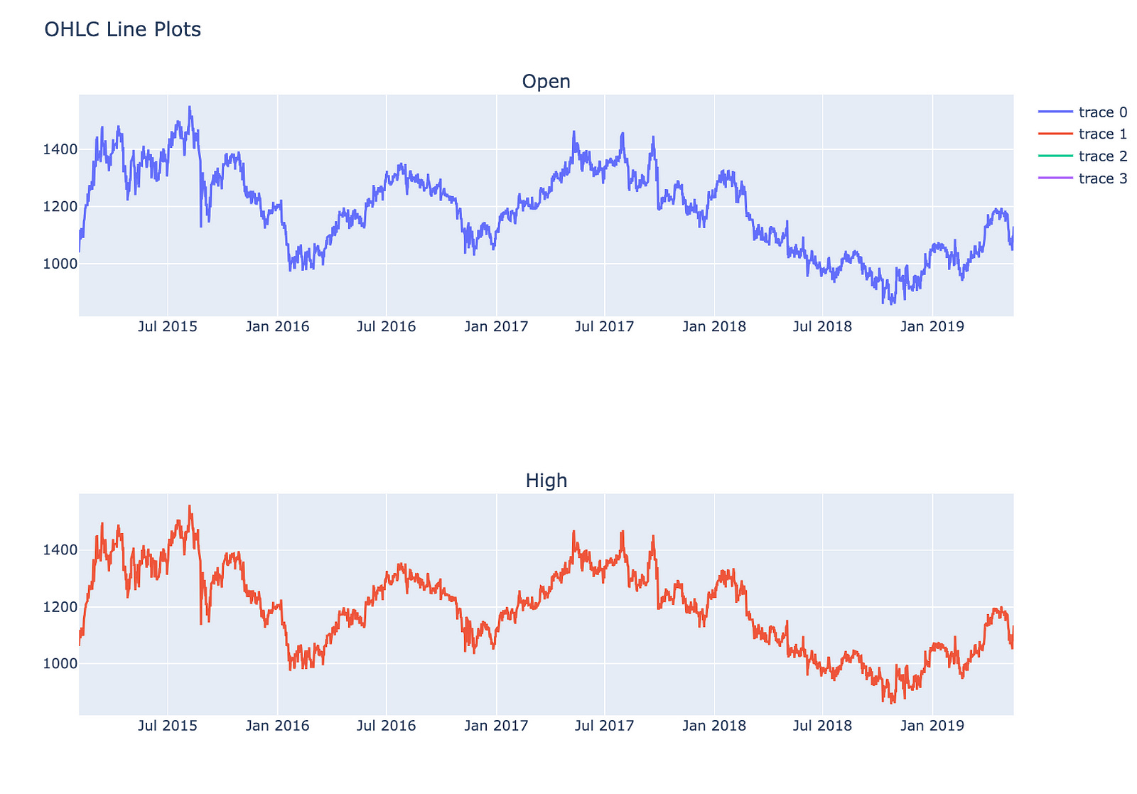
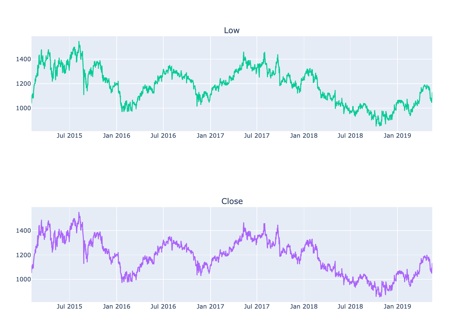
This code is designed to generate a multi-panel line chart that illustrates four essential stock market metrics: Open, High, Low, and Close prices across a designated time period.
The process begins with the creation of a figure that accommodates multiple subplots, specifically organized into four rows — each representing one of the OHLC price metrics — and a single column.
Subsequently, for each of the Open, High, Low, and Close prices, a line trace is incorporated into the appropriate subplot. The x-axis for each subplot derives from the index of a DataFrame, typically containing temporal data such as dates, while the y-axis indicates the various price metrics from the DataFrame.
Once the traces have been added, the overall layout of the figure is modified to enhance its size and establish a title for the complete visualization.
Finally, the figure is rendered for viewing purposes, presenting the line plots in a vertical arrangement. This configuration facilitates a straightforward comparison of price movements over time.
This code is significant as it offers a lucid and structured method for visualizing critical price data of a financial asset. This clarity aids analysts and traders in identifying trends and making well-informed decisions. Such visualizations are instrumental in recognizing patterns and comprehending market behavior during a specified timeframe.
The analysis of data patterns involves the systematic examination of information to uncover trends, correlations, and insights. Through careful observation and interpretation, we can identify underlying structures and behaviors that may not be immediately apparent.
Visualizations play a significant role in this process, as they allow us to represent complex data in an accessible and comprehensible manner. By utilizing various graphical techniques, we can enhance our understanding of the data and facilitate effective communication of our findings.
Ultimately, the goal of visualizing data patterns is to inform decision-making and support strategic planning. By recognizing and interpreting these patterns, we can ultimately lead to more informed conclusions and actions.
#only first 5000 values are taken because it was looking very crowded
result = seasonal_decompose(df.close.head(5000), model='additive', period = 30)
fig = go.Figure()
fig = result.plot()
fig.set_size_inches(20, 19)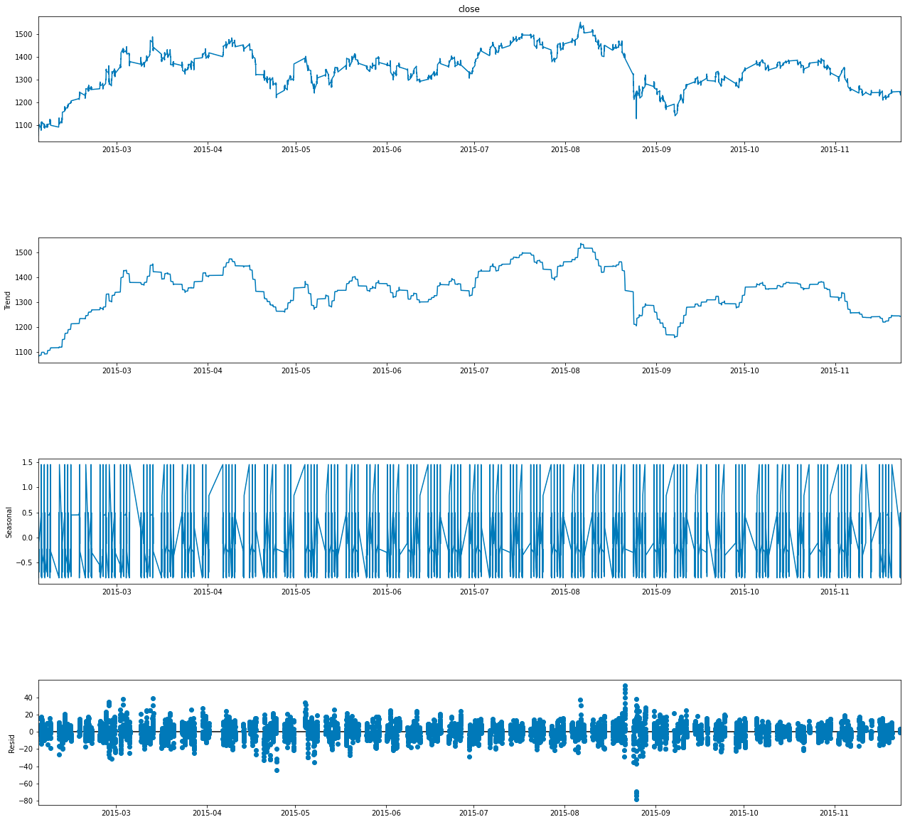
This code pertains to the analysis of a time series dataset, with particular emphasis on identifying and visualizing its underlying components.
In terms of functionality, the code begins by selecting the first 5000 entries from the close column of a DataFrame referred to as df. This column is likely derived from a financial dataset, such as stock prices, where close signifies the closing price of a financial instrument.
Subsequently, the code employs the seasonal_decompose function to decompose the time series data into three primary components: trend, seasonal, and residual, which represents random noise. By opting for an additive model, it suggests that these components are intended to sum together, allowing for the reconstruction of the original series. The specified parameter period = 30 indicates a focus on a seasonality cycle encompassing 30 observations, which likely relates to daily patterns that could be observed over the course of a month.
In addition, the code conducts a visualization of the decomposition results by producing a figure that illustrates the various components of the time series. This visual representation facilitates a deeper understanding of how each component influences the overall behavior of the data.
Moreover, the dimensions of the figure are calibrated to 20 by 19 inches, a substantial size intended to enhance clarity and detail within the visual output.
The utilization of this code is significant as it empowers analysts and data scientists to gain a more nuanced understanding of time series data. By isolating trends, seasonal patterns, and random fluctuations, informed decisions can be made regarding forecasting, anomaly detection, or strategic business insights, particularly in financial contexts. The visualization aspect further improves interpretability, allowing stakeholders to more easily comprehend complex relationships and patterns inherent to the data.
Candlestick charts serve as a valuable tool for traders seeking to forecast potential price movements by analyzing historical patterns. These charts depict four key price points — namely the opening price, closing price, highest price, and lowest price — within a specified time frame chosen by the trader.
Furthermore, numerous algorithms utilize the same price data represented in candlestick charts, demonstrating their importance in algorithmic trading strategies. It is also worth noting that trading decisions are frequently influenced by emotional responses, a phenomenon that can be interpreted through the insights provided by candlestick patterns.
The following section presents an overview of five distinct types of candlesticks. These candlesticks are essential for understanding the various patterns that can emerge in financial markets.
open_data = [33.0, 33.3, 33.5, 33.0, 34.1]
high_data = [33.1, 33.3, 33.6, 33.2, 34.8]
low_data = [32.7, 32.7, 32.8, 32.6, 32.8]
close_data = [33.0, 32.9, 33.3, 33.1, 33.1]
dates = [datetime(year=2013, month=10, day=10),
         datetime(year=2013, month=11, day=10),
         datetime(year=2013, month=12, day=10),
         datetime(year=2014, month=1, day=10),
         datetime(year=2014, month=2, day=10)]

fig = go.Figure(data=[go.Candlestick(x=dates,
                       open=open_data, high=high_data,
                       low=low_data, close=close_data,
               increasing_line_color= 'green', decreasing_line_color= 'red')])

fig.show()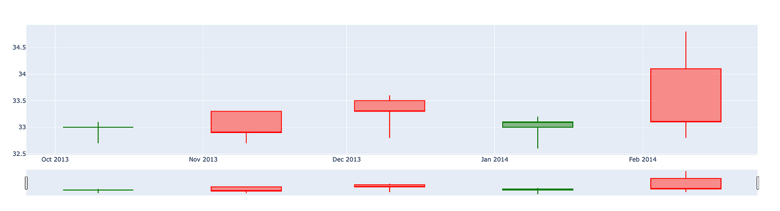
This code is designed to produce a candlestick chart that illustrates the movement of stock prices over a designated time frame.
It begins by establishing four separate lists that encompass various price data: opening prices, highest prices, lowest prices, and closing prices for a series of dates. Alongside this price data, there is also a list of dates that marks when these prices were recorded.
The candlestick chart is a widely utilized tool in finance, displaying the high, low, open, and close prices for a specific period. This format enables analysts and traders to effectively evaluate market trends and variations. Each candlestick within the chart signifies the price movement for an individual date, with a green candlestick representing an increase in price (where the closing price exceeds the opening price) and a red candlestick indicating a decrease.
Ultimately, the code culminates in the visual presentation of the chart, allowing users to discern the relationship among stock prices across time. This visualization plays a crucial role in facilitating informed trading decisions, analyzing trends, and comprehending market behavior. In summary, this code serves as an essential tool for anyone wishing to swiftly grasp stock performance and represent data in an accessible and understandable format.
The candlestick chart for Siemens presents a visual representation of the companys stock performance over a specified period. This chart allows investors and analysts to observe price movements, identify trends, and make informed decisions based on historical data.
The chart typically consists of individual candlesticks, each representing a specific time frame, such as a day or a week. Each candlestick displays the opening price, closing price, highest price, and lowest price for that period. The body of the candlestick indicates the price range between the opening and closing values, while the wicks, or shadows, demonstrate the highest and lowest prices achieved during that timeframe.
By analyzing the candlestick patterns, one can gain insights into market sentiment and potential future price movements. This tool is valuable for those looking to understand the performance of Siemens stock and anticipate possible trends in the financial markets.
import plotly.graph_objects as go

import pandas as pd
from datetime import datetime


fig = go.Figure(data=[go.Candlestick(x=df.index,
                open=df['open'],
                high=df['high'],
                low=df['low'],
                close=df['close'])])

fig.show()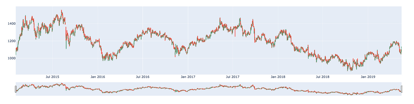
This code is designed to generate a candlestick chart, which serves as a financial visualization tool to illustrate the price movements of a security over a defined time period. Specifically, this chart enables traders and analysts to clearly visualize the open, high, low, and close prices of various assets, such as stocks or cryptocurrencies.
The process begins with the importation of several essential libraries. Plotly is utilized for creating interactive visualizations, pandas facilitates data manipulation and analysis, and datetime is essential for managing date and time information.
Subsequently, the code creates a figure via Plotlys go.Figure function. Within this figure, a candlestick trace is incorporated. This trace draws upon data from a DataFrame, referred to as df, which presumably contains historical price information related to the asset. The x-values signify time series, which likely consist of timestamps or dates extracted from the DataFrames index, while the corresponding columns provide the open, high, low, and close values required for the chart.
Ultimately, the candlestick chart is presented using the fig.show() function, which renders the visualization in an interactive format. This allows users to engage with the chart by hovering over the candlesticks to view specific price points and timing details.
The importance of this code lies in its ability to offer a visual analysis of financial data. Candlestick charts convey more comprehensive information compared to traditional line charts, as they encapsulate four distinct price points — open, high, low, and close — in a single visual representation for each time period. This capability enables traders to swiftly evaluate market dynamics, identify trends, and make informed trading decisions. Furthermore, by employing an interactive library like Plotly, the user experience is significantly enhanced, allowing for a dynamic exploration of the data.
Creating a dataset for training and testing purposes is an essential step in the development of machine learning models. This process involves splitting the available data into two distinct subsets: one for training the model and the other for evaluating its performance.
The training dataset is utilized to teach the model, enabling it to learn patterns and make predictions based on the provided information. Conversely, the test dataset is reserved for validating the model’s accuracy and generalizability to unseen data. This distinction is crucial, as it ensures that the model is not merely memorizing the training data, but is capable of operating effectively in real-world scenarios.
Implementing an appropriate strategy for dividing the data is vital. It is important to ensure that both subsets are representative of the overall dataset. Various methods can be employed to achieve this, including random sampling or stratified sampling, depending on the specific characteristics of the data and the objectives of the study.
By adhering to best practices in the creation of train and test datasets, one can enhance the reliability and effectiveness of machine learning models, ultimately leading to more accurate predictions and better performance in practical applications.
new_df = pd.DataFrame()
new_df = df['close']
new_df.index = df.index
This code snippet is designed to create a new DataFrame based on an existing one. The process begins with the initialization of an empty DataFrame, referred to as new_df.
Subsequently, the code extracts the close column from the original DataFrame, labeled as df, and assigns it to new_df. As a result, new_df will now consist solely of the values from the close column.
Moreover, the index of new_df is established to align with the index of df. This step is essential as it preserves the row labels of the original DataFrame, thereby facilitating any subsequent manipulation or analysis that relies on the index.
The overarching intent of this code is to streamline the data found in the close column of the original DataFrame for further analytical activities. By generating a new DataFrame, it allows for focused examination of this particular subset of data, minimizing the need to engage with the entire original dataset. This approach ultimately enhances the clarity, efficiency, and comprehensibility when working with larger datasets.
scaler=MinMaxScaler(feature_range=(0,1))
final_dataset=new_df.values

train_data=final_dataset[0:20000,]
valid_data=final_dataset[20000:,]
This code snippet is an integral component of a data preprocessing workflow, commonly utilized in machine learning and statistical modeling.
To begin, the code initiates a MinMaxScaler, a utility designed to adjust feature values to a specified range, typically between 0 and 1. This scaling process is particularly beneficial for algorithms that depend heavily on the scale of the input data. Following this, the code converts a dataframe known as new_df into a NumPy array, which is then stored in a variable referred to as final_dataset. Subsequently, the dataset is divided into two segments: a training dataset comprising the first 20,000 entries and a validation dataset that includes entries starting from the 20,001st onward.
The mechanism behind this code involves configuring the MinMaxScaler with a feature range of (0, 1), ensuring that all feature values will be scaled within this specified range when the scaling is applied. The method new_df.values extracts the core data as a NumPy array, facilitating more straightforward manipulation of the dataset. The division of the dataset into training and validation sets is accomplished through basic array indexing, a standard practice for creating distinct datasets intended for training models and assessing their performance.
This code serves an important purpose in the realm of machine learning. Scaling feature values is essential as it enhances the performance and convergence speed of a variety of algorithms, particularly those that involve calculations of distances or gradients, such as neural networks and k-nearest neighbors. Additionally, the separation of the dataset into training and validation sets is vital for accurately evaluating a models performance on previously unseen data. This practice helps mitigate the risk of overfitting and ensures that the model can generalize effectively to new data. By facilitating training on one subset while validating model accuracy on another, this division provides valuable insights into the model’s expected performance in real-world applications.
train_df = pd.DataFrame()
valid_df = pd.DataFrame()
train_df['Close'] = train_data
train_df.index = new_df[0:20000].index
valid_df['Close'] = valid_data
valid_df.index = new_df[20000:].index
This code snippet establishes two DataFrames, train_df and valid_df, which are essential for a machine learning model, particularly in the analysis of time series or financial data.
Initially, the code creates two empty DataFrames through the use of pd.DataFrame(), a function from the pandas library. These DataFrames are intended to subsequently store the closing prices of a financial asset, such as stock prices.
The next step involves populating the Close column of the train_df DataFrame with data from train_data, while the valid_df DataFrames Close column is filled with valid_data. This process is vital as it distinguishes between the training and validation sets, a necessary division for the effective training and evaluation of the model.
Furthermore, the code assigns the indices of both DataFrames based on a predetermined set of indices from another DataFrame, referred to as new_df. The initial 20,000 entries of new_df are designated as the indices for the training data, with the following entries allocated to the validation data. Proper indexing is critical in time series data to ensure accurate alignment of each observation with its corresponding date or time.
The overall purpose of this code is to prepare the dataset for model training. By creating distinct training and validation sets, the approach allows developers to train their models on one segment of the data while assessing their performance on a separate, unseen segment. This separation is essential to mitigate the risk of overfitting and to guarantee that the model performs reliably on new data.
In conclusion, this code effectively establishes the necessary foundations for training and validating a predictive model based on time series data. This process is crucial for ensuring the reliability and accuracy of the predictions generated by the model.
scaler=MinMaxScaler(feature_range=(0,1))
scaled_data=scaler.fit_transform(final_dataset.reshape(-1,1))

x_train_data,y_train_data=[],[]

for i in range(60,len(train_data)):
    x_train_data.append(scaled_data[i-60:i,0])
    y_train_data.append(scaled_data[i,0])

x_train_data,y_train_data=np.array(x_train_data),np.array(y_train_data)

x_train_data=np.reshape(x_train_data,(x_train_data.shape[0],x_train_data.shape[1],1))
The code snippet presented pertains to the preprocessing of a dataset commonly utilized in time series forecasting, particularly in scenarios such as stock price prediction or other forms of sequential data analysis.
Initially, the code employs MinMax Scaling by initializing a MinMaxScaler, which serves to scale the input data to a designated range, specifically between 0 and 1. This transformation is of great importance as many machine learning algorithms operate more effectively when the input features are uniformly scaled.
Subsequently, the fit_transform method is applied to the dataset, reshaping it into a two-dimensional format conducive to the scaling process. This transformation entails modifying the structure of the data so that it comprises a single feature column, with the use of -1 indicating that the number of rows will be determined automatically.
Following this, the code constructs the training dataset for a model through a looping mechanism. In this process, a sliding window encompassing the last 60 time steps (or previous data points) is utilized as input features. Concurrently, the target value corresponding to the subsequent time step is appended to y_train_data. This approach aligns with standard practices in time series modeling, where historical data points are leveraged to forecast future values.
Moreover, both x_train_data and y_train_data undergo conversion into numpy arrays. This conversion is beneficial as numpy arrays allow for enhanced efficiency in numerical operations and satisfy the input format requirements of many machine learning frameworks.
Finally, the input data is reshaped to conform to the anticipated input dimensions of the model. Specifically, this step transforms the two-dimensional array of input features into a three-dimensional format, which is often essential for models such as LSTM (Long Short-Term Memory). These models require input data structured in a way that encompasses dimensions for the number of samples, time steps, and features.
This particular code snippet plays a vital role in preparing time series data for machine learning models. Ensuring proper data scaling and reshaping constitutes critical steps that enhance the models ability to learn effectively from the data. Scaling aids in achieving convergence during training, while appropriately formatting the data enables the utilization of historical information to make predictions about future outcomes.
Long Short Term Memory Networks, commonly referred to as LSTM, are an advanced type of recurrent neural network (RNN) that are designed to retain information over extended periods.
In the process of making decisions, you do not begin from a blank slate. Instead, you draw upon your past experiences and memories. For instance, when you read a newspaper, your understanding of the words is facilitated by prior knowledge stored in your memory. If you come across a new word, it is subsequently added to your memory for future reference. This leads to an important consideration for model development: should your model be required to process all information without prior context, or would it be more effective if it had the capacity to store and utilize memory from previous encounters?
This is where LSTM networks prove to be particularly beneficial. They are specifically engineered to remember information for longer durations, making them ideally suited for tasks such as time series prediction and forecasting. By incorporating a memory space, LSTM networks enhance the intelligence of the model and improve its ability to understand and predict based on previously acquired knowledge.
lstm_model=Sequential()
lstm_model.add(LSTM(units=50,return_sequences=True,input_shape=(x_train_data.shape[1],1)))
lstm_model.add(LSTM(units=50))
lstm_model.add(Dense(1))

inputs_data=new_df[len(new_df)-len(valid_data)-60:].values
inputs_data=inputs_data.reshape(-1,1)
inputs_data=scaler.transform(inputs_data)

lstm_model.compile(loss='mean_squared_error',optimizer='adam')
lstm_model.fit(x_train_data,y_train_data,epochs=1,batch_size=1,verbose=2)

lstm_model.summary()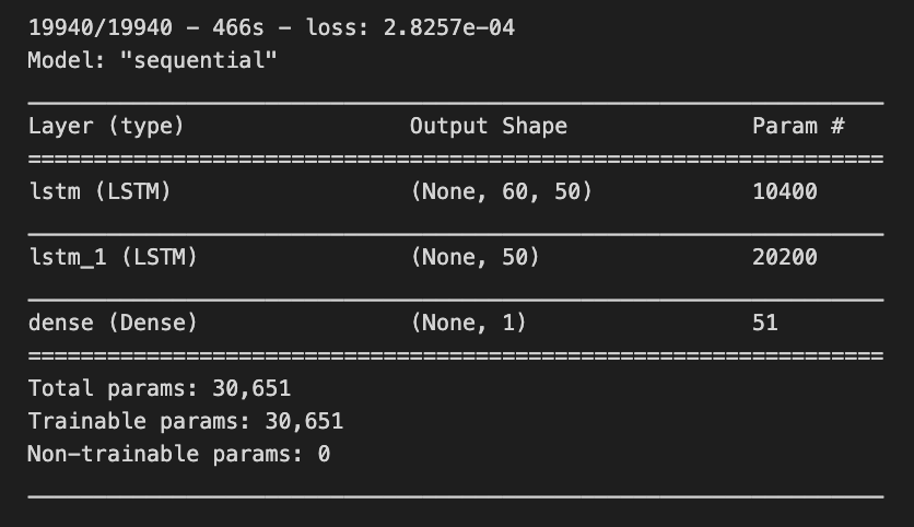
This code snippet illustrates the development and training of a Long Short-Term Memory (LSTM) neural network model, utilizing Keras, which is integrated within the TensorFlow library. The primary objective of this code is to construct a model capable of recognizing patterns within sequential data, a functionality frequently applied in the domain of time series forecasting.
The process begins with the initialization of a sequential model, which allows for the addition of layers in a linear fashion. Subsequently, an initial LSTM layer containing 50 units is incorporated, configured to return sequences. This configuration is essential for the subsequent stacking of another LSTM layer. The input_shape parameter specifies the expected format of the input data, indicating that the model is designed to receive sequences of a predetermined length with a single feature.
Following this, a second LSTM layer is integrated without the return of sequences, suggesting that this layer will yield an output exclusively for the last time step as opposed to every time step throughout the sequence. An output layer, characterized as a Dense layer, is then added. This layer is intended to furnish the final predictions, consisting of a single unit, as it is typically associated with regression tasks where the goal is to predict a solitary continuous value.
In terms of data preparation, the model draws input data from a DataFrame, specifically utilizing a specific subset that amalgamates current data with previous timesteps (set at 60). The shape of the data is modified to align with LSTM requirements and undergoes scaling through a standard scaler to ensure that the input values fall within an appropriate range, typically between 0 and 1.
The compilation of the model follows, employing a loss function known as mean squared error, which assesses the alignment of the models predictions with the actual target values. An optimizer, specifically the adam algorithm, is also included, facilitating the adjustment of weights during the training process to minimize the stated loss.
The training of the model occurs with the training data over the course of one epoch, utilizing a predetermined batch size. This phase entails modifying the model parameters based on the training data to further minimize loss.
Lastly, the summary function is invoked to present an overview of the LSTM model architecture, including details regarding the number of parameters associated with each layer.
The importance of this code emerges in contexts where the goal is to forecast future values derived from historical data, a common requirement across various fields such as finance and weather forecasting. LSTM models are particularly adept for these applications, as they are engineered to learn long-term dependencies and patterns within sequential data, thereby addressing limitations encountered in earlier recurrent neural networks (RNNs). Consequently, this code serves as a foundational framework for creating a machine learning model capable of processing and predicting outcomes based on time-dependent information.
X_test=[]
for i in range(60,inputs_data.shape[0]):
    X_test.append(inputs_data[i-60:i,0])
X_test=np.array(X_test)

X_test=np.reshape(X_test,(X_test.shape[0],X_test.shape[1],1))
predicted_closing_price=lstm_model.predict(X_test)
predicted_closing_price=scaler.inverse_transform(predicted_closing_price)
This code is crafted to prepare data for predictions in a machine learning model, specifically one that utilizes Long Short-Term Memory (LSTM) neural networks. These networks are well-regarded for time series forecasting, including applications such as stock price prediction.
The initial phase of the code involves creating an empty list called X_test. It systematically iterates from an index of 60 up to the total count of data points available in inputs_data. For each index, the code appends a segment of the data that consists of the preceding 60 time steps (or entries) of the first feature. This process generates sequences of historical data, which the LSTM model can use to derive predictions.
Once the list of sequences is fully populated, it is transformed into a NumPy array to streamline subsequent processing. Utilizing this format is advantageous in machine learning due to its efficiency and ability to handle numerical operations effectively.
The next step involves reshaping the X_test array into three dimensions. This is a crucial requirement because LSTMs expect their input data to conform to a specific structure, namely (samples, time steps, features). In this context, samples denotes the quantity of sequences prepared, time steps correlates to the previous 60 time entries, and features represents the singular feature under analysis, thus making the last dimension equal to one.
Following this arrangement, the reshaped X_test is inputted into a pre-trained LSTM model to generate predictions for closing prices. The model produces output values based on the historical sequences provided to it.
The predicted closing prices may be represented in a normalized or scaled format due to the initial preprocessing of the raw data. The final step involves applying an inverse scaling function, typically offered by a scaler object, which serves to convert these predictions back to their original scale.
The necessity of this code segment lies in its role in preparing input features for forecasting with the LSTM model. It ensures that the predictions are interpretable and applicable in their original context, such as actual stock prices. By bridging the transition from raw data to model input, this code facilitates time series analysis and forecasting across financial and other sequential datasets.
valid_df['Predictions']=predicted_closing_priceThe line of code in question assigns a series of predicted closing prices to a new column titled Predictions within a DataFrame referred to as valid_df.
The DataFrame valid_df is presumably utilized for validation purposes, likely containing historical or test data intended to evaluate the effectiveness of a predictive model. The variable predicted_closing_price encompasses the predicted values, which are presumably generated by a machine learning model designed to forecast future closing prices of various financial assets, such as stocks.
Incorporating these predicted values into the DataFrame as a new column facilitates an easy comparison between the models predictions and the actual values, if available. This comparison is essential for assessing the accuracy and overall performance of the model. Such validation is a critical aspect of determining the models efficacy and supporting data-driven decision-making based on its generated outputs.
Utilizing this code is significant in data analysis workflows where clarity and ease of comparison are paramount, particularly in the realm of financial forecasting, where understanding the models performance against actual outcomes is of utmost importance.
Your knowledge has been developed based on data available until October 2023.
In this context, it is essential to consider the varying outcomes and trends that may emerge in the future. The predictions derived from this data are influenced by numerous factors, including societal changes, technological advancements, and economic developments.
As such, these forecasts should be viewed as informed estimates rather than certainties. Ongoing analysis and updates to the underlying data will be necessary to refine these predictions and maintain their relevance over time.
fig = go.Figure()
fig.add_trace(go.Scatter(x=train_df.index,y=train_df['Close'],
                    mode='lines',
                    name='Siemens Train Data'))
fig.add_trace(go.Scatter(x=valid_df.index,y=valid_df['Close'],
                    mode='lines',
                    name='Siemens Valid Data'))
fig.add_trace(go.Scatter(x=valid_df.index,y=valid_df['Predictions'],
                    mode='lines',
                    name='Prediction'))
This code serves to create a visual representation of time-series data concerning Siemens stock prices, specifically the closing prices during both the training and validation phases, as well as the predicted values from a model.
The process begins with the initialization of a new figure through a plotting library, specifically Plotly, which facilitates interactive visualizations. Following this, three separate traces are added to the figure. The first trace illustrates the actual closing prices from the training dataset, identified as train_df, and is depicted as a line. The second trace corresponds to the closing prices retrieved from the validation dataset, labeled valid_df, and is also represented as a line. The third trace displays the predictions generated by the model based on the validation dataset, continuing the line representation.
