

Algorithmic Alpha: Enhancing Momentum Strategies with Machine Learning
How to combine Rolling OLS, Fama-French factors, and constrained clustering to build a Max-Sharpe portfolio.

Download source code using the button at the end of article!
The notebook contains link to download dataset, and also all of the outputs working!
Quantitative trading is no longer just about crossing two moving averages; it requires a robust pipeline that marries traditional financial theory with modern machine learning. In this walkthrough, we build a complete, end-to-end algorithmic trading strategy that targets high-momentum stocks within the S&P 500. We move beyond simple technical analysis by engineering advanced features — including Garman-Klass volatility and Rolling OLS betas against Fama-French factors — and applying unsupervised learning to detect market regimes. By “seeding” a K-Means clustering algorithm with specific RSI targets, we create a hybrid model that isolates high-potential assets before feeding them into a Mean-Variance optimizer. Whether you are a data scientist looking to apply your skills to finance, or a trader seeking to automate your workflow, this guide demonstrates how to turn raw price data into a mathematically optimized portfolio.
from statsmodels.regression.rolling import RollingOLS
import pandas_datareader.data as web
import matplotlib.pyplot as plt
import statsmodels.api as sm
import pandas as pd
import datetime as dt
import yfinance as yf
import pandas_ta
import warnings
warnings.filterwarnings(’ignore’)
This small block is the setup and toolkit declaration for a quant-trading module that will fetch market data, compute time-series features and technical indicators, run lightweight rolling regressions, and visualize or diagnose results before feeding them into machine learning or signal-generation components. Conceptually it’s doing three things: (1) bring in data access and time handling so we can build a clean, indexed price series; (2) provide analytic primitives — technical indicators and rolling regression — to convert raw prices into predictive features and regime-aware coefficients; and (3) give us plotting and diagnostic facilities while silencing noisy warnings for a cleaner development experience.
On the data side we import both a web data reader and yfinance. In practice you’ll use one or the other to pull historical price series (usually adjusted close) and timestamps for the training and backtest windows. The datetime utilities are there so you can explicitly set reproducible start/end ranges and ensure the DataFrame index is proper pandas DatetimeIndex. Using pandas as the primary in-memory structure lets you align series, resample to a common frequency and handle missing data (forward-fill or drop) before feature construction; getting these alignments right is critical to avoid look-ahead bias when you later roll features into your model.
For feature engineering we bring in pandas_ta, which gives a broad, vectorized set of common technical indicators (SMA, EMA, RSI, ATR, etc.) that are convenient to compute as additional columns. These indicators act as engineered inputs to ML models or rule-based overlays; we compute them here rather than inside the model so we can validate stationarity, correlation and information leakage independently. Keep in mind to use adjusted prices and to align indicator windows carefully so the indicator value at time t only depends on data ≤ t.
The RollingOLS import is the core for generating time-varying linear relationships. Instead of running many separate OLS fits in a Python loop (which is slow and error-prone), RollingOLS efficiently computes rolling-window OLS estimates so you can extract a sequence of betas, standard errors and residuals that evolve through time. We use this when we want features like a dynamic hedge ratio between two assets, a local beta to the market, or residual-based mean-reversion signals. The key “why” here is that financial relationships are nonstationary: a single global OLS coefficient often misses regime shifts, whereas rolling coefficients can capture structural changes and therefore produce more robust, adaptive features for downstream ML. When you use RollingOLS, ensure your design matrix (exogenous variables) is properly aligned, that you include a constant if needed (sm.add_constant), and that the window and min_periods settings are chosen to balance responsiveness versus estimation noise.
statsmodels.api gives the higher-level modeling and diagnostic utilities: summaries, hypothesis tests, and convenience functions to inspect fit quality. Extracting .params, .bse, .pvalues and .resid from the rolling results feeds both feature construction (e.g., use the rolling beta as a feature) and risk controls (e.g., flag statistically insignificant betas). Matplotlib is included for plotting time series, betas, residuals and indicator diagnostics so you can visually validate that features behave sensibly across regimes and that no unintended look-ahead leaks are present.
Finally, warning suppression is applied here to keep the notebook or logs tidy; this is a development convenience but not a substitute for paying attention to warnings during model validation. Some warnings (e.g., about convergence or deprecated behavior) may point to crucial issues, so use the filter judiciously and re-enable or inspect warnings when moving code into production.
Put together, these imports and small runtime settings set the stage for a workflow: fetch and clean adjusted price series, compute technical indicators and align exogenous variables, run RollingOLS to produce time-varying coefficients and residuals, validate and visualize those features, and then feed the validated features into your ML pipeline or signal generator — always taking care to avoid look-ahead, handle missing data, and choose window sizes that trade off bias and variance appropriately for the target strategy horizon.
#load data
sp500 = pd.read_html(’https://en.wikipedia.org/wiki/List_of_S%26P_500_companies’)[0]
This single line pulls the S&P 500 constituent table off the public Wikipedia page and produces a DataFrame you can use as the initial universe list for a quant strategy. Under the hood pandas parses the HTML and returns all tabular blocks it finds; selecting index [0] is a pragmatic shortcut that assumes the first table on the page is the canonical list. In practice that table typically contains columns such as the ticker symbol, company name, sector, and headquarters — fields you’ll use to seed universe selection, sector-neutral constraints, and metadata-driven features.
Why we do this here (and why you need to treat it carefully): for research and quick backtests Wikipedia is convenient because it’s freely accessible and generally up-to-date. However the page is not an authoritative market source and its structure can change. Because pd.read_html returns a list of DataFrames rather than a single guaranteed schema, you should verify that the expected columns exist after loading and fail fast if the table layout has shifted. Treat this as a snapshot step — you’re capturing the current constituents at request time, which is important because the S&P 500 membership evolves with reconstitutions, mergers and delistings; reproducible backtests must persist that snapshot alongside your trade logic and market data.
There are several normalization and validation tasks that follow this load and explain why they matter for downstream ML and trading tasks. Normalize ticker strings to the format expected by your price-data provider (different vendors represent special tickers like BRK.B or BF.B differently), trim whitespace, ensure unique symbols, and cohere casing. Enrich or validate the table against a more authoritative source if you need production-grade correctness: mismatches or stale tickers will cause lookup failures, misaligned training labels, and accidental leakage in portfolio simulations. Also check for and handle missing values in key columns (e.g., sector) so that feature engineering or sector-neutral portfolio construction does not silently break.
Operational considerations: cache the downloaded snapshot with a timestamp and provenance metadata so backtests can be reproduced; add retries, timeouts and user-agent headers or use an API if you’ll be doing this frequently to avoid being blocked. For production, prefer exchange/issuer-provided lists or paid vendor snapshots that include historical constituent changes and corporate-action mappings; these reduce reconciliation burden and help ensure that training labels and backtest outcomes reflect the true tradable universe. In short, this line kickstarts universe selection, but it should be followed by verification, normalization, and durable storage before those symbols feed your feature pipeline, labeling, or live trading systems.
sp500.head(5)This single call is a quick, intentional inspection step: after ingesting S&P 500 time-series data into the DataFrame named sp500, we ask for the first five rows to validate that the data loaded the way we expect before any downstream processing. In practical terms this confirms the chronological order and index type (we expect a DateTime index or a date column sorted ascending), shows the column set (for example Date/Open/High/Low/Close/Adj Close/Volume or any custom fields), and exposes obvious issues such as missing values, mis-parsed dates, duplicated header rows, or unexpected extra columns that would break feature engineering or model training.
Why this matters for quant trading with ML: many errors at ingestion cause subtle but fatal problems later — a wrong sort order creates look-ahead leakage, an incorrect price column (Close vs Adj Close) gives an unadjusted target that ignores splits/dividends, and off-by-one date parsing shifts the alignment of features and labels. Viewing the first few rows lets you decide the next actions: if dates aren’t parsed as datetimes, parse them; if the order is descending, re-sort ascending; if Adj Close is missing, decide whether to compute or substitute Close; if there are NaNs or zero volumes at the start, choose an imputation or filter policy. This is a low-cost guard that informs those larger, high-impact decisions.
After this check you typically follow with automated validations (df.info(), dtypes, isnull().sum(), duplicated index checks) and domain-specific checks (market holidays, expected start date, continuity of trading days, no forward-filled labels). In short, head(5) is the first step in a chain of sanity checks that prevents data-quality issues from propagating into feature creation, cross-validation, and ultimately into trading signals and P&L estimates.
sp500[’Symbol’] = sp500[’Symbol’].replace(”.”,”-”)
symbols_list = sp500[’Symbol’].unique().tolist()
symbols_list
This block is doing a small but important normalization step on your universe of S&P 500 tickers and then turning that cleaned column into a de‑duplicated list you can iterate over for data fetching and model work. First, every symbol string in the DataFrame gets its dot characters converted to hyphens. The practical intent is to normalize ticker formatting across data sources — examples include class shares like BRK.B (often represented with a dot) versus data providers or downstream code that expect BRK‑B. Normalizing here prevents mismatches when you later pull historical prices, join with other datasets, or use these strings as keys in feature pipelines or labeling logic.
Next, the code extracts the unique symbols from the column and converts them into a Python list. Doing uniqueness after normalization is deliberate: it ensures you don’t treat two different textual representations of the same underlying asset as separate instruments, which would otherwise produce duplicate downloads, redundant feature rows, and potentially label leakage or skewed training data. The resulting list is the canonical set of tickers used for subsequent I/O (API calls, batch downloads), universe construction, and iteration in feature/target generation — which improves performance by avoiding repeated network requests and keeps the ML training set consistent.
A couple of practical caveats to keep in mind for robustness: string replacement should be literal (use Series.str.replace(“.”, “-”, regex=False) or escape the dot) so you don’t accidentally trigger regex behavior; trim whitespace and normalize case if your other sources use different casing; and handle NaNs explicitly before replacing. These small guards reduce downstream surprises when assembling time-series inputs and labels for your quant models.
end_date = ‘2023-09-27’
start_date = pd.to_datetime(end_date) - pd.DateOffset(365*8)
df = yf.download(tickers=symbols_list,start=start_date,end=end_date).stack()
df.index.names = [’date’,’ticker’]
df.columns = df.columns.str.lower()
df
This snippet creates an 8‑year historical window ending on a fixed date and then pulls time series price data for a list of tickers, reshaping the download into a tidy table that’s easier to feed into feature-engineering and modeling steps. First, the code computes the start date by subtracting eight years (365 * 8 days) from the specified end date; the eight‑year horizon is a deliberate choice for quant work because it gives you multiple market regimes and more training examples, which helps models generalize and avoid overfitting to a single regime. Next, yf.download retrieves the usual OHLC/volume/adj‑close fields for every ticker over that interval; yfinance returns those fields as a multi‑column (field × ticker) wide table, which is awkward for row‑oriented pipelines.
To make the data “tidy” the code uses .stack() to move the ticker level out of the columns and into the row index, producing a dataframe where each row corresponds to a single (date, ticker) observation and the columns are the price/volume fields. Naming the two index levels as [‘date’, ‘ticker’] makes downstream code and groupby operations explicit and less error‑prone, and lowercasing column names standardizes feature names (so lookups and joins are case-insensitive and consistent across modules). This layout — one row per date/ticker with consistent column names — is much easier to work with for feature construction (rolling returns, volatility, lagged predictors), train/validation splits that respect time and instrument, and for batching inputs into ML models.
A couple of practical caveats relevant to quant ML: DateOffset(365*8) is a convenient approximation and ignores leap‑day effects, but is usually fine for multi‑year windows; you’ll still want to handle non‑trading days, missing values, corporate actions (adjusted close is included but you should verify adjustments are correct), and timezones before creating model features. The reshaped dataframe is now ready for groupwise feature generation, cross‑sectional normalization, and label construction for downstream model training and backtesting.
#Calculate Garman_klass volatility,rsi(Relative Strength Index),bollinger band, ATR, MACD,Dollar Volume
import numpy as np
df[’garman_klass_vol’] = ((np.log(df[’high’])-np.log(df[’low’]))**2)/2-(2*np.log(2)-1)*((np.log(df[’adj close’])-np.log(df[’open’]))**2)
df[’rsi’] = df.groupby(level=1)[’adj close’].transform(lambda x: pandas_ta.rsi(close=x,length=20))
df[’bb_low’] = df.groupby(level=1)[’adj close’].transform(lambda x: pandas_ta.bbands(close=np.log1p(x),length=20).iloc[:,0])
df[’bb_mid’] = df.groupby(level=1)[’adj close’].transform(lambda x: pandas_ta.bbands(close=np.log1p(x),length=20).iloc[:,1])
df[’bb_high’] = df.groupby(level=1)[’adj close’].transform(lambda x: pandas_ta.bbands(close=np.log1p(x),length=20).iloc[:,2])
df
This block constructs a small set of per-instrument technical features that will feed downstream ML models for quant trading. Conceptually, each line either produces a volatility/momentum measure or a volatility envelope around price, and every indicator is computed independently for each asset (via groupby) so that information does not bleed between tickers. The result is a feature-enriched DataFrame aligned to the original index so rows remain directly usable as observations for model training or live signals.
The garman_klass_vol line implements the Garman–Klass volatility estimator using log prices (high, low, open, adjusted close). We use log prices because volatility is naturally measured on multiplicative returns; the Garman–Klass formula combines the high–low range with the open–close return term to produce a variance estimate that is less biased and more efficient than simple close-to-close variance for intraday/high-low information. Practically this gives a per-period variance proxy (not yet annualized), and you should be aware that for very small samples or noisy data this estimator can sometimes behave poorly — clip or regularize negative/implausible values and convert to an annualized volatility if that’s what your model expects.
RSI is computed per asset with a 20-period window. RSI captures recent momentum and helps the model detect overbought/oversold regimes; a 20-period lookback is a common compromise between sensitivity and stability for daily data. Using groupby(…).transform ensures the computed RSI is aligned with the original index and computed only from past data for that asset (aside from any pandas_ta implementation details — confirm it doesn’t peek ahead).
Bollinger bands are built from the log1p of adjusted close and are exposed as three separate columns (bb_low, bb_mid, bb_high). The pandas_ta.bbands call returns lower, middle (simple moving average), and upper bands (middle ± k·std), and the code picks those columns explicitly. The choice to use np.log1p on price reduces scale heteroskedasticity across instruments (large nominal prices won’t dominate band width) and stabilizes variance, so band widths reflect multiplicative volatility rather than absolute dollar moves. Two points to watch: (1) log1p on price is a transformation choice — many practitioners compute bands on raw prices or on log returns; be consistent across your feature set, and (2) initial window periods will produce NaNs, so downstream pipelines must handle those rows.
Operational notes tied to model quality: groupby(level=1) indicates a MultiIndex (likely date, ticker) and avoids cross-ticker leakage — this is critical for realistic backtests. transform preserves the original row indexing so features line up correctly, but you must still shift features if you plan to use them as inputs to predict the next bar’s return to avoid lookahead bias. Also normalize/scale features (or use per-asset standardization) before feeding them into learning algorithms. Finally, although the header mentions ATR, MACD and dollar volume, they aren’t computed here; if you need them, compute them consistently (same grouping, same log/linear basis) and be mindful of computational cost: lambdas invoking pandas_ta on each group are simple but can be slow for large universes — consider vectorized implementations or applying pandas_ta to concatenated groups where possible.
def compute_atr(stock_data):
    atr = pandas_ta.atr(high=stock_data[’high’],low=stock_data[’low’],close=stock_data[’close’],length=14)
    return atr.sub(atr.mean()).div(atr.std())

df[’atr’] = df.groupby(level=1,group_keys=False).apply(compute_atr)
This block computes a volatility feature (14-period Average True Range, ATR) for each instrument in the dataset and stores a standardized version of that feature back onto the DataFrame. Conceptually the code does two things in sequence: generate an ATR time series from the instrument high/low/close data, then normalize that series so it becomes a z‑score that is comparable across instruments and time.
Inside compute_atr, pandas_ta.atr is used with length=14 to produce the standard 14‑period ATR from the high/low/close columns. ATR measures recent absolute price movement (true range averaged over the window), so it serves as a per‑instrument volatility signal for the ML model. Immediately after computing ATR, the function standardizes the series by subtracting its mean and dividing by its standard deviation (atr.sub(atr.mean()).div(atr.std())). This yields a z‑scored ATR: values indicate how many standard deviations current volatility is from that instrument’s average, which helps the learning algorithm treat volatility signals from different instruments on the same scale.
The df line applies this function on a per‑instrument basis: df.groupby(level=1, group_keys=False).apply(compute_atr) groups the DataFrame by the index’s level 1 (typically the ticker or instrument identifier in a MultiIndex), runs compute_atr on each group independently, and returns a concatenated Series aligned with the original rows; assigning it to df[‘atr’] attaches the standardized ATR back to the corresponding rows. group_keys=False keeps the resulting index consistent with df so the assignment aligns correctly.
A few practical and ML‑specific caveats to keep in mind: first, ATR produces NaNs at the beginning of each group equal to the lookback length (14), so you’ll see missing values that need to be handled downstream. Second, the current standardization uses the full-series mean and std for each instrument — that normalizes cross‑instrument scale but introduces a potential lookahead/data‑leakage issue if you compute these statistics using future data relative to a training split. For production/causal feature generation you should compute rolling or expanding mean/std up to each timestamp (or fit scalers only on training data) to avoid leaking future information. Third, if an instrument’s ATR is constant (std == 0) you’ll get NaNs from the division; defensively handle zero‑variance cases (e.g., fallback to zero or small epsilon). Finally, for performance and clarity, consider using groupby(…).transform to produce a same‑shaped Series directly, or compute rolling/expanding standardization in a vectorized way so the feature pipeline remains fast and causally correct for model training and live trading.
def compute_macd(close):
    macd = pandas_ta.macd(close=close,length=20).iloc[:,0]
    return macd.sub(macd.mean()).div(macd.std())

df[’macd’] = df.groupby(level=1,group_keys=False)[’adj close’].apply(compute_macd)
df
This snippet computes a per-asset MACD feature and stores a normalized version on the DataFrame. The code assumes df is a panel-style DataFrame with a MultiIndex where level=1 is the asset identifier (ticker); grouping by level=1 ensures each asset’s adjacency-close time series is processed independently and in time order, which is essential because MACD is an EMA-based momentum indicator that requires contiguous historical values.
Inside compute_macd, pandas_ta.macd is called with length=20. That call returns the MACD output (typically MACD line, signal line, and histogram); .iloc[:,0] selects the primary MACD line (the difference between two EMAs). The function then standardizes that series by subtracting its mean and dividing by its standard deviation, producing a z-score. The rationale is twofold: first, converting to a z-score makes the MACD comparable across assets that have different price scales and volatilities, which is important when you feed features from many tickers into a single ML model; second, unit-scaling helps model learning and optimization (it prevents features with larger magnitudes from dominating gradients or regularization).
When the groupby/apply runs, group_keys=False makes sure the returned Series keeps the same index shape as the input so it can be assigned directly into df[‘macd’]. A couple of practical notes and caveats: EMA-based indicators produce NaNs during the initial warm-up window, so expect NaNs at the start of each asset’s series; these propagate through the normalization. Also, the current normalization uses the full-series mean and std for each asset — that simplifies implementation and yields features centered per-asset, but it introduces look-ahead bias if you compute these statistics using future data and then use the features in backtesting or live prediction. To avoid that you should compute rolling or expanding mean/std (or compute stats only on historical data up to each time point). Finally, changing the length parameter (here 20) alters MACD sensitivity: a larger length smooths/makes the indicator less noisy and shifts the feature’s time horizon, which should be chosen to match the intended trading frequency.
df[’dollar volume’] = (df[’adj close’]*df[’volume’])/1e6
df
This block creates a per-row measure of traded liquidity and immediately surfaces it in the DataFrame. For each daily row it multiplies the adjusted close price by the traded share volume, producing the daily dollar value transacted for that security; dividing by 1e6 simply rescales the number into millions to keep magnitudes readable and numerically convenient for downstream models and displays. We use the adjusted close rather than raw close because adjusted prices account for corporate actions (splits and dividends), so the dollar-volume series reflects economically comparable trade values across time rather than artificial jumps caused by corporate events.
Why this matters in quant trading: dollar volume is a practical liquidity proxy used to screen and weight instruments, to avoid trading illiquid names, and as an input feature in models that account for execution risk or turnover. Typical follow-ups include filtering out rows below a minimum dollar-volume threshold, using it as a weighting factor for portfolio construction, or applying transformations (log, rank, or z-score) and winsorization before feeding it into a machine-learning model — those transformations control skew and the influence of outliers. Note also that this calculation is a vectorized DataFrame operation (efficient in pandas) and it adds a new column in-place; the subsequent bare df in the code simply forces the DataFrame to be emitted (e.g., for display or inspection) but doesn’t change data.
Practical cautions: ensure there are no missing or non-numeric entries in price/volume that would propagate NaNs, and remember dollar volume measures traded activity, not outstanding size (market cap), so it captures liquidity dynamics rather than capitalization. Depending on model needs you may want further normalization, aggregation (e.g., average dollar volume over a window), or alignment with intraday data if execution modeling requires higher granularity.
#Aggreagate and filter the top 150 liquid stocks monthly to reduce the features for training
#for dollar volume
#to aggregate the other features
last_cols = [ c for c in df.columns.unique(0) if c not in [’dollar volume’,’high’,’low’,’close’,’open’,’volume’]]
last_cols

data = (pd.concat([df.unstack(’ticker’)[’dollar volume’].resample(’M’).mean().stack(’ticker’).to_frame(’dollar volume’),df.unstack()[last_cols].resample(’M’).last().stack(’ticker’)],axis=1)).dropna()
data
This block reshapes and temporally aggregates your raw panel so you can pick the most liquid stocks on a monthly basis and feed consistent, month‑aligned features into the model. At a high level it (1) identifies which column groups to treat specially, (2) computes a monthly liquidity measure from dollar volume, (3) captures a single month‑end snapshot for the remaining features, and (4) reassembles those results into a tidy monthly (date × ticker) table ready for downstream filtering/training.
First, last_cols captures the set of top‑level column names (you’re using a MultiIndex for columns) that you want to aggregate with the “last observation” rule; it intentionally excludes the price/volume family [‘dollar volume’,’high’,’low’,’close’,’open’,’volume’] because those need different aggregation logic (liquidity is being summarized, prices are being snapshotted). This separation is important: dollar volume is a liquidity metric that we want to summarize over the month, while price-like and other features are best represented by the most recent available value at month end.
The core transformation uses unstack/stack to toggle between long and wide shapes so pandas’ time resampling can operate on the date index. unstack(‘ticker’) pivots tickers into columns so the DataFrame has a DatetimeIndex and can be resampled by month. For dollar volume you call resample(‘M’).mean() — averaging daily dollar volume across the month produces a robust monthly liquidity estimate that smooths intra‑month spikes and is stable for ranking. For the other features you call resample(‘M’).last() so you capture the month‑end snapshot (the most recent value in the month), which is what you typically want when aligning features to a monthly label or next‑period target. After resampling you stack(‘ticker’) to put ticker back into the index (returning a long form with a MultiIndex like (month_end_date, ticker)).
Finally, pd.concat combines the monthly mean dollar volume column and the month‑end snapshots for the other feature groups into a single DataFrame keyed by (date, ticker). dropna() removes any rows missing any of these aggregated values so the downstream model sees complete feature vectors. The resulting table is exactly the structure you need to (a) rank tickers by monthly dollar volume and (b) select the top N (e.g., 150) liquid securities each month to reduce feature dimensionality and ensure training uses consistently observed, month‑aligned inputs.
Notes and small caveats: using mean for dollar volume is a reasonable default to smooth noise, but you might prefer sum or median depending on whether total traded value or robustness to outliers is more important. Ensure the index you resample is a proper DatetimeIndex (sorted and timezone‑aware as needed), because resample operates on the row index after unstacking. Also, this code does not perform the actual “top 150” filtering; the next step should group by month and take the top 150 tickers by the computed dollar volume before passing data into training.
#calculate the 5 year rolling average of dollar volume fro each stock before filtering
data[’dollar volume’] = (data.loc[:,’dollar volume’].unstack(’ticker’).rolling(5*12,min_periods=12).mean().stack())
data[’dollar volume rank’] = data.groupby(’date’)[’dollar volume’].rank(ascending=False)
data = data[data[’dollar volume rank’]<150].drop([’dollar volume’,’dollar volume rank’],axis=1)
data
This block converts the per-row dollar-volume series into a time-smoothed liquidity signal for each ticker, uses that signal to pick a liquid trading universe on each date, and then cleans up the temporary columns. Concretely, the code first pivots the dollar-volume series so each ticker becomes a column indexed by date, computes a 5-year rolling mean along the date axis for each ticker, and then pivots the result back to the original long (date, ticker) layout. The reason for the unstack/rolling/stack pattern is practical: pandas’ rolling operates along the index, so to compute a separate rolling average for every ticker you briefly need a wide (date x ticker) shape; stacking restores the original multi-index alignment so the smoothed values can be assigned back into the original DataFrame.
The choice of window and minimum data points encodes business assumptions about liquidity. Using 5*12 sets a 60-period window — in this code that implies monthly data and therefore a five‑year lookback — which smooths out transient spikes in volume and produces a stable, longer-term estimate of tradability. min_periods=12 enforces that at least one year of history must exist before we trust the average; this prevents noisy estimates from very short histories while still allowing newer securities to enter the universe once they’ve accumulated a year of data.
Once every ticker/date has a smoothed dollar-volume, the code ranks tickers by that smoothed liquidity on each date (descending, so the largest dollar volumes get the top ranks) and filters to keep only the most liquid names. Filtering by rank < 150 keeps the top ~149 tickers by this liquidity metric on each date. This step is a practical liquidity screen: downstream ML models and backtests operate on a universe where execution is more realistic, slippage and market-impact are reduced, and labels/returns are less distorted by tiny, illiquid stocks.
Finally, the temporary helper columns are dropped to return the DataFrame to its original schema. A couple of operational notes: the rank default handles ties by averaging ranks (which may slightly affect cutoffs), and the strict <150 condition excludes the 150th-ranked ticker — if you intend to keep exactly 150 names use <=150 (or adjust for ties explicitly). Also, unstack/stack can be memory- and time-intensive for very large universes; an alternative is groupby(‘ticker’)[‘dollar volume’].rolling(window).mean() with careful index handling, but that API can be more verbose. Overall, this block enforces a robust, long-term liquidity filter so the ML models are trained and evaluated on a realistically tradable set of instruments.
#calculate monthly returns of different time horizons
#first case study: AAPL stock
def investment_returns(stock):
    lags = [1,2,3,6,9,12]
    outlier_cutoff = 0.005
    for lag in lags:
        stock[f’return {lag} m’] = (stock[’adj close’].pct_change(lag).pipe(lambda x: x.clip(lower=x.quantile(outlier_cutoff),upper=x.quantile(1-outlier_cutoff))).add(1).pow(1/lag).sub(1))
    return stock

data = data.groupby(level=1,group_keys=False).apply(investment_returns).dropna()
data
This block is building a set of engineered return features — one per holding horizon — for each instrument so downstream ML models can reason about multi-horizon momentum/mean-reversion. The outer call groups the data by the second level of the index (the instrument/time-series key) and runs investment_returns on each group; that grouping is important because pct_change and the quantile-based clipping must be computed per instrument to avoid leakage across tickers and to keep the time-series continuity intact. group_keys=False preserves the original index layout so the new columns align with the original rows.
Inside investment_returns the code iterates a list of horizons (lags = [1,2,3,6,9,12]) and computes, for each horizon, a per-period compounded return column named ‘return {lag} m’. For each lag the pipeline does three things in sequence. First it computes the multi-period total return with adj close.pct_change(lag) — that gives the raw return over lag periods. Second it winsorizes that series by clipping values to the outlier quantiles (here 0.5% and 99.5%) so extreme moves, data glitches, or very large gaps don’t dominate later transformations or training. That clipping is done per-instrument because it is applied inside the grouped function. Third it converts the clipped multi-period total return into an equivalent single-period (per-month) geometric return by computing (1 + total_return) ** (1/lag) — 1. This geometric root is chosen because returns compound: the per-period geometric mean correctly converts a multi-period cumulative return into the consistent per-period rate that the ML model should see, whereas an arithmetic average would misrepresent compounding and bias features for longer horizons.
Finally, apply returns a combined frame with the new columns, and dropna() removes initial rows that lack enough history for the largest lag(s). Practically, this gives you robust, per-month compounded return features at multiple time scales that capture momentum/mean-reversion signals for use as inputs or labels in your quant models. A couple of implementation caveats to keep in mind: clipping is a form of winsorization and the cutoff (0.005) is a hyperparameter you may want to tune per-universe; and if (1 + total_return) becomes non-positive (extreme negative returns <= -100%), taking a fractional power can be undefined — clipping typically prevents that, but you may want an explicit floor (e.g., -0.999) or alternative handling for distressed securities.
#Introduce Fama-french factors (all 5 fama-french factors) and calculate rolling factor betas
factor_data = web.DataReader(’F-F_Research_Data_5_factors_2x3’,’famafrench’,start=’2010’)[0].drop(’RF’,axis=1)
factor_data.index = factor_data.index.to_timestamp()
factor_data = factor_data.resample(’M’).last().div(100)#divide result by hundred
factor_data.index.name = ‘date’
factor_data
This block is preparing the Fama–French factor time series so they can be used as predictors (and to compute rolling betas) in a quant trading ML pipeline. First, it pulls the 5-factor Fama–French dataset from the famafrench source starting in 2010 and immediately selects the primary table that contains the factor returns. That table contains six columns: Mkt–RF, SMB, HML, RMW, CMA and RF; the code drops the RF column because RF is the risk-free rate that we usually treat separately — the factor columns (e.g., Mkt–RF) are already expressed as excess returns and are what we want as explanatory variables in factor regressions, whereas RF is used only when converting asset returns to excess returns for regression input.
The index returned by the data source is a PeriodIndex, so the code converts it to a DatetimeIndex with to_timestamp() so the series can be resampled and merged cleanly with price/return series that use Timestamps. It then resamples to a monthly frequency and takes the last observation of each month. This step enforces a consistent monthly cadence and ensures the factor timestamps align with typical month-end asset returns (using last() is a pragmatic choice to represent the factor value for the month rather than an average or first-day value).
Next, the series is divided by 100 to convert the published percentage points into decimal returns (e.g., 1.2 -> 0.012), which is the numeric convention you ordinarily use when performing regressions or feeding features into ML models. Finally, the index is labeled ‘date’ so merges and downstream dataframes keep a consistent, explicit index name for readability and automated joins. Collectively, these transformations ensure the factor data are in the right frequency, units, and index type to be aligned with asset returns and used to compute rolling OLS betas or to supply factor exposures as features for machine-learning models.
#join each factor to the public data
#on the first month return
factor_data = factor_data.join(data[’return 1 m’]).sort_index()
We start with factor_data — the feature matrix you’ve computed for each asset/date — and we need to attach the label we’re trying to predict: the one-month forward return stored in data[‘return 1 m’]. The join call performs an index-aligned merge, so each feature row is paired with the corresponding one-month return using the DataFrame index rather than by column values. In practice that means you must have a consistent index (typically a MultiIndex like (date, asset) or a DatetimeIndex per asset) so the label we attach truly represents the return that follows the factor observation and not some mismatched row.
Using .join instead of a column-based merge is intentional because it enforces alignment by the index and preserves the existing structure of factor_data. The default left-join behavior keeps every factor row even when a matching return is missing, which produces NaNs in the target column; this is useful when you want to keep the full feature set and handle missing labels explicitly later (drop, impute, or mark for exclusion in backtests). If you needed to drop rows that lack returns immediately, you would explicitly choose an inner join or drop NaNs after the join.
Finally, .sort_index() re-orders the resulting DataFrame deterministically by its index (for MultiIndex typically date then asset). Sorting is important for downstream time-series steps: it ensures chronological ordering for splitting train/validation/test sets, for rolling-window calculations, and prevents subtle bugs where unsorted indices can produce look-ahead or misaligned aggregations. Together, this line aligns features with the forward-looking target and puts the dataset into the canonical order expected by the subsequent ML training or backtesting pipeline.
#filter stocks less than 10 month of data because our rolling window regression is for about 2 years which is 24 months
observation_data = factor_data.groupby(level=1).size()
valid_stocks = observation_data[observation_data>=10]
This block is computing how many timepoints we have for each stock and then keeping only the stocks that meet a minimum history requirement. factor_data is arranged with a MultiIndex where level=1 is the stock identifier (so each row is a single stock at a single date). Grouping by level=1 and calling size() returns the number of rows per stock — effectively the number of monthly observations available for that asset. The second line then selects stocks whose observation counts are at least 10 and stores that filtered index as valid_stocks.
Why this matters: downstream we run rolling-window regressions and machine‑learning routines that need a minimum number of historical observations to produce stable estimates. Very short time series create noisy betas, unstable factor estimates and can break windowed calculations when the requested window exceeds the available data. By dropping stocks with insufficient history up front we reduce estimation variance, avoid runtime errors when constructing rolling regressions, and limit the universe to assets for which our learned relationships have a chance to be meaningful.
Two implementation notes that are relevant to robustness. First, size() counts rows regardless of whether the factor values are present; if factor_data contains missing values you may prefer count() on a particular column so you only count usable observations. Second, the choice of “>=10” is a business/hyperparameter decision — the comment mentions a 24‑month rolling window, so if you truly require full-window estimates you might enforce 24 instead. Using 10 is a pragmatic trade‑off that keeps more names in the universe at the cost of some increased estimation noise; make sure that choice aligns with downstream model assumptions. Finally, prefer grouping by an explicit index name (e.g., level=’asset’) rather than numeric level indices to avoid breakage if the MultiIndex layout changes.
factor_data = factor_data[factor_data.index.get_level_values(’ticker’).isin(valid_stocks.index)]
factor_data
This snippet filters the factor_data DataFrame down to only those rows whose ticker label appears in the valid_stocks index. Concretely, factor_data is expected to have a MultiIndex where one level is named ‘ticker’; get_level_values(‘ticker’) extracts that per-row ticker label and isin(valid_stocks.index) builds a boolean mask selecting only rows whose ticker exists in the validated universe. Assigning the result back to factor_data replaces the original DataFrame with the pruned one.
We do this because later stages — feature engineering, label alignment, model training and backtests — must operate on a single, consistent stock universe. Keeping only tickers that are present in valid_stocks prevents mismatches when joining with other datasets (prices, volumes, labels), avoids attempting to train or infer on instruments outside the approved universe, and reduces the risk of subtle data-leakage or survivorship issues caused by using tickers that were later removed from consideration. It also trims the dataset size, which improves downstream performance and memory use.
A few practical points that matter for robustness: this approach preserves the original index structure (other index levels such as date remain intact) because we filter by index-level values instead of resetting the index. It also relies on the ‘ticker’ level existing and being comparable to valid_stocks.index; mismatched types or string normalizations (case, extra whitespace, different ID formats) will cause unintended drops, so ensure tickers are normalized before this step. Finally, if valid_stocks is dynamic over time (different universes at different dates), this static mask is only correct for the point-in-time universe represented by valid_stocks.index — if you need time-varying universes, apply a date-aware join or mask that considers both date and ticker.
#calculate rolling factor beta for all our features
betas = (factor_data.groupby(level=1,group_keys=False).apply(lambda x: RollingOLS(endog=x[’return 1 m’],exog=sm.add_constant(x.drop(’return 1 m’,axis=1)),window=min(24,x.shape[0]),min_nobs=len(x.columns)+1).fit(params_only=True).params.drop(’const’,axis=1)))
betas
This one-liner builds a time-varying map of factor betas by running a rolling OLS of 1-month returns on your factor/features for each group (most likely each instrument) and returning the estimated loadings at each timestamp. The overall flow is: factor_data is grouped along level=1 (so you operate independently down each time-series), and for each group’s DataFrame x you treat ‘return 1 m’ as the dependent variable and every other column as the explanatory factors. sm.add_constant is applied to the exogenous matrix so the regression includes an intercept; the RollingOLS estimator then fits ordinary least squares on a sliding window whose size is chosen as min(24, x.shape[0]) — i.e., up to a 24-period lookback but smaller when the group doesn’t yet have that many observations. fit(params_only=True) asks for only the parameter series (to save compute and memory), .params returns the sequence of coefficient estimates aligned with the right-hand edge of each rolling window, and finally .drop(‘const’, axis=1) removes the intercept so the result contains just factor betas.
Why each choice matters: grouping by the second index ensures you estimate exposures per entity across time rather than pooling cross-sectionally, which preserves the causal/temporal direction required for signal generation and avoids lookahead bias. The rolling window gives you time-local betas so your model or signal can respond to regime changes; 24 is a domain choice (e.g., 24 months if data is monthly) that trades responsiveness for noise — shorter windows track changes faster but are noisier, longer windows are smoother but slower to adapt. The min_nobs argument enforces a minimum number of observations for the regression to run (so you don’t attempt an underdetermined fit); note a subtlety here: len(x.columns)+1 is computed before dropping the return column, so this value may be one larger than the number of parameters after adding the constant. In practice that makes the minimum requirement slightly stricter (it will produce NaNs for the earliest windows where you might otherwise have just enough observations), so you may want to set min_nobs equal to the number of exogenous columns including the constant to exactly reflect the degrees-of-freedom requirement. Using params_only=True is an intentional optimization because you only need the betas for downstream signal/risk calculations, not the full regression diagnostics.
The output is a long-form table of time-varying betas aligned to the timestamps of the end of each rolling window and keyed by the same grouping index. Expect NaNs for early timestamps where the window/min_nobs condition isn’t met or where features have missing data; those NaNs need handling before they feed into any machine-learning model or trading rule. In the quant workflow, these rolling betas are typically used as time-local exposure estimates — either directly as features for a predictive model, as inputs to risk-parity/hedging calculations, or to normalize cross-sectional signals — so keeping the window, min_nobs, and group definition aligned with your investment horizon and sample availability is important.
#Join all features to data dataframe
#first we shift beta on a ticker level(level 1)
betas.groupby(’ticker’).shift()
This small block is preparing the beta feature so it can be used as a predictive input rather than a contemporaneous label. The call groups the betas series/frame by ticker and then calls shift(), which moves every value down by one row within each ticker’s time series (default periods=1). In practical terms that means the beta measured at time t will end up aligned to time t+1 after the shift — exactly what you want when you intend to use yesterday’s beta to predict tomorrow’s return, and to avoid leaking future information into your features.
Why group by ticker? Because betas are time series per security and you must shift each series independently. Without the groupby you would shift across the entire dataset and mix values between different tickers, which would create nonsensical feature alignments and break causality. The comment’s mention of “level 1” suggests this data may live in a MultiIndex (for example (date, ticker)) — if so, grouping by the ticker index level (groupby(level=1) or groupby(‘ticker’) depending on structure) has the same intent: constrain the shift to each instrument’s history.
A couple of operational details that matter for correctness: the direction of the shift depends on the index order, so ensure rows for each ticker are sorted chronologically before grouping and shifting; otherwise you can misalign features. The shift will introduce a NaN at the first observation for every ticker (since there’s no prior beta to move into that slot), so downstream joining or model training must handle those rows explicitly (drop, forward-fill, or impute depending on your pipeline rules). Finally, after shifting you typically merge or concat the shifted betas back into your main data frame on ticker+date so that each record has the appropriately lagged beta available as an input for the ML model. This enforces temporal causality and prevents lookahead bias in the quant trading pipeline.
factors = [’Mkt-RF’,’SMB’,’HML’,’RMW’,’CMA’]
data = (data.join(betas.groupby(’ticker’).shift()))
data.loc[:,factors] = data.groupby(’ticker’,group_keys=False)[factors].apply(lambda x: x.fillna(x.mean()))
data = data.drop(’adj close’,axis=1)
data = data.dropna()
data.info()
This short block is preparing time-series features — specifically factor exposures and pre-computed betas — for a machine-learning pipeline that will predict returns in a quant trading context. The first line defines which Fama/French-style factors we care about. The next operation attaches the beta series to the main data table after shifting it by one period within each ticker group. Concretely, by grouping betas by ticker and calling shift(), we move each beta value forward so the feature on a given row represents the previously observed beta for that instrument; joining those shifted values into data therefore aligns past betas with the current row. The practical purpose is to prevent look-ahead: models must only see information that would have been available at prediction time, so we use the prior-period beta rather than the contemporaneous or future beta.
After the betas are aligned, the code focuses on the five named factor columns and imputes missing entries on a per-ticker basis. Using groupby(ticker) and applying fillna(x.mean()) limits the imputation statistic to the same instrument, preserving cross-sectional differences in factor exposures. The reason for imputing here is pragmatic: many ML algorithms cannot handle NaNs, and a consistent, instrument-specific mean is a simple, stable replacement that avoids injecting cross-asset information. A subtle caveat: computing the mean over the entire history of a ticker will include future observations relative to a given row and can introduce leakage; if you need strict causal training/validation splits, prefer forward-looking-safe imputation such as expanding (past-only) means or last-observation-forward-fill within the training window.
Next, the adjusted close price column is dropped. In a prediction pipeline you often remove raw price columns either because they’re redundant with engineered return targets or because they could trivially leak information that the model shouldn’t use; this line enforces that the features passed forward are the intended signals (factors, betas, other engineered features) rather than raw prices. After that, any remaining rows containing NaNs are dropped so the dataset entering the model is numerically clean — this is a final safety step to ensure downstream training or scoring routines won’t fail on missing values.
Finally, data.info() is called to produce a concise summary of the resulting table (column dtypes and non-null counts). That serves as a quick validation check: you can confirm that the factor and beta columns are populated as expected, that the adjusted-price column has been removed, and that the row counts match what you intended after alignment, imputation, and NaN removal. Overall, the flow enforces temporal alignment (no look-ahead), fills missing factor exposures in an instrument-local way, and produces a NaN-free feature set suitable for machine-learning models used in the quant strategy.
#To improve the graph accuracy and not have our inital centre as random we use the RSI as our constraints
#Hence, we improve our centroid by applying pre-defined cetroids
target_rsi_vlaues = [30,45,55,70]
initial_centroids = np.zeros((len(target_rsi_vlaues),18))
initial_centroids[:,1] = target_rsi_vlaues
initial_centroids
This block is deliberately seeding cluster centroids with domain knowledge from the RSI rather than leaving them to a random initializer, so the subsequent clustering is anchored to meaningful market regimes. First, the code chooses four target RSI levels (30, 45, 55, 70) — these are common breakpoints in momentum analysis (30 often used as an “oversold” threshold, 70 as “overbought”, and the mid values representing neutral/transitionary momentum). Next, it allocates an array of zeros sized (4, 18), which represents four centroids across an 18-dimensional feature space used by the model. The only non-zero entries set here are the RSI dimension (column index 1), where each centroid gets one of the chosen RSI targets. The practical effect is that K‑means (or another centroid-based algorithm) will start with centers that are separated along the momentum axis, encouraging the clustering to partition data into regimes defined by RSI while allowing the algorithm to adjust the remaining 17 feature coordinates during training.
Why this matters for quant trading: seeding centroids by RSI encodes prior beliefs about regime structure (oversold, neutral low, neutral high, overbought) directly into the model, which tends to yield more stable and interpretable clusters, faster convergence, and clusters that align with actionable signal regimes. A few important caveats and implementation notes: make sure the RSI feature truly occupies column index 1 in your feature matrix; ensure all features are scaled consistently (if RSI is on a different scale than other features, these seeded values can dominate or be ignored improperly); and consider initializing the other dimensions with dataset means (or a small random jitter) rather than strict zeros if zero is not a neutral or typical value for those features. Finally, this is a pragmatic hybrid of domain-driven initialization and data-driven optimization — useful for steering unsupervised learning toward trading-relevant regimes while still letting the algorithm refine the centroids.
#From here on we can use a machine learning model to determine which type of portfolio we’ll need
#for the case study, however, we will use the long portfolio
#We can also predict the magnitude of each stock
#Clustering is adopted for this case study and we will need a number of 4 clusters for monthly stock grouping
from sklearn.cluster import KMeans
def get_cluster(df):
    df[’cluster’] = KMeans(n_clusters=4,random_state=0,init=initial_centroids).fit(df).labels_
    return df

data = data.dropna().groupby(’date’,group_keys=False).apply(get_cluster)
# data = data.drop(’cluster’,axis=1)
data
This block takes the cleaned cross-sectional stock data and, for each date, runs a KMeans clustering pass to label every instrument with one of four clusters. The rationale is that we want a monthly (or per-date) segmentation of the universe so we can treat different clusters differently in the downstream portfolio construction or magnitude-prediction steps — for example, selecting a long-only portfolio from clusters that historically show certain behavior, or building separate prediction models per cluster. The sequence of operations is: first, remove any rows with missing values so the clustering algorithm receives complete feature vectors; then group the cleaned table by date and apply get_cluster to each group’s rows. get_cluster fits a fresh KMeans model with n_clusters=4 to that date’s cross-section, stores the resulting label for each row in a new column cluster, and returns the augmented slice. Because group_keys=False is used, the original indexing is preserved rather than introducing a nested group index.
Why this is done per date rather than once globally: fitting KMeans per date produces clusters that capture the cross-sectional structure at each snapshot, which is useful when clusters are expected to rotate or change composition through time (common in equity markets as regimes shift). Note the trade-off: per-date fitting gives temporally local clusters but they are not guaranteed to be comparable across dates unless you provide consistent initialization. That is why the code sets random_state=0 and supplies initial_centroids to init — this enforces reproducibility and, if initial_centroids were chosen deliberately, can keep cluster semantics more stable across dates. If initial_centroids is not consistent with the current feature dimensionality or if some date’s group has fewer rows than the requested cluster count, KMeans.fit will fail, so you must ensure those conditions are handled upstream.
A few practical implementation caveats that affect the “how” and the quality of results: KMeans is sensitive to feature scaling, so you typically want to standardize or normalize the features before clustering to prevent attributes with large numeric ranges from dominating the Euclidean distance. Also, because the code fits a separate model per date, clustering hyperparameters (k=4 here) should be validated for each time horizon — consider elbow/silhouette analysis or domain-driven choices — and you should guard for small-date buckets where n_rows < n_clusters. Finally, the commented line shows an option to drop the cluster column later; keeping the column makes it straightforward to feed cluster membership into downstream modeling and portfolio construction, whereas dropping it would revert to an unlabeled table.
In short: the data flows from cleaning (dropna) into a per-date clustering step, where each cross-section is labeled into four clusters via KMeans (with deterministic init), and the result is the original dataset augmented with a cluster column that downstream processes use to construct cluster-specific portfolios or per-cluster predictive models.
#Plot a graph for all 4 clusters
def plot_clusters(data):
    cluster_0 = data[data[’cluster’] == 0]
    cluster_1 = data[data[’cluster’] == 1]
    cluster_2 = data[data[’cluster’] == 2]
    cluster_3 = data[data[’cluster’] == 3]
    plt.scatter(cluster_0.iloc[:,0],cluster_0.iloc[:,1], color = ‘red’,label = ‘cluster 0’)
    plt.scatter(cluster_1.iloc[:,0],cluster_1.iloc[:,1], color = ‘green’,label = ‘cluster 1’)
    plt.scatter(cluster_2.iloc[:,0],cluster_2.iloc[:,1], color = ‘blue’,label = ‘cluster 2’)
    plt.scatter(cluster_3.iloc[:,0],cluster_3.iloc[:,1], color = ‘black’,label = ‘cluster 3’)
    plt.legend()
    plt.show()
    return
This function’s intent is straightforward: take a DataFrame that has a clustering assignment in a ‘cluster’ column and produce a 2‑D scatter visualization showing the four cluster groups. Conceptually the data flow is: receive the DataFrame, slice it into four subsets (one per cluster label 0–3), and plot each subset’s first two columns against each other with distinct colors and legend entries. The plotted points therefore represent whatever two dimensions are in columns 0 and 1 of the input DataFrame — typically these will be two features (or two components after a dimensionality reduction step) chosen to give a human-readable view of cluster separation.
Why this is useful in a quant‑ML context: visualizing clusters helps you validate whether the unsupervised step discovered meaningful structure — for example, regime segments, groups of assets with similar factor exposures, or time periods with similar microstructure characteristics. Seeing compact, well‑separated groups supports the hypothesis that you can apply different predictive models or weighting schemes per cluster; overlapping or elongated clusters warn that the clustering choice or feature set may be inappropriate or that additional preprocessing (scaling, decorrelation, choice of distance metric) is needed.
The code’s design choices have consequences. Using iloc[:,0] and iloc[:,1] implicitly restricts the visualization to the first two columns; that is why you typically reduce the feature space to two informative axes (PCA, t‑SNE, UMAP, or selected features) before calling this function. Hardcoding cluster labels 0–3 and fixed colors assumes exactly four clusters and contiguous integer labels; if the upstream clustering produces a different number or nonzero‑based labels, some clusters will be ignored or misplotted. The scatter approach is appropriate for exploratory analysis but does not convey density well when points overlap — you may want alpha blending, smaller markers, or a 2D kernel density estimate for dense regions.
Operationally, this plotting function is a diagnostic, not part of the trading execution path: it should be used during model development and model selection to inspect cluster quality and to communicate findings to stakeholders. For a more robust workflow, consider adding defensive checks (validate the presence of the ‘cluster’ column, verify that there are at least two numeric columns to plot, handle variable numbers of clusters), annotate axes and title to record which features or components are plotted, and optionally plot cluster centroids, sizes, or time‑ordered traces to connect clusters back to market regimes. Finally, remember to check that the features used for clustering are appropriately scaled and stationary: poor preprocessing can produce visually distinct clusters that are unstable out of sample and harmful when used to switch trading strategies.
plt.style.use(’ggplot’)
for i in data.index.get_level_values(’date’).unique().to_list():
    g = data.xs(i,level=0)
    plt.title(f’Date {i}’)
    plot_clusters(g)
This small block is a visualization loop whose purpose is to step through each trading date in your dataset and render whatever cluster visualization plot_clusters produces for that snapshot. Setting the plotting style up front (ggplot) standardizes the look across frames so visual comparisons between dates are easier — consistent grid, colors and line styles reduce cognitive overhead when you’re scanning for changes in cluster structure or outliers.
The for loop iterates over the unique values of the MultiIndex level labeled ‘date’ (assumes the date is the first/index-level-0). For each date value, the code extracts the cross-section for that date with data.xs(i, level=0). That call isolates all rows that belong to the current date while preserving the remaining index structure (for example, instrument identifiers or features). The result g is a DataFrame representing the entire universe of observations for a single calendar or trading timestamp; downstream code therefore receives a compact, date-local dataset containing the features or signals that were used by the clustering algorithm.
After extraction the code assigns a title to the current matplotlib figure and then calls plot_clusters(g). Conceptually plot_clusters is responsible for taking that single-date slice, computing or rendering cluster assignments (or receiving precomputed labels), and drawing the visual elements that let you assess cluster membership, inter-cluster distances, density, or other diagnostics. Putting the title here ties the visual directly to the timestamp, which is critical when you’re reviewing model behavior over time — you want to know whether cluster boundaries are stable, whether a regime shift appears, or whether a particular instrument jumps cluster membership right after an event.
A few implicit design decisions and operational caveats are worth calling out. Using unique() guarantees that each date is plotted once, but it doesn’t guarantee chronological order unless the index is sorted; if temporal ordering matters, make sure the date level is sorted first. The code also assumes plot_clusters manages figure creation/clearing; otherwise you’ll overwrite plots or get cumulative drawings. For long time ranges this loop will produce many figures, so in practice you’ll likely want to save each figure to disk with the date in the filename or use an interactive animation approach to avoid excessive memory use.
From a quant-ML perspective, the whole pattern is a diagnostic and monitoring tool: by inspecting per-date cluster plots you validate that your feature normalization, dimensionality reduction, and clustering logic produce meaningful, stable groupings; you can detect data-quality problems (missing features, stale signals), evaluate liquidity/sector-driven cluster shifts, and derive or vet trading signals that depend on relative positioning of instruments within clusters.
“”“NOTE: For each month we select a cluster to create a portfolio based on efficient frontier max sharpe ratio optimization:
1. We first filter based on the cluster we chose
2. We select cluster 3 because they have higher RSI(70+), hence, they can outperform other clusters down the following months”“”

filtered_data = data[data[’cluster’] == 3].copy()
filtered_data = filtered_data.reset_index(level=1)#Hence from here we convert out dataframe to dictionary by first resetting the index
filtered_data.index = filtered_data.index + pd.DateOffset(1)
filtered_data = filtered_data.reset_index().set_index([’date’,’ticker’])
dates = filtered_data.index.get_level_values(’date’).unique().tolist()
fixed_dates = {}
for d in dates:
    fixed_dates[d.strftime(’%Y-%m-%d’)] = filtered_data.xs(d,level=0).index.tolist()

fixed_dates
This block’s end goal is to produce a simple mapping of rebalance dates to the tickers that belong to the cluster we want to form a portfolio from, so the optimizer can iterate month-by-month and build an efficient-frontier (max Sharpe) portfolio from those tickers. Concretely, we pick cluster == 3 because, by your domain assumption, that group exhibits high RSI readings (70+), which you believe will lead to relative outperformance in the subsequent period; the remainder of the code prepares those cluster-3 constituents in a way that avoids look‑ahead and is easy to consume in the optimizer loop.
Step by step: we narrow the universe to rows where cluster == 3 and immediately call .copy() to get an independent DataFrame (this prevents chained-assignment warnings and accidental modifications of the original dataset). The next operation, reset_index(level=1), takes the second level of the index (presumably the ticker level) out of the index and into a column while leaving the date level as the primary index. That layout is important because the subsequent line increments the DataFrame’s index by pd.DateOffset(1) — this shifts every date forward by one calendar day. The purpose of that shift is to ensure the signals observed at time t are applied to the portfolio at t+1, preventing look-ahead bias when you later evaluate returns or rebalance (note: DateOffset(1) is a simple forward-shift; if your rebalance frequency is monthly or you want business-day alignment, you may need a different offset).
After the shift we rebuild a clear MultiIndex by resetting the index and then setting [‘date’,’ticker’] as the index. That gives you a canonical (date, ticker) multi-index that matches how downstream code commonly expects to receive per-period asset lists and metrics. We then extract the unique dates from the date index and iterate through them to build fixed_dates, a dictionary keyed by date strings (YYYY-MM-DD). For each date key we use filtered_data.xs(d, level=0) to grab the cross-section of rows for that date — .xs is an efficient way to slice by the top level of a MultiIndex — and take its index (which is the list of tickers for that date) as the dictionary value.
Why this form? A dict of date -> list of tickers is convenient and serializable for portfolio construction loops: on each rebalance date you can fetch that ticker list, compute expected returns/covariances from your feature pipeline or historical window, and then run the max-Sharpe optimization. A couple of practical caveats to watch: using DateOffset(1) may land on weekends/holidays (so ensure your price/return alignment handles non-trading days), confirm you’re shifting by the intended rebalance horizon (monthly vs daily), and be mindful of timezones and any rows that may drop out after the shift. Otherwise, this transformation cleanly isolates the candidate set per rebalance period and prevents look‑ahead contamination when feeding the optimizer.
def optim_weights(prices,lower_bound=0):
    returns = expected_returns.mean_historical_return(prices=prices,frequency=252)
    cov = risk_models.sample_cov(prices=prices,frequency=252)
    ef = EfficientFrontier(expected_returns=returns,cov_matrix=cov,weight_bounds=(lower_bound,.1),solver=’SCS’)
    weights = ef.max_sharpe()
    return ef.clean_weights()
This function takes a price history table and turns it into a concrete, deployable long-only portfolio by building an annualized return/covariance estimate and then solving a constrained mean-variance optimization that maximizes Sharpe ratio. Concretely, the first two lines convert raw prices into the inputs the optimizer needs: mean_historical_return computes an annualized expected return vector (frequency=252 assumes daily prices so the returns and resulting Sharpe are on an annualized basis), and sample_cov computes the sample covariance matrix of asset returns (also annualized). Using annualized inputs is important because the Sharpe objective and risk trade-offs are meaningful only when return and volatility are on the same time scale.
Those estimates feed into an EfficientFrontier object which encodes the quadratic program for mean-variance optimization. The weight_bounds argument (lower_bound, 0.1) enforces per-asset position limits: the lower bound (default 0) prevents short positions and the fixed upper bound of 10% prevents concentration in any single asset. Capping weights is a common portfolio construction rule in quant trading to improve diversification and control single-name exposure and turnover risk. The solver ‘SCS’ is selected for the underlying cone-program solve; it is robust for the kind of convex constraints used here, though other solvers (ECOS, OSQP, etc.) are alternatives depending on performance and numerical behavior.
Calling ef.max_sharpe() runs the optimizer to find the weight vector w that maximizes (expected portfolio excess return) / (portfolio volatility) under the given constraints — in other words, it finds the mean-variance efficient portfolio with the highest Sharpe ratio (by default the risk-free rate parameter is zero unless you pass one). The method enforces the usual normalization and feasibility constraints (weights sum to one when doing long-only allocations and respect the supplied bounds), so the result is a tradable allocation. Finally, ef.clean_weights() post-processes the raw numeric solution to a readable dictionary by zeroing tiny numerical noise, rounding, and removing near-zero positions; returning that makes the output safe to use for downstream position-sizing and order-generation.
A couple of practical notes tied to quant trading: sample covariance and historical mean returns are noisy — you’ll often get more stable out-of-sample performance by using covariance shrinkage, robust estimators, or adding turnover/transaction-cost constraints. Also consider explicitly setting a realistic risk-free rate for Sharpe computation, handling missing/irregular price timestamps, and validating that the input prices are the intended granularity (daily) before relying on the 252 frequency. If you need cardinality constraints, transaction-cost-aware optimization, or leverage management, those require additional constraints or a different optimization setup.
#Download fresh prices data
stocks = data.index.get_level_values(’ticker’).unique().tolist()
new_df = yf.download(tickers=stocks,start=data.index.get_level_values(’date’).unique()[0]-pd.DateOffset(months=12),end=data.index.get_level_values(’date’).unique()[-1])
This small snippet’s goal is to ensure we have a fresh, contiguous history of market prices for all tickers represented in our existing dataset so we can build features (returns, moving averages, volatility, etc.) and avoid look‑ahead or edge effects when training or backtesting models. It starts by pulling the unique tickers out of a MultiIndexed DataFrame called data: get_level_values(‘ticker’) reads the ticker level, unique() removes duplicates, and tolist() converts the result into a plain Python list because yf.download expects a list (or comma‑separated string) of symbols. That list is the set of instruments for which we will fetch prices.
Next, the code computes the time window to fetch by using the minimum date found in the existing data and subtracting a 12‑month DateOffset, and by using the latest date as the end. The reason for extending the start back by one year is practical: many common features (moving averages, ATR, volatility windows, rolling statistics) require a warm‑up period so that initial rows are not dominated by NaNs and indicators are stable. Choosing a calendar 12 months is a simple heuristic that usually covers enough trading days for those warm‑ups; in some workflows you’d prefer a fixed number of trading days (e.g., 252) or a longer history for longer rolling windows.
Then yf.download is called with the ticker list and that date range. Under the hood yfinance will fetch OHLCV (and typically Adj Close) time series for each symbol across the specified interval and return a DataFrame where columns are organized by price field (Open/High/Low/Close/Adj Close/Volume) and, for multiple tickers, usually a higher‑level column for each ticker. This fresh_df becomes the canonical price source for feature construction, reindexing and alignment to the target dates in data, and it ensures training and backtesting use market information only from on or before each target date.
A few practical cautions and improvements tied to the why/how: unique()[0] and unique()[-1] assume the unique dates are ordered — using .min() and .max() is safer and clearer. YFinance can return NaNs for non‑trading days, delisted tickers, or failed requests, so you should explicitly choose whether to use Adj Close for return calculations, handle timezone and holiday alignment, forward/backfill or drop missing data, and consider API rate limits or caching. Finally, be deliberate about whether calendar months meet your feature needs or whether you should use a fixed number of trading days for the warm‑up; making those choices explicit avoids subtle data leakage or unstable features in a quant‑ML pipeline.
#Calculate daily returns from our new data
#Loop through each month, select the stocks and calculate the weights for the next month
#If the maximum sharpe ratio falls on a given month, apply equally-weighted weights
#calculate eaach day given returns
returns_dataframe = np.log(new_df[’Adj Close’]).diff()
portfolio_df = pd.DataFrame()
for start_date in fixed_dates.keys():
try:
end_date = (pd.to_datetime(start_date)+pd.offsets.MonthEnd(0)).strftime(’%Y-%m-%d’)
cols = fixed_dates[start_date]
optimisation_start_date = (pd.to_datetime(start_date)-pd.DateOffset(months=12)).strftime(’%Y-%m-%d’)
optimisation_end_date = (pd.to_datetime(start_date)-pd.DateOffset(days=1)).strftime(’%Y-%m-%d’)
optimisation_df = new_df[optimisation_start_date:optimisation_end_date][’Adj Close’][cols]
success = True
try:
weights = optim_weights(prices=optimisation_df,lower_bound=round(1/(len(optimisation_df.columns)*2),3))
weights = pd.DataFrame(weights,index=pd.Series(0))
sucess = False
except:
print(f’Max Sharpe optimisation failed for {start_date}, continuing with equal weights’)
if success==False:
weights = pd.DataFrame([1/len(optimisation_df.columns) for i in range(len(optimisation_df.columns))],index=optimisation_df.columns.tolist(), columns=pd.Series(0)).T
temp_df = returns_dataframe[start_date:end_date]
temp_df = temp_df.stack().to_frame(’return’).reset_index(level=0).merge(weights.stack().to_frame(’weight’).reset_index(level=0,drop=True),left_index=True,right_index=True).reset_index().set_index([’Date’, ‘Ticker’]).unstack().stack()
temp_df.index.names = [’date’, ‘ticker’]
temp_df[’weighted_return’] = temp_df[’return’]*temp_df[’weight’]
temp_df = temp_df.groupby(level=0)[’weighted_return’].sum().to_frame(’Strategy Return’)
portfolio_df = pd.concat([portfolio_df,temp_df],axis=0)
except Exception as e:
print(e)
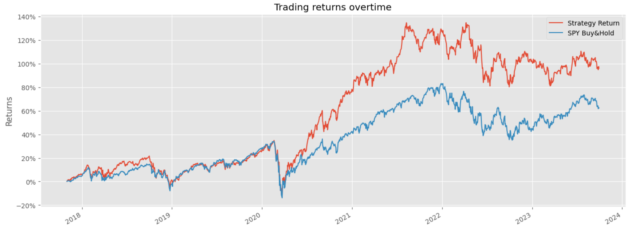
portfolio_df = portfolio_df.drop_duplicates()
print(portfolio_df)This block implements a monthly rebalancing loop that turns price data into a daily time series of strategy returns by (a) estimating portfolio weights from the previous 12 months, (b) applying those weights to each trading day of the target month, and © concatenating the resulting daily strategy returns into a single portfolio series. The choice to use log returns at the top (np.log(new_df[‘Adj Close’]).diff()) is deliberate: log returns are additive over time and numerically stable for summation/aggregation, which simplifies generating a daily strategy return series and preserves compounding behavior when you need to accumulate returns later.
Each iteration of the for-loop uses a mapping fixed_dates[start_date] to decide which tickers are in the investible universe for the upcoming month. The code computes an optimisation window that looks back 12 months from the rebalancing date (optimisation_start_date..optimisation_end_date). That one-year window is a standard trade-off in quant work: it provides enough history to estimate expected returns and covariances while still being recent enough to reflect regime changes. The optimisation dataframe (optimisation_df) contains the historical adjusted prices for only the tickers you intend to consider; that becomes the input to the portfolio optimiser.
Weights are then produced by calling optim_weights(prices=optimisation_df, lower_bound=…). The lower bound is set to roughly 1/(2*N) (rounded), which is a form of regularization to prevent the optimiser from assigning extremely small or zero weights and thereby creating an overly concentrated or unstable portfolio. If that optimisation fails, the intended behavior is to fall back to equal weights for the tickers so the strategy can continue to produce returns rather than skip a month. That fallback is important operationally: optimization routines can fail due to bad covariance matrices, collinearity, NaNs, or numerical problems, and a deterministic equal-weight strategy is a robust default.
After resolving weights, the code aligns weights with daily returns for the target month. It slices the precomputed log-return series between start_date and month-end, stacks the wide-form returns to long-form (date,ticker,return), and merges the per-ticker weight so each date–ticker row carries its allocation. Multiplying return*weight yields a weighted return per row, and grouping by date sums those weighted returns into a single daily “Strategy Return.” Concatenating each month’s daily series into portfolio_df builds the continuous strategy time series across all months.
A few implementation issues to be aware of that affect correctness and maintainability. The success/fallback logic is buggy: success is set True and never flipped, while the code also assigns to a misspelled variable sucess in the try block, so the equal-weight fallback will not execute as intended. The construction of the fallback weights DataFrame also looks incorrect (it builds a column-index/row-index orientation that may not align with tickers on merge). The try/except around optimisation is very broad (catching all exceptions without logging the specific error), which hides why optimisation failed; prefer catching specific exceptions and logging the optimiser’s message. Finally, the repeated stacking/unstacking to align weights is fragile; it’s safer to represent weights as a Series indexed by ticker and merge on the ticker column explicitly, or reindex the weights to the tickers and broadcast across the date index to avoid accidental misalignment.
Operational improvements to consider for a production-quality quant trading pipeline: validate that optimisation_df has no NaNs and sufficient history before optimising; ensure weights sum to 1 and are of float dtype; make the optimisation lower bound a parameter that can be tuned or cross-validated to avoid implicit hard-coded regularization; move the final concat and duplicate-dropping outside the loop for performance; and replace print debugging with structured logging. These changes will make the rebalancing logic more robust for machine-learning driven quant strategies, where reliable, well-aligned weight signals and transparent failure modes are critical to avoid biasing model training or backtests.
#visualise our returns
spy = yf.download(tickers=’SPY’,start=’2015-01-01’,end=dt.date.today())
# return the log return of spy
spy_return = np.log(spy[[’Adj Close’]]).diff().dropna().rename({’Adj Close’: ‘SPY Buy&Hold’},axis=1)
portfolio_df = portfolio_df.merge(spy_return,left_index=True,right_index=True)
portfolio_df
First we pull historical SPY price data for the same sample window as the strategy so we can create a benchmark for comparison; using the Adjusted Close ensures prices reflect dividends and splits, which is essential for accurate total-return comparisons. The start date is fixed at 2015–01–01 and the end date is dt.date.today(), so the benchmark covers the period of interest up to the present — that makes the comparison apples-to-apples with your portfolio timeframe.
Next we convert the Adjusted Close series into log returns by taking the natural log of prices and differencing. Taking log returns (log(P_t) − log(P_{t−1})) is numerically stable and time-additive: log returns sum over time which makes it straightforward to compute cumulative returns and to use in statistical or ML models that assume additive noise. This also tends to produce distributions that are better behaved for many models and avoids small-multiplicative rounding issues that can occur with raw percentage returns. We drop the first NaN created by the differencing operation so the series is clean and alignable.
The result is renamed to ‘SPY Buy&Hold’ to make its role explicit: it’s the buy-and-hold benchmark’s daily log return (not a cumulative series). That label both clarifies intent and avoids column-name collisions when we merge. We then merge that benchmark series into portfolio_df using both DataFrame indices. Because pandas.merge with left_index/right_index defaults to an inner join, the resulting portfolio_df will contain only dates present in both datasets — in other words, it forces strict date alignment. This behavior is often desirable so that any performance comparison or ML feature set uses rows with valid data for both portfolio and benchmark, but if you instead want to preserve every row of the portfolio regardless of SPY coverage you should explicitly use how=’left’ and handle missing benchmark values as needed.
A few practical caveats and consequences: if portfolio_df uses a different frequency (intraday timestamps, different timezone, or business-day-only vs calendar-day indices) you’ll get mismatches; you may need to resample, localize/convert timezones, or forward/backfill to align. Also, for visualization you’ll often convert these log returns into cumulative returns for plotting (e.g., np.exp(spy_return.cumsum()) — 1) so the benchmark shows compounded buy-and-hold performance alongside the strategy. Overall, this block prepares a clean, adjusted, and aligned benchmark series so you can directly compare or feed SPY returns into downstream ML evaluation or plotting.
plt.style.use(’ggplot’)

portfolio_cumm = np.exp(np.log1p(portfolio_df).cumsum())-1
portfolio_cumm
First, the single style-setting line just picks a consistent plotting theme so any subsequent charts (e.g., of these cumulative returns) look polished and readable — it doesn’t affect the numbers but is helpful when you present strategy performance.
The core expression transforms a time series of periodic simple returns into a time series of cumulative returns by working in log-return space. For each cell you take log1p(return) — i.e., log(1 + r) — which converts a multiplicative return factor into an additive log-return; summing those (cumsum) gives the cumulative log return up to each time point. Exponentiating the cumulative log return converts back to a cumulative gross return factor, and subtracting 1 gives the cumulative net return (the familiar “X% from start” series). In short: log1p → cumulative sum → exp → −1 yields the time series of compounded returns expressed as percentage change from the start.
Why do it this way? Aggregating returns by summing log-returns is mathematically exact for compounding and numerically more stable than repeated multiplications, especially over long horizons or when returns are small. Using log1p (instead of log(1 + r)) improves numerical precision for small r. The pattern is equivalent to doing (1 + r).cumprod() − 1 but more robust and convenient if you’ve been modeling or normalizing in log-return space.
Two practical cautions: the values must be simple returns (not already percentages) and must be > −1 (a −100% return is invalid for log). NaNs propagate through cumsum, and extreme negative returns close to −1 can cause large negative log values; handle missing data or clip/flag catastrophic losses before this transformation. In the quant-ML workflow, we typically model or normalize using log returns for learning, then convert back exactly as shown to produce interpretable cumulative performance curves for backtesting, visualizations, and downstream metrics like drawdown and Sharpe.
#plot the graph
import matplotlib.ticker as mtick
portfolio_cumm[:’2023-09-29’].plot(figsize=(16,6))
plt.title(’Trading returns overtime’)
plt.gca().yaxis.set_major_formatter(mtick.PercentFormatter(1))
plt.ylabel(’Returns’)
plt.show()
This snippet takes a time-indexed cumulative-returns series (portfolio_cumm) and renders a clean, human-readable visualization of strategy performance up to a fixed cutoff date. The first decisive operation is the temporal slice portfolio_cumm[:’2023–09–29’], which selects all observations through that date; this is commonly used to limit the plotted horizon (for example to isolate a backtest period, align with a train/test split, or exclude incomplete recent data). Passing that slice directly to the pandas .plot method produces a line chart showing the evolution of cumulative returns over time; using a larger figsize=(16,6) is purely presentational but important in practice to make trends, drawdowns and regime changes visually discernible when you have many time points.
After the line is drawn, the code sets the y-axis formatter to PercentFormatter(1). This is a critical semantic choice: PercentFormatter(1) interprets the plotted numeric values as decimals where 1.0 == 100%, so a value of 0.12 will render as 12%. In quant trading contexts we prefer percent formatting because stakeholders and diagnostic checks think in percentages rather than raw decimals; it makes the magnitude of returns, drawdowns and volatility immediately legible. Be careful: this formatter assumes your cumulative series is in decimal form (e.g., cumulative return = 1.12 for +12% or 0.12 for +12% depending on your convention). If your series is already scaled to percent (12.0), the formatter will be misleading, so confirm how portfolio_cumm was computed (typically via (1+returns).cumprod() — 1 or similar).
The title and y-label are set to explicitly communicate intent: “Trading returns overtime” and “Returns” orient readers and downstream reviewers to what the plot measures. Finally plt.show() flushes the figure to the active display backend so the chart appears. Operationally, note that plt.gca() manipulates the current axis object returned by pandas plotting; in more complex pipelines it’s often clearer to capture the axis returned by .plot(…) and configure that object directly to avoid stateful interactions across multiple plots.
From a model-development perspective, this visualization serves multiple diagnostic roles: it reveals whether your ML-driven signals generate sustained alpha versus noise, highlights drawdowns and recovery characteristics, and can expose overfitting (e.g., a crisp step-up only in-sample but flat out-of-sample). Practically, before handing this chart to stakeholders or using it to select models, verify the index continuity, confirm the cumulative-return scaling, and consider augmenting the plot with benchmarks, rolling-volatility bands, or drawdown overlays to give a fuller picture of risk-adjusted performance.
