

Beyond the Backtest: Engineering Robust Quant Trading Strategies
A deep dive into algorithmic optimization, avoiding ML overfitting traps, and surviving real-world transaction fees.

Download the jupyter notebook using the button at the end of this article!
# python 3.7

# For yahoo finance
import io
import re
import requests

# The usual suspects
import numpy             as np
import pandas            as pd
import matplotlib.pyplot as plt

#  Fancy graphics
plt.style.use('seaborn')

# Getting Yahoo finance data
def getdata(tickers,start,end,frequency):
    OHLC    = {}
    cookie  = ''
    crumb   = ''
    res     = requests.get('https://finance.yahoo.com/quote/SPY/history')
    cookie  = res.cookies['B']
    pattern = re.compile('.*"CrumbStore":\{"crumb":"(?P<crumb>[^"]+)"\}')
    for line in res.text.splitlines():
        m = pattern.match(line)
        if m is not None:
            crumb = m.groupdict()['crumb']
    for ticker in tickers:
        url_str  = "https://query1.finance.yahoo.com/v7/finance/download/%s"
        url_str += "?period1=%s&period2=%s&interval=%s&events=history&crumb=%s"
        url = url_str % (ticker, start, end, frequency, crumb)
        res = requests.get(url, cookies={'B': cookie}).text
        OHLC[ticker] = pd.read_csv(io.StringIO(res), index_col=0,
                                   error_bad_lines=False).replace('null', np.nan).dropna()
        OHLC[ticker].index = pd.to_datetime(OHLC[ticker].index)
        OHLC[ticker] = OHLC[ticker].apply(pd.to_numeric)
    return OHLC

# Assets under consideration
tickers = ['%5EGSPTSE','%5EGSPC','%5ESTOXX','000001.SS']

# If yahoo data retrieval fails, try until it returns something
data = None
while data is None:
    try:
        data = getdata(tickers,'946685000','1685008000','1d')
    except:
         pass

ICP = pd.DataFrame({'SP500':    data['%5EGSPC']['Adj Close'],
                    'TSX':      data['%5EGSPTSE']['Adj Close'],
                    'STOXX600': data['%5ESTOXX']['Adj Close'],
                    'SSE':      data['000001.SS']['Adj Close']}).fillna(method='ffill')

# since last commit, yahoo finance decided to mess up (more) some of the tickers data, so now we have to drop rows...
ICP = ICP.dropna()
Importing the io module makes the in-memory stream utilities available so the notebook can turn raw HTTP response text into a file-like object that pandas.read_csv can consume. In the S&P500 ingestion workflow, getdata fetches CSV content via requests.get and then hands that text to io.StringIO so pandas.read_csv can parse it directly into a DataFrame without touching disk; that in-memory handoff is what lets the pipeline move from raw prices over HTTP to cleaned numeric series ready for downstream rolling-return and plotting logic. The same pattern appears elsewhere in the project where HTTP CSV responses are parsed into DataFrames, so io.StringIO is acting as the lightweight adapter between network text and pandas’ file-oriented CSV reader.
BuyHold_SP     = ICP['SP500']    /float(ICP['SP500'][:1])   -1
BuyHold_TSX    = ICP['TSX']      /float(ICP['TSX'][:1])     -1
BuyHold_STOXX  = ICP['STOXX600'] /float(ICP['STOXX600'][:1])-1
BuyHold_SSE    = ICP['SSE']      /float(ICP['SSE'][:1])     -1

BuyHold_25Each = BuyHold_SP*(1/4) + BuyHold_TSX*(1/4) + BuyHold_STOXX*(1/4) + BuyHold_SSE*(1/4)
BuyHold_SP constructs a simple buy‑and‑hold return series for the S&P500 by normalizing the ICP[’SP500’] price series to its initial observation and converting that normalization into cumulative return units; in other words it anchors the S&P500 price history to a zero‑base start so every later value represents the percent change since the first price in ICP[’SP500’]. Within the notebook’s workflow—raw prices → cleaned series → engineered signals—BuyHold_SP is an engineered signal used for exploratory plotting and as an input to the allocation/optimization prototypes (for example, when comparing equal‑weight aggregates or feeding returns into routines that maximize median yearly performance). The implementation explicitly forces the initial denominator to be a scalar so the division yields a time series of relative changes rather than an unintended elementwise alignment, which makes it directly comparable to the other index buy‑and‑hold series and easy to average across indices to produce BuyHold_25Each. This approach differs from the closely related SP1Y calculation, which computes one‑year percent changes by comparing each date to a 252‑day lag, and from the YTD series, which reanchors over the most recent 252 trading days; BuyHold_SP instead uses the full-history anchor at the very first observation, which is why it’s appropriate for long‑run cumulative return visualization and baseline comparisons in the notebook.
plt.figure(figsize=(16,6))
plt.plot(BuyHold_SP*100,     label='Buy & Hold USA')
plt.plot(BuyHold_TSX*100,    label='Buy & Hold Canada')
plt.plot(BuyHold_STOXX*100,  label='Buy & Hold Europe')
plt.plot(BuyHold_SSE*100,    label='Buy & Hold China')
plt.plot(BuyHold_25Each*100, label='Buy & Hold 25% Each')
plt.xlabel('Time')
plt.ylabel('Cumulative Return (in %)')
plt.margins(x=0.005,y=0.02)
plt.axhline(y=0, xmin=0, xmax=1, linestyle='--', color='k')
plt.legend()
plt.show()
Output
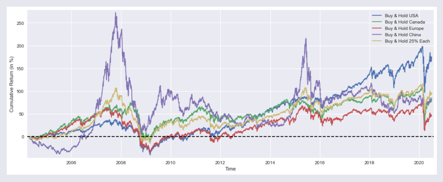
:
plt.figure with a figsize argument creates a new Matplotlib figure of the specified physical dimensions (16 by 6 inches) and provides the clean drawing surface for the subsequent time‑series plots, axes labels, legend and horizontal zero line that follow. In the context of this notebook, which is producing side‑by‑side cumulative return traces for buy‑and‑hold strategies across regions and a 25% each portfolio, the explicit figure sizing enforces a consistent aspect ratio so the multiple overlaid series, axis labels and legend are readable and comparable across cells; it also resets any prior plotting state so the plotted lines, margins and reference line apply to a fresh canvas. The same pattern appears in other cells that visualize rolling 1‑year returns or compare optimized portfolios, so using plt.figure with an identical figsize keeps all exploratory charts visually consistent when evaluating allocation and optimization outputs in the Quantitative‑Notebooks‑master_cleaned workflow.
SP1Y     = ICP['SP500']    /ICP['SP500'].shift(252)   -1
TSX1Y    = ICP['TSX']      /ICP['TSX'].shift(252)     -1
STOXX1Y  = ICP['STOXX600'] /ICP['STOXX600'].shift(252)-1
SSE1Y    = ICP['SSE']      /ICP['SSE'].shift(252)     -1

Each251Y = SP1Y*(1/4) + TSX1Y*(1/4) +STOXX1Y*(1/4) + SSE1Y*(1/4)
In this notebook’s workflow that turns raw prices into engineered return series for exploration and portfolio testing, SP1Y is the rolling one‑year buy‑and‑hold return series derived from the SP500 price column in ICP. Concretely, the code takes each date’s SP500 price and compares it to the price one trading year earlier (using pandas’ shift with a 252‑period lag), then converts that ratio into a percent return by subtracting one; that produces a time series where each timestamp
plt.figure(figsize=(16,6))
plt.plot(SP1Y*100,     label='Rolling 1 Year Buy & Hold Return USA')
plt.plot(TSX1Y*100,    label='  ""  ""  Canada')
plt.plot(STOXX1Y*100,  label='  ""  ""  Europe')
plt.plot(SSE1Y*100,    label='  ""  ""  China')
plt.plot(Each251Y*100, label='  ""  ""  25% Each')
plt.xlabel('Time')
plt.ylabel('Returns (in %)')
plt.margins(x=0.005,y=0.02)
plt.axhline(y=0, xmin=0, xmax=1, linestyle='--', color='k')
plt.legend()
plt.show()
Output:

In the notebook’s visualization step, the call to plt.figure creates a wide 16 by 6 inch plotting canvas so the time series are laid out with enough horizontal space for date labels and temporal patterns to be visible; this is a consistent visual framing used across the notebook for comparative time‑series plots. The subsequent plotting sequence draws the five precomputed series SP1Y, TSX1Y, STOXX1Y, SSE1Y and Each251Y, each scaled by 100 so the y-axis shows percent returns; the labels mark these as rolling one‑year buy‑and‑hold returns for USA, Canada, Europe, China and a 25%‑each composite, respectively. The code then sets the x and y axis labels to give viewers context, tightens margins to avoid clipping of line ends, and overlays a horizontal dashed zero line to make positive versus negative one‑year performance immediately apparent; a legend is added so each colored trace can be identified, and finally the display call renders the figure in the notebook. This follows the same plotting pattern used elsewhere in the project—same figure sizing, margin and baseline conventions—but differs from the other examples by focusing on rolling 1‑year return series (rather than cumulative buy‑and‑hold traces or optimizer output curves) to support exploratory comparisons that inform the allocation and optimization experiments elsewhere in the notebook.
marr      = 0 #minimal acceptable rate of return (usually equal to the risk free rate)
SP1YS     = (SP1Y.mean()    -marr) /SP1Y.std()
TSX1YS    = (TSX1Y.mean()   -marr) /TSX1Y.std()
STOXX1YS  = (STOXX1Y.mean() -marr) /STOXX1Y.std()
SSE1YS    = (SSE1Y.mean()   -marr) /SSE1Y.std()
Each251YS = (Each251Y.mean()-marr) /Each251Y.std()

print('SP500 1 Year Buy & Hold Sharpe Ratio =',round(SP1YS,2))
print('TSX      "" "" =',round(TSX1YS   ,2))
print('STOXX600 "" "" =',round(STOXX1YS ,2))
print('SSE      "" "" =',round(SSE1YS   ,2))
print('25% Each "" "" =',round(Each251YS,2))
Output:
SP500 1 Year Buy & Hold Sharpe Ratio = 0.51
TSX      "" "" = 0.34
STOXX600 "" "" = 0.26
SSE      "" "" = 0.27
25% Each "" "" = 0.39
marr is set to zero to establish the minimal acceptable rate of return used as the baseline for the simple risk‑adjusted metrics that follow; conceptually it plays the role of the risk‑free or target return that we subtract from each annual return series before standardizing. The notebook then computes SP1YS, TSX1YS, STOXX1YS, SSE1YS and Each251YS by taking the mean of each previously derived one‑year return series (for example SP1Y, which you already saw) minus marr and dividing that excess mean by the series standard deviation, producing a Sharpe‑like score for each asset and for the equal‑weighted four‑asset portfolio. The subsequent print calls emit those rounded Sharpe values so you can quickly compare risk‑adjusted performance across instruments; these numbers feed the exploratory comparison layer of the notebook and act as simple inputs/benchmarks for the allocation and optimization experiments elsewhere in the file.
from scipy.optimize import minimize

def multi(x):
    a, b, c, d = x
    return a, b, c, d   #the "optimal" weights we wish to discover

def maximize_sharpe(x): #objective function
    weights = (SP1Y*multi(x)[0] + TSX1Y*multi(x)[1]
               + STOXX1Y*multi(x)[2] + SSE1Y*multi(x)[3])
    return -(weights.mean()/weights.std())

def constraint(x):      #since we're not using leverage nor short positions
    return 1 - (multi(x)[0]+multi(x)[1]+multi(x)[2]+multi(x)[3])

cons = ({'type':'ineq','fun':constraint})
bnds = ((0,1),(0,1),(0,1),(0,1))
initial_guess = (1, 0, 0, 0)

# this algorithm (SLSQP) easly gets stuck on a local
# optimal solution, genetic algorithms usually yield better results
# so my inital guess is close to the global optimal solution

ms = minimize(maximize_sharpe, initial_guess, method='SLSQP',
              bounds=bnds, constraints=cons, options={'maxiter': 10000})

msBuyHoldAll = (BuyHold_SP*ms.x[0] + BuyHold_TSX*ms.x[1]
                + BuyHold_STOXX*ms.x[2] + BuyHold_SSE*ms.x[3])

msBuyHold1yAll = (SP1Y*ms.x[0] + TSX1Y*ms.x[1]
                   + STOXX1Y*ms.x[2] + SSE1Y*ms.x[3])
The import pulls the minimize optimizer from scipy.optimize into the notebook so the interactive workflow can run a constrained numerical optimization to pick portfolio weights for the cross-asset experiments. The code defines multi to unpack the decision vector into four asset weights, and maximize_sharpe as the objective that builds a weighted aggregate return series from the previously computed SP1Y, TSX1Y, STOXX1Y and SSE1Y series and then returns the negative of the series’ mean divided by its standard deviation so the minimizer effectively maximizes Sharpe. A constraint function is provided to enforce the no-leverage/no-short rule by requiring the sum of the four weights to be at most one, and bounds restrict each weight to the unit interval; an initial_guess seeds the solver near a plausible solution. The call to minimize invokes the SLSQP algorithm with those bounds, constraints and a high iteration limit so the optimizer iteratively adjusts x to minimize the objective under the feasibility rules. The solver result object ms holds the optimized weight vector in ms.x, which the notebook then uses to assemble msBuyHoldAll and msBuyHold1yAll by taking weighted combinations of the BuyHold_* cumulative series and the one-year return series for downstream plotting and summary statistics. This follows the same constrained-optimization pattern used by the maximize_median_yearly_return routine (which differs only in the objective it hands to minimize), and the optimized weights are later reused to compute YTD and plotted cumulative-return comparisons in the notebook’s exploration flow.
plt.figure(figsize=(16,6))
plt.plot(BuyHold_SP*100,     label='Buy & Hold S&P500')
plt.plot(BuyHold_25Each*100, label='  ""  ""  25% of Each')
plt.plot(msBuyHoldAll*100,   label='  ""  ""  Max Sharpe')
plt.xlabel('Time')
plt.ylabel('Cumulative Return (in %)')
plt.margins(x=0.005,y=0.02)
plt.axhline(y=0, xmin=0, xmax=1, linestyle='--', color='k')
plt.legend()
plt.show()

print('SP500 Weight =',round(ms.x[0]*100,2),'%')
print('TSX ""       =',round(ms.x[1]*100,2),'%')
print('STOXX600 ""  =',round(ms.x[2]*100,2),'%')
print('SSE ""       =',round(ms.x[3]*100,2),'%')
print()
print('Sharpe =',round(msBuyHold1yAll.mean()/msBuyHold1yAll.std(),3))
print()
print('Median yearly excess return over SP500 =',round((msBuyHold1yAll.median()-SP1Y.median())*100,1),'%')
Output:
SP500 Weight = 92.49 %
TSX ""       = 0.0 %
STOXX600 ""  = 0.0 %
SSE ""       = 7.5 %

Sharpe = 0.522

Median yearly excess return over SP500 = 0.0 %
After creating the 16 by 6 inch canvas (as covered earlier), the cell draws three cumulative return time series — BuyHold_SP, BuyHold_25Each and msBuyHoldAll — scaled to percentage terms so the vertical axis is interpreted as cumulative return in percent. It labels the horizontal axis as Time and the vertical axis as Cumulative Return (in %), tightens the plot margins slightly, places a dashed horizontal baseline at zero to separate gains from losses, adds a legend to identify each curve, and renders the figure for visual comparison. Once the chart is shown, the cell prints the optimized portfolio weights stored in ms.x for the four assets (SP500, TSX, STOXX600, SSE) as percentage values rounded to two decimals, then computes and prints a Sharpe‑like statistic by taking the mean of msBuyHold1yAll divided by its standard deviation, and finally reports the median yearly excess return of the optimized strategy relative to the one‑year SP500 series by subtracting SP1Y.median() from msBuyHold1yAll.median() and converting that difference to percent. In the notebook’s experimental pipeline this visualization and the subsequent numeric outputs let you directly compare the Max‑Sharpe allocation against the plain S&P500 buy‑and‑hold and the 25%‑each rule
def maximize_median_yearly_return(x): #different objective function
    weights = (SP1Y*multi(x)[0] + TSX1Y*multi(x)[1]
               + STOXX1Y*multi(x)[2] + SSE1Y*multi(x)[3])
    return -(float(weights.median()))

mm = minimize(maximize_median_yearly_return, initial_guess, method='SLSQP',
              bounds=bnds, constraints=cons, options={'maxiter': 10000})

mmBuyHoldAll = (BuyHold_SP*mm.x[0] + BuyHold_TSX*mm.x[1]
                + BuyHold_STOXX*mm.x[2] + BuyHold_SSE*mm.x[3])

mmBuyHold1yAll = (SP1Y*mm.x[0] + TSX1Y*mm.x[1]
                   + STOXX1Y*mm.x[2] + SSE1Y*mm.x[3])
maximize_median_yearly_return is the alternate objective the notebook uses when prototyping portfolio weight discovery: it takes a candidate weight vector x, asks the helper multi to unpack those four allocations, and forms a portfolio time series by linearly combining the four precomputed one‑year return series SP1Y, TSX1Y, STOXX1Y and SSE1Y with those weights. It then computes the median of that combined yearly‑return series and returns its negation so that the external optimizer minimize will seek weights that maximize the median annual return rather than a mean‑based metric. The surrounding call to minimize runs with the SLSQP algorithm and the same bounds and constraints used elsewhere in the notebook to keep each weight between zero and one and to enforce the sum constraint, producing the optimization result mm whose mm.x holds the discovered allocations. The notebook then builds two diagnostic series from mm.x: mmBuyHoldAll composes the cumulative buy‑and‑hold return streams BuyHold_SP, BuyHold_TSX, BuyHold_STOXX and BuyHold_SSE with those weights for long‑run performance visualization, and mmBuyHold1yAll composes the one‑year return streams SP1Y, TSX1Y, STOXX1Y and SSE1Y for direct comparison of annualized behavior under the median‑maximizing allocation. This mirrors the maximize_sharpe pattern used elsewhere but substitutes median of yearly returns as the robustness‑oriented objective.
plt.figure(figsize=(16,6))
plt.plot(BuyHold_SP*100,     label='Buy & Hold S&P500')
plt.plot(BuyHold_25Each*100, label='  ""  ""  25% of Each')
plt.plot(mmBuyHoldAll*100,   label='  ""  ""  Max 1Y Median')
plt.xlabel('Time')
plt.ylabel('Cumulative Return (in %)')
plt.margins(x=0.005,y=0.02)
plt.axhline(y=0, xmin=0, xmax=1, linestyle='--', color='k')
plt.legend()
plt.show()

print('SP500 Weight =',round(mm.x[0]*100,2),'%')
print('TSX ""       =',round(mm.x[1]*100,2),'%')
print('STOXX600 ""  =',round(mm.x[2]*100,2),'%')
print('SSE ""       =',round(mm.x[3]*100,2),'%')
print()
print('Sharpe =',round(mmBuyHold1yAll.mean()/mmBuyHold1yAll.std(),3))
print()
print('Median yearly excess return over SP500 =',round((mmBuyHold1yAll.median()-SP1Y.median())*100,1),'%')
Output:
SP500 Weight = 100.0 %
TSX ""       = 0.0 %
STOXX600 ""  = 0.0 %
SSE ""       = 0.0 %

Sharpe = 0.508

Median yearly excess return over SP500 = 0.0 %
This cell renders a wide comparative time‑series plot and then prints the optimized weights and summary statistics so you can visually and numerically judge the allocation experiment: after creating the familiar 16 by 6 inch canvas (already discussed), it plots the cumulative return traces for BuyHold_SP, BuyHold_25Each and the mmBuyHoldAll portfolio scaled into percentage points and labels each trace for the legend, then annotates the x and y axes to show time and cumulative return in percent. It tightens the plot edges with small x/y margins and draws a dashed horizontal zero line as a baseline reference before showing the legend and rendering the figure. Immediately after the visualization, it prints the four asset weights taken from the optimizer state mm.x as percentages (SP500, TSX, STOXX600, SSE), reports a Sharpe estimate computed from mmBuyHold1yAll as mean over standard deviation, and reports the median yearly excess return by differencing mmBuyHold1yAll median against the already‑derived SP1Y median (expressed in percent). This follows the same plotting-and-summary pattern used elsewhere in the notebook; the only substantive difference from the near-identical cells is that this cell surfaces the max 1‑year median optimization results (mm and mmBuyHold1yAll) rather than the max‑Sharpe variant (ms and msBuyHold1yAll) or the YTD/dynamic allocation traces in other figures.
YTD_SP     = ICP['SP500'][-252:]    /float(ICP['SP500'][-252])   -1
YTD_TSX    = ICP['TSX'][-252:]      /float(ICP['TSX'][-252])     -1
YTD_STOXX  = ICP['STOXX600'][-252:] /float(ICP['STOXX600'][-252])-1
YTD_SSE    = ICP['SSE'][-252:]      /float(ICP['SSE'][-252])     -1

YTD_25Each = YTD_SP*(1/4) + YTD_TSX*(1/4) + YTD_STOXX*(1/4) + YTD_SSE*(1/4)

YTD_max_sharpe = YTD_SP*ms.x[0] + YTD_TSX*ms.x[1] + YTD_STOXX*ms.x[2] + YTD_SSE*ms.x[3]
YTD_max_median = YTD_SP*mm.x[0] + YTD_TSX*mm.x[1] + YTD_STOXX*mm.x[2] + YTD_SSE*mm.x[3]
Within the interactive notebook that turns raw price series into exploratory return traces, these statements build the year‑to‑date (YTD) cumulative return series used for the visualization and allocation prototyping steps. They read the four equity price series out of the ICP container, take the trailing 252 trading‑day window for each market, normalize that window to its first value so the series starts at zero return, and express every point as a cumulative return over that last year. The four normalized YTD series are then combined in two ways: one as a simple equal‑weight (25% each) portfolio to give a naive benchmark for the year, and two as linear portfolios constructed from the optimizer outputs ms.x and mm.x so you can compare the YTD performance of the maximum‑Sharpe and maximum‑median allocations (recall maximize_median_yearly_return unpacks allocations into mm.x). Conceptually, these YTD traces are short, fixed‑length time series (one trading year long) anchored to the most recent date, intended for the wide comparative plot and the printout of end‑of‑window performance that follow. Compared with the earlier SP1Y family, which computes a rolling 1‑year return by dividing each date by its 252‑day shifted value and therefore produces a same‑length series (with initial NaNs), the YTD series explicitly slices the final 252 observations and normalizes to the slice start; the end result covers the identical calendar span as the last 252‑day rolling window but exists as an isolated, no‑NaN series ready for plotting and portfolio aggregation rather than as a full‑history rolling series.
plt.figure(figsize=(15,6))
plt.plot(YTD_SP*100,         label='YTD Buy & Hold S&P500')
plt.plot(YTD_25Each*100,     label='  ""  ""  25% of Each')
plt.plot(YTD_max_sharpe*100, label='  ""  ""  Max Sharpe')
plt.plot(YTD_max_median*100, label='  ""  ""  Max 1Y Median')
plt.xlabel('Time')
plt.ylabel('Cumulative Return (in %)')
plt.margins(x=0.005,y=0.02)
plt.axhline(y=0, xmin=0, xmax=1, linestyle='--', color='k')
plt.legend()
plt.show()

print('Buy & Hold S&P500 YTD Performance (at 1 July 2020) =',round(float(YTD_SP[-1:]*100),1),'%')
print(' "" "" 25% of Each   "" "" =',round(float(YTD_25Each[-1:]*100),1),'%')
print(' "" "" Max Sharpe    "" "" =',round(float(YTD_max_sharpe[-1:]*100),1),'%')
print(' "" "" Max 1Y Median "" "" =',round(float(YTD_max_median[-1:]*100),1),'%')
Output:
Buy & Hold S&P500 YTD Performance (at 1 July 2020) = 3.4 %
 "" "" 25% of Each   "" "" = -1.7 %
 "" "" Max Sharpe    "" "" = 3.3 %
 "" "" Max 1Y Median "" "" = 3.4 %
This cell builds a focused comparative visualization and textual summary that sits at the exploratory end of the pipeline: after the price ingestion and feature engineering stages produced year‑to‑date cumulative series, the notebook opens a 15 by 6 inch plotting canvas to display four YTD cumulative return traces so you can visually compare plain S&P500 buy‑and‑hold against three allocation schemes. It plots YTD_SP, YTD_25Each, YTD_max_sharpe and YTD_max_median scaled into percent, assigns labels so the legend identifies each strategy, and then annotates the axes with time and cumulative return in percent. Small axis margins are applied to avoid clipping, and a dashed horizontal baseline at zero is drawn to make gains and losses visually obvious. The plot is rendered inline, which the Jupyter outputs array records as the image artifact we inspected earlier. Immediately after rendering, the cell prints the terminal YTD performance for each of the four series by taking the last observation from each series, converting to percent and rounding to one decimal place so you get a compact numeric summary (the printed lines also become entries in the outputs array). Conceptually this is the same comparative plotting pattern used elsewhere in the notebook (other figures use a very similar layout and labeling) but narrower than some full-history canvases and specifically focused on YTD behaviour; the YTD_max_median and YTD_max_sharpe series shown here are the results of the allocation experiments (the former tied to the maximize_median_yearly_return routine and the latter produced by the SciPy constrained optimizer), and because marr was set to zero earlier the printed performance figures are interpreted against a nil benchmark.
ICP['SPRet']    = ICP['SP500'] /ICP['SP500'].shift(1)-1
ICP['SSERet']   = ICP['SSE']   /ICP['SSE'].shift(1)  -1

ICP['Strat'] = ICP['SPRet'] * 0.8 + ICP['SSERet'] * 0.2

ICP['Strat'][SP1Y.shift(1)  > -0.17] = ICP['SSERet']*0 + ICP['SPRet']*1
ICP['Strat'][SSE1Y.shift(1) > 0.29]  = ICP['SSERet']*1 + ICP['SPRet']*0

DynAssAll    = ICP['Strat'].cumsum()
DynAssAll1y  = ICP['Strat'].rolling(window=252).sum()
DynAssAllytd = ICP['Strat'][-252:].cumsum()
Within the notebook’s exploratory pipeline that turns raw prices into candidate allocation signals, the first two assignments compute the spot daily return series for the S&P500 and for the SSE by taking each day’s index level, comparing it to the previous trading day’s level, and expressing the change as a percent return; these are the elemental return time series used downstream. The next step constructs a prototype strategy signal called Strat as a simple linear blend that leans 80% toward the S&P500 daily return and 20% toward the SSE daily return, which serves as a baseline tactical mix to observe combined behavior. Two conditional reallocations then apply rule-based overrides that use yesterday’s one‑year return signals (the SP1Y and SSE1Y series computed elsewhere) as decision inputs: whenever the prior day’s SP1Y exceeds a negative 17 percent threshold, the strategy is switched to a pure S&P500 exposure for that date by assigning the S&P500 daily return alone; whenever
plt.figure(figsize=(15,6))
plt.plot(BuyHold_SP*100,     label='Buy & Hold SP&500')
plt.plot(mmBuyHoldAll*100,   label='  ""  ""  Max 1Y Median')
plt.plot(DynAssAll*100,      label='Dynamic Asset Allocation')
plt.xlabel('Time')
plt.ylabel('Cumulative Return (in %)')
plt.margins(x=0.005,y=0.02)
plt.axhline(y=0, xmin=0, xmax=1, linestyle='--', color='k')
plt.legend()
plt.show()

print('Median yearly excess return over SP500 =',round(float(DynAssAll1y.median()-SP1Y.median())*100,1),'%')
Output:
Median yearly excess return over SP500 = 2.3 %
This cell draws a comparative cumulative‑return chart for a set of precomputed series so you can visually inspect how the dynamic allocation experiment tracked against simple buy‑and‑hold baselines. It creates a wide 15 by 6 inch plotting canvas, converts the three candidate cumulative return series into percent scale, and overlays them with clear labels so the legend identifies the BuyHold_SP trace, the mmBuyHoldAll trace that came out of the maximize_median_yearly_return routine, and the DynAssAll dynamic allocation trace. Small axis margins are applied so the lines don’t butt up against the plot border, and a horizontal reference line is drawn at zero percent return to make gains and losses visually obvious; axis labels and a legend complete the visualization before the plot is rendered inline (those rendered images are one of the artifacts that Jupyter records into the outputs array we discussed earlier).
After the visual check, the cell computes and prints a single scalar summary: the median yearly excess return of DynAssAll relative to the S&P500. That value is produced by taking the median of the DynAssAll1y one‑year return series and subtracting the median of SP1Y, scaling to percent and rounding for display. In the exploratory workflow of the notebook this numeric line complements the plotted traces by quantifying whether the dynamic allocation is delivering higher typical annual performance than the S&P500 baseline. The overall pattern and plotting conventions mirror the other figure cells we reviewed (same percent scaling, baseline line, margins and legend), with the main differences being the specific series plotted and the slightly different canvas width here.
plt.figure(figsize=(15,6))
plt.plot(YTD_SP*100,         label='YTD Buy & Hold S&P500')
plt.plot(YTD_max_median*100, label='  ""  ""  Max 1Y Median')
plt.plot(DynAssAllytd*100,   label='Dynamic Asset Allocation')
plt.xlabel('Time')
plt.ylabel('Cumulative Return (in %)')
plt.margins(x=0.005,y=0.02)
plt.axhline(y=0, xmin=0, xmax=1, linestyle='--', color='k')
plt.legend()
plt.show()

print('Buy & Hold S&P500 YTD Performance (at 1 July 2020) =',round(float(YTD_SP[-1:]*100),1),'%')
print(' "" "" Max 1Y Median "" ""  =',round(float(YTD_max_median[-1:]*100),1),'%')
print(' Strategy YTD Performance   =',round(float(DynAssAllytd[-1:]*100),1),'%')
Output:
Buy & Hold S&P500 YTD Performance (at 1 July 2020) = 3.4 %
 "" "" Max 1Y Median "" ""  = 3.4 %
 Strategy YTD Performance   = 7.6 %
This cell renders a wide time‑series comparison of year‑to‑date cumulative returns so you can visually compare the S&P500 buy‑and‑hold path against the allocation experiments and also prints the numeric YTD endpoints for quick inspection. It first creates a 15 by 6 inch plotting canvas using matplotlib so the three traces have room to be read in-line in the notebook; then it draws the three precomputed cumulative series YTD_SP, YTD_max_median, and DynAssAllytd after scaling them into percent points so the vertical axis is intuitive for a human reader. The plotting calls add a baseline at zero to make gains and losses immediately visible, tighten margins slightly to avoid clipping at the edges, label the horizontal and vertical axes to indicate time and cumulative return percent, and include a legend so each trace can be identified. The three print lines then extract the most recent element from each corresponding series, convert that endpoint into a percentage and round to one decimal place, producing the textual summaries you see beneath the figure. YTD_max_median is the year‑to‑date cumulative series produced from the weight vector discovered by maximize_median
# python 3.7

# For yahoo finance
import io
import re
import requests

# The usual suspects
import numpy             as np
import pandas            as pd
import matplotlib.pyplot as plt

# Tree models and data pre-processing
from numpy               import vstack, hstack
from sklearn             import tree

# Fancy graphics
plt.style.use('seaborn')

# Getting Yahoo finance data
def getdata(tickers,start,end,frequency):
    OHLC = {}
    cookie = ''
    crumb = ''
    res = requests.get('https://finance.yahoo.com/quote/SPY/history')
    cookie = res.cookies['B']
    pattern = re.compile('.*"CrumbStore":\{"crumb":"(?P<crumb>[^"]+)"\}')
    for line in res.text.splitlines():
        m = pattern.match(line)
        if m is not None:
            crumb = m.groupdict()['crumb']
    for ticker in tickers:
        url_str = "https://query1.finance.yahoo.com/v7/finance/download/%s"
        url_str += "?period1=%s&period2=%s&interval=%s&events=history&crumb=%s"
        url = url_str % (ticker, start, end, frequency, crumb)
        res = requests.get(url, cookies={'B': cookie}).text
        OHLC[ticker] = pd.read_csv(io.StringIO(res), index_col=0,
                                   error_bad_lines=False).replace('null', np.nan).dropna()
        OHLC[ticker].index = pd.to_datetime(OHLC[ticker].index)
        OHLC[ticker] = OHLC[ticker].apply(pd.to_numeric)
    return OHLC

# A (lagged) technical indicator (Average True Range)
def ATR(df, n):
    df = df.reset_index()
    i = 0
    TR_l = [0]
    while i < df.index[-1]:
        TR = (max(df.loc[i+1, 'High'], df.loc[i, 'Close']) -
              min(df.loc[i+1, 'Low'], df.loc[i, 'Close']))
        TR_l.append(TR)
        i = i + 1
    return pd.Series(TR_l).ewm(span=n, min_periods=n).mean()

# Assets under consideration
tickers = ['PEP','KO']

data = None
while data is None:
    try:
        data = getdata(tickers,'946685000','1687427200','1d')
    except:
         pass

KO = data['KO'].drop('Volume',axis=1)
PEP = data['PEP'].drop('Volume',axis=1)
Within the DecisionTreeRegressors notebook the getdata routine pulls historical price CSVs from Yahoo over HTTP and pandas.read_csv expects a file-like object, so import io is used to create an in-memory text buffer that bridges the two: the HTTP response body (response.text) is wrapped with io.StringIO so pandas can parse it as if it were a file without writing anything to disk. That in-memory buffering is directly part of the data flow that feeds the rest of the notebook: requests.get retrieves the CSV text, io.StringIO turns that string into a file-like stream, pandas.read_csv consumes the stream to produce the per-ticker OHLC DataFrames, and those DataFrames are then cleaned (null replacement, dropped rows, datetime and numeric conversion) and handed downstream to the feature construction and modeling steps that follow. The same import io pattern appears elsewhere in the project with identical intent — the only differences are which tickers and date ranges are requested — so import io here is the common, lightweight mechanism used across notebooks to convert HTTP CSV payloads into pandas-ready inputs for the experimental workflows.
variables = pd.DataFrame({'TPEP':(PEP['Close']/PEP['Close'].shift(7)-1).shift(1),
                      'TKO':(KO['Close']/KO['Close'].shift(6)-1).shift(1)})

variables['Target'] = variables.min(axis=1)
variables['IsPEP']  = variables['Target'].isin(variables['TPEP'])

variables['Open']   = np.where(variables['Target'].isin(variables['TPEP']),
                               PEP['Open'],
                               KO['Open'])

variables['Close']  = np.where(variables['Target'].isin(variables['TPEP']),
                               PEP['Close'],
                               KO['Close'])

variables['Returns'] = variables['Close']/variables['Open']-1

variables['APEP'] = PEP['Open']
variables['AKO']  = KO['Open']

variables = variables.reset_index().drop('Date',axis=1)

variables['ATR'] = ATR(PEP,40)

variables = variables.dropna()
variables = variables.reset_index().drop('index',axis=1)

# This is a minimalistic example, adding more information (which is no easy task)
# will much likely yield a better signal to noise ratio

features  = ['IsPEP','AKO','ATR','APEP']
variables builds a single tabular dataset that the notebook will feed into the tree‑based experiments: it assembles two engineered return series, picks the asset to trade each row, attaches the traded prices and a realized return, computes a volatility feature, cleans up missing rows, and lists the columns that will be used as model inputs. The two engineered series are stored as TPEP and TKO and are constructed as multi‑day percent changes computed on PEP and KO closes and then shifted so the values are available at decision time (the extra shift prevents look‑ahead). The Target column records the lower of those two engineered returns on each row, and IsPEP is a Boolean flag that indicates when that lower value came from the PEP series. Using IsPEP the code selects the corresponding Open and Close prices for the chosen asset on each date and computes Returns as the realized return from Open to Close for that chosen asset. APEP and AKO preserve the raw open prices for PEP and KO respectively so the model can see price‑level information in addition to the binary IsPEP signal. The ATR column is produced by calling the ATR function with PEP and a 40‑period span, providing a volatility proxy; after adding ATR the frame drops rows with NaNs (created by the lookback shifts and ATR) and reindexes for a contiguous training set. Finally features names are enumerated as IsPEP, AKO, ATR, and APEP so the subsequent regression workflow knows which columns to use as predictors. Conceptually this follows the same pattern seen elsewhere in the project—creating a small DataFrame of lagged/engineered signals and a realized
training = 38
testing = 3
seed = 123

returns = []

# Rolling calibration and testing of the Decision Tree Regressors
for ii in range(0, len(variables)-(training+testing), testing):
    X, y = [], []

    iam  = ii+training
    lazy = ii+training+testing

    # Training the model with the last 38 days
    for i in range(ii, iam):
        X.append([variables.iloc[i][var] for var in features])
        y.append(variables.iloc[i].Close)

    model = tree.DecisionTreeRegressor(max_depth=19,
                                       min_samples_leaf=3,
                                       min_samples_split=16,
                                       random_state=seed)
    model.fit(vstack(X), hstack(y))

    XX = []

    # Testing it out-of-sample, its used for the next 3 days
    for i in range(iam, lazy):
        XX.append([variables.iloc[i][var] for var in features])

    # We trade if the predicted close price is superior to the open price
    trades = np.where(model.predict(vstack(XX)) > variables['Open'][iam:lazy],
                      variables['Returns'][iam:lazy],
                      np.nan)

    for values in trades:
        returns.append(values)
Within the decision‑tree experiment workflow, the training variable sets the length of the historical lookback used to fit each DecisionTreeRegressor and therefore directly controls the temporal context the model learns from: here training is set to 38 days while testing is set to 3 days, so the notebook performs a rolling calibration where every calibration window uses the most recent 38 rows from the engineered variables DataFrame and then evaluates the fitted model over the following 3 days. The loop advances in steps equal to testing, so each iteration computes the start index, the end of the training window, and the end of the short out‑of‑sample window; for each training window the code constructs the feature matrix X by pulling the listed features from variables for each row and the target vector y from the Close column, stacks them into NumPy arrays with vstack/hstack, and fits a sklearn DecisionTreeRegressor configured with the given hyperparameters and a fixed random_state seed to ensure repeatable splits. After fitting, the code assembles the feature rows for the three out‑of‑sample days, asks the model to predict the Close for those days, and converts those predictions into a simple trade decision by comparing each predicted Close to the recorded Open: if the prediction exceeds the Open the strategy records the precomputed intraday return from variables[’Returns’] for that day, otherwise it records a missing value so no trade is counted. Each resulting value (either a realized return or NaN) is appended to the returns list for later aggregation and performance plotting. Conceptually, training = 38 therefore defines the model’s memory for each calibration step in the prototype trading loop, and combined with testing = 3 implements a short rolling re‑calibration cadence that feeds the tree predictions into the downstream simulated P&L series that the notebook later summarizes and plots.
CompRes = pd.DataFrame({'Baseline': variables[-len(returns):].set_index(PEP[-len(returns):].index)['Returns'],
                        'DTR': returns})

CompRes['Baseline'].describe()
Output:
count    5079.000000
mean        0.000618
std         0.011310
min        -0.089762
25%        -0.004870
50%         0.000437
75%         0.005935
max         0.106294
Name: Baseline, dtype: float64
In the modeling workflow, CompRes is constructed as the single table that brings the baseline buy‑and‑hold return series and the decision‑tree regression (DTR) strategy returns side‑by‑side so the notebook can compare distributions, rolling‑window summaries and cumulative paths. To build that alignment the code takes the tail segment of the baseline container named variables that matches the length of the DTR return vector, reindexes that slice to the timestamps taken from PEP so the two series share the same DateTime index, and extracts the baseline’s Returns column as the Baseline column of CompRes; the DTR column is populated directly from the returns vector produced by the tree model/strategy. After assembling these two columns into the DataFrame, the notebook calls describe on the Baseline column to emit summary statistics (count, mean, std, quantiles, etc.) so you immediately get a quantitative snapshot of the benchmark before producing the histograms, rolling‑return plots and cumulative return comparisons that follow.
fig, ax = plt.subplots(figsize=(16,6))

hist1, bins1 = np.histogram(CompRes['Baseline'].dropna(), bins=50)
width = 0.7 * (bins1[1] - bins1[0])
center = (bins1[:-1] + bins1[1:]) / 2

ax.bar(center, hist1, align='center', width=width, label='Baseline')

hist2, bins2 = np.histogram(CompRes['DTR'].dropna(), bins=50)
ax.bar(center, hist2, align='center', width=width, label='DTR Return Distribution')

plt.legend()
plt.show()

CompRes['DTR'].describe()
Output:
count    2358.000000
mean        0.001084
std         0.012664
min        -0.089762
25%        -0.005079
50%         0.000743
75%         0.007033
max         0.106294
Name: DTR, dtype: float64
The call to plt.subplots with a 16 by 6 inch canvas creates a Matplotlib figure and a single axes object sized for a wide comparison plot; that axes is the drawing surface for the rest of the cell. The code then builds a frequency representation of the per-period returns stored in the CompRes DataFrame: it computes a histogram for the Baseline series using fifty bins, derives a usable bar width as a fraction of the histogram bin size, and computes the bin centers so the bars are positioned correctly on the x axis. Those center positions and widths are used to draw a bar plot of the Baseline return frequencies onto the axes. The same histogram procedure is repeated for the DTR series and the resulting bars are overlaid on the same axes so the two return distributions can be compared visually; the axes legend is added and the figure is rendered to the notebook. Finally, a descriptive summary is produced for the DTR series so you get numeric statistics (count, mean, std, percentiles, min/max) to accompany the visual comparison. In the context of the notebook’s decision-tree evaluation workflow, this cell complements the earlier wide time‑series cumulative and rolling-return plots by revealing distributional differences between the baseline and the Decision Tree Regressor outputs — helping you judge variance, skew, and tail behavior of the model’s period-by-period returns before you interpret cumulative performance or apply transaction‑cost adjustments.
tc = -0.0005 #Simulating 0.05% transaction costs

plt.figure(figsize=(16,6))
plt.plot(((CompRes['DTR'].dropna()+tc).cumsum())*100, color='coral', label='DTR Cumulative Returns')
plt.plot(((CompRes['Baseline']+tc).cumsum())*100, label='Baseline')
plt.xlabel('Time')
plt.ylabel('Cumulative Returns')
plt.margins(x=0.005,y=0.02)
plt.axhline(y=0, xmin=0, xmax=1, linestyle='--', color='k')
plt.legend()
plt.show()
Output:
The notebook assigns tc to a small negative scalar to represent a uniform per‑trade execution friction of 0.05%, and that adjustment is applied to the realized return series before the notebook visualizes cumulative performance so the comparison between the DecisionTreeRegressor strategy and the buy‑and‑hold baseline reflects trading costs. In this workflow the DTR out‑of‑sample returns that were accumulated by the rolling training/testing loop (see gap_L157_157 where each trade return was appended into returns) are combined into the CompRes table and the tc value is added to those series after any NaN pruning so the plotted cumulative sum converts net-of-cost performance into percentage points on the 16×6 figure canvas. This same plain‑vanilla cost adjustment pattern is used elsewhere in the notebook — for example it is added before taking rolling sums when producing yearly rolling returns in the similar plotting cell (which uses a shorter window for trades per year), whereas other diagnostic plots such as the raw return distribution histogram omit the tc adjustment to show gross return shape — so tc provides a simple, consistent way to penalize every realized trade across the DecisionTreeRegressor experiments (constructed earlier in the loop at gap_L141_141 from the design matrix built at gap_L136_136) before downstream aggregation and plotting.
plt.figure(figsize=(16,6))
plt.plot((CompRes['DTR'].dropna()+tc).rolling(window=119).sum(), color='coral', label='DTR Yearly Returns')
plt.plot((CompRes['Baseline']+tc).rolling(window=252).sum(), label='Baseline')
plt.xlabel('Time')
plt.ylabel('Yearly Rolling Return')
plt.margins(x=0.005,y=0.02)
plt.axhline(y=0, xmin=0, xmax=1, linestyle='--', color='k')
plt.legend()
plt.show()
# Descriptive statistics of the strategy rolling yearly return
#(assuming 119 trades per year)
((CompRes['DTR'].dropna()+tc).rolling(window=119).sum()).describe()
Output:
count    2240.000000
mean        0.057887
std         0.092749
min        -0.193644
25%         0.005353
50%         0.052851
75%         0.115318
max         0.380145
Name: DTR, dtype: float64
Within the DTR evaluation workflow, that call prepares a wide Matplotlib canvas (16 by 6 inches) so the notebook can draw the side‑by‑side rolling‑year return comparisons for the DTR signal and the baseline with appropriate horizontal space and legible tick/legend placement. The figure sizing matters because the plotted series are derived from CompRes after the rolling training loop and the transaction‑cost adjustment; giving the axes extra width makes trends and crossing events in the 119‑ and 252‑period rolling windows easier to read. Functionally it uses Matplotlib’s pyplot state machine to set the figure dimensions without explicitly capturing an axes object, so the subsequent plotting calls implicitly create and draw onto the current axes; that differs from the histogram case where subplots was used to return an explicit figure and axes to perform bar plotting. Reusing a consistent 16x6 canvas across the notebook (seen elsewhere for cumulative returns and distribution plots) keeps visual comparisons uniform when inspecting model performance and cumulative paths.
This is an illustrative example of a Pairs Trading involving Coca-Cola (KO) and PepsiCo (PEP), despite being fundamentaly different companies, for example, KO has half the sales of PEP but has a higher Net Income however they both manufacture, distribute and sell soft beverages.
But the market already knows past information if any new information is released, specially if affects both companies like for example new regulations affecting the beverage market, its expected that it will affect both companies in the same way therefore the price of each should move in the same direction.
This strategy falls under the expectation that when prices depart from their historic equilibrium (quantified here as rolling correlation), the company that valued less in the last week will catchup during the trade session, being the positions open at open price (slippage & transaction costs can be factored in but aren’t accounted for) and sold at close
# python 3.7

# For yahoo finance
import io
import re
import requests

# The usual suspects
import numpy             as np
import pandas            as pd
import matplotlib.pyplot as plt

# Fancy graphics
plt.style.use('seaborn')

# Getting Yahoo finance data
def getdata(tickers,start,end,frequency):
    OHLC = {}
    cookie = ''
    crumb = ''
    res = requests.get('https://finance.yahoo.com/quote/SPY/history')
    cookie = res.cookies['B']
    pattern = re.compile('.*"CrumbStore":\{"crumb":"(?P<crumb>[^"]+)"\}')
    for line in res.text.splitlines():
        m = pattern.match(line)
        if m is not None:
            crumb = m.groupdict()['crumb']
    for ticker in tickers:
        url_str = "https://query1.finance.yahoo.com/v7/finance/download/%s"
        url_str += "?period1=%s&period2=%s&interval=%s&events=history&crumb=%s"
        url = url_str % (ticker, start, end, frequency, crumb)
        res = requests.get(url, cookies={'B': cookie}).text
        OHLC[ticker] = pd.read_csv(io.StringIO(res), index_col=0,
                                   error_bad_lines=False).replace('null', np.nan).dropna()
        OHLC[ticker].index = pd.to_datetime(OHLC[ticker].index)
        OHLC[ticker] = OHLC[ticker].apply(pd.to_numeric)
    return OHLC

# Assets under consideration
tickers = ['PEP','KO']

data = None
while data is None:
    try:
        data = getdata(tickers,'946685000','1687427200','1d')
    except:
         pass

KO = data['KO']
PEP = data['PEP']
The import io line brings in Python’s I/O utilities (most importantly StringIO) so the notebook can treat the raw CSV text returned by Yahoo Finance as a file-like object that pandas can parse directly in memory. In the getdata workflow, requests fetches the CSV payload for each ticker from Yahoo, and import io is what lets the code wrap that response text into an in-memory text stream that pandas.read_csv can consume; after pandas parses the stream the notebook converts the index to datetimes, coerces columns to numeric, and builds the OHLC dictionary that becomes KO and PEP. That in-memory parsing pattern is why this file doesn’t write temporary files to disk: import io connects the HTTP response->pandas step of the raw prices → cleaned series stage of the project pipeline, and those cleaned DataFrames are what subsequent cells use to compute ReturnPEP, the pairs DataFrame, buy‑and‑hold series and the rolling statistics we examined earlier. Compared with other places that operate on already-loaded DataFrames, import io lets this notebook bridge the network download and pandas ingestion in one step.
#tc = -0.0005 # Transaction costs

pairs = pd.DataFrame({'TPEP':PEP['Close'].shift(1)/PEP['Close'].shift(2)-1,
                      'TKO':KO['Close'].shift(1)/KO['Close'].shift(2)-1})

# Criteria to select which asset we're gonna buy, in this case, the one that had the lowest return yesterday
pairs['Target'] = pairs.min(axis=1)

# Signal that triggers the purchase of the asset
pairs['Correlation'] = ((PEP['Close'].shift(1)/PEP['Close'].shift(20)-1).rolling(window=9)
                        .corr((KO['Close'].shift(1)/KO['Close'].shift(20)-1)))

Signal = pairs['Correlation'] < 0.9

# We're holding positions that weren't profitable yesterday
HoldingYesterdayPosition = ((pairs['Target'].shift(1).isin(pairs['TPEP']) &
                             (PEP['Close'].shift(1)/PEP['Open'].shift(1)-1 < 0)) |
                            (pairs['Target'].shift(1).isin(pairs['TKO']) &
                             (KO['Close'].shift(1)/KO['Open'].shift(1)-1 < 0))) # if tc, add here

# Since we aren't using leverage, we can't enter on a new position if
# we entered on a position yesterday (and if it wasn't profitable)
NoMoney = Signal.shift(1) & HoldingYesterdayPosition

pairs['PEP'] = np.where(NoMoney,
                        np.nan,
                        np.where(PEP['Close']/PEP['Open']-1 < 0,
                                 PEP['Close'].shift(-1)/PEP['Open']-1,
                                 PEP['Close']/PEP['Open']-1))

pairs['KO'] = np.where(NoMoney,
                       np.nan,
                       np.where(KO['Close']/KO['Open']-1 < 0,
                                KO['Close'].shift(-1)/KO['Open']-1,
                                KO['Close']/KO['Open']-1))

pairs['Returns'] = np.where(Signal,
                            np.where(pairs['Target'].isin(pairs['TPEP']),
                                      pairs['PEP'],
                                      pairs['KO']),
                             np.nan) # if tc, add here

pairs['CumulativeReturn'] = pairs['Returns'].dropna().cumsum()
This cell transforms the raw PEP and KO price series into the engineered signals and per-day trade returns that feed the pairs-trading experiment’s evaluation pipeline. It begins by deriving yesterday’s one-day returns for each ticker from the Close series so the DataFrame has two candidate return columns (TPEP and TKO) that represent which asset underperformed on the prior day. It then marks the “Target” for a potential long entry as the asset with the lower prior-day return, implementing the simple mean-reversion choice rule: buy the lagging name. To avoid entering in regimes where the pair moves almost perfectly together, it computes a rolling correlation between 20-day shifted returns of the two tickers using
# Pepsi returns
ReturnPEP = PEP['Close']/PEP['Open']-1
BuyHoldPEP = PEP['Adj Close']/float(PEP['Adj Close'][:1])-1

# Coca Cola returns
ReturnKO = KO['Close']/KO['Open']-1
BuyHoldKO = KO['Adj Close']/float(KO['Adj Close'][:1])-1

# Benchmark
ReturnBoth = (ReturnPEP+ReturnKO)/2
BuyHoldBoth = ((BuyHoldPEP+BuyHoldKO)/2).fillna(method='ffill')
ReturnPEP is the per‑day open‑to‑close return series for PepsiCo: it takes the Close column from the PEP price table, scales it by the same row’s Open price and subtracts one to produce a sequence of realized intraday returns. PEP is the historical OHLC price DataFrame pulled earlier by the ingestion step, so ReturnPEP converts those raw prices into the engineered signal that represents what you would have earned if you entered at the market open and exited at the market close each day. That intraday return series is used throughout the pairs‑trading notebook as the observed outcome to compare against a buy‑and‑hold benchmark (BuyHoldPEP, which normalizes adjusted closes to the first observation) and to combine with the KO series into portfolio aggregates like ReturnBoth; downstream it feeds into the rolling calibration and evaluation machinery (for example the training design matrix assembled in the rolling loop and the out‑of‑sample returns accumulated for DecisionTreeRegressor evaluation), whereas other similar code in the project computes lagged or multi‑day returns and rolling correlations to generate signals rather than the same‑session realized returns that ReturnPEP represents.
returns = pairs['Returns'].dropna()
cumulret = pairs['CumulativeReturn'].dropna()

fig, ax = plt.subplots(figsize=(16,6))

hist1, bins1 = np.histogram(ReturnBoth.dropna(), bins=50)
width = 0.7 * (bins1[1] - bins1[0])
center = (bins1[:-1] + bins1[1:]) / 2

ax.bar(center, hist1, align='center', width=width, label='50/50 Returns')

hist2, bins2 = np.histogram(returns, bins=50)
ax.bar(center, hist2, align='center', width=width, label='Pairs Trading')

plt.legend()
plt.show()

print('=====Strategy Returns=====')
print('Mean return =',round((returns.mean())*100,2),"%")
print('Standard deviaton =',round((returns.std())*100,2),"%")
print("==========================")
print('Worst return =',round((min(returns))*100,2),"%")
print('Best return =',round((max(returns))*100,2),"%")
print("=========================")
print('Lower quantile =',round((returns.quantile(q=0.25))*100,2),"%")
print('Median return =',round((returns.quantile(q=0.5))*100,2),"%")
print('Upper quantile =',round((returns.quantile(q=0.75))*100,2),"%")
Output:
=====Strategy Returns=====
Mean return = 0.14 %
Standard deviaton = 1.36 %
==========================
Worst return = -14.41 %
Best return = 11.08 %
=========================
Lower quantile = -0.38 %
Median return = 0.26 %
Upper quantile = 0.74 %
# Some stats, this could be improved by trying to estimate a yearly sharpe, among many others
executionrate = len(returns)/len(ReturnBoth)

maxdd = round(max(np.maximum.accumulate(cumulret)-cumulret)*100,2)

mask = returns<0
diffs = np.diff(mask.astype(int))
start_mask = np.append(True,diffs==1)
mask1 = mask & ~(start_mask & np.append(diffs==-1,True))
id = (start_mask & mask1).cumsum()
out = np.bincount(id[mask1]-1,returns[mask1])
badd = round(max(-out)*100,2)

spositive = returns[returns > 0]
snegative = -returns[returns < 0]
winrate = round((len(spositive)/(len(spositive)+len(snegative)))*100,2)

beta = round(returns.corr(ReturnBoth),2)

sharpe = round((float(cumulret[-1:]))/cumulret.std(),2)

tret = round((float(cumulret[-1:]))*100,2)
Remember that returns was defined earlier as the cleaned, non-missing pairs strategy per-day return series; executionrate simply measures how often the strategy actually produced a return by taking the count of those non-missing strategy-return observations and dividing it by the count of observations in the baseline buy-and-hold return series ReturnBoth. Conceptually this is an empirical participation or coverage rate: the numerator reflects days where the pairs logic generated an executable signal (and therefore a realized return), and the denominator represents the universe of days with baseline returns against which the strategy is being compared. The notebook reports this as part of the summary alongside winrate, maximum drawdown and Sharpe, so executionrate is used not as a performance metric but as a descriptive statistic indicating how frequently the pairs signals fired relative to the buy-and-hold timeline; this follows the same pattern elsewhere in the notebook where ReturnBoth serves as the baseline series for visual and tabular comparisons.
plt.figure(figsize=(16,6))
plt.plot(BuyHoldBoth*100, label='Buy & Hold 50/50')
plt.plot(cumulret*100, label='Pairs Trading', color='coral')
plt.xlabel('Time')
plt.ylabel('Returns (in %)')
plt.margins(x=0.005,y=0.02)
plt.axhline(y=0, xmin=0, xmax=1, linestyle='--', color='k')
plt.legend()
plt.show()

print("Cumulative Return = ",tret,"%")
print("=========================")
print("Execution Rate = ",round(executionrate*100,2),"%")
print("Win Rate = ",winrate,"%")
print("=========================")
print("Maximum Loss = ",maxdd,"%")
print("Maximum Consecutive Loss = ",badd,"%")
print("=========================")
print("Beta = ",beta)
print("Sharpe = ",sharpe)
# Return ("alpha") decay is pretty noticeable from 2011 onwards, most likely due to overfitting, they're not reinvested
Output:
Cumulative Return =  335.16 %
=========================
Execution Rate =  45.45 %
Win Rate =  68.28 %
=========================
Maximum Loss =  22.5 %
Maximum Consecutive Loss =  15.49 %
=========================
Beta =  0.63
Sharpe =  3.76
Calling plt.figure with a 16 by 6 inch canvas creates a new Matplotlib drawing area sized to match the other large visualizations in this notebook so the time series are plotted at a readable horizontal scale. The cell then overlays the BuyHoldBoth series and the cumulret series (each scaled to percent) so the notebook presents a direct visual comparison between the 50/50 buy‑and‑hold benchmark and the pairs‑trading strategy across the full sample; the second series is colored coral to make the strategy trace stand out. Axis labels are applied to clarify that the vertical axis is percent returns, a small margin is enforced to avoid clipped endpoints, and a dashed horizontal line at zero is drawn to mark breakeven so gains and drawdowns are visually obvious; a legend is added and the figure is rendered to the user. After the plot, the cell prints the already computed summary statistics — cumulative return, execution rate, win rate, maximum drawdown, maximum consecutive loss, beta, and Sharpe — so the visual comparison is immediately paired with numeric diagnostics (executionrate, winrate, maxdd, badd, beta, sharpe were computed in prior cells). This use of the high‑level pyplot API differs from the other histogram example that used an explicit Figure/Axes via subplots, but functionally serves the same purpose: consistent, large-format visualization for assessing strategy performance against the buy‑and‑hold baseline.
BuyHoldBothYTD = (((PEP['Adj Close'][-252:]/float(PEP['Adj Close'][-252])-1)+(KO['Adj Close'][-252:]/float(KO['Adj Close'][-252])-1))/2).fillna(method='ffill')
StrategyYTD = returns[-92:].cumsum()

plt.figure(figsize=(16,6))
plt.plot(BuyHoldBothYTD*100, label='Buy & Hold 50/50')
plt.plot(StrategyYTD*100, label='Pairs Trading', color='coral')
plt.xlabel('Time')
plt.ylabel('Returns (in %)')
plt.margins(x=0.005,y=0.02)
plt.axhline(y=0, xmin=0, xmax=1, linestyle='--', color='k')
plt.legend()
plt.show()

print('Buy & Hold 50/50 YTD Performance (at 1 July 2020) =',round(float(BuyHoldBothYTD[-1:]*100),1),'%')
print('Strategy YTD Performance =',round(float(StrategyYTD[-1:]*100),1),'%')
Output:
Buy & Hold 50/50 YTD Performance (at 1 July 2020) = -4.8 %
Strategy YTD Performance = -9.7 %
BuyHoldBothYTD builds a year‑to‑date, equal‑weighted buy‑and‑hold benchmark from the adjusted close series for PEP and KO by taking each ticker’s trailing 252 trading days, normalizing those slices to their value at the start of that 252‑day window to produce cumulative returns from that start date, averaging the two per‑ticker return series to form a 50/50 portfolio, and forward‑filling any gaps so the benchmark is defined every trading day. StrategyYTD is created by taking the recent strategy return series named returns, restricting it to a shorter recent window of 92 observations and computing its cumulative sum so the pairs trading performance is expressed on the same cumulative scale. The plotting code overlays the buy‑and‑hold benchmark and the pairs trading cumulative return (both converted to percentage points) on a single time axis, adds axis labels, a horizontal zero reference line, and a legend so performance can be visually compared. Finally, the code prints the terminal values of the buy‑and‑hold YTD series and the strategy cumulative series as percentage values rounded for human reading. This mirrors earlier patterns in the notebook that produced buy‑and‑hold series for each ticker and plotted cumulative returns, but differs in that the buy‑and‑hold benchmark here is explicitly windowed to the last 252 days and the strategy trace is windowed to the last 92 days before aggregation and display.
Download the source code using the button below: