

Building a Financial Pattern Recognition Engine
separating true market signals from noise using Density-Based and Probabilistic Machine Learning models.

Download the source code using the link at the end of the article!
Financial markets are rarely static; they cycle through evolving regimes defined by shifting correlations, volatility spikes, and liquidity crunches. However, defining these regimes historically relies on discretionary labels or simplistic heuristics that often lag behind reality. To capture the true, latent structure of the market, we must move beyond supervised learning and allow the data to speak for itself. This article constructs a comprehensive Unsupervised Learning pipeline designed to uncover hidden patterns in financial time series. By moving from dimensionality reduction techniques like PCA to a comparative analysis of clustering algorithms — ranging from the spherical assumptions of K-Means and the probabilistic nature of Gaussian Mixture Models to the density-based precision of HDBSCAN — we demonstrate how to transform raw, noisy market features into distinct, actionable market regimes. We will explore not just the theoretical underpinnings of these methods, but the practical code required to implement, validate, and visualize them.
Overview of Clustering Algorithms
Both clustering and dimensionality reduction are techniques for summarizing data. Dimensionality reduction compresses the data by representing it with fewer, new features that retain the most relevant information. Clustering, by contrast, groups existing observations into subsets of similar data points.
Clustering helps reveal structure in data by creating categories from continuous variables and enables automatic classification of new objects according to those learned criteria. Common applications include hierarchical taxonomies, medical diagnostics, and customer segmentation. Clusters can also be used to produce representative prototypes — for example, using a cluster centroid as a representative sample — which is useful in applications such as image compression.
Clustering algorithms differ in their strategy for identifying groups:
- Combinatorial algorithms search among alternative partitions to select the most coherent grouping.
- Probabilistic models estimate the distributions that most likely generated the clusters.
- Hierarchical methods produce a sequence of nested clusters, optimizing coherence at each level.
Algorithms also vary in the notion of what constitutes a useful grouping, which should align with the data characteristics, domain, and application goals. Common grouping types include:
- Clearly separated groups of various shapes
- Prototype- or center-based, compact clusters
- Density-based clusters of arbitrary shape
- Connectivity- or graph-based clusters
Other important aspects of a clustering algorithm include whether it:
- requires exclusive cluster membership,
- produces hard (binary) versus soft (probabilistic) assignments, and
- is complete in the sense of assigning every data point to a cluster.
from warnings import filterwarnings
filterwarnings(’ignore’)
These two lines globally silence Python’s warning system so that any warning issued by libraries or your own code will not be printed to stdout/stderr. In a pipeline for unsupervised market-pattern discovery and clustering you will typically see many non-fatal warnings from numerical libraries, scikit-learn, pandas, or visualization tools — things like deprecation notices, convergence hints, dtype coercions, or warnings about ill-conditioned inputs — and the call to filterwarnings(‘ignore’) is a blunt way to remove that noise so logs and notebook outputs stay clean.
That choice has practical motivations: when running long experiments or producing reports for stakeholders you may prefer uncluttered output; third‑party libraries can generate repeated or low‑value warnings that distract from key metrics; and in demo environments presentation clarity is often prioritized. However, because warnings are early signals of issues that do not stop execution, globally ignoring them also hides useful diagnostics. In this domain that can be dangerous: warnings about empty clusters, failed convergence, numeric overflow/underflow, or type coercions can indicate data quality problems, bad feature scaling, or algorithm misuse that materially change clustering results and downstream pattern discovery.
A safer pattern is to be deliberate about which warnings you suppress and when. During development and validation keep warnings visible so you can catch data drift, preprocessing bugs, or model instability. In production or presentation contexts, suppress only specific categories or modules (for example DeprecationWarning from a known library you accept, or a noisy message from a plotting backend) or use a local suppression context so that only the noisy callsite is silenced. Alternatively, route warnings into your logging system so they are recorded and searchable even if not printed. In short: the code here achieves a clean run by ignoring all warnings, but that convenience trades off early diagnostics that are important for reliable, interpretable unsupervised learning and should be replaced with more targeted handling once the pipeline is mature.
%matplotlib inline
import matplotlib.pyplot as plt
import pandas as pd
from numpy.random import rand, seed
from sklearn.preprocessing import StandardScaler
from sklearn.neighbors import kneighbors_graph
from sklearn.datasets import make_blobs, make_circles, make_moons
from matplotlib.colors import ListedColormap
from sklearn.cluster import KMeans, SpectralClustering, DBSCAN, AgglomerativeClustering
from sklearn.mixture import GaussianMixture
from sklearn.metrics import adjusted_mutual_info_score
import seaborn as sns
This block of imports sets up a small laboratory for iteratively developing and validating unsupervised clustering methods for market-pattern discovery. At a high level the intended flow is: generate or load market-like data (pandas / synthetic generators), normalize it so distance measures are meaningful (StandardScaler), construct similarity/connectivity structures when needed (kneighbors_graph), apply a variety of clustering algorithms (centroid-based, graph-based, density-based, hierarchical, probabilistic), compare and validate results (adjusted_mutual_info_score), and finally visualize outcomes (matplotlib / seaborn / ListedColormap). Each import supports a specific role in that pipeline.
We explicitly include numpy.random.seed and rand to control and inject random variation reproducibly. In exploratory work with market data you’ll often prototype on synthetic datasets to understand algorithm behavior — make_blobs, make_circles and make_moons produce canonical clustering shapes (spherical, concentric, and crescent-shaped) that reveal strengths and failure modes of different clustering methods. Using a fixed seed ensures experiment reproducibility, which is important when tuning hyperparameters like k, eps (DBSCAN) or affinity parameters for spectral methods.
StandardScaler is included because almost every clustering method here is distance- or variance-sensitive. Normalizing features to zero mean and unit variance prevents any single feature (e.g., absolute price level vs. short-term volatility) from dominating Euclidean or Mahalanobis-like distances. In a market context this is why we typically cluster on returns, normalized indicators, or PCA components rather than raw prices: scaling makes cluster assignments more reflective of pattern shape than scale.
kneighbors_graph constructs the local-neighborhood adjacency matrix that spectral clustering needs as an affinity approximation and that agglomerative clustering can use as a connectivity constraint. This graph is the mechanism by which we translate local similarity into a global structure; choices like number of neighbors or whether the graph is symmetric materially change the spectrum and therefore the clusters SpectralClustering produces. That’s why we bring this utility in early: it’s a tunable bridge between raw features and graph-based methods.
The set of clustering algorithms reflects complementary assumptions you’ll want to test against market data. KMeans is fast and interpretable but assumes roughly spherical clusters of similar size; use it when you expect regime centers or prototype patterns. SpectralClustering converts local similarities into a low-dimensional eigenembedding and can recover complex non-convex groupings (useful for irregular pattern shapes). DBSCAN is density-based and identifies arbitrarily shaped clusters while explicitly marking noise/outliers — valuable for spotting anomalous market behavior. AgglomerativeClustering gives a hierarchical view and can enforce connectivity constraints from kneighbors_graph, which is useful when you want a dendrogram-style analysis of pattern granularity. GaussianMixture models produce soft/ probabilistic assignments and per-cluster covariances, which let you reason about confidence and the shape/overlap of discovered regimes.
adjusted_mutual_info_score is included to compare clusterings in a principled way. Since labels in unsupervised learning are arbitrary permutations and market ground truth is often absent, AMI is useful when you want to (a) compare an algorithm to a synthetic ground truth, or (b) measure similarity between two clustering runs (e.g., before/after preprocessing or across hyperparameter sweeps). Unlike raw accuracy or simple matching, AMI corrects for chance and is label-invariant.
Finally, matplotlib, seaborn and ListedColormap plus pandas form the display and data-management layer: pandas for ingesting and shaping time-series or feature matrices, seaborn for higher-level, publication-ready visualizations of cluster structure, and ListedColormap to control color mapping when plotting cluster labels. The notebook magic (%matplotlib inline) simply keeps plots visible during iterative exploration.
Practical notes and cautions: scaling choice matters (StandardScaler is a sensible default but consider RobustScaler if outliers dominate), spectral methods require careful tuning of neighborhood/affinity to avoid spurious splits, DBSCAN’s eps/min_samples are highly data-dependent, and KMeans/GMM require you to pick k (so use elbow/silhouette/AMI comparisons or stability checks). For market pattern discovery you’ll usually precompute features that capture shape (returns, rolling statistics, wavelet/PCA components) before feeding this pipeline; the imports here give you the tools to prototype that end-to-end workflow and to compare algorithmic assumptions against the empirical structure of your market features.
sns.set_style(’white’)
seed(42)
The first line, sns.set_style(‘white’), configures the global plotting aesthetic so all subsequent Seaborn/Matplotlib figures use a clean white background and minimal visual clutter. For market-pattern discovery and clustering this matters because we rely heavily on visual inspection — heatmaps, scatter plots of embedding spaces, cluster-centroid overlays — to validate and communicate patterns. A white style removes distracting gridlines and colored backgrounds that can obscure subtle structure in dense plots, making differences between clusters and temporal patterns easier to perceive and more consistent across figures and reports. It’s a purely presentation-level change (it does not affect data or algorithms), but setting it once at the top ensures consistent, publication-ready visuals throughout an analysis.
The second line, seed(42), fixes the random number generator so that later stochastic operations are repeatable. In unsupervised workflows you frequently encounter randomness: initial centroid placement in K-means, random subsets in sampling or bootstrap, stochastic initializations in mixture models, the random component of dimensionality-reduction techniques (e.g., random projections, certain t-SNE/UMAP runs), and any shuffling used for cross-validation or bootstrapping. By setting a seed you make experiment outputs deterministic for debugging, for comparing algorithm variants, and for producing reproducible figures and metrics. Note that “seed(42)” must be the call that targets the actual RNG your code uses (e.g., numpy.random.seed, Python’s random.seed, or the RNG seeding functions of libraries like PyTorch/Scikit-learn); if multiple RNGs are in play you should set each one explicitly. Also be deliberate about the choice to fix randomness: it’s excellent for reproducibility and debugging, but when assessing robustness you should run multiple seeds to ensure conclusions are not an artifact of one initialization.
flatui = [”#9b59b6”, “#3498db”, “#95a5a6”, “#e74c3c”, “#34495e”, “#2ecc71”]
cmap = ListedColormap(sns.color_palette(flatui))
These two lines are setting up a fixed, discrete color mapping you’ll use when visualizing cluster assignments or other categorical outputs from the unsupervised pipeline. The first line defines an explicit, ordered palette of hex color codes — a small set of visually distinct colors chosen so different clusters or pattern classes are easy to distinguish. By declaring the palette up front you control the aesthetics and ensure consistency across multiple plots (scatter projections, heatmaps, dendrograms, time-series label overlays), which is important when you’re interpreting clusters in market-pattern discovery.
The second line converts that palette into a matplotlib-friendly, discrete colormap. sns.color_palette(flatui) turns the hex strings into normalized RGB tuples (the format plotting libraries expect), and wrapping that sequence with ListedColormap produces a colormap that maps integer indices to the exact colors you provided. This is deliberate: unlike continuous colormaps that interpolate hues across a range, a ListedColormap preserves exact, categorical colors so cluster label 0 always maps to the first color, label 1 to the second, etc. That deterministic mapping avoids visual ambiguity (e.g., gradients suggesting ordinal relationships) and makes legends and colorbars read as discrete categories rather than continuous measures.
From a workflow perspective this matters for interpreting unsupervised results: clear, consistent discrete colors make it easier to track a cluster across dimensionality-reduction plots (t-SNE/UMAP), compare cluster compositions over time, and present stable visuals to stakeholders. A couple practical notes: the order of colors controls label-to-color assignment (so reorder if you want a different mapping), ensure the palette size matches or exceeds your expected number of clusters, and if accessibility is a concern, choose or test palettes for color-blind friendliness.
Generating Synthetic Datasets
n_samples = 1500
random_state = 170
These two lines are small knobs that control two important experimental variables: the size of the dataset you operate on and the pseudo‑randomness that governs any stochastic steps in the pipeline. n_samples = 1500 determines how many observations are produced or drawn into the downstream unsupervised workflow. In practice that value directly shapes the signal-to-noise trade-offs you will see: with more samples you increase the chance of capturing rarer market regimes, subtle pattern structure, and stable cluster statistics, but you also increase computational cost, memory use, and the risk of including outdated or non‑stationary data that can muddy cluster interpretations. Choosing 1,500 here is a pragmatic compromise — large enough to allow multiple clusters and substructure to appear reliably for typical simulated or preprocessed market feature spaces, yet small enough to keep iterative experiments (clustering runs, dimensionality reduction, hyperparameter sweeps) responsive.
random_state = 170 fixes the random number generator seed used by any stochastic components that follow (data generation, shuffling, random sampling, initial centroids for k‑means, randomized PCA, etc.). The primary reason to set a seed is reproducibility: it ensures that when you re-run the experiment you get the same synthetic dataset or the same initialization path, which is essential for debugging, for comparing configurations, and for attributing changes to algorithmic choices rather than RNG noise. Practically this means the pipeline’s non‑deterministic branches behave deterministically for that particular value, so results, plots, and cluster assignments are stable across runs.
Two operational caveats follow from these choices. First, a single sample size and a single seed can hide sensitivity: clustering outcomes in unsupervised learning can vary with both dataset composition and RNG state. To gain robust conclusions about discovered market patterns you should treat n_samples as a tunable parameter (or run experiments at multiple sizes) and run multiple seeds to estimate variability — e.g., bootstrap sampling or repeating clustering with different random_state values and aggregating metrics like silhouette or cluster membership stability. Second, for real market time series you often should not randomly sample across time without preserving temporal structure; instead use windowed sampling or stratification so that n_samples reflects realistic temporal coverage of regimes rather than a time‑mixed snapshot.
In short: n_samples controls how much market data the clustering system sees (affecting detectability of patterns and compute cost), and random_state makes the stochastic parts of the pipeline repeatable. Use both intentionally — document the seed, sweep multiple sizes and seeds when assessing pattern stability, and respect temporal sampling constraints when working with real market data.
blobs = make_blobs(n_samples=n_samples,
                   random_state=random_state)
This single call to make_blobs is being used to synthesize a controlled clustering dataset: it samples n_samples points from a mixture of isotropic Gaussian distributions and returns both the feature vectors and the ground-truth cluster labels. By generating data this way we get predictable, well-separated groups that are ideal for exercising and debugging the clustering pipeline — distance computations, normalization, dimensionality reduction, and the clustering algorithm itself — without the mess and unknowns of real market data.
Specifying n_samples determines the dataset size so you can test scalability and statistical stability of your clustering approach; using random_state seeds the underlying RNG to make the generation deterministic, which is crucial for repeatable experiments, hyperparameter tuning and comparisons across algorithm variants. The function returns a tuple (X, y) where X contains the feature vectors and y contains the true cluster assignments; keeping the labels allows you to compute supervised-style evaluation metrics (adjusted rand index, normalized mutual information) to measure how well an unsupervised algorithm recovers expected structure.
We use synthetic blobs here intentionally as a sanity-check and benchmark: they reveal issues like incorrect distance metrics, absence of scaling, or bugs in cluster-assignment logic. However, because make_blobs creates isotropic, Gaussian-shaped clusters, it is a simplification compared to real market patterns, which can be non-Gaussian, heteroskedastic, time-dependent and multi-scale. After verifying the pipeline on blobs, the next steps should include adding heterogeneity (varying covariances, noise, correlated features), constructing time-series-aware features or synthetic pattern generators, and testing robustness to outliers — so that the clustering behavior observed on blobs meaningfully transfers to the goal of discovering real market pattern clusters.
noisy_circles = make_circles(n_samples=n_samples,
                             factor=.5,
                             noise=.05)
This single line generates a synthetic two-dimensional dataset of two concentric circular clusters and assigns it to noisy_circles. make_circles constructs points on an outer circle and an inner circle; the factor parameter (.5) sets the radius of the inner circle to half the outer circle, so the classes are arranged as two rings with a clear non-linear separation. The noise parameter (.05) adds Gaussian perturbation to each point, which simulates realistic measurement or market noise and makes the cluster boundary fuzzy rather than perfectly circular.
Practically, the function returns a tuple (X, y): X is an (n_samples, 2) array of coordinates and y is a length-n_samples vector of integer labels (0/1) indicating which ring each sample came from. Although labels are produced, in the context of unsupervised learning for market pattern discovery you should treat y as ground truth only for evaluation and diagnostics — your clustering pipeline should not use y during model fitting. The n_samples argument controls dataset size and the draw is stochastic unless you pass a random_state.
Why we use this here: concentric circles are a deliberately non-linearly separable structure that exposes limitations of simple distance-based methods (like K-means) and motivates non-linear or graph-based approaches (spectral clustering, kernel methods, manifold embeddings) that are more appropriate for detecting pattern topology in market data. The factor and noise parameters let us tune difficulty: decreasing factor increases the gap between rings, and increasing noise simulates lower signal-to-noise ratio typical of financial time series, both of which affect algorithm performance and robustness. For reproducible experiments, fix random_state; for realistic robustness testing, vary noise and sample size and then use the supplied labels only to measure clustering quality.
noisy_moons = make_moons(n_samples=n_samples,
                         noise=.05)
This single call is generating a synthetic two‑class dataset known as the “two moons”: two interleaving half‑circles that form a nonlinearly separable shape. The function constructs coordinate pairs describing the two curved manifolds and — by default — also returns class labels identifying which moon each point belongs to. In the context of unsupervised market pattern discovery, we typically discard those labels when training clustering or manifold‑learning algorithms, but keep them for downstream evaluation (ARI, NMI, accuracy against a known ground truth) so we can quantitatively measure how well an algorithm recovers the true nonlinear structure.
The n_samples parameter controls how many samples are drawn from those two manifolds, so it directly affects statistical power, granularity of the pattern and computational cost: more samples give a denser representation of the moons (better approximating continuous market behavior) but require more computation and may amplify overfitting risks in downstream models. The noise parameter (.05 here) injects isotropic Gaussian perturbations into each coordinate, simulating measurement error or idiosyncratic market noise. We add this noise deliberately to avoid a trivially separable toy problem; it forces clustering and embedding methods to be robust to realistic variability and tests whether algorithms can recover manifold structure under perturbation.
Practically, this dataset is chosen because it stresses algorithms that assume convex clusters or linear separability (e.g., k‑means will typically fail to separate the moons correctly), while highlighting methods that capture non‑linear geometry (spectral clustering, DBSCAN, affinity propagation, manifold learning such as Isomap/UMAP). A final operational note: make_moons is stochastic unless you set random_state; if you need reproducible experiments for model comparisons, pass a fixed random_state so the same noisy realization is generated each run.
uniform = rand(n_samples, 2), NoneThis line constructs a synthetic dataset and immediately wraps it in the usual (features, labels) pair shape used throughout the codebase, but intentionally supplies no labels. The first element, rand(n_samples, 2), produces n_samples rows and two feature columns sampled uniformly (typically in [0,1) when using NumPy’s RNG). We choose two dimensions here so the generated points are easy to visualize and to serve as a minimal testbed for clustering/structure discovery algorithms. The second element is None, which is a deliberate placeholder that signals “unlabeled” data to downstream components that expect an (X, y) tuple; downstream code can therefore unpack this into X, y and know to treat y as absent rather than as a valid label array.
Why do this in an unsupervised market-pattern workflow? A uniform point cloud is a natural null model: it represents data with no inherent cluster structure, so it’s useful for sanity checks, baseline comparisons, or algorithm calibration (for example, to verify that a clustering algorithm doesn’t invent structure where none exists, or to estimate false-positive cluster detection rates). Storing the sample as (X, None) keeps it compatible with pipelines and metric functions that accept supervised-style inputs, while making the unsupervised intent explicit. A couple of practical notes: reproducibility depends on the random seed being set elsewhere (use a controlled RNG rather than global rand if determinism is required), and if you want these synthetic points to reflect market-scaled ranges or noise characteristics you should scale or transform the uniform draws accordingly before feeding them into pattern discovery or clustering stages.
X, y = make_blobs(n_samples=n_samples,
                  random_state=random_state)
This line uses scikit-learn’s data generator to create a controlled clustering problem: make_blobs samples n_samples points from a mixture of isotropic Gaussian blobs and returns the feature matrix X (coordinates of each sample) and y (the integer index of the blob each sample came from). In terms of data flow, we request a synthetic dataset, the generator draws points around several cluster centers (by default three unless you override centers), and hands back X for use by the clustering algorithm and y as “ground truth” labels that reflect the true cluster assignments used to generate the data.
We generate this synthetic data for a few practical reasons. First, it gives a simple, reproducible sandbox for developing and debugging unsupervised pipelines: n_samples controls the dataset size so we can test performance and scalability, and random_state fixes the RNG so experiments are repeatable. Second, because make_blobs produces clearly separated, Gaussian-shaped clusters, it makes it easy to validate algorithm behavior and tuning — for example, to check that a clustering method can recover the underlying structure, to compare metrics (adjusted rand index, normalized mutual information) against the returned y, or to visualize decision boundaries while iterating on feature transformations and hyperparameters.
At the same time, keep in mind why this is only a starting point for market pattern discovery. Real market data exhibit non-Gaussian tails, heteroskedasticity, temporal dependence, and regime shifts that make clustering harder than clean blobs. Use these synthetic blobs to validate implementation, unit-test evaluation code, and establish baseline behavior, but then progressively increase realism — vary cluster_std, add anisotropy or noise, increase dimensionality, or switch to generators that simulate heavy tails — and ultimately validate on real market features. Importantly, in the unsupervised workflow you feed only X into clustering, while y is retained solely for benchmarking and diagnostics during development.
elongated = X.dot([[0.6, -0.6], [-0.4, 0.8]]), yThis single line takes your original feature matrix X and applies a fixed 2×2 linear map to produce a new, “elongated” feature representation, then pairs that transformed feature matrix with y as a tuple for downstream use. Concretely, X must be n×2 so X.dot([[0.6, -0.6], [-0.4, 0.8]]) yields an n×2 matrix whose rows are linear combinations of the original feature axes; the trailing “, y” simply packages the transformed features with the label vector so you can still evaluate or visualize results against ground truth if needed (note: for true unsupervised training you wouldn’t feed y into the learner, only into evaluation).
Why do this? The chosen matrix is not arbitrary: its eigenvalues are 1.2 and 0.2, so the transform stretches data along one principal direction and compresses it along the orthogonal direction (hence “elongated”). That intentionally introduces anisotropic variance and a dominant direction in feature space, which is useful when experimenting with market-pattern discovery because many market phenomena are directional (correlated movements across instruments or scaled latent factors). In practice this does three things for your unsupervised pipeline: (1) it makes principal directions more pronounced, helping covariance-aware methods (PCA, GMM, spectral clustering) to pick up structure; (2) it creates pathological cases for distance-based methods like k-means where scaling can bias cluster assignments unless you standardize or use an appropriate metric; and (3) because the matrix has nonzero determinant it’s invertible, so no information is lost — only the relative variances change — but the condition number (~6) means noise along the stretched axis will be amplified compared with the compressed axis.
How this fits into the overall goal: by simulating an elongated covariance structure you can test how your clustering and pattern-discovery algorithms respond to directionally driven market signals, compare algorithms that use isotropic distances versus full-covariance models, and verify that preprocessing (whitening/standardization) or model choices are appropriate for the kinds of anisotropic patterns you expect in market data. Finally, be mindful to use y only for validation/visualization in this unsupervised context and consider normalizing or inverting the transform when you want to remove the artificial anisotropy.
varied = make_blobs(n_samples=n_samples,
                    cluster_std=[1.0, 2.5, 0.5],
                    random_state=random_state)
This line uses sklearn’s make_blobs to synthesize a labeled clustering dataset so we can exercise and validate unsupervised methods under controlled conditions. Internally make_blobs samples points from Gaussian (isotropic) distributions placed at a small number of centers; by returning both the feature matrix and the true cluster labels it gives us a playground where we know the “ground truth” structure even though the eventual algorithms we evaluate will be unsupervised. We use such synthetic data to isolate algorithm behavior (sensitivity to overlap, density, and spread) without the noise and confounders of real market data.
The key argument here is cluster_std=[1.0, 2.5, 0.5], which creates three clusters with very different dispersions: one moderately spread (1.0), one wide and overlapping (2.5), and one tight and compact (0.5). That deliberate imbalance is why we prefer this constructor instead of a single scalar: it simulates heterogeneous market regimes — e.g., stable low-volatility pockets, noisy high-volatility periods, and concentrated recurring patterns — and forces clustering algorithms to cope with unequal variances. Practically, this helps reveal weaknesses in methods that assume equal spherical clusters (KMeans) versus those that model different covariances (Gaussian Mixture Models) or adapt to density (DBSCAN). It also highlights preprocessing needs (feature scaling, variance-stabilizing transforms) and parameter sensitivity when moving to real, heterogeneous market features.
The random_state argument fixes the RNG so experiments are reproducible; when you tune algorithm hyperparameters or compare approaches across runs, deterministic synthetic inputs are crucial for attributing differences to algorithmic behavior rather than sampling noise. Finally, note the operational role of these blobs: they’re not the end goal but a diagnostic tool — the returned samples and labels let us compute objective metrics (ARI, AMI, silhouette conditioned on true labels) and visualize separation in low dimensions, giving confidence about which clustering strategies are suitable before we apply them to unlabeled market data.
default_params = {’quantile’: .3,
                  ‘eps’: .2,
                  ‘damping’: .9,
                  ‘preference’: -200,
                  ‘n_neighbors’: 10,
                  ‘n_clusters’: 3}
This small dictionary is a compact set of defaults that steer several distinct decisions in the unsupervised pipeline for market-pattern discovery: how we set local similarity scales, how we form neighborhood structure, how we detect dense regions or exemplars, and finally how many clusters we expect to report. Think of it as parameters that get consulted at successive stages of the pipeline as the raw time-series or feature vectors are converted into a similarity graph and then into cluster labels.
First, quantile = 0.3 is used very early in the flow to pick a robust, local scale from the pairwise distance distribution. In practice we compute pairwise distances between market-window feature vectors and then take the 30th percentile as a characteristic local distance (or as a cutoff for building a similarity kernel). The reason we use a quantile rather than the mean or max is that financial distances are heavy-tailed and contain outliers; using a lower quantile produces a scale that emphasizes the denser, locally relevant neighborhoods and prevents a few extreme distances from blowing up the kernel bandwidth or adjacency thresholds.
Next, n_neighbors = 10 and eps = 0.2 control how we convert that local scale into an explicit neighborhood graph or density criterion. n_neighbors defines the k in a k-NN graph (or a local smoothing radius for manifold embeddings such as UMAP or spectral methods): choosing 10 captures short-term/short-range market pattern relationships without immediately fusing distant regimes. eps is the radius/distance threshold used by density-based steps (e.g., DBSCAN-like filtering) — in normalized distance units a small eps (0.2 here) forces clusters to be formed only from fairly tight groups of similar windows. Together these two parameters determine graph connectivity and therefore the granularity of the structures we will be able to discover: increase them to find coarser, broader regimes; decrease them to focus on very tight, repeating micro-patterns.
The dictionary also includes damping = 0.9 and preference = -200, which are parameters you would consult if using an exemplar-based method such as Affinity Propagation to discover representative patterns. Damping close to 1 slows and stabilizes the iterative message-passing updates — important for noisy financial similarity matrices where oscillations are common — while a negative, relatively large-magnitude preference biases the algorithm toward fewer exemplars (each exemplar corresponds to a prototypical market pattern). The absolute value of preference must be interpreted relative to the similarity scale set earlier (the quantile-derived kernel); in other words, -200 here is intentionally low to avoid exploding the number of exemplars given the similarity values we produce.
Finally, n_clusters = 3 is the target or baseline number of groups we expect to interpret downstream (for example as market regimes or risk-return pattern families), and it is used when a fixed-cluster algorithm (like KMeans) is applied to an embedding or when we want a controlled summary of the results for reporting. Note that when using density- or exemplar-based algorithms that determine cluster count automatically, n_clusters may serve only as a sanity-check or a parameter for post-processing (e.g., merging small clusters until we reach this target).
Operationally the pipeline guided by these defaults looks like: compute distances → extract a robust local scale via quantile → build a k-NN / affinity graph with n_neighbors and eps → optionally run an exemplar method with damping/preference or a density method using eps → optionally refine or reduce to n_clusters for interpretation. These values are intentionally conservative starting points for market data: quantile and n_neighbors keep the focus local, eps enforces tightness of patterns, damping/preference stabilize and control exemplar counts, and n_clusters provides a human-interpretable summary size. When tuning, monitor distance histograms, graph connectivity, cluster sizes, silhouette/stability metrics and exemplar interpretability — adjust the quantile if the scale is too global, eps/n_neighbors if the graph is too sparse or too dense, and preference/damping if the exemplar solver oscillates or produces too many/few prototypes.
datasets = [(’Standard Normal’, blobs, {}),
            (’Various Normal’, varied, {’eps’: .18, ‘n_neighbors’: 2}),
            (’Anisotropic Normal’, elongated, {’eps’: .15, ‘n_neighbors’: 2}),
            (’Uniform’, uniform, {}),
            (’Circles’, noisy_circles, {’damping’: .77, ‘preference’: -240,
                                        ‘quantile’: .2, ‘n_clusters’: 2}),
            (’Moons’, noisy_moons, {’damping’: .75,
                                    ‘preference’: -220, ‘n_clusters’: 2})]
This small block is a compact registry that pairs six synthetic data scenarios with any algorithm hyperparameters that make sense for them. Conceptually it’s a list of cases the clustering pipeline will iterate over: each entry is (label, dataset_array, params_dict). The label is just human-readable for plots or logs, the dataset_array (blobs, varied, elongated, uniform, noisy_circles, noisy_moons) is the X matrix for that scenario, and the params_dict contains algorithm-specific settings you’ll apply when fitting a clustering method on that dataset. An empty dict means “use the algorithm defaults”; non-empty dicts encode manual tuning that produced sensible results for that particular shape.
Why we do this: different cluster geometries and density regimes require different hyperparameters and sometimes different algorithms. By keeping those choices next to the dataset they apply to, the pipeline can programmatically pick up sensible settings instead of brittle one-size-fits-all defaults. Practically, the code that consumes this list will loop over entries, load X, instantiate or configure a clustering model (or a family of models) and update its configuration with the params_dict before fitting and labeling. That keeps the flow tidy: data → dataset-specific config → fit → labels → evaluation/visualization.
How the specific entries map to intent (and why those parameters look the way they do): “Standard Normal” (blobs) represents compact, spherical clusters — most algorithms and default settings work here so no overrides are necessary. “Various Normal” and “Anisotropic Normal” model heteroskedastic or stretched clusters; they include small-radius and neighbor-related settings (eps, n_neighbors) because density-based or graph-based clustering depends sensitively on neighborhood size — smaller eps or neighbor counts help detect tight or elongated groups without merging distinct clusters. “Uniform” is a structured-noise baseline used to check false positives; it has no special params. “Circles” and “Moons” are intentionally non-convex shapes that break spherical-cluster assumptions; their params (damping, preference, quantile, n_clusters) reflect the need to tune affinity/propagation and bandwidth-based algorithms (damping/preference for affinity propagation, quantile for bandwidth estimation used by MeanShift or similar, and forcing n_clusters=2 to express known ground-truth) so the algorithm can capture ring or crescent shapes rather than incorrectly splitting or merging them.
A few operational notes tied to the market-pattern goal: these synthetic scenarios map to common regimes you might see in financial time-series feature space — tight regimes, regime shifts with differing variances, correlated (stretched) factor moves, noisy/unstructured periods, and non-linear relationships or cyclical patterns. Testing clustering behavior across these shapes helps choose algorithms and hyperparameters that are robust before running on real market data. Also, because many of the params are distance- or density-sensitive, you should always ensure consistent feature scaling and consider automating bandwidth/neighborhood selection (or cross-validation) for production use; hard-coded params are useful for demos and reproducibility but should be replaced by principled selection methods or validation when moving to live market discovery.
Plot Results from the Clustering Algorithm
fig, axes = plt.subplots(figsize=(15, 15),
                         ncols=5,
                         nrows=len(datasets),
                         sharey=True,
                         sharex=True)

plt.setp(axes, xticks=[], yticks=[], xlim=(-2.5, 2.5), ylim=(-2.5, 2.5))

for d, (dataset_label, dataset, algo_params) in enumerate(datasets):
    params = default_params.copy()
    params.update(algo_params)

    X, y = dataset
    X = StandardScaler().fit_transform(X)

    # connectivity matrix for structured Ward
    connectivity = kneighbors_graph(X, n_neighbors=params[’n_neighbors’],
                                    include_self=False)
    connectivity = 0.5 * (connectivity + connectivity.T)

    kmeans = KMeans(n_clusters=params[’n_clusters’])

    spectral = SpectralClustering(n_clusters=params[’n_clusters’],
                                  eigen_solver=’arpack’,
                                  affinity=’nearest_neighbors’)

    dbscan = DBSCAN(eps=params[’eps’])
    average_linkage = AgglomerativeClustering(linkage=”average”,
                                              affinity=”cityblock”,
                                              n_clusters=params[’n_clusters’],
                                              connectivity=connectivity)

    gmm = GaussianMixture(n_components=params[’n_clusters’],
                          covariance_type=’full’)

    clustering_algorithms = ((’KMeans’, kmeans),
                             (’SpectralClustering’, spectral),
                             (’AgglomerativeClustering’, average_linkage),
                             (’DBSCAN’, dbscan),
                             (’GaussianMixture’, gmm))

    for a, (name, algorithm) in enumerate(clustering_algorithms):

        if name == ‘GaussianMixture’:
            algorithm.fit(X)
            y_pred = algorithm.predict(X)
        else:
            y_pred = algorithm.fit_predict(X)

        axes[d, a].scatter(X[:, 0],
                           X[:, 1],
                           s=5,
                           c=y_pred,
                           cmap=cmap)

        if d == 0:
            axes[d, a].set_title(name, size=14)
        if a == 0:
            axes[d, a].set_ylabel(dataset_label, size=12)

        if y is None:
            y = [.5] * n_samples
        mi = adjusted_mutual_info_score(labels_pred=y_pred,
                                        labels_true=y)
        axes[d, a].text(0.85, 0.91,
                        f’MI: {mi:.2f}’,
                        transform=axes[d, a].transAxes,
                        fontsize=12)
        axes[d, a].axes.get_xaxis().set_visible(False)

sns.despine()
fig.tight_layout()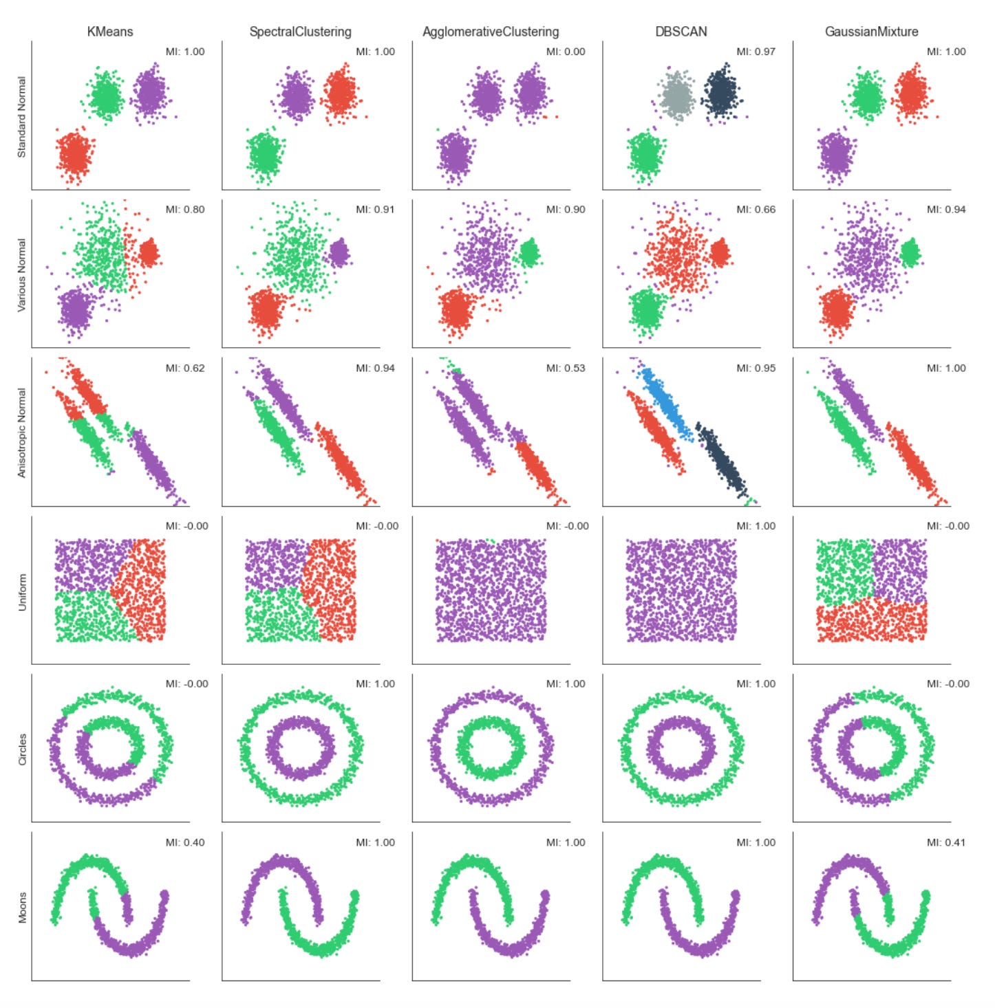
The code is building a small evaluation and visualization pipeline that runs several unsupervised clustering algorithms over multiple datasets so you can visually and quantitatively compare how each method discovers market patterns. At the top level it creates a grid of subplots with rows corresponding to datasets and columns to clustering algorithms, and it forces a common visual frame (shared x/y axes, fixed axis limits and removed tick marks) so differences in cluster geometry are easier to compare at a glance.
For each dataset the first step is to copy and merge algorithm parameters so each dataset can override defaults. The feature matrix X is immediately standardized with StandardScaler — this is important because almost all of the clustering methods here are distance- or covariance-based, so scaling prevents features with larger numeric ranges (for example volatility vs return magnitude) from dominating the distance calculations and producing misleading cluster assignments.
Next the code builds a k-nearest-neighbors connectivity graph from X and symmetrizes it with 0.5*(A + A.T). Symmetrization produces an undirected adjacency matrix; this is necessary for algorithms that accept a connectivity constraint (here AgglomerativeClustering) and for neighborhood-based spectral methods. The connectivity encodes local structure — which points are “neighbors” in feature space — and is used to encourage agglomerative clustering to merge along locally coherent groups rather than globally-linking far-away points.
The script instantiates five clustering approaches with different inductive biases: KMeans (centroid-based, spherical clusters), SpectralClustering (graph/eigenvector-based, using nearest-neighbors affinity and an eigensolver), AgglomerativeClustering with average linkage and a cityblock affinity constrained by the precomputed connectivity (hierarchical, locality-preserving merges), DBSCAN (density-based, controlled by eps so it can find arbitrarily-shaped clusters and mark noise), and a GaussianMixture model (probabilistic, full-covariance elliptical clusters). Each algorithm’s parameters are taken from the merged params so you can tune neighbors, eps, and n_clusters per dataset. Note that GaussianMixture is called with fit() followed by predict() because its API returns responsibilities and then requires a separate predict step; the other estimators expose fit_predict() for convenience.
Inside the inner loop each algorithm is fit and the predicted labels are used to color a scatter plot of the first two scaled dimensions. Presenting the same two axes across methods makes it easy to see how centroid, graph, hierarchical, density, and model-based methods partition the same market feature space differently — important when you are searching for recurring market patterns that may be linear, manifold-like, density-driven, or elliptical. Titles and dataset labels are added only where relevant to keep the grid readable.
To provide a quantitative measure the code computes adjusted_mutual_info_score (AMI) between predicted labels and a supplied y. AMI is a good choice for comparing clusterings because it is permutation-invariant (cluster label indices do not need to match) and it’s adjusted for chance, so it is more meaningful than raw overlap. If y is None the code substitutes a constant dummy label vector to avoid errors, but that effectively yields a meaningless MI — in practice you would want to either supply a ground-truth segmentation or skip the score when none exists. The MI value is annotated on each subplot in axis-relative coordinates so you can quickly scan algorithm performance across datasets.
Finally, the plot aesthetics are tightened (sns.despine and tight_layout) so the grid is compact and visually comparable. Overall, this block is designed to let you iterate over different datasets and parameterizations and immediately see how different unsupervised algorithms expose different structures in market data — helping you choose methods that reveal robust, actionable market patterns for downstream clustering or regime-detection tasks.
k-Means Clustering — Implementation
k-Means is the best-known clustering algorithm, originally proposed by Stuart Lloyd at Bell Labs in 1957.
The algorithm identifies K centroids and assigns each data point to exactly one cluster, with the objective of minimizing the within-cluster variance (also called inertia). It typically uses Euclidean distance, though other distance metrics can be applied. k-Means implicitly assumes clusters are spherical and of similar size and does not account for covariance among features.
The clustering problem is NP-hard: there are K^N possible ways to partition N observations into K clusters. The standard iterative k-Means algorithm converges to a local optimum for a given K and proceeds as follows:
1. Initialize: randomly select K cluster centers and assign each point to the nearest centroid.
2. Repeat until convergence:
a. For each cluster, recompute the centroid as the mean of its members.
b. Reassign each observation to the closest centroid.
3. Convergence criterion: assignments (or the within-cluster variance) no longer change.
2D Cluster Demonstration
def sample_clusters(n_points=500,
                    n_dimensions=2,
                    n_clusters=5,
                    cluster_std=1):

    return make_blobs(n_samples=n_points,
                              n_features=n_dimensions,
                              centers=n_clusters,
                              cluster_std=cluster_std,
                              random_state=42)
This small helper function is a deterministic data generator intended to produce a controlled, synthetic dataset of clustered points that you can use as a playground for unsupervised learning tasks like cluster discovery and validation. Conceptually, the function delegates to sklearn.datasets.make_blobs to synthesize n_points observations in an n_dimensions feature space, where those observations are drawn from a mixture of n_clusters isotropic Gaussian blobs. The generated output is the usual (X, y) pair: X is a floating-point feature matrix you can feed to clustering algorithms, and y are the ground-truth cluster labels you can use for evaluation and debugging.
Walking through the data flow: the caller specifies how many samples to create, how many numeric features each sample should have, how many latent clusters to emulate, and how much intra-cluster dispersion to inject via cluster_std. make_blobs creates cluster centers (by default randomly placed but reproducible here) and then samples points around each center according to a spherical Gaussian with the specified standard deviation. Because we pass random_state=42, the same centers and draws are produced every time, which makes experiments and visual comparisons repeatable.
Why these choices matter: n_points controls statistical stability and realistic sample sizes for downstream algorithms; n_dimensions lets you mimic feature complexity — low-dimensional (2D) output is convenient for visualization and intuition, while higher dimensions are useful to stress-test algorithms and pipelines. n_clusters encodes the expected number of latent market regimes or pattern types you want to simulate; cluster_std controls separability and noise level — small std produces well-separated, easy-to-find regimes, while larger stds create overlap and ambiguity like real-world market noise, which is where clustering robustness matters. The fixed random_state is deliberate so you can iterate on preprocessing, algorithms and hyperparameters without the confound of data variance.
In the context of unsupervised learning for market pattern discovery, this generator is primarily a diagnostic and development tool: it lets you validate that your clustering pipeline (feature scaling, dimensionality reduction, model selection and evaluation metrics) behaves sensibly under known ground truth before you apply it to noisy, nonstationary market data. Use the returned labels to compute external metrics (ARI, AMI) and to compare how different clustering algorithms or distance metrics recover the planted structure. Also use parameter sweeps (vary cluster_std, n_clusters, dimensionality) to simulate different market regimes and stress-test sensitivity to overlap and high-dimensionality.
Be aware of limitations: make_blobs produces simple, isotropic Gaussian clusters, so it does not capture many realistic market data properties such as skewness, heavy tails, time dependence, heteroskedasticity, or complex non-linear cluster shapes. For those, you’ll need more sophisticated simulation (e.g., mixtures with anisotropic covariances, temporal dynamics, or synthetic series with regime switching). Finally, because many clustering methods are scale-sensitive, remember to include appropriate scaling or normalization after generating X when you’re evaluating algorithms.
data, labels = sample_clusters(n_points=250,
                               n_dimensions=2,
                               n_clusters=3,
                               cluster_std=3)
This single call is creating a small synthetic dataset that mimics clustered market behavior so we can develop and validate unsupervised clustering workflows. Internally the helper sample_clusters will choose (explicitly or implicitly) a set of cluster centers in a 2‑D feature space and then draw points around those centers; the result is a matrix of observations (data) and a corresponding vector of ground‑truth cluster assignments (labels). The function parameters control the dataset shape and difficulty: n_points=250 determines the total number of sample observations (so you’ll roughly get 250 / n_clusters points per cluster if the generator distributes points evenly), n_dimensions=2 makes the samples two‑dimensional so they’re easy to visualize and debug, n_clusters=3 forces the generator to create three distinct latent groups, and cluster_std=3 sets the Gaussian standard deviation used to scatter points around each center.
Why we do this: synthetic clustered data gives us a controlled sandbox to test clustering algorithms and experiment with preprocessing and evaluation strategies before moving to noisy market data. The cluster_std parameter is especially important because it governs the signal‑to‑noise ratio — a small std produces tight, well‑separated groups that are easy to recover, while a larger std (like 3 here) increases intra‑cluster variance and overlap, which simulates realistic variability in market patterns and tests robustness of methods (k‑means, GMM, DBSCAN, spectral clustering, etc.). Choosing n_dimensions=2 is a deliberate tradeoff: it simplifies inspection and plotting so we can quickly validate whether an algorithm is capturing the intended structure; raising dimensions later lets us exercise behavior under the “curse of dimensionality.”
How the outputs are used in an unsupervised workflow: data feeds the clustering pipeline (possibly after scaling, PCA/UMAP, or feature engineering), while labels are not used to train unsupervised models but retained as ground truth for offline evaluation and parameter tuning — e.g., computing ARI/AMI/Fowlkes–Mallows to compare recovered clusters to true assignments or to run sensitivity analyses on preprocessing choices. Practically, if you care about reproducibility or consistent experiments with different cluster spreads, ensure the generator’s random seed is controlled; also consider whether the generator uses equal cluster sizes and per‑cluster stds or supports heterogeneity if you need more realistic market scenarios.
In short, this line produces a controlled, two‑dimensional, three‑cluster synthetic dataset with moderate spread, giving you both the inputs to run clustering and the labels to quantitatively evaluate algorithm behavior under the kind of intra‑cluster variability you might expect when discovering market patterns.
x, y = data.T

plt.figure(figsize=(14, 8))
plt.scatter(x, y, c=labels, s=20, cmap=cmap)
plt.title(’Sample Data’, fontsize=14)
sns.despine();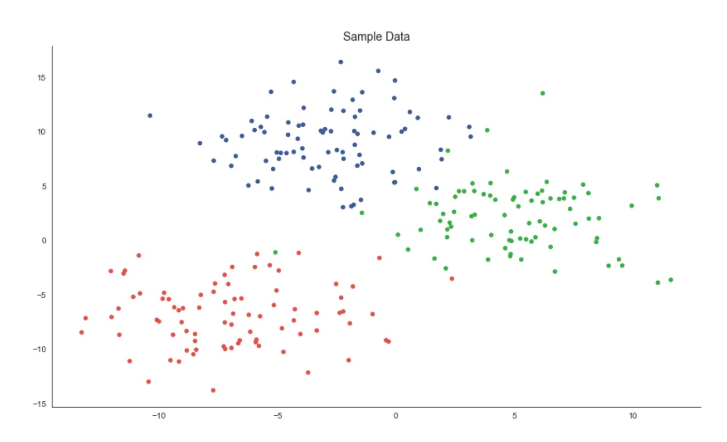
The first line unpacks the two coordinate dimensions from the input array into variables x and y. Practically, this treats each row (or column, depending on how data is shaped) as a separate feature axis so we can plot a two‑dimensional view of the dataset — an important step in unsupervised workflows because a 2D projection gives immediate visual intuition about structure, separability and outliers before deeper quantitative evaluation.
Next, we create a plotting canvas with a deliberately large figure size to ensure points and color differences are readable when you have many samples. The scatter plot then places each sample at its (x, y) coordinates and uses the labels array to assign colors via the colormap. In the context of market pattern discovery, those labels usually represent cluster assignments or some continuous score derived from an unsupervised model; coloring by labels lets you visually validate whether the algorithm has found coherent groups, whether clusters are compact or elongated, and where clusters overlap or produce ambiguous boundaries. The point size (s=20) is chosen to balance density and legibility — small enough to avoid excessive occlusion but large enough to perceive local structure — while the chosen cmap controls how distinct category or value differences appear; if labels are categorical, a discrete/qualitative colormap is preferable to avoid implying an ordering that doesn’t exist.
Finally, we add a concise title for readability and call sns.despine() to remove the top and right axes lines so the plot reads cleaner and focuses attention on the data geometry. The overall purpose of this block is exploratory validation: by visually inspecting the spatial arrangement of labeled points you can decide whether to change clustering hyperparameters, re‑engineer features (e.g., add volatility or seasonality signals), apply a different distance metric, or proceed with downstream analysis such as cluster profiling, anomaly investigation, or regime‑based strategy development.
K-means implementation
Assign Points to the Nearest Centroid
def assign_points(centroids, data):
    dist = cdist(data, centroids)        # all pairwise distances
    assignments = np.argmin(dist, axis=1)   # centroid with min distance
    return assignments
This small function implements the assignment step of a prototype-based clustering loop (think k-means style). It takes a set of current centroids and all data points, computes the pairwise distances from every data point to every centroid, and then assigns each point to the centroid with the minimum distance. Concretely, the distance matrix has one row per data point and one column per centroid; argmin across columns yields a length-n array of integer indices that map each point to its nearest centroid. Those indices are the fundamental labels used by the algorithm to recompute centroids and to evaluate convergence.
Why we do this: the assignment transforms continuous feature observations into discrete cluster memberships so we can summarize similar market behaviors. Choosing the nearest centroid creates a Voronoi partition of feature space — each centroid represents the prototype pattern for its cell, and data points belonging to that cell are considered instances of that pattern. This step is the “E-step” in expectation–maximization-style clustering or the assignment phase in k-means; without it you cannot compute the next centroid locations or the cluster-level statistics needed for pattern discovery.
Important assumptions and shape/metric expectations: this code assumes data and centroids are 2-D arrays with the same feature dimensionality (n×d and k×d). cdist (from SciPy) is typically Euclidean by default, so the notion of “nearest” is Euclidean distance unless you change the metric. That choice matters a lot for market data: raw price levels, returns, volatility, autocorrelation features, or normalized shape descriptors each interact differently with Euclidean geometry. Because Euclidean distance is sensitive to scale, you should normalize or standardize features (or choose an alternative metric) before calling this function to prevent some features from dominating assignments.
Performance and scaling considerations: computing the full n×k distance matrix is O(n·k·d) in time and O(n·k) in memory, which is fine for moderate datasets but can be a bottleneck for very large tick-level or multi-instrument datasets. If you anticipate large n or k, consider batching/chunking the data, using spatial indexes (KD-tree, BallTree) or approximate nearest-neighbor methods, or using more memory-efficient pairwise argmin utilities (scikit-learn has optimized functions) to reduce both time and memory pressure.
Operational edge cases and robustness: ties in distance are resolved by argmin’s deterministic index ordering (first minimum wins), but for noisy market data you may see many near-ties; consider adding tie-breaking logic or deterministic perturbation if that matters. Watch out for NaNs in inputs (will propagate into distances) and for empty clusters after centroid recomputation — if a centroid loses all points you’ll need a reinitialization strategy (reseed from data, split largest cluster, etc.). Also ensure centroids are updated with the same feature scaling used here to keep assignments meaningful.
In the larger context of unsupervised learning for market pattern discovery, this function is the mechanism that groups observations around prototype behaviors. Repeating assignment and centroid-update steps produces compact cluster prototypes that summarize recurring market motifs (e.g., specific intraday shapes, regime signatures, or volatility patterns). Getting assignments correct and meaningful — by choosing appropriate features, scaling, and distance metrics — is therefore critical to discovering actionable, interpretable clusters of market behavior.
Adjust centroids to better represent clusters
def optimize_centroids(data, assignments):
    data_combined = np.column_stack((assignments.reshape(-1, 1), data))
    centroids = pd.DataFrame(data=data_combined).groupby(0).mean()
    return centroids.values
This small function implements the “centroid update” step you see in k-means–style clustering: given a matrix of feature vectors and an array of integer cluster assignments, it returns the mean feature vector for each cluster (i.e., the centroids). Practically, it first ensures assignments are a column vector and concatenates that column with the feature matrix so each row is [label, features]. Wrapping that combined array in a pandas DataFrame lets the code group rows by the label column (column 0) and compute the column-wise mean for each group; the resulting DataFrame rows are the centroids and .values converts them back to a NumPy array for downstream numeric use.
Why do we compute means here? The arithmetic mean minimizes squared error within each cluster, so replacing cluster members with their mean reduces within-cluster variance and produces a prototypical pattern for that cluster. In an unsupervised market-pattern workflow those centroids are the canonical patterns we use for interpretation, anomaly detection, or to reassign time series segments in the next algorithm iteration.
A few operational details to keep in mind. The function returns an array of shape (k, d) where k is the number of distinct labels present in assignments and d is the number of feature columns; however, k equals the number of labels actually present, not necessarily the nominal number of clusters you expected. Pandas.groupby will produce rows only for labels that appear, and its groups are ordered by the group key (sorted unless you pass sort=False). That means if some cluster indices have no members (empty clusters) they simply won’t appear in the output — downstream code that relies on a fixed mapping from cluster index to centroid must either reindex the result or otherwise handle missing labels. Also note NaNs in the input features will propagate into the means unless you pre-clean or specify skipna behavior; and repeated conversions to DataFrame may be suboptimal for very large tick-level market datasets.
If you need greater performance or explicit handling of empty clusters, consider an alternative numeric approach (e.g., per-label sums and counts via np.bincount to compute means and to detect zero-count clusters) or keep a persistent centroid array and fill empty-cluster slots with prior centroids. In short: this function succinctly implements centroid recomputation via group-mean aggregation, which is the core update step for discovering and refining market pattern clusters, but be deliberate about label continuity, missing clusters, NaN handling, and performance for large-scale market data.
Compute Distances from Points to Centroids
def distance_to_center(centroids, data, assignments):
    distance = 0
    for c, centroid in enumerate(centroids):
        assigned_points = data[assignments == c, :]
        distance += np.sum(cdist(assigned_points, centroid.reshape(-1, 2)))
    return distance
This small function computes the total within-cluster distance between data points and their assigned centroids, producing a single scalar that quantifies cluster compactness. It walks through each centroid index, selects all data rows whose cluster label equals that index, computes the pairwise Euclidean distances between those assigned rows and the centroid representation, and accumulates the sum of those distances. The final returned value is the aggregate distance across all clusters and therefore serves as an objective or diagnostic number you can minimize or monitor while fitting a clustering model.
Operationally, the key steps are: for each centroid c, the line assigned_points = data[assignments == c, :] filters the dataset down to only the observations currently assigned to cluster c. The code then calls scipy.spatial.distance.cdist to compute distances between these assigned observations and the centroid. Because cdist expects 2-D arrays (rows = observations, columns = features), the centroid is reshaped with centroid.reshape(-1, 2) before calling cdist. That reshape implies a specific data layout: each centroid is stored as a flat array that must be interpreted as a sequence of 2-dimensional feature pairs (for example, time steps each with [price, volume]). cdist returns a matrix of pairwise distances and np.sum aggregates them into a scalar; that scalar is added to the running total.
Why this is done: summing distances to centroids gives a simple, interpretable measure of how well centroids represent their assigned points — lower totals mean tighter clusters. In the context of unsupervised market pattern discovery, this function is evaluating how closely each market pattern prototype (the centroid) matches the actual market segments assigned to it. Using Euclidean distances (cdist’s default) is computationally cheap and effective when features are aligned and comparable (e.g., normalized price-volume pairs across timesteps). The centroid reshape to (-1, 2) enforces the temporal/paired structure of market observations so distances compare corresponding feature pairs.
A few practical notes and assumptions to be aware of: assigned_points must have the same per-row dimensionality as the reshaped centroid — otherwise cdist will error or produce unintended results. If a centroid has no assigned points, the slice yields an empty array and the summed contribution is zero (so the function tolerates empty clusters). Also, this function sums raw Euclidean distances rather than squared distances; traditional k-means optimizes the sum of squared distances, so if you are using this as an optimization objective you should align the distance form with the algorithm. Finally, for performance and clarity you might preprocess centroids into the correct 2-D shape once (avoiding repeated reshape operations) and consider vectorizing the accumulation (or using squared distances) if you need to scale this to large collections of time-series market patterns.
Dynamic Cluster Plotting
def plot_clusters(x, y, labels,
                  centroids, assignments, distance,
                  iteration, step, ax, delay=2):
    ax.clear()
    ax.scatter(x, y, c=labels, s=20, cmap=cmap)
    # plot cluster centers
    centroid_x, centroid_y = centroids.T
    ax.scatter(*centroids.T, marker=’o’,
               c=’w’, s=200, cmap=cmap,
               edgecolor=’k’, zorder=9)
    for label, c in enumerate(centroids):
        ax.scatter(c[0], c[1],
                   marker=f’${label}$’,
                   s=50,
                   edgecolor=’k’,
                   zorder=10)
    # plot links to cluster centers
    for i, label in enumerate(assignments):
        ax.plot([x[i], centroid_x[label]],
                [y[i], centroid_y[label]],
                ls=’--’,
                color=’black’,
                lw=0.5)
    sns.despine()
    title = f’Iteration: {iteration} | {step} | Inertia: {distance:,.2f}’
    ax.set_title(title, fontsize=14)
    ax.axes.get_xaxis().set_visible(False)
    ax.axes.get_yaxis().set_visible(False)

    display.display(plt.gcf())
    display.clear_output(wait=True)
    sleep(delay)
This function is purely a visualization routine that animates one step of a clustering algorithm so you can watch how market data points are being grouped and how the cluster centers evolve. Conceptually, the inputs are the point coordinates (x, y), a color label per point for aesthetic grouping (labels), the current centroid locations, the current assignment of each point to a centroid (assignments), a scalar “distance” measure (inertia), and metadata about iteration and step. The routine’s job is to lay these pieces out on an axes object so you can judge clustering quality and behavior as the algorithm runs over iterations.
First the routine draws the dataset as a scatter, coloring points by the provided labels. Coloring by label (rather than raw coordinates) is important for human pattern recognition: it lets you immediately see which points are considered part of the same cluster and whether those groups align with visually coherent market regimes or technical patterns. The centroids are then drawn on top with a larger, high-contrast marker (white fill with a black edge) and placed at a higher z-order so they remain visible even when many points overlap them. This visual hierarchy (points below, centers above) makes centroid movement and convergence easy to follow during iterations.
To make cluster identities explicit, the code then overlays a small, labeled marker at each centroid showing the cluster index. Displaying the index on the centroid is useful when you want to trace how a particular cluster ID moves across iterations or to correlate that ID with downstream analytics (e.g., feature distributions or trading signals derived from that cluster). The black-edged, numbered markers reduce ambiguity that can arise when colors are similar or when cluster centroids cross paths.
Next, the function draws dashed lines from every data point to the centroid it is currently assigned to. That step is particularly informative for debugging and for understanding algorithmic decisions: long lines highlight poorly fitting points or potential outliers, large cumulative line lengths reflect higher inertia, and changes in the pattern of lines from one iteration to the next reveal whether points are being reassigned or if centroids are stabilizing. The distance value passed into the function is shown in the title; semantically this should be the clustering inertia or within-cluster sum-of-squares, so pairing it with the assignment links gives you both a global numeric objective and a local, visual explanation for that objective.
Finally, the routine polishes the view for an animation-style presentation: it removes axis ticks/frames (sns.despine and hiding axes) so you focus on the clusters, sets a descriptive title that includes iteration, step, and inertia so you can track progress, and uses display/clear_output combined with sleep to render the frame and pause briefly. That pattern is designed for interactive environments (Jupyter) and intentionally slows the loop so you can inspect transitions between algorithmic steps (for example, “assignment” vs “update” phases). A couple of practical notes: drawing a line per point is informative but can become costly for large datasets — consider sampling points or throttling frame frequency for production-scale visual debugging. Also ensure the passed-in distance is the same objective the algorithm optimizes (so the title accurately reflects convergence), because that metric is the primary numeric signal you’ll use alongside the visual cues to decide whether the clustering is discovering meaningful market patterns.
Run the K-Means Experiment
The following figures highlight how the resulting centroids partition the feature space into regions — Voronoi cells — that delineate the clusters.
k-means requires continuous features or categorical variables encoded with one-hot encoding. Because the algorithm relies on distance metrics that are sensitive to scale, features should be standardized so they contribute equally.
The result is optimal for the chosen initialization; however, different starting positions can produce different outcomes. Therefore, we run the clustering procedure multiple times from different initial values and select the solution that minimizes within-cluster variance.
n_clusters = 3
data, labels = sample_clusters(n_points=250,
                               n_dimensions=2,
                               n_clusters=n_clusters,
                               cluster_std=3)
x, y = data.T
This short block is setting up a controlled synthetic dataset that we’ll use as a playground for unsupervised market-pattern discovery and clustering experiments. We first decide on the experiment parameters: n_clusters = 3 declares that we want three underlying groups (this mirrors the hypothesis that there are three repeating market regimes or pattern families to discover). The call to sample_clusters(…) then synthesizes a 2‑dimensional point cloud of 250 observations composed of those three clusters; cluster_std=3 controls the Gaussian dispersion of each cluster and therefore how much overlap and noise exists between groups.
The sensible choices here serve specific purposes. Using n_dimensions=2 keeps the feature space low-dimensional so we can visualize results directly (useful during development and debugging) while still having nontrivial structure. The moderate cluster_std intentionally prevents perfectly separable clusters: it forces clustering algorithms to demonstrate robustness to noise and boundary ambiguity, which is important because real market patterns are noisy and overlapping. The returned labels are the ground‑truth cluster assignments produced by the sampler and are useful only for evaluation (e.g., computing ARI, NMI, or cluster purity); in a true unsupervised pipeline you would feed only the data into the clustering model and use labels solely to measure success.
Concretely, sample_clusters produces an array data with shape (250, 2) — each row is an observation in 2D — and a labels array of length 250 with the cluster index for each point. The final line x, y = data.T transposes and unpacks the two coordinate columns into vectors of length 250 so they’re convenient for visualization or for any algorithm that expects separate feature arrays. Overall, this block establishes a repeatable, interpretable testbed: a modest-sized, two-dimensional, three‑cluster dataset with controlled noise, which we can use to develop, compare, and validate unsupervised clustering approaches intended to surface recurring market patterns.
x_init = uniform(x.min(), x.max(), size=n_clusters)
y_init = uniform(y.min(), y.max(), size=n_clusters)
centroids = np.column_stack((x_init, y_init))
distance = np.sum(np.min(cdist(data, centroids), axis=1))
This short block is doing two related things for an unsupervised clustering step: it seeds a set of centroids in the 2D feature space and then computes a single-number measure of how well those centroids would “explain” the data right now. The ultimate goal — discovering recurring market patterns and grouping similar market states — depends heavily on where you start your centroids and on an objective you use to compare different starts, so both actions here are about initializing and evaluating a candidate clustering.
First, two arrays of random coordinates are drawn independently for each centroid: one from the observed range of the x feature and one from the observed range of the y feature. Sampling uniformly between x.min() and x.max() (and similarly for y) ensures every initial centroid lies within the bounding box of the historical market points rather than arbitrarily far away. That keeps the initial centroids relevant to the data distribution and avoids degenerate starts that would trivially yield very large distances. The two 1‑D arrays are then combined into an (n_clusters, 2) array of centroid coordinates; the column_stack step enforces the same 2‑column layout as the data so subsequent pairwise distance computations align by feature.
Next, the code measures how close every market observation is to its nearest centroid by computing all pairwise distances between data points and centroids (cdist returns an (n_samples, n_clusters) distance matrix) and taking the minimum distance per data point (np.min with axis=1). Summing those minima produces a single scalar that represents the total “within-cluster” distance for this particular initialization. Practically, this scalar functions as an immediate objective or score: lower values mean the centroids are, on average, nearer to data points and therefore form more compact clusters. In k‑means-style workflows this number is used to compare different initializations, drive iterative centroid updates, or select the best random seed; note that standard k‑means typically uses squared Euclidean distance (inertia), but the sum of Euclidean distances is a comparable compactness measure if you are consistent.
A couple of practical notes tied to the market-pattern goal: sampling coordinates independently into the bounding box can place centroids in low-density regions (outside the data convex hull) and lead to slower convergence or poor local minima, so it’s common to use smarter seeding (k-means++ or multiple random restarts) when searching for robust market patterns. Also ensure your distance metric matches your clustering objective (squared vs. linear distance) and that any downstream optimization is minimizing the same measure you compute here.
fig, ax = plt.subplots(figsize=(10, 10))

iteration, tolerance, delta = 0, 1e-4, np.inf
while delta > tolerance:
    assignments = assign_points(centroids, data)
    plot_clusters(x, y, labels,
                  centroids,
                  assignments,
                  distance,
                  iteration,
                  step=’Assign Points’,
                  ax=ax)

    centroids = optimize_centroids(data, assignments)
    delta = distance - distance_to_center(centroids, data, assignments)
    distance -= delta

    plot_clusters(x, y, labels,
                  centroids,
                  assignments,
                  distance,
                  iteration,
                  step=’Optimize Centers’,
                  ax=ax)

    iteration += 1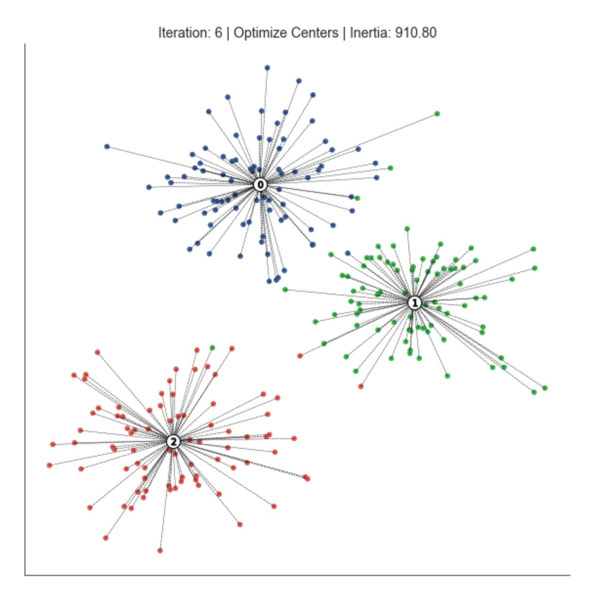
This loop is implementing an iterative clustering procedure (essentially the k-means pattern) that alternates between assigning observations to the nearest prototype and recomputing those prototypes until the clustering stabilizes. We start with an iteration counter and a convergence tolerance; delta is seeded as infinite so the loop runs at least once. Each pass through the loop represents one refinement step in the search for stable market pattern prototypes (centroids) and the partitioning of the dataset into clusters that represent market regimes or recurring patterns.
The first active step is assign_points(centroids, data). Here the current centroids are used as anchors to decide which cluster each data point belongs to: for each observation we compute a distance to each prototype according to the chosen distance function and pick the nearest one. The purpose of this step is to group observations by proximity to the current prototypes so that we can later recompute prototypes that better represent those groups; in market terms, this is the moment we classify each time window / feature vector as belonging to a particular pattern. Accurate assignment is critical because mis-assignments propagate into poor centroid updates and bad pattern discovery.
Immediately after assignment the code calls plot_clusters with step=’Assign Points’. This is a visualization checkpoint to show the current partitioning given the centroids before we move them. Plotting at this stage helps diagnose whether the assignment is sensible (for example, whether clusters are mixing or a centroid is isolated), which is particularly valuable in exploratory market analysis where visual confirmation of regime separation can reveal model or feature issues.
Next, optimize_centroids recomputes the prototypes from the points currently assigned to each cluster. In a standard implementation this is the mean of points in each cluster (or another robust representative if using medoids or domain-specific estimators). The reason for recomputing is to reduce the within-cluster dispersion: the centroid update moves each prototype toward the center of mass of the patterns currently assigned to it, which improves cluster coherence and makes the prototypes more representative of true market patterns.
After updating centroids the code computes delta via distance — distance_to_center(centroids, data, assignments) and subtracts delta from distance. Conceptually, distance_to_center returns the current total within-cluster distance (the clustering objective) given the new centroids; delta therefore measures the improvement (reduction) in that objective compared to the previous value. The loop’s stopping condition checks whether this improvement falls below the tolerance: when delta is sufficiently small, further centroid updates no longer yield meaningful gains and the algorithm has converged to a stable set of prototypes. Using an objective-difference stopping criterion focuses termination on meaningful changes in cluster quality rather than on an arbitrary iteration count.
The code then plots again with step=’Optimize Centers’ to show the new centroids and updated objective. This second plot in each iteration lets you visually compare how the prototypes moved relative to the assignment snapshot and to track convergence over iterations. Finally, iteration is incremented and the loop repeats until the change in objective is negligible. Together these alternating assignment and optimization steps produce a set of centroids that summarize dominant market patterns and a mapping from observations to clusters that you can use for downstream analysis like regime detection or cluster-based feature engineering.
A couple of practical notes tied to why these choices matter: the distance/objective computation is the direct signal of clustering quality, so its correct initialization and sign convention matter (you must ensure distance is initialized consistently before the loop and that delta is interpreted as a positive improvement). Also, handling corner cases in optimize_centroids (empty clusters) and choosing an appropriate distance metric or normalization for market features are important to avoid misleading prototypes — these choices directly affect the meaningfulness of the discovered market patterns.
Plot Voronoi tessellation
def plot_voronoi(x, y, labels, centroids, assignments,
                 distance, iteration, step, ax, delay=1):
    ax.clear()
    ax.scatter(x, y, c=labels, s=20, cmap=cmap)

    # plot cluster centers
    ax.scatter(*centroids.T,
               marker=’o’,
               c=’w’,
               s=200,
               edgecolor=’k’,
               zorder=9)

    for i, c in enumerate(centroids):
        ax.scatter(c[0], c[1],
                   marker=f’${i}$’,
                   s=50,
                   edgecolor=’k’,
                   zorder=10)

    # plot links to centroid
    cx, cy = centroids.T
    for i, label in enumerate(assignments):
        ax.plot([x[i], cx[label]],
                [y[i], cy[label]],
                ls=’--’,
                color=’k’,
                lw=0.5)

    # plot voronoi
    xx, yy = np.meshgrid(np.arange(x.min() - 1, x.max() + 1, .01),
                         np.arange(y.min() - 1, y.max() + 1, .01))
    Z = assign_points(centroids,
                      np.c_[xx.ravel(),
                            yy.ravel()]).reshape(xx.shape)

    plt.imshow(Z, interpolation=’nearest’,
               extent=(xx.min(), xx.max(), yy.min(), yy.max()),
               cmap=cmap,
               aspect=’auto’,
               origin=’lower’,
               alpha=.2)
    title = f’Iteration: {iteration} | {step} | Distance: {distance:,.1f}’
    ax.set_title(title)
    sns.despine()
    display.display(plt.gcf())
    display.clear_output(wait=True)
    sleep(delay)
This function is an animated diagnostic for a clustering iteration: it redraws the current point assignments, centroids, assignment links and an approximate Voronoi partition so you can see how the algorithm (e.g., k‑means or a nearest‑centroid method) is evolving over time. The routine begins by clearing the axis and immediately plotting the data points (x, y) colored by their current labels. Coloring points by labels gives an at‑a‑glance view of cluster membership and helps you spot where the algorithm is mixing points across clusters or leaving obvious structure unmodeled.
Next it plots the cluster centers on top of the points. The centers are drawn first as large white circles with a black edge so they remain visually prominent regardless of the colormap, and then each centroid is overplotted with a smaller marker that contains its integer index. That two‑step draw (big white disk then indexed marker) is deliberate: the white disk provides contrast against potentially busy or similarly colored nearby points, while the numeric marker makes it easy to track which centroid is which across frames as they move between iterations.
To make the membership relationships explicit, the function draws dashed lines from every data point to its assigned centroid. These links are a powerful diagnostic: they show the dispersion of points within each cluster, reveal long links that could indicate outliers or ill‑placed centroids, and visually reinforce the nearest‑centroid decision being used. The visual weight (thin, dashed, black line) keeps the emphasis on the overall pattern without overwhelming the point markers.
The heart of the decision‑region visualization is the Voronoi approximation. The code builds a dense regular grid across the plotting extent and then calls assign_points with the flattened grid to compute, for each grid cell, the index of the nearest centroid. Reshaping that result back to the grid produces a 2D label map Z that represents the partition of feature space by nearest centroid. This approach approximates the exact Voronoi diagram but is simpler and robust for display; it is also vectorizable because we operate on a single flattened (Nx2) array rather than iterating pixel by pixel.
That label map is rendered with imshow, using extent and origin=’lower’ so the image coordinates align with the axis data coordinates. The image is drawn with a low alpha so the Voronoi regions subtly color the background without obscuring individual points, making it easier to see boundary positions and how the partition moves as centroids update. The title encodes run metadata — iteration number, step (for example “assignment” vs “update”), and an aggregate distance metric — so viewers can correlate visual changes with numeric convergence measures.
Finally, the function calls display utilities and sleeps for a short delay to produce an animation effect: display.display / display.clear_output with wait=True replaces the previous frame in an interactive notebook and sleep controls the frame rate. Together these produce a live, stepwise visualization that ties the algorithm’s numeric convergence (distance) to geometric changes in assignments and decision boundaries, which is invaluable when exploring market pattern structure unsupervised: you can visually validate that clusters correspond to meaningful market regimes, spot instability, assess centroid drift, and decide when to adjust preprocessing, the distance metric, or the number of clusters. One practical note: the grid resolution (.01 step) determines the Voronoi fidelity and the rendering cost; for very wide or dense datasets you may want to coarsen that step or restrict the plotted extent to keep updates responsive.
Running the Voronoi Experiment
n_clusters = 3
data, labels = sample_clusters(n_points=250,
                               n_dimensions=2,
                               n_clusters=n_clusters,
                               cluster_std=3)
x, y = data.T
This small block is preparing a controlled synthetic dataset you can use to prototype and validate clustering methods for market-pattern discovery. By setting n_clusters = 3 you declare the number of underlying groups you want the generator to produce — conceptually this models three distinct market regimes or pattern-types that a clustering algorithm should try to recover. The call to sample_clusters creates n_points data samples in n_dimensions space (here 250 two-dimensional points), and cluster_std = 3 controls how dispersed each synthetic cluster is: larger values increase overlap and noise, making the clustering task harder and simulating more ambiguous or noisy market conditions. Returning both data and labels is deliberate even though the downstream task is unsupervised: labels provide a ground truth for evaluation and visualization (e.g., computing ARI/NMI, plotting colored scatter plots) so you can quantify how well an unsupervised method recovers the planted structure.
Functionally, data comes back as an array of 250 points in 2D and labels is the vector of the true cluster assignments. The next line transposes the data so you can easily unpack coordinates into x and y arrays for plotting or simple visual inspection. Using a 2D layout is a pragmatic choice for iterative development — it gives immediate, intuitive feedback about algorithm behavior and failure modes (overlap, outliers, elongated shapes) before moving to higher-dimensional market features.
From a methodological point of view, this setup lets you experiment with two important axes: the assumed number of clusters (n_clusters) and cluster dispersion (cluster_std). Varying n_clusters tests whether your clustering method can estimate or adapt to the correct model complexity, while varying cluster_std tests robustness to noise and overlap — both of which are critical for market-pattern discovery where signals are noisy and regimes can blend. Keep in mind practical additions you’ll want for real market data: reproducible random seeds for consistent experiments, feature scaling or normalization, and potentially more realistic cluster covariances or temporal structure to better mirror financial time-series behavior.
x_init = uniform(x.min(), x.max(),
                 size=n_clusters)
y_init = uniform(y.min(), y.max(),
                 size=n_clusters)
centroids = np.column_stack((x_init, y_init))

distance = np.sum(np.min(cdist(data,
                               centroids),
                         axis=1))
This snippet is performing the initialization and immediate evaluation step you would expect at the start of a centroid-based clustering routine (think k‑means style), with the explicit goal of discovering market patterns by grouping similar observations. First, x_init and y_init are drawn independently from uniform distributions between the observed minima and maxima of the x and y features. Sampling each dimension uniformly across its observed range places initial centroids somewhere inside the axis-aligned bounding box of the data: the intent is to spread starting centroids across the data extent rather than seeding them in one localized region, which helps the iterative clustering process explore different partitionings of the feature space.
Those one-dimensional samples are then combined with np.column_stack to form a (n_clusters, 2) array of centroid coordinates. Conceptually this gives you a set of candidate cluster centers in the two‑dimensional feature plane (x, y) from which you can proceed to assign points and refine centers. Using the bounding box for sampling is simple and cheap, but note the tradeoff: it ignores the joint density of the data so centroids can land in low‑density or outlier regions; in practice you might prefer kmeans++ or density‑aware initializers to reduce poor initializations.
Next, cdist computes the pairwise Euclidean distances between every data point and every centroid, producing an (n_points, n_clusters) distance matrix. Taking np.min(…, axis=1) collapses that matrix to a per‑point scalar: the distance from each data point to its nearest centroid. Summing those minima yields the total within‑cluster dispersion (often called inertia or the distortion objective). We compute this scalar because it quantifies clustering quality for this initialization — lower values indicate that points are, on average, closer to their assigned centers and thus that the centroids better capture local market structure.
In short: the code seeds centroids uniformly across the observed x/y ranges, builds a centroid matrix, measures each point’s distance to its closest seed, and aggregates those distances into a single loss-like metric. That aggregated distance is what you would use to compare different initializations, to drive an assignment/update loop, or to select the best initialization when running multiple restarts for robust unsupervised discovery of market patterns.
fig, ax = plt.subplots(figsize=(12, 12))

iteration, tolerance, delta = 0, 1e-4, np.inf
while delta > tolerance:
    assignments = assign_points(centroids, data)
    plot_voronoi(x, y, labels,
                 centroids,
                 assignments,
                 distance,
                 iteration,
                 step=’Assign Data’,
                 ax=ax)

    centroids = optimize_centroids(data, assignments)
    delta = distance - distance_to_center(centroids,
                                          data,
                                          assignments)
    distance -= delta

    plot_voronoi(x, y, labels,
                 centroids,
                 assignments,
                 distance,
                 iteration,
                 step=’Optimize Centroids’,
                 ax=ax)
    iteration += 1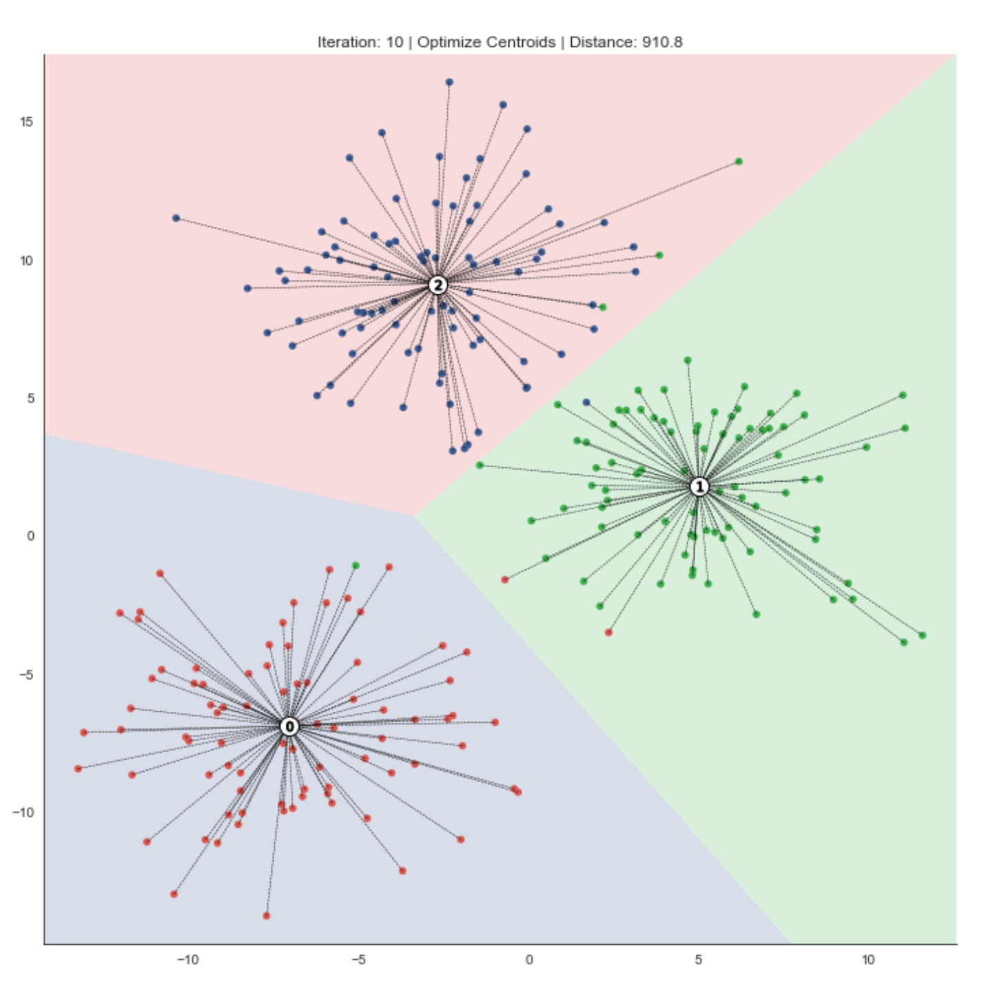
This loop is an explicit, visual implementation of the classic centroid-based clustering alternation (k‑means style) tailored for exploratory, unsupervised discovery of market patterns. The goal is to iteratively partition the dataset into clusters, move cluster centers to better represent their assigned points, and stop once those moves no longer meaningfully improve the clustering objective — all while producing diagnostic Voronoi plots that make the clustering dynamics visible.
At the top we initialize iteration bookkeeping and a convergence test: tolerance is the minimum meaningful improvement we care about, and delta measures the objective change between iterations. Each loop cycle represents one complete “assign” then “update centroids” step. First, assign_points(centroids, data) computes which centroid each market-observation belongs to under the chosen distance metric; this is the hard assignment step that groups similar market observations together. Immediately after assignment the code calls plot_voronoi with step=’Assign Data’ to draw the current decision regions and point-to-centroid assignments. Plotting at this point is intentional: it shows the partition induced by the existing centroids before any centroid movement, which helps you visually inspect whether clusters align with known market features or if assignments look unstable.
Next, optimize_centroids(data, assignments) recomputes each centroid from the points assigned to it — typically the mean of assigned points — so the center better represents current cluster members. After updating centroids, the code measures improvement by computing the difference between the previous objective (distance) and the new objective returned by distance_to_center(centroids, data, assignments). Conceptually, distance is the clustering objective (e.g., sum of distances or sum of squared distances of points to their assigned centroids). Delta = previous_objective — new_objective captures how much the objective decreased due to the centroid updates. The line distance -= delta is just a compact way to set distance to the new objective (previous minus the improvement), ensuring the loop tracks the up-to-date objective value.
A second plot_voronoi call with step=’Optimize Centroids’ follows the centroid update. This is important because it shows two distinct snapshots per iteration: how points were assigned given the old centers, and how the centers moved as a result. Together these plots let you see whether centroid shifts are meaningful for pattern discovery — large shifts suggest unstable clusters or poor initialization; small shifts indicate tightening clusters that are converging to stable market patterns.
The loop terminates when delta falls beneath tolerance (i.e., centroid moves no longer produce a meaningful decrease in the objective), which enforces a convergence criterion based on objective improvement rather than raw centroid displacement. That choice is intentional: for market-pattern clustering we care about whether the overall fit to the data improves, not just whether a centroid jitters a small amount. Note also the algorithm converges to a local minimum of the objective, so initialization, feature scaling, and the chosen distance metric strongly influence the resulting clusters — important practical considerations when you use these clusters to infer market regimes or group securities by behavior.
A couple practical caveats that follow from this structure: ensure data is appropriately normalized beforehand so features with large scales don’t dominate the distance metric; handle empty clusters inside optimize_centroids (re‑initializing or merging) to avoid errors; and consider adding a max-iteration guard or checking for negative delta (which would indicate a bug in the objective evaluation) to make the loop robust. The alternating assign/optimize pattern here, together with the visual diagnostics, provides an interpretable, iterative process to discover and validate market patterns via unsupervised clustering.
K-Means: Evaluating Cluster Quality
2D Cluster Demonstration
def sample_clusters(n_points=500,
                    n_dimensions=2,
                    n_clusters=5,
                    cluster_std=1):
    return make_blobs(n_samples=n_points,
                      n_features=n_dimensions,
                      centers=n_clusters,
                      cluster_std=cluster_std,
                      random_state=42)
This small wrapper creates a synthetic dataset of clustered points using scikit-learn’s make_blobs; conceptually the function is a controlled data factory so we can prototype and benchmark unsupervised clustering methods for market-pattern discovery. When you call sample_clusters you specify how many total observations you want (n_points), how many feature dimensions each observation should have (n_dimensions), how many latent groups or regimes to simulate (n_clusters), and how tightly points should be grouped around each center (cluster_std). Those arguments are passed directly to make_blobs, which draws cluster centers (either chosen randomly or provided explicitly) and then samples points from isotropic Gaussian distributions around each center; the result is an X matrix of shape (n_points, n_dimensions) and an array of integer labels indicating the generating cluster for each point.
Why we use this here: synthetic blobs give deterministic, easily interpretable structure so we can validate clustering algorithms, tune hyperparameters, and visualize algorithm failure modes before moving on to messy market data. The fixed random_state=42 makes experiments reproducible so comparisons between algorithm variants are meaningful. The cluster_std parameter is particularly important for testing robustness: small values create well-separated, spherical clusters that many algorithms will recover easily, while larger values introduce overlap and ambiguity that more closely exercises algorithmic decisions (distance metric sensitivity, initialization stability, and model selection for number of clusters).
A few practical caveats tied to the market-pattern context: make_blobs generates isotropic, Gaussian, and typically balanced clusters, which is a simplification compared with financial regimes that often have skew, heavy tails, heteroskedasticity, correlated features, and temporal structure. Because of that, this function is best used for early-stage development — unit tests, visualization, and baseline comparisons — not for final validation. If you need to more realistically emulate market regimes, explicitly supply centers, vary cluster_std per cluster, apply affine transforms to induce correlated/elliptical clusters, add outliers, or inject time-series dynamics and volatility clustering. Finally, retain the returned cluster labels as ground truth when you want to compute supervised clustering metrics (ARI, NMI) to quantify how well an unsupervised method recovers the underlying regimes.
Evaluating the Number of Clusters Using Inertia
The k-Means objective suggests comparing the evolution of inertia (the within-cluster variance). Initially, adding centroids sharply decreases inertia because the new clusters improve the overall fit.
Once an appropriate number of clusters has been reached (if such a number exists), additional centroids produce only marginal reductions in within-cluster variance, since they tend to split natural groupings. Consequently, when k-Means captures the data’s cluster structure well, the inertia typically follows an elbow-shaped curve similar to the explained-variance ratio in PCA.
def inertia_plot_update(inertias, ax, delay=1):
    inertias.plot(color=’k’,
                  lw=1,
                  title=’Inertia’,
                  ax=ax,
                  xlim=(inertias.index[0], inertias.index[-1]),
                  ylim=(0, inertias.max()))
    ax.axes.get_xaxis().set_visible(False)
    ax.axes.get_yaxis().set_visible(False)
    display.display(plt.gcf())
    display.clear_output(wait=True)
    sleep(delay)
This small helper is designed to render a live, notebook-friendly visualization of the clustering objective (inertia) as it changes across runs or iterations, so you can visually inspect convergence or locate an “elbow” for choosing k. The function expects inertias to be a pandas Series (index representing iteration number or k value, values being inertia) and ax to be an existing Matplotlib Axes; using an external axes lets the caller reuse the same figure across updates and avoids creating a flood of new figure objects.
First, the code draws the inertia sequence as a simple black line with a thin linewidth and the title “Inertia”. Explicitly setting xlim to (inertias.index[0], inertias.index[-1]) and ylim to (0, inertias.max()) stabilizes the plot scale: it prevents autoscaling from reflowing the axes between updates and ensures the vertical axis always has a meaningful baseline at zero so relative changes in inertia are easy to interpret. This stability matters when you’re monitoring small incremental changes during an iterative clustering run or comparing inertia across different k values — without fixed limits the plot can jump around and obscure the trend you care about.
Next, the code hides the x- and y-axis ticks/labels to reduce visual clutter and focus the viewer on the trendline itself. In the context of market pattern discovery, that reduces distraction from granular tick labels and emphasizes the macro behaviour of the objective (how quickly inertia drops as k increases, or whether inertia stabilizes over iterations).
Finally, the function updates the notebook output: it displays the current figure, clears the notebook output buffer to prepare for the next frame, and pauses for delay seconds. That display + clear_output pattern is the standard way to produce an animation-like effect in Jupyter — each call replaces the previous frame so you see a smooth sequence of updates rather than a backlog of static images. The brief sleep ensures each frame is visible long enough to inspect. Overall this routine is a UX-focused tool that makes it easier to monitor and reason about clustering behavior (convergence and elbow detection) while running unsupervised experiments on market data.
def plot_kmeans_result(data, labels, centroids,
                       assignments, ncluster, Z, ax):

    # plot data
    ax.scatter(*data.T, c=labels, s=20, cmap=cmap)

    # plot cluster centers
    ax.scatter(*centroids.T,
               marker=’o’,
               c=’w’,
               s=200,
               edgecolor=’k’,
               zorder=9)

    for i, c in enumerate(centroids):
        ax.scatter(*c,
                   marker=f’${i}$’,
                   s=50,
                   edgecolor=[’k’],
                   zorder=10)
        xy = pd.DataFrame(data[assignments == i],
                          columns=[’x’, ‘y’]).assign(cx=c[0],
                                                     cy=c[1])

        ax.plot(xy[[’x’, ‘cx’]].T.values,
                xy[[’y’, ‘cy’]].T.values,
                ls=’--’,
                color=’k’,
                lw=0.5)

    # plot voronoi
    ax.imshow(Z, interpolation=’nearest’,
              extent=(xx.min(), xx.max(), yy.min(), yy.max()),
              cmap=cmap,
              aspect=’auto’,
              origin=’lower’,
              alpha=.2)
    ax.set_title(f’Number of Clusters: {ncluster}’)
    plt.tight_layout()
This function is a visualization routine to inspect KMeans clustering results in 2D feature space, and every plotting choice is intended to make the cluster structure and assignments immediately interpretable for market-pattern discovery. It begins by scattering the raw data points colored by their cluster label (labels). Coloring here encodes the model’s discrete partitioning of market observations so you can quickly see the spatial grouping of patterns and whether clusters correspond to coherent market regimes or are overly mixed.
Next, the code emphasizes the learned prototypes by plotting the centroids as large white circles with a black edge. Centroids serve as an interpretable “prototype” or representative pattern for each cluster; making them visually prominent helps you judge whether those prototypes lie in dense regions of the data or are being pulled by outliers. The code then overlays a numeric marker for each centroid (marker f’${i}$’) so you can unambiguously map a centroid back to its cluster index in subsequent annotations or diagnostics.
For each cluster, the code extracts the points assigned to that centroid (assignments == i) and draws a thin dashed line from each point to its centroid. These radial connectors are an explicit visualization of within-cluster distances and assignment decisions: they reveal cluster compactness, long tails, and potential misassignments (points that are far from their assigned centroid and maybe closer to another). The DataFrame step is just a convenience for selecting x/y and attaching the centroid coordinates; conceptually this is a per-cluster grouping followed by a vector of point-to-centroid segments.
To show the decision boundaries implied by the nearest-centroid rule, the function plots a background image Z (typically computed by classifying a fine mesh grid with the centroids) over the plotting extent. Rendering Z with low alpha produces a Voronoi-like visualization of which region of feature space maps to which cluster; this helps you see boundary geometry, capture anisotropies in cluster influence, and check whether natural market separations align with algorithmic partitions. Careful ordering (zorder) and alpha ensure the boundaries are visible but do not obscure points or labels.
Finally, a title annotates the number of clusters and tight_layout is called to make the figure presentable. A few implementation notes to keep in mind: Z, xx, yy, and cmap are expected to be prepared outside this function (Z is the mesh-classification result and xx/yy define its extent), and using DataFrame for the short grouping is convenient but can be replaced by numpy indexing for speed if you render many points. The visual elements (marker sizing, line width, alpha) are tuned to highlight prototypes, assignments, and boundaries so you can quickly assess clustering quality, detect outliers, and iterate on feature choices or cluster count while pursuing unsupervised market pattern discovery.
Running the Elbow Experiment
n_clusters, max_clusters = 4, 7
cluster_list = list(range(1, max_clusters + 1))
inertias = pd.Series(index=cluster_list)
This small block sets up the hyperparameter space and a storage structure for evaluating clustering solutions as part of an unsupervised pipeline that aims to discover market patterns and group similar behaviors. We define two integers up front: n_clusters = 4 is a working/default choice for the number of clusters (often derived from prior domain knowledge or a preliminary run), and max_clusters = 7 caps the exploratory range so we can systematically evaluate multiple cluster counts without over-searching. The intent is to treat n_clusters as the target you might pick after evaluation, while max_clusters bounds the exploration used to find that target.
We then build cluster_list as the sequence of integer cluster counts we will evaluate: 1 through max_clusters. Including k=1 is deliberate — the inertia for one cluster equals the total within-cluster variance and serves as a useful reference point when inspecting how inertia decreases as k increases (this baseline helps visualize the elbow). Using a contiguous integer range ensures we probe every candidate k in the practical range for market-regime or pattern granularity.
Finally, inertias = pd.Series(index=cluster_list) preallocates a pandas Series keyed by those cluster counts so each computed inertia can be stored by its k value (e.g., inertias[3] = value). This choice does three things: it makes later assignment and plotting simple and explicit (index alignment means you can directly plot the series against the index), it ensures missing/uncomputed entries are NaN which is helpful for debugging or partial runs, and it preserves the natural ordering of k for downstream heuristics such as the elbow method or comparisons with other metrics (silhouette, Calinski-Harabasz) that you might store in parallel series. In short, this block is preparing a concise, index-aligned structure to evaluate how clustering quality evolves with k so we can choose an appropriate number of market-pattern clusters.
data, labels = sample_clusters(n_clusters=n_clusters)
x, y = data.T
This block is the data-generation and simple unpacking step for a controlled clustering experiment. The call to sample_clusters(n_clusters=n_clusters) is producing a synthetic dataset that simulates multiple latent market regimes: it returns a 2‑D array of observations (data) and a parallel array of true cluster identifiers (labels). The reason we synthesize clusters rather than pulling raw market data here is deliberate — in unsupervised learning for market pattern discovery we often need a ground-truth signal to validate algorithms and to tune hyperparameters (for example, cluster count, separation, and within‑cluster variance) under known conditions. The n_clusters argument controls the complexity of that ground truth — more clusters increase the challenge for a clustering algorithm and let us test sensitivity to regime multiplicity.
The next operation, x, y = data.T, transposes the data matrix and unpacks the two feature dimensions into separate one‑dimensional arrays. Conceptually, data is an N×2 matrix where each row is a two‑feature observation (two market-derived signals, e.g., short‑term return and volatility). Transposing yields a 2×N array so that x and y become the two coordinate vectors of length N. This unpacking is typically done for visualization (scatter plots with x on the horizontal axis and y on the vertical), for intuitive per‑feature analysis, or for operations that expect separate feature arrays. Note that this is a presentation convenience — most clustering algorithms expect the original N×2 shape, so if the goal is training rather than plotting you should keep the data matrix intact.
Why this matters for our overall goal: by generating labeled synthetic clusters and then separating the two features, we can quickly inspect separability, anisotropy, and overlap between regimes. Visual inspection of x vs. y colored by labels helps decide whether clusters are linearly separable (suggesting KMeans might suffice) or require density/graph methods (DBSCAN, spectral clustering). The labels give us a validation signal (adjusted rand index, mutual information, etc.) to quantify how well unsupervised methods recover the intended market regimes, which is crucial because real market labels are unavailable.
A few practical cautions: ensure you don’t lose the sample ordering or alignment between data and labels when transposing/unpacking, and remember that the two separate vectors are primarily for plotting or feature‑wise transforms — reassemble to N×2 when feeding models. Also be mindful that the synthetic generator’s parameters (cluster covariances, mixing proportions, and noise) implicitly shape the difficulty of the discovery task, so vary n_clusters and other sampling options to stress‑test the clustering pipeline before applying it to real market data.
xx, yy = np.meshgrid(np.arange(x.min() - 1, x.max() + 1, .01),
                     np.arange(y.min() - 1, y.max() + 1, .01))
This line constructs a dense 2D grid that spans the feature space defined by the two variables x and y; that grid is what we will later probe to visualize cluster assignments or density surfaces. Concretely, we compute one 1D range for the x-axis from slightly left of the minimum x to slightly right of the maximum x (x.min() — 1 … x.max() + 1) and an analogous 1D range for y, both sampled at a fixed resolution of 0.01. np.meshgrid then turns those two 1D ranges into two 2D arrays, xx and yy, where each cell (i, j) represents the x and y coordinates of a point in the full grid. This prepares a regular lattice of coordinate pairs that you can vectorize into a (num_points, 2) array (e.g., with ravel() and np.c_) and feed into a clustering/density function to get predictions or scores for every grid point.
The rationale for the +/-1 padding is to avoid clipping: we want a visual margin around the extremal samples so cluster boundaries or density contours are not cut off at the data limits. The choice of step = 0.01 is a resolution trade-off — it yields a smooth-looking boundary and fine-grained contours useful for detecting subtle market-pattern transitions, but it increases the number of evaluation points (and thus compute and memory) quadratically. Because both padding and step size are in the original feature units, they only make sense if x and y have comparable, meaningful scales; otherwise you should scale the features or use relative padding (for example a percentage of the data range).
In the context of unsupervised market-pattern discovery, this grid is purely a visualization / evaluation scaffold: we don’t change the model or the clusters by creating it, we merely sample the model across the 2D input space so we can draw decision regions, density maps, or contour plots that reveal regimes and cluster shapes. Two practical cautions: (1) if x and y come from a dimensionality reduction of a higher-dimensional embedding (PCA, t-SNE, UMAP), interpret boundaries accordingly; (2) for very large ranges or very fine steps, consider coarsening the resolution or using adaptive sampling to avoid excessive memory/computation.
fig, axes = plt.subplots(ncols=3, nrows=3, figsize=(16, 9))
axes = np.array(axes).flatten()

# Plot Sample Data
axes[0].scatter(x, y,
                c=labels, s=10,
                cmap=cmap)
axes[0].set_title(’{} Sample Clusters’.format(n_clusters))
for ax in axes:
    ax.axes.get_xaxis().set_visible(False)
    ax.axes.get_yaxis().set_visible(False)
sns.despine();


for c, n_clusters in enumerate(range(1, max_clusters + 1), 2):
    kmeans = KMeans(n_clusters=n_clusters, random_state=42).fit(data)
    centroids, assignments, inertia = kmeans.cluster_centers_, kmeans.labels_, kmeans.inertia_
    inertias[n_clusters] = inertia
    inertia_plot_update(inertias, axes[1])
    Z = kmeans.predict(np.c_[xx.ravel(), yy.ravel()]).reshape(xx.shape)
    plot_kmeans_result(data, labels, centroids, assignments,  n_clusters, Z, axes[c])
fig.tight_layout()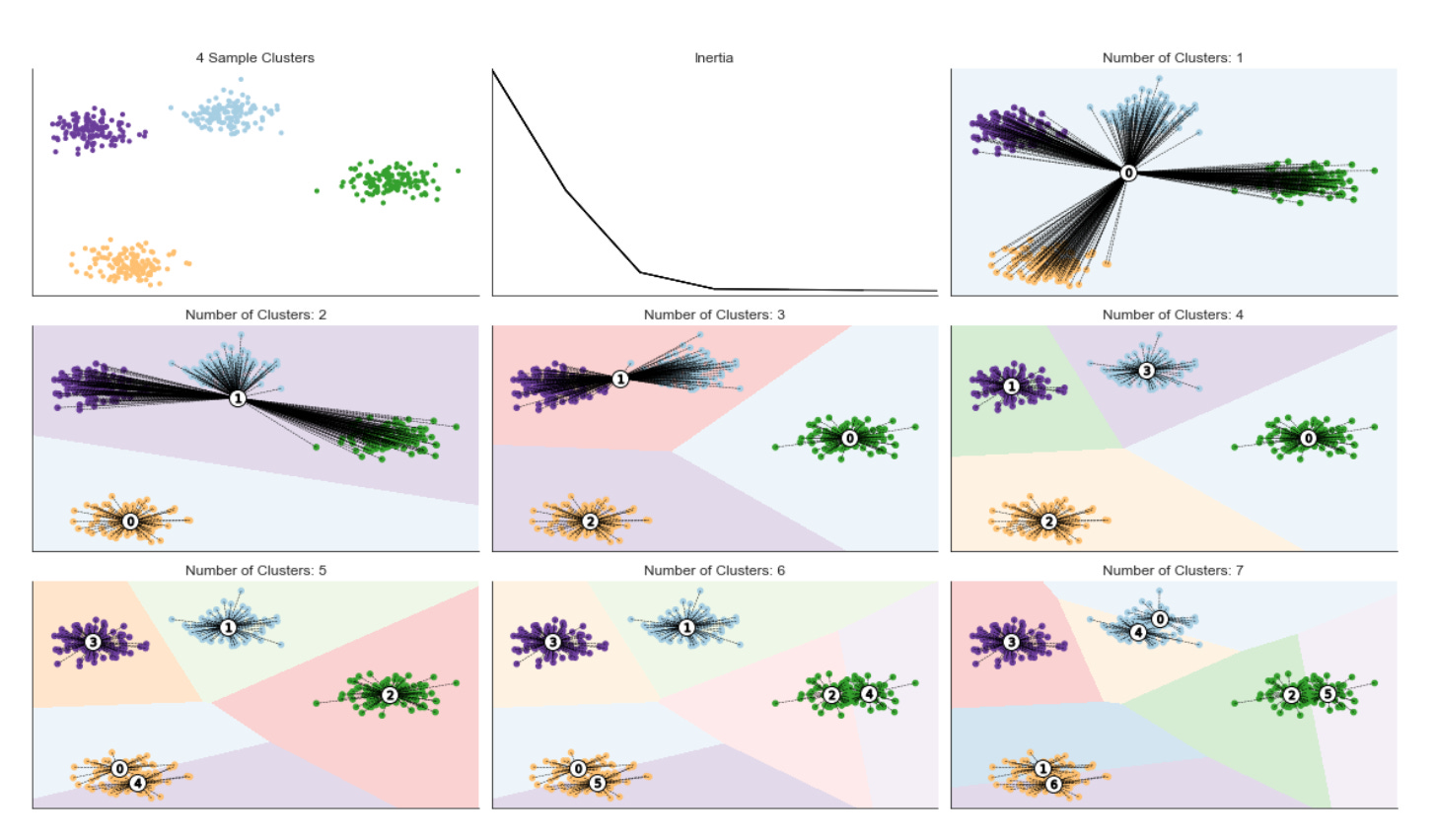
The block starts by allocating a 3x3 canvas and flattening it to a one-dimensional list of axes so we can address subplots by index rather than (row, column). The first subplot (axes[0]) is used to show the raw sample points colored by an existing label vector and styled with a colormap; this gives an immediate visual reference of the data distribution or any prior segmentation you might have. Immediately after plotting the sample, the code hides axis ticks and spines for every subplot to keep the visual focus on cluster structure rather than on axis ticks or grid lines.
Next we enter the loop over n_clusters (1 up to max_clusters). Note the enumerate starts at 2 so that axes[1] is reserved for a running inertia plot and the remaining axes (axes[2] and onward) receive the visualizations for each K value. For each n_clusters we fit a KMeans instance with a fixed random_state for reproducibility; the fit produces three things we need: cluster_centers_ (the prototypical patterns KMeans has learned), labels_ (assignment of each data point to a cluster), and inertia_ (sum of squared distances to cluster centers which quantifies within-cluster compactness). We store inertia in a dictionary keyed by n_clusters so that we can track how inertia changes as k increases — this is the numeric backbone of the elbow method used to choose an appropriate number of clusters in unsupervised market pattern discovery.
After updating the inertia dictionary we call inertia_plot_update(inertias, axes[1]), which is responsible for drawing the evolving inertia-versus-k curve on the reserved subplot. Showing inertia as we iterate helps you observe diminishing returns: inertia will go down as k increases, but a sharp elbow indicates a good tradeoff between model complexity and fit quality. This step ties directly into “why” we run KMeans for multiple k values: we’re scanning model complexity to identify stable, meaningful market patterns rather than overfitting noise.
To visualize cluster decision regions, the code builds a grid of points (xx, yy are assumed precomputed meshgrid arrays) and runs kmeans.predict on the flattened grid; reshaping that prediction back to xx’s shape yields Z, a matrix of region labels for each location on the 2D plane. Painting Z as a background produces the Voronoi-like partitioning that KMeans induces — this is the “how” of turning centroids and assignments into an intuitive spatial map of cluster boundaries. Such boundaries can reveal regime boundaries in market-feature space, helping you judge whether clusters make practical sense for downstream actions.
Finally, plot_kmeans_result overlays the actual data points (colored by their assignments), the centroids, and the background segmentation into the designated axes[c]. Those per-k panels give you immediate visual feedback on how cluster prototypes and assignments change as you vary k: whether centroids align with salient market behaviors, whether clusters are stable or fragmented, and whether boundaries cut across dense data regions or slice through noise. The loop ends by calling tight_layout to collapse subplot margins so panels are readable. Altogether, this block combines quantitative (inertia) and qualitative (decision boundaries, centroids, assignments) diagnostics to support unsupervised discovery of market patterns and to inform selection of a meaningful cluster granularity for downstream analysis.
Silhouette Score Evaluation
The [silhouette coefficient](http://scikit-learn.org/stable/modules/generated/sklearn.metrics.silhouette_score.html) quantifies cluster quality by comparing how close each sample is to other points in its assigned cluster versus points in the nearest neighboring cluster. Concretely, it compares the mean intra-cluster distance (a) with the mean distance to the nearest cluster (b) and computes the silhouette score s as
Values close to 1 indicate well-separated clusters; values near 0 indicate overlapping clusters; negative values (rare in practice) imply that many points may be assigned to the wrong cluster. A useful visualization plots each sample’s silhouette value alongside the global average, which highlights how coherent each cluster is relative to the overall configuration. As a rule of thumb, avoid clusters whose mean silhouette score is below the dataset-wide average.
The figure below shows excerpts from silhouette plots for three and four clusters. In the three-cluster case, cluster 1 contributes substantially below the global average, indicating a poor fit; in the four-cluster case, each cluster contains some samples with above-average silhouette values.
def plot_silhouette(values, y_lower, i, n_cluster, ax):
    cluster_size = values.shape[0]
    y_upper = y_lower + cluster_size

    color = plt.cm.viridis(i / n_cluster)
    ax.fill_betweenx(np.arange(y_lower, y_upper), 0, values,
                facecolor=color, edgecolor=color, alpha=0.7)
    ax.text(-0.05, y_lower + 0.5 * cluster_size, str(i))
    y_lower = y_upper + 10
    return y_lower
This small helper draws the horizontal “bar” for one cluster’s silhouette values and returns the vertical offset where the next cluster’s bars should start. It expects to be called iteratively for each cluster: you pass in the silhouette scores for that cluster (values), a running vertical position (y_lower) that marks where this cluster’s block should begin, the cluster index (i), the total number of clusters (n_cluster), and the matplotlib axis to draw on. The function first determines how many samples belong to the cluster (cluster_size) and computes y_upper = y_lower + cluster_size so the cluster occupies a contiguous vertical span proportional to its sample count — this preserves visual scale so larger clusters take more vertical space in the silhouette plot.
Color selection is driven by the normalized cluster index (i / n_cluster) mapped through the viridis colormap. Normalizing by n_cluster distributes colors evenly across the available palette regardless of the actual number of clusters, which makes it easier to visually track the same cluster across runs or compare clusters in a single plot. The main drawing call uses fill_betweenx to fill the horizontal area between x=0 and the silhouette values across the integer y positions spanning [y_lower, y_upper). Using fill_betweenx (instead of e.g. vertical bars) is intentional: silhouette values are one number per sample, and plotting those as horizontal filled segments produces the familiar silhouette fingerprints that reveal the internal distribution of scores inside each cluster — including the length and sign of negative scores which indicate poorly placed samples.
The function also places a small cluster label to the left of the block (x = -0.05) centered vertically at y_lower + 0.5 * cluster_size. Choosing a slight negative x-position assumes the plot’s x-range will include negatives (silhouette values range from -1 to 1), so the label sits in the left margin and doesn’t overlap the bars. After rendering, y_lower is advanced to y_upper + 10, intentionally inserting a fixed vertical padding of 10 units before the next cluster’s block; that padding prevents blocks from touching and improves readability when iterating through clusters. Finally, the function returns the updated y_lower so a caller that loops over clusters can stack these blocks sequentially.
A few practical notes tied to our goal of unsupervised market-pattern discovery: this function assumes the caller has already sorted or arranged silhouette scores per cluster in the desired display order (silhouette plots typically sort values within each cluster to produce the clear “fingerprint” shape). Filling from 0 to the score also naturally shows negative silhouette values extending left of zero, which is valuable for diagnosing overlapping market segments or mis-assigned samples. The consistent coloring and proportional vertical sizing make it easier to compare cluster cohesion and relative sizes across candidate clusterings when evaluating clustering choices for market pattern extraction.
def format_silhouette_plot(ax):
    ax.set_title(”Silhouette Plot”)
    ax.set_xlabel(”Silhouette Coefficient”)
    ax.set_ylabel(”Cluster Label”)
    ax.axvline(x=silhouette_avg,
               color=’red’,
               linestyle=’--’,
               lw=1)
    ax.set_xticks([-0.1, 0, 0.2, 0.4, 0.6, 0.8, 1])
This small helper focuses on making the silhouette visualization immediately interpretable for a clustering evaluation step in the pipeline. At a high level the goal is to present silhouette coefficients — which measure how similar each sample is to its own cluster versus other clusters (range roughly -1 to 1) — in a way that supports quick, actionable decisions about cluster quality when exploring market patterns.
First, the title and axis labels are set so the plot is self-descriptive: the title flags this as the silhouette plot, the x-axis expresses that the horizontal dimension is the silhouette coefficient (the per-sample quality metric we care about), and the y-axis labels correspond to cluster identifiers so the viewer can map rows of silhouette bars back to clusters. Those labels are important because the plot is often consumed during iterative model selection and they reduce cognitive overhead when comparing different clusterings or parameter choices.
The vertical dashed red line at silhouette_avg marks the mean silhouette score across all samples. Visually anchoring the average is the key decision here: it shows at a glance which clusters and what proportion of samples are above or below the aggregate quality baseline, which helps you decide whether a clustering is acceptable or whether clusters should be merged/split or outliers removed. The dashed style, red color, and modest line width are chosen so the marker is salient without obscuring the per-sample silhouette bars.
Finally, the chosen x-ticks (including a small negative tick at -0.1 and ticks up to 1) reflect the allowed/expected range of silhouette values and provide consistent gradations for assessing quality (for example, values near or below 0 indicate overlapping/poor clusters, while values toward 1 indicate strong separation). The inclusion of a slightly negative tick gives space to display and compare negative coefficients without cropping, which is useful because poorly clustered market behaviors can and do produce negative silhouette scores.
One implementation note: silhouette_avg is referenced but not passed into the function; for clarity and reusability it’s better to accept it as an explicit parameter (format_silhouette_plot(ax, silhouette_avg)) or otherwise ensure it’s documented that the function closes over a variable in the surrounding scope. Overall, this formatting function is aimed at making silhouette diagnostics fast and reliable for guiding unsupervised discovery and clustering decisions in market-pattern analysis.
def plot_final_assignments(x, y, centroids,
                           assignments, n_cluster, ax):
    c = plt.cm.viridis(assignments / n_cluster)
    ax.scatter(x, y, marker=’.’, s=30,
               lw=0, alpha=0.7, c=c, edgecolor=’k’)
    ax.scatter(*centroids.T, marker=’o’,
               c=’w’, s=200, edgecolor=’k’)
    for i, c in enumerate(centroids):
        ax.scatter(*c, marker=’${}$’.format(i),
                   s=50, edgecolor=’k’)

    ax.set_title(’{} Clusters’.format(n_cluster))
This small function is the final visualization step that turns cluster membership and centroid locations into a readable, interpretable figure for assessing unsupervised market-pattern discovery. It starts by mapping each point’s integer cluster assignment into a color value using the viridis colormap: dividing assignments by n_cluster produces normalized inputs in the 0–1 range that the colormap expects, so each cluster gets a distinct hue. Choosing viridis is deliberate — it’s perceptually uniform and handles luminance changes smoothly, which helps you detect density and shape differences in crowded market-feature spaces without introducing misleading contrast artifacts.
Next, the function draws the individual data points with ax.scatter. The dots are moderately small (s=30) and slightly transparent (alpha=0.7) so dense regions remain visually interpretable and overplotting is softened; black edges are used to help points separate from similarly colored neighbors. This layer is the primary evidence of how market observations distribute across clusters, letting you inspect shape, overlap, and outliers that indicate distinct or ambiguous market regimes.
After plotting raw points, the code overlays the centroids as larger white circles with black borders. Rendering centroids after the points makes sure the prototype locations remain clearly visible on top of dense point clouds; the white fill maximizes contrast against the colored points so the centroid positions are immediately obvious. Finally, the for-loop places a small numbered marker at each centroid using the cluster index as the marker symbol. These numeric labels are important operationally because they tie visual clusters back to the algorithm’s internal IDs, enabling you to reference specific cluster prototypes when interpreting or reporting discovered market patterns.
The function finishes by setting the subplot title to show the number of clusters, which is useful when comparing multiple models or hyperparameter settings. One practical caveat: the color normalization uses division by n_cluster, which maps assignments into [0, (n_cluster-1)/n_cluster] rather than the full 0–1 range; for strictly categorical coloring you may prefer a listed/categorical colormap or a Normalize that spans 0..n_cluster-1 so each cluster occupies the intended color slot. Overall, this plot is intended as a quick visual validation tool for clustering results — helping you verify that centroids represent coherent market patterns, identify overlapping clusters or outliers, and decide whether more preprocessing or a different number of clusters is needed.
n_clusters = 4
max_clusters = 7
cluster_list = list(range(1, max_clusters + 1))
inertias = pd.Series(index=cluster_list)
These four lines are setup for a small, explicit search over candidate cluster counts (k) so we can pick a sensible number of clusters for unsupervised market pattern discovery. We start by declaring an initial working choice, n_clusters = 4, which typically serves either as a default/fallback for downstream code or as a starting hypothesis about the granularity of market regimes we expect to see. The choice of four often reflects domain judgment — a compromise between capturing meaningful structure and keeping clusters interpretable to traders/analysts — but it is not final; the subsequent code will evaluate a range of possible k values.
max_clusters = 7 establishes an upper bound on how many clusters we will consider. Constraining the search to a modest upper limit is intentional: it limits computational cost, reduces the risk of overfitting noise in high-dimensional market features, and enforces interpretability (too many clusters make regime descriptions noisy and hard to act on). The cluster_list built from 1..max_clusters enumerates every candidate k in that range so we can loop deterministically over k values when fitting clustering models and collecting fit metrics.
inertias = pd.Series(index=cluster_list) creates an indexed container in which we will store the KMeans inertia (sum of squared distances of samples to their nearest cluster center) for each k. We use inertia here because it directly measures within-cluster compactness and is the standard quantity plotted in an “elbow” curve to detect diminishing returns as k increases. A pandas Series indexed by k keeps the results aligned with the candidate cluster counts, simplifies plotting and inspection, and gracefully handles any missing values if a particular k fails to fit.
A couple of practical points tied to the “why/how” for market pattern discovery: inertia is sensitive to feature scaling, so you should normalize or standardize your market features before fitting KMeans; also, inertia alone can be misleading (for example, it always decreases with k), so this setup is typically followed by elbow inspection and/or complementary metrics like silhouette scores or gap statistics before committing to n_clusters as the final choice. Finally, note that k=1 is included for completeness (it represents total variance), but some validation metrics (e.g., silhouette) are undefined at k=1, so downstream code should handle that case appropriately.
data, labels = sample_clusters(n_clusters=n_clusters)
x, y = data.T
The first line calls a helper, sample_clusters(n_clusters=…), and unpacks two things: a feature matrix (data) and a vector of ground‑truth cluster ids (labels). Conceptually this function is creating a controlled, synthetic market dataset — several compact groups of observations that represent different market patterns — so we have a known “answer” to use for visualization, validation, and debugging. In the unsupervised learning workflow this synthetic data is useful because it lets us exercise clustering algorithms under reproducible conditions (varying cluster count, separation, variance, outliers) and compute external metrics (ARI, NMI, purity) to measure how well the algorithm discovers the planted patterns, even though those labels will not be used during model fitting.
The second line transposes data and unpacks it into x and y. That indicates data is originally shaped so that rows are samples and columns are features (a typical (n_samples, 2) matrix); transposing yields a shape where each feature becomes a 1‑D array, so x and y are the two feature vectors. Practically, that unpacking is done because many downstream steps — scatter plots, simple diagnostic analyses, or APIs that accept separate coordinate arrays — expect two one‑dimensional arrays instead of a 2D matrix. Note that for most clustering algorithms you would pass the original (n_samples, n_features) data matrix directly; the transpose/unpack is just a convenience for operations that want per‑feature vectors.
Two important process notes underlying these lines: first, the labels returned by sample_clusters are strictly for evaluation and visualization — they must not be used as training targets in the unsupervised stage to avoid label leakage. Second, because this is synthetic data meant to model market patterns, you should still consider the same preprocessing steps you would for real market data (scaling, outlier handling, temporal features) before feeding data into a clustering model; those choices materially affect whether the learned clusters correspond to meaningful market regimes or just artifacts of scale. After this block, the typical flow is to either plot x versus y colored by labels to inspect the planted structure or feed data into a clustering algorithm and compare predicted clusters to labels to validate the discovery pipeline.
fig, axes = plt.subplots(ncols=2,
                         nrows=max_clusters,
                         figsize=(12, 20))

axes[0][0].scatter(x, y, c=labels, s=10, cmap=cmap)
axes[0][0].set_title(’Sample Clusters’)

for i in range(max_clusters):
    for j in [0, 1]:
        axes[i][j].axes.get_xaxis().set_visible(False)
        axes[i][j].axes.get_yaxis().set_visible(False)
sns.despine()

for row, n_cluster in enumerate(range(2, max_clusters + 1), 1):
    kmeans = KMeans(n_clusters=n_cluster,
                    random_state=42).fit(data)

    centroids, assignments, inertia = (kmeans.cluster_centers_,
                                       kmeans.labels_,
                                       kmeans.inertia_)
    inertias[n_cluster] = inertia
    inertia_plot_update(inertias, axes[0][1])

    silhouette_avg = silhouette_score(data, assignments)
    silhouette_values = silhouette_samples(data, assignments)
    silhouette_plot, cluster_plot = axes[row]

    y_lower = 10
    for i in range(n_cluster):
        y_lower = plot_silhouette(np.sort(silhouette_values[assignments == i]),
                                  y_lower,
                                  i,
                                  n_cluster,
                                  silhouette_plot)
    format_silhouette_plot(silhouette_plot)
    plot_final_assignments(x, y, centroids, assignments,
                           n_cluster, cluster_plot)
    fig.tight_layout()

fig.suptitle(f’KMeans Silhouette Plot with {n_clusters} Clusters’,
             fontsize=14)
fig.tight_layout()
fig.subplots_adjust(top=.95)
This block is building a compact visual diagnostics dashboard to evaluate KMeans clustering across multiple k values so we can choose meaningful clusters for market-pattern discovery. At the top level it creates a two-column, max_clusters-row grid of subplots and reserves the top row for a sample cluster scatter on the left and an inertia (elbow) plot on the right. Reserving the top row lets the remaining rows (one per tested k) show a pair of panels: a silhouette plot (left) and the corresponding 2‑D cluster assignment scatter (right). Hiding axis ticks and calling sns.despine is purely a presentation decision to reduce visual clutter so the viewer can focus on cluster structure and silhouette shapes.
The main loop iterates k from 2 up to max_clusters. Starting at 2 is deliberate: silhouette scores require at least two clusters, so k=1 is skipped. For each k a KMeans model is fit on data, and we immediately extract three outputs that drive the diagnostics: cluster_centers_ (centroids), labels_ (per-sample assignments), and inertia_ (sum of squared distances to centroids). Inertia is stored in the inertias mapping and passed to inertia_plot_update so the right-top plot is kept current; this builds an elbow-style visualization that helps detect diminishing returns in intra-cluster variance as k increases.
Quality of cluster structure is assessed with silhouette_score (a global average) and silhouette_samples (per-sample values). The per-sample values are what get visualized in the silhouette subplot: for each cluster we select the silhouette scores for samples assigned to that cluster, sort them, and draw them as adjacent horizontal bars. Sorting is important because it displays each cluster’s internal consistency as a continuous block — low or negative scores stand out visually and make it easy to spot clusters that are poorly separated. The code uses an incremental y_lower offset (initialized to 10) to stack these blocks with spacing between clusters; plot_silhouette encapsulates the drawing of each cluster’s block and returns the next baseline so the loop can keep stacking.
After all cluster bars are drawn the silhouette axis is formatted (likely setting x-limits to the expected [-0.1, 1], adding a vertical line for the average silhouette, labeling ticks, etc.) via format_silhouette_plot. The paired right-hand panel for that row is handled by plot_final_assignments, which plots the original 2-D coordinates (x, y) colored by cluster assignment and overlays centroids. Showing centroids on the same scatter is important for market-pattern interpretation: it lets you connect a centroid (the prototypical market state) to the actual samples and visually validate whether the centroid meaningfully represents a cluster of market behavior.
Throughout the loop, fig.tight_layout is called to keep subplots from overlapping and to make room for per-iteration updates; after the loop a suptitle is added and the top margin is adjusted so the title doesn’t collide with the top-row plots. In short, the flow is: fit KMeans → record inertia (elbow) → compute silhouette values → visualize per-cluster silhouette distributions → visualize spatial cluster assignments with centroids. Together, the inertia trend, silhouette distributions, and assignment plots give complementary evidence for which k reveals robust, well-separated market patterns suitable for downstream analysis or labeling.
Hierarchical clustering
Hierarchical clustering removes the requirement to specify a target number of clusters by successively merging data into clusters of increasing dissimilarity. Rather than optimizing a single global objective, it incrementally builds a sequence of nested clusters, ranging from one cluster containing all observations to clusters consisting of individual data points.
Hierarchical clustering does not have hyperparameters like k-means; instead, the choice of dissimilarity measure between clusters (rather than between individual points) substantially affects the resulting clustering. Common linkage criteria include:
- Single-link: distance between the nearest members of two clusters
- Complete-link: maximum distance between members of two clusters
- Group-average: average distance between members of the clusters
- Ward’s method: merge clusters to minimize within-cluster variance
Loading the Iris Dataset
iris = load_iris()
iris.keys()
This tiny block is the opening of a data-probing step in a clustering workflow: load_iris() pulls a small, well-documented dataset into memory and iris.keys() lists the named fields that accompany the numerical arrays. The important consequence is that load_iris() does not return just a raw NumPy array but a container (a scikit-learn Bunch) that packages the feature matrix alongside metadata — typically fields such as ‘data’ (the n×p feature matrix), ‘target’ (class labels), ‘feature_names’, ‘target_names’, and ‘DESCR’ (a textual description). Calling keys() is a deliberate, defensive inspection to discover exactly which components are present before downstream code touches them.
Why this matters for unsupervised market-pattern discovery: before you run any clustering algorithm you need to know what you actually have — the dimensionality, human-readable feature names for interpretation, and any available ground-truth labels you might later use for evaluation. For example, discovering that the container exposes ‘data’ and ‘feature_names’ tells you where to grab the numeric matrix and how to map cluster centroids back to meaningful attributes; seeing ‘DESCR’ warns you that there is dataset-level documentation you should read to understand measurement units and any preprocessing already applied. Seeing a ‘target’ field is a prompt to treat it as an evaluation aid only — in unsupervised experiments you normally do not train on those labels, but you can compute clustering metrics (ARI, purity) against them to validate whether discovered patterns align with known classes.
Practically, this inspection step drives the next decisions in the pipeline: confirm shape and dtype of iris[‘data’] to choose a scaler (e.g., standardization to avoid features with larger ranges dominating distance-based clusters), consider dimensionality reduction (PCA/UMAP) if p is large or for visualization, and pick a clustering method whose assumptions fit the data density and scale. It also prevents errors later by ensuring your code references correct keys (avoiding KeyError) and by surfacing metadata you’ll need to interpret clusters in business terms when you map the toy example back to market features. In short, load_iris() loads both data and context; keys() is the quick reconnaissance that tells you how to use that data safely and meaningfully in an unsupervised clustering workflow.
print(iris.DESCR)
That single line prints the dataset metadata that the loader attached to the iris object — the long-form description string that explains how the samples were collected, what each feature represents, the number of samples, and other provenance notes. In practice we call this early in the workflow to force a quick, human-readable check of assumptions before any modeling: it tells you whether the data are measured in compatible units, whether there are known caveats (sampling bias, missing-value conventions), and whether the dataset is inherently labeled even if you plan to ignore labels for an unsupervised experiment.
Knowing this metadata drives concrete decisions downstream for unsupervised market-pattern discovery. For example, seeing the feature definitions and ranges informs whether you must standardize or otherwise normalize features (distance-based clustering like k-means or DBSCAN is sensitive to scale), whether any features are categorical or require encoding, and whether units differ enough to bias distance metrics. The described sample size and dimensionality help you decide whether to run a dimensionality reduction step (PCA, UMAP) before clustering to denoise and to make clusters more separable, and they set expectations about whether algorithms reliant on asymptotic behavior are appropriate.
Because the iris description also documents the true class labels and expected groupings (three species), printing it is useful for benchmarking: even though our goal is unsupervised discovery for market patterns, we can use labeled datasets as a sanity-check to validate clustering choices and validation metrics (silhouette score, adjusted rand index when comparing to known labels). It also alerts you to class balance issues or small-sample regimes that would affect cluster stability and the interpretation of cluster centroids as market archetypes.
Finally, including this printed description in experiment logs improves reproducibility and auditability. When you or others later revisit an experiment, the attached DESCR output explains data provenance and any implicit assumptions you used when choosing preprocessing, distance metrics, or the number of clusters — all of which are critical when translating these unsupervised methods to real market data where measurement, sampling, and business meaning vary.
features = iris.feature_names
data = pd.DataFrame(data=np.column_stack([iris.data, iris.target]),
                    columns=features + [’label’])
data.label = data.label.astype(int)
data.info()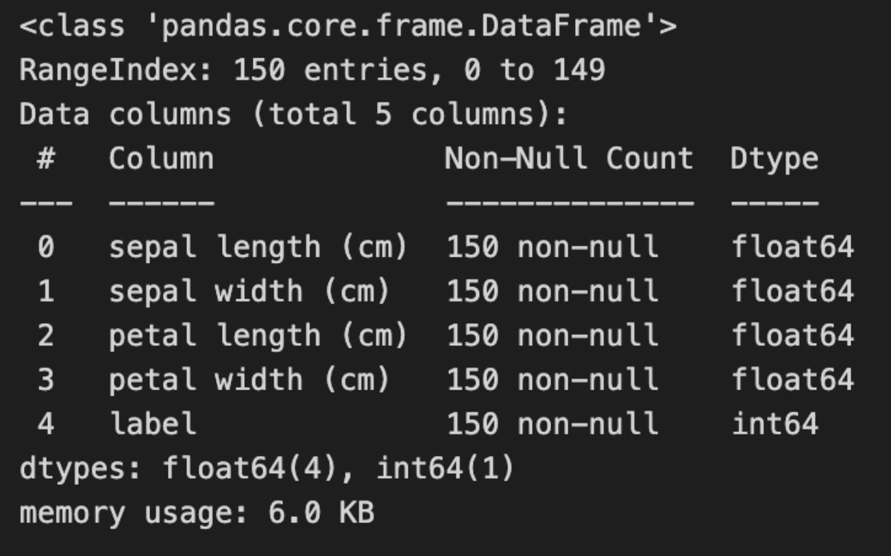
First, the code captures the feature metadata and constructs a single tabular object that combines the input vectors and the associated target into a predictable column layout. By taking the dataset’s feature names and then column-stacking the numeric feature matrix with the target vector, the code ensures each row contains all predictor values followed by a labeled column named “label”. This ordering (features first, label last) is deliberate: it makes it straightforward later to select “all feature columns” for unsupervised processing while keeping the target available for validation, plotting, or backtesting without accidental mixing into the training inputs.
Next, the explicit conversion of the label column to integer type is a small but important hygiene step. The raw target often arrives as a float (e.g., 0.0, 1.0, 2.0) and casting it to int solidifies its semantic role as a discrete class index rather than a continuous value. For our unsupervised pipeline this prevents accidental inclusion of a floating-label column in numeric transformations that expect continuous features, and it also simplifies downstream evaluation code (metrics, confusion matrices, color maps) that commonly expect integer class identifiers. If we later want to treat these as categorical in pandas or scikit-learn, we can convert to a category dtype, but int is a safe default for quick comparisons.
Calling data.info() is a lightweight integrity and sanity check before any heavy preprocessing. It gives you the number of rows, non-null counts per column, dtypes, and memory usage so you can immediately spot problems such as missing values, mis-typed columns, or unexpectedly large memory footprints. In an unsupervised workflow this early inspection helps avoid subtle bugs: for example, discovering a label column encoded as a float (which we already fixed), or detecting NaNs that would derail distance calculations, PCA, or clustering algorithms.
In the context of “Unsupervised Learning for Market Pattern Discovery and Clustering,” this block is preparing the dataset for the core analytics: the feature columns represent market signals or engineered indicators that will feed the unsupervised models (normalization, dimensionality reduction, clustering), while the label column is retained only for evaluation, visualization, and backtesting of discovered clusters against known regimes. The explicit column naming and type normalization here make the downstream pipeline reproducible and robust: you can reliably drop the last column when fitting models, apply consistent scalers/transformers to the remaining columns, and then reattach the integer labels to validate whether the clusters align with expected market regimes.
Data standardization
Because hierarchical clustering relies on a distance metric, it is sensitive to scale.
scaler = StandardScaler()
features_standardized = scaler.fit_transform(data[features])
n = len(data)
This block standardizes the feature matrix and captures the dataset size, preparing the raw inputs for downstream unsupervised pattern discovery and clustering. StandardScaler computes the per-feature mean and standard deviation, then subtracts the mean and divides by the standard deviation for every feature column: mathematically x’ = (x — µ) / σ. Doing this with scaler.fit_transform(data[features]) both learns those µ and σ from the provided slice of the dataframe and immediately applies the normalization, returning a numeric array (rows × features). The result is a zero-centered, unit-variance representation where differences across features become comparable in scale.
We perform this normalization intentionally because most clustering and manifold methods (k-means, hierarchical clustering, PCA, spectral methods, distance-based or gradient-based optimizers) are sensitive to feature scales. Without standardization, features with larger numeric ranges or variances would dominate Euclidean distances and principal components, biasing the discovered clusters toward those dimensions rather than true patterns. StandardScaler also improves numerical stability and convergence properties of algorithms that assume similarly scaled inputs.
Because scaler.fit_transform fits the parameters on the supplied data, the scaler object retains mean_ and scale_ so you can transform new observations consistently or inverse_transform cluster centroids back to original units for interpretation. That persistence is important for interpretability (e.g., mapping standardized cluster prototypes to price-return or volatility units) and for applying the same preprocessing to out-of-sample windows if you later validate clusters. Note, though, that fit_transform expects cleaned numeric inputs: handle missing values first (impute) and be aware that global mean/std are sensitive to outliers — for heavy-tailed market features you may prefer RobustScaler, log transforms, or winsorization to avoid skewed normalization.
Finally, n = len(data) captures the number of observations (rows) in the dataset and should match the number of rows in features_standardized. You’ll use n downstream for loop bounds, sizing cluster label arrays, building adjacency matrices, or controlling windowing logic. For time-series market data, also reflect on the choice to standardize globally versus per-window: global scaling is fine for exploratory, cross-sectional pattern discovery, but if you need to respect temporal non-stationarity or avoid “future” information leakage in rolling analyses, compute scaling parameters on appropriate training windows instead.
Dimensionality reduction for cluster visualization
pca = PCA(n_components=2)
features_2D = pca.fit_transform(features_standardized)
These two lines instantiate a principal component analysis (PCA) transform constrained to two dimensions and then both fit that transform to your standardized feature set and apply it to produce a 2‑D representation. Concretely, PCA computes the orthogonal directions (principal components) that capture the largest variance in the standardized data — by finding eigenvectors of the covariance matrix — and fit_transform returns the coordinates of each data point when projected onto those top two directions. We standardize before PCA so the components reflect correlations and relative signal structure rather than raw scale differences between features.
Why do this in the context of unsupervised market pattern discovery and clustering? Reducing dimensionality to two principal components serves two purposes: it concentrates the majority of the dataset’s linear variance into a compact form (which reduces noise and redundant information from highly correlated indicators), and it produces a low‑dimensional space in which distance‑based clustering algorithms and visual inspection are more meaningful and efficient. The orthogonality of the components removes linear collinearity, which helps k‑means and similar algorithms behave more stably and interpretably.
Important practical notes that follow from this choice: projecting to two components necessarily discards variance, so you should inspect pca.explained_variance_ratio_ to confirm how much information is retained; if the retained variance is low, increase n_components or consider nonlinear embeddings (t‑SNE/UMAP) for manifold structure. Also remember PCA is linear and sensitive to global structure — it will not capture nonlinear relationships or cluster shapes that are not aligned with directions of greatest variance. Finally, you can examine pca.components_ (the loadings) to interpret which original features drive each principal direction, which aids in understanding the market patterns the transform emphasizes before you feed features_2D into downstream clustering or visualization steps.
ev1, ev2 = pca.explained_variance_ratio_
ax = plt.figure(figsize=(14, 6)).gca(title=’2D Projection’,
                                     xlabel=f’Explained Variance: {ev1:.2%}’,
                                     ylabel=f’Explained Variance: {ev2:.2%}’)
ax.scatter(*features_2D.T, c=data.label, s=25, cmap=cmap)
sns.despine()
plt.tight_layout()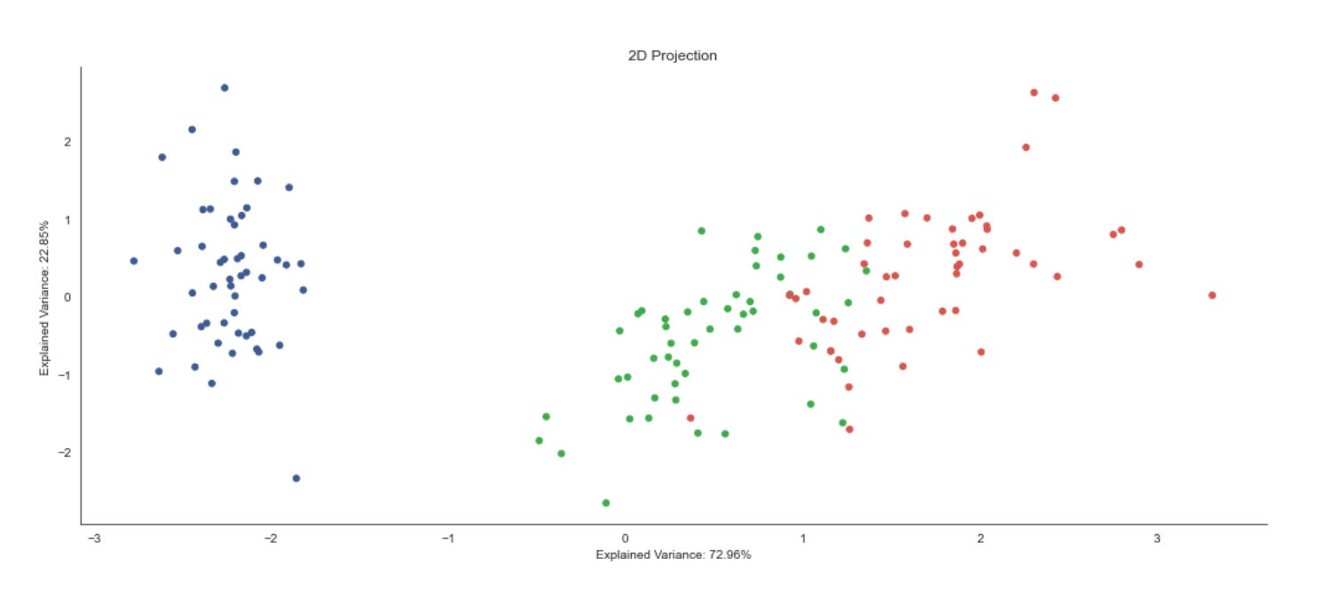
First, the code pulls the two numbers that describe how much of the total variance in the original high-dimensional market feature set is captured by the first two principal components: ev1 and ev2. We surface these values because they quantify the fidelity of a 2D PCA projection — the higher these percentages, the more faithfully the 2D scatter will represent inter-sample distances and structure from the original space. Showing them up front guides interpretation: if ev1+ev2 is small, you should treat any apparent clusters in the plot as potentially misleading artifacts of dimensionality reduction rather than definitive market segments.
Next, a plotting canvas and axes are created with a wide layout (14x6) to give the scatter room. The axis title and the x/y labels are annotated with the explained-variance percentages: this is deliberate UX to keep the viewer aware of projection quality when inspecting the visualization. Embedding those numbers in the axis labels is a compact way to make the plot self-documenting for downstream reviewers or reports.
The core visual is a scatter plot of the 2D features. The code unpacks features_2D.T into the two arguments expected by scatter, so the first principal component is plotted on x and the second on y. Each point is colored by data.label and rendered with a modest size (s=25); the chosen colormap provides consistent, qualitative separation of label categories. In our unsupervised-learning workflow that label array is typically either cluster IDs from a clustering algorithm or some external class/segment assignment used for validation; coloring by label lets you quickly assess cluster compactness, separation, and overlap in the PCA-projected space. Marker size and an explicit colormap are practical choices to balance point visibility and avoid misleading visual density artifacts.
Finally, sns.despine() removes the top and right axis spines to produce a cleaner, publication-style aesthetic, and plt.tight_layout() ensures labels and title don’t get clipped. From a process standpoint, this plot is a diagnostic: it helps you decide whether a 2D PCA projection is adequate for visual cluster discovery, whether you should inspect more components, or whether you should try non-linear embeddings (t-SNE/UMAP) or revisit preprocessing (scaling, feature selection) to reveal market structure more faithfully.
Performing Agglomerative Clustering
Z = linkage(features_standardized, ‘ward’)
Z[:5]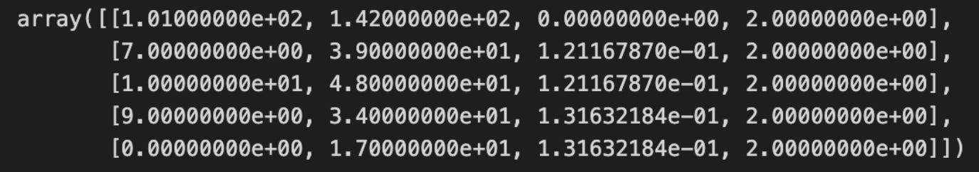
Why we do this here: hierarchical clustering (and Ward in particular) gives you a multi-scale view of market structure without specifying the number of clusters up-front, which is valuable for exploratory pattern discovery. Standardizing the features beforehand is critical because Ward’s objective is sensitive to feature scale — if one feature dominates numerically it will skew the variance calculation and therefore the merges. Practical considerations: linkage is O(n²) in memory/time, so it becomes expensive for large universes; outliers can disproportionately affect early merges; and Ward assumes Euclidean geometry, so if your features or similarity notion require a different metric you’d need a different method. Typical next steps are visualizing Z with a dendrogram to choose cut thresholds, using fcluster to extract flat clusters at a chosen level, and validating clusters with domain metrics (silhouette, cluster-wise returns/volatility summaries) to ensure the discovered groups map to meaningful market patterns.
linkage_matrix = pd.DataFrame(data=Z,
                              columns=[’cluster_1’, ‘cluster_2’,
                                       ‘distance’, ‘n_objects’],
                              index=range(1, n))
for col in [’cluster_1’, ‘cluster_2’, ‘n_objects’]:
    linkage_matrix[col] = linkage_matrix[col].astype(int)
linkage_matrix.info()
This block takes the raw linkage output (Z) from hierarchical clustering and turns it into a tidy, self-describing table that we can reliably use for downstream decisions about market patterns and clusters. Z normally encodes each agglomeration step as a row containing two cluster identifiers that were merged, the distance between them, and the number of original observations merged into the resulting cluster. Wrapping Z in a DataFrame with explicit column names (‘cluster_1’, ‘cluster_2’, ‘distance’, ‘n_objects’) makes that structure explicit and easier to query and document in later analysis.
Indexing the rows with range(1, n) gives each merge step a stable, human-friendly label 1..n-1 (where n is the original number of observations). This mirrors the canonical representation of hierarchical linkage: there are n-1 merge steps, and labeling them this way makes it straightforward to refer to a particular merge when tracing cluster formation or annotating a dendrogram.
The explicit casts of ‘cluster_1’, ‘cluster_2’, and ‘n_objects’ to int are an important robustness step. Linkage output can contain float-typed values (for implementation reasons), so converting these three columns to integers avoids later surprises when we treat cluster IDs as indices or compare them to original sample indices. Integer cluster IDs are required if we need to map merges back to original observations, build a cluster-membership map, or filter clusters by size. Leaving ‘distance’ as a float is deliberate: distance represents the continuous linkage metric used to decide cluster separation, and we need it to stay numeric and precise so thresholding or split-point selection (e.g., cut the tree at a distance to define clusters) behaves correctly.
Finally, calling linkage_matrix.info() is a quick sanity-check: it verifies the dtypes and memory footprint so we can confirm the integer casts took effect and the table is ready for deterministic downstream processing. In the context of unsupervised market-pattern discovery, these steps ensure the hierarchical merge history is stored in a stable, type-safe form so you can reliably select clusters by distance or size, trace how patterns merged across steps, and produce reproducible cluster assignments for further analysis or feature engineering.
linkage_matrix.head()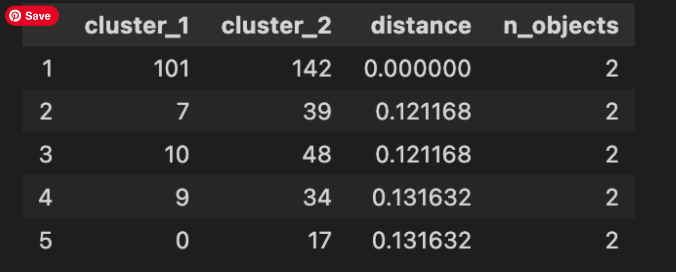
This single-line call is a quick, interactive sanity check: it prints the first few rows of the linkage matrix (here exposed as a DataFrame) so you can inspect the earliest agglomerative merges produced by the hierarchical clustering. In practice the linkage matrix encodes the sequence of merge operations — each row represents one merge event and typically contains the two cluster indices that were combined, the distance at which they were joined, and the number of original observations contained in the newly formed cluster. Calling head() is a low-cost way to peek at these columns to confirm the clustering is behaving as expected before you move on to visualizations or threshold selection.
Why we do this in the market-pattern pipeline: the first merges correspond to the most similar pairs of market items under our chosen distance metric and linkage rule. Those small-distance merges reveal fine-grained, local pattern similarity — for example, nearly identical short-term returns, repeated intraday shapes, or duplicated/near-duplicate observations that may indicate data leakage or preprocessing problems. Inspecting the head helps you validate that feature scaling, normalization, and distance choice are producing semantically meaningful pairings rather than grouping by spurious scales or noise.
When you read the rows, remember how to interpret indices and fields: indices less than n_samples refer to original observations (e.g., individual time-series windows), while indices greater than or equal to n_samples represent internally created cluster IDs from previous merges. The distance column gives the dissimilarity at merge time — increasing distances as you go down the merge history are expected for most linkage methods, and unusual patterns (NaNs, extremely large or zero distances, or non-monotonic jumps) are signals to revisit preprocessing, outlier handling, or the linkage metric. The cluster-size column is also useful: a rapid growth in cluster sizes or many early merges producing large clusters may indicate an overly coarse feature representation.
Finally, treat head() as a diagnostic step, not the whole analysis. It guides decisions you’ll make next: inspect tail() to see the final high-level merges, plot the dendrogram to select cut thresholds, compute cluster validity metrics (cophenetic correlation, silhouette) and, crucially for business use, map merged indices back to tickers and timestamps to interpret the discovered patterns. If the head output flags unexpected behavior (duplicates, non-monotonic distances, or meaningless pairings), iterate on feature engineering, distance metric, or linkage method before committing to downstream clustering and pattern-interpretation work.
linkage_matrix[[’distance’, ‘n_objects’]].plot(secondary_y=[’distance’],
                                               title=’Agglomerative Clustering Progression’,
                                               figsize=(14, 4))
plt.tight_layout();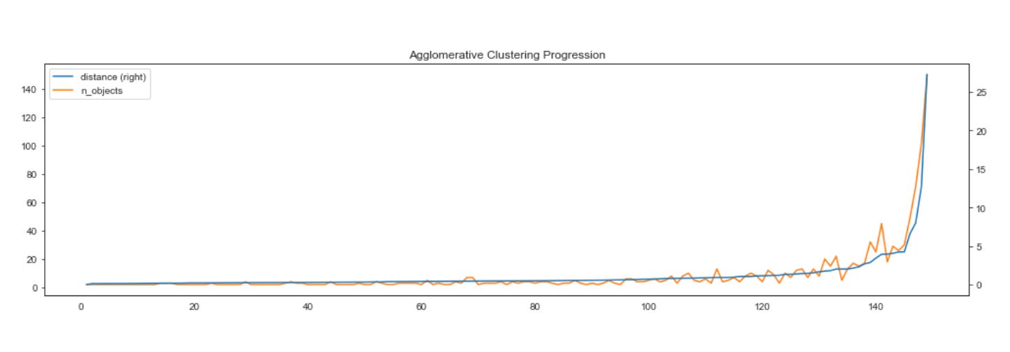
This small block takes the linkage progress that was computed during hierarchical (agglomerative) clustering and turns it into a compact visual diagnostic: we extract the two columns — n_objects (the size of the cluster formed at each merge) and distance (the linkage height or dissimilarity at which the merge occurred) — and hand them to the DataFrame plotting routine. The plot draws n_objects against the left y-axis and, because of secondary_y=[‘distance’], distance against a separate right y-axis; using two axes is deliberate because cluster sizes and linkage distances are on different scales and overlaying them on a single axis would either obscure one series or distort interpretation.
The reason we visualize these two series together is practical for unsupervised market pattern discovery: n_objects shows how cluster membership aggregates over successive merges (so you can see where a few elements coalesce into a large cluster), while distance reveals the magnitude of dissimilarity at each merge. Watching these together lets you spot meaningful structure — for example, a sharp jump in distance paired with a large jump in n_objects often signals a natural separation in the data (an “elbow” or a place to cut the dendrogram), whereas sustained small distances with gradual growth in n_objects indicates many small, similar clusters. This is essential when trying to identify robust market regimes or recurring patterns without labels.
Finally, the title and figure size are there to make the plot readable in dashboards or reports, and tight_layout() is called to prevent axis labels and the title from overlapping or being clipped. In short, this plot is a diagnostic tool used to guide threshold selection and interpret the hierarchical structure learned from market time series or feature vectors, helping you decide how many clusters capture meaningful market patterns and where merges indicate true dissimilarity rather than incremental grouping.
Comparing linkage types
Hierarchical clustering reveals degrees of similarity among observations by iteratively merging them. A large drop in the similarity metric between successive merges indicates that a meaningful cluster structure existed before that merge.
A dendrogram visualizes these successive merges as a binary tree: leaves represent individual observations and the root represents the final merge. The dendrogram also shows that similarity decreases monotonically from bottom to top, so selecting a clustering corresponds naturally to cutting the dendrogram at a chosen height.
The following figure shows the dendrogram for the classic Iris dataset (four classes, three features) using the four distance metrics introduced above. The fit of the hierarchical clustering is quantified by the cophenetic correlation coefficient, which compares the original pairwise distances with the similarity (merge height) at which each pair was joined. A coefficient of 1 indicates that closer points always merge earlier.
methods = [’single’, ‘complete’, ‘average’, ‘ward’]
pairwise_distance = pdist(features_standardized)
These two lines set up the pairing of a distance backbone with several hierarchical linkage strategies so you can compare how different agglomerative rules group market behaviors. First, pairwise_distance = pdist(features_standardized) computes the condensed matrix of pairwise distances between every pair of observations in your standardized feature space. The reason we compute distances on standardized features is deliberate: features are scaled to comparable units so no single price-derived attribute with a large range dominates the Euclidean geometry. pdist (by default Euclidean) produces the compact n(n−1)/2 representation that downstream hierarchical algorithms accept; computing it once also guarantees that every linkage method compares the same similarity relationships, which is important when you want to attribute differences in clustering solely to linkage choice rather than to different distance calculations.
The methods list enumerates four commonly used agglomerative linkage rules: ‘single’, ‘complete’, ‘average’, and ‘ward’. Each encodes a different criterion for merging clusters and therefore extracts different structural notions of “market pattern” from the same distance relationships. Single linkage merges clusters based on the minimum inter-cluster distance and tends to produce long, chaining clusters — that can be useful if you want to capture gradual transitions or series-like similarity across instruments or time windows, but it is very sensitive to noise and can connect dissimilar regions through intermediate points. Complete linkage uses the maximum inter-cluster distance, producing tighter, more compact clusters and being more robust to chaining at the cost of sometimes splitting naturally elongated patterns. Average linkage (UPGMA) takes the mean inter-cluster distance and behaves as a middle ground, often yielding more balanced clusters when no extreme chaining or compactness is desired. Ward’s method is distinct: it merges clusters to minimize the increase in total within-cluster variance, which biases the solution toward spherical, variance-homogeneous clusters; Ward implicitly assumes Euclidean geometry and benefits from the standardization done earlier because it relies on variance-based criteria.
Operationally, computing pdist once and iterating over these methods lets you directly compare how the agglomeration rule changes cluster boundaries for the same similarity graph, which is exactly the diagnostic we need in unsupervised market-pattern discovery. Practically, use single if you suspect progressive pattern continuities, complete or Ward when you need compact, interpretable pattern groups, and average as a compromise; but be mindful of outliers and the Euclidean assumption in Ward — you may need robust scaling or alternative distance metrics if heavy-tailed features or non-Euclidean relationships are present.
fig, axes = plt.subplots(figsize=(15, 8), nrows=2, ncols=2, sharex=True)
axes = axes.flatten()
for i, method in enumerate(methods):
    Z = linkage(features_standardized, method)
    c, coph_dists = cophenet(Z, pairwise_distance)
    dendrogram(Z,
               labels=data.label.values,
               orientation=’top’,
               leaf_rotation=0.,
               leaf_font_size=8.,
               ax=axes[i])
    axes[i].set_title(f’Method: {method.capitalize()} | Correlation: {c:.2f}’,
                      fontsize=14)


sns.despine()
fig.tight_layout()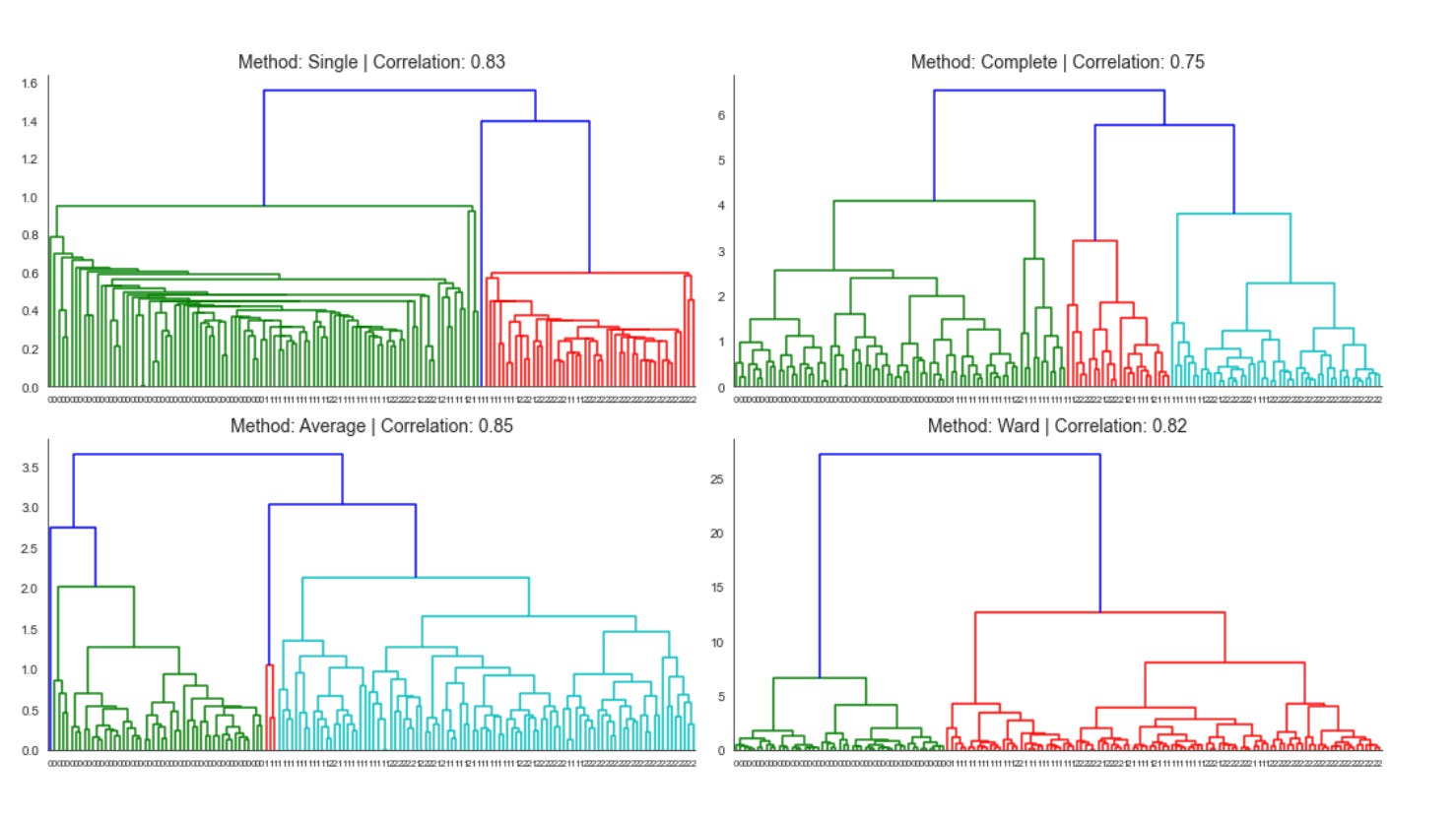
The block starts by creating a 2x2 grid of subplots and flattening the axes so we can iterate over them uniformly; this layout is simply to compare multiple hierarchical linkage strategies side-by-side so we can judge their suitability for discovering market patterns. For each linkage method in your methods list, the code runs an agglomerative hierarchical clustering (linkage) on features_standardized. Using standardized features here is deliberate: financial features often live on different scales and have different variances, so standardization prevents any single feature from dominating the distance calculations and biases the cluster topology — which is critical when the goal is to discover meaningful market patterns rather than artifacts of scale.
Next the script computes the cophenetic correlation (cophenet) between the tree implied by that linkage and the original pairwise distances (pairwise_distance). The cophenetic correlation c measures how faithfully the dendrogram preserves the original pairwise dissimilarities; values closer to 1 indicate the hierarchical tree is a good low-dimensional summary of the original distances. We compute this for each method so we can objectively compare linkage choices (single vs. complete vs. average vs. Ward, etc.), because different linkages produce different cluster shapes and sensitivities to outliers — and here the aim is to pick the linkage that best preserves the market-similarity structure in your data.
After computing those diagnostics, the code renders a dendrogram for the current linkage on the corresponding axis, labeling leaves with data.label so each terminal node maps back to the original instrument/time-slice/market segment. The dendrogram parameters (top orientation, no leaf rotation, small font) are chosen to maximize readable labels and consistent orientation across plots, making visual comparison easier. Each subplot’s title is annotated with the linkage name and the cophenetic correlation so you can immediately see both the qualitative cluster structure and the quantitative fidelity measure.
Finally, a light aesthetic cleanup (removing spines) and tight layout are applied so the panels are visually comparable and not overlapping. In practice, you’d use the cophenetic scores from these plots to choose the best linkage, then cut that chosen tree at a sensible height (or use a distance threshold) to extract clusters for downstream analysis — e.g., characterizing recurring market regimes, grouping similar instruments, or seeding further unsupervised models.
Different linkage methods produce different dendrogram appearances, so dendrograms are not reliable for comparing results across methods. Moreover, the Ward method — which minimizes within-cluster variance — may emphasize total variance rather than changes in variance, which can be misleading. Use alternative quality metrics instead, such as the cophenetic correlation or measures like inertia when they align with the overall analysis goals.
Retrieve cluster members
n = len(Z)
from collections import OrderedDict
clusters = OrderedDict()

for i, row in enumerate(Z, 1):
    cluster = []
    for c in row[:2]:
        if c <= n:
            cluster.append(int(c))
        else:
            cluster += clusters[int(c)]
    clusters[n+i] = cluster
This snippet reconstructs the explicit membership of every internal node produced by a hierarchical clustering linkage matrix so you can map merges back to the original observations — a necessary step when you want to inspect or extract the actual groups for pattern discovery and downstream analysis.
First, an ordered container is created to hold clusters as they are built. The code then walks the linkage matrix Z row by row (each row is one merge step). At each merge step i it reads the two identifiers in the row’s first two columns; those identifiers reference either original observations (leaves) or previously created internal clusters. For each identifier c the code branches: if c refers to an original observation (the check c <= n), it appends that leaf index directly to the current cluster’s list; otherwise c names an internal cluster and the code expands that cluster in-place by concatenating the already-built member list from clusters[int(c)]. After processing both children, the new merged cluster is saved under a new unique id clusters[n + i]. The enumerate start and the n+i indexing ensure every merge step produces a unique key and that later merges can reference earlier internal nodes.
Why this construction matters: hierarchical clustering only stores the merge operations and distances; it does not directly give you the flattened set of member indices for each internal node. By materializing the member lists you can inspect cluster contents at any merge level, compute intra-cluster statistics, attach representative patterns back to original time series/tickers, or select clusters for automated pattern-labeling — all crucial for unsupervised market-pattern discovery and downstream clustering workflows.
Two practical details to keep in mind. First, the code casts linkage entries to int because many linkage implementations store indices as floats; the cast makes them usable as dictionary keys. Second, be aware of indexing conventions: this code assumes the linkage’s leaf ids compare against n as written; with SciPy’s linkage, for N observations len(Z) == N-1 and leaf ids run 0..N-1, so you must set n correctly (usually N = len(Z) + 1) or adapt the comparison to avoid off-by-one errors. Finally, this naive concatenation approach is straightforward and readable but can be O(N²) in memory/time for large N because lists grow repeatedly; for very large datasets consider more memory-efficient representations (e.g., pointers, generators, or delayed expansion) if performance becomes an issue.
clusters[230]
When you evaluate clusters[230] you are performing a direct lookup into whatever container is holding our clustering results; what that single expression returns depends on the container’s type and on how we chose to represent clusters. In one common design pattern for unsupervised market-pattern work, clusters is a list (or array) where each element is a cluster object or a list of member indices/tickers — in that case clusters[230] yields the entire 231st cluster’s contents (the member series, indices, or feature summaries). Another common pattern is to store a label vector where clusters[i] is the cluster label assigned to the i-th time series; in that case clusters[230] returns the numeric label for the 231st instrument/observation rather than a cluster’s full membership. If clusters is a dict, the lookup treats 230 as a key and returns whatever metadata or member-list we mapped to that cluster id.
Why you’d do this lookup is tied to interpretation and validation. Pulling out a single cluster lets you profile its members (count, representative centroid, intra-cluster similarity, distributions of key features like volatility or seasonality) to decide whether the grouping reflects a meaningful market pattern or is an artifact of preprocessing or distance metric choice. Practically, you’ll inspect clusters[230] to check size (is it a tiny outlier cluster or a large, heterogeneous group?), to compute summary statistics (means, medians, silhouette contributions) and to visualize representative time series. Those checks drive decisions like re-scaling, changing the similarity measure (DTW vs Euclidean), adjusting cluster count or linkage parameters, or engineering additional features.
A couple of operational cautions follow from this single-index access. First, confirm whether indexing is zero-based and whether the element you expect corresponds to an ID (cluster number) or an observation index; mixing those conventions is a common source of misinterpretation. Second, defensively handle missing keys or out-of-range indices (KeyError/IndexError) and empty clusters: an empty list signals a degenerate grouping that may need parameter tuning. Finally, once you obtain clusters[230], typical next steps are to compute intra-cluster cohesion and inter-cluster separation metrics, visualize a cluster centroid and several member time series, and log domain features (e.g., sector, liquidity) for that cluster so you can map unsupervised patterns back to actionable market insights.
Animating Agglomerative Clustering
def get_2D_coordinates():
    points = pd.DataFrame(features_2D).assign(n=1)
    return dict(enumerate(points.values.tolist()))
This small function is a packing step in the pipeline: it takes whatever two-dimensional features you already produced (features_2D) and turns them into a simple, index-keyed map of numeric coordinate arrays that downstream components can consume easily. First, the code constructs a pandas DataFrame from features_2D. Using a DataFrame here gives a concise and robust way to ensure the rows are treated uniformly (e.g., consistent length and dtype) before serialization or further use.
Next it calls .assign(n=1) to append a constant column named “n” with value 1 for every row. Practically, this is a compatibility shim: many visualization and client-side consumers expect a fixed-length numeric tuple per point (for example [x, y, size] or [x, y, weight]), or a non-empty list for uniform processing. Adding a constant column guarantees a minimum tuple length and preserves a homogeneous numeric shape even if the rest of the pipeline sometimes produces only two columns. It’s not performing normalization or scientific transformation here — it’s purely structural/formatting to satisfy downstream expectations.
After that the function converts the DataFrame to a list-of-lists via points.values.tolist(). This drops column labels and produces a compact, JSON-friendly representation of numeric rows (fast and lightweight for transport). Finally, it enumerates that list and wraps it in dict(…) so each row becomes an entry keyed by its integer position: {0: [x0, y0, 1], 1: [x1, y1, 1], …}. Enumerating preserves the original ordering and gives a simple deterministic lookup key that is easy for front-ends, APIs, or subsequent map/graph construction to reference.
In the context of unsupervised market-pattern discovery and clustering, this function’s role is therefore packaging the reduced-dimensional coordinates (e.g., from PCA/UMAP/t-SNE) into a predictable, serialized form for visualization, cluster labeling overlays, or spatial neighbor computations. A couple of practical caveats: converting to .values.tolist() discards column names and any original item identifiers — if you need to trace clusters back to original securities or timestamps, preserve those IDs before this conversion; and if the added “n” intends to represent a meaningful metric (size/weight), consider naming it explicitly and computing a non-constant value. If you want stronger guarantees against accidental mutation or to retain indices, using DataFrame.to_dict(orient=’index’) or returning structured records including original IDs is a clearer alternative.
n_clusters = Z.shape[0]
points = get_2D_coordinates()
cluster_states = {0: get_2D_coordinates()}

for i, cluster in enumerate(Z[:, :2], 1):
    cluster_state = dict(cluster_states[i-1])
    merged_points = np.array([cluster_state.pop(c) for c in cluster])
    cluster_size = merged_points[:, 2]
    new_point = np.average(merged_points[:, :2],
                           axis=0,
                           weights=cluster_size).tolist()
    new_point.append(cluster_size.sum())
    cluster_state[n_clusters+i] = new_point
    cluster_states[i] = cluster_state
This block is reconstructing the agglomerative clustering process in 2D so you can track how centroids and cluster sizes evolve at each merge — useful for visualization, inspection, or extracting cluster-level features for unsupervised market-pattern discovery. The input Z is the linkage matrix (one row per merge) and get_2D_coordinates() provides the current mapping from cluster id → [x, y, size]. We keep a temporal sequence of cluster-state snapshots in cluster_states so we can look back at the exact cluster configuration after each merge.
We start with an initial snapshot (cluster_states[0]) that represents every original observation as its own cluster (each entry must contain x, y and an initial size, commonly 1). The loop then walks the linkage matrix row-by-row; Z[:, :2] yields the pair of cluster ids that are being merged at each agglomeration step. enumerate starts at 1 so that the newly created cluster ids line up with the conventional scheme (original ids 0..n-1, new clusters numbered from n onward). At each iteration we copy the previous snapshot (cluster_state = dict(cluster_states[i-1])) to avoid mutating past states — this preserves a history of cluster configurations required for later analysis or visualization.
For the chosen pair of cluster ids we remove (pop) their entries from the copied snapshot and collect them into merged_points. Popping models the fact that two clusters cease to exist as independent entities once merged. Each merged_points row is expected to be [x, y, size] so we extract the size column to use as weights. The size is how many original observations that cluster represents; carrying it forward is essential in market clustering so large segments retain proportionate influence when forming higher-level clusters.
We compute the new cluster’s 2D location as a size-weighted average of its components’ coordinates. Using weighted averaging (rather than a simple arithmetic mean) ensures that merging a big cluster with a small one yields a centroid that reflects the bulk of the data — that’s important for realistic market-segmentation centroids and for avoiding misleading shifts driven by small outliers. We then append the total size (sum of the component sizes) to the centroid to form the new [x, y, size] entry for the merged cluster.
The new cluster is inserted into the working snapshot under a generated id (n_clusters + i), and that snapshot is stored in cluster_states[i]. By storing a fresh snapshot at each step, the code gives you the entire agglomerative history: centroids and sizes at every merge level. This is exactly the information you need to visualize how market patterns coalesce, to compute cluster-level metrics at different resolutions, or to extract temporal/structural features for downstream unsupervised analysis.
A few practical notes: this code assumes get_2D_coordinates() returns entries with a size field (otherwise weights must be initialized), and that Z contains valid integer cluster indices (linkage outputs can be floats, so casting may be required). Also, keeping full snapshots is memory-heavy for very large datasets; if you only need final clusters or occasional levels, consider storing only selected snapshots or recomputing on demand.
cluster_states[100]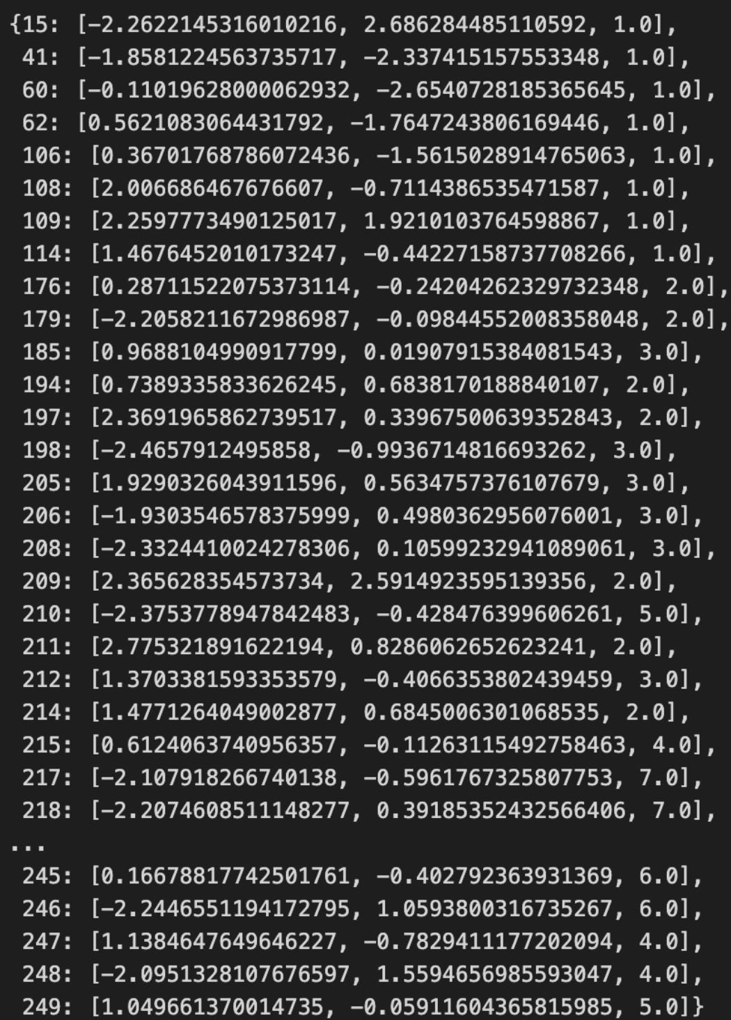
Here you’re indexing into the collection that holds the latent “cluster state” sequence for the market — cluster_states[100] asks “what cluster label (or state representation) is associated with the 101st time window or sample.” In the context of unsupervised market-pattern discovery this is a simple but important operation: it extracts the discrete state assigned by the clustering/segmentation step for a single time slice so you can inspect that state, compare it to surrounding states, or use it to compute local diagnostics (transition counts, run lengths, alignment with events, etc.).
How that single expression behaves depends on the container type, and those semantics affect how you should use it. If cluster_states is a NumPy array or Python list you get the element at positional index 100 (zero-based), typically an integer cluster label or a compact state object. If it’s a pandas Series with an integer index, cluster_states[100] will look up by label — which can be a different meaning if your Series uses timestamps or shifted indices (use .iloc[100] for positional access). If cluster_states stores soft assignments (probability vectors per sample) then cluster_states[100] will return that probability vector rather than a single discrete label; if it stores Viterbi or smoothed HMM states you’ll get the decoded state at that time. Be explicit about the container type to avoid off-by-one or label-versus-position mistakes.
Why you pull a single state: it’s a fast diagnostic to validate that the clustering pipeline produced sensible, temporally-coherent labels and that the index you think you’re inspecting actually maps to the intended time window and preprocessed features. Typical follow-ups are to fetch the corresponding raw/normalized feature window, the cluster centroid or prototype, and neighboring states (e.g., indices 99–101) to assess transition behavior. One-off inspection is also used when building transition matrices, computing state dwell times, or visually highlighting representative patterns in plots.
A few practical cautions and best practices: check bounds (IndexError for lists/arrays, KeyError for dicts/Series label misses) and prefer safe accessors (.get, .iloc, .take) if the index mapping might change. Confirm whether the stored element is a scalar label or a probability vector, and if you need deterministic reproducibility ensure the underlying clustering is deterministic or you’ve persisted the mapping. Finally, remember a single-state read is noisy — use aggregated statistics (state frequencies, transition probabilities, silhouette or cluster-quality metrics) before drawing conclusions about model performance or market regimes.
Setting up animation
%%capture
fig, ax = plt.subplots(figsize=(14, 6))
ax.axes.get_xaxis().set_visible(False)
ax.axes.get_yaxis().set_visible(False)

sns.despine()
xmin, ymin = np.min(features_2D, axis=0) * 1.1
xmax, ymax = np.max(features_2D, axis=0) * 1.1
ax.set(xlim=(xmin, xmax), ylim=(ymin, ymax))
This block is preparing a clean, presentation-ready canvas for plotting a two-dimensional embedding of market features (for example the 2D output of PCA, t-SNE, or UMAP). We create an appropriately wide figure so the visual layout gives clusters room to separate horizontally (the chosen figsize emphasizes readability for time‑series–derived features or horizontally-oriented cluster spreads). The cell is run with capture so the notebook won’t immediately print intermediary output — useful when this plotting is part of a larger pipeline or when you want to control when the figure is displayed.
Next, the code intentionally removes visual clutter: x and y axis ticks and labels are hidden and seaborn’s despine is called to remove the top and right spines. This is a deliberate design choice for unsupervised pattern discovery where absolute axis values often carry less semantic meaning after dimensionality reduction; the goal is to make cluster shape, density and relative positions more salient to the analyst rather than numerical axis annotations.
The bounds computation is critical to maintaining a stable, unclipped view of the embedding. By taking the per-dimension minima and maxima of features_2D (np.min/max with axis=0) we obtain the true data envelope for the X and Y axes. Multiplying those extents by 1.1 adds 10% relative padding around the data; using a multiplicative factor rather than a fixed constant scales the margin appropriately for different embedding ranges and prevents points, hulls, or cluster annotations from being plotted right at the frame edge. Finally, calling ax.set(xlim=(xmin, xmax), ylim=(ymin, ymax)) explicitly locks those limits so any subsequent plotting (cluster markers, labels, density contours, convex hulls) won’t trigger autoscaling and will render consistently across repeated figures or comparison panels. Together these steps produce a clean, framed visualization that emphasizes cluster geometry and inter-cluster relationships — exactly what you want when exploring and communicating unsupervised market pattern discovery.
scat = ax.scatter([], [])


def animate(i):
    df = pd.DataFrame(cluster_states[i]).values.T
    scat.set_offsets(df[:, :2])
    scat.set_sizes((df[:, 2] * 2) ** 2)
    return scat,


anim = FuncAnimation(fig,
                     animate,
                     frames=cluster_states.keys(),
                     interval=250,
                     blit=False)

HTML(anim.to_html5_video())
This small animation loop is the visual driver that turns a sequence of cluster snapshots into an animated scatterplot so you can watch how market clusters evolve over time. The code intentionally avoids recreating plot objects on every frame for performance: we create a single empty scatter artist up front (scat = ax.scatter([], [])), and then update its data in-place inside animate(i), which is what FuncAnimation calls for each frame.
When animate(i) runs, it pulls the cluster representation for the current time key i (cluster_states[i]) and immediately coerces it into a 2-D numeric array via pd.DataFrame(…).values.T. The transpose is important: cluster_states entries are structured such that converting to a DataFrame yields columns that represent features per cluster point, so the .T makes each row correspond to one plotted point. From that array, the first two columns (df[:, :2]) become the x,y coordinates fed to scat.set_offsets — these are typically low-dimensional embeddings or coordinates (for example two principal components or t-SNE coordinates) that place clusters in a 2D market-pattern space.
The third column (df[:, 2]) is used to encode a per-cluster magnitude — often cluster size, weight, or a measure of significance. We multiply that value by 2 and then square it before sending it to scat.set_sizes: (df[:, 2] * 2) ** 2. This scaling chain is deliberate because matplotlib expects marker sizes as areas in points²; squaring preserves a perceptual mapping from the original scalar to visual area, and the factor of 2 is an empirical visibility boost so smaller clusters remain visible. Adjust this scaling if your cluster-magnitude range or desired visual emphasis differs.
FuncAnimation is set up with frames=cluster_states.keys(), so it will iterate through whatever ordering your keys provide. Be aware: if your keys are not already in time order, you should pass a sorted list of keys to ensure the animation reflects chronological progression. interval=250 sets the playback speed to 250 ms per frame, and blit=False is chosen to keep updates straightforward (blitting can be faster but requires returning background states and is more fragile if other artists on the axes change). The animate function returns a one-tuple containing the scatter artist (return scat,), which is the contract FuncAnimation expects when blit=True; returning it is harmless for blit=False and keeps the code ready for enabling blitting later.
Finally, anim.to_html5_video() converts the resulting animation into an embeddable HTML5 video for notebook display. In the context of unsupervised market pattern discovery, this visualization ties together the pipeline: each frame encodes the clustering result at a given time, position encodes where clusters lie in the learned 2D embedding (revealing drift, separation, or convergence), and marker area encodes cluster importance (showing growth, shrinkage, splits or merges). Watching that progression makes temporal cluster dynamics explicit and helps you spot persistent patterns, regime shifts, or transient anomalies that automated clustering metrics alone might miss.
Practical notes: ensure every cluster_states entry has at least three numeric features (x, y, magnitude) and consistent ordering; if performance becomes an issue, consider enabling blit=True and implementing a proper background restoration, or downsampling frames. Also tune the magnitude-to-size mapping to match your data distribution so visual differences are meaningful rather than misleading.
scikit-learn implementation
clusterer = AgglomerativeClustering(n_clusters=3)
data[’clusters’] = clusterer.fit_predict(features_standardized)
This block takes a preprocessed feature matrix (features_standardized) and assigns each sample to one of three clusters using hierarchical agglomerative clustering, then writes those assignments back into the original DataFrame under data[‘clusters’]. Conceptually, the pipeline is: we start with standardized market features so every dimension contributes comparably to distance calculations; the AgglomerativeClustering object is configured to produce a fixed number of groups (n_clusters=3); calling fit_predict builds the hierarchical cluster tree by iteratively merging the closest pairs of observations (according to the clustering linkage/metric) until exactly three clusters remain, and immediately returns a cluster label for each row.
The reason we standardized features before this step is important: agglomerative clustering is distance-based, so features with larger numeric ranges would otherwise dominate the merge decisions and distort the discovered market patterns. Using standardized inputs makes the geometric notion of “closeness” reflect relative changes across features rather than raw scale differences, which helps the algorithm reveal meaningful behavioral regimes in the market data instead of artifacts of units or volatility differences.
Choosing agglomerative (hierarchical) clustering here is deliberate: unlike flat methods such as k-means, hierarchical clustering preserves a nested, tree-like relationship among observations, which is valuable when exploring market structure because it lets you inspect merges at multiple granularities (for example via a dendrogram) and supports interpretability of how regimes are related. Specifying n_clusters=3 is a modelling decision that imposes a desired level of granularity — often motivated by domain hypotheses (e.g., bull / bear / neutral regimes) or a tradeoff between interpretability and fidelity. That hyperparameter should be validated (silhouette score, Davies–Bouldin, stability checks, or domain-driven evaluation) and may be changed as you gain evidence about the number of meaningful market patterns.
Operationally, fit_predict is non-incremental: it computes the full pairwise structure for the dataset and then returns deterministic labels for the input rows; those labels are stored back into the DataFrame so subsequent steps (profiling cluster-specific statistics, visualizing time segments, conditioning models on regime, or backtesting regime-aware strategies) can join cluster membership to the original time series. Be aware of practical caveats: hierarchical clustering can become computationally and memory expensive for very large datasets, linkage/metric choices materially affect cluster shapes (Ward tends to produce compact, variance-minimizing clusters), and you must avoid lookahead leakage when forming features/standardization if this is applied in a live or backtest pipeline.
In short, this snippet converts standardized market feature vectors into an interpretable regime label per observation via hierarchical merging constrained to three groups; the output enables downstream analysis and decisioning around discovered market patterns, but n_clusters, linkage/metric, and scalability/validation considerations should be treated as tunable design choices rather than fixed defaults.
fig, axes = plt.subplots(ncols=2, figsize=(14, 6))

labels, clusters = data.label, data.clusters
mi = adjusted_mutual_info_score(labels, clusters)

axes[0].scatter(*features_2D.T,
                c=data.label,
                s=25,
                cmap=cmap)
axes[0].set_title(’Original Data’)
axes[1].scatter(*features_2D.T,
                c=data.clusters,
                s=25,
                cmap=cmap)
axes[1].set_title(’Clusters | MI={:.2f}’.format(mi))
for i in [0, 1]:
    axes[i].axes.get_xaxis().set_visible(False)
    axes[i].axes.get_yaxis().set_visible(False)

sns.despine()
fig.tight_layout()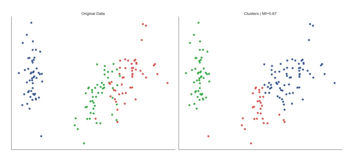
This block is building a compact visual comparison between the ground-truth labeling of your market instances and the clusters produced by the unsupervised pipeline, then annotating that comparison with a quantitative agreement score. First, it prepares a two-panel figure so we can view the same 2D embedding side-by-side: the left panel shows the original labels and the right shows the cluster assignments. The 2D coordinates (features_2D) have been transposed when passed into the scatter calls to supply the x and y arrays that matplotlib expects; plotting the same embedding twice ensures any differences you see are due to coloring (labels vs clusters), not a difference in layout.
Before drawing the plots the code computes adjusted_mutual_info_score(labels, clusters). We use the adjusted mutual information (AMI) because it measures how much information is shared between the true labels and the discovered clusters while correcting for agreement that could arise by chance; AMI is permutation-invariant (cluster IDs can be relabeled) and robust to differing cluster counts, so it’s a suitable single-number summary of cluster quality in this unsupervised context. That scalar is then injected directly into the right panel’s title so the visual comparison carries an immediate quantitative verdict: high AMI suggests the clustering recovers known market regimes or patterns; low AMI suggests mismatch and prompts further investigation.
Visually, both scatter plots use the same colormap and marker size to keep the visual encoding consistent; this makes it easier to spot where cluster assignments diverge from labels in the embedding space. The axes ticks and labels are hidden to reduce clutter — the focus is pattern correspondence, not precise coordinate values — while seaborn.despine removes the top/right spines for a cleaner, publication-style look. Finally, tight_layout is applied to prevent overlap between subplots and titles so the visual and textual elements remain legible.
From a workflow standpoint, this figure is a rapid diagnostic for market-pattern discovery: it lets you validate whether the clusters correspond to known market regimes or behavioral groups in the labeled set, guides hyperparameter tuning or feature engineering when AMI is low, and surfaces localized failures (e.g., clusters that split a single label or merge distinct labels) that warrant algorithmic or data-preprocessing changes. Keep in mind AMI is a summary measure — use it alongside visual inspection and other diagnostics (silhouette scores, cluster-size distributions, confusion matrices) to get a fuller picture of clustering performance on market data.
Comparing Mutual Information Across Linkage Options
mutual_info = {}
for linkage_method in [’ward’, ‘complete’, ‘average’]:
    clusterer = AgglomerativeClustering(n_clusters=3, linkage=linkage_method)
    clusters = clusterer.fit_predict(features_standardized)
    mutual_info[linkage_method] = adjusted_mutual_info_score(clusters, labels)
This loop is running a small model-selection experiment: it takes a standardized feature matrix and, for three different hierarchical linkage strategies, fits an agglomerative clustering model, retrieves the cluster assignments, and measures how well those assignments align with an external reference using adjusted mutual information (AMI). The input to each iteration is features_standardized — these features have already been normalized so that distance-based methods operate on comparable scales; that normalization is essential because all the linkage methods here rely on pairwise distances and Ward in particular minimizes variance, so unscaled features would bias cluster shapes toward features with larger numeric ranges.
For each linkage_method we instantiate AgglomerativeClustering with n_clusters=3 and that linkage. Conceptually, agglomerative clustering builds a hierarchy by repeatedly merging the closest pairs of clusters. The linkage parameter controls how “closest” is defined: Ward merges based on minimizing the increase in total within-cluster variance (favoring compact, spherical clusters in Euclidean space), complete linkage uses the maximum inter-point distance between clusters (producing tighter, more conservative clusters that avoid long chains), and average linkage uses the average inter-point distance (a middle ground that balances sensitivity to outliers and chaining). Trying multiple linkages is deliberate: different market patterns (e.g., regime shifts, sector-driven groupings, or transient co-movements) produce different geometric signatures in feature space, so alternative linkage criteria let us probe multiple plausible cluster geometries.
clusterer.fit_predict(features_standardized) both fits the hierarchical model and returns an integer label for every sample indicating its assigned cluster after cutting the dendrogram to produce n_clusters clusters. Those labels represent the unsupervised discovery of market patterns — each label is a candidate segment or regime that the algorithm thinks groups together by similarity.
We then compute adjusted_mutual_info_score between those predicted cluster labels and labels, which are external or proxy labels (for example, known market regimes, annotated events, or a held-out segmentation). Using AMI is intentional: it is an extrinsic evaluation metric that measures the agreement between two labelings while accounting for chance agreement and being invariant to label permutations. This makes AMI suitable when you want to see whether the clusters you discovered correspond to any meaningful, externally observed market categories without being misled by arbitrary cluster numbering.
Finally, the code stores the AMI score in mutual_info keyed by linkage_method. The resulting dictionary is a compact summary that lets you compare how different linkage assumptions affect alignment with the external labels. Practically, this is a quick way to pick a linkage that best uncovers the kinds of market structure you care about, but remember the caveats: fixing n_clusters=3 embeds a strong prior about how many regimes or segments exist, and hierarchical linkage choices can be sensitive to noise and outliers. If you need a more thorough selection, vary n_clusters, inspect dendrograms, or combine these AMI checks with internal metrics (silhouette, stability) and domain constraints.
ax = (pd.Series(mutual_info)
      .sort_values()
      .plot.barh(figsize=(12, 4),
                 title=’Mutual Information’))
sns.despine()
plt.tight_layout()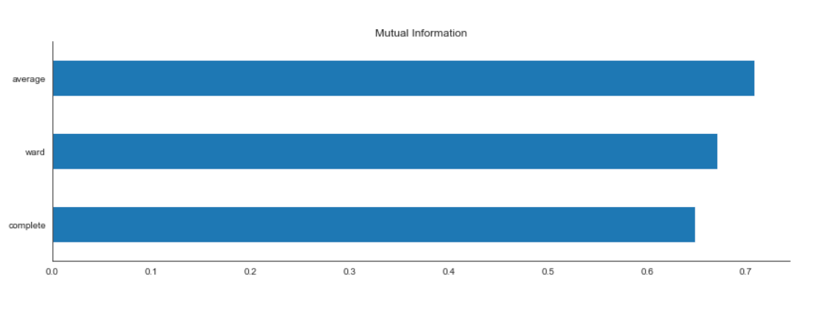
This small block takes the precomputed mutual information scores and turns them into a concise visual ranking that you can use when interpreting or selecting features for downstream unsupervised pattern discovery. First, the raw mutual_info object (which could be a list, array, or mapping of feature → score) is wrapped in a pandas Series so that each score is associated with a feature label. Converting to a Series gives us convenient indexing, sorting, and plotting semantics that preserve feature names on the axis and makes further manipulation trivial.
Next the Series is sorted with sort_values(). The sorting is intentional: ordering scores makes it trivial to see which features convey the most information relative to whatever signal the mutual information was computed against (for example cluster labels produced by a clustering pass, or another derived target). Sorting produces a monotonic axis so the eye can quickly compare relative importance and you can set explicit cutoffs (e.g., choose top-k features) based on that visual ordering. Note that sort_values defaults to ascending; if your goal is to display the highest-information features at the top, you would pass ascending=False.
The sorted Series is then plotted as a horizontal bar chart via plot.barh(…). A horizontal layout is chosen because feature names are often long in market data (tickers, technical indicator names, etc.), and horizontal bars allow labels to remain readable without truncation; they also make it easy to compare lengths when you have many features. The figsize argument provides enough horizontal space for long labels and prevents overlap, while the title communicates exactly what the metric is (mutual information), which is important for reproducibility and interpreting results later.
The return value of the plotting call is assigned to ax, the matplotlib Axes, which you can programmatically tweak afterwards if you need to (e.g., add annotations, change tick formatting, or save at a specific DPI). After plotting, sns.despine() is called to remove the top and right spines. This is an aesthetic but purposeful choice: it reduces visual clutter and focuses attention on the bars themselves, which is especially useful when presenting feature importance in a report or dashboard.
Finally, plt.tight_layout() adjusts subplot parameters so titles, labels and tick names don’t overlap or get clipped. That avoids a common presentation problem where long feature names or the figure title get truncated, ensuring the chart is usable as-is for analysis or inclusion in documentation.
Overall, this sequence converts numeric mutual-information outputs into a clean, sorted visualization that supports two core tasks in unsupervised market pattern discovery: 1) quickly identifying which features drive the discovered structure (so you can interpret clusters or patterns), and 2) informing feature selection or dimensionality-reduction decisions for subsequent modeling.
Gaussian mixture models
Gaussian mixture models (GMMs) are a generative modeling approach that assumes the data were produced by a mixture of multivariate normal distributions. The algorithm estimates the mean vectors and covariance matrices of those component distributions.
GMMs generalize the k-means algorithm by incorporating feature covariances, allowing clusters to take ellipsoidal shapes rather than spherical ones. Cluster centers correspond to the component means, and GMMs perform soft assignments: each data point has a probability of belonging to each cluster.
Expectation–Maximization Algorithm
Gaussian Mixture Models (GMMs) use the Expectation–Maximization (EM) algorithm to identify the components of a mixture of Gaussian distributions. The objective is to estimate the mixture parameters from unlabeled data.
The algorithm proceeds iteratively as follows:
1. Initialization: Choose initial parameters (for example, random centroids or results from K‑Means).
2. Repeat until convergence (e.g., when changes in assignments fall below a threshold):
1. Expectation step: Compute soft assignments — the probability that each data point was generated by each component.
2. Maximization step: Update the parameters of the Gaussian components to maximize the likelihood given the current soft assignments.
features = iris.feature_names
data = pd.DataFrame(data=np.column_stack([iris.data, iris.target]),
                    columns=features + [’label’])
data.label = data.label.astype(int)
data.info()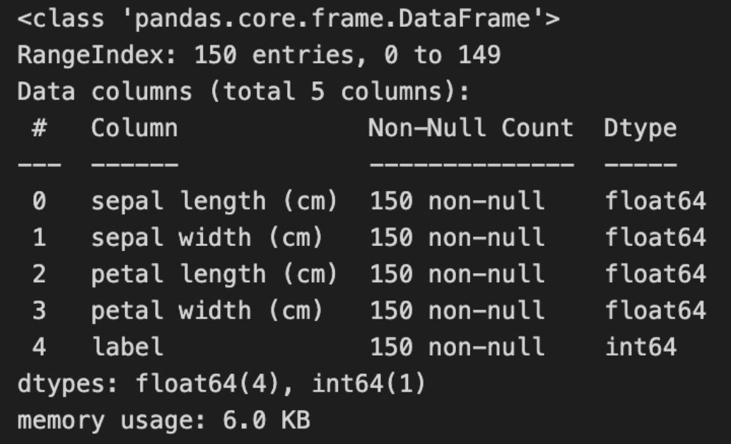
This block builds a tidy, inspectable table that pairs the raw feature vectors with their known class labels so you can both run unsupervised routines and later evaluate or visualize results against ground truth. It starts by taking the list of feature names from the dataset metadata, then horizontally concatenates the feature matrix and the target vector into one 2-D array. The column_stack step ensures that each row still corresponds to the same sample — features followed by its label — producing an array shaped (n_samples, n_features + 1). Creating a pandas DataFrame around that array gives you a labelled, tabular representation (columns named with the original feature names plus a final “label” column), which is much more convenient for exploratory work, grouping, plotting, and selectively passing only feature columns into clustering algorithms.
Casting the label column to integer is an intentional data hygiene step: many dataset loaders represent targets as floats, which can complicate categorical operations, plotting color maps, group-by keys, or external clustering metrics that expect discrete class identifiers. Converting to int makes the label unambiguous as a categorical identifier for downstream evaluation (e.g., computing adjusted rand index, confusion matrices, or coloring clusters in visualizations). Note the important operational discipline here: although the labels are attached to the DataFrame for convenience, they should be excluded from the feature matrix you feed into unsupervised algorithms — they exist solely so you can validate or interpret discovered patterns against known classes.
Finally, calling data.info() is a quick validation checkpoint. It confirms the number of rows and columns, shows dtypes (so you can verify that feature columns are numeric and label is integer), and reveals non-null counts and memory usage. This helps you decide whether preprocessing is needed (imputation for missing values, type conversion, or normalization/scaling before clustering) and gives immediate confidence that the assembled dataset is structurally ready for the next steps in your unsupervised market-pattern discovery and clustering workflow.
scaler = StandardScaler()
features_standardized = scaler.fit_transform(data[features])
n = len(data)
This block standardizes the selected feature columns and captures the number of rows in the dataset. The StandardScaler is instantiated to compute per-feature means and standard deviations; calling fit_transform on data[features] both fits those statistics to the current dataset and immediately applies the transformation, producing an array in which each feature has zero mean and unit variance. The result is a dense numeric matrix (shape: samples × features) ready for downstream unsupervised methods.
We standardize here because distance- and variance-sensitive algorithms (k-means, hierarchical clustering, PCA, Gaussian mixtures) assume comparable feature scales. Without this step, a price series with large absolute values or a volatility metric with a large spread would dominate Euclidean distances and principal components, biasing the discovered market patterns toward scale effects instead of genuine structural relationships. Standardization also improves numerical conditioning and, for iterative methods like k-means, typically speeds up convergence. Note the practical caveats: StandardScaler uses the empirical mean and standard deviation, so it is sensitive to outliers and to non‑stationarity across time windows; if your features contain extreme outliers or heavy tails you may prefer RobustScaler or a log transform, and if you will evaluate on new data you should fit the scaler on training data only to avoid leakage. Also ensure missing values are handled before calling fit_transform.
Finally, n = len(data) captures the sample count for later steps — this is used to size arrays, allocate cluster label containers, iterate windows, or compute aggregate statistics (cluster sizes, silhouette calculations, sampling rates). Because fit_transform returns a numpy array, you may want to reattach column names (e.g., convert back to a DataFrame) if downstream code relies on feature labels for interpretation of clusters or components.
Dimensionality Reduction for Cluster Visualization
pca = PCA(n_components=2)
features_2D = pca.fit_transform(features_standardized)
This pair of statements constructs and applies a Principal Component Analysis (PCA) transform to your preprocessed market feature matrix, reducing its dimensionality to two orthogonal axes. Concretely, PCA(n_components=2) configures the transform to keep the two principal directions that capture the largest portions of variance in the input; fit_transform then computes those directions from features_standardized (by estimating the covariance structure and extracting the leading eigenvectors) and projects the original high-dimensional samples onto that two-dimensional subspace, returning a (n_samples, 2) array in features_2D. Using fit_transform here both fits the PCA model to the dataset and immediately applies that fitted linear projection to produce the low-dimensional representation.
We do this because, for unsupervised market-pattern discovery, we want a compact representation that preserves the dominant signals while discarding lower-variance noise and redundant correlations. PCA finds orthogonal axes that maximize variance, so the first two components summarize the strongest linear patterns across instruments, time windows, or engineered features; reducing to two dimensions is commonly used to enable visualization and to make downstream clustering (e.g., KMeans, DBSCAN) more robust and computationally efficient. Because you passed standardized inputs, the algorithm treats each original feature on a comparable scale and the implicit centering PCA performs won’t be biased by scale differences — this is crucial for market data where magnitude differences across indicators would otherwise skew the principal directions.
There are practical consequences to be aware of: the resulting features_2D are uncorrelated linear combinations of the originals, which improves the behavior of distance-based clusterers and reduces the curse of dimensionality, but PCA is linear and cannot capture nonlinear manifold structure, so clusters driven by complex interactions may be blurred. Also verify how much variance the two components explain (pca.explained_variance_ratio_) — if it’s small, you may lose important information by truncating at two components and should consider more components or nonlinear techniques (t-SNE, UMAP, kernel PCA). Finally, because fit_transform fits the projection to this dataset, persist the fitted PCA object (pca) and use pca.transform(…) for any new or validation data to ensure consistent projections when you apply clustering or interpret component loadings to link back to market factors.
ev1, ev2 = pca.explained_variance_ratio_
ax = plt.figure(figsize=(10, 6)).gca(title=’2D Projection’,
                                     xlabel=f’Explained Variance: {ev1:.2%}’,
                                     ylabel=f’Explained Variance: {ev2:.2%}’)
ax.scatter(*features_2D.T, c=data.label, s=15, cmap=cmap)
ax.set_xticklabels([])
ax.set_xticks([])
sns.despine()
plt.tight_layout();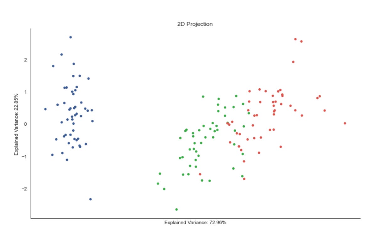
The first line pulls the two explained-variance ratios out of the fitted PCA model; these numbers quantify how much of the original data variance each of the first two principal components captures. We extract them so the visualization can communicate fidelity of the 2D projection — if these percentages are small, the scatter will be a lossy summary of the high-dimensional market signals, and we should be cautious about over-interpreting apparent clusters.
Next we create an axes object and immediately decorate it: the title “2D Projection” positions the plot in its role as a dimensionality-reduction view, while the x- and y-axis labels are set to the individual explained-variance percentages (formatted as percentages). Labeling the axes with per-component explained variance (rather than raw axis names) signals to the reader how much signal each plotted axis carries, which is critical when judging whether separation in the plot likely reflects true structure in the full feature space versus projection artifacts.
The core visual is the scatter call, which places the 2D PCA coordinates (features_2D) on the plot and colors each point by data.label. In our unsupervised market-pattern workflow, data.label will typically be a clustering assignment or some categorical tag inferred from the algorithm; coloring by that label lets you visually validate cluster cohesion and separation in the reduced space. The point size and chosen colormap control readability and categorical contrast; these are practical choices to make dense market-day or instrument-level points distinguishable without overwhelming the figure.
Finally, the remaining commands are purely presentation cleanups: the x-axis ticks and labels are removed to reduce visual clutter (we already convey axis meaning via the explained-variance labels), seaborn.despine removes the top/right spines to produce a cleaner, publication-ready look, and tight_layout ensures the title/labels don’t overlap the figure boundaries. Together these choices prioritize clear visual assessment of cluster structure over showing raw numeric axis ticks — a deliberate trade-off when the goal is qualitative pattern discovery rather than precise axis-value interpretation.
Perform Gaussian Mixture Model (GMM) Clustering
n_components = 3
gmm = GaussianMixture(n_components=n_components)
gmm.fit(features_standardized)
This three-line block is the moment we turn preprocessed market features into a statistical model of latent market regimes. By setting n_components = 3 we are telling the algorithm to explain the observed feature distribution as a mixture of three Gaussian-distributed subpopulations; creating GaussianMixture(…) builds an expectation-maximization (EM) model that will estimate the parameters (component weights, means, covariances) for those subpopulations; calling gmm.fit(features_standardized) runs the EM optimization on the standardized feature matrix so the model parameters are learned from the data. In short: the code instantiates a probabilistic clustering model and fits it to your currently normalized market features, producing a compact, parametric description of three recurring pattern-types present in the data.
The “how” is EM: during fit the algorithm alternates between computing responsibilities (E-step) — the posterior probability each data point came from every Gaussian component — and updating the component parameters to maximize the expected complete-data likelihood (M-step). That process yields component means (centroids in feature space), covariance matrices (shape and orientation, which capture intra-cluster variance and correlations), and mixture weights (relative prevalence of each regime). Because the model is probabilistic, each observation receives soft assignments (probabilities) rather than a hard label; this is important for market regime work where transitions and mixed states are common.
The choice to use features_standardized is deliberate: standardization puts features on comparable scales so no single feature with large numeric range disproportionately drives the likelihood updates or distorts the estimated covariances. Standardized inputs also improve numerical stability of the covariance estimates and convergence behavior of EM. Selecting n_components = 3 is a modeling decision — three regimes might map to intuitive market states (e.g., trending up, trending down, and sideways), but it’s not sacred; in practice you should validate component count using information criteria (BIC/AIC), cross-validation, or domain knowledge, and consider multiple random initializations to avoid local optima.
What you get from fit are interpretable model objects: component means describe prototypical feature vectors for each discovered market pattern, covariances reveal typical within-regime variability and co-movement structure, and posterior probabilities (responsibilities or score_samples/predict_proba) let you track regime membership over time. Those outputs can drive downstream tasks — cluster-based signal generation, regime-aware risk models, anomaly detection when probability under all components is low, or clustering visualizations. The soft probabilities are particularly useful for detecting regime transitions and for weighting strategies probabilistically rather than making brittle hard switches.
Finally, some practical caveats: EM can converge to local maxima so run multiple initializations or set random_state for reproducibility; consider reg_covar or tying covariances if singularities appear; choose covariance_type (full, tied, diag, spherical) according to data volume and interpretability needs; and remember to fit on an appropriate training window and then apply predict/predict_proba to out-of-sample data to avoid lookahead. All of these choices affect how faithfully the GMM captures meaningful market patterns versus fitting noise.
data[’clusters’] = gmm.predict(features_standardized)

labels, clusters = data.label, data.clusters
mi = adjusted_mutual_info_score(labels, clusters)
First, the code asks the fitted Gaussian Mixture Model (GMM) to assign each observation to a cluster by calling predict on the standardized feature matrix. Internally the GMM computes the posterior responsibility of each Gaussian component for every sample and then converts those soft responsibilities into a hard assignment by picking the component with the largest posterior probability. We store those hard cluster ids back into the dataframe so each row carries both its original attributes and the cluster identity; this makes it straightforward to slice, aggregate, or visualize discovered market patterns downstream.
Using standardized features here is critical to why the assignments are meaningful: standardization equalizes scale across input dimensions so the GMM’s covariance-based distance calculations aren’t dominated by any single feature. The reason for choosing a GMM rather than a simple k-means is also relevant to the business goal — markets often exhibit multimodal, anisotropic (elliptical) clusters and heteroskedasticity across dimensions; a GMM models component covariances explicitly and can therefore capture such structure that would be lost with spherical assumptions.
Next, the code extracts the reference labels (labels) and the predicted cluster ids (clusters) and computes the adjusted mutual information (AMI) between them. AMI measures the agreement between two labelings while correcting for agreement that can happen by chance and is invariant to arbitrary relabeling of clusters, which is important because cluster ids themselves carry no semantic meaning. We use AMI here to quantify how well the unsupervised clusters align with an external or surrogate labeling (for example, known regimes, sectors, or annotated events). A high AMI suggests the discovered patterns correspond to meaningful, preexisting categories; a low AMI suggests the model has found different structure or that the chosen features/GMM configuration aren’t capturing the expected signals.
A few practical implications follow from this flow: because predict returns hard assignments, you lose information about uncertainty — for market pattern discovery you often want to inspect predict_proba/responsibilities to find borderline or mixed-regime observations. Also, AMI is an external validation metric and only applies when you have a reference labeling; when you don’t, rely on internal diagnostics (BIC/AIC, silhouette, component covariances) and visual inspection of responsibilities. Finally, remember that the GMM’s assumptions (Gaussian components, number of components) and the preprocessing choices (standardization, feature selection) strongly affect both the cluster geometry and the AMI result, so use AMI together with model selection and uncertainty checks to iterate toward robust market-pattern clusters.
fig, axes = plt.subplots(ncols=2, figsize=(14, 6))

axes[0].scatter(*features_2D.T, c=data.label, s=25, cmap=cmap)
axes[0].set_title(’Original Data’)
axes[1].scatter(*features_2D.T, c=data.clusters, s=25, cmap=cmap)
axes[1].set_title(’Clusters | MI={:.2f}’.format(mi))

for ax in axes:
    ax.axes.get_xaxis().set_visible(False)
    ax.axes.get_yaxis().set_visible(False)

sns.despine()
fig.tight_layout()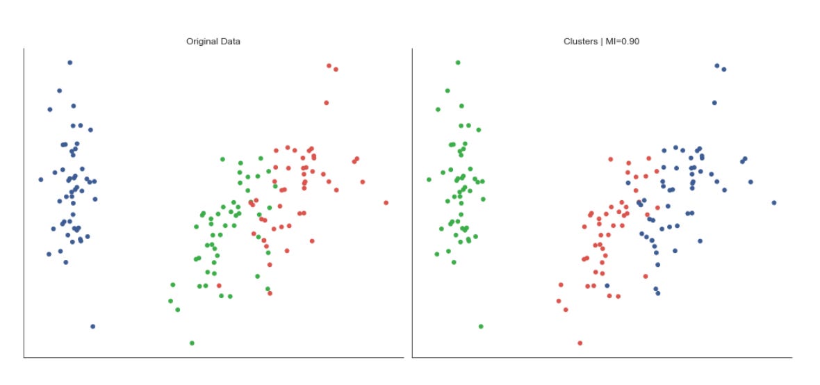
The code builds a compact visual diagnostic to compare the 2‑D embedding of market data with both the ground truth (or original labels) and the clusters discovered by the unsupervised algorithm. First it creates a two‑column figure so we can see the two projections side‑by‑side; the figure size is chosen to give each scatter plot enough room for point density and color differentiation. The scatter calls take the 2‑D features (unpacked by transposing) as x and y coordinates and use a color array to paint each point: the left plot colors points by data.label (the reference or known regime/segment assignment) and the right plot colors by data.clusters (the assignments produced by the clustering pipeline). Using the same colormap for both plots keeps color semantics consistent so you can quickly judge whether cluster IDs align visually with known labels.
The right subplot’s title also renders a formatted MI value (mutual information), which provides a quantitative complement to the visual comparison: while the scatterplots let you inspect shape, overlap, and spatial separation of groups, the MI summarizes how much information the discovered clusters share with the labels, helping you detect whether the clustering captures meaningful market structure. The fixed marker size (s=25) is an aesthetic choice to balance visibility against overplotting; pick a different size when point density changes.
Finally, the code suppresses axis ticks/labels and removes the seaborn plot spines to emphasize the spatial relationships and color groupings rather than absolute coordinates or axis framing. That visual simplification makes it easier to spot patterns like well separated regimes, blended boundaries, or systematic misalignments between labels and clusters — insights that directly inform whether the current feature extraction, embedding, or clustering steps are producing useful market patterns. Tight layout is applied last to prevent overlapping titles and ensure the two panels render cleanly.
Visualizing Gaussian Distributions
The figures below display Gaussian Mixture Model (GMM) cluster membership probabilities for the Iris dataset, represented as contour lines:
xmin, ymin = features_2D.min(axis=0)
xmax, ymax = features_2D.max(axis=0)

x = np.linspace(xmin, xmax, 500)
y = np.linspace(ymin, ymax, 500)
X, Y = np.meshgrid(x, y)

simulated_2D = np.column_stack([np.ravel(X), np.ravel(Y)])
simulated_4D = pca.inverse_transform(simulated_2D)
Z = atleast_2d(np.clip(np.exp(gmm.score_samples(simulated_4D)), a_min=0, a_max=1)).reshape(X.shape)
This block builds a regular 2D sampling grid in the PCA-reduced space, maps those grid points back into the original feature space, asks the trained Gaussian Mixture Model (GMM) how likely each reconstructed point is, and then reshapes those likelihoods back into the grid form so they can be visualized as a density surface over the 2D projection. Concretely, the code first finds the minimum and maximum coordinates of the data in the 2D projection (xmin/ymin, xmax/ymax) so the grid covers exactly the range of observed latent points; that ensures the visualization focuses on the region of interest rather than empty space. It then creates 500 evenly spaced samples along each axis and makes an X,Y meshgrid — 500×500 is a resolution choice that balances spatial detail against compute cost.
Next, the meshgrid is flattened into an N×2 array (one row per grid location) and passed through pca.inverse_transform to reconstruct each 2D latent coordinate back into the original 4D feature space. This inverse mapping is necessary because the GMM density was evaluated in the original feature space (or was trained there): the model’s parameters and covariance structure live in that space, so scoring must happen there to get meaningful likelihoods that reflect the original market-feature geometry.
GMM.score_samples returns log probability densities for each reconstructed sample; np.exp converts those log-densities into actual density values. The code then clips those densities to the interval [0,1] — a pragmatic step to avoid extreme values dominating a visualization and to guarantee non-negative finite values for plotting. Finally, atleast_2d and reshape restore the 2D grid shape so Z aligns with X and Y for contour/heatmap plotting. The resulting Z surface highlights high-likelihood regions in the PCA plane, which correspond to frequently occurring market patterns (clusters) in the original feature space and so supports unsupervised pattern discovery and cluster delineation.
A couple of practical notes implicit in these choices: sampling at the PCA bounds keeps the visualization faithful to observed data; inverse_transform ensures the GMM is evaluated in the same coordinate system it was trained on; and clipping/reshaping are visualization-friendly adjustments — if you need rigorous probability scaling rather than display-friendly values, consider normalizing by the max density or working in log-space instead of hard clipping.
fig, ax = plt.subplots(figsize=(14, 8))

CS = ax.contour(X, Y, Z,
                cmap=’RdBu_r’,
                alpha=.8)
CB = plt.colorbar(CS, shrink=0.8)
ax.scatter(*features_2D.T, c=data.label, s=25, cmap=cmap)

ax.axes.get_xaxis().set_visible(False)
ax.axes.get_yaxis().set_visible(False)
sns.despine()
fig.tight_layout()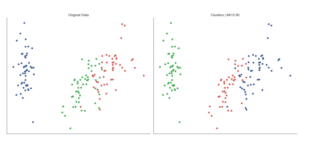
This block builds a single, publication-ready visualization that overlays a continuous landscape (Z evaluated on the grid X,Y) with the projected datapoints and their cluster assignments, so you can inspect how the learned structure corresponds to individual market observations. The figure size is set widescreen to give room for contours and points to breathe; the contour call draws level sets of Z using a diverging colormap and a slight alpha so the underlying points remain visible. Contours are useful here because they make level sets and ridges apparent — for example, peaks of a density estimate or high-score regions from a model — which helps you spot regions that correspond to recurring market patterns or decision boundaries between clusters.
The colorbar that follows maps those contour levels to numeric values, making the landscape interpretable (you can read off whether a contour corresponds to a high-density region, a high score, or a trough). Shrinking the colorbar keeps it visually proportional to the main plot without dominating the layout. On top of the continuous field we scatter the 2D projections of the original feature vectors; coloring the points by data.label shows cluster membership directly in the same spatial frame as the landscape, so you can assess whether clusters align with peaks, valleys, or separatrices in Z. The chosen point size and colormap usage are deliberate trade-offs: large enough to be seen, small enough not to obscure contour detail, and using a consistent colormap conceptually ties label color to cluster identity.
Finally, the plot is decluttered for pattern-focused inspection: axis ticks are hidden and seaborn’s despine removes extraneous borders so the eye is drawn to spatial relationships rather than numeric axes, and tight_layout ensures labels, colorbar, and plot elements don’t overlap. In the context of unsupervised market pattern discovery and clustering, this visualization lets you validate that the continuous objective you’re visualizing (density, cluster score, decision function) corresponds to discrete cluster assignments, revealing whether clusters capture meaningful modes in the market data or whether the clustering should be adjusted (different projection, bandwidth, or clustering hyperparameters).
fig = plt.figure(figsize=(14, 6))
ax = fig.gca(projection=’3d’)

CS = ax.contourf3D(X, Y, Z, cmap=’RdBu_r’, alpha=.5)
CB = plt.colorbar(CS, shrink=0.8)

ax.scatter(*features_2D.T, c=data.label, s=25, cmap=cmap)
fig.tight_layout()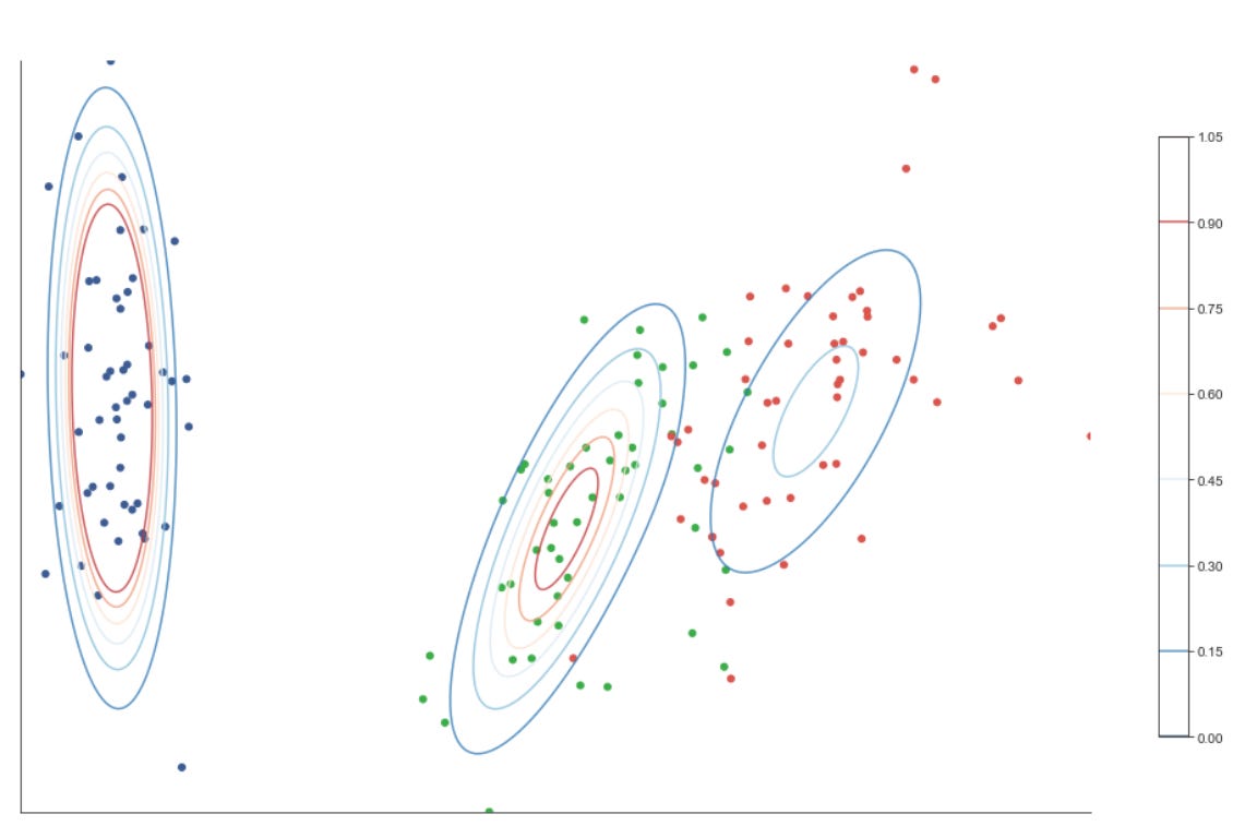
This block builds a single 3D diagnostic figure that juxtaposes a continuous scalar field (the Z surface) with your labeled sample points so you can visually evaluate how discovered market patterns and cluster assignments align with the underlying learned landscape.
First we create a 3D plotting context (fig + ax) so everything that follows is rendered in three dimensions. The contourf3D call then paints a filled, continuous surface over the grid defined by X and Y with height or score given by Z. Practically, Z is typically a scalar function that summarizes something meaningful for pattern discovery — for example a kernel density estimate, a cluster-affinity/score surface, a dimensionality-reduction embedding’s third axis, or model decision values — and contourf3D makes regions of similar value visually obvious. The use of the diverging “RdBu_r” colormap and alpha=0.5 is intentional: the diverging map highlights sign/contrast in the scalar field (useful when Z encodes positive vs negative evidence), and the semi-transparency ensures the surface does not completely occlude the sample points you will plot on top.
We immediately attach a colorbar to that contour set so the color-to-value mapping is explicit; the returned CS object is what the colorbar uses to scale ticks and colors. The shrink parameter reduces the colorbar’s footprint to keep the layout balanced in the combined figure area.
Next we overlay the empirical points with ax.scatter. The unpacking of features_2D.T supplies coordinate columns to the 3D scatter call, and c=data.label colors each point according to its cluster or pattern label produced by your unsupervised algorithm. This overlay is the key interpretive step: by comparing where labeled points lie relative to contours of Z, you can assess whether cluster boundaries or high-density regions in the scalar field correspond to the algorithm’s labels — a direct visual check for coherence of discovered market regimes or pattern clusters. The choice of point size (s=25) and a separate cmap for the labels balances visibility and avoids overwhelming the contour surface.
Finally, fig.tight_layout() tidies spacing so axis labels, the colorbar and the plot area do not overlap. A couple of practical notes: ensure the dimensionality of features_2D matches the 3D axes (if you truly have only two features you must choose a z coordinate or project into 3D first), and be mindful whether data.label is categorical or continuous — pick a colormap and normalization that reflect that (discrete colors for cluster ids, continuous for scores). Overall, this visualization is designed to help you validate and interpret unsupervised market pattern discovery by showing how model-derived scalar fields and sample-level cluster assignments relate spatially.
Bayesian information criterion
Because we are looking for the minimum value, two clusters are the preferred solution, with three clusters a close runner-up; however, this can vary depending on the random sample.
bic = {}
for n_components in range(2, 8):
    gmm = GaussianMixture(n_components=n_components)
    gmm.fit(features_standardized)
    bic[n_components] = gmm.bic(features_standardized)
pd.Series(bic)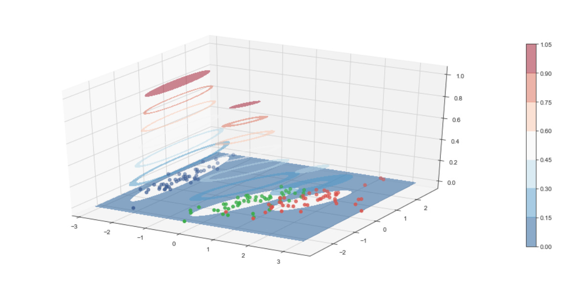
This block is performing model selection for a Gaussian Mixture Model (GMM) by sweeping through a small range of candidate cluster counts and recording the Bayesian Information Criterion (BIC) for each. The data flow is straightforward: you take the preprocessed feature matrix features_standardized, instantiate a GMM with a candidate number of components, fit the model to the standardized features so the algorithm estimates means, covariances and mixture weights, and then evaluate that fitted model with gmm.bic(…) to produce a scalar score. Each score is stored keyed by its n_components and finally converted to a pandas Series so you can quickly inspect or plot the BIC as a function of component count.
Why do we do this? BIC provides a trade-off between model fit (log-likelihood) and model complexity (number of free parameters); it is essentially -2 * log-likelihood + penalty, where the penalty grows with the number of parameters and with log(N) (N = number of observations). Using BIC helps avoid overfitting by preferring simpler mixture models unless additional components give a sufficiently better likelihood. In the context of unsupervised market pattern discovery, that means you are searching for the number of latent market regimes or pattern clusters that explains the data well without inventing spurious clusters driven by noise.
There are important reasons behind some implicit choices here. The code uses features_standardized: standardization ensures features contribute comparably to the covariance estimates and prevents variables on larger scales from dominating cluster shapes. The loop range (2–7) constrains the search to a small, interpretable set of candidate cluster counts; in practice you pick a range based on domain knowledge (e.g., a plausible number of market regimes) and computational budget. Note also that sklearn’s GaussianMixture has defaults (covariance_type=’full’, a single initialization unless you change n_init, unspecified random_state), so fitting may converge to different local optima if you rerun; for stable model selection you should run multiple initializations, set random_state for reproducibility, and check convergence diagnostics (gmm.converged_, gmm.lower_bound_).
Finally, interpret the results thoughtfully. A lower BIC indicates a preferred model, so you typically pick the n_components with the minimum BIC and then refit a final GMM (with more n_init or adjusted covariance_type) to produce posterior probabilities or hard cluster assignments for downstream analysis. Keep in mind BIC’s bias toward parsimony (it penalizes complexity more strongly than AIC), its dependence on sample size (the log(N) term), and limitations in high dimensions where covariance estimation becomes noisy — in those cases consider regularizing covariances, using diagonal covariance, dimensionality reduction before clustering, or complementary validation methods (held-out likelihood, stability across subsamples, or domain-driven checks of cluster interpretability). These steps help ensure the chosen mixture model yields robust, actionable market pattern clusters rather than artifacts of model parameterization or noisy features.
Density-Based Clustering
features = iris.feature_names
data = pd.DataFrame(data=np.column_stack([iris.data,
                                          iris.target]),
                    columns=features + [’label’])
data.label = data.label.astype(int)
data.info()
First we capture the human-readable feature names in features so we can keep column semantics when we move numeric arrays into a table. Next, np.column_stack is used to concatenate the feature matrix and the target vector horizontally into a single 2‑D array; this guarantees the rows remain aligned (each row is one observation with its features followed by its label). That stacked array is passed into a pandas DataFrame with columns set to features + [‘label’], which makes the last column explicitly named “label” rather than leaving it as an anonymous array column — this name is important for downstream bookkeeping (e.g., when we want to exclude the label during unsupervised model fitting or reference it for evaluation).
The explicit cast data.label = data.label.astype(int) converts the target values from whatever numeric type they came in (often floats from scikit‑learn datasets) into integer class IDs. We do this because class identifiers are discrete categories; using integer types avoids surprises in later code that expects categorical or integer labels for grouping, evaluation metrics, or plotting. Importantly, in an unsupervised workflow you should keep this label only for validation and diagnostics (e.g., computing adjusted rand index or visualizing cluster purity) and not feed it into clustering as a feature — otherwise you introduce label leakage.
Finally, calling data.info() is a schema and sanity check: it prints row/column counts, non‑null counts and dtypes so you can confirm there are no missing values, that feature columns are numeric, and that the label column is now an integer type. In the context of unsupervised market pattern discovery and clustering, these steps establish a clear, labeled tabular dataset where feature semantics are preserved and the label is available for downstream evaluation while being kept logically separable from the unsupervised modeling pipeline.
Dimensionality reduction for visualizing clusters
pca = PCA(n_components=2)
features_2D = pca.fit_transform(features_standardized)
This block takes your standardized market feature matrix and projects it down into a low-dimensional space that captures the dominant directions of variance. By calling PCA(n_components=2) and then pca.fit_transform(features_standardized), we first fit a principal component model to the standardized data (computing orthogonal directions — via SVD — that explain decreasing amounts of variance) and then immediately project each sample onto the top two of those directions. Practically, the data flow is: features_standardized (assumed zero-mean, unit-variance per feature) -> PCA fit (learns the two basis vectors that capture the most variance) -> transformed output features_2D (each row is the original sample expressed as a 2D coordinate in the principal-component space).
We choose standardized inputs because PCA is variance-driven and sensitive to scale: without standardization, high-variance features would dominate the principal components irrespective of their economic importance. Picking n_components=2 is primarily a decision for interpretability and visualization — reducing to two dimensions lets us plot market patterns and visually inspect cluster structure — and also simplifies downstream clustering by reducing noise and the curse of dimensionality. The components themselves are linear combinations of the original features (the loadings), so they can be inspected to understand which original features drive the axes of variation; this helps connect discovered clusters back to market behaviors.
Be aware of the method’s assumptions and operational implications: PCA is a linear, variance-maximizing transform, so it will miss nonlinear structure and is sensitive to outliers; it also compresses information, so two components may not preserve all cluster-relevant signals. For robust pipelines, fit the PCA on your training/analysis window and reuse pca.transform for new data (don’t refit if you need consistent projections). Check pca.explained_variance_ratio_ to quantify how much information those two dimensions retain, consider more components or nonlinear alternatives (t-SNE/UMAP) if clustering or pattern separation is poor, and inspect loadings to interpret what market features the principal axes represent.
ev1, ev2 = pca.explained_variance_ratio_
ax = plt.figure(figsize=(10, 6)).gca(title=’2D Projection’,
                      xlabel=f’Explained Variance: {ev1:.2%}’,
                      ylabel=f’Explained Variance: {ev2:.2%}’)
ax.scatter(*features_2D.T, c=data.label, s=25, cmap=cmap)
ax.set_xticklabels([])
ax.set_xticks([])
ax.set_yticklabels([])
ax.set_yticks([])
sns.despine()
plt.tight_layout();
First we read off the fraction of total variance explained by the first two principal components with pca.explained_variance_ratio_. Assigning those to ev1 and ev2 is a deliberate choice: these two numbers quantify how much of the original market-data variability is captured by the 2D projection. Knowing these proportions is important because they set expectations about how faithful the scatter plot will be as a summary of the high-dimensional structure — if ev1+ev2 is low, cluster separations in 2D can be misleading.
Next we create the plotting canvas and annotate the two axes with those explained-variance values. Putting ev1 and ev2 into the axis labels (formatted as percentages) makes the plot self-describing: a reader can immediately judge whether the visualization is representing a large or modest slice of the original variance. That choice supports the overall goal of unsupervised market-pattern discovery by making it explicit how much information we have preserved when compressing to two dimensions.
The core visual step is the scatter call. features_2D is the 2D embedding of each sample (typically the first two PCA components), and using the unpacked transpose as arguments supplies the x and y coordinates for each market snapshot. Coloring points by data.label maps cluster membership (or any unsupervised label) to color, so we can visually validate whether the clustering algorithm found coherent groups and whether those groups separate cleanly in the principal-component space. The size and colormap choices are purely visual parameters but matter for readability when there are many points or when some clusters are small.
Finally, the code tidies the presentation: removing ticks and tick labels and calling sns.despine produces a minimalist, publication-style figure that focuses attention on cluster structure rather than axis ticks. plt.tight_layout() ensures labels and the figure don’t overlap or get clipped. Be mindful of trade-offs here: removing ticks improves aesthetics for pattern inspection, but if you need to reason about absolute coordinate values or reproduce distances, keeping axis scales or adding a grid may be preferable.
In practice, use the explained-variance numbers and this plot together as a diagnostic. If ev1+ev2 is high, separations you see are likely meaningful; if it’s low, consider inspecting higher-dimensional cluster metrics (silhouette, pairwise distances, or cluster projections on multiple component pairs) or alternative dimensionality reductions (e.g., t-SNE/UMAP) before drawing conclusions about market regimes. Also guard against a runtime assumption here: the code assumes at least two PCA components exist — validate that upstream when you compute PCA.
Execute DBSCAN Clustering
Density-based spatial clustering of applications with noise (DBSCAN) was developed in 1996 and received the KDD Test of Time Award in 2014 in recognition of the attention it has received in both theory and practice.
DBSCAN distinguishes core and non-core samples. Core samples can extend a cluster, while non-core samples are assigned to a cluster but do not have enough nearby neighbors to further grow it. All other samples are treated as noise (outliers) and are not assigned to any cluster.
The algorithm uses two parameters: `eps` (the neighborhood radius) and `min_samples` (the minimum number of points required for a core sample). DBSCAN is deterministic and produces exclusive clusters. It has difficulty handling clusters with varying density and high-dimensional data, and tuning `eps` and `min_samples` can be challenging because the required density often varies across a dataset.
clusterer = DBSCAN()
data[’clusters’] = clusterer.fit_predict(features_standardized)
fig, axes = plt.subplots(ncols=2,
                         figsize=(14, 6))

labels, clusters = data.label, data.clusters
mi = adjusted_mutual_info_score(labels, clusters)

axes[0].scatter(*features_2D.T, c=data.label, s=25, cmap=cmap)
axes[0].set_title(’Original Data’)
axes[1].scatter(*features_2D.T, c=data.clusters, s=25, cmap=cmap)
axes[1].set_title(’Clusters | MI={:.2f}’.format(mi))

for ax in axes:
    ax.axes.get_xaxis().set_visible(False)
    ax.axes.get_yaxis().set_visible(False)
sns.despine()
fig.tight_layout()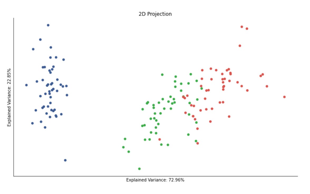
This block is performing an unsupervised clustering step with a visual evaluation against some reference labels, and it’s organized to make both the algorithmic decision and its visual outcome explicit. First, DBSCAN is instantiated and immediately used to cluster the standardized feature matrix; fit_predict both fits the density-based model and returns a cluster assignment for each sample, which is saved back into the dataframe as data[‘clusters’]. The choice to run DBSCAN on features_standardized is intentional: DBSCAN’s neighborhood and distance computations are sensitive to feature scale, so standardization equalizes feature variances and prevents any single high-variance feature from dominating the distance metric. Note also that DBSCAN can mark samples as noise with a label of -1, which is important for market pattern discovery because it naturally separates rare or anomalous market behaviors from denser, repeated patterns.
Next, the code prepares a two-panel figure to juxtapose the original labeling and the DBSCAN-derived clusters. The labels variable is taken from data.label (these might be expert-driven categories, known regimes, or a heuristic grouping) while clusters are the unsupervised assignments. Adjusted mutual information (AMI) is computed between those two arrays to quantify agreement: AMI is permutation-invariant and corrected for chance, so it’s a robust summary of whether DBSCAN recovered structure similar to the reference labels beyond what random assignment would produce. Including that MI score in the plot title gives a quick, interpretable metric of clustering quality without relying on label ordering.
For visualization, the code scatters a 2D projection of the features (features_2D) twice — left colored by the original labels and right colored by the DBSCAN clusters — so you can visually compare spatial structure and how the algorithm partitioned the projection. Using a consistent colormap and marker size across both subplots ensures the comparison focuses on cluster assignment changes rather than aesthetic differences. It’s important to remember that the 2D projection is only a visualization aid; DBSCAN operated in the standardized (likely higher-dimensional) feature space, so some discrepancies between projected appearance and cluster assignments are expected.
Finally, the plotting details (hiding axes, removing spines, tight layout) are purely for readability: removing tick marks and spines reduces non-essential clutter so the eye focuses on the pattern of colors and the MI score. Practically, this block is a quick experimental loop in an unsupervised market-pattern discovery workflow: standardize features, run a density-based clustering that can identify both dense regimes and outliers, measure agreement with any available labels using AMI, and visualize the results in 2D to guide further tuning (e.g., adjusting DBSCAN’s eps/min_samples, changing feature transforms or projection method).
Compare Parameter Settings
eps_range = np.arange(.2, .91, .05)
min_samples_range = list(range(3, 10))
labels = data.label
mi = {}
for eps in eps_range:
    for min_samples in min_samples_range:
        clusterer = DBSCAN(eps=eps, min_samples=min_samples)
        clusters = clusterer.fit_predict(features_standardized)
        mi[(eps, min_samples)] = adjusted_mutual_info_score(clusters, labels)
This code is performing a small grid search over DBSCAN hyperparameters and recording how well each resulting clustering matches a set of reference labels. Conceptually the data flow is: take the standardized feature matrix, instantiate a DBSCAN model for a particular (eps, min_samples) pair, run fit_predict to produce cluster assignments (an integer label per sample, with -1 for noise), then compute the adjusted mutual information (AMI) between those cluster assignments and the supplied labels, and finally store that AMI score keyed by the hyperparameter pair. Repeating this for the eps and min_samples ranges builds a lookup (mi) that you can later query to pick the parameter combination that best recovers the reference labeling.
Why this exact sequence matters for market-pattern discovery: DBSCAN is a density-based clustering algorithm that identifies contiguous regions of similar behaviour without forcing every point into a cluster, so it is a good candidate when you expect irregular-shaped clusters or want to isolate “noise” behavior (e.g., transient market anomalies). The two DBSCAN knobs have concrete geometric meanings that directly affect the discovered market structures. eps is the radius used to define a point’s neighborhood; smaller eps finds only very tight, locally concentrated patterns, while larger eps merges broader regimes. min_samples sets the minimum neighborhood density required to call a point a core point and thereby form a stable cluster; raising it makes clusters require more support and reduces spurious small groups. Exploring eps from 0.2 to 0.9 (step 0.05) and min_samples from 3 to 9 scans a reasonable range from tight to loose neighborhoods and from small to modest cluster-size thresholds so you can observe how sensitive the discovered regimes are to those density parameters.
Two important implementation reasons underlie preprocessing and the scoring choice. First, you run DBSCAN on features_standardized: DBSCAN uses a distance metric directly, so standardizing features ensures eps has the same meaning across dimensions and that any feature with larger numeric scale does not dominate the neighborhood computation. Second, you evaluate clusters with adjusted_mutual_info_score against labels: AMI quantifies how much information the clustering and the reference labeling share while correcting for chance agreement and for differing numbers of clusters. Using AMI lets you compare parameter combinations objectively and choose hyperparameters that produce clusters most consistent with the reference patterns (for validation or tuning), rather than relying on raw label overlap that can be misleading when cluster counts differ.
Practical caveats and possible refinements: DBSCAN marks noise points as -1 and AMI will treat noise as an additional label, so if many points become noise you can get inflated or depressed scores depending on how the reference labels align with that noise assignment. If you don’t have reliable ground-truth labels (true in many unsupervised market tasks), you should instead consider internal quality metrics (silhouette, density-based scores) or domain-specific validations. The grid search here is brute-force and potentially expensive for larger grids or datasets; you can accelerate it with parallel evaluation, use a k-distance plot to pick a narrower eps window, or adaptively search (e.g., Bayesian optimization). Finally, once the mi dictionary is filled, the typical next step is to pick the (eps, min_samples) with the maximum AMI and inspect the corresponding clustering (including number/size of clusters and noise fraction) to ensure the chosen parameters produce economically meaningful market regimes, not just numerically high agreement.
results = pd.Series(mi)
results.index = pd.MultiIndex.from_tuples(results.index)
fig, axes = plt.subplots(figsize=(12, 6))
ax = sns.heatmap(results.unstack(),
                 annot=True,
                 fmt=’.2f’,
                 cmap=’Blues’)
ax.yaxis.set_major_formatter(ticker.FormatStrFormatter(’%0.2f’))
plt.tight_layout()
This block takes a collection of pairwise scores (mi) — typically mutual information values computed between market features, instruments, or time windows — and turns them into a readable matrix visualization so you can spot structural relationships that inform clustering or feature grouping.
First, results = pd.Series(mi) converts the raw mapping of pairs → score into a pandas Series so we can use pandas’ multi-index and reshaping utilities. The next line, results.index = pd.MultiIndex.from_tuples(results.index), ensures that those pair keys (which are tuples like (feature_a, feature_b)) become a true two-level index. This is important because the subsequent unstack operation expects a MultiIndex to pivot one level into columns; unstack is how we go from a long-form list of pairwise values into a 2D square matrix where rows and columns correspond to the same set of features.
We create a figure with a controlled size (fig, axes = plt.subplots(figsize=(12, 6))) so the matrix and annotations are legible for typical numbers of features. Then results.unstack() produces the 2D DataFrame that seaborn.heatmap consumes. The heatmap call uses annot=True and fmt=’.2f’ to draw the numeric values inside each cell rounded to two decimals, which makes it easier to inspect exact MI values for thresholding or debugging. The sequential ‘Blues’ colormap emphasizes magnitude (darker = stronger dependency), which helps reveal blocks or high-MI pockets that are candidates for clusters or combined features.
ax.yaxis.set_major_formatter(ticker.FormatStrFormatter(‘%0.2f’)) forces the y-axis tick labels to show the same two-decimal formatting as the annotations; this keeps axis labels compact and comparable to the cell values so you don’t get distracting long floats or inconsistent formatting. Finally, plt.tight_layout() adjusts spacing so labels, ticks, and the colorbar aren’t clipped.
Why this matters for unsupervised market-pattern discovery: the resulting heatmap is a quick, interpretable representation of pairwise dependence structure. Block-diagonal patterns or dense high-value regions point to groups of features that move together (useful for forming similarity graphs, affinity matrices, or selecting features for clustering). Conversely, sparsity or low MI suggests independence and candidates for dimensionality reduction. A couple of practical caveats to keep in mind: unstack will produce NaNs if the input isn’t a complete square (e.g., only upper triangle supplied), and raw MI scales may need normalization if you want consistent color interpretation across different datasets.
clusterer = DBSCAN(eps=.8, min_samples=5)
data[’clusters’] = clusterer.fit_predict(features_standardized)

labels, clusters = data.label, data.clusters
mi = adjusted_mutual_info_score(labels, clusters)

fig, axes = plt.subplots(ncols=2, figsize=(14, 6))
axes[0].scatter(*features_2D.T, c=data.label, s=25, cmap=cmap)
axes[0].set_title(’Original Data’)
axes[1].scatter(*features_2D.T, c=data.clusters, s=25, cmap=cmap)
axes[1].set_title(’Clusters | MI={:.2f}’.format(mi))

for ax in axes:
    ax.axes.get_xaxis().set_visible(False)
    ax.axes.get_yaxis().set_visible(False)
sns.despine()
plt.tight_layout()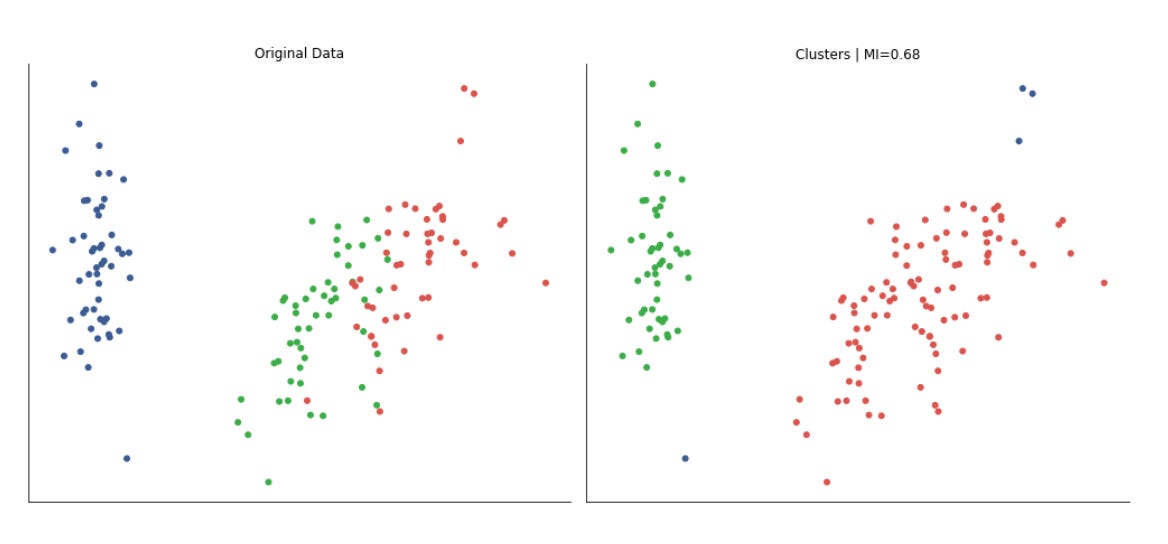
This block takes the pipeline from raw, scaled features to a quick quantitative and visual check of whether a density-based clustering method has discovered the same structure that your existing labels suggest, which is useful when the overall goal is unsupervised discovery of recurring market patterns and grouping similar market regimes.
First, DBSCAN is instantiated and applied to the standardized features. The reason we run DBSCAN on standardized data is practical: DBSCAN is a distance-based algorithm, so differing feature scales would distort neighborhood computations and therefore cluster shapes. DBSCAN itself was chosen because it finds arbitrarily-shaped clusters and explicitly marks noise, which is often desirable in market data where outlier days or events should not be forced into a cluster. The two DBSCAN hyperparameters — eps (neighborhood radius) and min_samples (minimum points to form a core) — control cluster granularity and noise sensitivity: smaller eps or larger min_samples makes the algorithm stricter and produces more noise points. The call returns cluster labels for each sample and these are attached back into the data table so downstream analysis can treat discovered clusters as another feature.
Next, the code computes adjusted mutual information (AMI) between the provided labels and the DBSCAN cluster assignments. AMI is used because clustering labels are permutation invariant and AMI adjusts for agreement that could occur by chance; unlike simple accuracy it measures the information overlap between two labelings regardless of labeling order and compensates for different numbers of clusters. The resulting scalar (printed in the plot title) gives a compact, interpretable summary of how well the unsupervised clusters align with the existing labels: values near 1 mean strong agreement, values near 0 mean little more than chance.
For visual inspection, the script builds a two-panel figure using a 2D projection of the features (features_2D). Important: the 2D coordinates are only for visualization — clustering was performed on the standardized higher-dimensional features — so the plot shows how the original labels and the discovered clusters map onto a human-interpretable embedding. The left subplot colors points by the original labels, the right by DBSCAN clusters, and the same colormap is used to keep color-to-class correspondence consistent. Including the AMI in the cluster plot’s title pairs the qualitative view with the quantitative score so you can quickly spot cases where the score might be misleading (e.g., similar AMI but different geometric alignments).
Finally, the small presentation tweaks are deliberate: axis ticks/labels are hidden and spines removed to reduce visual clutter and emphasize cluster geometry and color groupings, and tight_layout is applied to avoid overlapping titles or panels. A couple of practical caveats: DBSCAN’s results are sensitive to eps/min_samples and to the distance metric, so you should tune those parameters (or use a reachability plot / k-distance plot) and verify that the 2D embedding you use for visualization preserves neighborhood structure; likewise, AMI is a helpful global summary but should be complemented by inspection of cluster sizes, noise fraction (DBSCAN’s -1 label), and domain-specific backtests when evaluating discovered market patterns.
DBSCAN in Python
def run_dbscan(point, members):
    members.add(point)
    neighbors = kdtree.query_radius(atleast_2d(data_[point]), eps)[0]
    if len(neighbors) < min_samples:
        return members | set(neighbors)
    else:
        for neighbor in set(neighbors) - set(members):
            members.update(run_dbscan(neighbor, members))
    return members
This function is the recursive region-growing step of a DBSCAN-style clustering routine: starting from a seed point it marks that point as visited, finds all points within radius eps (the “neighborhood”), and either halts expansion if the seed is not a core point or expands the cluster by visiting neighbors if it is. In the broader context of unsupervised market-pattern discovery, this is the mechanism that grows clusters of similar market snapshots (dense sets of observations) while leaving isolated or sparse observations labeled as noise or border points.
Concretely, the function first records that the incoming point has been seen by adding it to members. It then performs a radius query against a KD-tree using the point’s feature vector (wrapped with atleast_2d because the KD-tree API expects a 2-D query), retrieving all indices within eps. Using a spatial index keeps neighborhood lookups fast, which is important when scanning many time windows or high-frequency feature vectors in a market dataset.
Next it applies the DBSCAN core-point test: if the number of neighbors is smaller than min_samples, the point is not a core point. In that case the function does not recursively expand; it returns the current members unioned with the neighbor indices. That implements the DBSCAN behavior that non-core (border) points can be attached to a cluster but do not cause further expansion of density-reachable regions.
If the seed is a core point (neighbors count >= min_samples), the function iterates over each neighbor that hasn’t already been recorded in members, and recursively calls run_dbscan for that neighbor. Each recursive call may add more points to members; because members is mutated in-place and also propagated via return value, the recursion performs a depth-first region expansion until there are no new neighbors to visit. The set subtraction avoids revisiting already-visited points and prevents infinite recursion on cycles.
A few implementation details and caveats to watch for: members is a mutable set that is updated in place and also returned — callers should expect side effects. Using set(neighbors) to convert KD-tree result arrays is fine but be mindful of dtype (int indices) and potential performance hits from repeated conversions. The current code adds neighbors to members for non-core points (via members | set(neighbors)), which effectively marks those neighbors as visited without expanding them; that may be intended to attach border points but can also prematurely mark points as visited if you intended a separate “visited” vs “clustered” distinction. The recursion approach is straightforward but can cause deep call stacks for large clusters and repeated neighbor queries for the same points; an explicit stack/queue (iterative expansion) and a separate visited set can be more robust and more efficient.
Overall, this function implements the local expansion/region-query logic that defines DBSCAN clusters: using eps and min_samples it identifies dense neighborhoods and grows clusters of similar market-pattern feature vectors while excluding sparse or noise points. Tuning eps and min_samples controls the time scale and density sensitivity of the discovered market patterns, and improving the recursion/visited semantics will help scale this routine to large market datasets.
Dynamic plotting
def plot_dbscan(data, assignments, axes, delay=.5):
    for ax in axes:
        ax.clear()
    xmin, ymin = data[[’x’, ‘y’]].min()
    xmax, ymax = data[[’x’, ‘y’]].max()
    data.plot.scatter(x=’x’, y=’y’, c=data.label,
                      cmap=cmap, s=25,
                      title=’Original Data’,
                      ax=axes[0],
                      colorbar=False)
    plot_data.clusters = plot_data.index.map(assignments.get)
    db_data = data.fillna(0)[data.clusters.notnull()]
    db_data.plot.scatter(x=’x’, y=’y’,
                         cmap=cmap,
                         colorbar=False,
                         xlim=(xmin, xmax),
                         ylim=(ymin, ymax),
                         c=db_data.clusters,
                         s=25,
                         title=’DBSCAN’, ax=axes[1])

    display.display(plt.gcf())
    display.clear_output(wait=True)
    sleep(delay)
This function’s job is to produce a live, side‑by‑side visualization that helps you compare the raw, labeled market points with the clusters DBSCAN discovered. At the start it wipes the passed axes clean so each frame is drawn from a known state; this prevents previously drawn points or annotations from accumulating when you repeatedly call the function during an iterative exploration or parameter sweep. Immediately after, it computes the global x and y bounds from the data and holds them aside — those bounds are reused to lock the plot ranges for the DBSCAN subplot so that the two panels remain directly comparable and do not visually distort as points are added or removed.
The left subplot is drawn first as a reference “Original Data” view: the DataFrame points are scattered by their x/y coordinates and colored by an existing label column. Showing the original labels is important for market pattern discovery because it gives you a baseline segmentation or class signal to compare against the unsupervised clusters (for example, to judge whether DBSCAN is finding structure that aligns with known market regimes or anomalies).
Next the code maps DBSCAN’s assignment results back onto the tabular index and binds those labels as a cluster column on the plotting DataFrame. The assignments input is expected to be a mapping from row index to cluster id; using index.map(assignments.get) preserves the one‑to‑one alignment between original samples and assigned clusters so you can directly compare membership. After that it builds db_data by filling missing numeric values with zeros and then keeping only rows that have a non‑null cluster assignment. Filling NaNs guards against plotting failures when feature values are missing; filtering out null cluster values focuses the DBSCAN view on the points DBSCAN considered part of clusters rather than noise. (Note: DBSCAN often marks noise as a special value such as -1 or leaves an entry None/NaN via the assignments mapping — the filter choice here intentionally hides noise from the cluster plot so the viewer sees only coherent groups.)
The right subplot then draws those clustered points with the same x/y limits and color mapping, titled “DBSCAN.” Locking xlim/ylim to the previously computed bounds is purposeful: when you want to judge whether clusters match or diverge from labeled structure, changing plot scales between views can be misleading. The color map and point sizing are tuned for clarity rather than for a quantitative legend (the colorbar is disabled to reduce visual clutter in an iterative display).
Finally, the function uses Jupyter notebook display primitives to present the current figure and immediately clear the output buffer (with wait=True to avoid flicker), and it pauses for a short delay. That pattern creates an animated, frame‑by‑frame visualization you can use while tuning DBSCAN parameters or scanning through time windows of market data to see how cluster structure evolves. One practical implementation note: the code refers to plot_data in the cluster‑assignment line but uses data elsewhere; that appears to be an inconsistency — the intended behavior is to attach the mapped cluster ids to the same DataFrame being plotted (e.g., data[‘clusters’] = data.index.map(assignments.get) and then filter on data[‘clusters’]). Also consider explicitly mapping missing assignments to a sentinel like -1 if you want to visualize noise instead of omitting it. These small adjustments will make the visualization reliable and easier to interpret while you iterate on unsupervised market pattern discovery.
eps, min_samples = .6, 5
data_ = features_standardized.copy()
kdtree = KDTree(data_)
These three lines set up the core neighborhood-search ingredients for a density-based clustering pass (DBSCAN-style) aimed at discovering recurring market patterns. First, eps and min_samples encode the DBSCAN intuition: eps is the neighborhood radius within which observations are considered “close” and min_samples is the minimum number of neighbors required for a point to be considered a core point (and thus seed a cluster). Choosing eps = 0.6 and min_samples = 5 is a pragmatic starting point — 5 is a common default for the expected minimum cluster size (it prevents trivial two- or three-point fluctuations from being treated as patterns), while eps = 0.6 implicitly assumes that the features are on a standardized scale where a distance of 0.6 signifies meaningful similarity between market-pattern vectors. These values are not magic; they must be tuned with domain knowledge (e.g., expected pattern duration or volatility) or diagnostics such as a k-distance plot.
Next, the code copies the standardized feature matrix into data_. That copy is intentional: it preserves the original features_standardized for auditing, further experiments, or hyperparameter sweeps without accidental mutation. More importantly, working on the standardized representation is why the eps value is meaningful — standardization rescales heterogeneous indicators (price returns, volumes, technical ratios) so Euclidean distance reflects relative similarity instead of being dominated by any single feature. This normalization is critical in unsupervised market-pattern discovery because it stabilizes distance calculations and prevents a large-scale feature from creating spurious clusters.
Finally, building a KDTree over data_ is a performance and algorithmic choice for neighbor queries. A KDTree indexes points to answer radius and nearest-neighbor queries much faster than naive O(n²) pairwise checks, so when the next step repeatedly asks “which points lie within eps of this point?” the KDTree enables O(log n) average query time (subject to the usual caveats). In practical terms, the KDTree will be used to enumerate eps-neighborhoods for every observation, allowing the algorithm to classify core, border, and noise points and assemble clusters. Two important caveats: KDTree assumes a meaningful metric (Euclidean by default), so its effectiveness relies on the prior standardization and on a problem dimensionality where KDTree still performs well; in very high-dimensional feature spaces the tree can degenerate and distance measures become less discriminative, necessitating dimensionality reduction or approximate neighbor methods. Overall, these lines prepare a standardized, immutable dataset and a fast spatial index so the density-based clustering can robustly and efficiently identify recurring market patterns.
to_do = list(range(len(data_)))
shuffle(to_do)
The first line builds an explicit sequence of integer indices that enumerate every example in data_. Conceptually this creates a lightweight “view” of the dataset — a map from position → sample — without copying the actual samples. By working with indices rather than duplicating rows or windows of market data, downstream code can efficiently reference, reorder, or batch samples while keeping the original data_ intact for later mapping of cluster labels or diagnostics.
The second line randomizes that index sequence in-place. The immediate operational effect is that any subsequent iteration over to_do will visit the dataset in a random order. In the context of unsupervised learning for market pattern discovery and clustering, this randomization serves two main purposes: first, it prevents order-induced bias when forming minibatches or seeding clustering routines (many algorithms implicitly assume samples are IID and can be misled by long runs of highly correlated, consecutively ordered time windows); second, it promotes better exploration during stochastic updates or centroid initialization so that cluster assignments are less likely to be dominated by contiguous periods of market behavior.
Choosing to shuffle indices (instead of shuffling the raw data) also preserves a clear reversible mapping back to the original series. That mapping is important when you need to visualize discovered clusters in their temporal context, compute regime transition statistics, or reconstruct cluster-specific time series segments for post hoc analysis. Note that the shuffle here is in-place: the original list object changes, which is efficient but means you must copy the index list first if you need the original order later.
Be mindful of trade-offs: if detecting temporally coherent structures or regime shifts is the goal, fully randomizing sample order can destroy the sequential signals you want to analyze. In those cases consider block-shuffling (shuffle contiguous blocks), stratified sampling by regime proxy, or leaving temporal order intact for algorithms that model dynamics. Also, for reproducibility and debuggability, set the random seed in your RNG before the shuffle so experiments can be repeated exactly. Finally, for very large datasets, using a vectorized permutation routine (e.g., numpy.random.permutation) or streaming sampling strategies may be more efficient than constructing a Python list, but the semantic intent — randomize access to samples while preserving the original dataset — remains the same.
plot_data = pd.DataFrame(data=np.c_[features_2D, labels],
                        columns=[’x’, ‘y’, ‘label’]).assign(clusters=np.nan)
This single line constructs a tidy, plot-ready table that brings together the 2D coordinates produced by your dimensionality-reduction step and any existing label information, and also reserves a column for the clustering results you will compute next. Concretely, features_2D holds the two continuous embedding coordinates (the reduced-market-feature representation you will visualize and cluster), and labels contains the current identifiers (these might be ground-truth segments, prior heuristic labels, or intermediate groupings). np.c_ horizontally concatenates those three columns into a single 2D array so each row remains aligned: the x and y coordinates sit beside the corresponding label for the same observation.
Turning that array into a pandas DataFrame with columns named ‘x’, ‘y’, and ‘label’ makes the structure explicit and convenient for downstream operations (scatter plotting, groupby aggregations, or metric calculations). Naming the coordinates ‘x’ and ‘y’ signals they are positional coordinates for visualization; naming the other column ‘label’ keeps available whatever prior segmentation or annotated signal you have, which is important when you want to compare algorithmic clusters against existing market segments or compute clustering diagnostics (purity, adjusted rand index, etc.).
The final .assign(clusters=np.nan) intentionally creates an empty placeholder column called ‘clusters’ initialized to NaN. This is a deliberate design choice: it reserves a dedicated slot to store the cluster IDs produced by your unsupervised algorithm (or meta-clustering steps) without overwriting the original labels, enabling side-by-side comparison and easier bookkeeping. Initializing to NaN also makes it explicit that clustering has not yet been applied and avoids accidental interpretation of some default value; later you will populate this column with integer or categorical cluster labels once the clustering step completes.
A couple of practical notes to keep in mind: the concatenation assumes features_2D and labels are aligned and have the same number of rows — mismatched lengths will raise errors. Also, because the data is funneled through a NumPy array first, type coercion can occur (e.g., integer labels may become floats); if you need to preserve label types (strings or nullable integers), consider constructing the DataFrame from a dict or casting the column after creation. Overall, this DataFrame centralizes the reduced-dimension features, existing labels, and a placeholder for algorithmic clusters, making it ideal for visual exploration and quantitative evaluation in the market-pattern-discovery workflow.
n_clusters = 1This single assignment defines the number of clusters that downstream clustering algorithms will be asked to produce; setting n_clusters = 1 tells the pipeline to collapse the entire dataset into a single group. Practically, that means algorithms like K‑means will compute one centroid (effectively the global mean in feature space) and assign every sample to that centroid, and mixture models will fit a single component to capture the overall distribution. The reason you might do this deliberately is pragmatic: as a baseline or sanity check it lets you confirm that the rest of the pipeline (feature extraction, scaling, label plumbing, evaluation scaffolding and downstream consumers of cluster labels) behaves correctly when there is no segmentation, and it gives a trivial lower-bound result to compare against more sophisticated clusterings.
However, using one cluster has important consequences you must be aware of. From an analysis standpoint it asserts that the market is homogeneous — you will not discover distinct regimes, patterns, or segments because all temporal windows or instruments are treated identically; cluster-derived features (cluster id, cluster-specific statistics) will be constant and therefore carry no predictive signal. From an evaluation standpoint, many internal clustering metrics (e.g., silhouette score) are undefined or meaningless for k=1, and measures of within‑cluster variance will simply reflect the dataset’s total variance rather than separability. Algorithmically, some implementations tolerate k=1 without issue while others expect k≥2, so the code that consumes n_clusters may need guard clauses or alternative logic if you switch between exploratory and production modes.
In the context of unsupervised learning for market pattern discovery, n_clusters = 1 is best used temporarily: as a controlled baseline, a debugging aid, or a fallback when downstream logic needs a valid label but you do not yet want to impose segmentation. For any meaningful regime discovery you should iterate on selecting k (elbow/silhouette/BIC/AIC/gap statistic), consider density‑based or model‑based methods that infer the number of components automatically, or use regime‑specific models (HMMs, change‑point detection) that more naturally express market heterogeneity.
fig, axes = plt.subplots(ncols=2, figsize=(14, 6))
for ax in axes:
    ax.axes.get_xaxis().set_visible(False)
    ax.axes.get_yaxis().set_visible(False)
sns.despine()

assignments = {}
while to_do:
    item = to_do.pop()
    neighbors = kdtree.query_radius(atleast_2d(data_[item, :]), eps)[0]
    if len(neighbors) < min_samples:
        assignments[item] = 0
        plot_dbscan(plot_data, assignments, axes)
    else:
        new_cluster = run_dbscan(item, set())
        to_do = [t for t in to_do if t not in new_cluster]
        for member in new_cluster:
            assignments.update({member: n_clusters})
        n_clusters += 1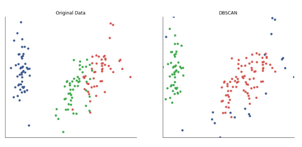
The first few lines set up a minimal visualization canvas and intentionally remove axis clutter so the visual output focuses on pattern clusters rather than coordinate ticks. Hiding axes and calling sns.despine() is a deliberate UX choice: when we’re exploring unsupervised clusters of market-pattern feature vectors, the visual emphasis is on the spatial grouping and noise points, not on precise axis values.
Next we initialize assignments = {} to hold the cluster label for each data index, and enter a while loop that runs until the to_do list (the set or list of unprocessed point indices) is empty. The loop processes one point at a time by popping an index (item) from to_do, then uses a KD-tree spatial index to fetch the local neighborhood of that point within radius eps. The KD-tree query (query_radius) is used for performance: neighborhood lookups are the most frequent operation in density-based clustering, and the KD-tree makes these queries efficient even in moderately high-dimensional feature space that represents market behavior patterns.
The code then applies the DBSCAN core-point test: if the number of neighbors is less than min_samples, that point is considered noise (non-core) under DBSCAN semantics. We label it with 0 in assignments to indicate noise and call plot_dbscan to visualize the current state. Marking noise early is important in market-pattern discovery: it explicitly separates out low-density, idiosyncratic patterns that shouldn’t drive cluster definitions for common regimes.
If the point has enough neighbors, we treat it as the seed of a new cluster. run_dbscan(item, set()) performs the region-expansion step: starting from the seed, it explores reachable neighbors, recursively adding points that meet the core-point condition, until it returns the full set of members for that cluster. Returning the cluster as a set is deliberate — it makes membership checks and the subsequent filtering operation easy and avoids duplicates. Once we have the new_cluster, we remove all its members from to_do to prevent reprocessing, and we assign the current cluster id (n_clusters) to every member in assignments. Finally we increment n_clusters so the next discovered dense region gets a new label.
From a systems perspective, this code encodes the standard DBSCAN control flow (seed selection → neighbor test → region expansion → labeling), but optimized for iterative exploration across a precomputed neighborhood structure (KD-tree) and integrated with incremental plotting to monitor progress. Key parameters govern behavior: eps defines the spatial scale for “similarity” in the market-feature space, and min_samples controls the density threshold that distinguishes persistent market regimes from transient noise. A few pragmatic notes: using 0 to denote noise is conventional but should be consistent with downstream consumers, the filtering of to_do via list comprehension is simple but could be expensive for large datasets (consider set operations or marking visited flags), and plot_dbscan calls inside the loop are useful for debugging/visualization but could slow batch runs if invoked frequently. Overall, this block is implementing density-based clustering to discover recurring market pattern regimes and to separate noise — enabling unsupervised identification of clusters without predefining the number of clusters.
HDBSCAN
Hierarchical DBSCAN is a recent extension of DBSCAN that models clusters as “islands” of differing density to address DBSCAN’s limitations. It distinguishes core and non-core samples. Using the parameters `min_cluster_size` and `min_samples`, it defines neighborhoods and grows clusters. The algorithm iterates over multiple `eps` values and selects the most stable clustering. In addition to detecting clusters of varying density, it reveals the data’s density variation and hierarchical structure.
The figures below illustrate how DBSCAN and HDBSCAN can identify clusters with markedly different shapes.
clusterer = HDBSCAN()
data[’clusters’] = clusterer.fit_predict(features_standardized)

labels, clusters = data.label, data.clusters
mi = adjusted_mutual_info_score(labels, clusters)
This block runs a density-based clustering step on preprocessed market features and then measures how the discovered groupings align with an existing set of labels. The pipeline is: take standardized feature vectors, ask HDBSCAN to find high-density regions and produce a hard label for each sample, attach those labels to the dataset, and compute an information-theoretic agreement score between those discovered clusters and whatever label column you already have.
Why we standardize before this: HDBSCAN estimates cluster structure from distances/densities, so any feature with a larger numeric range would dominate the metric and distort the density estimate. Standardizing the features ensures each dimension contributes comparably to neighborhood and density calculations, which stabilizes cluster discovery across heterogeneous market indicators.
Why HDBSCAN here: unlike k-means or Gaussian mixtures, HDBSCAN infers the number of clusters from the data, finds arbitrarily-shaped clusters, and explicitly marks low-density points as noise. That behavior is desirable for market pattern discovery because financial regimes and patterns often vary in density and shape, and there will be outliers or transient states that we prefer to separate from stable clusters. fit_predict runs the algorithm and returns integer labels; HDBSCAN typically uses -1 for points it deems noise, so you get a mixture of cluster indices and a noise class. Writing those labels back into data makes the clustering consumable by downstream analysis (time-series aggregation, backtesting, feature analysis).
Why compute adjusted_mutual_info_score (AMI): AMI measures the mutual information between the discovered clusters and the provided labels, corrected for chance. It is permutation-invariant (cluster indices need not match label IDs) and tolerates different numbers of clusters, so it’s a better quantitative alignment metric for evaluating an unsupervised result against a proxy or held-out categorical signal than raw accuracy. In practice, you use this score to gauge whether the unsupervised clusters correspond to known market partitions (e.g., sectors, regimes, annotated events), while remembering AMI is only a statistical alignment: a high AMI suggests the clustering recovered structure similar to the labels, a low AMI suggests either the labels and discovered patterns differ or the clustering needs tuning.
Practical caveats and next steps: HDBSCAN has hyperparameters (min_cluster_size, min_samples, metric) that strongly affect outcomes, so use cluster persistence, soft membership probabilities and visual diagnostics (UMAP/t-SNE, cluster size/time stability) to validate results. Decide how to handle HDBSCAN’s -1 noise label when computing AMI (include it as a separate class or exclude noise points) because that choice changes interpretation. Finally, because the goal is market pattern discovery and clustering for downstream use, complement AMI with domain checks — economic interpretability, temporal consistency, and performance in downstream strategies — rather than relying on a single numeric score.
fig, axes = plt.subplots(ncols=2, figsize=(14, 6))

axes[0].scatter(*features_2D.T, c=data.label, s=25, cmap=cmap)
axes[0].set_title(’Original Data’)
axes[1].scatter(*features_2D.T, c=data.clusters, s=25, cmap=cmap)
axes[1].set_title(’Clusters | MI={:.2f}’.format(mi))

for ax in axes:
    ax.axes.get_xaxis().set_visible(False)
    ax.axes.get_yaxis().set_visible(False)
sns.despine()
fig.tight_layout()
This block builds a concise visual comparison between the original 2‑dimensional embedding of market data and the clusters produced by your unsupervised pipeline, so you can judge whether the discovered groupings align with known structure or market regimes. First, two side‑by‑side axes are created and the same 2D coordinates are drawn on both subplots: features_2D is a two‑column embedding (for example the output of PCA/UMAP/t-SNE applied to your market feature vectors), and the call that unpacks its transpose maps the first column to x and the second to y. Plotting the same coordinates in both panels isolates the difference to only the colorization (labels vs clusters), which is important for visually assessing whether clustering has captured the spatial patterns present in the embedding.
On the left panel each point is colored by data.label — this is your reference or “ground truth” partitioning (it could be expert labels, event markers, or a surrogate label set used for evaluation). The right panel colors the same points by data.clusters, the groups returned by the unsupervised method. Showing them side‑by‑side makes it easy to see where the algorithm agrees or diverges from the reference: contiguous regions, split clusters, or mixed colors indicate different failure or success modes for pattern discovery. The right subplot title includes MI={:.2f}, which injects the mutual information score computed earlier; presenting MI there gives an immediate quantitative complement to the visual comparison so you can correlate qualitative observations with a numeric measure of dependence between labels and clusters.
Several small but intentional plotting choices improve interpretability: a single colormap (cmap) and a fixed marker size (s=25) keep the visual encoding consistent so differences are due to grouping rather than point styling; hiding axis ticks and labels removes irrelevant numeric clutter so the viewer focuses on cluster geometry; sns.despine() removes the top/right spines for a cleaner aesthetic; and fig.tight_layout() ensures the two panels and their titles don’t overlap. One practical caveat: using the same colormap alone doesn’t guarantee that a particular color corresponds to the same semantic group across panels unless labels and cluster IDs share a consistent encoding or you explicitly construct a shared color mapping — otherwise colors are comparable only at the level of spatial patterns, not category identity. Overall, this visualization is intended to quickly surface where the unsupervised method is discovering meaningful market patterns and where it is fragmenting or conflating regimes, enabling targeted follow‑ups such as tuning clustering hyperparameters, changing the embedding method, or inspecting specific misclustered segments.
Alternative dataset
alternative_data = np.load(’clusterable_data.npy’)
fig, ax = plt.subplots(figsize=(12, 6))
ax.set_aspect(’equal’)
ax.scatter(*alternative_data.T, s=20)

ax.axes.get_xaxis().set_visible(False)
ax.axes.get_yaxis().set_visible(False)
sns.despine()
fig.tight_layout()
The first line loads a NumPy array called alternative_data from disk; in this workflow that array is the 2‑D representation we will visually inspect for clusterability (typically it’s the result of feature engineering and a dimensionality‑reduction step such as PCA, UMAP or t‑SNE, so it should be shaped (n_samples, 2)). The plotting block then creates a wide figure and single axes to emphasize global structure; setting a larger figsize is a deliberate choice to give spatial separation for clusters and make small density differences visible.
Calling set_aspect(‘equal’) is important: it forces the plot to use the same scale on the x and y axes so Euclidean distances and geometric shapes are not visually distorted. For pattern discovery and clustering, that matters because visual judgments about cluster separation, elongation, or relative distances should reflect the true geometry of the projected embedding rather than an artifact of axis scaling. The scatter call unpacks the two columns of alternative_data into x and y coordinates and draws each sample as a point; the point size (s=20) is chosen to balance between visibility and overplotting — dense regions remain readable while sparse points aren’t lost.
After plotting, the code hides the numeric axes and removes the top/right spines (sns.despine()) to reduce visual clutter and direct attention to the shape and topology of the point cloud rather than precise coordinates. This stylistic choice reflects the goal: we’re assessing pattern structure (clusters, manifolds, outliers) visually, not reading exact values. Finally, fig.tight_layout() ensures labels and plot elements don’t get clipped and that the presentation is clean for reporting or exploratory review.
In the context of unsupervised market pattern discovery, this snippet is a diagnostic visualization step: it lets you quickly verify whether the projected data shows compact groups, elongated structures, or substantial noise that would affect clustering. If you see overlapping masses or heavy overplotting, you’ll want to revisit preprocessing (scaling, outlier handling), the choice of embedding, or visualization tweaks (alpha, smaller markers, or interactive zoom) before committing to clustering or interpreting discovered patterns.
Comparison of DBSCAN and HDBSCAN
dbscan = DBSCAN(eps=.02, min_samples=10)
db_clusters = dbscan.fit_predict(alternative_data)
These two lines instantiate and run a density-based clustering pass (DBSCAN) over your feature matrix so you can discover recurring market patterns and flag atypical observations without supplying labels. DBSCAN groups points that are densely packed in feature space and marks sparsely populated points as noise; that matches the goal of market pattern discovery because we often care about persistent regimes (dense clusters of similar behaviour) and outliers (rare events or market shocks) rather than forcing every sample into a fixed number of clusters.
The first line sets the two key DBSCAN hyperparameters: eps (the neighborhood radius) and min_samples (the minimum number of points required to form a dense region). eps = 0.02 defines the radius (in whatever distance units your features use) within which neighbors count toward cluster density, and min_samples = 10 requires at least 10 neighboring points inside that radius for a point to be considered a “core” point. Together they implement the algorithm’s notion of density: a core point has a sufficiently dense local neighborhood, non-core points that are reachable from core points become part of the same cluster, and points that are neither core nor reachable are labeled as noise. Choosing these values is effectively your decision about how tight a pattern must be and how many occurrences constitute a meaningful market regime rather than random variation.
The second line runs fit_predict on alternative_data, which both fits the model and returns a 1-D array of integer cluster labels for each row in your input. Labels ≥ 0 identify distinct clusters; label -1 designates noise/outliers. The returned array is the direct mapping from each feature vector (e.g., a snapshot of market indicators, engineered signals, or alternative-data-derived features) to a discovered regime or anomaly, ready for profiling, downstream rule creation, or feeding into subsequent models.
A few practical “why/how” notes that matter for robustness. eps is expressed in the same units as your feature distances, so you must normalize or standardize alternative_data before using an absolute eps value like 0.02; otherwise eps becomes meaningless across mixed-scale features. The choice of eps and min_samples should be tuned with domain-informed heuristics: use a k-distance graph (k = min_samples — 1) to find the elbow for a reasonable eps, or try a small hyperparameter sweep informed by how frequently you expect a regime to recur. Be aware of high-dimensional effects: in many dimensions Euclidean distances concentrate and density-based methods degrade, so apply dimensionality reduction or careful feature selection before DBSCAN when your feature count is large.
Operationally, DBSCAN is attractive for market-pattern discovery because it does not require specifying the number of clusters up front and it naturally separates noise. That makes it useful for detecting nonparametric, arbitrarily shaped clusters of behavior (e.g., regimes that are not spherical) and for highlighting rare events for further investigation. The trade-offs are sensitivity to eps/min_samples, potential performance issues on very large datasets without spatial indexing, and reduced effectiveness in very high-dimensional spaces.
Finally, treat the returned labels as hypotheses to validate rather than final decisions: inspect representative samples from each cluster, profile clusters by economically meaningful metrics (volatility, drawdown, liquidity), and check temporal consistency (do clusters correspond to contiguous market periods or pop up sporadically?). Use noise points to seed anomaly analysis; use cluster assignments to segment training data or to trigger regime-specific strategies. Tuning and validation close the loop between these DBSCAN results and the ultimate objective of unsupervised market pattern discovery and clustering.
hdbscan = HDBSCAN(min_cluster_size=15, gen_min_span_tree=True)
hdb_clusters = hdbscan.fit_predict(alternative_data)
This block constructs an HDBSCAN density-based clusterer and immediately applies it to the precomputed feature matrix named alternative_data. In practical terms, the call to HDBSCAN(min_cluster_size=15, gen_min_span_tree=True) configures a clustering algorithm that looks for groups of at least 15 samples and also retains the minimum spanning tree (MST) used during clustering so you can inspect or visualize the structure that produced the clusters. Setting min_cluster_size to 15 is a business-driven choice: it prevents the model from treating very small, potentially noisy pockets of similar observations as meaningful market patterns, thereby trading sensitivity to tiny, possibly spurious patterns for more robust, interpretable clusters.
When you call fit_predict(alternative_data), HDBSCAN executes its multi-step density-based pipeline on that matrix. Internally it computes core distances (roughly the distance to the k-th nearest neighbor, where k defaults to min_cluster_size unless min_samples is specified), converts those to mutual reachability distances, builds a minimum spanning tree of the mutual reachability graph, and then produces a condensed cluster hierarchy. The algorithm then extracts clusters from that hierarchy by maximizing cluster stability rather than forcing a fixed k; this is why HDBSCAN is well suited to market pattern discovery — it finds variable-shaped, variable-density clusters and explicitly labels low-density points as noise (-1) instead of forcing them into clusters.
From a “how this fits into our pipeline” perspective: alternative_data should be a thoughtfully engineered feature matrix (numeric, scaled, and often reduced in dimensionality — e.g., after PCA or UMAP) because HDBSCAN relies on distance relationships and can be sensitive to scale and high dimensionality. The gen_min_span_tree=True flag is useful for diagnostics: it gives you the MST object you can plot (or use with the condensed tree) to validate whether clusters represent coherent separation in feature space or are artifacts of preprocessing. After fit_predict, you get a label per row where positive integers are cluster ids and -1 denotes noise; additional useful outputs include .probabilities_ for soft-membership strengths and .condensed_tree_ for cluster hierarchy exploration.
Finally, a few operational notes that guide tuning and interpretation: adjust min_cluster_size (and optionally min_samples) to control the granularity and robustness of discovered patterns; be mindful of the curse of dimensionality — dimensionality reduction or feature selection usually improves results; and for large market datasets consider approximate nearest-neighbor indices or batching because the k-NN step dominates runtime. The end goal here is to use HDBSCAN’s ability to discover stable, noise-aware groups as inputs to downstream tasks — cluster-level analysis, prototype construction, anomaly detection, or as features for subsequent supervised models.
cluster_sizes = pd.DataFrame({’HDBSCAN’: pd.Series(hdb_clusters).value_counts(),
                              ‘DBSCAN’: pd.Series(db_clusters).value_counts()})
This single statement converts the raw cluster label arrays produced by HDBSCAN and DBSCAN into a compact, side‑by‑side summary of how many samples each algorithm assigned to each cluster. Concretely, each labels array (hdb_clusters, db_clusters) is turned into a pandas Series and then reduced with value_counts(), which computes the frequency of every unique label — that gives you the empirical size of each cluster and implicitly highlights the proportion of points flagged as noise (typically label -1). Those two count Series are then assembled into a DataFrame with two columns, one for HDBSCAN and one for DBSCAN; pandas aligns the series by their label indices so the resulting table shows counts for each label value across both algorithms, with missing entries where a particular label exists in only one algorithm.
We do this because raw cluster labels are not directly readable for downstream analysis: counts are the simplest, most actionable statistic for pattern discovery. Cluster sizes tell you which groupings are dominant in the market data, which are marginal or spurious, and how each algorithm’s notion of structure differs (for example, whether HDBSCAN produces many small, dense clusters while DBSCAN finds fewer large ones). The use of value_counts() — rather than, say, just listing unique labels — preserves the frequency distribution, which is critical when deciding thresholds for filtering small clusters, calibrating minimum cluster size parameters, or weighting clusters in aggregate analyses.
Two important practical notes that shape how you should interpret and act on this table: first, cluster labels are arbitrary integers and are not aligned semantically across algorithms, so columnwise comparisons are about size distributions and noise ratios, not about direct label-to-label correspondence. Second, because the DataFrame aligns on the union of labels, you’ll see NaNs where one algorithm has a label the other does not; you’ll typically want to fill those with zeros if you’re going to compute ratios or plot side‑by‑side bar charts. Finally, in the context of unsupervised market pattern discovery, this summary is a quick diagnostic for cluster robustness and prevalence — it guides whether to tune algorithm hyperparameters, merge small clusters, or treat a large noise fraction as an indicator that your feature representation or density parameters need revisiting.
cluster_sizes.sort_index(ascending=False).plot.barh(subplots=True,
                                                    layout=(2, 1),
                                                    figsize=(8, 8),
                                                    legend=False)
sns.despine()
plt.tight_layout()
This block is about turning the computed cluster counts into a compact, readable visualization so you can judge the shape of the clustering (which patterns dominate, which are rare, whether there are many singletons or one huge cluster). The data flow is simple: you start with cluster_sizes (a Series or DataFrame that encodes counts per cluster or per clustering outcome), you reorder it, and then you draw horizontal bars with a few aesthetic tweaks.
Concretely, the call to sort_index(ascending=False) reverses the ordering of the index before plotting. That choice controls visual order — e.g., if your cluster labels carry a natural ordinal meaning (time, hierarchical rank, or a label you want shown high-to-low), reversing the index ensures those labels appear from top to bottom in the intended sequence. Note the important distinction: if your goal is to show clusters sorted by population, you should use sort_values(ascending=False) instead; sort_index only rearranges by label, not by size.
The .plot.barh(…) produces a horizontal bar chart. Horizontal bars are chosen because they scale well with long cluster labels and make it easier to compare magnitudes side‑to‑side. Passing subplots=True with layout=(2, 1) instructs pandas to create separate panels when cluster_sizes is a DataFrame with multiple columns — each column gets its own horizontal bar subplot arranged into two rows and one column. If cluster_sizes is a Series, you’ll effectively get a single horizontal bar plot; the layout parameter is only meaningful when multiple panels are actually produced. figsize=(8, 8) controls the total canvas size so labels and bars aren’t cramped, and legend=False removes an unnecessary legend when each subplot’s meaning is already conveyed by axis labels or titles.
Finally, sns.despine() and plt.tight_layout() are purely presentation touches: despine removes the top/right axes lines to give a cleaner, publication-ready look, and tight_layout resolves overlapping text and margins so tick labels and titles are legible. From the perspective of unsupervised market-pattern discovery, this visualization step is important for quality control — it reveals imbalance, dominant patterns, and potential noise clusters at a glance. Small practical notes: if you expect a heavy‑tailed cluster size distribution, consider plotting proportions or using a log scale; if you want consistent ordering across multiple charts, explicitly sort by the same key (e.g., size) before plotting; and annotate bars with counts or percentages when you need precise comparisons.
fig, axes = plt.subplots(ncols=2,
                         figsize=(14, 6))
cmap = ListedColormap(sns.color_palette(’Paired’,
                                        len(np.unique(db_clusters))))
axes[0].scatter(*alternative_data.T, c=db_clusters, s=10, cmap=cmap)
axes[0].set_title(’DBSCAN’)
axes[1].scatter(*alternative_data.T, c=hdb_clusters, s=10, cmap=cmap)
axes[1].set_title(’HDBSCAN’)

for ax in axes:
    ax.axes.get_xaxis().set_visible(False)
    ax.axes.get_yaxis().set_visible(False)
sns.despine()
fig.tight_layout()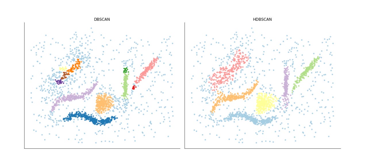
This block builds a small side-by-side visualization to compare the clustering results from two unsupervised algorithms (DBSCAN and HDBSCAN) on a 2D representation of market data. The input “alternative_data” is assumed to be a two-dimensional embedding (for example from PCA, t-SNE or UMAP) where each row is a sample and the two columns are the plotted coordinates; passing alternative_data.T to scatter unpacks those two coordinate arrays as x and y so we are plotting each sample in the same spatial embedding for both algorithms. The two scatter plots are placed into a single figure with two columns so the viewer can directly compare the spatial distribution of points that each algorithm groups together.
Before plotting, a categorical colormap is created using seaborn’s Paired palette and then wrapped in a ListedColormap; the number of colors requested is driven by the unique labels found in the DBSCAN result. That colormap is supplied to both scatter calls so cluster labels become colors via the scatter c argument. Using a consistent palette like this is intended to make the clusters visually distinct and to facilitate quick assessment of cluster shape, size and relative location. The marker size (s=10) is chosen to balance point visibility against overplotting density so local concentrations remain readable.
Each subplot is titled to make clear which clustering algorithm produced the labels being displayed. After plotting, the code hides the x and y axes on both panels and removes the figure spines with sns.despine; those choices are deliberate aesthetic decisions to emphasize cluster structure and relative positions rather than precise numeric coordinates, which is often more useful when the goal is pattern discovery and qualitative comparison of clustering behavior. tight_layout is called at the end to ensure the two plots and their titles are arranged neatly without overlap.
One important practical detail: the colormap is created from the unique labels of DBSCAN only, then reused for HDBSCAN. That keeps colors consistent for labels that both algorithms share, but it can misrepresent label sets if HDBSCAN produces more (or fewer) distinct labels, or if noise labels (commonly -1) are present — colors can shift or be duplicated unintentionally. For a robust comparison you typically want to build a palette sized to cover the union of labels from both algorithms (or map labels to categorical indices explicitly) so colors correspond predictably across panels. Overall, this visualization step helps you rapidly inspect how the two unsupervised methods partition the same embedded market data, which clusters are stable across methods, and where the algorithms disagree — insights that guide subsequent refinement of feature engineering, embedding choices, or clustering hyperparameters.
HDBSCAN: Density-Based Dendrogram
fig, ax = plt.subplots(figsize=(14, 6))
hdbscan.condensed_tree_.plot(select_clusters=True,
                             cmap=’Blues’,
                             selection_palette=sns.color_palette(’Set2’, 8))
fig.tight_layout();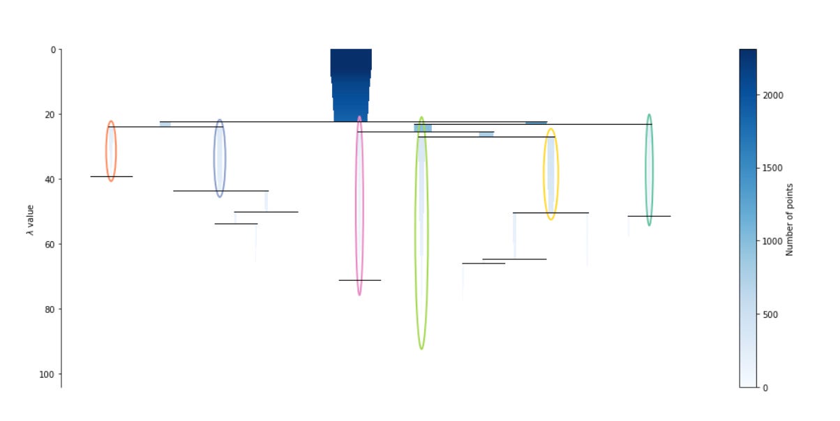
This block is creating a visual summary of HDBSCAN’s hierarchical clustering structure so you can judge which market patterns the algorithm found and how stable those patterns are across density thresholds. The condensed tree is HDBSCAN’s compact representation of the hierarchical clustering process: each horizontal branch corresponds to a cluster at a given density (expressed as lambda, the inverse of distance), the width of a branch reflects how many points it contains at that density, and the vertical span of a branch shows the range of lambda values over which that cluster persists. In practice, long vertical spans indicate clusters that persist across many density levels (i.e., stable, robust market patterns), while short-lived branches indicate transient or noise-like groupings.
By calling condensed_tree_.plot(select_clusters=True) we tell the visualization to highlight exactly those clusters that HDBSCAN’s cluster-selection procedure chose as the final clusters (typically using the excess-of-mass or leaf selection strategy). This is important for the business goal: we don’t just want every ephemeral split in the hierarchy, we want the modes the algorithm considers meaningful for downstream pattern labeling and segmentation of market behavior. The selection_palette argument assigns distinct, easily separable colors to those selected clusters so you can quickly match colored branches in the tree to cluster labels used elsewhere in the pipeline; limiting the palette (here eight colors) is a practical choice when you expect a small number of meaningful market regimes.
The cmap parameter (set to ‘Blues’) provides the background shading for the rest of the tree, which helps visually de-emphasize unselected or less-stable branches while preserving the full hierarchical context. Together, the colored selected branches and the shaded background make it straightforward to read cluster sizes, splits, and persistence — key cues for deciding whether discovered clusters map to economically sensible market patterns or whether further tuning (e.g., changing min_cluster_size, min_samples, or the cluster-selection method) is needed. Finally, fig.tight_layout() is a presentation detail to avoid label and axis clipping so the plot is clean for inspection or inclusion in reports.
Minimum spanning tree
fig, ax = plt.subplots(figsize=(14, 7))
hdbscan.minimum_spanning_tree_.plot(edge_cmap=’Blues’,
                                    edge_alpha=0.6,
                                    node_size=20,
                                    edge_linewidth=1)
sns.despine()
fig.tight_layout();
This block is focused on visualizing the minimum spanning tree (MST) that HDBSCAN builds from the mutual-reachability graph — an essential intermediate structure the algorithm uses to create the single‑link hierarchy from which clusters are extracted. We start by creating a plotting canvas sized for readability; the figure/axis pair is where the MST drawing is rendered so we can control layout and later combine this view with other plots if needed.
The call to hdbscan.minimum_spanning_tree_.plot is the core action: it draws the MST edges and nodes and encodes edge weights (the mutual‑reachability distances) as a color gradient using edge_cmap=’Blues’. In practice that means edges with different widths/colors communicate relative similarity between points — longer/more intense colored edges correspond to larger mutual‑reachability distances and therefore weaker similarity (i.e., potential separators between clusters). The plot parameters (edge_alpha, node_size, edge_linewidth) are styling choices intended to emphasize the structure you care about: semi‑transparent edges avoid visual clutter where many edges overlap, small nodes keep the focus on the topology of connections rather than individual points, and a modest linewidth makes the important connections easily visible without overwhelming the color mapping. Together these choices make it easier to spot long bridges, isolated nodes, and dense core regions in the MST.
Why look at the MST in the market‑pattern clustering workflow? HDBSCAN’s clustering decisions are driven by how points connect in the MST: tight subgraphs with short edge distances form stable clusters, while long edges act as bottlenecks or separators that define cluster boundaries. For market pattern discovery this translates directly to identifying regime boundaries, structural breaks, or rare/novel patterns — e.g., clusters of similar price-movement motifs versus bridges indicating transitions between regimes. Visualizing the MST helps you validate whether the extracted clusters align with meaningful market structure and where parameter tuning (e.g., minimum cluster size or minimum samples) might be needed.
Finally, the call to sns.despine and fig.tight_layout are finishing touches that improve readability: removing the top/right spines gives a cleaner, less distracting visualization and tight_layout prevents labels or edges from being clipped. For reproducibility and diagnostic purposes you may want to overlay node colors by cluster label or use fixed node positions (for example from a UMAP/t-SNE embedding) so the MST topology aligns spatially with other visualizations; those steps make it easier to interpret MST features in the context of the original market‑pattern embedding.