

Building a Statistical Arbitrage Strategy from Scratch in Python
A Step-by-Step Guide to Signal Generation, PnL Calculation, and Visualization using Pandas

Use the button at the end of this article to download the source code
Statistical arbitrage (“StatArb”) is often viewed as the “black box” of quantitative finance — complex, opaque, and reserved for institutional players. However, at its core, StatArb is simply about identifying and exploiting temporary pricing inefficiencies between mathematically related assets. In this article, we will deconstruct a Lead-Lag strategy, a classic approach where we hypothesize that the price movements of certain “leader” stocks (like major tech giants) can predict the short-term trajectory of a correlated “target” asset.
We will move beyond simple correlation and dive into the mechanics of covariance and signal projection. Rather than relying on gut feeling, we will construct a robust Python pipeline that mathematically models how a target stock should move based on its leaders. By calculating the residuals — the difference between the expected price and the actual price — we can generate a mean-reverting trading signal. Crucially, we will enhance this signal using Rolling Confidence Intervals, effectively creating a volatility filter that prevents the algorithm from trading when market noise is too high.
From a technical perspective, this guide focuses on vectorized implementation. We will avoid slow Python loops and instead leverage the power of Pandas and NumPy to handle data ingestion, signal generation, and backtesting efficiently. You will see how to transform raw time-series data into clear buy/sell signals, complete with entry and exit thresholds derived from statistical variance.
By the end of this walkthrough, you will have a fully functional, end-to-end environment — from setting up a Kaggle/local workspace to visualizing realized PnL. While this model is “naive” and intended for educational simulation (ignoring slippage and transaction costs), the architecture provides a solid foundation for understanding how quantitative strategies are built, tested, and visualized in the real world.
Prepare your environment
Set up a Jupyter environment and install the required Python packages:
- numpy
- pandas
- yfinance
You will also need access to the `analysis_utils.py` module for common helper functions.
import os
import warnings
import numpy as np
import pandas as pd
import matplotlib.pyplot as plt
import seaborn as sns
import dotenv

try:
    get_ipython().run_line_magic(”load_ext”, “dotenv”)
except Exception:
    pass

warnings.filterwarnings(”ignore”)

RUNNING_ON_KAGGLE = os.getenv(’IS_KAGGLE’, ‘True’) == ‘True’

if RUNNING_ON_KAGGLE:
    print(’Running in Kaggle...’)
    _pkgs = [”yfinance”, “statsmodels”, “seaborn”, “itertools”, “scikit-learn”]
    try:
        ip = get_ipython()
        for _p in _pkgs:
            ip.run_line_magic(”pip”, f”install {_p}”)
    except Exception:
        for _p in _pkgs:
            os.system(f”pip install {_p}”)

    for dirpath, _, filenames in os.walk(’/kaggle/input’):
        for fname in filenames:
            print(os.path.join(dirpath, fname))
else:
    print(’Running Local...’)

import yfinance as yf
from analysis_utils import calculate_profit, load_ticker_prices_ts_df, plot_strategy, load_ticker_ts_df
The code begins by trying to integrate dotenv into an interactive IPython session. That attempt is wrapped in a try/except so the code can run both inside notebooks (where get_ipython() and the %load_ext magic are available) and in non-interactive or script contexts where they are not. The practical purpose of loading dotenv in an interactive session is to populate environment variables (API keys, dataset flags, etc.) from a .env file so downstream data-fetching and configuration behave consistently across machines and sessions.
Immediately after, warnings are globally suppressed with warnings.filterwarnings(“ignore”). In an exploratory quant workflow and backtesting loop, this keeps notebook output focused on relevant results (plots, metrics) by preventing repeated library warnings from cluttering the logs during iterative runs and experiments.
Next the code determines whether it’s running on Kaggle by reading the IS_KAGGLE environment variable (defaulting to the string ‘True’ if unset) and comparing it to ‘True’. This boolean flag drives environment-specific behavior: if running on Kaggle, the script prints an identifying message and ensures required Python packages are available in the ephemeral Kaggle kernel. It defines a list of packages (_pkgs) that provide market data access, statistical tools, plotting, and ML utilities, then attempts to install them via IPython’s %pip magic (appropriate in notebook kernels). If that approach fails (for example, outside an IPython environment), it falls back to invoking pip through the shell using os.system. The objective here is to make the execution environment self-contained so later cells can import and use those libraries without import errors.
Still under the Kaggle branch, the code walks the /kaggle/input directory and prints every file path it finds. This enumerates dataset files that are mounted into the Kaggle runtime, making it explicit which data artifacts are available for the backtest or analysis steps that follow. If the RUNNING_ON_KAGGLE flag is false, the script simply prints “Running Local…”, indicating that dependency management and data availability are expected to be handled outside this bootstrapping logic.
Finally, the script imports yfinance and several helper functions from analysis_utils: calculate_profit, load_ticker_prices_ts_df, plot_strategy, and load_ticker_ts_df. In the quant-trading context this completes environment setup for the core workflow: yfinance is used to fetch historical market prices, the load_ticker* functions standardize and load time-series price data into the expected DataFrame structures needed for signal generation and vectorized backtests, calculate_profit computes the P&L outcomes of a given strategy (turning signals into monetary results), and plot_strategy provides visual diagnostics of entry/exit behavior and performance. Together these imports mark the transition from environment preparation into the data ingestion, strategy evaluation, and visualization stages of the trading analysis.
Set up the Universe
We will load a basket of the highest-capitalization stocks from the Nasdaq-100. Because StatArb is a tactical strategy, we will focus exclusively on correlation and covariance and filter the basket using those criteria.
import matplotlib.pyplot as plt
import pandas as pd

START = “2020-01-01”
END = “2023-11-22”
symbols = [
    “AAPL”, “MSFT”, “AMZN”, “TSLA”, “GOOG”, “GOOGL”, “META”, “NVDA”, “PEP”,
    “AVGO”, “ADBE”, “COST”, “PYPL”, “AMD”, “QCOM”, “INTC”, “TXN”, “CHTR”,
    “TMUS”, “ISRG”, “SBUX”, “AMGN”, “INTU”, “ADP”, “CSX”, “ADI”, “MU”,
    “ZM”, “MAR”, “GILD”, “MELI”, “WDAY”, “CTSH”, “PANW”, “REGN”, “LRCX”,
    “BKNG”, “EXC”, “ADSK”, “KLAC”, “TEAM”
]

price_df = load_ticker_prices_ts_df(symbols, START, END)
valid_cols_df = price_df.dropna(axis=1)
periodic_rets = valid_cols_df.pct_change().dropna()
cumulative_rets = (1 + periodic_rets).cumprod() - 1

plt.figure(figsize=(16, 16))
for sym in cumulative_rets.columns:
    plt.plot(cumulative_rets.index, cumulative_rets[sym].mul(100.0), label=sym)

plt.xlabel(”Date (Year-Month)”)
plt.ylabel(”Cummulative Returns(%”)
plt.legend()
plt.show()
This block produces and plots the cumulative total returns for a fixed universe of tickers over a given date range so you can visually compare how each security performed over time — a common diagnostic step in quant trading to assess relative performance and to sanity‑check inputs for downstream portfolio construction or backtests.
First, the code defines the analysis window (START, END) and the tickers of interest. It then calls load_ticker_prices_ts_df(symbols, START, END) to retrieve a time‑series DataFrame of prices for every symbol across the same calendar index. The implicit goal of this load is to produce aligned price histories so that subsequent return calculations are comparable across tickers.
Next, price_df.dropna(axis=1) removes any entire columns that contain missing values. This enforces a strict alignment: every column that remains has a complete price history across the whole date range. Doing this prevents mixed-length series or sparse data from contaminating percentage‑change and compounding calculations, so all returned series share the same index and are comparable point‑by‑point.
With valid_cols_df in hand, the code computes periodic_rets = valid_cols_df.pct_change().dropna(). pct_change() converts the price series into period‑over‑period returns (by default one period, typically one trading day). Converting to returns normalizes different price levels and is the standard input for performance aggregation, risk metrics, and portfolio analytics. The immediate dropna() removes the first row of NaNs produced by the pct_change operation, leaving only valid return observations.
The cumulative returns are then computed as (1 + periodic_rets).cumprod() — 1. This applies discrete compounding: each (1 + r_t) multiplies the running product, so cumprod() gives the growth factor of a notional unit investment over time; subtracting 1 converts that growth factor into a cumulative return expressed as a fractional gain since the first plotted date. In quant terms, this shows the total realized return from a buy‑and‑hold position initiated at the start of the series, accounting for period‑by‑period compounding.
Finally, the plotting section creates a large figure and iterates over every symbol column in cumulative_rets, plotting the date index against cumulative_rets[sym].mul(100.0). Multiplying by 100 converts the fractional cumulative returns into percent terms for more intuitive visual interpretation. Each symbol is plotted as a separate trace, with axis labels and a legend so you can see each ticker’s trajectory over time and directly compare magnitudes and drawdown/recovery patterns across the universe. The overall result is a compact visualization of compounded performance of all included tickers between START and END, suitable for preliminary performance comparison in a quant workflow.
import matplotlib.pyplot as plt

BASE_TICKER = “AAPL”
SMOOTH_WINDOW = 24
ROLL_WINDOW = SMOOTH_WINDOW * 10
plt.figure(figsize=(16, 8))

plotted_tickers = []
lead_candidates = []

for symbol in tickers:
    if symbol == BASE_TICKER:
        continue
    corr_val = tickers_df[symbol].corr(tickers_df[BASE_TICKER])
    if abs(corr_val) < 0.75:
        continue

    lead_candidates.append(symbol)

    corr_series = tickers_df[symbol].rolling(ROLL_WINDOW).corr(tickers_df[BASE_TICKER])
    smoothed_corr = corr_series.rolling(SMOOTH_WINDOW).mean()
    plt.plot(
        tickers_df.index,
        smoothed_corr,
        label=f”{symbol} (Corr: {corr_val:.2f})”,
        alpha=corr_val,
        linewidth=corr_val,
    )
    plotted_tickers.append(symbol)

plt.axhline(y=0, color=”k”, linestyle=”--”, linewidth=1)
plt.xlabel(”Date (Year-Month)”)
plt.ylabel(”Correlation with AAPL”)
plt.legend()
plt.show()
The code is building a time-series visualization of how other tickers’ correlations with a base instrument (AAPL) evolve over time, and it also filters for tickers that are meaningfully correlated with that base. It starts by defining a few parameters: a base ticker symbol to compare against, a short smoothing window (SMOOTH_WINDOW) and a longer rolling window for the correlation calculation (ROLL_WINDOW = SMOOTH_WINDOW * 10). Those windows set the temporal scales used below: the longer ROLL_WINDOW determines the span used to compute a local Pearson correlation, while the shorter SMOOTH_WINDOW is used to smooth that sequence of local correlations so the plotted lines are less noisy and easier to interpret.
The main loop iterates through a collection of tickers and immediately skips the base ticker so AAPL is not compared to itself. For each other symbol it computes a single Pearson correlation value (corr_val) between that ticker’s entire historical series and the base ticker’s entire series. That single-number correlation is used as a pre-filter: if its absolute value is below 0.75 the code ignores the ticker entirely, so only tickers with reasonably strong historical relationships to AAPL are considered further. Tickers that pass this threshold are appended to lead_candidates, indicating they’re potential instruments of interest for downstream analysis (for example, candidate pairs for pair trading or lead/lag investigations).
For each candidate, the code then constructs a time-varying correlation series: it computes a rolling Pearson correlation between the candidate and AAPL across windows of length ROLL_WINDOW. This produces a series whose value at each time point reflects the local correlation over the preceding ROLL_WINDOW observations. Because that rolling correlation can still be noisy, the series is further smoothed by applying a simple moving average with the SMOOTH_WINDOW. The two-stage approach (longer window for correlation followed by a shorter smoothing window) produces a more stable, interpretable time series of correlation dynamics that highlights broader structural changes while suppressing high-frequency jitter.
When plotting, each smoothed time-varying correlation is drawn against the DataFrame index (dates). The plot label embeds the static corr_val to give a quick reference to the overall historical correlation, while the line’s visual prominence — alpha (transparency) and linewidth — is scaled by corr_val so tickers with stronger overall correlations appear visually emphasized. Each symbol that gets plotted is also recorded in plotted_tickers for bookkeeping or potential later use. A horizontal dashed line at y=0 is added as a reference to distinguish periods of positive versus negative correlation. Finally, axis labels, a legend, and a displayed figure complete the visualization.
Taken together, the code filters for instruments with strong historical relationships to AAPL, computes their time-local correlation profiles, smooths those profiles for readability, and encodes both static and dynamic correlation information visually. In a quant trading context this supports tasks like identifying pairs for mean-reversion strategies, monitoring regime shifts in relationships for hedging, or spotting candidates that may lead or lag the base instrument over different market regimes.
The plot above shows correlations over time; they oscillate between uncorrelated and correlated regimes.
In practice, the stock basket is periodically reconstituted based on specific selection criteria — correlation can be one such factor. In this simulation, most of the selected tickers (for example, MSFT and GOOGL) remain highly correlated.
Signalling Action
The naive statistical-arbitrage algorithm begins by transforming every price series into a short-term deviation from its own trend. For each leader stock and for the target asset, an exponential moving average is computed over a fixed look-back window such as one month. At every time step, the current price is compared to this EMA, and the difference between the two becomes the working signal. This difference measures how far each instrument is trading above or below its recent equilibrium.
These EMA differences are then used to measure how the leaders and the target move together. Over a longer rolling window, for example six months, the correlation between each leader’s EMA difference and the target’s EMA difference is computed. This captures the strength and direction of their short-term co-movements and provides a dynamic measure of how tightly each leader is linked to the target.
Correlation alone, however, only tells how synchronized two series are, not how large the influence is. To recover scale, covariance ratios are computed for every leader–target pair. These ratios quantify how much the target typically moves when a given leader moves, preserving the magnitude of that relationship rather than just its direction.
Using these covariance ratios, a synthetic prediction for the target is built from each leader. Each leader’s EMA difference is multiplied by its covariance ratio with the target, producing a projected EMA difference for the target, which represents how the target would be expected to move if it followed that leader in lockstep. This step plays the same conceptual role as the hedge ratio in cointegration-based pairs trading, where one asset’s movement is mapped onto another through a linear projection.
The actual target EMA difference is then compared with each of these leader-based projections. The gap between the projected and actual value is a residual that shows whether the target has under- or over-performed relative to what that leader implies. When these residuals are summed across all leaders, they form a raw mispricing signal that reflects how far the target has drifted away from the collective behavior of its reference group.
Finally, each leader’s contribution to this signal is weighted by its correlation with the target so that leaders that are more tightly coupled to the target have more influence, while weakly related leaders contribute less. The result is a single scalar signal that combines direction, magnitude, and reliability of the leader relationships.
Covariance, which is the core quantity behind the projection step, is defined as
Here Xi and Yi are individual observations from the two series, Xˉ and Yˉ\bar{Y}Yˉ are their respective means, and nnn is the number of observations in the rolling window. Covariance measures how movements in one series scale into movements in the other. Unlike correlation, which is normalized and therefore loses information about absolute size, covariance preserves magnitude, which is exactly what is needed when projecting leader moves onto a target in a trading signal.
arb_df = tickers_rets_df.copy()
arb_df[”price”] = tickers_df[TARGET]

tgt_col = TARGET
ema_tgt_col = f”ema_{tgt_col}”
ema_d_tgt_col = f”ema_d_{tgt_col}”

arb_df[ema_tgt_col] = arb_df[tgt_col].ewm(MA_WINDOW).mean()
arb_df[ema_d_tgt_col] = arb_df[tgt_col] - arb_df[ema_tgt_col]
arb_df[ema_d_tgt_col].fillna(0, inplace=True)

for lead in LEADS:
    ema_col = f”ema_{lead}”
    ema_d_col = f”ema_d_{lead}”
    corr_col = f”{lead}_corr”
    covr_col = f”{lead}_covr”
    proj_col = f”{lead}_emas_d_prj”
    act_col = f”{lead}_emas_act”

    src = arb_df[lead]
    ema_series = src.ewm(MA_WINDOW).mean()
    arb_df[ema_col] = ema_series
    arb_df[ema_d_col] = src - ema_series
    arb_df[ema_d_col].fillna(0, inplace=True)

    arb_df[corr_col] = arb_df[ema_d_col].rolling(ARB_WINDOW).corr(arb_df[ema_d_tgt_col])

    cov_series = arb_df[ema_d_col].rolling(ARB_WINDOW).cov(arb_df[ema_d_tgt_col])
    var_series = arb_df[ema_d_col].rolling(ARB_WINDOW).var()
    arb_df[covr_col] = cov_series / var_series

    arb_df[proj_col] = arb_df[ema_d_col] * arb_df[covr_col]
    arb_df[act_col] = arb_df[proj_col] - arb_df[ema_d_tgt_col]

arb_df.filter(regex=f”(_emas_d_prj|_corr|_covr)$”).dropna().iloc[ARB_WINDOW:]
We start by creating a working dataframe, arb_df, that combines the return series (tickers_rets_df) with the raw price series for our target instrument (tickers_df[TARGET]). Adding the target price allows us to compute a smoothed trend for the target (an exponential moving average) and then isolate short-term deviations from that trend; these deviations are the quantities we’ll try to explain and potentially arbitrage against.
Next, we compute an exponential moving average (EMA) of the target price using MA_WINDOW and derive ema_d_tgt_col as the instantaneous deviation of the target price from its EMA (price minus EMA). The EMA acts as a trend filter — by subtracting the EMA we concentrate on transient, mean-reverting moves rather than longer-term drift. Any initial NaNs produced by the EMA are filled with zeros so downstream rolling statistics operate on numeric values immediately.
For each instrument listed in LEADS we perform a parallel transformation: compute that lead’s EMA (same MA_WINDOW) and form its deviation series (lead price minus lead EMA). Those lead deviations are the candidate explanatory variables for the target’s deviation. We then quantify the linear relationship between each lead’s deviation and the target’s deviation over a rolling lookback of ARB_WINDOW. Specifically, we compute the rolling Pearson correlation (ema_lead vs. ema_target) as a descriptive measure, and we compute the rolling covariance and variance to form covr_col = cov(lead, target) / var(lead). This ratio is the time-varying linear slope that maps a unit deviation in the lead into an expected deviation in the target — in other words, a rolling regression coefficient that projects target deviations from lead deviations.
Using that dynamic slope, we create a projection series (proj_col) by multiplying the lead deviation by covr_col. That projection is the model’s expected value for the target deviation given the current lead deviation and the recent relationship strength. We then compute act_col as the difference between that projected target deviation and the actual target deviation (proj — actual). The act series is effectively the residual or mispricing signal: its sign and magnitude indicate how much the lead-based projection disagrees with what the target is actually doing in that instant, which is exactly the information used to form statistical-arbitrage entry/exit decisions.
Finally, the code selects the columns related to projections, correlations, and coefficients, drops rows with NaNs created by the rolling computations, and slices off the initial ARB_WINDOW rows (the warm-up period before the rolling window is fully populated). The result is a dataset of aligned, windowed relationship metrics and projection/residual signals you can use for constructing arb trades.
Next, we weigh the signals:
accum_weights = 0
accum_delta = 0
for symbol in LEADS:
    corr_mag = arb_df[f”{symbol}_corr”].fillna(0).abs()
    accum_weights += corr_mag
    weighted_col = f”{symbol}_emas_act_w”
    arb_df[weighted_col] = arb_df[f”{symbol}_emas_act”].fillna(0) * corr_mag
    accum_delta += arb_df[weighted_col]

weights = accum_weights.replace(0, 1)
delta_projected = accum_delta

weights.dropna().iloc[ARB_WINDOW:]
The block starts by initializing two accumulators: accum_weights and accum_delta, both scalars that will be used to build up per-row totals across a set of lead symbols. The LEADS collection is the list of instruments whose signals will be combined for the arbitrage/hedging decision; the loop iterates through each symbol to compute that symbol’s contribution to the aggregate signal.
For each symbol, the code constructs corr_mag as the absolute value of the symbol-specific correlation column with NaNs replaced by zero. This step converts a possibly signed correlation measure into a nonnegative importance weight and treats any missing correlation information as no influence (zero). That corr_mag is then added into accum_weights, so accum_weights becomes, for each row, the sum of absolute correlation magnitudes across all lead symbols — effectively the total “weight mass” available for normalization across the leads.
Concurrently, the code builds a per-symbol weighted signal column named “<symbol>_emas_act_w” by taking the symbol’s “<symbol>_emas_act” series (with its own NaNs zeroed out) and multiplying it by corr_mag. The “<symbol>_emas_act” field represents the active EMA-derived signal for that lead; multiplying by corr_mag scales that signal by how strongly the instrument is correlated (in magnitude) and thus how influential it should be in the combined decision. Each weighted per-symbol column is written back into arb_df, and those weighted columns are cumulatively summed into accum_delta; after the loop, accum_delta is the row-wise sum of all correlation-weighted EMA signals across the leads — a raw, unnormalized projected delta or net signal.
After aggregating over all symbols, weights is derived from accum_weights with zeros replaced by ones. This replacement is performed so that downstream normalization steps that divide by weights will not encounter zero denominators; in other words, it preserves the accumulated structure while guaranteeing a safe nonzero divisor. delta_projected is then set to accum_delta, representing the projected net position change (the combined, correlation-weighted EMA signal) to be used by the rest of the arbitrage pipeline.
Finally, the code returns a sliced view of the weights series: any NaNs are dropped and the series is truncated to exclude the initial ARB_WINDOW rows. This focuses subsequent processing on the period after the warm-up window (where indicators and correlations become meaningful) and excludes rows with missing weight data, so downstream consumers receive a clean, post-warmup weight series aligned with the projected delta. Overall, the block converts per-symbol EMA signals and correlations into a single aggregated, correlation-weighted projection and a corresponding normalization weight for use in the quant trading arbitrage process.
col_name = f”{TARGET}_signal”
arb_df.loc[:, col_name] = delta_projected / weights
arb_df[col_name].iloc[ARB_WINDOW:]
The first line builds a column name from the TARGET identifier by appending “_signal”. This yields a descriptive field name (for example, “EURUSD_signal” or “BTC_signal”) that will store the per-row trading signal for that target instrument. Constructing the name this way makes it explicit which instrument’s signal is being stored and keeps the DataFrame column semantics consistent with other instrument-specific fields.
The second line writes a vectorized, element-wise signal into that newly named column across the entire DataFrame. It computes delta_projected / weights and assigns the result to arb_df.loc[:, col_name]. Conceptually, delta_projected holds the projected position change or expected directional exposure for each time step, while weights provides a scaling factor (risk budget, volatility normalization, notional capacity, or other per-row/per-asset normalization). Dividing the projected delta by weights converts raw projected moves into a normalized signal — in practice this yields the target trade amount or a unitless signal that is comparable across assets and time by accounting for differences captured in weights. Using .loc[:, col_name] ensures the calculation is stored as a full column aligned with the DataFrame index so downstream code can treat the signal like any other time series in arb_df.
The final expression arb_df[col_name].iloc[ARB_WINDOW:] selects a slice of that signal column starting at the positional index ARB_WINDOW and continuing to the end. In the context of quant trading, this step isolates the portion of the signal series that is considered valid for trading or evaluation, typically because earlier positions within the initial ARB_WINDOW are unreliable (for example, produced by warm-up or rolling-window computations that create NaNs or unstable estimates). Using .iloc enforces positional slicing rather than label-based indexing, so the code explicitly drops the first ARB_WINDOW rows and produces the subsequence of signals that the rest of the pipeline will consume for execution or backtesting.
The quality of the trading signal is assessed by examining how its residuals behave relative to their own statistical uncertainty. The idea is to determine whether the observed deviations are small enough to be explained by normal noise or large enough to indicate a meaningful mispricing. This is done by constructing confidence bands around the mean of the residual-based signal and then checking how often and how far the signal moves outside those bands.
The confidence interval for the signal is defined in terms of the sample mean and the variability of the residuals. In its standard form, it is written as
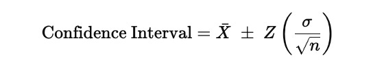
In this expression, Xˉ represents the sample mean of the signal, which is the central level around which the residuals fluctuate. The quantity σ\sigmaσ is the standard deviation of the residuals, so it measures how volatile or noisy the signal is. The term nnn is the number of observations used to estimate these statistics, and dividing by n\sqrt{n}n converts the raw volatility into the standard error of the mean. The factor Z is the Z-score associated with the chosen confidence level, which is 1.96 for a 95 percent interval, meaning that under a normality assumption, about ninety-five percent of observations should lie inside these bounds.
When these upper and lower limits are plotted together with the signal, they form dynamic bands around the mean. If the signal stays inside them, its movements are statistically consistent with random fluctuations. When it pushes beyond them, the deviation is large relative to its historical noise, which is precisely the condition under which a mean-reversion or statistical-arbitrage trade becomes justified. The code that follows computes the mean, standard deviation, standard error, and confidence bands so they can later be used to decide when the signal is strong enough to act upon.
ema_col = arb_df[f”ema_{TARGET}”]
ema_d_col = arb_df[f”ema_d_{TARGET}”]
signal_col = arb_df[f”{TARGET}_signal”]

errors_series = (ema_col + ema_d_col + signal_col) - ema_col.shift(-1)

arb_df[”rmse”] = np.sqrt(errors_series.pow(2).rolling(ARB_WINDOW).mean()).fillna(0)

rolling_mean = errors_series.rolling(ARB_WINDOW).mean().fillna(0)
rolling_std = errors_series.rolling(ARB_WINDOW).std().fillna(0)

ci_lower_vals = rolling_mean - 1.96 * rolling_std
ci_upper_vals = rolling_mean + 1.96 * rolling_std

arb_df[”ci_lower”] = signal_col.fillna(0) + ci_lower_vals
arb_df[”ci_upper”] = signal_col.fillna(0) + ci_upper_vals
arb_df[”ci_spread”] = arb_df[”ci_upper”] - arb_df[”ci_lower”]

arb_df.fillna(0, inplace=True)
arb_df[[”ci_lower”, “ci_upper”]].iloc[ARB_WINDOW:].tail(10)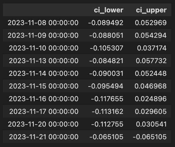
This block is constructing a short-time, probabilistic error model around a trading signal derived from exponential moving averages (EMAs) to support arbitrage decisions. At the top we pull three series from the DataFrame: the current EMA for the target instrument, a delta or derivative-like EMA term (ema_d), and the numeric trading signal. The code then forms a one-step-ahead prediction error series by comparing a constructed current estimate to the next-period EMA: errors_series = (ema + ema_d + signal) — ema.shift(-1). In narrative terms, the left side is the model’s implied value for the next bar (it combines the current EMA, an EMA-derived adjustment, and the current signal contribution) and ema.shift(-1) is the realized EMA in the subsequent timestamp, so the subtraction produces the one-step forecast error for each row.
Next, the code summarizes recent forecast performance with a rolling root-mean-square error (RMSE) over ARB_WINDOW periods. Taking the squared errors, averaging them over the window, and then square-rooting yields a scale-aware measure of typical absolute forecast deviation; this is written into arb_df[“rmse”]. Simultaneously, the code computes the rolling mean and rolling standard deviation of the errors over the same window. The rolling mean captures any systematic bias (whether the constructed estimate is consistently high or low), and the rolling standard deviation captures the recent variability of the one-step errors.
Those rolling statistics are then used to form approximate 95% confidence intervals around the rolling mean of the errors: ci_lower_vals = rolling_mean — 1.96 * rolling_std and ci_upper_vals = rolling_mean + 1.96 * rolling_std. The multiplier 1.96 reflects the two-sided 95% interval under a normality assumption for the error distribution, so these bounds represent a probabilistic envelope for the forecast error centered on its rolling mean.
The code then maps these error-centered intervals back to the signal axis by adding the signal series to each bound: arb_df[“ci_lower”] = signal + ci_lower_vals and arb_df[“ci_upper”] = signal + ci_upper_vals (with signal NaNs treated as zero before addition). This shifts the error-based bands from “error around zero” into “expected range for the signal-adjusted estimate,” producing an upper and lower band that represent where the signal-adjusted prediction is expected to fall with ~95% probability given recent error behavior. The ci_spread column is the width of that interval and quantifies the current uncertainty magnitude around the signal-adjusted prediction.
Finally, the DataFrame is cleansed of NaNs by filling them with zeros so subsequent logic won’t be interrupted by missing values, and the code presents the last ten entries of the confidence interval columns after the initial ARB_WINDOW rows (where rolling statistics become meaningful). Altogether, this sequence produces both an absolute error metric (rmse) and interval bands around the trading signal, which can be used in arbitrage logic to judge signal confidence, set entry/exit thresholds, or size trades based on recent predictive performance.
Visualizing the Signal and Errors
Now that the signal and error metrics are available, we will visualize them.
df = arb_df
tgt = TARGET
start = ARB_WINDOW

fig, (ax_top, ax_bottom) = plt.subplots(2, 1, gridspec_kw={”height_ratios”: (3, 1)}, figsize=(22, 8))

ax_top.set_title(f”Visualizing {tgt}’s Signal and Errors”)
idx = df.index[start:]

ax_top.plot(idx, df[tgt].iloc[start:], label=f”{tgt} $”, alpha=1, color=”b”)
ax_top.plot(idx, df[f”ema_{tgt}”].iloc[start:], label=f”{tgt} EMA $”, alpha=1)

combined_series = df[f”{tgt}_signal”].iloc[start:].fillna(0) + df[tgt].iloc[start:]
ax_top.plot(idx, combined_series, label=f”{tgt} + Signal $”, alpha=0.75, linestyle=”--”, color=”r”)
ax_top.legend()

ax_bottom.plot(idx, df[f”{tgt}_signal”].iloc[start:], label=f”Wieghted {tgt} Signal $”, alpha=0.75, color=”g”)
ax_bottom.plot(idx, df[”rmse”].iloc[start:], label=”RMSE”, alpha=0.75, linestyle=”--”, color=”r”)
ax_bottom.fill_between(
    idx,
    df[”ci_lower”].iloc[start:],
    df[”ci_upper”].iloc[start:],
    color=”gray”,
    alpha=0.3,
)
ax_bottom.axhline(0, color=”black”, linestyle=”--”, linewidth=1)
ax_bottom.legend()

plt.tight_layout()
plt.show()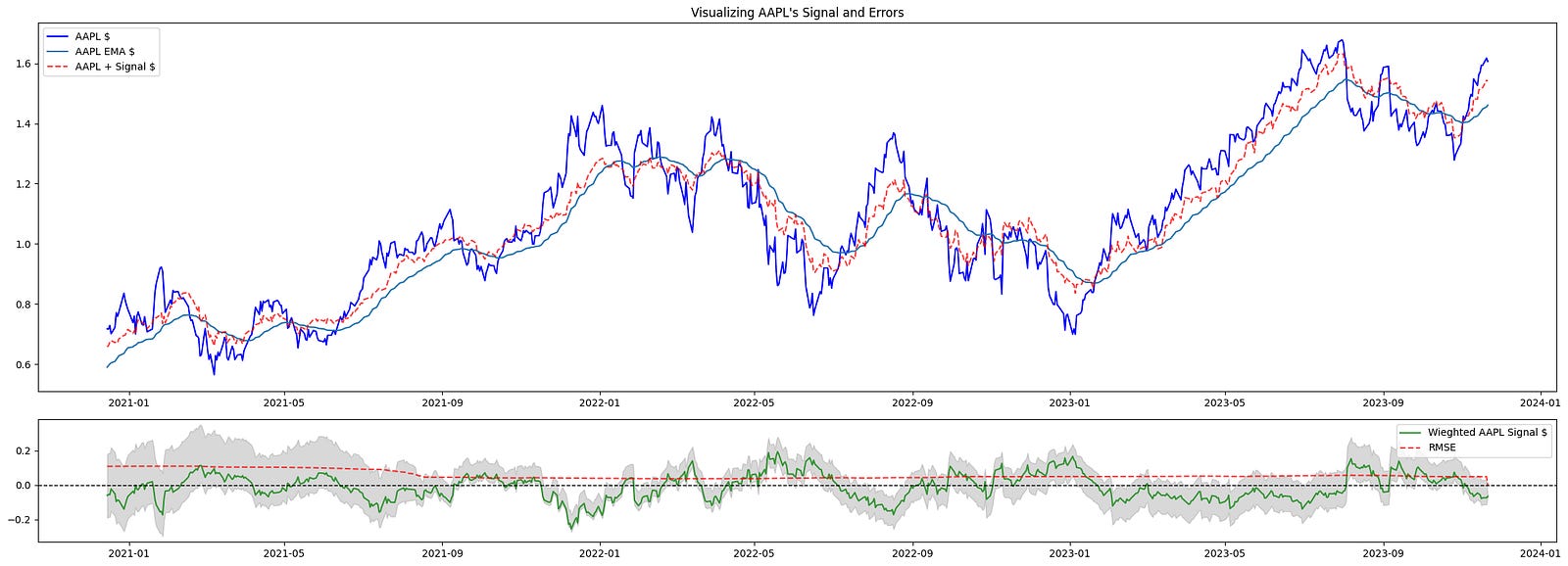
This block constructs a two-row visualization that helps you inspect a target instrument’s raw series, its trend estimate, the effect of the trading signal on the series, and error/uncertainty metrics — all sliced to exclude the initial warm‑up period. It begins by defining the plotting range with start = ARB_WINDOW and building idx = df.index[start:], which means every plotted series will skip the first ARB_WINDOW observations. That start offset exists because the indicators used to generate the signal and EMA require a warm-up period; excluding those points avoids showing transient initialization artifacts in the charts.
The top subplot is focused on the price-level view and how the signal would alter or augment that level. First it plots the target series df[tgt].iloc[start:] (the raw price/time series) to show the baseline. Immediately after it overlays df[f”ema_{tgt}”].iloc[start:], the exponential moving average, so you can visually compare the short-term price action to its smoothed trend — the EMA is included because the signal generation logic typically depends on trend/smoothing, and seeing both together clarifies whether the signal is trend-following or mean-reverting. Next the code constructs combined_series by adding the weighted signal series to the raw series: df[f”{tgt}_signal”].iloc[start:].fillna(0) + df[tgt].iloc[start:]. The fillna(0) ensures missing signal values don’t propagate NaNs into the sum; the resulting combined_series represents the price trajectory after applying the signal adjustment (i.e., the hypothetical adjusted price or directional shift induced by the signal), and this is plotted with a dashed red line so you can directly compare “price with signal” against raw price and EMA.
The bottom subplot surfaces the signal magnitude and the error/uncertainty metrics that indicate whether the signal is meaningful for trading. It plots the weighted signal series df[f”{tgt}_signal”].iloc[start:] in green to show the sign and magnitude of the strategy’s directional input over time. It then plots df[“rmse”].iloc[start:] (RMSE) as a dashed red line to show the model or residual error scale; juxtaposing RMSE with signal amplitude makes it easier to judge signal-to-noise ratio — i.e., whether signal excursions are large relative to typical error. The shaded area created by fill_between between df[“ci_lower”].iloc[start:] and df[“ci_upper”].iloc[start:] visualizes the confidence interval around the relevant estimate (error or forecast band), giving an immediate sense of uncertainty and the range within which outcomes are expected to lie. A horizontal zero line is added to the bottom axis so you can quickly see sign changes in the signal and whether values are meaningfully positive or negative relative to the baseline.
Finally, a legend is added to each subplot to map colors/linestyles to series, tight_layout is called to prevent overlap of axes and labels, and plt.show() renders the figure. Together, these two panels give a concise diagnostic view: the top panel shows price, trend, and the hypothetical effect of acting on the signal; the bottom panel quantifies the signal’s magnitude against model error and uncertainty, which are central for evaluating the signal’s tradability and the risks of acting on it within a quantitative trading workflow.
As the StatArb window incorporates more data, its predictions become more “accurate.” Tighter confidence bands increase the likelihood that we will simulate a trade.
Notably, in the post‑COVID market regime (2020–2023) there were persistent trends that aided the predictions’ accuracy.
Simulated Trading
Now we’ll act on our signals. Because this is a simulation, it intentionally ignores several market nuances — for example, stop losses and transaction costs.
The code below will take long or short positions in a portfolio depending on whether the signal crosses the specified thresholds:
long_thresh = 0.0025
short_thresh = -0.0025
conf_spread_thresh = 0.15
max_qty = 1

df = arb_df  # local alias to operate on the same DataFrame

df[”orders”] = 0
signal_col = f”{TARGET}_signal”
sig_series = df[signal_col]
next_signal = sig_series.shift(-1)

long_entry = (
    (sig_series > long_thresh)
    & (next_signal <= long_thresh)
    & (sig_series < df[”ci_upper”])
    & (sig_series > df[”ci_lower”])
    & (df[”ci_spread”] < conf_spread_thresh)
)

short_entry = (
    (sig_series < short_thresh)
    & (next_signal >= short_thresh)
    & (sig_series < df[”ci_upper”])
    & (sig_series > df[”ci_lower”])
    & (df[”ci_spread”] < conf_spread_thresh)
)

df.loc[long_entry, “orders”] += max_qty
df.loc[short_entry, “orders”] -= max_qty

df[”orders”].fillna(0, inplace=True)
df.loc[df[”orders”] != 0, “orders”].tail(10)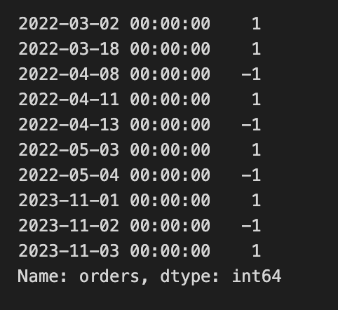
This block is building discrete trade entry signals for an arbitrage strategy by scanning a precomputed signal series and marking single-unit long or short orders when the signal crosses back through predefined thresholds while the model’s uncertainty is small. The top-level constants set the entry thresholds (long_thresh and short_thresh), the maximum allowed confidence-interval spread for acting (conf_spread_thresh), and the fixed trade size (max_qty). The ultimate goal is to populate an “orders” column on the arb_df DataFrame with +1 for a long entry, -1 for a short entry, or 0 for no action, so downstream execution or backtesting logic has simple, per-row discrete instructions.
After aliasing the DataFrame and creating the orders column initialized to zero, the code loads the strategy signal series (TARGET_signal) and constructs next_signal by shifting the series one step forward (shift(-1)), which places the next time-step’s signal value on the current row. That alignment is used to detect a crossing event between the current time and the immediately following time: the code is not simply checking whether the signal is above or below a threshold now, but whether it will cross the threshold between the current and next sample — a way to detect turning points or imminent reversals rather than persistent excursions.
The long_entry boolean mask requires five things simultaneously: the current signal is above the long threshold, the next signal is at-or-below that threshold (so the signal crosses downward through the long threshold between now and the next bar), the current signal lies between the computed confidence interval bounds (ci_lower < signal < ci_upper), and the confidence-interval spread (ci_spread) is less than the configured conf_spread_thresh. Together these checks mark moments when the signal is momentarily high but immediately reverts through the threshold, and when the model’s uncertainty is acceptably small and the estimate is within its own plausible bounds — conditions under which the strategy elects to place a long trade of size max_qty. The short_entry mask is the mirror image: it requires the current signal to be below the short threshold and the next signal to be at-or-above it (an upward crossing through the short threshold), plus the same confidence-interval inclusion and narrow spread requirement; when true, the code places a -max_qty order to open a short.
Those boolean masks are applied with .loc to increment the orders column by +max_qty for long_entry rows and decrement by max_qty for short_entry rows. Any remaining NaNs in the orders column are filled with zero to ensure a clean integer-like column. The final expression selects the last ten non-zero entries of the orders column, which provides a quick view of the most recent trade signals generated by these crossing-and-confidence criteria. Overall, the block turns temporal crossing behavior of the signal, gated by confidence metrics, into explicit one-unit entry instructions for the arbitrage system.
This code sample uses Pandas to compute PnL. A production trade-execution system would be substantially different.
import pandas as pd
import numpy as np

subset_mask = add_long_cond | add_short_cond
cols_needed = [”price”, “orders”, f”{TARGET}_signal”]
changes = arb_df.loc[subset_mask, cols_needed].copy()

changes[”position”] = changes[”orders”].cumsum()
changes[”stat_change”] = np.sign(changes[”orders”].shift(1)) != np.sign(changes[”orders”])
prev_position = changes[”position”].shift(1)

changes[”price_open”] = changes[”price”].shift(1)
same_state_mask = changes[”stat_change”] == False
avg_vals = (changes.loc[same_state_mask, “price_open”].shift(1) + changes.loc[same_state_mask, “price_open”]) / 2
changes[”cost_open_avg”] = np.nan
changes.loc[same_state_mask, “cost_open_avg”] = avg_vals
changes[”cost_open_avg”].fillna(changes[”price_open”], inplace=True)

changes[”price_close”] = changes[”price”]
changes.loc[changes.index[0], “price_close”] = np.nan

pnl_series = (changes.loc[changes[”stat_change”], “price_close”] - changes.loc[changes[”stat_change”], “cost_open_avg”]) * np.sign(changes[”position”].shift(1))
changes[”pnl”] = pnl_series
changes[”pnl_rets”] = changes[”pnl”] / changes[”cost_open_avg”].abs()

changes.fillna(0, inplace=True)

# ensure final column name matches original ‘holdings’
changes[”holdings”] = changes[”position”]

arb_df = pd.concat([arb_df, changes[[”pnl”, “pnl_rets”, “holdings”]]], axis=1).drop_duplicates(keep=”last”)

changes.tail(10)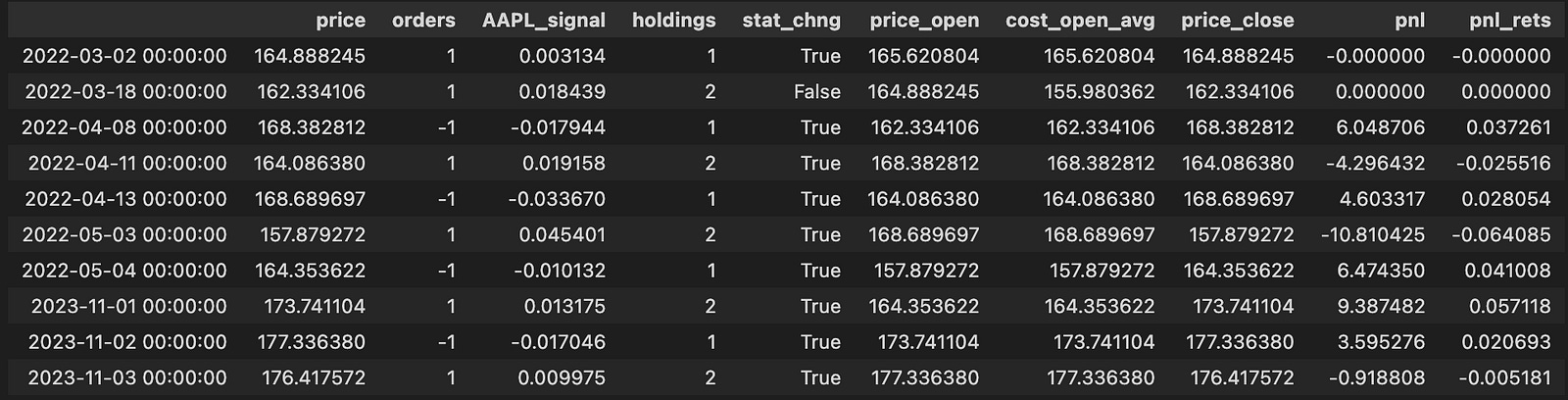
This block isolates the moments when we might change exposure and then computes realized PnL and holdings for those times. It begins by building a boolean mask (subset_mask) that marks rows where either the long or short entry condition is true; from the original arb_df we copy only the columns we need — price, orders, and the signal column — into a working DataFrame called changes so we operate on a focused subset without altering the source directly.
Next, the code turns the sequence of discrete order events into a running inventory by cumulatively summing the orders column into changes[“position”]. This gives the position after each event. To detect transitions between directional states it computes changes[“stat_change”] by comparing the sign of the previous order to the sign of the current order; when the sign differs (including switching between zero, positive, and negative) that boolean becomes True and marks a state flip. The script also computes prev_position = changes[“position”].shift(1) but, as written, that temporary variable is not used later in the block; the same shifted position is re-derived inline where needed.
The code then establishes an opening price for each event window: price_open is simply the prior price (price.shift(1)). It creates same_state_mask as the complement of stat_change — i.e., rows where the order sign did not change compared to the previous order. For those rows it constructs avg_vals as the average of two consecutive price_open values (the price_open for the row and the previous price_open). These averages are assigned into a new cost basis column cost_open_avg for rows that remained in the same state; for all other rows cost_open_avg defaults to the single price_open value. The logic here produces a blended open cost when the state persists across consecutive events and a single-period open cost when a new state begins.
The code defines price_close as the current price (the exit price for any closure), explicitly nulling out the first row’s price_close to avoid producing a spurious PnL at the dataset head. Realized PnL is then computed only on state-change rows: for rows where stat_change is True, pnl is (price_close — cost_open_avg) multiplied by the sign of the prior position (position.shift(1)). That multiplication assigns the correct sign to the price difference so that exiting a long yields positive PnL when price_close > cost_open_avg and exiting a short yields positive PnL when price_close < cost_open_avg. The code stores that selective series back into changes[“pnl”] (other rows remain NaN), and also computes pnl_rets as pnl divided by the absolute cost_open_avg to express the realized move as a return relative to the opening cost.
After the selective calculations, the code replaces NaNs with zeros so that the working DataFrame contains numeric values everywhere. It then adds a holdings column which mirrors the cumulative position to ensure the output column name matches the rest of the pipeline. Finally, it merges these computed columns back into the original arb_df via pd.concat aligned on the index, keeping the most recent duplicate rows (so the new pnl/pnl_rets/holdings values replace any prior ones at those indices), and then returns the tail of the changes DataFrame for inspection. Overall, the block turns discrete order events into an inventory time series and computes realized PnL and returns at the exact moments when the directional state changes, using averaged or single-period opens as the cost basis depending on whether the state persisted.
Finally, we visualize the trades executed alongside the signal and the acceptable error measures:
plt.figure(figsize=(26, 18))

fig2, axes = plt.subplots(
    3, 1, gridspec_kw={”height_ratios”: (3, 1, 1)}, figsize=(24, 12)
)
ax_top, ax_mid, ax_bot = axes

df = arb_df
start_idx = ARB_WINDOW
tgt = TARGET
long_mask = add_long_cond
short_mask = add_short_cond
short_thr = SHORT_THRESHOLD
long_thr = LONG_THRESHOLD

# Price plot with trade markers
ax_top.plot(
    df.iloc[start_idx:].index,
    df[”price”].iloc[start_idx:],
    color=”g”,
    lw=1.25,
    label=f”{tgt}”,
)
ax_top.plot(
    df.loc[long_mask].index,
    df.loc[long_mask, “price”],
    “^”,
    markersize=12,
    color=”blue”,
    label=”Buy”,
)
ax_top.plot(
    df.loc[short_mask].index,
    df.loc[short_mask, “price”],
    “v”,
    markersize=12,
    color=”red”,
    label=”Sell”,
)
ax_top.set_ylabel(”Price in $”)
ax_top.legend(loc=”upper left”, fontsize=10)
ax_top.set_title(f”Stat-Arb {tgt}”, fontsize=18)

# Cumulative returns
cum_returns = df[”pnl_rets”].iloc[start_idx:].fillna(0).cumsum()
ax_mid.plot(df[”pnl”].iloc[start_idx:].index, cum_returns, color=”b”, label=”Returns”)
ax_mid.set_ylabel(”Cumulative Profit (%)”)
ax_mid.legend(loc=”upper left”, fontsize=10)
ax_mid.set_title(f”Cummulative Returns”, fontsize=18)

# Signal plot with thresholds, fills and confidence band
ax_bot.plot(
    df.iloc[start_idx:].index,
    df[f”{tgt}_signal”].iloc[start_idx:],
    label=”Signal”,
    alpha=0.75,
    color=”g”,
)
ax_bot.plot(
    df.loc[long_mask].index,
    df.loc[long_mask, f”{tgt}_signal”],
    “^”,
    markersize=12,
    color=”blue”,
    label=”Buy”,
)
ax_bot.plot(
    df.loc[short_mask].index,
    df.loc[short_mask, f”{tgt}_signal”],
    “v”,
    markersize=12,
    color=”red”,
    label=”Sell”,
)
ax_bot.axhline(0, color=”black”, linestyle=”--”, linewidth=1)
ax_bot.axhline(short_thr, color=”r”, linestyle=”--”, label=f”Short ({short_thr})”, linewidth=1)
ax_bot.axhline(long_thr, color=”b”, linestyle=”--”, label=f”Long ({long_thr})”, linewidth=1)

sig_series = df[f”{tgt}_signal”]
ax_bot.fill_between(df.index, sig_series, short_thr, where=(sig_series < short_thr), interpolate=True, color=”red”, alpha=0.3)
ax_bot.fill_between(df.index, sig_series, long_thr, where=(sig_series > long_thr), interpolate=True, color=”blue”, alpha=0.3)

ax_bot.fill_between(
    df.iloc[start_idx:].index,
    df[”ci_lower”].iloc[start_idx:],
    df[”ci_upper”].iloc[start_idx:],
    color=”gray”,
    alpha=0.3,
    label=”Confidence”,
)
ax_bot.legend(loc=”lower left”, fontsize=10)
ax_bot.set_title(”Leads’ Signal”, fontsize=18)

plt.tight_layout()
plt.show()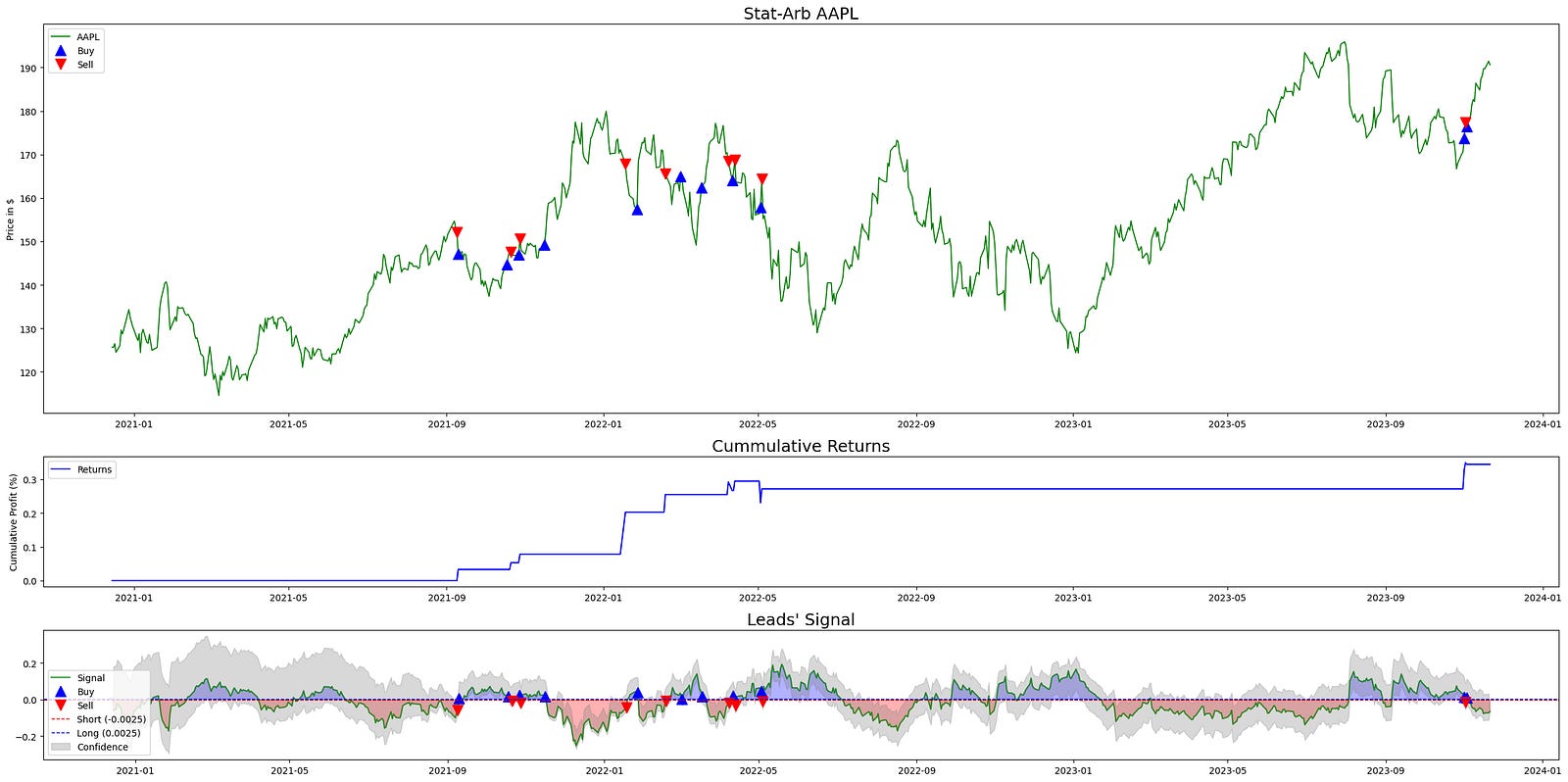
This block builds a three-panel diagnostic chart to visualize how a statistical-arbitrage signal behaves, where trades occurred, and how those trades translated into cumulative profit. The overall goal is to give a compact, aligned view of price, strategy returns, and the driving signal (with its thresholds and confidence interval) so you can quickly assess signal quality and trading outcomes for the specified target asset in a quant-trading workflow.
At the top level the code creates a large figure and then a 3×1 grid of subplots with height ratios (3,1,1). That layout intentionally gives more vertical space to the price series (top plot) while keeping cumulative returns and the signal compact underneath; this visually prioritizes price context while keeping returns and signal immediately available beneath it.
Before plotting, data and control variables are selected from the dataframe: df is the arb_df for the instrument, start_idx is ARB_WINDOW (used to trim the early rows), tgt identifies the target series suffix used to reference signal columns, long_mask and short_mask are boolean selectors marking buy/sell entry points, and long_thr / short_thr are the numeric threshold levels for long and short decisions. These choices let subsequent plotting draw only relevant periods and annotate trade events and thresholds consistently across panels.
The top subplot draws the price path from start_idx onward to avoid showing early periods often contaminated by initial rolling- or lookback-based calculations. On that price trace the code overlays trade markers: upward-pointing blue triangles at indices where the long_mask is true (Buy) and downward red triangles where the short_mask is true (Sell). Placing the same buy/sell markers on the price series makes it easy to correlate signal-triggered entries with actual market prices and to inspect execution context (e.g., whether buys happened near support or sells at resistance).
The middle subplot computes cumulative returns as a simple cumulative sum of the per-period pnl_rets column starting at start_idx. A fillna(0) before cumsum ensures any NaNs from initial periods do not propagate and artificially suppress the cumulative sum. Plotting this cumulative profit curve gives a compact summary of realized strategy performance over the same index window used for price and signal, letting you align equity path with event timing shown above and below.
The bottom subplot is a focused view of the model signal and its decision logic. It plots the target-specific signal series from start_idx onward, and overlays the same buy/sell markers so you can see exactly which signal values produced trade entries. Horizontal dashed lines are drawn at zero, the short threshold, and the long threshold to show the decision boundaries explicitly; these lines communicate the rule: when the signal exceeds long_thr you go long, and when it falls below short_thr you short.
Two kinds of fills enhance interpretation: first, fill_between highlights regions of the signal that cross the thresholds — red fills where the signal is below the short threshold and blue fills where it is above the long threshold — which visually emphasizes actionable regions versus neutral. Second, a gray translucent band is drawn between df[“ci_lower”] and df[“ci_upper”] (from start_idx onward) to represent a confidence interval around the signal, which lets you judge signal reliability at each timestamp; wider bands indicate higher uncertainty, and events within tight bands are more precise. Together, thresholds, fills, markers, and the confidence band make the signal panel a compact diagnostic of both what the model recommended and how confident it was when recommending it.
Finally, legends, axis labels, titles, tight_layout and show are used to produce a clear, publication-ready visual. The three panels are vertically aligned on the same time index so you can trace a single timestamp vertically through price, realized returns, and signal with thresholds/confidence to understand cause (signal), effect (trade), and outcome (PnL) in the stat-arb strategy.
This simulation simplifies the market in the same way the StatArb algorithm was simplified. A production implementation would employ more sophisticated statistical methods and run in a high-frequency execution environment, trading intraday (or near-intraday) because alpha from market inefficiencies is typically captured very quickly.
We also omitted back-testing, forward-testing, and parameter tuning for elements such as rolling window lengths and threshold values.
