

Building a Stock Market Classifier: A Comparative Analysis of Baseline and LSTM Models
A comprehensive walkthrough of feature engineering, time-series cross-validation, and model evaluation with ROC curves

Download link at the end of article for source code!
Start by importing the libraries your script will use. Libraries are collections of ready-made code that save you from rewriting common tasks, like handling numbers, tables, plots, downloading stock quotes, or building neural networks. Doing this first makes your workspace ready and helps avoid missing-tool errors later.
Typical choices for an LSTM stock-forecasting project include numpy for number work, pandas for data tables (a DataFrame is just a smart table), matplotlib or seaborn for plotting, scikit-learn for things like scaling (scaling means putting numbers on the same range), a data source library like yfinance or pandas_datareader to fetch stock prices, and TensorFlow/Keras to build the LSTM model (an LSTM is a neural network good at learning from sequences like price histories). Importing these at the top keeps the code clear and tells anyone reading what tools the project relies on.
#Standard libraries
import pandas as pd
import seaborn as sns
import numpy as np
import matplotlib.pyplot as plt
import time

# library for sampling
from scipy.stats import uniform

# libraries for Data Download
import datetime
from pandas_datareader import data as pdr
import fix_yahoo_finance as yf

# sklearn
from sklearn.pipeline import Pipeline
from sklearn.preprocessing import StandardScaler
from sklearn.preprocessing import MinMaxScaler
from sklearn.model_selection import TimeSeriesSplit
from sklearn.model_selection import RandomizedSearchCV
from sklearn.model_selection import GridSearchCV
from sklearn import metrics
from sklearn.metrics import make_scorer
from sklearn.metrics import accuracy_score
from sklearn.model_selection import train_test_split
from sklearn import linear_model

# Keras
import keras
from keras.models import Sequential
from keras.layers import LSTM
from keras.layers import Dense
from keras.layers import Dropout
from keras.wrappers.scikit_learn import KerasClassifier
Imagine we’re building a little factory that takes historical prices and tries to predict the next move; the opening lines import the tools the factory needs. Pandas supplies the spreadsheet-like workbench for time series, NumPy gives the fast number-crunching arrays, and seaborn plus matplotlib are the easel and paint for visualizing patterns; time helps us clock how long training takes. We bring in a sampler from SciPy so we can randomly try different hyperparameter values — like tasting random spice mixes when experimenting with a recipe.
To fetch data we load datetime for date handling and the pandas-datareader and Yahoo helper so the program can reach out and pull historical stock prices, like ordering ingredients from the market. For preparing inputs and evaluating models we assemble scikit-learn pieces: Pipeline to chain preprocessing and modeling steps into one assembly line; StandardScaler and MinMaxScaler to rescale features so they play nicely together — key concept: scaling makes different-valued features comparable by putting them on the same numerical footing. TimeSeriesSplit gives train/test folds that respect chronology — key concept: time-series cross-validation avoids peeking into the future by splitting along time.
We also import RandomizedSearchCV and GridSearchCV to search for good hyperparameters (randomized is like sampling at random, grid is exhaustive tasting), plus metrics and make_scorer to judge model quality, and train_test_split or simple baselines from linear_model to compare against.
Finally we bring in Keras: Sequential as a recipe card to stack layers, LSTM as the memory cell that learns temporal dependencies — key concept: an LSTM layer can remember information across time steps — Dense for final predictions, Dropout to reduce overfitting, and KerasClassifier to let the neural net plug into scikit-learn’s tools. Altogether, these imports prepare a pipeline to download data, scale it, tune and train an LSTM, and visualize how well our forecasts work in the larger stock-forecasting project.
We’ll group related code into small classes so the project stays tidy and easy to change later. A *Data class* reads your historical prices and turns them into sequences the LSTM can learn from; a sequence is a tiny timespan of past prices the model uses to predict the next price. This makes feeding data to the model consistent and lets you swap datasets without rewriting the training loop.
A Model class wraps the LSTM itself and its settings (how many layers, hidden size, etc.). Think of it as a neat box that knows how to take a sequence and return a prediction. Keeping model code here makes it simple to try different architectures or save and load weights.
A Trainer class runs the training loop: it handles batching, computes loss, steps the optimizer, and can implement early stopping (which stops training if validation loss stops improving). This separates “how we train” from “what we train,” so experiments are less error-prone and easier to reproduce.
Finally, add a Scaler class to normalize and inverse-transform prices (normalizing means scaling numbers to a small range so the model learns better). Normalization prevents large price values from dominating the learning and makes the model converge faster. Also include methods to save and load checkpoints so you can resume training or evaluate a saved model later.
# Define a callback class
# Resets the states after each epoch (after going through a full time series)
class ModelStateReset(keras.callbacks.Callback):
    def on_epoch_end(self, epoch, logs={}):
        self.model.reset_states()
reset=ModelStateReset()

# Different Approach
#class modLSTM(LSTM):
#    def call(self, x, mask=None):
#        if self.stateful:
#             self.reset_states()
#        return super(modLSTM, self).call(x, mask)
Imagine you’re training a storyteller to predict stock moves, and you want a polite stagehand who steps in after each training pass (an epoch) to wipe the storyteller’s short-term memory so the next pass starts fresh. The class declaration creates that stagehand: class ModelStateReset(keras.callbacks.Callback) tells Keras “here’s a callback object that can hook into training events.” A callback is like an assistant that gets called at well-defined moments during training to perform side tasks. The on_epoch_end method is the specific cue the assistant listens for — it will run when an epoch finishes, receiving the epoch index and a logs dictionary (logs={} provides a default so the method signature always works). Inside that method self.model.reset_states() instructs the model to clear its recurrent hidden states; key concept: stateful RNNs keep their hidden states between batches to remember sequence context, and reset_states() erases that memory so successive epochs don’t incorrectly share state. The line reset = ModelStateReset() simply creates an instance of the assistant so you can pass it into model.fit(…, callbacks=[reset]) and have it do its job automatically.
The commented alternative shows another way: subclassing LSTM and overriding call to reset states whenever the layer is stateful before delegating to the original behavior — like modifying the storyteller itself to clear its own memory. That approach works but changes the layer behavior; using a callback keeps the training flow cleaner. Either way, clearing state between full passes helps your LSTM learn stock patterns without leaking memory across unrelated sequences, which is important for reliable price forecasting.
Write functions to turn your work into tidy, reusable steps. Functions make each task clear, let you test pieces separately, and let you try different ideas fast — which is handy when tuning an LSTM for stock forecasts.
Start with data helpers that load CSVs into a DataFrame — a DataFrame is just a smart table that keeps rows and columns. Add simple cleaning steps: sort by date, drop missing rows, and pick the features you need. Also include scaling (e.g., MinMax) so the model learns faster; scaling keeps numbers small and comparable.
Create a sequence builder that slides a fixed window over your time series and returns X (past windows) and y (future targets). LSTMs expect sequences of past values, so this step turns raw prices into the right shape for training.
Write a model factory that builds and compiles your LSTM. Keep architecture choices (layers, units, dropout) as parameters so you can experiment without rewriting code. Add a train function that handles batching, epochs, and callbacks like early stopping.
Finally, include predict, inverse-scale, and evaluate functions that produce forecasts, convert them back to real prices, and compute errors like RMSE. Also add save/load utilities so you can reuse trained models later without retraining. These functions make your pipeline repeatable and easy to debug.
# Function to create an LSTM model, required for KerasClassifier
def create_shallow_LSTM(epochs=1,
                        LSTM_units=1,
                        num_samples=1,
                        look_back=1,
                        num_features=None,
                        dropout_rate=0,
                        recurrent_dropout=0,
                        verbose=0):

    model=Sequential()

    model.add(LSTM(units=LSTM_units,
                   batch_input_shape=(num_samples, look_back, num_features),
                   stateful=True,
                   recurrent_dropout=recurrent_dropout))

    model.add(Dropout(dropout_rate))

    model.add(Dense(1, activation=’sigmoid’, kernel_initializer=keras.initializers.he_normal(seed=1)))

    model.compile(loss=’binary_crossentropy’, optimizer=”adam”, metrics=[’accuracy’])

    return model
Think of this function as a reusable recipe card that builds a small LSTM network for KerasClassifier: the def line names the recipe create_shallow_LSTM and lists the knobs you can tune like epochs, number of LSTM units, how many past steps to look at (look_back), how many features each step has, and dropout rates. The model=Sequential() line lays out an empty baking tray where we’ll place layers one after another; Sequential means layers are stacked in order. Adding LSTM(…) places a memory cell on the tray: units=LSTM_units sets how much memory the cell has, batch_input_shape=(num_samples, look_back, num_features) fixes the exact shape of inputs — a requirement when the layer is stateful — and stateful=True tells the cell to carry its memory across batches like keeping a simmering stock between ladles; recurrent_dropout applies controlled forgetting on the cell’s internal connections to reduce overfitting (a one-sentence key concept: dropout randomly disables some connections during training so the model doesn’t memorize noise). The Dropout(dropout_rate) layer is another intentional forgetting step applied to the LSTM outputs. The Dense(1, activation=’sigmoid’, kernel_initializer=keras.initializers.he_normal(seed=1)) adds a single output neuron that squashes its value into a probability between 0 and 1, with a carefully chosen initializer to start weights sensibly. model.compile(…) tells Keras how to evaluate and update the network — binary_crossentropy fits a two-way outcome (like up vs down), optimizer=”adam” is the adaptive recipe for adjusting weights, and accuracy is tracked as a metric. Finally return model hands you the ready-to-train model. This compact recipe is ready to be used in your stock forecasting pipeline when you frame the problem as predicting direction or a binary event.
This section covers the data you’ll use to forecast stock prices with an LSTM model, which is a kind of neural network that learns from sequences of numbers. Think of this part as getting your inputs and putting them in the right shape so the model can actually learn patterns over time.
Start with historical market data like the date, open/high/low/close prices and volume. You can add simple technical indicators if you want, such as moving averages; a DataFrame is just a smart table that keeps these columns neatly aligned by date. Collecting the right columns now makes the modeling steps later much simpler.
Clean the data first: fill or drop missing values and make sure timestamps are continuous. Scale the numbers so they are on a similar range — scaling (also called normalization) just means shrinking values so the model trains faster and more reliably. This step prevents very large price numbers from dominating learning.
Build input sequences by sliding a fixed-length window over the time series; each window becomes one training example and the next price is the label. LSTMs need these ordered sequences to learn how past values influence future ones. Finally, split into train, validation and test sets without shuffling so the test set truly represents future data and you can evaluate realistic performance.
This step is about bringing in the raw data*— the original, unprocessed stock prices and related fields your model will learn from. Raw data means the numbers as they came from a file or service, before you clean or transform them. Getting this right matters because everything that follows (cleaning, scaling, building sequences) depends on the input.
You’ll usually load historical price files like CSVs (a simple text file where commas separate columns) or pull data from an API such as Yahoo Finance or Alpha Vantage. Typical columns are date, open, high, low, close, and volume. Make sure the dates are in order and that you know the timezone; misaligned timestamps can confuse a time-based model. Also check for missing rows or obvious errors — it’s easier to fix these now than after you build your dataset.
For an LSTM (a type of neural network that learns from sequences of numbers, like price over time) you’ll later turn this raw table into sliding windows of past prices. Importing clean, well-organized raw data prepares you for that step and reduces surprises during training.
# Imports data
start_sp=datetime.datetime(1980, 1, 1)
end_sp=datetime.datetime(2019, 2, 28)

yf.pdr_override()
sp500=pdr.get_data_yahoo(’^GSPC’,
                        start_sp,
                        end_sp)
sp500.shape
We’re starting by saying what we want: grab historical market data so our forecasting model has something to learn from. The first two lines set a time window: start_sp = datetime.datetime(1980, 1, 1) and end_sp = datetime.datetime(2019, 2, 28). Think of those as setting the start and end marks on a calendar — a datetime object represents a specific point in time used for slicing the data. That window tells the downloader how much history to fetch.
Next, yf.pdr_override() quietly swaps in yfinance as the backend for the pandas-datareader helper, like changing the mail carrier so Yahoo’s finance API can deliver the data in a format pandas understands. Then pdr.get_data_yahoo(‘^GSPC’, start_sp, end_sp) places the request: it asks for S&P 500 historical prices between the dates you picked, and returns a table-like object called a DataFrame which holds columns like Open, High, Low, Close, Volume.
Finally, sp500.shape is queried so you can see the size of that table — shape returns a tuple (rows, columns), and knowing the number of rows tells you how many time steps you have. With the S&P 500 series loaded and its dimensions known, you’re ready to transform those rows into sequences and feed them into the LSTM to learn price patterns.
Creating features means building the inputs the model will use to learn. Think of *features* as the signals you feed an LSTM so it can spot patterns, and the *target* as the future price you want it to predict. This step matters because the wrong inputs make learning slow or misleading.
Start with simple, obvious things: past prices and returns, trading volume, and basic moving averages. You can add technical indicators like RSI or MACD, but explain them in one line when you add them (for example, RSI is a measure of recent gains versus losses). Keep each feature as a number the model can use.
Scale your features so they live on similar ranges — that’s called normalization, and it helps the LSTM train faster and avoid getting stuck. Be careful to avoid data leakage: only use information available at the prediction time, never peeking into future data.
Finally, turn the time series into sequences the LSTM can read. Use a sliding window to make short past histories (timesteps) and their matching targets. This reshapes your table into a 3D array: samples × timesteps × features, which is the format LSTMs expect.
# Compute the logarithmic returns using the Closing price
sp500[’Log_Ret_1d’]=np.log(sp500[’Close’] / sp500[’Close’].shift(1))

# Compute logarithmic returns using the pandas rolling mean function
sp500[’Log_Ret_1w’]=pd.Series(sp500[’Log_Ret_1d’]).rolling(window=5).sum()
sp500[’Log_Ret_2w’]=pd.Series(sp500[’Log_Ret_1d’]).rolling(window=10).sum()
sp500[’Log_Ret_3w’]=pd.Series(sp500[’Log_Ret_1d’]).rolling(window=15).sum()
sp500[’Log_Ret_4w’]=pd.Series(sp500[’Log_Ret_1d’]).rolling(window=20).sum()
sp500[’Log_Ret_8w’]=pd.Series(sp500[’Log_Ret_1d’]).rolling(window=40).sum()
sp500[’Log_Ret_12w’]=pd.Series(sp500[’Log_Ret_1d’]).rolling(window=60).sum()
sp500[’Log_Ret_16w’]=pd.Series(sp500[’Log_Ret_1d’]).rolling(window=80).sum()
sp500[’Log_Ret_20w’]=pd.Series(sp500[’Log_Ret_1d’]).rolling(window=100).sum()
sp500[’Log_Ret_24w’]=pd.Series(sp500[’Log_Ret_1d’]).rolling(window=120).sum()
sp500[’Log_Ret_28w’]=pd.Series(sp500[’Log_Ret_1d’]).rolling(window=140).sum()
sp500[’Log_Ret_32w’]=pd.Series(sp500[’Log_Ret_1d’]).rolling(window=160).sum()
sp500[’Log_Ret_36w’]=pd.Series(sp500[’Log_Ret_1d’]).rolling(window=180).sum()
sp500[’Log_Ret_40w’]=pd.Series(sp500[’Log_Ret_1d’]).rolling(window=200).sum()
sp500[’Log_Ret_44w’]=pd.Series(sp500[’Log_Ret_1d’]).rolling(window=220).sum()
sp500[’Log_Ret_48w’]=pd.Series(sp500[’Log_Ret_1d’]).rolling(window=240).sum()
sp500[’Log_Ret_52w’]=pd.Series(sp500[’Log_Ret_1d’]).rolling(window=260).sum()
sp500[’Log_Ret_56w’]=pd.Series(sp500[’Log_Ret_1d’]).rolling(window=280).sum()
sp500[’Log_Ret_60w’]=pd.Series(sp500[’Log_Ret_1d’]).rolling(window=300).sum()
sp500[’Log_Ret_64w’]=pd.Series(sp500[’Log_Ret_1d’]).rolling(window=320).sum()
sp500[’Log_Ret_68w’]=pd.Series(sp500[’Log_Ret_1d’]).rolling(window=340).sum()
sp500[’Log_Ret_72w’]=pd.Series(sp500[’Log_Ret_1d’]).rolling(window=360).sum()
sp500[’Log_Ret_76w’]=pd.Series(sp500[’Log_Ret_1d’]).rolling(window=380).sum()
sp500[’Log_Ret_80w’]=pd.Series(sp500[’Log_Ret_1d’]).rolling(window=400).sum()

# Compute Volatility using the pandas rolling standard deviation function
sp500[’Vol_1w’]=pd.Series(sp500[’Log_Ret_1d’]).rolling(window=5).std()*np.sqrt(5)
sp500[’Vol_2w’]=pd.Series(sp500[’Log_Ret_1d’]).rolling(window=10).std()*np.sqrt(10)
sp500[’Vol_3w’]=pd.Series(sp500[’Log_Ret_1d’]).rolling(window=15).std()*np.sqrt(15)
sp500[’Vol_4w’]=pd.Series(sp500[’Log_Ret_1d’]).rolling(window=20).std()*np.sqrt(20)
sp500[’Vol_8w’]=pd.Series(sp500[’Log_Ret_1d’]).rolling(window=40).std()*np.sqrt(40)
sp500[’Vol_12w’]=pd.Series(sp500[’Log_Ret_1d’]).rolling(window=60).std()*np.sqrt(60)
sp500[’Vol_16w’]=pd.Series(sp500[’Log_Ret_1d’]).rolling(window=80).std()*np.sqrt(80)
sp500[’Vol_20w’]=pd.Series(sp500[’Log_Ret_1d’]).rolling(window=100).std()*np.sqrt(100)
sp500[’Vol_24w’]=pd.Series(sp500[’Log_Ret_1d’]).rolling(window=120).std()*np.sqrt(120)
sp500[’Vol_28w’]=pd.Series(sp500[’Log_Ret_1d’]).rolling(window=140).std()*np.sqrt(140)
sp500[’Vol_32w’]=pd.Series(sp500[’Log_Ret_1d’]).rolling(window=160).std()*np.sqrt(160)
sp500[’Vol_36w’]=pd.Series(sp500[’Log_Ret_1d’]).rolling(window=180).std()*np.sqrt(180)
sp500[’Vol_40w’]=pd.Series(sp500[’Log_Ret_1d’]).rolling(window=200).std()*np.sqrt(200)
sp500[’Vol_44w’]=pd.Series(sp500[’Log_Ret_1d’]).rolling(window=220).std()*np.sqrt(220)
sp500[’Vol_48w’]=pd.Series(sp500[’Log_Ret_1d’]).rolling(window=240).std()*np.sqrt(240)
sp500[’Vol_52w’]=pd.Series(sp500[’Log_Ret_1d’]).rolling(window=260).std()*np.sqrt(260)
sp500[’Vol_56w’]=pd.Series(sp500[’Log_Ret_1d’]).rolling(window=280).std()*np.sqrt(280)
sp500[’Vol_60w’]=pd.Series(sp500[’Log_Ret_1d’]).rolling(window=300).std()*np.sqrt(300)
sp500[’Vol_64w’]=pd.Series(sp500[’Log_Ret_1d’]).rolling(window=320).std()*np.sqrt(320)
sp500[’Vol_68w’]=pd.Series(sp500[’Log_Ret_1d’]).rolling(window=340).std()*np.sqrt(340)
sp500[’Vol_72w’]=pd.Series(sp500[’Log_Ret_1d’]).rolling(window=360).std()*np.sqrt(360)
sp500[’Vol_76w’]=pd.Series(sp500[’Log_Ret_1d’]).rolling(window=380).std()*np.sqrt(380)
sp500[’Vol_80w’]=pd.Series(sp500[’Log_Ret_1d’]).rolling(window=400).std()*np.sqrt(400)

# Compute Volumes using the pandas rolling mean function
sp500[’Volume_1w’]=pd.Series(sp500[’Volume’]).rolling(window=5).mean()
sp500[’Volume_2w’]=pd.Series(sp500[’Volume’]).rolling(window=10).mean()
sp500[’Volume_3w’]=pd.Series(sp500[’Volume’]).rolling(window=15).mean()
sp500[’Volume_4w’]=pd.Series(sp500[’Volume’]).rolling(window=20).mean()
sp500[’Volume_8w’]=pd.Series(sp500[’Volume’]).rolling(window=40).mean()
sp500[’Volume_12w’]=pd.Series(sp500[’Volume’]).rolling(window=60).mean()
sp500[’Volume_16w’]=pd.Series(sp500[’Volume’]).rolling(window=80).mean()
sp500[’Volume_20w’]=pd.Series(sp500[’Volume’]).rolling(window=100).mean()
sp500[’Volume_24w’]=pd.Series(sp500[’Volume’]).rolling(window=120).mean()
sp500[’Volume_28w’]=pd.Series(sp500[’Volume’]).rolling(window=140).mean()
sp500[’Volume_32w’]=pd.Series(sp500[’Volume’]).rolling(window=160).mean()
sp500[’Volume_36w’]=pd.Series(sp500[’Volume’]).rolling(window=180).mean()
sp500[’Volume_40w’]=pd.Series(sp500[’Volume’]).rolling(window=200).mean()
sp500[’Volume_44w’]=pd.Series(sp500[’Volume’]).rolling(window=220).mean()
sp500[’Volume_48w’]=pd.Series(sp500[’Volume’]).rolling(window=240).mean()
sp500[’Volume_52w’]=pd.Series(sp500[’Volume’]).rolling(window=260).mean()
sp500[’Volume_56w’]=pd.Series(sp500[’Volume’]).rolling(window=280).mean()
sp500[’Volume_60w’]=pd.Series(sp500[’Volume’]).rolling(window=300).mean()
sp500[’Volume_64w’]=pd.Series(sp500[’Volume’]).rolling(window=320).mean()
sp500[’Volume_68w’]=pd.Series(sp500[’Volume’]).rolling(window=340).mean()
sp500[’Volume_72w’]=pd.Series(sp500[’Volume’]).rolling(window=360).mean()
sp500[’Volume_76w’]=pd.Series(sp500[’Volume’]).rolling(window=380).mean()
sp500[’Volume_80w’]=pd.Series(sp500[’Volume’]).rolling(window=400).mean()

# Label data: Up (Down) if the the 1 month (≈ 21 trading days) logarithmic return increased (decreased)
sp500[’Return_Label’]=pd.Series(sp500[’Log_Ret_1d’]).shift(-21).rolling(window=21).sum()
sp500[’Label’]=np.where(sp500[’Return_Label’] > 0, 1, 0)

# Drop NA´s
sp500=sp500.dropna(”index”)
sp500=sp500.drop([’Open’, ‘High’, ‘Low’, ‘Close’, ‘Adj Close’, ‘Volume’, “Return_Label”], axis=1)
Think of your data frame as a long journal of daily market life; the first line turns raw closing prices into a gentle measure of change by taking the logarithm of today’s close divided by yesterday’s — log returns are a compact, additive way to measure percentage changes. The next block builds a family of multi-week return features by sliding a window across that daily log-return column and summing the values inside each window; a rolling window is like a postage stamp you slide along the timeline so each day collects the cumulative log-return over the past 5, 10, 15 … up to 400 days, giving you short- and long-horizon return signals (summing log returns gives the total log return over the period).
Right after, volatility is computed by taking the rolling standard deviation of daily log returns and multiplying by the square root of the window length — standard deviation quantifies typical fluctuation size, and scaling by the square root of time converts that daily variability into the variability over the whole window. Then volumes are smoothed in the same sliding-window spirit by taking rolling means of the raw Volume column so each date also carries short- and long-term average trading activity.
To create a target for prediction, the code sums the next 21 trading-day log returns (it shifts the series backward and then rolls), so every row gets a forward-looking one-month return; a binary Label marks 1 if that forward return is positive and 0 otherwise, turning future movement into a classification target. Finally, any rows with missing values are dropped and raw price columns removed so the frame contains only engineered features and the label. All these features become the inputs your LSTM can learn temporal patterns from when forecasting stock movement.
Start by getting a feel for the data: how many rows and columns it has, what the column names are, and what types each column is (numbers, text, or dates). A DataFrame is just a smart table that holds this data. This quick check tells you if you loaded the right file and what needs fixing before modeling.
Make sure your date column is really a date and that the rows are sorted by time. LSTMs are a kind of neural network that read sequences, so they need the data in the right order and with a proper time index. Converting and sorting now avoids subtle errors later when you build sequences.
Look for missing or duplicate rows and note any unusual values. Count holes and duplicates so you can decide how to fill or drop them. Cleaning these issues first keeps your model from learning junk.
Compute simple summary stats — mean, standard deviation, min, max — and peek at correlations between features. These numbers show the data’s scale and relationships, which helps choose scaling and which inputs matter most. A quick plot of price over time also helps you spot trends or sudden jumps that may need special handling.
# Show rows and columns
print(”Rows, Columns:”);print(sp500.shape);print(”\n”)

# Describe DataFrame columns
print(”Columns:”);print(sp500.columns);print(”\n”)

# Show info on DataFrame
print(”Info:”);print(sp500.info()); print(”\n”)

# Count Non-NA values
print(”Non-NA:”);print(sp500.count()); print(”\n”)

# Show head
print(”Head”);print(sp500.head()); print(”\n”)

# Show tail
print(”Tail”);print(sp500.tail());print(”\n”)

# Show summary statistics
print(”Summary statistics:”);print(sp500.describe());print(”\n”)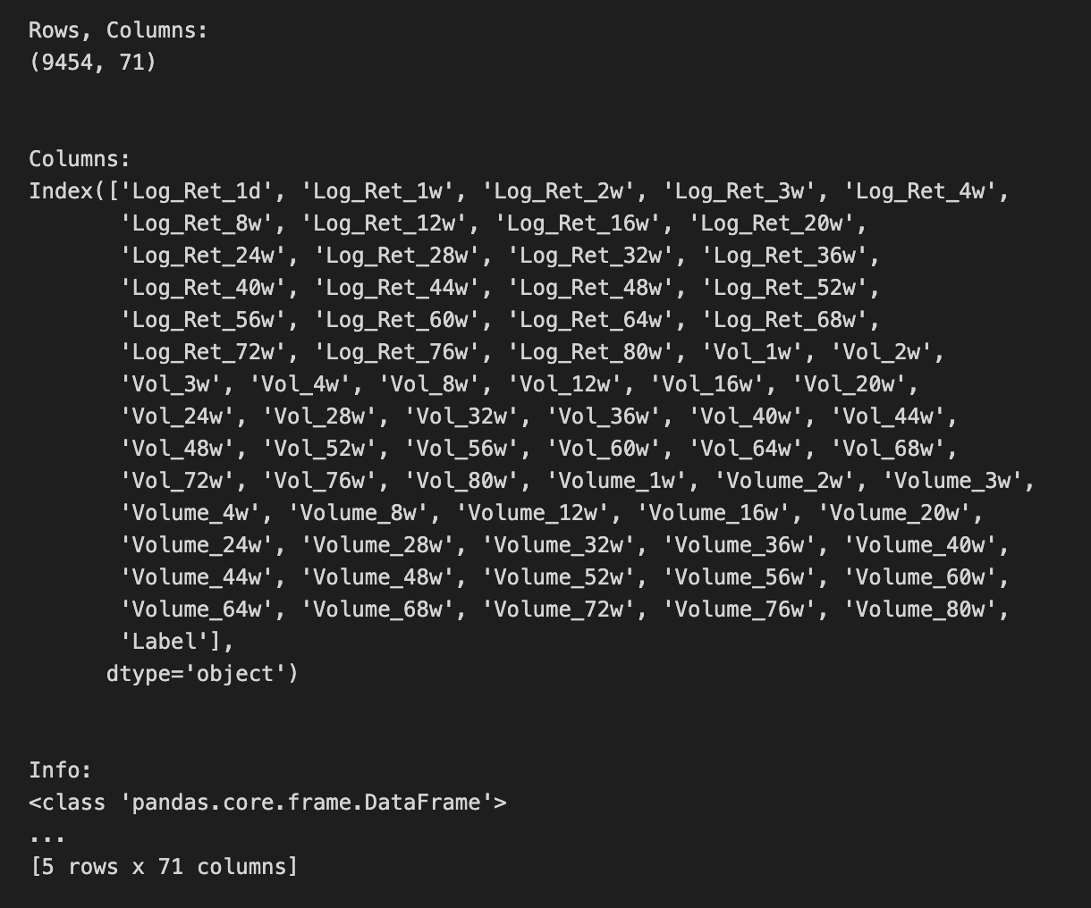
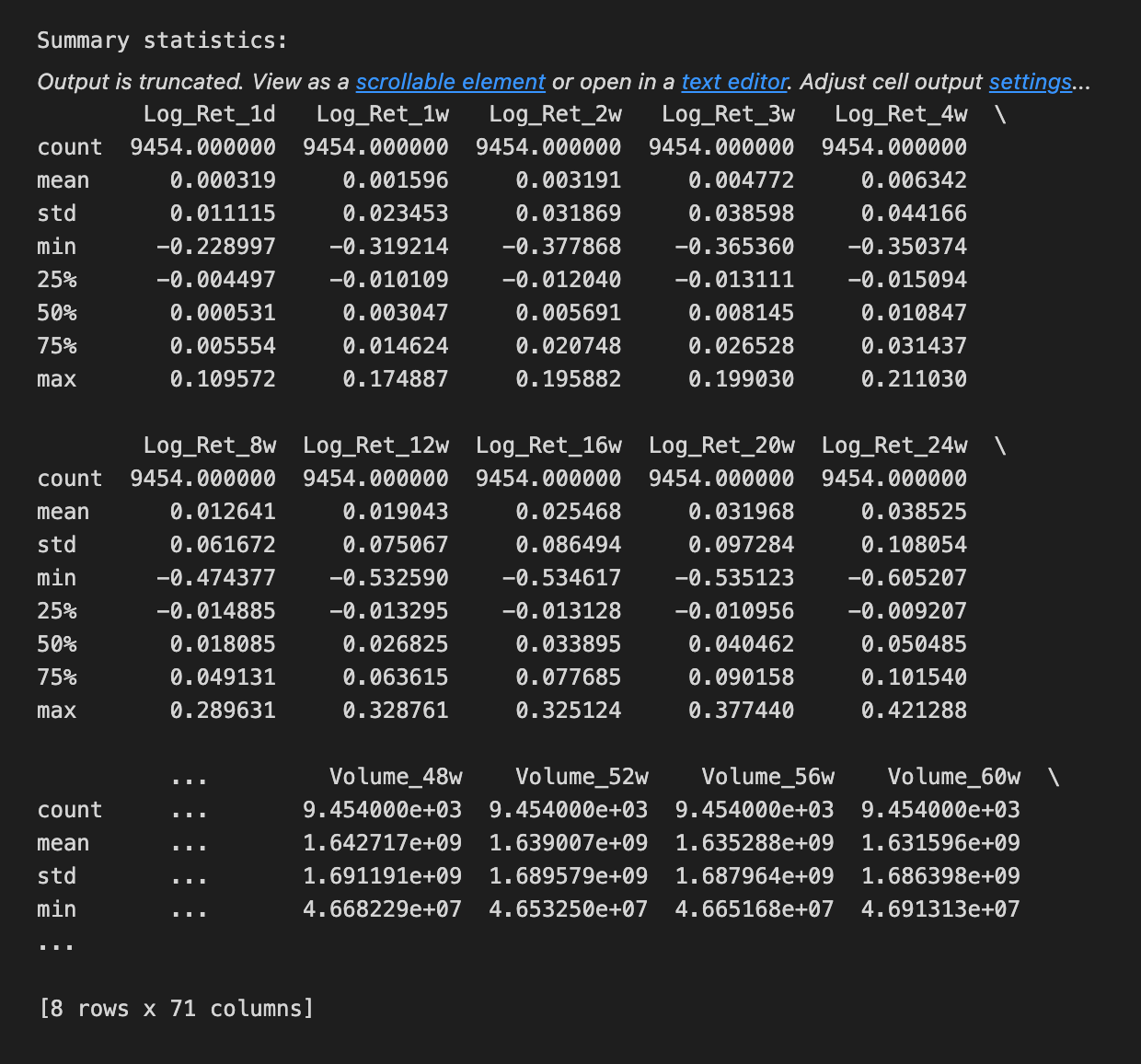
We begin by taking a friendly inventory of the sp500 dataset to make sure our inputs are sound before we feed them into an LSTM. A DataFrame is a 2D labeled data structure, like a spreadsheet, and the first printed pair shows its shape so we immediately know how many rows (time steps) and columns (features) we have — think of it as measuring the size of the room we’ll be working in. Printing the column labels then tells us what each feature is named, like reading the ingredient labels on a shelf so we know which variables are available. Calling the info method acts like looking at the building blueprint: it lists each column’s data type and memory footprint and flags non-null counts; data types are critical because an ML model expects numeric inputs, not text. Counting non-NA values is our attendance check, a direct way to spot missing data that we’ll need to handle. Showing the head and tail is like peeking at the first and last pages of a logbook to confirm ordering and to inspect a few actual records for obvious issues. Finally, the describe call produces a statistical report card — count, mean, standard deviation, min, quartiles and max — letting us see distributions and potential outliers at a glance, which guides scaling or transformation choices. All these steps help ensure the time series is clean, typed correctly, and well-understood before we build and train the LSTM forecast.
Before you feed anything into the LSTM (that’s a kind of neural network that learns from sequences, like past prices), take a moment to plot the data. Seeing the raw price history helps you spot obvious trends, repeating patterns, or weird spikes that could confuse the model. This quick look also helps you pick sensible settings later, like how many past days the model should consider.
Plot both the raw prices and any transformed versions you’ll use, such as scaled values (scaling just means squashing numbers into a smaller range so the model learns better). Mark where you split the data into training and testing sets so you can see whether the test portion looks like the training portion. If they look very different, the model may struggle.
After you run the model, plot predicted values against the actual prices on the same chart so you can see how well the LSTM follows reality. Also plot residuals (the differences between prediction and truth); residuals let you spot consistent bias or patterns the model missed.
Keep charts simple and readable: label axes, include a legend, and use dates on the x-axis. Good plots are cheap and fast, and they often save you hours of debugging later.
# Plot the logarithmic returns
sp500.iloc[:,1:24].plot(subplots=True, color=’blue’, figsize=(20, 20));
We’re trying to lay out the logarithmic returns for a set of S&P 500 series so we can visually inspect how each return path behaves over time. The line begins with sp500, which is a pandas DataFrame holding the series; iloc is an integer-location based slicer like cutting a loaf by positions, and iloc[:, 1:24] means “take every row but only the columns from position 1 up to (but not including) 24” — that exclusive upper bound is a key slicing rule. After selecting those columns we call .plot(), which is pandas’ friendly wrapper around matplotlib that turns columns into lines on a chart; giving subplots=True is like putting each ingredient into its own bowl so every column gets its own small chart to avoid overlap and make patterns easy to see. The color=’blue’ argument simply paints every line blue so the visuals are consistent, and figsize=(20, 20) sets the canvas size in inches so each small chart has room to breathe. The trailing semicolon is a notebook nicety that suppresses the textual return value display for a cleaner output. By spreading the log-returns across separate plots you can quickly spot trends, volatility shifts, or anomalies before you proceed to preprocessing and feeding the data into an LSTM for forecasting.
# Plot the Volatilities
sp500.iloc[:,24:47].plot(subplots=True, color=’blue’,figsize=(20, 20));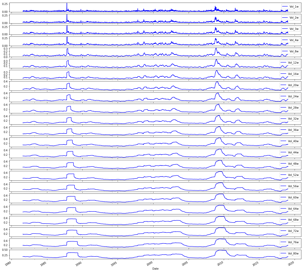
We want to take a look at a set of volatility series from an S&P 500 table, so the comment tells us the intent: “Plot the Volatilities.” Think of the DataFrame like a big cookbook where each column is a recipe card for one volatility series; sp500.iloc[:,24:47] is the act of pulling out a specific stack of cards by position — iloc is a positional indexer that selects rows and columns by number rather than by name, and here : means every row while 24:47 picks columns 24 up to 46.
Once those columns are selected, calling .plot(…) asks pandas to draw them, and the parameters shape how the drawings appear. Setting subplots=True is like asking for one individual plate per recipe so each series gets its own small chart rather than all being layered together; key concept: subplots create separate axes so you can compare shapes without overlap. color=’blue’ paints every line the same calm blue so the eye tracks volatility consistently, and figsize=(20,20) hands matplotlib a large canvas in inches so each small chart has plenty of room. The trailing semicolon is a tiny Jupyter notebook trick to suppress printing of the matplotlib object and leave only the visual.
Seeing these volatility traces helps you spot trends, spikes, or quiet stretches before you feed the cleaned, understood series into your LSTM forecasting pipeline.
# Plot the Volumes
sp500.iloc[:,47:70].plot(subplots=True, color=’blue’, figsize=(20, 20));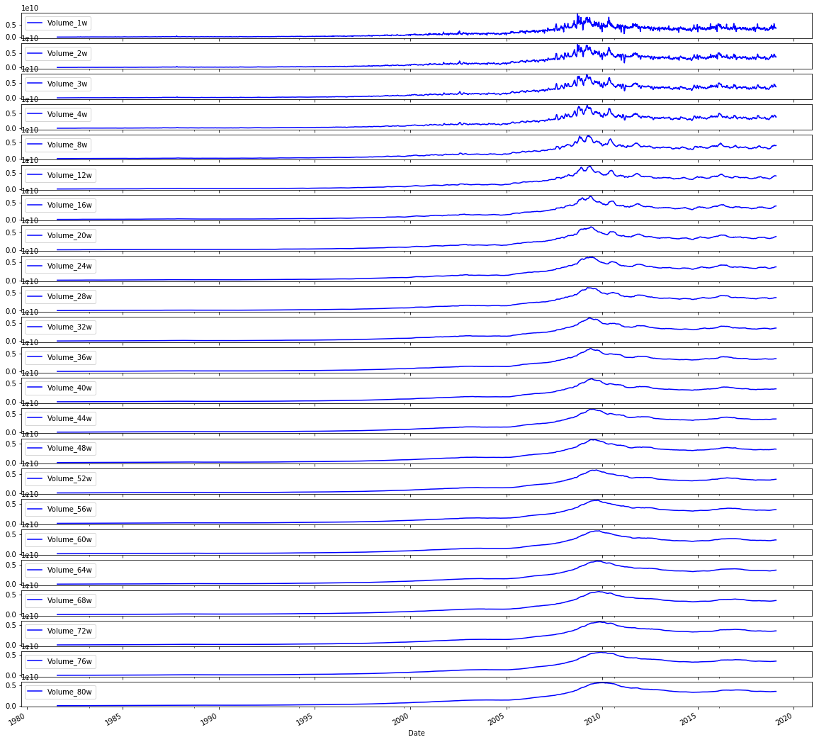
We want to take a quick visual tour of trading volumes before we feed anything into the model, because a picture often reveals trends, spikes, or gaps that numbers alone hide. The comment at the top simply says “Plot the Volumes” to remind us of that intention.
The line that follows reaches into the sp500 table and selects a block of columns by position: iloc[:,47:70] picks every row (the “:” is like saying “give me the whole timeline”) and columns 47 through 69 by integer position. Key concept: iloc is integer-location based indexing used to select rows and columns by their numerical positions. After selecting those columns, .plot(subplots=True, color=’blue’, figsize=(20, 20)) lays out a set of line charts — one small chart for each chosen column — so we can compare individual volume series side by side. Key concept: subplots=True tells the plotting engine to create separate axes for each column instead of overlaying them on a single plot. The color argument keeps all lines blue for visual consistency, and figsize=(20, 20) makes a large grid so each mini-chart is readable. The trailing semicolon is a quiet nudge to the notebook to show only the visuals, not the plot object.
Seeing these volume patterns helps you decide normalization, outlier handling, or which series to include as inputs to your LSTM forecast.
# Plot correlation matrix

focus_cols=sp500.iloc[:,24:47].columns

corr=sp500.iloc[:,24:70].corr().filter(focus_cols).drop(focus_cols)

mask=np.zeros_like(corr); mask[np.triu_indices_from(mask)]=True # we use mask to plot only part of the matrix

heat_fig, (ax)=plt.subplots(1, 1, figsize=(9,6))

heat=sns.heatmap(corr,
                   ax=ax,
                   mask=mask,
                   vmax=.5,
                   square=True,
                   linewidths=.2,
                   cmap=”Blues_r”)

heat_fig.subplots_adjust(top=.93)

heat_fig.suptitle(’Volatility vs. Volume’, fontsize=14, fontweight=’bold’)

plt.savefig(’heat1.eps’, dpi=200, format=’eps’);
We’re trying to reveal relationships — a little conversation — between a focused set of volatility columns and a broader set of variables (like volume measures), so we can spot which signals might help the LSTM learn. The first line selects the column names in positions 24 through 46: think of it as picking the recipe cards you care most about. Then a correlation table is built from columns 24 through 69, and from that table we keep only the columns matching our focus cards and remove those same labels from the rows, so the table becomes a cross-talk matrix showing how other features correlate with the chosen volatility features. A correlation matrix is simply a compact way to measure how two variables move together.
Next, a mask array is created that matches the correlation matrix shape and has the upper triangle marked; imagine putting a privacy screen over half a mirror so you only see one side of a symmetric relationship. A matplotlib figure and axis are prepared as a canvas and frame for the drawing. Seaborn’s heatmap then paints the correlation values as colors on that canvas, using the mask to hide the mirrored half, capping color intensity at 0.5 so extreme values don’t dominate, making cells square for neatness, and using a reversed blue palette so stronger correlations read visually as darker tones. The figure spacing and a bold title are set to make the plot presentable, and finally the image is exported to an EPS file for high-quality inclusion in reports. Seeing which features co-move with volatility helps inform which inputs to feed your LSTM forecasting model.
# Plot correlation matrix

focus_cols=sp500.iloc[:,24:47].columns

corr=sp500.iloc[:,1:47].corr().filter(focus_cols).drop(focus_cols)

mask=np.zeros_like(corr); mask[np.triu_indices_from(mask)]=True # we use mask to plot only part of the matrix

heat_fig, (ax)=plt.subplots(1, 1, figsize=(9,6))

heat=sns.heatmap(corr,
                   ax=ax,
                   mask=mask,
                   vmax=.5,
                   square=True,
                   linewidths=.2,
                   cmap=”Blues_r”)

heat_fig.subplots_adjust(top=.93)

heat_fig.suptitle(’Volatility vs. Return’, fontsize=14, fontweight=’bold’)

plt.savefig(’heat2.eps’, dpi=200, format=’eps’);
We’re trying to build a little map that shows how volatility-related columns relate to return-related columns so we can pick sensible inputs for our LSTM. First, we pick the columns we want to focus on by slicing the table: focus_cols = sp500.iloc[:,24:47].columns grabs the names of those columns so we can highlight their relationships. Next, we compute pairwise correlations across a wider set with sp500.iloc[:,1:47].corr() — correlation is a simple measure of linear association between two series, ranging from -1 to 1 — and then we .filter(focus_cols).drop(focus_cols) to keep only the correlations of other features against our focus columns while removing the diagonal self-comparisons.
To make the map easier to read we create a mask: mask=np.zeros_like(corr) creates an array the same shape as the correlation table, and mask[np.triu_indices_from(mask)]=True fills the upper triangle with True; a mask is just a way to hide parts of the plot so we avoid redundant mirrored information, like folding a map to look at one side.
We then make a figure and axis with plt.subplots(1, 1, figsize=(9,6)) to reserve plotting space, and call sns.heatmap(…) to draw the colored grid where each cell’s color encodes correlation strength. The arguments control the axis, apply the mask, cap the color scale at 0.5 so moderate correlations stand out, force square cells for neatness, add thin lines between cells, and choose a reversed blue palette. heat_fig.subplots_adjust(top=.93) makes room for the title, heat_fig.suptitle(…) stamps a bold heading, and plt.savefig(‘heat2.eps’, dpi=200, format=’eps’) writes the image to disk.
Seeing those relationships helps us decide which features to feed into the LSTM and spot multicollinearity before we build the forecasting model.
# Plot correlation matrix

focus_cols=sp500.iloc[:,47:70].columns

corr=sp500.iloc[:, np.r_[1:24, 47:70]].corr().filter(focus_cols).drop(focus_cols)

mask=np.zeros_like(corr); mask[np.triu_indices_from(mask)]=True # we use mask to plot only part of the matrix

heat_fig, (ax)=plt.subplots(1, 1, figsize=(9,6))

heat=sns.heatmap(corr,
                   ax=ax,
                   mask=mask,
                   vmax=.5,
                   square=True,
                   linewidths=.2,
                   cmap=”Blues_r”)

heat_fig.subplots_adjust(top=.93)

heat_fig.suptitle(’Volume vs. Return’, fontsize=14, fontweight=’bold’)

plt.savefig(’heat3.eps’, dpi=200, format=’eps’);
We want to visualize how a group of “focus” columns relate to a broader set of variables so you can spot which features (like volumes) correlate with returns. The first line picks those focus columns by slicing the DataFrame like choosing a subset of ingredients from a big pantry: focus_cols = sp500.iloc[:,47:70].columns selects columns 47 through 69. Next, a wider selection of columns is assembled with numpy’s r_ to combine ranges, then .corr() computes pairwise relationships among them; correlation measures the linear relationship between two variables and helps us see who moves together. The .filter(focus_cols).drop(focus_cols) keeps only the columns corresponding to the focus set while dropping their mirror rows, producing a rectangular table of how every other variable correlates with each focus column.
To keep the plot uncluttered, a mask is made: np.zeros_like creates an array of zeros matching the correlation table and np.triu_indices_from sets the upper triangle to True so it will be hidden; a mask is a boolean filter that hides parts of the visualization for clarity. plt.subplots creates a figure and axes (think of a function as a reusable recipe card that lays out your canvas), and sns.heatmap paints the correlation values using the mask, limiting the color scale with vmax=.5, making cells square, adding thin separators, and using a reversed blue colormap so stronger correlations stand out. The figure is nudged with subplots_adjust, given a bold title, and finally saved as an EPS file with plt.savefig for high-quality output. Viewing these relationships helps you choose and engineer features before feeding them into the LSTM forecasting model.
First, hold back a chunk of the most recent prices as your *test* data. This is the unseen future your model will try to predict, so keep it out of training and validation. For time series, that means slicing by date rather than shuffling rows, because mixing past and future would give an unrealistic advantage.
Next, prepare the training and validation sets and any transformations you need, like scaling or turning prices into sliding windows of past values. Scaling makes numbers easier for models to learn. Sliding windows turn a long list of prices into many short sequences the model can use to learn patterns.
Make two model sets: simple baselines and the LSTM models. A baseline is a straightforward method, like “predict tomorrow will equal today” or a moving average, and it helps you check whether the fancy model really improves things. An *LSTM* is a kind of neural network that remembers sequences, useful for time-based patterns.
Keep the test set the same for both model types so comparisons are fair. Save your preprocessing steps and model versions so you can reproduce results and understand why one approach wins. This prepares you to evaluate performance honestly and iterate from there.
# Model Set 1: Volatility

# Baseline
X_train_1, X_test_1, y_train_1, y_test_1=train_test_split(sp500.iloc[:,24:47], sp500.iloc[:,70], test_size=0.1 ,shuffle=False, stratify=None)
# LSTM
# Input arrays should be shaped as (samples or batch, time_steps or look_back, num_features):
X_train_1_lstm=X_train_1.values.reshape(X_train_1.shape[0], 1, X_train_1.shape[1])
X_test_1_lstm=X_test_1.values.reshape(X_test_1.shape[0], 1, X_test_1.shape[1])

# Model Set 2: Return
X_train_2, X_test_2, y_train_2, y_test_2=train_test_split(sp500.iloc[:,1:24], sp500.iloc[:,70], test_size=0.1 ,shuffle=False, stratify=None)
# LSTM
# Input arrays should be shaped as (samples or batch, time_steps or look_back, num_features):
X_train_2_lstm=X_train_2.values.reshape(X_train_2.shape[0], 1, X_train_2.shape[1])
X_test_2_lstm=X_test_2.values.reshape(X_test_2.shape[0], 1, X_test_2.shape[1])

# Model Set 3: Volume
X_train_3, X_test_3, y_train_3, y_test_3=train_test_split(sp500.iloc[:,47:70], sp500.iloc[:,70], test_size=0.1 ,shuffle=False, stratify=None)
# LSTM
# Input arrays should be shaped as (samples or batch, time_steps or look_back, num_features):
X_train_3_lstm=X_train_3.values.reshape(X_train_3.shape[0], 1, X_train_3.shape[1])
X_test_3_lstm=X_test_3.values.reshape(X_test_3.shape[0], 1, X_test_3.shape[1])

# Model Set 4: Volatility and Return
X_train_4, X_test_4, y_train_4, y_test_4=train_test_split(sp500.iloc[:,1:47], sp500.iloc[:,70], test_size=0.1 ,shuffle=False, stratify=None)
# LSTM
# Input arrays should be shaped as (samples or batch, time_steps or look_back, num_features):
X_train_4_lstm=X_train_4.values.reshape(X_train_4.shape[0], 1, X_train_4.shape[1])
X_test_4_lstm=X_test_4.values.reshape(X_test_4.shape[0], 1, X_test_4.shape[1])

# Model Set 5: Volatility and Volume
X_train_5, X_test_5, y_train_5, y_test_5=train_test_split(sp500.iloc[:,24:70], sp500.iloc[:,70], test_size=0.1 ,shuffle=False, stratify=None)
# LSTM
# Input arrays should be shaped as (samples or batch, time_steps or look_back, num_features):
X_train_5_lstm=X_train_5.values.reshape(X_train_5.shape[0], 1, X_train_5.shape[1])
X_test_5_lstm=X_test_5.values.reshape(X_test_5.shape[0], 1, X_test_5.shape[1])

# Model Set 6: Return and Volume
X_train_6, X_test_6, y_train_6, y_test_6=train_test_split(pd.concat([sp500.iloc[:,1:24], sp500.iloc[:,47:70]], axis=1), sp500.iloc[:,70], test_size=0.1 ,shuffle=False, stratify=None)
# LSTM
# Input arrays should be shaped as (samples or batch, time_steps or look_back, num_features):
X_train_6_lstm=X_train_6.values.reshape(X_train_6.shape[0], 1, X_train_6.shape[1])
X_test_6_lstm=X_test_6.values.reshape(X_test_6.shape[0], 1, X_test_6.shape[1])

# Model Set 7: Volatility, Return and Volume
X_train_7, X_test_7, y_train_7, y_test_7=train_test_split(sp500.iloc[:,1:70], sp500.iloc[:,70], test_size=0.1 ,shuffle=False, stratify=None)
# LSTM
# Input arrays should be shaped as (samples or batch, time_steps or look_back, num_features):
X_train_7_lstm=X_train_7.values.reshape(X_train_7.shape[0], 1, X_train_7.shape[1])
X_test_7_lstm=X_test_7.values.reshape(X_test_7.shape[0], 1, X_test_7.shape[1])
Imagine we’re preparing seven different recipe variations to teach a kitchen robot (an LSTM) how to predict tomorrow’s price. Each set begins by cutting the master spreadsheet into ingredients and a single dish to predict: the features come from selected column ranges and the dish is the value in column 70. The train_test_split line is like reserving 10% of the samples as a held-out tasting set (test_size=0.1) while keeping the time order intact (shuffle=False) — for time series, preserving order is a key concept because shuffling would mix past and future.
For Model Set 1 we slice columns 24 through 46 as the volatility ingredients and split them into training and testing inputs and targets. Then we reshape the flat tables into the three-dimensional form an LSTM expects: samples, time_steps, features. An LSTM expects a 3D input shaped as (samples, time_steps, features). Here we reshape so time_steps equals 1, effectively giving the model single-step windows of features, like handing it one recipe card at a time. Model Sets 2 and 3 repeat that process for return columns (1–23) and volume columns (47–69) respectively.
Model Set 4 combines volatility and return by expanding the column slice to 1–46; Set 5 combines volatility and volume with 24–69. Set 6 stitches return and volume together explicitly using concat, which is like gluing two ingredient lists side-by-side before splitting. Finally Set 7 uses all features 1–69 so the model sees every available signal. Each subsequent reshape converts the table into samples × 1 × features so the LSTM can consume them. By preparing these seven flavored datasets we can compare how volatility, return, and volume — alone or together — help an LSTM forecast stock prices.
Now we want to *show the label distribution* — that means look at how the target values (the numbers you’re trying to predict) are spread out. The “label” is just the thing the model learns to predict, and “distribution” means whether those values cluster, are skewed, or have lots of outliers.
This matters for an LSTM (an LSTM is a kind of neural network that learns from sequences, like past prices). If most labels are similar or bunched in one range, the model might just learn that common value instead of meaningful patterns. Checking the distribution helps you spot skew, extreme jumps, or class imbalance if you turned price movement into categories like “up” and “down.”
A simple histogram or box plot and a quick table of counts is usually enough. If you see skew or big outliers, consider rescaling the labels, clipping extremes, or using class weights or sampling strategies — these fixes make training more stable and fair. Showing the label distribution prepares you to choose the right loss, scaling, and evaluation steps for better forecasts.
print(”train set increase bias = “+ str(np.mean(y_train_7==1))+”%”)

print(”test set increase bias = “ + str(np.mean(y_test_7==1))+”%”)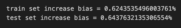
Think of the program as a little scoreboard that tells you whether your training and test datasets are biased toward days when the stock goes up. The first line prints a friendly label “train set increase bias = “ and then tacks on the value computed by np.mean(y_train_7==1), converted to text, followed by a percent sign; that value summarizes how often the target in the training set indicates an increase. Using equality (==1) creates a list of True/False flags saying “did the price go up?” for each sample, and a key concept is that True/False can be treated as 1/0 so taking their mean gives the proportion that are True.
The second line does the same announcement for the test set, so you can compare whether your model will see a similar balance of up-days in evaluation as it did in learning. The print calls are like calling out the counts on a scoreboard, the equality checks are like flipping a yes/no coin for each day, and np.mean is the simple averaging step that turns those yes/no flips into a single percentage-like number. If you want an actual percent, you could multiply by 100, but as written it’s the fractional bias with a percent sign. Knowing these proportions helps you spot class imbalance before feeding data into your LSTM, which matters for fair stock-price forecasting.
Start by collecting the price data and putting it into a tidy DataFrame, which is just a smart table where rows are dates and columns are prices or indicators. Having a clean table makes later steps predictable and easier to debug.
Clean the data by filling or dropping missing values and making sure the time order is correct. Time order matters because LSTM is a sequence model that learns patterns over time, so shuffled data would break those patterns.
Scale the numbers using normalization, which just means shrinking values to a smaller range so the model learns faster and more reliably. You’ll need to remember to reverse this scaling when you turn predictions back into real prices.
Turn the time series into sequences: make short windows of past prices that the model will use to predict the next price. This prepares the data in the format an LSTM expects — a sequence-in, sequence-out setup.
Split into training and test sets, keeping the time split (no random shuffle) so the model is always tested on future data it hasn’t seen. That gives you a realistic sense of how it will perform live.
Build an LSTM model, a kind of neural network that remembers order and trends. Train it over several epochs, where each epoch is one full pass through the training data, and watch validation performance to avoid overfitting.
Evaluate with meaningful metrics like RMSE, which tells you the average error in price units, and visualize predictions against real prices to spot patterns or systematic mistakes. Finally, save the model and the scaler so you can load them to make future forecasts without repeating training.
First, gather your price data and put it into a table-like structure called a *DataFrame*, which is just a smart table that makes columns and rows easy to work with. This step matters because clean, well-organized data is the base for every later step.
Next, clean and engineer features like moving averages or volume, and fill or drop missing values so the model sees reliable signals. Feature choices help the model focus on useful patterns instead of noise.
Scale the numbers so they live in a similar range; this is called normalization and it helps neural networks learn faster and more stably. Think of it like making sure all inputs speak the same language.
Convert the sequence of prices into overlapping windows the LSTM can learn from, where each window is a small time series and the LSTM predicts the next value. Creating these windows teaches the model about how past values relate to the next one.
Split data into training and testing sets so you can check if the model actually generalizes to new data; this avoids cheating by testing on what the model has already seen. Use time-aware splitting so future data never leaks into the past.
Build and train an *LSTM* (a neural network that remembers sequences over time) and monitor validation loss to avoid overfitting, which is when a model memorizes instead of learns. Early stopping or regularization keeps the model useful on new data.
After training, transform predictions back to the original scale and compare them to real prices using simple metrics like MAE or RMSE to see how far off you are on average. Visualize predictions vs actuals to spot patterns the numbers might hide.
Walk-forward cross-validation is a way to split time-ordered data for training and validation. A *cross-validator* here just gives you which row numbers (indices) go into the training set and which go into the development (dev) or validation set. This matters for things like daily stock prices, where each sample happens at a fixed time interval.
In every split the validation set always comes later in time than the training set — its indices are higher. You can’t shuffle the rows randomly because that would mix future data into the past and let the model “peek” at what it’s supposed to predict. Keeping the order protects against that kind of leakage.
We use walk-forward splitting for forecasting with LSTMs because it mimics real forecasting: you train on past data and then test on data that actually comes later. This also helps you see whether the model stays reliable as time moves forward. The usual diagram shows a series of train windows that step forward, each followed by a later validation window.
# Time Series Split
dev_size=0.1
n_splits=int((1//dev_size)-1)   # using // for integer division
tscv=TimeSeriesSplit(n_splits=n_splits)
Imagine you’re setting aside a small tasting portion before you bake the whole batch: dev_size = 0.1 names that little reserved slice, so 10% of the timeline will act as the development (validation) portion. Next we try to figure out how many times we can peel off that development slice as we walk forward through history: n_splits = int((1//dev_size)-1) attempts to divide the whole (1.0) by the dev slice size and then subtract one to leave room for rolling training windows. A subtle point: using // performs floor division (with floating-point quirks it may round down unexpectedly), and int(…) makes sure we end up with an integer count of folds. Finally, tscv = TimeSeriesSplit(n_splits=n_splits) constructs the splitter that hands you a series of training/validation pairs over time. TimeSeriesSplit makes folds that respect temporal order so the model never “looks into the future” when validating. Think of the splitter as a slow curtain that reveals more past data to the model at each step, just like repeating a recipe with progressively longer ingredient lists. Together these lines reserve a validation slice size, convert that into a sensible number of rolling experiments, and create the mechanism to generate those ordered train/validation pairs — essential groundwork before you feed sequences into your LSTM to forecast stock prices.
Scaling means changing your numbers so they sit on a similar scale. Neural nets like LSTM learn faster and more reliably when inputs aren’t wildly different in size — for example, when one feature is in millions and another is between 0 and 1. This step helps gradients behave and prevents one feature from dominating the learning.
Standardization subtracts the mean and divides by the standard deviation, so data ends up with *zero mean and unit variance*. That’s useful when you want values centered and spread out based on their natural variability. Normalization (or min–max scaling) rescales values to a fixed range, usually 0 to 1, which is handy when your network prefers bounded inputs. Choose based on your model and data; many practitioners use min–max for stock prices because it keeps inputs within a predictable range.
Always fit your scaler only on the training set and then apply it to validation and test sets. Fitting on all data leaks future information into training and gives misleading performance. Save the fitted scaler so you can *inverse transform* model outputs back to original price units; otherwise your predicted numbers won’t be interpretable as real stock prices.
Scale both features and the target price if your model predicts scaled values, and apply the exact same transformation every time. This keeps training, evaluation, and live predictions consistent and makes the final results meaningful for decisions.
Always split your data before any preprocessing. Cross-validation splitting must happen first because any operation that *extracts knowledge* (like computing a mean for scaling) should only see the training data. Treat cross-validation as the outermost loop so you don’t accidentally leak information from the test folds and get an overly optimistic score.
The Pipeline class in scikit-learn is a way to glue several processing steps into one object. It has fit, predict and score methods and behaves like any other model, so you can treat the whole chain as a single estimator. A common use is to chain preprocessing (like scaling, which adjusts feature ranges) with a model so the same transforms are applied consistently during training and evaluation.
For time series we often use Walk-Forward CV, which rolls the training window forward in time. In each split the scaler (the thing that computes and applies scaling) is refit only on the sub-training split. This prevents the future (validation/test) data from influencing the scaler and thus avoids data leakage; think of it as only learning from the past.
The preprocessing flow is: first split into TRAIN and VALID according to the cv parameter in GridSearchCV or RandomizedSearchCV (cv tells how to split during hyperparameter search). Fit the scaler on TRAIN, transform TRAIN, and train models on that transformed TRAIN. Then transform VALID with that scaler and predict on the transformed VALID.
After hyperparameter selection, fit the scaler on TRAIN+VALID and transform them, then train the final model using the best parameters from Walk-Forward CV. Finally transform TEST with the scaler and predict on TEST. This gives the final model more data to learn from while keeping the test set untouched until the end.
Regularization means adding a small penalty to the weights of your baseline model so it can’t wander too freely. This makes the model less likely to learn random noise from the training data and helps it generalize*— that is, do better on new stock-price data instead of just the past data.
L2 regularization (called Ridge) adds a penalty equal to the sum of the squared weights. That pushes weights to be relatively small, and the stronger the penalty the smaller and more stable the weights become. The penalty strength, lambda, is a single number you should choose with walk‑forward cross‑validation — a rolling validation that respects time order so you don’t peek into the future.
L1 regularization (called Lasso) adds a penalty equal to the sum of the absolute values of the weights. That tends to shrink some weights exactly to zero, so some inputs stop contributing at all — in other words, it can act like automatic feature selection. As with L2, lambda is learned with walk‑forward cross‑validation; this is handy when you want to find which lagged prices or indicators really matter.
Elastic Net mixes L1 and L2 penalties so you get a bit of both behaviors. It uses lambda for overall strength and alpha to set the balance between L1 and L2. This gives a middle ground: you still cut weights, but less abruptly than Lasso, which is useful when predictors are correlated or you want both shrinkage and some selection.
A “Configuration Baseline Models” step just means you set up simple reference models to compare against your LSTM. A baseline model is a basic method that gives a quick, honest guess — for example a persistence model that says tomorrow’s price will equal today’s price, or a moving average that smooths recent prices. LSTM is a kind of neural network that learns from sequences, like a series of past prices, so baselines show whether the complex model really adds value.
When you configure these baselines you pick things like how many past days to use (window size), whether to scale prices to a smaller range, and which error measure to report. Scaling means making numbers easier for models to handle. Error measures like MSE (mean squared error) or MAE (mean absolute error) tell you how far predictions stray from real prices. Getting these settings right makes the comparison fair and prepares you to judge if the LSTM truly improves forecasts.
# Standardized Data
steps_b=[(’scaler’, StandardScaler(copy=True, with_mean=True, with_std=True)),
           (’logistic’, linear_model.SGDClassifier(loss=”log”, shuffle=False, early_stopping=False, tol=1e-3, random_state=1))]

#Normalized Data
#steps_b=[(’scaler’, MinMaxScaler(feature_range=(0, 1), copy=True)),
#         (’logistic’, linear_model.SGDClassifier(loss=”log”, shuffle=False, early_stopping=False, tol=1e-3, random_state=1))]

pipeline_b=Pipeline(steps_b) # Using a pipeline we glue together the Scaler & the Classifier
# This ensure that during cross validation the Scaler is fitted to only the training folds

# Penalties
penalty_b=[’l1’, ‘l2’, ‘elasticnet’]

# Evaluation Metric
scoring_b={’AUC’: ‘roc_auc’, ‘accuracy’: make_scorer(accuracy_score)} #multiple evaluation metrics
metric_b=’accuracy’ #scorer is used to find the best parameters for refitting the estimator at the end
Imagine we’re building a small factory that takes price features, tidies them up, and then decides if the next move is up or down — each line here wires one machine into that factory. First we define a pair of steps: a StandardScaler that centers features to zero mean and unit variance (key concept: scaling prevents features with large ranges from dominating learning), followed by an SGDClassifier set to “log” loss so it behaves like logistic regression trained with stochastic gradient descent; the classifier arguments (no shuffle, no early stopping, tolerance and a random seed) control how the optimizer searches for a solution and keep results reproducible.
We also show an alternative scaler commented out, MinMaxScaler, which rescales features into a fixed 0–1 band — think of it as a different way to normalize ingredient sizes before mixing. The Pipeline line glues the scaler and classifier into one reusable recipe card; importantly, this avoids data leakage during cross-validation by fitting the scaler only on each training fold (key concept: data leakage leads to over-optimistic performance).
Penalties lists the regularization strategies we’ll try: l1, l2, and elasticnet, which are ways to discourage overfitting by shrinking or selecting weights. scoring_b defines multiple evaluation metrics we care about — AUC and accuracy — using roc_auc and a wrapped accuracy scorer, while metric_b selects ‘accuracy’ as the primary scorer used to pick the best parameters when refitting the estimator.
All together, these lines set up a disciplined experiment to preprocess, regularize, and evaluate a classifier, a useful baseline or feature-check before you feed signals into your LSTM forecasting pipeline.
Configuring an LSTM model means choosing the settings that control how it learns to predict stock prices. An LSTM is a type of neural network that remembers patterns over time, so these choices shape how well it captures market rhythms. Good configuration matters because stock data is noisy and easy to overfit.
Decide on a sequence length (how many past time steps the model sees), batch size (how many examples it learns from at once), number of epochs (how many times it looks through the data), and learning rate (how big each update is). Typical sequence lengths are days to weeks, batch sizes are tens to hundreds, and the learning rate is small (e.g., 0.001). These control memory, speed, and stability during training.
Choose the model architecture: one or more LSTM layers with a set number of units (neurons), optional dropout (randomly ignoring some neurons to prevent overfitting), and a final dense output layer for the price. Use a regression loss like mean squared error (MSE) because we predict continuous prices, and an optimizer like Adam to adjust weights. Add early stopping and checkpoints to save the best model and avoid training too long.
Preprocess your data by scaling prices (e.g., MinMax scaling) because neural nets learn better on similar-sized numbers. Split into train and test sets, and convert series into sequences with the chosen window. You can add extra features like volume or indicators, which often improves forecasts. Save the configuration so you can reproduce or tune experiments later.
# Batch_input_shape=[1, 1, Z]  -> (batch size, time steps, number of features)
# Data set inputs(trainX)=[X, 1, Z]  -> (samples, time steps, number of features)

# number of samples
num_samples=1
# time_steps
look_back=1


# Evaluation Metric
scoring_lstm=’accuracy’
Imagine we’re assembling a tiny kitchen to teach a model how past prices predict the next one. The first two comment lines set the shapes of the ingredients: Batch_input_shape=[1, 1, Z] is saying we will feed the LSTM one mini-batch at a time (batch size 1), each batch containing one time step, and Z different features per time step — think of batch size as how many identical dishes you cook at once, time steps as how many consecutive days of prices you put into the pot, and features as the different ingredients like open, high, low, volume. The dataset inputs line maps samples to the recipe count: Data set inputs(trainX)=[X, 1, Z] means you have X examples (samples), each example is a single time step with Z features.
Setting num_samples = 1 names how many examples you’re currently treating as a unit; it’s the count of recipes on your counter. look_back = 1 chooses how many previous time steps the model looks back — a look-back of 1 means the model uses one prior moment to predict the next, like consulting only yesterday’s price. The variable scoring_lstm = ‘accuracy’ picks the performance metric: accuracy measures how often a categorical prediction exactly matches the label, and as a key concept, metrics must match the task — for continuous forecasting you’d usually prefer mean squared error rather than accuracy.
All together these lines establish the input geometry and evaluation lens for the LSTM kitchen; getting shapes and metrics right is essential before you bake forecasts for stock prices.
This is section 6, Models. Here we build the pieces that actually learn from past prices and try to predict future stock values.
We’ll mainly use LSTM models — an LSTM is a kind of neural network that remembers patterns over time, like how recent prices and trends affect what comes next. We train the model on historical data so it learns those patterns, then test it on new data to see how well it forecasts. This step matters because a model that understands time patterns can give more realistic predictions than one that looks at each day by itself.
We’ll also compare settings like how many memory cells the LSTM has, how long of a price history we feed it, and how many training passes we run. These choices — called hyperparameters — shape how well the model learns and how quickly it runs. Trying different options helps us find a balance between accurate forecasts and a model that’s practical to use.
This model predicts volatility, which is just how much a stock’s price swings up and down over time. Volatility matters because it helps you understand risk and make safer forecasts — sometimes predicting volatility is easier and more useful than predicting the exact price.
We first turn prices into returns, which are the percentage or *log* changes from one day to the next — a simple way to compare moves. Then we compute a rolling standard deviation over a short window to get realized volatility; a rolling window just means we look at the last N days each time. This gives a smoother series that an LSTM can learn from.
An LSTM is a kind of neural network that remembers patterns in sequences, like past volatility values, so it can predict the next one. We feed the model sequences of recent volatility, scale the numbers so the network trains well, and keep the time order when we split into training and test sets (don’t shuffle time series data — that would leak the future into the past).
We train with a regression loss like mean squared error and watch validation error for early stopping, which prevents overfitting by stopping when the model stops improving. Evaluating with RMSE or similar measures tells you how close predicted volatility is to actual volatility, and that helps decide if the model is ready to support trading or risk decisions.
A baseline is just a simple, easy-to-understand method we use as a reference point. Think of it as the score you must beat — a basic rule of thumb that any fancy model should outperform.
Common baselines for stock forecasting are very simple: predict that tomorrow’s price equals today’s price, or use a short moving average (which is just the average of the last few prices). These are easy to run and explain, and they give you a quick sense of how hard the task really is.
You’ll compare your LSTM’s errors (like mean absolute error) against the baseline’s errors to see if the LSTM actually learns useful patterns. This step helps catch models that look complex but don’t improve on trivial rules, and it sets a realistic performance goal before you fine-tune the LSTM.
# Model specific Parameter

# Number of iterations
iterations_1_b=[8]


# Grid Search

# Regularization
alpha_g_1_b=[0.0011, 0.0013, 0.0014] #0.0011, 0.0012, 0.0013
l1_ratio_g_1_b=[0, 0.2, 0.4, 0.6, 0.8, 1]

# Create hyperparameter options
hyperparameters_g_1_b={’logistic__alpha’:alpha_g_1_b,
                       ‘logistic__l1_ratio’:l1_ratio_g_1_b,
                       ‘logistic__penalty’:penalty_b,
                       ‘logistic__max_iter’:iterations_1_b}

# Create grid search
search_g_1_b=GridSearchCV(estimator=pipeline_b,
                            param_grid=hyperparameters_g_1_b,
                            cv=tscv,
                            verbose=0,
                            n_jobs=-1,
                            scoring=scoring_b,
                            refit=metric_b,
                            return_train_score=False)
# Setting refit=’Accuracy’, refits an estimator on the whole dataset with the parameter setting that has the best cross-validated mean Accuracy score.
# For multiple metric evaluation, this needs to be a string denoting the scorer is used to find the best parameters for refitting the estimator at the end
# If return_train_score=True training results of CV will be saved as well

# Fit grid search
tuned_model_1_b=search_g_1_b.fit(X_train_1, y_train_1)
#search_g_1_b.cv_results_


# Random Search

# Create regularization hyperparameter distribution using uniform distribution
#alpha_r_1_b=uniform(loc=0.00006, scale=0.002)
#l1_ratio_r_1_b=uniform(loc=0, scale=1)

# Create hyperparameter options
#hyperparameters_r_1_b={’logistic__alpha’:alpha_r_1_b, ‘logistic__l1_ratio’:l1_ratio_r_1_b, ‘logistic__penalty’:penalty_b,’logistic__max_iter’:iterations_1_b}

# Create randomized search
#search_r_1_b=RandomizedSearchCV(pipeline_b,
#                                  hyperparameters_r_1_b,
#                                  n_iter=10,
#                                  random_state=1,
#                                  cv=tscv,
#                                  verbose=0,
#                                  n_jobs=-1,
#                                  scoring=scoring_b,
#                                  refit=metric_b,
#                                  return_train_score=True)
# Setting refit=’Accuracy’, refits an estimator on the whole dataset with the parameter setting that has the best cross-validated Accuracy score.
# For multiple metric evaluation, this needs to be a string denoting the scorer is used to find the best parameters for refitting the estimator at the end
# If return_train_score=True training results of CV will be saved as well

# Fit randomized search
#tuned_model_1_b=search_r_1_b.fit(X_train_1, y_train_1)


# View Cost function
print(’Loss function:’, tuned_model_1_b.best_estimator_.get_params()[’logistic__loss’])

# View Accuracy
print(metric_b +’ of the best model: ‘, tuned_model_1_b.best_score_);print(”\n”)
# best_score_ Mean cross-validated score of the best_estimator

# View best hyperparameters
print(”Best hyperparameters:”)
print(’Number of iterations:’, tuned_model_1_b.best_estimator_.get_params()[’logistic__max_iter’])
print(’Penalty:’, tuned_model_1_b.best_estimator_.get_params()[’logistic__penalty’])
print(’Alpha:’, tuned_model_1_b.best_estimator_.get_params()[’logistic__alpha’])
print(’l1_ratio:’, tuned_model_1_b.best_estimator_.get_params()[’logistic__l1_ratio’])

# Find the number of nonzero coefficients (selected features)
print(”Total number of features:”, len(tuned_model_1_b.best_estimator_.steps[1][1].coef_[0][:]))
print(”Number of selected features:”, np.count_nonzero(tuned_model_1_b.best_estimator_.steps[1][1].coef_[0][:]))

# Gridsearch table
plt.title(’Gridsearch’)
pvt_1_b=pd.pivot_table(pd.DataFrame(tuned_model_1_b.cv_results_), values=’mean_test_accuracy’, index=’param_logistic__l1_ratio’, columns=’param_logistic__alpha’)
ax_1_b=sns.heatmap(pvt_1_b, cmap=”Blues”)
plt.show()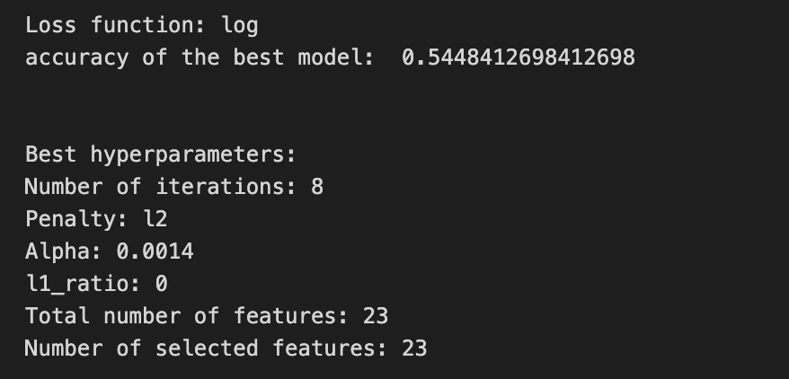

We’re trying to find the best settings for a model so it will generalize well to future stock movements, and the first line sets a small list of allowed solver iterations like writing “try up to 8 steps” on a recipe card (iterations_1_b = [8]). The next two lines set up candidate strengths and mixes of regularization (alpha and l1_ratio), which control how aggressively we shrink coefficients to avoid overfitting — regularization is like putting a leash on model complexity. Those lists are gathered into a hyperparameter dictionary keyed for the pipeline’s logistic step, so the grid knows which knobs to turn.
GridSearchCV is created next: it is the systematic tasting session that tries every combination, using tscv for time-aware cross-validation (time-series cross-validation preserves temporal order so we validate like we would predict forward). Scoring and refit tell the search how to judge and which metric to use to refit the final model. The fit call runs the whole tasting session on X_train_1 and y_train_1 and gives back tuned_model_1_b.
A randomized search appears commented out as an alternative tasting method that samples from continuous distributions rather than exhaustively checking a grid. After fitting, we inspect the winner: we print the chosen loss, the best cross-validated score, and the selected hyperparameters (iterations, penalty, alpha, l1_ratio) by asking the final estimator for its parameters. We then count total and nonzero coefficients to see how many features survived the regularization — nonzero count shows selected features. Finally we build a pivot table of mean test accuracy over l1_ratio and alpha and draw a heatmap so we can visually spot the sweet spot, like mapping which spice combo worked best. All of these tuning and validation steps are the same careful craft you’ll need when tuning an LSTM for stock-price forecasting.
A confusion matrix is just a small table that shows how often your model’s predictions match the real outcomes. It compares what you predicted (like “price will go up”) with what actually happened (price up or down), so you can see every kind of right and wrong at a glance. This is useful when you turn a continuous price forecast into categories like “up” or “down.”
The table has four cells: true positives (predicted up and it was up), true negatives (predicted down and it was down), false positives (predicted up but it fell), and false negatives (predicted down but it rose). Saying each name this way keeps the meaning clear and helps you spot which mistakes happen most.
Looking at a confusion matrix helps you decide what to fix — maybe your model predicts ups well but misses downs, or vice versa. You can then compute accuracy and other measures, or weigh mistakes differently if some errors cost more in trading. For stock forecasting, that context matters because the type of error can affect strategy and risk.
# Make predictions
y_pred_1_b=tuned_model_1_b.predict(X_test_1)

# create confustion matrix
fig, ax=plt.subplots()
sns.heatmap(pd.DataFrame(metrics.confusion_matrix(y_test_1, y_pred_1_b)), annot=True, cmap=”Blues” ,fmt=’g’)
plt.title(’Confusion matrix’); plt.ylabel(’Actual label’); plt.xlabel(’Predicted label’)
ax.xaxis.set_ticklabels([’Down’, ‘Up’]); ax.yaxis.set_ticklabels([’Down’, ‘Up’])

print(”Accuracy:”,metrics.accuracy_score(y_test_1, y_pred_1_b))
print(”Precision:”,metrics.precision_score(y_test_1, y_pred_1_b))
print(”Recall:”,metrics.recall_score(y_test_1, y_pred_1_b))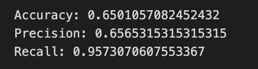

Now we ask our tuned LSTM to tell us what it thinks will happen: the predict call applies the model’s learned patterns to each test example and returns a predicted direction for each day. Key concept: prediction means the model uses its learned weights to map inputs to output labels or probabilities.
Next we build a picture of how well those predictions match reality by drawing a confusion matrix; creating the figure and axes gives us a blank canvas to paint on, and the heatmap plots the matrix of counts so you can see at a glance where the model is right or wrong. Key concept: a confusion matrix shows the counts of true vs predicted classes so you can inspect types of errors.
We then add a title and axis labels so the picture is readable, and replace the numeric tick labels with “Down” and “Up” to make the axes speak the language of stock moves rather than abstract indices.
Finally we print three summary scores that quantify performance: accuracy is the fraction of all days the model classified correctly, precision tells you of the days the model predicted “Up” how many were actually up (useful when false positives are costly), and recall measures of the actual up-days how many the model captured (important when missing an up move is costly). Key concept: these metrics each emphasize different error trade-offs.
Together, the visual confusion matrix and these metrics help you judge whether the model’s direction forecasts are reliable enough to inform trading or further model tuning.
The ROC curve is a simple picture that shows how well a binary predictor separates two classes. In stock forecasting that usually means predicting “price up” vs “price down.” It plots the true positive rate (the share of actual ups you caught) against the false positive rate (the share of downs you mistakenly called ups) as you change the decision threshold.
By sliding the threshold you can trade catching more real ups for making more false alarms. The curve makes that tradeoff obvious and helps you pick a threshold that matches how much risk or cost you can tolerate. The area under the curve (AUC) is a single number summary: 1.0 means perfect separation, 0.5 means random guessing.
ROC is useful when you want an overall comparison between models, especially if you care about both hits and false alarms. One word of context: in stock work classes can be imbalanced or the cost of a false buy may be higher than a missed opportunity, so also check precision or a precision-recall curve if those concerns matter more.
y_proba_1_b=tuned_model_1_b.predict_proba(X_test_1)[:, 1]
fpr, tpr, _=metrics.roc_curve(y_test_1,  y_proba_1_b)
auc=metrics.roc_auc_score(y_test_1, y_proba_1_b)
plt.plot(fpr,tpr,label=”AUC=”+str(auc))
plt.legend(loc=4)
plt.plot([0, 1], [0, 1], linestyle=’--’) # plot no skill
plt.title(’ROC-Curve’)
plt.show()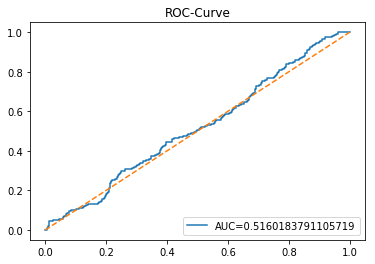
Imagine we’re checking how well our model can tell if the price will go up or down, and we’re painting a picture of its skill. First we ask our tuned model for probabilities on the test set — predict_proba is like a reusable recipe card that, instead of a single yes/no, gives the chance of each outcome; taking [:, 1] selects the probability of the “positive” class (for example, price-up). Next we sweep through different decision thresholds to see how often the model correctly catches rises versus how often it cries wolf; roc_curve returns the false positive rate and true positive rate at many thresholds. A key concept: the ROC curve plots true positive rate against false positive rate to show the trade-off between sensitivity and false alarms. We then summarize that curve with a single number using roc_auc_score; AUC (area under the curve) is a single-number summary where 1.0 is perfect separation and 0.5 is no better than random. Now we draw the picture: plotting fpr against tpr traces the curve and we add a label showing the AUC so the score rides alongside the curve. Adding a legend (loc=4 places it in the lower-right) makes the label readable, and drawing a dashed diagonal line marks the “no-skill” reference. Finally we title the plot and display it so we can visually judge performance. Seeing this curve helps us decide whether an LSTM-based forecast is reliably picking price direction.
An LSTM is a type of neural network that learns from sequences of numbers, like historical stock prices, so it can predict what might come next. We use it for stock forecasting because it can remember patterns over time and ignore short-term noise, which helps when prices depend on things that happened many days ago.
Inside an LSTM are “cells” with simple parts called gates that decide what to keep and what to forget — like a little filter that keeps useful memory and drops irrelevant details. This matters because regular networks often forget long-term signals; LSTMs help avoid that problem so the model can learn trends that span weeks or months.
To build a forecasting model you feed the LSTM short windows of past prices (a sequence input) and ask it to predict the next price. You usually scale the numbers first so the network learns faster, split data into training and testing sets to check real performance, and pick a loss function (a measure of error) to tell the model how to improve. Scaling and splitting are simple steps that make training stable and results believable.
When training, watch for overfitting (when the model learns noise, not signal) and use tools like dropout (randomly ignoring some connections during training) or early stopping (stop when validation error stops improving). These keep the model useful on new, unseen data.
start=time.time()

# number of epochs
epochs=1
# number of units
LSTM_units_1_lstm=195
# numer of features
num_features_1_lstm=X_train_1.shape[1]
# Regularization
dropout_rate=0.1
recurrent_dropout=0.1 # 0.21
# print
verbose=0

#hyperparameter
batch_size=[1]

# hyperparameter
hyperparameter_1_lstm={’batch_size’:batch_size}


# create Classifier
clf_1_lstm=KerasClassifier(build_fn=create_shallow_LSTM,
                          epochs=epochs,
                          LSTM_units=LSTM_units_1_lstm,
                          num_samples=num_samples,
                          look_back=look_back,
                          num_features=num_features_1_lstm,
                          dropout_rate=dropout_rate,
                          recurrent_dropout=recurrent_dropout,
                          verbose=verbose)
# Gridsearch
search_1_lstm=GridSearchCV(estimator=clf_1_lstm,
                          param_grid=hyperparameter_1_lstm,
                          n_jobs=-1,
                          cv=tscv,
                          scoring=scoring_lstm, # accuracy
                          refit=True,
                          return_train_score=False)

# Fit model
tuned_model_1_lstm=search_1_lstm.fit(X_train_1_lstm, y_train_1, shuffle=False, callbacks=[reset])


print(”\n”)

# View Accuracy
print(scoring_lstm +’ of the best model: ‘, tuned_model_1_lstm.best_score_)
# best_score_ Mean cross-validated score of the best_estimator

print(”\n”)

# View best hyperparameters
print(”Best hyperparameters:”)
print(’epochs:’, tuned_model_1_lstm.best_estimator_.get_params()[’epochs’])
print(’batch_size:’, tuned_model_1_lstm.best_estimator_.get_params()[’batch_size’])
print(’dropout_rate:’, tuned_model_1_lstm.best_estimator_.get_params()[’dropout_rate’])
print(’recurrent_dropout:’, tuned_model_1_lstm.best_estimator_.get_params()[’recurrent_dropout’])

end=time.time()
print(”\n”)
print(”Running Time:”, end - start)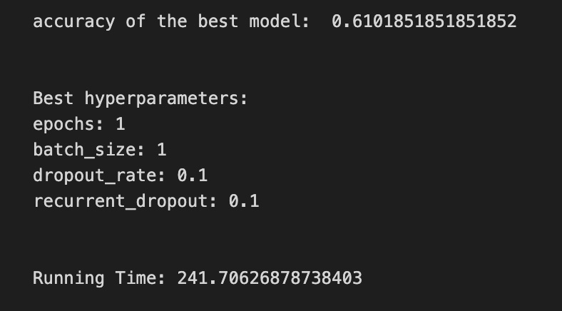
We begin by starting a stopwatch so we can report how long the whole tuning exercise takes, like checking the oven timer before baking. Then we set a few kitchen parameters: one training epoch (one pass through the data), the number of LSTM units (195) which controls how big the memory layer is, and the number of input features taken from the training array shape — a feature is one measurable input the model uses to learn. Small regularization values (dropout and recurrent_dropout of 0.1) are sprinkled in to reduce overfitting, and verbose is set low so the output stays tidy.
A batch size list with a single value is wrapped into a hyperparameter dictionary so the grid search knows what to try; think of the dictionary as a shopping list of settings to evaluate. KerasClassifier wraps the reusable recipe card create_shallow_LSTM into a scikit-learn estimator, passing in the epoch count, LSTM size, sample/window info, feature count, and dropout flavors so each candidate model is built consistently. GridSearchCV then takes that estimator and systematically tries hyperparameter combinations; cross-validation is used to judge candidates by splitting data into train/validation slices to estimate generalization.
Here we use a time-series-aware splitter (tscv), parallelize work with all cores, score by a chosen metric, and set refit so the best model is retrained on full training folds. We call fit with shuffle=False to preserve temporal order (important for sequences) and supply a reset callback so the model state is clean between folds. After fitting we print the best cross-validated score and peek the best estimator’s parameters; finally we stop the clock and report running time. All of these steps are about finding a reliable LSTM configuration to improve stock-price forecasts.
A confusion matrix is a simple table that shows how often your model’s predictions match the real outcomes. In stock forecasting with an LSTM, you often turn continuous price forecasts into categories like “up” or “down,” and the confusion matrix counts wins and mistakes for each category.
Each cell has a clear meaning: a true positive is when you predicted “up” and the price went up, a false positive is when you predicted “up” but it went down, and so on. Saying it plainly helps you spot whether the model is wrongly biased toward one side, such as always predicting rises.
Looking at this table tells you more than one number like accuracy. It shows the types of errors your LSTM makes, which helps decide fixes — change thresholds, rebalance classes, or adjust the model. It’s a quick, visual check to guide the next steps in improving your forecasts.
# Make predictions
y_pred_1_lstm=tuned_model_1_lstm.predict(X_test_1_lstm)

# create confustion matrix
fig, ax=plt.subplots()
sns.heatmap(pd.DataFrame(metrics.confusion_matrix(y_test_1, y_pred_1_lstm)), annot=True, cmap=”Blues” ,fmt=’g’)
plt.title(’Confusion matrix’); plt.ylabel(’Actual label’); plt.xlabel(’Predicted label’)
ax.xaxis.set_ticklabels([’Down’, ‘Up’]); ax.yaxis.set_ticklabels([’Down’, ‘Up’])

print(”Accuracy:”,metrics.accuracy_score(y_test_1, y_pred_1_lstm))
print(”Precision:”,metrics.precision_score(y_test_1, y_pred_1_lstm))
print(”Recall:”,metrics.recall_score(y_test_1, y_pred_1_lstm))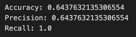

We ask the trained LSTM model to make predictions on the test features with tuned_model_1_lstm.predict(X_test_1_lstm); think of the model as a reusable recipe card that takes the test inputs and returns its best-guess labels for whether the price will go Up or Down. Next we prepare a blank canvas with fig, ax = plt.subplots() so we have a frame (figure) and a plotting area (axes) to draw on.
To visualize how well the model did, we compute and draw a confusion matrix: metrics.confusion_matrix(y_test_1, y_pred_1_lstm) counts true vs predicted outcomes and wrapping it in pd.DataFrame makes it friendly for plotting; a confusion matrix is a table showing correct and mistaken classifications so you can see where the model confuses classes. sns.heatmap(…, annot=True, cmap=”Blues”, fmt=’g’) paints that table as a colored grid, annot=True writes the counts into each cell, cmap chooses a blue color scale, and fmt=’g’ ensures the numbers appear as integers. We add a title and axis labels so the plot reads “Actual label” vs “Predicted label,” and we set tick labels to [‘Down’, ‘Up’] so the rows and columns match the direction labels.
Finally, we print summary scores: accuracy is the fraction of total correct predictions, precision is the fraction of predicted Ups that were actually Up, and recall is the fraction of actual Ups the model successfully identified. These diagnostics tell you where the LSTM succeeds or needs more tuning in the larger task of forecasting stock price direction.
A ROC curve (Receiver Operating Characteristic curve) is a simple picture that shows how well a model can tell two things apart, like “price will go up” versus “price will go down.” The vertical axis is the true positive rate, which is the share of actual ups you caught. The horizontal axis is the false positive rate, which is the share of downs you mistakenly called ups. The curve is drawn by changing the cutoff (the threshold) you use to turn a model score into an up/down decision.
The area under that curve, called AUC, boils the whole picture down to one number. AUC of 1.0 means perfect separation. AUC of 0.5 means your model is no better than random guessing. This helps you compare models without picking one specific cutoff first.
ROC curves are useful in stock forecasting when you turn predicted price moves into buy/sell signals. They let you see the trade-off between catching more real moves and making more false trades. That matters because more false trades mean more fees and losses, so choosing the right threshold depends on your tolerance for missed moves versus bad trades.
To make a ROC curve you score each example, sweep the threshold, and plot true versus false positive rates. It gives a clear, threshold-free view of signal quality before you start backtesting with real money.
y_proba_1_lstm=tuned_model_1_lstm.predict_proba(X_test_1_lstm)[:, 1]
fpr, tpr, _=metrics.roc_curve(y_test_1,  y_proba_1_lstm)
auc=metrics.roc_auc_score(y_test_1, y_proba_1_lstm)
plt.plot(fpr,tpr,label=”AUC=”+str(auc))
plt.legend(loc=4)
plt.plot([0, 1], [0, 1], linestyle=’--’) # plot no skill
plt.title(’ROC-Curve’)
plt.show()
We want to judge how confidently our tuned LSTM can say “the price will go up” and visualize that confidence as a diagnostic curve. The first line asks the trained LSTM model for probabilities on the test set, like asking each prediction to report how sure it is that the next movement is the positive class; taking [:, 1] selects the probability of the “up” class for every example. The next line asks sklearn to turn those probabilities and the true labels into points for a receiver operating characteristic: the ROC curve plots the trade-off between true positive rate and false positive rate — a key concept: ROC shows how well the model separates classes as you vary the decision threshold. The third line computes the area under that curve, AUC, which boils the model’s discrimination ability into a single number between 0 and 1. The next plotting line draws the ROC by plotting false positive rate against true positive rate and labels it with the AUC so the plot tells a story at a glance. Calling legend places that label neatly on the drawing. Plotting the dashed diagonal draws a “no-skill” baseline, like a coin flip reference line to compare against. Finally, setting the title names the chart and show renders the figure so you can inspect the model’s diagnostic performance visually. Peeking at this ROC and AUC helps you understand how well your LSTM predicts direction and guides the next steps in improving your stock-forecasting model.
This model predicts returns instead of raw prices. A return is just the percent change from one price to the next, so it removes the upward drift and helps the model focus on short-term moves. This often makes the data steadier and easier for an LSTM to learn, because LSTMs (a kind of neural network that remembers patterns over time) do better when the numbers don’t wander too much.
We might use simple percent returns or log returns — the log of the price ratio — which behaves nicely for math and approximates percentage changes for small moves. Before training we still scale the returns so the network sees small, well-behaved numbers; this helps training converge faster and avoids exploding gradients.
After the LSTM predicts future returns, we convert them back to prices by applying those percent changes to the last known price (multiply successively by 1 + return). This step gives us price forecasts you can compare to real market prices. Doing returns first prepares the model to capture relative moves, and converting back gives you the concrete dollar or index level you need for evaluation or trading ideas.
A *baseline* is just a simple rule or model you use before building anything fancy. For stock forecasting, that might mean “predict tomorrow will be the same as today” (called persistence) or using a moving average, which is just the recent average price. These are easy to compute and give a clear starting point.
We use a baseline so we know if a complex model, like an LSTM (a kind of neural network that remembers patterns over time), actually helps. If your LSTM can’t beat the baseline, it probably isn’t learning useful signals, so you either need better data, features, or a different model. Starting with a baseline keeps your work honest and saves time by showing whether extra complexity is worth it.
# Model specific Parameter

# Number of iterations
iterations_2_b=[8]


# Grid Search

# Regularization
alpha_g_2_b=[0.0011, 0.0012, 0.0013]
l1_ratio_g_2_b=[0, 0.2, 0.4, 0.6, 0.8, 1]

# Create hyperparameter options
hyperparameters_g_2_b={’logistic__alpha’:alpha_g_2_b,
                       ‘logistic__l1_ratio’:l1_ratio_g_2_b,
                       ‘logistic__penalty’:penalty_b,
                       ‘logistic__max_iter’:iterations_2_b}

# Create grid search
search_g_2_b=GridSearchCV(estimator=pipeline_b,
                          param_grid=hyperparameters_g_2_b,
                          cv=tscv,
                          verbose=0,
                          n_jobs=-1,
                          scoring=scoring_b,
                          refit=metric_b,
                          return_train_score=False)
# Setting refit=’Accuracy’, refits an estimator on the whole dataset with the parameter setting that has the best cross-validated mean Accuracy score.
# For multiple metric evaluation, this needs to be a string denoting the scorer is used to find the best parameters for refitting the estimator at the end
# If return_train_score=True training results of CV will be saved as well

# Fit grid search
tuned_model_2_b=search_g_2_b.fit(X_train_2, y_train_2)
#search_g_2_b.cv_results_


# Random Search

# Create regularization hyperparameter distribution using uniform distribution
#alpha_r_2_b=uniform(loc=0.00006, scale=0.002) #loc=0.00006, scale=0.002
#l1_ratio_r_2_b=uniform(loc=0, scale=1)

# Create hyperparameter options
#hyperparameters_r_2_b={’logistic__alpha’:alpha_r_2_b, ‘logistic__l1_ratio’:l1_ratio_r_2_b, ‘logistic__penalty’:penalty_b,’logistic__max_iter’:iterations_2_b}

# Create randomized search
#search_r_2_b=RandomizedSearchCV(pipeline_b, hyperparameters_r_2_b, n_iter=10, random_state=1, cv=tscv, verbose=0, n_jobs=-1, scoring=scoring_b, refit=metric_b, return_train_score=False)
# Setting refit=’Accuracy’, refits an estimator on the whole dataset with the parameter setting that has the best cross-validated Accuracy score.

# Fit randomized search
#tuned_model_2_b=search_r_2_b.fit(X_train_2, y_train_2)


# View Cost function
print(’Loss function:’, tuned_model_2_b.best_estimator_.get_params()[’logistic__loss’])

# View Accuracy
print(metric_b +’ of the best model: ‘, tuned_model_2_b.best_score_);print(”\n”)
# best_score_ Mean cross-validated score of the best_estimator

# View best hyperparameters
print(”Best hyperparameters:”)
print(’Number of iterations:’, tuned_model_2_b.best_estimator_.get_params()[’logistic__max_iter’])
print(’Penalty:’, tuned_model_2_b.best_estimator_.get_params()[’logistic__penalty’])
print(’Alpha:’, tuned_model_2_b.best_estimator_.get_params()[’logistic__alpha’])
print(’l1_ratio:’, tuned_model_2_b.best_estimator_.get_params()[’logistic__l1_ratio’])

# Find the number of nonzero coefficients (selected features)
print(”Total number of features:”, len(tuned_model_2_b.best_estimator_.steps[1][1].coef_[0][:]))
print(”Number of selected features:”, np.count_nonzero(tuned_model_2_b.best_estimator_.steps[1][1].coef_[0][:]))

# Gridsearch table
plt.title(’Gridsearch’)
pvt_2_b=pd.pivot_table(pd.DataFrame(tuned_model_2_b.cv_results_), values=’mean_test_accuracy’, index=’param_logistic__l1_ratio’, columns=’param_logistic__alpha’)
ax_2_b=sns.heatmap(pvt_2_b, cmap=”Blues”)
plt.show()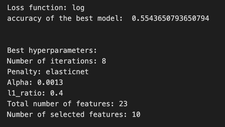

We’re trying to find the best seasoning for a logistic model inside a preprocessing-and-model pipeline by systematically trying different regularization settings and seeing which one performs best under time-series cross-validation. First we list the small number of iterations and the candidate regularization strengths (alpha) and mixing ratios between L1 and L2 (l1_ratio); think of hyperparameters as recipe tweaks you can change before you bake. Those lists are collected into a hyperparameters dictionary whose keys target the logistic step inside the pipeline (the double underscore is how we point to a nested recipe card).
Next we build a grid search: GridSearchCV will try every combination from that dictionary, using tscv (time-series cross-validation), running jobs in parallel, and scoring according to our chosen metric; cross-validation is like tasting the dish at different times to make sure it generalizes. The refit argument tells the search to retrain a final estimator on all the training data with the best hyperparameter setting found. We then fit the search to X_train_2 and y_train_2 so the experiment runs and records results.
There’s an alternative randomized search commented out, which would sample from continuous distributions rather than exhaustively trying each combo — useful when the menu is huge. After fitting, we inspect the chosen model: we print the loss function used, the best cross-validated score, and the specific hyperparameters (iterations, penalty, alpha, l1_ratio). To see which features survived regularization we read the learned coefficients from the pipeline’s logistic step and count non-zero entries, like checking which ingredients actually flavored the final dish.
Finally we reshape the cross-validation results into a pivot table and draw a heatmap of mean test accuracy over l1_ratio and alpha so we can visually spot the sweet spot. All of these steps help pick robust inputs and baselines before feeding a cleaned, well-tuned representation into an LSTM for stock price forecasting.
A confusion matrix is just a simple table that shows how often your model guessed each outcome correctly or incorrectly. In stock forecasting with an LSTM, you usually turn the price prediction into a direction: up or down (this makes the problem a classification one). This table helps you see at a glance whether the model thinks prices go up when they actually go up, or whether it’s often wrong in one direction.
The table has four cells: true positives (TP) — model predicted up and the price went up; false positives (FP) — predicted up but it went down; true negatives (TN) — predicted down and it went down; and false negatives (FN) — predicted down but it went up. From these you get metrics like accuracy (overall correct rate), precision (how often an up prediction is right), and recall (how many actual ups the model caught). Explaining each term this way makes the numbers easier to act on.
A confusion matrix doesn’t tell you how big the price errors are — it only tells direction hits and misses. So use it together with regression measures like MSE if you care about price size as well. Looking at the matrix also helps spot bias, for example if the model always predicts down, which would be bad for trading decisions.
# Make predictions
y_pred_2_b=tuned_model_2_b.predict(X_test_2)

# create confustion matrix
fig, ax=plt.subplots()
sns.heatmap(pd.DataFrame(metrics.confusion_matrix(y_test_2, y_pred_2_b)), annot=True, cmap=”Blues” ,fmt=’g’)
plt.title(’Confusion matrix’); plt.ylabel(’Actual label’); plt.xlabel(’Predicted label’)
ax.xaxis.set_ticklabels([’Down’, ‘Up’]); ax.yaxis.set_ticklabels([’Down’, ‘Up’])

print(”Accuracy:”,metrics.accuracy_score(y_test_2, y_pred_2_b))
print(”Precision:”,metrics.precision_score(y_test_2, y_pred_2_b))
print(”Recall:”,metrics.recall_score(y_test_2, y_pred_2_b))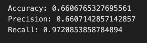
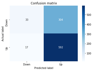
First we ask the trained model to make its forecasts for the held-out days: tuned_model_2_b.predict(X_test_2) calls a function — a reusable recipe card that takes the test inputs and returns the model’s guesses, which we store in y_pred_2_b. Next we prepare a blank canvas and frame for a visual: fig, ax = plt.subplots() creates a figure and axes so we can draw on it. Then we build and draw a confusion matrix heatmap with sns.heatmap(pd.DataFrame(metrics.confusion_matrix(y_test_2, y_pred_2_b)), annot=True, cmap=”Blues”, fmt=’g’). A confusion matrix is a table that tallies true versus predicted labels so you can see hits and misses; converting it to a DataFrame and drawing a colored heatmap helps your eye find patterns of correct and incorrect directional forecasts. The following lines set the title and axis labels so the picture is readable, and ax.xaxis.set_ticklabels([‘Down’, ‘Up’]); ax.yaxis.set_ticklabels([‘Down’, ‘Up’]) replace numeric ticks with the meaningful labels for direction. Finally we print three summary scores: accuracy shows the overall fraction of correct predictions in one sentence, precision tells you the proportion of predicted “Up” days that were actually Up (useful when you want your “buy” calls to be trustworthy), and recall tells you the proportion of actual Up days that the model successfully detected (useful when you want to catch as many rising days as possible). Together these steps let you inspect and quantify how well the LSTM is forecasting stock direction so you can iterate and improve the model.
A ROC curve is a simple graph that shows how a classifier trades off catching true signals against raising false alarms. The vertical axis is the *true positive rate*, which means the fraction of actual “ups” you correctly predict. The horizontal axis is the *false positive rate*, which means the fraction of “downs” you incorrectly call “up.” Seeing the whole curve helps you understand performance across all decision thresholds, not just at one cut-off.
A single-number summary is the AUC, the *area under the ROC curve*, which runs from 0 to 1. An AUC of 0.5 means the model is guessing at random; closer to 1 is better. This number is handy because it compares models without you choosing a threshold first.
For stock price forecasting with an LSTM, we often convert continuous price forecasts into a simple up/down prediction so the ROC applies. That means if your LSTM predicts direction, the ROC tells you how well it separates days that go up from days that go down. If one class (up or down) is much rarer, also look at precision–recall curves, because they can give clearer insight when classes are imbalanced.
A practical tip: always compute ROC and AUC on a held-out test set, not on training data. Use the curve to pick a threshold that matches your trading goals — whether you want fewer false alarms or to catch more true moves — since trading costs and risk tolerance should guide that choice.
y_proba_2_b=tuned_model_2_b.predict_proba(X_test_2)[:, 1]
fpr, tpr, _=metrics.roc_curve(y_test_2,  y_proba_2_b)
auc=metrics.roc_auc_score(y_test_2, y_proba_2_b)
plt.plot(fpr,tpr,label=”AUC=”+str(auc))
plt.legend(loc=4)
plt.plot([0, 1], [0, 1], linestyle=’--’) # plot no skill
plt.title(’ROC-Curve’)
plt.show()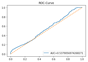
Imagine you’re checking how confidently a trained model calls a stock move “up” versus “down” and then drawing a picture that summarizes those calls. The first line asks the tuned model to give probabilities for each test example, and the [:, 1] slice picks the probability of the “positive” class (think of it as taking the jar labeled “up” to see how full it is for each day). Then we convert those probabilities and the true labels into two sequences: false positive rate and true positive rate, using a sliding threshold that walks from very strict to very permissive — the ROC curve traces the trade-off between catching real ups and mistakenly calling downs as ups (a key concept: the ROC curve shows how sensitivity and fall-out change as you vary the decision threshold). The AUC function collapses that whole curve into one number, the area under the curve, which acts like a single-score summary of discriminative power.
Next we plot the FPR vs TPR and paint the AUC value into the label so the viewer can read how well the classifier separates classes, then add a legend tucked into the lower-right. We also draw a dashed diagonal line representing a “no-skill” classifier that guesses randomly, give the plot a title, and finally render the figure to the screen. Seeing this curve helps you judge whether your LSTM-based forecasting setup is actually learning to discriminate future upward moves from downward ones.
An LSTM is a kind of neural network that learns from sequences — like a list of past stock prices — and tries to predict what comes next. The full name, Long Short-Term Memory, means it can remember useful information for a long time and ignore what’s not helpful. This helps because prices depend both on recent moves and on patterns that take longer to show up.
Inside an LSTM are simple switches called gates: a forget gate decides what old bits to drop, an input gate decides what new bits to keep, and an output gate decides what to pass on. Saying it another way, the model learns what to remember, what to update, and what to use for predictions. That keeps short-term noise from drowning out longer trends.
For stock forecasting you still need to prepare data: scale numbers so the network learns well, pick how many past days to feed it (the sequence length), and split data into training and testing so you check real performance. Also watch for overfitting, where the model learns past quirks instead of general patterns — simpler models and validation help avoid that. These steps make the LSTM’s predictions more reliable in practice.
start=time.time()


# number of epochs
epochs=1
# number of units
LSTM_units_2_lstm=180
# number of samples
num_samples=1
# time_steps
look_back=1
# numer of features
num_features_2_lstm=X_train_2.shape[1]
# Regularization
dropout_rate=0.
recurrent_dropout=0.4
# print
verbose=0

#hyperparameter
batch_size=[1]

# hyperparameter
hyperparameter_2_lstm={’batch_size’:batch_size}


# create Classifier
clf_2_lstm=KerasClassifier(build_fn=create_shallow_LSTM,
                           epochs=epochs,
                           LSTM_units=LSTM_units_2_lstm,
                           num_samples=num_samples,
                           look_back=look_back,
                           num_features=num_features_2_lstm,
                           dropout_rate=dropout_rate,
                           recurrent_dropout=recurrent_dropout,
                           verbose=verbose)
# Gridsearch
search_2_lstm=GridSearchCV(estimator=clf_2_lstm,
                           param_grid=hyperparameter_2_lstm,
                           n_jobs=-1,
                           cv=tscv,
                           scoring=scoring_lstm, # accuracy
                           refit=True,
                           return_train_score=False)

# Fit model
tuned_model_2_lstm=search_2_lstm.fit(X_train_2_lstm, y_train_2, shuffle=False, callbacks=[reset])


print(”\n”)

# View Accuracy
print(scoring_lstm +’ of the best model: ‘, tuned_model_2_lstm.best_score_)
# best_score_ Mean cross-validated score of the best_estimator

print(”\n”)

# View best hyperparameters
print(”Best hyperparameters:”)
print(’epochs:’, tuned_model_2_lstm.best_estimator_.get_params()[’epochs’])
print(’batch_size:’, tuned_model_2_lstm.best_estimator_.get_params()[’batch_size’])
print(’dropout_rate:’, tuned_model_2_lstm.best_estimator_.get_params()[’dropout_rate’])
print(’recurrent_dropout:’, tuned_model_2_lstm.best_estimator_.get_params()[’recurrent_dropout’])

end=time.time()
print(”\n”)
print(”Running Time:”, end - start)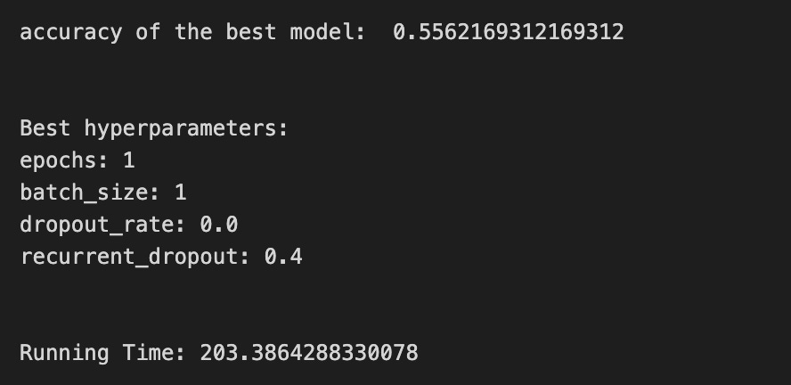
We’re building a little experiment to tune a small LSTM that will help forecast stock prices, and the first line start=time.time() simply starts a stopwatch so we can tell how long our whole tuning story takes. The next lines set the recipe’s ingredients: epochs=1 decides how many full passes through the data the network will take (an epoch is one complete training pass over the data), LSTM_units_2_lstm=180 chooses how many memory cells the LSTM has (more units can store more temporal patterns), num_samples and look_back=1 say how the input is shaped in time, and num_features_2_lstm=X_train_2.shape[1] reads how many features each time step has from the training data. dropout_rate and recurrent_dropout control regularization by randomly masking connections like occasionally leaving out a spice so the model doesn’t overfit, and verbose=0 silences progress printing.
batch_size=[1] and hyperparameter_2_lstm package the batch-size options we’ll try; batch size is how many samples we use before updating weights, so it affects training stability. KerasClassifier wraps our create_shallow_LSTM function into a scikit-learn-style estimator so we can use familiar tuning tools; the many parameters passed set up the LSTM’s architecture and training behavior. GridSearchCV then becomes our tasting panel, exploring hyperparameter combinations in param_grid using all processors (n_jobs=-1) and a time-series aware cross-validator tscv; cross-validation is a method of repeatedly splitting data to robustly estimate performance. scoring_lstm sets the metric to compare models.
We fit the search with shuffle=False (preserve time order) and a reset callback to clear state between folds. The prints show the best cross-validated score and the winning hyperparameters via get_params(), and ending the stopwatch reports running time. All together, this procedure helps find a reliable LSTM configuration to improve stock-price forecasts.
A confusion matrix is a simple table that shows how often your model’s predictions match reality, with counts for each kind of right and wrong answer. For stock forecasting with an LSTM, we usually turn continuous price predictions into labels like up or down (that’s called converting to a classification problem), and the matrix then shows how many times you predicted up when the market went up, predicted down when it went down, and the two kinds of mistakes.
Seeing those counts helps you spot what the model struggles with, because you can turn them into metrics like accuracy, precision, and recall, which tell you different things about errors. This matters in trading: some mistakes cost more than others, so the confusion matrix helps you decide if you should adjust thresholds, rebalance classes, or change the model to lower the most harmful errors.
# Make predictions
y_pred_2_lstm=tuned_model_2_lstm.predict(X_test_2_lstm)

# create confustion matrix
fig, ax=plt.subplots()
sns.heatmap(pd.DataFrame(metrics.confusion_matrix(y_test_2, y_pred_2_lstm)), annot=True, cmap=”Blues” ,fmt=’g’)
plt.title(’Confusion matrix’); plt.ylabel(’Actual label’); plt.xlabel(’Predicted label’)
ax.xaxis.set_ticklabels([’Down’, ‘Up’]); ax.yaxis.set_ticklabels([’Down’, ‘Up’])

print(”Accuracy:”,metrics.accuracy_score(y_test_2, y_pred_2_lstm))
print(”Precision:”,metrics.precision_score(y_test_2, y_pred_2_lstm))
print(”Recall:”,metrics.recall_score(y_test_2, y_pred_2_lstm))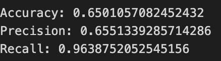

First we ask our tuned LSTM model to make predictions on the test feature set, like sending a trained forecaster out to give daily calls. The output is a list of predicted directions that we will compare to the true directions.
Next we build a visual scoreboard called a confusion matrix, which is a table showing actual versus predicted counts in one place. We turn that table into a neat heatmap so the numbers stand out: wrapping the matrix in a DataFrame gives it row/column structure, the heatmap draws colored squares where darker blues mean more cases, annot=True writes the counts right on each square, and fmt=’g’ ensures those counts appear as whole numbers. Then we add a title and axis labels so the viewer knows which axis is actual and which is predicted, and we relabel the ticks to say “Down” and “Up” so the categories read like simple market moves.
Finally we print three summary scores to quantify performance: accuracy — the fraction of all days we called correctly; precision — of the days we predicted “Up,” how many were truly up (a measure of false alarms); and recall — of the days that were truly “Up,” how many we captured (a measure of missed opportunities). Together the heatmap and these metrics let us see not just a single number but where the LSTM confuses up and down, guiding the next tuning steps in your stock-forecasting project.
An ROC curve is a simple picture that shows how well a model tells events apart. It plots the true positive rate (how often you correctly predict an up move) against the false positive rate (how often you wrongly predict an up move) as you change the cutoff that turns a probability into an up/down decision.
You usually use an ROC curve when your LSTM is predicting a direction (up or down) rather than exact prices. It helps you see the trade-off between catching more true up moves and making more false alarms, which matters when you decide how aggressive your trading signals should be.
The area under the curve, or AUC, is a single number summary: closer to 1 means the model separates ups and downs well; 0.5 means it’s no better than random. Use AUC to compare models, but remember it ignores how big the price moves are — it only cares about direction.
Finally, ROC curves are useful for choosing a decision threshold and comparing classifiers, but in noisy markets you should pair them with profit-based metrics (like expected return or risk) to make practical trading choices.
y_proba_2_lstm=tuned_model_2_lstm.predict_proba(X_test_2_lstm)[:, 1]
fpr, tpr, _=metrics.roc_curve(y_test_2,  y_proba_2_lstm)
auc=metrics.roc_auc_score(y_test_2, y_proba_2_lstm)
plt.plot(fpr,tpr,label=”AUC=”+str(auc))
plt.legend(loc=4)
plt.plot([0, 1], [0, 1], linestyle=’--’) # plot no skill
plt.title(’ROC-Curve’)
plt.show()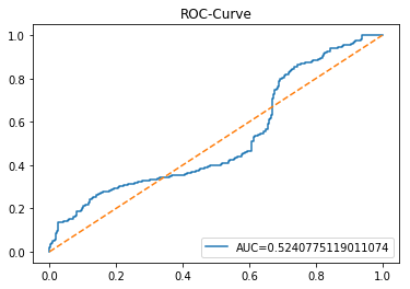
Imagine we’re checking how confident our tuned LSTM model is when it suggests the next move in the market. The first line asks the model’s recipe card (a function we can reuse) for probabilities on the test set, then plucks the second column — those are the model’s confidence scores for the “positive” class, like a dial from 0 to 1 indicating how strongly the model favors an up move. Next, we sweep across many decision thresholds to build two arrays: false positive rate and true positive rate; the roc_curve function gives us those rates so we can see how often we cry wolf versus how often we catch real signals at each threshold, and a key concept: an ROC curve visualizes the trade-off between sensitivity and false alarms. We then compute the area under that curve with roc_auc_score, which is a single-number summary of ranking ability — conceptually, AUC is the probability a random positive is scored higher than a random negative. The plot call draws the ROC line and labels it with the AUC so the curve and its score sit together on the graphic. Adding the legend in the corner helps identify the curve, and plotting a dashed diagonal from (0,0) to (1,1) gives us the “no-skill” baseline like a coin flip. Finally we title and show the figure so the class can inspect model discrimination visually. This is how we turn LSTM outputs into a clear diagnostic for buy/sell signal quality.
Model 3 focuses on trading volume — the count of shares or contracts that change hands during a time period. Trading volume is useful because big price moves on high volume often mean stronger, more reliable trends, while moves on low volume can be weaker or short-lived. This model treats volume as an extra signal to help the LSTM see when price action has real force behind it.
An LSTM is a kind of neural network that learns from sequences, like a stock’s recent minutes, hours, or days. For this model you feed the LSTM both price history and the matching volume history so it can learn patterns that involve both. Before training, you should align timestamps and scale volume (for example with a log transform or standardization) so huge volume numbers don’t drown out the price information; scaling makes training more stable.
Expect volume to often improve short-term forecasts because it adds context about market participation, but remember it can be noisy. Always check performance on holdout data to avoid overfitting and to see whether volume actually helps your price predictions in real trading conditions.
A baseline is the simplest model or rule you use before you build a fancy one. In stock forecasting it might be as basic as “tomorrow’s price equals today’s price” (a naive forecast), or the average of the last few prices (a moving average). Calling one a baseline gives you a clear point to beat, so you know your LSTM is actually helping.
Pick a couple of easy baselines: the last known price, a short moving average, or a linear trend fit to recent data (a simple straight-line guess). These are quick to run and easy to understand, which makes them great first checks. Running them first also helps find data problems — if your complex model can’t beat the baseline, something is wrong.
When you train an LSTM (a type of neural network for sequences), compare its error to the baseline error on the same test set. If the LSTM’s error isn’t meaningfully lower, then you may need more data, better features, or a different model. Using baselines keeps your work honest and saves you time by showing early whether improvements are real.
# Model specific Parameter

# Number of iterations
#iterations_3_b=[20]


# Grid Search

# Regularization
#alpha_g_3_b=[0.00007, 0.00008, 0.00009]
#l1_ratio_g_3_b=[0., 0.2, 0.4, 0.6, 0.8,  1]

# Create hyperparameter options
#hyperparameters_g_3_b={’logistic__alpha’:alpha_g_3_b,
#                       ‘logistic__l1_ratio’:l1_ratio_g_3_b,
#                       ‘logistic__penalty’:penalty_b,
#                       ‘logistic__max_iter’:iterations_3_b}

# Create grid search
#search_g_3_b=GridSearchCV(estimator=pipeline_b,
#                          param_grid=hyperparameters_g_3_b,
#                          cv=tscv,
#                          verbose=0,
#                          n_jobs=-1,
#                          scoring=scoring_b,
#                          refit=metric_b,
#                          return_train_score=False)
# Setting refit=’Accuracy’, refits an estimator on the whole dataset with the parameter setting that has the best cross-validated mean Accuracy score.
# For multiple metric evaluation, this needs to be a string denoting the scorer is used to find the best parameters for refitting the estimator at the end
# If return_train_score=True training results of CV will be saved as well

# Fit grid search
#tuned_model_3_b=search_g_3_b.fit(X_train_3, y_train_3)
#search_g_3_b.cv_results_


# Random Search

# Create regularization hyperparameter distribution using uniform distribution
alpha_r_3_b=uniform(loc=0.00001, scale=0.0001)
l1_ratio_r_3_b=uniform(loc=0, scale=1)

# Create hyperparameter options
hyperparameters_r_3_b={’logistic__alpha’:alpha_r_3_b, ‘logistic__l1_ratio’:l1_ratio_r_3_b, ‘logistic__penalty’:penalty_b,’logistic__max_iter’:iterations_3_b}

# Create randomized search
search_r_3_b=RandomizedSearchCV(pipeline_b, hyperparameters_r_3_b, n_iter=20, random_state=1, cv=tscv, verbose=0, n_jobs=-1, scoring=scoring_b, refit=metric_b, return_train_score=False)
# Setting refit=’Accuracy’, refits an estimator on the whole dataset with the parameter setting that has the best cross-validated Accuracy score.

# Fit randomized search
tuned_model_3_b=search_r_3_b.fit(X_train_3, y_train_3)


# View Cost function
print(’Loss function:’, tuned_model_3_b.best_estimator_.get_params()[’logistic__loss’])

# View Accuracy
print(metric_b +’ of the best model: ‘, tuned_model_3_b.best_score_);print(”\n”)
# best_score_ Mean cross-validated score of the best_estimator

# View best hyperparameters
print(”Best hyperparameters:”)
print(’Number of iterations:’, tuned_model_3_b.best_estimator_.get_params()[’logistic__max_iter’])
print(’Penalty:’, tuned_model_3_b.best_estimator_.get_params()[’logistic__penalty’])
print(’Alpha:’, tuned_model_3_b.best_estimator_.get_params()[’logistic__alpha’])
print(’l1_ratio:’, tuned_model_3_b.best_estimator_.get_params()[’logistic__l1_ratio’])

# Find the number of nonzero coefficients (selected features)
print(”Total number of features:”, len(tuned_model_3_b.best_estimator_.steps[1][1].coef_[0][:]))
print(”Number of selected features:”, np.count_nonzero(tuned_model_3_b.best_estimator_.steps[1][1].coef_[0][:]))

# Gridsearch table
plt.title(’Gridsearch’)
pvt_3_b=pd.pivot_table(pd.DataFrame(tuned_model_3_b.cv_results_), values=’mean_test_accuracy’, index=’param_logistic__l1_ratio’, columns=’param_logistic__alpha’)
ax_3_b=sns.heatmap(pvt_3_b, cmap=”Blues”)
plt.show()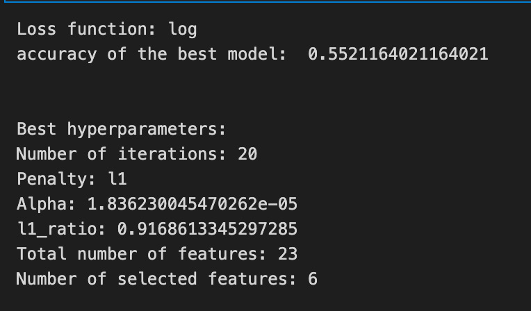

Imagine we’re tuning a chef’s recipe to get the best-flavored model for predicting stock moves; the program’s goal is to search the space of regularization settings and find the combination that gives the best cross-validated accuracy. At first you can see a commented-out grid search — that’s like trying every single spice combination on a checklist — but instead the chef chooses a randomized tasting: we define two flavor jars, one for alpha sampled uniformly from a very small range (a gentle penalty strength) and one for l1_ratio sampled uniformly between 0 and 1 (how much we mix L1 vs L2 regularization). A hyperparameter dictionary bundles those jars together with the chosen penalty type and iteration budget so the search knows what to vary.
RandomizedSearchCV is our tasting session where the procedure tries 20 random combinations (n_iter=20), uses time-series aware cross-validation so folds respect order (tscv), and scores using the chosen metric; refit tells the process which score to use when it retrains the winner on the whole training set. We call fit with the training features and labels, and the search returns the tuned model.
Next we print the learned loss function and the best cross-validated accuracy to see how the winner performed. We then extract the best hyperparameters — iterations, penalty, alpha, and l1_ratio — straight from the pipeline-wrapped estimator, because the pipeline prefixes names so we can grab the logistic parameters. Counting nonzero coefficients is like counting which ingredients survived the pruning from regularization, telling us how many features were effectively selected. Finally, we summarize the search results into a pivot table of mean test accuracy across l1_ratio and alpha and draw a heatmap so we can visually spot the sweet spots. All of this is a tuning step that prepares reliable inputs or baselines for the larger LSTM-based stock forecasting pipeline.
A confusion matrix is a simple table that counts how often your model’s classified predictions match reality. Think of it as four boxes: true positive (predicted “price up” and it went up), false positive (predicted “up” but it fell), false negative (predicted “down” but it went up), and true negative (predicted “down” and it fell). Saying each term in plain words helps you see what mistakes the model makes.
In stock forecasting with an LSTM, you often turn the continuous price output into categories like up or down so you can use a confusion matrix — LSTMs give probabilities, and you pick a threshold to convert those into labels. The matrix shows not just overall accuracy but the kinds of errors, which is crucial when wrong directions cost money. It also helps with issues like class imbalance (many small moves and few big moves) and lets you decide whether to favor catching more ups (higher recall) or being more precise when you call an up (higher precision).
# Make predictions
y_pred_3_b=tuned_model_3_b.predict(X_test_3)

# create confustion matrix
fig, ax=plt.subplots()
sns.heatmap(pd.DataFrame(metrics.confusion_matrix(y_test_3, y_pred_3_b)), annot=True, cmap=”Blues” ,fmt=’g’)
plt.title(’Confusion matrix’); plt.ylabel(’Actual label’); plt.xlabel(’Predicted label’)
ax.xaxis.set_ticklabels([’Down’, ‘Up’]); ax.yaxis.set_ticklabels([’Down’, ‘Up’])

print(”Accuracy:”,metrics.accuracy_score(y_test_3, y_pred_3_b))
print(”Precision:”,metrics.precision_score(y_test_3, y_pred_3_b))
print(”Recall:”,metrics.recall_score(y_test_3, y_pred_3_b))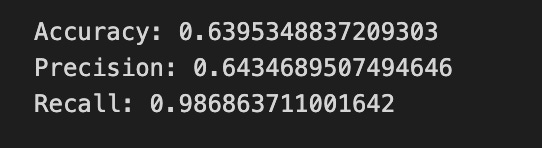

First you ask the trained model to make its guesses: y_pred_3_b = tuned_model_3_b.predict(X_test_3) is like handing the LSTM its exam paper (X_test_3) and collecting its answers into y_pred_3_b. Next we prepare a canvas to visualize how well those guesses match reality by creating a matplotlib figure and axis with fig, ax = plt.subplots(), giving us a place to draw. A confusion matrix is a table that tallies true labels against predicted labels so you can see where the model confuses classes; metrics.confusion_matrix(y_test_3, y_pred_3_b) builds that tally and wrapping it in pd.DataFrame makes it neat for plotting. Passing that table to sns.heatmap draws a colored grid with annotations (annot=True) and integer formatting (fmt=’g’), using a blue palette to highlight counts. The title and axis labels clarify that rows are actual outcomes and columns are predictions, and ax.xaxis.set_ticklabels([‘Down’, ‘Up’]); ax.yaxis.set_ticklabels([‘Down’, ‘Up’]) names the two classes so the grid reads “Down vs Up.” Finally, the three print statements report standard performance numbers: accuracy is the fraction of all correct predictions, precision is the share of predicted Ups that were actually Up, and recall is the share of actual Ups that the model successfully found. Together these steps turn raw model outputs into a readable performance story for your LSTM stock-movement predictor.
The ROC curve is a simple picture that shows the trade-off between catching real positives and avoiding false alarms. In plain terms, it plots the true positive rate (the share of actual up-days you correctly call up) against the false positive rate (the share of down-days you mistakenly call up). Seeing the whole curve helps you understand how your decision changes as you make the model more or less eager to say “up.”
When you use an LSTM to forecast stock prices, it usually predicts a continuous number, like tomorrow’s price. To use an ROC curve, you first turn those numbers into a binary signal (up vs down) by picking a threshold. The ROC is useful because it evaluates your model across all possible thresholds, so you can compare models fairly and pick a threshold that fits your trading goals. The area under the curve (AUC) gives one easy score: 0.5 is random guessing, 1.0 is perfect, and higher is better.
y_proba_3_b=tuned_model_3_b.predict_proba(X_test_3)[:, 1]
fpr, tpr, _=metrics.roc_curve(y_test_3,  y_proba_3_b)
auc=metrics.roc_auc_score(y_test_3, y_proba_3_b)
plt.plot(fpr,tpr,label=”AUC=”+str(auc))
plt.legend(loc=4)
plt.plot([0, 1], [0, 1], linestyle=’--’) # plot no skill
plt.title(’ROC-Curve’)
plt.show()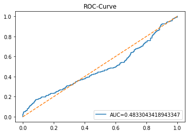
We start by asking the trained model how confident it is that each test example belongs to the positive class: tuned_model_3_b.predict_proba(X_test_3) returns probabilities for each class, and [:, 1] picks the probability of the positive class for every example, like reading the confidence score on each forecast. Next, metrics.roc_curve(y_test_3, y_proba_3_b) walks through many possible decision thresholds and computes the false positive rate and true positive rate at each threshold; the ROC curve is the plot of that trade-off as you move the threshold. The underscore captures a returned value we don’t need, a common Python way to say “I’m ignoring this.” Then metrics.roc_auc_score(y_test_3, y_proba_3_b) squeezes the ROC into one handy summary number: AUC is the area under the ROC and measures how well the model separates classes on average. We plot the fpr versus tpr and label the line with the AUC so the plot itself announces the model’s score, converting the number to text for the legend. Adding plt.legend(loc=4) places the legend in the lower-right; the diagonal plt.plot([0,1],[0,1], linestyle=’ — ‘) draws a no-skill baseline where predictions are random. Finally, plt.title gives the plot a name and plt.show() unveils the figure for inspection. Together, these steps let you visualize and quantify how well your classifier predicts direction — an essential check when your LSTM is being used to forecast stock price movements.
An LSTM, short for Long Short-Term Memory, is a kind of neural network that reads data in order, one step at a time, so it’s good for time-based things like stock prices. Think of it like a reader that can remember important parts of a story and forget the rest; that memory helps it spot patterns over days or months.
LSTMs use simple switches called gates — a forget gate, an input gate, and an output gate — to decide what to keep, what to add, and what to show. These gates make the model better at keeping long-term trends without being overwhelmed by every tiny tick in the price.
For forecasting stocks you feed the model sequences (sliding windows) of past prices and often other signals, and it learns to predict the next step. We usually scale numbers first so the model trains faster and doesn’t get confused by large values.
Training happens by comparing predictions to real prices and adjusting the model, but be careful: LSTMs can overfit, meaning they learn past noise instead of real patterns. Using walk-forward validation — training on past data and testing on the next unseen period — helps mimic real trading and gives a more honest performance check.
Finally, remember that LSTM forecasts are probabilistic aids, not guarantees; they can improve decisions but can’t predict every market shock.
start=time.time()


# number of epochs
epochs=1
# number of units
LSTM_units_3_lstm=180
# number of samples
num_samples=1
# time_steps
look_back=1
# numer of features
num_features_3_lstm=X_train_3.shape[1]
# Regularization
dropout_rate=0.
recurrent_dropout=0.4
# print
verbose=0

#hyperparameter
batch_size=[1]

# hyperparameter
hyperparameter_3_lstm={’batch_size’:batch_size}


# create Classifier
clf_3_lstm=KerasClassifier(build_fn=create_shallow_LSTM,
                           epochs=epochs,
                           LSTM_units=LSTM_units_3_lstm,
                           num_samples=num_samples,
                           look_back=look_back,
                           num_features=num_features_3_lstm,
                           dropout_rate=dropout_rate,
                           recurrent_dropout=recurrent_dropout,
                           verbose=verbose)
# Gridsearch
search_3_lstm=GridSearchCV(estimator=clf_3_lstm,
                           param_grid=hyperparameter_3_lstm,
                           n_jobs=-1,
                           cv=tscv,
                           scoring=scoring_lstm, # accuracy
                           refit=True,
                           return_train_score=False)

# Fit model
tuned_model_3_lstm=search_3_lstm.fit(X_train_3_lstm, y_train_3, shuffle=False, callbacks=[reset])


print(”\n”)

# View Accuracy
print(scoring_lstm +’ of the best model: ‘, tuned_model_3_lstm.best_score_)
# best_score_ Mean cross-validated score of the best_estimator

print(”\n”)

# View best hyperparameters
print(”Best hyperparameters:”)
print(’epochs:’, tuned_model_3_lstm.best_estimator_.get_params()[’epochs’])
print(’batch_size:’, tuned_model_3_lstm.best_estimator_.get_params()[’batch_size’])
print(’dropout_rate:’, tuned_model_3_lstm.best_estimator_.get_params()[’dropout_rate’])
print(’recurrent_dropout:’, tuned_model_3_lstm.best_estimator_.get_params()[’recurrent_dropout’])

end=time.time()
print(”\n”)
print(”Running Time:”, end - start)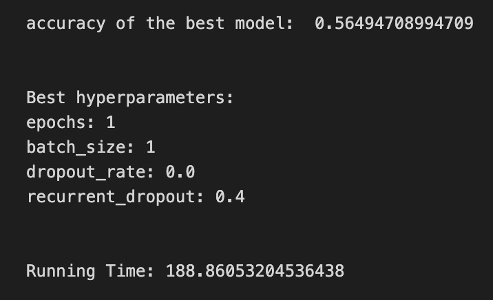
We begin by stamping the current time so we can later tell how long training took, like noting when we start baking a batch. Next we set a handful of knobs: epochs is how many full passes over the dataset we’ll make (think of repeating the whole recipe to improve taste), LSTM_units is how many memory cells the layer has, num_samples and look_back describe how many input examples and how many past time steps the model sees (look_back is the size of the short history window), and num_features reads the width of each input row. A dropout_rate and recurrent_dropout are regularizers that randomly silence neurons to avoid overfitting, and verbose controls how chatty the training logs are.
We then prepare the hyperparameter grid by putting batch_size into a list and wrapping it into a dictionary; batch_size slices the training data into smaller servings for each gradient update. After that we create a KerasClassifier wrapper around a create_shallow_LSTM function so the model becomes a scikit-learn-style estimator; a function is a reusable recipe card that returns a compiled model. The wrapper forwards epoch count, LSTM size, input dimensions, and dropout settings so each trial builds the same shaped model.
Next we set up GridSearchCV to search over batch sizes in parallel (n_jobs=-1) using a time-series cross-validator tscv; cross-validation for time series must preserve order, so shuffle is disabled later. The scoring metric is scoring_lstm (accuracy here), and refit=True means the best found model will be retrained on all training folds. We fit the search on X_train_3_lstm and y_train_3 with shuffle=False and a reset callback to clear state between folds.
Finally we print the best score and the chosen hyperparameters by querying the tuned estimator, compute elapsed time, and show how long the experiment took. All of these steps prepare and select the best LSTM setup to forecast stock prices from recent history.
A confusion matrix is just a simple table that compares what your model predicted to what actually happened. Each cell counts how many times the model said “up” when the price went up, said “up” when it went down, and so on. I’ll name them: a true positive is when you predicted an up and the price did go up, and a false positive is when you predicted an up but it fell — each jargon term is explained right away.
When you use an LSTM to forecast stock prices, you often turn the problem into a yes/no question, like “will the price go up?” The confusion matrix then shows the types of mistakes the LSTM makes. That matters because trading decisions care about what kind of errors happen, not just how often you’re right. For example, many small false positives can cost more than a few missed opportunities.
The matrix also gives you more useful numbers, like precision (of the times you predicted up, how many were actually up) and recall (of the real ups, how many did you catch). Looking at these helps you tune thresholds, manage risk, and decide whether your model is too cautious or too aggressive.
# Make predictions
y_pred_3_lstm=tuned_model_3_lstm.predict(X_test_3_lstm)

# create confustion matrix
fig, ax=plt.subplots()
sns.heatmap(pd.DataFrame(metrics.confusion_matrix(y_test_3, y_pred_3_lstm)), annot=True, cmap=”Blues” ,fmt=’g’)
plt.title(’Confusion matrix’); plt.ylabel(’Actual label’); plt.xlabel(’Predicted label’)
ax.xaxis.set_ticklabels([’Down’, ‘Up’]); ax.yaxis.set_ticklabels([’Down’, ‘Up’])

print(”Accuracy:”,metrics.accuracy_score(y_test_3, y_pred_3_lstm))
print(”Precision:”,metrics.precision_score(y_test_3, y_pred_3_lstm))
print(”Recall:”,metrics.recall_score(y_test_3, y_pred_3_lstm))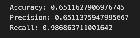
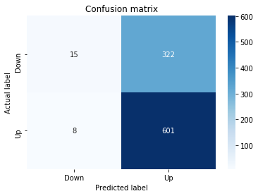
First we ask the tuned LSTM model to make predictions on the test features with tuned_model_3_lstm.predict(X_test_3_lstm); think of that like sending the model a batch of unseen market snapshots and getting back its calls on whether the price will go Up or Down. Next we set up a plotting canvas with fig, ax = plt.subplots() so we have a place to draw our performance scoreboard.
We compute and show a confusion matrix with sns.heatmap(pd.DataFrame(metrics.confusion_matrix(y_test_3, y_pred_3_lstm)), annot=True, cmap=”Blues”, fmt=’g’); a confusion matrix is a compact table that counts true vs predicted labels so you can see where the model is getting decisions right or mixing things up. The annot=True prints the counts on the heatmap, cmap=”Blues” gives a blue color scale, and fmt=’g’ ensures whole-number formatting for those counts.
We then add human-friendly labels and a title with plt.title(…); plt.ylabel(…); plt.xlabel(…), and we replace numeric tick labels with ax.xaxis.set_ticklabels([‘Down’, ‘Up’]); ax.yaxis.set_ticklabels([‘Down’, ‘Up’]) so the axes read as market directions instead of indices — this makes the scoreboard readable at a glance.
Finally we print three summary scores: accuracy, precision, and recall. Accuracy tells you the overall fraction of correct calls, precision tells you how often an “Up” call was actually Up (confidence in positive calls), and recall tells you how many of the real Ups the model successfully detected (sensitivity). Together these pieces let you judge how well the LSTM forecasts directional moves in the stock-price project.
A ROC curve shows how well a binary predictor works by plotting the true positive rate against the false positive rate as you change the decision threshold. The true positive rate is the share of real “ups” you correctly predict, and the false positive rate is the share of real “downs” you mistakenly call “up.” In stock-forecasting with an LSTM, you’d use it when your model predicts a direction (up/down) rather than a price, and it helps you see the tradeoff between catching rises and avoiding false signals.
The area under that curve, called AUC, is a single number summarizing performance: 1.0 is perfect, 0.5 is no better than random. That makes AUC handy for comparing models without committing to a specific threshold. Practically, ROC analysis helps you pick a threshold that matches your trading goals — for example, whether you prefer fewer false alarms or more catches — so your model’s decisions align with how you manage risk and costs.
y_proba_3_lstm=tuned_model_3_lstm.predict_proba(X_test_3_lstm)[:, 1]
fpr, tpr, _=metrics.roc_curve(y_test_3,  y_proba_3_lstm)
auc=metrics.roc_auc_score(y_test_3, y_proba_3_lstm)
plt.plot(fpr,tpr,label=”AUC=”+str(auc))
plt.legend(loc=4)
plt.plot([0, 1], [0, 1], linestyle=’--’) # plot no skill
plt.title(’ROC-Curve’)
plt.show()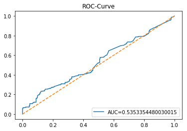
We want to see how well our tuned LSTM model can score the chance that a stock will move up, so the first line asks the model for probabilities on the test set and keeps the probability of the positive class: predict_proba returns estimated probabilities for each class so slicing [:, 1] picks the model’s confidence that the target is “up” (a probability between 0 and 1). Next, we call a helper that compares those probabilities to the true labels and returns three things; fpr and tpr are the false positive and true positive rates at many thresholds, and the third value is the thresholds themselves — the ROC curve is a way to show the trade-off between sensitivity and false alarms across decision thresholds. We compute auc as a single-number summary: the area under that ROC curve, where 1.0 is perfect and 0.5 is no better than random. Then we draw the diagnostic: plotting fpr against tpr traces the ROC curve, and we attach a label that embeds the numeric AUC so we can read model quality at a glance. Showing a legend at the lower-right makes that label visible, and plotting the diagonal dashed line from (0,0) to (1,1) gives a “no-skill” baseline to compare against. Finally we title the figure and display it so we can visually judge our LSTM’s discriminative power for forecasting stock moves, an essential step when deciding whether the model’s probabilistic signals are trustworthy in the larger forecasting system.
Model 4 uses both *volatility* and *return* as inputs to the LSTM. Volatility is just how wildly a price moves or how much it varies over time, and return is the price change over a period, usually shown as a percent. Saying both out loud helps the model see not just which way prices move, but also how strongly and erratically they move.
Feeding volatility and return together gives the LSTM two complementary clues: return shows direction and momentum, while volatility signals risk and surprise. This helps the network learn patterns in both size and uncertainty of moves, which often improves short-term forecasts. It’s worth scaling these features first so their different ranges don’t confuse the model.
# Model specific Parameter

# Number of iterations
iterations_4_b=[8]


# Grid Search

# Regularization
alpha_g_4_b=[0.0011, 0.0012, 0.0013]
l1_ratio_g_4_b=[0, 0.2, 0.4, 0.6, 0.8, 1]

# Create hyperparameter options
hyperparameters_g_4_b={’logistic__alpha’:alpha_g_4_b,
                       ‘logistic__l1_ratio’:l1_ratio_g_4_b,
                       ‘logistic__penalty’:penalty_b,
                       ‘logistic__max_iter’:iterations_4_b}

# Create grid search
search_g_4_b=GridSearchCV(estimator=pipeline_b,
                          param_grid=hyperparameters_g_4_b,
                          cv=tscv,
                          verbose=0,
                          n_jobs=-1,
                          scoring=scoring_b,
                          refit=metric_b,
                          return_train_score=False)
# Setting refit=’Accuracy’, refits an estimator on the whole dataset with the parameter setting that has the best cross-validated mean Accuracy score.
# For multiple metric evaluation, this needs to be a string denoting the scorer is used to find the best parameters for refitting the estimator at the end
# If return_train_score=True training results of CV will be saved as well

# Fit grid search
tuned_model_4_b=search_g_4_b.fit(X_train_4, y_train_4)
#search_g_4_b.cv_results_


# Random Search

# Create regularization hyperparameter distribution using uniform distribution
#alpha_r_4_b=uniform(loc=0.00006, scale=0.002) #loc=0.00006, scale=0.002
#l1_ratio_r_4_b=uniform(loc=0, scale=1)

# Create hyperparameter options
#hyperparameters_r_4_b={’logistic__alpha’:alpha_r_4_b, ‘logistic__l1_ratio’:l1_ratio_r_4_b, ‘logistic__penalty’:penalty_b,’logistic__max_iter’:iterations_4_b}

# Create randomized search
#search_r_4_b=RandomizedSearchCV(pipeline_b, hyperparameters_r_4_b, n_iter=10, random_state=1, cv=tscv, verbose=0, n_jobs=-1, scoring=scoring_b, refit=metric_b, return_train_score=False)
# Setting refit=’Accuracy’, refits an estimator on the whole dataset with the parameter setting that has the best cross-validated Accuracy score.

# Fit randomized search
#tuned_model_4_b=search_r_4_b.fit(X_train_4, y_train_4)


# View Cost function
print(’Loss function:’, tuned_model_4_b.best_estimator_.get_params()[’logistic__loss’])

# View Accuracy
print(metric_b +’ of the best model: ‘, tuned_model_4_b.best_score_);print(”\n”)
# best_score_ Mean cross-validated score of the best_estimator

# View best hyperparameters
print(”Best hyperparameters:”)
print(’Number of iterations:’, tuned_model_4_b.best_estimator_.get_params()[’logistic__max_iter’])
print(’Penalty:’, tuned_model_4_b.best_estimator_.get_params()[’logistic__penalty’])
print(’Alpha:’, tuned_model_4_b.best_estimator_.get_params()[’logistic__alpha’])
print(’l1_ratio:’, tuned_model_4_b.best_estimator_.get_params()[’logistic__l1_ratio’])

# Find the number of nonzero coefficients (selected features)
print(”Total number of features:”, len(tuned_model_4_b.best_estimator_.steps[1][1].coef_[0][:]))
print(”Number of selected features:”, np.count_nonzero(tuned_model_4_b.best_estimator_.steps[1][1].coef_[0][:]))

# Gridsearch table
plt.title(’Gridsearch’)
pvt_4_b=pd.pivot_table(pd.DataFrame(tuned_model_4_b.cv_results_), values=’mean_test_accuracy’, index=’param_logistic__l1_ratio’, columns=’param_logistic__alpha’)
ax_4_b=sns.heatmap(pvt_4_b, cmap=”Blues”)
plt.show()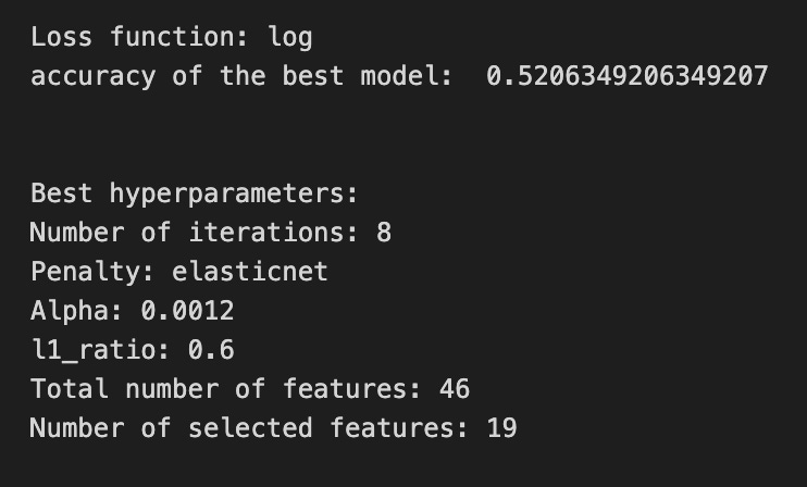

We’re trying to find the best regularization settings for a logistic step inside a larger pipeline, so the first two lines set the small lists of options to try: iterations_4_b=[8] fixes the optimizer to run 8 passes, alpha_g_4_b and l1_ratio_g_4_b are the grid of candidate regularization strengths and elastic-net mixes respectively. A hyperparameter grid is simply a menu of recipes to taste, and hyperparameters_g_4_b maps the pipeline’s logistic parameters to those menus (note the “logistic__” prefix points into the second step of the pipeline).
Next, GridSearchCV is created with the pipeline, that hyperparameter grid, a time-series cross-validator tscv, a scoring dictionary scoring_b, and refit=metric_b; cross-validation here means we repeatedly train and validate on different time-respecting splits so performance estimates respect temporal order. Setting refit to a metric means after testing all combinations, GridSearchCV will retrain the pipeline on the whole training set using the hyperparameters that gave the best value of that metric. The .fit call runs the whole tasting session against X_train_4 and y_train_4 and returns the best found model as tuned_model_4_b. The commented RandomizedSearchCV section is an alternative that samples from continuous distributions rather than exhaustively trying a grid.
After fitting, we peek inside the winner: printing the loss used by the logistic solver, the chosen metric score (best_score_), and each chosen hyperparameter like iterations, penalty, alpha and l1_ratio. We then count total features and nonzero coefficients from the fitted logistic to see how many inputs were effectively used (nonzero weights are the selected features). Finally, we summarize the grid results into a pivot table of mean_test_accuracy and draw a heatmap so we can visually spot good regions of the hyperparameter space. All of this helps tune the model selection step that sits upstream of the LSTM forecasting pipeline.
A confusion matrix is a simple table that shows how often your model’s predictions match reality. If your LSTM is predicting whether a stock will go *up* or *down* (we turned the price forecast into a yes/no decision), the matrix counts true ups predicted as up, true downs predicted as down, and the two kinds of mistakes. Seeing those counts helps you understand not just how often the model is right, but what kinds of errors it makes.
The four boxes have names: true positives (predicted up and it went up), true negatives (predicted down and it went down), false positives (predicted up but it went down), and false negatives (predicted down but it went up). Knowing these matters because in trading different mistakes have different costs — a false buy might lose more than a missed opportunity.
From the confusion matrix you can derive simple scores like accuracy (overall right answers), precision (of the times you said “up,” how many were actually up), and recall (of all actual ups, how many you caught). These metrics let you tune the model or the decision threshold — the cutoff where you call a prediction “up” — so the model fits the risk you’re willing to take.
If your original task was predicting exact prices (regression), you only use a confusion matrix after you convert to categories like up/down. The matrix then becomes a practical tool to turn predictions into real trading choices and to see where your LSTM needs improvement.
# Make predictions
y_pred_4_b=tuned_model_4_b.predict(X_test_4)

# create confustion matrix
fig, ax=plt.subplots()
sns.heatmap(pd.DataFrame(metrics.confusion_matrix(y_test_4, y_pred_4_b)), annot=True, cmap=”Blues” ,fmt=’g’)
plt.title(’Confusion matrix’); plt.ylabel(’Actual label’); plt.xlabel(’Predicted label’)
ax.xaxis.set_ticklabels([’Down’, ‘Up’]); ax.yaxis.set_ticklabels([’Down’, ‘Up’])

print(”Accuracy:”,metrics.accuracy_score(y_test_4, y_pred_4_b))
print(”Precision:”,metrics.precision_score(y_test_4, y_pred_4_b))
print(”Recall:”,metrics.recall_score(y_test_4, y_pred_4_b))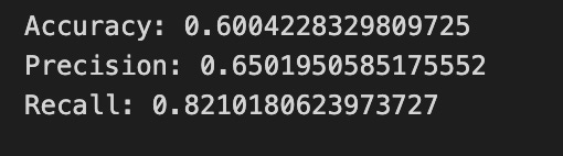
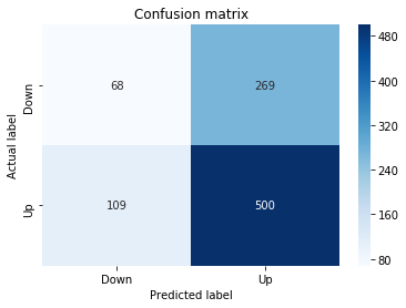
First, the program asks the trained model to make guesses on the test examples, calling predict on the test inputs so the model can “vote” Up or Down for each sample; think of it as following a recipe to bake one more batch and seeing what comes out. Those guesses are collected into y_pred_4_b so we can compare them against the true labels.
Next, we build a scoreboard called a confusion matrix that tallies hits and misses: how many actual Ups were predicted Up, how many actual Ups were predicted Down, and vice versa. A confusion matrix is a table that summarizes classification performance in terms of true/false positives and negatives. We turn that table into a pandas DataFrame and draw it as a colored heatmap so the numbers jump out visually; annotating prints the counts on each cell, the “Blues” palette gives stronger color to larger counts, and formatting ensures integers show clearly. The plot is titled and the axes are labeled and relabeled to read ‘Down’ and ‘Up’ so you can immediately see actual versus predicted directions.
Finally, the program prints three simple scores: accuracy, precision, and recall. Accuracy is the fraction of all predictions that were correct; precision is the fraction of predicted Ups that were actually Up (one-sentence definition: precision measures how often a positive prediction is right); recall is the fraction of actual Ups that the model successfully flagged (one-sentence definition: recall measures how many real positives were detected). Together these visuals and numbers let you judge how well your LSTM is forecasting price direction and guide the next round of tuning.
The ROC curve is a simple chart that helps you judge a classifier: it plots the true positive rate (how often your model correctly predicts the event you care about) against the false positive rate (how often it cries wolf) as you change the decision threshold. A threshold is just the cut-off on the model’s probability output — your LSTM gives a probability that the price will go up, and the threshold decides when you call that an “up” prediction.
The area under the ROC curve, or AUC, summarizes performance into one number between 0.5 (random guessing) and 1.0 (perfect). A higher AUC means the model is generally better at ranking true events above false ones. This matters for trading because you often care more about ranking likely moves than a single fixed yes/no rule.
ROC curves are especially helpful when classes are imbalanced (for example, big moves are rare), because simple accuracy can be misleading in that case. They also help you pick a threshold that balances catching real opportunities versus avoiding false alarms, which you’ll tweak depending on your risk tolerance and trading costs.
y_proba_4_b=tuned_model_4_b.predict_proba(X_test_4)[:, 1]
fpr, tpr, _=metrics.roc_curve(y_test_4,  y_proba_4_b)
auc=metrics.roc_auc_score(y_test_4, y_proba_4_b)
plt.plot(fpr,tpr,label=”AUC=”+str(auc))
plt.legend(loc=4)
plt.plot([0, 1], [0, 1], linestyle=’--’) # plot no skill
plt.title(’ROC-Curve’)
plt.show()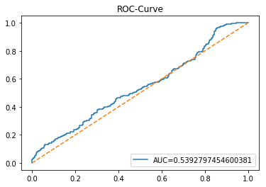
Think of the program as a small inspector that checks how well our model estimates the chance of a stock move and then draws a picture of its strengths and weaknesses. The first line asks the tuned_model_4_b for probabilities on the test set X_test_4 by using a function that works like a reusable recipe card: predict_proba returns the model’s confidence for each class, and slicing [:, 1] picks the probability of the “positive” class — the chance the event (e.g., price up) happens. Next, metrics.roc_curve tastes those probabilities against the true labels y_test_4 and returns two arrays, fpr and tpr, which trace the false positive rate and true positive rate at every decision threshold; a ROC curve is a way to visualize the trade-off between catching real events and raising false alarms. The auc computed by metrics.roc_auc_score is a single-number summary — area under that ROC curve — where 1.0 is perfect and 0.5 is coin-flip, so it tells us overall discriminative power. Then the program draws the curve with plt.plot and labels it with the numeric AUC so we can read the score on the figure, adds a legend in the corner, and overlays a dashed diagonal line to show the “no-skill” baseline of random guessing. Finally it titles the plot and displays it with plt.show(). Seeing this ROC and AUC helps you judge how reliably the LSTM-based model predicts up/down moves across thresholds, an essential check when forecasting stock prices.
An LSTM (Long Short-Term Memory) is a kind of neural network layer that learns from sequences, like a series of past stock prices, by remembering useful bits of information over time. Think of it as a little storyteller that holds important facts from earlier in the story so future predictions make sense.
It uses simple control bits called gates — a forget gate to drop old noise, an input gate to add new signals, and an output gate to decide what to share next — and those gates help it keep the right balance between old and new information. This design helps avoid the “vanishing gradient” problem, which is a technical way of saying the network can actually learn long-range patterns instead of losing them.
LSTMs are popular for stock forecasting because prices are a time series — each value depends on earlier ones — and markets often show patterns that unfold over many days. Because markets are noisy and changeable, you still need care: choose how many past steps the model sees (sequence length), and keep expectations realistic since models can’t predict sudden events.
In practice you feed the LSTM scaled sequences (scaling makes training faster and more stable), split data into train/validation sets to avoid overfitting, and tune how complex the model is so it generalizes to new market days.
start=time.time()


# number of epochs
epochs=1
# number of units
LSTM_units_4_lstm=200
# number of samples
num_samples=1
# time_steps
look_back=1
# numer of features
num_features_4_lstm=X_train_4.shape[1]
# Regularization
dropout_rate=0.
recurrent_dropout=0.4
# print
verbose=0

#hyperparameter
batch_size=[1]

# hyperparameter
hyperparameter_4_lstm={’batch_size’:batch_size}


# create Classifier
clf_4_lstm=KerasClassifier(build_fn=create_shallow_LSTM,
                           epochs=epochs,
                           LSTM_units=LSTM_units_4_lstm,
                           num_samples=num_samples,
                           look_back=look_back,
                           num_features=num_features_4_lstm,
                           dropout_rate=dropout_rate,
                           recurrent_dropout=recurrent_dropout,
                           verbose=verbose)
# Gridsearch
search_4_lstm=GridSearchCV(estimator=clf_4_lstm,
                           param_grid=hyperparameter_4_lstm,
                           n_jobs=-1,
                           cv=tscv,
                           scoring=scoring_lstm, # accuracy
                           refit=True,
                           return_train_score=False)

# Fit model
tuned_model_4_lstm=search_4_lstm.fit(X_train_4_lstm, y_train_4, shuffle=False, callbacks=[reset])


print(”\n”)

# View Accuracy
print(scoring_lstm +’ of the best model: ‘, tuned_model_4_lstm.best_score_)
# best_score_ Mean cross-validated score of the best_estimator

print(”\n”)

# View best hyperparameters
print(”Best hyperparameters:”)
print(’epochs:’, tuned_model_4_lstm.best_estimator_.get_params()[’epochs’])
print(’batch_size:’, tuned_model_4_lstm.best_estimator_.get_params()[’batch_size’])
print(’dropout_rate:’, tuned_model_4_lstm.best_estimator_.get_params()[’dropout_rate’])
print(’recurrent_dropout:’, tuned_model_4_lstm.best_estimator_.get_params()[’recurrent_dropout’])

end=time.time()
print(”\n”)
print(”Running Time:”, end - start)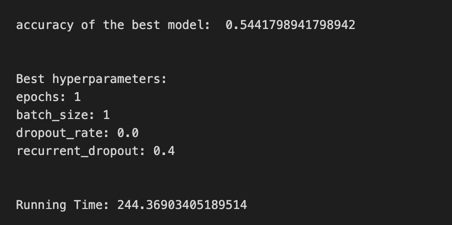
We start by marking time with start=time.time() so we can measure how long the whole experiment takes. Then a few settings define the experiment: epochs=1 tells the training loop how many full passes over the data to make (an epoch is like repeating a recipe step end-to-end), LSTM_units_4_lstm=200 sets how many neurons the LSTM layer will have, num_samples and look_back describe how many sequences and time steps we feed the model, and num_features_4_lstm=X_train_4.shape[1] reads the number of input variables directly from the training matrix. dropout_rate and recurrent_dropout set regularization; regularization is a simple way to prevent overfitting by randomly ignoring parts of the model during training. verbose=0 silences progress output.
We then declare batch_size as a list because hyperparameter search expects options, and wrap that into hyperparameter_4_lstm. KerasClassifier(build_fn=create_shallow_LSTM, …) wraps a Keras model so it behaves like a scikit-learn estimator; that wrapper takes our build function and the parameters we just set. GridSearchCV(…) is like trying different spice levels with cross-validation to find the best flavor; cross-validation (cv=tscv) evaluates generalization by training and testing on different time-ordered folds, and scoring=scoring_lstm tells it which metric to optimize.
Calling search_4_lstm.fit(X_train_4_lstm, y_train_4, shuffle=False, callbacks=[reset]) runs the search: shuffle=False preserves time order important for forecasting, and callbacks=[reset] can reset state between runs. After fitting, we print the best mean cross-validated score and extract chosen hyperparameters via best_estimator_.get_params(). Finally end=time.time() and print the elapsed time. All of these steps together are a careful experiment to find LSTM settings that will help forecast future stock prices.
A confusion matrix is a simple table that compares what your model predicted with what actually happened. In stock forecasting you usually turn prices into classes like “up” or “down”, so the matrix shows counts of correct and incorrect direction predictions. This helps you see the kinds of mistakes your LSTM makes, not just how often it’s right.
The four basic counts are true positives (correctly predicted up), true negatives (correctly predicted down), false positives (predicted up but it went down), and false negatives (predicted down but it went up). Seeing these separately matters because some mistakes cost more in trading — for example, a false positive might lead to a losing buy order.
From the confusion matrix you can compute familiar scores like accuracy, precision (how many predicted ups were actually up), recall (how many actual ups you caught), and the F1 score (a balance of precision and recall). These give more insight than a single error number like MSE, which is for regression and won’t tell you about direction errors.
Watch out for class imbalance — if the market mostly goes up, a model that always predicts up will look good on accuracy but fail in practice. Use the confusion matrix to tune your decision threshold and trading rules so the model’s mistakes match the costs you care about.
# Make predictions
y_pred_4_lstm=tuned_model_4_lstm.predict(X_test_4_lstm)

# create confustion matrix
fig, ax=plt.subplots()
sns.heatmap(pd.DataFrame(metrics.confusion_matrix(y_test_4, y_pred_4_lstm)), annot=True, cmap=”Blues” ,fmt=’g’)
plt.title(’Confusion matrix’); plt.ylabel(’Actual label’); plt.xlabel(’Predicted label’)
ax.xaxis.set_ticklabels([’Down’, ‘Up’]); ax.yaxis.set_ticklabels([’Down’, ‘Up’])

print(”Accuracy:”,metrics.accuracy_score(y_test_4, y_pred_4_lstm))
print(”Precision:”,metrics.precision_score(y_test_4, y_pred_4_lstm))
print(”Recall:”,metrics.recall_score(y_test_4, y_pred_4_lstm))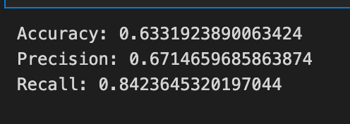
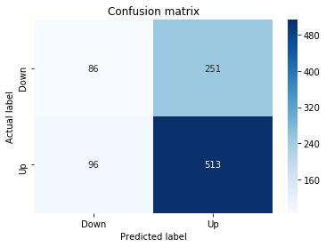
First we ask the tuned LSTM to vote on our test set by calling its predict method with the test features; that line runs the trained model on unseen sequences and returns the predicted direction for each example. A prediction is simply the model’s best guess about whether the price will go up or down, based on what it learned during training.
Next we set up a plotting canvas so we can visualize a scoreboard of guesses versus reality — the confusion matrix. Computing the confusion matrix compares the actual labels to the predicted labels and counts hits and misses; a confusion matrix is a compact table that tells you true positives, true negatives, false positives and false negatives. Wrapping that table in a DataFrame and passing it to a heatmap paints those counts with color (annot=True prints the numbers on each cell, cmap=”Blues” chooses the palette, fmt=’g’ ensures integer formatting), and the title and axis labels make the plot readable. Replacing numeric ticks with ‘Down’ and ‘Up’ translates model output into the financial language we’re interested in.
Finally we print three summary scores. Accuracy reports the fraction of all examples the model got right in one sentence: accuracy = correct predictions / total predictions. Precision answers, in one sentence: of the times the model predicted “Up”, how many were actually “Up”. Recall answers, in one sentence: of the actual “Up” days, how many did the model successfully detect. Together the heatmap and these metrics give you a clear picture of how well the LSTM is forecasting price direction for the larger stock prediction task.
A ROC curve (Receiver Operating Characteristic curve) is a simple graph that shows how well a model separates two classes. It plots the true positive rate (the share of actual positives your model catches) against the false positive rate (the share of negatives the model mistakenly flags). Seeing both rates together helps you understand the trade-off between catching more events and raising more false alarms.
The area under the ROC curve, or AUC, summarizes that graph into one number between 0 and 1. An AUC closer to 1 means the model usually ranks true positives higher than negatives (so it’s good at telling them apart). This gives a quick, threshold-independent sense of performance before you pick a specific decision cutoff.
For stock forecasting with an LSTM, you often turn continuous price predictions into simple buy/sell signals (a binary decision). The ROC curve helps you choose a threshold that balances catching profitable moves against making too many bad trades. It’s also useful when your “buy” days are rare (class imbalance), because it focuses on ranking ability rather than raw accuracy. Use ROC and AUC early to compare models and guide threshold tuning before you run trading simulations.
y_proba_4_lstm=tuned_model_4_lstm.predict_proba(X_test_4_lstm)[:, 1]
fpr, tpr, _=metrics.roc_curve(y_test_4,  y_proba_4_lstm)
auc=metrics.roc_auc_score(y_test_4, y_proba_4_lstm)
plt.plot(fpr,tpr,label=”AUC=”+str(auc))
plt.legend(loc=4)
plt.plot([0, 1], [0, 1], linestyle=’--’) # plot no skill
plt.title(’ROC-Curve’)
plt.show()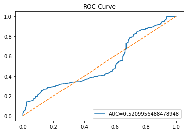
Picture that our LSTM has learned something about future stock moves and now we’re asking it not just “up or down?” but “how confident are you?” The first line asks the tuned model for probabilities on the test set and then takes the second column, which is the model’s estimated chance of the positive class; key concept: predict_proba returns confidence scores for each class rather than hard labels, so we can rank predictions by likelihood. Think of those probabilities as thermometers that tell us how hot the model thinks a buy signal is.
Next, we feed those confidence scores and the true labels into a routine that samples many decision thresholds and returns false positive and true positive rates for each threshold. Key concept: the ROC curve plots true positive rate versus false positive rate to visualize the trade-off between catching real signals and raising false alarms. Calling roc_curve is like tasting the model at many spice levels to see how flavor (sensitivity) and spiciness (false alarm) change.
We then compute a single summarizing number, AUC, which is literally the area under that ROC curve and quantifies overall separability between up and down days in one number. Plotting fpr against tpr draws the curve and labels it with the AUC so you can compare models at a glance; adding the diagonal dashed line shows a no-skill baseline where guessing is random. Finally, we give the plot a title and show it so the class can read the story visually. All of this helps you judge and tune threshold choices for the LSTM forecasts in your stock prediction project.
This is Model 5, which uses volatility and return together as inputs. Volatility means how wildly the price swings (think of it as the size of bumps), and return means the percent change from one time to the next. We feed these features into an LSTM, which is a kind of neural network that remembers patterns over time so it can forecast future prices.
Combining volatility and return helps the LSTM see both how big moves are and which way they tend to go. That extra context can make forecasts more stable and better at handling sudden swings. This step prepares the model to balance trend information with risk information when predicting stock price.
A baseline is a very simple model you build first so you have something to compare your LSTM against. Think of it as a basic rule of thumb, like “tomorrow’s price will be today’s price” — this is called a persistence model, and it often works surprisingly well for short-term stock forecasts. Creating a baseline helps you see if your fancy neural network actually gives extra value or just more complexity.
Good baseline choices include persistence, a moving average (which smooths recent prices), or a simple linear model that uses a few past values. These are quick to run and easy to understand, so they tell you whether improvements from the LSTM are meaningful. You should evaluate them with time-series-aware methods like walk-forward validation, which trains only on past data and tests on future data to avoid data leakage.
Use common error metrics like MAE (mean absolute error — the average absolute difference between prediction and reality) or MSE (mean squared error — which penalizes big mistakes more). Comparing these numbers between the baseline and your LSTM shows whether the neural network truly improves forecasts, not just looks impressive on paper.
# Model specific Parameter

# Number of iterations
iterations_5_b=[10]


# Grid Search

# Regularization
alpha_g_5_b=[0.0001, 0.0003, 0.0005]
l1_ratio_g_5_b=[0, 0.2, 0.4, 0.6, 0.8, 1]

# Create hyperparameter options
hyperparameters_g_5_b={’logistic__alpha’:alpha_g_5_b,
                       ‘logistic__l1_ratio’:l1_ratio_g_5_b,
                       ‘logistic__penalty’:penalty_b,
                       ‘logistic__max_iter’:iterations_5_b}

# Create grid search
search_g_5_b=GridSearchCV(estimator=pipeline_b,
                          param_grid=hyperparameters_g_5_b,
                          cv=tscv,
                          verbose=0,
                          n_jobs=-1,
                          scoring=scoring_b,
                          refit=metric_b,
                          return_train_score=False)
# Setting refit=’Accuracy’, refits an estimator on the whole dataset with the parameter setting that has the best cross-validated mean Accuracy score.
# For multiple metric evaluation, this needs to be a string denoting the scorer is used to find the best parameters for refitting the estimator at the end
# If return_train_score=True training results of CV will be saved as well

# Fit grid search
tuned_model_5_b=search_g_5_b.fit(X_train_5, y_train_5)
#search_g_5_b.cv_results_


# Random Search

# Create regularization hyperparameter distribution using uniform distribution
#alpha_r_5_b=uniform(loc=0.00006, scale=0.002) #loc=0.00006, scale=0.002
#l1_ratio_r_5_b=uniform(loc=0, scale=1)

# Create hyperparameter options
#hyperparameters_r_5_b={’logistic__alpha’:alpha_r_5_b, ‘logistic__l1_ratio’:l1_ratio_r_5_b, ‘logistic__penalty’:penalty_b,’logistic__max_iter’:iterations_5_b}

# Create randomized search
#search_r_5_b=RandomizedSearchCV(pipeline_b, hyperparameters_r_5_b, n_iter=10, random_state=1, cv=tscv, verbose=0, n_jobs=-1, scoring=scoring_b, refit=metric_b, return_train_score=False)
# Setting refit=’Accuracy’, refits an estimator on the whole dataset with the parameter setting that has the best cross-validated Accuracy score.

# Fit randomized search
#tuned_model_5_b=search_r_4_b.fit(X_train_5, y_train_5)


# View Cost function
print(’Loss function:’, tuned_model_5_b.best_estimator_.get_params()[’logistic__loss’])

# View Accuracy
print(metric_b +’ of the best model: ‘, tuned_model_5_b.best_score_);print(”\n”)
# best_score_ Mean cross-validated score of the best_estimator

# View best hyperparameters
print(”Best hyperparameters:”)
print(’Number of iterations:’, tuned_model_5_b.best_estimator_.get_params()[’logistic__max_iter’])
print(’Penalty:’, tuned_model_5_b.best_estimator_.get_params()[’logistic__penalty’])
print(’Alpha:’, tuned_model_5_b.best_estimator_.get_params()[’logistic__alpha’])
print(’l1_ratio:’, tuned_model_5_b.best_estimator_.get_params()[’logistic__l1_ratio’])

# Find the number of nonzero coefficients (selected features)
print(”Total number of features:”, len(tuned_model_5_b.best_estimator_.steps[1][1].coef_[0][:]))
print(”Number of selected features:”, np.count_nonzero(tuned_model_5_b.best_estimator_.steps[1][1].coef_[0][:]))

# Gridsearch table
plt.title(’Gridsearch’)
pvt_5_b=pd.pivot_table(pd.DataFrame(tuned_model_5_b.cv_results_), values=’mean_test_accuracy’, index=’param_logistic__l1_ratio’, columns=’param_logistic__alpha’)
ax_5_b=sns.heatmap(pvt_5_b, cmap=”Blues”)
plt.show()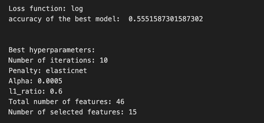

Imagine we’re tuning a forecasting machine the way a chef tweaks a recipe to get the perfect flavor. First we declare how many times a training loop can repeat — iterations_5_b is like saying “stir the pot 10 times” so the optimizer has room to settle. Then we list a few regularization strengths (alpha_g_5_b) and mixing ratios between L1 and L2 penalties (l1_ratio_g_5_b); regularization is a gentle penalty that keeps the model from memorizing noise by shrinking coefficients. We bundle those choices into a hyperparameter map keyed to the steps inside our preprocessing-and-model conveyor belt (the pipeline), so the grid search knows which knobs to turn for the logistic estimator: penalty type, alpha, l1_ratio, and max iterations.
Next we launch a grid search that systematically tries every combination, using a time-aware cross-validation splitter (tscv) which respects chronological ordering — an important key concept for time series so the model never “peeks” into the future. The grid search scores each attempt with our chosen metric and, because we set refit to a particular metric, it will finally retrain the best-found configuration on the whole training set.
When the search finishes, we ask the tuned model for the loss function used and the cross-validated score, and we print the best hyperparameter values so we can see which recipe won. We then count how many coefficients remain nonzero to understand which features were effectively selected by the elastic-net penalty. Finally, we turn the cross-validation results into a heatmap that visualizes mean accuracy across alpha and l1_ratio so we can spot trends at a glance.
All of these steps help find a robust classifier that complements the LSTM forecasting pipeline by providing reliable directional signals for stock predictions.
A confusion matrix is a simple table that shows how a model’s predicted labels match the actual labels. In plain terms, it tells you how many times the model guessed “up” and was right, guessed “up” and was wrong, guessed “down” and was right, and guessed “down” and was wrong. This makes it easy to see the kinds of mistakes the model makes, not just the overall accuracy.
For stock forecasting with an LSTM, we often turn the problem into a classification task like predicting price up or down. A confusion matrix then helps you spot bias (for example, a model that always predicts “down”) and decide whether to change thresholds, rebalance the training data, or tune the model. It’s also the basis for measures like precision and recall, which help you weigh the costs of different errors — useful when a false signal can cost real money.
# Make predictions
y_pred_5_b=tuned_model_5_b.predict(X_test_5)

# create confustion matrix
fig, ax=plt.subplots()
sns.heatmap(pd.DataFrame(metrics.confusion_matrix(y_test_5, y_pred_5_b)), annot=True, cmap=”Blues” ,fmt=’g’)
plt.title(’Confusion matrix’); plt.ylabel(’Actual label’); plt.xlabel(’Predicted label’)
ax.xaxis.set_ticklabels([’Down’, ‘Up’]); ax.yaxis.set_ticklabels([’Down’, ‘Up’])

print(”Accuracy:”,metrics.accuracy_score(y_test_5, y_pred_5_b))
print(”Precision:”,metrics.precision_score(y_test_5, y_pred_5_b))
print(”Recall:”,metrics.recall_score(y_test_5, y_pred_5_b))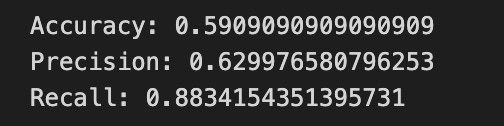
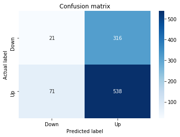
We first ask the tuned model to make predictions on the held-out test features, like consulting a reusable recipe card (the model) to produce a batch of dishes (predicted labels) from the same inputs the LSTM saw in training. The next lines set up a visual canvas by creating a matplotlib figure and axes so we can place a neat chart on it.
To inspect how well the model guessed price direction, we compute and draw a confusion matrix — think of it as a scoreboard that counts true and false calls for each class; a confusion matrix is a table that shows correct and incorrect predictions across classes. Seaborn’s heatmap paints that table with color intensity, and wrapping the matrix in a DataFrame makes it tabular for the plotting function. annot=True writes the raw counts onto each cell so you can read scores directly; fmt=’g’ ensures integer-style formatting, and cmap=”Blues” gives a calm blue palette. We then add a title and axis labels to explain the plot, and replace numeric tick labels with ‘Down’ and ‘Up’ so the scoreboard reads in plain language.
Finally, we print three summary metrics. Accuracy shows the overall proportion of correct direction predictions; precision tells you of all times the model predicted “Up”, how often it was right; recall (sensitivity) tells you of all actual “Up” days, how many the model correctly identified. These three numbers give quick diagnostic signals about how the LSTM’s directional forecasts are performing for the larger stock forecasting task.
An ROC curve is a simple picture that shows how well a model can tell two things apart — like whether a stock will go up or down. It plots the true positive rate (how often the model correctly says “up”) against the false positive rate (how often it wrongly says “up”). Seeing this trade-off helps you understand performance at different decision thresholds (the cut-off where the model decides “up” vs “down”).
The area under that curve, called AUC, is a single number that sums up overall ability: 1.0 is perfect, 0.5 is no better than guessing. In stock forecasting with an LSTM, the ROC and AUC help when classes are imbalanced (for example, many more “no move” days), and when you need to pick a threshold that balances catching moves versus avoiding false signals. Checking the ROC prepares you for real trading choices because it shows how changing your threshold will affect hits and false alarms.
y_proba_5_b=tuned_model_5_b.predict_proba(X_test_5)[:, 1]
fpr, tpr, _=metrics.roc_curve(y_test_5,  y_proba_5_b)
auc=metrics.roc_auc_score(y_test_5, y_proba_5_b)
plt.plot(fpr,tpr,label=”AUC=”+str(auc))
plt.legend(loc=4)
plt.plot([0, 1], [0, 1], linestyle=’--’) # plot no skill
plt.title(’ROC-Curve’)
plt.show()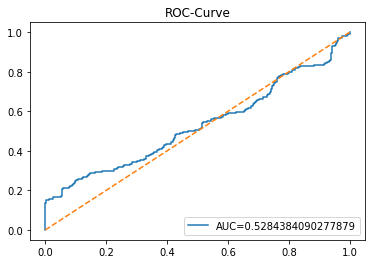
We’re trying to judge how well the model predicts the direction of the stock (up or down) by looking at its confidence and trade-offs, and each line helps build that diagnostic picture. First, y_proba_5_b = tuned_model_5_b.predict_proba(X_test_5)[:, 1] asks the trained model for its confidence that each test example belongs to the “positive” class; think of predict_proba as a thermometer that reads how warm (confident) the model is about the positive outcome, and [:, 1] picks the temperature for that specific class. Next, fpr, tpr, _ = metrics.roc_curve(y_test_5, y_proba_5_b) computes the false positive and true positive rates at many thresholds so we can see how sensitivity and false alarms trade off; a ROC curve is a plot of true positive rate versus false positive rate that shows classifier discrimination ability. The line auc = metrics.roc_auc_score(y_test_5, y_proba_5_b) summarizes that curve into one number between 0 and 1, where larger area means better separation between classes. Then plt.plot(fpr, tpr, label=”AUC=”+str(auc)) draws the ROC curve and tags it with the AUC so you can read the score right on the plot. plt.legend(loc=4) places that label nicely in the corner. plt.plot([0, 1], [0, 1], linestyle=’ — ‘) adds a dashed diagonal representing a “no-skill” classifier for reference. Finally plt.title(‘ROC-Curve’) names the figure and plt.show() displays it. Seeing this curve tells you how reliably the LSTM-based forecast distinguishes upward from downward moves, a useful check on model usefulness before deployment.
An LSTM is a type of recurrent neural network that’s good at learning from sequences, like a series of past stock prices. Saying “recurrent” just means the model looks at data one step at a time and keeps a little memory of what came before, which helps it spot patterns over time.
What makes LSTMs special are their gates: the input gate (decides what new information to keep), the forget gate (decides what old information to drop), and the output gate (decides what to pass on). Those gates help the model remember useful trends and ignore noise, which is why LSTMs handle long-term dependencies better than basic RNNs that often forget older signals.
For stock forecasting you feed the LSTM windows of past data — a lookback period — so it can learn how past moves relate to the next price. You should scale (normalize) the data first because neural nets learn faster and more stably when numbers are in a smaller range. This preparation step makes training more reliable.
Training LSTMs requires care: pick an appropriate lookback, tune the number of layers and units, and use regularization like dropout or early stopping to avoid overfitting (when the model learns noise instead of real patterns). Also validate by testing on future time periods, not shuffled data, because time order matters.
Remember, LSTMs are powerful but not magical. They work best with good features, sensible targets, and realistic expectations about noise and unpredictability in markets.
start=time.time()


# number of epochs
epochs=1
# number of units
LSTM_units_5_lstm=190
# number of samples
num_samples=1
# time_steps
look_back=1
# numer of features
num_features_5_lstm=X_train_5.shape[1]
# Regularization
dropout_rate=0.
recurrent_dropout=0.3
# print
verbose=0

#hyperparameter
batch_size=[1]

# hyperparameter
hyperparameter_5_lstm={’batch_size’:batch_size}


# create Classifier
clf_5_lstm=KerasClassifier(build_fn=create_shallow_LSTM,
                           epochs=epochs,
                           LSTM_units=LSTM_units_5_lstm,
                           num_samples=num_samples,
                           look_back=look_back,
                           num_features=num_features_5_lstm,
                           dropout_rate=dropout_rate,
                           recurrent_dropout=recurrent_dropout,
                           verbose=verbose)
# Gridsearch
search_5_lstm=GridSearchCV(estimator=clf_5_lstm,
                           param_grid=hyperparameter_5_lstm,
                           n_jobs=-1,
                           cv=tscv,
                           scoring=scoring_lstm, # accuracy
                           refit=True,
                           return_train_score=False)

# Fit model
tuned_model_5_lstm=search_5_lstm.fit(X_train_5_lstm, y_train_5, shuffle=False, callbacks=[reset])


print(”\n”)

# View Accuracy
print(scoring_lstm +’ of the best model: ‘, tuned_model_5_lstm.best_score_)
# best_score_ Mean cross-validated score of the best_estimator

print(”\n”)

# View best hyperparameters
print(”Best hyperparameters:”)
print(’epochs:’, tuned_model_5_lstm.best_estimator_.get_params()[’epochs’])
print(’batch_size:’, tuned_model_5_lstm.best_estimator_.get_params()[’batch_size’])
print(’dropout_rate:’, tuned_model_5_lstm.best_estimator_.get_params()[’dropout_rate’])
print(’recurrent_dropout:’, tuned_model_5_lstm.best_estimator_.get_params()[’recurrent_dropout’])

end=time.time()
print(”\n”)
print(”Running Time:”, end - start)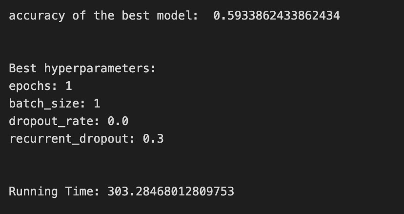
We begin by starting a clock so we can measure how long the whole experiment takes — timing your work is like timing how long a baking session runs. Then a handful of knobs are set: epochs is how many full passes through the training data we will repeat (an epoch is like repeating a recipe end-to-end), LSTM_units_5_lstm controls how many internal memory cells the LSTM has (more units can learn richer patterns), num_samples and look_back describe how the input is shaped in time, and num_features_5_lstm reads the number of input signals from the training array shape so the model knows what each time step contains. Dropout and recurrent_dropout are gentle forgettings that help prevent overfitting by randomly silencing connections during training. Verbose controls printing, and batch_size is how many examples we process before updating weights — a mini-recipe step size.
A hyperparameter dictionary is prepared so the grid search knows which values to try; a hyperparameter is a tunable setting that affects learning but isn’t learned from data. The KerasClassifier wraps a build function (create_shallow_LSTM) so our Keras model speaks scikit-learn’s language, letting us use tools like GridSearchCV. GridSearchCV is like taste-testing different spice combinations by training and validating models over many folds; cross-validation is a method to estimate performance by splitting data into different train/test segments, and here tscv implies time-aware splitting appropriate for time series so we don’t cheat by shuffling chronological data. We pass scoring_lstm to tell the search how to judge models, allow parallel jobs, and ask it to return the best fitted model.
We fit the search on the training arrays with shuffle=False (don’t reorder time) and a reset callback to clean any internal state between runs; a callback is a small helper run at certain training events. After fitting we print the best score, query the best estimator for its chosen hyperparameters (epochs, batch_size, dropout settings), stop the clock, and report total running time. All together, these steps tune an LSTM’s settings so it can better forecast stock prices by learning temporal patterns.
A confusion matrix is a simple table that shows how many times your model guessed each class right or wrong. In stock-direction terms, it counts cases like “predicted up and it went up” or “predicted down but it went up,” which tell you not just how often the model is right, but *what kinds* of mistakes it makes.
LSTMs are a type of neural network called Long Short-Term Memory that predict numbers over time, like prices. If you care about direction (up vs. down), you turn those numbers into labels by using a rule, for example “price change > 0 = up.” The confusion matrix works on those labels, so you’ll first convert predictions and actuals into the same up/down categories.
Looking at the matrix helps more than a single accuracy number because it shows false positives (predict up when it fell) and false negatives (predict down when it rose). From that you can compute precision (how many predicted ups were really up) and recall (how many real ups you caught). This helps you pick thresholds, balance mistakes you care about, and plan next steps like reweighting data or changing the loss the model learns.
# Make predictions
y_pred_5_lstm=tuned_model_5_lstm.predict(X_test_5_lstm)

# create confustion matrix
fig, ax=plt.subplots()
sns.heatmap(pd.DataFrame(metrics.confusion_matrix(y_test_5, y_pred_5_lstm)), annot=True, cmap=”Blues” ,fmt=’g’)
plt.title(’Confusion matrix’); plt.ylabel(’Actual label’); plt.xlabel(’Predicted label’)
ax.xaxis.set_ticklabels([’Down’, ‘Up’]); ax.yaxis.set_ticklabels([’Down’, ‘Up’])

print(”Accuracy:”,metrics.accuracy_score(y_test_5, y_pred_5_lstm))
print(”Precision:”,metrics.precision_score(y_test_5, y_pred_5_lstm))
print(”Recall:”,metrics.recall_score(y_test_5, y_pred_5_lstm))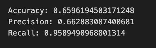

Imagine we’ve already trained an LSTM to predict whether a stock will go up or down, and now we’re asking it to make guesses on unseen data: the first line asks the model to taste each test example and say “Up” or “Down” — predict returns those labels for every sample so we can compare them to the truth. Next we build a visual summary of how those guesses match reality by creating a plotting canvas and drawing a colored grid where each cell counts how many times a particular actual label met a particular prediction; a confusion matrix compares actual versus predicted labels, showing true positives, false positives, false negatives, and true negatives in one tidy table. The heatmap call turns that table into an annotated, blue-shaded image so large errors leap out, and setting the axis labels and tick names simply names the rows and columns “Down” and “Up” so the picture reads like a map of errors. Finally, we print three common scores: accuracy tells you the overall fraction of correct guesses, precision tells you of the times the model predicted “Up” how often it was right, and recall tells you of all actual “Up” days how many the model caught; precision and recall are one-sentence reminders of trade-offs between false alarms and missed signals. Together these visuals and numbers help you judge whether the LSTM is reliably forecasting direction or needs more tuning for the trading task.
An ROC curve shows how well your model separates two outcomes by plotting the true positive rate (the share of real “ups” you catch) against the false positive rate (the share of “downs” you mistakenly call “up”) as you sweep the decision threshold. In stock forecasting with an LSTM (a type of neural network that learns patterns over time), the model usually gives a score or probability for “price will rise,” and the ROC curve checks those scores across all possible cutoffs.
The area under the ROC curve, or AUC, is a single number that summarizes performance: 1.0 is perfect separation, 0.5 is no better than random guessing. This is handy when class sizes are uneven or when you care about the balance between catching true rises and avoiding false alerts, because simple accuracy can be misleading in those cases.
Use the ROC to compare models without picking a threshold yet, and to pick a threshold later that matches your trading goals (for example, prioritize fewer false alarms or more detected rises). Computing it just means varying the threshold on the LSTM’s probability output and measuring true/false positive rates at each step, which most ML toolkits can do for you.
y_proba_5_lstm=tuned_model_5_lstm.predict_proba(X_test_5_lstm)[:, 1]
fpr, tpr, _=metrics.roc_curve(y_test_5,  y_proba_5_lstm)
auc=metrics.roc_auc_score(y_test_5, y_proba_5_lstm)
plt.plot(fpr,tpr,label=”AUC=”+str(auc))
plt.legend(loc=4)
plt.plot([0, 1], [0, 1], linestyle=’--’) # plot no skill
plt.title(’ROC-Curve’)
plt.show()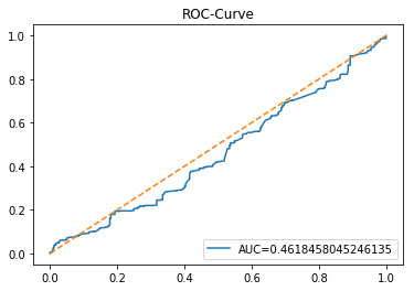
We want to see how well the LSTM-based classifier separates days that go up from days that go down, so the first line asks the trained model for probabilities and keeps the number that says “chance of the positive class” — calling predict_proba returns a probability for each class, and [:, 1] selects the probability of the class we care about (for example, “price up”). Next, we turn those probabilities and the true labels into the false positive and true positive rates with roc_curve; a ROC curve compares the trade-off between catching positives and avoiding false alarms at different thresholds, and the function also returns threshold values (the underscore is just a throwaway variable for things we don’t need). The following line computes the area under that ROC curve with roc_auc_score; AUC is a single-number summary of separability where 1.0 is perfect and 0.5 is no better than guessing. Then we draw the ROC curve by plotting false positive rate against true positive rate and attach a label that includes the numeric AUC so the plot itself tells the story. We add a legend in the lower-right so that label is visible. To give a baseline, we also plot a dashed diagonal from (0,0) to (1,1): that line is the “no-skill” reference where predictions are random. Finally, we set a title and call show to render the figure so we can visually inspect model performance. All of this helps us judge how well the LSTM’s probability predictions would support trading or signal decisions in the broader stock-forecasting project.
Model 6 uses trading volume and return as its inputs. Trading volume is just the number of shares or contracts traded and shows how much interest there is in a stock right now. Return is the change in price (usually a percent or log change) and tells you how much the price moved over a period.
We feed these two signals into an LSTM so the model can learn patterns in both activity and price movement — volume often spikes around big moves, and returns show momentum. This helps the LSTM make better short-term forecasts because it sees not just where price went, but how the market behaved while it moved.
A baseline is the simple forecast you try first so you know whether your fancy LSTM actually helps. It’s a low-effort model or rule that sets a minimum score to beat. We need this so we don’t celebrate tiny or meaningless improvements later.
Common baselines are very simple. One is the *persistence* or naive forecast that just predicts tomorrow’s price will equal today’s price. Another is a moving average, which predicts the next price as the average of the last few prices — that smooths out short bumps. You can also try a basic linear regression, which fits a straight-line relationship between recent prices and the next one; it’s quick and interpretable.
Compare your LSTM to baselines using clear numbers, like MAE (mean absolute error — the average size of your mistakes) or RMSE (root-mean-square error — which punishes big mistakes more). These metrics tell you not just whether you’re better, but how much better. That helps you decide if the extra model complexity is worth it.
Start by coding and evaluating a baseline before building the LSTM. It’s faster to run, helps you spot data or preprocessing bugs, and gives a realistic target so you don’t overfit or overclaim results.
# Model specific Parameter

# Number of iterations
iterations_6_b=[8]


# Grid Search

# Regularization
alpha_g_6_b=[0.0011, 0.0012, 0.0013]
l1_ratio_g_6_b=[0, 0.2, 0.4, 0.6, 0.8, 1]

# Create hyperparameter options
hyperparameters_g_6_b={’logistic__alpha’:alpha_g_6_b,
                       ‘logistic__l1_ratio’:l1_ratio_g_6_b,
                       ‘logistic__penalty’:penalty_b,
                       ‘logistic__max_iter’:iterations_6_b}

# Create grid search
search_g_6_b=GridSearchCV(estimator=pipeline_b,
                          param_grid=hyperparameters_g_6_b,
                          cv=tscv,
                          verbose=0,
                          n_jobs=-1,
                          scoring=scoring_b,
                          refit=metric_b,
                          return_train_score=False)
# Setting refit=’Accuracy’, refits an estimator on the whole dataset with the parameter setting that has the best cross-validated mean Accuracy score.
# For multiple metric evaluation, this needs to be a string denoting the scorer is used to find the best parameters for refitting the estimator at the end
# If return_train_score=True training results of CV will be saved as well

# Fit grid search
tuned_model_6_b=search_g_6_b.fit(X_train_6, y_train_6)
#search_g_6_b.cv_results_


# Random Search

# Create regularization hyperparameter distribution using uniform distribution
#alpha_r_6_b=uniform(loc=0.00006, scale=0.002) #loc=0.00006, scale=0.002
#l1_ratio_r_6_b=uniform(loc=0, scale=1)

# Create hyperparameter options
#hyperparameters_r_6_b={’logistic__alpha’:alpha_r_6_b, ‘logistic__l1_ratio’:l1_ratio_r_6_b, ‘logistic__penalty’:penalty_b,’logistic__max_iter’:iterations_6_b}

# Create randomized search
#search_r_6_b=RandomizedSearchCV(pipeline_b, hyperparameters_r_6_b, n_iter=10, random_state=1, cv=tscv, verbose=0, n_jobs=-1, scoring=scoring_b, refit=metric_b, return_train_score=False)
# Setting refit=’Accuracy’, refits an estimator on the whole dataset with the parameter setting that has the best cross-validated Accuracy score.

# Fit randomized search
#tuned_model_6_b=search_r_4_b.fit(X_train_6, y_train_6)


# View Cost function
print(’Loss function:’, tuned_model_6_b.best_estimator_.get_params()[’logistic__loss’])

# View Accuracy
print(metric_b +’ of the best model: ‘, tuned_model_6_b.best_score_);print(”\n”)
# best_score_ Mean cross-validated score of the best_estimator

# View best hyperparameters
print(”Best hyperparameters:”)
print(’Number of iterations:’, tuned_model_6_b.best_estimator_.get_params()[’logistic__max_iter’])
print(’Penalty:’, tuned_model_6_b.best_estimator_.get_params()[’logistic__penalty’])
print(’Alpha:’, tuned_model_6_b.best_estimator_.get_params()[’logistic__alpha’])
print(’l1_ratio:’, tuned_model_6_b.best_estimator_.get_params()[’logistic__l1_ratio’])

# Find the number of nonzero coefficients (selected features)
print(”Total number of features:”, len(tuned_model_6_b.best_estimator_.steps[1][1].coef_[0][:]))
print(”Number of selected features:”, np.count_nonzero(tuned_model_6_b.best_estimator_.steps[1][1].coef_[0][:]))

# Gridsearch table
plt.title(’Gridsearch’)
pvt_6_b=pd.pivot_table(pd.DataFrame(tuned_model_6_b.cv_results_), values=’mean_test_accuracy’, index=’param_logistic__l1_ratio’, columns=’param_logistic__alpha’)
ax_6_b=sns.heatmap(pvt_6_b, cmap=”Blues”)
plt.show()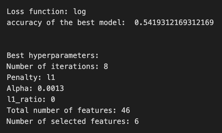

We’re trying to find the best regularization settings for a logistic model wrapped inside a processing pipeline, like trying different spice combinations on the same recipe to see which tastes best. The single-value list iterations_6_b sets how many times the logistic solver will iterate — like letting the oven run for a fixed number of minutes. The lists alpha_g_6_b and l1_ratio_g_6_b define grids of regularization strength and the mix between L1 and L2 penalties (alpha is how strong the shrinkage is; l1_ratio controls the blend between L1 sparseness and L2 smoothness). hyperparameters_g_6_b packages those choices with penalty_b and the iterations into the parameter names prefixed with logistic__ to address the logistic step inside the pipeline, just like labeling ingredients for a specific stage of a multi-step recipe.
GridSearchCV is initialized to try every combination from that parameter grid on the pipeline_b estimator, using tscv for time-series cross-validation (a form of CV that respects chronological order: train on the past, test on the next slice). verbose, n_jobs, scoring, refit and return_train_score control output, parallelism, evaluation metric and whether to retrain the final model with the best found parameters. Then fit runs the whole tasting process against X_train_6 and y_train_6 to pick the best combo.
The commented RandomizedSearchCV lines show an alternative that samples from continuous uniform distributions instead of exhaustive search — like tasting a random selection of spice blends. After fitting, we print the selected loss function, the chosen evaluation score, and the best hyperparameters (iterations, penalty type, alpha, l1_ratio). We count total coefficients and nonzero coefficients to see how many features survived the regularizer, like counting which ingredients stayed in the final dish. Finally, we summarize grid results into a pivoted heatmap of mean test accuracy so you can visually scan which l1_ratio/alpha pairs performed best. All of this tuning helps prevent overfitting and pick robust settings — an important step before or alongside training LSTMs for reliable stock-price forecasting.
A confusion matrix is just a small table that counts how often your model’s predictions match reality. In stock forecasting with an LSTM, it’s most useful when you turn price changes into labels like up, down, or flat (that is, you convert continuous prices into simple categories).
Each cell in the table compares what actually happened to what the model predicted. One axis is the true label (what really happened) and the other is the predicted label (what the model said). From that you get simple counts like true positives (model said up and it was up) and false positives (model said up but it fell). Saying it this way makes it easy to see specific mistakes.
A confusion matrix tells you more than plain accuracy. It shows whether the model tends to miss real rises (low recall, meaning it misses many true ups) or to call rises too often (low precision, meaning many predicted ups were wrong). Those derived ideas — precision, recall, F1 — are just ways to summarize the table into useful numbers.
Look at the confusion matrix after training your LSTM to decide if the model is being too cautious or too risky, and to help you pick thresholds or balance classes (for example, give more weight to rare but important up days). This helps you make better trading decisions, not just chase a single accuracy number.
# Make predictions
y_pred_6_b=tuned_model_6_b.predict(X_test_6)

# create confustion matrix
fig, ax=plt.subplots()
sns.heatmap(pd.DataFrame(metrics.confusion_matrix(y_test_6, y_pred_6_b)), annot=True, cmap=”Blues” ,fmt=’g’)
plt.title(’Confusion matrix’); plt.ylabel(’Actual label’); plt.xlabel(’Predicted label’)
ax.xaxis.set_ticklabels([’Down’, ‘Up’]); ax.yaxis.set_ticklabels([’Down’, ‘Up’])

print(”Accuracy:”,metrics.accuracy_score(y_test_6, y_pred_6_b))
print(”Precision:”,metrics.precision_score(y_test_6, y_pred_6_b))
print(”Recall:”,metrics.recall_score(y_test_6, y_pred_6_b))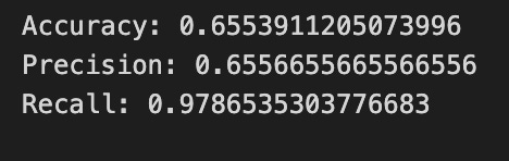

We start by asking the tuned_model_6_b to make predictions on X_test_6 and store them as y_pred_6_b, like handing a trained chef a new set of ingredients and asking them to prepare a dish from the learned recipe; key concept: predict runs the learned network on new inputs to produce outputs. Next, fig, ax = plt.subplots() opens a clean canvas and an axes object so we have a place to draw our graphical summary.
The heatmap call draws a visual table built from metrics.confusion_matrix(y_test_6, y_pred_6_b) wrapped in a DataFrame, with numbers annotated and a blue color palette to show intensity — think of the confusion matrix as a scoreboard that counts where actual labels and predicted labels agree or disagree; key concept: a confusion matrix shows counts of true vs predicted class outcomes. The title and axis labels make the chart readable, and setting tick labels to [‘Down’, ‘Up’] maps the numeric rows/columns back to our trading directions so anyone glancing at the plot knows which cells mean correct up predictions or mistaken down-as-up calls.
Finally, printing accuracy, precision, and recall gives three quick scalar summaries: accuracy is the overall fraction of correct predictions, precision tells you how often an “Up” prediction was actually up, and recall measures how many actual “Up” cases were caught by the model — each is a different lens on performance. Together these lines turn raw model outputs into a human-friendly assessment of how well the LSTM is forecasting stock direction.
A ROC curve is a simple picture that shows how a model trades off between catching real positives and raising false alarms. In plain words, it plots the *true positive rate* (how many actual upward moves you correctly predict) against the *false positive rate* (how many non-upward moves you mistakenly call upward). The curve summarizes performance across all possible decision thresholds instead of just one.
In a stock-forecasting project with an LSTM, you usually predict prices (a regression), but you can turn that into a yes/no signal like “up tomorrow” (a classification). A ROC curve then helps you pick or compare thresholds for turning predicted values into buy/sell signals. This matters because a small change in threshold can greatly affect trading outcomes, so you want a way to compare models that doesn’t depend on one arbitrary cutoff.
You’ll also hear about *AUC* (area under the ROC curve): values near 1.0 mean strong signal, 0.5 means no better than random. Be careful though — time series data and imbalanced classes (many more non-up days than up days) can mislead ROC, so use proper rolling validation and avoid data leakage when you evaluate models.
y_proba_6_b=tuned_model_6_b.predict_proba(X_test_6)[:, 1]
fpr, tpr, _=metrics.roc_curve(y_test_6,  y_proba_6_b)
auc=metrics.roc_auc_score(y_test_6, y_proba_6_b)
plt.plot(fpr,tpr,label=”AUC=”+str(auc))
plt.legend(loc=4)
plt.plot([0, 1], [0, 1], linestyle=’--’) # plot no skill
plt.title(’ROC-Curve’)
plt.show()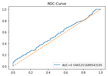
We’re trying to judge how well our model can tell “up” from “down” movements, so the first line asks the tuned model for its confidence that each test example belongs to the positive class; predict_proba hands back probability scores and [:, 1] picks the column that corresponds to the class we care about, much like looking at the “chance of rain” column in a weather table. The next line sends those true labels and predicted probabilities into a routine that traces the model’s behavior across thresholds, returning the false positive and true positive rates; a ROC curve shows the trade-off between catching real positives and accidentally flagging negatives as positives as you vary the decision cutoff. We then compute the area under that curve with roc_auc_score, which squashes the whole trade-off into a single number between 0 and 1 — higher means better discrimination. The plotting lines draw that ROC trace and attach a legend that includes the AUC so we can read the summary right on the plot; calling plt.legend is like pinning a label next to a chart so future viewers understand it. Adding the diagonal dashed line plots a “no-skill” baseline where predictions are random, giving a handy visual reference. Finally, we title the plot “ROC-Curve” and call plt.show() to render the figure on screen. Together, these steps turn model confidences into a visual and numeric evaluation useful for assessing LSTM-based stock direction forecasts.
An LSTM is a kind of neural network that works well with sequences, like time series of stock prices; here “neural network” just means a computer program that learns patterns from data. It’s designed to remember information over long stretches of time, so it can pick up on both recent swings and older trends in price history.
LSTMs use *gates* — tiny switches that decide what to forget, what new information to store, and what to pass on — which helps them avoid the common problem where learning fades away over long sequences (called the vanishing gradient). That makes them a popular choice for forecasting stocks, because price movements can depend on patterns at many different time scales.
In practice, LSTMs still need tidy inputs and care: scale your numbers (so the model trains better), keep a clear train/test split, and guard against overfitting with regularization or dropout so the model doesn’t just memorize past prices. These steps help the LSTM learn useful, general patterns you can trust when making short‑term forecasts.
start=time.time()


# number of epochs
epochs=1
# number of units
LSTM_units_6_lstm=400
# number of samples
num_samples=1
# time_steps
look_back=1
# numer of features
num_features_6_lstm=X_train_6.shape[1]
# Regularization
dropout_rate=0.
recurrent_dropout=0.5
# print
verbose=0

#hyperparameter
batch_size=[1]

# hyperparameter
hyperparameter_6_lstm={’batch_size’:batch_size}


# create Classifier
clf_6_lstm=KerasClassifier(build_fn=create_shallow_LSTM,
                           epochs=epochs,
                           LSTM_units=LSTM_units_6_lstm,
                           num_samples=num_samples,
                           look_back=look_back,
                           num_features=num_features_6_lstm,
                           dropout_rate=dropout_rate,
                           recurrent_dropout=recurrent_dropout,
                           verbose=verbose)
# Gridsearch
search_6_lstm=GridSearchCV(estimator=clf_6_lstm,
                           param_grid=hyperparameter_6_lstm,
                           n_jobs=-1,
                           cv=tscv,
                           scoring=scoring_lstm, # accuracy
                           refit=True,
                           return_train_score=False)

# Fit model
tuned_model_6_lstm=search_6_lstm.fit(X_train_6_lstm, y_train_6, shuffle=False, callbacks=[reset])


print(”\n”)

# View Accuracy
print(scoring_lstm +’ of the best model: ‘, tuned_model_6_lstm.best_score_)
# best_score_ Mean cross-validated score of the best_estimator

print(”\n”)

# View best hyperparameters
print(”Best hyperparameters:”)
print(’epochs:’, tuned_model_6_lstm.best_estimator_.get_params()[’epochs’])
print(’batch_size:’, tuned_model_6_lstm.best_estimator_.get_params()[’batch_size’])
print(’dropout_rate:’, tuned_model_6_lstm.best_estimator_.get_params()[’dropout_rate’])
print(’recurrent_dropout:’, tuned_model_6_lstm.best_estimator_.get_params()[’recurrent_dropout’])

end=time.time()
print(”\n”)
print(”Running Time:”, end - start)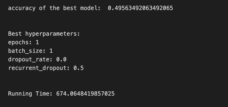
We begin by starting a clock with start = time.time() so we can later tell how long the whole training and search took — like noting the start time before a long experiment. Next you set a few recipe parameters: epochs=1 is how many full passes over the training set the network will make (an epoch is one full pass through the data), LSTM_units_6_lstm=400 decides how many memory cells the LSTM has (more units can remember richer patterns), num_samples, look_back and num_features_6_lstm describe the input shape so the model knows how many past timesteps and features it will expect, and dropout_rate and recurrent_dropout apply regularization by randomly ignoring some connections to avoid overfitting, like occasionally skipping an ingredient to test robustness. verbose=0 keeps training quiet.
You declare batch_size as [1] and wrap it in hyperparameter_6_lstm so GridSearchCV can try values; batch size controls how many samples are processed before updating weights, similar to tasting one spoonful versus a whole pot. KerasClassifier(build_fn=create_shallow_LSTM, …) wraps a Keras model in a scikit-learn-style estimator so it can be used with familiar tools; a wrapper like this makes a Keras model behave like a scikit-learn object. GridSearchCV(…) then orchestrates a systematic search over hyperparameters and evaluates each choice with cross-validation; cross-validation is a method that splits data into folds to estimate performance reliably, and here tscv ensures the time order is respected because it’s time-series data.
Fitting with search_6_lstm.fit(X_train_6_lstm, y_train_6, shuffle=False, callbacks=[reset]) runs the grid search while keeping temporal order (shuffle=False) and using reset to clear state between folds. After fitting you print the best score and inspect best_estimator_.get_params() for epochs, batch_size, dropout_rate, and recurrent_dropout so you know the winning recipe. Finally end=time.time() and print the Running Time to see experiment cost. All together, these steps search for the best LSTM configuration to improve your stock-price forecasts.
A confusion matrix is a simple table that shows how many times your model guessed each class right or wrong. For stock forecasting with an LSTM, the classes might be “price up” or “price down.” Each cell tells you counts like true positive (predicted up and it was up) or false positive (predicted up but it was down), so you see exactly which mistakes happen.
This matters because raw accuracy can hide problems when one class happens more often (for example, prices rising more than falling). The confusion matrix makes class imbalances and specific error types obvious, which helps you decide whether to retrain, change thresholds, or focus on reducing costly mistakes. In short, it’s a lightweight diagnostic that points to practical fixes for your LSTM’s forecasting behavior.
# Make predictions
y_pred_6_lstm=tuned_model_6_lstm.predict(X_test_6_lstm)

# create confustion matrix
fig, ax=plt.subplots()
sns.heatmap(pd.DataFrame(metrics.confusion_matrix(y_test_6, y_pred_6_lstm)), annot=True, cmap=”Blues” ,fmt=’g’)
plt.title(’Confusion matrix’); plt.ylabel(’Actual label’); plt.xlabel(’Predicted label’)
ax.xaxis.set_ticklabels([’Down’, ‘Up’]); ax.yaxis.set_ticklabels([’Down’, ‘Up’])

print(”Accuracy:”,metrics.accuracy_score(y_test_6, y_pred_6_lstm))
print(”Precision:”,metrics.precision_score(y_test_6, y_pred_6_lstm))
print(”Recall:”,metrics.recall_score(y_test_6, y_pred_6_lstm))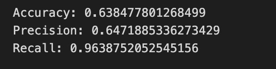

We start by asking our tuned LSTM model to vote on what it thinks will happen to unseen examples: y_pred_6_lstm = tuned_model_6_lstm.predict(X_test_6_lstm) runs the model over the test inputs and produces predicted labels, like consulting a trained forecaster for each day in the test set. Next we prepare a little canvas for a visual scoreboard with fig, ax = plt.subplots(), which gives us a plotting surface to draw on.
To see how the model’s votes line up with reality we turn the comparison into a confusion matrix and draw it as a color map. We compute the matrix of actual versus predicted labels with metrics.confusion_matrix(y_test_6, y_pred_6_lstm), wrap it as a DataFrame so the plotting library can read it nicely, and call sns.heatmap(…, annot=True, cmap=”Blues”, fmt=’g’) to paint counts into colored squares — annot=True writes the numbers on the squares so you can read the scores. We then add a title and axis labels to explain the plot, and rename the tick marks to “Down” and “Up” so the two classes (price down vs. price up) are clear. A confusion matrix is simply a scoreboard that shows where the model was right and where it confused categories.
Finally we print three summary scores: accuracy (the fraction of overall correct predictions), precision (of the times the model predicted “Up”, how many were actually up), and recall (of the actual “Up” days, how many did the model catch). Seeing these numbers alongside the heatmap helps you judge whether the LSTM is reliably forecasting price direction or favoring one outcome — an essential check as we refine our stock price forecasting model.
A ROC curve shows how well a binary classifier sorts positives from negatives as you change the decision threshold. It plots the *true positive rate* (how often you correctly call an event positive) against the *false positive rate* (how often you incorrectly call a negative event positive). The area under that curve, called AUC, is a single-number summary of overall discrimination: higher means the model separates classes better.
For stock forecasting with an LSTM, you usually predict prices (a regression). To use a ROC curve you first turn those predictions into classes, for example “price up” vs “price down” by picking a threshold on the predicted change. This is useful because many trading decisions depend on direction, not exact price, so the ROC helps judge how well your model predicts direction across thresholds.
Keep in mind a ROC curve doesn’t tell you the best threshold for trading — it just shows tradeoffs between catching true moves and making false alarms. It also won’t work well if one class is very rare (class imbalance), and it isn’t a substitute for profit-based backtesting. Use the ROC to compare models and to visualize tradeoff choices before you pick a threshold tied to your trading goals.
y_proba_6_b=tuned_model_6_b.predict_proba(X_test_6)[:, 1]
fpr, tpr, _=metrics.roc_curve(y_test_6,  y_proba_6_b)
auc=metrics.roc_auc_score(y_test_6, y_proba_6_b)
plt.plot(fpr,tpr,label=”AUC=”+str(auc))
plt.legend(loc=4)
plt.plot([0, 1], [0, 1], linestyle=’--’) # plot no skill
plt.title(’ROC-Curve’)
plt.show()
Imagine we’ve just asked our trained model how confident it is that each test example will move in the direction we’re calling the “positive” class. The first line asks the model for predicted probabilities and then selects the column for the positive class; predict_proba returns a probability for each class, and slicing [:, 1] picks the model’s confidence that the event will occur. Next we take those confidences and ask: if we sweep a decision threshold from 0 to 1, how often do we catch true positives versus how often do we raise false alarms? The call that computes fpr and tpr evaluates that trade-off across thresholds — the ROC curve plots true positive rate against false positive rate to visualize the balance between sensitivity and specificity. We also summarize that whole curve with a single score by computing the AUC; the area under the ROC is a compact measure of discrimination, where values closer to 1 indicate better separation between classes. Then we draw the curve by plotting the false positive rates against the true positive rates and attach a label that includes the AUC so the plot tells its own story. We add a legend and place it in the lower-right, plot a dashed diagonal line to show the “no-skill” random baseline, give the chart a title, and finally show the figure. Seeing this plot helps us judge whether the model’s probability estimates can meaningfully inform binary trading decisions in our LSTM-based stock price forecasting pipeline.
Model 7 uses volatility, return and trading volume together. Volatility is how much the price jumps around, return is the percent change in price, and trading volume is how many shares are being bought and sold. These three features capture the size of moves, their direction, and how much market activity is behind them, which gives a fuller picture than price alone.
We feed these inputs into an LSTM (a sequence model called Long Short-Term Memory that handles time-based data well) to forecast stock price. Adding volume and volatility helps the LSTM learn not just trends but also the intensity and risk behind those trends, which often makes predictions more realistic. This setup prepares the model to pick up short-term bursts and sustained moves, improving its usefulness for trading or risk analysis.
By “baseline” I mean a simple reference model you use before building the LSTM. A baseline could be the *persistence* rule (predict tomorrow’s price equals today’s price) or a short moving average; these are easy methods that give you a performance floor to beat. Saying this out loud helps you confirm the LSTM actually adds value instead of just being more complicated.
Using a baseline also helps catch mistakes early. If your fancy LSTM can’t beat the baseline on a metric like RMSE (root mean squared error, which measures average size of prediction mistakes), you know something is off with data, model setup, or training. Start simple, compare, then iterate — this makes your forecasting work more reliable and easier to improve.
# Model specific Parameter

# Number of iterations
iterations_7_b=[10]


# Grid Search

# Regularization
alpha_g_7_b=[0.0019, 0.002, 0.0021]
l1_ratio_g_7_b=[0, 0.2, 0.4, 0.6, 0.8, 1]

# Create hyperparameter options
hyperparameters_g_7_b={’logistic__alpha’:alpha_g_7_b,
                       ‘logistic__l1_ratio’:l1_ratio_g_7_b,
                       ‘logistic__penalty’:penalty_b,
                       ‘logistic__max_iter’:iterations_7_b}

# Create grid search
search_g_7_b=GridSearchCV(estimator=pipeline_b,
                          param_grid=hyperparameters_g_7_b,
                          cv=tscv,
                          verbose=0,
                          n_jobs=-1,
                          scoring=scoring_b,
                          refit=metric_b,
                          return_train_score=False)
# Setting refit=’Accuracy’, refits an estimator on the whole dataset with the parameter setting that has the best cross-validated mean Accuracy score.
# For multiple metric evaluation, this needs to be a string denoting the scorer is used to find the best parameters for refitting the estimator at the end
# If return_train_score=True training results of CV will be saved as well

# Fit grid search
tuned_model_7_b=search_g_7_b.fit(X_train_7, y_train_7)
#search_g_7_b.cv_results_


# Random Search

# Create regularization hyperparameter distribution using uniform distribution
#alpha_r_7_b=uniform(loc=0.00006, scale=0.002) #loc=0.00006, scale=0.002
#l1_ratio_r_7_b=uniform(loc=0, scale=1)

# Create hyperparameter options
#hyperparameters_r_7_b={’logistic__alpha’:alpha_r_7_b, ‘logistic__l1_ratio’:l1_ratio_r_7_b, ‘logistic__penalty’:penalty_b,’logistic__max_iter’:iterations_7_b}

# Create randomized search
#search_r_7_b=RandomizedSearchCV(pipeline_b, hyperparameters_r_7_b, n_iter=10, random_state=1, cv=tscv, verbose=0, n_jobs=-1, scoring=scoring_b, refit=metric_b, return_train_score=False)
# Setting refit=’Accuracy’, refits an estimator on the whole dataset with the parameter setting that has the best cross-validated Accuracy score.

# Fit randomized search
#tuned_model_7_b=search_r_4_b.fit(X_train_7, y_train_7)


# View Cost function
print(’Loss function:’, tuned_model_7_b.best_estimator_.get_params()[’logistic__loss’])

# View Accuracy
print(metric_b +’ of the best model: ‘, tuned_model_7_b.best_score_);print(”\n”)
# best_score_ Mean cross-validated score of the best_estimator

# View best hyperparameters
print(”Best hyperparameters:”)
print(’Number of iterations:’, tuned_model_7_b.best_estimator_.get_params()[’logistic__max_iter’])
print(’Penalty:’, tuned_model_7_b.best_estimator_.get_params()[’logistic__penalty’])
print(’Alpha:’, tuned_model_7_b.best_estimator_.get_params()[’logistic__alpha’])
print(’l1_ratio:’, tuned_model_7_b.best_estimator_.get_params()[’logistic__l1_ratio’])

# Find the number of nonzero coefficients (selected features)
print(”Total number of features:”, len(tuned_model_7_b.best_estimator_.steps[1][1].coef_[0][:]))
print(”Number of selected features:”, np.count_nonzero(tuned_model_7_b.best_estimator_.steps[1][1].coef_[0][:]))

# Gridsearch table
plt.title(’Gridsearch’)
pvt_7_b=pd.pivot_table(pd.DataFrame(tuned_model_7_b.cv_results_), values=’mean_test_accuracy’, index=’param_logistic__l1_ratio’, columns=’param_logistic__alpha’)
ax_7_b=sns.heatmap(pvt_7_b, cmap=”Blues”)
plt.show()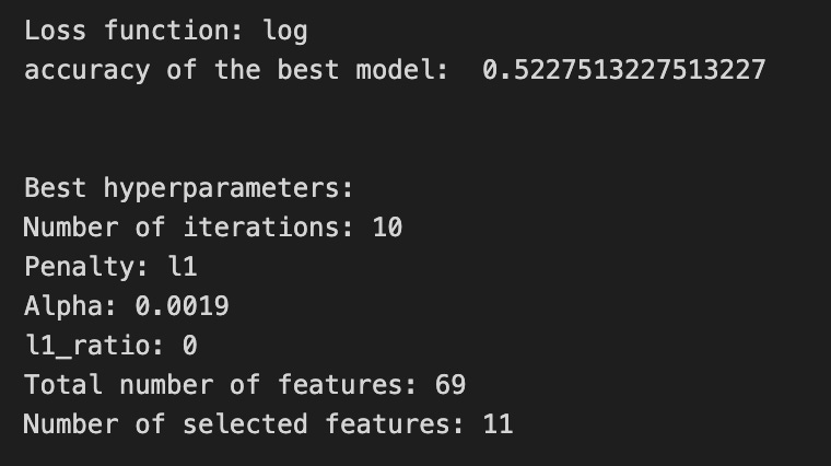

Imagine we’re tuning a little chef inside our forecasting pipeline to pick the best seasoning for predicting stock moves; iterations_7_b sets how many times the chef will stir the pot (max iterations for the optimizer), and alpha_g_7_b and l1_ratio_g_7_b are the jars of regularization spices we want to try (different strengths and mixes of L1/L2). Those options get bundled into a recipe book called hyperparameters_g_7_b that names which pipeline ingredient (logistic) each spice applies to. GridSearchCV is our tasting panel that will try every recipe in the book across time-aware folds; cross-validation is a technique to estimate model performance by repeatedly training and testing on different slices of the data to avoid overfitting. We give the panel the pipeline to taste (estimator), the recipe book (param_grid), the time-series cross-validator (cv=tscv), how to score recipes (scoring_b), which metric to use when picking the single winner (refit=metric_b), and some practical settings like parallel jobs (n_jobs) and verbosity. Calling .fit(X_train_7, y_train_7) is like sending ingredients to the panel and letting them evaluate all combinations. The commented-out RandomizedSearchCV lines are an alternate plan where we’d sample recipes randomly instead of exhaustively. After tasting, we peek at the best chef’s rules with get_params to print the loss function, the chosen score, and the exact hyperparameters (iterations, penalty, alpha, l1_ratio). We then count total coefficients and nonzero coefficients to see how many features survived the regularization selection. Finally we build a pivot table of mean_test_accuracy and draw a heatmap so we can visually inspect the performance landscape — like a flavor map showing which spice levels worked best. All of this tuning helps the larger LSTM forecasting project by ensuring the classifier stage is well-regularized and selects useful signals for better price predictions.
A confusion matrix is a simple table that compares what your model predicted to what actually happened. In stock forecasting we often turn prices into categories like up or down (that’s called classification), and the confusion matrix shows how often those predictions match reality. This helps you see mistakes at a glance instead of relying on one number like accuracy.
The table has four basic outcomes. A true positive is when the model predicts up and the stock really went up. A false positive is when it predicts up but the stock went down — a false alarm. A true negative is predicting down and it is down, and a false negative is missing an up move. Saying these out loud makes it easier to decide what kind of mistake hurts you most in trading.
A confusion matrix gives more insight than raw accuracy because it shows the types of errors. For example, if the market mostly goes up, a model that always predicts up might look good on accuracy but the matrix will reveal it’s useless. That information helps you tune thresholds, choose which errors to avoid, and manage trading risk.
You can also compute metrics from the matrix like precision (how many predicted ups were correct) and recall (how many actual ups you caught). These let you balance chasing opportunities versus avoiding false signals, which is crucial for a trading strategy.
# Make predictions
y_pred_7_b=tuned_model_7_b.predict(X_test_7)

# create confustion matrix
fig, ax=plt.subplots()
sns.heatmap(pd.DataFrame(metrics.confusion_matrix(y_test_7, y_pred_7_b)), annot=True, cmap=”Blues” ,fmt=’g’)
plt.title(’Confusion matrix’); plt.ylabel(’Actual label’); plt.xlabel(’Predicted label’)
ax.xaxis.set_ticklabels([’Down’, ‘Up’]); ax.yaxis.set_ticklabels([’Down’, ‘Up’])

print(”Accuracy:”,metrics.accuracy_score(y_test_7, y_pred_7_b))
print(”Precision:”,metrics.precision_score(y_test_7, y_pred_7_b))
print(”Recall:”,metrics.recall_score(y_test_7, y_pred_7_b))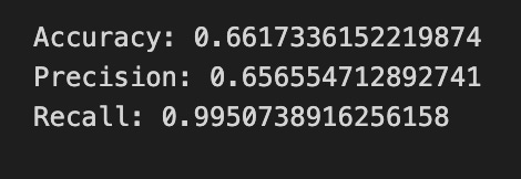
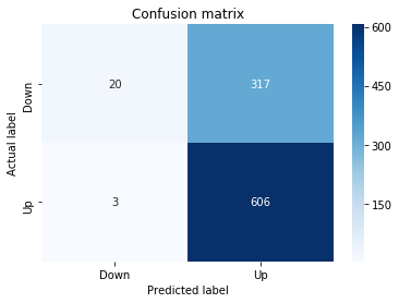
First we ask our trained model to make its best guess about unseen data: y_pred_7_b = tuned_model_7_b.predict(X_test_7) is like presenting a new plate of ingredients to a recipe card and asking what dish it will produce — here the model returns predicted class labels (Up or Down) for each test example. To visualize how well those guesses match reality we prepare a plotting surface with fig, ax = plt.subplots(), giving us a canvas and a pencil to draw on.
We then compute and draw a confusion matrix with sns.heatmap(pd.DataFrame(metrics.confusion_matrix(y_test_7, y_pred_7_b)), annot=True, cmap=”Blues”, fmt=’g’); a confusion matrix is a simple table that counts how often each true label was predicted as each label, making mistakes and successes easy to see. The annotations show counts, and the color scale helps your eye spot patterns. Adding plt.title and axis labels names the visualization so viewers know what they’re looking at, and ax.xaxis.set_ticklabels([‘Down’, ‘Up’]); ax.yaxis.set_ticklabels([‘Down’, ‘Up’]) replaces numeric ticks with human-friendly class names.
Finally, we print three scalar summaries: accuracy, precision, and recall. Accuracy is the overall fraction of correct predictions in one sentence; precision is, in one sentence, the proportion of predicted Ups that were actually Up; recall is, in one sentence, the proportion of actual Ups that we successfully caught. Together, the matrix and these metrics give a clear picture of how well the LSTM-based forecast distinguishes Up versus Down, guiding the next refinement of the forecasting model.
A ROC curve (short for Receiver Operating Characteristic curve) is a simple line that shows how well a model separates two classes, like “price goes up” versus “price goes down.” It plots the true positive rate (the share of actual ups you correctly predicted) against the false positive rate (the share of downs you mistakenly called ups) as you change the cutoff that turns a predicted probability into a buy signal. The area under that curve, called AUC, is a single number summary: closer to 1 means the model separates ups and downs well, and 0.5 means it’s guessing.
In stock forecasting with an LSTM, you often turn continuous price forecasts into binary signals (buy/sell) by picking a threshold (a cutoff probability or predicted change that triggers action). A ROC curve helps you compare models and pick a threshold without committing to one arbitrary cutoff first. This matters because different thresholds trade off false alarms versus missed moves, and you might prefer one trade-off depending on fees or risk appetite.
y_proba_7_b=tuned_model_7_b.predict_proba(X_test_7)[:, 1]
fpr, tpr, _=metrics.roc_curve(y_test_7,  y_proba_7_b)
auc=metrics.roc_auc_score(y_test_7, y_proba_7_b)
plt.plot(fpr,tpr,label=”AUC=”+str(auc))
plt.legend(loc=4)
plt.plot([0, 1], [0, 1], linestyle=’--’) # plot no skill
plt.title(’ROC-Curve’)
plt.show()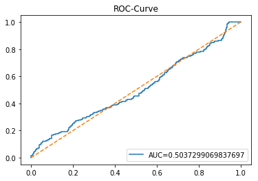
We want to see how well the model’s probability estimates separate upward moves from downward moves, so the first line asks the tuned model for probabilities on the test set; predict_proba hands back a confidence score for each class, and the [:, 1] slice picks the probability of the positive class for every example — like asking the model, “how sure are you that each day is an up day?” and taking the “up” score from each answer.
Next, we sweep a decision threshold across all possible cutoffs to build the operating curve: metrics.roc_curve computes pairs of false positive rate and true positive rate at many thresholds — a ROC curve shows the tradeoff between true positive rate and false positive rate as you vary the decision threshold. The auc line computes a single summary number, the area under that curve, which captures overall separability (1.0 means perfect separation, 0.5 means random guessing). We then draw the ROC by plotting the fpr against the tpr and attach a label showing the AUC so the curve carries its numeric score. Showing a legend in the lower-right makes that label readable, and plotting the dashed diagonal is like sketching a “no-skill” baseline (a coin flip) for visual comparison. Finally, we title the figure and render it so you can inspect how well the model ranks up-versus-down cases.
Seeing this ROC and AUC helps you judge whether your LSTM’s forecasts actually distinguish price rises from falls and whether to adjust thresholds or model tuning.
An LSTM (Long Short-Term Memory) is a kind of recurrent neural network — that means it looks at data in order, like prices over time — and it uses tiny switches called *gates* to decide what to remember and what to forget. Those gates let the model keep useful long-term patterns without being overwhelmed by every single noisy tick.
LSTMs are a good fit for forecasting stock prices because they can learn from sequences of past prices and indicators to predict what might come next. To use one, we usually feed it short chunks of recent history (a sliding window), where each chunk is a sequence of past prices used to predict the next price; this prepares the model to see patterns over fixed time spans.
In practice, scale your inputs (scaling means squashing numbers to a similar range) and keep a time-based train/test split so the model never sees future data during training — that avoids a lookahead bias, which would make results misleading. Also try simple architectures first and monitor validation performance to spot overfitting, since LSTMs can memorize noise.
Remember that markets are noisy and influenced by many factors, so an LSTM is a tool, not a magic crystal ball. Combine it with good features, realistic backtesting, and careful evaluation to get useful, reliable forecasts.
start=time.time()


# number of epochs
epochs=1
# number of units
LSTM_units_7_lstm=220
# numer of features
num_features_7_lstm=X_train_7.shape[1]
# Regularization
dropout_rate=0.
recurrent_dropout=0.4
# print
verbose=0

#hyperparameter
batch_size=[1]

# hyperparameter
hyperparameter_7_lstm={’batch_size’:batch_size}


# create Classifier
clf_7_lstm=KerasClassifier(build_fn=create_shallow_LSTM,
                           epochs=epochs,
                           LSTM_units=LSTM_units_7_lstm,
                           num_samples=num_samples,
                           look_back=look_back,
                           num_features=num_features_7_lstm,
                           dropout_rate=dropout_rate,
                           recurrent_dropout=recurrent_dropout,
                           verbose=verbose)
# Gridsearch
search_7_lstm=GridSearchCV(estimator=clf_7_lstm,
                           param_grid=hyperparameter_7_lstm,
                           n_jobs=-1,
                           cv=tscv,
                           scoring=scoring_lstm, # accuracy
                           refit=True,
                           return_train_score=False)

# Fit model
tuned_model_7_lstm=search_7_lstm.fit(X_train_7_lstm, y_train_7, shuffle=False, callbacks=[reset])


print(”\n”)

# View Accuracy
print(scoring_lstm +’ of the best model: ‘, tuned_model_7_lstm.best_score_)
# best_score_ Mean cross-validated score of the best_estimator

print(”\n”)

# View best hyperparameters
print(”Best hyperparameters:”)
print(’epochs:’, tuned_model_7_lstm.best_estimator_.get_params()[’epochs’])
print(’batch_size:’, tuned_model_7_lstm.best_estimator_.get_params()[’batch_size’])
print(’dropout_rate:’, tuned_model_7_lstm.best_estimator_.get_params()[’dropout_rate’])
print(’recurrent_dropout:’, tuned_model_7_lstm.best_estimator_.get_params()[’recurrent_dropout’])

end=time.time()
print(”\n”)
print(”Running Time:”, end - start)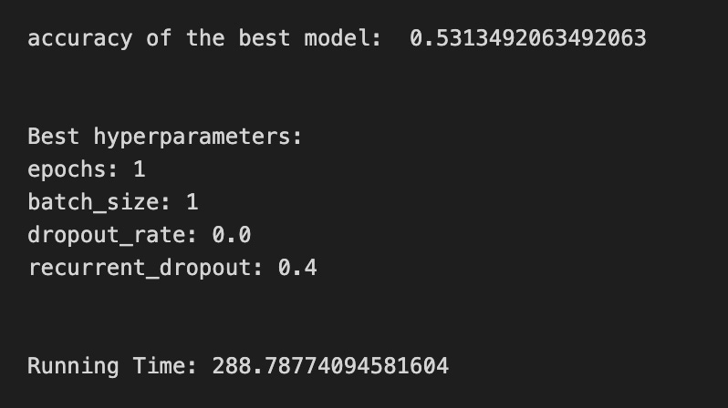
We start by stamping the clock so we can tell how long the whole experiment takes — a little timer that wraps the work. Next we set the training recipe: a single epoch (one full pass over the data), 220 LSTM units (think of units as memory cells that hold patterns over time), and we read the number of input features from the training array shape so the model knows how many signals each time step carries. Regularization is prepared with dropout and recurrent_dropout; dropout randomly silences connections to prevent overfitting, and recurrent_dropout does the same specifically for the LSTM’s internal recurrence. Verbose controls how chatty the training will be.
We name a small batch_size list so the grid search has something to try; batch size is like how many samples you taste before adjusting the recipe. Those batch sizes are wrapped into a hyperparameter dictionary for the tuner. Then we create a KerasClassifier using a build function called create_shallow_LSTM — treat that build function as a reusable recipe card that returns a compiled model; the wrapper makes the Keras model behave like an sklearn estimator so it can be tuned with scikit-learn tools.
GridSearchCV is set up to try hyperparameter combinations in parallel, using a time-series-aware cross-validator so past/future ordering is respected — key idea: in time series you can’t shuffle freely. We give it a scoring function, ask it to refit the best model, and then call fit on the training arrays with shuffle turned off and a reset callback to clear model state between folds.
After fitting we print the best cross-validated score and then query the chosen estimator for the hyperparameters it settled on (epochs, batch_size, dropout settings). Finally we read the clock again and print running time. All of these steps are orchestration to reliably find a good LSTM configuration for forecasting stock prices.
A confusion matrix is just a little table that counts how often your model’s predictions match the truth. Each row shows the actual outcome and each column shows the model’s prediction, so you can quickly see where it gets things right and where it slips up.
When you use an LSTM to forecast stock moves, you often turn the problem into classes like up or down (a regression model predicts a number, but a classifier predicts categories). The confusion matrix then shows, for example, how many times the market actually went up but the model predicted down — that kind of mistake matters for trading decisions.
You can also get simple scores from the matrix, like accuracy (how often it was right), precision (of the times it predicted “up,” how many were really up), and recall (of all the actual “up” days, how many the model caught). These short definitions keep the jargon useful and readable.
A big reason to use a confusion matrix is it reveals which errors happen, not just how many errors. That helps you decide whether to change the model, adjust decision thresholds, or weigh different mistakes differently based on trading costs.
# Make predictions
y_pred_7_lstm=tuned_model_7_lstm.predict(X_test_7_lstm)

# create confustion matrix
fig, ax=plt.subplots()
sns.heatmap(pd.DataFrame(metrics.confusion_matrix(y_test_7, y_pred_7_lstm)), annot=True, cmap=”Blues” ,fmt=’g’)
plt.title(’Confusion matrix’); plt.ylabel(’Actual label’); plt.xlabel(’Predicted label’)
ax.xaxis.set_ticklabels([’Down’, ‘Up’]); ax.yaxis.set_ticklabels([’Down’, ‘Up’])

print(”Accuracy:”,metrics.accuracy_score(y_test_7, y_pred_7_lstm))
print(”Precision:”,metrics.precision_score(y_test_7, y_pred_7_lstm))
print(”Recall:”,metrics.recall_score(y_test_7, y_pred_7_lstm))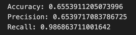

First, imagine you’ve trained a forecaster and now you ask it to make a forecast for each test day — the line with predict is exactly that: tuned_model_7_lstm.predict(X_test_7_lstm) asks your learned LSTM to turn each test input into a predicted label (likely “Up” or “Down”), and you store those answers in y_pred_7_lstm so you can compare them to the real world.
Next we prepare a blank canvas to visualize how well the forecaster did: fig, ax = plt.subplots() opens a plotting area, like clearing a sheet before painting. metrics.confusion_matrix(y_test_7, y_pred_7_lstm) counts where predictions and actuals agreed or disagreed, and wrapping it in pd.DataFrame makes those counts play nicely with seaborn. sns.heatmap paints those counts as a colored grid with annot=True to write the numbers on each square, cmap=”Blues” to choose a blue color palette, and fmt=’g’ to display the counts as integers; the title and axis labels give context, and ax.xaxis.set_ticklabels and ax.yaxis.set_ticklabels rename the ticks to the human-friendly classes “Down” and “Up”. A confusion matrix is a table that shows true versus predicted labels so you can spot patterns of errors.
Finally, the print lines report three simple summary scores: accuracy is the fraction of correct guesses, precision is the fraction of predicted “Up” that were actually “Up” (a measure of trust in positive predictions), and recall is the fraction of actual “Up” that you detected (a measure of completeness). Together these steps turn raw LSTM outputs into human-understandable evaluation, helping you refine the forecasting model.
A ROC curve is a simple visual that shows how well a binary classifier separates two classes — for stock forecasting that usually means predicting *up* versus *down* days. Think of it as tracing your model’s trade-offs as you move the decision *threshold* (the cut-off on predicted probability where you call a day “up”); this helps you see performance across all possible thresholds instead of just one number.
The vertical axis is the True Positive Rate (TPR), also called recall — the share of actual up days you correctly predict. The horizontal axis is the False Positive Rate (FPR) — the share of down days you accidentally call up. The curve plots TPR against FPR for every threshold. The area under that curve, called *AUC*, summarizes performance: 0.5 is random guessing and 1.0 is perfect separation. This gives a quick sense of how well your LSTM’s probability outputs separate up and down days.
In practice, you use the ROC to pick a threshold that balances catching real up days and avoiding false signals, which matters when trading costs or risk differ. One caution: if one class is rare (class imbalance, meaning many more up days than down days), the ROC can be optimistic — in that case also look at a Precision-Recall curve or evaluate thresholds by expected profit to match your trading goals.
Plot the ROC for cross-validated folds and report AUC with confidence intervals so your choice isn’t driven by random chance.
y_proba_7_b=tuned_model_7_b.predict_proba(X_test_7)[:, 1]
fpr, tpr, _=metrics.roc_curve(y_test_7,  y_proba_7_b)
auc=metrics.roc_auc_score(y_test_7, y_proba_7_b)
plt.plot(fpr,tpr,label=”AUC=”+str(auc))
plt.legend(loc=4)
plt.plot([0, 1], [0, 1], linestyle=’--’) # plot no skill
plt.title(’ROC-Curve’)
plt.show()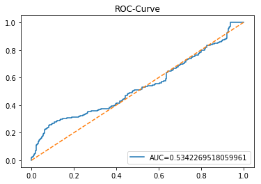
Imagine we’re checking how well our model can say “yes” or “no” about a future price move, and we want a clear picture of its confidence and trade-offs. The first line asks the tuned model to give probabilities for the test set and then selects the second column, which is the probability of the positive class — a key concept: predict_proba returns the model’s confidence for each class, and slicing [:, 1] picks the probability that the event of interest happens. Next, the metrics.roc_curve call converts those probabilities and the true labels into points that describe how the true positive rate changes against the false positive rate as you sweep a decision threshold — a key concept: an ROC curve visualizes the trade-off between catching positives and raising false alarms. The auc line then summarizes that curve into one number between 0 and 1 where higher is better — a key concept: AUC measures the overall ability of the model to rank positive examples above negatives. The first plt.plot draws the ROC curve and labels it with the AUC so you can read the summary at a glance; plt.legend(loc=4) puts that label in the lower-right corner. The dashed diagonal plotted next is the no-skill line, showing where a random guess would sit, and the title plus show display the finished chart. Together, these steps let you judge how well your LSTM-based forecast separates up-moves from down-moves.