

Building Robust LSTM Models for Stock Price Trends
etailed Approach to Data Acquisition, Normalization, and Hyper-parameter Tuning

Link to download the source code at the end of this article.
In the dynamic world of financial markets, accurately predicting stock price movements is a formidable challenge that demands sophisticated analytical approaches. This notebook is dedicated to refining a Long Short-Term Memory (LSTM) model to address shortcomings identified in earlier iterations. Our analysis highlighted several critical areas for improvement: the model’s tendency to overfit due to a limited dataset size, an excessive focus on feature extraction, incorrect predictions resulting from improper normalization, and a noticeable lack of hyperparameter tuning. Additionally, initial attempts indicated that LSTMs are particularly adept at detecting stock price movements, prompting a more focused exploration. To address these issues, this revised approach systematically tackles the challenges by implementing a structured plan designed to enhance forecasting accuracy and model robustness.
Index of Steps:
Acquiring Data and Setup: Acquire data from the API and set up the environment in Colab.
Data Visualization: Visualize the data through plots to understand trends and patterns.
Normalization: Normalize the dataset appropriately to ensure model accuracy.
Data Exploration: Explore the data further by examining EMA, moving averages, and one-step-ahead predictions.
Hyperparameter Tuning: Conduct thorough hyperparameter tuning to optimize model performance.
Establishing Average Price: Establish an average price, then utilize it to prepare the training and testing datasets.
Training the LSTM Network: Train the LSTM network using the prepared data.
Graphical Display of Predictions: Display the model’s predictions graphically to evaluate performance visually.
Fine-tuning and Adjustments: Fine-tune hyperparameters, adjust training processes, and evaluate for overfitting or underfitting.
Conclusions: Draw conclusions based on the experimentation conducted to inform future modeling strategies.
These steps are designed to systematically address and rectify the deficiencies noted in the previous iterations of the LSTM model, leading to improved predictive capabilities and deeper insights into the dynamics of stock price movements.
Imports libraries for data analysis
from pandas_datareader import data
import matplotlib.pyplot as plt
import pandas as pd
import datetime as dt
import urllib.request, json
import os
import numpy as np
import tensorflow as tf
from sklearn.preprocessing import MinMaxScaler
The code snippet is dedicated to importing crucial libraries for delving into financial data examination and predicting stock prices with TensorFlow. Let’s dive into the roles of each import statement:
1. pandas_datareader.data: This nifty library enables fetching financial data from diverse online sources.
2. matplotlib.pyplot: A gem in Python, this library turns data visualization into a walk in the park.
3. pandas: A staple tool for wrangling and scrutinizing data is at your fingertips with this library.
4. datetime: This handy library equips you with classes to tinker with dates and times.
5. urllib.request, json: Tasked with firing off HTTP requests and wrestling JSON data into shape.
6. os: This module opens up avenues to tap into system-specific functionalities.
7. numpy: Your go-to for crunching numbers seamlessly within Python.
8. tensorflow: The star of the show, an open-source machine learning powerhouse that crafts and hones neural network models.
9. sklearn.preprocessing.MinMaxScaler: This wizardry gets your features scaled just right, a sweet spot for your machine learning algorithms.
These libraries are the backbone for snagging financial data, grooming it, constructing a TensorFlow-powered deep learning model, and painting vivid pictures with the results unearthed from the analysis. Each library brings its unique prowess to the table, tailored for distinct tasks in the project.
Checks and prints GPU device availability
device_name = tf.test.gpu_device_name()
if device_name != '/device:GPU:0':
  raise SystemError('GPU device not found')
print('Found GPU at: {}'.format(device_name))
This snippet of code leverages the TensorFlow library to verify the availability of a GPU device for use. Initially, it retrieves the GPU device name by employing the function tf.test.gpu_device_name(). Subsequently, the code validates whether the device name is not identical to ‘/device:GPU:0’, which indicates the absence of a GPU device. If this condition is met, a SystemError is triggered, signaling that the GPU device could not be located. Conversely, if a GPU device is detected, a message is displayed confirming the presence of the GPU device.
We employ this code to confirm that the necessary GPU device is accessible for TensorFlow models to leverage. The utilization of a GPU can tremendously expedite the training and inference processes for deep learning models, as GPUs are specifically designed for swift parallel computations. Verifying the existence of a GPU device before executing deep learning operations is crucial to harness the performance advantages offered by GPU acceleration.
Reads specific columns from a CSV file
df = pd.read_csv(os.path.join(f'{googlepath}','ge.us.txt'),delimiter=',',usecols=['Date','Open','High','Low','Close'])The following script serves the purpose of importing a CSV file into a pandas DataFrame.
Here’s a breakdown of how the script operates:
1. It accesses a CSV file from a designated path constructed through os.path.join(), merging the ‘googlepath’ variable with the file name ‘ge.us.txt’.
2. It defines the delimiter utilized in the CSV file, opting for a comma ‘,’ in this instance.
3. It specifically extracts and reads the columns indicated in the ‘usecols’ parameter, which are ‘Date’, ‘Open’, ‘High’, ‘Low’, and ‘Close’.
This script plays a crucial role in retrieving pertinent information from a CSV file and transferring it into a pandas DataFrame for subsequent examination, modification, or visualization in Python. By stipulating the desired columns, it streamlines the process of loading solely the essential data into memory, particularly beneficial when handling extensive datasets.
Sort dataframe by date.
df = df.sort_values('Date')
df.head()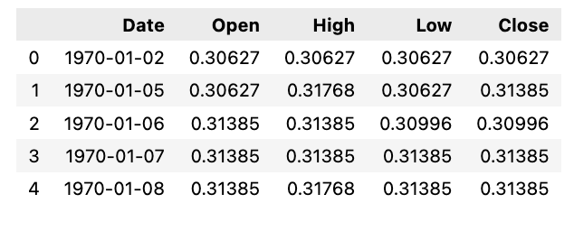
Arranging a DataFrame called df in ascending order based on the values in the ‘Date’ column is the aim of this code snippet.
In the realm of Pandas, the .sort_values() function shines as it effortlessly organizes DataFrame contents along a specific axis. By singling out the ‘Date’ column for sorting purposes, this piece of code reshapes the rows within df by the ‘Date’ values in a rising sequence.
The beauty of using such code lies in how it streamlines data structuring within a DataFrame, paving the way for smoother analysis and interpretation of the embedded information. Sorting not only streamlines data, it also fast-tracks data insights, unravels patterns, and facilitates side-by-side comparisons effortlessly.
Calculate the average of the high and low prices, and then utilize that value to create a plot.
Plots average price over time
plt.figure(figsize = (18,9))
plt.plot(range(df.shape[0]),(df['Low']+df['High'])/2.0)
plt.xticks(range(0,df.shape[0],500),df['Date'].loc[::500],rotation=45)
plt.xlabel('Date',fontsize=18)
plt.ylabel('avg Price',fontsize=18)
plt.show()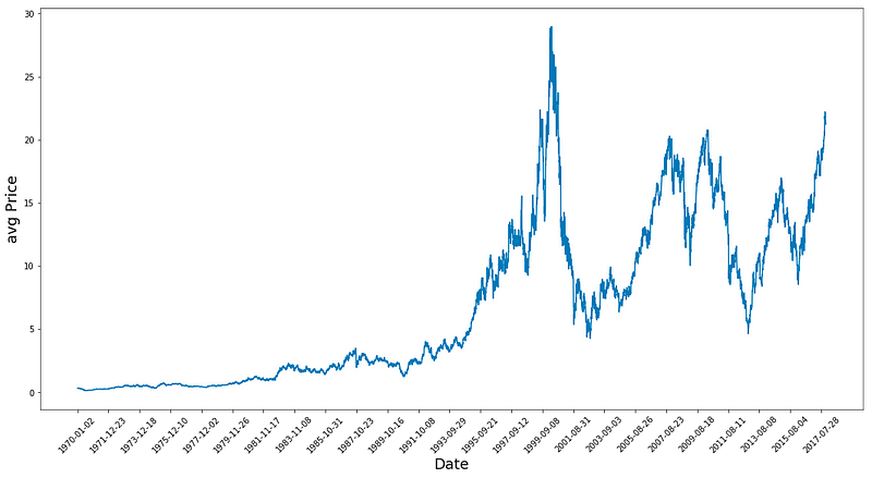
In this code snippet, we delve into a data visualization process employing the matplotlib library in Python. Let’s break down what this code accomplishes:
To kick things off, it crafts a figure object tailored to a specific size, spanning 18 inches in width and 9 inches in height, destined for the plot’s canvas.
Subsequently, it illustrates the average price, derived from computing the mean of the ‘Low’ and ‘High’ values housed in a DataFrame labeled ‘df’, mapped against the DataFrame’s row range.
The code then orchestrates the positioning of x-ticks along the plot, spaced at 500-unit intervals, coinciding with the date values sourced from the ‘Date’ column of the DataFrame for every 500th row. These x-ticks receive a 45-degree rotation to bolster legibility.
For clarity’s sake, it assigns the ‘Date’ moniker to the x-axis and ‘avg Price’ to the y-axis labels.
Lastly, the plot comes to life, breathing vitality into the visual representation of the average price trend over time, unearthed from the ‘Low’ and ‘High’ columns within the DataFrame. The tailored adjustments like figure dimensions, x-tick placements, and axis descriptors serve to enrich the plot’s readability and digestibility.
Calculates average prices using high and low prices from a dataframe
high_prices = df.loc[:,'High'].as_matrix()
low_prices = df.loc[:,'Low'].as_matrix()
avg_prices = (high_prices+low_prices)/2.0
This particular code excerpt aims to determine the average price per row in the DataFrame labeled ‘df’. Its methodology involves accessing the ‘High’ and ‘Low’ columns within the DataFrame, transforming them into NumPy arrays utilizing the as_matrix() function. Consequently, the average price is computed by adding up the ‘High’ and ‘Low’ values and then dividing the total by 2.
Utilizing this code is imperative for efficiently assessing the average price derived from the ‘High’ and ‘Low’ values within the DataFrame by leveraging vectorized operations, thus eliminating the need for manual row-by-row iteration. This streamlined approach proves to be both quicker and more succinct, especially when managing extensive datasets, in contrast to the traditional approach reliant on loops for calculations.
Thoughts on the Plot:
1. The data shows a peak in 1983, followed by continuous growth until two significant crashes — one circa 2001 and the other during the 2009 financial market collapse. This observation is quite fascinating!
2. By calculating average prices, the data is normalized, offering a clearer depiction compared to focusing solely on high or closing prices as it provides insights into business activities throughout the entire day.
The dataset consists of approximately 12,000 data points. Following a split, the average dataset is divided, with around 11,000 data points allocated to training and the remaining portion designated for testing. Subsequently, the training dataset undergoes normalization.
Splits data into training and testing
train = avg_prices[:11000]
test = avg_prices[11000:]
len(avg_prices)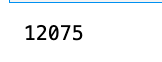
In this piece of code, two subsets named train and test are generated from the avg_prices list. The train subset consists of the initial 11,000 elements of avg_prices, while the test subset comprises the remaining elements starting from the 11,000th position to the end of the list.
In the realms of machine learning and data analysis, it’s a standard procedure to divide a dataset into a training set (referred to as train here) for model training and a test set (referred to as test here) for evaluating the model’s performance on unseen data. This method aids in determining how well the model can generalize to new data.
The utilization of the len(avg_prices) function at the end appears to be for verifying the total count of elements in the avg_prices list. This check is valuable for ensuring the dataset splitting has been done accurately and that the combined lengths of the training and test subsets correspond to the total length of the original dataset.
Let’s start the data normalization process by scaling it. The normalization procedure involves creating a window to smooth out the data points. Using a window size of 2500 for 10000 data points would yield 4 distinct data points. The final normalization step smooths out the remaining data points. By applying MinMaxScaler, all data is scaled to fall within the range of 0 and 1.
Additionally, you can adjust the shape of both training and test data. The process involves splitting the complete series into windows based on the observation that different time periods exhibit varying value ranges. Failing to do so could result in the earlier data being clustered near 0, contributing little to the learning process. Opting for a window size of 2500 addresses this issue. For more details, refer to the link provided: https://machinelearningmastery.com/rescaling-data-for-machine-learning-in-python-with-scikit-learn/
Uses MinMaxScaler to normalize data. Reshapes data
scaler = MinMaxScaler() #use mimaxscaler from scikitlearn to normalize data
train = train.reshape(-1,1)
test = test.reshape(-1,1)
This snippet demonstrates how to standardize data with MinMaxScaler, a tool from the scikit-learn library.
The MinMaxScaler works by adjusting and standardizing each feature individually so that it falls within a designated range, typically between zero and one, based on the training data. This process proves beneficial, especially when dealing with models that demand consistent feature scaling, such as neural networks, support vector machines, and algorithms relying on distance calculations.
Initially, the code initializes the MinMaxScaler object as ‘scaler.’ Subsequently, both the training and testing data undergo a transformation where they are reshaped to a single feature column by utilizing the ‘reshape(-1,1)’ function. This reshaping step becomes crucial for applying the MinMaxScaler correctly, as it requires the input data to conform to a specific structure.
Essentially, this snippet serves the purpose of preprocessing and standardizing the data before inputting it into machine learning models. This practice ensures improved performance and smoother convergence throughout the training process.
Let’s standardize the average prices and make predictions based on them directly rather than creating new features. The dataset consists of 12,075 records, and we can apply normalization using the sliding window method.
Applies scaler to sliding windows of data
window_size = 2500
for x in range(0,10000,window_size):
    scaler.fit(train[x:x+window_size,:])
    train[x:x+window_size,:] = scaler.transform(train[x:x+window_size,:])

scaler.fit(train[x+window_size:,:])
train[x+window_size:,:] = scaler.transform(train[x+window_size:,:])
This code snippet demonstrates the application of a technique known as “scaling” on a given set of training data, a pivotal stage in preparing data for machine learning models.
The process unfolds in the following manner:
1. Initializing a window_size parameter to 2500, specifying the quantity of data points processed in each iteration.
2. Iterating through the training data in segments of the window_size.
3. Training a scaler on the data within each segment using scaler.fit() to calculate essential statistics for data transformation.
4. Transforming the data within the segment post-scaler fitting with scaler.transform(), standardizing or normalizing the data based on the computed statistics.
5. The iteration repeats until all data segments have undergone scaling.
The objective behind this code is to ensure uniform scaling of all features within the data. When features exhibit varying scales, machine learning models might underperform, with certain features overshadowing others due to their larger magnitudes. By standardizing the data, all features are brought to a comparable scale, potentially enhancing the efficacy and consistency of machine learning models.
In essence, this code aids in the pre-processing of training data by scaling it through a dynamic window approach, priming the data for optimal machine learning model training.
Reshapes the array “train”
train = train.reshape(-1)The code provided here serves to transform the train array into a one-dimensional structure. By utilizing -1 within the .reshape() function, NumPy is instructed to compute the size of the new dimension automatically, considering the total count of elements in the initial array. This guarantees that the reshaped array retains the original array’s element count.
Rearranging arrays can prove beneficial when dealing with tasks related to machine learning models or particular mathematical computations that demand precise array configurations. Streamlining an array into a one-dimensional layout can simplify the execution of operations or facilitate passing it to machine learning models that operate optimally with one-dimensional inputs.
Transform this into a 2D shape train.
Reshape and scale test data
test = scaler.transform(test).reshape(-1)It looks like this snippet is handling data scaling for the variable ‘test.’ Let’s dive into what’s going on here:
First off, the code utilizes the scaler.transform() function on the test data. This function standardizes or normalizes the data according to a predefined scaling technique.
Following that, the .reshape(-1) function steps in to transform the scaled data into a one-dimensional array. By using ‘-1’ as an argument, the function automatically adjusts the array into a single dimension based on its elements.
The primary objective behind employing this code is to preprocess the test data consistently with the training data. This ensures that both datasets share the same scaling and data structure, which is crucial for maintaining uniformity before feeding them into a machine learning model. Scaling data holds significance in various machine learning algorithms as it prevents features of different scales from disproportionately influencing the model’s performance.
It’s common practice not to scale down the test data but to undergo transformation and reshape it to match the train data shape. You can opt to smooth the data by utilizing exponential moving average to eliminate the inherent irregularities in stock prices and yield a more polished curve. Remember, it’s advisable to solely smooth the training data.
Finding the exponential moving average (EMA) is a common technique used in financial analysis to assess trends over time by giving more weight to recent data points.
Calculate exponential moving average for train
EMA = 0.0 # keep EMA 0.0
ema2 = 0.1 # gamma is a variabe that can be multiplied with train
for i in range(11000):
  EMA = ema2*train[i] + (1-ema2)*EMA
  train[i] = EMA
The provided code functions to compute an Exponential Moving Average (EMA) employing a smoothing factor identified as ema2. It iterates through a train list containing 11,000 elements and modifies each element to incorporate the EMA value.
Outlined below is the operational sequence:
1. Initialization of EMA and ema2 values.
2. Iteration over 11,000 elements within the train list.
3. Conduct the following steps for each element in the loop:
a. Compute the ongoing EMA by merging the previous EMA value with the current train element, utilizing the formula: EMA = ema2 * train[i] + (1 — ema2) * EMA.
b. Revise the current element in the train list with the calculated EMA value.
This code snippet serves the purpose of attenuating fluctuations or disturbances in training data by imparting more significance to recent data points. It facilitates in generating a moving average that promptly reflects recent modifications. Such functionality finds application in diverse domains like signal processing, data analysis, and time-series prediction for scrutinizing data trends and patterns effectively.
Concatenates training and test data
all_avg_data = np.concatenate([train,test],axis=0)Here we have some code that merges two numpy arrays, namely ‘train’ and ‘test,’ vertically along axis 0. This operation effectively stacks the rows of the test array beneath those of the train array, producing a fresh numpy array referred to as all_avg_data.
Concatenating arrays comes in handy when you aim to blend two arrays along a precise axis without conducting any extra data manipulations. Such a technique proves valuable when prepping data for machine learning algorithms, conducting data analysis, or whenever there’s a need to merge datasets seamlessly.
Anticipating the Future by Staying a Step Ahead Through Averaging
What exactly is meant by One Step Ahead Prediction?
One Step Ahead Prediction, in the realm of time series forecasting, involves predicting the next observation in the sequence of data points. It requires predicting just one time step forward.
The concept involves leveraging historical data to forecast the value for the immediate next time point in the sequence. By averaging all available data points, the aim is to project the average value for the next day based on patterns observed in the historical data.
Essentially, the method entails training the data to discern patterns that can aid in generating an output, which is then utilized for prediction. This iterative process continues as long as the selected training data is employed.
Utilizing averaging techniques, particularly for short-term predictions, enables representing future values based on historical trends. However, employing such methods for multiple time steps can yield suboptimal outcomes. Standard averaging and exponential moving average are two common techniques employed for such predictions. Both these methods are assessed both qualitatively, through visual evaluation, and quantitatively, using metrics like Mean Squared Error (MSE), to gauge the effectiveness of the forecasts.
Mean Squared Error (MSE) serves as a crucial metric in this context, computed by squaring the error between the predicted value and the true value for a single time step ahead and then averaging these squared errors across all predictions.
Understanding the complexity of this issue starts with simplifying it as a basic average computation task. Initially, you will attempt to forecast forthcoming stock market prices (e.g., xt+1) by averaging past stock market prices over a set window size (e.g., xt-N, …, xt) (considered the preceding 100 days). Subsequently, you will explore a more sophisticated “exponential moving average” technique to assess its performance. Finally, you will delve into the pinnacle of time-series prediction — Long Short-Term Memory (LSTM) models.
To kick things off, let’s analyze the effectiveness of plain averaging. Essentially, the prediction for time t+1 is determined by averaging all recorded stock prices within the timeframe from t to t-N.
Calculate moving average of training data
window_size = 100 # chose standard window size of 100
N = train.size
mse_err = []
_avg_pred = [] #create a list for average x, predictions and mse errors
_avg_x = []

for idx1 in range(window_size,N): #make a for loop where if the value is greater than size then use timedelta function for that 1 day

    if idx1 >= N:
        date = dt.datetime.strptime(k, '%Y-%m-%d').date() + dt.timedelta(days=1)
    else:
        date = df.loc[idx1,'Date']  #if not just find that value in the dataframe for the data and put it in date

    _avg_pred.append(np.mean(train[idx1-window_size:idx1])) #Keep apending values into into the lists
    mse_err.append((_avg_pred[-1]-train[idx1])**2)   #calculate mse errors
    _avg_x.append(date) #this is the x train for averages we will use to train

print('MSE error for standard averaging: %.5f'%(0.5*np.mean(mse_err)))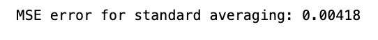
Below is a code snippet that computes the Mean Squared Error (MSE) for a standard averaging method. Here’s a breakdown of its functionality:
To begin with, it sets up initial parameters such as the window size, the size of training data (N), and initializes lists to hold average predictions, MSE errors, and average x values.
Next, it loops through a range starting from the window size to the training data size (N). For each iteration:
- It determines the average prediction by computing the mean of values within the window of size window_size.
- It calculates the MSE by contrasting this average prediction with the actual value in the training data at index idx1.
- It appends the average prediction, MSE error, and date to their respective lists.
Finally, it calculates the overall MSE for the standard averaging method by averaging all MSE errors obtained, halving the result.
This code proves handy in assessing how well a standard averaging technique performs on a specific dataset. It aids in gauging the predictive accuracy of this straightforward averaging approach by quantifying errors using MSE. Such an analysis becomes pivotal when juxtaposing the efficacy of more intricate models against this fundamental method.
Generating training data ranging from 100 to the size of our training set (11,000 instances), we derive the dates to calculate their mean. These averages are subsequently added to the list of average predictions. In cases where this range criterion is not met, a test set is generated, and all dates are added to a collection of standard averages. Finally, the mean squared error, `mse_err`, is computed.
The method mentioned above is remarkably efficient for obtaining simple or standard averages. By utilizing timedelta to manipulate dates, the code shifts the date back by one day and combines it with the date using datetime, effectively extracting the date and time information from the specified format.
This code snippet will run only if `idx1` exceeds the dataset size (ensuring that testing and training data are handled distinctly).
You can refer to this resource for further insights: https://machinelearningmastery.com/normalize-standardize-time-series-data-python/
The MSE error looks fantastic! It’s much lower than we anticipated, just as we had hoped.
Plotting true and predicted data
plt.figure(figsize = (18,9))
plt.plot(range(df.shape[0]),all_avg_data,color='y',label='True')
plt.plot(range(window_size,N),_avg_pred,color='b',label='Prediction')
plt.xlabel('Date')
plt.ylabel('avg Price')
plt.legend(fontsize=18)
plt.show()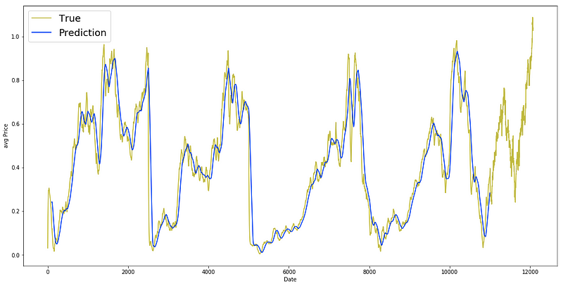
The provided code snippet serves the purpose of generating a line plot that visually presents the comparison between the true average prices (all_avg_data) and the predicted average prices (_avg_pred) across a range of dates.
To break it down further:
1. By initiating a figure with specified dimensions (18 inches in width and 9 inches in height) using plt.figure(figsize=(18, 9)), the graph layout is established.
2. The line plt.plot(range(df.shape[0]), all_avg_data, color=’y’, label=’True’) showcases the true average prices (all_avg_data) in a yellow hue (‘y’), utilizing x-axis values obtained from range(df.shape[0]).
3. For the predicted average prices (_avg_pred), plt.plot(range(window_size, N), _avg_pred, color=’b’, label=’Prediction’) employs a blue color scheme (‘b’) and defines the date range for predictions using the window_size and N variables.
4. Adjusting the x-axis label to ‘Date’ and the y-axis label to ‘avg Price’ is accomplished with plt.xlabel(‘Date’) and plt.ylabel(‘avg Price’).
5. By including a legend featuring ‘True’ and ‘Prediction’ labels, plt.legend(fontsize=18) introduces a visual guide to the plot, with font size customization through the fontsize parameter.
6. Lastly, plt.show() renders the plot for viewing.
This code segment proves valuable for visually assessing the correspondence between actual and predicted average prices within a specified timeframe. It aids in gauging the predictive model’s efficacy by enabling a visual scrutiny of the alignment between forecasted values and real data.
Let’s now delve into the Exponential Moving Average approach, a technique we previously explored.
Exponential Moving Average (EMA) is utilized for forecasting the upcoming step, following the formula:
xt+1 = EMAt = γ × EMAt-1 + (1-γ) xt
Here, EMA0 = 0, and EMA signifies the continuously adjusted exponential moving average value.
This methodology aids in predicting the subsequent step (t+1), emphasizing recent data while retaining the influence of earlier observations within the average. Witness its efficacy in one-step ahead predictions below.