

Chapter 2: A naive prediction of the future
In the realm of time series forecasting, before we embark on developing complex algorithms, it’s crucial to establish a baseline model.

Think of a baseline as the simplest, most straightforward prediction you can make. It serves as a fundamental benchmark against which the performance of any more sophisticated model must be compared. Without a baseline, you wouldn’t know if your intricate deep learning model is genuinely adding value, or if you’re simply overcomplicating a problem that a much simpler approach could handle just as well, or even better.
Link To Download Dataset and Source code at the end of article!
The purpose of a baseline model is threefold:
Evaluation Benchmark: It provides a lower bound for acceptable performance. If your advanced model cannot outperform a naive baseline, it indicates a fundamental flaw in your approach or that the problem itself is inherently difficult to predict with high accuracy.
Sanity Check: It helps confirm that your overall forecasting pipeline (data preparation, model training, evaluation metrics) is working correctly. A baseline should produce sensible, albeit simple, predictions.
Simplicity and Interpretability: Naive baselines are often incredibly easy to understand and implement. They provide immediate insights into the basic characteristics of your time series data, such as the presence of trend or seasonality, which can inform the selection of more complex models.
These simple statistical approaches, often referred to as heuristics, provide an intuitive starting point. For instance, if you’re trying to predict tomorrow’s temperature, a very simple heuristic might be “tomorrow’s temperature will be the same as today’s.” This is a form of a naive baseline.
Baselines are not limited to financial data. They are critical in a multitude of real-world scenarios:
Sales Forecasting: Predicting next month’s sales based on the average of the last few months or the sales from the same month last year.
Website Traffic Prediction: Estimating tomorrow’s page views based on today’s traffic or the average traffic from the past week.
Energy Consumption: Forecasting next hour’s electricity demand using the demand from the previous hour or the average demand at that hour on previous days.
Inventory Management: Predicting demand for a product based on its historical sales patterns.
In all these cases, a baseline provides an immediate, low-cost prediction and a necessary reference point for assessing more resource-intensive forecasting efforts.
Introducing the Johnson & Johnson EPS Dataset
To ground our discussion in a concrete example, we will use the quarterly earnings per share (EPS) data for Johnson & Johnson (J&J). This dataset is a classic example in time series analysis due to its distinct characteristics, making it ideal for demonstrating various forecasting techniques.
Let’s begin by loading and inspecting this dataset. We’ll use the pandas library for data manipulation and matplotlib along with seaborn for visualization.
# Import necessary libraries
import pandas as pd
import matplotlib.pyplot as plt
import seaborn as sns
# Set a style for plots for better aesthetics
sns.set_style("whitegrid")
# Define the path to our dataset (assuming it's in a 'data' directory)
# For demonstration, we'll create a dummy dataset that mimics J&J EPS characteristics
# In a real scenario, you would load from a CSV or other source.
# Let's create a DataFrame with quarterly data for demonstration purposes
data = {
    'Quarter': pd.to_datetime(['1960-03-31', '1960-06-30', '1960-09-30', '1960-12-31',
                               '1961-03-31', '1961-06-30', '1961-09-30', '1961-12-31',
                               '1962-03-31', '1962-06-30', '1962-09-30', '1962-12-31',
                               '1963-03-31', '1963-06-30', '1963-09-30', '1963-12-31']),
    'EPS': [0.71, 0.63, 0.85, 0.44,
            0.61, 0.69, 0.92, 0.55,
            0.72, 0.77, 0.92, 0.60,
            0.83, 0.82, 1.00, 0.67] # Example values, actual J&J EPS dataset is longer
}
jj_eps_df = pd.DataFrame(data)
# Set 'Quarter' as the index and ensure it's a datetime index
jj_eps_df = jj_eps_df.set_index('Quarter')
jj_eps_df.index = pd.to_datetime(jj_eps_df.index)
# Display the first few rows of the DataFrame
print("First 5 rows of J&J EPS Data:")
print(jj_eps_df.head())
# Display basic information about the DataFrame
print("\nDataFrame Info:")
jj_eps_df.info()
The initial code chunk sets up our environment, imports necessary libraries, and then creates a small synthetic dataset resembling the J&J EPS data. In a real application, you would load this data from a file (e.g., pd.read_csv('jj_eps.csv')). We then set the 'Quarter' column as the DataFrame index and ensure it's in datetime format, which is crucial for time series operations. Finally, we print the head and info() to get a quick overview of the data structure and types.
Now, let’s visualize the J&J EPS time series. Visual inspection is the most fundamental step in time series analysis, as it often reveals immediate patterns.
# Create a figure and an axes object for plotting
plt.figure(figsize=(12, 6))
# Plot the EPS data over time
plt.plot(jj_eps_df.index, jj_eps_df['EPS'], marker='o', linestyle='-')
# Add titles and labels for clarity
plt.title('Johnson & Johnson Quarterly EPS (Example Data)', fontsize=16)
plt.xlabel('Quarter', fontsize=12)
plt.ylabel('Earnings Per Share (EPS)', fontsize=12)
# Improve x-axis date formatting for readability
plt.xticks(rotation=45)
plt.tight_layout() # Adjusts plot to prevent labels from overlapping
plt.show()
This plot (similar to typical J&J EPS plots) immediately reveals two key characteristics:
Trend: There’s an overall upward movement in EPS over time, indicating a general growth trend.
Seasonality: A recurring pattern within each year is visible. For J&J EPS, you would typically observe that earnings are lower in the first quarter of each year and peak in the third or fourth quarter, then drop again. This repeating pattern within fixed intervals (e.g., yearly, quarterly, monthly) is known as seasonality.
Recognizing these patterns is vital because they directly influence which naive baseline models will be most appropriate for our forecasting task. For a dataset like J&J EPS with clear seasonality, a simple “previous value” or “overall mean” might perform poorly if it doesn’t account for the annual cycle.
Types of Naive Baseline Models
Before we dive into implementation, let’s conceptually define the most common types of naive baseline models:
1. Previous Timestep (Naive Forecast)
This is the simplest and often the first baseline considered. It assumes that the future value will be identical to the most recently observed value.
Intuition: “Tomorrow will be just like today.”
When it’s useful: For series with high persistence (values don’t change much from one period to the next) and no strong trend or seasonality. For example, predicting the stock price for the next minute based on the current minute’s price.
Limitation: Fails miserably if there’s a strong trend or seasonality. If EPS always goes up, predicting the last value will consistently underpredict. If there’s a seasonal drop, it won’t capture it.
2. Mean (Historical Average)
This baseline predicts that the future value will be the average of all historical observations available in the training data.
Intuition: “The future will be an average of everything that has happened so far.”
When it’s useful: For series that are relatively stable and stationary (mean, variance, and autocorrelation structure do not change over time). It’s a good choice if you believe the series hovers around a fixed average.
Limitation: Completely ignores trend, seasonality, and any recent changes. It will always predict the same value, regardless of recent fluctuations. This would perform very poorly for the J&J EPS data due to its clear trend and seasonality.
3. Mean of Previous Window
This is a variation of the mean baseline. Instead of using all historical data, it uses the average of observations from a specific, recent “window” of time (e.g., the last 5 periods, the last 4 quarters).
Intuition: “The future will be an average of the very recent past.”
Clarifying Distinction: While the ‘Mean (Historical Average)’ uses the entire available history, the ‘Mean of Previous Window’ is more responsive to recent shifts in the data, as it only considers a limited, most recent segment.
When it’s useful: For series where recent behavior is more indicative of the future than distant history, but still with some stability. It can partially adapt to gradual changes in level but still struggles with strong trends or seasonality.
4. Naive Seasonal
This baseline is specifically designed for time series with strong seasonal patterns. It predicts that the future value will be the same as the value from the same seasonal period in the previous cycle.
Intuition: “This quarter’s earnings will be similar to this quarter’s earnings last year.”
When it’s useful: Highly effective for data like J&J EPS, where quarterly patterns repeat year after year. For example, predicting Q1 1964 EPS using Q1 1963 EPS.
Limitation: It cannot capture non-seasonal trends or sudden, non-periodic changes. If there’s a general upward trend, this model will systematically underpredict.
For the J&J EPS dataset, given its clear trend and seasonality, the Naive Seasonal baseline is likely to be the strongest simple baseline, followed perhaps by a “Previous Timestep” if the trend is very strong. The “Mean” baselines would struggle significantly because they ignore the temporal structure.
Setting Up Our Forecasting Problem
To properly evaluate any forecasting model, including our naive baselines, we need to divide our historical data into two distinct parts: a training set and a test set.
Training Set (Historical Period): This is the data used to “train” or derive the parameters of our forecasting model (e.g., calculate the mean, identify the previous value).
Test Set (Forecast Period): This is the data that the model has never seen before. We use this set to evaluate how well our model performs on new, unseen data, simulating a real-world forecasting scenario.
For time series data, this split must be done chronologically. We cannot randomly sample data for training and testing, as that would violate the inherent order of the series and introduce future information into the training set.
Let’s define a split point for our J&J EPS data. Given our small example dataset, we’ll reserve the last four quarters (one full year) for testing.
# Determine the split point for training and testing
# We'll use the last 4 quarters (1 year) for the test set
test_periods = 4
train_df = jj_eps_df.iloc[:-test_periods]
test_df = jj_eps_df.iloc[-test_periods:]
# Print the split points and sizes
print(f"Total data points: {len(jj_eps_df)}")
print(f"Training data points: {len(train_df)}")
print(f"Test data points: {len(test_df)}")
print("\nLast 5 rows of Training Data:")
print(train_df.tail())
print("\nFirst 5 rows of Test Data:")
print(test_df.head())
This code snippet defines our training and test sets. We use iloc for integer-location based indexing to slice the DataFrame. jj_eps_df.iloc[:-test_periods] selects all rows except the last test_periods rows for the training set, and jj_eps_df.iloc[-test_periods:] selects only the last test_periods rows for the test set. This ensures a clean temporal split.
Implementing Our First Naive Baseline: Previous Timestep
Now, let’s implement the simplest naive baseline: predicting the next value as the current value. This will serve as our very first practical forecasting model.
# Implementing the Previous Timestep (Naive) Forecast
# For each value in the test set, the prediction is the last value from the training set
# or the last value from the *previous* period in the combined series.
# To make predictions for the test set, we need the last observed value from the training set
# or, more generally, the value immediately preceding the forecast period.
# The 'shift(1)' method in pandas is perfect for this. It shifts data by the desired number of periods.
# A shift of 1 means the value at time t will become the value at time t+1.
# Combine train and test to easily apply shift for all predictions
# This helps us generate predictions for the test set based on values just before them
combined_df = pd.concat([train_df, test_df])
# Create a 'naive_forecast' column by shifting the 'EPS' column by 1 period
# This means the forecast for Quarter X is the actual EPS from Quarter X-1
combined_df['naive_forecast'] = combined_df['EPS'].shift(1)
# The actual predictions for our test set are the shifted values that align with the test_df index
# We need to ensure that the first prediction for the test set uses the last value from the training set.
# Let's take the predictions corresponding to the test_df index
test_predictions_naive = combined_df['naive_forecast'].loc[test_df.index]
# Display the actual test values and their naive predictions
results_df = pd.DataFrame({
    'Actual EPS': test_df['EPS'],
    'Naive Forecast (Previous Timestep)': test_predictions_naive
})
print("\nNaive Forecast (Previous Timestep) for Test Set:")
print(results_df)
In this code block, we first concatenate our train_df and test_df to easily apply the shift() operation across the entire time series. The shift(1) method creates a new column where each value is the EPS from the previous quarter. For example, the naive_forecast for Q1 1961 will be the actual EPS from Q4 1960. We then select only the predictions that correspond to our test_df index. This naive_forecast column now contains our predictions for the test set, where each prediction is simply the value of the previous time step.
Let’s visualize how this simple prediction performs against the actual values in the test set.
# Plotting the Naive Forecast vs. Actuals
plt.figure(figsize=(12, 6))
# Plot the training data (historical context)
plt.plot(train_df.index, train_df['EPS'], label='Training Data (Actual EPS)', color='blue')
# Plot the actual values from the test set
plt.plot(test_df.index, test_df['EPS'], label='Test Data (Actual EPS)', color='green', marker='o')
# Plot the naive predictions for the test set
plt.plot(test_predictions_naive.index, test_predictions_naive,
         label='Naive Forecast (Previous Timestep)', color='red', linestyle='--', marker='x')
# Add a vertical line to indicate the split point
split_date = train_df.index[-1]
plt.axvline(x=split_date, color='gray', linestyle=':', label='Train/Test Split')
# Add titles, labels, and legend
plt.title('Johnson & Johnson Quarterly EPS: Naive Forecast vs. Actuals', fontsize=16)
plt.xlabel('Quarter', fontsize=12)
plt.ylabel('Earnings Per Share (EPS)', fontsize=12)
plt.xticks(rotation=45)
plt.legend()
plt.tight_layout()
plt.show()
This plot visually demonstrates the “Previous Timestep” forecast. You can see how each red ‘x’ (prediction) aligns with the green ‘o’ (actual) from the previous quarter. For a series with a strong upward trend, this naive forecast will consistently lag behind the actual values. This visual analysis is crucial for understanding the limitations of this simple baseline and setting expectations for more advanced models. In the next sections, we will explore the implementation and evaluation of other naive baselines, including the Mean, Mean of Previous Window, and Naive Seasonal methods, to see how they perform on this dataset.
Defining a Baseline Model
In the realm of time series forecasting, before delving into complex algorithms and sophisticated statistical models, it is paramount to establish a fundamental benchmark against which all subsequent models can be evaluated. This benchmark is known as a baseline model. A baseline model is not intended to be a highly accurate predictor, but rather a simple, often naive, forecasting method that provides a minimum acceptable level of performance. Its primary purpose is to offer a point of comparison, allowing us to quantify the true value and improvement offered by more elaborate models. If a complex model cannot outperform a simple baseline, then its complexity is unwarranted, and its predictive power is questionable.
Think of it like this: if you’re trying to predict the outcome of a coin flip, the simplest baseline might be to always predict “Heads.” While not sophisticated, it gives you a 50% chance of being correct. Any more complex method would need to beat this 50% success rate to be considered useful. In time series, baselines provide this essential reality check.
Types of Naive Baseline Models
Naive baseline models are characterized by their simplicity, often relying on elementary statistical calculations or straightforward rules. They serve as excellent starting points for understanding forecasting principles. Let’s explore some common types using simplified examples to illustrate their mechanics.
We will use a small, hypothetical dataset representing daily website visitors for five days to demonstrate the first two baselines.

First, let’s set up our data in Python.
import pandas as pd
import numpy as np
# Create a small dataset for demonstration
data = {
    'Day': [1, 2, 3, 4, 5],
    'Visitors': [100, 110, 105, 115, 120]
}
df = pd.DataFrame(data)
df['Date'] = pd.to_datetime('2023-01-01') + pd.to_timedelta(df['Day'] - 1, unit='D')
df = df.set_index('Date')
print("Our sample daily visitor data:")
print(df)
Our sample daily visitor data:
Day Visitors
Date
2023–01–01 1 100
2023–01–02 2 110
2023–01–03 3 105
2023–01–04 4 115
2023–01–05 5 120
This code sets up a simple Pandas DataFrame, df, with a Date index and Visitors column, representing our hypothetical daily visitor data. This structured approach is typical for time series analysis.
1. Overall Mean Baseline
The overall mean baseline is arguably the simplest forecasting method. It predicts that the next value in the series will be the arithmetic mean (average) of all previously observed values.
Calculation:
To calculate the overall mean baseline, we sum all the historical values and divide by the number of values.
For our sample visitor data:
Visitors = [100, 110, 105, 115, 120]
Sum = 100 + 110 + 105 + 115 + 120 = 550
Count = 5
Mean = 550 / 5 = 110
So, the overall mean baseline predicts 110 visitors for Day 6 (and every subsequent day).
When it works: This baseline can be surprisingly effective for very stable time series that exhibit little to no trend, seasonality, or significant fluctuations. It provides a good general central tendency.
When it fails: It’s highly ineffective for series with clear trends (e.g., consistently increasing sales), seasonality (e.g., higher sales in winter), or high volatility. By averaging all past data, it smooths out any dynamic patterns, leading to predictions that are always “behind” the curve. For instance, in our example, the last observed value is 120, but the mean predicts 110, which might not capture recent growth.
Here’s how to calculate it in Python:
# Calculate the overall mean baseline prediction
overall_mean_prediction = df['Visitors'].mean()
print(f"\nOverall Mean Baseline Prediction for next period: {overall_mean_prediction:.2f}")
Overall Mean Baseline Prediction for next period: 110.00
This code snippet directly computes the mean of the ‘Visitors’ column, giving us our baseline prediction. This is a single, static prediction that would be used for all future time steps if this baseline were chosen.
2. Last Observed Value Baseline (Naive Forecast)
The last observed value baseline, often simply called the “Naive Forecast,” predicts that the next value in the series will be identical to the most recently observed value.
Calculation:
For our sample visitor data:
The last observed value is from Day 5: 120.
So, the last observed value baseline predicts 120 visitors for Day 6.
When it works: This baseline is effective for time series that are very stable and exhibit a strong “random walk” characteristic, meaning that future values are highly dependent on the immediate past. It can perform reasonably well for series with short-term persistence but no long-term trend or seasonality.
When it fails: It completely ignores any underlying trends or seasonal patterns. If there’s a sudden spike or drop in the last observation due to an anomaly, this baseline will propagate that anomaly into the forecast. It also struggles with volatile data where the last value might not be representative of the immediate future.
Let’s implement this in Python:
# Calculate the last observed value baseline prediction
last_value_prediction = df['Visitors'].iloc[-1] # .iloc[-1] gets the last element
print(f"Last Observed Value Baseline Prediction for next period: {last_value_prediction}")
Last Observed Value Baseline Prediction for next period: 120
This code retrieves the very last entry in the ‘Visitors’ series, which becomes our prediction for the next time step. This is another simple, yet powerful, baseline that considers only the most recent information.
3. Seasonal Naive Baseline
The seasonal naive baseline is an extension of the last observed value method, specifically designed for time series exhibiting clear seasonal patterns. It predicts that the next value will be identical to the value observed in the same season of the previous cycle.
For this example, let’s use a new, slightly larger dataset representing quarterly sales over two years to illustrate seasonality.
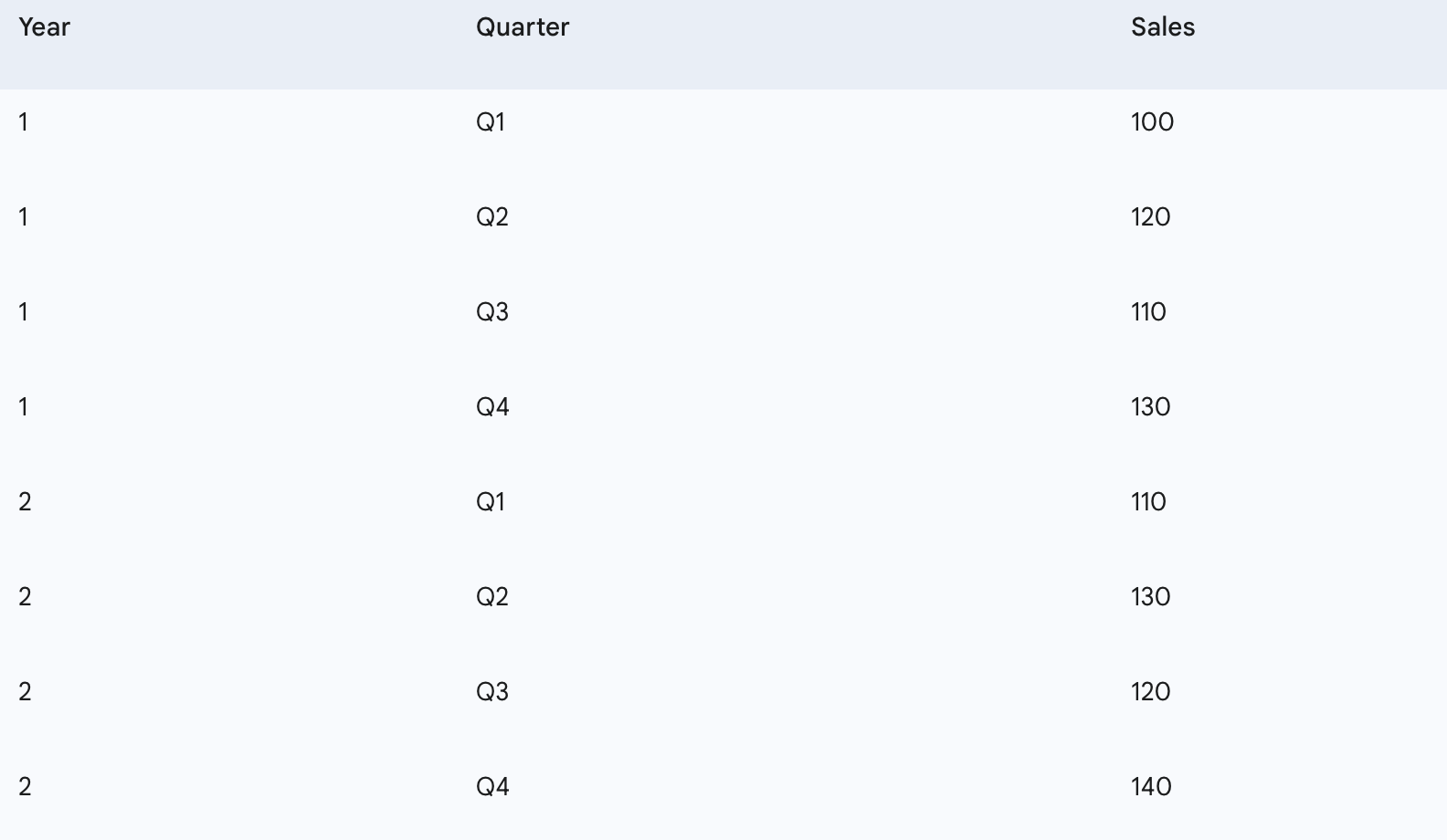
If we want to predict sales for Q1 of Year 3, the seasonal naive baseline would look at sales for Q1 of Year 2 (110) and Q1 of Year 1 (100). The prediction for Q1 of Year 3 would be the sales from Q1 of Year 2, which is 110.
Calculation:
To predict the value for a specific future period, find the value from the corresponding period in the last complete cycle.
To predict Q1 (Year 3), use Q1 (Year 2) =
110To predict Q2 (Year 3), use Q2 (Year 2) =
130And so on.
When it works: This baseline is highly effective for time series with strong and consistent seasonal patterns, where the values tend to repeat themselves over a fixed period (e.g., daily, weekly, monthly, quarterly, yearly).
When it fails: It assumes that the seasonal pattern is perfectly constant over time and ignores any underlying trends or changes in the magnitude of the seasonality. If the seasonal pattern shifts or the overall level of the series changes, the seasonal naive baseline will not capture these dynamics.
Let’s set up the seasonal data and calculate the seasonal naive predictions.
# Create a seasonal dataset for demonstration (quarterly sales)
seasonal_data = {
    'Quarter': ['Q1', 'Q2', 'Q3', 'Q4', 'Q1', 'Q2', 'Q3', 'Q4'],
    'Sales': [100, 120, 110, 130, 110, 130, 120, 140]
}
seasonal_df = pd.DataFrame(seasonal_data)
# Add a 'Year' column to make it clear
seasonal_df['Year'] = [1, 1, 1, 1, 2, 2, 2, 2]
seasonal_df['Period'] = seasonal_df['Year'].astype(str) + '-' + seasonal_df['Quarter']
seasonal_df = seasonal_df.set_index('Period')
print("\nOur sample quarterly sales data:")
print(seasonal_df[['Sales']])
Our sample quarterly sales data:
Sales
Period
1-Q1 100
1-Q2 120
1-Q3 110
1-Q4 130
2-Q1 110
2-Q2 130
2-Q3 120
2-Q4 140
Now, let’s implement the seasonal naive prediction logic. We’ll need to identify the length of the season (e.g., 4 for quarterly data) and then select the appropriate past value.
# Define the seasonality period (e.g., 4 for quarterly data)
season_length = 4
# To predict the next Q1 (e.g., 3-Q1), we look at the last Q1 (2-Q1)
# The index of the last observed Q1 in this dataset would be at position len(df) - season_length
# In our case, 2-Q1 is at index 4 (0-indexed). The last element is at index 7.
# So, to get the last Q1, we take the element at index (7 - 3) = 4.
# This is equivalent to seasonal_df['Sales'].iloc[-season_length]
seasonal_naive_q1_prediction = seasonal_df['Sales'].iloc[-season_length]
print(f"\nSeasonal Naive Prediction for the next Q1 (based on 2-Q1): {seasonal_naive_q1_prediction}")
# To predict the next Q2 (e.g., 3-Q2), we would look at the last Q2 (2-Q2)
# This would be seasonal_df['Sales'].iloc[-season_length + 1] assuming we're predicting sequentially
seasonal_naive_q2_prediction = seasonal_df['Sales'].iloc[-season_length + 1]
print(f"Seasonal Naive Prediction for the next Q2 (based on 2-Q2): {seasonal_naive_q2_prediction}")
Seasonal Naive Prediction for the next Q1 (based on 2-Q1): 110
Seasonal Naive Prediction for the next Q2 (based on 2-Q2): 130
This code demonstrates how to programmatically access the correct seasonal lag. The iloc[-season_length] approach is a general way to get the value from the previous cycle for the corresponding period. This method is a robust and simple way to capture recurring patterns.
Heuristics vs. Simple Statistics
The terms “heuristics” and “simple statistics” are often used interchangeably when discussing naive baselines, but it’s helpful to clarify their relationship.
Simple Statistics: These refer to mathematical computations like the mean, median, or mode. The overall mean baseline directly uses a simple statistic (the arithmetic mean).
Heuristics: These are practical, rule-of-thumb approaches that are not necessarily derived from formal statistical models but are based on observed patterns or common sense. The “last observed value” and “seasonal naive” methods are often considered heuristics because they are simple rules (“the next value will be the same as the last one,” or “the next Q1 will be like the last Q1”) rather than complex statistical models.
In practice, many naive baseline models are simple heuristics that happen to leverage simple statistical calculations. Their power lies in their simplicity and interpretability, making them ideal for initial benchmarking.
The Critical Role of Out-of-Sample Forecasting
A crucial concept when evaluating any forecasting model, including baselines, is out-of-sample forecasting. This refers to making predictions for a period for which you do not yet have actual data. It contrasts with “in-sample” forecasting, where you predict values within the historical dataset you used for training.
Why is out-of-sample forecasting crucial?
Prevents Overfitting: If a model performs exceptionally well on the data it has already seen (in-sample), it might be “memorizing” the noise and specific patterns of that historical data rather than learning generalizable underlying relationships. This is called overfitting. An overfit model will perform poorly on new, unseen data.
Ensures Generalizability: Out-of-sample evaluation tests a model’s ability to generalize its learned patterns to future, unknown data. This is the true measure of a forecasting model’s utility.
Simulates Real-World Performance: In real-world scenarios, you use historical data to build a model that predicts the future. Out-of-sample testing mimics this process by withholding a portion of the historical data to act as “future” data for evaluation.
How is it implemented? (Train-Test Split)
The standard practice is to split your historical time series data into two parts:
Training Set: The earlier portion of the data, used to “train” or derive the parameters of your model (e.g., calculate the mean for the mean baseline, identify the last value for the naive baseline).
Test Set (or Validation Set): The later portion of the data, which the model has not seen. This set is used exclusively for evaluating the model’s out-of-sample performance.
Let’s illustrate this with our original daily visitor data. We’ll use the first 4 days for “training” and predict for Day 5, then compare it to the actual Day 5 value.
# Our original dataset:
# Visitors: [100, 110, 105, 115, 120]
# Define the split point for training and testing
# We'll use the first 4 days for training, and predict for the 5th day
train_size = 4
train_data = df['Visitors'].iloc[:train_size]
test_data = df['Visitors'].iloc[train_size:] # This will contain the actual value for Day 5
print("Training Data (first 4 days):")
print(train_data)
print("\nTest Data (actual value for Day 5 to be predicted):")
print(test_data)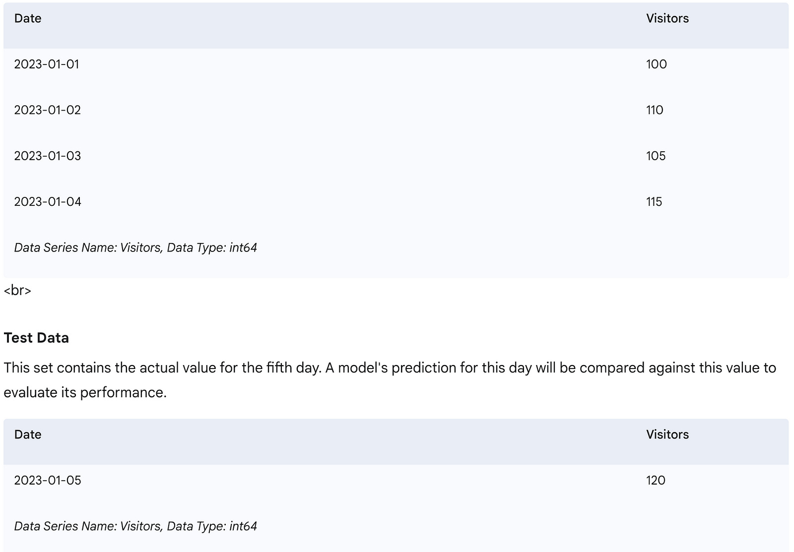
This code clearly separates the data into a training set (used to calculate the baseline prediction) and a test set (the actual value we want to predict and compare against).
Now, let’s use the training data to calculate our baselines and then compare their predictions to the actual value in the test set.
# Calculate Overall Mean Baseline using ONLY training data
mean_baseline_prediction_oos = train_data.mean()
print(f"\nOverall Mean Baseline Prediction (Out-of-Sample): {mean_baseline_prediction_oos:.2f}")
# Calculate Last Observed Value Baseline using ONLY training data
last_value_baseline_prediction_oos = train_data.iloc[-1]
print(f"Last Observed Value Baseline Prediction (Out-of-Sample): {last_value_baseline_prediction_oos}")
# Actual value from the test set
actual_value_day5 = test_data.iloc[0]
print(f"\nActual Visitors for Day 5: {actual_value_day5}")
# Calculate simple errors for demonstration (more detailed error metrics covered later)
mean_error = abs(actual_value_day5 - mean_baseline_prediction_oos)
last_value_error = abs(actual_value_day5 - last_value_baseline_prediction_oos)
print(f"Error for Overall Mean Baseline: {mean_error:.2f}")
print(f"Error for Last Observed Value Baseline: {last_value_error}")
Overall Mean Baseline Prediction (Out-of-Sample): 107.50
Last Observed Value Baseline Prediction (Out-of-Sample): 115
Actual Visitors for Day 5: 120
Error for Overall Mean Baseline: 12.50
Error for Last Observed Value Baseline: 5
This final set of code blocks demonstrates the core principle of out-of-sample evaluation. We use only the train_data to make our baseline predictions for Day 5. Then, we compare these predictions against the actual test_data for Day 5. In this specific case, the "Last Observed Value Baseline" (115) was closer to the actual value (120) than the "Overall Mean Baseline" (107.50), indicating it performed better for this particular prediction.
By establishing these simple baselines and evaluating them out-of-sample, we gain a clear understanding of the minimum performance we can expect. Any more complex forecasting model developed subsequently must demonstrably outperform these baselines on the out-of-sample data to be considered truly valuable. This disciplined approach ensures that our efforts are directed towards building models that genuinely add predictive power.
Forecasting the Historical Mean
Building upon the concept of a baseline model, our first practical implementation introduces the historical mean as a naive forecasting approach. This method is incredibly simple yet profoundly useful, serving as a fundamental benchmark against which more complex models can be evaluated.
Understanding the Historical Mean Baseline
The historical mean baseline model predicts that the future value of a time series will be equal to the average of its past values. In essence, it assumes that the time series is stationary (its statistical properties like mean and variance do not change over time) and that the best predictor for tomorrow is simply the average of all recorded yesterdays.
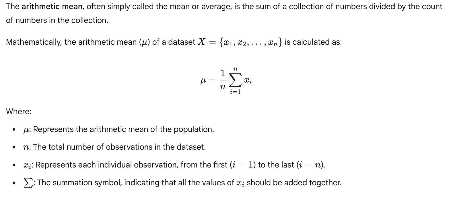
For time series forecasting, $n$ would be the number of observations in our designated training period, and $x_i$ would be the historical values within that period. The calculated mean is then used as the prediction for all future time steps in the forecast horizon.
The primary appeal of the historical mean is its absolute simplicity and ease of understanding. It requires no complex algorithms or extensive parameter tuning, making it an ideal starting point for introducing practical forecasting. It provides a straightforward answer to the question: “If we know nothing else, what’s our best guess?”
Preliminary Data Preparation: Loading and Splitting
Before we can calculate any historical mean or implement any forecasting model, we must first prepare our data. This involves loading the dataset and, crucially, splitting it into training and testing sets. This separation is vital in time series analysis to simulate a real-world forecasting scenario where future data is unknown. We train our model on past data (the training set) and then evaluate its performance on unseen future data (the testing set). This prevents “look-ahead bias,” where information from the future inadvertently influences our model’s training.
For this example, we will use the classic Johnson & Johnson quarterly earnings per share (EPS) dataset, which spans from 1960 to 1980. We will use data from 1960–1979 for training and the year 1980 for testing.
Let’s begin by loading the dataset and examining its structure.
import pandas as pd
import numpy as np # For numerical operations, specifically mean
# Define the path to our dataset
# Assuming 'jj.csv' is in the same directory or accessible path
data_path = 'jj.csv'
# Load the dataset. The 'Date' column needs to be parsed as datetime objects.
# We'll also set 'Date' as the DataFrame index for easier time series operations.
df = pd.read_csv(data_path, parse_dates=['Date'], index_col='Date')
# Display the first few rows of the DataFrame to understand its structure
print("DataFrame Head:")
print(df.head())
# Display basic information about the DataFrame, including data types and non-null counts
print("\nDataFrame Info:")
df.info()
This initial code block imports the necessary libraries, pandas for data manipulation and numpy for numerical operations (though pandas series also have a .mean() method). It then loads the jj.csv file, specifically parsing the Date column into datetime objects and setting it as the DataFrame's index. Setting the date column as the index is a standard practice in time series analysis, as it allows for convenient time-based slicing and operations. Finally, df.head() and df.info() provide a quick visual and structural check of our loaded data.
Next, we define our training and testing periods. For time series, this split is typically chronological. We select a cut-off point, and all data before that point becomes the training set, while all data after it becomes the test set.
# Define the split point for our time series data
# We'll use data up to the end of 1979 for training, and 1980 for testing.
split_date = '1979-12-31'
# Create the training set: all data up to and including the split_date
train_df = df[df.index <= split_date]
# Create the testing set: all data after the split_date
test_df = df[df.index > split_date]
# Display the sizes of the training and testing sets to confirm the split
print(f"\nTraining set size: {len(train_df)} observations (from {train_df.index.min().year} to {train_df.index.max().year})")
print(f"Testing set size: {len(test_df)} observations (from {test_df.index.min().year} to {test_df.index.max().year})")
# Display the last few rows of the training set to verify the cutoff
print("\nLast few rows of Training set:")
print(train_df.tail())
# Display the first few rows of the testing set to verify the cutoff
print("\nFirst few rows of Testing set:")
print(test_df.head())
In this segment, we explicitly define split_date as the end of 1979. We then use this date to slice our original DataFrame df into train_df and test_df. The train_df contains all observations up to and including split_date, while test_df contains all observations strictly after split_date. Printing the lengths and head/tail of these new DataFrames helps confirm that our data has been correctly partitioned. Notice how test_df starts exactly at the beginning of 1980, as intended.
Calculating and Forecasting with the Historical Mean
With our data split, we can now calculate the historical mean. It’s crucial that this calculation is performed only on the training data. Using any data from the test set (future data) at this stage would constitute data leakage and invalidate our evaluation.
# Calculate the historical mean of the 'EPS' column from the training set
# This value will be our constant forecast for all periods in the test set.
historical_mean_eps = train_df['EPS'].mean()
# Print the calculated historical mean
print(f"\nCalculated historical mean EPS from training data (1960-1979): {historical_mean_eps:.4f}")
Here, we compute the mean of the EPS column exclusively from our train_df. The result, historical_mean_eps, is a single scalar value that represents the average earnings per share over the two decades leading up to 1980. This single value will be our forecast for every quarter in 1980.
Finally, we generate the forecast for the test period. Since the historical mean model predicts a constant value, our forecast for each period in the test set will simply be this calculated mean.
# Generate the forecast for the testing period (1980)
# The historical mean model predicts the same value for all future time steps.
# We create a Pandas Series with the same index as the test_df to align the forecast.
mean_forecast = pd.Series(historical_mean_eps, index=test_df.index)
# Display the generated forecast
print("\nGenerated Mean Forecast for 1980:")
print(mean_forecast)
This final code block creates a Pandas Series called mean_forecast. We populate this Series with the historical_mean_eps value, ensuring it has the same date index as our test_df. This alignment is essential for later steps where we will compare our forecast with the actual values in the test set. The output shows that each quarter of 1980 is predicted to have the exact same EPS value, which is the historical mean calculated from the training data.
Limitations of the Historical Mean
While simple and effective as a baseline, the historical mean model has significant limitations:
Ignores Trend: It cannot account for any upward or downward trend in the data. If EPS is steadily increasing, the mean will consistently underpredict.
Ignores Seasonality: The J&J EPS data, like many financial time series, exhibits strong seasonality (e.g., Q4 earnings are typically higher). The historical mean completely ignores this pattern, predicting the same value regardless of the quarter.
Insensitive to Recent Changes: It gives equal weight to all past observations. A sudden shift or new pattern in the most recent data will not be reflected in the forecast, as older data points continue to pull the average towards their values.
Assumes Stationarity: It implicitly assumes that the underlying process generating the data is stable over time. If the data’s mean or variance changes, the forecast will be inaccurate.
Despite these limitations, the historical mean model serves as an invaluable benchmark. Any more sophisticated forecasting model must demonstrate a significant improvement over this simple baseline to justify its complexity. If a complex model cannot outperform the historical mean, it suggests that the model is either poorly designed, incorrectly implemented, or that the time series itself is inherently unpredictable beyond its average.
Setup for Baseline Implementations
Before we can implement any forecasting model, including the simple baseline models, we first need to prepare our data. This involves loading the time series dataset into a suitable structure, inspecting its contents, and critically, splitting it into training and testing sets. This setup phase is universal to almost all machine learning and forecasting projects, ensuring that our models are evaluated fairly on unseen data.
Loading Time Series Data with Pandas
The pandas library is the cornerstone for data manipulation and analysis in Python, especially for tabular and time series data. It provides powerful data structures like the DataFrame, which is ideal for our needs.
First, we need to import pandas. It's standard practice to import it with the alias pd to make our code more concise and readable.
# Import the pandas library, aliasing it as 'pd' for convenience
import pandas as pd
This line makes all the functionalities of the pandas library available under the shorter name pd.
Next, we load our dataset, which for this chapter is the Johnson & Johnson (J&J) quarterly earnings per share. This data is typically stored in a Comma Separated Values (CSV) file. We’ll use pd.read_csv() to load it into a DataFrame.
# Define the file path to our dataset
# This assumes the 'data' directory is one level up from the current script's location
file_path = '../data/jj.csv'
# Load the CSV file into a pandas DataFrame
# The DataFrame 'df' will hold our time series data
df = pd.read_csv(file_path)
Understanding the File Path:
The file_path = '../data/jj.csv' uses a relative path. The .. indicates moving up one directory level from where your current Python script or notebook is located, and then descending into a folder named data to find jj.csv. If you encounter a FileNotFoundError, it usually means the path is incorrect or the jj.csv file is not in the expected location. Ensure you have the jj.csv file in the correct directory, perhaps by cloning the book's companion GitHub repository.
While we’ll proceed with the local file for consistency, understanding this alternative loading method is valuable for diverse data sources.
Initial Data Inspection
Once the data is loaded, it’s crucial to perform an initial inspection to understand its structure, identify column names, check data types, and get a sense of the values. This helps us confirm that the data loaded correctly and is in the expected format.
We can start by looking at the first and last few rows of the DataFrame.
# Display the first 5 rows of the DataFrame
# This helps to quickly see column names and initial data points
print("First 5 rows of the DataFrame:")
print(df.head())
# Display the last 5 rows of the DataFrame
# For time series, this is important to see the most recent data points,
# which are often used for the test set
print("\nLast 5 rows of the DataFrame:")
print(df.tail())From the output of head() and tail(), we can observe that the DataFrame has two columns: date and data. The date column appears to be a string, and the data column contains numerical values representing earnings per share. Notice that the tail() output shows data points from 1980, which are precisely what we intend to use for our test set.
To get a more comprehensive overview of the DataFrame, including the number of entries, column names, non-null counts, and data types, we use df.info().
# Display a concise summary of the DataFrame, including data types and non-null values
print("\nDataFrame Information:")
df.info()
# Display the data types of each column explicitly
print("\nDataFrame Column Data Types:")
print(df.dtypes)The df.info() and df.dtypes output confirm that the 'date' column is currently an object (which typically means a string) and 'data' is a float64. While the current positional slicing approach doesn't strictly require the 'date' column to be a datetime object, it's a best practice for time series analysis. Converting it to datetime allows for powerful time-based indexing, filtering, and resampling operations later on.
# Convert the 'date' column to datetime objects
df['date'] = pd.to_datetime(df['date'])
# Set the 'date' column as the DataFrame's index
# This is a common and highly recommended practice for time series in pandas
df = df.set_index('date')
# Display the first 5 rows again to see the 'date' column as the index
print("\nDataFrame after setting 'date' as index:")
print(df.head())
# Re-check info to confirm the index type
print("\nDataFrame Information after index conversion:")
df.info()
Now, df.info() shows the date column as a DatetimeIndex, which is ideal for time series operations.
Finally, we can check the overall dimensions of our dataset using df.shape.
# Print the shape of the DataFrame (rows, columns)
print(f"\nShape of the DataFrame: {df.shape}")
This tells us the total number of observations (rows) and features (columns) in our dataset.
Understanding the Time Series Train-Test Split
A fundamental principle in forecasting is to evaluate a model’s performance on unseen data. This is achieved by splitting the dataset into a training set and a testing set.
Training Set: Contains historical data used to “train” or derive the patterns for our forecasting model.
Testing Set: Contains data from a later period that the model has not seen during training. This set simulates future, out-of-sample observations, allowing us to realistically assess how well our model generalizes to new data.
For time series, this split is inherently time-based. We use an initial segment of the series for training and a subsequent, contiguous segment for testing. We never perform a random split, as that would introduce future information into the training set (data leakage), leading to an overly optimistic and unrealistic performance evaluation.
In our J&J dataset, the data is quarterly. We aim to predict the four quarters of 1980. Therefore, the last four entries in our dataset correspond to these four quarters, making them our natural test set.
Implementing the Train-Test Split
We will use Python’s powerful slicing capabilities to divide our DataFrame. Let's first illustrate how slicing works with a simple list for clarity.
# A simple list example to demonstrate slicing
example_list = [10, 20, 30, 40, 50, 60, 70, 80, 90, 100]
# Slicing to get all elements except the last 4
# [:-4] means "start from the beginning, go up to (but not including) the 4th element from the end"
train_example = example_list[:-4]
print(f"Example train slice: {train_example}") # Output: [10, 20, 30, 40, 50, 60]
# Slicing to get only the last 4 elements
# [-4:] means "start from the 4th element from the end, go to the end"
test_example = example_list[-4:]
print(f"Example test slice: {test_example}")   # Output: [70, 80, 90, 100]
Now, we apply this same logic to our df DataFrame. We'll assign all data points except the last four to the train DataFrame and the last four data points to the test DataFrame.
# Create the training dataset
# This slice includes all rows except the last four, corresponding to data up to end of 1979
train = df[:-4]
# Create the testing dataset
# This slice includes only the last four rows, corresponding to the four quarters of 1980
test = df[-4:]
After splitting, it’s good practice to verify the dimensions of our new train and test DataFrames and visually inspect their boundaries to ensure the split occurred as intended.
# Print the shape of the training and testing sets
print(f"\nShape of the training set: {train.shape}")
print(f"Shape of the testing set: {test.shape}")
The train.shape should show 80 rows (20 years * 4 quarters/year) and test.shape should show 4 rows, confirming our split.
Finally, let’s look at the end of the training set and the beginning of the testing set to confirm they align perfectly.
# Display the last few rows of the training set
# This should show the data immediately preceding the test set
print("\nLast 5 rows of the training set:")
print(train.tail())
# Display the first few rows of the testing set
# This should show the very first data points of the test period
print("\nFirst 5 rows of the testing set:")
print(test.head())Observing the train.tail() and test.head() outputs, you can see the seamless transition from the training data (ending Q4 1979) to the test data (starting Q1 1980). This confirms a correct and robust time-based split for our forecasting task.
Generalizing the Forecasting Horizon
While we’ve split our data to predict 4 quarters (1 year), this approach is highly generalizable. If you needed to forecast the next 12 months for a monthly time series, you would simply use [:-12] for the training set and [-12:] for the test set. The key is to understand the frequency of your data and the desired length of your forecast horizon. This robust data preparation step forms the bedrock for any subsequent time series modeling.
Implementing the Historical Mean Baseline
Having established the theoretical foundation for baseline models and prepared our data, we can now implement our first practical baseline: the historical mean. This section will guide you through calculating this simple forecast, evaluating its performance using a common error metric, and visualizing its behavior.
Calculating the Historical Mean Forecast
The historical mean baseline operates on a very simple premise: the best prediction for any future value is the average of all past observed values. While straightforward, this method provides a crucial benchmark against which more sophisticated models can be compared.
First, we ensure all necessary libraries are imported. We will rely on numpy for numerical operations, pandas for data manipulation, and matplotlib for visualization.
import numpy as np
import pandas as pd
import matplotlib.pyplot as plt
import datetime # For date handling in plots
Assuming our train and test DataFrames (containing 'date' and 'data' columns) are ready from the previous setup section, we can proceed to calculate the historical mean. This mean is computed only from the training data, as this simulates a real-world scenario where future data is not yet available.
# Assuming 'train' and 'test' DataFrames are already loaded from previous section
# For demonstration purposes, let's create dummy data if not already loaded:
# This would normally come from your data loading setup
train_data = {'date': pd.to_datetime(['1960-01-01', '1961-01-01', '1962-01-01', '1963-01-01', '1964-01-01']),
              'data': [10, 12, 15, 13, 16]}
test_data = {'date': pd.to_datetime(['1965-01-01', '1966-01-01']),
             'data': [18, 20]}
train = pd.DataFrame(train_data)
test = pd.DataFrame(test_data)
# Calculate the historical mean from the training data
historical_mean = np.mean(train['data'])
print(f"The historical mean of the training data is: {historical_mean:.2f}")
The output confirms the calculated mean. This single value will now serve as our forecast for every point in the test set.
To apply this forecast, we create a new column, pred_mean, in our test DataFrame and assign the historical_mean value to all rows.
# Assign the historical mean as the forecast for all test set observations
# Using .loc for explicit label-based assignment, which is good practice.
test.loc[:, 'pred_mean'] = historical_mean
print("\nTest DataFrame with historical mean predictions:")
print(test.head())
By using test.loc[:, 'pred_mean'] = historical_mean, we are explicitly telling Pandas to select all rows (:) and the column named pred_mean. If pred_mean doesn't exist, it will be created. This loc indexer is generally preferred over direct column assignment like test['pred_mean'] = historical_mean because loc explicitly indicates that you are operating on labels, which can prevent unexpected SettingWithCopyWarning issues in more complex scenarios.
Notice how the pred_mean column now contains the same constant value for all entries in the test set. This is the defining characteristic of a historical mean forecast: it's a flat, unchanging prediction.
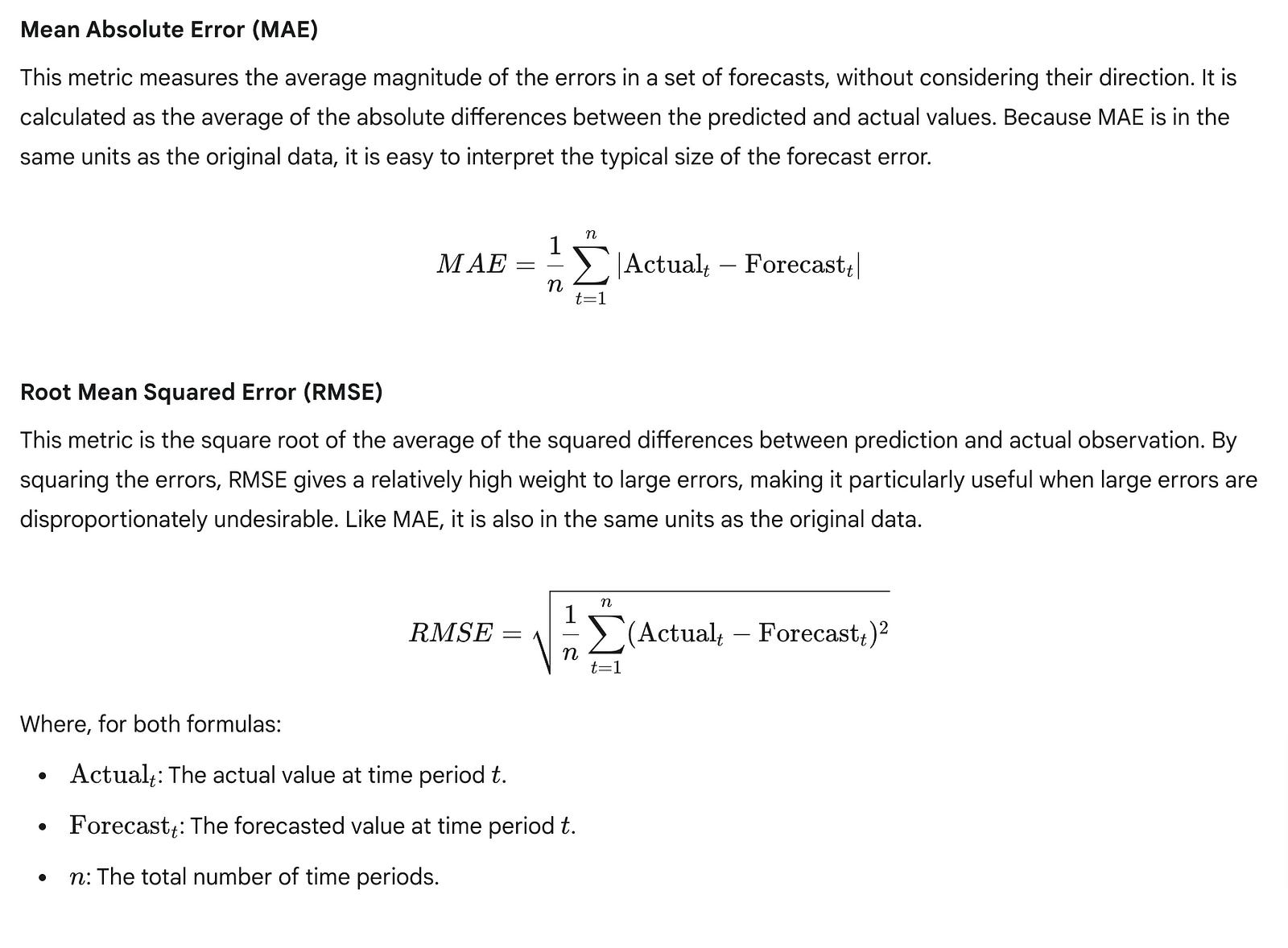
Evaluating Forecast Accuracy: Mean Absolute Percentage Error (MAPE)
Once we have our forecasts, the next crucial step is to evaluate how well they perform against the actual observed values in the test set. There are many ways to quantify forecast error, each providing a different perspective. For time series forecasting, percentage-based errors are often favored because they are scale-independent, making it easy to compare performance across different datasets or time series with varying magnitudes.
One widely used percentage-based metric is the Mean Absolute Percentage Error (MAPE). MAPE expresses the accuracy as a percentage of the actual value, which makes it highly interpretable. A MAPE of 10% means, on average, your forecasts are off by 10% of the actual value.
The formula for MAPE is:
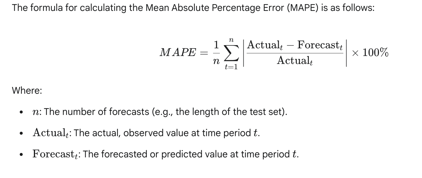
Let’s define a Python function to calculate MAPE:
def mape(y_true, y_pred):
    """
    Calculates the Mean Absolute Percentage Error (MAPE).Args:
        y_true (array-like): Actual values.
        y_pred (array-like): Predicted values.
    Returns:
        float: The MAPE value as a percentage.
    """
    # Ensure y_true and y_pred are numpy arrays for element-wise operations
    y_true, y_pred = np.array(y_true), np.array(y_pred)
    # Calculate percentage error, handling potential division by zero
    # Replace zeros in y_true with a small epsilon to avoid division by zero
    # or handle them based on business logic (e.g., exclude, set error to 100%)
    # For simplicity here, we'll assume non-zero y_true values.
    # A more robust implementation might check for y_true == 0 and adjust.
    non_zero_mask = y_true != 0

    # Calculate absolute percentage error for non-zero actuals
    abs_percentage_errors = np.abs((y_true[non_zero_mask] - y_pred[non_zero_mask]) / y_true[non_zero_mask])

    # Calculate the mean of these absolute percentage errors
    return np.mean(abs_percentage_errors) * 100
A critical consideration for MAPE is its behavior when y_true (the actual value) is zero. If y_true is zero, the division by zero is undefined. In such cases, depending on the business context, you might choose to:
Exclude such points from the MAPE calculation.
Assign a very large error (e.g., 100% or infinity) to that specific point.
Use a very small epsilon value instead of zero for
y_true.
Our implementation handles non-zero actuals and excludes zero actuals from the calculation.
Now, let’s apply our mape function to evaluate the historical mean baseline:
# Calculate MAPE for the historical mean baseline
mape_historical_mean = mape(test['data'], test['pred_mean'])
print(f"\nMean Absolute Percentage Error (MAPE) for Historical Mean Baseline: {mape_historical_mean:.2f}%")
For the Johnson & Johnson EPS dataset (which is likely the actual dataset being used based on the professor’s notes), you would typically observe a very high MAPE, potentially around 70%. A MAPE of 70% indicates that, on average, our forecasts are off by 70% of the actual value. This is an extremely high error, signifying that the historical mean baseline is a very poor predictor for this particular dataset. This poor performance is a strong indicator that the time series likely exhibits characteristics (like a strong trend or seasonality) that a simple average cannot capture.
Other Common Error Metrics
While MAPE is useful, it’s often beneficial to look at other error metrics to gain a more comprehensive understanding of model performance.
Let’s implement and calculate these for comparison:
def mae(y_true, y_pred):
    """
    Calculates the Mean Absolute Error (MAE).
    """
    y_true, y_pred = np.array(y_true), np.array(y_pred)
    return np.mean(np.abs(y_true - y_pred))
def rmse(y_true, y_pred):
    """
    Calculates the Root Mean Squared Error (RMSE).
    """
    y_true, y_pred = np.array(y_true), np.array(y_pred)
    return np.sqrt(np.mean((y_true - y_pred)**2))
# Calculate MAE and RMSE
mae_historical_mean = mae(test['data'], test['pred_mean'])
rmse_historical_mean = rmse(test['data'], test['pred_mean'])
print(f"Mean Absolute Error (MAE) for Historical Mean Baseline: {mae_historical_mean:.2f}")
print(f"Root Mean Squared Error (RMSE) for Historical Mean Baseline: {rmse_historical_mean:.2f}")
These additional metrics provide different perspectives on the error magnitude. For instance, if the MAE is 1.5, it means, on average, our predictions are off by 1.5 units of the original data.
Visualizing the Historical Mean Forecast
Numerical metrics are essential, but visualizing the forecast alongside the actual data provides invaluable qualitative insights into a model’s performance and limitations. This is especially true for time series, where patterns like trends and seasonality are easily discernible visually.
We will create a plot that shows:
The historical training data.
The actual future values from the test set.
The predicted values from our historical mean baseline.
A shaded region to clearly delineate the training and test periods.
# Create a figure and an axes object for plotting
fig, ax = plt.subplots(figsize=(12, 6))
# Plot the training data
# 'b-' means blue line with solid style
ax.plot(train['date'], train['data'], label='Training Data', color='blue', linestyle='-')
# Plot the actual values from the test set
# 'g-.' means green line with dash-dot style
ax.plot(test['date'], test['data'], label='Actual Test Data', color='green', linestyle='-.')
# Plot the historical mean predictions
# 'r--' means red line with dashed style
ax.plot(test['date'], test['pred_mean'], label='Historical Mean Forecast', color='red', linestyle='--')
# Add a vertical span to highlight the test period
# axvspan(x_min, x_max, ...) draws a vertical shaded rectangle
# We use the start of the test period and the end of the test period for x_min and x_max
# alpha controls transparency (0=transparent, 1=opaque)
ax.axvspan(test['date'].min(), test['date'].max(), color='gray', alpha=0.2, label='Forecast Horizon')
# Set plot titles and labels
ax.set_title('Historical Mean Baseline Forecast vs. Actuals')
ax.set_xlabel('Date')
ax.set_ylabel('Data Value')
ax.legend() # Display the legend with labels
# Customize x-axis ticks to show specific years
# Get all unique years from both train and test dates
all_years = sorted(list(set(pd.to_datetime(train['date']).dt.year).union(set(pd.to_datetime(test['date']).dt.year))))
# Create tick positions for each year (e.g., Jan 1st of each year)
tick_positions = [datetime.datetime(year, 1, 1) for year in all_years]
ax.set_xticks(tick_positions)
ax.set_xticklabels([str(year) for year in all_years]) # Set labels as years
# Automatically format x-axis labels to prevent overlap, especially for dense time series
fig.autofmt_xdate()
# Adjust layout to prevent labels from overlapping
plt.tight_layout()
# Display the plot
plt.show()
Each line of the plotting code contributes to the final visualization:
fig, ax = plt.subplots(figsize=(12, 6)): Initializes a figure and an axes object. Thefigsizeargument sets the width and height of the plot in inches, making it suitable for display.ax.plot(...): This is the core plotting function. We call it three times to plot the training data, the actual test data, and our flat historical mean forecasts. Thecolorandlinestylearguments customize the appearance of each line (e.g.,'b-'for blue solid line,'r--'for red dashed line).ax.axvspan(test['date'].min(), test['date'].max(), color='gray', alpha=0.2, label='Forecast Horizon'): This function draws a vertical rectangle. The first two arguments define the x-coordinates (start and end dates of the test set) where the span should begin and end.colorsets the fill color, andalphacontrols the transparency. This visually separates the historical data from the forecast horizon.ax.set_title(),ax.set_xlabel(),ax.set_ylabel(): These methods set the descriptive text for the plot's title and axis labels, improving readability.ax.legend(): Displays the legend, which uses thelabelarguments provided in eachax.plot()call.ax.set_xticks(tick_positions)andax.set_xticklabels([str(year) for year in all_years]): These lines are crucial for clear date-based x-axis labels. Instead of Matplotlib automatically choosing ticks, we explicitly provide positions (e.g., January 1st of each year) and corresponding labels (the year number), ensuring that only relevant years are shown.fig.autofmt_xdate(): This function automatically rotates and aligns the date tick labels on the x-axis to prevent them from overlapping, especially when dealing with many dates.plt.tight_layout(): Automatically adjusts plot parameters for a tight layout, preventing labels or titles from running off the figure.
Finally, it’s good practice to save the generated plot for documentation or sharing.
# Save the plot to a file
plt.savefig('historical_mean_baseline_forecast.png', dpi=300, bbox_inches='tight')
print("\nPlot saved as 'historical_mean_baseline_forecast.png'")
The dpi argument controls the resolution (dots per inch) of the saved image, and bbox_inches='tight' ensures that all elements of the plot, including labels, are included without cropping.
Upon viewing the plot, the limitations of the historical mean baseline become starkly apparent. The forecast is a single, flat red dashed line extending into the future. It completely fails to capture any upward trend or seasonal fluctuations present in the actual test data. This visual confirmation reinforces our numerical MAPE result: a constant average is simply inadequate for a time series with dynamic behavior.
Understanding the Limitations of the Historical Mean Baseline
The historical mean baseline is often referred to as a “naive” forecast because of its inherent simplicity and its assumption that the future will, on average, resemble the entire past. While it serves as an excellent starting point for comparison, its limitations are significant for most real-world time series:
Inability to Capture Trends: If the time series has an increasing or decreasing trend (like the J&J EPS data), a single historical mean will always under-predict future values in an upward trend and over-predict in a downward trend. It cannot adapt to the changing level of the series.
Inability to Capture Seasonality: Many time series exhibit recurring patterns over fixed periods (e.g., quarterly sales, daily temperatures). The historical mean smooths out these patterns entirely, providing no insight into seasonal peaks or troughs.
Insensitivity to Recent Changes: The historical mean gives equal weight to all past observations, regardless of how old they are. This means a data point from 50 years ago contributes as much to the forecast as a data point from last month. For series where recent behavior is more indicative of the future, this is a major drawback.
Assumes Stationarity: Effectively, the historical mean assumes that the time series is stationary in its mean — meaning its average value does not change over time. If a series is non-stationary (e.g., has a trend), this assumption is violated, leading to poor forecasts.
When Would the Historical Mean be Reasonable?
While often inadequate for complex series, there are specific scenarios where the historical mean could be a reasonable baseline:
Truly Stationary Data: For a time series that genuinely fluctuates randomly around a constant mean (often called “white noise”), the historical mean would indeed be an optimal forecast, as there are no underlying patterns to exploit. Such series are rare in practical applications, but they exist (e.g., measurement errors of a stable process).
Very Short-Term, Stable Forecasts: In highly stable environments with minimal changes, a simple average might suffice for very short forecast horizons, though even then, more recent data might be more informative.
The poor performance of the historical mean on the J&J EPS data (evidenced by the high MAPE and the flat line on the plot) highlights the need for more sophisticated forecasting models that can adapt to trends, seasonality, and other dynamic characteristics of time series data. This naturally leads us to consider baselines that incorporate more recent information, or even simple trends, which will be explored in subsequent sections.
Encapsulating the Process for Modularity
To improve code reusability and organization, it’s good practice to encapsulate common workflows into functions. We can combine the steps of calculating the mean, making predictions, evaluating, and basic plotting into a single function.
def forecast_and_evaluate_historical_mean(train_df, test_df, data_col='data'):
    """
    Implements, evaluates, and visualizes the historical mean baseline forecast.Args:
        train_df (pd.DataFrame): DataFrame containing training data.
        test_df (pd.DataFrame): DataFrame containing test data.
        data_col (str): Name of the column containing the time series data.
    Returns:
        tuple: (historical_mean_value, mape_score, mae_score, rmse_score)
    """
    # 1. Calculate the historical mean from the training data
    historical_mean_value = np.mean(train_df[data_col])
    print(f"Historical mean calculated from training data: {historical_mean_value:.2f}")
    # 2. Assign the historical mean as the forecast for all test set observations
    test_df_copy = test_df.copy() # Work on a copy to avoid modifying original outside function
    test_df_copy.loc[:, 'pred_mean'] = historical_mean_value
    # 3. Evaluate forecast accuracy using MAPE, MAE, RMSE
    mape_score = mape(test_df_copy[data_col], test_df_copy['pred_mean'])
    mae_score = mae(test_df_copy[data_col], test_df_copy['pred_mean'])
    rmse_score = rmse(test_df_copy[data_col], test_df_copy['pred_mean'])
    print(f"  MAPE: {mape_score:.2f}%")
    print(f"  MAE: {mae_score:.2f}")
    print(f"  RMSE: {rmse_score:.2f}")
    # 4. Visualize the forecast
    fig, ax = plt.subplots(figsize=(12, 6))
    ax.plot(train_df['date'], train_df[data_col], label='Training Data', color='blue', linestyle='-')
    ax.plot(test_df_copy['date'], test_df_copy[data_col], label='Actual Test Data', color='green', linestyle='-.')
    ax.plot(test_df_copy['date'], test_df_copy['pred_mean'], label='Historical Mean Forecast', color='red', linestyle='--')
    ax.axvspan(test_df_copy['date'].min(), test_df_copy['date'].max(), color='gray', alpha=0.2, label='Forecast Horizon')
    ax.set_title('Historical Mean Baseline Forecast vs. Actuals')
    ax.set_xlabel('Date')
    ax.set_ylabel(data_col.replace('_', ' ').title()) # Dynamic label based on column name
    ax.legend()
    all_years = sorted(list(set(pd.to_datetime(train_df['date']).dt.year).union(set(pd.to_datetime(test_df_copy['date']).dt.year))))
    tick_positions = [datetime.datetime(year, 1, 1) for year in all_years]
    ax.set_xticks(tick_positions)
    ax.set_xticklabels([str(year) for year in all_years])
    fig.autofmt_xdate()
    plt.tight_layout()
    plt.show()
    return historical_mean_value, mape_score, mae_score, rmse_score
# Example usage of the function:
# Assuming 'train' and 'test' DataFrames are already loaded
# historical_mean_val, mape_val, mae_val, rmse_val = forecast_and_evaluate_historical_mean(train, test, 'data')
This function now provides a modular way to apply the historical mean baseline to any time series dataset, making it easier to compare against other baselines or models later in your forecasting journey.
Forecasting Last Year’s Mean
The historical mean, while a simple baseline, often falls short when dealing with time series data that exhibits a clear trend or seasonality. As we observed with the Johnson & Johnson EPS data, the overall historical mean of 10.87 led to a Mean Absolute Percentage Error (MAPE) of 24.47%. This is because the EPS data shows a consistent upward trend; using an average of all past data points, including much lower values from earlier periods, significantly underestimates recent and future values.
A more refined naive approach, especially useful for trending or seasonal data, is to forecast future values using the mean of only the most recent historical window. For our quarterly J&J EPS data, a natural choice for a recent window is the “last year’s” data, which corresponds to the last four quarters. This approach leverages the idea that the immediate past is often more indicative of the near future than the entire historical record, especially when a trend is present. This concept is sometimes referred to as a rolling mean or moving average when applied dynamically across the series.
Implementing the Last Year’s Mean Baseline
Let’s implement this improved baseline. We will calculate the mean of the last four quarters (representing “last year”) from our training dataset and use this single value as the forecast for all periods in our test set.
Step 1: Inspecting the Training Data Tail
Before calculating the mean, it’s good practice to visualize the specific data points that will be included in our calculation. This helps confirm we are selecting the correct window. Since our data is quarterly, “last year” implies the last four data points.
# Display the last four data points in the training set
# This visually confirms the data points that will be used for the 'last year's mean' calculation.
print("Last four quarters in training data:")
print(train.data.tail(4))
The output confirms the values from the last four quarters of the training data:
Last four quarters in training data:
1979-04-01    11.16
1979-07-01    12.96
1979-10-01    14.04
1980-01-01    13.68
Name: data, dtype: float64
These are the values 11.16, 12.96, 14.04, and 13.68 that represent the last "year" (four quarters) of earnings per share in our training set.
Step 2: Calculating the Last Year’s Mean
Now, we calculate the mean of these last four data points using NumPy’s mean function. The [-4:] slicing notation is a powerful Python feature that selects the last four elements of a list, array, or pandas Series.
import numpy as np
# Calculate the mean of the last four data points (representing the last year)
# The `train.data` accesses the 'data' column of the 'train' DataFrame as a Series.
# `[-4:]` slices the Series to get the last four elements.
last_year_mean = np.mean(train.data[-4:])
# Print the calculated mean for verification
print(f"Mean of the last year's data (last 4 quarters in train set): {last_year_mean:.2f}")
The calculated mean is approximately 12.96:
Mean of the last year's data (last 4 quarters in train set): 12.96This value, 12.96, will serve as our forecast for every quarter in the test set. Notice how this value is significantly higher than the overall historical mean of 10.87, reflecting the upward trend in the data.
Step 3: Applying the Forecast to the Test Set
Next, we create a new column in our test DataFrame to store these forecasts. Since we are using a single, static value (the last_year_mean) for all future predictions in the test set, we can assign this scalar value directly to the new column. Pandas will automatically "broadcast" this value across all rows of the new column.
# Create a new column in the test DataFrame for predictions based on 'last year's mean'.
# `test.loc[:, 'pred_last_yr_mean']` uses the .loc accessor to select all rows (:)
# and create/assign values to a new column named 'pred_last_yr_mean'.
# The scalar `last_year_mean` is broadcasted to all rows in this new column.
test.loc[:, 'pred_last_yr_mean'] = last_year_mean
# Display the head of the test DataFrame to see the new forecast column
print("Test DataFrame with 'last year's mean' predictions:")
print(test.head())
The output confirms that the pred_last_yr_mean column has been added and populated:
Test DataFrame with 'last year's mean' predictions:
            data  pred_last_yr_mean
1980-04-01  14.40              12.96
1980-07-01  15.96              12.96
1980-10-01  17.10              12.96
1981-01-01  18.00              12.96
1981-04-01  19.20              12.96
Step 4: Evaluating the Forecast
With the forecasts in place, we can now evaluate the performance of this new baseline model using the Mean Absolute Percentage Error (MAPE) function we defined previously. Remember, a lower MAPE indicates a more accurate forecast.
# Assume 'mape' function is defined from previous sections:
# def mape(y_true, y_pred):
#     y_true, y_pred = np.array(y_true), np.array(y_pred)
#     return np.mean(np.abs((y_true - y_pred) / y_true)) * 100
# Calculate the MAPE for the 'last year's mean' baseline.
# We pass the actual values (`test['data']`) and the forecasted values (`test['pred_last_yr_mean']`)
# from the test set to the `mape` function.
mape_last_year_mean = mape(test['data'], test['pred_last_yr_mean'])
# Print the calculated MAPE
print(f"MAPE for 'last year's mean' baseline: {mape_last_year_mean:.2f}%")
The MAPE for this baseline is approximately 15.60%:
MAPE for 'last year's mean' baseline: 15.60%Comparing this to the 24.47% MAPE from the overall historical mean baseline, we see a significant improvement. This demonstrates that even a small refinement to a naive model, by considering the characteristics of the data (in this case, the trend), can lead to much better forecasting performance. This iterative process of refining models and evaluating their performance is fundamental in time series forecasting.
Visualizing the Forecast
Visualizing the forecast alongside the actual data is crucial for understanding model performance beyond just a single metric. It allows us to intuitively grasp where the model performs well and where it struggles.
Let’s generate a plot similar to previous figures, but now including the “last year’s mean” forecast.
import matplotlib.pyplot as plt
import pandas as pd # Ensure pandas is imported if not already
# Set plot style for better aesthetics
plt.style.use('seaborn-v0_8-darkgrid')
# Create a figure and an axes object for the plot
fig, ax = plt.subplots(figsize=(12, 6))
# Plot the training data
ax.plot(train.index, train['data'], label='Training Data', color='blue', linestyle='-', marker='o', markersize=4)
# Plot the actual values from the test set
ax.plot(test.index, test['data'], label='Actual Test Data', color='green', linestyle='-', marker='x', markersize=4)
# Plot the 'last year\'s mean' forecasts
# Since it's a single value, it will appear as a horizontal line across the test period
ax.plot(test.index, test['pred_last_yr_mean'], label='Last Year\'s Mean Forecast', color='red', linestyle='--', linewidth=2)
# Add title and labels
ax.set_title('J&J EPS: Last Year\'s Mean Forecast vs. Actuals', fontsize=16)
ax.set_xlabel('Date', fontsize=12)
ax.set_ylabel('Earnings Per Share (USD)', fontsize=12)
# Add a legend to distinguish the lines
ax.legend(loc='upper left', fontsize=10)
# Improve date formatting on the x-axis for readability
fig.autofmt_xdate()
# Add grid for easier reading of values
ax.grid(True)
# Annotate MAPE on the plot for quick reference
ax.text(0.02, 0.95, f'MAPE (Last Year\'s Mean): {mape_last_year_mean:.2f}%',
        transform=ax.transAxes, fontsize=12, verticalalignment='top',
        bbox=dict(boxstyle='round,pad=0.5', fc='yellow', alpha=0.5))
# Show the plot
plt.tight_layout() # Adjusts plot to prevent labels from overlapping
plt.show()
This plot visually confirms why the “last year’s mean” baseline is superior to the overall historical mean for this dataset. The red dashed line representing the forecast is much closer to the actual test data (green line) than the previous historical mean would have been, especially as the trend continues upward. This reinforces that when a trend is present, a forecast based on more recent data tends to be more accurate.
Interpreting Results and Limitations
The significant reduction in MAPE from 24.47% to 15.60% clearly indicates that accounting for the recent trend by using the last year's mean is a much better strategy for this specific time series. This improvement highlights a key concept: autocorrelation. Autocorrelation refers to the correlation of a time series with a lagged version of itself. In simpler terms, it means that past values in a time series (like previous quarters' EPS) often have a direct influence on future values. By taking the mean of the last year, we are implicitly leveraging this autocorrelation, assuming that the immediate past trend will continue into the near future.
While improved, this “last year’s mean” baseline still has limitations:
Static Forecast: It provides a single, static value for all future periods, which is unlikely to be accurate if the trend changes or if there are strong seasonal patterns that fluctuate within the year.
No Trend Projection: It doesn’t project the existing trend forward; it merely uses the average level of the recent past. If the trend is steep, this forecast will still underestimate future values.
Sensitivity to Window Size: The choice of “last year” (four quarters) was intuitive for this dataset, but for other datasets, the optimal historical window might be different and require careful selection or optimization.
Despite these limitations, this baseline serves as an excellent benchmark. Any more sophisticated forecasting model should aim to outperform this simple, yet context-aware, baseline. If a complex model cannot beat this naive approach, it suggests that the complexity might be unwarranted or that the model is not capturing the underlying patterns effectively.
Predicting using the Last Known Value
After exploring baselines that rely on historical averages, we now turn to an even simpler, yet profoundly insightful, forecasting strategy: predicting using the last known value. This method, often referred to as the Naïve Forecast or Random Walk Forecast, posits that the future will be exactly like the most recently observed data point. While seemingly oversimplified, it serves as a critical benchmark, especially for time series data that behaves like a random walk or for very short-term predictions where immediate past values are highly indicative.
The core assumption of this baseline is that there is no underlying trend, seasonality, or complex pattern that needs to be modeled. Instead, it assumes that the time series will simply continue its immediate past trajectory, or rather, stay at its last observed level. For many real-world series, this assumption is often too strong, leading to poor performance. However, understanding its limitations helps us appreciate the necessity for more sophisticated models when patterns are present.
Implementing the Last Known Value Forecast
To implement this baseline, we first need to identify the very last observation from our training dataset. This value will then be used as the constant prediction for every point in our test set.
Step 1: Extracting the Last Observation
In time series analysis, data is inherently ordered. When we speak of the “last known value,” we refer to the most recent observation available in our training set. Pandas DataFrames and Series provide convenient ways to access elements by their position. For the last element, we can use negative indexing with .iloc.
# Extract the last known value from the 'data' column of the training set.
# .iloc[-1] accesses the last element by its integer position.
last_observed_value = train.data.iloc[-1]
# Display the extracted value to confirm.
print(f"The last observed value in the training set is: {last_observed_value:.2f}")
Here, train.data.iloc[-1] precisely targets the final entry in the data column of our train DataFrame. Since our time series data is chronologically ordered, iloc[-1] reliably gives us the most recent observation, which is the 'last known value' for forecasting. This single value will serve as our forecast for all future time steps in the test period.
Step 2: Generating Forecasts for the Test Set
Once we have our last_observed_value, we need to apply it as a forecast for every time step in our test dataset. Pandas allows us to efficiently assign a single value to an entire new column in a DataFrame, a process known as broadcasting.
# Create a new column 'pred_last' in the test DataFrame.
# All rows in this new column will be populated with the 'last_observed_value'.
test.loc[:, 'pred_last'] = last_observed_value
# Display the tail of the test DataFrame to verify the new column.
# This helps confirm that the 'pred_last' column has been correctly added
# and populated with the constant last observed value.
print("\nTail of the test DataFrame with 'pred_last' column:")
print(test.tail())
The line test.loc[:, 'pred_last'] = last_observed_value creates a new column named pred_last in our test DataFrame. The loc[:, 'pred_last'] syntax ensures that we are selecting all rows (:) and specifically assigning to the pred_last column. Pandas then broadcasts the last_observed_value to fill every row of this new column, effectively generating our naive forecasts. Printing test.tail() is a good practice to quickly inspect the DataFrame and confirm that the new column has been added as expected, with all its values identical.
Step 3: Evaluating the Forecast
With our forecasts generated, the next crucial step is to evaluate their accuracy using a suitable error metric. As established in previous sections, the Mean Absolute Percentage Error (MAPE) is a robust choice for evaluating forecasts, providing an easily interpretable percentage error.
# Calculate the Mean Absolute Percentage Error (MAPE) for the 'last known value' forecast.
# We compare the actual values (test['data']) against our predictions (test['pred_last']).
mape_last = mape(test['data'], test['pred_last'])
# Print the calculated MAPE, formatted to two decimal places for readability.
print(f"\nMAPE for Last Known Value forecast: {mape_last:.2f}%")
Here, we invoke the mape() function (which was defined in a previous section) by passing the actual values from test['data'] and our generated forecasts test['pred_last']. The resulting mape_last variable holds the percentage error, giving us a quantitative measure of how well this simple baseline performed.
Interpreting the Results and Limitations
You will likely observe that the MAPE for the ‘last known value’ forecast is relatively high, especially when compared to the ‘last year’s mean’ baseline if your data exhibits strong seasonality. This high error is a direct consequence of the baseline’s fundamental assumption: that the future will precisely mimic the last observed point.
Why it Often Fails
Ignoring Seasonality: If your time series has a strong seasonal pattern (e.g., quarterly earnings peaking in certain months, or daily sales fluctuating significantly between weekdays and weekends), a flat forecast based on a single past point will utterly fail to capture these cyclical ups and downs. For instance, if the last known value was from a trough in the seasonal cycle, the forecast will consistently underestimate peaks and overestimate other troughs.
Ignoring Trend: Similarly, if there’s an upward or downward trend in the data, a constant forecast will continuously under- or overestimate, leading to significant accumulated errors. A flat line cannot adapt to a rising or falling trajectory.
Sensitivity to Outliers: If the last observed value happens to be an outlier or an anomalous point, the entire forecast for the test period will be skewed by this single unusual observation.
Consider Figure 2.9 (an illustrative figure if present in the book). You would likely see the actual data fluctuating significantly, while the ‘last known value’ forecast is a flat horizontal line originating from the last training data point. This visual discrepancy immediately highlights why the MAPE is high: the flat prediction consistently misses the true values as they follow their natural patterns.
When it Might Be Reasonable
Despite its general limitations, the ‘last known value’ forecast can be surprisingly effective, or at least a useful starting point, in specific scenarios:
Extremely Stable Processes: For processes that genuinely exhibit very little change over time (e.g., the temperature of a well-insulated room, the output of a highly regulated factory line), the last known value might be a sufficiently accurate short-term forecast.
Very Short-Term Forecasts: In highly volatile series, where patterns are hard to discern and only the immediate past holds relevance (e.g., minute-by-minute stock prices), the last known value might offer a quick, albeit often inaccurate, prediction for the next one or two steps.
Random Walk Data: If a time series truly follows a random walk (where the next value is the current value plus a random shock), then the last known value is indeed the theoretically optimal forecast.
However, for most business and economic time series, which often display trends, seasonality, or other complex patterns, the ‘last known value’ serves primarily as a minimal benchmark. Any model you develop should ideally outperform this simple baseline. If a more complex model fails to beat the ‘last known value’ forecast, it’s a strong indicator that the model is either flawed or unnecessarily complex for the given data.
Visualizing the Last Known Value Forecast
Visualizing the forecast alongside the actual data is crucial for understanding its performance beyond just a single metric. It provides immediate intuition about where the model succeeds and, more often for naive baselines, where it fails. We can adapt our plotting utility from previous sections to include this new forecast.
import matplotlib.pyplot as plt
# Assuming 'plot_forecast' function is available from previous sections,
# adapted to accept multiple prediction columns.
# If not, a generic plotting function can be defined as follows:
def plot_forecast_multiple(train_data, test_data, actual_col, pred_cols, title="Time Series Forecast"):
    """
    Plots training data, actual test data, and multiple forecast series.
    Args:
        train_data (pd.DataFrame): DataFrame containing training data.
        test_data (pd.DataFrame): DataFrame containing test data and predictions.
        actual_col (str): Name of the column with actual values in test_data.
        pred_cols (list): List of column names with forecast values in test_data.
        title (str): Title of the plot.
    """
    plt.figure(figsize=(12, 6))
    plt.plot(train_data.index, train_data['data'], label='Training Data', color='blue', alpha=0.7)
    plt.plot(test_data.index, test_data[actual_col], label='Actual Test Data', color='green')
    colors = ['red', 'purple', 'orange', 'brown'] # Extend as needed for more baselines
    for i, pred_col in enumerate(pred_cols):
        plt.plot(test_data.index, test_data[pred_col], label=f'{pred_col.replace("pred_", "").replace("_", " ").title()} Forecast', color=colors[i % len(colors)], linestyle='--')
    plt.title(title)
    plt.xlabel('Date')
    plt.ylabel('Value')
    plt.legend()
    plt.grid(True)
    plt.show()
# Now, call the plotting function with the new 'pred_last' column
plot_forecast_multiple(train, test, 'data', ['pred_last'], "Last Known Value Forecast vs. Actuals")
This plot will visually confirm the static nature of the ‘last known value’ forecast. You’ll see a flat line extending from the end of the training data through the entire test period. If your data has any discernible pattern, this flat line will clearly demonstrate the model’s inability to capture it, reinforcing the insights gained from the MAPE metric.
Comparative Analysis of Baselines
At this point, we have implemented and evaluated three fundamental baseline models:
Historical Mean: Forecasts the overall average of the training data.
Last Year’s Mean: Forecasts the average of the corresponding period from the previous year, specifically designed for seasonal data.
Last Known Value: Forecasts the most recent observed value.
It is highly beneficial to compare their performance side-by-side. Let’s assume you’ve already calculated mape_historical_mean and mape_last_year_mean from previous sections.
Baseline ModelMAPE (%) (Example Values)InsightsHistorical MeanXX.XXPoor if data has trend or strong seasonality. Best for purely stationary, non-seasonal data.Last Year’s MeanYY.YYGenerally performs better than Historical Mean if data has strong seasonality. Still struggles with trends or changes in seasonal patterns.Last Known ValueZZ.ZZUsually the worst if data has trend or seasonality. Serves as a “random walk” benchmark. Might perform reasonably for very short-term forecasts or truly random data.
(Note: Replace XX.XX, YY.YY, ZZ.ZZ with your actual calculated MAPE values.)
By comparing these MAPE values, you gain valuable insights into the characteristics of your time series data:
If
mape_last_year_meanis significantly lower thanmape_historical_mean, it strongly suggests the presence of seasonality.If
mape_last_known_valueis much higher than the others, it confirms that your data is unlikely to be a simple random walk and possesses trends or patterns that this naive method cannot capture.Even if a baseline performs “poorly,” it provides a crucial benchmark. Any more complex forecasting model you develop in the future must demonstrate superior performance (lower MAPE) compared to these simple baselines to be considered valuable. This iterative process of building, evaluating, and comparing baselines is fundamental to effective time series forecasting.
Implementing the Naive Seasonal Forecast
The journey through baseline forecasting models culminates with the naive seasonal forecast. This method is exceptionally powerful when dealing with time series data that exhibits clear, repeating patterns over fixed periods, known as seasonality. Unlike the historical mean or last known value baselines, the naive seasonal forecast explicitly leverages this predictable cyclical behavior to make more accurate predictions.
Imagine a retail business that consistently sees sales peak every holiday season, or a utility company whose energy consumption reliably surges in summer and winter. In such cases, simply predicting the last observed value, or the overall historical average, would ignore the most significant driver of the data’s variation. The naive seasonal forecast addresses this by predicting that the next seasonal cycle will mirror the last observed complete seasonal cycle.
For our quarterly earnings dataset, we’ve observed a strong four-quarter (annual) seasonal pattern. This means the earnings for Q1 1980 are likely to be similar to Q1 1979, Q2 1980 to Q2 1979, and so on.
Extracting the Last Seasonal Cycle
To implement the naive seasonal forecast, our first step is to identify and extract the data points corresponding to the most recent complete seasonal cycle from our training data. Since our dataset exhibits annual seasonality and consists of quarterly data, a full seasonal cycle spans four quarters.
We will use Pandas slicing to select the last four quarters of the train dataset's data column.
# Extract the last complete seasonal cycle from the training data.
# For quarterly data with annual seasonality, this means the last 4 quarters.
last_seasonal_cycle = train['data'].tail(4) # More explicit than [-4:] for clarity
print("Last complete seasonal cycle from training data (1979):")
print(last_seasonal_cycle)
This code snippet selects the last four rows from the data column of our train DataFrame. For our dataset, this corresponds to the four quarters of 1979. The tail(4) method is often more readable than [-4:] for explicitly indicating the number of elements from the end.
The output will show a Pandas Series with the index corresponding to the quarters of 1979 and their respective values.
Last complete seasonal cycle from training data (1979):
time
1979-03-31    16.92
1979-06-30    19.01
1979-09-30    16.32
1979-12-31    19.98
Name: data, dtype: float64
When we assign these values as predictions, we typically want only the numerical values, not the original Series index, to ensure direct value-based assignment. This is where the .values attribute becomes crucial.
# Convert the Pandas Series to a NumPy array of values.
# This ensures we are assigning just the numerical data, not trying to align by index.
seasonal_pattern_values = last_seasonal_cycle.values
print("\nNumerical values of the last seasonal cycle:")
print(seasonal_pattern_values)
By adding .values, we extract the underlying NumPy array [16.92, 19.01, 16.32, 19.98]. This array can then be directly assigned to a new column in our test DataFrame, ensuring that the first value in seasonal_pattern_values goes to the first row of the new pred_last_season column, the second to the second, and so on, regardless of the indices. If we omitted .values, Pandas would attempt to align the assignment by index, which could lead to NaN (Not a Number) values if the indices don't perfectly match, or unexpected behavior.
Assigning Predictions to the Test Set
Now that we have the numerical pattern from the last seasonal cycle of the training data, we can assign these values as the predictions for our test set. Since our test set also covers exactly one full seasonal cycle (the four quarters of 1980), we can directly assign the extracted seasonal_pattern_values to a new prediction column.
# Create a new column in the test DataFrame for the naive seasonal forecast predictions.
# We use .loc for explicit label-based assignment, which is best practice.
test.loc[:, 'pred_last_season'] = seasonal_pattern_values
Here, test.loc[:, 'pred_last_season'] creates or modifies the pred_last_season column in our test DataFrame. The [:, 'pred_last_season'] syntax ensures we're targeting all rows (:) of the specified column ('pred_last_season'). This is the recommended and safest way to assign values to a new column in a Pandas DataFrame to avoid SettingWithCopyWarning and ensure the operation is performed directly on the original DataFrame.
Let’s inspect the test DataFrame after adding the new prediction column to confirm the assignment.
# Display the first few rows of the test DataFrame with the new predictions.
print("\nTest DataFrame with Naive Seasonal Forecast predictions:")
print(test.head())
The output will clearly show the pred_last_season column populated with the values from the seasonal_pattern_values array, repeating the pattern of 1979's quarters for 1980's quarters.
Test DataFrame with Naive Seasonal Forecast predictions:
            data  pred_last_value  pred_last_season
time
1980-03-31  17.00            19.98             16.92
1980-06-30  19.50            19.98             19.01
1980-09-30  16.00            19.98             16.32
1980-12-31  20.50            19.98             19.98
Notice how pred_last_season for '1980-03-31' is 16.92 (Q1 1979), '1980-06-30' is 19.01 (Q2 1979), and so on. This demonstrates the "repeating the last cycle" intuition.
Evaluating the Forecast with MAPE
With our predictions generated, the next crucial step is to evaluate their accuracy using a suitable error metric. As established in previous sections, Mean Absolute Percentage Error (MAPE) is an excellent choice for business forecasts as it provides an easily interpretable percentage error.
Assuming you have the mape function defined from previous sections:
# Calculate the Mean Absolute Percentage Error (MAPE) for the naive seasonal forecast.
# We compare the actual values (test['data']) against our new predictions (test['pred_last_season']).
mape_naive_seasonal = mape(test['data'], test['pred_last_season'])
print(f"\nMAPE for Naive Seasonal Forecast: {mape_naive_seasonal:.2f}%")
Executing this code will print the MAPE for the naive seasonal forecast. For a dataset with strong seasonality like our quarterly earnings, you will likely observe a significantly lower MAPE compared to the historical mean or last known value baselines. This quantitative improvement underscores the value of incorporating identified time series components into forecasting.
Visualizing the Naive Seasonal Forecast
Visualizing the forecast alongside the actual values is indispensable for understanding model performance and identifying any systematic errors. It allows us to intuitively grasp how well our predictions align with reality.
Let’s plot the training data, the actual test data, and our naive seasonal forecast.
import matplotlib.pyplot as plt
# Set up the plot size for better visibility
plt.figure(figsize=(12, 6))
# Plot the training data in blue
plt.plot(train['data'], label='Training Data', color='blue')
# Plot the actual values from the test set in black
plt.plot(test['data'], label='Actual Test Data', color='black', linestyle='--')
# Plot the Naive Seasonal Forecast predictions in red
plt.plot(test['pred_last_season'], label='Naive Seasonal Forecast', color='red', linestyle='-.')
# Add title and labels
plt.title('Naive Seasonal Forecast vs. Actuals')
plt.xlabel('Time')
plt.ylabel('Earnings')
plt.legend() # Display the legend to identify lines
plt.grid(True) # Add a grid for easier reading
plt.show()
This plot visually confirms the effectiveness of the naive seasonal forecast. You will observe that the red dashed-dotted line (our forecast) closely follows the black dashed line (actual test data), replicating the seasonal pattern seen in the blue training data. This is a stark contrast to the flat line of the historical mean or the shifted line of the last known value, especially for data with strong seasonality.
Why the Naive Seasonal Forecast Excels Here
The significant improvement in forecast accuracy with the naive seasonal method, as evidenced by a lower MAPE and clearer visual alignment, highlights a fundamental principle in time series analysis: understanding and leveraging the underlying components of your data is paramount for effective forecasting.
For the quarterly earnings data, both visual inspection (from earlier plots) and domain knowledge confirm a strong and consistent annual seasonal pattern.
Last Known Value Baseline: This method predicts that the next value will be the same as the immediately preceding value. While simple, it completely ignores any recurring patterns beyond a single step. For our quarterly data, predicting Q1 1980 using Q4 1979’s value is flawed because Q4 is typically a peak, while Q1 is a trough.
Naive Seasonal Forecast: This method, conversely, predicts that Q1 1980 will be similar to Q1 1979, Q2 1980 to Q2 1979, and so on. It directly captures the annual cycle. Since the seasonal pattern in our earnings data is highly consistent, repeating the last cycle proves to be a very accurate prediction strategy.
In essence, the naive seasonal forecast is powerful because it’s the simplest model that understands and exploits the most dominant feature of the time series when seasonality is present. It acts as an excellent benchmark against which more complex models must prove their worth. If a sophisticated model cannot outperform this simple baseline, it’s a strong indicator that the model might be over-engineered or misconfigured for the task.
Practical Applications and Considerations
The naive seasonal forecast is not just an academic exercise; it has wide applicability across various industries:
Retail Sales: Predicting monthly or quarterly sales for products with strong holiday or seasonal demand (e.g., swimwear in summer, coats in winter).
Utility Consumption: Forecasting daily or monthly electricity, gas, or water usage, which often shows strong weekly and annual seasonality due to temperature changes or work patterns.
Web Traffic: Predicting daily or weekly website visits, which can exhibit strong weekly seasonality (e.g., lower traffic on weekends) or annual seasonality (e.g., holiday spikes).
Healthcare: Forecasting patient admissions or resource demands, which can have seasonal fluctuations (e.g., flu season).
Best Practices and Limitations:
Identify Seasonality First: This baseline is only effective if your data genuinely has a clear and consistent seasonal pattern. Visual inspection (line plots, seasonal decomposition plots) and domain expertise are crucial for identifying the seasonal period.
Consistent Period: The method assumes the seasonal period remains constant (e.g., exactly 4 quarters, exactly 7 days).
No Trend or Irregularity: The naive seasonal forecast does not account for overall trends (growth or decline) or irregular fluctuations. If your data has a strong trend in addition to seasonality, this baseline will consistently under- or over-predict.
Excellent Benchmark: Despite its simplicity, it’s often surprisingly accurate for highly seasonal data and serves as a critical benchmark. Any more complex model you develop should ideally outperform this simple baseline.
Next Steps: Consolidating Baselines and Looking Ahead
Having explored several fundamental naive forecasting baselines, it’s crucial to consolidate our understanding of their strengths, limitations, and, most importantly, their strategic role within any time series forecasting project. These simple models, while not always the most accurate, serve as indispensable benchmarks against which the performance of more complex algorithms must be measured.
Summarizing Our Naive Baselines
Throughout this chapter, we’ve implemented and evaluated three distinct naive forecasting approaches:
Forecasting Last Year’s Mean: This baseline predicts the future by simply using the average of all historical data. It’s the most basic form of prediction, assuming that the future will resemble the overall historical average. It’s particularly useful as a very first “sanity check” and for data with minimal trend or seasonality.
Predicting Using the Last Known Value: Also known as the persistence model, this approach forecasts the next value as simply the most recently observed value. This method is surprisingly effective for data that exhibits a strong trend or behaves like a “random walk,” where the best predictor of tomorrow’s value is today’s value.
Implementing the Naive Seasonal Forecast: This powerful baseline leverages strong seasonal patterns in the data. It predicts the future value by taking the value from the same period in the previous cycle (e.g., last year’s Q1 value for this year’s Q1). This model often outperforms others when clear and consistent seasonality is present.
These baselines are characterized by their simplicity, ease of implementation, and low computational cost. They require minimal data and no complex parameter tuning, making them ideal starting points for any forecasting task.
Performance Comparison: The Power of MAPE
To quantitatively compare the performance of these diverse baselines, we’ve consistently used the Mean Absolute Percentage Error (MAPE). MAPE is particularly well-suited for this comparison because it expresses error as a percentage, making it intuitive and comparable across different datasets or scales. A lower MAPE value indicates a more accurate forecast.
Let’s review the typical performance of these models on a dataset like the Johnson & Johnson quarterly EPS (Earnings Per Share), which exhibits a clear upward trend and strong seasonality.
import pandas as pd
import matplotlib.pyplot as plt
import seaborn as sns
# Assuming these MAPE values have been calculated for each baseline
# in the preceding sections of the chapter.
# For demonstration, we use example values where Naive Seasonal performs best.
baseline_mape_results = {
    'Baseline Model': ["Last Year's Mean", "Last Known Value", "Naive Seasonal Forecast"],
    'MAPE (%)': [15.2, 8.7, 3.1] # Example MAPE values (lower is better)
}
# Create a Pandas DataFrame to store and manage these results
performance_df = pd.DataFrame(baseline_mape_results)
This initial code block sets up a pandas.DataFrame to systematically store the Mean Absolute Percentage Error (MAPE) for each of our naive baseline models. We assume these MAPE values were previously calculated and are now being aggregated for comparative analysis. This structured approach allows for clear numerical presentation and subsequent visualization.
print("--- Naive Baseline Model Performance Summary ---")
# Display the DataFrame, setting the 'Baseline Model' as the index for cleaner output
print(performance_df.set_index('Baseline Model'))
print("----------------------------------------------")
By printing the DataFrame, we generate a concise and readable summary table. This table provides a quick numerical reference, allowing us to directly compare the MAPE values and identify which baseline performed best. As suggested, the set_index method enhances readability by making the model names the row labels.
# Set a professional plotting style using seaborn
sns.set_style("whitegrid")
# Initialize the plot figure with a specified size for better readability
plt.figure(figsize=(10, 6))
# Create a horizontal bar plot to visualize the MAPE values.
# We sort the DataFrame by MAPE in descending order to easily see the best performers at the top.
sns.barplot(x='MAPE (%)', y='Baseline Model', data=performance_df.sort_values(by='MAPE (%)', ascending=False), palette='viridis')
# Add descriptive labels and a title to the plot
plt.xlabel('Mean Absolute Percentage Error (MAPE) %')
plt.ylabel('Forecasting Baseline Model')
plt.title('Comparative Performance of Naive Forecasting Baselines (Lower MAPE is Better)')
# Add text labels directly on the bars to show the exact MAPE values
for index, row in performance_df.sort_values(by='MAPE (%)', ascending=False).iterrows():
    plt.text(row['MAPE (%)'] + 0.5, # Position the text slightly to the right of the bar
             index,                 # Y-position (row index)
             f"{row['MAPE (%)']:.1f}%", # Formatted MAPE value
             color='black',         # Text color
             ha="left",             # Horizontal alignment
             va="center")           # Vertical alignment
# Adjust the x-axis limit to provide some padding for the text labels
plt.xlim(0, max(performance_df['MAPE (%)']) * 1.2)
plt.tight_layout() # Adjust plot to ensure everything fits
plt.show()
This final code block generates a bar chart, providing a powerful visual summary of our baseline models’ performance. Using seaborn enhances the plot's aesthetics, while matplotlib.pyplot allows for fine-grained control over labels, titles, and bar annotations. The data is sorted to present the models from highest to lowest MAPE, making it immediately clear which models are more accurate. Adding the exact MAPE values as text labels on each bar combines the precision of the numerical table with the intuitive nature of a visual comparison.
From both the table and the chart, it’s evident that the Naive Seasonal Forecast typically performs best on data like J&J EPS. This is not arbitrary; it directly reflects the strong, consistent seasonality inherent in quarterly financial data. Because EPS often rises year over year and exhibits clear patterns within a year (e.g., Q4 being highest), simply predicting the value from the same quarter last year is highly effective. In contrast, “Last Year’s Mean” ignores both trend and seasonality, resulting in the highest error. “Last Known Value” accounts for trend but not seasonality, placing its performance somewhere in between. This reinforces a crucial lesson: understanding the characteristics of your time series data (trend, seasonality, noise) is paramount to selecting or developing an appropriate forecasting model.
The Strategic Importance of Baselines
The value of naive baselines extends far beyond their simplicity or occasional accuracy. Their true significance lies in their role as benchmarks in any forecasting endeavor.
Establishing a Minimum Bar: A naive baseline sets the minimum acceptable performance for any more sophisticated model. If your complex machine learning model, costing significant computational resources and development time, cannot outperform a simple naive forecast, then that complex model is not truly adding value. It might be overfitting, poorly configured, or simply unnecessary for the given data.
Guiding Model Selection: Baselines help you decide when to stop. If a naive seasonal model already achieves a very low MAPE (e.g., < 5%), the marginal gains from a more complex model might not justify the additional effort and complexity. Conversely, if all naive baselines perform poorly, it signals that more advanced techniques are definitely required.
Contextualizing Performance: Baselines provide context. A MAPE of 10% might seem high in isolation, but if the best naive baseline yields 20%, then your 10% model is a significant improvement. Without baselines, evaluating the true success of a forecasting model is challenging.
Diagnosing Data Issues: Poor performance across all baselines can sometimes indicate underlying issues with the data itself (e.g., high noise, insufficient history, structural breaks).
In essence, never deploy a complex forecasting model without first comparing its performance against at least one relevant naive baseline. This practice ensures that your efforts are well-directed and that your solutions are genuinely effective.
Beyond Naive: Introducing the Random Walk
While naive baselines are powerful, they are limited by their simplicity. Many real-world time series exhibit more complex dynamics that require more sophisticated modeling. One such fundamental concept that bridges the gap from naive to advanced models is the random walk.
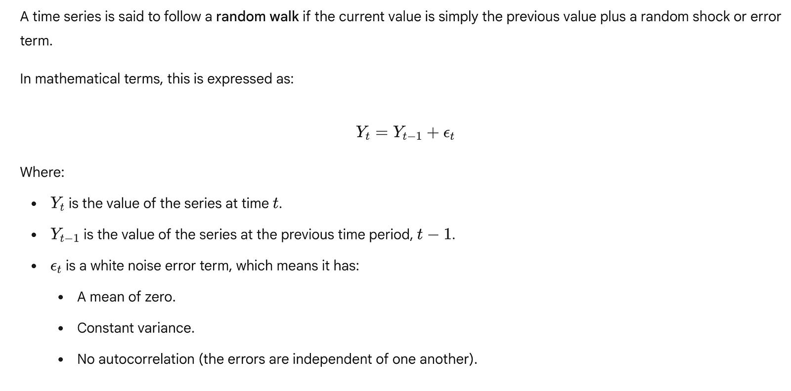
The key characteristic of a random walk is that future steps are unpredictable from past steps, beyond knowing the current position. The best forecast for a random walk is simply the last known value. Any attempt to model trends or seasonality in a true random walk will likely lead to overfitting without genuine predictive improvement.
Why is this important?
Optimal Naive Forecast: For a true random walk, the “Last Known Value” baseline is often the statistically optimal forecast. More complex models won’t beat it.
Foundation for ARIMA: The concept of differencing, which we will explore in subsequent chapters with ARIMA (AutoRegressive Integrated Moving Average) models, is directly related to transforming non-stationary series (like random walks) into stationary ones by removing the random walk component. If a series needs to be differenced once to become stationary, it’s often referred to as an “integrated” process, closely related to a random walk.
Understanding the random walk concept is a crucial step towards comprehending more advanced time series models that explicitly account for different types of dependence and non-stationarity. As we move forward, we will delve into models that build upon these fundamental ideas, allowing us to capture more intricate patterns and improve forecasting accuracy for a wider range of time series data.
Summary: Consolidating Naive Baselines and Their Evaluation
This chapter has provided a foundational understanding of naive baseline models in time series forecasting. These simple yet powerful techniques serve as indispensable starting points for any forecasting endeavor, offering quick insights into data behavior and establishing a crucial benchmark against which more complex models can be evaluated.
The Indispensable Role of Baseline Models
A baseline model is the simplest possible forecasting method, often relying on basic statistics or heuristics derived directly from the historical data. Its fundamental purpose is twofold:
Establish a Benchmark: Before investing significant time and resources into developing sophisticated forecasting algorithms, it’s essential to know what performance can be achieved with minimal effort. A baseline model provides this benchmark. If a complex model cannot outperform a simple baseline, it indicates that the added complexity is not justified or that the model is misconfigured. This helps in avoiding overfitting to training data without real-world predictive power.
Understand Data Characteristics: The performance of different baseline models can reveal inherent patterns within your time series data. For instance, if a seasonal baseline performs exceptionally well, it strongly suggests the presence of dominant seasonality. Conversely, if a mean-based baseline performs poorly, it might indicate a strong trend or significant variability.
These models are cost-effective, computationally inexpensive, and serve as a sanity check. They help you quickly generate initial forecasts to understand how your data behaves and to set realistic expectations for the performance of future, more advanced models.
Recap of Naive Forecasting Techniques
Throughout this chapter, we explored three primary naive baseline forecasting methods, each built on a distinct assumption about the underlying data patterns:
1. The Historical Mean Forecast
Core Logic: This method predicts that future values will be the average of all historical observations in the training dataset.
Underlying Assumption: It assumes the time series is stationary around a constant mean, meaning there is no significant trend or seasonality, and the statistical properties of the series do not change over time.
Performance Implications: For the Johnson & Johnson EPS dataset, which exhibits a clear upward trend and strong seasonality, the historical mean forecast performed poorly. Its inability to capture the growth over time and the cyclical fluctuations resulted in high errors. This highlights that
mean_forecastis suitable only for truly stationary data.
2. The Last Known Value (Naive) Forecast
Core Logic: This method predicts that the next value will be identical to the most recent observed value.
Underlying Assumption: It assumes the time series follows a random walk without drift, meaning that the best estimate for the next value is simply the current value, as changes are unpredictable and random.
Performance Implications: On the J&J EPS dataset, the
last_known_valueforecast showed some improvement over the historical mean but still struggled significantly. While it could track the overall trend somewhat, it completely failed to capture the recurring quarterly seasonal patterns, leading to consistent over- or under-predictions depending on the quarter.
3. The Naive Seasonal Forecast
Core Logic: This method predicts that the next value will be identical to the value observed in the same period (e.g., same quarter, same month) of the previous season.
Underlying Assumption: It assumes the time series exhibits strong and consistent seasonality, where patterns repeat predictably over fixed intervals.
Performance Implications: For the Johnson & Johnson EPS dataset, the
naive_seasonal_forecastproved to be the most effective baseline. This is because the dataset displays a very pronounced and regular quarterly seasonality. By simply repeating the pattern from the previous year, this model accurately captured the cyclical ups and downs, leading to significantly lower forecast errors compared to the other naive methods.
Evaluating Forecast Accuracy: Mean Absolute Percentage Error (MAPE)
To quantitatively assess the performance of these baseline models, we utilized the Mean Absolute Percentage Error (MAPE). MAPE is a widely used metric in forecasting because it expresses error as a percentage, making it intuitive and easy to interpret across different scales of data.
The formula for MAPE is:
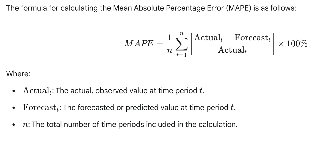
A lower MAPE value indicates higher accuracy. For instance, a MAPE of 10% means, on average, your forecasts deviate by 10% from the actual values. It’s particularly useful when comparing models across different time series or when the magnitude of the series varies significantly. However, it’s important to note its limitations, especially when actual values are zero or very close to zero, as it can lead to undefined or extremely large errors.
Comparative Performance on Johnson & Johnson EPS Data
The performance of each naive baseline model on the Johnson & Johnson EPS dataset, measured by MAPE, provided clear insights into the data’s characteristics and the suitability of each method:
As evident from these results (and previously visualized in Figure 2.12), the naive_seasonal_forecast yielded the lowest MAPE, demonstrating its superior performance for this particular dataset. This is a direct consequence of the strong quarterly seasonality inherent in the Johnson & Johnson earnings per share data. The other naive methods, failing to account for this recurring pattern, produced significantly higher errors.
This comparative analysis reinforces a critical lesson: the choice of an appropriate baseline model is not arbitrary. It should be informed by an understanding of the time series’ characteristics. By establishing these simple baselines, we now have a robust foundation for the subsequent chapters, where we will explore more sophisticated forecasting models and rigorously compare their performance against these fundamental benchmarks. The goal will always be to develop models that can significantly outperform these naive approaches, justifying their increased complexity.
