

Chapter 5: Optimizing k-Nearest Neighbors for Regression and Classification
From Feature Selection to Model Evaluation: Leveraging Cross-Validation, Hyperparameter Tuning, and Advanced Metrics in KNN Applications

Source code, download link at the end!
The k-Nearest Neighbors (KNN) algorithm is a simple yet powerful tool in both regression and classification tasks. Its non-parametric nature allows it to make predictions based on the similarity of input data points, determined by their proximity in feature space. This method has gained popularity due to its intuitive approach and flexibility, as it adapts well to various datasets without making strong assumptions about their underlying distributions. However, to maximize the performance of KNN models, careful attention must be paid to data preprocessing, feature selection, and the fine-tuning of hyperparameters such as the number of neighbors (k).
In this article, we explore the key steps involved in optimizing KNN for both regression and classification tasks. Starting with data preprocessing techniques like feature scaling and mutual information-based feature selection, we move on to cross-validation methods, model evaluation metrics, and hyperparameter tuning using grid search. Visualizations such as learning curves, validation curves, and performance metrics like root mean squared error (RMSE) and precision-recall curves are used to gain insights into model performance and stability. By combining these techniques, we aim to build robust KNN models capable of delivering accurate and reliable predictions.
import warnings
from pathlib import Path
import numpy as np
import pandas as pd
import seaborn as sns
import matplotlib.pyplot as plt
from scipy.stats import spearmanr
from sklearn.datasets import load_boston
from sklearn.neighbors import KNeighborsClassifier, KNeighborsRegressor
from sklearn.model_selection import cross_val_score, cross_val_predict, validation_curve, learning_curve, GridSearchCV
from sklearn.feature_selection import mutual_info_regression, mutual_info_classif
from sklearn.preprocessing import StandardScaler, scale
from sklearn.pipeline import Pipeline
from sklearn.metrics import make_scorer
from yellowbrick.model_selection import ValidationCurve, LearningCurve
This code snippet begins with the importation of various libraries and modules integral to data science and machine learning. The warnings module manages code warnings, allowing filtering of unwanted alerts during execution. Path from pathlib simplifies file path handling and consolidates differences across operating systems. NumPy and Pandas are essential for data manipulation, with NumPy providing powerful array objects and Pandas offering DataFrames for tabular data management. Seaborn and Matplotlib facilitate data visualization, with Seaborn enhancing Matplotlib for more visually appealing statistical graphics. The SciPy.stats library includes the spearmanr method for calculating the Spearman rank-order correlation coefficient, useful in non-parametric statistics.
Scikit-learn components include the load_boston function for accessing the Boston housing dataset, the KNeighbors Classifier and Regressor for implementing k-nearest neighbors algorithms, and model selection tools such as cross_val_score, cross_val_predict, validation_curve, and learning_curve for evaluating model performance and visualizing learning processes. GridSearchCV aids in hyperparameter tuning by testing various parameter combinations. Feature selection functions like mutual_info_regression and mutual_info_classif assess the relationship between features and target variables to identify key predictors. The StandardScaler is used for scaling features to achieve zero mean and unit variance, improving model performance. The Pipeline tool combines multiple workflow steps, including preprocessing and modeling.
Additionally, the make_scorer function allows for custom scoring metrics for model evaluation. Yellowbrick’s ValidationCurve and LearningCurve classes provide visualizations to better understand model performance over different hyperparameter values or training set sizes. This setup equips users with a comprehensive toolkit for analysis and modeling, focusing on regression and classification tasks.
%matplotlib inline
plt.style.use('fivethirtyeight')
warnings.filterwarnings('ignore')
The command %matplotlib inline is used in Jupyter notebooks to display matplotlib plots directly below the code cells, allowing for easy data visualization. The plt.style.use function with the argument ‘fivethirtyeight’ sets a clean and modern style for the plots, enhancing their readability by modifying elements such as grid lines and colors. The command warnings.filterwarnings(‘ignore’) is used to suppress any warnings that may occur during code execution, helping to maintain a clean output. However, ignoring warnings can conceal important messages that may need attention.
DATA_PATH = Path('..', '..', 'data')This line of code creates a variable named DATA_PATH and assigns it a Path object from the pathlib module, which simplifies handling filesystem paths. The ‘..’ strings are used to move up one directory level. Therefore, Path(‘..’, ‘..’, ‘data’) constructs a path that goes up two levels from the current directory to access a folder named data. As a result, DATA_PATH contains the path to the data directory located two levels up from where the script is executed, facilitating cross-platform file path management since pathlib handles operating system differences automatically.
house_sales = pd.read_csv(DATA_PATH / 'kc_house_data.csv')
house_sales = house_sales.drop(
    ['id', 'zipcode', 'lat', 'long', 'date'], axis=1)
house_sales.info()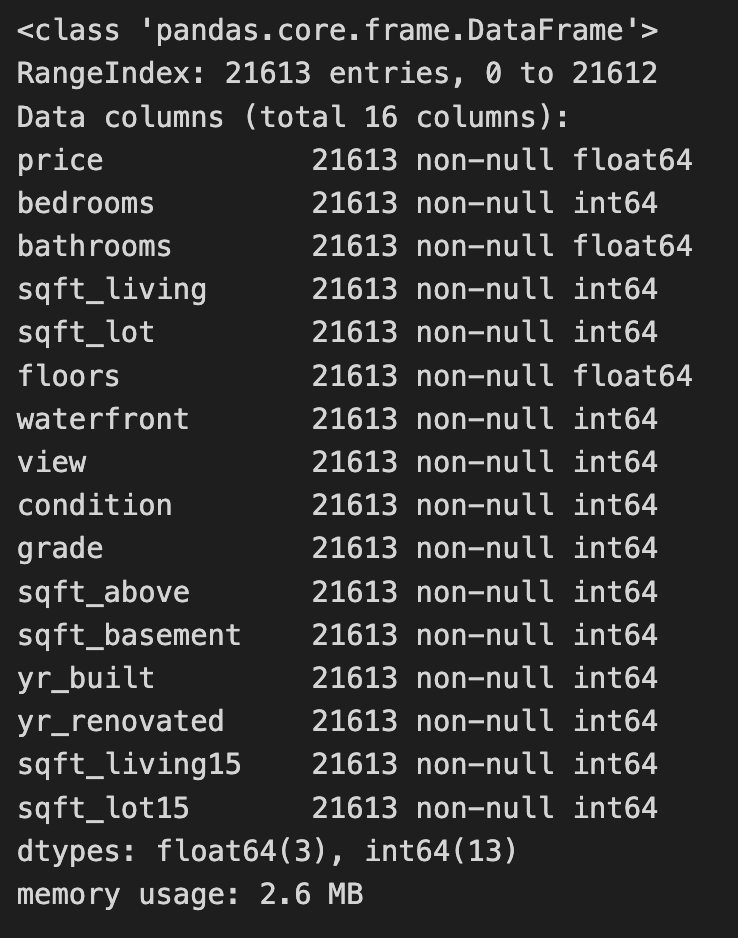
The code reads a CSV file containing house sales data into a Pandas DataFrame and removes unnecessary columns such as id, zipcode, lat, long, and date. This process simplifies the dataset to focus on features relevant for modeling, particularly for a k-nearest neighbors project. The house_sales.info() method then provides a summary of the modified DataFrame, indicating it contains 21,613 entries, with the index ranging from 0 to 21,612, confirming all entries are accounted for. The summary includes the remaining 16 columns, their data types, and the number of non-null entries, which helps in understanding the dataset’s structure and the presence of missing values. The retained columns feature attributes like price, bedrooms, bathrooms, and sqft_living, which are important for predicting house prices. Most features are of integer or float types, typical for numerical data, and the DataFrame’s memory usage is reported as 2.6 MB, indicating it is manageable for analysis. This process effectively readies the data for further exploration or modeling, especially for applying the k-nearest neighbors algorithm to predict house prices based on the selected features.
sns.distplot(house_sales.price);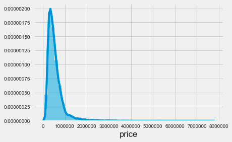
The code snippet sns.distplot(house_sales.price) uses the Seaborn library to create a distribution plot of house prices from the house_sales dataset. This function visualizes the distribution of house prices, producing a histogram alongside a kernel density estimate. The resulting plot reveals a highly skewed distribution, with most prices concentrated at the lower end, particularly between zero and just under one million. This indicates that most house sales occur at lower price points, while the tail of the distribution extends toward higher prices, showing fewer sales in that range. The density decreases sharply beyond a certain price threshold, indicating that very few houses are sold at higher prices. This visualization is essential for understanding pricing dynamics in the housing market, as it highlights the prevalence of lower-priced homes compared to luxury properties. It serves as a valuable tool for analyzing price distribution in the dataset and can inform further analysis, such as applying k-nearest neighbors for predictive modeling.
X_all = house_sales.drop('price', axis=1)
y = np.log(house_sales.price)
This snippet prepares data for a machine learning model by creating the feature set and transforming the target variable. It first creates X_all by removing the price column from the house_sales DataFrame to ensure the target variable is excluded from the features used for training. Next, it defines y as the logarithm of the price column to stabilize variance and improve model performance, particularly when the price distribution is skewed.
mi_reg = pd.Series(mutual_info_regression(X_all, y),
                   index=X_all.columns).sort_values(ascending=False)
mi_reg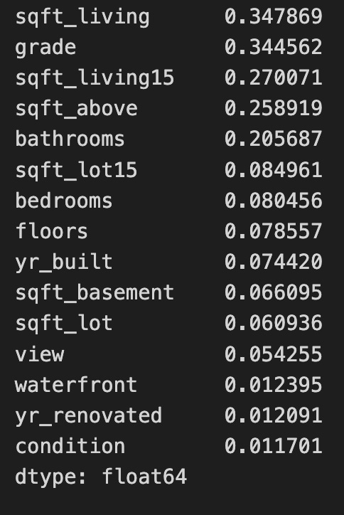
The code uses the mutual_info_regression function from the sklearn.feature_selection module to calculate the mutual information between each feature in the dataset X_all and the target variable y. This function helps to identify the relationship between features and the target in regression tasks. The result is a sorted series of mutual information scores, where each score quantifies the information gained about the target variable from the corresponding feature. Higher scores indicate a stronger relationship, meaning the feature provides more information about the target. For example, features like sqft_living and grade score the highest, making them the most informative predictors, while features such as waterfront and yr_renovated score lower, indicating they contribute less to predicting the target. This analysis supports feature selection, enabling practitioners to prioritize the most relevant features for developing predictive models. Focusing on features with higher mutual information scores can improve model performance and interpretability. The output is a series of floating-point numbers, which is standard for these statistical measures.
X = X_all.loc[:, mi_reg.iloc[:10].index]This line selects specific columns from the DataFrame X_all based on the index of the first 10 rows of the DataFrame mi_reg. It first retrieves the first 10 rows of mi_reg and obtains their index labels. Then, it uses these index labels to select the corresponding columns from X_all, applying the selection to all rows. As a result, a new DataFrame X is created, consisting solely of the columns from X_all that match the indices of the first 10 rows in mi_reg.
sns.pairplot(X.assign(price=y), y_vars=['price'], x_vars=X.columns);
The code uses the Seaborn library to create a pairplot, which visualizes relationships between multiple variables in a dataset. It combines features from the DataFrame X and the target variable price from y into a single DataFrame using X.assign(price=y). This allows for an in-depth analysis of the dataset.
The output is a grid of scatter plots, with each plot showing the relationship between price and one of the features from X. The x-axis represents a feature, while the y-axis consistently represents price, enabling a quick visual assessment of correlations. For example, there is a positive correlation between sqft_living and price, indicating that larger living spaces generally lead to higher prices. Features like grade and sqft_above also show positive relationships with price, suggesting that higher grades and more above-ground square footage are linked to increased property values.
In contrast, features such as floors and bedrooms show less distinct relationships with price, with scatter plots displaying more scattered points and no clear trend. This could indicate that these features have a less direct impact on pricing, or that other factors may be influencing price more significantly.
correl = (X
          .apply(lambda x: spearmanr(x, y))
          .apply(pd.Series, index=['r', 'pval']))

correl.r.sort_values().plot.barh();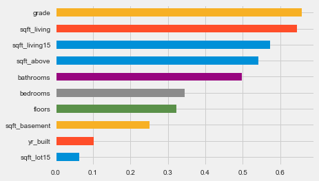
The code calculates the Spearman correlation coefficients between features in a DataFrame X and a target variable y. It uses the apply function to compute the Spearman correlation for each column in X against y, creating a new DataFrame with correlation coefficients and associated p-values. The resulting DataFrame, correl, is sorted and visualized as a horizontal bar chart, where each bar represents a feature. The bar length indicates the magnitude of the Spearman correlation coefficient, with values close to 1 or -1 indicating strong relationships, while values near 0 suggest weak relationships. Features are arranged in ascending order of their correlation coefficients, making it easy to identify those with the strongest impacts on the target variable. Features like grade and sqft_living show high positive correlations with y, implying that increases in these features lead to an increase in the target variable. In contrast, features such as yr_built and sqft_lot15 show lower correlation values. This analysis aids the k-nearest neighbors approach by highlighting which features are most significant for predicting the target variable, thus supporting feature selection and model optimization.
X_scaled = scale(X)This line of code uses a function from a library like sklearn.preprocessing to perform feature scaling on a dataset X. The scale function standardizes the features by removing the mean and scaling to unit variance. It calculates the mean and standard deviation for each feature in X and transforms the data so that the scaled features have a mean of 0 and a standard deviation of 1. This process is important in many machine learning algorithms because it ensures that all features contribute equally, preventing larger value features from dominating the learning process. The result is stored in X_scaled, which is now ready for use in training models or conducting analysis where feature scaling is beneficial.
model = KNeighborsRegressor()
model.fit(X=X_scaled, y=y)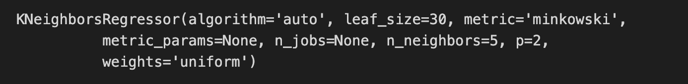
The code snippet initializes a K-Nearest Neighbors regressor model using the KNeighborsRegressor class from the sklearn.neighbors module. The model is fitted to the scaled feature data X_scaled and the target variable y, allowing it to learn the relationship between input features and target values based on the provided training data.
The output displays the configuration parameters of the KNN regressor. The algorithm is set to auto, enabling the model to select the best method for computing nearest neighbors. The n_neighbors parameter is set to 5, meaning the model will consider the five closest data points for predictions. The distance metric is specified as minkowski, with p set to 2 to utilize Euclidean distance. Additionally, the weights parameter is set to uniform, indicating that all neighbors have equal influence on the predictions.
This code snippet effectively prepares a KNN regression model to predict continuous outcomes based on input features, leveraging the specified parameters to enhance its performance. The output confirms the model’s configuration and provides insight into its operational functioning during the prediction phase.
y_pred = model.predict(X_scaled)This code uses a machine learning model to make predictions based on the input data, X_scaled. The model is an instance that has been trained on a dataset and is capable of generating predictions using the predict method. The predict method takes the preprocessed input data, X_scaled, which has undergone scaling to normalize or standardize the feature values, enhancing the model’s predictive accuracy. When model.predict(X_scaled) is called, the model evaluates the scaled input and produces predictions, which are stored in y_pred. These predictions can then be analyzed further to assess the model’s performance or inform decision-making based on the predicted outcomes.
from sklearn.metrics import (mean_squared_error,
                             mean_absolute_error,
                             mean_squared_log_error,
                             median_absolute_error,
                             explained_variance_score,
                             r2_score)
This code snippet imports critical evaluation metrics from the sklearn.metrics module for assessing regression model performance. The mean_squared_error function calculates the average squared difference between predicted and actual values, with lower values indicating better predictions. The mean_absolute_error computes the average absolute differences between predicted and actual values, presenting a clear measure of errors in the original data’s units. The mean_squared_log_error measures the average of the squared logarithmic differences, useful for targets with large value ranges, as it minimizes the effect of significant discrepancies. The median_absolute_error provides the median of absolute errors, which is more resilient to outliers compared to the mean. The explained_variance_score assesses how well the predicted values capture the variance of the actual data, with a score of 1 reflecting perfect explanation and a score near 0 indicating poor performance. The r2_score, or coefficient of determination, reveals the proportion of variance in the dependent variable explained by the model’s independent variables, with scores closer to 1 being optimal. These metrics offer a robust framework for diagnosing and improving regression model performance.
error = (y - y_pred).rename('Prediction Errors')This line of code calculates the prediction errors by subtracting the predicted values from the actual values, resulting in a new object, usually a Pandas Series, that contains the differences for each prediction. By calling rename to label the Series as Prediction Errors, it becomes easier to identify and reference later, which is useful for data visualization and model debugging. This approach effectively tracks the discrepancy between predictions and actual outcomes.
scores = dict(
    rmse=np.sqrt(mean_squared_error(y_true=y, y_pred=y_pred)),
    rmsle=np.sqrt(mean_squared_log_error(y_true=y, y_pred=y_pred)),
    mean_ae=mean_absolute_error(y_true=y, y_pred=y_pred),
    median_ae=median_absolute_error(y_true=y, y_pred=y_pred),
    r2score=explained_variance_score(y_true=y, y_pred=y_pred)
)
This code snippet calculates performance metrics for a regression model and stores them in a dictionary called scores. It computes the root mean squared error by taking the square root of the mean squared error between the true values and the predicted values, helping to assess prediction accuracy with lower values indicating better performance. It also calculates the root mean squared log error, which is useful for data with a wide range, as it penalizes underestimations less severely than RMSE. The mean absolute error is evaluated next, representing the average absolute differences between predicted and true values, with lower values being preferable. The median absolute error is calculated to provide a measure less sensitive to outliers. Lastly, the explained variance score measures how well the model captures variability in the true data, with scores closer to one indicating better model performance. This snippet effectively offers a set of performance metrics for assessing a regression model’s prediction accuracy.
fig, axes = plt.subplots(ncols=3, figsize=(15, 5))
sns.scatterplot(x=y, y=y_pred, ax=axes[0])
axes[0].set_xlabel('Log Price')
axes[0].set_ylabel('Predictions')
axes[0].set_ylim(11, 16)
sns.distplot(error, ax=axes[1])
pd.Series(scores).plot.barh(ax=axes[2], title='Error Metrics')
fig.suptitle('In-Sample Regression Errors', fontsize=24)
fig.tight_layout()
plt.subplots_adjust(top=.8);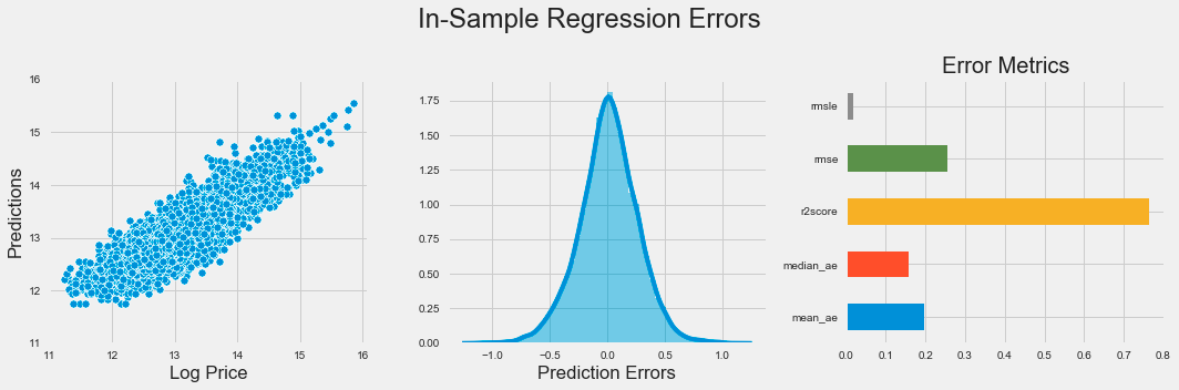
The code snippet produces a visual representation of regression errors from a k-nearest neighbors model using Matplotlib and Seaborn. It creates a figure with three horizontally arranged subplots. The first subplot is a scatter plot that illustrates the relationship between actual log prices and predicted values, with the y-axis limited to a range of 11 to 16 to emphasize the relevant data.
The second subplot shows a distribution plot of prediction errors, which are the differences between actual and predicted values. This plot reveals the spread and central tendency of the errors, indicating whether the model overestimates or underestimates log prices. Ideally, the errors should be normally distributed around zero, which implies unbiased predictions.
The third subplot is a horizontal bar chart summarizing various error metrics, including mean squared logarithmic error, mean squared error, R-squared score, median absolute error, and mean absolute error. Each metric quantifies different aspects of model performance, and the bar lengths allow for easy visual comparison of accuracy.
The figure titled In-Sample Regression Errors effectively conveys the performance of the k-nearest neighbors model through visualizations that showcase the relationship between actual and predicted values, the distribution of prediction errors, and key performance metrics. This combination of plots provides a clear understanding of the model’s strengths and weaknesses in predicting log prices.
def rmse(y_true, pred):
    return np.sqrt(mean_squared_error(y_true=y_true, y_pred=pred))

rmse_score = make_scorer(rmse)
This snippet defines a function for calculating the root mean square error (RMSE) between true values and predicted values. The rmse function calls mean_squared_error to compute the mean squared error, which measures the average squared differences between the predicted and actual values. The RMSE is then obtained by taking the square root of the mean squared error using np.sqrt from the NumPy library. Additionally, the make_scorer function creates a scoring function that can be utilized with model evaluation tools, such as cross-validation, allowing easy integration of the rmse function into various machine learning workflows. This code effectively calculates RMSE and facilitates its use in model evaluation.
cv_rmse = {}
n_neighbors = [1] + list(range(5, 51, 5))
for n in n_neighbors:
    pipe = Pipeline([('scaler', StandardScaler()),
                     ('knn', KNeighborsRegressor(n_neighbors=n))])
    cv_rmse[n] = cross_val_score(pipe,
                                X=X,
                                y=y,
                                scoring=rmse_score,
                                cv=5)
This code evaluates a K-Nearest Neighbors regression model using cross-validation to measure performance based on root mean squared error. It initializes an empty dictionary to store RMSE scores for different values of neighbors. The list of neighbors includes 1 and values from 5 to 50 in increments of 5, providing a range of options to test with the K-Nearest Neighbors Regressor.
For each neighbor value, a machine learning pipeline is created. The pipeline first scales the features with StandardScaler, which standardizes the data for effective performance of the KNN algorithm. Next, it applies the KNeighborsRegressor with the current neighbor count. The pipeline is then evaluated using cross_val_score with 5-fold cross-validation on the training data and the specified custom RMSE scoring. The resulting RMSE scores are stored in the dictionary, associating the number of neighbors with the corresponding RMSE scores from the cross-validation.
cv_rmse = pd.DataFrame.from_dict(cv_rmse, orient='index')
best_n, best_rmse = cv_rmse.mean(1).idxmin(), cv_rmse.mean(1).min()
cv_rmse = cv_rmse.stack().reset_index()
cv_rmse.columns =['n', 'fold', 'RMSE']
The code snippet processes a DataFrame named cv_rmse. It begins by converting a dictionary into a DataFrame with the keys as row indices. Then, it calculates the mean root mean square error (RMSE) for each index, which likely corresponds to different model parameter configurations, using the mean function. The index of the minimum mean RMSE is identified to determine the best parameter configuration, while the actual minimum RMSE value is also obtained. Following that, the DataFrame is reshaped from a wide format to a long format using the stack function, which combines the columns into a single values column while preserving the indices. After resetting the index, the DataFrame is cleaned and the columns are renamed to ’n’, ‘fold’, and ‘RMSE’ for clarity. This process prepares the data for further analysis or visualization.
ax = sns.lineplot(x='n', y='RMSE', data=cv_rmse)
ax.set_title(f'Cross-Validation Results KNN | Best N: {best_n:d} | Best RMSE: {best_rmse:.2f}');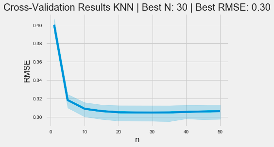
The code snippet uses the Seaborn library to generate a line plot that visualizes cross-validation results for a k-nearest neighbors model. The x-axis displays the number of neighbors, labeled n, while the y-axis shows the root mean square error, a standard metric for assessing regression model performance. The data is derived from a DataFrame named cv_rmse, which contains RMSE values for various n.
The plot’s title includes the optimal number of neighbors and the best RMSE value determined during cross-validation. This context helps viewers understand that the optimal neighbor count is 30, corresponding to a minimum RMSE of 0.30.
The graph reveals a trend where RMSE decreases as the number of neighbors increases from 0 to around 10, indicating improved model performance with more neighbors. However, after reaching a certain threshold, the RMSE stabilizes, suggesting that increasing neighbors further does not significantly improve accuracy. The shaded area around the line illustrates the confidence interval, highlighting the variability of RMSE estimates. This visualization effectively depicts the relationship between neighbor count and model performance, aiding users in selecting an appropriate value for n in KNN applications.
pipe = Pipeline([('scaler', StandardScaler()),
                 ('knn', KNeighborsRegressor(n_neighbors=best_n))])
y_pred = cross_val_predict(pipe, X, y, cv=5)

ax = sns.scatterplot(x=y, y=y_pred)
y_range = list(range(int(y.min() + 1), int(y.max() + 1)))
pd.Series(y_range, index=y_range).plot(ax=ax, lw=2, c='darkred');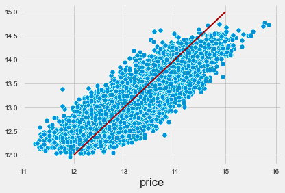
The code implements a machine learning pipeline using the k-nearest neighbors algorithm for regression tasks. It sets up a pipeline that includes a StandardScaler for feature scaling and a KNeighborsRegressor for making predictions. The cross_val_predict function is then used for cross-validation to generate predictions for the target variable based on the features. This approach helps evaluate the model’s performance by providing a reliable estimate of its predictive capabilities.
The output visualizes the relationship between actual target values and predicted values in a scatter plot. Each blue dot represents a data point, with the x-axis for actual prices and the y-axis for predicted prices. A red line indicates the ideal scenario where predicted values match actual values, serving as a benchmark for accuracy. The proximity of the blue dots to this line reflects the alignment of the model’s predictions with actual data.
The distribution of blue dots indicates a positive correlation between actual and predicted prices, suggesting that the KNN model captures the underlying trend effectively. However, some points deviate from the red line, particularly at higher price ranges, indicating areas for potential model improvement. This visualization offers insights into the model’s performance and demonstrates the effectiveness of the KNN algorithm in predicting the target variable.
scores = dict(
    rmse=np.sqrt(mean_squared_error(y_true=y, y_pred=y_pred)),
    rmsle=np.sqrt(mean_squared_log_error(y_true=y, y_pred=y_pred)),
    mean_ae=mean_absolute_error(y_true=y, y_pred=y_pred),
    median_ae=median_absolute_error(y_true=y, y_pred=y_pred),
    r2score=explained_variance_score(y_true=y, y_pred=y_pred)
)
This code snippet creates a dictionary called scores that stores various performance metrics comparing predicted values to actual values. The metrics include root mean squared error, which assesses prediction accuracy by calculating the square root of the mean of squared differences. Root mean squared logarithmic error evaluates the ratio of actual to predicted values, making it useful for targets with a wide range. Mean absolute error averages the absolute differences between actual and predicted values, offering a clear measure of accuracy that is not influenced by outliers. Median absolute error focuses on the median of absolute differences, providing robustness against extreme values. Finally, the explained variance score indicates how much of the variance in the dependent variable can be predicted from the independent variables, with a score closer to 1 indicating a better fit.
fig, axes = plt.subplots(ncols=3, figsize=(15, 5))
sns.scatterplot(x=y, y=y_pred, ax=axes[0])
axes[0].set_xlabel('Log Price')
axes[0].set_ylabel('Predictions')
axes[0].set_ylim(11, 16)
sns.distplot(error, ax=axes[1])
pd.Series(scores).plot.barh(ax=axes[2], title='Error Metrics')
fig.suptitle('Cross-Validation Regression Errors', fontsize=24)
fig.tight_layout()
plt.subplots_adjust(top=.8);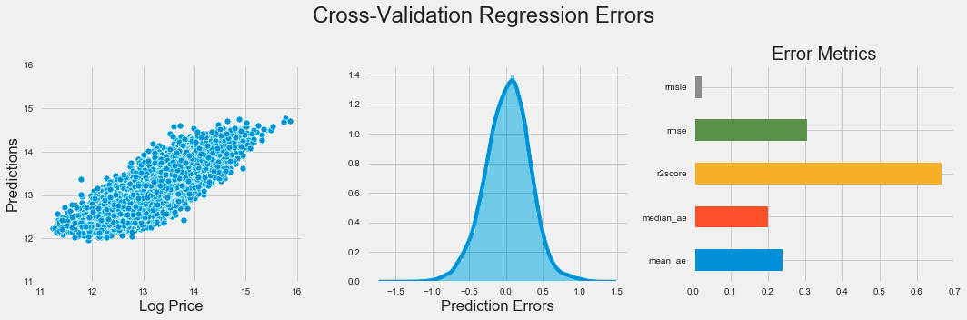
The code generates a visual representation of regression errors from a k-nearest neighbors model using Matplotlib and Seaborn. It creates a figure with three subplots in one row to provide an overview of the model’s performance. The first subplot is a scatter plot comparing predicted values to actual log prices, with the x-axis showing log price and the y-axis displaying predictions, limited to a range between 11 and 16 for focus.
The second subplot presents a distribution plot of prediction errors, indicating the differences between predicted and actual values. This helps assess the error distribution, with a bell-shaped curve suggesting consistent errors and significant skewness indicating potential prediction issues.
The third subplot features a horizontal bar chart displaying various error metrics such as mean squared error, mean absolute error, and median absolute error, each color-coded for easy comparison. This chart quantifies the model’s performance, allowing for quick evaluation of the metrics.
The figure is titled Cross-Validation Regression Errors, summarizing the insights from the visualizations. The layout enhances clarity regarding the model’s predictive accuracy and error distribution, crucial for evaluating the effectiveness of the k-nearest neighbors algorithm. Tight layout adjustments ensure that the subplots are organized and easy to read.
pipe = Pipeline([('scaler', StandardScaler()),
                 ('knn', KNeighborsRegressor())])

n_folds = 5
n_neighbors = tuple(range(5, 101, 5))

param_grid = {'knn__n_neighbors': n_neighbors}

estimator = GridSearchCV(estimator=pipe,
                         param_grid=param_grid,
                         cv=n_folds,
                         scoring=rmse_score,
#                          n_jobs=-1
                        )
estimator.fit(X=X, y=y)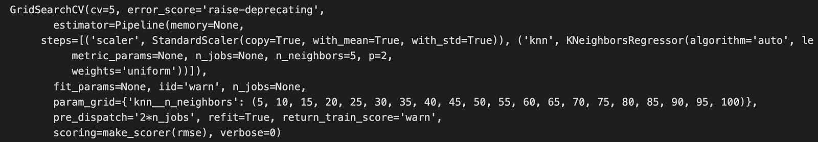
The code snippet establishes a machine learning pipeline utilizing the k-nearest neighbors algorithm for regression tasks. It creates a pipeline containing a StandardScaler for feature scaling and a KNeighborsRegressor for regression. The StandardScaler standardizes features by removing the mean and scaling to unit variance, which is important for KNN as it is sensitive to data scale.
Next, the code defines a grid of hyperparameters to test during model training, focusing on the number of neighbors that KNN will consider, ranging from 5 to 100 in increments of 5. This range allows the model to evaluate different configurations to identify the optimal number of neighbors that reduces prediction error.
The GridSearchCV function is then used to conduct an exhaustive search over the specified parameter grid, employing cross-validation with 5 folds to ensure model performance is stable and not overly fitted to specific data subsets. The evaluation metric is a custom root mean square error function, which measures the difference between predicted and actual values.
After fitting the estimator with the features and target variable, the output from GridSearchCV will typically present the best parameters, corresponding scores, and a detailed report on performance across different parameter combinations. Additionally, an output image displays the internal configuration of GridSearchCV, indicating tested parameters, the number of cross-validation folds, and the scoring method. This information is vital for understanding model evaluation and determining the most effective model configuration for a specific dataset.
cv_results = estimator.cv_results_This line retrieves the cross-validation results from a trained estimator, which is typically a model in a machine learning framework like scikit-learn. The estimator is your fitted model, and cv_results_ is an attribute that holds a dictionary with various metrics and information gathered during cross-validation, including performance metrics for different hyperparameter combinations, validation scores, and possibly training times. By assigning this to the variable cv_results, you can easily access and analyze the model’s performance across various folds and configurations during cross-validation, allowing for more informed decisions about model tuning or selection later.
test_scores = pd.DataFrame({fold: cv_results[f'split{fold}_test_score'] for fold in range(n_folds)},
                           index=n_neighbors).stack().reset_index()
test_scores.columns = ['k', 'fold', 'RMSE']
This code creates a DataFrame called test_scores to organize test scores from cross-validation results. It uses the pd.DataFrame function with a dictionary comprehension, where each key corresponds to a fold number and the value is the associated test score from cv_results, accessed using keys formatted as split{fold}_test_score. The DataFrame rows are indexed by n_neighbors, which holds various k values representing configurations tested during cross-validation. The .stack() method reshapes the DataFrame from wide to long format, consolidating the folds into a single column for easier data manipulation. The .reset_index() method converts the multi-level index into regular columns, simplifying access. Finally, the columns are renamed to k, fold, and RMSE, where k denotes different neighbor values, fold indicates the specific fold number, and RMSE represents the test scores. This code effectively organizes cross-validation results into a format suitable for analysis or visualization.
mean_rmse = test_scores.groupby('k').RMSE.mean()
best_k, best_score = mean_rmse.idxmin(), mean_rmse.min()
This code calculates the mean Root Mean Square Error for various values of k in the test_scores DataFrame. It groups the DataFrame by the k column and computes the mean RMSE for each group. The result is a Series with unique k values as the index and the corresponding mean RMSEs as the values. It then determines the k that produces the lowest mean RMSE using idxmin to find the index of the minimum value, which identifies the best k, while min retrieves the minimum value, indicating the optimal parameter and its associated error metric.
sns.pointplot(x='k', y='RMSE', data=test_scores, scale=.3, join=False, errwidth=2)
plt.title('Cross Validation Results')
plt.tight_layout()
plt.gcf().set_size_inches(10, 5);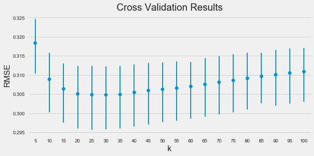
The code snippet uses the Seaborn library to create a point plot that visualizes the relationship between the number of neighbors in the k-nearest neighbors algorithm and the root mean square error obtained from cross-validation. The point plot function is executed with parameters for the x-axis as k, the y-axis as RMSE, and the data source as test_scores. It adjusts marker size with the scale parameter and specifies no connections between points with join set to false. The errwidth parameter defines the width of the error bars that reflect the variability of the RMSE values.
The resulting image shows a trend where RMSE decreases as k increases, suggesting that more neighbors improve predictive performance. The error bars highlight the stability of RMSE across different cross-validation folds, with shorter bars indicating consistent performance. The title Cross Validation Results summarizes the plot’s purpose, and labeled axes clarify the examined relationship.
fig, ax = plt.subplots(figsize=(16, 9))
val_curve = ValidationCurve(KNeighborsRegressor(),
                      param_name='n_neighbors',
                      param_range=n_neighbors,
                      cv=5,
                      scoring=rmse_score,
#                       n_jobs=-1,
                      ax=ax)
val_curve.fit(X, y)
val_curve.poof()
fig.tight_layout();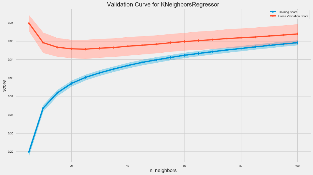
The code uses the ValidationCurve class from the sklearn library to assess the performance of a K-Nearest Neighbors regressor by varying the number of neighbors, known as n_neighbors. The ValidationCurve function calculates the training and cross-validation scores for different n_neighbors values, which helps evaluate the model’s generalization to unseen data.
The resulting graph displays two curves: the training score in blue and the cross-validation score in red. The x-axis represents the number of neighbors, while the y-axis shows the score based on root mean squared error. The shaded areas around the cross-validation curve illustrate score variability across different folds of the cross-validation.
As the number of neighbors increases, the training score typically remains high, indicating good fit to the training data. Initially, the cross-validation score improves and then stabilizes, suggesting that a small number of neighbors may lead to overfitting, whereas increasing neighbors can enhance generalization. The gap between training and cross-validation scores may indicate overfitting, with a smaller gap reflecting better generalization.
fig, ax = plt.subplots(figsize=(16, 9))
l_curve = LearningCurve(KNeighborsRegressor(n_neighbors=best_k),
                        train_sizes=np.arange(.1, 1.01, .1),
                        scoring=rmse_score,
                        cv=5,
#                         n_jobs=-1,
                        ax=ax)
l_curve.fit(X, y)
l_curve.poof()
fig.tight_layout();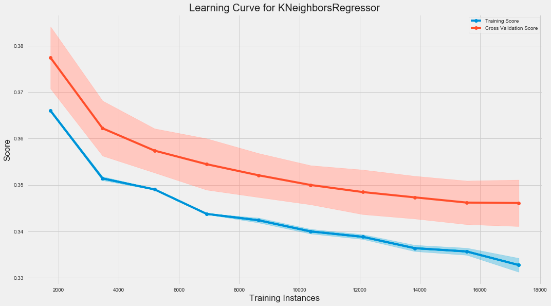
The code snippet creates a learning curve for a K-Nearest Neighbors regression model using the LearningCurve class from a library, likely sklearn. It initializes a plot and evaluates the model’s performance as the training dataset size increases. The train_sizes parameter specifies the proportion of training data from 10% to 100% in increments of 10%. The model is scored using the root mean square error, and 5-fold cross-validation is performed for robustness.
