

Chapter 7: Comparative Analysis of Linear Regression Models: Ordinary Least Squares vs. Stochastic Gradient Descent
Exploring the Application and Visualization of OLS and SGD for Data Prediction and Model Evaluation

Article Download Link Will be In Next Chapter, Both the chapters are interlinked.
Linear regression is a widely-used statistical method for understanding the relationship between independent variables and a dependent variable. In machine learning and data analysis, two prominent techniques for fitting linear models are Ordinary Least Squares (OLS) and Stochastic Gradient Descent (SGD). Both methods aim to find the best-fit line that minimizes errors between predicted and actual values, but they differ in their approach and computational efficiency. This article explores how these models work, compares their results, and illustrates their application with detailed visualizations and statistical summaries.
The code presented here demonstrates how to apply OLS and SGD for regression analysis, with a focus on visualizing data patterns and residuals. Using synthetic datasets, the article showcases various stages of the process, including generating data, fitting models, and interpreting results through plots and statistical outputs. By comparing the performance of both models through root mean square error (RMSE) and residual analysis, this tutorial provides valuable insights into the strengths and limitations of each approach.
%matplotlib inline
from pathlib import Path
import matplotlib.pyplot as plt
import pandas as pd
import numpy as np
from mpl_toolkits.mplot3d import Axes3D
from matplotlib import cm
import statsmodels.api as sm
from sklearn.linear_model import SGDRegressor
from sklearn.preprocessing import StandardScaler
import warnings
This code snippet sets up the environment and libraries needed for data visualization and linear regression. The magic command %matplotlib inline enables direct rendering of Matplotlib plots in a Jupyter Notebook, allowing plots to appear below the code cells without extra commands. The script imports key libraries including Path from pathlib for intuitive file path management, matplotlib.pyplot for creating plots, pandas for data manipulation and analysis, and numpy for numerical operations and array handling. Axes3D from mpl_toolkits.mplot3d facilitates the creation of 3D plots for enhanced data visualization. The cm module from matplotlib assists with color mapping in plots, while statsmodels.api provides tools for statistical modeling and linear regression functions. SGDRegressor from sklearn.linear_model indicates the use of stochastic gradient descent for optimizing regression models, and StandardScaler from sklearn.preprocessing standardizes features by scaling them, which is typically necessary for many machine learning algorithms. The import of warnings helps manage warning messages during execution to keep the output clean. This setup creates a solid foundation for conducting linear regression, visualizing data, and performing numerical analysis.
plt.style.use('ggplot')
pd.options.display.float_format = '{:,.2f}'.format
warnings.filterwarnings('ignore')
This code snippet sets up the environment for data visualization and analysis. It uses plt.style.use to apply the ggplot style to all plots created with Matplotlib, providing a clean and visually appealing look with a soft grid and adjusted color palettes. The configuration pd.options.display.float_format formats floating-point numbers in pandas to two decimal places with commas as thousands separators, enhancing readability for large datasets. Additionally, warnings.filterwarnings is used to suppress non-critical warnings during code execution, allowing you to focus on results, although this may lead to overlooking important messages if issues arise.
x = np.linspace(-5, 50, 100)
y = 50 + 2 * x  + np.random.normal(0, 20, size=len(x))
data = pd.DataFrame({'X': x, 'Y': y})
ax = data.plot.scatter(x='X', y='Y');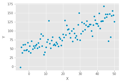
The code generates a dataset and visualizes it with a scatter plot to analyze linear relationships in data. It creates an array of 100 evenly spaced values between -5 and 50, representing the independent variable x. The dependent variable y is calculated using the equation y equals 50 plus 2x, establishing a linear relationship with a slope of 2 and a y-intercept of 50. To simulate real-world data, random noise is added to y using a normal distribution with a mean of 0 and a standard deviation of 20.
This data is organized into a pandas DataFrame, pairing each x value with its corresponding y value. A scatter plot is then generated, displaying x on the horizontal axis and y on the vertical axis. The resulting plot shows points scattered around an upward trend, indicating a positive correlation between x and y. While the overall pattern suggests that y tends to increase as x increases, the random noise causes the points to deviate from a straight line, typical in real-world data. This scatter plot is a preliminary step in linear regression analysis, facilitating the examination of the relationship between variables and the possibility of fitting a regression line to predict y based on x.
X = sm.add_constant(data['X'])
model = sm.OLS(data['Y'], X).fit()
print(model.summary())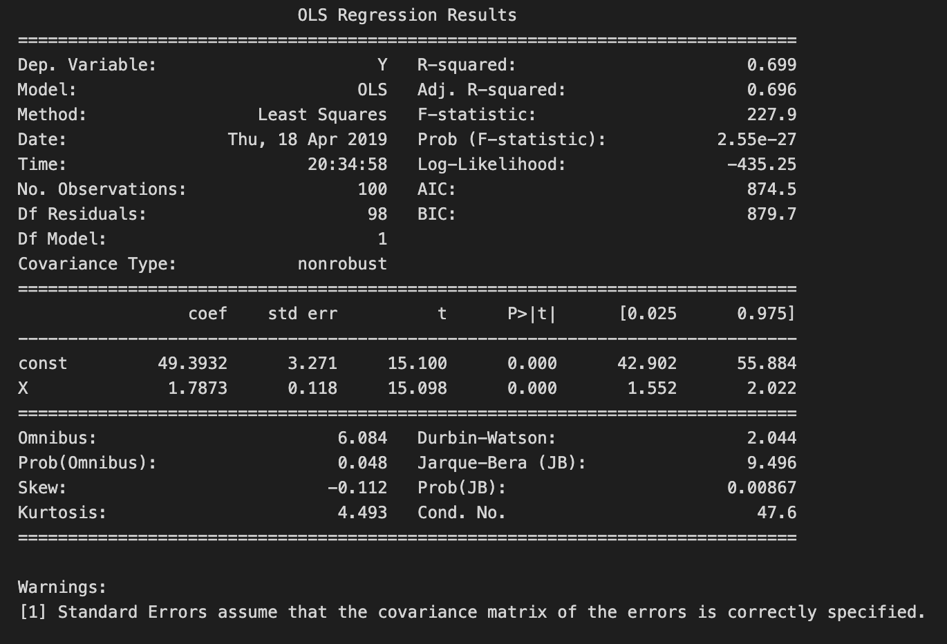
The code snippet conducts linear regression analysis using the Ordinary Least Squares method from the statsmodels library in Python. It begins by adding a constant term to the independent variable X, which is required for the regression model to incorporate an intercept. The OLS model is then fitted to the dependent variable Y and the independent variable X, including the constant. Finally, a detailed summary of the regression results is displayed.
The summary reveals key statistics, with the dependent variable Y explained by about 69.9% of the variance, as reflected by the R-squared value of 0.699, indicating a strong relationship between X and Y. The adjusted R-squared value of 0.696, which adjusts for the number of predictors, confirms the model’s good fit. An F-statistic of 227.9 and a p-value of 2.55e-27 highlight the overall statistical significance of the regression model, suggesting at least one predictor significantly predicts the dependent variable.
The coefficients table outlines the estimated coefficients for the constant and variable X. The constant term is roughly 49.393, representing the expected value of Y when X is zero, while the coefficient for X is 1.787, indicating that a one-unit increase in X predicts an approximate increase of 1.787 units in Y. The accompanying standard errors, t-values, and p-values reveal the significance of each coefficient; the p-value for X is 0.000, providing strong evidence that X significantly predicts Y. Diagnostic statistics in the model, such as the Durbin-Watson statistic and the Omnibus test, confirm that the model is well-specified, with no significant violations of linear regression assumptions.
beta = np.linalg.inv(X.T.dot(X)).dot(X.T.dot(y))
pd.Series(beta, index=X.columns)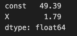
The code calculates coefficients for a linear regression model using the normal equation method. It computes the dot product of the transpose of the feature matrix X with itself and then takes the inverse of that product to establish the relationship between the independent and dependent variable y. The resulting coefficients, stored in the variable beta, are obtained by multiplying the inverse with the dot product of the transpose of X and y.
The output displays the calculated coefficients. The first coefficient represents the intercept of the regression line, approximately 49.39, indicating the expected value of the dependent variable when all independent variables are zero. The second coefficient, related to X, is about 1.79, meaning that for each unit increase in X, the dependent variable is expected to increase by approximately 1.79 units, assuming other variables remain constant.
The coefficients are stored as 64-bit floating-point numbers, a common format for numerical computations in Python. This output clearly outlines how the independent variable X influences the dependent variable and the baseline value of the intercept, demonstrating a fundamental approach to linear regression and the interpretation of relationships in the data.
data['y-hat'] = model.predict()
data['residuals'] = model.resid
ax = data.plot.scatter(x='X', y='Y', c='darkgrey')
data.plot.line(x='X', y='y-hat', ax=ax);
for _, row in data.iterrows():
plt.plot((row.X, row.X), (row.Y, row['y-hat']), 'k-') 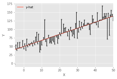
The code snippet executes a linear regression analysis and visualizes the results through a scatter plot and a line plot. It predicts the dependent variable values, stored in the DataFrame under the column y-hat, using a fitted model. The residuals, which are the differences between the observed and predicted values, are also calculated and recorded in the DataFrame under the column residuals.
The visualization starts with a scatter plot of the original data, with X on the x-axis and Y on the y-axis, using dark grey points to highlight the data distribution. A line representing the predicted values y-hat is overlaid on this scatter plot, demonstrating the linear relationship established by the regression model. Vertical lines are drawn from each data point to its corresponding predicted value on the regression line, visually representing the residuals and the deviation of each observed value from the predicted value. This visualization clearly demonstrates the relationship among the actual data, the regression line, and the residuals, effectively illustrating the concept of linear regression and the model’s accuracy.
## Create data
size = 25
X_1, X_2 = np.meshgrid(np.linspace(-50, 50, size), np.linspace(-50, 50, size), indexing='ij')
data = pd.DataFrame({'X_1': X_1.ravel(), 'X_2': X_2.ravel()})
data['Y'] = 50 + data.X_1 + 3 * data.X_2 + np.random.normal(0, 50, size=size**2)

## Plot
three_dee = plt.figure(figsize=(15, 5)).gca(projection='3d')
three_dee.scatter(data.X_1, data.X_2, data.Y, c='g');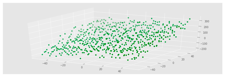
The code generates a synthetic dataset for a linear regression problem and visualizes it with a three-dimensional scatter plot. It creates a grid of points using np.meshgrid, resulting in two-dimensional arrays for the variables X1 and X2 that span from -50 to 50 with a size of 25, amounting to 625 points when flattened. A DataFrame is then constructed with X1 and X2 as independent variables. The dependent variable Y is computed with the equation Y equals 50 plus X1 plus three times X2, adding Gaussian noise to simulate real-world variability. This noise, generated by np.random.normal, introduces randomness with a mean of 0 and a standard deviation of 50.
For visualization, Matplotlib is used to create a 3D scatter plot, where X1 is on the x-axis, X2 on the y-axis, and Y on the z-axis, with points colored green to highlight the data distribution. The resulting plot shows a cloud of points that generally follows a linear trend, indicating the relationship defined in the equation for Y. The spread of the points reflects the added noise, causing deviations from linearity. As X2 increases, Y tends to rise more sharply due to its coefficient of 3, while changes in X1 have a more modest effect. This visualization effectively demonstrates the relationships among the variables and prepares the ground for further analysis, like fitting a linear regression model to predict Y based on X1 and X2.
X = data[['X_1', 'X_2']]
y = data['Y']
We are selecting specific columns from a data structure, likely a pandas DataFrame. The variable X contains values from columns X_1 and X_2, creating a new DataFrame with these two features to be used as input variables for the linear regression model. Meanwhile, the variable y holds the values from column Y, which acts as our target variable, representing the output we aim to predict based on the inputs in X. Thus, X includes the features for our model, and y contains the values we want to predict.
X_ols = sm.add_constant(X)
model = sm.OLS(y, X_ols).fit()
print(model.summary())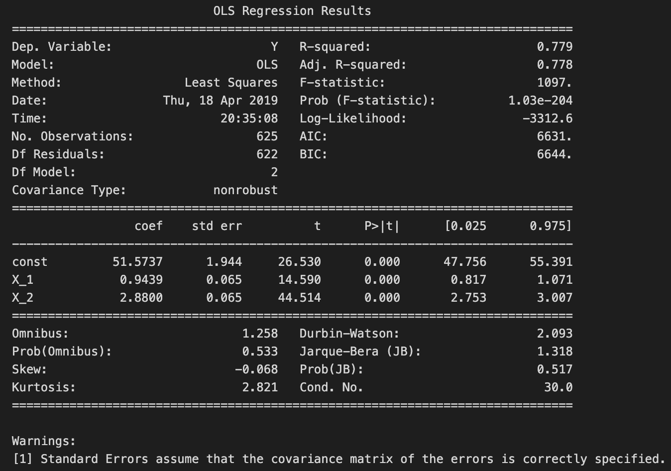
The code snippet uses the statsmodels library to perform Ordinary Least Squares regression. It begins by adding a constant term to the predictor variables, which is necessary to estimate the intercept in the regression model. The model is then fitted using the dependent variable y and the modified predictor variables. The fit method estimates the coefficients of the regression model based on the provided data.
The model summary output includes an overview of the regression results. The dependent variable is labeled Y, and the R-squared value is 0.779, indicating that approximately 77.9% of the variance in Y is explained by the independent variables. The adjusted R-squared value of 0.778 accounts for the number of predictors, indicating a good fit.
The coefficients table shows the estimated coefficients for the constant term and the two predictors, X1 and X2. The constant term has a coefficient of about 51.5737, which represents the expected value of Y when both predictors are zero. The coefficient for X1 is approximately 0.9439, meaning a one-unit increase in X1 is expected to raise Y by about 0.9439 units, holding X2 constant. The coefficient for X2 is 2.8800, suggesting that a one-unit increase in X2 is associated with an increase of about 2.8800 units in Y, holding X1 constant.
The output also includes standard errors, t-values, and p-values for each coefficient. The p-values for both X1 and X2 are 0.000, indicating these predictors are statistically significant. The t-values are high, reinforcing the significance of these predictors.
Additional statistics, such as the Omnibus test, Durbin-Watson statistic, and Jarque-Bera test, assess the model’s assumptions. The Durbin-Watson statistic of 2.093 suggests no significant autocorrelation in the residuals, which is beneficial in regression analysis. The warning about standard errors implies that the covariance matrix of the errors is assumed to be correctly specified, crucial for valid inference.
In summary, the output indicates a well-fitted linear regression model with significant predictors, offering valuable insights into the relationships between the independent and dependent variables.
beta = np.linalg.inv(X_ols.T.dot(X_ols)).dot(X_ols.T.dot(y))
pd.Series(beta, index=X_ols.columns)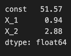
The code calculates coefficients for a linear regression model using the ordinary least squares method. It first computes the inverse of the product of the transpose of the design matrix X_ols and X_ols, which is crucial for determining the best-fitting line by minimizing the squared differences between observed and predicted values. Next, it multiplies the transposed design matrix by the target variable y to project y onto the predictor space, allowing for the calculation of coefficients that explain the variation in y.
The output is a pandas Series displaying the estimated coefficients for the regression model. The index corresponds to the model variables, including a constant term and coefficients for each predictor variable. These values indicate the expected change in the target variable for a one-unit increase in each predictor while holding other variables constant. For example, a coefficient of 51.57 for the constant means that when all predictors are zero, the expected target value is 51.57. Coefficients of 0.94 and 2.88 for predictors indicate that increases in these predictors lead to respective increases in the target variable. This output clarifies the relationship between the predictors and the target variable, which is key for understanding the model’s behavior.
plt.rc('figure', figsize=(12, 7))
plt.text(0.01, 0.05, str(model.summary()), {'fontsize': 14}, fontproperties = 'monospace')
plt.axis('off')
plt.tight_layout()
plt.subplots_adjust(left=0.2, right=0.8, top=0.8, bottom=0.1)
# plt.savefig('multiple_regression_summary.png', bbox_inches='tight', dpi=300);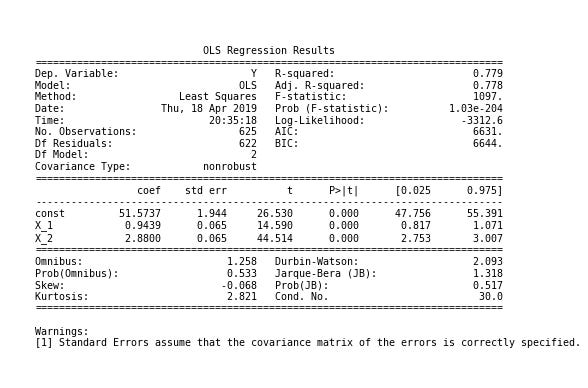
The code snippet creates a visualization for displaying a linear regression model summary using Matplotlib. It sets the figure size to 12 by 7 inches for an optimal layout. The plt.text function inserts the model summary, formatted as a readable string with a font size of 14 in a monospace style to enhance clarity. The plt.axis command removes axes, focusing solely on the text without distractions. The plt.tight_layout function adjusts the figure layout, while plt.subplots_adjust fine-tunes margins for better visual balance.
The output provides a summary of an Ordinary Least Squares regression analysis, including key statistics such as the dependent variable, R-squared value, and coefficients for predictor variables. A R-squared value of 0.779 indicates that the model explains approximately 77.9% of the variance in the dependent variable, suggesting a good fit. Coefficients for the constant and predictors (X_1 and X_2) are displayed with their standard errors, t-values, and p-values. P-values below 0.05 usually indicate statistical significance for each predictor.
