
Comprehensive Guide to Exploratory Data Analysis in Python for Stock Market Data
Comprehensive Guide to Exploratory Data Analysis in Python for Stock Market Data
Mastering Python Tools and Techniques for Financial Data Analysis

In this article, we delve deep into the practical aspects of exploratory data analysis (EDA) using Python, specifically tailored for analyzing stock market data. EDA is a fundamental step in the data science workflow, allowing analysts to uncover patterns, spot anomalies, and test hypotheses using statistical summaries and graphical representations. Our focus will be on utilizing Python’s powerful libraries and tools to handle, process, and visualize stock data effectively. From importing libraries to plotting intricate financial indicators, this guide covers the essential steps and methodologies that enhance the analysis and decision-making processes in financial markets.
Download the source code from link at the end of this article.
Let’s dive into some data analysis to explore further.
Features that have been produced will assist in grasping the changing characteristics of past data.
Let’s start by bringing in the necessary libraries.
Imports libraries and sets plot dpi.
import os
import pandas as pd
import matplotlib.pyplot as plt
import seaborn as sns
import warnings
import plotting
import statsmodels.api as sm
from importlib import reload
import numpy as np
import operator
warnings.filterwarnings('ignore')
plt.rcParams['figure.dpi'] = 227 # native screen dpi for my computer
The following code excerpt showcases a common setup encountered in Python-based data analysis or data science projects. Let’s delve into its operations:
1. Library Importation: The script kicks off by importing a range of essential libraries/modules such as os, pandas, matplotlib.pyplot, seaborn, warnings, plotting, statsmodels.api, numpy, and operator. These libraries are frequently employed for data analysis and visualization duties.
2. Setting Configurations: The script establishes specific configurations utilizing the imported libraries. For instance, it silences output warnings with warnings.filterwarnings(‘ignore’) and configures the DPI (dots per inch) for displayed figures via plt.rcParams[‘figure.dpi’] = 227. These adjustments aid in tailoring plot displays and quelling unnecessary warnings.
3. Module Reloading: The inclusion of from importlib import reload allows for the reloading of previously imported modules without necessitating the restart of the Jupyter notebook or Python kernel. This feature proves handy during the developmental phase when modifications are made to external modules and swift inclusion of these changes is desired without the need for a complete environment restart.
4. Intent: This code snippet is typically utilized at the project’s outset or within a Jupyter notebook to configure the operational environment for data analysis activities. It handles library imports, fine-tunes visualization settings, manages warnings, and readies the groundwork for ensuing data analysis, visualization, and statistical modeling operations.
5. Significance:
- Dependencies: The inclusion of libraries like pandas, matplotlib, and seaborn is imperative for executing data manipulations and visualizations.
- Configuration: Establishing settings such as DPI for figures and handling warnings aids in personalizing outputs and enhancing plot aesthetics.
- Functionality: Reloading modules is sometimes vital for seamlessly integrating alterations made during the development phase without necessitating a complete environment restart.
In essence, this code snippet stands as a conventional setup that primes the Python environment for effective execution of data analysis, visualization, and statistical modeling endeavors.
Read and store CSV stock data
files = os.listdir('data/stocks')
stocks = {}
for file in files:
    if file.split('.')[1] == 'csv':
        name = file.split('.')[0]
        stocks[name] = pd.read_csv('data/stocks/'+file, index_col='Date')
        stocks[name].index = pd.to_datetime(stocks[name].index)
This snippet of code is designed to scan a directory called ‘data/stocks’ and extract a list of files within it. It proceeds to iterate through each file and verifies if the file possesses a ‘.csv’ extension. These files are presumed to pertain to stock information and are incorporated into a dictionary labeled ‘stocks’.
For every valid CSV file detected, the script leverages pandas’ read_csv function to import the data, designating the ‘Date’ column as the primary index. Subsequently, it adjusts the index to a datetime format with the aid of pd.to_datetime. The resultant DataFrame is then added to the ‘stocks’ dictionary, with the corresponding file name serving as the key (minus the ‘.csv’ extension).
This code proves to be highly beneficial in automating the task of sourcing stock data from numerous CSV files, thereby streamlining the data preparation phase for subsequent analysis or manipulation. Through this implementation, we can effectively load and structure stock data from diverse files into an organized layout suitable for various data-oriented tasks like analysis, visualization, and additional processing.
Prints list of stocks in uppercase
print('List of stocks:', end=' ')
for i in stocks.keys():
    print(i.upper(), end=' ')
Above is a snippet of code that showcases how to display a curated list of keys from a dictionary named stocks. It kicks off by showcasing “List of stocks:” followed by the uppercase rendition of each key from the stocks dictionary, ensuring they are displayed with spaces in between.
In essence:
1. By leveraging the stocks.keys() function, the code manages to extricate the keys stored within the stocks dictionary.
2. Subsequently, a for loop is employed to navigate through each key within the dictionary.
3. As each key is processed, the print(i.upper(), end=’ ‘) command takes charge by converting the key to uppercase via the upper() method. The presence of the end=’ ‘ segment is instrumental in curbing the default newline behavior post each printout. This technique fosters a coherent presentation of the output on a single line, effectively spacing out each element.
This nifty piece of code proves to be handy in scenarios where there is a need to convey a list of keys from a dictionary to the end user in a well-structured format. The inclusion of end=’ ‘ within the print function emerges as a pivotal enabler, empowering the user to govern the separator amidst the printed components.
Display first few rows of TSLA stock
stocks['tsla'].head()
This snippet of code allows us to peek at the initial rows of information housed in the ‘tsla’ column within the ‘stocks’ DataFrame. It’s handy for gaining a rapid insight into the data, grasping its setup, and making initial observations. Employing ‘.head()’ enables us to constrain the display to the first few rows, making it easier to comprehend the data without inundating the output.
Let’s Look for a Relationship
stocks[‘tsla’].corr()[[‘Return’]].sort_values(by=’Return’, ascending=False)[:5]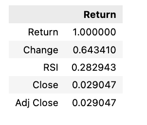
The following script calculates the correlation between the returns of the ‘TSLA’ stock and all other stocks in the dataset, ranking them in descending order. It then identifies the top 5 stocks with the strongest correlations to ‘TSLA’.
- stocks[‘tsla’].corr(): Computes correlation coefficients between the returns of ‘TSLA’ and other stocks.
- [[‘Return’]]: Filters correlation with returns.
- .sort_values(by=’Return’, ascending=False): Arranges correlations in descending order based on returns.
- [:5]: Selects the top 5 results with the highest correlation to ‘TSLA’.
This code is beneficial for examining how the performance of ‘TSLA’ interacts with that of other stocks in the dataset. Analyzing these relationships is key for managing portfolios, assessing risks, and making informed investment choices.
The connection between return, change, and RSI is significant.
Creates and displays a heatmap
plt.rcParams['figure.dpi'] = 227
plt.figure(figsize=(18,14))
sns.heatmap(stocks['tsla'].corr(), annot=True, fmt='.2f')
plt.ylim(17, 0)
plt.title('Correlation Between Tesla Features', fontSize=15)
plt.show()
Within this code excerpt, several tasks are accomplished:
1. Adjusting the figure’s DPI (dots per inch) to 227 for enhanced detail in the plot’s resolution.
2. Constructing a figure with precise dimensions of 18x14 inches.
3. Generating a heatmap based on correlation values extracted from the Tesla stock dataset’s features.
4. Embedding correlation values onto the heatmap as annotations, rounded off to two decimal points.
5. Ensuring proper alignment by setting limits on the y-axis.
6. Appending a title to the plot denoting the depiction of feature correlations within Tesla.
By employing this code, it becomes feasible to tailor the visual representation of the correlation matrix by configuring elements such as figure size, DPI, annotations, axis boundaries, and title, thereby enriching both the informational depth and visual allure. This sort of fine-tuning plays a pivotal role in effectively showcasing and interpreting data visually, a critical aspect in data analysis and decision-making processes.
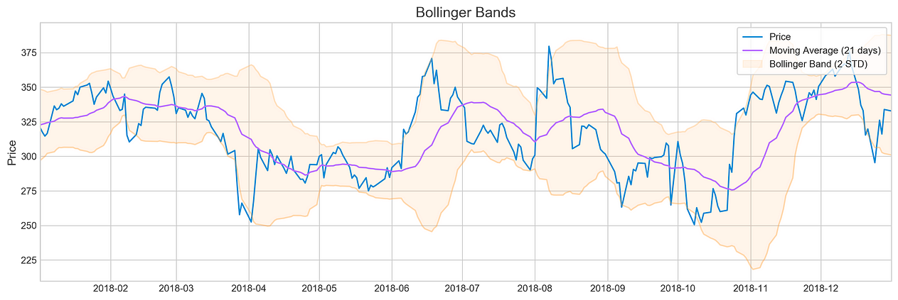
When it comes to analyzing the stock market, key indicators like Bollinger Bands, RSI, MACD, and trading volume play a crucial role in making informed decisions. These tools provide valuable insights into market trends and help traders gauge the momentum and potential direction of a stock. By incorporating these indicators into their analysis, investors can gain a more comprehensive understanding of market conditions and make strategic trading decisions.
Plotting Bollinger Bands for Tesla in 2018
plotting.bollinger_bands(stocks['tsla'].loc['2018':'2018'])