

Data Visualization Using Matplotlib
Numerical data can be comprehended much more easily via data visualization than through a simple table of numbers.

Charting libraries are used primarily to obtain instant insights into data and identify patterns, trends, and outliers.
A stock price chart is the first step toward determining which algorithmic trading strategy fits the stock — some strategies are more suitable for trending stocks, others for mean-reversion stocks, etc. The quality of a chart cannot be substituted for numerical statistics.
In this article, we will learn about Matplotlib, a Python visualization library that extends NumPy’s capabilities to create static, animated, and interactive visualizations. Matplotlib can be used directly to chart DataFrames in the pandas library.
Topics covered in this article include:
Figure and subplot creation.
Adding markers, colors, and styles to plots.
Labeling, ticking, and legending axes.
Annotating data points to enhance their value.
Creating and saving plots.
Matplotlib charting pandas DataFrames.
Figures and subplots creation
The Matplotlib drawing canvas supports plotting multiple charts (subplots) on a single figure.
Subplot definitions
Matplotlib.pyplot.figure objects can be created using the following method:

The result is a figure object with no axes (0 Axes):
<Figure size 2400x1200 with 0 Axes>We need to create space for subplots on this figure before we plot anything. We can do this by specifying the size and position of the subplot using matplotlib.pyplot.figure.add_subplot(…) method.
On the left, a 1x2 subplot is added. On the top right, a 2x2 subplot is added. And finally, a 2x2 subplot is added on the bottom right:

We just added the following subplots to the figure object:
We can now add visualizations to the charts once we have created the plots (“plots”/”subplots”). As physical space on the page is very expensive in all reports, it is best to create charts like the one above.
Subplots in plots
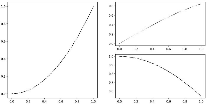
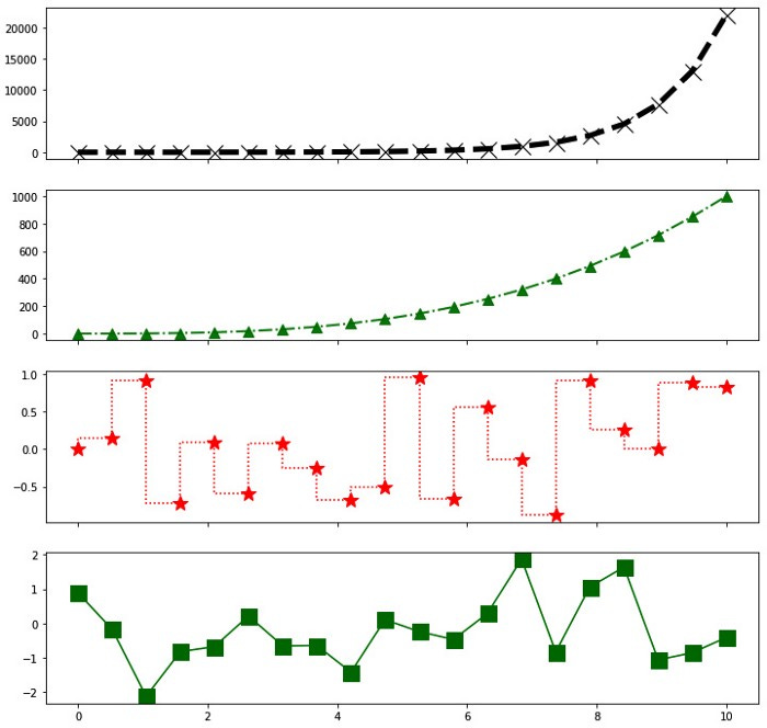
Numpy.linspace(…) generates evenly spaced values on the x axis, followed by numpy.square(…), numpy.sin(…), and numpy.cos(…) on the y axis.
In order to plot these functions, we will use the variables ax1, ax2, and ax3 we obtained from adding subplots:

We now plot the values in the following figure:
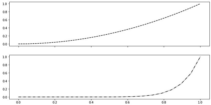
In order to specify the same x axis for all subplots, the sharex= parameter can be used when creating subplots.
Here are a few examples to demonstrate this functionality: plot the square, then raise x to its power of ten and plot it with the same x-axis using numpy.power(…):

Using a common x-axis and plotting different functions on each graph, we get the following diagram:
As of yet, the charts generated do not have self-explanatory units, nor do they indicate what each chart represents. The charts should be enhanced with colors, markers, and line styles, and the axes should be enriched with ticks, legends, and labels, as well as annotations for selected data points.
Adding colors, markings, and styles to plots
It is easier to understand charts when they are colored, marked, and have different styles of lines.
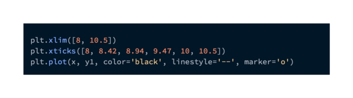
Using the following parameters, the following code block plots four different functions:
In order to assign colors, use the parameter color=.
To change the width/thickness of the lines, use the linewidth= parameter.
Data points are marked with different shapes using the marker= parameter.
These markers can be resized using the markersize= parameter.
Transparency can be modified using the alpha= parameter.
By using the drawstyle= parameter, the default line connectivity between data points is replaced by step connectivity.
It looks like this:
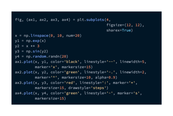
Among the four functions displayed in the output are the following, each of which has different attributes:
Multi-time series charts can be generated with different colors, line styles, marker styles, transparency, and size options. It is important to choose the colors carefully, since some laptop screens and printed paper may not render them well.
Making outstanding charts requires enriching axes.
Axes can be enhanced with ticks, labels, and legends
Ticks, limits, and labels can be added to further customize the charts.
The x axis range is set using matplotlib.pyplot.xlim(…) method.
On the x axis, the ticks appear in the following order: matplotlib.pyplot.xticks(…)
By doing this, the x axis is modified so it falls within the specified limits, and the ticks are placed at the explicitly specified values:
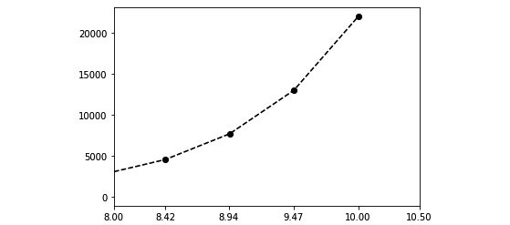
By using matplotlib.Axes.set_yscale(…), we can also change the scale of one of the axes to non-linear.
It is possible to change the labels on the x axis with matplotlib.Axes.set_xticklabels(…):

That code block output shows the change in y axis scale, which is now logarithmic, and the tick labels on x axis:

Figure 6. A logarithmic y-axis scale and custom tick labels on the x-axis are used in this plot
If we are communicating percentage changes or multiplicative factors, logarithmic scales are useful in charts.
It is possible to set the x and y axes labels using the matplotlib.Axes.set_xlabel(…) and matplotlib.Axes.set_ylabel(…) methods.
In matplotlib.Axes.legend(…), a legend is added to make plots more readable. When loc=’best’ is specified, Matplotlib decides where the legend should appear on the plot:
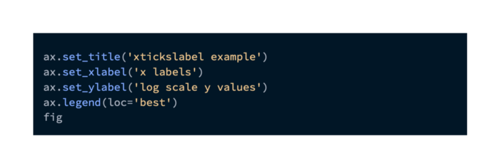
The title, x- and y-axis labels, and legend are shown in the following plot:

An explanation of the units and labels of the axes of the chart is sufficient for understanding charts with different renderings of each time series. A few special data points are always worth mentioning, however.
Annotating data points to enrich them
In our plots, we can add a text box using matplotlib.Axes.text(…):

As a result, we get:

It is possible to control the annotations more precisely by using matplotlib.Axes.annotate(…) .
Following is the code block that controls the annotation using the following parameters:
Location of the data point is specified by the xy= parameter.
A text box’s location is specified by the xytext= parameter.
A dictionary of parameters can be specified in the arrowprops= parameter to control the arrow between the text box and the data point.
A color is specified by the facecolor= parameter, and the size of the arrow is specified by the shrink= parameter.
Orienting the text box relative to the data point is controlled by the horizontalalignment= and verticalalignment= parameters.
Following is the code:

Here are the results:
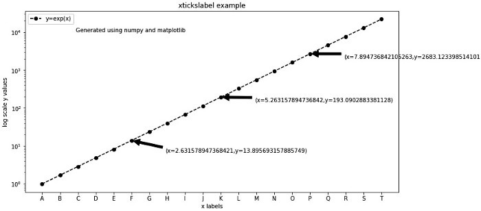
Readers can focus on the message of the chart by paying attention to the key data points.
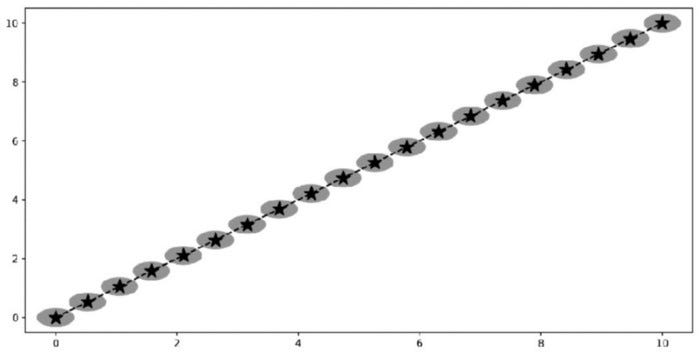
Shape annotations can be added using matplotlib.Axes.add_patch(…) method.
In the code block that follows, we add a matplotlib.pyplot.Circle object with the following parameters:
To specify the location, use the xy= parameter
To specify the radius of the circle, use the radius= parameter
Color= specifies the circle’s color
Following is the code:

Data points are surrounded by circles in the following plot:

Once we have created beautiful, professional charts, we need to learn how to share them.
The saving of plots to files
Matplotlib.pyplot.figure provides a number of size and resolution options for saving plots to disk, including the dpi= parameter:

In the fig.png file, the following plot will be written:
Frequently, trading strategy performance images are exported for HTML or email reports. Charts should be printed at your printer’s DPI.
DataFrame charting with Matplotlib and Pandas
Series and DataFrame objects can be plotted with the pandas library using Matplotlib.
The Cont value should contain continuous values that mimic prices, while the Delta1 and Delta2 values should represent price changes. Five possibilities are represented by the Cat value:

DataFrame generated by this method is as follows:

This DataFrame can be visualized in a number of ways.
DataFrame column line plots
The pandas.DataFrame.plot(…) method can be used to plot ‘Cont value’ on a line plot:

Charts produced by this command are as follows:
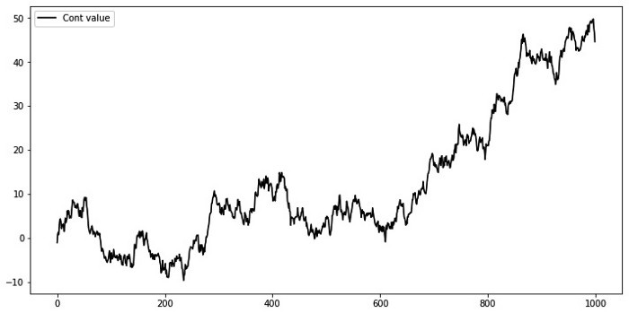
Time series are typically displayed using line charts.
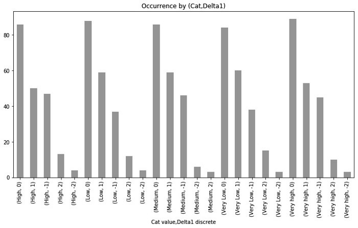
A DataFrame column can be plotted as a bar graph
If the kind parameter is set to ‘bar’, pandas.DataFrame.plot(…) will generate a bar chart.
A bar chart depicting Delta1 discrete value counts can be created by grouping the DataFrame by the ‘Cat value’ value:

In the following plot, (Cat value, Delta1 discrete) values are plotted as a function of frequency:
A horizontal bar plot is built instead of a vertical one when the kind=’barh’ parameter is used:
As a result, we get:
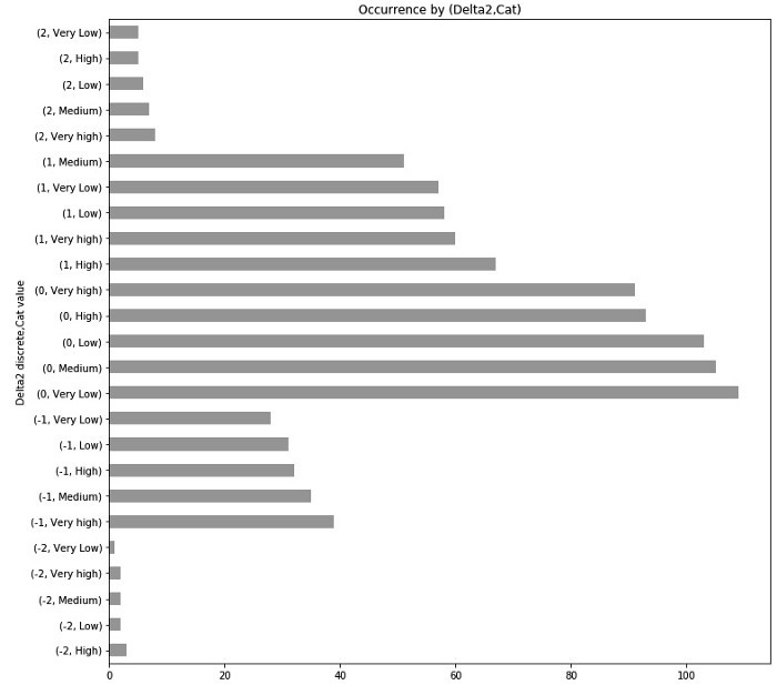
Comparisons of categorical values are best done with bar plots.
Plotting the density and histogram of a column in a DataFrame
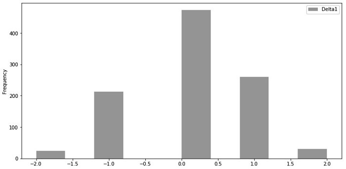
In the pandas.DataFrame.plot(…) method, the kind parameter is used to build a histogram.
In order to visualize the Delta1 discrete values, let’s create a histogram:

A histogram of the generated data is shown below:
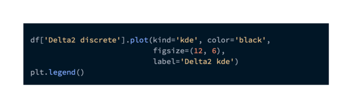
With the kind=’kde’ parameter, we can generate a Probability Density Function (PDF) of Delta2 discrete values by using Kernel Density Estimation (KDE):
As a result, we get:
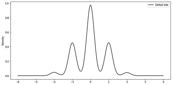
The probability distribution of some random variables can be assessed using histograms and PDFs/KDEs.
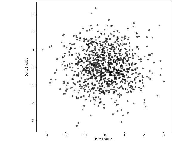
Creating scatter plots from two columns of a DataFrame
The kind=’scatter’ parameter is used to generate scatter plots from the pandas.DataFrame.plot(…).
Delta1 and Delta2 values are plotted in the following code block:

As a result, we get:
It builds scatter plots between non-diagonal entries and histogram/KDE plots between Delta1 and Delta2 values using the pandas.plotting.scatter_matrix(…) method:

As a result, we get:
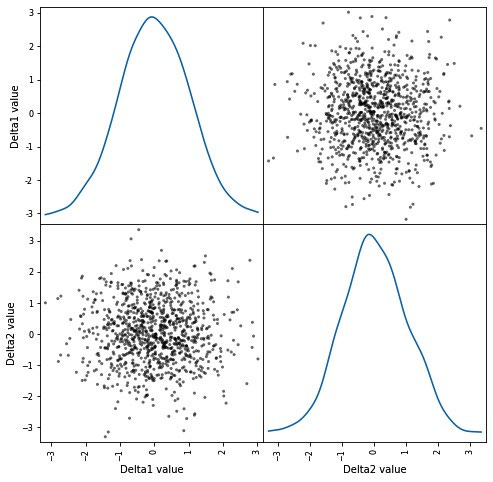
To observe relationships between two variables, scatter plots/scatter matrices are used.
