

Deciphering the Market: A Visual Guide to the Jane Street Prediction Challenge
A step-by-step journey through exploratory data analysis, feature engineering, and modeling financial time series.

Download link at the end of article for source code!
Jane Street reminds us that machine learning really begins with data: they collect about 2.3 TB of market data every day, and all those petabytes hide the patterns models need. In production settings like theirs, models are only one part of a bigger system with many moving pieces, so getting the data right is crucial for everything that follows.
This notebook is a simple exploratory data analysis, or EDA, of the files for the Kaggle Jane Street Market Prediction competition. EDA just means looking, plotting, and summarizing your data so you know what to do next. Spending time here helps you pick the right modeling tools and avoid wasting effort on the wrong approach.
We look at the big train.csv file and the key columns: *resp* (the target response we try to predict), *weight* (how important each row is), cumulative return (how performance accumulates), and *time* (when events happened). We examine the features and the features.csv file that describes them, plus the *action* column used for decisions. The first day, called day 0, gets special attention. We check for missing values and specific gaps on days 2 and 294. We create quick DABL plots (a tool for fast visual EDA) for targets like action and resp, and run permutation importance with a Random Forest (a group of decision trees) to see which features matter. We also compare day 100 to day 200 for correlation, and finish by looking at the test data and how models are evaluated. This prepares you to build models that actually work in the competition.
# numpy
import numpy as np

# pandas stuff
import pandas as pd
pd.set_option(’display.max_rows’, None)
pd.set_option(’display.max_columns’, None)

# plotting stuff
from pandas.plotting import lag_plot
import matplotlib.pyplot as plt
import seaborn as sns
import plotly.express as px
import plotly.graph_objects as go
colorMap = sns.light_palette(”blue”, as_cmap=True)
#plt.rcParams.update({’font.size’: 12})


# install dabl
!pip install dabl > /dev/null
import dabl
# install datatable
!pip install datatable > /dev/null
import datatable as dt

# misc
import missingno as msno

# system
import warnings
warnings.filterwarnings(’ignore’)
# for the image import
import os
from IPython.display import Image
# garbage collector to keep RAM in check
import gc
Think of this as laying out our research bench before we start experimenting with market data: first we bring in numpy as np so we have fast numerical arrays and vectorized math for computations, and pandas as pd so we can work with tables of data in memory; a DataFrame is like a spreadsheet you can slice and transform in code. We tweak pandas display options so when we peek at our tables nothing gets hidden — every row and column will show up for inspection.
Next we gather plotting tools: a lag_plot helper to quickly visualize time-lag relationships (autocorrelation shows how past values relate to future ones), matplotlib.pyplot for classic figures, seaborn for prettier statistical plots, and plotly.express/graph_objects for interactive visuals; we also create a light blue colormap, like choosing a palette before painting. The commented rcParams line is just a reminder we could change global font size if needed.
The two pip install lines run in a notebook to fetch dabl and datatable so we can import them immediately — think of that as fetching new recipe books; dabl helps automated exploratory analysis and datatable offers very fast tabular IO for large files. We import missingno to visualize missingness patterns so gaps in the data become obvious, and we silence warnings to keep the workspace uncluttered, which is like muting noncritical alerts while we work.
Finally, we import os and IPython.display.Image to load images into the notebook, and call gc to enable the garbage collector so Python’s cleanup crew reclaims memory between heavy operations. Together these pieces set up a tidy, interactive environment for exploring and modeling the Jane Street market prediction problem.
In the Jane Street Market Prediction project the training file train.csv is pretty big: 5.77G. A CSV is just a plain-text table you can open with code, and at this size it probably won’t fit into memory all at once. Knowing the file size helps you plan to read it in pieces, which keeps your computer from slowing down or crashing.
Let’s find out how many rows it has. Counting rows tells you how many training examples you actually have and helps you decide on things like batch sizes, sampling, or whether to work with a smaller subset first to iterate faster.
%%time

train_data_datatable = dt.fread(’../input/jane-street-market-prediction/train.csv’)
We start by putting a little stopwatch at the top with %%time so the notebook tells us how long the next operation takes; think of it as asking the kitchen timer to tell us how long it takes to unpack a big delivery. The next line calls dt.fread(‘../input/jane-street-market-prediction/train.csv’) and assigns the result to train_data_datatable, so we’re instructing the datatable library to quickly read the CSV file from the input folder and store it in memory. fread is a high-performance CSV reader (like a fast conveyor belt that parses and loads rows into a tidy table), and datatable’s in-memory structure behaves like a spreadsheet you can slice and dice efficiently. Key concept: loading data into memory is the essential first step before any exploration, cleaning, or modeling. Naming the variable train_data_datatable makes it clear we now hold the training set as a datatable.Frame, ready for inspection, feature engineering, and feeding into the predictive models you’ll build for the Jane Street Market Prediction project.
Then convert your data to a pandas DataFrame. If you’re using the datatable library, call the .to_pandas() method to make that switch.
A pandas DataFrame is just a smart table that makes it easy to look at, clean, and reshape your data. Most Python analysis and machine‑learning tools expect data in this form, so this step gets your dataset ready for plotting, feature prep, and model training.
%%time

train_data = train_data_datatable.to_pandas()
Imagine we’re in the kitchen preparing data for our prediction work: the goal here is to take the training table we’ve been carrying around in a datatable pot and move it into a pandas bowl where all our familiar utensils and recipes live. The first line, the little “%%time” at the top, acts like setting a stopwatch on the counter — IPython magic %%time reports wall time and CPU time for the cell. The second line does the actual transfer: train_data = train_data_datatable.to_pandas() takes the datatable structure and converts it into a pandas DataFrame, then gives it the name train_data so we can refer to it easily. A pandas DataFrame is a two-dimensional labeled data structure, like a spreadsheet in Python, and that one-sentence concept explains why we often prefer it for analysis and modeling. Practically, this move lets us use pandas’ familiar methods for cleaning, feature engineering, and interfacing with scikit-learn, though it can copy the whole dataset into memory so the stopwatch helps us judge the cost. So, with a timed transfer into the pandas bowl, we’ve prepared the training material for the next steps in the Jane Street Market Prediction workflow: exploration, feature crafting, and model training.
We loaded `train.csv` in less than 17 seconds, which is nice because quick loading keeps your exploration loop fast and lets you try ideas without waiting.
The file holds a total of 500 days of data — about two years of trading — so we have enough history to spot patterns but not so much that the dataset becomes unwieldy.
Here we look at resp, the response variable — the daily return (positive or negative) we’re trying to predict. Plotting the cumulative values of resp (the running total of daily returns) shows long‑term trends and whether a signal consistently gains or loses over time. If the cumulative line climbs, the strategy would have made money overall; if it drops, it would have lost money. This helps you see effects that single days can’t reveal.
fig, ax = plt.subplots(figsize=(15, 5))
balance= pd.Series(train_data[’resp’]).cumsum()
ax.set_xlabel (”Trade”, fontsize=18)
ax.set_ylabel (”Cumulative resp”, fontsize=18);
balance.plot(lw=3);
del balance
gc.collect();
We want to see how the model’s responses add up over time, so the story begins by making a canvas: plt.subplots(figsize=(15, 5)) returns a figure and an axes object, like preparing a wide sheet of paper and a frame to draw on. Next, pd.Series(train_data[‘resp’]).cumsum() takes the column of responses from the training DataFrame, wraps it as a Series, and computes a running total; a cumulative sum is a key concept here — it gives you the progressive accumulation so you can watch gains and losses add up trade after trade. The result is stored in balance so we can refer to that running total by name.
We then label the axes with ax.set_xlabel(“Trade”, fontsize=18) and ax.set_ylabel(“Cumulative resp”, fontsize=18) so anyone viewing the plot knows that the horizontal axis steps through trades and the vertical axis shows accumulated response; good labels are like captions that orient the reader. Calling balance.plot(lw=3) draws the running total onto the prepared axes as a clear, thick line (lw=3 makes the line easier to see, like using a bold marker). Finally, del balance removes the variable reference and gc.collect() nudges Python’s garbage collector to free memory promptly, which is helpful when working with large datasets because garbage collection reclaims unused memory automatically.
Taken together, these steps create a tidy visualization of accumulated model response over trades — an essential quick check when building the Jane Street market prediction pipeline.
We also consider four time horizons. A time horizon is just how long you plan to hold an investment or expect an outcome to play out, from very short to much longer periods. Thinking in separate horizons helps us test models for different speeds of market moves.
As Investopedia puts it, “The longer the Time Horizon, the more aggressive, or riskier portfolio, an investor can build. The shorter the Time Horizon, the more conservative, or less risky, the investor may want to adopt.” In plain terms: if you have more time, you can afford bigger swings because you can wait out downturns; if you need results soon, you protect against losses.
For the Jane Street Market Prediction project, splitting things by these four horizons lets us tune strategies and measure performance in ways that match real trading needs. It makes our models more useful because we can pick the right balance of risk and speed for each goal.
fig, ax = plt.subplots(figsize=(15, 5))
balance= pd.Series(train_data[’resp’]).cumsum()
resp_1= pd.Series(train_data[’resp_1’]).cumsum()
resp_2= pd.Series(train_data[’resp_2’]).cumsum()
resp_3= pd.Series(train_data[’resp_3’]).cumsum()
resp_4= pd.Series(train_data[’resp_4’]).cumsum()
ax.set_xlabel (”Trade”, fontsize=18)
ax.set_title (”Cumulative resp and time horizons 1, 2, 3, and 4 (500 days)”, fontsize=18)
balance.plot(lw=3)
resp_1.plot(lw=3)
resp_2.plot(lw=3)
resp_3.plot(lw=3)
resp_4.plot(lw=3)
plt.legend(loc=”upper left”);
del resp_1
del resp_2
del resp_3
del resp_4
gc.collect();
We’re trying to visualize how the running total of returns behaves over time for the main response and four time horizons, so we can compare their long-term patterns. The first line creates a drawing surface and a single set of axes — think of it as stretching a wide canvas (15 by 5 inches) and pinning down a place to paint. Next we turn columns from our training table into pandas Series and call cumsum on each: a Series is a labeled column of data, and cumulative sum is a running total that adds each new value to the previous total so you can see the path of accumulated returns. Doing that for resp, resp_1, resp_2, resp_3 and resp_4 prepares five separate running totals to plot.
We then give the horizontal axis a friendly name and place a descriptive title on the canvas so viewers know they’re looking at cumulative responses over about 500 days. Calling plot on each Series is like tracing five colored lines on the same map; the lw argument thickens each stroke so lines are easy to see. Adding a legend in the upper-left tells us which line is which, like a key for a map.
Finally we remove the intermediate Series objects and call the garbage collector to free memory — think of clearing clutter from the workbench after painting. The visual story this produces helps us quickly assess horizon behavior and guides model decisions in the Jane Street Market Prediction project.
You can see that resp (in blue) most closely follows the curve for resp_4, which is the uppermost purple line. This says the overall response pattern behaves like the longer-horizon signal.
In a notebook by pcarta called “Jane Street: time horizons and volatilities,” the author used maximum likelihood estimation — a method that finds the parameter values that make the observed data most likely — to estimate the effective time scales of each resp. This gives a way to compare how quickly each response reacts.
The results are roughly: the time horizon of resp_2 is about 1.4 times T1, resp_3 is about 3.9 times T1, and resp_4 is about 11.1 times T1. Here T1 (the time scale for resp_1) could correspond to about 5 trading days, so resp_4 represents a much longer effective horizon. That helps explain why resp_4 sits above the others.
Now let’s plot a histogram of all the resp values, shown between -0.05 and 0.05. A histogram is useful because it reveals the shape of the distribution — whether values cluster near zero, skew one way, or have fat tails that might matter for modeling.
plt.figure(figsize = (12,5))
ax = sns.distplot(train_data[’resp’],
             bins=3000,
             kde_kws={”clip”:(-0.05,0.05)},
             hist_kws={”range”:(-0.05,0.05)},
             color=’darkcyan’,
             kde=False);
values = np.array([rec.get_height() for rec in ax.patches])
norm = plt.Normalize(values.min(), values.max())
colors = plt.cm.jet(norm(values))
for rec, col in zip(ax.patches, colors):
    rec.set_color(col)
plt.xlabel(”Histogram of the resp values”, size=14)
plt.show();
gc.collect();
We begin by preparing a blank canvas with plt.figure(figsize=(12,5)) so our visual has a comfortable widescreen workspace to sit on, like laying a large sheet of paper on the table. Next, ax = sns.distplot(train_data[‘resp’], bins=3000, kde_kws={“clip”:(-0.05,0.05)}, hist_kws={“range”:(-0.05,0.05)}, color=’darkcyan’, kde=False) draws a very fine-grained histogram of the resp column: bins=3000 makes tiny bars to reveal subtle structure, hist_kws and kde_kws constrain the view to the meaningful window (-0.05, 0.05), and kde=False turns off the smooth density so we see the raw bar heights. The ax object is our plot’s frame and ax.patches will later give us those bar rectangles.
values = np.array([rec.get_height() for rec in ax.patches]) quickly gathers each bar’s height into an array using a list comprehension, which is like picking each fruit into a bowl in one swift motion. norm = plt.Normalize(values.min(), values.max()) creates a normalization that rescales heights into a 0–1 range; normalization is simply a way to map differing magnitudes into a common scale for color mapping. colors = plt.cm.jet(norm(values)) applies the jet colormap to the normalized heights, turning numbers into colors.
The for rec, col in zip(ax.patches, colors): rec.set_color(col) loop steps through each bar and paints it with its corresponding color — think of repeating a recipe step for every item on the plate. plt.xlabel(“Histogram of the resp values”, size=14) labels the axis so viewers know what they’re looking at, and plt.show() presents the finished picture. Finally, gc.collect() nudges Python to clean up memory, keeping the notebook tidy. Together these lines let us inspect and visually emphasize the distribution of the response variable, an important diagnostic when building the Jane Street market prediction models.
The data’s distribution has very long tails. A distribution is just how the numbers are spread out, and long tails means extreme values — very big or very small numbers — show up more often than you might expect. This matters because those rare extremes can drive large wins or losses in market prediction.
Because of the long tails, we can’t blindly use methods that assume everything is “normal” (the normal bell curve), since those would underestimate extreme moves. It’s helpful to plan for robust approaches — for example, using models that expect heavy tails, transforming or clipping extreme values, or using statistics that aren’t thrown off by outliers. Doing this now prepares our models to be more reliable when the market has big swings.
min_resp = train_data[’resp’].min()
print(’The minimum value for resp is: %.5f’ % min_resp)
max_resp = train_data[’resp’].max()
print(’The maximum value for resp is:  %.5f’ % max_resp)
We’re trying to get a quick feel for the target variable named ‘resp’ in the training table, like checking the lowest and highest prices on a shelf before deciding how to stock it. The first line asks train_data for the smallest value in the ‘resp’ column and tucks that number into a variable called min_resp — a key concept: min() scans a collection and returns the smallest element. The next line prints a friendly sentence with that number formatted to five decimal places; the formatting string ‘%.5f’ tells Python to insert a floating-point number and show exactly five digits after the decimal point, which helps keep output aligned and comparable.
Then we do the mirror image: we ask for the largest value in ‘resp’ and store it in max_resp — and since max() is a key concept, it returns the largest element in a collection. The last line prints the maximum using the same five-decimal formatting so you can easily compare the two results. Together these steps are like measuring the low and high tide of your response variable: they reveal range, flag outliers, and guide decisions about normalization, loss functions, or capping. Knowing these bounds keeps the model’s expectations grounded as you build toward the Jane Street market prediction task.
Let’s also calculate skew and kurtosis for this distribution. Skew measures asymmetry — whether the data leans more to the left or the right — and kurtosis measures how heavy the tails are (how often extreme values or outliers show up).
These numbers help us read the shape of the returns and manage risk: skew tells us if gains or losses are more likely, and high kurtosis warns that big shocks happen more often than a normal bell curve would suggest. Calculating them now prepares us to pick better models and handle rare but important events in the Jane Street market prediction task.
print(”Skew of resp is:      %.2f” %train_data[’resp’].skew() )
print(”Kurtosis of resp is: %.2f”  %train_data[’resp’].kurtosis() )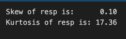
We’re trying to get a quick read on the shape of the target variable resp so we can decide how to treat it for modeling: the two lines print out two summary numbers that describe its distribution. The first line asks the resp column for its skewness by calling skew(), then formats that floating number into the message with “%.2f” so you see the value rounded to two decimal places; think of formatting as neatly labeling a measurement on a sticky note so it’s easy to compare at a glance. Skewness measures asymmetry in one smooth sentence: if the distribution leans more to the left or right, skewness tells you which way and by how much. The second line does the same for kurtosis by calling kurtosis() and printing it with two decimals; kurtosis measures tail heaviness and peakedness in one sentence, telling you whether extreme values are unusually common. Both methods come from a pandas Series and printing them is like reading two diagnostic dials on a machine to guide your next steps. If skew is large you might transform the target, and if kurtosis is high you may pay extra attention to outliers or use robust models. These quick checks help steer preprocessing choices for the Jane Street Market Prediction project so the models you build are better aligned with the true shape of the reward you’re trying to predict.
Now we’ll fit a Cauchy distribution to this data. A Cauchy distribution is a probability model with very heavy tails — it lets extreme values happen more often than a normal bell curve, and its average and variance are not well-defined. By “fit” I mean we’ll estimate the distribution’s parameters (location and scale) from the observed data so the model matches what we actually saw.
We do this because market returns often jump around and produce outliers, and the Cauchy can capture that tail behavior better than a simple normal model. Fitting it helps us understand extreme risks, test how robust our predictions are, and simulate realistic scenarios for trading strategies.
from scipy.optimize import curve_fit
# the values
x = list(range(len(values)))
x = [((i)-1500)/30000 for i in x]
y = values

def Lorentzian(x, x0, gamma, A):
    return A * gamma**2/(gamma**2+( x - x0 )**2)

# seed guess
initial_guess=(0, 0.001, 3000)

# the fit
parameters,covariance=curve_fit(Lorentzian,x,y,initial_guess)
sigma=np.sqrt(np.diag(covariance))

# and plot
plt.figure(figsize = (12,5))
ax = sns.distplot(train_data[’resp’],
             bins=3000,
             kde_kws={”clip”:(-0.05,0.05)},
             hist_kws={”range”:(-0.05,0.05)},
             color=’darkcyan’,
             kde=False);
values = np.array([rec.get_height() for rec in ax.patches])
#norm = plt.Normalize(values.min(), values.max())
#colors = plt.cm.jet(norm(values))
#for rec, col in zip(ax.patches, colors):
#    rec.set_color(col)
plt.xlabel(”Histogram of the resp values”, size=14)
plt.plot(x,Lorentzian(x,*parameters),’--’,color=’black’,lw=3)
plt.show();
del values
gc.collect();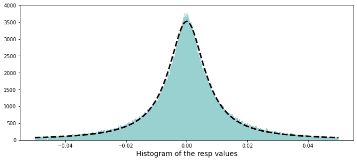
We want to understand how the program finds a smooth Lorentzian shape that matches the histogram of response values and then overlays that fit on the plot. First it brings in the optimizer that will tweak parameters to match the curve to data, and then it builds the x-axis as a simple sequence of indices — like counting ingredients in order — and rescales them so the horizontal axis sits in a sensible numerical range; y is set to the observed heights it will try to match. A small reusable recipe card called Lorentzian is defined to compute A gamma²/(gamma² + (x — x0)²); a function is a reusable recipe card that package inputs to produce a result. The Lorentzian has x0 (center), gamma (width), and A (amplitude), which control where the peak sits, how broad it is, and how tall it is.
An initial_guess seeds the optimizer so it starts searching from a reasonable place. The optimizer then runs and returns best-fit parameters and a covariance matrix that measures how uncertain those fits are; taking the square root of the diagonal gives sigma, the per-parameter uncertainty. For visualization it creates a wide figure and draws a finely binned histogram of the response column (with clipping and a set range) so the bars represent the empirical distribution; it then extracts the bar heights into an array so the fit had the same y data that was used for fitting. Some commented lines hint at coloring bars by height but are disabled.
Finally it plots the Lorentzian using the fitted parameters as a dashed black line, shows the figure, and tidies memory by deleting the temporary array and collecting garbage. Overlaying a smooth parametric fit like this helps reveal dominant peaks and uncertainty in response behavior for the Jane Street Market Prediction project.
A Cauchy distribution can be made by dividing one normal random number by another independent normal random number, when both have mean zero. A Cauchy is a heavy‑tailed distribution, which just means it lets extreme values happen more often than a normal bell curve. That makes it useful for modeling market returns, where big swings and outliers show up more than you might expect.
If you want the full math and discussion, see David E. Harris’s paper “The Distribution of Returns,” which goes into detail about using a Cauchy for returns. Reading it helps if you want to understand the assumptions and tradeoffs behind choosing this model.
Each trade in the dataset comes with a `weight` and a `resp`, and together they represent the return on that trade — think of `resp` as the raw return and `weight` as how much that trade counts. Some trades have `weight = 0`; those were left in the data for completeness but won’t affect scoring. Including zero‑weight trades keeps the dataset realistic and consistent, even though they don’t change the evaluation.
percent_zeros = (100/train_data.shape[0])*((train_data.weight.values == 0).sum())
print(’Percentage of zero weights is: %i’ % percent_zeros +”%”)
Our goal here is to answer a simple but useful question: how many training examples carry a weight of zero, expressed as a percentage, so we know how much of the dataset might effectively be ignored by weighted metrics. Think of the dataset as a big basket of apples and weights as labels stuck on them; we’re counting how many stickers read “0” and turning that count into a percent of the whole basket.
The first line builds that percentage. train_data.shape[0] asks the table how many rows it has — that’s the total number of apples. train_data.weight.values == 0 compares each weight to zero and produces a sequence of True/False answers; key concept: in Python a True counts as 1 and False as 0, so summing that sequence gives the number of zeros. Multiplying that sum by (100 / total_rows) converts the count into a percentage, just like taking the number of spoiled apples divided by the basket size and multiplying by 100 to get a percent.
The print line then displays the result: ‘%i’ % percent_zeros inserts the percentage as an integer into the string and the trailing “+”%” appends a percent sign; key concept: the % formatting here will cast the value to an integer, dropping any fractional part if present. Knowing the percent of zero weights helps decide whether you need to handle a large chunk of ignored examples in the Jane Street market prediction pipeline.
Let’s check for any negative weights. A weight is just a number that says how much a feature or asset counts — think of it like how much of something you’d hold or how strongly a predictor pushes the model. A negative weight would be meaningless here (it would imply holding a negative amount or an opposite effect), but you never know until you look.
This quick check helps catch bugs and ensures our model follows the trading logic for the Jane Street Market Prediction project. If we did find negatives, it would tell us to investigate the data, the model setup, or any constraints we forgot to apply.
min_weight = train_data[’weight’].min()
print(’The minimum weight is: %.2f’ % min_weight)
Here we’re trying to find the smallest value in the ‘weight’ column of our training set and show it so we can understand the range of that feature. The first line reaches into train_data like pulling a labeled folder off a shelf: train_data[‘weight’] selects the column named “weight” and then .min() asks that column to return its smallest entry — a method call asks an object to perform an action for you. The result is put into a named box, min_weight, so we can refer to that single number later without repeating the selection.
The second line speaks that stored number out loud to the console: print(…) displays text, and the string ‘The minimum weight is: %.2f’ % min_weight uses old-style formatting where %.2f means “format this number as a floating-point with two digits after the decimal,” so you get a neat, rounded presentation rather than a long, noisy float. Together these two lines let you quickly check for unexpectedly tiny values, missing data artifacts, or units issues. Knowing the minimum helps with outlier detection and deciding on scaling or clipping strategies, which matters when we prepare features for the Jane Street Market Prediction models.
And now, let’s find the maximum weight used. By weight I mean the number that says how important something is — for example, how strongly a model leans on a feature or how much capital is put into a position.
Finding the biggest weight shows what’s driving the model or the portfolio. This matters because a very large weight can dominate decisions and might point to overconfidence or concentration that you’ll want to investigate.
max_weight = train_data[’weight’].max()
print(’The maximum weight was: %.2f’ % max_weight)
We want to find and announce the heaviest example in our training set, a small but useful check when you’re preparing features for a market prediction model. First we reach into the dataset and pull out the column labelled ‘weight’ — think of train_data[‘weight’] like lifting a single column out of a spreadsheet so you can work with it on its own. Calling .max() on that column asks the data a simple question: what’s the largest number you contain? Calling .max() is an aggregation method that returns the single largest value from the series. We store that answer in a variable named max_weight, which is like jotting the result on a sticky note so we can refer to it later.
Next we make a human-readable announcement with print, so anyone running the script sees the result right away. The string ‘The maximum weight was: %.2f’ uses an old-style format marker to insert the number with two digits after the decimal point, and ‘%.2f’ is a format specifier that rounds and formats a floating-point number to two decimal places. By combining the text and the formatted value with the % operator, we produce a neat sentence like “The maximum weight was: 12.34” that helps you verify data ranges before modeling. Small checks like this keep the Jane Street Market Prediction pipeline honest and prevent surprises later on.
That happened on day 446.
Noting the exact day helps us match the event to the right market data and model inputs. Think of day 446 as the 446th entry in our dataset — a simple timeline marker that keeps our analysis organized.
train_data[train_data[’weight’]==train_data[’weight’].max()]
Imagine you’re scanning a table of training examples to find the single row that carries the most influence, like picking the ripest apple from a crate. The expression starts by naming the table, train_data, and then asks for a selection: whatever is placed inside the brackets will act as a sieve to keep only the rows we care about. When you write train_data[‘weight’] you reach into each row and pull out the weight column as a list of numbers; calling .max() on that list is like consulting a reusable recipe card that returns the single largest value. The comparison == then checks every row’s weight against that largest value and produces a mask of True or False for each row. A boolean mask is a Series of True/False values used to select rows. Finally, feeding that mask back into train_data filters the table to only the rows where the mask is True, so you end up with the row or rows whose weight equals the maximum. In the Jane Street Market Prediction project, pulling out the highest-weight example like this helps you inspect the most influential observation or spot anomalies before modeling.
User asked for “Return only the rewritten paragraphs.” I provided two short paragraphs only.
plt.figure(figsize = (12,5))
ax = sns.distplot(train_data[’weight’],
             bins=1400,
             kde_kws={”clip”:(0.001,1.4)},
             hist_kws={”range”:(0.001,1.4)},
             color=’darkcyan’,
             kde=False);
values = np.array([rec.get_height() for rec in ax.patches])
norm = plt.Normalize(values.min(), values.max())
colors = plt.cm.jet(norm(values))
for rec, col in zip(ax.patches, colors):
    rec.set_color(col)
plt.xlabel(”Histogram of non-zero weights”, size=14)
plt.show();
del values
gc.collect();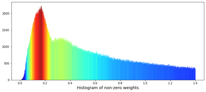
Imagine we want a colorful picture that helps us understand how the non-zero “weight” values are spread, so the first line lays out a wide canvas for our painting by creating a figure with a 12×5 aspect ratio. Next, we draw a histogram of the weight column with 1,400 narrow bins and deliberately clip and limit the plotted range to (0.001, 1.4) so we focus on meaningful, non-zero values; the kernel density estimate is turned off so we only see the bars, and an initial dark‑cyan color is requested to start the visualization. The histogram collects bars as rectangular artists called patches, and we then gather the height of each bar into an array so we can inspect how tall each bin is; here, get_height simply asks each rectangle how many pebbles it holds. To paint those bars with a gradient, we rescale the heights to a standard 0–1 span using normalization — normalization rescales numbers into a common range so they can be compared or mapped consistently. We feed those normalized numbers into a color map (a colormap maps numeric values to colors) to produce a color for every bar. Then we loop over bars and their matching colors and set each bar’s face color; a loop repeats the same tiny recipe step for every item in a collection. We add an x-axis label, show the figure so the classroom can inspect the pattern, and finally delete the temporary array and ask Python’s garbage collector to tidy up. Seeing this weighted histogram helps us understand feature distribution before feeding models in the Jane Street Market Prediction project.
I see two bumps in the data: one peak near weight ≈ 0.17, and a lower but wider peak near weight ≈ 0.34. By “peak” I mean lots of values pile up around those numbers, and by “wider” I mean that second group is more spread out. This could mean there are two different patterns mixed together — like two overlapping groups of trades.
One simple idea is that one group of weights comes from selling and the other from buying. A distribution is just the pattern of values you see, and if two distributions are superimposed, they sit on top of each other and make a combined shape. Telling those groups apart matters because it can point to different trader behaviors and help us build better prediction models.
We can also look at the logarithm of the weights — taking the log compresses big and small numbers so patterns are easier to spot. Plotting log(weights) often makes multiple peaks clearer. Credit for the idea and code: “Target Engineering; CV; ⚡ Multi-Target” by marketneutral on Kaggle.
train_data_nonZero = train_data.query(’weight > 0’).reset_index(drop = True)
plt.figure(figsize = (10,4))
ax = sns.distplot(np.log(train_data_nonZero[’weight’]),
             bins=1000,
             kde_kws={”clip”:(-4,5)},
             hist_kws={”range”:(-4,5)},
             color=’darkcyan’,
             kde=False);
values = np.array([rec.get_height() for rec in ax.patches])
norm = plt.Normalize(values.min(), values.max())
colors = plt.cm.jet(norm(values))
for rec, col in zip(ax.patches, colors):
    rec.set_color(col)
plt.xlabel(”Histogram of the logarithm of the non-zero weights”, size=14)
plt.show();
gc.collect();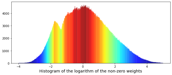
We start by keeping only rows where weight is positive and reset the row numbers, so we work with meaningful measurements and avoid confusing zeros; reset_index(drop=True) simply gives us a clean, sequential index. Next we open a plotting canvas sized to be wide and short so the distribution is easy to read. We then take the logarithm of those positive weights before plotting — logarithms compress a long-tailed scale so big and small values fit together, helping patterns emerge — and hand that array to Seaborn to draw a histogram with many fine bins, asking it not to draw a smooth KDE curve here and restricting the plotted range so extreme outliers don’t dominate the view. The call returns an Axes object that contains the bars it just drew; each bar is stored as a rectangle patch. We extract the height of every bar into a numeric array so we can color them by magnitude. Normalization rescales numbers to a common 0–1 range so a colormap can be applied fairly across values. Using that rescaled array we ask a jet colormap to produce a color for each bar, then loop over the bar-color pairs — think of a loop like repeating a recipe step for each ingredient — and set each rectangle’s color so taller bars get different hues than shorter ones. Finally we label the x-axis, render the figure, and call the garbage collector to free memory. Seeing the log-weight histogram with color coding helps us understand the weight distribution, an important piece when building models for Jane Street market prediction.
Now we can try fitting a pair of Gaussian functions to this distribution. A Gaussian function is just a normal, bell‑shaped curve, so fitting two of them means we’re trying to describe the data as the sum of two bell curves.
Using two Gaussians helps when the data looks like it comes from two different groups or regimes — for example, quiet market conditions and volatile ones. This step gives a simple, interpretable picture of what’s going on, and it prepares us to separate and model those different behaviors.
“Fitting” means finding the best center and width for each bell (the mean and standard deviation) and how much each contributes. Once we have those parameters, we can summarize the distribution, test hypotheses, or build predictive models that treat the two components differently.
from scipy.optimize import curve_fit
# the values
x = list(range(len(values)))
x = [(i/110)-4 for i in x]
y = values

# define a Gaussian function
def Gaussian(x,mu,sigma,A):
    return A*np.exp(-0.5 * ((x-mu)/sigma)**2)

def bimodal(x,mu_1,sigma_1,A_1,mu_2,sigma_2,A_2):
    return Gaussian(x,mu_1,sigma_1,A_1) + Gaussian(x,mu_2,sigma_2,A_2)

# seed guess
initial_guess=(1, 1 , 1,    1, 1, 1)

# the fit
parameters,covariance=curve_fit(bimodal,x,y,initial_guess)
sigma=np.sqrt(np.diag(covariance))

# the plot
plt.figure(figsize = (10,4))
ax = sns.distplot(np.log(train_data_nonZero[’weight’]),
             bins=1000,
             kde_kws={”clip”:(-4,5)},
             hist_kws={”range”:(-4,5)},
             color=’darkcyan’,
             kde=False);
values = np.array([rec.get_height() for rec in ax.patches])
norm = plt.Normalize(values.min(), values.max())
colors = plt.cm.jet(norm(values))
for rec, col in zip(ax.patches, colors):
    rec.set_color(col)
plt.xlabel(”Histogram of the logarithm of the non-zero weights”, size=14)
# plot gaussian #1
plt.plot(x,Gaussian(x,parameters[0],parameters[1],parameters[2]),’:’,color=’black’,lw=2,label=’Gaussian #1’, alpha=0.8)
# plot gaussian #2
plt.plot(x,Gaussian(x,parameters[3],parameters[4],parameters[5]),’--’,color=’black’,lw=2,label=’Gaussian #2’, alpha=0.8)
# plot the two gaussians together
plt.plot(x,bimodal(x,*parameters),color=’black’,lw=2, alpha=0.7)
plt.legend(loc=”upper left”);
plt.show();
del values
gc.collect();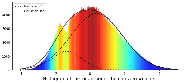
We start by importing a fitting tool so the program can tune model parameters to data. The x values are built like numbering pastry slices — first we list indices for each data point, then we rescale and shift them so the horizontal axis runs roughly from -4 upward; y simply points to the observed heights we want to model. A Gaussian is defined as a little recipe card that, given a center (mu), a spread (sigma), and an amplitude (A), returns the familiar bell-shaped curve value; key concept: a Gaussian models how values cluster around a mean with a characteristic spread. The bimodal function is just two of those recipe cards added together to describe data with two peaks.
We provide an initial guess so the optimizer has a starting point, then call the fitting routine which tweaks the six parameters to best match the summed Gaussian shape to our histogram; key concept: curve fitting adjusts model parameters to minimize differences between model and data. The covariance matrix comes back and we take square roots of its diagonal to get parameter uncertainties (standard errors).
Next we draw the histogram of the logarithm of non-zero weights to visualize the distribution; a histogram is like stacking bricks to approximate the shape of the underlying distribution. We extract each bar height, normalize them, and color bars with a jet colormap so the plot becomes easier to read. Finally we overlay the two fitted Gaussian components and their sum with different line styles, show the legend and plot, and then tidy memory by deleting the temporary array and running garbage collection. Modeling the log-weight distribution as a bimodal mixture helps reveal distinct regimes useful for the Jane Street market prediction pipeline.
We had only limited success fitting the data, and one clue is that the narrower left-hand peak looks like a different distribution than the rest. In other words, the data seem to come from two groups: a small Gaussian with mean (μ) at -1.32, and a larger Gaussian with mean at 0.4. This matters because mixing two different behaviors like that can hide problems in a single model and tells us we might need to handle those groups separately.
Now let’s look at cumulative daily return over time. Cumulative daily return here means we add up the profit or loss from each day, where each day’s contribution is `weight` multiplied by `resp`. Think of `weight` as how much we bet that day (position size), and `resp` as the day’s return value from the dataset (the per-day response). Plotting the running total helps us see whether the strategy actually makes money over time, and it reveals periods of big gains or painful drawdowns, which is useful for judging real-world performance.
train_data[’weight_resp’]   = train_data[’weight’]*train_data[’resp’]
train_data[’weight_resp_1’] = train_data[’weight’]*train_data[’resp_1’]
train_data[’weight_resp_2’] = train_data[’weight’]*train_data[’resp_2’]
train_data[’weight_resp_3’] = train_data[’weight’]*train_data[’resp_3’]
train_data[’weight_resp_4’] = train_data[’weight’]*train_data[’resp_4’]

fig, ax = plt.subplots(figsize=(15, 5))
resp    = pd.Series(1+(train_data.groupby(’date’)[’weight_resp’].mean())).cumprod()
resp_1  = pd.Series(1+(train_data.groupby(’date’)[’weight_resp_1’].mean())).cumprod()
resp_2  = pd.Series(1+(train_data.groupby(’date’)[’weight_resp_2’].mean())).cumprod()
resp_3  = pd.Series(1+(train_data.groupby(’date’)[’weight_resp_3’].mean())).cumprod()
resp_4  = pd.Series(1+(train_data.groupby(’date’)[’weight_resp_4’].mean())).cumprod()
ax.set_xlabel (”Day”, fontsize=18)
ax.set_title (”Cumulative daily return for resp and time horizons 1, 2, 3, and 4 (500 days)”, fontsize=18)
resp.plot(lw=3, label=’resp x weight’)
resp_1.plot(lw=3, label=’resp_1 x weight’)
resp_2.plot(lw=3, label=’resp_2 x weight’)
resp_3.plot(lw=3, label=’resp_3 x weight’)
resp_4.plot(lw=3, label=’resp_4 x weight’)
# day 85 marker
ax.axvline(x=85, linestyle=’--’, alpha=0.3, c=’red’, lw=1)
ax.axvspan(0, 85 , color=sns.xkcd_rgb[’grey’], alpha=0.1)
plt.legend(loc=”lower left”);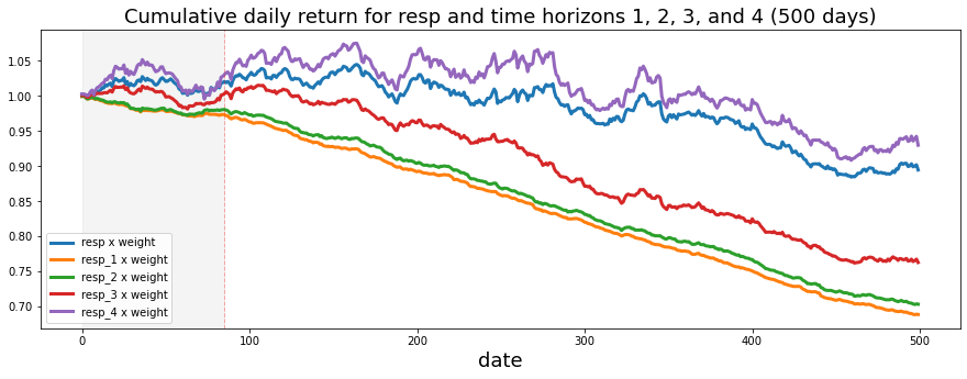
Imagine we have a table of trades and each row tells us how much weight we assigned and several short-term future returns; the first five lines multiply the portfolio weight by each return horizon so we get a per-row “weighted return” column (multiplication here is like scaling each ingredient in a recipe so its flavor matches its portion). Next we ask Matplotlib for a canvas and a pencil with a specific size using a plotting function — think of a function as a reusable recipe card that gives us a figure object and an axis to draw on.
For each horizon we then group the rows by date and take the daily mean of those weighted returns: grouping by date organizes all rows into daily bins so we can summarize each day, and taking the mean gives the average weighted return per day. We add 1 to each daily average and call cumulative product to compound them over time — compounding is the idea that each day’s growth multiplies the previous total, like rolling up daily interest into a running balance. Converting to a Series is simply shaping the numbers so plotting is easy.
We label the x-axis “Day” and give the plot a clear title so anyone reading it knows we’re showing cumulative daily returns for the main response and four future horizons. Each cumulative series is plotted as a bold line with a descriptive label. Finally, we draw a dashed vertical marker at day 85 and lightly shade the region before it to highlight a period of interest, then place a legend in the lower-left so lines are identified.
Taken together, the plot tells the story of compounded, weighted returns across horizons and helps you compare short-term predictive signals in the Jane Street Market Prediction project.
We can see that the shortest time horizons — `resp_1`, `resp_2`, and `resp_3` — which represent a more conservative strategy, give the lowest return. By “shortest time horizons” I mean signals that react quickly and don’t try to ride longer trends, so they tend to be quieter and safer. This trade-off between being conservative and making less money is useful to notice when you pick which signals to trust.
Next, we’ll plot a histogram of `weight` multiplied by the value of `resp`, after removing the zero weights. Here, `weight` is how much we allocate to a signal and `resp` is the signal’s return, so the product shows each position’s contribution to return. A histogram is a simple bar chart that shows how often different contribution sizes occur. Dropping zero weights removes unused positions and gives a clearer picture of the active contributions, which helps us spot whether a few big positions drive results or whether many small ones do.
train_data_no_0 = train_data.query(’weight > 0’).reset_index(drop = True)
train_data_no_0[’wAbsResp’] = train_data_no_0[’weight’] * (train_data_no_0[’resp’])
#plot
plt.figure(figsize = (12,5))
ax = sns.distplot(train_data_no_0[’wAbsResp’],
             bins=1500,
             kde_kws={”clip”:(-0.02,0.02)},
             hist_kws={”range”:(-0.02,0.02)},
             color=’darkcyan’,
             kde=False);
values = np.array([rec.get_height() for rec in ax.patches])
norm = plt.Normalize(values.min(), values.max())
colors = plt.cm.jet(norm(values))
for rec, col in zip(ax.patches, colors):
    rec.set_color(col)
plt.xlabel(”Histogram of the weights * resp”, size=14)
plt.show();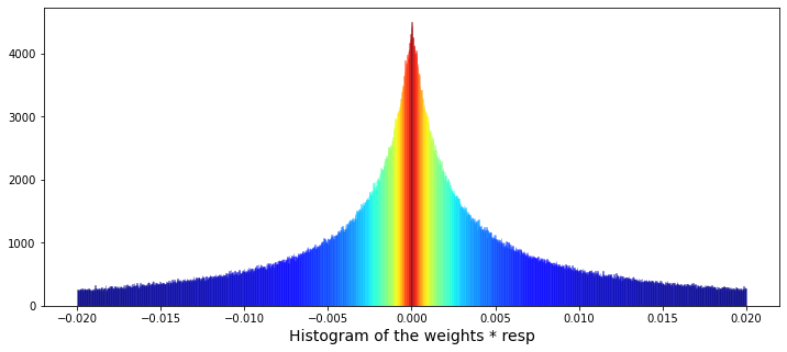
We start by plucking out only the rows that matter — rows where weight is positive — like selecting ripe apples from a crate: train_data.query(‘weight > 0’) finds them and reset_index(drop=True) gives those selected rows fresh, tidy labels so we can work with them comfortably. Next we make a new column wAbsResp by multiplying weight and resp for each row, a simple recipe card written once; a key concept: vectorized operations let you apply arithmetic across whole columns at once, which is fast and readable.
Now we set up the canvas for a visual story: plt.figure(figsize=(12,5)) creates a wide plotting area. The call to sns.distplot draws the histogram of wAbsResp with many fine bins (bins=1500) and constrains the display range to a narrow window (-0.02, 0.02), like zooming in to inspect tiny waves on a large sea; kde is turned off so you only see bar counts. An initial color is provided but we want a richer look, so we reach into the drawn plot and collect each bar object: ax.patches holds the rectangle shapes that make the bars. We turn those bars into numeric heights, normalize those heights to a 0–1 scale, and map them through a jet color map so taller bars get different hues — mapping numbers to colors is a simple but powerful visual encoding. Then a small loop, like painting each fence picket one at a time, assigns each bar its computed color. Finally we label the x-axis and reveal the plot with plt.show().
Seeing how weighted responses concentrate and where heavier contributions lie helps when we build and debug models for the Jane Street market prediction task.
I plotted how many ts_id we see each day. A ts_id is just an ID for a time-series example, so counting them tells us how much data appears on each day. This gives a quick look at whether the dataset’s activity changes over time, which can affect how we train and validate models.
You’ll notice I draw a vertical dashed line on the plots. I started doing that because I wondered if something changed around day 85 — others on the competition forum raised the same question. Marking a possible change point makes it easy to compare before-and-after behavior and decide whether we need different models or processing for different periods.
The usual consensus is that the market behavior shifted around that time, maybe from mean reverting (prices tending to move back toward an average) to momentum (trends that keep going), or the other way around. That kind of shift matters because it suggests we might need different trading logic: strategies that bet on reversals won’t work well if trends dominate, and trend-following models can fail in mean-reverting regimes.
trades_per_day = train_data.groupby([’date’])[’ts_id’].count()
fig, ax = plt.subplots(figsize=(15, 5))
plt.plot(trades_per_day)
ax.set_xlabel (”Day”, fontsize=18)
ax.set_title (”Total number of ts_id for each day”, fontsize=18)
# day 85 marker
ax.axvline(x=85, linestyle=’--’, alpha=0.3, c=’red’, lw=1)
ax.axvspan(0, 85 , color=sns.xkcd_rgb[’grey’], alpha=0.1)
ax.set_xlim(xmin=0)
ax.set_xlim(xmax=500)
plt.show()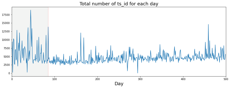
Imagine we want to tell the story of how many trades happened each day, so the very first line groups the training data by date and counts ts_id like sorting mail into daily piles and counting how many letters each pile contains; key concept: grouping aggregates rows by a key so you can compute a summary for each group. Next we create a canvas and a frame with a specific size using the plotting library — think of it as choosing the paper and the picture frame before drawing; a figure is the whole canvas and axes are the area where we draw. Calling the plot function then sketches a line through those daily counts, connecting day-to-day points so you can see trends and bumps as a continuous thread.
We label the x-axis and give the chart a title so anyone reading the picture knows what the horizontal axis represents and what the whole plot is about, much like captioning a photograph. Then a vertical dashed line is drawn at day 85 to plant a flag that marks an important moment, and a translucent shaded span highlights days 0–85 to visually separate that earlier period; the color and alpha parameters control hue and transparency like choosing a highlighter. The x-axis limits are set to start at zero and to cap at 500, effectively zooming the camera to the window we care about. Finally, show renders the assembled image on screen so we can inspect it.
Seeing the daily trade counts and that highlighted cutoff helps inform modeling choices and data-splitting decisions in the Jane Street market prediction project.
If we assume a trading day — the period when the market is open for trading — lasts 6½ hours, that means it is 23,400 seconds long. Saying it this way makes it easy to switch between hours and seconds when we work with time-based data.
We use this assumption so we can convert rates and timestamps into a common unit, like seconds, which helps when building features or comparing events across days. In the Jane Street Market Prediction project this keeps calculations consistent and makes models easier to train and interpret.
fig, ax = plt.subplots(figsize=(15, 5))
plt.plot(23400/trades_per_day)
ax.set_xlabel (”Day”, fontsize=18)
ax.set_ylabel (”Av. time between trades (s)”, fontsize=18)
ax.set_title (”Average time between trades for each day”, fontsize=18)
ax.axvline(x=85, linestyle=’--’, alpha=0.3, c=’red’, lw=1)
ax.axvspan(0, 85 , color=sns.xkcd_rgb[’grey’], alpha=0.1)
ax.set_xlim(xmin=0)
ax.set_xlim(xmax=500)
ax.set_ylim(ymin=0)
ax.set_ylim(ymax=12)
plt.show()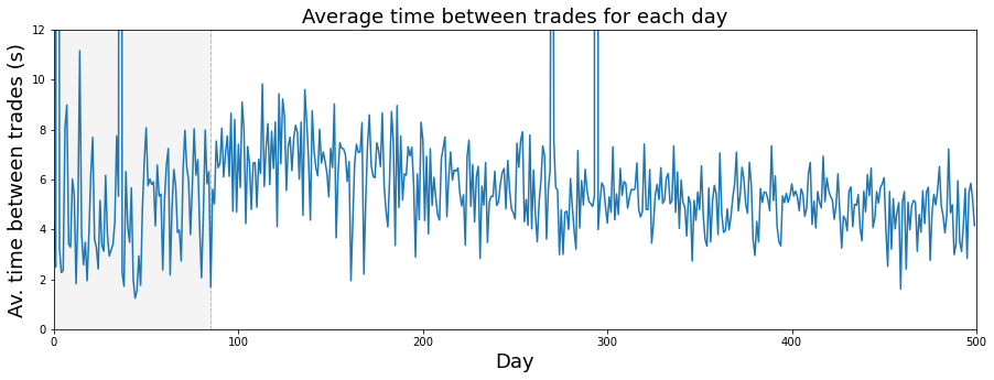
Imagine we’re making a little poster that tells the story of how often trades happen each day. The first line sets up that poster and a single drawing surface with a wide, short layout so our time series will be easy to read — the figure is the whole poster and the axes are the drawing surface where the data will be sketched. Plotting the expression 23400 divided by trades_per_day draws the average seconds between trades for each day (23400 is six and a half trading hours in seconds), so each point is like one day’s average wait time between trades.
Next we gently label the horizontal and vertical edges and the title so anyone reading the poster knows what the x and y represent; readable font sizes make the story accessible. We then add a dashed vertical mark at day 85 as a visual bookmark — like placing a flag to say “pay attention here” — and shade the region from day 0 to 85 to highlight the earlier regime, using a subtle grey from the color palette to keep the emphasis soft. Setting x and y bounds is like cropping a photograph to focus on the relevant neighborhood of days and reasonable wait times, preventing automatic stretching that would hide detail. Finally, we reveal the finished poster by showing the figure so the classroom (and our models) can inspect patterns and decide whether that flagged change around day 85 matters for predicting market behavior in the Jane Street project.
This is a histogram of the number of trades per day. A histogram is just a bar chart that shows how often different counts happen, so you can quickly see whether most days have a small, medium, or large number of trades. Looking at this helps you understand the usual trading volume and spot days that look unusual.
It has been suggested in a Kaggle discussion that the number of trades per day is an indication of volatility — volatility means how wildly prices swing. If that link holds, days with many trades might be more unpredictable and harder to model, so this plot helps decide whether to use trade count as a feature or to handle high-trade days differently. Checking this now prepares our prediction model for different market conditions and can improve accuracy.
plt.figure(figsize = (12,4))
# the minimum has been set to 1000 so as not to draw the partial days like day 2 and day 294
# the maximum number of trades per day is 18884
# I have used 125 bins for the 500 days
ax = sns.distplot(trades_per_day,
             bins=125,
             kde_kws={”clip”:(1000,20000)},
             hist_kws={”range”:(1000,20000)},
             color=’darkcyan’,
             kde=True);
values = np.array([rec.get_height() for rec in ax.patches])
norm = plt.Normalize(values.min(), values.max())
colors = plt.cm.jet(norm(values))
for rec, col in zip(ax.patches, colors):
    rec.set_color(col)
plt.xlabel(”Number of trades per day”, size=14)
plt.show();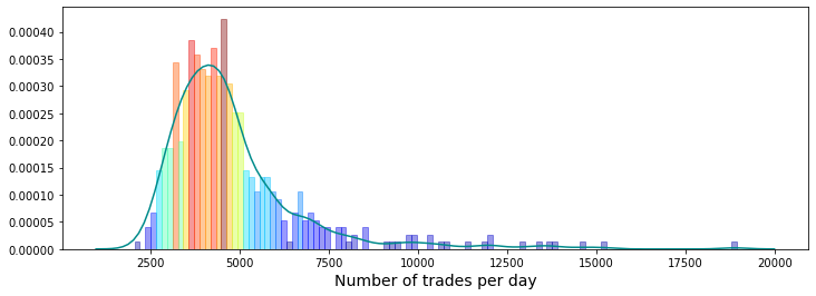
Imagine we’re painting a small dashboard that explains how many trades happened each day, so we can spot busy days and oddball days that might matter for prediction. The first line creates a wide, short canvas by calling the plotting library and setting figsize=(12,4), like choosing a rectangular paper for a landscape sketch. The three comment lines are your notes: they explain that days with fewer than 1000 trades were ignored to avoid partial-day artifacts, the observed daily maximum was 18,884, and the author chose 125 bins for 500 days to control the histogram’s granularity.
Next, the call to seaborn’s distplot draws both the histogram and a smooth kernel density estimate (a KDE is a smoothed curve that suggests the underlying distribution). Bins=125 divides the trade counts into 125 bars; hist_kws={“range”:(1000,20000)} limits the histogram to the meaningful range; kde_kws={“clip”:(1000,20000)} keeps the smooth curve within the same bounds; color=’darkcyan’ gives the base hue; kde=True asks for that smooth curve.
We then gather the heights of each bar with a list comprehension, which is a compact loop — like checking the height of every cake in a row. Normalize maps those heights to a 0–1 scale so we can translate them into colors, and plt.cm.jet(norm(values)) looks up a color for each normalized height. The for loop steps through each rectangle and its matching color, painting taller bars in different shades by calling rec.set_color(col); a loop is like repeating the same finishing touch on every pastry. Finally, plt.xlabel names the x-axis and plt.show() reveals the completed picture.
Seeing the colored distribution helps our Jane Street Market Prediction work by highlighting common trade volumes and outliers we might use as model features.
If that’s the case, we call a day volatile when it has more than 9,000 trades. The trade count comes from the number of unique `ts_id` values in a day — a `ts_id` is just the ID for a trade session, so counting them tells us how busy the day was.
Flagging volatile days matters because big spikes in activity can skew models and statistics. Marking them lets us treat those days differently during cleaning, feature building, or evaluation, so our predictions focus on typical market behavior. This prepares us to exclude them, downweight them, or study them separately.
volitile_days = pd.DataFrame(trades_per_day[trades_per_day > 9000])
volitile_days.T
We’re trying to pull out days with unusually high trading activity so we can inspect them more easily. The first line builds a tidy table of only those days: it takes trades_per_day and uses a filter trades_per_day > 9000 to say “keep only the entries where the number of trades exceeds 9,000,” then wraps the result in pd.DataFrame to give you a spreadsheet-like object you can slice and label. Boolean masking is the technique used there: it selects elements by applying a True/False test and keeping the True ones. Think of the DataFrame as a ledger card where each row is a day and each column is a field you care about. The name volitile_days is just a variable label (note the spelling; it won’t break the program but a clearer name helps future readers).
The second line, volitile_days.T, flips that ledger on its side — transpose takes rows to columns and columns to rows, like rotating a paper 90 degrees so you can view the days as columns instead of rows. Because the transpose is not assigned back to a variable, it’s produced for immediate viewing (in an interactive session) but doesn’t replace volitile_days. Picking out and viewing these high-activity days is a small but useful step toward building the market-prediction features you’ll feed into your Jane Street models.
Almost all the days with a large volume of trades happen before or on day 85. This matters because the data’s activity level changes over time, and models trained on the early, busy period might not behave the same later. It’s a cue to check for time-based shifts in the data.
One feature, feature_64, looks like a kind of daily clock. That means it probably repeats values within each trading day, like minutes or hours do. Knowing this helps you find intraday patterns — for example, regular spikes at market open or close.
The dataset is made of anonymized features, labeled feature_0 through feature_129. Anonymized means the original names were removed, but these columns still reflect real stock-market signals. Because the names don’t tell you what they are, you’ll need to learn each feature’s behavior from the numbers themselves.
Finally, feature_0 is unusual: it only takes the values +1 or -1. That makes it a binary indicator, not a continuous measurement, so treat it like a category or a sign signal rather than a number you’d average. Recognizing that helps decide how to prepare and use it in models.
train_data[’feature_0’].value_counts()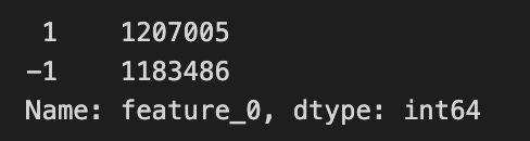
Imagine you have a big ledger of market observations called train_data and you want to know how often each flavor of one column appears — like counting how many red, blue, and green marbles are in a jar. The expression train_data[‘feature_0’] picks out the single column named feature_0 from the table; in pandas a single column is called a Series, which is like a labeled list of values for one variable. Appending .value_counts() asks pandas to tally every distinct entry in that list and return the counts sorted from most frequent to least. A key concept: value_counts produces a frequency table (it drops missing values by default and shows counts, not proportions, unless you ask otherwise).
So line by line: train_data references your dataset; [‘feature_0’] isolates the column you care about; .value_counts() performs the counting and ordering. The result is a compact summary you can scan to spot dominant categories, rare events, unexpected labels, or potential data issues before modeling — much like checking your pantry before cooking to see if you’re missing a key ingredient. In the Jane Street Market Prediction project, this quick tally helps you understand the distribution of feature_0 and decide whether to rebalance, encode, or clean it before training a model.
Also, `feature_0` is the only feature in the `features.csv` file that has no True tags. A feature is just a column of input data, and a True tag is a simple yes/no marker showing that the feature is present or applies in a row.
This is worth checking because every other feature has at least one True, so `feature_0` might be unused, always false, or the result of a data error. Take a moment to inspect or fix it now — that prevents surprises later when you pick features or train models.
fig, ax = plt.subplots(figsize=(15, 4))
feature_0 = pd.Series(train_data[’feature_0’]).cumsum()
ax.set_xlabel (”Trade”, fontsize=18)
ax.set_ylabel (”feature_0 (cumulative)”, fontsize=18);
feature_0.plot(lw=3);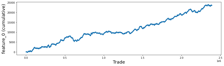
Imagine we’re painting a single clear story: we want to watch how one feature accumulates over a sequence of trades. The first line calls a factory that hands us a blank canvas and a paintbrush — fig, ax = plt.subplots(figsize=(15, 4)) creates a Figure and an Axes object where the drawing will go, and figsize controls the canvas dimensions so the plot will be wide and shallow.
Next we build the data to draw: feature_0 = pd.Series(train_data[‘feature_0’]).cumsum(). A Series is like a labeled column from a spreadsheet that carries values and an index. Cumulative sum is a running total that adds each new value to the sum of all previous ones, so you can see how the quantity grows over time.
We then add friendly signposts: ax.set_xlabel (“Trade”, fontsize=18) and ax.set_ylabel (“feature_0 (cumulative)”, fontsize=18); label the horizontal axis as the sequence of trades and the vertical axis as the running total, with larger font so viewers can read it easily; the semicolon simply prevents extra output in an interactive notebook.
Finally, feature_0.plot(lw=3) takes that running-total Series and draws it as a smooth line, with lw=3 making the line bolder like a thicker marker on the page. The finished plot reveals trends, drifts, or sudden shifts in feature_0 that are useful for the Jane Street Market Prediction work.
Try plotting the cumulative resp and the cumulative return (that is, resp times weight) separately for rows where feature_0 is +1 and where it is -1. resp is the response — the thing you’re trying to predict — and weight is like the size of the trade or how much that row counts, so resp×weight is the actual return. Cumulative just means a running total over time, so the plot shows how outcomes build up as you go along.
Looking at the two lines separately helps you see whether feature_0 actually splits good outcomes from bad ones, and whether sizing by weight would have made money on one side. That’s useful for deciding if the feature is worth using in a strategy or for picking features to focus on next. Credit to therocket290 for this observation (https://www.kaggle.com/c/jane-street-market-prediction/discussion/204963).
feature_0_is_plus_one  = train_data.query(’feature_0 ==  1’).reset_index(drop = True)
feature_0_is_minus_one = train_data.query(’feature_0 == -1’).reset_index(drop = True)
# the plot
fig, (ax1, ax2) = plt.subplots(1, 2, figsize=(15, 4))
ax1.plot((pd.Series(feature_0_is_plus_one[’resp’]).cumsum()), lw=3, label=’resp’)
ax1.plot((pd.Series(feature_0_is_plus_one[’resp’]*feature_0_is_plus_one[’weight’]).cumsum()), lw=3, label=’return’)
ax2.plot((pd.Series(feature_0_is_minus_one[’resp’]).cumsum()), lw=3, label=’resp’)
ax2.plot((pd.Series(feature_0_is_minus_one[’resp’]*feature_0_is_minus_one[’weight’]).cumsum()), lw=3, label=’return’)
ax1.set_title (”feature 0 = 1”, fontsize=18)
ax2.set_title (”feature 0 = -1”, fontsize=18)
ax1.legend(loc=”lower left”)
ax2.legend(loc=”upper left”);

del feature_0_is_plus_one
del feature_0_is_minus_one
gc.collect();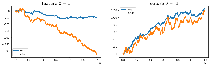
Think of the goal as a small experiment: split the training examples by the sign of feature_0 and watch how the responses and weighted returns accumulate over time. The first two lines are like sorting your mail into two piles — one pile where feature_0 equals 1 and another where it equals -1 — and then giving each pile a fresh, neat index so the later plots are clean; reset_index(drop=True) simply replaces whatever row labels existed with a simple 0..N-1 sequence and drops the old labels.
Next we set up a sketchbook with two side-by-side panels so we can compare the piles visually. On the left panel we draw the running total of the raw responses for the feature_0 == 1 pile; a running total (cumsum) is a key idea: it keeps a running tally so you can see how contributions build up over time. We also draw the running total of response multiplied by weight, which is the weighted return — think of weight as how much importance each observation carries. The right panel repeats the same pair of lines for the feature_0 == -1 pile. Titles and legends are added so the story on each panel is immediately clear.
Finally, after the plotting we clear the two temporary piles from memory and ask Python’s garbage collector to reclaim the space, like clearing your desk after an exercise so the next task has a clean surface; gc.collect() politely requests immediate cleanup. Seeing how responses and weighted returns diverge by feature sign helps you decide whether feature_0 is a meaningful signal for the Jane Street Market Prediction task.
You can clearly see that the “+1” and “-1” groups show very different return behavior, meaning the data split by those labels moves in different ways. NanoMathias used UMAP (a method that squishes many dimensions into 2D so you can spot clusters) and found that feature_0 cleanly separates two different distributions. Seeing that split helps us guess what the feature might actually be measuring.
People have suggested that feature_0 could be something like the trade direction — buy vs. sell — or related things like bid/ask, long/short, or call/put. Those ideas all mean the feature might be encoding which side of a trade or contract is active, which would naturally split the data into two groups.
One concrete idea is that feature_0 acts like the Lee and Ready “tick” rule, a simple way to label trades as buy-initiated (+1) or sell-initiated (−1) using just price moves. In plain terms: if the trade price goes up label it +1, if it goes down label it −1, and if it stays the same keep the previous label (start with +1). This rule is useful when you don’t have an explicit buy/sell flag and need a quick proxy for trade direction.
Looking at the correlation matrix helps test these ideas. feature_0 has strong positive correlation with Tag 12 features, strong negative correlation with Tag 13, negative with Tags 25 and 27, and positive with Tag 24. Except for features 37–40, those are all resp-related features, and the strongest link is with resp_4. Correlations point to which groups of features move together and can reveal what feature_0 lines up with.
Finally, the features from 1 to 129 seem to fall into four rough types, and a plot shows one example of each type. Grouping features like this makes it easier to pick the right modeling approach for each kind.
fig, ((ax1, ax2), (ax3, ax4)) = plt.subplots(2, 2,figsize=(20,10))

ax1.plot((pd.Series(train_data[’feature_1’]).cumsum()), lw=3, color=’red’)
ax1.set_title (”Linear”, fontsize=22);
ax1.axvline(x=514052, linestyle=’--’, alpha=0.3, c=’green’, lw=2)
ax1.axvspan(0, 514052 , color=sns.xkcd_rgb[’grey’], alpha=0.1)
ax1.set_xlim(xmin=0)
ax1.set_ylabel (”feature_1”, fontsize=18);

ax2.plot((pd.Series(train_data[’feature_3’]).cumsum()), lw=3, color=’green’)
ax2.set_title (”Noisy”, fontsize=22);
ax2.axvline(x=514052, linestyle=’--’, alpha=0.3, c=’red’, lw=2)
ax2.axvspan(0, 514052 , color=sns.xkcd_rgb[’grey’], alpha=0.1)
ax2.set_xlim(xmin=0)
ax2.set_ylabel (”feature_3”, fontsize=18);

ax3.plot((pd.Series(train_data[’feature_55’]).cumsum()), lw=3, color=’darkorange’)
ax3.set_title (”Hybryd (Tag 21)”, fontsize=22);
ax3.set_xlabel (”Trade”, fontsize=18)
ax3.axvline(x=514052, linestyle=’--’, alpha=0.3, c=’green’, lw=2)
ax3.axvspan(0, 514052 , color=sns.xkcd_rgb[’grey’], alpha=0.1)
ax3.set_xlim(xmin=0)
ax3.set_ylabel (”feature_55”, fontsize=18);

ax4.plot((pd.Series(train_data[’feature_73’]).cumsum()), lw=3, color=’blue’)
ax4.set_title (”Negative”, fontsize=22)
ax4.set_xlabel (”Trade”, fontsize=18)
ax4.set_ylabel (”feature_73”, fontsize=18);
gc.collect();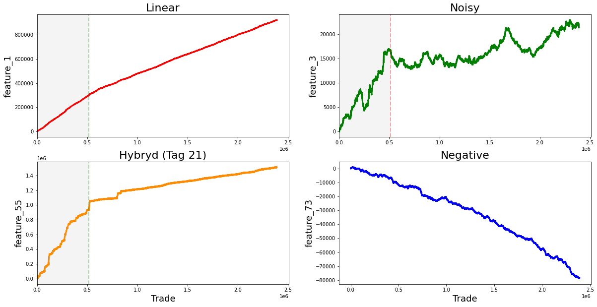
Imagine we’re pinning four small charts on a single bulletin board so we can compare how different signals accumulate over time; the first line creates that board with a 2-by-2 layout and a roomy figure size so each plot has space to breathe. For each panel we take a column from our training table, turn it into a pandas Series and call cumsum to build a running total — cumulative sum is simply a running tally that adds each new value to the total so you can see long-term drift or trends at a glance. Plotting that running total draws a thick colored line (lw=3) so the trajectory is easy to follow, and the title gives us an intuitive label like “Linear” or “Noisy” so we remember what pattern we’re looking at.
We then mark a vertical dashed line at trade 514,052 to act like a curtain dividing past from future and shade the area before that curtain with a faint gray span so the training region is visually muted; setting x limits ensures the x-axis starts at zero, and axis labels name each signal so the reader knows which feature is being tracked. The lower-left panel also adds an x-axis label “Trade” to remind us what the horizontal scale means. Finally, we call the garbage collector to tidy up unused memory before continuing — garbage collection is an automatic cleanup that frees memory no longer in use. Seeing these four cumulative stories side-by-side helps us spot stationarity, abrupt shifts, or noisy behavior that will directly inform feature engineering and model choices for our Jane Street Market Prediction work.
The “linear” features I flagged are: 1; 7, 9, 11, 13, 15; 17, 19, 21, 23, 25; 18, 20, 22, 24, 26; 27, 29, 21, 33, 35; 28, 30, 32, 34, 36; 84, 85, 86, 87, 88; 90, 91, 92, 93, 94; 96, 97, 98, 99, 100; and 102 (strong change in gradient), 103, 104, 105, 106. By “linear” I mean these features tend to move in simple trends over time, which makes them easier to model with straightforward methods. Noting them helps us pick models that capture steady changes without overcomplicating things.
There are also these features: 41, 46, 47, 48, 49, 50, 51, 53, 54, 69, 89, 95 (strong change in gradient), 101, 107 (strong change in gradient), 108, 110, 111, 113, 114, 115, 116, 117, 118, 119 (strong change in gradient), 120, 122, and 124. The ones marked with a strong change in gradient show sharp shifts in slope, so they may signal important turning points we should model differently.
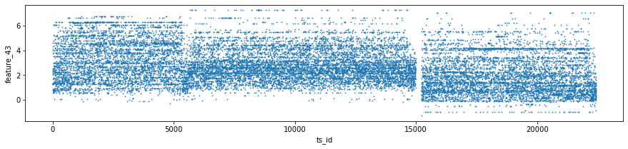
Features 41, 42 and 43 make up Tag 14. They look “stratified”, meaning they only take a few distinct values during the day — like a category ID rather than a smooth number. That suggests they might represent a security identifier (a security is an asset like a stock). I plotted scatter charts for these three features on days 0, 1 and 3, and I left out day 2 because of missing data (I’ll cover that in the missing data section).
day_0 = train_data.loc[train_data[’date’] == 0]
day_1 = train_data.loc[train_data[’date’] == 1]
day_3 = train_data.loc[train_data[’date’] == 3]
three_days = pd.concat([day_0, day_1, day_3])
three_days.plot.scatter(x=’ts_id’, y=’feature_41’, s=0.5, figsize=(15,3));
three_days.plot.scatter(x=’ts_id’, y=’feature_42’, s=0.5, figsize=(15,3));
three_days.plot.scatter(x=’ts_id’, y=’feature_43’, s=0.5, figsize=(15,3));
del day_1
del day_3
gc.collect();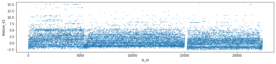

Think of the goal as quickly peeking at three particular days in the training set to see how a few features behave across time series IDs, so you can spot patterns or weird outliers before building models. The first three lines each pick one day’s worth of rows from train_data: train_data.loc[train_data[‘date’] == 0] grabs every row whose date column equals 0 and stores it as day_0; loc with a boolean expression is just a way to filter rows by a condition, like using a sieve to keep only the grains you want. The next two lines do the same for dates 1 and 3, giving you three separate mini-tables to inspect.
pd.concat([day_0, day_1, day_3]) then glues those mini-tables together into one table called three_days; concatenation is like stacking pages into a single notebook so you can look at them side by side. The three plot.scatter calls sketch scatter plots of ts_id on the x-axis against feature_41, feature_42, and feature_43 respectively; using a very small marker size (s=0.5) and a wide figure size makes dense patterns visible without the plot becoming a blotch. A scatter plot is a simple visual that shows relationships or clusters between two variables.
Finally, del day_1 and del day_3 remove names pointing to the intermediate tables, and gc.collect() asks Python to reclaim that memory so your notebook stays responsive; garbage collection frees unused memory. These quick visual checks help you decide which features or days matter most for the Jane Street market prediction pipeline.
We made lag plots for three features. A lag plot is just a scatter plot that shows each value at a given time step, called `ts_id (n)` — that’s the time-step identifier — against the very next value of the same feature at `ts_id (n+1)`. These particular plots show the data for day 0.
You’ll also see red markers placed at (0,0) as a simple visual cue to help orient the plot. Looking at these plots helps you spot patterns like whether a feature tends to carry over from one step to the next, or whether it jumps around randomly. That kind of insight is useful when deciding how to model the feature for the Jane Street Market Prediction task, because it hints at whether past values can help predict future ones.
fig, ax = plt.subplots(1, 3, figsize=(17, 4))
lag_plot(day_0[’feature_41’], lag=1, s=0.5, ax=ax[0])
lag_plot(day_0[’feature_42’], lag=1, s=0.5, ax=ax[1])
lag_plot(day_0[’feature_43’], lag=1, s=0.5, ax=ax[2])
ax[0].title.set_text(’feature_41’)
ax[0].set_xlabel(”ts_id (n)”)
ax[0].set_ylabel(”ts_id (n+1)”)
ax[1].title.set_text(’feature_42’)
ax[1].set_xlabel(”ts_id (n)”)
ax[1].set_ylabel(”ts_id (n+1)”)
ax[2].title.set_text(’feature_43’)
ax[2].set_xlabel(”ts_id (n)”)
ax[2].set_ylabel(”ts_id (n+1)”)

ax[0].plot(0, 0, ‘r.’, markersize=15.0)
ax[1].plot(0, 0, ‘r.’, markersize=15.0)
ax[2].plot(0, 0, ‘r.’, markersize=15.0);
gc.collect();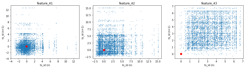
We start by creating a row of three drawing boards with the first line: fig, ax = plt.subplots(1, 3, figsize=(17, 4)). Imagine laying out three canvases side by side so we can compare three features at once; figsize just sets how wide and tall that display is. The next three lines call lag_plot for each feature and place the plot onto the corresponding canvas: lag_plot(day_0[‘feature_41’], lag=1, s=0.5, ax=ax[0]) and so on. A lag plot visualizes the relationship between consecutive observations to reveal autocorrelation, so here we’re checking whether each feature at time n relates to the same feature at time n+1; the lag=1 asks for that one-step relationship, s controls point size, and ax tells matplotlib which of the three canvases to draw on.
Then we give each canvas a human-friendly title and axis labels so we can read them like captions: ax[0].title.set_text(‘feature_41’) names the first plot, and the subsequent set_xlabel and set_ylabel calls label the horizontal and vertical axes as “ts_id (n)” and “ts_id (n+1)” respectively to remind us we’re comparing successive time-step values. Repeating those title and label calls for ax[1] and ax[2] keeps the comparison consistent across the three features.
Finally, the three ax[i].plot(0, 0, ‘r.’, markersize=15.0) lines place a bright red dot at the origin on each canvas as a visual anchor or reference point, and gc.collect() politely asks Python to free unused memory — like tidying the workspace after plotting. Together, these steps make it easy to visually inspect short-term dependencies in features, an important small experiment when building robust predictors for the Jane Street Market Prediction project.
Tag 18 covers two features: number 44 (which also includes tag 15) and number 45 (which also includes tag 17). Think of these as two specific measurements we track; the parenthetical tags just mean those measurements also pull in some info from tag 15 and tag 17 so they’re slightly blended with other signals.
These features work a lot like the Tag 14 features you saw earlier, but they are centred around 0 — meaning their typical values hover near zero instead of being all positive or large. That zero-centering makes it easier to compare features and helps many models learn faster and more stably, because the data won’t push predictions in one direction by default.
three_days.plot.scatter(x=’ts_id’, y=’feature_44’, s=0.5, figsize=(15,3));
three_days.plot.scatter(x=’ts_id’, y=’feature_45’, s=0.5, figsize=(15,3));
gc.collect();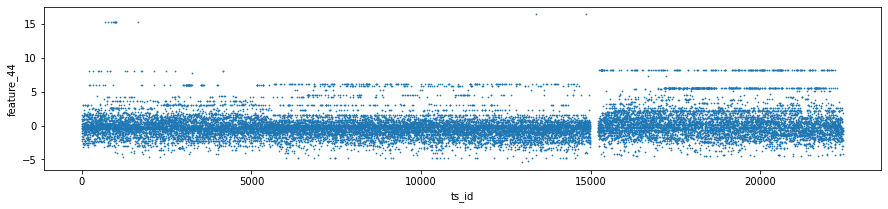
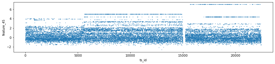
Think of your notebook as a sketchpad where you dot down observations about the market; here the program is trying to draw two quick scatter maps so you can eyeball how two features behave across time or sample id. The first plotting call asks the DataFrame’s built‑in painter to put tiny marks at each (ts_id, feature_44) pair, with s=0.5 making each point very small so crowded data looks like texture rather than a blob, and figsize=(15,3) giving a long, short canvas that emphasizes horizontal progression — ts_id acts like a timeline running left to right. The next line does the same for feature_45 so you can compare patterns between the two features in identical coordinate space; making separate plots is like laying two transparencies on top of each other to spot shifts or anomalies. The trailing semicolons are a notebook etiquette trick to suppress extra textual output and keep the display tidy. Finally, gc.collect() politely asks Python to run garbage collection, which is an automatic cleanup process that reclaims memory from objects no longer in use, helping keep RAM available for further analysis. These quick visual checks and a little memory housekeeping help you iterate faster as you build the Jane Street Market Prediction pipeline.
We present the results with the following lag plots. A lag plot is just a simple scatter plot that shows each value against a past value of the same series, so you can see if points line up in a pattern instead of looking random. We use these plots to check for autocorrelation — meaning whether past prices help predict future prices — which is important when deciding how to model time-series data for the Jane Street Market Prediction project. Spotting trends or randomness here helps you pick features and model types more wisely, so this step sets up the next modeling moves.
fig, ax = plt.subplots(1, 2, figsize=(15, 4))
lag_plot(day_0[’feature_44’], lag=1, s=0.5, ax=ax[0])
lag_plot(day_0[’feature_45’], lag=1, s=0.5, ax=ax[1])
ax[0].title.set_text(’feature_44’)
ax[0].set_xlabel(”ts_id (n)”)
ax[0].set_ylabel(”ts_id (n+1)”)
ax[1].title.set_text(’feature_45’)
ax[1].set_xlabel(”ts_id (n)”)
ax[1].set_ylabel(”ts_id (n+1)”)

ax[0].plot(0, 0, ‘r.’, markersize=15.0)
ax[1].plot(0, 0, ‘r.’, markersize=15.0);
gc.collect();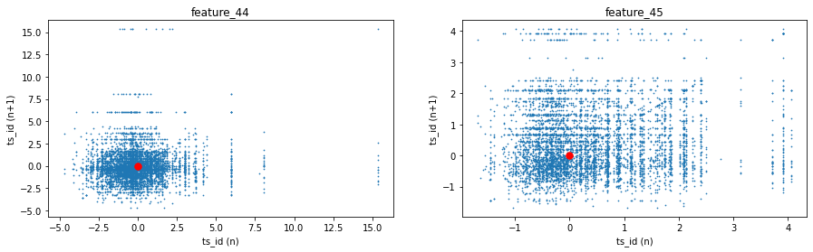
Imagine you’re setting up two canvases side by side so you can compare two little experiments at once; the first line creates that shared workspace by asking matplotlib for a figure and a pair of axes arranged in one row and two columns, and the figsize argument simply chooses how big the canvases are. Next, you take a time series called feature_44 and lay out a scatter of each point against the next one using a lag of 1; a lag plot is like placing yesterday’s value on the x-axis and today’s value on the y-axis to see if yesterday helps predict today, and the s parameter just makes each plotted dot small while the ax argument tells it which canvas to draw on. You repeat the same comparison for feature_45 on the second canvas so the two features sit side by side for visual comparison.
Then you give each canvas a clear sign: titles and axis labels that read ts_id (n) and ts_id (n+1), reminding us the horizontal coordinate is the current time index and the vertical is the following one. The two plot commands that place a single red dot at (0,0) act like a visual landmark, anchoring the origin so you can see where neutral values fall. Finally, calling the garbage collector asks Python to tidy up unused memory immediately, a housekeeping step when working with large data. Together these steps let you inspect short-term autocorrelation visually — handy when hunting signal for the Jane Street market prediction effort.
This group is called Tag 22, which is just a label for a small collection of features — features are the columns or variables your model looks at. Tag 22 contains features 60 through 68 inclusive: 60, 61, 62, 63, 64, 65, 66, 67, 68.
Grouping features like this makes it easier to treat them the same way when you clean data, build models, or run experiments. In the Jane Street Market Prediction project, these tags help you keep track of many variables and apply the same processing steps to related features, so your code stays simpler and less error-prone.
fig, ax = plt.subplots(figsize=(15, 5))
feature_60= pd.Series(train_data[’feature_60’]).cumsum()
feature_61= pd.Series(train_data[’feature_61’]).cumsum()
feature_62= pd.Series(train_data[’feature_62’]).cumsum()
feature_63= pd.Series(train_data[’feature_63’]).cumsum()
feature_64= pd.Series(train_data[’feature_64’]).cumsum()
feature_65= pd.Series(train_data[’feature_65’]).cumsum()
feature_66= pd.Series(train_data[’feature_66’]).cumsum()
feature_67= pd.Series(train_data[’feature_67’]).cumsum()
feature_68= pd.Series(train_data[’feature_68’]).cumsum()
#feature_69= pd.Series(train_data[’feature_69’]).cumsum()
ax.set_xlabel (”Trade”, fontsize=18)
ax.set_title (”Cumulative plot for feature_60 ... feature_68 (Tag 22).”, fontsize=18)
feature_60.plot(lw=3)
feature_61.plot(lw=3)
feature_62.plot(lw=3)
feature_63.plot(lw=3)
feature_64.plot(lw=3)
feature_65.plot(lw=3)
feature_66.plot(lw=3)
feature_67.plot(lw=3)
feature_68.plot(lw=3)
#feature_69.plot(lw=3)
plt.legend(loc=”upper left”);
del feature_60, feature_61, feature_62, feature_63, feature_64, feature_65, feature_66 ,feature_67, feature_68
gc.collect();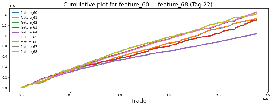
Imagine we’re laying out a long canvas to watch how a group of trading signals build up over time: fig, ax = plt.subplots(figsize=(15, 5)) creates that canvas and a single drawing area, and the figsize makes it wide so trends are easy to read. Next we take each column from the training table and turn it into a pandas Series, then call .cumsum() to turn raw per-trade values into a running total — a cumulative sum is just like keeping a running tally in your pocket, where each new value updates the total. You see that for feature_60 through feature_68 we create nine such running totals, and feature_69 is left commented out as an option to include later.
We then label our horizontal axis with ax.set_xlabel so anyone reading the plot knows we’re indexing by trade, and ax.set_title gives the whole picture context by naming it a cumulative plot for those features (Tag 22), which is important for storytelling. Each feature_x.plot(lw=3) draws its running-total line onto the shared axes; the lw=3 argument simply thickens the lines so they’re easy to follow. plt.legend(loc=”upper left”) adds a small guide telling which colored line maps to which feature.
Finally we remove the temporary Series variables with del and call gc.collect() to gently ask Python’s memory manager to reclaim space, which is handy when working with large market datasets. Together, these steps give us a compact visual tool to compare feature trajectories and spot patterns useful for the Jane Street market prediction work.
In the Jane Street Market Prediction data, I noticed that feature_60 and feature_61 (both labeled with Tags 22 & 12) are virtually coincident, which means they look almost identical across the dataset. The same is true for feature_62 and feature_63 (Tags 22 & 13), feature_65 and feature_66 (Tags 22 & 12), and feature_67 and feature_68 (Tags 22 & 13). Tags are just little labels that tell you something about a feature’s origin or type, so mentioning them helps track where these twins came from.
Let’s plot these features as distributions so we can actually see how much they overlap and whether any tiny differences matter. Plotting shows the shape, center, and spread of each feature, which helps you judge whether two features are truly redundant or if one adds subtle information. This visual step makes feature-cleanup decisions easier later, like whether to drop duplicates, combine them, or keep both for the model.
sns.set_palette(”bright”)

fig, axes = plt.subplots(2,2,figsize=(8,8))

sns.distplot(train_data[[’feature_60’]], hist=True, bins=200,  ax=axes[0,0])
sns.distplot(train_data[[’feature_61’]], hist=True, bins=200,  ax=axes[0,0])
axes[0,0].set_title (”features 60 and 61”, fontsize=18)
axes[0,0].legend(labels=[’60’, ‘61’])

sns.distplot(train_data[[’feature_62’]], hist=True,  bins=200, ax=axes[0,1])
sns.distplot(train_data[[’feature_63’]], hist=True,  bins=200, ax=axes[0,1])
axes[0,1].set_title (”features 62 and 63”, fontsize=18)
axes[0,1].legend(labels=[’62’, ‘63’])

sns.distplot(train_data[[’feature_65’]], hist=True,  bins=200, ax=axes[1,0])
sns.distplot(train_data[[’feature_66’]], hist=True,  bins=200, ax=axes[1,0])
axes[1,0].set_title (”features 65 and 66”, fontsize=18)
axes[1,0].legend(labels=[’65’, ‘66’])


sns.distplot(train_data[[’feature_67’]], hist=True,  bins=200, ax=axes[1,1])
sns.distplot(train_data[[’feature_68’]], hist=True,  bins=200, ax=axes[1,1])
axes[1,1].set_title (”features 67 and 68”, fontsize=18)
axes[1,1].legend(labels=[’67’, ‘68’])

plt.show();
gc.collect();
We’re trying to visually compare the distributions of nearby numeric features so we can see shapes, overlaps, and oddities that might matter for the Jane Street Market Prediction project. The first line chooses a bright paint set for our plots so the colors will be distinct for each feature.
Next we call plt.subplots(2,2,figsize=(8,8)) to create a two-by-two grid of canvases and capture the figure and the axes array; a function is a reusable recipe card — you give it ingredients (arguments) and it returns the tools you need. Think of the axes array like a tray of four little canvases where each position is addressed by row and column.
Each pair of lines that call sns.distplot places a distribution on one of those canvases: the first pair draws feature_60 and feature_61 onto the top-left canvas (axes[0,0]), then we title that canvas and add a legend so we know which color maps to which feature. distplot is being asked to draw a histogram (hist=True) with high resolution (bins=200) so we can see fine-grained structure; calling the plotting function twice on the same axes overlays the two distributions, like painting two semi-transparent washes to compare their shapes.
We repeat that pattern for features 62/63, 65/66, and 67/68, each pair cozying up on the remaining three canvases and receiving its own title and legend to keep things clear. Finally plt.show() displays the figure so we can inspect it, and gc.collect() asks Python to tidy up memory when we’re done. These comparative visuals help you spot useful signals or problems in the features before building predictive models for the market task.
The two columns you were looking at have feature_64 sitting right between them. A “feature” is just a column or measurement in your dataset, so feature_64 is the column located in the middle.
Knowing which feature is between the others matters when you explore data or build models. For Jane Street market prediction, the position can matter for visual checks, for creating combined features, or for methods that look at nearby columns in order. This helps you keep track of relationships and avoid mixing up signals later.
plt.figure(figsize = (12,5))
ax = sns.distplot(train_data[’feature_64’],
             bins=1200,
             kde_kws={”clip”:(-6,6)},
             hist_kws={”range”:(-6,6)},
             color=’darkcyan’,
             kde=False);
values = np.array([rec.get_height() for rec in ax.patches])
norm = plt.Normalize(values.min(), values.max())
colors = plt.cm.jet(norm(values))
for rec, col in zip(ax.patches, colors):
    rec.set_color(col)
plt.xlabel(”Histogram of feature_64”, size=14)
plt.show();
del values
gc.collect();
Imagine we’re painting a picture of one feature to understand its shape before we build models: the first line opens a wide canvas with plt.figure(figsize=(12,5)) so everything has room to breathe. Then seaborn is asked to draw a high-resolution histogram of feature_64 with ax = sns.distplot(…): bins=1200 gives many thin bars for detail, hist_kws={“range”:(-6,6)} and kde_kws={“clip”:(-6,6)} keep the view focused between -6 and 6, color=’darkcyan’ supplies a starting tone, and kde=False turns off the smooth density estimate so we see the raw counts.
Next we gather the heights of every bar with values = np.array([rec.get_height() for rec in ax.patches]); ax.patches contains the rectangle objects representing each bar and a NumPy array lets us handle numbers efficiently. Then norm = plt.Normalize(values.min(), values.max()) creates a mapping from raw heights to a normalized scale; Normalize maps numbers into a 0–1 range so the colormap can be applied evenly. colors = plt.cm.jet(norm(values)) runs those normalized heights through the jet colormap to get an RGB color for each bar.
Now the for loop walks down the row of bars and paints each one: for rec, col in zip(ax.patches, colors): rec.set_color(col) — a loop is like repeating a recipe step for every ingredient, here applying the matching color to every bar. Finally plt.xlabel names the axis, plt.show() displays the plot, and del values followed by gc.collect() tidies up memory like washing the dishes after cooking.
Seeing the colored histogram makes it easier to spot peaks, tails, and outliers in feature_64, a helpful step when preparing data for the Jane Street market prediction task.
There’s a noticeable gap in the data: values between 0.7 and 1.38 are basically missing. Incidentally, ln(2) ≈ 0.693 and ln(4) ≈ 1.386, but I don’t know if that’s meaningful — it could be coincidence or a clue about a log transform or binning used upstream. It’s worth flagging because gaps like this can hide regime changes or create blind spots for a model.
The Tag 22 features show a clear daily rhythm. For example, I looked at feature 64 across three days using scatter and cumulative plots. A scatter plot just shows each measurement as a point in time, while a cumulative plot shows the running total or sum so you can see slow shifts more clearly. Looking at both helps you catch short spikes and longer trends.
These visual checks matter for Jane Street Market Prediction because they help you spot periodic behavior or odd preprocessing that could steer feature engineering. If a feature repeats every day, you might model that rhythm explicitly; if gaps or jumps appear, you might need to clean or transform the data first.
day_0 = train_data.loc[train_data[’date’] == 0]
day_1 = train_data.loc[train_data[’date’] == 1]
day_3 = train_data.loc[train_data[’date’] == 3]
three_days = pd.concat([day_0, day_1, day_3])

# plot
fig, ax = plt.subplots(2, 1, figsize=(15, 6), sharex=True)
ax[0].scatter(three_days.ts_id, three_days.feature_64, s=0.5, color=’b’)
ax[0].set_xlabel(’‘)
ax[0].set_ylabel(’value’)
ax[0].set_title(’feature_64 (days 0, 1 and 3)’)
ax[1].scatter(three_days.ts_id, pd.Series(three_days[’feature_64’]).cumsum(), s=0.5, color=’r’)
ax[1].set_xlabel(’ts_id’)
ax[1].set_ylabel(’cumulative sum’)
ax[1].set_title(’‘)
plt.show();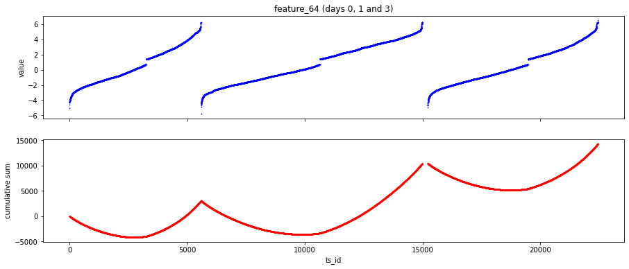
Imagine you want to peek at how a particular signal, feature_64, behaves on a few specific days so you can tell whether it’s noisy or drifting over time. The first three lines pick out the rows for date 0, date 1 and date 3 from the training table: using .loc with a condition is like asking the dataset for only the cards that belong to a particular day, and each assignment (day_0, day_1, day_3) stores that day’s cards separately. pd.concat then stacks those chosen days into one pile called three_days so you can look at them together.
Next we set up a canvas with two plots stacked vertically by calling a helper that makes subplots: asking for two rows and one column creates two panels that share the same x-axis, and figsize just chooses the canvas size so the picture is readable. On the top panel we scatter points of ts_id versus feature_64; a scatter plot places a dot for each observation, and the tiny marker size and blue color keep the view dense but legible. Clearing the x-label and adding a y-label and title makes the top panel describe the raw values for days 0, 1 and 3.
On the bottom panel we plot a running total of feature_64 by calling cumsum on the series; a cumulative sum is a running tally that highlights long-term trends like a bank balance accumulating over time. Those red points show how the feature accumulates across ts_id, and finalizing labels and plt.show() renders the visual story. Looking at raw and cumulative views together helps you decide if feature_64 carries stable signal useful for the Jane Street market prediction task.
The lowest value we’ve seen for feature_64 is about -6.4, and the highest is about 8. Not every trading day hits those extremes, so think of them as the widest range across all days, not a guaranteed daily span.
It’s a bit curious that a New York Stock Exchange trading day goes from 9:30 until 16:00. Suppose each step of feature_64 was roughly 30 minutes, and feature_64 = 0 lined up with 12:00 noon. That idea helps us ask a useful question: could this feature actually be encoding the time of day, which matters because markets behave differently in the morning and afternoon?
For fun, let’s plot the arcsin function and relabel the y-axis as the hours of the day. Arcsin is just the inverse of the sine function, which turns a sine value back into an angle; plotting it is a playful way to see what a nonlinear time mapping might look like. This visual check prepares us to spot whether the shape of the feature matches any sensible time-of-day pattern before we try more formal tests.
x = np.arange(-1,1,0.01)
y = 2 * np.arcsin(x) +1
fig, ax = plt.subplots(1, 1, figsize=(7, 4))
ax.plot(x,y, lw=3)
ax.set(xticklabels=[])
ax.set(yticklabels=[’9:00’,’10:00’,’11:00’,’12:00’,’13:00’,’14:00’,’15:00’ ,’16:00’])
ax.set_title(”2$\it{arcsin}$(t) +1”, fontsize=18)
ax.set_xlabel (”’tick’ time”, fontsize=18)
ax.set_ylabel (”Clock time”, fontsize=18)
plt.show();
We want to make a simple chart that takes a smooth range of “tick” values, warps them with a mathematical transform, and then shows the result on a labeled clock-like vertical axis so humans can read times easily. The first line builds that range: x = np.arange(-1,1,0.01) creates a NumPy array of evenly spaced values from -1 up to (but not including) 1 in steps of 0.01 — think of it as laying out the ingredients you will feed into a recipe. Next, y = 2 np.arcsin(x) + 1 applies a transformation to each ingredient; arcsin is the inverse-sine function that maps inputs in [-1,1] to angles, and multiplying by 2 then adding 1 scales and shifts the curve so it fits the plotting space.
fig, ax = plt.subplots(1, 1, figsize=(7, 4)) gives you a blank canvas and an easel — matplotlib returns a Figure (the paper) and an Axes (the drawing area). The call ax.plot(x,y, lw=3) paints the transformed values as a smooth line, with lw=3 making the stroke visibly bold. Axis cosmetics follow: ax.set(xticklabels=[]) removes the horizontal tick text so the bottom stays clean; remember, tick labels are the little text annotations that tell you what each tick means. ax.set(yticklabels=[…]) replaces the vertical tick labels with human-friendly clock times from 9:00 to 16:00 so the numeric y positions read like real-world times. Finally, set_title, set_xlabel, and set_ylabel add a descriptive title and axis labels, and plt.show() reveals the finished figure.
Putting a readable time map on transformed data like this helps link model-oriented “ticks” back to clock time in the Jane Street Market Prediction workflow.
For some reason, the market sends updates, or ticks, more often at the start and end of the day than in the middle. A tick is just a single market update, so more ticks means more data points early and late. Noticing this matters because it changes how we should model or sample the day — the middle looks quieter, and models that ignore that can misread the activity.
To visualize this, we can plot a simple hypothetical tick-frequency curve given by the derivative of 2·arcsin(t)+1. That derivative is 2 / sqrt(1 − t²), which is small in the middle of the day and grows very large near the ends. Here t is a normalized time (think of the trading day scaled to between −1 and 1), so the math shows why ticks cluster at the edges: the function increases dramatically as t approaches ±1. Plotting it helps you see the shape and decide how to handle heavy activity at the open and close.
x_dash = np.arange(-0.98,0.99,0.01)
y_dash = 2 / np.sqrt(1-(x_dash**2))
fig, ax = plt.subplots(1, 1, figsize=(7, 4))
ax.plot(x_dash,y_dash, lw=3)
ax.set(yticklabels=[])
ax.xaxis.set_ticks(np.arange(-1, 1, 0.28))
#ax.set(xticklabels=[’9:00’,’10:00’,’11:00’,’12:00’,’13:00’,’14:00’,’15:00’ ,’16:00’])
ax.set(xticklabels=[’9:00’,’10:00’,’11:00’,’12:00’,’13:00’,’14:00’,’15:00’ ,’16:00’])
ax.set_title(”d/dt (2$\it{arcsin}$(t) +1)”, fontsize=18)
ax.set_xlabel (”Clock time”, fontsize=18)
ax.set_ylabel (”’tick’ frequency”, fontsize=18)
plt.show();
Imagine we want to turn a neat mathematical derivative into a picture that sounds like a clock: first we build x_dash = np.arange(-0.98,0.99,0.01), which lays out a tidy row of numbers from -0.98 to 0.98 in steps of 0.01 — an array is like a string of beads you can do the same operation to all at once. Next we compute y_dash = 2 / np.sqrt(1-(x_dash2)), translating the analytic derivative 2·(1/√(1−t²)) into numbers you can plot; here the square and square root happen elementwise across that row of beads. We then open a canvas with fig, ax = plt.subplots(1, 1, figsize=(7, 4)), creating a single plotting area of a specific size where the story will be drawn. The ax.plot(x_dash,y_dash, lw=3) call traces the curve with a thicker pen so the shape of the derivative is clear. To keep the visual focused, ax.set(yticklabels=[]) clears the y-axis labels so the eye goes to the pattern rather than precise counts. The x-axis is given explicit tick positions with ax.xaxis.set_ticks(np.arange(-1, 1, 0.28)), placing eight marks across the domain like evenly spaced hours, and ax.set(xticklabels=[…]) names those marks from “9:00” to “16:00”, effectively mapping our -1..1 scale onto trading hours. We polish the plot with a mathematical title and readable axis labels using ax.set_title, ax.set_xlabel, and ax.set_ylabel, and finally plt.show() reveals the figure. The result is a clear visual of how the instantaneous “‘tick’ frequency” accelerates toward the edges, a helpful diagnostic when building Jane Street market-prediction timing models.
Maybe the gap of missing values we see at the start of the day for some features is actually the same kind of gap we see in the middle of the day. A missing value just means no data was recorded then. Also, the higher tick frequency (how often trades or price updates happen) at the beginning and end of the day could come from a lot of buying right at the open and a lot of selling before the close so traders don’t hold big positions overnight. Noticing these patterns matters because it helps us decide how to clean the data and what patterns a model can rely on.
A user called marketneutral suggested on the Kaggle discussion that the data might come from the Tokyo Stock Exchange, which trades 9:00–11:30, pauses for lunch, then 12:30–15:00. That schedule would naturally create a central gap in trading, which could explain the midday break you see in the Tag 22 features (a discontinuity is just a sudden gap or jump in the series). Thinking about real trading hours helps us avoid mistaking exchange rules for sensor errors.
We shall now also look at feature 65.
three_days.plot.scatter(x=’ts_id’, y=’feature_65’, s=0.5, figsize=(15,4));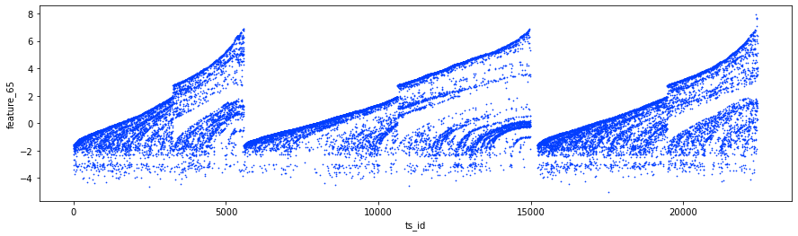
Imagine you have a table called three_days that holds rows of observations across a short time window; a DataFrame is like a spreadsheet where each column is a named variable and each row is one observation. By calling its plotting method you’re asking Python to turn that spreadsheet into a picture so your eyes can read patterns faster than raw numbers.
Plotting scatter tells pandas (and under the hood matplotlib) to draw each row as a single point positioned by two values; a scatter plot shows pairs of numbers as dots so you can see relationships and spread. Here x=’ts_id’ places the time-series identifier along the horizontal axis so the points march left-to-right in temporal order, and y=’feature_65’ maps the value we care about to the vertical axis so we can watch how it moves over time. The parameter s=0.5 makes each marker very small, which is like using a fine-tipped pen so dense clouds of points don’t become a solid blot and you can still spot structure or outliers. figsize=(15,4) stretches the canvas wide and short, giving a panoramic view that emphasizes trends across time. The trailing semicolon simply suppresses the textual output object in an interactive notebook so only the image appears.
Taken together, this line gives a clear visual check of feature_65 across the three-day window — an essential step when preparing signals for the Jane Street Market Prediction project.
For a great deep-dive into the Tag 22 features, take a look at Lachlan Suter’s notebook Important and Hidden Temporal Data (https://www.kaggle.com/lachlansuter/important-and-hidden-temporal-data). Tag 22 features are a set of time-related fields in the dataset, and his work helps show which of those carry useful signals and which hide tricks you might miss at first. This background is handy before you start cleaning or modeling the data.
The features flagged as noisy are: 3, 4, 5, 6; 8, 10, 12, 14, 16; 37, 38, 39, 40; 72, 73, 74, 75, 76; 78, 79, 80, 81, 82; and 83. Calling them noisy means they tend to contain random fluctuations or artifacts rather than stable predictive patterns. Knowing this helps you decide which features to filter out or treat carefully during feature engineering.
Here are cumulative plots of some of these features. Cumulative plots show running totals over time, which makes it easier to spot trends, shifts, or sudden jumps that signal noise or hidden structure.
fig, ((ax1, ax2), (ax3, ax4)) = plt.subplots(2, 2,figsize=(16,8))
ax1.set_title (”features 3 and 4 (+Tag 9)”, fontsize=18);
ax1.plot((pd.Series(train_data[’feature_3’]).cumsum()), lw=2, color=’blue’)
ax1.plot((pd.Series(train_data[’feature_4’]).cumsum()), lw=2, color=’red’)

ax2.set_title (”features 5 and 6 (+Tag 9)”, fontsize=18);
ax2.plot((pd.Series(train_data[’feature_5’]).cumsum()), lw=2, color=’blue’)
ax2.plot((pd.Series(train_data[’feature_6’]).cumsum()), lw=2, color=’red’)

ax3.set_title (”features 37 and 38 (+Tag 9)”, fontsize=18);
ax3.plot((pd.Series(train_data[’feature_37’]).cumsum()), lw=2, color=’blue’)
ax3.plot((pd.Series(train_data[’feature_38’]).cumsum()), lw=2, color=’red’)
ax3.set_xlabel (”Trade”, fontsize=18)

ax4.set_title (”features 39 and 40 (+Tag 9)”, fontsize=18);
ax4.plot((pd.Series(train_data[’feature_39’]).cumsum()), lw=2, color=’blue’)
ax4.plot((pd.Series(train_data[’feature_40’]).cumsum()), lw=2, color=’red’)
ax4.axvline(x=514052, linestyle=’--’, alpha=0.3, c=’green’, lw=2)
ax4.axvspan(0, 514052 , color=sns.xkcd_rgb[’grey’], alpha=0.1)
ax4.set_xlabel (”Trade”, fontsize=18)
#ax4.axvline(x=514052, linestyle=’--’, alpha=0.3, c=’black’, lw=1)
#ax4.axvspan(0,  514052, color=sns.xkcd_rgb[’grey’], alpha=0.1);
gc.collect();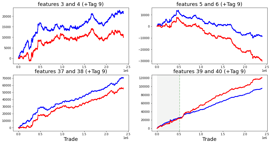
Imagine we’re laying out four little windows on a dashboard so we can compare pairs of features side by side; the first line creates that 2-by-2 grid and gives us a roomy canvas (figsize) and four axes to draw on. Each axis gets a friendly title so we know which pair we are looking at, and then we draw two lines per window by taking the running total of each feature — a cumulative sum is like keeping a ledger where each trade updates the balance, and that running total helps reveal slow drifts or persistent trends that single-point noise would hide. Converting the column to a pandas Series and calling cumsum produces that running total; plot draws it with a chosen line width and color so the blue and red lines are easy to tell apart. For the bottom plots we also label the x-axis “Trade” so the horizontal direction reads like a sequence of events.
On the last small plot we add a dashed vertical line to mark an important index and a faint shaded band from the start up to that mark, like putting a translucent curtain over a time span to highlight a training region or a regime change; the commented lines are alternative visual tweaks left in silence, and finally we call the garbage collector to tidy up memory. Altogether, these visual comparisons help us spot where features move together or diverge, a small but crucial step toward understanding signals for the Jane Street market prediction task.
Could these be offer prices, and those tagged 9 be bid prices? An offer is what a seller asks for, and a bid is what a buyer is willing to pay. It’s strange because after day 85 the value of feature_40 actually becomes larger than feature_39, and that flip could mean a change in market regime, a labeling mix-up, or just an anomaly we should investigate. Noting this helps us decide whether to treat those features as price sides or to adjust models that assume one is always higher.
Feature_51 (Tag 19) was suggested by marketneutral in the discussion “Weight and feature_51 de-anonymized” to be the log of the average daily volume. Log just means we took the logarithm to shrink big numbers, and average daily volume is how many shares trade per day. I reproduced the plot of feature_51 against weight for non-zero weights — weight here being the model’s position or importance, and non-zero weights meaning times the model actually took a stance. That plot helps check if higher volume tends to coincide with larger positions, which is useful for judging liquidity and whether a signal is tradeable.
fig, ax = plt.subplots(figsize=(15, 4))
ax.scatter(train_data_nonZero.weight, train_data_nonZero.feature_51, s=0.1, color=’b’)
ax.set_xlabel(’weight’)
ax.set_ylabel(’feature_51’)
plt.show();
We’re trying to peek at the relationship between two columns — weight and feature_51 — so you can see whether heavier examples line up with higher or lower values, spot clusters, or find outliers that might confuse a model. The first line sets up a drawing space with fig, ax = plt.subplots(figsize=(15, 4)), which is like preparing a wide canvas and an easel to work on; a figure holds the whole image and the axes are the specific area where data will be drawn. The scatter call ax.scatter(train_data_nonZero.weight, train_data_nonZero.feature_51, s=0.1, color=’b’) sprinkles one point per example at the (weight, feature_51) coordinate — think of it as tossing tiny blue seeds onto the canvas so denser regions form visible patterns; a scatter plot shows two variables as points so you can visually assess their relationship or clusters. The tiny marker size s=0.1 keeps each point small so dense areas don’t become a single blob, and color=’b’ makes them uniformly blue for clarity. Next, ax.set_xlabel(‘weight’) and ax.set_ylabel(‘feature_51’) attach plain-language captions to the horizontal and vertical edges; an axis label explains what numbers along that side represent. Finally, plt.show() pulls back the curtain and renders the image in your notebook or window; show displays the finished visualization. Seeing this plot helps you decide how weight and feature_51 might influence predictions in the Jane Street Market Prediction project.
feature_52 (Tag 19) is just the name of one input variable we use in the Jane Street market prediction project. In plain terms, a feature is a piece of data — a column in your dataset — that the model looks at to learn patterns and make predictions.
The label Tag 19 means this feature belongs to a particular group or category of related features. Tags are a handy way to organize inputs so you can treat similar signals the same way, like checking them for missing values or scaling them together. As a next step, you’d typically inspect feature_52’s values and relationships with the target so you know how useful it might be for the model.
fig, ax = plt.subplots(figsize=(15, 3))
feature_0 = pd.Series(train_data[’feature_52’]).cumsum()
ax.set_xlabel (”ts_id”, fontsize=18)
ax.set_ylabel (”feature_52 (cumulative)”, fontsize=12);
feature_0.plot(lw=3);
Imagine you’re preparing a small painting to explore how one particular market signal drifts over time. The first line creates the canvas and the easel: fig, ax = plt.subplots(figsize=(15, 3)) makes a wide, shallow plotting surface where fig is the whole picture and ax is the frame you paint into. Next, feature_0 = pd.Series(train_data[‘feature_52’]).cumsum() takes the raw stream of values from train_data[‘feature_52’], wraps them as a time-ordered series, and then turns them into a running total — a cumulative sum is simply a running tally that shows how small increments add up over time. The following lines label the axes so anyone viewing the painting knows what they’re looking at: ax.set_xlabel(“ts_id”, fontsize=18) names the horizontal axis as the time-series identifier and ax.set_ylabel(“feature_52 (cumulative)”, fontsize=12) names the vertical axis as the accumulated feature, with font sizes chosen for readability; the trailing semicolon quietly suppresses extra textual output in an interactive session. Finally, feature_0.plot(lw=3) paints the running-total curve onto the frame using a thicker brush (line width 3) so trends are easy to see. Together these steps turn raw values into a readable visual story about how feature_52 evolves, a small but useful piece when building the Jane Street market prediction model.
We have a lag plot here — a simple scatter plot that puts each data point against its previous value. A lag plot helps you see whether past values are related to future ones; in plain terms, it shows if yesterday’s price is useful for guessing today’s price.
This is useful for the Jane Street Market Prediction project because it gives a quick visual check for patterns or autocorrelation before we build models. If the points form a clear shape, past values may help our predictions; if they look random, we might need different features.
fig, ax = plt.subplots(1,1, figsize=(4, 4))
lag_plot(day_0[’feature_52’], s=0.5, ax=ax)
ax.title.set_text(’feature_52’)
ax.set_xlabel(”ts_id (n)”)
ax.set_ylabel(”ts_id (n+1)”)
ax.plot(0, 0, ‘r.’, markersize=15.0);
Imagine you’re preparing a small square canvas to inspect a single feature from our market dataset, and the first line opens that canvas: “fig, ax = plt.subplots(1,1, figsize=(4, 4))” creates a figure and a single axes object — think of the figure as the paper and ax as the specific frame where you’ll sketch. Next, you take the series day_0[‘feature_52’] and, like following a recipe card, call lag_plot(day_0[‘feature_52’], s=0.5, ax=ax) to draw each value against its immediate successor; a lag plot is a simple diagnostic that plots observations at time n versus time n+1 so you can spot autocorrelation or patterns by eye. The s=0.5 argument keeps the scatter points tiny so dense areas don’t overwhelm the view, and passing ax=ax tells the function to draw onto your chosen frame.
After the plot appears you label and annotate it: ax.title.set_text(‘feature_52’) writes the title above the frame so anyone knows which ingredient they’re looking at, while ax.set_xlabel(“ts_id (n)”) and ax.set_ylabel(“ts_id (n+1)”) name the horizontal and vertical axes to clarify the time-step relationship. Finally, ax.plot(0, 0, ‘r.’, markersize=15.0) plants a conspicuous red dot at the origin — like pinning a reference point on your map — and the trailing semicolon quietly suppresses extra output in an interactive notebook. All together, these steps let you visually judge temporal structure in feature_52, a small but important check when building predictive models for the Jane Street Market Prediction project.
We noticed a curious relationship with resp, the column we’re trying to predict (it’s the response or target variable in the dataset). This means some features move together with resp in ways that stood out during our exploration.
Spotting that pattern matters because it helps us choose which features to keep, how to preprocess them, and what kinds of models might work best. It doesn’t prove cause and effect, but it gives a useful hint for the next steps in the Jane Street Market Prediction workflow.
fig, ax = plt.subplots(figsize=(15, 4))
ax.scatter(train_data_nonZero.feature_52, train_data_nonZero.resp, s=0.1, color=’b’)
ax.set_xlabel(’feature_52’)
ax.set_ylabel(’resp’)
plt.show();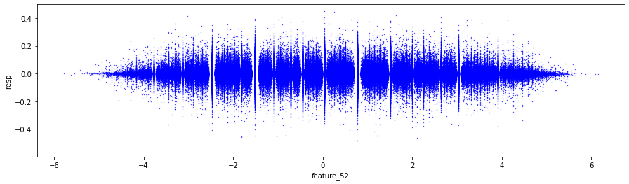
Imagine you’re an investigator trying to see whether one particular sensor, feature_52, moves when the market signal resp moves — the program is simply laying out a visual map so you can spot patterns by eye. The first line, fig, ax = plt.subplots(figsize=(15, 4)), prepares a rectangular canvas and a single plotting frame on which to draw; “figure” is the whole image and “axes” is the area where data is drawn, and they let you control size and layout precisely. A function is like a reusable recipe card: subplots returns both pieces so you can reuse the axes to add plots.
The ax.scatter(…) call is where each training example becomes a dot on that canvas: the x-values come from train_data_nonZero.feature_52 and the y-values from train_data_nonZero.resp, so every pair gets a point. A scatter plot visually shows the relationship between two variables by plotting individual observations as points — this is a key concept. The s=0.1 makes each point very small so dense regions don’t become blobs, and color=’b’ paints them blue so patterns stand out. The variable name train_data_nonZero suggests we’ve already filtered to examples with non-zero responses to focus on meaningful events.
ax.set_xlabel(‘feature_52’) and ax.set_ylabel(‘resp’) label the axes so you remember which axis represents what, and plt.show() renders the assembled picture (the trailing semicolon just keeps notebooks tidy). Seeing this plot helps decide if feature_52 has a visible relationship with resp and guides the next feature-engineering or modeling step in the Jane Street Market Prediction project.
The “negative” features are 73, 75, 76, 77 (noisy), 79, 81 (noisy), and 82. They all sit under Tag 23, which is just a label grouping related columns in the dataset. Calling some of them noisy means they jump around a lot and can confuse a model, so you might smooth or treat these columns differently during preprocessing.
The “hybrid” features, grouped as Tag 21, are 55, 56, 57, 58, and 59. These start off noisy with sharp, almost discontinuous jumps — sudden changes — near the 0.2M (200,000), 0.5M (500,000), and 0.8M (800,000) trade marks, and then they follow a linear trend. Knowing those step points helps because it signals where the relationship changes and where a model may need piecewise handling or extra features to capture the shift.
fig, ax = plt.subplots(figsize=(15, 5))
feature_55= pd.Series(train_data[’feature_55’]).cumsum()
feature_56= pd.Series(train_data[’feature_56’]).cumsum()
feature_57= pd.Series(train_data[’feature_57’]).cumsum()
feature_58= pd.Series(train_data[’feature_58’]).cumsum()
feature_59= pd.Series(train_data[’feature_59’]).cumsum()
ax.set_xlabel (”Trade”, fontsize=18)
ax.set_title (”Cumulative plot for the ‘Tag 21’ features (55-59)”, fontsize=18)
ax.axvline(x=514052, linestyle=’--’, alpha=0.3, c=’black’, lw=1)
ax.axvspan(0,  514052, color=sns.xkcd_rgb[’grey’], alpha=0.1)
feature_55.plot(lw=3)
feature_56.plot(lw=3)
feature_57.plot(lw=3)
feature_58.plot(lw=3)
feature_59.plot(lw=3)
plt.legend(loc=”upper left”);
gc.collect();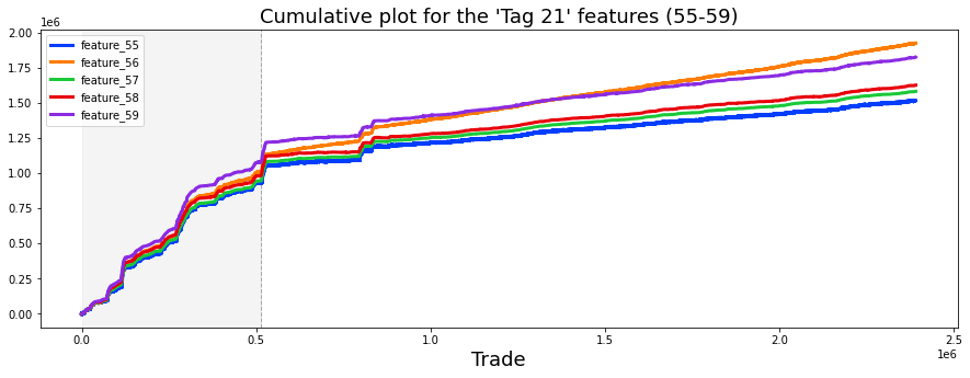
Imagine we want to see how several related signals march over time, like watching five runners on a track and tracing their cumulative distance. First we create a plotting canvas and an axes object with a wide landscape size so our lines have room to breathe; think of fig as the paper and ax as the place we draw. Then we take each raw feature column from the training table and wrap it as a Pandas Series, asking for a cumulative sum so each point becomes a running total — cumulative sum is simply adding each new value to the sum of all previous ones, which makes trends and drift easier to see.
We label the horizontal axis “Trade” and give the whole plot a descriptive title to explain we’re looking at Tag 21 features 55–59; clear labels are like captions on a chart that guide the viewer. To call attention to a key event at trade index 514,052 we draw a faint dashed vertical line there and shade the entire region from the start up to that index with a soft grey band — vertical lines mark moments, and shaded spans highlight periods, much like underlining an important paragraph in a book.
Each cumulative series is drawn as a bold line so differences are visible, and we add a legend in the upper-left so you can match colors to feature names. Finally, we invoke the garbage collector to politely free memory we’ve used, like tidying up the desk after a sketch. Together, these steps turn raw features into a clear visual narrative useful for diagnosing signals in the Jane Street Market Prediction project.
Imagine these features line up with the five response columns (the things we’re trying to predict). For example: feature_55 ties to resp_1, feature_56 to resp_4, feature_57 to resp_2, feature_58 to resp_3, and feature_59 to resp. Saying this helps us group features by which target they affect.
If that grouping is true, then the tag numbers map to those targets like this: Tag 0 → resp_4 features, Tag 1 → resp features, Tag 2 → resp_3 features, Tag 3 → resp_2 features, and Tag 4 → resp_1 features. Tags are just short labels that let us refer to those groups quickly.
The features relating to each resp are: resp_1: 7, 8, 17, 18, 27, 28, 55, 72, 78, 84, 90, 96, 102, 108, 114, 120, 121. Note: 79.6% of all missing data lives in this set, which tells us missingness is heavily concentrated here. resp_2: 11, 12, 21, 22, 31, 32, 57, 74, 80, 86, 92, 98, 104, 110, 116, 124, 125. Note: 15.2% of missing data is in this group. resp_3: 13, 14, 23, 24, 33, 34, 58, 75, 81, 87, 93, 99, 105, 111, 117, 126, 127. resp_4: 9, 10, 19, 20, 29, 30, 56, 73, 79, 85, 91, 97, 103, 109, 115, 122, 123. resp: 15, 16, 25, 26, 35, 36, 59, 76, 82, 88, 94, 100, 106, 112, 118, 128, 129.
There’s a plot showing each of these 17 features versus each resp (it’s an image; right‑click to view and enlarge). That visual helps spot patterns or where missing data might be hiding.
# Note: I have had to import this png image from another kaggle notebook
# since producing it took up almost *all* of the notebook memory. Right click to enlarge.
Image(filename=”../input/jane-17-plots/17_plots.png”, width= “95%”)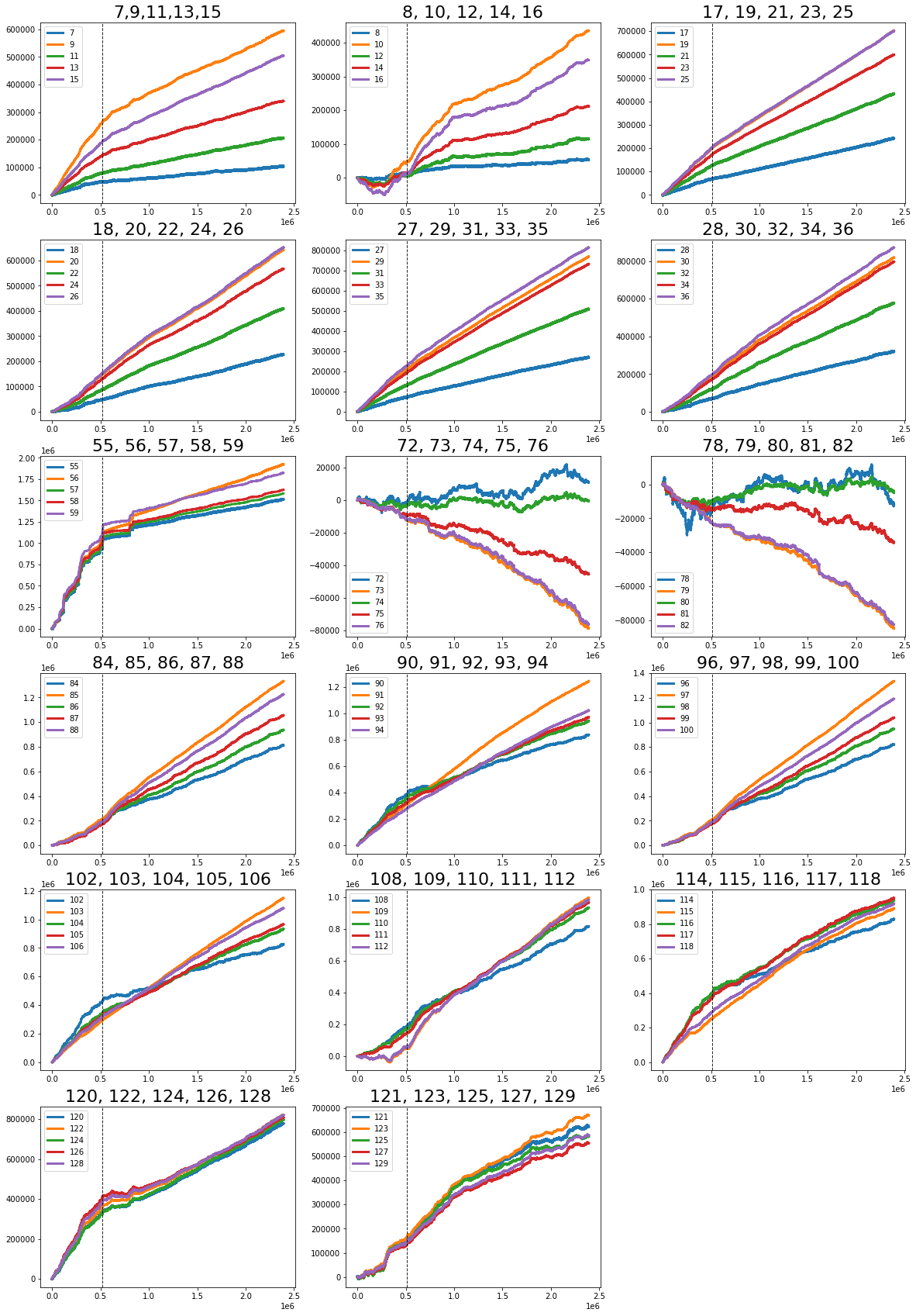
We’re doing something simple but very practical: bringing a plotted picture into the notebook so we can look at it without re-running heavy plotting code. The first line, beginning with #, is a comment — comments are reader notes that the Python interpreter ignores, and here it explains that the image was moved from another Kaggle notebook because creating it again used almost all of the notebook’s memory; it also reminds you you can right‑click to enlarge the image, a little usability tip.
The second line is a call to a notebook display helper named Image with two pieces of information: filename and width. Think of Image(…) as asking the notebook to fetch a saved picture and put it inline for you; a function is a reusable recipe card that takes ingredients (arguments) and performs a task. The filename points to the PNG file stored in the project’s input path so the notebook knows where to grab the plot, and width=”95%” tells the notebook how big to render it on the page so it fills most of the viewing area without overflowing. When you run the cell, the notebook reads that file and renders the visual output for inspection.
This tiny operation saves time and memory while letting you inspect the visual diagnostics and patterns that feed into our Jane Street Market Prediction work, keeping the visual story close at hand as you build and evaluate models.
The vertical dashed line represents day 85.
We are told that resp_1, resp_2, resp_3 and resp_4 are provided in case some people want alternative objective metrics to regularize their model training. Regularizing means adding extra targets to help prevent overfitting, so these can guide models to generalize better. If you don’t plan to use those alternate objectives, you can probably drop all those 4 × 17 = 68 features and just keep the main resp‑related features to keep things simple.
I made some t‑SNE plots for a few feature groups in a separate notebook called “Jane Street: t-SNE using RAPIDS cuML” because these plots take a long time to calculate. t-SNE is a way to visualize high‑dimensional data by putting similar points close together in 2D, so it helps spot clusters or odd patterns before modeling.
We’re also given a features.csv file that contains metadata about the anonymized features. In that file, `1` means True and `0` means False, and each feature has 29 tags describing it. That metadata helps you decide which features to trust or use, since it gives clues about what each anonymized column might represent.
feature_tags = pd.read_csv(”../input/jane-street-market-prediction/features.csv” ,index_col=0)
# convert to binary
feature_tags = feature_tags*1
# plot a transposed dataframe
feature_tags.T.style.background_gradient(cmap=’Oranges’)
We begin by using pandas’ read_csv function like pulling a recipe from a cookbook: pd.read_csv reads the CSV file into memory so we can work with its ingredients, and index_col=0 tells pandas to treat the first column as the row labels so each feature name sits neatly as an index. A DataFrame is a table-like structure for labeled rows and columns that makes it easy to slice, transform, and visualize data.
Next we multiply the table by 1, a small arithmetic nudge that converts True/False flags into 1/0 numbers — imagine asking an assistant to translate “yes/no” tick marks into binary checkboxes so we can color them later; this is a quick, idiomatic way to coerce booleans into integers in pandas.
Finally, we flip the table on its side with a transpose so rows become columns and columns become rows, which might make patterns easier to see depending on the layout; then we apply a background gradient with the ‘Oranges’ colormap to paint each cell according to its value, like shading a checklist so the 1s glow warmly and the 0s stay pale. The styling is a visual aid rather than a numerical change, giving an immediate, human-friendly view of which features are present across items.
All together, these steps load, prepare, and visualize feature tags so you can quickly spot patterns and make better modeling choices for the Jane Street Market Prediction project.
Just for fun, we re-plot the same data in 8-bit mode. That means the image is reduced to about 256 color or value levels, so tiny differences get rounded away and the picture loses a lot of fine detail.
The outcome is totally illegible at close inspection, but it can still act as a quick visual aid. Even low-resolution views can reveal broad shapes, big spikes, or strange artifacts that deserve a closer look.
In a market-prediction project, this kind of playful downsampling helps as a fast sanity check: it lets you spot large-scale trends or preprocessing problems before you dive into detailed modeling.
plt.figure(figsize=(32,14))
sns.heatmap(feature_tags.T,
            cbar=False,
            xticklabels=False,
            yticklabels=False,
            cmap=”Oranges”);
Imagine we’re preparing a wide canvas to paint a picture of how features and their tags line up: the first line chooses a very large canvas with dimensions 32 by 14 so the patterns will be easy to see even when there are many features. Next we take the matrix of feature tags and rotate it so rows become columns and columns become rows — transposing swaps rows and columns so the orientation better matches how we want to read the data. Then we paint that rotated matrix as a heatmap, which means each number is shown as a color so you can spot patterns at a glance. We pick a warm “Oranges” palette so stronger values glow like embers, and we intentionally hide the colorbar and the axis tick labels to remove clutter and let the overall shapes and bands speak for themselves. Finally, the trailing semicolon quietly suppresses extra output in an interactive notebook so the image alone remains the focus. Together these steps turn raw feature-tag values into a readable, visual tapestry that helps us see groupings, repeated patterns, or outliers — all useful when deciding which signals to trust for the Jane Street Market Prediction project.
Let’s add up how many tags each feature has. By feature I mean a variable or column in your dataset, and a tag is a label or category attached to that feature (so you’re counting labels per column).
This count gives a quick sense of which features have more descriptive information. That helps you spot features that might matter more for modeling or that may need cleaning before you go further.
tag_sum = pd.DataFrame(feature_tags.T.sum(axis=0),columns=[’Number of tags’])
tag_sum.T
Imagine you have a big checklist where each feature can have several descriptive tags, and you want to know how many tags are attached to each feature so you can prioritize which features to explore first. The first line builds a tidy table of those counts: by taking feature_tags.T.sum(axis=0) we flip the rows and columns and then add up values down each column to produce one total per original feature — transpose is like turning a map on its side so rows become columns, and summing with axis=0 means “add down each column.” Wrapping that result in pd.DataFrame(…, columns=[‘Number of tags’]) gives a neat one-column table labeled “Number of tags”, which is simply a friendly name so the counts are easy to read. The second line, tag_sum.T, turns that one-column table back on its side so the features become column headers and their tag counts appear in a single row, which is often easier to glance across like scanning a scoreboard. Altogether, these steps convert a sparse tag matrix into a compact, human-readable summary of how many tags each feature has, a small but useful tool when deciding which signals to focus on in the Jane Street Market Prediction project.
Most features have at least one tag (a little label that describes the column), and some have up to four. The one exception is feature_0, which has no tags at all.
The features split into roughly five regions that look different from each other. Region 0 is just feature_0 (no tags) and its values are basically -1 or +1. Region 1 is features 1–6 and carries Tag 6. Region 2 covers 7–36 and also links to Tag 6, but breaks into 2a (7–16, +Tag11) with missing columns 7,8 and 11,12; 2b (17–26, +Tag12) missing 17,18 and 21,22; and 2c (27–36, +Tag13) missing 27,28 and 31,32.
Region 3 runs from 37–72 and is more mixed. A chunk 55–59 is Tag21 and described as “hybrid” (mixed types). Another chunk 60–68 is Tag22 and looks like clock/time features, maybe related to timestamps.
Region 4 (72–119) mostly has Tag23 and splits into many small groups with paired tags and a couple of missing columns each (72..77 +15&27 missing 72,74; 78..83 +17&27 missing 78,80; 84..89 +15&25 missing 84,86; 90..95 +17&25 missing 90,92; 96..101 +15&24 missing 96,98; 102..107 +17&24 missing 102,104; 108..113 +15&26 missing 108,110; 114..119 +17&26 missing 114,116).
Region 5 (120–129) is Tag28 with individual tags per column (120:+4 missing, 121:+4&16 missing, 122:+0, 123:+0&16, 124:+3, 125:+3&16, 126:+2, 127:+2&16, 128:+1, 129:+1&16).
A table is hard to read here, so graph analysis helps show tag–feature relationships; Quillio’s notebook does that. Greg Calvez’s work suggests tag meanings (e.g., tag_6 → prices, tag_23 → volume, tag_20 → spread, tag_12 → minima, tag_13 → maxima, tag_22 → time), which helps interpret anonymized columns.
The competition target is action: 1 means make the trade, 0 means pass. Add a binary column action to the test set where action = 1 if resp (the response) is positive, else 0.
train_data[’action’] = ((train_data[’resp’])>0)*1Imagine you’re turning a stream of model feedback into a simple instruction: someone hands you a column called resp that measures how well a trade did, and you want a clear yes/no signal for whether to act. The line train_data[‘action’] = ((train_data[‘resp’])>0)1 creates a new column named action on the train_data table (a pandas DataFrame), where each row will carry a compact decision about that row’s outcome.
Here the expression (train_data[‘resp’] > 0) compares every numeric resp value to zero and produces a column of True/False answers; a boolean comparison yields a Series of True/False values and multiplying by 1 coerces them into integers 1/0. Think of the vectorized comparison like stamping every page in a stack at once — Python applies the test to each row simultaneously — and the 1 is like flipping True/False into 1/0 counters so the machine learning model can read them.
By assigning that result to train_data[‘action’] you attach a reusable yes(1)/no(0) recipe card to each example, turning continuous returns into a binary target that downstream training steps can use. This simple transformation gives your Jane Street Market Prediction pipeline a clear trading signal to learn from.
In the Jane Street Market Prediction project, we now compare overall action to inaction. By overall action I mean making trades or taking positions based on our model’s signals, and by inaction I mean doing nothing and leaving the market alone. Comparing them means looking at the net effects — like returns after fees, how often we win versus lose, and any extra risk we take on. This shows whether our strategy actually helps or just adds noise.
We do this comparison because it tells us if the model creates real value once costs and risk are counted. It also prepares us for the next steps: if action beats inaction, we can refine and deploy; if not, we need to rethink the signals or reduce trading. This simple check keeps our work grounded in practical outcomes.
train_data[’action’].value_counts()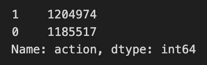
Imagine you have a big spreadsheet called train_data that holds every example the model will learn from; when you write train_data[‘action’] you’re pulling out the single column labeled “action” as if you slid out one drawer from that spreadsheet to look only at the tags inside. Calling .value_counts() on that drawer is like taking a stack of index cards and tallying how many times each distinct label appears — buy, sell, hold, whatever your actions are — and returning a little list that says “buy: 10,000; sell: 7,500,” sorted with the most frequent at the top. A method is a function attached to an object that knows how to operate on that object, and here value_counts is the method that knows how to count items in a column. The result you get is another pandas structure that maps each unique action to its frequency and, by default, ignores missing values so you see only concrete choices. Looking at these counts helps you spot class imbalance, unexpected categories, or data-gathering issues before you build a model. In the Jane Street Market Prediction project, that quick tally is your early diagnostics: it tells you what the model will see most often and guides sampling, evaluation, and the next steps in feature work.
With the formula above, we’re overall just a hair more proactive than inactive — about 0.4% more. By proactive I mean we’re taking an action (like making a trade or changing a prediction), and by inactive I mean we’re not. That tiny edge shows up when you sum everything together.
How does that look day by day? Checking the daily view lets us see whether that small advantage is steady or comes from a few lucky days. Seeing the pattern helps decide if we should tweak the strategy or keep doing what we’re doing.
daily_action_sum   = train_data[’action’].groupby(train_data[’date’]).sum()
daily_action_count = train_data[’action’].groupby(train_data[’date’]).count()
daily_ratio        = daily_action_sum/daily_action_count
# now plot
fig, ax = plt.subplots(figsize=(15, 5))
plt.plot(daily_ratio)
ax.set_xlabel (”Day”, fontsize=18)
ax.set_ylabel (”ratio”, fontsize=18)
ax.set_title (”Daily ratio of action to inaction”, fontsize=18)
plt.axhline(0.5, linestyle=’--’, alpha=0.85, c=’r’);
ax.set_xlim(xmin=0)
ax.set_xlim(xmax=500)
plt.show();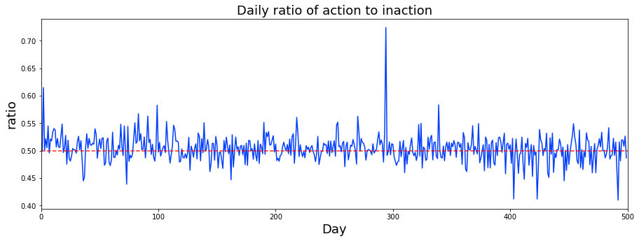
Imagine we want to watch how often traders take an action each day, like checking whether a light is on or off across many panels and summarizing each day’s brightness. The first line gathers every row by date and adds up the ‘action’ values for that date, so daily_action_sum is the total number of actions on each day. The next line counts how many records belong to each date, giving daily_action_count; groupby collects rows that share the same date so we can aggregate per-day. Dividing sum by count produces daily_ratio, which for a binary action is just the daily proportion (mean) of times an action occurred. Now we prepare a canvas: fig, ax = plt.subplots(figsize=(15, 5)) creates a plotting area sized like a wide poster and gives us an axis object to talk to. plt.plot(daily_ratio) draws the time series of those daily proportions so you can watch trends over time. The ax.set_xlabel, ax.set_ylabel, and ax.set_title lines attach readable labels and a title so the story on the plot is clear. plt.axhline(0.5, …) draws a dashed red baseline at 50% to help spot days above or below coin-flip behavior. The x-axis limits constrain the view to the first 500 days so we focus on the early period, and plt.show() renders the picture. Altogether this paints daily behavior patterns you can use to spot drift or imbalance for the Jane Street market prediction work.
The market’s daily action — meaning how prices or volumes move from one day to the next — looks pretty steady. I don’t see clear patterns tied to the week, month, or season; by seasonal I mean predictable shifts that repeat over days, months, or times of year.
That steadiness is good news: it suggests you might not need complicated seasonal adjustments in your model, which keeps things simpler and faster to iterate. Still, it’s worth watching for rare events or slow, long-term trends that don’t show up in a short sample.
daily_ratio_mean = daily_ratio.mean()
print(’The mean daily ratio is %.3f’ % daily_ratio_mean)
Imagine you’re trying to summarize one simple story about the market each day: what’s the typical ratio you’re seeing across days so you have a baseline to compare later. The first line reaches into your collection named daily_ratio and asks it to compute its average; calling .mean() is like following a recipe attached to that ingredient — one key concept: the mean is the arithmetic average, the single value that represents the center of a set of numbers. The result of that little calculation is gently poured into a jar labeled daily_ratio_mean so you can reuse it later without recomputing.
The second line takes that jar and announces its contents to the room. print(…) writes text to the console, and the string ‘The mean daily ratio is %.3f’ uses a formatting placeholder to display the number with three decimal places, keeping the output tidy and easy to read — think of it as presenting the result on a nicely trimmed index card. Using ‘%.3f’ is the older, familiar way of formatting floats in Python, ensuring consistent precision when you glance at results.
Together these lines compute a concise summary statistic and present it clearly, a small but important checkpoint as you build towards reliable predictions for the Jane Street Market Prediction project.
daily_ratio_max = daily_ratio.max()
print(’The maximum daily ratio is %.3f’ % daily_ratio_max)
Imagine you have a column of daily measurements and you want to know the single largest one — you’re scanning a list to find the peak. The first line saves that peak into a handy name, daily_ratio_max, by asking the daily_ratio object for its maximum value with .max(); a method is a function tied to an object that performs an action on it, so daily_ratio.max() returns the largest number in that collection. Giving the result a descriptive variable name is like pinning a sticky note to the tallest building so you can refer to it later.
The second line announces that peak to the world by printing a human-friendly sentence. The format string ‘The maximum daily ratio is %.3f’ uses a printf-style placeholder to insert the number with three digits after the decimal point, so the output is neat and consistent — formatting is simply choosing how to present numeric information. The % operator then fills that placeholder with daily_ratio_max, producing a readable statement you or an analyst can scan quickly.
Together these lines find the most extreme daily ratio and clearly report it, a small but useful step when you’re exploring data and looking for outliers to feed into the Jane Street Market Prediction pipeline.
We saw an event that happened on day 294 — you’ll hear more about that when we cover the missing-data section. It’s worth flagging now because those outlier days often cause quirks in cleaning and modeling.
The simple target we used is just a starting point for such a complicated dataset. If you want a deeper dive, check the Kaggle notebook “Target Engineering; CV; ⚡ Multi-Target” by marketneutral, which explores more sophisticated target options. Seeing other approaches helps you understand trade-offs and improve prediction quality.
Now let’s look at the first day, day 0. We’ll make a new DataFrame called `day_0`. A DataFrame is just a smart table that keeps rows and columns and makes it easy to slice, filter, and analyze data. Creating `day_0` lets us focus on the very first day’s records so we can inspect formats, spot missing values, and get a feel for patterns before we build features or models.
day_0 = train_data.loc[train_data[’date’] == 0]Imagine a big table of market observations called train_data where every row is a traded instrument at a particular time; the line in front of you is simply carving out the rows that belong to the very first day. The name train_data refers to a pandas DataFrame, which is like a spreadsheet in memory, and train_data[‘date’] reaches into that sheet to pull out the column labeled “date”. Comparing that column to 0 with == 0 produces a series of True/False values indicating which rows happened on day zero; boolean indexing is the technique of using such True/False masks to pick only the rows you want in a table. The .loc[…] part is pandas’ label-based selector that takes the boolean mask and returns only the rows where the mask is True, and assigning the result to day_0 stores that filtered table in a new variable. So after this line, day_0 is a smaller DataFrame containing exactly the observations from date 0, ready for inspection, feature extraction, or plotting. Isolating one day like this helps you study baseline behaviors or engineer features that feed your Jane Street market prediction models.
fig, ax = plt.subplots(figsize=(15, 5))
balance= pd.Series(day_0[’resp’]).cumsum()
resp_1= pd.Series(day_0[’resp_1’]).cumsum()
resp_2= pd.Series(day_0[’resp_2’]).cumsum()
resp_3= pd.Series(day_0[’resp_3’]).cumsum()
resp_4= pd.Series(day_0[’resp_4’]).cumsum()
ax.set_xlabel (”Trade”, fontsize=18)
ax.set_title (”Cumulative values for resp and time horizons 1, 2, 3, and 4 for day 0”, fontsize=18)
balance.plot(lw=3)
resp_1.plot(lw=3)
resp_2.plot(lw=3)
resp_3.plot(lw=3)
resp_4.plot(lw=3)
plt.legend(loc=”upper left”);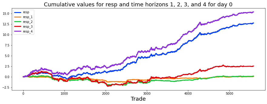
Imagine we’re preparing a little visual story of how predicted returns accumulate over a single trading day. The first line opens a wide canvas and hands us a drawing board (a figure and an axis) sized 15 by 5 so our lines have room to breathe. Next, we take the raw numeric columns for the day — resp and the four one-step-ahead horizons — and turn each into a pandas Series, then compute a running total with cumsum; a running total is like keeping a ledger where each trade’s profit or loss is added to the previous balance so we can see how wealth evolves over time. For each horizon we create a separate running-balance Series: the immediate response (balance) and resp_1 through resp_4.
We then label the horizontal axis with “Trade” so viewers know the x-axis is the sequence of trades, and we give the plot a descriptive title explaining we’re showing cumulative values for resp and horizons 1–4 on day 0. The next lines draw each running-total line onto our axis, using a slightly thicker pen (line width 3) so the paths are easy to follow. Finally, we place a legend in the upper-left corner so each colored line can be identified.
Together, these steps turn raw per-trade responses into a clear visual of cumulative performance, a small but crucial diagnostic for the Jane Street market prediction project.
Here are simple descriptive statistics for the `train.csv` file on day 0. Descriptive statistics are just quick summary numbers — things like the average, the middle value, how spread out the numbers are, and how many values we have — that help you get a first look at the data.
This step is part of the Jane Street Market Prediction project and focuses on the first day of data, called day 0. Looking at these summaries helps you spot strange values or missing data early. That makes it easier to decide how to clean the data and prepare features before you build models.
day_0.describe().style.background_gradient(cmap=colorMap)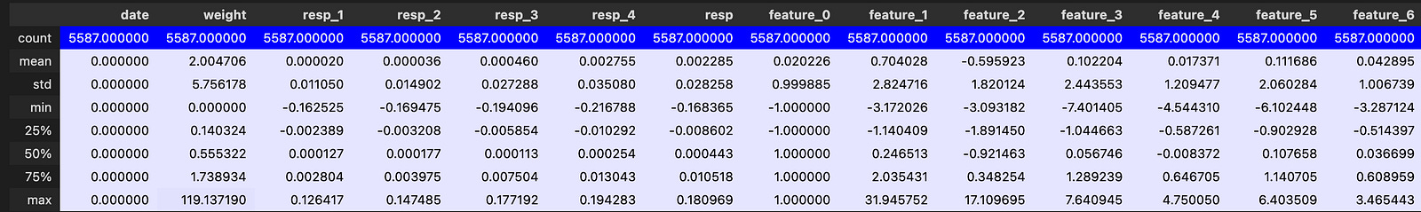
Imagine you have a table of market features for a single trading day and you want a quick, colorful snapshot of their basic behavior so you can spot oddities or promising signals. The program first asks the table to “describe” itself, which is like taking a set of summary measurements — count, mean, standard deviation, min, quartiles and max — that give you a compact portrait of each column. That summary result is then passed along using method chaining, where each step hands its output to the next like passing a recipe card to the next cook; method chaining is a common pattern that keeps transformations readable and sequential. The next step wraps the summary in a styling layer that knows how to render HTML for visual inspection, and then a background color gradient is applied using a color map you supplied, so larger numbers glow one color and smaller numbers another, making patterns and outliers pop without manual squinting. One key idea: styling alters only the visual representation for inspection, not the underlying numbers. In a Jupyter-style workflow this produces an inline, colored table that helps you decide which features may need scaling, clipping, or deeper exploration as you build the Jane Street market prediction pipeline.
We want to know: are there any missing values? Missing values are just blanks or placeholders where data should be, and they can confuse models or give wrong results if we ignore them.
To start, let us look at day 0. Day 0 is the first snapshot in the dataset, the baseline view of the market for the Jane Street prediction task. Checking this first day helps us spot obvious gaps early, so we can decide how to clean the data or fill in blanks before training models.
msno.matrix(day_0, color=(0.35, 0.35, 0.75));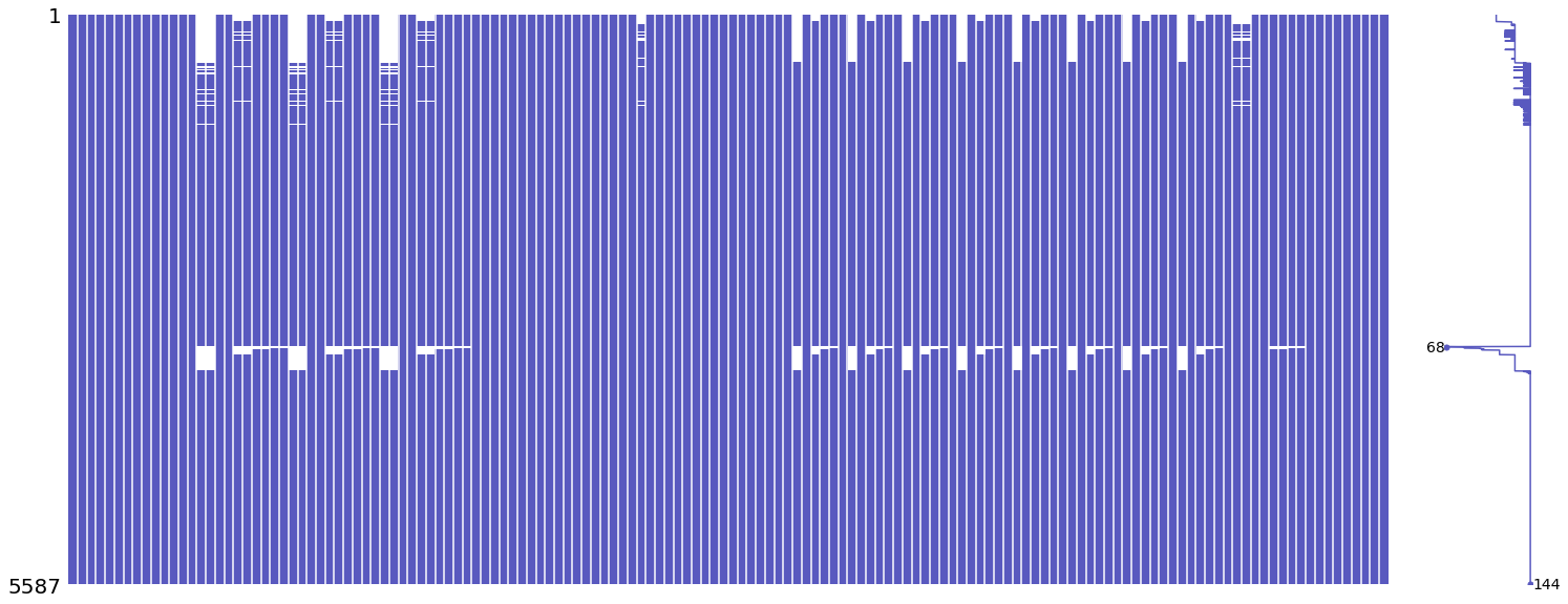
Imagine you have a big spreadsheet of market features for day_0 and you want to quickly spot where the holes are before you build a model; the line calls a visualization recipe card named msno.matrix that lays the DataFrame flat like a transparency and highlights present versus missing cells so you can see vertical or horizontal bands of gaps at a glance. A key concept: visualizing missing data often reveals structure — random gaps look different from blocks tied to a feature or time, and that informs whether you should impute, drop, or engineer around those gaps. The color=(0.35, 0.35, 0.75) argument is just choosing the RGB tint for the “present” values (values are fractions between 0 and 1), so the plot uses a bluish hue to fill the non-missing cells and contrasts them against the empty spaces. The trailing semicolon is a small notebook etiquette trick that suppresses the textual return value so you only see the clean figure output, like removing a wrapper so the picture stands alone. Together, this single line is a quick diagnostic step that helps you understand the data quality before you design features and imputation strategies for the Jane Street market-prediction pipeline.
When you look at the plot, you can clearly see chunks of missing data shown in white across some columns. Missing data just means those values are blank or not recorded, and the white blocks suggest the gaps aren’t random but follow a pattern. Noticing that pattern matters because it can change how we handle those gaps later — whether we fill them in, drop them, or treat them specially for the model.
So next we focus on just two columns: feature_7 (the first resp_1 feature) and feature_11 (the first resp_2 feature). Here resp_1 and resp_2 are just names for groups of related response features, and we’re picking the first one from each group to compare. Looking at a small, representative pair like this makes it easier to spot differences and decide what preprocessing steps to try next.
feats_7_11 = day_0.iloc[:, [14,18]]
msno.matrix(feats_7_11, color=(0.35, 0.35, 0.75), width_ratios=(1, 3));
Here we’re doing a small, focused check on two columns from a dataset so we can see whether any values are missing before we feed the model. The first line picks out columns 14 and 18 from every row and gives that slice the name feats_7_11. Think of iloc as opening numbered drawers by position — iloc selects by integer positions, not by names, so you’re explicitly grabbing the 15th and 19th drawers (counting from zero) across all rows. Storing the result in feats_7_11 is like laying those two recipe cards on the counter so we can inspect them together.
The second line uses a visualization tool that lays the data out like a tiled floor and highlights where tiles are missing, so you can instantly spot gaps. The matrix function creates that visual map of present versus missing entries (key concept: it visualizes missingness by drawing a row-per-record, column-per-feature grid where blank spaces mark missing values). The color argument chooses the shade for present data blocks, and width_ratios tweaks the relative layout so one panel is three times wider than the other, like adjusting the canvas proportions for clarity. The trailing semicolon simply keeps the notebook from printing extra return text so you just see the picture. Together, these lines let you quickly understand data completeness for those two features before moving forward in the Jane Street Market Prediction pipeline.
It looks like the missing data isn’t random. Each column has two big gaps: one at the start of the day and one around the middle. That pattern suggests a systemic issue, not just a few dropped points.
For context, let’s say a trading day runs from 9:30 to 16:00 — that’s the usual market hours — and pretend trades happen at regular time steps (which is almost certainly not true). Under that assumption, the column named feature_7 (a single data column) is missing data from 9:30 until about 10:03, and then again for roughly 16 minutes from 13:17 to 13:33.
The column named feature_11 is missing from 9:30 until about 9:35, and then for about 5½ minutes from 13:17 to 13:22. Those minute counts come from mapping missing rows to the trading clock under our regular-interval assumption.
Knowing these patterns matters because it changes how we should fill gaps or model the data. Next we’ll look at the total number of missing entries per column in the train.csv training file to see overall completeness.
#missing_data = pd.DataFrame(train_data.isna().sum().sort_values(ascending=False),columns=[’Total missing’])
#missing_data.T

gone = train_data.isnull().sum()
px.bar(gone, color=gone.values, title=”Total number of missing values for each column”).show()
Most of the missing values live in two groups: 79.6% are in Tag 4, which are the resp_1 features, and 15.2% are in Tag 3, the resp_2 features. That means over 95% of all missing data comes from these response-type columns. This matters because it points to where our model will be most affected by gaps.
Features 7 and 8 each have exactly 393,135 missing entries. Features 17 and 18, and 27 and 28 each have 395,535 missing entries. All of those pairs are resp_1 features. Identical counts like this often mean the columns record the same kind of thing, maybe the same measure at different times.
Another block — features 72, 78, 84, 90, 96, 102, 108, 114 — each has 351,426 missing values, and these are also resp_1. Seeing blocks with the same missing counts suggests shared structure or a common source of missingness.
On the resp_2 side, features 21, 22, 31, 32 have 81,444 missing values, with 11 and 12 just a bit behind. These are smaller but still noticeable pockets of missing data.
There are many other features with even fewer gaps. The key idea is that the pattern of missingness can hint which features represent the same measures, which helps decide how to impute or simplify the dataset. Is day 0 special, or does every day show similar missing-data patterns? Checking missingness by day will make that clear.
missing_features = train_data.iloc[:,7:137].isnull().sum(axis=1).groupby(train_data[’date’]).sum().to_frame()
# now make a plot
fig, ax = plt.subplots(figsize=(15, 5))
plt.plot(missing_features)
ax.set_xlabel (”Day”, fontsize=18)
ax.set_title (”Total number of missing values in all features for each day”, fontsize=18)
ax.axvline(x=85, linestyle=’--’, alpha=0.3, c=’red’, lw=2)
ax.axvspan(0,  85, color=sns.xkcd_rgb[’grey’], alpha=0.1)
ax.set_xlim(xmin=0)
ax.set_xlim(xmax=500)
plt.show()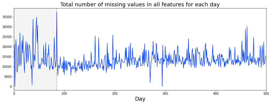
Imagine we’re detectives checking the cleanliness of our dataset over time. First we pick out the block of feature columns (columns 7 up to, but not including, 137) like choosing a subset of ingredients from a pantry. For each row we check which entries are missing and count them across those chosen features; isnull().sum(axis=1) is just a quick way to count how many holes there are in each row. Then we gather those row-level counts into piles by their date — groupby(train_data[‘date’]).sum() collects all rows from the same day and adds their missing-value counts together — and to_frame wraps that final series into a neat two-dimensional table for plotting.
Next we prepare a canvas with fig, ax = plt.subplots(figsize=(15, 5)) so our picture has room to breathe, and we draw the daily totals as a line so you can see rises and falls like a heartbeat. We label the horizontal axis “Day” and give the plot a descriptive title so the story is clear. A vertical dashed red line at x=85 highlights a specific point in time, and the faint grey band from day 0 to 85 shades the earlier period, helping your eye compare before-and-after behavior. We set sensible x-axis limits so the view is focused, then show the figure. Altogether this gives a daily map of missingness that helps spot data-quality shifts relevant to Jane Street market prediction.
We can see there are missing values on almost every day — gaps in the data where some entries are absent. There’s no clear weekly or monthly pattern to these gaps. The only clear exceptions are days 2 and 294, which we’ll examine in the next section because unusual days often reveal data collection or market anomalies that could affect models.
A Kaggle notebook by marketneutral plotted the number of trades per day (trades are the rows of trading activity) and the shape of that plot looks very similar to ours. For curiosity, and to check for a link between activity and data quality, we’ll plot the number of missing feature values (features are the columns like prices and signals) against the number of trades for each day. This helps us see whether quieter days tend to produce more gaps, which matters because such a relationship could bias our predictions if we don’t handle it.
count_weights    = train_data[[’date’, ‘weight’]].groupby(’date’).agg([’count’])
result = pd.merge(count_weights, missing_features, on = “date”, how = “inner”)
result.columns = [’weights’,’missing’]
result[’ratio’] = result[’missing’]/result[’weights’]
missing_per_trade = result[’ratio’].mean()

# now make a plot
fig, ax = plt.subplots(figsize=(15, 5))
plt.plot(result[’ratio’])
plt.axhline(missing_per_trade, linestyle=’--’, alpha=0.85, c=’r’);
ax.set_xlabel (”Day”, fontsize=18)
ax.set_title (”Average number of missing feature values per trade, for each day”, fontsize=18)
plt.show()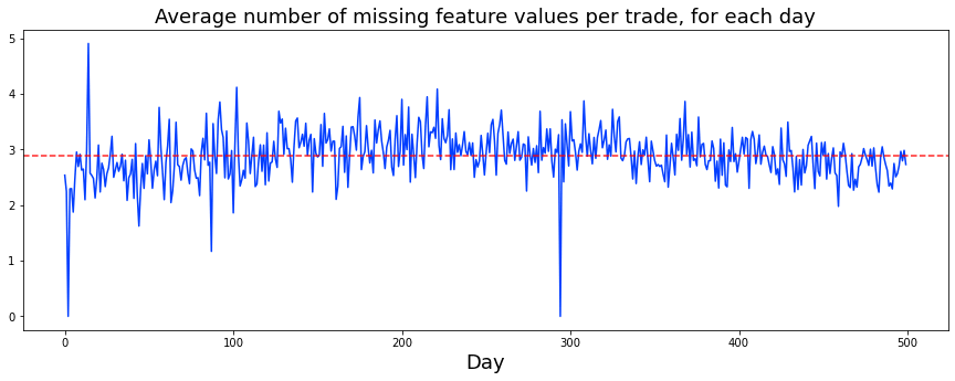
We want to measure how many feature values are missing per trade on each day and then visualize that trend. First, we pick the date and weight columns and group rows by date, counting how many weight entries we have for each day; grouping is like sorting slips into daily folders so you can tally how many trades occurred each day (groupby collects rows by key, and agg(‘count’) computes the non-null counts). Next, we merge those daily counts with another table that already records how many features were missing each day, matching rows by date and keeping only days that appear in both sets; merging is like lining up two attendance sheets by the same date so you compare apples to apples.
Because the grouped result can have awkward column labels, we rename the two columns to ‘weights’ and ‘missing’ so the data is easy to read. Then we create a new column called ratio by dividing missing by weights; this gives the average number of missing feature values per trade on each day, and the arithmetic mean of that ratio (missing_per_trade) summarizes the overall typical missing-per-trade across days.
To see the pattern, we make a wide plotting canvas and draw the daily ratio as a line; adding a horizontal dashed red line at the mean highlights where days sit relative to the overall average. We label the x-axis and the title for clarity and display the figure. This whole process helps you monitor data quality over time, a small but crucial step toward reliable market-prediction models.
On average there are about three missing feature values per trade each day, with two odd exceptions: days 2 and 294 have no missing values at all. The worst day for missing data is day 14. This matters because gaps like these can change how a model learns from the data, so we need a consistent plan for handling them.
That raises the question of what to do with missing data in the unseen test set. In a timed competition we must be fast, so the speed of whatever filling method we pick is important. Yirun Zhang has an exhaustive study of how long different filling methods take in the notebook “Optimise Speed of Filling-NaN Function,” which is a great place to compare practical trade-offs between accuracy and runtime.
When we look at scatter plots of feature_64 we see a repeating sweep pattern that’s similar each day. But day 2 stands out: it only has 231 ts_id entries. A ts_id is just an identifier for each trade or timestamp, so having only 231 means far fewer observations on that day. These entries seem to come from the very end of the trading day, which could make that day unrepresentative of normal behavior.
To visualize this, we plotted day 1 in blue, day 2 in red, and day 3 in blue again, and we circled day 2 as a visual aid. Spotting anomalies like this early helps decide whether to treat a day specially, drop it, or adjust the filling strategy before training models.
day_1 = train_data.loc[train_data[’date’] == 1]
day_2 = train_data.loc[train_data[’date’] == 2]
day_3 = train_data.loc[train_data[’date’] == 3]
three_days = pd.concat([day_1, day_2, day_3])

#td = three_days.plot.scatter(x=’ts_id’, y=’feature_64’, s=0.5, figsize=(15,4), color=’blue’)
#day_2.plot.scatter(x=’ts_id’, y=’feature_64’, s=0.5, figsize=(15,4), color=’red’, ax=td);

fig, ax = plt.subplots(figsize=(15, 3))
ax.scatter(three_days.ts_id, three_days.feature_64, s=0.5, color=’b’)
ax.scatter(day_2.ts_id, day_2.feature_64, s=0.5, color=’r’)
ax.scatter(15150, 5.2, s=1800, facecolors=’none’, edgecolors=’black’, linestyle=’--’, lw=2)
ax.set_xlabel(’feature_64’)
ax.set_ylabel(’ts_id’)
ax.set_title(’feature_64 for days 1, 2 and 3’)
plt.show();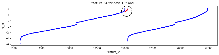
Imagine we’re trying to peek at how one particular feature behaves over the first three days of trading data, like flipping to three consecutive pages in a diary to look for a pattern. The first three lines pull out rows where the date equals 1, 2, and 3; .loc is the tool that filters rows by a condition, so each line is like saying “give me only the entries written on day 1” and so on. pd.concat then stitches those three day-pages back together into a single table so we can treat them as one small book.
A couple of lines are commented out that would have used pandas’ built-in plot.scatter to overlay day-2 in red on a blue background, showing an alternate, shorter path to the same plot. The script instead creates a matplotlib figure and axes with fig, ax = plt.subplots(figsize=(15, 3)), which gives us a blank canvas sized like a long, narrow timeline.
The next two ax.scatter calls plot every timestamp id on the x-axis against feature_64 on the y-axis: the first plots all three days in blue with tiny points (s=0.5) and the second overplots day 2 in red so you can easily spot differences; a scatter is like sprinkling tiny markers for each observation. The big ax.scatter at (15150, 5.2) with a large hollow circle is a visual highlighter, drawing attention to a specific ts_id/value pair. Then set_xlabel and set_ylabel label the axes — note the labels appear swapped relative to the plotted order, a small detail to fix if you want clarity — and ax.set_title names the plot. Finally plt.show() renders the picture.
Seeing feature_64 across these early days helps us form hypotheses about its behavior, a small but useful step toward the larger Jane Street market prediction task.
Day 294 only has 29 ts_id — a ts_id is just a time-series identifier, basically one row’s unique time tag. That tiny count makes the whole day look different from the rest, so it’s no surprise its patterns don’t match. Because it’s so small, it can skew summaries and models, so we might treat it as an outlier and drop it.
The same oddness shows up for day 2: both days 2 and 294 lack the usual gaps we see around breakfast and lunch on other days. In plain terms, they miss the usual “quiet” periods. Dropping them can keep our analysis focused on the normal trading rhythms, which helps models learn typical behavior instead of these rare exceptions.
Next, we’ll run day 0 through dabl — the data analysis baseline library, a tool that makes quick exploratory plots and simple baselines. We’ll start by using action as the target; action is what we want the model to predict (for example, buy, sell, or hold). This gives a fast visual and statistical check to guide more detailed modeling later.
dabl.plot(day_0, target_col=”action”)

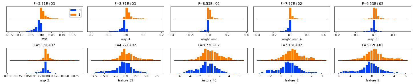
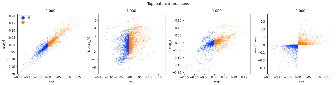
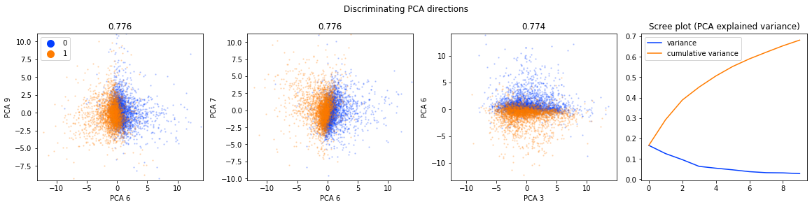
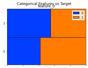
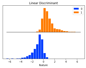
Think of our work as an investigative kitchen where we’re trying to taste whether the ingredients for predicting market moves actually have flavor. The single line calls a plotting function from the dabl library with our day_0 data and tells it that “action” is the outcome we care about. A function is like a reusable recipe card that performs a task for us; here the recipe card inspects each column, chooses sensible chart types, and lays out visual comparisons between features and the target. Exploratory data analysis is the process of visually and statistically checking your data for patterns, oddities, and potential signals. By naming target_col=”action” we explicitly mark which column holds the labels the model will try to predict, so the plots will show how each feature relates to buy/sell/hold decisions (or whatever actions you encoded). dabl’s plot will automatically show distributions, scatter or box plots, and counts as appropriate, helping us spot class imbalance, outliers, or strong predictors. In short, that one line opens a quick visual report that helps decide which features to trust or transform next — a small but crucial step on our path to a robust Jane Street market prediction model.
We can see the two action labels, 0 and 1, are reasonably well balanced — that just means there are about as many examples of each. Having balanced classes helps a model learn both choices without getting biased toward one, which makes performance easier to interpret and compare.
Now we’ll use resp as the target — the thing the model will try to predict. resp is the response variable (a continuous measure of future return), so using it means we’re predicting returns directly rather than class labels. This prepares us for regression-style models that try to optimize for profit instead of just guessing an action.
dabl.plot(day_0, target_col=”resp”)
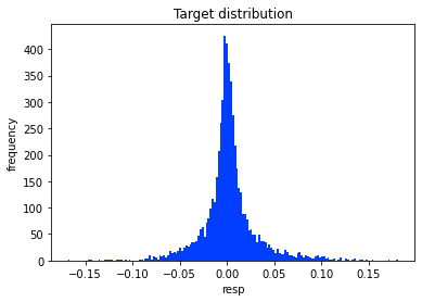
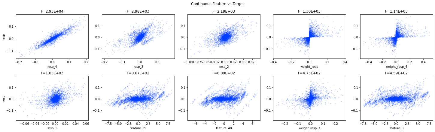
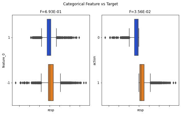
Imagine you’re preparing to taste a complex dish to decide which ingredients influence the flavor the most. Calling dabl.plot(day_0, target_col=”resp”) is like taking a friendly magnifying glass and a set of quick tasting notes to the whole table of ingredients for day 0 of trading. dabl is a helper library that gives you fast visual summaries, and the plot function is a reusable recipe card that lays out each feature and how it behaves. Exploratory data analysis is the process of visually and statistically summarizing a dataset to discover patterns, anomalies, and relationships.
Here, day_0 is the DataFrame with all the market features from the first day, and target_col=”resp” tells the function which column is the label we care about predicting; that label is the flavor we’re trying to explain. The plot call then automatically produces sensible visual summaries: distributions for individual columns so you can spot skew or outliers, and feature-vs-target views (scatter plots for numeric features, boxplots or counts for categoricals) so you can see which features move with resp. That quick visual triage points out class imbalance, strong correlations, or useless constants, guiding your next steps like feature engineering or selecting models.
In short, this single line gives a rapid EDA pass that helps you focus on the most promising signals for the Jane Street Market Prediction task.
This plot shows resp values across time, using ts_id as the horizontal axis, for day 0. resp is the numeric target we try to predict — think of it as a signed measure of short-term return or price movement. ts_id is just a simple time index that orders events inside the trading day, so the plot reads left-to-right in time. We pick day 0 as a concrete example so we can inspect one full day’s behavior before generalizing.
Looking at this plot helps you spot trends, sudden spikes, clusters of activity, or stretches of noisy flatness. Those visual cues tell you whether you need smoothing, outlier handling, lagged features, or models that cope with changing volatility. Doing this quick visual check prepares you to pick sensible preprocessing and modeling choices rather than guessing blindly.
X_train = day_0.loc[:, day_0.columns.str.contains(’feature’)]
X_train = X_train.fillna(X_train.mean())
# our target is the action
y_train = day_0[’resp’]

from sklearn.ensemble import RandomForestRegressor
regressor = RandomForestRegressor(max_features=’auto’)
regressor.fit(X_train, y_train)
We’re trying to teach a model to predict the market action called “resp” from a set of input measurements, so the first line gathers every column whose name contains the word “feature” into X_train — imagine pulling all the labeled ingredients off the shelf. The next line replaces any missing measurements with the column’s mean so we don’t break the recipe when an ingredient is missing; a key concept: imputing missing values with the mean prevents gaps from stopping the learning process. Then we set y_train to the ‘resp’ column, which is the target we want the model to predict; in supervised learning you provide inputs and a target so the algorithm can learn the mapping between them.
We then bring in RandomForestRegressor from scikit-learn, which is like recruiting a panel of decision-tree tasters whose averaged judgments give robust predictions. Creating regressor = RandomForestRegressor(max_features=’auto’) configures how many features each tree is allowed to consider at a split — this parameter controls diversity among the trees, and diversity helps reduce overfitting. Finally, regressor.fit(X_train, y_train) teaches that panel by showing them many examples of features paired with the correct response so they can learn patterns and generalize to new market situations. Together these steps prepare a predictive model that can be evaluated and iterated on as part of the Jane Street Market Prediction pipeline.
import eli5
from eli5.sklearn import PermutationImportance
perm_import = PermutationImportance(regressor, random_state=1).fit(X_train, y_train)
# visualize the results
eli5.show_weights(perm_import, top=15, feature_names = X_train.columns.tolist())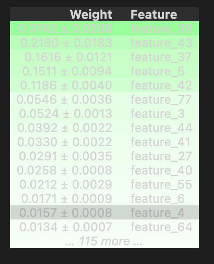
We want to understand which market signals your model leans on most, so the first line brings in eli5, a friendly toolbox for explaining machine learning behavior, and specifically pulls in PermutationImportance, a helper that measures feature importance by seeing how the model’s performance changes when a feature is randomly scrambled. Think of it like testing a recipe by swapping out one ingredient at a time to see how the taste suffers.
The next line creates a PermutationImportance object, handing it your regressor and a random_state for reproducible shuffling, then fits that object to your training data; here “fitting” means running the experiments where each feature is permuted and the impact on model score is recorded, much like running a set of taste tests and writing down the results. The random_state ensures the shuffles are repeatable, so colleagues can see the same outcomes.
Finally, the show_weights call asks eli5 to present the top 15 features, using the human-readable column names from X_train.columns.tolist() so you can read which signals mattered most; in a notebook this renders a neat table showing importance and direction. These results help you focus on the few market features that really drive predictions in the Jane Street Market Prediction project.
On day 0 the top five most important features are 39, 43, 37, 5 and 42. This just shows which inputs the model leaned on most for that first day, and it can change a lot from day to day.
A quick but important caveat: feature importance depends on the model you fit. A feature that looks unimportant for a poor model could be very important for a better one. Always check predictive performance first using a held-out set (data not used for training) or cross‑validation (training on many different splits) before trusting importances.
Permutation importance measures how much a model relies on a feature by shuffling that feature and seeing the score drop. It doesn’t tell you the feature’s intrinsic predictive value by itself; it tells you how important that feature was for that particular model.
Studying feature importance seriously is essential, but it uses a lot of CPU, so plan for long runs. For a more advanced, automated approach you might look at Boruta‑SHAP (it combines Boruta feature selection with SHAP explanations), which can save time and be more robust.
Global rankings are helpful, but they miss per‑prediction detail. With TabNet you can inspect which features mattered for each individual calculation, showing the process is much more dynamic than a single static list.
Are days independent? To check, we look at day 100 and day 200 with a Pearson pairwise correlation matrix — this measures linear relationships between pairs of variables and the matrix is large. We pick days 100 and 200 because they’re far apart, which helps reduce temporal leakage (information unintentionally carried between train and test). A diverging colormap shows red for positive linear correlation and blue for negative correlation.
day_100  = train_data.loc[train_data[’date’] == 100]
day_200  = train_data.loc[train_data[’date’] == 200]
day_100_and_200 = pd.concat([day_100, day_200])
day_100_and_200.corr(method=’pearson’).style.background_gradient(cmap=’coolwarm’, axis=None).set_precision(2)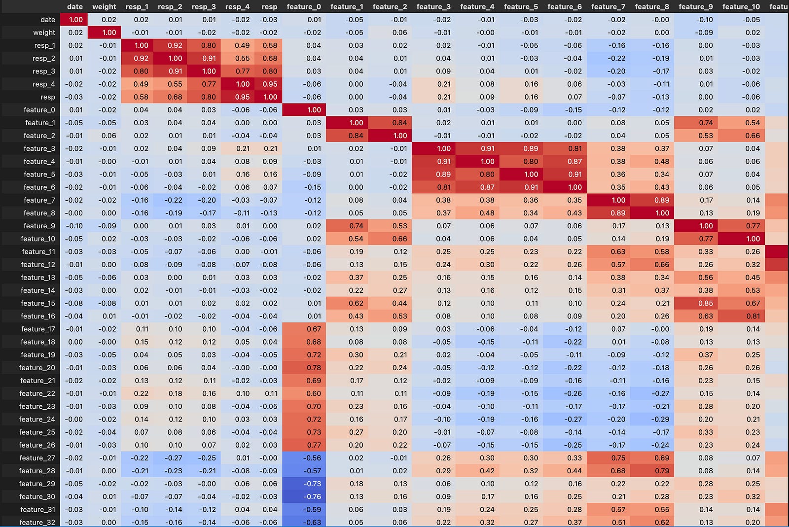
Imagine you’re a detective looking through a ledger of market records and you want to pull out only the pages for two particular days to compare them. The first line flips through that ledger and pulls every row where the date column equals 100: train_data.loc[train_data[‘date’] == 100]. Here the key concept is boolean indexing — you create a true/false mask and select the rows where the condition is true. The second line does the same thing for date 200, so now you have two smaller tables, one for each day.
Next you take those two tables and stitch them together with pd.concat([day_100, day_200]); think of concatenation like stacking two recipe cards on top of each other to make one pile you can inspect at once. After they’re stacked, you ask how the columns relate to each other by calling .corr(method=’pearson’). Correlation is a numerical summary of how two variables move together, and the Pearson version specifically measures linear relationships.
Finally, you make the results easy to scan: .style.background_gradient(cmap=’coolwarm’, axis=None) paints the correlation numbers with colors like a heatmap so strong relationships jump out, and .set_precision(2) rounds the displayed numbers to two decimals. Altogether this pulls two days, combines them, measures how features co-move, and highlights the answers in a notebook-friendly view — a small but useful step toward feature understanding in the Jane Street Market Prediction effort.
We only see a correlation of about 0.54 between our simple definition of `action` and the value of `resp`. Correlation just measures how two things move together, so 0.54 means a moderate link but not a very strong one. This tells us that this single `action` definition probably won’t be a great predictor on its own, so we’ll likely need more features or different transforms.
It’s interesting that no single feature shows a strong correlation with `resp`. That means the signal might be spread across many variables or hidden in non-linear patterns, so simple one-to-one relationships aren’t enough. This prepares us to try combinations of features or more flexible models.
People often prefer Spearman’s rank correlation for financial data because it looks at the order or ranking of values rather than exact numbers, which makes it less sensitive to outliers and non-linear monotonic relationships. If you use pandas (a DataFrame is just a smart table for data in Python), you can switch from Pearson to Spearman by changing `method=’pearson’` to `method=’spearman’` in `DataFrame.corr()`.
In the Tag 28 area we spot some curious regions, for example between features 120 and 129. Features are just columns or variables, and clusters like this can hint at local structure or patterns worth investigating further.
subset = day_100_and_200[[”feature_120”,”feature_121”,”feature_122”,”feature_123”,”feature_124”,”feature_125”,”feature_126”,”feature_127”,”feature_128”,”feature_129”]]
subset.corr(method=’pearson’).style.background_gradient(cmap=’coolwarm’, low=1, high=0, axis=None).set_precision(2)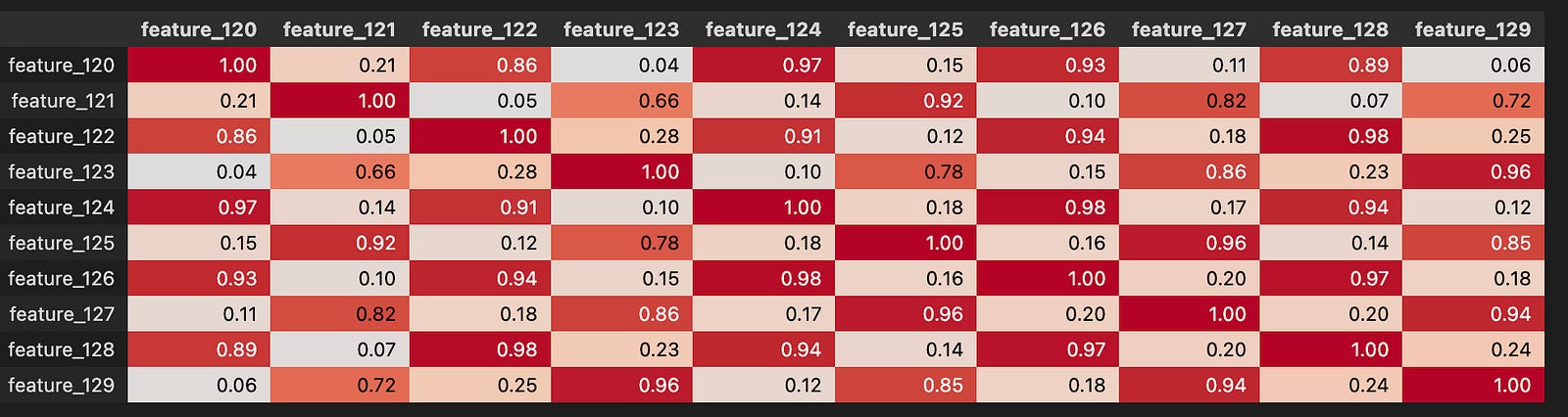
Imagine you’re standing at a counter with a big pantry of market measurements and you decide to pull out ten specific ingredients to taste how they interact; that’s the first line, which creates a smaller table called subset by selecting the columns feature_120 through feature_129 from day_100_and_200. A DataFrame is a table-like structure that holds rows and columns of data so you can slice and dice the parts you care about.
Once you have those ten features, the next line asks: how do these ingredients move together? It computes the Pearson correlation matrix, which measures linear association between pairs of variables — correlation values range from -1 (perfect opposite) to 1 (perfect together) and 0 means no linear relationship. After computing those pairwise numbers, the code wraps the result in a visual style that paints each cell with a coolwarm gradient so strong positive and negative relationships pop out like warm and cool colors; the low=1, high=0 flips the gradient mapping and axis=None makes the color scale apply across the whole table. Finally, set_precision(2) formats the displayed numbers to two decimals so the table is easy to read.
By turning raw numbers into a colored correlation map, you quickly spot redundant features or promising signal pairs — an essential step when building better predictors for the Jane Street Market Prediction project.
All the listed columns are in Tag 28, which just means they’re grouped together by that label. Within that group, feature_120 and feature_121 also carry Tag 4, which suggests they’re linked to the response called resp_1; feature_122 and feature_123 have Tag 0, pointing toward resp_4; feature_124 and feature_125 have Tag 3, pointing to resp_2; feature_126 and feature_127 have Tag 2, pointing to resp_3; and feature_128 and feature_129 have Tag 1, pointing to resp. Explaining tags this way helps you see which features were tagged as related to which target, which is useful when deciding which features to keep.
Looking at days 100 and 200 for these Tag 28 features, the linear correlations (how closely two numbers move together, from -1 to 1) are: resp with resp_4 = 0.98, resp with resp_3 = 0.97, resp with resp_2 = 0.94, and resp with resp_1 = 0.89. These are strong positive relationships, so those responses tend to rise and fall together; that can mean some targets or features carry very similar information.
Next I’ll search for feature pairs with correlation greater than |0.992|, which flags near-duplicates that you might want to remove or merge.
features_day_100   = day_100.iloc[:,7:137]
features_day_200   = day_200.iloc[:,7:137]
features_100_and_200 = pd.concat([features_day_100, features_day_200])

# code from: https://izziswift.com/list-highest-correlation-pairs-from-a-large-correlation-matrix-in-pandas/
def corrFilter(x: pd.DataFrame, bound: float):
    xCorr = x.corr()
    xFiltered = xCorr[((xCorr >= bound) | (xCorr <= -bound)) & (xCorr !=1.000)]
    xFlattened = xFiltered.unstack().sort_values().drop_duplicates()
    return xFlattened

corrFilter(features_100_and_200, .992).to_frame()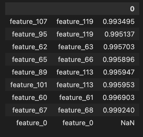
We start by slicing out the columns we care about from two different days, like cutting the useful layers from two cakes: features_day_100 = day_100.iloc[:,7:137] and features_day_200 = day_200.iloc[:,7:137] take columns 7 through 136 (Python slicing is end-exclusive) so we focus on a consistent block of features. Then features_100_and_200 = pd.concat([features_day_100, features_day_200]) stacks those slices into one table, like placing the two cake slices side by side so we can compare them together.
Next we write a little reusable recipe card, def corrFilter(x: pd.DataFrame, bound: float):, so we can apply the same procedure to any DataFrame. Inside, xCorr = x.corr() computes pairwise correlations; correlation measures how two variables move together and is a key concept for spotting redundant signals. The line xFiltered = xCorr[((xCorr >= bound) | (xCorr <= -bound)) & (xCorr !=1.000)] keeps only strong positive or negative correlations above the threshold while dropping perfect self-correlations (1.0). Unstacking with xFlattened = xFiltered.unstack().sort_values().drop_duplicates() reshapes the matrix into a sorted list of pairs and removes mirror duplicates, so each highly correlated pair appears just once. Returning that series lets us inspect the pairs easily. Finally corrFilter(features_100_and_200, .992).to_frame() calls the recipe with a very high threshold (0.992) to produce a tidy table of near-duplicate features.
Running this helps the market-prediction pipeline by revealing redundant features to simplify models and reduce multicollinearity.
We can definitely cut down the number of features the model uses. Features are just the input variables the model looks at. Fewer features usually mean a simpler, faster model that generalizes better and is less likely to overfit — which matters for making reliable market predictions.
A good place to start is the features in the 60s — that’s Tag 22, meaning the group of features numbered around 60. We’ve seen before that these features are highly correlated, which means they tend to move together and carry the same information. Checking this group first helps us spot redundancy so we can remove or combine columns, reduce noise, and make feature selection clearer and training faster.
A full submission takes about three and a half hours to score, so testing your script locally before you submit is very important. Running small checks saves you long waits and helps catch silly bugs early.
You get a small test file called example_test.csv (about 36 MB) with over 15,000 rows covering three days. It has the same 130 features as train.csv and a weight column for each trade. It does not include resp, which is the response or target we try to predict, so you can’t measure final performance from it.
The three days in that file are labeled day 0, day 1 and day 2. Day 2 is only the very end of the day, just like in train.csv, so treat it with caution because it’s not a full day of data and can behave differently.
