

EDA and Feature Importance in Jane Street Trading: A Day 0 Case Study
A Statistical Approach to Understanding and Improving Trading Models

Jane Street utilizes machine learning (ML) as a cornerstone of its operations, beginning with the data it collects and analyzes. The firm gathers approximately 2.3 terabytes of market data daily. Within this substantial volume of data lies a wealth of relationships and statistical patterns that inform the models driving its strategies. However, successful implementation of ML in a production environment like Jane Street’s requires an integration of multiple interconnected components.
Download the jupyter notebook from link at the end of this article.
This notebook presents a straightforward exploratory data analysis (EDA) of the datasets associated with the Kaggle competition, Jane Street Market Prediction. The aim is to delve into various aspects of the data and uncover insights that may prove beneficial in selecting appropriate modeling approaches. A thorough understanding of the data’s structure is crucial to identifying the most effective techniques for addressing the challenges at hand. Moreover, visualizing the data can enhance comprehension and stimulate interest among traders and researchers alike.
In this analysis, several topics will be covered. For instance, the train.csv file is notably large, and we will examine the significance of the response variable and weights. Additionally, we will investigate cumulative returns, time variables, and the features present in the dataset, including a detailed look at features.csv.
Further, we will explore actions, reviewing the first day of data collection, commonly referred to as “day 0.” An assessment of any missing values will be conducted, with particular focus on the data from Days 2 and 294. We shall also employ DABL plots to visualize the targets of action and the response variable.
To assess feature importance, we will utilize Random Forest for permutation importance analysis. Furthermore, we will examine potential correlations between the data from day 100 and day 200. Finally, we will review the test data while discussing evaluation metrics relevant to this analysis.
# numpy
import numpy as np

# pandas stuff
import pandas as pd
pd.set_option('display.max_rows', None)
pd.set_option('display.max_columns', None)

# plotting stuff
from pandas.plotting import lag_plot
import matplotlib.pyplot as plt
import seaborn as sns
import plotly.express as px
import plotly.graph_objects as go
colorMap = sns.light_palette("blue", as_cmap=True)
#plt.rcParams.update({'font.size': 12})


# install dabl
!pip install dabl > /dev/null
import dabl
# install datatable
!pip install datatable > /dev/null
import datatable as dt

# misc
import missingno as msno

# system
import warnings
warnings.filterwarnings('ignore')
# for the image import
import os
from IPython.display import Image
# garbage collector to keep RAM in check
import gc
It incorporates a range of libraries and packages that facilitate various functions within the analysis workflow, each fulfilling a unique role.
To begin with, the code imports several key libraries. NumPy serves as a fundamental tool for numerical computing, offering robust support for arrays and matrices alongside a variety of mathematical functions. Pandas is another critical library that excels in data manipulation and analysis, allowing for efficient handling of data structured in tabular formats, commonly known as dataframes. For visualization, Matplotlib and Seaborn are utilized; Matplotlib provides foundational capabilities, while Seaborn enhances the visual appeal of statistical graphics. Additionally, Plotly is integrated for interactive plotting, making it particularly useful for web applications and dashboards. Dabl simplifies the data analysis process by automating tasks related to data cleaning and visualization. The Datatable library is crafted for managing large datasets effectively, ensuring high-performance data manipulation. Missingno is included to visualize missing data in datasets, thereby assisting in the assessment of data integrity and completeness. Lastly, the code imports the Warnings library to manage any warnings that may occur during code execution, which contributes to producing a cleaner output.
The setup also addresses environment configuration. Display options for Pandas are adjusted, allowing users to view all rows and columns when inspecting data frames, an essential aspect of thorough data examination. Furthermore, the code includes commands to install additional libraries, namely dabl and datatable, which may not be included in all standard setups.
In terms of memory management, the code incorporates the gc (garbage collector) module. This module is vital for maintaining efficient memory usage by cleaning up unused objects, a necessary function when working with substantial datasets to mitigate potential slowdowns or crashes.
Lastly, the code provides functionality for displaying images in Jupyter notebooks, which can enhance the dynamic nature of presentations involving data or results.
The size of the train.csv file is substantial, measuring 5.77 gigabytes. To better understand its scope, we can examine the total number of rows contained within the file.
!wc -l ../input/jane-street-market-prediction/train.csv
The command presented is a command line instruction intended for use within a Unix-like operating system, focusing on file handling and data analysis.
The command executed is “!wc -l,” which employs the “wc” utility, a standard command in Unix. This utility is capable of counting lines, words, and characters in a text file. The “-l” option specifically directs the “wc” utility to count only the number of lines contained within the specified file.
In this instance, the file being analyzed is “train.csv,” which is located in the directory “../input/jane-street-market-prediction/.” The presence of the double dots (“..”) at the start of the path signifies that the command is referencing a parent directory located one level above the current working directory.
The primary aim of this command is to ascertain the total number of lines present in the “train.csv” file. This information can serve various purposes. Firstly, it provides an overview of the data by indicating its size, which can be beneficial for guiding subsequent analysis or processing actions. Secondly, it contributes to data validation; by verifying the number of lines, users can confirm that the file has loaded correctly and contains expected content. Moreover, understanding the size of the dataset assists in evaluating the computational resources necessary for data processing or analysis.
%%time

train_data_datatable = dt.fread('../input/jane-street-market-prediction/train.csv')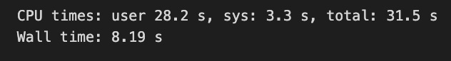
The provided code is intended to load a dataset from a CSV file using the datatable library in Python, which is known for its efficiency in handling large datasets. Specifically, it is set to read a file named train.csv found within the directory ../input/jane-street-market-prediction/.
The command %%time at the start serves as a Jupyter Notebook cell magic command designed to measure the duration of the code that follows it. Upon execution, this command will yield the time taken to complete the file reading process. The choice of the fread function from the datatable library suggests a preference for a faster and more efficient data loading method compared to alternatives such as pandas read_csv, especially beneficial when dealing with sizable CSV files.
This code is essential for the processes of data preprocessing and analysis in data science and machine learning. It enables users to load training data into memory, facilitating further manipulation, cleaning, and analysis. Efficiently loading data is particularly important when handling large datasets, as it significantly influences both the performance of the workflow and the time required for data processing tasks.
%%time

train_data = train_data_datatable.to_pandas()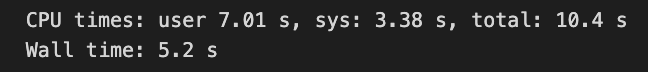
This code snippet is designed for use in a Jupyter notebook or an interactive Python environment, serving the purpose of converting data from a specialized data structure, likely derived from a data manipulation library such as Datatable, into a pandas DataFrame. The %%time magic command is employed to measure the execution time of the entire cell, thereby enabling an assessment of the performance of the operation.
The conversion process involves taking the train_data_datatable, which is a Datatable object, and transforming it into a pandas DataFrame. This data structure, provided by the pandas library, is widely recognized for its optimization in data analysis. Datatable is celebrated for its speed and efficiency in managing large datasets, while pandas offers a comprehensive suite of features for data manipulation and analysis.
The rationale for using this code arises in situations where one has a large dataset effectively processed with Datatable but wishes to harness the capabilities of pandas for advanced data analysis. By converting the Datatable object into a pandas DataFrame, users can take advantage of the extensive functionalities that pandas provides, including data cleaning, exploratory analysis, and visualization, among others. Additionally, the timing information gathered during the conversion is valuable for performance monitoring, as it allows for an understanding of the duration of the conversion process, which can be critical in data processing workflows.
We have successfully loaded the file train.csv in a duration of less than 17 seconds.
The dataset consists of a total of 500 days of data, equivalent to two years of trading information. We will now examine the cumulative values of the variable resp over this period.
fig, ax = plt.subplots(figsize=(15, 5))
balance= pd.Series(train_data['resp']).cumsum()
ax.set_xlabel ("Trade", fontsize=18)
ax.set_ylabel ("Cumulative resp", fontsize=18);
balance.plot(lw=3);
del balance
gc.collect();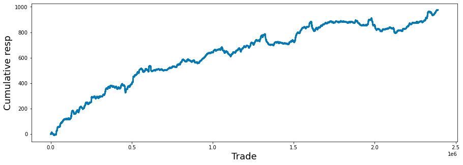
It consists of several key components that contribute to its overall functionality and usefulness.
Initially, the code establishes a subplot with predetermined dimensions, measuring 15 inches in width and 5 inches in height. This setup creates a suitable canvas for data visualization.
Subsequently, the code computes a series referred to as balance, which represents the cumulative sum of a column labeled resp from a DataFrame known as train_data. This cumulative sum is instrumental in understanding the ongoing total of responses over time, thereby revealing trends or the overall performance of trades.
In terms of the plots accessibility, the x-axis is designated as Trade and the y-axis as Cumulative resp, both characterized by a font size of 18. This enhancement significantly improves the clarity of the plot by explicitly indicating what each axis denotes.
The cumulative response data is then visually represented through a line plot, with a specified line width that augments its visibility. This design choice facilitates the straightforward interpretation of how responses accumulate across trades.
Lastly, to ensure efficient memory management, the balance variable is deleted after plotting, and garbage collection is activated to reclaim memory resources. This practice is particularly beneficial when dealing with extensive datasets, as it helps to prevent memory leaks by releasing resources that are no longer needed.
Investing strategies can vary significantly based on the time horizon an investor has for their financial goals. A longer time horizon typically allows for a more aggressive or risk-oriented investment portfolio. This is due to the extended timeframe available to recover from potential market fluctuations.
Conversely, a shorter time horizon may necessitate a more conservative approach. In such cases, investors tend to prioritize stability and risk reduction, as they have limited time to withstand market volatility before needing access to their funds.
fig, ax = plt.subplots(figsize=(15, 5))
balance= pd.Series(train_data['resp']).cumsum()
resp_1= pd.Series(train_data['resp_1']).cumsum()
resp_2= pd.Series(train_data['resp_2']).cumsum()
resp_3= pd.Series(train_data['resp_3']).cumsum()
resp_4= pd.Series(train_data['resp_4']).cumsum()
ax.set_xlabel ("Trade", fontsize=18)
ax.set_title ("Cumulative resp and time horizons 1, 2, 3, and 4 (500 days)", fontsize=18)
balance.plot(lw=3)
resp_1.plot(lw=3)
resp_2.plot(lw=3)
resp_3.plot(lw=3)
resp_4.plot(lw=3)
plt.legend(loc="upper left");
del resp_1
del resp_2
del resp_3
del resp_4
gc.collect();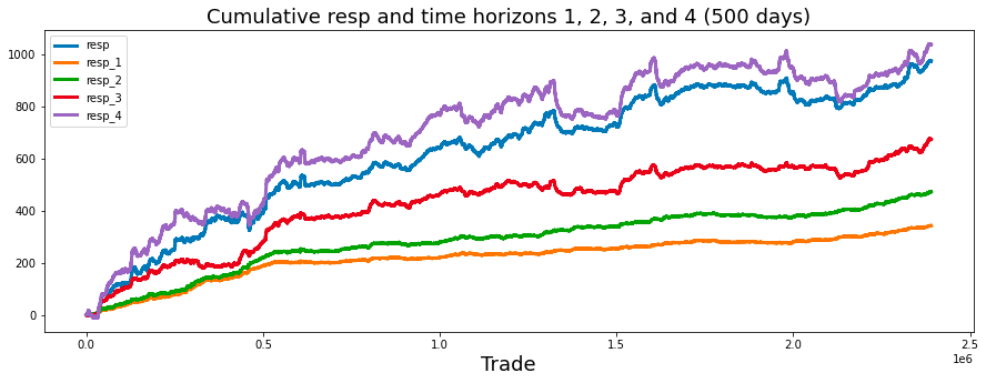
This code is designed to generate a visual representation of cumulative responses over a specified time frame, focusing on the cumulative sums of trade responses documented within a dataset.
Initially, the code establishes a series of subplots, the dimensions of which are determined by a predefined figure size. This setup dictates the overall appearance of the displayed plot.
Subsequently, the code computes the cumulative sums for various response variables, identified as resp, resp_1, resp_2, resp_3, and resp_4, which are drawn from a DataFrame referred to as train_data. Each of these series likely corresponds to responses recorded at different time intervals, such as immediate responses or those captured after one day, two days, and so forth.
The x-axis is designated with the label Trade, indicating that the data pertains to trading activities over time. Additionally, a title is included to provide context about the nature of the plot, specifically highlighting the cumulative responses across multiple time horizons.
The plotting phase involves displaying each cumulative response series on a shared set of axes. This arrangement facilitates a comparative analysis of how these responses develop cumulatively throughout the trading period, with a suitable line width applied to enhance clarity.
In conjunction with the plotting, a legend is incorporated to differentiate the lines representative of various time horizons, thereby aiding in the interpretation of the plot.
In terms of resource management, once the data visualization is complete, the temporary variables storing the cumulative sums are removed to conserve memory. Furthermore, a garbage collection process is initiated to ensure that any residual resources are eliminated, thereby optimizing system performance.
plt.figure(figsize = (12,5))
ax = sns.distplot(train_data['resp'],
             bins=3000,
             kde_kws={"clip":(-0.05,0.05)},
             hist_kws={"range":(-0.05,0.05)},
             color='darkcyan',
             kde=False);
values = np.array([rec.get_height() for rec in ax.patches])
norm = plt.Normalize(values.min(), values.max())
colors = plt.cm.jet(norm(values))
for rec, col in zip(ax.patches, colors):
    rec.set_color(col)
plt.xlabel("Histogram of the resp values", size=14)
plt.show();
gc.collect();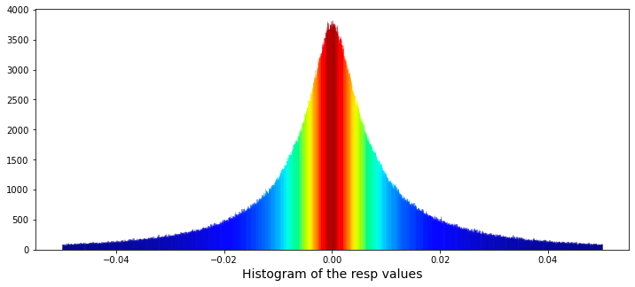
It accomplishes this through the creation of a histogram utilizing the Seaborn library, featuring customized visual elements and a color gradient that corresponds to the heights of the histogram bars.
To initiate the process, a plot figure is established with specific dimensions, measuring twelve inches in width and five inches in height. Subsequently, the code employs the Seaborn distplot function — despite the fact that this function has been deprecated — to produce a histogram based on the resp column contained within the train_data DataFrame. The histogram comprises 3,000 bins, facilitating a detailed analysis of the data distribution. Additionally, both the histogram and the kernel density estimation (kde) are confined to a range between -0.05 and 0.05.
In terms of aesthetics, a color normalization procedure is executed, which entails assessing the heights of the individual histogram bars and normalizing these values. Colors are then selected from a gradient, specifically utilizing the jet colormap, to correspond with these normalized bar heights. This results in a visually engaging representation wherein bars of varying heights are depicted in different colors.
Further enhancing the visualization, the x-axis is labeled to accurately describe the data being represented, thereby improving the clarity and comprehensibility of the plot. Upon completion of these processes, the generated plot is displayed through the plt.show() command, while a garbage collection function is subsequently invoked to optimize memory usage.
min_resp = train_data['resp'].min()
print('The minimum value for resp is: %.5f' % min_resp)
max_resp = train_data['resp'].max()
print('The maximum value for resp is:  %.5f' % max_resp)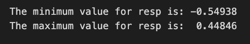
The code snippet presented has been developed to extract and display the minimum and maximum values from a specific column identified as resp within a dataset named train_data.
To achieve its objective, the code begins by calculating the minimum value of the resp column utilizing the min() function, and subsequently assigns this value to the variable named min_resp. This minimum value is then printed, formatted to five decimal places for clarity.
Following this step, the code determines the maximum value of the resp column using the max() function, storing this result in a variable designated as max_resp. The maximum value is also printed, adhering to the same formatting standard of five decimal places.
We will proceed to calculate the skewness and kurtosis of this distribution. Skewness measures the asymmetry of the distribution, indicating whether the data points tend to fall more on one side than the other. Kurtosis, on the other hand, assesses the tailedness of the distribution, providing insights into the presence of outliers and the behavior of the distributions tails.
By analyzing these two statistical measures, we can gain a deeper understanding of the distributions characteristics.
print("Skew of resp is:      %.2f" %train_data['resp'].skew() )
print("Kurtosis of resp is: %.2f"  %train_data['resp'].kurtosis() )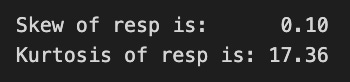
The code in question computes and presents two important statistical measures, namely skewness and kurtosis, for a dataset referred to as resp within a DataFrame designated as train_data.
Skewness quantifies the asymmetry present in the probability distribution of a real-valued random variable. A skewness value nearing zero suggests that the data distribution is symmetric. Conversely, a positive skewness indicates the presence of a longer tail on the right side, while a negative skew indicates a longer tail on the left side.
Kurtosis, on the other hand, assesses the tailedness of the distribution. Elevated kurtosis values signify a distribution characterized by heavier tails and a greater number of outliers compared to a normal distribution. In contrast, lower kurtosis values indicate lighter tails and fewer outliers.
Through the calculation and display of these two statistics, the code assists analysts and data scientists in gaining a deeper understanding of the distributional features of the dataset at hand. This understanding is vital for a variety of applications, including the selection of suitable statistical tests, the formulation of modeling strategies, and the implementation of data preprocessing steps for analysis or machine learning endeavors. Furthermore, it can offer valuable insights into data behavior and the identification of potential anomalies.
We will proceed to fit a Cauchy distribution to the data in question. The Cauchy distribution is a continuous probability distribution characterized by its unique properties. It is important to consider the implications of using this particular distribution in the context of our analysis.
By applying the Cauchy distribution to the data set, we aim to achieve a better understanding of the underlying characteristics and potential patterns within the data. This process will involve examining how well the distribution aligns with our observations and assessing its effectiveness in capturing the relevant features.
from scipy.optimize import curve_fit
# the values
x = list(range(len(values)))
x = [((i)-1500)/30000 for i in x]
y = values

def Lorentzian(x, x0, gamma, A):
    return A * gamma**2/(gamma**2+( x - x0 )**2)

# seed guess
initial_guess=(0, 0.001, 3000)

# the fit
parameters,covariance=curve_fit(Lorentzian,x,y,initial_guess)
sigma=np.sqrt(np.diag(covariance))

# and plot
plt.figure(figsize = (12,5))
ax = sns.distplot(train_data['resp'],
             bins=3000,
             kde_kws={"clip":(-0.05,0.05)},
             hist_kws={"range":(-0.05,0.05)},
             color='darkcyan',
             kde=False);
values = np.array([rec.get_height() for rec in ax.patches])
#norm = plt.Normalize(values.min(), values.max())
#colors = plt.cm.jet(norm(values))
#for rec, col in zip(ax.patches, colors):
#    rec.set_color(col)
plt.xlabel("Histogram of the resp values", size=14)
plt.plot(x,Lorentzian(x,*parameters),'--',color='black',lw=3)
plt.show();
del values
gc.collect();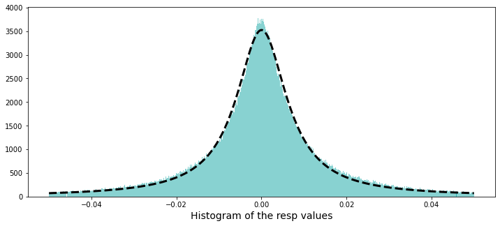
The Lorentzian function is renowned for its utility in describing resonance phenomena, characterized by its peak value and width. Therefore, it proves to be an effective tool for modeling particular types of spectral data or response distributions.
Initially, the code generates a list of x-values based on the length of an input array named values. It normalizes these x-values by applying a shift and scale, which is advantageous for adjusting the data into a standard range suitable for fitting. This step ensures that the data is presented in a manner conducive to effective analysis.
The code subsequently defines the mathematical function known as the Lorentzian. This function incorporates parameters that correspond to the peak position, width of the peak, and amplitude of the peak. Through these parameters, the function captures how the response values behave as a function of x, thereby facilitating the representation of the data.
To enhance the fitting process, an initial estimation of the parameters required for the Lorentzian function is provided. This preliminary guess is critical, as curve fitting algorithms depend on starting points to initiate their optimization procedures.
The code proceeds to utilize the curve_fit function from the scipy.optimize library. This function engages in an optimization routine aimed at minimizing the disparity between the model (Lorentzian) and the actual data (y-values) by fine-tuning the parameters. The optimal values of these parameters, as well as the covariance of the fit, are returned, offering insights into the parameter accuracy.
Additionally, the code includes a visualization component. It plots the fit alongside the distribution of the response values by creating a histogram of the input data and overlaying the fitted Lorentzian curve. This visual representation aids in assessing how effectively the fitted model aligns with the observed data.
Lastly, the code manages resources effectively by clearing memory by removing unnecessary variables and invoking garbage collection.
A Cauchy distribution can be derived from the ratio of two independent normally distributed random variables that possess a mean of zero. The paper authored by David E. Harris, titled The Distribution of Returns, provides an in-depth examination of employing a Cauchy distribution for modeling financial returns.
percent_zeros = (100/train_data.shape[0])*((train_data.weight.values == 0).sum())
print('Percentage of zero weights is: %i' % percent_zeros +"%")
Initially, the code calculates the total number of entries in the dataset by examining its shape, specifically focusing on the first dimension, which indicates the number of rows present.
Subsequently, it evaluates the weight attribute within the dataset to ascertain the count of values that are equal to zero. This process involves a comparison operation that generates a boolean array; each entry within this array signifies whether the corresponding weight is zero. The total count of zero weights is derived by summing these boolean values.
Following this, the code calculates the percentage of entries with zero weights. This is accomplished by dividing the count of zero weights by the total number of entries and multiplying the resulting fraction by 100 to express it as a percentage.
In the final step, the code produces and displays a formatted string that presents the calculated percentage of zero weights, rounded to the nearest integer.
Let us examine the possibility of negative weights. While a negative weight would lack significance, it is important to remain open to any potential findings.
min_weight = train_data['weight'].min()
print('The minimum weight is: %.2f' % min_weight)
This code snippet is intended to identify and present the minimum weight from a dataset known as train_data, which is organized to include a column labeled weight.
The process begins with the extraction of the weight column from the train_data dataset. Following this, the code employs the min() function to calculate the minimum value within this column, allowing it to determine the smallest weight recorded in the dataset. The result is then formatted to display two decimal places before being printed, ensuring that the output is both clear and easily interpretable for the user.
The next step involves determining the maximum weight that has been utilized.
max_weight = train_data['weight'].max()
print('The maximum weight was: %.2f' % max_weight)
It specifically examines a column labeled weight within this dataset.
The code operates by employing a function that calculates the highest value found in the weight column of train_data. This function, referred to as max(), determines the largest numeric value among all entries in that column.
Once the maximum weight is established, the code formats this value to two decimal places to enhance readability. It subsequently prints a message to the console that incorporates the identified maximum weight.
The rationale for implementing this code is twofold. Firstly, understanding the maximum weight can yield valuable insights into the dataset, particularly in areas where weight measurements hold significance, such as health data and logistics. This understanding aids in recognizing outliers or extreme values, which may warrant further investigation.
Secondly, displaying the maximum weight in a clear and formatted manner supports effective reporting and documentation of findings derived from the dataset. Clear communication is essential, especially in research or data analysis contexts where stakeholders require a concise summary of key metrics.
train_data[train_data['weight']==train_data['weight'].max()]
This code is intended to filter a dataset, specifically a DataFrame, which is a widely utilized data structure in Python for managing tabular data, with the goal of retrieving the rows that correspond to the maximum weight value.
The process begins with the identification of the weight column within the DataFrame referred to as train_data. Following this, the code calculates the maximum weight value present in that column by employing the .max() method. Subsequently, it generates a boolean mask, which establishes a condition that evaluates to True for rows where the weight is equal to the maximum value. This mask is then utilized to filter the entire DataFrame, resulting in a new DataFrame that includes solely those rows where the weight matches the maximum weight value.
We will now examine a histogram that displays the non-zero weights.
plt.figure(figsize = (12,5))
ax = sns.distplot(train_data['weight'],
             bins=1400,
             kde_kws={"clip":(0.001,1.4)},
             hist_kws={"range":(0.001,1.4)},
             color='darkcyan',
             kde=False);
values = np.array([rec.get_height() for rec in ax.patches])
norm = plt.Normalize(values.min(), values.max())
colors = plt.cm.jet(norm(values))
for rec, col in zip(ax.patches, colors):
    rec.set_color(col)
plt.xlabel("Histogram of non-zero weights", size=14)
plt.show();
del values
gc.collect();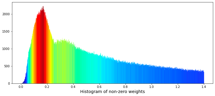
The primary objective of this visualization is to display the distribution of weight values, with particular emphasis on non-zero weights. This process is instrumental in comprehending the datas distribution, detecting trends, and identifying potential outliers.
In terms of functionality, the code begins with the initialization of a figure, which is designed with specific dimensions to ensure a clear representation of the data. Following this, a histogram is generated according to defined parameters, such as the number of bins used to segment the data and the range of values included in the visualization. Notably, a kernel density estimate (KDE) is not employed in this context, as the kde parameter is set to False, thereby confining the focus to the histogram alone.
The code also involves a step where the heights of the histogram bars are analyzed and normalized. Subsequently, colors are assigned to these bars from a selected color map, creating an aesthetically pleasing gradient that correlates with the varying heights of the bars. Additionally, a label is applied to the x-axis, providing clarity on what the histogram represents. After the visualization is displayed, the code addresses memory management by deleting specific variables and invoking garbage collection to recover any unused memory.
This visual representation aids in recognizing patterns, assessing data quality, and informing subsequent statistical analysis or modeling choices. Without such visualizations, it may prove difficult to fully understand the underlying structure of the data and to make informed decisions regarding potential preprocessing or feature engineering.
The data shows the presence of two distinct peaks in the distribution of weights. The first peak appears at a weight of approximately 0.17, while a second, broader peak can be observed at a weight of approximately 0.34. This phenomenon raises the possibility that these peaks may represent two separate underlying distributions that overlap. It could be proposed that one distribution is associated with selling activity, while the other pertains to buying activity.
To further explore this relationship, we have the option to plot the logarithm of the weights. The methodology for this analysis can be referenced in the work entitled Target Engineering; CV; ⚡ Multi-Target, authored by marketneutral on Kaggle.
train_data_nonZero = train_data.query('weight > 0').reset_index(drop = True)
plt.figure(figsize = (10,4))
ax = sns.distplot(np.log(train_data_nonZero['weight']),
             bins=1000,
             kde_kws={"clip":(-4,5)},
             hist_kws={"range":(-4,5)},
             color='darkcyan',
             kde=False);
values = np.array([rec.get_height() for rec in ax.patches])
norm = plt.Normalize(values.min(), values.max())
colors = plt.cm.jet(norm(values))
for rec, col in zip(ax.patches, colors):
    rec.set_color(col)
plt.xlabel("Histogram of the logarithm of the non-zero weights", size=14)
plt.show();
gc.collect();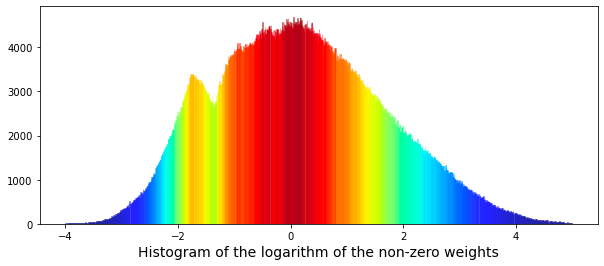
Each component of the code serves a specific purpose, contributing to the overall effectiveness of the visualization.
Initially, the code filters the dataset, referred to as train_data, to retain only those entries where the weight exceeds zero. This step is essential since logarithmic transformations of zero or negative values are undefined and could result in errors during the visualization process.
Following the data filtering, the code establishes a figure for plotting, specifying dimensions that ensure the visual output is appropriately sized for analysis. This preparation facilitates a clear presentation of the data.
The next step involves generating a histogram of the logarithm of the non-zero weights using the seaborn library. The code incorporates particular configurations for the histogram, such as the number of bins and certain clipping options for the kernel density estimate (KDE).
In addition, the histogram bars are color-coded using a gradient derived from the Jet color map, based on their heights. This visual differentiation aids in identifying weight ranges that are more prevalent within the dataset.
To enhance the readability of the plot, an x-axis label is included to indicate what the histogram represents. This labeling is vital for providing clear context to the viewer.
Once all components are configured, the plot is displayed using the show function from matplotlib, making the visual representation accessible to the user. Finally, the code incorporates garbage collection to reclaim memory that may have been utilized during the data handling and plotting processes.
We are now able to attempt to fit a pair of Gaussian functions to this distribution.
from scipy.optimize import curve_fit
# the values
x = list(range(len(values)))
x = [(i/110)-4 for i in x]
y = values

# define a Gaussian function
def Gaussian(x,mu,sigma,A):
    return A*np.exp(-0.5 * ((x-mu)/sigma)**2)

def bimodal(x,mu_1,sigma_1,A_1,mu_2,sigma_2,A_2):
    return Gaussian(x,mu_1,sigma_1,A_1) + Gaussian(x,mu_2,sigma_2,A_2)

# seed guess
initial_guess=(1, 1 , 1,    1, 1, 1)

# the fit
parameters,covariance=curve_fit(bimodal,x,y,initial_guess)
sigma=np.sqrt(np.diag(covariance))

# the plot
plt.figure(figsize = (10,4))
ax = sns.distplot(np.log(train_data_nonZero['weight']),
             bins=1000,
             kde_kws={"clip":(-4,5)},
             hist_kws={"range":(-4,5)},
             color='darkcyan',
             kde=False);
values = np.array([rec.get_height() for rec in ax.patches])
norm = plt.Normalize(values.min(), values.max())
colors = plt.cm.jet(norm(values))
for rec, col in zip(ax.patches, colors):
    rec.set_color(col)
plt.xlabel("Histogram of the logarithm of the non-zero weights", size=14)
# plot gaussian #1
plt.plot(x,Gaussian(x,parameters[0],parameters[1],parameters[2]),':',color='black',lw=2,label='Gaussian #1', alpha=0.8)
# plot gaussian #2
plt.plot(x,Gaussian(x,parameters[3],parameters[4],parameters[5]),'--',color='black',lw=2,label='Gaussian #2', alpha=0.8)
# plot the two gaussians together
plt.plot(x,bimodal(x,*parameters),color='black',lw=2, alpha=0.7)
plt.legend(loc="upper left");
plt.show();
del values
gc.collect();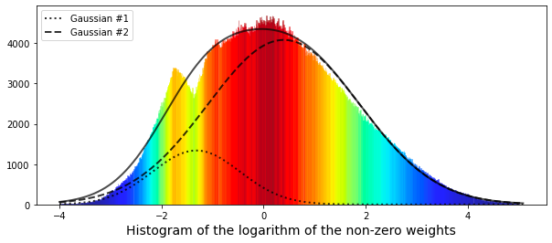
It encompasses several stages that contribute to its effectiveness in this task.
To begin with, the process involves preparing the data. The code generates a list of x values that represent data points, which are rescaled through various arithmetic operations. The corresponding y values are derived from an existing dataset known as values, enabling a structured approach to data representation.
Next, a Gaussian function is established, modeling a normal distribution characterized by its mean (mu), standard deviation (sigma), and amplitude (A). This function is fundamental as it encapsulates the bell-shaped nature intrinsic to the distributions being studied.
In addition, the code delineates a bimodal function, which is the result of summing two Gaussian functions. This aspect becomes particularly pertinent in scenarios where the data reveals two distinct peaks or modes. By modeling two separate distributions, the code achieves a more precise fitting of the data.
The script then engages in curve fitting through the use of the curve_fit function from the scipy.optimize module. This process begins with an initial estimation of parameters for the two Gaussian distributions. It is a crucial step aimed at identifying the optimal parameters that minimize the discrepancy between the observed data and the established model.
To enhance comprehension of the results, visualization is employed utilizing matplotlib for plotting and seaborn for generating the histogram. This histogram illustrates the distribution of the logarithm of the non-zero weights, a common practice in data analysis that helps to address issues of skewness or outliers. The fitted Gaussian curves are overlaid on the histogram, facilitating a straightforward comparison between the model and the actual data. Distinct colors are utilized for the histogram bars to promote visual clarity, while differing line styles illustrate the fitted Gaussian curves.
Lastly, the code incorporates memory management practices, where values generated within the function are deleted and garbage collection is activated to optimize memory usage. This aspect is particularly significant when dealing with larger computations.
The results achieved thus far have been somewhat limited. The smaller peak on the left side appears to correspond to a different distribution. For reference, the mean (denoted as $\mu$) of the smaller Gaussian is positioned at -1.32, while that of the larger Gaussian is found at 0.4.
Now, let us examine the cumulative daily return over time. This return is calculated by multiplying the specified weight by the value of the response variable.
train_data['weight_resp']   = train_data['weight']*train_data['resp']
train_data['weight_resp_1'] = train_data['weight']*train_data['resp_1']
train_data['weight_resp_2'] = train_data['weight']*train_data['resp_2']
train_data['weight_resp_3'] = train_data['weight']*train_data['resp_3']
train_data['weight_resp_4'] = train_data['weight']*train_data['resp_4']

fig, ax = plt.subplots(figsize=(15, 5))
resp    = pd.Series(1+(train_data.groupby('date')['weight_resp'].mean())).cumprod()
resp_1  = pd.Series(1+(train_data.groupby('date')['weight_resp_1'].mean())).cumprod()
resp_2  = pd.Series(1+(train_data.groupby('date')['weight_resp_2'].mean())).cumprod()
resp_3  = pd.Series(1+(train_data.groupby('date')['weight_resp_3'].mean())).cumprod()
resp_4  = pd.Series(1+(train_data.groupby('date')['weight_resp_4'].mean())).cumprod()
ax.set_xlabel ("Day", fontsize=18)
ax.set_title ("Cumulative daily return for resp and time horizons 1, 2, 3, and 4 (500 days)", fontsize=18)
resp.plot(lw=3, label='resp x weight')
resp_1.plot(lw=3, label='resp_1 x weight')
resp_2.plot(lw=3, label='resp_2 x weight')
resp_3.plot(lw=3, label='resp_3 x weight')
resp_4.plot(lw=3, label='resp_4 x weight')
# day 85 marker
ax.axvline(x=85, linestyle='--', alpha=0.3, c='red', lw=1)
ax.axvspan(0, 85 , color=sns.xkcd_rgb['grey'], alpha=0.1)
plt.legend(loc="lower left");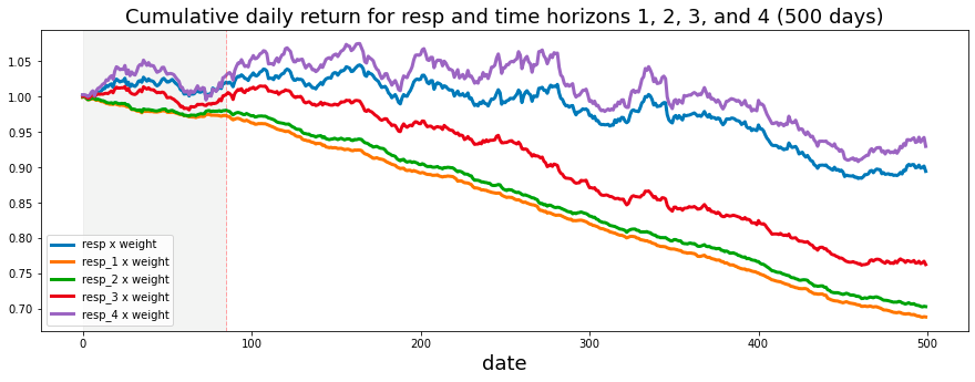
This process can be understood through its fundamental functionality and overarching objectives.
Initially, the code performs the weighting and response calculation. It modifies a dataset, referred to as train_data, by creating new columns that multiply a designated weight column with several response columns labeled as resp, resp_1, resp_2, resp_3, and resp_4. This operation allows for the development of new variables that capture the weighted responses associated with each response variable. This step ultimately enhances the analysis by incorporating the significance of the weights assigned to these responses.
Following this, the code proceeds to calculate the cumulative returns linked to each weighted response over a specified time period organized by date. The calculation begins by determining the mean of the weighted response values for each date. Subsequently, a cumulative product operation is applied, which constructs a running total of these returns. This process effectively illustrates how wealth would accumulate over time when returns are reinvested.
The script also includes a plotting component, which generates a visual representation of the cumulative returns pertaining to each weighted response. The resulting plot is designed with thoughtful customization, featuring axis labels, a title, and a legend to enhance readability and comprehension of the results. Furthermore, the plot incorporates markers and highlighted regions to emphasize specific periods, such as around day 85, which may be pertinent for analysis or for highlighting significant trends or events.
The significance of this code is particularly relevant for individuals engaged in the analysis of financial data or the assessment of investment strategies. It provides valuable insights into the ways in which various factors — represented by the different response variables — affect returns when appropriately weighted. By illustrating these relationships over time, stakeholders are afforded the opportunity to evaluate performance trends and make informed decisions grounded in historical data. This may lead to strategic adjustments in response to observed patterns.
The analysis indicates that the shortest time horizons, namely resp_1, resp_2, and resp_3, which align with a more cautious investment strategy, yield the least favorable returns.
Next, we will create a histogram to illustrate the product of the weight and the corresponding values of resp, excluding instances where the weight is zero.
train_data_no_0 = train_data.query('weight > 0').reset_index(drop = True)
train_data_no_0['wAbsResp'] = train_data_no_0['weight'] * (train_data_no_0['resp'])
#plot
plt.figure(figsize = (12,5))
ax = sns.distplot(train_data_no_0['wAbsResp'],
             bins=1500,
             kde_kws={"clip":(-0.02,0.02)},
             hist_kws={"range":(-0.02,0.02)},
             color='darkcyan',
             kde=False);
values = np.array([rec.get_height() for rec in ax.patches])
norm = plt.Normalize(values.min(), values.max())
colors = plt.cm.jet(norm(values))
for rec, col in zip(ax.patches, colors):
    rec.set_color(col)
plt.xlabel("Histogram of the weights * resp", size=14)
plt.show();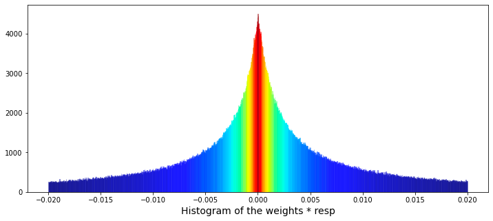
The primary focus is on filtering data, performing calculations, and creating visual representations to enhance understanding.
Initially, the code filters the dataset known as train_data to eliminate any entries where the weight column is zero. This step is crucial, as zero weights may indicate invalid or irrelevant data points that could distort the results of the analysis.
Subsequently, the code calculates a new column labeled wAbsResp. This column represents the product of the weight and resp values from the filtered dataset. This calculation is instrumental in assessing the influence of responses while duly considering their corresponding weights.
The visualization component of the code employs a function from the seaborn library to generate a histogram of the wAbsResp values. It specifies the number of bins and the range for the histogram, aiming to illustrate the distribution of the weighted absolute responses. This visualization can yield insights into the characteristics of the data, including potential skewness or the existence of outliers.
Moreover, the code includes features that enhance the presentation of the histogram. It utilizes a color map to assign colors to the histogram bars according to their heights, which not only adds visual interest but also helps highlight variations in the data.
Finally, the x-axis is clearly labeled to indicate that the histogram represents the Histogram of the weights * resp, thereby providing context for the data displayed.
The following analysis presents the daily count of ts_id. It is important to note that I have included a vertical dashed line in the visualizations. This decision was motivated by questions regarding potential modifications made by Jane Street to their trading model around day 85.
trades_per_day = train_data.groupby(['date'])['ts_id'].count()
fig, ax = plt.subplots(figsize=(15, 5))
plt.plot(trades_per_day)
ax.set_xlabel ("Day", fontsize=18)
ax.set_title ("Total number of ts_id for each day", fontsize=18)
# day 85 marker
ax.axvline(x=85, linestyle='--', alpha=0.3, c='red', lw=1)
ax.axvspan(0, 85 , color=sns.xkcd_rgb['grey'], alpha=0.1)
ax.set_xlim(xmin=0)
ax.set_xlim(xmax=500)
plt.show()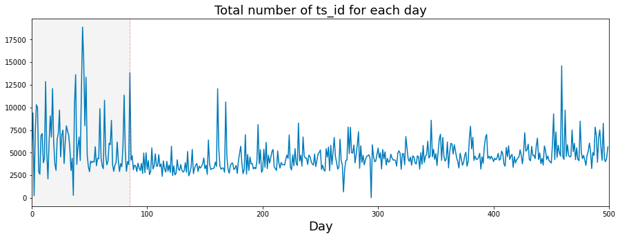
This code has been developed to analyze and illustrate the number of transactions, denoted by ts_id, occurring each day within a dataset. It performs several key functions.
Initially, the code aggregates the data by the date column, counting the instances of ts_id for each day. This aggregation provides a comprehensive summary of the number of transactions that took place on each distinct date.
Subsequently, the code prepares to generate a plot with designated dimensions of 15 units in width and 5 units in height. Once the figure is established, the code plots the number of transactions per day against time, illustrating how transaction volume fluctuates throughout the specified period.
In terms of presentation, the x-axis is appropriately labeled as Day, and the plot includes a title that clearly conveys the graphs subject matter. Both the labels and title are formatted to enhance readability.
A significant feature of the plot is the inclusion of a vertical dashed line at day 85, serving to indicate an important event or threshold within the dataset. To further aid visual clarity, the area up to this day is shaded in a light gray hue, distinguishing it from the remainder of the data.
The code also defines the limits for the x-axis in order to display a particular range of days, specifically from 0 to 500.
If we consider a trading day to be 6 and a half hours long, which amounts to 23,400 seconds, then we can proceed with the analysis.
fig, ax = plt.subplots(figsize=(15, 5))
plt.plot(23400/trades_per_day)
ax.set_xlabel ("Day", fontsize=18)
ax.set_ylabel ("Av. time between trades (s)", fontsize=18)
ax.set_title ("Average time between trades for each day", fontsize=18)
ax.axvline(x=85, linestyle='--', alpha=0.3, c='red', lw=1)
ax.axvspan(0, 85 , color=sns.xkcd_rgb['grey'], alpha=0.1)
ax.set_xlim(xmin=0)
ax.set_xlim(xmax=500)
ax.set_ylim(ymin=0)
ax.set_ylim(ymax=12)
plt.show()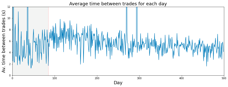
The presented code is designed to produce a visual representation in the form of a line plot, which illustrates the average time between trades over a specified duration, primarily focusing on daily trading activities.
To begin, the code establishes a figure and axes, setting the dimensions at 15 by 5 inches. This setup provides a proper canvas for the plot.
Subsequently, the average time between trades is plotted. This is accomplished by calculating a value derived from a constant (23400 seconds, interpreted as the number of seconds in a trading day) divided by a variable named trades_per_day, which denotes the assumed number of trades conducted each day. This calculation takes place across a range corresponding to the index of days.
Moreover, the code includes the labeling of axes and the title of the plot. The x-axis is labeled Day, the y-axis reads Average time between trades (s), and the title of the plot clarifies its focus: Average time between trades for each day.
A notable feature of the plot is the addition of a vertical dashed line at the x-value of 85, signaling a significant point in the analyzed data. Additionally, a shaded grey area extends from day 0 to day 85, visually emphasizing this interval within the graph.
To enhance clarity, the code sets limits on the axes; the x-axis is constrained from 0 to 500, while the y-axis ranges from 0 to 12. This limitation ensures that the visible portion of the graph highlights relevant data points. Finally, the plot is rendered and displayed for the viewer’s assessment.
A histogram illustrating the daily number of trades is presented. It has been proposed that the quantity of trades occurring each day can serve as an indicator of that days market volatility.
plt.figure(figsize = (12,4))
# the minimum has been set to 1000 so as not to draw the partial days like day 2 and day 294
# the maximum number of trades per day is 18884
# I have used 125 bins for the 500 days
ax = sns.distplot(trades_per_day,
             bins=125,
             kde_kws={"clip":(1000,20000)},
             hist_kws={"range":(1000,20000)},
             color='darkcyan',
             kde=True);
values = np.array([rec.get_height() for rec in ax.patches])
norm = plt.Normalize(values.min(), values.max())
colors = plt.cm.jet(norm(values))
for rec, col in zip(ax.patches, colors):
    rec.set_color(col)
plt.xlabel("Number of trades per day", size=14)
plt.show();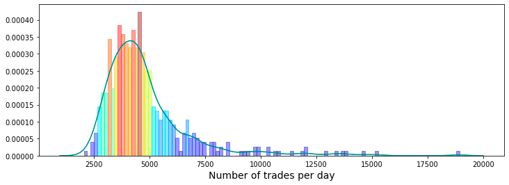
It produces a histogram alongside a kernel density estimate (KDE), which together illustrate the number of trades executed each day during a designated period of 500 days.
To create this visualization, the code begins by defining the dimensions of the plotting figure. It also sets particular boundaries to exclude fractional days, specifically by limiting the minimum trade count to 1,000 and the maximum to 20,000. This approach ensures that only significant trading activity is represented, avoiding clutter from data points that may not be relevant.
The visualization employs 125 bins to effectively showcase the distribution of trade counts across the days, facilitating a more accessible analysis of any trends or patterns present within the dataset. The integration of the histogram and KDE provides a holistic view of trade frequency, indicating where the bulk of trading activity occurs.
Each bar in the histogram is differentiated by its height through color coding, which enhances the visual clarity of the plot and allows for easy comparison of trade frequencies across various ranges.
Additionally, the x-axis is clearly labeled to give context to the measurements, specifically indicating the number of trades per day. This labeling contributes to the overall comprehensibility of the chart for the viewer.
It is important to note that the only feature present in the features.csv file that does not contain any True tags is feature_0.
fig, ax = plt.subplots(figsize=(15, 4))
feature_0 = pd.Series(train_data['feature_0']).cumsum()
ax.set_xlabel ("Trade", fontsize=18)
ax.set_ylabel ("feature_0 (cumulative)", fontsize=18);
feature_0.plot(lw=3);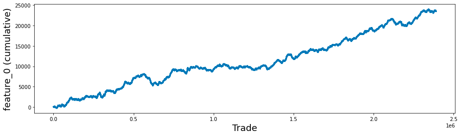
This code snippet aims to facilitate data visualization through the utilization of the Matplotlib library in Python. It generates a plot that visually depicts the cumulative sum of a particular feature, referred to as feature_0, from a dataset that is likely associated with trade data.
Initially, the code creates a new figure and establishes a corresponding set of axes, specifying the dimensions of the figure to be 15 inches in width and 4 inches in height. This setup provides the necessary framework for rendering the plot.
Subsequently, the code retrieves the feature_0 column from the train_data DataFrame, transforms it into a Pandas Series, and then computes its cumulative sum. This cumulative sum reflects the aggregate of all previous values within the series, offering insights into the overall accumulation of feature_0 over time or across different entries.
Following this, the code proceeds to label the x-axis and y-axis with designated font sizes to enhance readability. This practice ensures that viewers comprehend the representations of both axes.
It is quite intriguing to analyze the cumulative response and return, specifically looking at the cases where feature_0 is set to +1 and -1, separately. This observation has been previously discussed in a contribution on a relevant topic.
feature_0_is_plus_one  = train_data.query('feature_0 ==  1').reset_index(drop = True)
feature_0_is_minus_one = train_data.query('feature_0 == -1').reset_index(drop = True)
# the plot
fig, (ax1, ax2) = plt.subplots(1, 2, figsize=(15, 4))
ax1.plot((pd.Series(feature_0_is_plus_one['resp']).cumsum()), lw=3, label='resp')
ax1.plot((pd.Series(feature_0_is_plus_one['resp']*feature_0_is_plus_one['weight']).cumsum()), lw=3, label='return')
ax2.plot((pd.Series(feature_0_is_minus_one['resp']).cumsum()), lw=3, label='resp')
ax2.plot((pd.Series(feature_0_is_minus_one['resp']*feature_0_is_minus_one['weight']).cumsum()), lw=3, label='return')
ax1.set_title ("feature 0 = 1", fontsize=18)
ax2.set_title ("feature 0 = -1", fontsize=18)
ax1.legend(loc="lower left")
ax2.legend(loc="upper left");

del feature_0_is_plus_one
del feature_0_is_minus_one
gc.collect();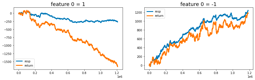
It operates by filtering the dataset, performing calculations, and producing visual representations of the results.
Initially, the code filters the train_data dataset into two distinct subsets. The first subset consists of all rows where feature_0 equals 1, while the second subset contains rows where feature_0 equals -1. After filtering, each subset is reindexed to remove the original index numbers, ensuring a clean slate for subsequent analysis.
Next, the code calculates the cumulative sum for both subsets, focusing on the response variable (resp) as well as the weighted response, which is obtained by multiplying resp by a weight factor. These cumulative sums provide insights into the trends and patterns of response and return over time or across the dataset.
The results are presented through visualizations comprising two subplots, each dedicated to one of the filtered datasets corresponding to feature_0 values of 1 and -1. These plots vividly illustrate the cumulative response and return, facilitating comparative analysis based on the different values of the feature.
To enhance clarity, the visualizations are equipped with titles and legends, which explain the content and significance of each plot.
Furthermore, the code includes a memory management component. It deletes the temporary variables created for the subsets and invokes garbage collection, which is particularly advantageous when handling large datasets.
The primary purpose of this code is to provide an analytical framework for evaluating the performance of a specific feature within the dataset. It highlights the impact of differing feature_0 values on response and return metrics, which is essential for predictive modeling and performance evaluation.
In addition, the analysis of cumulative responses and returns offers stakeholders valuable insights that support informed decision-making grounded in historical performance.
Lastly, effective management of memory resources is crucial when working with extensive datasets, hence the removal of temporary variables and the implementation of garbage collection techniques.
fig, ((ax1, ax2), (ax3, ax4)) = plt.subplots(2, 2,figsize=(20,10))

ax1.plot((pd.Series(train_data['feature_1']).cumsum()), lw=3, color='red')
ax1.set_title ("Linear", fontsize=22);
ax1.axvline(x=514052, linestyle='--', alpha=0.3, c='green', lw=2)
ax1.axvspan(0, 514052 , color=sns.xkcd_rgb['grey'], alpha=0.1)
ax1.set_xlim(xmin=0)
ax1.set_ylabel ("feature_1", fontsize=18);

ax2.plot((pd.Series(train_data['feature_3']).cumsum()), lw=3, color='green')
ax2.set_title ("Noisy", fontsize=22);
ax2.axvline(x=514052, linestyle='--', alpha=0.3, c='red', lw=2)
ax2.axvspan(0, 514052 , color=sns.xkcd_rgb['grey'], alpha=0.1)
ax2.set_xlim(xmin=0)
ax2.set_ylabel ("feature_3", fontsize=18);

ax3.plot((pd.Series(train_data['feature_55']).cumsum()), lw=3, color='darkorange')
ax3.set_title ("Hybryd (Tag 21)", fontsize=22);
ax3.set_xlabel ("Trade", fontsize=18)
ax3.axvline(x=514052, linestyle='--', alpha=0.3, c='green', lw=2)
ax3.axvspan(0, 514052 , color=sns.xkcd_rgb['grey'], alpha=0.1)
ax3.set_xlim(xmin=0)
ax3.set_ylabel ("feature_55", fontsize=18);

ax4.plot((pd.Series(train_data['feature_73']).cumsum()), lw=3, color='blue')
ax4.set_title ("Negative", fontsize=22)
ax4.set_xlabel ("Trade", fontsize=18)
ax4.set_ylabel ("feature_73", fontsize=18);
gc.collect();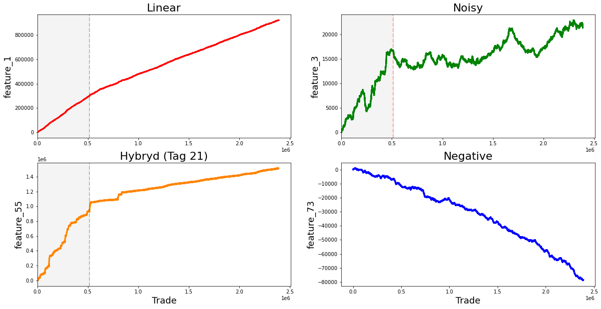
It employs libraries such as Matplotlib and Pandas to produce a series of plots that illustrate the cumulative sums of various features from the dataset known as train_data.
To begin with, the code sets up a figure with a 2x2 grid of subplots. This arrangement allows for the simultaneous display of four distinct plots. The dimensions of the figure are specified as 20x10 inches, providing sufficient space for an effective presentation of the visualizations.
In the next phase, the code generates four subplots, each concentrating on a different feature from the train_data dataset. For every subplot, the cumulative sum of specified features, namely feature_1, feature_3, feature_55, and feature_73, is computed and depicted. The use of cumulative sums is a prevalent method in time series analysis, which aids in illustrating temporal changes while mitigating fluctuations. Each subplot is accompanied by a title and uses distinct colors to enhance visual differentiation between the features.
The implementation further includes vertical dashed lines positioned at the x-coordinate of 514052 on the first and second subplots. These lines signify a pivotal event or threshold in the data being represented. Additionally, a shaded area is incorporated to emphasize the region extending from the start of the x-axis to the vertical line. This visual element provides context, suggesting the occurrence of notable events leading up to this point.
Moreover, every subplot is clearly labeled with appropriate axis labels and titles to effectively communicate the essence of each graph. At the conclusion of the script, the command gc.collect() is invoked to facilitate memory garbage collection. This practice is considered prudent in programming, especially when handling substantial datasets, as it aids in reducing memory consumption.
The dataset you are examining contains several notable linear features. It initially begins with the value one, followed by a series of values that include seven, nine, eleven, thirteen, and fifteen. Continuing along this trajectory are the numbers seventeen, nineteen, twenty-one, twenty-three, and twenty-five, as well as eighteen, twenty, twenty-two, twenty-four, and twenty-six. Further values in this dataset comprise twenty-seven, twenty-nine, twenty-one, thirty-three, and thirty-five, alongside twenty-eight, thirty, thirty-two, thirty-four, and thirty-six.
Additionally, the dataset includes the range of eighty-four to eighty-eight, followed by ninety to ninety-four. The final segment shows a strong change in gradient, highlighting values from ninety-six to one hundred, as well as one hundred two to one hundred six.
Moreover, there are other significant values that demonstrate strong changes in gradient. These include forty-one, forty-six, forty-seven, forty-eight, forty-nine, fifty, fifty-one, fifty-three, fifty-four, sixty-nine, eighty-nine, ninety-five, one hundred one, one hundred seven, one hundred eight, one hundred ten, one hundred eleven, one hundred thirteen, one hundred fourteen, one hundred fifteen, one hundred sixteen, one hundred seventeen, one hundred eighteen, one hundred nineteen, one hundred twenty, one hundred twenty-two, and one hundred twenty-four.
The features labeled as forty-one, forty-two, and forty-three, collectively known as Tag 14, exhibit intriguing characteristics. These features appear to display a stratified nature, consistently adopting discrete values throughout each day. This raises the possibility that these values may represent a financial security. To further illustrate this, scatter plots showcasing the three features have been prepared, specifically for days zero, one, and three. It is worth noting that data for day two has been excluded and will be addressed in the forthcoming section regarding missing data.
day_0 = train_data.loc[train_data['date'] == 0]
day_1 = train_data.loc[train_data['date'] == 1]
day_3 = train_data.loc[train_data['date'] == 3]
three_days = pd.concat([day_0, day_1, day_3])
three_days.plot.scatter(x='ts_id', y='feature_41', s=0.5, figsize=(15,3));
three_days.plot.scatter(x='ts_id', y='feature_42', s=0.5, figsize=(15,3));
three_days.plot.scatter(x='ts_id', y='feature_43', s=0.5, figsize=(15,3));
del day_1
del day_3
gc.collect();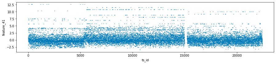
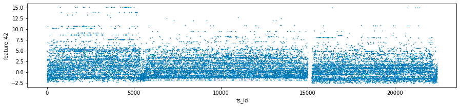
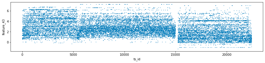
This code is intended for the analysis and visualization of data, specifically focusing on a dataset named train_data, which likely includes time series information along with various features and dates.
The first step in the process is the filtering of data. The code isolates three specific days by utilizing the date column, thus creating distinct datasets for day 0, day 1, and day 3, referred to as day_0, day_1, and day_3.
Following the filtering stage, the code integrates the datasets from the three selected days into a single variable known as three_days. This consolidation allows for a more comprehensive examination of the data across the specified days.
Next, the code proceeds to generate scatter plots for three particular features — feature_41, feature_42, and feature_43 — against a time series identifier, ts_id. Each plot is designed with specified dimensions for better visibility, and the individual data points are represented as small sizes (0.5) to minimize overlap.
In terms of memory management, the code deletes the datasets for day 1 and day 3 after the plots have been produced to free up resources. Additionally, it invokes the garbage collector to recover any unused memory that may still be allocated to those deleted objects.
The three features exhibit noteworthy lag plots that illustrate the relationship between the value of each feature at ts_id $(n)$ and its subsequent value at ts_id $(n+1)$, specifically for day 0. For clarity, red markers have been positioned at the coordinates (0,0) to serve as a visual reference.
fig, ax = plt.subplots(1, 3, figsize=(17, 4))
lag_plot(day_0['feature_41'], lag=1, s=0.5, ax=ax[0])
lag_plot(day_0['feature_42'], lag=1, s=0.5, ax=ax[1])
lag_plot(day_0['feature_43'], lag=1, s=0.5, ax=ax[2])
ax[0].title.set_text('feature_41')
ax[0].set_xlabel("ts_id (n)")
ax[0].set_ylabel("ts_id (n+1)")
ax[1].title.set_text('feature_42')
ax[1].set_xlabel("ts_id (n)")
ax[1].set_ylabel("ts_id (n+1)")
ax[2].title.set_text('feature_43')
ax[2].set_xlabel("ts_id (n)")
ax[2].set_ylabel("ts_id (n+1)")

ax[0].plot(0, 0, 'r.', markersize=15.0)
ax[1].plot(0, 0, 'r.', markersize=15.0)
ax[2].plot(0, 0, 'r.', markersize=15.0);
gc.collect();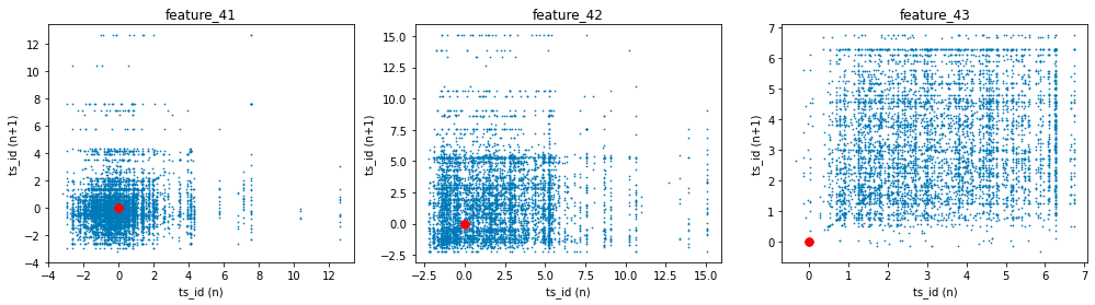
The process begins with the creation of subplots, where a figure containing three horizontal plots is initialized. The dimensions defined by the figsize parameter indicate that the overall layout will be wider than it is tall, making this arrangement suitable for side-by-side visualization of data trends.
For each feature — specifically feature_41, feature_42, and feature_43 — the code makes use of the lag_plot function. This function is commonly employed to illustrate the relationship between a time series and its lagged version, in this instance, a lag of one time unit. By plotting each feature against its own lagged values, these visualizations assist in identifying potential patterns, trends, or correlations within the dataset over time.
Following the creation of the lag plots, the code enhances each subplot by setting appropriate titles and labels for both the x and y axes. Each plot is distinctly labeled to correspond to its respective feature, thereby facilitating easier interpretation of the presented correlations.
Additionally, red points are plotted at the origin (0, 0) on each subplot. This visual marker serves as a reference point, particularly illustrating instances where both the current observation and its lagged counterpart are equal to zero.
Finally, the code includes a call to gc.collect(), which is a memory management operation that can help free up space by cleaning unreferenced objects. This step can be particularly useful when working with large datasets, as efficient memory management is crucial during the processes of data handling and visualization.
The Tag 18 features, which include features 44 and 45 in conjunction with tags 15 and 17, exhibit similarities to the previously discussed Tag 14 features. However, it is noteworthy that the emphasis has shifted towards a central focus on the value of zero.
three_days.plot.scatter(x='ts_id', y='feature_44', s=0.5, figsize=(15,3));
three_days.plot.scatter(x='ts_id', y='feature_45', s=0.5, figsize=(15,3));
gc.collect();

This code is designed to visualize data from a dataset named three_days. It creates scatter plots for two specific features, feature_44 and feature_45, using a shared x-axis denoted as ts_id.
The scatter plots utilize small marker sizes, specified as s=0.5, and are set to dimensions of 15 units in width and 3 units in height. This particular sizing enhances the visual representation, facilitating a clearer interpretation of the correlation between the time series identifier (ts_id) and each feature.
Upon generating the plots, the code invokes a function called gc.collect(), which pertains to the management of memory through garbage collection. This function is instrumental in reclaiming memory by removing unused objects, which is particularly relevant when dealing with extensive datasets or operating within environments that have limited memory resources.
fig, ax = plt.subplots(1, 2, figsize=(15, 4))
lag_plot(day_0['feature_44'], lag=1, s=0.5, ax=ax[0])
lag_plot(day_0['feature_45'], lag=1, s=0.5, ax=ax[1])
ax[0].title.set_text('feature_44')
ax[0].set_xlabel("ts_id (n)")
ax[0].set_ylabel("ts_id (n+1)")
ax[1].title.set_text('feature_45')
ax[1].set_xlabel("ts_id (n)")
ax[1].set_ylabel("ts_id (n+1)")

ax[0].plot(0, 0, 'r.', markersize=15.0)
ax[1].plot(0, 0, 'r.', markersize=15.0);
gc.collect();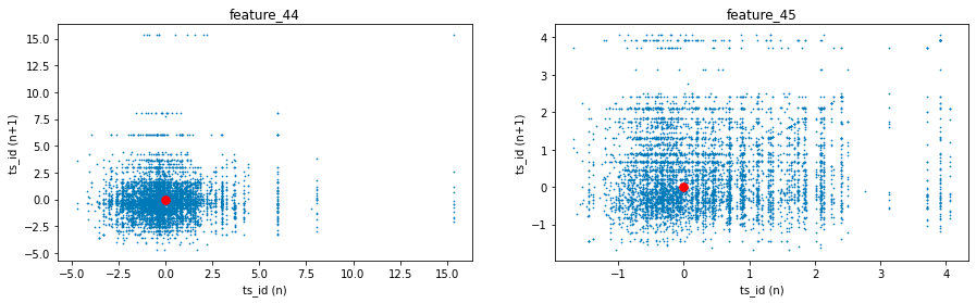
It does so by generating lag plots, which are instrumental in time series analysis for assessing any correlation between a variable and its preceding values.
The functionality of the code is structured as follows. Initially, it employs a plotting library, likely Matplotlib, to generate a figure that consists of two subplots arranged in a single row with two columns. This arrangement facilitates a side-by-side comparison of the two features.
Subsequently, the code creates lag plots for each feature. This involves plotting the values of a feature against its prior (lagged) values, with the lag defined as one. As a result, each plot point illustrates the relationship between a specific time point and its immediate predecessor.
Additionally, the code customizes each subplot with titles that pertain specifically to feature_44 and feature_45. The axes of the plots are labeled accordingly to represent values at time n and time n+1.
Moreover, a red dot is depicted at the origin point (0, 0) in both subplots. This dot acts as a reference point, facilitating a better understanding of the graphical representations.
Finally, the code incorporates a command for garbage collection. This step is likely implemented to release memory resources, which is especially beneficial in environments where multiple tasks are executed or large datasets are processed.
Features 60 to 68 (Tag 22)
fig, ax = plt.subplots(figsize=(15, 5))
feature_60= pd.Series(train_data['feature_60']).cumsum()
feature_61= pd.Series(train_data['feature_61']).cumsum()
feature_62= pd.Series(train_data['feature_62']).cumsum()
feature_63= pd.Series(train_data['feature_63']).cumsum()
feature_64= pd.Series(train_data['feature_64']).cumsum()
feature_65= pd.Series(train_data['feature_65']).cumsum()
feature_66= pd.Series(train_data['feature_66']).cumsum()
feature_67= pd.Series(train_data['feature_67']).cumsum()
feature_68= pd.Series(train_data['feature_68']).cumsum()
#feature_69= pd.Series(train_data['feature_69']).cumsum()
ax.set_xlabel ("Trade", fontsize=18)
ax.set_title ("Cumulative plot for feature_60 ... feature_68 (Tag 22).", fontsize=18)
feature_60.plot(lw=3)
feature_61.plot(lw=3)
feature_62.plot(lw=3)
feature_63.plot(lw=3)
feature_64.plot(lw=3)
feature_65.plot(lw=3)
feature_66.plot(lw=3)
feature_67.plot(lw=3)
feature_68.plot(lw=3)
#feature_69.plot(lw=3)
plt.legend(loc="upper left");
del feature_60, feature_61, feature_62, feature_63, feature_64, feature_65, feature_66 ,feature_67, feature_68
gc.collect();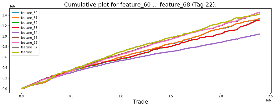
Its main purpose is to aid in the examination of trends over time through a graphical representation.
The process begins with the establishment of a figure and axes for the chart. The dimensions of the figure are intentionally wide, measuring 15 units in width and 5 units in height, which ensures clarity when displaying time series data.
Next, the code calculates the cumulative sums for features designated as feature_60 through feature_68 from a dataset referred to as train_data. This operation is a common practice in data analysis as it allows for the tracking of total quantities over time, providing a means to observe and analyze trends effectively.
The x-axis is labeled as Trade, indicating that the plot is likely associated with trading or time-series data. A descriptive title is added to the plot, signifying that it displays cumulative sums for the specified features.
Subsequently, the cumulative sums for each feature are plotted on the same axes, resulting in a line plot for each feature. The line widths are adjusted to ensure that the lines are adequately thick and easily visible for the viewer.
To enhance clarity, a legend is placed in the upper left of the plot, which aids in distinguishing between the various lines representing different features.
After the plotting is complete, the code removes the cumulative sum variables from memory to free up resources. It then invokes a garbage collection routine to clean up any unused memory.
It is observed that feature_60 and feature_61, both associated with Tags 22 and 12, are nearly indistinguishable from one another. Similarly, the same holds true for feature_62 and feature_63, which share Tags 22 and 13. This pattern continues with feature_65 and feature_66 (also linked to Tags 22 and 12), as well as feature_67 and feature_68, which are both associated with Tags 22 and 13.
To further analyze these similarities, it would be beneficial to visualize these features by plotting their distributions.
sns.set_palette("bright")

fig, axes = plt.subplots(2,2,figsize=(8,8))

sns.distplot(train_data[['feature_60']], hist=True, bins=200,  ax=axes[0,0])
sns.distplot(train_data[['feature_61']], hist=True, bins=200,  ax=axes[0,0])
axes[0,0].set_title ("features 60 and 61", fontsize=18)
axes[0,0].legend(labels=['60', '61'])

sns.distplot(train_data[['feature_62']], hist=True,  bins=200, ax=axes[0,1])
sns.distplot(train_data[['feature_63']], hist=True,  bins=200, ax=axes[0,1])
axes[0,1].set_title ("features 62 and 63", fontsize=18)
axes[0,1].legend(labels=['62', '63'])

sns.distplot(train_data[['feature_65']], hist=True,  bins=200, ax=axes[1,0])
sns.distplot(train_data[['feature_66']], hist=True,  bins=200, ax=axes[1,0])
axes[1,0].set_title ("features 65 and 66", fontsize=18)
axes[1,0].legend(labels=['65', '66'])


sns.distplot(train_data[['feature_67']], hist=True,  bins=200, ax=axes[1,1])
sns.distplot(train_data[['feature_68']], hist=True,  bins=200, ax=axes[1,1])
axes[1,1].set_title ("features 67 and 68", fontsize=18)
axes[1,1].legend(labels=['67', '68'])

plt.show();
gc.collect();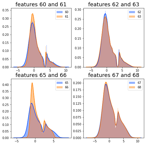
It generates multiple subplots that facilitate the comparison of distributions between various pairs of features, offering a means for visual analysis of their characteristics.
The initial step involves setting the color palette for the visualizations. By employing the function sns.set_palette(bright), the plots are rendered in a more visually appealing bright color scheme. This contributes to the overall effectiveness of the visual representation.
Subsequently, the code creates a grid of subplots using the plt.subplots(2, 2, figsize=(8, 8)) function. This command establishes a 2x2 arrangement of subplots, each designed to display the distributions of selected features. Each subplot is allocated a specific size, ensuring an organized presentation of the data.
The visualization of distributions is achieved by calling the sns.distplot function for each subplot, targeting pairs of different features, such as feature_60 and feature_61. This function generates histograms that illustrate the distribution of data across various values, utilizing 200 bins to provide detailed insight into the datas behavior.
To clarify the content of each subplot, titles are assigned that indicate the features under examination, and legends are included to distinguish between the various features depicted within that subplot. This enhances the interpretability of the visualizations.
Once the plots have been prepared, the command plt.show(); is executed to render and display the visualizations. This step is vital for allowing analysts to view the results of their work.
Finally, the code invokes gc.collect(); to perform garbage collection. This process aids in memory management by reclaiming resources that are no longer required, a practice that is especially important when dealing with large datasets.
The purpose of utilizing this code is to facilitate data exploration. The visualizations assist in understanding the central tendency, spread, and overall shape of the feature distributions, which is a critical aspect during the exploratory data analysis phase. Moreover, by plotting pairs of features concurrently, analysts can conduct comparative analyses, enabling them to identify potential correlations or similarities between the features.
Between them lies the variable known as feature_64.
plt.figure(figsize = (12,5))
ax = sns.distplot(train_data['feature_64'],
             bins=1200,
             kde_kws={"clip":(-6,6)},
             hist_kws={"range":(-6,6)},
             color='darkcyan',
             kde=False);
values = np.array([rec.get_height() for rec in ax.patches])
norm = plt.Normalize(values.min(), values.max())
colors = plt.cm.jet(norm(values))
for rec, col in zip(ax.patches, colors):
    rec.set_color(col)
plt.xlabel("Histogram of feature_64", size=14)
plt.show();
del values
gc.collect();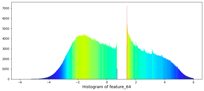
Initially, it establishes a new figure for plotting, specifying a dimension of 12 by 5 inches, which provides an appropriate space for visualization. Following this setup, the code employs the Seaborn library to generate the histogram for feature_64. The histogram is configured with a substantial number of bins, specifically 1200, to achieve a high level of granularity in depicting the frequency distribution. Additionally, the range of the histogram is truncated to values between -6 and 6, allowing for a clearer focus on the central portion of the data distribution. It is noteworthy that the kernel density estimate (KDE) feature is disabled, as indicated by the kde parameter being set to False.
To enhance the visual presentation, the code captures the heights of the histograms bars to normalize these values for coloring purposes. A color map, known as jet, is then applied to the bars according to their heights, resulting in a visually pleasing gradient effect that promotes clarity and engagement.
Furthermore, the x-axis is appropriately labeled to reflect what the histogram represents, ensuring that viewers can easily interpret the data being displayed. The final step involves rendering the histogram visually through the use of the plt.show() function.
Lastly, the code includes a memory management aspect, wherein it removes the array of values utilized for coloring and invokes garbage collection to optimize memory resources.
There exists a significant gap in the values ranging from 0.7 to 1.38. Notably, the natural logarithm of 2 is approximately 0.693, while the natural logarithm of 4 is about 1.386. The relevance of this observation remains unclear.
The features designated as Tag 22 display an intriguing daily pattern. To illustrate this, I have provided scatter and cumulative plots over a span of three days for feature 64.
day_0 = train_data.loc[train_data['date'] == 0]
day_1 = train_data.loc[train_data['date'] == 1]
day_3 = train_data.loc[train_data['date'] == 3]
three_days = pd.concat([day_0, day_1, day_3])

# plot
fig, ax = plt.subplots(2, 1, figsize=(15, 6), sharex=True)
ax[0].scatter(three_days.ts_id, three_days.feature_64, s=0.5, color='b')
ax[0].set_xlabel('')
ax[0].set_ylabel('value')
ax[0].set_title('feature_64 (days 0, 1 and 3)')
ax[1].scatter(three_days.ts_id, pd.Series(three_days['feature_64']).cumsum(), s=0.5, color='r')
ax[1].set_xlabel('ts_id')
ax[1].set_ylabel('cumulative sum')
ax[1].set_title('')
plt.show();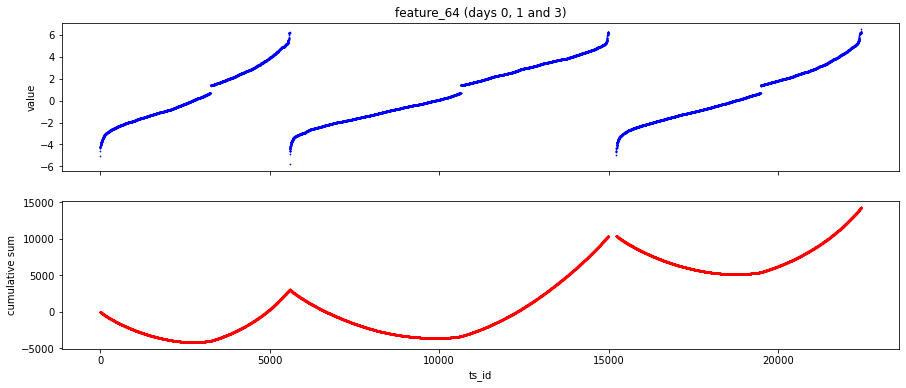
To begin with, the code filters the training data to retrieve records associated with days 0, 1, and 3. This is achieved by creating separate subsets for each of these days. Following this step, the individual subsets are combined into a single DataFrame named three_days. This consolidated format allows for easier comparison and analysis.
The code further develops a two-panel scatter plot as part of its visualization process. The first panel illustrates the values of feature_64 in relation to the unique identifiers (ts_id) from the combined data for the specified days. In the second panel, the cumulative sum of feature_64 is displayed across the same identifiers, effectively demonstrating how the feature accumulates over the selected time points.
In terms of its operational mechanics, the code employs the loc method to filter data within the DataFrame based on the date column, a common technique in pandas for selecting subsets. The concatenation of the filtered DataFrames is accomplished using the pd.concat function, which facilitates the integration of multiple day comparisons into a singular format. Additionally, the code utilizes the Matplotlib library to create scatter plots, allowing for customized sizing and coloring of data points. The cumulative sum is calculated through Pandas Series operations, offering insights into trends across the designated time periods.
The necessity of this code can be attributed to several factors. Firstly, it supports data exploration by enabling analysts or data scientists to visualize and comprehend the behavior of a particular feature across chosen days, potentially uncovering trends or anomalies. Secondly, concentrating on specific days allows stakeholders to compare feature values at different times, thus enhancing analytical insights into the temporal dynamics of the data. Lastly, the depiction of the cumulative sum aids in identifying overarching trends and cumulative effects, which are vital for understanding long-term behavior in time series data.
The global minimum value of feature_64 is approximately -6.4, while the global maximum value is approximately 8. It is noteworthy that not all trading days on the New York Stock Exchange reach these limits.
In considering the time frame of a trading day, which runs from 9:30 AM to 4:00 PM, one might explore an interesting scenario. If the units of feature_64 were redefined to represent approximately 30 minutes, with a value of 0 corresponding to noon, it could provide a unique perspective on the data.
To further illustrate this concept, we can create a plot of the *arcsin* function and label the y-axis with the corresponding hours of the day, offering an engaging way to visualize the information.
x = np.arange(-1,1,0.01)
y = 2 * np.arcsin(x) +1
fig, ax = plt.subplots(1, 1, figsize=(7, 4))
ax.plot(x,y, lw=3)
ax.set(xticklabels=[])
ax.set(yticklabels=['9:00','10:00','11:00','12:00','13:00','14:00','15:00' ,'16:00'])
ax.set_title("2$\it{arcsin}$(t) +1", fontsize=18)
ax.set_xlabel ("'tick' time", fontsize=18)
ax.set_ylabel ("Clock time", fontsize=18)
plt.show();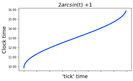
The process begins with the generation of an array of values that ranges from -1 to 1, with increments of 0.01. This array is assigned to the variable x, which is significant as it defines the domain for evaluating the mathematical function.
Following the data creation, the code computes a new array named y for each value in the x array. This computation is based on the formula 2 * arcsin(x) + 1, where arcsin denotes the inverse sine function. Consequently, this step transforms the x values into their corresponding y values according to the specified mathematical expression.
Next, the code establishes a new figure and axes for the plot, specifying the dimensions of the figure. It then employs the plot method to generate a line plot of y in relation to x, designating a particular line width for visual clarity.
To enhance the appearance of the plot, the tick labels for the x-axis are omitted to ensure clarity. In contrast, customized tick labels representing time are applied to the y-axis. Additionally, the plot is adorned with a title, and labels for both axes are included to clarify what each axis represents.
In its final stage, the code executes the plt.show() command, which renders the plot in a graphical window.
where, for some reason, the tick time is more frequent at the start and end of the day than in the middle. Also for fun let us plot the hypothetical tick frequency,
x_dash = np.arange(-0.98,0.99,0.01)
y_dash = 2 / np.sqrt(1-(x_dash**2))
fig, ax = plt.subplots(1, 1, figsize=(7, 4))
ax.plot(x_dash,y_dash, lw=3)
ax.set(yticklabels=[])
ax.xaxis.set_ticks(np.arange(-1, 1, 0.28))
#ax.set(xticklabels=['9:00','10:00','11:00','12:00','13:00','14:00','15:00' ,'16:00'])
ax.set(xticklabels=['9:00','10:00','11:00','12:00','13:00','14:00','15:00' ,'16:00'])
ax.set_title("d/dt (2$\it{arcsin}$(t) +1)", fontsize=18)
ax.set_xlabel ("Clock time", fontsize=18)
ax.set_ylabel ("'tick' frequency", fontsize=18)
plt.show();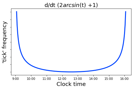
This code serves to create a visual representation of a mathematical function associated with the derivative of a transformation involving the arcsine function. Specifically, it plots the equation \( y = \frac{2}{\sqrt{1 — x²}} \) over a defined range of x values, which are derived from an array spanning from -0.98 to 0.98 in increments of 0.01.
The first step in the process involves the generation of an array containing the x-values, which range from -0.98 to 0.98. For each of these values, the corresponding y-values are computed using the defined mathematical function. This calculation is pertinent in fields such as calculus, particularly within the context of analyzing the arcsine function.
Subsequent to data preparation, a figure and axes are established with a predetermined size. The x and y values derived are then plotted as a line graph, with a specified line thickness.
In terms of axis configuration, the y-axis tick labels are removed to enhance clarity. The x-axis is customized to showcase specific tick marks that correlate with designated times. This adjustment aids in interpreting the graph, aligning numerical values with particular moments of the day.
Moreover, the plot is titled, and the axes are labeled, which enriches the viewers understanding of the graphs intent. These chosen labels elucidate the relationship of the function to time, especially in relation to oscillatory or periodic phenomena.
Finally, the plot is rendered visible through a command that executes the configurations described above.
If this hypothesis holds true, it is possible that the period of missing values observed at the beginning of the day for certain features is analogous to the period of missing values encountered during the midday. Furthermore, it is plausible that the increased frequency of tick data at both the beginning and end of the trading day is attributed to a surge in buying activity when the market opens, followed by heightened selling as the trading session draws to a close, allowing traders to avoid holding significant positions overnight.
The idea was initially proposed, to my recollection, by a user known as marketneutral in a discussion thread. They suggested that the data might be related to equities traded on the Tokyo Stock Exchange, which operates from 9:00 AM to 11:30 AM, breaks for lunch, and then resumes trading from 12:30 PM to 3:00 PM. This trading schedule may clarify the observed central discontinuity in the features associated with Tag 22.
Next, we will examine feature 65.
three_days.plot.scatter(x='ts_id', y='feature_65', s=0.5, figsize=(15,4));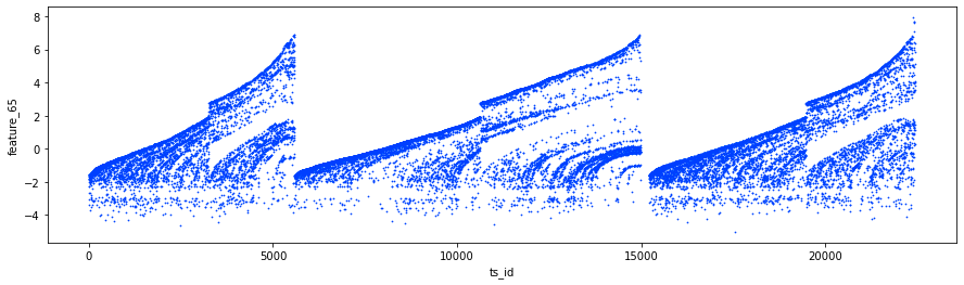
Specifically, it juxtaposes the variable ts_id with another variable, feature_65. The points on the scatter plot are given a very small size of 0.5, which minimizes the risk of excessive overlap, a consideration that is especially pertinent when handling large datasets. The dimensions of the figure are specified to be 15 units in width and 4 units in height to enhance visibility.
Employing this code serves several significant purposes.
Firstly, scatter plots are recognized as effective tools for visualizing the correlation between two continuous variables. By plotting ts_id against feature_65, one is able to readily identify patterns, trends, and possible correlations or outliers within the dataset.
Secondly, this plot is instrumental during the exploratory data analysis phase. It enables analysts to grasp the datas distribution and the interaction between these two features, thereby informing subsequent analysis or model development.
Lastly, presenting data visually often proves to be more comprehensible and communicative than transmitting raw data tables. This advantage is particularly beneficial in contexts such as presentations or reports.
For an insightful examination of the features associated with Tag 22, I recommend reviewing the notebook titled *Important and Hidden Temporal Data*, authored by Lachlan Suter. This resource offers valuable information that may enhance your understanding.
The features identified as ‘noisy’ include numbers 3, 4, 5, 6, 8, 10, 12, 14, 16, 37, 38, 39, 40, 72, 73, 74, 75, 76, as well as 78, 79, 80, 81, 82, and 83.
Additionally, cumulative plots of some of these features are provided for further analysis, which can aid in visualizing the data trends.
fig, ((ax1, ax2), (ax3, ax4)) = plt.subplots(2, 2,figsize=(16,8))
ax1.set_title ("features 3 and 4 (+Tag 9)", fontsize=18);
ax1.plot((pd.Series(train_data['feature_3']).cumsum()), lw=2, color='blue')
ax1.plot((pd.Series(train_data['feature_4']).cumsum()), lw=2, color='red')

ax2.set_title ("features 5 and 6 (+Tag 9)", fontsize=18);
ax2.plot((pd.Series(train_data['feature_5']).cumsum()), lw=2, color='blue')
ax2.plot((pd.Series(train_data['feature_6']).cumsum()), lw=2, color='red')

ax3.set_title ("features 37 and 38 (+Tag 9)", fontsize=18);
ax3.plot((pd.Series(train_data['feature_37']).cumsum()), lw=2, color='blue')
ax3.plot((pd.Series(train_data['feature_38']).cumsum()), lw=2, color='red')
ax3.set_xlabel ("Trade", fontsize=18)

ax4.set_title ("features 39 and 40 (+Tag 9)", fontsize=18);
ax4.plot((pd.Series(train_data['feature_39']).cumsum()), lw=2, color='blue')
ax4.plot((pd.Series(train_data['feature_40']).cumsum()), lw=2, color='red')
ax4.axvline(x=514052, linestyle='--', alpha=0.3, c='green', lw=2)
ax4.axvspan(0, 514052 , color=sns.xkcd_rgb['grey'], alpha=0.1)
ax4.set_xlabel ("Trade", fontsize=18)
#ax4.axvline(x=514052, linestyle='--', alpha=0.3, c='black', lw=1)
#ax4.axvspan(0,  514052, color=sns.xkcd_rgb['grey'], alpha=0.1);
gc.collect();
The primary aim of this visualization is to elucidate how these features behave over time or across different trades.
The process begins with the establishment of subplots, wherein a figure is defined with a size of 16 by 8. This configuration creates a layout that includes four axes, labeled as ax1, ax2, ax3, and ax4, allowing for the simultaneous display of multiple plots.
Each subplot presents the cumulative sums of two distinct features from the dataset. Specifically, ax1 illustrates the cumulative sums for feature_3 and feature_4, utilizing blue and red colors for differentiation. This approach is replicated in ax2, ax3, and ax4, each subplot focusing on different pairs of features: ax2 highlights features 5 and 6, while ax3 and ax4 concentrate on features 37 and 38, and 39 and 40, respectively.
To enhance the clarity of the visualizations, ax4 includes several annotations, such as a vertical line positioned at a specific x-value (514052) and a shaded region that emphasizes this area. This addition could signify a notable event or point of interest within the dataset, fostering rapid visual reference for comparative analysis.
The code also incorporates titles and labels for each plot, thereby ensuring that viewers can easily comprehend which features are being represented.
Moreover, the invocation of gc.collect() at the end of the code suggests an intention to manage memory usage efficiently, particularly in light of the potential handling of large datasets.
It is possible that the values being referred to represent offer prices, while those identified with Tag 9 correspond to bid prices. Notably, an observation can be made that after day 85, the value of the variable feature_40 exceeds that of feature_39.
Regarding feature_51, which is associated with Tag 19, there is a relevant discussion on the topic titled Weight and feature_51 de-anonymized. In this discussion, contributor marketneutral suggests that feature_51 represents the logarithm of the average daily volume of the stock. Subsequently, I present a reproduction of the plot depicting feature_51 in relation to weight for instances where the weights are non-zero.
fig, ax = plt.subplots(figsize=(15, 4))
ax.scatter(train_data_nonZero.weight, train_data_nonZero.feature_51, s=0.1, color='b')
ax.set_xlabel('weight')
ax.set_ylabel('feature_51')
plt.show();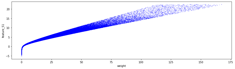
The provided code is utilized to create a scatter plot that illustrates the relationship between two variables: weight and feature_51 from a dataset known as train_data_nonZero.
Initially, the code establishes a plotting area with a designated figure size of 15 by 4 inches using the Matplotlib library, which is commonly imported as plt.
Subsequently, the scatter plot is generated by plotting points where the x-coordinates represent the values of weight and the y-coordinates correspond to the values of feature_51 within the train_data_nonZero dataset. Each point is sized at 0.1, resulting in relatively small dots that are colored blue.
The axes of the plot are labeled accordingly, with the x-axis denoted as weight and the y-axis as feature_51. This labeling provides essential context for the viewers regarding the data presented in the scatter plot.
Finally, the code includes a command to render and display the plot on the screen through plt.show(). This feature allows users to visualize the distribution of feature_51 in relation to weight.
In terms of the topic at hand, which is labeled as feature_52 and designated with Tag 19, please provide any context or specifics related to this feature if necessary.
fig, ax = plt.subplots(figsize=(15, 3))
feature_0 = pd.Series(train_data['feature_52']).cumsum()
ax.set_xlabel ("ts_id", fontsize=18)
ax.set_ylabel ("feature_52 (cumulative)", fontsize=12);
feature_0.plot(lw=3);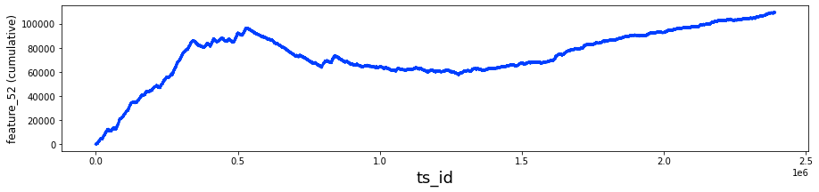
It utilizes the Matplotlib library for plotting and the Pandas library for managing and manipulating the data.
Initially, the code establishes a figure and an axis with predetermined dimensions for the plot. The size is designed to be wide and horizontal, which is often advantageous for visualizing time series data across multiple points.
Next, it computes the cumulative sum for the feature_52 column from a DataFrame referred to as train_data. This cumulative sum provides a running total of the values in the specified column, which is beneficial for analyzing trends over time or evaluating cumulative impacts.
The x-axis is designated with the label ts_id, likely indicating a time series identifier, while the y-axis is labeled feature_52 (cumulative). These labels serve to clarify the information depicted in the plot.
In the concluding stage, the code visualizes the cumulative sum series by plotting it with a specified line width, effectively representing how the values of feature_52 accumulate over time or in relation to another identifier.
having the following lag plot
fig, ax = plt.subplots(1,1, figsize=(4, 4))
lag_plot(day_0['feature_52'], s=0.5, ax=ax)
ax.title.set_text('feature_52')
ax.set_xlabel("ts_id (n)")
ax.set_ylabel("ts_id (n+1)")
ax.plot(0, 0, 'r.', markersize=15.0);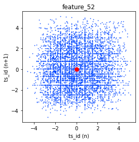
This code is intended to create a visualization of the time series data associated with a particular feature known as feature_52. It employs matplotlib, a widely used plotting library in Python, to generate a lag plot. A lag plot is a visual tool that assists in identifying correlations between observations at various time points within a time series.
The process begins with the establishment of a figure and corresponding axes for the plot, set to a size of 4 by 4 inches, providing a balanced square format. Following this, the lag_plot function is invoked using the specific data of the feature, which is likely part of a broader dataset referred to as day_0. This function creates the lag plot by correlating the value of the feature at time n with its value at time n+1.
Additionally, the plot is titled feature_52 to clarify the data being represented. The labels for the x and y axes are designated as ts_id (n) and ts_id (n+1), respectively, enhancing the understanding of what each axis signifies. Finally, a red dot is positioned at the origin (0, 0), sized appropriately to serve as a reference point within the visualization.
fig, ax = plt.subplots(figsize=(15, 4))
ax.scatter(train_data_nonZero.feature_52, train_data_nonZero.resp, s=0.1, color='b')
ax.set_xlabel('feature_52')
ax.set_ylabel('resp')
plt.show();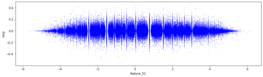
The main objective of this scatter plot is to illustrate the relationship between two variables: feature_52 and resp from a dataset known as train_data_nonZero.
Initially, the code establishes a figure and a set of subplots, designating the overall dimensions of the plot to be 15 inches in width and 4 inches in height. This setup creates the appropriate space for rendering the visual representation of the data.
Subsequently, the code employs the scatter function to depict individual data points on the axes. Each point corresponds to a pair of values derived from feature_52 and resp. The points are represented with a very small marker size of 0.1 and are colored blue, which serves to enhance their visibility.
The axes are then labeled to provide clarity, with the x-axis being denoted as feature_52 and the y-axis labeled as resp. This labeling is crucial, as it allows viewers to promptly recognize the variables that are being compared.
The features categorized under the term Negative include numbers 73, 75, 76, 77 — denoted as noisy — along with 79, and 81, which is also noisy, as well as 82. These features are located within the section identified as Tag 23.
In contrast, the features classified as Hybrid, specifically those in Tag 21, encompass numbers 55, 56, 57, 58, and 59. Initially, these features exhibit noise, displaying prominent, almost discontinuous steps at the trade marks of 0.2M, 0.5M, and 0.8M. Subsequently, they transition to a linear pattern. Collectively, these five features constitute the Tag 21 set.
fig, ax = plt.subplots(figsize=(15, 5))
feature_55= pd.Series(train_data['feature_55']).cumsum()
feature_56= pd.Series(train_data['feature_56']).cumsum()
feature_57= pd.Series(train_data['feature_57']).cumsum()
feature_58= pd.Series(train_data['feature_58']).cumsum()
feature_59= pd.Series(train_data['feature_59']).cumsum()
ax.set_xlabel ("Trade", fontsize=18)
ax.set_title ("Cumulative plot for the 'Tag 21' features (55-59)", fontsize=18)
ax.axvline(x=514052, linestyle='--', alpha=0.3, c='black', lw=1)
ax.axvspan(0,  514052, color=sns.xkcd_rgb['grey'], alpha=0.1)
feature_55.plot(lw=3)
feature_56.plot(lw=3)
feature_57.plot(lw=3)
feature_58.plot(lw=3)
feature_59.plot(lw=3)
plt.legend(loc="upper left");
gc.collect();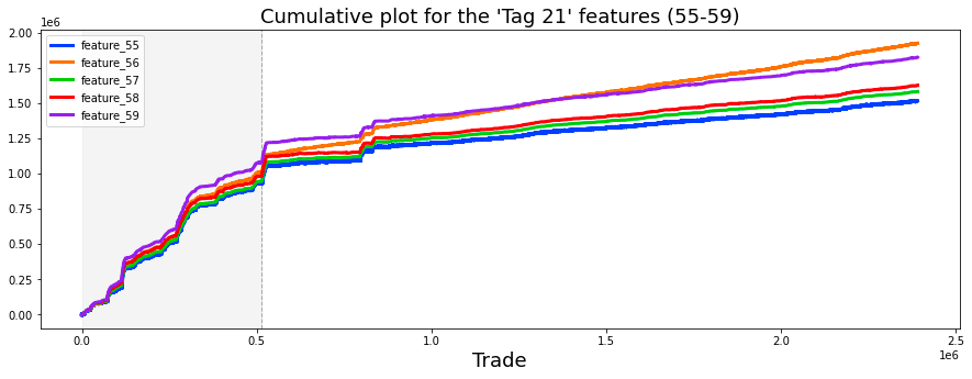
This code is an essential component in the process of data visualization, utilizing the Matplotlib library to generate a cumulative plot for selected features from a dataset.
The code initiates by creating a figure and a series of axes for the plot with defined dimensions of 15 inches in width and 5 inches in height. It then proceeds to compute the cumulative sum of specific features, identified as feature_55, feature_56, feature_57, feature_58, and feature_59, from the dataset referred to as train_data. This cumulative sum serves as a running total, providing valuable insights into the overall trends of these features over time.
Subsequently, the code configures the plot by setting labels and titles to enhance clarity and information. The x-axis is designated with the label Trade, and a title communicates that the plot features data associated with Tag 21. To further illustrate specific parts of the dataset, the code includes a vertical dashed line at the position x=514052, accompanied by a grey shaded area, thus highlighting a particular range of values.
The plotting of features is conducted by rendering each cumulative sum series with a determined line width, thereby visually representing the trends across the range of values. Furthermore, a legend is incorporated in the upper left corner of the plot to provide clarity regarding which line corresponds to each feature.
In terms of execution, this code employs the Pandas library to effectively manage the dataset and facilitate the calculation of cumulative sums. The cumulative sums themselves are calculated using the .cumsum() method, which adds the successive elements within the series. The plotting functions are applied to the axes object, enabling the visual rendering of the features. Additionally, visual markers, such as vertical lines and shaded regions, are employed to enhance the interpretability of the plot.
The significance of this code lies in its ability to aid in the interpretation of data. The cumulative plot offers a means to understand overarching trends and behaviors of the selected features over time, which is crucial for data-driven decision-making. It provides a direct visual comparison among multiple features, assisting in the identification of patterns or correlations that may exist. The incorporation of vertical lines and shaded areas highlights significant events or periods within the dataset, which can inform analysts and decision-makers concerning important changes or contexts.
It is possible that the features may be associated with the five response values, specifically as follows: feature 55 may correspond to response 1, feature 56 to response 4, feature 57 to response 2, feature 58 to response 3, and feature 59 to the general response.
In the event that these associations hold true, then the following designations can be made. Tag 0 would signify features related to response 4. Tag 1 would indicate features associated with the general response. Tag 2 would denote features corresponding to response 3, Tag 3 would refer to features linked to response 2, and Tag 4 would represent features associated with response 1.
For clarity, let us review the features associated with each response. The features related to response 1 include 7, 8, 17, 18, 27, 28, 55, 72, 78, 84, 90, 96, 102, 108, 114, 120, and 121. It is noteworthy that 79.6% of all missing data is found within this particular set of features. The features associated with response 2 are numbered 11, 12, 21, 22, 31, 32, 57, 74, 80, 86, 92, 98, 104, 110, 116, 124, and 125, from which 15.2% of the missing data is derived.
The features corresponding to response 3 are 13, 14, 23, 24, 33, 34, 58, 75, 81, 87, 93, 99, 105, 111, 117, 126, and 127. Features related to response 4 are numbered 9, 10, 19, 20, 29, 30, 56, 73, 79, 85, 91, 97, 103, 109, 115, 122, and 123. Lastly, the features associated with the general response include 15, 16, 25, 26, 35, 36, 59, 76, 82, 88, 94, 100, 106, 112, 118, 128, and 129.
We will now examine a plot of these 17 features corresponding to each response. Please note that this is an image; you may right-click to view and enlarge it.
# Note: I have had to import this png image from another kaggle notebook
# since producing it took up almost *all* of the notebook memory. Right click to enlarge.
Image(filename="../input/jane-17-plots/17_plots.png", width= "95%")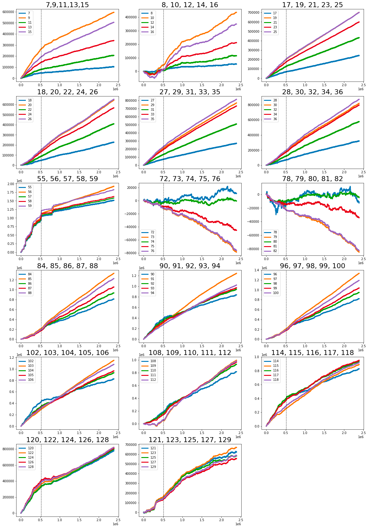
It employs a function to render a PNG image file, which is located in a specific directory relative to the current path of the notebook. The image, entitled 17_plots.png, originates from another Kaggle notebook. This choice likely stems from the fact that generating the plots represented by this image requires substantial computational resources and memory.
