

Engineering a Stock Prediction Pipeline: Building a Robust Trading Pipeline with Python and TA-Lib
Master the art of data preparation, outlier removal, and signal generation for quantitative strategies.

Download source code link at the end of the article:
There are some issues with displaying images in certain articles. I’m aware of the problem and currently working to fix it. In the meantime, you can view the complete output and all the charts in the Jupyter notebook.
Success in algorithmic trading relies less on finding a “magic algorithm” and more on the quality of the pipeline that feeds it. Raw market data is inherently noisy and unstructured, making it unsuitable for direct modeling without rigorous preprocessing. This guide provides a practical, code-first approach to constructing a production-grade trading workflow. We will walk through the essential stages of data ingestion, cleaning, and outlier removal, before utilizing TA-Lib to engineer powerful alpha factors — transforming raw price action into robust, actionable signals for your quantitative strategies.
import warnings
warnings.filterwarnings(’ignore’)
Those two lines globally silence all Python warning messages for the running process. In practice, the warnings module is used by libraries to emit non-fatal alerts — deprecation notices, numerical stability hints, performance suggestions, or environment/configuration issues — and calling filterwarnings(‘ignore’) disables every such warning emitted after that point across all modules. The immediate effect is a much cleaner console or log output, which is often why teams put this at the top of notebooks or quick backtests to reduce noise.
In an algorithmic trading codebase, the intent is usually to avoid flooding logs with repetitive, benign messages from dependencies (e.g., deprecated API calls in a plotting library, or benign dtype coercions in pandas) so that you and other engineers can focus on important runtime information like order execution logs, slippage, and exceptions. That can be valuable during exploratory analysis or when generating human-facing reports where warning clutter obscures core output.
However, silencing all warnings is risky in a trading context because warnings are early indicators of issues that can materially affect strategy behavior and P&L. Deprecation warnings can hide forthcoming API changes that will break live trading; numerical or precision warnings from NumPy/Pandas/TA libraries can signal stability problems in indicators; resource or threading warnings may flag concurrency issues that manifest under production load. Because filterwarnings(‘ignore’) is global and permanent for the process, it can mask these signals and make bugs harder to find or lead to silent misbehavior.
A safer approach is to be intentional about which warnings to suppress: restrict suppression to specific warning categories, modules, or message patterns and do it only around the code that is known to generate benign noise. Another good pattern is to capture warnings and route them into structured logs (so they’re suppressed on stdout but still recorded), or to use temporary warning filters scoped to a particular block when you’re calling a noisy third-party routine during backtests. In short, prefer targeted filtering and persistent recording of warnings over a blanket ignore; that preserves the cleanliness of your output while keeping important diagnostic signals available for monitoring, debugging, and risk management.
%matplotlib inline

from pathlib import Path
import numpy as np
import pandas as pd

import matplotlib.pyplot as plt
import seaborn as sns
This small setup block is doing the standard environment preparation for a notebook-based algorithmic trading workflow: it chooses an inline plotting backend for immediate visual feedback and imports the core libraries we’ll use to ingest, transform, analyze, and visualize time-series market data. In practice the data flow starts with Pathlib objects to locate CSVs or other data artifacts robustly across environments — we prefer Path over plain strings because it centralizes path manipulations (joining, resolving, checking existence) and reduces platform-specific bugs when loading historical ticks, bars, or other datasets used by strategies and backtests.
Pandas and NumPy form the computational backbone. We use pandas to represent market data as time-indexed DataFrames (OHLCV, ticks, signal columns), because pandas makes resampling, alignment, timezone handling, and missing-value propagation straightforward. NumPy is used where performance matters: indicator calculations and vectorized signal logic should operate on NumPy arrays (or pandas Series backed by NumPy) to avoid Python-level loops during backtests. This combination lets us compute moving averages, rolling volatility, returns, and other features efficiently while keeping the code readable and easy to align with timestamps.
Matplotlib and Seaborn are included for visualization: matplotlib gives precise control needed to render price series, overlay indicators, and annotate entry/exit markers that are critical for manual verification of strategy behavior, while Seaborn provides higher-level statistical plotting and polished styles (heatmaps for correlation matrices, distribution plots for returns, pairwise feature inspections) that help diagnose overfitting, feature redundancy, or regime changes. Using the notebook inline backend is intentional for iterative development: you can inspect charts and intermediate outputs immediately as you tune signals. For production backtests or automated runs, we typically switch to a non-interactive backend and save figures to files to avoid blocking execution.
Operationally, this setup encourages a workflow: locate and load data via Path -> read into pandas DataFrame -> normalize/clean timestamps and missing data -> compute features with NumPy-backed vectorized operations -> generate signals and perform backtests -> visualize outcomes with matplotlib/seaborn to validate hypothesis and inspect edge cases. A couple of practical notes tied to algorithmic trading: prefer vectorized implementations to keep backtest runtime reasonable, be explicit about datetime/timezone handling to avoid subtle alignment bugs across exchanges, and reserve seaborn/matplotlib styling in exploratory phases while exporting deterministic plots for reports or CI runs.
sns.set_style(’whitegrid’)
idx = pd.IndexSlice
deciles = np.arange(.1, 1, .1).round(1)
The first line, sns.set_style(‘whitegrid’), is a global plotting configuration: it switches seaborn/matplotlib to a clean, light background with subtle gridlines. In the context of algorithmic trading this is a deliberate choice to make time-series, cumulative P&L and cross-sectional comparison plots easier to read — gridlines help the viewer judge levels and slopes quickly when inspecting.strategy performance, drawdowns or factor exposures. Setting the style once up front ensures all subsequent plots are visually consistent for reporting and debugging.
The second line, idx = pd.IndexSlice, is a small convenience assignment for working with pandas MultiIndex objects. In trading code you typically have hierarchical indices (for example date × asset, or date × portfolio bucket) and you frequently need to select cross-sections for rebalancing, computing returns, or aggregating metrics. IndexSlice lets you write expressive loc-indexing like df.loc[idx[:, ‘AAPL’], :] or df.loc[idx[date_slice, :], [‘weight’,’return’]] rather than composing tuples manually. Assigning it to the name idx is purely for brevity and readability in the downstream selection logic that follows.
The third line, deciles = np.arange(.1, 1, .1).round(1), constructs the numeric cutpoints for decile-based bucketing: it produces [0.1, 0.2, …, 0.9]. These values are typically used to form quantile bins (e.g., with pandas.qcut or to compute percentile thresholds) so you can build decile portfolios, measure decile-level returns, or form long-short spreads between top and bottom buckets. The use of np.arange with a small step can introduce floating-point imprecision, so the .round(1) is intentional: it normalizes the cutpoints to one decimal place to avoid subtle mismatches when comparing or labeling buckets and to make later joins/labels deterministic. In short, this line prepares the canonical decile boundaries that downstream logic will use to discretize continuous signals into portfolio buckets for performance attribution and risk control.
Loading Data
DATA_STORE = Path(’..’, ‘data’, ‘assets.h5’)This single line declares a single, central reference to the on-disk asset store used throughout the trading codebase. By assigning a Path object to the uppercase name DATA_STORE we create an explicit, canonical handle for the HDF5 file that contains historical price/volume series, instrument metadata, and any precomputed features or aggregated windows. Using Pathlib instead of a bare string gives us cross‑platform path manipulation and convenient file operations (exists(), open(), etc.), and the HDF5 extension (.h5) signals that the file is a binary, columnar container (typically accessed via pandas.HDFStore or PyTables) which is chosen because it supports compact storage, compression, and efficient partial reads of large time series without materializing everything into memory — an important property for backtests and live-feeds in algorithmic trading.
Placing the file under a relative ../data location reflects a deliberate separation of code and data: keep large, frequently changing datasets out of the repository, and allow the data directory to be mounted or replaced in different environments (development, CI, production). The constant name (uppercase) makes it a single source of truth for all modules that need to load or persist market data, reducing the chance of hard-coded paths scattered through the codebase.
A few design and operational considerations inform this choice. HDF5 is excellent for read-heavy workflows and for efficient slicing by time/instrument, which aligns with how backtests and feature pipelines operate; however, HDF5 has limitations for concurrent writes and heavy multi-process access, so for high-concurrency ingestion you may prefer a database, object store with Parquet, or a write-ahead staging service. Also, relying on a relative path means the working directory matters — in production it’s safer to resolve this path or make it configurable via environment/config so deployments don’t fail due to a missing ../data folder.
In short: DATA_STORE centralizes where historical assets live, uses Pathlib for robust filesystem handling, and signals the use of an HDF5-backed time-series store optimized for the read-heavy, memory-conscious patterns typical in algorithmic trading, while also suggesting attention to configuration and concurrency as the system scales.
with pd.HDFStore(DATA_STORE) as store:
    data = (store[’quandl/wiki/prices’]
            .loc[idx[’2007’:’2016’, :],
                 [’adj_open’, ‘adj_high’, ‘adj_low’, ‘adj_close’, ‘adj_volume’]]
            .dropna()
            .swaplevel()
            .sort_index()
            .rename(columns=lambda x: x.replace(’adj_’, ‘’)))
    metadata = store[’us_equities/stocks’].loc[:, [’marketcap’, ‘sector’]]
This block opens the HDF5 store and materializes two clean, usable datasets that are the starting point for downstream algorithmic-trading tasks: a per-security time series of adjusted prices and volumes, and a small table of static stock metadata. The first expression reads the stored Quandl prices table and immediately restricts it to a ten-year date window (2007–2016) for all tickers, selecting only the adjusted open/high/low/close/volume fields. That date slicing limits the historical horizon you’ll backtest over or feature-engineer from, keeping later computations bounded and reproducible.
After selecting the relevant columns the code drops any rows containing missing values. The practical reason is to ensure every timestamp used for feature generation and return calculations has a complete set of price and volume inputs; leaving NaNs in place would propagate through derived signals and could silently break rolling/aggregation logic. If you need to preserve partial records for other strategies you would choose a different cleaning strategy (e.g., per-column fill or subset-based dropping), but here the intent is a contiguous, complete sample per observation.
Next the code swaps the two index levels and sorts the index. The original table is typically indexed as (date, ticker); swapping makes the outer level ticker and the inner level date. That layout is deliberate: making ticker the primary axis simplifies common operations in trading systems such as groupby(level=’ticker’) aggregations, per-security rolling window computations, and fast selection of an individual instrument’s time series. Sorting the index after swapping enforces a stable, ascending order (ticker, then date) so time-series operations assume monotonic timestamps within each ticker — a necessary condition for correct rolling windows, forward/backward fills, and any algorithms that iterate in chronological order.
Finally, the adjusted column names are simplified by stripping the ‘adj_’ prefix so downstream code can reference familiar names like open/high/low/close/volume without repeatedly handling adjusted-vs-unadjusted logic. In parallel, the metadata line pulls the stocks table and keeps only market capitalization and sector for each ticker. That metadata is purposefully kept separate: marketcap is commonly used for universe selection or weighting schemes, and sector is used for exposure controls or grouping; keeping it as a compact lookup table reduces memory footprint and separates static attributes from the time series.
One last practical note: the HDFStore is used within a context manager to ensure the file handle is closed cleanly. Also be aware this pipeline’s use of dropna may materially reduce sample size if many tickers have intermittent missing fields — which is an intentional trade-off here to guarantee clean inputs for feature calculation and backtesting.
data.info(null_counts=True)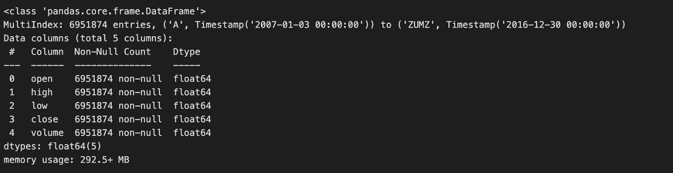
Calling data.info(null_counts=True) is a quick, diagnostic step you run immediately after loading market data to get a compact summary of the table that drives subsequent preprocessing and modeling decisions. The call prints the DataFrame’s index type and range, then for each column shows its name, dtype and the number of non-null entries, and finally the approximate memory footprint. In the algorithmic trading workflow this single snapshot tells you whether key series (prices, volumes, timestamps, identifiers) are represented with appropriate dtypes (e.g., numeric vs object, datetime vs string) and how much missing data each column contains — information you need before any feature engineering, resampling, or backtest.
Why this matters: non-null counts reveal the degree and distribution of missingness that will dictate your strategy for handling gaps. For time-series fields like prices you typically prefer interpolation or forward-fill with careful edge handling to avoid look-ahead bias; for reference fields (tickers, exchange ids) you may drop rows or cast to categorical if sparse. The dtypes reported by info tell you which columns need conversion (strings -> timestamps for indexing/resampling, objects -> numeric for indicator computation), and the memory-usage figure prompts downcasting (float64 -> float32, int64 -> int32, or using categorical encoding) when working with long histories or high-frequency data to reduce RAM and speed up backtests.
A couple of practical caveats and next steps: info’s non-null counts are a useful summary but don’t show the temporal pattern of missing values (e.g., clustered gaps or leading/trailing NaNs), so follow up with targeted checks like data.isna().sum(), visual inspection of series, and index continuity checks to decide interpolation windows and alignment strategies. Also note that in recent pandas versions the null_counts parameter has been superseded by newer flags (e.g., show_counts), so you may see a deprecation warning; the conceptual goal remains the same — get an early, actionable portrait of types, missingness, and memory so you can choose safe imputation, dtype conversions, and downcasting before feeding the data into signal generation or model training.
metadata.sector = pd.factorize(metadata.sector)[0]
metadata.info()
This two-line snippet is converting the sector column from textual categories into compact integer codes and then checking the DataFrame’s schema and memory footprint. The first line replaces each distinct sector string with a small integer label returned by pandas.factorize; the function actually produces a pair — an array of integer labels and an array of the unique values — but the code only keeps the labels (index [0]) and writes them back into metadata.sector. Conceptually, this turns a high-cardinality, variable-length string column into fixed-width numeric values that are far more efficient to store and feed into downstream algorithms.
We do this because most ML models and many numerical pipelines in an algorithmic trading stack expect numeric inputs, and categorical text values would otherwise require extra preprocessing at training or inference time. Factorizing here is a quick form of label-encoding that reduces memory and speeds up joins and vectorized operations. It also makes grouping and slicing (for sector-level portfolio rules, risk aggregation, or backtesting stratification) much more straightforward and deterministic within a single run.
There are important behavioral details to keep in mind: the integer codes start at zero and are assigned in the order that unique sector values first appear in the Series, so the mapping is data-order dependent and effectively arbitrary. Nulls in the original column are encoded as -1. Because the code discards the second return value (the uniques array), it does not persist the mapping between integers and sector names — which means this transformation will not be reproducible across different datasets or runs unless you explicitly save the mapping. That becomes critical when you need the same encoding at training, backtesting, and live trading times; otherwise you can mislabel sectors and corrupt features or decision logic.
Finally, metadata.info() is being used to validate the result: it confirms the sector column’s new dtype, non-null counts, and memory usage so you can verify the conversion succeeded and see the resource impact. For production robustness, consider alternatives depending on the model and use-case: persist the factorize uniques (or build an explicit mapping) to ensure stable encodings across environments; use pandas.Categorical (or category dtype) to get a memory-efficient representation that retains category names; or choose one-hot/embedding schemes if the model would wrongly interpret integer labels as ordinal.
data = data.join(metadata).dropna(subset=[’sector’])This line first augments the primary market data with asset-level metadata, then removes any rows that lack a sector label. Concretely, data.join(metadata) attaches columns from the metadata DataFrame to the data DataFrame by aligning on their indices (the default join behavior), so each market-observation row gets its corresponding metadata fields such as sector, industry, or other static descriptors. Immediately after that, .dropna(subset=[‘sector’]) discards any resulting rows where the sector field is missing, ensuring every remaining observation has a valid sector value for downstream processing.
We do this because sector is a critical discriminator in many algorithmic-trading workflows: it drives sector-neutral factor construction, sector-based risk models, portfolio tilting logic, and group-wise feature engineering. By enforcing presence of sector early, subsequent steps can safely compute sector-relative z-scores, apply sector-specific weights, or perform cross-sectional ranking without adding conditional logic to handle missing categories. Practically, the join-first-then-drop pattern preserves the row ordering and alignment of the primary data while ensuring we eliminate records that would otherwise introduce NaNs or incorrect group assignments into models and backtests.
There are important behavioral and data-quality implications to be aware of. Because join aligns on the DataFrame index, it assumes the metadata index matches the market-data index semantics (e.g., ticker, instrument ID, or a date-ticker MultiIndex). If indexes are different — say metadata keyed by ticker while data is keyed by date — this will produce unexpected mismatches; you should make the index correspondence explicit or use merge on key columns when appropriate. Also note that join defaults to a left join: combining it with dropna on sector effectively yields the same result as an inner join on rows that have sector, but the intermediate step preserves full alignment semantics before pruning. Dropping rows may materially change the universe and introduce survivorship or selection bias if missingness is non-random, so always quantify how many rows were removed and why. Finally, ensure metadata has unique keys to avoid duplicated rows after join; if there are duplicates, they can explode the data size and corrupt time-series relationships. If missing sector labels are frequent but non-informative, consider controlled imputation or a dedicated “unknown” bucket instead of outright dropping, depending on the modelling and backtest requirements.
data.info(null_counts=True)This single call interrogates the DataFrame’s metadata and prints a compact summary that’s meant to quickly reveal structural and cleanliness issues before any heavy algorithmic-trading work. When you run data.info(null_counts=True), pandas iterates over each column, counts non-null entries, determines the column dtype, and reports those non-null counts alongside the dtype and index range; it also prints an estimate of the DataFrame’s memory usage. The key purpose in our trading pipeline is diagnostic: the non-null counts reveal missing ticks or gaps in time-series columns that will affect resampling, windowed features, and model inputs; the dtypes flag columns that need conversion (for example, object -> datetime64 for timestamps, or object -> float for prices), and the memory-usage estimate helps decide whether to downcast numeric types or convert high-cardinality strings to categoricals before batch processing or vectorized calculations.
A few practical points that explain why we prefer this step up front: many downstream operations assume dense numeric arrays and consistent dtypes (e.g., rolling windows, vectorized indicators, or ML feature matrices), so discovering missing values or wrong dtypes early prevents subtle bugs and large, expensive type conversions later. Note that data.info prints to stdout (it doesn’t return the counts), and the non-null counts are what’s shown — true null counts are len(data) minus the reported non-null count, so if you need exact null tallies use data.isna().sum(). Also be aware that parameter names changed in recent pandas versions (null_counts was replaced by show_counts) and that memory_usage=’deep’ gives a more precise memory estimate for object columns; these refinements matter when diagnosing large tick-level datasets prior to feature engineering and model training.
print(f”# Tickers: {len(data.index.unique(’ticker’)):,.0f} | # Dates: {len(data.index.unique(’date’)):,.0f}”)This single line is a compact sanity check that reports the two most important dimensions of a market dataset for algorithmic trading: the number of distinct instruments (tickers) and the number of distinct time points (dates) present in the index. Internally it asks the DataFrame’s index for the unique labels at the named level ‘ticker’, counts them, formats that integer with thousands separators and zero decimal places, and does the same for the named level ‘date’, then prints a one-line summary. We do this early in a pipeline so we immediately confirm the breadth of the cross-section (how many symbols we have) and the length of the time series (how many distinct dates), which are critical to downstream decisions like whether the universe is large enough for cross-sectional signals, whether there is enough history for time-series models, and whether data ingestion succeeded.
There are a few important “why” and “how” implications to keep in mind. This relies on the index being a MultiIndex with named levels ‘ticker’ and ‘date’; if those names are missing or different you’ll get an error or wrong counts, so naming and normalizing the index upstream is important. Using index.unique(…) returns each distinct label, so duplicate rows for the same ticker on different dates won’t inflate the ticker count — that’s the desired behavior when checking universe size. For dates, the unique count reflects whatever granularity is in the index (timestamps vs. dates), so you should normalize datetimes to calendar or business-day granularity beforehand if you intend to count trading days specifically.
Finally, note some operational trade-offs: index.unique is typically efficient and fine for routine logging, but on extremely large datasets you may want to cache these counts or check index.levels (with care, since levels can include unused categories) to avoid extra work. This print-statement is therefore a lightweight, human-readable assertion that the dataset has the expected coverage before you proceed to feature engineering, backtesting, or model training.
Select the 500 Most-Traded Stocks
dv = data.close.mul(data.volume)This single line computes the per-bar dollar volume for each instrument by multiplying price by traded quantity: element-wise multiplication of the close price series with the corresponding volume series produces a new series (or DataFrame) where each cell is close * volume for that timestamp and asset. In pandas, using .mul instead of the bare * emphasizes element-wise alignment semantics — the indices and column labels are respected and any misaligned labels yield NaNs rather than silently broadcasting the wrong values — and it lets you later pass a fill_value if you need to treat missing entries specially.
We compute dollar volume because it is a simple, high-signal liquidity metric: price × volume approximates the cash flow traded in that bar and is widely used to screen out illiquid instruments, construct universe filters, and form position-sizing rules. Algorithmic strategies use dollar volume to enforce minimum liquidity thresholds, to compute volume-weighted features (e.g., volume-weighted returns), or to normalize signals (so signals are comparable across names with very different trading activity). Because this is a vectorized operation, it remains efficient across large cross-sections and long time series, which matters when you’re running universe-wide computations in a live or backtest pipeline.
A few practical considerations that explain why you’ll see this pattern in production code: make sure the close series is the correct form (adjusted vs unadjusted) for your objective, because corporate actions change the meaning of raw price times volume; watch NaN propagation — any missing price or volume will produce NaN dollar volume and should be handled (e.g., forward-fill, drop, or set fill_value in .mul); and be aware that raw dollar volume is highly skewed, so most downstream logic applies smoothing (rolling mean/median) or a log/winsorization transform before thresholding or ranking. Also consider zeros: zero volume entries may indicate off-market days and can break ratio calculations later, so handle them explicitly if you plan to divide by dollar volume.
In short, dv = data.close.mul(data.volume) is the vectorized creation of a core liquidity feature — dollar volume — which you will typically smooth, normalize, and use as a guardrail or weight in subsequent algorithmic trading decisions (universe selection, risk limits, or weighting schemes).
top500 = (dv.groupby(level=’date’)
          .rank(ascending=False)
          .unstack(’ticker’)
          .dropna(thresh=8*252, axis=1)
          .mean()
          .nsmallest(500))
This one-liner builds a stable universe of 500 tickers by turning a daily signal (dv) into per-date ranks, collapsing that into a ticker-by-time matrix, filtering out thin/incomplete series, and choosing the tickers with the best average rank over time. The input dv is expected to be indexed by date and ticker (a long Series or MultiIndex DataFrame). First we group by date and call rank(…, ascending=False) so that, on each trading day, the largest dv values receive the best (numerically smallest) ranks. Ranking per-date normalizes across different days and removes scale/outlier effects — we care about relative standing on each day, not the absolute magnitude of dv, which can vary over time and across instruments.
.unstack(‘ticker’) turns the per-date ranks into a 2‑D matrix with dates on the rows and tickers on the columns. That layout makes it trivial to measure a ticker’s persistence: we can compute summary statistics across the time axis for each column. Before summarizing, dropna(thresh=8*252, axis=1) removes any ticker column that doesn’t have at least 8*252 non-missing daily observations; this is a business rule to require roughly eight years of data (assuming ~252 trading days per year). The goal is to avoid including recently listed, illiquid, or otherwise sparse series that would make a long-term ranking unreliable.
After filtering, .mean() computes the time-series average of the per-day ranks for each remaining ticker. Averaging ranks (rather than averaging the raw dv) gives a robust, ordinal measure of sustained outperformance: a low mean rank means the ticker was frequently near the top of the daily leaderboard. Finally, .nsmallest(500) selects the 500 tickers with the lowest mean ranks — i.e., the 500 instruments that have been most consistently highly ranked by dv over the required history. Note two practical points: (1) pandas’ rank has tie-breaking behavior and a default method (usually ‘average’) so ties are handled consistently but not explicitly customized here; (2) unstacking creates a wide matrix in memory, so for extremely large universes you may want a streaming or chunked implementation instead of materializing the full DataFrame. Overall, this produces a stable, historically validated top-500 universe suitable for downstream portfolio construction or signal backtests.
Visualize the 200 Most Liquid Stocks
top200 = (data.close
          .mul(data.volume)
          .unstack(’ticker’)
          .dropna(thresh=8*252, axis=1)
          .mean()
          .div(1e6)
          .nlargest(200))
cutoffs = [0, 50, 100, 150, 200]
fig, axes = plt.subplots(ncols=4, figsize=(20, 10), sharex=True)
axes = axes.flatten()

for i, cutoff in enumerate(cutoffs[1:], 1):
    top200.iloc[cutoffs[i-1]:cutoffs[i]
                ].sort_values().plot.barh(logx=True, ax=axes[i-1])
fig.tight_layout()
This block is building a simple liquidity screen and then visualizing the distribution of average daily dollar volume for the most liquid names. The first pipeline computes a per-ticker liquidity metric: it multiplies price by volume to get dollar volume per observation, reshapes the Series into a date × ticker DataFrame with unstack(‘ticker’), then drops tickers that don’t have enough historical data (dropna(thresh=8*252, axis=1)). The threshold 8*252 enforces that only tickers with roughly eight years of trading history are kept, which reduces noise from recently listed or intermittently traded symbols and helps ensure the average reflects a stable trading profile rather than short-lived spikes. After that it takes the time-series mean for each remaining ticker to produce average daily dollar volume, divides by 1e6 to express the values in millions for readability, and selects the top 200 tickers by that metric with nlargest(200).
The second part prepares a compact visualization that breaks the top 200 into four equal buckets of 50 and plots each bucket on its own horizontal bar chart. The cutoffs array [0, 50, 100, 150, 200] defines those 50-name slices; the loop iterates through the successive ranges, uses iloc slicing to grab each 50-element block, sorts values ascending so the horizontal bars progress from small to large within each subplot, and plots them with a log-scaled x axis (logx=True). Using a logarithmic scale is important here because dollar volume is highly skewed — a few very liquid names can be orders of magnitude larger than the rest — and the log scale makes the within-bucket distribution and relative differences readable without the largest names dominating the visualization. sharex=True ensures all subplots use the same x-axis scale so cross-bucket visual comparisons are meaningful.
A few subtle but intentional choices: unstacking into ticker columns allows easy per-ticker aggregation and dropping columns by a non-null count threshold; taking a raw mean gives a simple, interpretable central tendency for liquidity (but be aware it is sensitive to outliers or regime changes — median or a trimmed mean could be alternatives if you worry about episodic spikes); dividing by 1e6 and using barh improves interpretability and label placement for long ticker names; and slicing the top 200 into four ordered buckets rather than plotting all 200 in a single chart produces more legible, comparable panels for inspection.
Operationally, this screen is aligned with algorithmic trading goals: it prioritizes tradability (dollar volume) to limit universe selection to names we can reasonably execute in and it visually surfaces the liquidity profile so you can validate that the selected universe is consistent with your execution assumptions. One caution: the dropna threshold is an absolute count of non-missing days, so you should ensure your date index and missing-data semantics match the intended historical window; also consider whether averaging across the entire history is appropriate if liquidity regimes have materially changed over the lookback.
to_drop = data.index.unique(’ticker’).difference(top500.index)This line builds the list of tickers in the raw dataset that we intend to remove from the trading universe. It first asks the DataFrame index for the unique values of the index level named “ticker” (so we get one label per ticker present in the data), then computes the set difference between that collection and the index of top500. The result, assigned to to_drop, is an Index-like collection of ticker labels that appear in data but do not appear in top500.
Functionally, this is a filtering decision: we identify all symbols that are outside our target universe (the top500) so that subsequent code can remove them from the dataset before feature engineering, signal generation, or backtesting. Doing this up front reduces noise and cost in downstream stages — fewer instruments means less memory, fewer computations, and a focus on highly liquid, investable names that better match execution assumptions for the algorithmic strategy.
A few implementation notes to be aware of: .unique(‘ticker’) assumes the index has a named level “ticker” (MultiIndex) and returns a deduplicated index of labels, and .difference performs label-based set subtraction against whatever object top500.index is (so the dtypes and naming must be compatible). This line itself does not mutate data; it only computes which tickers to drop. If top500 is a plain list/array or uses a different naming/dtype, you should normalize types or use isin-based filtering instead to avoid subtle mismatches.
len(to_drop)This single expression is an explicit, programmatic checkpoint: it evaluates how many items have been marked for removal (the length of the collection held in to_drop) so the rest of the pipeline can decide what to do next. In an algorithmic trading workflow, to_drop is typically the result of an earlier cleaning or feature-selection step — for example, columns with too many NaNs, instruments filtered out by liquidity or volume rules, features with near-zero importance from a model, or individual time-series rows flagged as outliers. Knowing the count is useful for control flow (skip the drop step if there’s nothing to remove), for logging and telemetry (record how many features or assets you pruned this run), and for risk checks (abort or raise an alert if an unusually large number of items are being removed, which may indicate upstream data corruption).
Why we do this explicitly: the numeric count is easier to reason about and compare against thresholds than the raw collection. Subsequent code will typically branch on whether len(to_drop) == 0, len(to_drop) > some_limit, or use the value in a metric emitted to monitoring so engineers and quants can track data quality over time. Using len() is also more explicit than relying on truthiness (if to_drop:) when you want the concrete number for alerts, conditional thresholds, or structured logs.
A few practical considerations: len() is constant-time and cheap for standard sequence and collection types (list, tuple, pandas Index, numpy array) because they implement __len__, so this check won’t be a performance bottleneck even in loops. Avoid calling len() on a generator or iterator (it will raise TypeError or require exhausting the iterator), and guard against to_drop being None if upstream logic can produce None — otherwise you’ll get a TypeError at runtime. If you need to both count and later iterate a generator, materialize it into a list first (aware of memory cost).
In short, this line is a small but important decision point in the data-preparation flow for the trading system: it quantifies what the cleaning/selection logic produced so downstream processes can act deterministically and so operations and alerts can be driven by concrete, auditable counts.
data = data.drop(to_drop, level=’ticker’)This line removes all observations in the dataset that belong to one or more tickers listed in to_drop, operating on a MultiIndex whose level is named “ticker”. Concretely, pandas locates the index level named “ticker” and deletes every index entry where that level matches any value in to_drop, returning a new DataFrame (or Series) that is then reassigned to data. Because the operation targets the index level, the removal is applied across all other index dimensions (e.g., dates, exchanges), so you end up with no rows for the dropped tickers at any timestamp.
We do this to constrain the trading universe before downstream processing: removing symbols with insufficient history, extreme outliers, delisted equities, or known bad data prevents those instruments from contaminating feature calculations, model training, or backtests. Excluding such tickers early reduces noise in cross-sectional signals, avoids look‑ahead or survivorship biases from partial histories, and keeps aggregation/groupby operations simpler and faster because they no longer need to handle special-case tickers.
A few practical behaviors and pitfalls to be aware of: drop by level returns a copy, not an in‑place mutation, which is why the result is reassigned to data. If any value in to_drop is not present in that index level, pandas will raise a KeyError unless you pass errors=’ignore’. The level name must exactly match an index level name; if “ticker” is instead a column or has a different name, the call will fail or do nothing. Also, because this is an index-level operation, it removes all rows where the ticker matches — if you only intended to remove certain dates or contexts for a ticker, use a boolean mask instead.
As a best practice in the algo‑trading pipeline, ensure to_drop is derived deterministically (for example based on minimum trade days, price thresholds, or liquidity filters), and consider logging the removed tickers and the pre/post row counts. If you expect occasional non-existent tickers, use errors=’ignore’ to make the operation robust in batch runs. This keeps the dataset clean and predictable for feature engineering, model fitting, and rigorous backtesting.
data.info(null_counts=True)This single call invokes pandas’ DataFrame.info to produce a concise structural summary of the dataset: it lists the index dtype and range, each column name with its dtype, the count of non-null entries per column (because null_counts=True), and an estimate of the DataFrame’s memory usage. Conceptually, the method scans the frame to determine each column’s type and number of present (non-NaN) values and then prints those diagnostics to stdout; it does not mutate the DataFrame or return those numbers for further programmatic use.
In the context of algorithmic trading this is a rapid, defensive check that informs immediate data-quality and performance decisions. The non-null counts surface holes in price, volume, or timestamp series that would otherwise propagate NaNs through indicator calculations, break resampling/grouping, or bias backtest results; seeing many missing values should drive a decision to impute, forward-fill, backfill, drop, or filter affected time ranges before computing signals. The dtypes call attention to columns that may need conversion (e.g., object timestamps that must be parsed to datetime64, numeric columns stored as object, or low-cardinality string columns better stored as category) — converting types both fixes logic errors and materially reduces memory and CPU cost when backtesting on multi-day or high-frequency data.
A few practical caveats and next steps follow from the call: computing non-null counts is an O(N) scan and can be expensive on very large tables, and the older null_counts argument may be replaced by show_counts in newer pandas versions; also, the printed memory estimate can understate usage for object columns unless you request a deep inspection. After reviewing info(), typical follow-ups are to run data.isna().sum() for explicit missing-value counts, data.memory_usage(deep=True) and dtype downcasting for performance, parse and set a datetime index, and assert index monotonicity/uniqueness so downstream resampling and lookback windows behave deterministically. Overall, info() is a quick diagnostic to decide whether to clean, convert, or optimize the dataset before feeding it into signal generation and backtesting pipelines.
print(f”# Tickers: {len(data.index.unique(’ticker’)):,.0f} | # Dates: {len(data.index.unique(’date’)):,.0f}”)This single line is a compact runtime sanity check that prints how many distinct instruments and trading dates are present in the dataset. Internally it treats data.index as a pandas Index/MultiIndex with named levels ‘ticker’ and ‘date’. The call data.index.unique(‘ticker’) extracts the unique labels for the ticker level, len(…) then counts them, and the same happens for the date level. The f-string prints both counts in a human-readable form using comma thousand-separators and zero decimal places so the numbers look like natural integers in the console.
Why this matters for algorithmic trading: the number of tickers gives you the cross-sectional breadth (how many instruments your strategy can operate on), while the number of dates gives you the temporal depth (how many observations you have to train backtests or estimate statistics). Verifying these two dimensions early helps catch common issues — missing or unexpectedly filtered symbols, accidental date truncation, or upstream joins that duplicated rows or dropped a level — before downstream model training, factor estimation, or portfolio construction.
A few practical notes and caveats. Using Index.unique with a level name assumes your index actually has named levels ‘ticker’ and ‘date’; if the index is not a MultiIndex or the names differ, this will raise an error, so it’s worth validating the index schema earlier in the pipeline. Also, unique(…) returns the distinct labels across the whole dataset, so the date count is global (not per ticker); if you need per-instrument series lengths or to detect uneven coverage, you’d compute per-ticker counts separately. Finally, the approach is fine for interactive checks and moderate-sized datasets; for very large indexes repeatedly materializing unique arrays can be more expensive than using nunique() or aggregated group counts when performance matters.
Remove Outlier Observations Based on Daily Returns
before = len(data)
data[’ret’] = data.groupby(’ticker’).close.pct_change()
data = data[data.ret.between(-1, 1)].drop(’ret’, axis=1)
print(f’Dropped {before-len(data):,.0f}’)
This snippet first captures the original row count so we can quantify how much data the cleaning step removes. That baseline is important in algorithmic trading pipelines because you want visibility into how many ticks or candles are being thrown away at each stage — large, unexplained drops can indicate upstream data issues.
Next, it computes per-ticker percentage returns by taking the percent change of the close price within each ticker group. Grouping by ticker ensures the return calculation uses the previous close for the same instrument and does not accidentally compute returns across different symbols, which would produce meaningless large deltas. The percent-change operation will introduce NaN for the first row of every ticker (no prior price) and will produce very large magnitude numbers when there are price discontinuities (e.g., bad ticks, splits, or data errors).
The code then filters rows to keep only returns in the inclusive range [-1, 1] and immediately drops the temporary ‘ret’ column. Constraining returns to this window effectively excludes impossible or suspicious moves (beyond ±100%) that could destabilize downstream models or trigger false trading signals — for example, a 10,000% return from a misreported price would otherwise dominate feature distributions, backtests, or risk calculations. Because NaN is not “between” any two numbers, the initial NaNs from pct_change are also removed by this filter, which is a convenient way to drop the first row per ticker. Dropping the ‘ret’ column afterward keeps the DataFrame schema clean for subsequent processing.
Finally, the print statement reports how many rows were removed, formatted with thousand separators for readability. This lightweight logging provides quick feedback during data preparation so you can detect abnormal loss rates and investigate issues like missing split adjustments or bad ticks if too many rows are dropped.
tickers = data.index.unique(’ticker’)
print(f”# Tickers: {len(tickers):,.0f} | # Dates: {len(data.index.unique(’date’)):,.0f}”)
This snippet is operating on a pandas object whose index is a MultiIndex with levels named ‘ticker’ and ‘date’. The first line pulls the set of unique ticker identifiers from the index level ‘ticker’ — not by scanning the DataFrame rows but by asking the index for its unique labels at that level. Conceptually this yields the trading universe represented in the dataset (each distinct symbol that appears anywhere in the time series).
The second line prints a compact, human-readable summary: it counts the number of unique tickers and the number of unique dates across the entire index and formats those counts with thousands separators and no decimal places. Using index.unique(‘date’) gives the total distinct trading days present in the dataset (across all tickers), and the f-string formatting :,.0f makes the output easier to scan when working with large datasets.
In an algorithmic trading context this is a quick, inexpensive sanity check performed at the start of a backtest or data pipeline run. The ticker count tells you the available universe for selection, portfolio construction, and any universe-level constraints; the date count tells you the historical depth and whether you have enough lookback to compute features or rolling statistics. Because unique collapses duplicates, this check also helps reveal data quality issues implicitly — for example, if different tickers have different date coverage you’ll still get the aggregate date count here, so the next step is usually per-ticker completeness checks (or looking for unexpected duplicates or missing trading days). Also be aware this approach assumes the index actually contains levels named ‘ticker’ and ‘date’ — if those levels are missing or named differently, the call will fail and you should map to the correct index levels before running downstream logic.
Sample price data (for illustration)
ticker = ‘AAPL’
# alternative
# ticker = np.random.choice(tickers)
price_sample = data.loc[idx[ticker, :], :].reset_index(’ticker’, drop=True)
The first line picks which universe member we want to extract: here it’s fixed to ‘AAPL’, but the commented alternative shows this spot is sometimes used to draw a random ticker from the available tickers when building training batches or running stochastic backtests. Choosing a single ticker at this stage is deliberate — downstream signal generation and strategy logic typically operate on a contiguous time series for one instrument, so we either target a specific asset for analysis or sample one at random to encourage model generalization across symbols.
The second line performs the actual extraction from a DataFrame whose index is a MultiIndex with a ticker level and a time (or other) level. Using idx[…] (the common alias for pandas.IndexSlice) allows clean, readable slicing when one index level is being fixed (ticker) and the other level is a full slice (:). That .loc call selects all rows that belong to the chosen ticker while keeping all columns. This is both semantically clear and efficient: it avoids manually masking or filtering the whole DataFrame and returns only the contiguous block of rows for that instrument, which is what time-series computations require.
Finally, .reset_index(‘ticker’, drop=True) removes the ticker level from the index while leaving the remaining level(s) — typically a DatetimeIndex — as the primary index for the resulting object. We drop rather than keep the ticker because it would be constant for this slice and would only clutter downstream code; most feature engineering, return calculations, and model inputs expect a single-level time index. Removing the ticker also avoids accidental grouping or joins keyed on a constant value. If you do need to preserve the symbol for bookkeeping, store it separately before resetting. Note also that this code will raise a KeyError if the ticker is not present; when sampling randomly in training, ensure reproducibility by seeding the random generator or validate membership beforehand.
price_sample.info()Calling price_sample.info() is a lightweight diagnostic step that prints a compact summary of the DataFrame’s structure so you can quickly validate what you just ingested. In the typical data pipeline it sits immediately after loading or receiving a price feed: we want to know which columns arrived, which columns are numeric versus object/strings, how many non-null values each column has, and an estimate of the memory footprint. That single snapshot drives several downstream decisions without mutating the data — it helps you decide whether to convert types, impute or drop missing rows, or downcast to save memory before heavy computation.
From an algorithmic-trading perspective the reasons are practical and safety-oriented. Many failures in backtests and live strategies come from wrong dtypes (e.g., prices stored as object/strings, timestamps not converted to datetime) or hidden NaNs that will propagate through indicator calculations and fill or cause misalignment during joins. The info() output flags exactly those problems: if price columns are non-numeric you know to coerce them to float; if the index or timestamp column is missing or has many nulls you know to reconstruct or reindex; if memory usage is large you’ll consider downcasting or streaming processing to avoid OOM during feature computation.
Operationally, use the info() result to decide a small set of corrective steps: convert timestamp columns to a proper DatetimeIndex (so resampling and rolling windows behave deterministically), force numeric price columns to floats and handle non-numeric tokens, address NaNs via forward/back fill or removal according to your fill strategy, and optimize dtypes (int8/float32) if memory is a concern for large tick datasets. Also be aware info() is a read-only, console-oriented probe — for deeper memory analysis use memory_usage=’deep’ or follow with head()/describe() to inspect values that led to the types you observed.
In short, price_sample.info() is an early-validation tool that tells you whether the raw price snapshot is structurally ready for feature engineering, indicator computation, or backtesting, and it steers immediate preprocessing choices to prevent subtle, costly errors later in the trading pipeline.
price_sample.to_hdf(’data.h5’, ‘data/sample’)This single line persists an in-memory price timeseries (price_sample) into an on-disk HDF5 store so the same cleaned/processed data can be reloaded later without re-running upstream ETL or feature construction. Concretely, pandas serializes the DataFrame/Series into the HDF5 container at path/key “data/sample” inside the file data.h5; the key creates a group-like hierarchy (so you can store multiple named tables/objects under the same file). The operation writes the index and column dtypes so your timestamp index and numeric price columns are preserved, which is important for deterministic backtests and reproducing signals.
We do this because HDF5 (via PyTables) is optimized for large numeric arrays: it gives fast binary I/O, efficient random access, and good compression/chunking options, so saving large historical price matrices is both space- and time-efficient compared with text formats. That efficiency matters in algorithmic trading workflows where backtests need many iterations on the same historical window and where loading speed can become a bottleneck.
A few practical implications to keep in mind for production-quality use: pandas.to_hdf defaults to a “fixed” (non-appendable) format unless you pass format=’table’, so if you plan to append new samples or run queries/filtering directly inside the HDF store, choose format=’table’ and appropriate compression/complevel. Also ensure PyTables is available; consider using a context-managed HDFStore when doing multi-step writes to avoid corruption on interruption, and be aware that HDF5 files are not a transactional or multi-writer store — concurrent writes or distributed use-cases often call for different storage (e.g., Parquet, a database, or a time-series DB). Finally, include meaningful filenames or keys (timestamps, version tags) and document the schema so downstream backtests and live systems load the exact dataset intended.
Group Data by Ticker
Organize records so that entries with the same ticker symbol are grouped together.
by_ticker = data.groupby(level=’ticker’)This line takes your time-series table (presumably a pandas DataFrame or Series whose index includes a level named “ticker”) and creates a GroupBy object that partitions the rows by instrument. Conceptually, you are telling pandas: “treat each instrument as an independent dataset.” That grouping is the foundation for every per-instrument computation that follows — per-ticker returns, moving averages, volatility estimates, z-score normalization, signal generation, per-instrument resampling, etc. — and it enforces the most important correctness constraint in algorithmic trading: no information should leak across tickers when computing metrics or signals.
Mechanically, groupby(level=’ticker’) is lazy: it doesn’t perform heavy computation immediately, it just records the grouping metadata and how to slice the original data. When you call aggregation or transformation methods (agg, transform, apply, rolling, resample, etc.), pandas will iterate over each ticker group and apply the requested operation to that group’s rows. Choose the operation type intentionally: use transform when you need a same-length, aligned result back on the original index (e.g., per-row z-score or demeaned returns), use agg when you want reduced summaries (e.g., daily realized volatility per ticker), and prefer built-in vectorized groupby methods or groupby.rolling for efficiency rather than groupby.apply which can be much slower.
A few practical and correctness-focused details to keep in mind. groupby(level=’ticker’) groups by the index level, so if your tickers are columns rather than an index layer you must group by the column name instead. By default pandas sorts group keys which can reorder groups; if preserving original row order is important for subsequent logic, pass sort=False. Some operations (e.g., groupby().rolling or groupby().resample) produce a MultiIndex in the result (ticker plus the original time index), so be explicit about index handling to avoid misalignment. Also note the memory/performance tradeoffs: the GroupBy object is inexpensive, but repeated expensive apply calls over many small groups can be a bottleneck — prefer transform/agg or consider parallelization frameworks (dask/joblib) if you must scale across many tickers.
In short, this single line is the switch that turns a flat multi-instrument dataset into a set of independent per-instrument pipelines. It’s how you guarantee per-ticker isolation for feature engineering and signal generation, and how you enable efficient, vectorized computations that are essential for correct and scalable algorithmic trading.
Historical Returns
T = [1, 2, 3, 4, 5, 10, 21, 42, 63, 126, 252]This single line defines the set of time horizons (T) that your trading logic will use as lookback windows for feature calculation and signal generation. In an algorithmic trading pipeline the raw price/time series flows through a stage that computes time-scale-specific statistics — returns, moving averages, volatility, momentum indicators, z‑scores, etc. — and T enumerates the different window lengths over which those statistics are computed. Practically, for each timestamp t you will compute features like the T-day return, rolling standard deviation, or an EWMA (using T as an effective span) using only data up to t−1 so you preserve causality.
The particular values are purposeful: 1–5 capture ultra-short horizons (tick-to-daily microstructure, very short-term mean reversion or immediate momentum), 10 and 21 capture short-intermediate horizons (two-week and roughly one-month behavior), and 42, 63, 126, 252 progressively capture multi-month to full-year effects (2 months, ~3 months/quarter, ~6 months, and a trading-year). Structuring horizons this way gives a multi-scale view of market behavior: short windows respond quickly to recent shocks, medium windows capture cyclical or regime tendencies, and long windows pick up structural trends or slowly evolving volatility. The roughly doubling spacing in the longer windows reduces redundancy while covering an order-of-magnitude range of timescales, which is important because many market phenomena are scale-dependent.
Why this matters algorithmically: combining features from multiple T values helps models distinguish transient noise from persistent signals and lets portfolio rules choose the horizon that best balances signal-to-noise and transaction cost tradeoffs. However, overlapping windows create highly correlated features (e.g., the 21-day and 42-day returns share much information), so you should expect multicollinearity — handle it with feature selection, regularization, dimensionality reduction, or by building meta-features (differences, ratios, or normalized scores) rather than feeding all raw windows blindly into a model.
Operational considerations follow directly from the choice of T. Compute rolling statistics in a vectorized, streaming-safe way (pandas/numba/cy libraries or online algorithms) and cache results to avoid repeated work across multiple signals. Ensure all computations are aligned to trading-day counts (these numbers assume trading days) and maintain strict look-ahead protection. Also normalize or annualize features appropriately before model training (e.g., scale returns by sqrt(T) or use z-scores) so that the model does not implicitly overweight longer-horizon features just because they have larger raw magnitudes. Finally, treat this list as a hyperparameter: you can tune, prune, or replace it with an exponentially weighted family or a coarser logarithmic grid to reduce dimensionality while preserving multi-scale coverage.
for t in T:
    data[f’ret_{t:02}’] = by_ticker.close.pct_change(t)
This loop iterates over a set of lookback periods T and, for each period t, computes the t-period simple return for each ticker and stores it as a new column on the main data table. Concretely, by_ticker is a grouped view keyed by ticker (so operations respect group boundaries), and by_ticker.close.pct_change(t) computes (close_now − close_t_bars_ago) / close_t_bars_ago for every row within each ticker group; assigning that Series into data[f’ret_{t:02}’] attaches the result to the same index so the row-level alignment is preserved. The zero-padded column name (‘ret_01’, ‘ret_05’, etc.) is deliberate: it keeps columns lexically ordered by horizon and makes downstream selection and display predictable.
We do this because multi-horizon simple returns are common, lightweight features for algorithmic trading models: short- and medium-term returns encode momentum, mean-reversion signals, and provide candidate target variables or risk-adjusted inputs. Computing returns per-group ensures we don’t leak information across different tickers and that the percent-change is measured over t observed bars (not calendar days), which is the expected behavior when T is specified in bar counts. Using pct_change keeps the computation vectorized and efficient compared with looping rows or manual shifts.
There are important practical choices and caveats tied to this implementation. pct_change produces NaN for the first t rows of each ticker and whenever close is missing, so you must decide how to treat those rows (drop, impute, or mask in training). pct_change yields arithmetic returns, not log returns; arithmetic returns are intuitive and directly interpretable for many strategies, but if you need additivity over time or better numerical properties for aggregation, consider using log-return (diff of log price) instead. Also ensure close is adjusted for corporate actions (splits/dividends) if you want economically correct returns; otherwise large discontinuities may create misleading signals. Finally, if T is large or contains many values, the repeated group operations are still vectorized but can be optimized further (e.g., compute log-price once and take shifted differences for many horizons) and you should guard against extreme outliers (clip or winsorize) if they would otherwise destabilize models or risk metrics.
Forward Returns
data[’ret_fwd’] = by_ticker.ret_01.shift(-1)
data = data.dropna(subset=[’ret_fwd’])
The two lines create the supervised learning target — the “next-period” return — and then remove any rows that no longer have a valid target. Concretely, by_ticker.ret_01.shift(-1) takes the current series of single-period returns (ret_01) and moves every value up by one row so that the return that actually occurs at time t+1 is placed on the row for time t; assigning that shifted series to data[‘ret_fwd’] turns it into the label we want the model to predict. Using shift(-1) (a negative shift) is important because it produces a forward-looking label (the immediate next return) rather than a lagged feature. Index alignment matters here: the shifted Series must be aligned with data’s index and — critically — the shift must have been done within each ticker’s chronological ordering so you don’t accidentally assign one ticker’s next return to a different ticker (that would introduce label leakage).
The dropna call then removes any rows where ret_fwd is NaN. Those NaNs occur wherever there is no “next” return available — typically the last timestamp for each instrument — and we must remove them because they are unlabeled and therefore unusable for supervised training or backtesting. Note that dropna(subset=[‘ret_fwd’]) only drops rows missing the target and leaves rows with other missing feature values intact; this keeps the dataset consistent while ensuring every retained row has a valid forward return. Operationally, before doing this you should ensure your data is sorted by ticker and time and that the shift was applied per-group; otherwise you risk misaligned labels or look‑ahead leakage, which would bias model evaluation and trading decisions.
Persist Results
Return only the rewritten text.
data.info(null_counts=True)When you call data.info(null_counts=True) Pandas examines the DataFrame and emits a concise, human-readable summary that helps you quickly assess completeness and shape of the dataset before any modeling or backtest. Concretely, the method walks every column, determines its dtype, counts how many non‑null entries are present (the null_counts=True flag requests these counts), and reports the overall index range and approximate memory footprint. The key purpose here is diagnostic: for algorithmic trading you need to know which fields contain missing values, which columns are stored with inefficient or unexpected dtypes, and how large the in‑memory representation is so you can make safe, performant preprocessing and backtest decisions.
Why that matters in practice: many trading algorithms depend on continuous, correctly-typed time series (prices, volumes, timestamps, and engineered features). Non‑null counts immediately reveal columns with missingness patterns that could break rolling/windowed indicators, cause NaN propagation through feature pipelines, or invalidate model training and evaluation. Seeing an unexpectedly low non‑null count on a price or target column tells you to investigate data ingestion, alignment, or market-hours gaps; seeing an object dtype where you expected numeric suggests parsing problems (commas, symbols, or mixed types) and that downstream vectorized math will be slow or incorrect. The memory usage summary helps you decide whether to downcast floats/ints or convert high‑cardinality strings to category to reduce RAM — a practical concern when holding long tick-level histories for many instruments.
How you typically act on the output: columns with near‑complete absence of data can be dropped; partially missing numeric features can be imputed with forward/backfill, interpolation, or model‑based imputers depending on causality and market microstructure; time columns should be coerced to datetime and set as the index to support resampling and alignment; object columns that are actually numeric should be coerced and cleaned to avoid surprises; and large memory footprints should prompt dtype downcasting or chunked processing. Note also that info prints to stdout for quick inspection; for programmatic checks you’d complement it with data.isna().sum(), data.memory_usage(deep=True), or dtype-specific analyses. Finally, be aware that some recent Pandas versions flag null_counts as deprecated — the summary will still appear but you may prefer the default info() behavior or explicit alternatives to avoid warnings.
data.to_hdf(’data.h5’, ‘data/top500’)This single call is serializing a pandas time-series or tabular object into an HDF5 container so it can be efficiently persisted and reloaded later in the trading pipeline. Concretely, the DataFrame referred to as data is being written into the file data.h5 under the internal HDF5 group/key “data/top500”. In HDF5 terms that key functions like a path inside the file: it gives you a namespaced location where the dataset will live, which makes it easy to store multiple logical tables (for example, different universes, snapshots, or preprocessing stages) in the same physical file.
Why use HDF5 here? For algorithmic trading we often work with large, columnar time series that need fast sequential reads and reasonably fast random access for slices; HDF5/PyTables gives both. Storing the cleaned, normalized or aggregated “top500” dataset to HDF5 minimizes round-trip parsing cost (CSV/JSON are expensive), preserves index and dtypes so downstream backtests and feature pipelines see deterministic inputs, and supports on-disk compression to reduce footprint. It also lets you version or namespace datasets in one file instead of scattering many files on disk.
There are important behavioral choices implicit in this call that affect performance and future operations. pandas.to_hdf uses PyTables under the hood and supports two main formats: “fixed” (fast to write/read but not appendable or queryable) and “table” (slower, but allows appends and where queries). The default usage here will produce a fixed-format dataset unless you explicitly pass format=’table’ or append=True; that choice matters if you plan to incrementally add ticks or daily snapshots. If you need to query on columns or append new rows frequently, prefer format=’table’ with data_columns set for the fields you will filter on. If you only create snapshots and read them back wholesale (typical for backtests), fixed format is faster.
Also be mindful of concurrency and deployment constraints: HDF5 files are not a robust multi-writer database. They work well for single-writer, many-reader patterns — so write in batches from a single upstream process (for example, end-of-day or periodic snapshots) and let multiple consumers read. Avoid using HDF5 as a high-frequency, multi-process feed store; for that use a true time-series database or message bus. Additionally, consider compression (complevel/complib) to save disk at the cost of CPU on write/read, and be cautious about atomicity and network filesystems — writes may not be atomic across NFS and similar.
Operationally, if you need more control, use a pd.HDFStore context so you can set mode, format, compression, and then close the store explicitly; and always test read-back with pd.read_hdf(‘data.h5’, ‘data/top500’) to verify indexes and types are preserved. Finally, think about naming/versioning the key (for example include a date or run-id) if you need reproducible backtests or to retain historical snapshots rather than overwriting the same key. These practices keep HDF5 a fast, reliable way to persist intermediate and historical datasets in an algorithmic trading stack.
Common Alpha Factors
An overview of commonly used alpha factors.
%matplotlib inline

from pathlib import Path
import numpy as np
import pandas as pd
import pandas_datareader.data as web

import statsmodels.api as sm
from statsmodels.regression.rolling import RollingOLS
from sklearn.preprocessing import scale
import talib

import matplotlib.pyplot as plt
import seaborn as sns
This block sets up the toolkit we’ll use to build, analyze and visualize algorithmic trading signals. At a high level the workflow you should picture is: retrieve time series market data, construct features and technical indicators, estimate time-varying relationships or models on moving windows, standardize and convert outputs into trading signals, and finally inspect and validate the signals with visual diagnostics. The imports here give us the primitives for each of those stages.
Pathlib provides a robust way to manage filesystem paths when we cache or read saved market data and model artifacts; prefer Path objects over string paths so the code behaves consistently across environments and OSes. Numpy and Pandas are the core numerical and time-series containers: use Pandas DataFrames indexed by timestamp to align multiple instruments, resample or reindex for matching bar frequencies, and use NumPy where you need efficient array operations during feature computation or vectorized backtests.
pandas_datareader (web) is the common convenience for pulling historical market prices from web APIs; the expectation is that you’ll fetch OHLCV series, then use Pandas to align symbols, drop or impute missing timestamps, and construct synchronous matrices of returns or log-prices before modeling. A crucial operational detail: always align and validate timestamps before feeding series into models or TA functions to avoid look‑ahead and misaligned signals.
For statistical modeling we bring in statsmodels.api and RollingOLS. RollingOLS lets us estimate OLS coefficients over a moving window, which is a common pattern in pairs trading and statistical arbitrage: we use rolling regression to estimate a time-varying hedge ratio (beta) between two assets, then compute the spread (residual) as the target for mean‑reversion signals. The key “why” here is that relationships among assets drift over time, so a static single-sample regression will often produce stale hedge ratios; a rolling fit captures recent dynamics. Be mindful of alignment: RollingOLS typically aligns its parameter output to the right edge of the window, so you must ensure you only use parameters available at time t to form a signal at t (no peeking). Also handle the window length and min_periods carefully to balance stability vs. responsiveness.
We import sklearn.preprocessing.scale to normalize variables. Normalization is used in two places: (1) to stabilize numerical conditioning before regression (particularly when mixing price scales or using technical indicators with different units), and (2) to compute z‑scores of residuals or spread for signal thresholds. Practically, normalization must be done without introducing look‑ahead — for rolling z‑scores you should compute mean/std on the in‑sample window, not across the full series.
TA‑Lib provides a large library of standard technical indicators (SMA, RSI, MACD, volatility measures) that you can combine with statistical signals to build filters or confirm entries/exits. TA functions operate on NumPy arrays and typically produce NaNs for the initial lookback period, so you’ll need to merge their outputs back into the DataFrame and manage those NaNs before generating signals or backtests.
Finally, matplotlib and seaborn are for visual diagnostics and exploratory analysis: plot price series, rolling betas, spreads, z‑scores, and cumulative P&L to validate assumptions and detect regime shifts or data issues. In Jupyter, %matplotlib inline ensures figures render inline within the notebook session. Use visual checks (residual histograms, QQ plots, autocorrelation plots, and heatmaps of parameter drift) to catch nonstationarity, structural breaks, or model misspecification before risking capital.
A couple of practical cautions that flow from these choices: always handle missing data (forward/backfill with care), compute rolling statistics and scaling within the same window used for model estimation to avoid leakage, and be explicit about the alignment of model outputs to timestamps when converting parameters and residuals into trade signals. Together, these libraries form a compact, reproducible pipeline for building and validating algorithmic trading strategies that combine statistical regression and classical technical indicators.
sns.set_style(’whitegrid’)
idx = pd.IndexSlice
deciles = np.arange(.1, 1, .1).round(1)
The first line sets the global plotting style to Seaborn’s “whitegrid”, which is a deliberate choice for financial charts because it produces a clean, white background with subtle gridlines. In an algorithmic trading workflow you’ll be generating many diagnostic plots — cumulative returns, drawdowns, turnover, factor exposures — so using a consistent, high‑contrast style with gridlines improves readability of value ticks and comparisons across panels and reports. This call affects Matplotlib’s rc settings for the session, so subsequent plots inherit a consistent visual language without changing any data or analysis logic.
The second line creates a convenient alias to Pandas’ IndexSlice helper. IndexSlice itself doesn’t transform data; it’s used with .loc to express complex slices over MultiIndex objects in a compact, readable way (for example selecting all dates for a given symbol or selecting specific decile groups across all time points). In trading code you commonly work with MultiIndex DataFrames (date × symbol, or date × decile), and IndexSlice makes those cross-sectional/time-based selections less error-prone and easier to read than nested tuples of slice objects. In short, it’s a syntactic aid that makes subsequent data extraction and aggregation steps — like building matrices of decile returns or isolating windows for turnover calculations — much clearer.
The third line builds a numeric array of decile cut points: 0.1 through 0.9. These values are the canonical quantile thresholds used to bucket instruments by a factor score (bottom decile, second decile, …, top decile) for aggregation and backtest construction. The explicit rounding to one decimal place is purposeful: floating‑point generation with np.arange can produce artifacts like 0.30000000000000004, which can break equality checks, produce ugly axis labels, or create surprise keys when used as labels/indexers — rounding yields clean, predictable boundaries for grouping, labeling, and plotting. Note that np.arange(.1, 1, .1) intentionally stops before 1.0; for decile bucketing you typically only need these internal cut points (0.1–0.9) to define ten groups. Together, these three lines set up consistent plotting, reliable MultiIndex slicing, and clean decile boundaries — foundational plumbing that keeps downstream factor ranking, grouping, and visualization robust and easy to interpret.
Loading data
data = pd.read_hdf(’data.h5’, ‘data/top500’)
price_sample = pd.read_hdf(’data.h5’, ‘data/sample’)
These two lines are doing the initial data ingestion step for a trading workflow: they open an HDF5-backed store and load two named tables into memory as pandas objects. The first read pulls the primary universe or feature table (key ‘data/top500’) into the variable data; in our context that is likely the historical record for the top 500 tickers — prices, volumes, or precomputed features across timestamps. The second read pulls a smaller or targeted table (key ‘data/sample’) into price_sample, which we typically use either as a lightweight price series for quick sanity checks, a look-up table of reference prices for backtests, or a down-sampled snapshot for prototyping signals. Conceptually, the code’s flow is: persistently stored HDF5 -> keyed dataset -> in-memory DataFrame, making both datasets immediately available for downstream alignment, feature engineering, or backtesting logic.
We use HDF5 (via pandas.read_hdf) for two pragmatic reasons that matter in algorithmic trading: performance and structure. HDF5 lets us store large, columnar time-series efficiently with compression and fast, keyed access, so loading either the full universe or a small sample is quicker than many flat formats. Also, the keyed layout (store/key) supports multiple related tables in the same file, which fits workflows that maintain raw prices, adjusted prices, and precomputed features together. So this read step is about reproducible, fast retrieval of authoritative data snapshots before any ephemeral transformations or model calculations.
There are several important expectations and next steps that justify extra attention here. We must confirm that the DataFrames come back with the correct time index and identifier semantics (e.g., DatetimeIndex, sorted ascending, timezone-aware vs naive), and that ticker identifiers match across data and price_sample so joins and reindexing behave deterministically. We often convert dtypes (float64->float32) and downcast identifiers to save memory, and we check for duplicates/missing timestamps because those directly affect signal generation and PnL computation. For backtesting specifically, price adjustments (splits/dividends) and alignment to bar boundaries (open, high, low, close at the intended candle frequency) need to be validated immediately after loading; otherwise a misaligned series can produce erroneous fills or signal leakage.
Finally, consider practical trade-offs and failure modes: reading entire tables into memory is straightforward but may not scale for multi-year high-frequency data, so using HDFStore with where-clauses, chunked processing, or a columnar on-disk store (Parquet / a timeseries DB) may be preferable when memory is constrained. Also be aware of concurrency and locking if multiple processes read/write the same HDF5 file. In short, these lines are the data-loading gatekeepers for the rest of the algo pipeline — they must return correctly typed, cleaned, and aligned time series for reliable signal computation and backtest results.
TA-Lib — Function Groups
Display the number of available functions for each group.
function_groups = [’Overlap Studies’,
                   ‘Momentum Indicators’,
                   ‘Volume Indicators’,
                   ‘Volatility Indicators’,
                   ‘Price Transform’,
                   ‘Cycle Indicators’,
                   ‘Pattern Recognition’,
                   ‘Statistic Functions’,
                   ‘Math Transform’,
                   ‘Math Operators’]
This small list is a taxonomy: a deliberate grouping of technical-analysis functions you will see referenced elsewhere in the trading system. At a high level it tells the rest of the codebase “what kind of indicators exist” so modules that build feature sets, configure UIs, or orchestrate indicator computation can reason about indicators by semantic category rather than by individual function names.
When the trading pipeline runs, this grouping shapes the control flow. For example, the UI or strategy configurator will iterate these groups to present logical sections to a user, a backtest will iterate them to build a feature matrix, and a runtime engine may use the group label to decide what to compute and when. Typical flow: user/strategy selects groups or specific indicators → system looks up implementations (often by mapping functions to these group keys) → indicators are parameterized and computed over historical tick/candle data → resulting time series become features for entry/exit rules, signals for ensemble models, or inputs for risk sizing. Grouping allows lazy-loading and conditional computation: if a strategy only needs “Momentum Indicators” and “Volume Indicators” we avoid computing expensive volatility or pattern-recognition features, improving throughput and resource usage.
Each group is chosen for a business and algorithmic reason. “Overlap Studies” (moving averages, band overlays) are trend-following references used for position direction and entry alignment; “Momentum Indicators” provide leading/lagging momentum signals (RSI, MACD) used for timing entries and confirming strength; “Volume Indicators” validate price moves and help detect liquidity changes; “Volatility Indicators” (e.g., ATR, Bollinger width) drive position sizing and stop placement; “Price Transform” methods (typical price, log returns) are feature-engineering steps that normalize or emphasize certain price characteristics; “Cycle Indicators” target periodicity and mean-reversion opportunities; “Pattern Recognition” encodes shape-based signals (candlestick patterns) that are often used as discrete event triggers; “Statistic Functions” provide normalization, hypothesis testing and correlation measures used in risk models and feature scaling; “Math Transform” holds smoothing, detrending or filtering transforms used to prepare signals; and “Math Operators” are elemental building blocks (add/subtract/divide) used to combine or create composite indicators.
Design decisions follow from these groupings. Group-level awareness supports smarter feature selection (avoid overfitting by constraining models to use at most N indicators per group), cross-validation strategies (test on diverse groups to reduce correlated failure modes), and pipeline optimizations (cache intermediate transforms used by multiple indicators within the same group). It also informs metadata you should attach to each indicator: whether it’s leading or lagging, computational cost, required input (price only vs. needs volume), expected lag, and typical parameter ranges. That metadata lets the orchestrator decide ordering (compute transforms once, then reuse), schedule heavy computations off the critical path, and enforce guardrails (e.g., prevent using only overlapping trend indicators in a single ensemble).
Operationally, be mindful of a few pitfalls: group boundaries can be fuzzy (an indicator might reasonably belong to two groups), names must be stable for mapping to implementations, and naive inclusion of many indicators across groups can create multicollinearity and increase false discovery risk. To make this robust, consider replacing the plain list with an enriched registry (enum or dict) that includes function references and metadata, supports lazy imports, and exposes tags like requires_volume, is_leading, and compute_cost. That preserves the clarity this list provides while making it actionable for the trading pipeline.
talib_grps = talib.get_function_groups()This single call asks the TA‑Lib wrapper to describe the library’s functions by grouping them into semantic buckets (e.g., “Momentum Indicators”, “Overlap Studies”, “Volatility Indicators”). Practically, talib.get_function_groups() returns a mapping from group names to the names of indicator functions that belong to each group — it’s not computing indicators yet, it’s returning metadata about what indicators are available. We assign that metadata to talib_grps so we can inspect and iterate it later without repeatedly hitting the API.
In a typical algorithmic‑trading pipeline you use this metadata as the first step of an introspection-driven workflow: you enumerate groups to discover candidate features, then for each function name you perform more detailed introspection (e.g., get_function_info or a local registry) to learn required inputs and default parameters. Based on that information you validate that the current market data feed contains the necessary series (close only vs. high/low/open/volume), decide which lookback windows to try, and build the function call that will produce the numerical series. The output series then gets aligned with bars, cleaned for NaNs or warm‑up periods, optionally normalized/scaled, and finally appended to your feature matrix for model training, signal generation, or backtesting.
Why do this instead of hardcoding a list of indicators? Using the grouped metadata makes the system extensible and safer: you can add or remove indicators by name or by category without changing core logic, drive UIs that let traders pick groups or indicator families, and automate validation so you never call a function that needs data you don’t have. It also supports experiment automation (e.g., try every momentum indicator with a fixed set of windows) and feature selection workflows, which is important to avoid bias and overfitting in quantitative strategies.
A few practical caveats to keep in mind: group metadata only tells you names and categories — you must still inspect each function’s parameter and input requirements and handle warm‑up NaNs and array types (TA‑Lib expects numpy arrays of floats). Some indicators are more expensive or require extra series (high/low), so use the grouping to prioritize cheap, single‑series indicators for real‑time systems. Cache talib_grps and any subsequent function metadata to avoid repeated introspection costs, and guard against version differences in TA‑Lib across environments. Taken together, this call is a lightweight discovery step that enables robust, maintainable, and automated feature engineering for algorithmic trading.
Unstable Periods
Some TA-Lib functions depend on all past data and are therefore referred to as “functions with memory.” For example, the Exponential Moving Average (EMA) is computed recursively using the previous EMA value; consequently, a single data point continues to influence all subsequent EMA values. By contrast, a Simple Moving Average (SMA) is determined only by values within a finite window.
Moving averages
Simple Moving Average (SMA)
df = price_sample.loc[’2012’: ‘2013’, [’close’]]This single line extracts the time-window of closing prices that the trading logic will operate on: it takes price_sample and produces a new DataFrame df that contains only the rows whose index labels fall between 2012 and 2013 (inclusive) and only the column named “close”. Because loc is label-based, the string slices ‘2012’:’2013’ are interpreted as calendar-range selectors when the index is a DatetimeIndex, so you get every timestamp from the start of 2012 through the end of 2013 (string-year slicing on a DatetimeIndex is convenient for whole-year ranges). We use a list for the column selector ([‘close’]) rather than a single-bracket selector so the result is a one-column DataFrame rather than a Series — that preserves a consistent 2‑D shape for downstream components (models, scalers, pipeline steps) that expect DataFrame-like input.
Why this matters for algorithmic trading: isolating a contiguous, well-defined historical window prevents accidental leakage of future data into training/backtesting and ensures any time-based resampling, rolling calculations, or performance metrics operate on the intended period. Using label-based loc with a DatetimeIndex also preserves the time index and its ordering, which is critical for aligning features and targets and for reproducible backtests. A couple of practical notes: the slice is inclusive of the end label (so ‘2013’ includes the full year if timestamps exist) and it relies on label semantics — if price_sample does not have a DatetimeIndex (or the index is unsorted), the selection may behave differently, so ensure the index is a properly sorted DatetimeIndex before slicing.
for t in [5, 21, 63]:
    df[f’SMA_{t}’] = talib.SMA(df.close,
                               timeperiod=t)
This loop iterates three time horizons (5, 21, 63) and computes a simple moving average (SMA) of the close price for each horizon, storing the result as a new column on the DataFrame named SMA_5, SMA_21, and SMA_63. Mechanically, talib.SMA computes a rolling mean over the specified timeperiod, so each output value is the arithmetic average of the previous t close values; TALib’s implementation returns an array aligned with the original series and will yield NaN (or the library’s equivalent) for the first t−1 rows because there isn’t enough history to form the window.
From an algorithmic trading perspective the intent is to create multiple smoothed views of price to separate noise from trend at different resolutions. The shortest window (5) reacts quickly to recent price changes and can be used for short-term momentum or entry/exit timing. The medium window (21) approximates a month of trading days (or the equivalent number of bars in your timeframe) and acts as a stability/confirmation filter. The longest window (63) smooths over many bars to capture the underlying trend and reduce sensitivity to transient swings. Using these three together enables typical pattern detection like crossovers (e.g., SMA_5 crossing SMA_21 for a short signal, confirmed by SMA_63 direction), trend filtering (take only trades aligned with SMA_63 slope), or generating momentum scores by comparing price to multiple SMAs.
There are important trade-offs and operational details to keep in mind. SMAs introduce lag — the longer the period, the slower the average tracks turning points — so they reduce false signals at the cost of delayed entries/exits. Also, these period numbers are counts of bars, not absolute time units: if your DataFrame is intraday 5-minute bars, 21 means 21 of those bars, not 21 days. Initial rows will be NaN until each window is “filled,” so your signal logic must handle warm-up (drop/ignore or wait for non-null values) to avoid look-ahead bias or runtime errors.
Regarding correctness in backtests and live use: talib.SMA is causal (it only uses past values to compute each point), so precomputing these columns on historical data does not by itself cause look-ahead bias. However, when you simulate tick-by-tick or bar-by-bar live processing, ensure you only use the SMA value computed from available past bars at decision time. Performance-wise, TALib is compiled C code and vectorized, so computing three SMAs in a small loop is efficient; if you scale to many indicators or very high-frequency data, consider incremental/updating calculations to avoid repeated full-series work.
Finally, think about how you’ll turn these SMAs into signals: common patterns include crossovers, slope/sign of the SMA for trend direction, normalized distance from price (price/SMA — 1) for mean-reversion sizing, or combining with volatility filters. Also consider testing alternate smoothers (EMA, WMA) if you want faster responsiveness with similar smoothing characteristics, and always validate parameter choices (5/21/63) on your specific asset and timeframe rather than assuming they transfer across markets.
ax = df.plot(figsize=(14, 5), rot=0)
sns.despine()
ax.set_xlabel(’‘);
This short block takes a time-series DataFrame (df) and produces a clean, presentation-ready line chart suitable for visually inspecting trading signals, price series, or indicator overlays. When df.plot(…) is called, pandas iterates over the DataFrame’s columns and draws each as a line (or other plot type depending on dtype), using the DataFrame index as the x-axis — so what you see is the sequence of values across time or whatever the index represents. The call returns a matplotlib Axes object (assigned to ax) so you can keep customizing the same figure; the figsize=(14, 5) parameter explicitly makes the canvas wide and short, which is a deliberate layout for algorithmic trading charts where you often want a long time horizon visible horizontally while keeping vertical space for stacked panels, and rot=0 forces tick labels to remain horizontal to improve legibility for short date strings or numeric ticks.
Next, sns.despine() is used to remove the top and right spines (the default behavior), which reduces visual clutter and places emphasis on the data lines themselves; in financial charts that clutter reduction helps the viewer focus on relative movements and crossovers rather than decorative box outlines. Because seaborn’s despine operates on the current axes (or will act on ax if passed), it integrates with the pandas plot call to produce a minimal, publication-style look without altering the underlying data or scales.
Finally, ax.set_xlabel(‘’) explicitly clears any automatic x-axis label that pandas/matplotlib might add (for example, “index” when the DataFrame index is unlabeled). This is a small but important UX decision: when the index already contains self-explanatory tick labels (dates, timestamps) or when you’ll add a more informative annotation elsewhere, removing the redundant axis label reduces noise and keeps the chart focused. Note: for dense datetime indices you may still want to rotate ticks, reduce tick frequency, or use a DateFormatter/Locator to avoid overlap — this snippet prioritizes a clean, wide layout and minimal axes chrome for quick visual inspection of trading behavior.
Exponential Moving Average (EMA)
df = price_sample.loc[’2012’, [’close’]]This line slices the price_sample time series to produce a focused dataset containing only the closing prices for the calendar year 2012. Because .loc is label-based, passing the string ‘2012’ against a DatetimeIndex will expand to every timestamp that falls in that year (so you get the full 2012 range, not just a single label). Using [‘close’] (a single-item list) rather than ‘close’ forces the result to be a one‑column DataFrame rather than a Series, which preserves 2D shape for downstream code that expects a DataFrame or a scikit-learn-style 2D array.
We do this to isolate the target series and timeframe for subsequent algorithmic-trading tasks — for example, to compute returns, construct features, run a backtest, or train a model on that specific historical window. Restricting to the year reduces memory and compute when you only need a particular test/training period, avoids leakage from future data, and preserves the datetime index so time-based operations (resampling, rolling windows, alignments) behave correctly. A couple of practical notes: if price_sample’s index is not a DatetimeIndex, ‘2012’ will be treated as a literal label and may not slice as intended; and if later code expects a Series, using [‘close’] will require either .squeeze() or switching to price_sample.loc[‘2012’, ‘close’].
for t in [5, 21, 63]:
    df[f’EMA_{t}’] = talib.EMA(df.close,
                               timeperiod=t)
This loop computes three exponential moving averages (EMAs) of the close price and stores them back on the DataFrame as new columns. For each time period t in [5, 21, 63] the code calls talib.EMA on df.close with timeperiod=t and assigns the resulting series/array to df[‘EMA_t’]. In terms of data flow, the close-price column is the input stream; talib consumes the whole series, applies the EMA recurrence (which weights recent closes more heavily than older ones) and returns an aligned series that is then written into the DataFrame under a descriptive column name.
We use EMAs instead of simple moving averages because EMAs react faster to recent price changes: the exponential kernel gives more weight to recent observations so short-term shifts in momentum show up sooner. That responsiveness is why EMAs are commonly used in algorithmic trading for momentum and crossover strategies — short EMAs indicate more immediate price reaction, long EMAs reveal the underlying trend. The three chosen windows (5, 21, 63) are pragmatic: 5 is a very short, noise-prone but highly responsive view; 21 approximates a trading-month horizon and balances responsiveness with smoothing; 63 approximates a quarter or medium-term trend. Using this set gives a multi-scale view that is useful for detecting both quick momentum changes and sustained trend direction.
A few practical implementation details and why they matter: talib.EMA implements the standard exponential recurrence efficiently in C, so it’s fast for large series; it returns a numpy array (or an aligned series-like object) which is assigned to the DataFrame column. The EMA calculation produces NaNs for the initial warm-up period (roughly the length of the window), so expect leading nulls in each EMA column — your signal logic or backtest should handle these (drop, ignore, or wait until enough data accumulates). Also, because the EMA at time t incorporates the close at time t, be explicit about execution semantics in your strategy: if you plan to generate a signal during bar t and trade within the same bar, you may be leaking future information; typically you would use the EMA computed up to the close of bar t to place orders on the next bar (or shift the EMA by one row to enforce no-lookahead).
Operational considerations: the choice of using df.close assumes closing prices are the best reference for your signals — some strategies prefer a typical price or volume-weighted series. EMAs are parameter-sensitive and prone to overfitting if you tune them aggressively; validate window choices with walk-forward testing and out-of-sample evaluation. Finally, account for non-trading days, missing data, and alignment when you resample or join multiple instruments; EMAs must be computed on a continuous time series or recomputed after resampling to avoid distorted signals.
ax = df.plot(figsize=(14, 5), rot=0)
sns.despine()
ax.set_xlabel(’‘);
This short block creates a clean, wide time-series chart of whatever numeric columns are in df (typically prices, indicators, or strategy signals in an algo‑trading workflow) and then immediately tweaks the axes so the visual emphasizes the data rather than chart chrome. When df.plot runs it uses pandas’ matplotlib-backed line-plot routine: every numeric column in the DataFrame is drawn on the same Axes (so you can visually compare multiple instruments or indicators), the DatetimeIndex (if present) is rendered as the x‑axis, and a matplotlib Axes object is returned and captured in ax for further customization. The figsize=(14, 5) choice gives a wide aspect ratio that spreads out time-series detail horizontally so short-lived events and small divergences are easier to see across typical trading horizons.
The rot=0 argument controls tick-label rotation: keeping the tick labels horizontal improves readability when the index formatting and tick density do not cause overlap; you would rotate labels only when tick text collides. After plotting, sns.despine() removes the top and right spines (the rectangular borders) from the current axes — a deliberate visual decision common in financial charts because it reduces frame noise and makes it easier to focus on price paths and annotated signals. Finally, ax.set_xlabel(‘’) clears any x‑axis label that pandas might have added (for example, the index name like “Date”) so you don’t clutter the bottom of the chart with redundant text; this keeps the plot minimalist and leaves the tick labels as the primary temporal cues.
Taken together, these lines produce a compact, publication‑ready base plot that is well suited for the subsequent, domain‑specific annotations you typically add in algorithmic trading: buy/sell markers, shaded regions for regime changes, vertical lines for events, or overlays of performance statistics. Using the returned ax is important because it allows consistent, programmatic augmentation of the same axes object rather than creating new figures or fragmented visuals.
Weighted Moving Average (WMA)
df = price_sample.loc[’2012’, [’close’]]This line pulls out the closing-price time series for the calendar year 2012 from the larger price_sample dataset. Under the hood it uses pandas label-based indexing: when the DataFrame is keyed by a DatetimeIndex, passing the partial string ‘2012’ tells pandas to select every row whose timestamp falls anywhere in that year. The second argument, [‘close’], restricts the result to the close column and — because the column name is passed as a single-element list — the result is a one-column DataFrame (not a Series). In the context of algorithmic trading, this isolates the canonical observation most strategies use for return calculations, signal generation and backtesting (closing prices are commonly used because they represent the market consensus at the end of each bar).
A few practical reasons for this exact form: using .loc with a year string is concise and leverages the optimized time-based indexing pandas provides, making slicing by period both readable and fast; returning a DataFrame (via the list) keeps downstream code consistent when it expects DataFrame methods or column access; and selecting a single year lets you run period-specific experiments or construct a clean in-sample/out-of-sample split. Be mindful of preconditions and edge cases: the index must be a DatetimeIndex (otherwise ‘2012’ is treated as a literal label), the index should be sorted to ensure correct range semantics, and if you plan to mutate this slice you should call .copy() to avoid chained-assignment issues. Finally, if you wanted a Series instead, you would use ‘close’ (no list); if you needed a multi-year range you could use a slice like ‘2012’:’2013’.
for t in [5, 21, 63]:
    df[f’WMA_{t}’] = talib.WMA(df.close,
                               timeperiod=t)
This loop computes three weighted moving averages of the close price and stores them as new columns on the dataframe so downstream logic can use them as trend and momentum signals. Concretely, for each period t in [5, 21, 63] the code calls talib.WMA(df.close, timeperiod=t) and inserts the result into df under the name “WMA_t”. Because talib is a C-backed library, this produces a vector of the same length as df.close but with NaNs for the initial t-1 observations where the window is incomplete.
Why use a WMA and why these windows: a WMA applies linearly increasing weights to the prices within the window (recent prices receive larger weights), so it reacts faster to recent price changes than a simple moving average of the same length. That makes WMAs useful for short-to-medium-term trend detection and crossover rules in algorithmic trading: the 5-period WMA captures very short-term price action, the 21-period WMA is a medium-term filter (roughly a month if using daily bars), and the 63-period WMA is a longer-term trend (roughly a quarter). Using multiple horizons lets the strategy distinguish transient noise from persistent moves — for example, by looking at crossovers between short and long WMAs for entry/exit signals or by using the relative position of price to the long WMA as a regime filter.
Operational considerations and why they matter: talib.WMA returns NaNs at the top of the series, so any downstream logic must handle those rows (filter them out, delay signal computation until all indicators are populated, or otherwise guard against NaN propagation). The indicator uses the raw close prices provided, so if your data requires corporate-action adjustments you should feed adjusted close values instead of raw closes to avoid bias. Also ensure the dataframe is chronologically ordered and contains consistently spaced bars — irregular sampling can distort windowed indicators. Finally, computing these columns in-place is efficient (leveraging talib’s C implementation), but remember to avoid lookahead when using them in backtests: compute and access indicators only from past and present rows relative to an evaluation point.
In short: this code creates short, medium, and long WMAs of the close to provide faster-reacting, weighted trend measures for entry, exit, or feature-generation in an algorithmic trading system, and you should handle initial NaNs, data adjustments, and ordering to keep signals honest and robust.
ax = df.plot(figsize=(14, 5), rot=0)
sns.despine()
ax.set_xlabel(’‘);
This code produces a compact, publication-ready time-series chart of whatever columns are in df (typically prices, indicators, or signal series in an algo‑trading workflow). df.plot draws each column against the DataFrame index (so your timestamps become the x‑axis), and returning the matplotlib Axes object (ax) lets the script immediately customize the same plot. Specifying figsize=(14, 5) enforces a wide, shallow canvas that is often better for visualizing intraday or multi-year time series where temporal trends and relative vertical movements must be visible without excessive vertical compression.
Rot=0 keeps the x‑tick labels horizontal so they’re easy to read when the tick density is moderate; this is chosen to improve legibility for aligned comparisons between price and indicator curves (note: if timestamps are very dense you’d typically switch to date locators/formatters to avoid overlap). sns.despine() removes the top and right plot spines — a deliberate aesthetic choice to reduce visual clutter and avoid drawing attention to non‑data elements, which helps you focus on the signal and price behavior that matter for strategy validation. Finally, ax.set_xlabel(‘’) clears the default x‑axis label (often the DataFrame index name) to prevent redundant or misleading axis text when embedding the chart in reports or dashboards.
Taken together, these small, deliberate choices create a clean, shareable visualization used during algorithm development for sanity checks: verifying price integrity, seeing how indicators align with price moves, spotting gaps or outliers, and providing a canvas where you can subsequently annotate trade entries/exits or performance overlays by reusing the returned ax.
Double-Exponential Moving Average (DEMA)
df = price_sample.loc[’2012’, [’close’]]Here price_sample is being sliced to produce a focused dataset containing only the closing prices for the calendar year 2012. The left-hand indexer, ‘2012’, relies on pandas’ label-based (and, with a DatetimeIndex, partial-string) indexing to select every row whose timestamp falls inside that year; the column indexer, [‘close’], explicitly requests the close column as a list so the result is a one‑column DataFrame rather than a Series. The net effect is df becomes a date-indexed DataFrame of close prices for 2012, which is the typical minimal input for many downstream algorithmic‑trading tasks — e.g., computing returns, building price-based indicators, backtesting signals or training models — because closing prices are a standard, consistent reference price.
A couple of practical reasons for this exact form: selecting a single-column DataFrame (using [‘close’] instead of ‘close’) preserves two-dimensional shape expectations of pipelines and scikit-learn-style transformers, and using the year string keeps the slicing concise when the DataFrame index is a DatetimeIndex. If you intend to mutate df afterward, be explicit with .copy() to avoid SettingWithCopyWarning; also remember column name matching is case-sensitive, so ensure the column is indeed named ‘close’.
for t in [5, 21, 63]:
    df[f’DEMA_{t}’] = talib.DEMA(df.close,
                                timeperiod=t)
This loop computes three double-exponential moving averages (DEMAs) of the close price and stores each as a new column on the dataframe. For each time period t in [5, 21, 63] the close series is fed into TA-Lib’s DEMA function and the resulting array is placed in df under the name DEMA_t. Conceptually, DEMA = 2*EMA(price, t) − EMA(EMA(price, t), t), so the function is producing a smoothed trend signal that attempts to remove much of the phase lag inherent in a single EMA while retaining smoothing to suppress high-frequency noise. We operate on close because closing prices are the canonical end-of-period value for most signal construction and backtests.
Why three periods and why DEMA specifically? The short (5), medium (21) and long (63) windows are deliberate: 5 is responsive to very recent moves (fast signal), 21 is a typical “monthly” or medium trend reference on daily bars, and 63 serves as a slower trend filter (roughly a quarter). Using multiple horizons helps you separate immediate momentum from broader trend — for example, crossovers between DEMA_5 and DEMA_21 can trigger entry/exit decisions, while DEMA_63 can act as a trend filter to avoid trading against the primary direction. Choosing DEMA rather than a plain EMA is a design tradeoff: you gain responsiveness (reduce signal lag) which can improve timeliness of entries, but that responsiveness also makes the indicator more susceptible to whipsaw and transient noise, so you should pair it with confirmation or volatility filters.
Operational considerations for algorithmic trading: TA-Lib returns NaNs at the start of the series while the indicator “warms up,” and DEMA needs enough data for the EMA and the EMA-of-EMA calculation — so you must account for that lookback when backtesting or live-deploying to avoid biased signals. Also ensure df.close contains clean numeric data (no strings/unexpected NaNs) because TA-Lib operates on arrays and will propagate missing values. Finally, verify that you’re not introducing look-ahead — computing DEMA on the current close is fine for end-of-bar signals, but you cannot use the close of an as-yet-unfinished bar in a live strategy without acknowledging that difference. In practice you’ll use these DEMA series to form crossovers, slope-based filters, or distance-from-price rules, and you should validate parameter choices against out-of-sample data and with risk controls to reduce the chance of overfitting or excessive whipsaw.
ax = df.plot(figsize=(14, 5), rot=0)
sns.despine()
ax.set_xlabel(’‘);
This snippet produces a compact, publication-ready time-series chart of the DataFrame so you can visually inspect price data and indicators as part of algorithmic-trading analysis. When you call df.plot(…) Pandas uses the DataFrame index for the x-axis and draws one line per column on a shared Matplotlib axes object (returned as ax). That single line-of-control (ax) is useful because downstream code can further annotate, add markers for signals, or format axes consistently across multiple panels.
The figsize=(14, 5) argument sets a wide, short aspect ratio that is intentional for time-series — it stretches the temporal axis so trends and signal alignments across time are easier to see without excessive vertical space. Setting rot=0 keeps tick labels horizontal for readability; this assumes you have either relatively few ticks or a tick-frequency strategy elsewhere (if ticks are dense you’d instead reduce tick frequency or rotate labels to avoid overlap). In short, these parameters prioritize visual clarity for evaluating entries, exits, and regime changes.
sns.despine() is called to remove the top and right spines (the default behavior) and simplify the visual frame around your plot. That reduction of non-data ink helps you focus on the price/indicator lines and makes it easier to spot subtle patterns that drive trading decisions. Calling despine after plotting ensures it applies to the axes just created; in multi-axes figures you can also pass the specific ax to despine to avoid affecting other subplots.
Finally, ax.set_xlabel(‘’) clears any automatic x-axis label Pandas might have inserted (often the index name). We do this when the x-axis is already self-explanatory (timestamps) or when labels would duplicate other UI elements in a dashboard or multi-plot layout. If you need more precise time formatting, annotation of trade events, or axis-level styling for backtesting visuals, you can continue manipulating ax (date formatters, y-labels, legends, vertical markers for trades, etc.) — this snippet simply creates a clean baseline plot for rapid visual validation of trading logic.
Triple Exponential Moving Average (TEMA)
df = price_sample.loc[’2012’, [’close’]]This line is a label-based slice that extracts the entire year of 2012 from the full price table and narrows the dataset down to the single “close” field. Concretely, price_sample is expected to be a time-indexed DataFrame (DatetimeIndex). Using .loc with the partial string ‘2012’ leverages pandas’ partial-string datetime indexing to expand into the equivalent date range ‘2012–01–01’ through ‘2012–12–31’, returning every row whose timestamp falls in that year. The second argument, [‘close’], selects only the close-price column; because it’s provided as a list, pandas returns a one-column DataFrame rather than a Series.
We do this because downstream algorithmic-trading steps — computing returns, generating indicators, training models, or running a backtest — typically operate on end-of-period prices and often expect a 2-D table (n rows × m features). Keeping the result as a DataFrame (instead of a Series) preserves column semantics and shapes required by vectorized transformations and scikit-learn-style APIs. Selecting a single year limits data to the intended training or evaluation window, reducing compute and preventing accidental leakage from future dates.
A few practical reasons and caveats: .loc with the year string is convenient and inclusive (it’s equivalent to slicing by that date range), but it only works when the index is a datetime-like index; if the index isn’t datetime you’ll get a KeyError or unexpected results. Also, because this is a view/selection operation, if you plan to modify df in place you should call .copy() to avoid SettingWithCopy warnings. Finally, ensure you handle missing closes (NaNs) and timezones consistently before using this subset for indicator calculation or model fitting to avoid subtle data-quality or look-ahead problems.
for t in [5, 21, 63]:
    df[f’TEMA_{t}’] = talib.TEMA(df.close,
                                timeperiod=t)
This loop computes three triple-exponential moving averages (TEMA) on the close price and stores them as new columns in the dataframe; each iteration calls talib.TEMA with a different lookback t (5, 21, 63) and assigns the result to df[‘TEMA_t’]. The practical intent is to create a short, medium, and long trend feature set in one concise pass — 5-period for very responsive, tactical signals; 21-period to capture typical monthly/short swing trends (≈21 trading days); and 63-period to represent a more persistent, multi-week/multi-month trend. Using TEMA instead of a plain EMA reduces lag: TEMA is computed as a specific combination of successive EMAs (roughly 3*EMA1 − 3*EMA2 + EMA3), which gives much of the smoothing benefit while bringing the indicator closer to current price action. That reduced lag is why we pick TEMA for entry/exit timing and trend confirmation — faster reaction than a single EMA, but still smoother than raw price.
From a data-flow perspective, the close series is passed into talib.TEMA which returns a vector of the same length; talib performs the exponential smoothing in C for performance and returns values aligned to the original index. The first several rows will be NaN (a warm-up period equal to the lookback), so downstream logic must either ignore or explicitly handle these initial missing values (e.g., dropna, start signals after max(t) bars, or carry forward with conservative assumptions). Because these indicators are derived only from historical closes, they don’t introduce look-ahead bias as long as the dataframe at signal-evaluation time only contains past data; however, ensure your backtest/walkforward pipeline slices data chronologically before computing decisions.
In terms of algorithmic use, these three TEMA columns become features for several common patterns: crossovers between price and TEMA (price breaking above short TEMA for a long entry), crossovers between TEMAs of different horizons (short TEMA crossing long TEMA for trend-change detection), or as filters to suppress trades when the medium and long TEMAs disagree (risk reduction). Choose t values deliberately because shorter periods increase responsiveness and false positives, whereas longer periods reduce noise but lag more; tuning those periods and combining them with volatility filters or volume-based confirmation typically improves real-world performance.
Operational considerations: talib is efficient and appropriate for production feature engineering, but be mindful of data frequency — 5/21/63 assume a daily-like cadence (5 ≈ week, 21 ≈ month, 63 ≈ quarter); if your df is intraday, reinterpret those numbers or resample. Also consider using adjusted close for equities to handle corporate actions, and plan how you’ll treat NaNs in model training or live execution. Finally, keep this loop as-is for clarity and DRYness; it’s a small, deterministic feature-construction step that feeds the rest of the strategy pipeline (signal logic, position sizing, and risk management).
ax = df.plot(figsize=(14, 5), rot=0)
sns.despine()
ax.set_xlabel(’‘);
This snippet is a compact, exploratory-plotting idiom: it takes the dataframe and turns its columns into time-series lines, immediately cleans up the aesthetics, and returns an axes handle for further annotation. Concretely, df.plot(…) draws the series (one line per column if the dataframe is multi-column), using the dataframe index as the x-axis; it returns a matplotlib Axes object so subsequent calls can modify the same figure. The figsize=(14, 5) gives a wide, short canvas that improves visibility of trends and overlaid indicators — important when you need to visually compare price movement and signals over many time steps. rot=0 forces horizontal x‑tick labels, which keeps dates readable when tick frequency is moderate; you would change that or format ticks differently when the index is very dense.
Calling sns.despine() removes the top and right spines on the axes. That’s an intentional, low‑noise styling choice: in trading visuals you want the viewer’s attention on the lines (prices, indicators, fills) and on the y‑axis scale, not on redundant box lines, so despine reduces visual clutter and aligns the plot with common financial-chart aesthetics. Finally ax.set_xlabel(‘’) clears whatever x-axis label pandas might have auto-assigned (often the index name such as “Date”); removing that label prevents overlap and keeps the plot minimal when the x-axis is self‑evident or will be annotated elsewhere.
In practice this pattern is used during algorithmic-trading development to quickly inspect raw prices, overlays (moving averages, signals), and backtest outputs for alignment, anomalies, or regime changes. Because you already hold the Axes object (ax), the same figure can be extended with buy/sell markers, shaded drawdown regions, or custom tick formatting before saving or embedding in a report. For large datasets or production dashboards you’d augment this with explicit tick locators/formatters, downsampling or an interactive plotting tool to maintain performance and legibility.
Triangular Moving Average (TRIMA)
df = price_sample.loc[’2012’, [’close’]]This single line extracts the closing-price time series for the calendar year 2012 from a larger price table. Concretely, pandas uses the label ‘2012’ to perform partial datetime indexing against the DataFrame’s index (this works when the index is a DatetimeIndex or another index type that supports partial string date selection), so it selects every row whose timestamp falls in that year; then the list [‘close’] restricts the selection to only the close column. The result is a one‑column DataFrame whose index is the timestamps within 2012 and whose values are the close prices for those timestamps.
We do this because, in algorithmic trading workflows, you commonly isolate a contiguous historical window (here, one year) to build, validate, or backtest a model or signal. Selecting only the close price is intentional: many signals, returns calculations, volatility estimates and feature engineering steps are computed from close prices (end‑of‑period prices are stable and commonly used for backtests), and reducing to a single column simplifies downstream processing and avoids leaking additional features that aren’t needed. Using [‘close’] (a list) rather than ‘close’ returns a DataFrame rather than a Series — an important distinction if later pipeline components (e.g., scikit‑learn transformers, model fit methods, or concatenation logic) expect 2D inputs.
A couple of practical notes: this partial string selection requires the index to be datetime-like; if the index were, say, plain strings, .loc[‘2012’] would try to find a literal label ‘2012’ instead of a year slice. Also, if you plan to modify the extracted data in place, consider calling .copy() to avoid SettingWithCopyWarning and unintended side effects on the original price_sample. Finally, ensure the index is sorted and unique for predictable slice behavior in backtests.
for t in [5, 21, 63]:
    df[f’TRIMA_{t}’] = talib.TRIMA(df.close,
                                timeperiod=t)
This loop computes three triangular moving averages (TRIMA) of the close price and stores each result as a new column on the dataframe, iterating over three time horizons: 5, 21, and 63. As the loop runs, talib.TRIMA consumes the historical close series and returns a smoothed series for the requested timeperiod; those values are then assigned to df[‘TRIMA_5’], df[‘TRIMA_21’], and df[‘TRIMA_63’] respectively. In practical terms this is a single-pass feature-engineering step that augments your price data with center-weighted trend estimates at short, medium, and longer horizons so downstream logic (signals, filters, or models) can reference them directly.
We use TRIMA because it’s a double-smoothed simple moving average whose effective weights form a triangle: values near the middle of the window receive more weight than the extremes. That design reduces high-frequency noise while avoiding the extreme endpoint sensitivity of a plain SMA; compared with an EMA, TRIMA is symmetric and emphasizes the central portion of the window. The effect you get is a smoother trend estimate that is less prone to being dominated by one recent outlier, which helps when you want robust trend confirmation rather than very reactive entries.
The chosen periods reflect a multi-horizon approach common in algorithmic trading: 5 captures very short-term behavior (e.g., a week of daily bars or a few sessions at higher frequency), 21 approximates a monthly trading cycle (about 21 trading days), and 63 covers a roughly quarterly span. Shorter TRIMA will adapt faster but remain noisier; longer TRIMA will be much smoother but lag more. Keeping all three lets your strategy form decisions that balance reactivity and reliability — e.g., require alignment across horizons, use crossovers for entry/exit, or combine them as inputs to a model that detects trend strength and persistence.
A few practical considerations: talib.TRIMA will produce NaNs for the initial rows where there aren’t enough observations to fill the window, so any downstream logic must handle those missing values (drop, forward-fill, or skip signals until populated). TA‑Lib calls are vectorized and efficient (C-backed), so this loop has minimal computational cost relative to Python-row operations. Finally, ensure the period choices match your data frequency (intraday vs daily) and be explicit about using only historical closes to avoid lookahead when backtesting or running live.
ax = df.plot(figsize=(14, 5), rot=0)
sns.despine()
ax.set_xlabel(’‘);
This three-line block produces a compact, publication-quality time-series plot of the DataFrame and then cleans up visual clutter so you can focus on the price and indicator traces that matter for trading decisions. The first call, df.plot(figsize=(14, 5), rot=0), uses the DataFrame’s index as the x-axis (typically a DatetimeIndex in a trading context) and draws each column as a separate line on a shared matplotlib Axes. The explicit figsize gives extra horizontal room to resolve time-based structure (important for seeing patterns, signals and entry/exit alignment across long time windows) while keeping the vertical dimension modest, and rot=0 forces tick labels to remain horizontal to improve legibility across many date ticks.
Capturing the returned Axes object in ax lets the next two calls operate directly on that plotting canvas, which is why we modify it rather than creating a new figure. sns.despine() removes the top and right spines of the plot; that stylistic choice reduces visual noise and emphasizes the data curves themselves, matching the typical financial-chart aesthetic where the plot area is uncluttered so you can inspect trend, volatility, and signal timing quickly. Finally, ax.set_xlabel(‘’) explicitly clears the x-axis label so you don’t repeat an obvious label like “Date” (the index labels remain), keeping the chart cleaner when you’ll annotate it with trade markers, P&L overlays, or subplot axes in a dashboard.
Overall, these three lines are about presentation: they turn raw time-series output into a readable canvas for visual verification of signals and backtest results. For production or dashboards you may next add date formatting, gridlines, legends, secondary axes (e.g., volume), or annotated trade markers, but this snippet establishes the clean baseline visualization you want when evaluating algorithmic trading behavior.
Kaufman Adaptive Moving Average (KAMA)
df = price_sample.loc[’2012’, [’close’]]This single line extracts the 2012 subset of closing prices from a larger price table: using .loc with the string ‘2012’ leverages pandas’ partial-string indexing on a DatetimeIndex to select every row whose timestamp falls within the calendar year 2012, and passing [‘close’] (a one-item list) selects that column while preserving a two-dimensional DataFrame shape rather than a one-dimensional Series. Practically, this shapes the data into a compact, consistent table of close prices for that year which downstream code can treat uniformly (for example, applying rolling windows, resampling, or feeding into vectorized feature/label pipelines that expect a DataFrame).
The choice to slice by year and to keep the result as a DataFrame is deliberate for algorithmic trading workflows: limiting to a single year confines computations to a relevant backtest or analysis window (reducing memory usage and making results temporally isolated), while the DataFrame form avoids surprises in subsequent transformations that assume column-oriented input (many pandas methods and ML/data-prep functions behave differently on Series vs DataFrame). Because .loc with a partial date string produces an inclusive interval spanning the full year boundaries, it captures all intra-day or daily rows within 2012 without you having to compute explicit start/end timestamps.
Two operational caveats explain why this exact form matters. First, partial-string slicing only works reliably when the index is a DatetimeIndex (or convertible to one) and is sorted; an unsorted or non-datetime index can raise errors or produce unexpected slices. Second, using [‘close’] versus ‘close’ controls the resulting data shape: use the list form when subsequent steps require 2D input (e.g., pipeline.fit_transform, DataFrame merging), and use the scalar form if you intentionally want a Series for elementwise arithmetic or index-aligned operations.
In short: this line isolates the close prices for 2012 into a stable, 2D table so you can run year-specific feature engineering, signal generation, or backtests in a predictable and memory-efficient way, while preserving downstream compatibility with DataFrame-oriented processing.
for t in [5, 21, 63]:
    df[f’KAMA_{t}’] = talib.KAMA(df.close,
                                timeperiod=t)
This loop is computing three variants of the Kaufman Adaptive Moving Average (KAMA) and storing each one as a new column on the DataFrame so downstream logic can reference fast, medium and slow adaptive averages in parallel. For every t in [5, 21, 63] the code passes the series of closing prices into talib.KAMA and assigns the resulting series to df[‘KAMA_t’]. Conceptually the close prices stream in, talib computes an adaptive smoothing for that whole series, and the result is written back into the frame under a name that encodes the lookback length.
We use KAMA instead of a simple moving average because KAMA adapts its smoothing factor to market behavior: it computes an “efficiency ratio” that measures trend versus noise and then adjusts the smoothing constant accordingly. When price movement is directional (high efficiency), KAMA reduces lag and becomes more responsive; when prices are choppy (low efficiency), KAMA increases smoothing to suppress noise. That adaptive property is why KAMA is valuable in algorithmic trading — it gives you a smoother trend indicator that still accelerates in genuine trends, reducing false triggers compared to fixed-period MA’s.
The three t values reflect a deliberate multi-horizon approach: 5 produces a fast, sensitive KAMA that reacts quickly to short-term directional changes; 21 is a medium-term compromise that captures shorter swings while filtering some noise; 63 is a slow KAMA that emphasizes the dominant trend and ignores transient fluctuations. Having these three parallel series enables common algorithmic rules: crossovers between fast and slow KAMAs to signal entries/exits, agreement across horizons for higher-confidence trades, or using the slow KAMA as trend bias while using the fast one for timing.
Practical considerations: talib.KAMA returns NaNs for the initial periods until enough observations exist, so expect leading NaNs in each KAMA_t column and handle them in your signal logic or when aligning with other features. Ensure the close series is sampled consistently (e.g., daily, minute) because KAMA’s behavior and the meaning of t depend on your time base. Also be mindful of lookahead/causality in backtests — talib computes the indicator over the full passed series but it does not introduce future values into a properly implemented backtest; still you should generate signals using only historical rows up to the current t to avoid forward bias.
Finally, performance and normalization notes: talib is vectorized and fast, so computing three KAMAs is inexpensive even on long histories. However, because KAMA is in price units, strategies that compare indicators across multiple instruments or use machine learning features may need to normalize or scale these columns. Overall, this block prepares adaptive trend signals at multiple horizons to feed into entry, exit, and risk-management rules for the trading system.
ax = df.plot(figsize=(14, 5), rot=0)
sns.despine()
ax.set_xlabel(’‘);
This small block is entirely about presentation: it renders a clean, consistent time‑series visualization of whatever is in df (typically prices, signals, or performance metrics in an algorithmic trading workflow) so you can quickly inspect behavior and annotate trading decisions.
When df.plot(…) is called the DataFrame’s index becomes the x axis (commonly a datetime index in trading data) and each column is drawn as a separate series on the axes. Specifying figsize=(14, 5) fixes the figure’s dimensions so plots are reproducible across reports and dashboards and provide enough horizontal space to resolve short-term structure (important when you’re scanning intraday signals or overlaying multiple series). rot=0 keeps tick labels horizontal rather than rotated; that choice favors legibility for date/time labels when you expect moderate density of ticks and want quick visual correlation with price movements or event markers. The plotting call returns a Matplotlib Axes instance (stored in ax) so subsequent styling and annotations are applied to the same axes object.
sns.despine() removes the top and right spines of the plot, a deliberate aesthetic choice that reduces visual clutter and places more emphasis on the data itself. In trading charts this improves perceptual clarity — there’s less “frame” competing with subtle signal crossings or performance curves — while matching the typical financial-plot conventions. Note that desspine acts on the current axes, so capturing the axes from df.plot and then calling despine ensures the intended axes are affected; you can also pass ax explicitly to make that coupling explicit.
ax.set_xlabel(‘’) clears the x-axis label. In practice the datetime index already communicates “time,” and labeling the axis can be redundant or create duplicate labels when arranging multiple stacked plots (e.g., price, indicator, and volume panels). Leaving the label empty keeps the visual compact and avoids repeated “Date” labels that waste vertical space in dashboards or backtest reports. The trade-off is that if the plot is detached from surrounding context (e.g., exported as a single figure), you may want to set an explicit, descriptive xlabel instead.
Overall, these steps are presentation-focused and don’t alter your trading logic or data; they standardize size and reduce noise so you can more effectively inspect signals, debug strategy behavior, and produce consistent visuals for reports. If you need stronger readability for dense datetime axes, consider also adding explicit tick formatting, tight_layout(), or passing the ax to seaborn/despine to avoid any ambiguity about which axes are being styled.
MESA Adaptive Moving Average (MAMA)
The MESA Adaptive Moving Average (MAMA) is an exponential moving average that adapts to price movement by using the rate of change of phase as measured by the Hilbert Transform Discriminator (see below). In addition to the price series, MAMA accepts two parameters — `fastlimit` and `slowlimit` — which define the maximum and minimum alpha values applied to the EMA when calculating MAMA.
df = price_sample.loc[’2012’, [’close’]]This line takes a subset of the historical price table, price_sample, and extracts only the closing prices for the calendar year 2012. Because price_sample is expected to have a DatetimeIndex, using .loc with the string ‘2012’ performs a label-based, year-based slice — it returns every row whose timestamp falls in 2012. The second argument, [‘close’], selects the named column but as a one-column DataFrame (not a Series), which preserves tabular shape for subsequent pipeline steps. The result is assigned to df so downstream code can operate on a compact, predictable dataset comprised solely of 2012 close prices.
We do this because closing prices are the canonical single-price input for many trading algorithms and backtests (indicators, signal generation, execution modeling). Restricting to one year and one column reduces memory/compute footprint and avoids accidental use of other fields (open/high/low/volume) when computing features or training models. Keep in mind this relies on price_sample having a proper DatetimeIndex (and being sorted); if the index is not datetime-labeled, .loc[‘2012’] will try to match a literal label and may fail or return nothing. Also note the inclusive nature of pandas label slicing and that selecting a single-column DataFrame via [‘close’] is intentional to maintain dimensionality consistency for downstream functions that expect DataFrame inputs.
len(talib.MAMA(df.close,
                         fastlimit=.5,
                         slowlimit=.05))
This line takes the close-price series from your dataframe and feeds it into TA‑Lib’s MESA Adaptive Moving Average (MAMA) routine, then immediately asks for the length of the object returned. MAMA is an adaptive smoothing algorithm: it inspects the recent cycle/phase behavior of the price series and computes two outputs — MAMA (the adaptive moving average itself) and FAMA (a further smoothed version, analogous to a signal line). The fastlimit and slowlimit parameters bound the algorithm’s adaptive alpha (its responsiveness): fastlimit controls the upper bound (how quickly the average can react to strong trends) and slowlimit controls the lower bound (how slowly it moves in choppy or range-bound markets). In algorithmic trading we use MAMA/FAMA to get a moving average that tightens up in trends and relaxes in noise, which helps produce more timely crossover signals with fewer false triggers compared with fixed-window moving averages.
What the code actually returns, though, is probably not what you expect. TA‑Lib’s MAMA returns two NumPy arrays (MAMA, FAMA) as a tuple. Applying len(…) to that tuple yields 2 (the number of outputs), not the number of samples in the output arrays. If your intention was to know how many time points were produced or to inspect array length, you need to unpack the tuple and measure one of the arrays (for example, MAMA, FAMA = talib.MAMA(…); len(MAMA)). Note also that TA‑Lib outputs are the same length as the input series but will often contain NaNs at the beginning owing to lookback/initialization; so if you want the count of valid values you should count non‑NaNs (e.g., np.count_nonzero(~np.isnan(MAMA))).
A couple of operational notes relevant to trading systems: the choice of fastlimit and slowlimit materially affects signal latency and churn — higher fastlimit gives quicker but potentially noisier signals, lower slowlimit produces more conservative smoothing — so tune them for your timeframe and instrument using out‑of‑sample validation. Also, ensure you preserve index alignment when you map the returned NumPy arrays back to your pandas dataframe (either pass df.close.values and reindex explicitly, or construct a Series from the result using df.index) so that signals align correctly with timestamps. Finally, because TA‑Lib runs in C and returns NumPy arrays, it’s efficient, but remember to handle NaNs and to test for the edge case where your input window is too short for meaningful output.
mama, fama = talib.MAMA(df.close,
                        fastlimit=.5,
                        slowlimit=.05)
df[’mama’] = mama
df[’fama’] = fama
This block computes the MESA Adaptive Moving Average (MAMA) and its companion signal line (FAMA) from the close prices and stores them on the dataframe so downstream strategy code can use them as trend/momentum inputs. Conceptually, MAMA is an adaptive exponential-type moving average whose smoothing constant (alpha) changes based on the detected cycle/phase of the price series; FAMA is a further smoothed “following” average of MAMA. Because the smoothing adapts to market rhythm, MAMA reacts quickly during strong directional moves but becomes much smoother (less sensitive) during choppy, non-cyclic periods — the goal is to reduce whipsaw signals while retaining responsiveness to real trends.
The talib.MAMA call takes the close series and two bounds, fastlimit and slowlimit, which constrain how large or small the adaptive alpha can become. fastlimit = 0.5 lets the MA respond aggressively when the algorithm detects a sharp phase change; slowlimit = 0.05 prevents the alpha from becoming so small that the average is effectively flat in noisy markets. Tuning these controls the tradeoff between sensitivity and stability: increasing fastlimit makes the indicator quicker (more signals, more noise), lowering slowlimit increases smoothing (fewer signals, potentially delayed entries).
Data flow here is straightforward: the close price series is passed into the MAMA routine, which returns two aligned series (mama and fama). Those outputs are attached to df as new columns so later steps — e.g., crossover detection, filtering, or risk logic — can reference them without recomputing. In practice you’ll use comparisons/crosses between mama and fama (MAMA > FAMA implies upward bias, MAMA < FAMA implies downward bias) or rate-of-change of MAMA for signal generation, but treat them as probabilistic filters rather than binary truth.
Operationally, watch for a few practical considerations: the indicator will produce NaNs at the start while internal state initializes, so handle initial windows in your backtest. MAMA’s adaptivity makes it sensitive to parameter choice and regime shifts, so validate parameters out of sample and avoid overfitting to a particular historical period. Also don’t treat MAMA/FAMA as a standalone decision — combine them with volatility, volume, position-sizing and stop rules to manage drawdowns. Finally, when running live or backtests, ensure you compute these values using only past and current bar data (no future bars) to avoid lookahead bias; recomputing on tick or bar close frequency will determine the real-time responsiveness of the signals.
ax = df.plot(figsize=(14, 5), rot=0)
sns.despine()
ax.set_xlabel(’‘);
This block draws a wide, clean time-series chart from a pandas DataFrame and then removes visual clutter so you can focus on the price/indicator lines. The call df.plot(figsize=(14, 5), rot=0) is doing the heavy lifting: pandas takes the DataFrame’s index (typically timestamps in algo trading) as the x-axis and plots each column as a separate series on the same Matplotlib axes, returning that axes handle in ax. The chosen figsize (14x5) gives extra horizontal resolution so intraday structure and trend segments are easier to read, and rot=0 forces horizontal tick labels (useful when your index is human-readable dates and you prefer no tilt).
Immediately after drawing, sns.despine() removes the top and right plot spines that are normally present in Matplotlib. The reason is aesthetic and functional: by eliminating those two borders you reduce visual noise and make relative movements, crossovers, and trend boundaries easier to perceive — important when visually validating signals or debugging strategy behavior. Note that despine targets the current axes by default; if you have multiple axes you should call it with the specific ax argument to avoid unintended side effects.
Finally, ax.set_xlabel(‘’) clears the x-axis label. In many algorithmic-trading plots the index already conveys the date/time range, or a title/subtitle elsewhere communicates context, so an explicit x-label can be redundant and consume vertical space. Clearing it keeps the plot compact and shifts attention to the plotted series and any annotations you might add (entries/exits, buy/sell markers, indicator overlays).
Overall, this sequence prioritizes rapid visual inspection: produce a wide, readable plot of your time series, remove nonessential frame elements, and eliminate redundant labels so you can more easily spot patterns and validate strategy logic. If you expect dense tick labels (many timestamps) you may still need to adjust tick frequency/formatting or rotate labels to avoid overlap; and in non-interactive scripts remember to render the figure (e.g., plt.show()).
Comparison
df = price_sample.loc[’2012’, [’close’]]
t = 21
This small snippet is doing two setup tasks that are common at the start of a feature/strategy computation for algorithmic trading: extracting the series of closing prices for a constrained time window, and defining a lookback length for subsequent rolling calculations. The first line, df = price_sample.loc[‘2012’, [‘close’]], uses pandas label-based indexing to slice the price_sample dataset to only the rows that belong to calendar year 2012 and to only the close column. The effect is a focused DataFrame whose index is the timestamps from 2012 and whose single column is the close price; using the list [‘close’] (instead of a bare label) deliberately produces a 2‑D DataFrame shape, which is often useful for downstream functions that expect DataFrame inputs rather than a Series. This reduction keeps memory and compute local to the period of interest and prevents accidental mixing of other price fields (open/high/low/volume) into later feature calculations or model inputs.
The second line, t = 21, sets the rolling/window length that will be used for later calculations such as rolling mean, volatility, momentum, or return horizons. The value 21 is a conventional choice because it approximates the number of trading days in one month; using this timeframe smooths high-frequency noise while still remaining responsive to recent market behavior. Functionally, t will serve as the lookback parameter for operations like df.rolling(t).mean(), pct_change(t), or calculating t‑day realized volatility. Choosing 21 trades off responsiveness and noise: a smaller t yields more reactive signals but higher variance, while a larger t produces smoother but more lagged indicators — so this single line encodes an explicit modeling assumption about the time horizon you want your signals to reflect.
Two practical things to keep in mind when you use this pattern in a trading pipeline: first, price_sample must have a DatetimeIndex (or be sliceable by the string ‘2012’) — otherwise .loc[‘2012’] will fail or behave unexpectedly. Second, because t defines how many past observations are required to compute features, downstream rolling operations will produce NaNs for the first t−1 rows; ensure your backtest or feature-engineering code handles those warm‑up periods appropriately to avoid look‑ahead or sample‑selection biases.
df[’SMA’] = talib.SMA(df.close, timeperiod=t)
df[’WMA’] = talib.WMA(df.close, timeperiod=t)
df[’TRIMA’] = talib.TRIMA(df.close, timeperiod=t)

ax = df[[’close’, ‘SMA’, ‘WMA’, ‘TRIMA’]].plot(figsize=(16, 8), rot=0)

sns.despine()
ax.set_xlabel(’‘)
plt.tight_layout();
This block starts by enriching the price dataframe with three different moving-average (MA) series computed over the same lookback window t. We compute a Simple Moving Average (SMA), a Weighted Moving Average (WMA), and a Triangular Moving Average (TRIMA) from the close price column using TA-Lib. Conceptually these three operators are variations on smoothing: the SMA is an equal-weighted average and serves as a baseline smoothing and trend estimator; the WMA applies linearly increasing weights so recent prices influence the average more strongly (reducing lag at the cost of more sensitivity to noise); TRIMA is essentially a double-smoothed/central-weighted average that produces a very smooth curve by emphasizing the central portion of the window (it typically reduces short-term noise but can introduce longer lag). Choosing all three in parallel is deliberate: by comparing their different lags and responsiveness you can better characterize short- vs. medium-term trend behavior and tune trading signals (e.g., using quicker WMA for entries and slower TRIMA or SMA for trend confirmation).
From a data-flow perspective, each TA-Lib call consumes the close price series and returns an array of MA values that are appended to df as new columns. Be aware that for the first t-1 rows these functions will yield NaNs because there isn’t enough history to fill the window — this matters for any downstream logic or backtest (you must drop or properly align those initial rows to avoid lookahead or misaligned signals). TA-Lib operates on numpy arrays under the hood and returns numpy arrays that pandas will align by index when assigned as new columns; ensuring your DataFrame index is the proper timestamp sequence keeps the series synchronized. Also consider that the choice of t is critical: larger t increases smoothing and lag (fewer false signals, later entries), while smaller t increases responsiveness and noise; selecting t should be driven by the instrument’s volatility and the strategy’s holding period.
The plotting step overlays the raw close and the three MA series to produce a visual diagnostic: this is a human-facing validation of the indicators’ relative positions and crossovers. In an algorithmic-trading context, we typically look at interactions such as price crossing above a faster MA (potential entry), divergence between fast and slow MAs (trend strength), or concurrence of all three MAs sloping in the same direction (higher-probability trend confirmation). The seaborn.despine() and ax.set_xlabel(‘’) calls are purely presentational — removing chart spines and the default x-label to produce a cleaner visualization — and plt.tight_layout() ensures labels and legend don’t overlap. Note that these plotting calls are for analysis and debugging; they should not be used inside high-throughput live logic.
Finally, a few practical cautions: ensure you handle the NaN startup rows before using these columns in signal logic to avoid miscomputed trades; avoid using visual validation as the sole test — quantify performance with out-of-sample backtests and walk-forward parameter selection for t; consider execution latency and data frequency when choosing smoothing windows (e.g., a t that makes sense on 1m bars may be inappropriate on daily bars); and if TA-Lib isn’t available in an environment, replicating these moving averages with pandas’ rolling functions is straightforward but be mindful of exact weighting formulas (WMA and TRIMA differ). These considerations will help you use the three MAs effectively as components of a robust algorithmic-trading signal pipeline.
df[’EMA’] = talib.EMA(df.close, timeperiod=t)
df[’DEMA’] = talib.DEMA(df.close, timeperiod=t)
df[’TEMA’] = talib.TEMA(df.close, timeperiod=t)

ax = df[[’close’, ‘EMA’, ‘DEMA’, ‘TEMA’]].plot(figsize=(16, 8), rot=0)

ax.set_xlabel(’‘)
sns.despine()
plt.tight_layout();
This block takes the close price series and computes three exponentially-weighted moving averages with progressively reduced lag, then plots them together with the raw price so you can visually compare smoothing and lag characteristics that are critical for algorithmic trading decisions. First, the close column is passed into TA-Lib’s EMA, DEMA and TEMA functions with the same timeperiod t; EMA is the standard exponential moving average (one pass of exponential smoothing) which reduces noise but introduces lag, DEMA (double EMA) attempts to reduce that lag by combining EMA and a second EMA of the EMA (effectively 2*EMA − EMA(EMA)), and TEMA (triple EMA) pushes that further by combining single, double and triple EMA terms to give an even lower-lag smoother. Using TA-Lib here is intentional: it provides fast, battle-tested implementations and ensures consistent handling of edge cases (NaNs at the start of the series, numeric stability), but you must still be aware that the first t-1 outputs will be NaN because of lookback requirements.
Those computed series are stored back into the dataframe so subsequent strategy code can reference them for signal generation, risk checks, or analytics. In practice you’ll use these series to build rules like crossovers (price crossing an EMA/DEMA/TEMA), trend filters (price above TEMA implies an uptrend), or momentum confirmations; the choice of t strongly affects sensitivity and must be tuned to the instrument and time frame — smaller t reduces lag but increases noise and false signals, larger t smooths more but reacts slower. Also take care to avoid lookahead bias when using these columns in backtests: any signal that references the current bar’s moving average must be applied only to trades placed on the next bar.
Finally, the plotting code overlays close, EMA, DEMA and TEMA so you can visually inspect how each smoother tracks price and where they diverge — this helps debug parameter choices and see where lag-reduction actually yields earlier signals. The figure size and rotation are chosen for readability, removing the x-axis label and extraneous spines declutters the chart for quick analyst review, and tight_layout prevents label clipping. Remember this plot is diagnostic rather than a component of execution; before using these indicators in live execution you should handle missing values, ensure consistent timestamp alignment (resample if necessary), test across market regimes, and include transaction costs and slippage in any evaluation.
df[’KAMA’] = talib.KAMA(df.close, timeperiod=t)
mama, fama = talib.MAMA(df.close,
                        fastlimit=.5,
                        slowlimit=.05)
df[’MAMA’] = mama
df[’FAMA’] = fama
ax = df[[’close’, ‘KAMA’, ‘MAMA’, ‘FAMA’]].plot(figsize=(16, 8), rot=0)

ax.set_xlabel(’‘)
sns.despine()
plt.tight_layout();
The snippet takes the close-price series and computes two different adaptive moving averages, then visualizes them alongside price so you (or a strategy) can interpret trend and timing information. First, df.close is fed to talib.KAMA with a timeperiod t and the result is written back into the DataFrame as the KAMA column. KAMA (Kaufman Adaptive Moving Average) adapts its smoothing constant based on price efficiency: when the market is trending it reduces smoothing (less lag), and when the market is noisy it increases smoothing (more filtering). We compute KAMA here to obtain a single, robust trend estimator that is less prone to whipsaw than a fixed-length moving average, which helps with entry/exit filtering and position sizing decisions.
Next the code computes talib.MAMA on the same close series, passing explicit fastlimit and slowlimit values, and assigns the two returned arrays to df[‘MAMA’] and df[‘FAMA’]. MAMA (Mesa Adaptive Moving Average) is another adaptive filter that uses a phase-based algorithm (Hilbert-transform-like elements) to change its responsiveness; talib returns MAMA (the adaptive average) and FAMA (a smoother “signal” average). The fastlimit and slowlimit control how extreme the adaptation can be: a larger fastlimit makes MAMA react more quickly to new trends (at the cost of more noise), while a smaller slowlimit forces more smoothing. In practical trading code you choose these to balance responsiveness against false signals; the snippet’s .5 and .05 are common starting points intended to give reasonably quick responses while still limiting noise amplification.
By assigning KAMA, MAMA and FAMA back into the DataFrame we make them immediately available for downstream uses: constructing rule-based signals (e.g., long when price > KAMA and MAMA crosses above FAMA), risk filters (only trade when KAMA slope exceeds a threshold), or feature inputs to models. Note that MAMA and FAMA are particularly useful for timing because their crossovers often indicate momentum shifts; KAMA is useful for trend confirmation and volatility-aware smoothing. Also be aware of practical issues: these indicators will produce NaNs for the initial rows until enough lookback data exists, and they should be computed only from past data in any backtest to avoid lookahead bias.
Finally, the plot overlays close, KAMA, MAMA and FAMA so you can visually validate behavior and inspect how different parameter choices affect responsiveness and noise. The lines let you quickly see crossovers, divergence, and where the adaptive averages trail or lead price. The cosmetic calls remove chart clutter and ensure layout fits. From an algorithmic trading perspective, after visual validation you would codify the signal logic (crossovers, slope thresholds, volatility filters), tune parameters on out-of-sample data, and include guardrails (minimum data length, NaN handling, transaction cost-aware backtests) before putting any live orders into the market.
fig, axes = plt.subplots(nrows=3, figsize=(14, 10), sharex=True, sharey=True)


df[[’close’, ‘SMA’, ‘WMA’, ‘TRIMA’]].plot(rot=0,
                                          ax=axes[0],
                                          title=’Simple, Weighted and Triangular Moving Averages’,
                                          lw=1, style=[’-’, ‘--’, ‘-.’, ‘:’], c=’k’)
df[[’close’, ‘EMA’, ‘DEMA’, ‘TEMA’]].plot(rot=0, ax=axes[1],
                                          title=’Simple, Double, and Triple Exponential Moving Averages’,
                                          lw=1, style=[’-’, ‘--’, ‘-.’, ‘:’], c=’k’)

df[[’close’, ‘KAMA’, ‘MAMA’, ‘FAMA’]].plot(rot=0, ax=axes[2],
                                          title=’Mesa and Kaufman Adaptive Moving Averages’,
                                          lw=1, style=[’-’, ‘--’, ‘-.’, ‘:’], c=’k’)
axes[2].set_xlabel(’‘)
sns.despine()
plt.tight_layout();
This block builds a three-row, vertically stacked comparison of several moving-average families against the instrument’s closing price so you can visually evaluate smoothing, lag and responsiveness — information you need when choosing indicator types and parameters for signals and risk control in an algorithmic trading strategy.
It starts by creating a 3-row subplot grid with shared x and y axes. Sharing the x-axis aligns every plot to the same time axis so you can directly compare when features such as crossovers and trend changes occur, and sharing the y-axis fixes the vertical scale so you can compare absolute offsets and lag between the moving averages and price without scale distortion. The figure size is chosen to give enough horizontal room for time-series detail and vertical room to read each panel.
Each row plots the close price together with a related family of moving averages. The first row overlays the simple (SMA), weighted (WMA) and triangular (TRIMA) moving averages with close; the second shows exponential variants (EMA, DEMA, TEMA) with close; the third shows adaptive approaches (KAMA, MAMA, FAMA) with close. Plotting the close together with each family highlights differences in smoothing and reaction speed: simple and triangular filters are more smoothed and laggy, weighted and exponential reduce lag, and adaptive methods change responsiveness based on noise or trend — all of which directly affects the timing and reliability of crossover-based entries/exits and trend filters in an automated system.
Styling choices are deliberate: the plots use a consistent color (c=’k’) with distinct line styles and a thin line width to keep the visuals uncluttered and printer-friendly, letting you focus on relative timing and shape rather than color cues. rot=0 keeps tick labels horizontal for readability. Clearing the bottom subplot’s x-axis label removes any redundant axis text so the tick labels alone convey time; sns.despine() removes the top/right spines for a cleaner, publication-style look, and tight_layout() adjusts spacing to prevent overlap and ensure titles and axis labels remain legible.
In practice you use this visualization as a diagnostic: inspect how each MA family lags price during trend onset and reversal, how quickly it reacts to noise, and whether crossovers between close and an MA (or between fast and slow MAs within a family) produce timely signals or false triggers. That visual evidence guides choices such as which MA type to use for momentum entry rules, where to set window lengths to balance detection speed versus noise immunity, and whether adaptive methods are worth the extra complexity for the asset and time frame you trade.
Overlap Studies
Bollinger Bands
s = talib.BBANDS(df.close,   # Number of periods (2 to 100000)
                 timeperiod=20,
                 nbdevup=2,    # Deviation multiplier for lower band
                 nbdevdn=2,    # Deviation multiplier for upper band
                 matype=1      # default: SMA
                 )
This single call computes Bollinger Bands over the price series and returns the three band series (upper, middle, lower). Conceptually the function slides a fixed-length window (timeperiod=20 here) across your close prices, computes a central tendency (the “middle band”, a moving average), measures dispersion within that window (the rolling standard deviation), and then constructs the outer bands by adding and subtracting a multiple of that dispersion from the middle band. In TA‑Lib the call returns a tuple of arrays (upperband, middleband, lowerband), aligned to the input series; the first (timeperiod-1) outputs will be NaN because there isn’t enough history to form a full window.
Parameter choices drive responsiveness and signal frequency. timeperiod=20 is the conventional Bollinger default — it gives a view of short‑to‑medium term behavior. nbdevup and nbdevdn are the multipliers on the rolling standard deviation used to form the upper and lower bands respectively (upper = middle + nbdevup * stddev; lower = middle — nbdevdn * stddev). Using 2 for both is the classical choice that captures roughly 95% of normally distributed returns; increasing these widens the bands and reduces false breakouts, decreasing them makes the bands tighter and more sensitive to short‑term volatility.
matype controls the flavor of the moving average used as the middle band. By default TA‑Lib uses a simple moving average; setting matype=1 switches to a different smoothing algorithm (commonly the exponential moving average), which weights recent prices more heavily and therefore makes the middle band and the resulting bands react faster to new price action. Picking EMA vs SMA is a tradeoff: EMA reduces lag and can detect trend shifts sooner, but it can increase noise and false signals compared with SMA.
Practical points for algorithmic trading: treat the bands primarily as a volatility filter and a reference for mean reversion vs momentum. Price hugging or breaking the upper band often indicates strong upward momentum (or overbought conditions in a mean‑reversion view); touches of the lower band can be entry opportunities in a mean‑reversion system. Always combine band signals with trend/context filters (e.g., position relative to the middle band, additional momentum or volume checks) and explicit risk rules, because bands alone produce many whipsaws. Also handle the NaN prefix properly and avoid look‑ahead by using values available up to the current bar only when making live decisions.
Finally, watch your input cleanliness and performance implications: TA‑Lib accepts pandas Series but returns numpy arrays; any NaNs in df.close propagate into the output, and the rolling calculations assume the windowed history — so ensure your data is properly adjusted (splits/dividends) and free of accidental forward‑filled values. Adjust timeperiod, nbdev multipliers, and matype during backtests to match the asset’s volatility regime rather than relying blindly on the defaults.
bb_bands = [’upper’, ‘middle’, ‘lower’]This single constant, bb_bands = [‘upper’, ‘middle’, ‘lower’], serves as a small but important piece of the plumbing that connects Bollinger Band calculations to the rest of an algorithmic trading system. In the broader workflow we first compute the three numerical series that make up the Bollinger Bands (typically a rolling simple moving average for the middle band, and the middle ± k * rolling stddev for upper and lower). Once those numeric series exist, these canonical string labels are used to name columns in dataframes, to index into dictionaries or MultiIndex structures, and to drive downstream logic such as signal generation, plotting, and risk rules. By centralizing the labels here, the rest of the codebase can refer to bb_bands[0] / bb_bands[1] / bb_bands[2] or iterate over them without hard-coding literal strings everywhere.
The ordering and choice of labels matter. Choosing [‘upper’, ‘middle’, ‘lower’] enforces a consistent, top-to-bottom ordering that is convenient for tasks that assume descending price hierarchy — e.g., plotting a filled area between upper and lower, or computing distances of price from the nearest band. When you iterate over this list you get the bands in a predictable sequence, which reduces indexing bugs (for example, when zipping band names with computed series to create dataframe columns) and makes vectorized operations consistent across modules. The explicit names also make intent clear in signal rules: “price crosses above ‘upper’ → breakout; price crosses below ‘lower’ → potential mean-reversion entry.”
From a design and robustness perspective, centralizing these labels reduces the risk of typos and semantic drift in a fast-moving codebase, which is particularly valuable in algorithmic trading where a mistyped column name can silently break a backtest. It also isolates a minor but brittle decision (how bands are named and ordered) so future changes — adding a fourth band, changing the display order, or localizing names — can be made in one place. For even stronger typing and discoverability in larger systems, consider replacing the plain list with an Enum or a small immutable mapping, which makes misuse harder and clarifies intent in type annotations.
Operationally, remember that these labels are only as correct as the data they’re attached to: ensure the computed series aligned with timestamps, handle NaNs at warmup correctly, and document whether ‘middle’ is an SMA/EMA and what k value the upper/lower use. The labels should match the rest of your conventions for indicator naming so signal code, risk modules, and visualizations all interpret the same band consistently.
df = price_sample.loc[’2012’, [’close’]]
df = df.assign(**dict(zip(bb_bands, s)))
ax = df.loc[:, [’close’] + bb_bands].plot(figsize=(16, 5), lw=1)

ax.set_xlabel(’‘)
sns.despine()
plt.tight_layout();
This block is preparing and rendering a diagnostic chart that overlays the close price with a set of indicator series (the Bollinger bands) for a single calendar year. First, it slices the master price table to the subset of rows for 2012 and keeps only the close price column; using .loc with the string ‘2012’ relies on a DatetimeIndex so the slice is label-based and returns every timestep in that year. The next step injects the precomputed band series into that small DataFrame: bb_bands is a list of column names (e.g., [“bb_upper”,”bb_mid”,”bb_lower”]) and s contains the corresponding series/arrays. The code builds a mapping with zip and DataFrame.assign to produce a new DataFrame that contains close plus each band column. Using assign in this way preserves index alignment, which is essential for avoiding look‑ahead or misaligned indicator values when we visually inspect signals.
The plotting line then explicitly selects the close column followed by the band columns to guarantee the plotted layering and ordering, and calls the DataFrame.plot API to draw the time series. The chosen figsize (wide and short) and a thin line width make the time-series overlay easier to read across a long date span. After plotting, the xlabel is cleared to reduce visual clutter since the x-axis is self-explanatory in a time-series chart, and seaborn.despine removes the top and right axes to create a cleaner, publication-style look. Finally, plt.tight_layout is applied to let matplotlib adjust margins so labels and the legend (if present) don’t get clipped when exporting or displaying the figure.
Why this matters for algorithmic trading: this chart is a quick sanity and validation step. Overlaying the computed bands on the close for a single year helps you verify that the band computation behaves as expected (correct width, correct phase relative to price), check for indexing/alignment mistakes that could introduce look‑ahead bias, and visually confirm candidate entry/exit points or regime shifts before encoding them into automated signals. A couple of practical cautions: ensure each element of s has the same index or shape as the 2012 slice (mismatched lengths or misaligned indices will raise errors or produce incorrect overlays), and remember this is an exploratory visualization — final performance testing should still be done on properly partitioned, backtest-ready datasets.
Normalized Squeeze and Mean-Reversion Indicators
fig, ax = plt.subplots(figsize=(16,5))
df.upper.div(df.close).plot(ax=ax, label=’bb_up’)
df.lower.div(df.close).plot(ax=ax, label=’bb_low’)
df.upper.div(df.lower).plot(ax=ax, label=’bb_squeeze’, rot=0)

plt.legend()
ax.set_xlabel(’‘)
sns.despine()
plt.tight_layout();
This block constructs a compact visual that converts absolute Bollinger-band levels into relative, trade-relevant signals and then plots them together so you can quickly spot volatility regimes. First we create a wide figure and single axis to give enough horizontal room for a time-series span (important for seeing squeezes over long histories). The data you feed in is expected to be a time-indexed DataFrame with columns upper, lower and close; pandas uses that index as the x-axis.
Next the code normalizes the band levels by the current close: df.upper.div(df.close) and df.lower.div(df.close). Plotting upper/close and lower/close rather than the raw band values is an explicit design choice to make the bands scale-invariant. In algorithmic trading this is critical because it lets you compare band behavior across instruments and across regimes where absolute price levels differ — you are looking at percentage offsets from price rather than dollar amounts. Practically, the two plotted series show the upper and lower band as a multiple of the underlying price (e.g., 1.02 means the band is 2% above the close).
The third plotted series, df.upper.div(df.lower), is a squeeze or band-width ratio: it tells you how wide the band envelope is relative to itself. A value close to 1 indicates the upper and lower bands have converged (low volatility / squeeze); larger values indicate wider bands (higher volatility). Plotting that ratio on the same axis makes it easy to see temporal coincidences between narrow relative bands and their absolute position relative to price. (Note: the code uses rot=0 on this plot call to ensure tick labels are unrotated; that only affects the axis labeling appearance.)
Finally, the block tidies the visualization — adding a legend, clearing the x-label, using seaborn’s despine to remove chart clutter, and tight_layout to avoid clipping. Those are presentation choices to make patterns and regime transitions visually salient for quick decisions. Operational caveats: be sure df.close has no zeros or NaNs (they will produce infinities) and consider whether upper/lower ratio or a normalized band width like (upper — lower) / close better reflects the trading signal you want. Also, for execution decisions you will typically overlay the actual close price or place the squeeze metric on a secondary axis so you can directly relate squeeze signals to price breakouts.
def compute_bb_indicators(close, timeperiod=20, matype=0):
    high, mid, low = talib.BBANDS(close,
                                  timeperiod=20,
                                  matype=matype)
    bb_up = high / close -1
    bb_low = low / close -1
    squeeze = (high - low) / close
    return pd.DataFrame({’BB_UP’: bb_up,
                         ‘BB_LOW’: bb_low,
                         ‘BB_SQUEEZE’: squeeze},
                        index=close.index)
This function starts with a series of closing prices and produces three Bollinger-related features that are normalized to the current price level. First it calls talib.BBANDS(close, timeperiod=20, matype=matype) to compute the standard Bollinger bands (upper, middle, lower). Note: the function signature exposes a timeperiod parameter, but the call hardcodes 20 — that is likely unintentional and you should either use the timeperiod argument or remove it to avoid confusion. The matype parameter is forwarded so you can choose the moving-average type (SMA, EMA, etc.), which matters because the band center and therefore the bands’ responsiveness depend on the averaging method.
After obtaining the three band arrays, the code converts them into price-relative signals rather than absolute levels. bb_up = high / close — 1 gives the fractional distance from the current close to the upper band (e.g., 0.02 means the upper band is 2% above the close). bb_low = low / close — 1 is the fractional distance to the lower band (typically negative). Squeeze = (high — low) / close measures the band width normalized by price, i.e., the relative volatility or “squeeze” of the bands. Normalizing by close is deliberate: it makes the features scale-invariant across instruments and different price regimes so models or thresholds trained on these features are more robust (a $1 band width means very different things on a $10 stock versus a $1000 stock, but a 1% squeeze is comparable).
These three normalized features are then returned as a pandas DataFrame aligned to the original close.index so downstream code can join or backtest without index misalignment. From an algorithmic trading perspective, bb_up and bb_low are useful as mean-reversion or breakout signals (close near the upper band implies potential overextension, near the lower band implies possible mean-reversion opportunity), while BB_SQUEEZE is a volatility-regime indicator (very small values indicate low volatility / compression that historically precedes breakouts; large values show expansion).
A few practical caveats and potential improvements: talib.BBANDS produces NaNs for the initial period-length rows, and those NaNs will propagate through the divisions — handle or filter them according to your pipeline. Also guard against zero or near-zero close prices to avoid divide-by-zero or inflated ratios. If you need the band center, you might want to include the middle band explicitly. Finally, decide whether you prefer percent (as coded) or log-difference scaling depending on your modeling needs, and make sure the timeperiod argument is actually used if you want flexibility.
data = (data.join(data
                  .groupby(level=’ticker’)
                  .close
                  .apply(compute_bb_indicators)))
This single statement enriches each row of the instrument-level time series with Bollinger Band-style indicators computed only from that instrument’s own close prices, then attaches those indicators back onto the original DataFrame so downstream signals can use them. Concretely, the data is grouped by the ticker index level — grouping on level=’ticker’ ensures that every calculation runs independently per instrument, which is critical in algorithmic trading to avoid cross-instrument information leakage and to preserve the temporal integrity of each security’s feature stream. From each group we select the close series (.close) and pass it into compute_bb_indicators; that function is expected to compute rolling statistics (e.g., moving mean, moving std, band upper/lower, band width, z-scores, etc.) using only past and present close values for that ticker and to return a Series or DataFrame indexed the same way as the input so the results remain aligned to the original timestamps.
The groupby(…).apply(…) step therefore produces a structure of indicator columns keyed to the same multi-index rows as the original data, and data.join(…) merges those new columns back onto the original DataFrame by index alignment. Using join here intentionally preserves the original row ordering and any existing columns while adding the computed indicator fields; this makes it straightforward to feed the enriched DataFrame into your signal-generation or model-training pipeline without reindexing. Because this pattern relies on perfect index alignment, compute_bb_indicators must not drop or reorder timestamps for a ticker and should handle the inevitable NaNs at the start of rolling windows (these NaNs are normal and should be handled later by your backtest or feature pipeline).
A couple of practical notes relevant to production algorithmic workflows: groupby.apply can be slower than specialized group-aware operations (e.g., groupby().rolling(…).agg(…) or vectorized implementations), so if compute_bb_indicators is a hot path you may want to optimize it; also watch for column-name collisions when joining (if the indicators use names that already exist in data, you’ll need suffix rules or renaming). Overall, this line implements per-ticker feature engineering for Bollinger-type indicators and merges them back into the main dataset so each ticker’s model or rule evaluations operate on correctly scoped, temporally aligned indicators.
Visualize the distribution
bb_indicators = [’BB_UP’, ‘BB_LOW’, ‘BB_SQUEEZE’]This small list is not just a collection of strings — it explicitly declares which Bollinger Band–derived features the trading system will compute, persist, and use downstream. In the processing pipeline you typically compute a moving average and its rolling standard deviation to produce an upper band and a lower band; those numeric outputs are captured as BB_UP and BB_LOW. BB_SQUEEZE represents a derived volatility regime feature (often computed from the band width or a thresholded band-width compared to its historical range) that flags periods of abnormally low volatility which tend to precede breakouts. By centralizing these names into a single list, the code establishes a canonical feature set that later steps (feature engineering, vectorization, model input assembly, backtest logic, or rule-based signal generation) can iterate over reliably instead of scattering “magic strings” throughout the codebase.
From a decision-making perspective BB_UP and BB_LOW serve complementary roles: the bands quantify expected price dispersion around a trend so crossings or distances to those bands map naturally to momentum or mean-reversion signals — for example, a close above BB_UP can be treated as a breakout/momentum entry while a touch of BB_LOW can be treated as a mean-reversion buy candidate (subject to confirmation and risk checks). BB_SQUEEZE is explicitly about regime detection: when the band width contracts below a calibrated threshold, it indicates low volatility and increases the conditional probability that a subsequent expansion will produce a significant move; that insight changes risk sizing, stop placement, and whether the strategy favors breakout entries over mean-reversion trades.
Operationally, keeping these indicators grouped makes downstream logic simpler and safer: the same loop can compute NaN-handling and lookback alignment, apply consistent normalization (e.g., normalize distances by price or band width), log and persist the exact feature names for reproducibility, and ensure the model/backtest uses an identical feature ordering. Also be mindful that Bollinger calculations introduce lookback-dependent NaNs and lag; treat initial rows accordingly, decide whether to forward-fill or exclude them from training/backtesting, and calibrate the BB_SQUEEZE threshold on walk-forward data to avoid lookahead bias.
q = .01
with sns.axes_style(’white’):
    fig, axes = plt.subplots(ncols=3, figsize=(14, 4), sharey=True, sharex=True)
    df_ = data[bb_indicators]
    df_ = df_.clip(df_.quantile(q),
                   df_.quantile(1-q), axis=1)
    for i, indicator in enumerate(bb_indicators):
        sns.distplot(df_[indicator], ax=axes[i])
    fig.suptitle(’Distribution of normalized Bollinger Band indicators’, fontsize=12)

    sns.despine()
    fig.tight_layout()
    fig.subplots_adjust(top=.93);
This block is a visualization step whose purpose is to inspect the empirical distributions of your Bollinger-band-derived features after normalization, so you can judge their shape, tails, and whether further preprocessing or different signal thresholds are needed for the trading models.
First, q = .01 establishes the trimming fraction — we’ll use the 1st and 99th percentiles as bounds. Inside the seaborn style context the code creates a single-row figure with three subplots (ncols=3) that share both x and y axes. Sharing axes is intentional: it forces a common scale across the indicator plots so you can directly compare dispersion and modality between indicators without being misled by differing axis ranges.
The data flow: df_ = data[bb_indicators] picks only the Bollinger-related columns. The next line performs per-column clipping: df_.quantile(q) and df_.quantile(1-q) compute the lower and upper quantile for each indicator (these are Series keyed by column), and DataFrame.clip(…, axis=1) applies those column-wise bounds. Using clip instead of dropping outliers preserves sample size while limiting the influence of extreme values that would otherwise stretch the histogram/KDE and mask the bulk distribution. Applying the quantile thresholds per column (axis=1) is important — it ensures each indicator is trimmed according to its own empirical scale, not by a global threshold.
The for loop iterates through the indicators and draws their distributions with sns.distplot on the corresponding axes. distplot overlays a histogram and a kernel density estimate, giving both frequency and smooth density views; that combination makes skew, multimodality, and heavy tails easy to see, which are all relevant for how you might threshold or transform these signals in the trading logic. The figure title describes what you’re looking at (normalized Bollinger Band indicators) and seaborn.despine removes the top/right spines for a cleaner, publication-style look.
Finally, layout adjustments (tight_layout and subplots_adjust(top=.93)) make room for the suptitle and avoid overlapping labels. Overall, this block is a lightweight but deliberate diagnostic step: clip extreme 1% tails per feature to get visually informative, comparable distribution plots, so you can make informed preprocessing or signal-thresholding decisions for the algorithmic trading pipeline.
Plotting Outlier Price Series
ncols = len(bb_indicators)
fig, axes = plt.subplots(ncols=ncols, figsize=(5*ncols, 4), sharey=True)
for i, indicator in enumerate(bb_indicators):
    ticker, date = data[indicator].nlargest(1).index[0]
    p = data.loc[idx[ticker, :], :].close.reset_index(’ticker’, drop=True)
    p = p.div(p.dropna().iloc[0])
    p.plot(ax=axes[i], label=ticker, rot=0)
    c = axes[i].get_lines()[-1].get_color()
    axes[i].axvline(date, ls=’--’, c=c, lw=1)
    ticker, date = data[indicator].nsmallest(1).index[0]
    p = data.loc[idx[ticker, :], :].close.reset_index(’ticker’, drop=True)
    p = p.div(p.dropna().iloc[0])
    p.plot(ax=axes[i], label=ticker, rot=0)
    c = axes[i].get_lines()[-1].get_color()
    axes[i].axvline(date, ls=’--’, c=c, lw=1)
    axes[i].set_title(indicator.upper())
    axes[i].legend()
    axes[i].set_xlabel(’‘)
sns.despine()
fig.tight_layout();
This block is an exploratory visualization that, for each Bollinger-like indicator in bb_indicators, finds the single most extreme positive and negative observations and plots the full normalized price history of the corresponding tickers with markers at the event dates. The intention in an algorithmic-trading context is to inspect how prices behaved around the indicator extremes — i.e., to validate whether large positive or negative indicator readings correspond to predictable price patterns that could inform entry, exit, or signal filters.
Concretely, the code creates one subplot per indicator so you can visually compare indicators side-by-side. For each indicator column it locates the row with the maximum value and the row with the minimum value (using nlargest(1)/nsmallest(1)), and extracts the multi-index tuple (ticker, date) for each extreme. Choosing single extremes instead of thresholded sets is useful for quick, focused sanity checks: you get the clearest example of how the price behaved at the most pronounced events for that metric.
Once an extreme (ticker, date) is identified, the code pulls the full close-price time series for that ticker across all dates, removes the ticker level from the index so the series is keyed by time only, and then normalizes the series by dividing by its first available (non-NaN) price. Normalization is important here because you’re comparing different tickers on the same axis: by rescaling to start at 1, you convert absolute prices into relative performance so differences in nominal price levels don’t dominate visual interpretation.
Each normalized series is plotted on the same axis for that indicator, and immediately after plotting the code captures the line’s color and draws a vertical dashed line at the event date using that same color. This pairing of line color and date marker creates a clear visual association between the event and the corresponding ticker’s price trace. sharey=True is used so all subplots share the same y-scale, allowing direct comparison of the magnitude of relative moves across indicators.
Finally, the code sets titles, legends, and cleans up the figure with seaborn.despine() and tight_layout() for presentation. A couple of practical caveats: this assumes data is a MultiIndex DataFrame (ticker, date) with a ‘close’ column and that an IndexSlice (idx) is available; nlargest/nsmallest will error if the column is all-NaN or empty; and plotting only the single top/bottom example is for illustration — if you need statistical validation you should aggregate many events and inspect average/median responses or event-study windows.
Hilbert Transform — Instantaneous Trendline
df = price_sample.loc[’2012’, [’close’]]
df[’HT_TRENDLINE’] = talib.HT_TRENDLINE(df.close)
This block first isolates the close-price series for the calendar year 2012 and then computes an adaptive trendline from that series using TA-Lib’s Hilbert Transform routine, storing the result as a new column. Concretely, price_sample.loc[‘2012’, [‘close’]] restricts the data to only the rows in 2012 and only the close column, producing a DataFrame df that contains the price history you intend to analyze for that year. The next line calls talib.HT_TRENDLINE on df.close and assigns the returned array back into df as HT_TRENDLINE.
Why use HT_TRENDLINE here? The Hilbert Transform trendline is an adaptive, phase-aware filter that attempts to extract the instantaneous trend component of a price series with less lag than a simple moving average. In algorithmic trading you typically compute such a smoothed trendline to reduce high-frequency noise, detect regime (trend vs. no-trend) and to produce robust signals (for example, price crossing above the trendline for a long bias, or using the trendline as a volatility-adjusted filter for other entries). Compared with fixed-length smoothing, the Hilbert approach adapts to local cycle characteristics, which can improve responsiveness in changing market conditions.
A few practical and technical notes you need to be aware of when using this pattern. First, TA-Lib’s HT_TRENDLINE is implemented as a filter with a lookback structure, so the earliest output values will be NaN or unreliable; expect a warm-up period. Second — and importantly — computing the Hilbert-based trendline on a truncated slice (only 2012) can introduce edge effects because the transform benefits from upstream history. For reliable results, run HT_TRENDLINE on a sufficiently long contiguous history (e.g., the full available series) and then slice out the year you want for downstream logic or visualization. Third, assigning back into df can trigger pandas’ view vs copy issues; prefer computing on the full Series (e.g., price_sample[‘HT_TRENDLINE’] = talib.HT_TRENDLINE(price_sample[‘close’])) or explicitly .copy() your slice before assignment to avoid SettingWithCopyWarning and unintended behavior.
In summary: this code extracts the 2012 close prices and computes an adaptive, low-lag trend estimate using the Hilbert Transform. That trendline is suitable as a denoised input for trend-detection and signal-generation, but for correctness and stability you should compute it over a longer, contiguous history and avoid pandas copy/view pitfalls when storing the result.
ax = df.plot(figsize=(16, 4), style=[’-’, ‘--’], rot=0)

ax.set_xlabel(’‘)
sns.despine()
plt.tight_layout();
This block takes a DataFrame of time-series data (typically timestamps as the index and one or more series as columns) and produces a clean, presentation-ready line chart so you can visually validate trading signals and price behavior. Pandas’ DataFrame.plot returns a Matplotlib Axes object; here that Axes is captured in ax so we can further tweak the presentation. By default the DataFrame’s index becomes the x-axis (so datetimes will be plotted as a time axis) and each column becomes a separate line — passing style=[‘-’, ‘ — ‘] assigns a specific line style to the first and second series so, for example, a primary price series can be shown as a solid line and a derived series (moving average, signal, model output) as a dashed line, making relative behavior easy to compare at a glance.
The figsize=(16, 4) choice gives a wide, short canvas that emphasizes trends over fine vertical exaggeration: a longer horizontal span helps inspect long backtests or intraday sequences without compressing time, while a modest height reduces the visual impact of small vertical fluctuations that could otherwise mislead interpretation. rot=0 keeps x-axis tick labels horizontal for readability — important when tick labels are compact time strings — and ax.set_xlabel(‘’) explicitly clears the automatic x-axis label that pandas sometimes inserts, producing a cleaner plot header when the index is already self-explanatory (e.g., date).
The subsequent seaborn.despine() call removes the top and right spines and slightly reduces visual clutter, focusing attention on the data lines and making cross-comparisons easier — this is a common aesthetic choice in financial charts where readability and quick pattern recognition matter. Finally, plt.tight_layout() adjusts subplot and label spacing so nothing (ticks, labels, legend) gets clipped when rendering or exporting the figure; that ensures the visualization is reliable for both interactive inspection and inclusion in reports or dashboards.
Together these steps are about producing an immediately useful diagnostic chart for algorithmic trading: rapid visual confirmation of fit between price and signals, detection of regime shifts or plotting artifacts, and clean presentation for reviews or documentation. The Axes object is retained so you can add further overlays (trade markers, shaded pnl regions, custom gridlines, etc.) without rewriting the base plotting logic.
Compute the Hilbert-based normalized indicator
Compute the Hilbert-based normalized indicator.
data[’HT’] = (data
              .groupby(level=’ticker’, group_keys=False)
              .close
              .apply(talib.HT_TRENDLINE)
              .div(data.close).sub(1))
This single line builds a per‑ticker, scale‑invariant feature that measures how far the TA‑Lib Hilbert Transform “instantaneous trendline” is from the current close price. Concretely, we group the DataFrame by the ticker level so each security’s close series is processed independently (avoiding cross‑ticker leakage and ensuring the indicator’s internal state resets per instrument), then call talib.HT_TRENDLINE on each close series to produce the trendline values. Setting group_keys=False ensures the Series returned by apply has the same index as the original rows so it can be aligned back into the DataFrame cleanly. After computing the trendline, we divide it element‑wise by the original close and subtract one, yielding (trendline / close) − 1 — a relative deviation rather than an absolute difference. The normalization makes the feature comparable across instruments with different price scales and easier to use for ranking, thresholding, or combining with other normalized signals in algorithmic trading. Practical implications to watch for: the HT_TRENDLINE output will include NaNs at the start of each series (indicator warm‑up), division by zero must be guarded against if any close equals zero, and grouping plus apply means the TA‑Lib call runs separately per ticker (which is necessary but may affect performance if you have many tiny groups).
q=0.005
with sns.axes_style(’white’):
    sns.distplot(data.HT.clip(data.HT.quantile(q), data.HT.quantile(1-q)))
    sns.despine();
This snippet is preparing and visualizing the empirical distribution of the HT column while deliberately suppressing extreme tail values so you can inspect the “typical” shape without a few outliers dictating the scale. First we pick q = 0.005, which defines the 0.5% and 99.5% quantiles. Those quantiles are used as hard lower/upper bounds in a winsorization-like step: data.HT.clip(data.HT.quantile(q), data.HT.quantile(1-q)) replaces anything below the 0.5% quantile with that lower threshold and anything above the 99.5% quantile with that upper threshold. The practical effect is to reduce the influence of extreme observations when estimating the bulk distribution — this stabilizes the histogram and kernel-density estimate so the visualization emphasizes the central mass rather than being stretched by a few outliers.
That clipped series is handed to seaborn’s distplot, which by default overlays a histogram and a kernel density estimate. For exploratory work in algorithmic trading this combination is useful: the histogram shows discrete empirical counts (helpful for spotting multimodality or gaps), while the KDE smooths those counts to expose the underlying continuous shape (helpful when deciding model assumptions such as Gaussianity or heavy tails). Using the clipping beforehand ensures the KDE bandwidth and histogram bins reflect the behavior of the majority of observations instead of being dominated by extreme price moves, execution errors, or data glitches.
Visually, the code runs inside a context manager setting the plotting style to ‘white’ to produce a clean background, and then calls sns.despine() to remove the top and right axes spines so the reader focuses on the data rather than chart ornamentation. Those styling choices are purely presentational but help produce clearer figures for reports or model documentation.
A few important caveats for algorithmic trading: winsorizing for visualization is fine, but you must not blindly apply the same clipping to live features without considering tail information, because rare extreme events often carry outsized risk and signal. Also avoid computing quantiles on the entire dataset if you’re going to use this logic in a model pipeline — compute thresholds using only training data or a rolling window to prevent look-ahead leakage. Finally, clipping creates artificial mass at the cut points, so for quantitative preprocessing consider alternative robust transforms (log, rank/quantile transforms, robust scalers) or explicit tail models if tail behavior matters to your strategy.
Parabolic SAR
The Parabolic SAR identifies potential trend reversals. It is a trend-following (lagging) indicator commonly used to set a trailing stop loss or to determine entry and exit points. On a price chart it appears as a series of dots near the price bars: dots above the price generally indicate a downtrend, while dots below the price indicate an uptrend. A change in the dots’ position is often interpreted as a trade signal. The indicator is less reliable in flat or range-bound markets.
It is computed as follows:
EP (the extreme point) is tracked during each trend and represents the highest price reached during an uptrend or the lowest price during a downtrend. EP is updated whenever a new maximum (or minimum) is observed.
The α value is the acceleration factor, typically initialized to 0.02. Each time a new EP is recorded, the acceleration factor is incremented by that initial value, causing the SAR to accelerate toward the price. To prevent excessive acceleration, a maximum value for the acceleration factor is commonly set (often 0.20).
df = price_sample.loc[’2012’, [’close’, ‘high’, ‘low’]]
df[’SAR’] = talib.SAR(df.high, df.low,
                      acceleration=0.02, # common value
                      maximum=0.2)
This block starts by isolating the price data for the calendar year 2012 and keeping only the columns that the Parabolic SAR calculation needs: close, high, and low. The loc[‘2012’, …] slice will pick rows whose DateTimeIndex falls in that year; conceptually you’re preparing a focused time window of price behavior so you can analyze or backtest indicator-driven logic specifically over that period.
Next, the code computes the Parabolic SAR indicator with talib.SAR using the high and low series and writes the resulting values into a new column named SAR. Parabolic SAR is a trend‑following, stop‑and‑reverse indicator: during an uptrend the SAR values sit below price and trail the price upwards (acting like a dynamic stop), and during a downtrend they sit above price and trail downward. The indicator is recursive — it advances a “stop” toward price points by accumulating an acceleration factor each time a new extreme point (EP) is made, and it flips polarity (stop becomes above/below price) when price reaches that stop, which is when a trend reversal signal is produced.
The parameters acceleration=0.02 and maximum=0.2 are the conventional defaults and control responsiveness. Acceleration is the step added to the factor when new extremes extend the trend; a small value (0.02) makes the SAR less sensitive and produces smoother trailing levels, reducing whipsaws, while raising it makes SAR react faster but increases false reversals. The maximum caps the accumulated acceleration (here at 0.2) to avoid runaway sensitivity as a trend extends. Choosing these values is a tradeoff between detecting reversals quickly (higher acceleration, higher false positives) and getting a stable trailing stop (lower acceleration, fewer but later signals).
Two practical cautions tied to algorithmic trading: first, because SAR is recursive and its initialization depends on prior trend history, you should normally compute the indicator on a longer historical series and then slice the results for your test window; computing SAR only on the 2012 slice can produce misleading initial SAR values and warm‑up artifacts. Second, assigning a new column to a sliced DataFrame can sometimes trigger pandas’ SettingWithCopyWarning — to avoid both issues, compute SAR on the full price history (or use a .copy() of the slice) and then subset for backtesting.
Finally, think of the produced SAR series as either a trailing stop level or a binary trend signal in your strategy: a common rule is “if close > SAR then long trend; if close < SAR then short (or stay flat)”, and entries/exits can be generated on crosses of price and SAR. Because SAR is sensitive to parameterization and market regime, it’s best used with risk controls (position sizing, hard stops) and/or confirmation from other indicators before deploying automated execution.
ax = df[[’close’, ‘SAR’]].plot(figsize=(16, 4), style=[’-’, ‘--’], title=’Parabolic SAR’)
ax.set_xlabel(’‘)
sns.despine()
plt.tight_layout();
This block takes the dataframe’s close price and the Parabolic SAR series and renders them together so you can visually validate how the SAR is behaving relative to price. By selecting df[[‘close’, ‘SAR’]] we guarantee the two series share the same index (typically a datetime index), so the plot aligns each SAR value with the corresponding candle close. The plot call maps the first column to the first style and the second column to the second style, producing a solid line for price and a dashed line for the SAR; that visual distinction makes it quick to tell which line is the indicator and which is the underlying price series.
We set a wide, short figure size (16x4) to emphasize temporal continuity across many bars — this is useful in algorithmic trading where you need to scan long histories to evaluate indicator behavior and false signals. The title “Parabolic SAR” documents the intent of the visualization, while calling ax.set_xlabel(‘’) explicitly removes any x‑axis label (often the index name), reducing clutter so attention stays on the lines themselves rather than redundant axis text. sns.despine() removes the top and right plot spines to produce a cleaner, more publication-style chart, which helps when comparing small deviations between series.
Tight layout adjusts the subplot parameters so labels, title, and legend don’t overlap or get clipped, which is particularly important given the wide figure and potential long datetime tick labels. From a trading perspective, this combined visualization supports a few critical workflows: it makes crossings and regime changes obvious (SAR below price implies a bullish regime, SAR above price implies bearish), helps detect frequent flips that indicate noise or poorly chosen SAR parameters, and facilitates manual inspection of candidate entries, exits, and trailing-stop behavior before encoding them into automated rules.
If you need to use this visualization as part of indicator calibration or backtest review, keeping the alignment and styling choices consistent across plots is key so that visual comparisons are meaningful. Consider augmenting this basic plot with point markers for SAR values, color-coding for regimes, or annotations for trade events if you want the chart to directly illustrate executed signals and their outcomes.
Normalized SAR Indicator
def compute_sar_indicator(x, acceleration=.02, maximum=0.2):
    sar = talib.SAR(x.high,
                    x.low,
                    acceleration=acceleration,
                    maximum=maximum)
    return sar/x.close - 1
This small function computes a scale-invariant Parabolic SAR signal for use in algorithmic trading. It accepts a time series-like object x that exposes high, low and close price series, passes the high and low series into TA-Lib’s SAR implementation (with configurable acceleration and maximum parameters) to produce the SAR price level for each bar, then converts those raw SAR price levels into a relative indicator by dividing by the close price and subtracting 1. The reason for that final step — returning (SAR/close) — 1 instead of the raw SAR values — is pragmatic: it normalizes the SAR to a percentage-style distance from the current close so the output is scale-invariant and comparable across instruments and timeframes (useful for ML features, risk controls, or threshold-based signals). Functionally, a negative value means SAR is below the current close (typical of an uptrend), a positive value means SAR is above the close (typical of a downtrend), and the magnitude expresses how far the SAR lies from price in relative terms.
The two parameters, acceleration and maximum, control SAR sensitivity: acceleration is the step increase when the trend continues (higher values make the SAR hug price more tightly and produce more frequent reversals), and maximum caps that acceleration (preventing runaway sensitivity). Those defaults (.02 and .2) are TA-Lib’s common defaults; you should tune them to your timeframe and instrument volatility to avoid excessive whipsaw or overly sluggish signals. Practical notes: TA-Lib’s SAR requires historical high/low data and will produce NaNs for initial periods, so expect and handle missing values; ensure your series are aligned and free of NaNs/zeros (division by zero if a close equals zero); and be mindful of lookahead risks in backtests — verify the SAR values are computed only from available historical bars at each timestep. Finally, this implementation is efficient and vectorized (TA-Lib is C-backed), but consider post-processing (clipping, smoothing, or combining with other indicators) and parameter tuning before using the output directly for trade decisions.
data[’SAR’] = (data.groupby(level=’ticker’, group_keys=False)
                  .apply(compute_sar_indicator))
This single line is taking your full market dataset and computing a Parabolic SAR (or another similarly stateful indicator) separately for each instrument, then writing the resulting values back into a new column named ‘SAR’. The DataFrame is organized with a MultiIndex whose one level is ‘ticker’, so grouping by level=’ticker’ isolates the timeseries for one instrument at a time; that isolation is important because SAR is a recursive indicator that depends on prior values for the same instrument and must not use data from other tickers (that would corrupt the algorithmic signals).
The apply(compute_sar_indicator) step runs your compute_sar_indicator function once for each ticker-group, passing the per-ticker sub-DataFrame (or Series) into it. Because compute_sar_indicator will normally iterate forward through time to update SAR, acceleration factors, and extreme points, it should expect the group to be ordered chronologically and must return a Series (or a one-column DataFrame) whose index matches the input group’s index so pandas can concatenate the per-ticker outputs correctly. Grouping ensures each invocation has a clean internal state and that initialization logic (first SAR value, EP, AF) is scoped to the single instrument being processed.
group_keys=False controls how pandas reassembles the results: it avoids adding the grouping key (ticker) back as an additional outer index level on the applied results. That behavior keeps the assembled output indexed identically to the original DataFrame, which is why the code can assign the combined result directly into data[‘SAR’] without further reindexing or reshaping. Because pandas aligns on index when assigning, this guarantees that each SAR value lands on the correct row for that ticker and timestamp.
A few operational implications follow from this structure. First, ensure data is sorted by time within each ticker before grouping; otherwise the recursive SAR computation will be incorrect. Second, compute_sar_indicator must produce the same length of output as its input group and should avoid side effects (mutating external state) so results remain deterministic. Third, performance: groupby.apply invokes Python-level function calls per ticker and can be slow for large universes; if this becomes a bottleneck, consider a vectorized approach, a C/Numba implementation, or processing tickers in parallel (while preserving per-ticker order) to speed things up. Finally, expect initial rows per ticker to contain NaNs while the SAR algorithm initializes, and design downstream signal logic to handle those warm-up periods appropriately.
q=0.005
with sns.axes_style(’white’):
    sns.distplot(data.SAR.clip(data.SAR.quantile(q), data.SAR.quantile(1-q)))
    sns.despine()
This block is building a robust, publication-style visualization of the distribution of the SAR indicator (data.SAR) so you can see the “typical” values without a few extreme points dominating the picture. First we set q = 0.005 to define very small tail cutoffs (0.5% on each side). Those cutoffs are used to compute the lower and upper quantiles and then clip the SAR series to those bounds; clipping here is essentially a winsorization for plotting — values below the 0.5th percentile are set to that percentile and values above the 99.5th percentile are set to that upper bound. The reason we do this before plotting is practical: indicators in market data often produce rare but extreme outliers (spikes or data errors) that stretch the x-axis and smooth out the kernel density or hide the shape of the central mass. Clipping preserves the number of observations and keeps those extremes visible (they become boundary values) while preventing them from distorting the perceived density of the bulk of the data.
With the clipped series we call seaborn’s distplot to render both a histogram and a kernel density estimate, which together reveal central tendency, spread, skew, and possible multi-modality in the SAR values. The context of algorithmic trading is important here: understanding that distribution helps decide how to threshold SAR for entry/exit signals, whether to normalize or transform the indicator before feeding it to a model, and whether the indicator’s behavior changes across regimes (e.g., if the distribution becomes wider or skewed). The plot styling calls (axes_style(‘white’) and despine()) are purely cosmetic: they produce a clean white background and remove the top/right axes lines so the distribution stands out clearly for fast visual interpretation.
A couple of practical caveats: winsorizing for visualization is different from removing or transforming outliers in a model pipeline — clipping can hide genuine extreme but actionable events, so don’t blindly apply the same transformation to a trading signal without considering business implications. Also, seaborn.distplot has been deprecated in recent versions; for production or reproducible notebooks you may prefer seaborn.histplot/kdeplot or explicit winsorization utilities if you want to permanently treat outliers. Overall, this snippet is a lightweight, robust way to inspect the SAR indicator’s empirical distribution to inform thresholding, normalization, and risk-aware signal design.
Momentum Indicators
Average Directional Movement Index (ADX)
df = price_sample.loc[’2012’: ‘2013’, [’high’, ‘low’, ‘close’]]This single line extracts a focused slice of the broader price table so downstream logic only works with the time window and fields relevant to trading calculations. Starting from price_sample (your full market history), .loc[‘2012’:’2013’, [‘high’, ‘low’, ‘close’]] performs a label-based row-and-column selection: it restricts rows to the index labels between ‘2012’ and ‘2013’ (inclusive when the index is a DatetimeIndex) and keeps only the three price columns. The result is a smaller DataFrame whose index is the original time index for that interval and whose columns are high, low, and close.
Why we do this: in algorithmic trading you typically isolate an in-sample or out-of-sample period for backtesting or model training, and you only need a handful of price fields to compute core features and risk measures. High and low capture intraday range/volatility information (used for ATR, range breakout rules, stop placement, etc.), while close is the canonical series for returns, signal generation, and P&L calculation. Restricting columns and time range reduces memory, I/O and computation cost, and prevents accidental leakage of future or irrelevant fields into indicator calculations.
A few important practical notes about how this selection behaves and why they matter. Label slicing with strings like ‘2012’:’2013’ relies on the index being time-like (DatetimeIndex) and sorted; with a DatetimeIndex pandas treats those strings as year-based endpoints so you typically get the entire 2012 and 2013 ranges. If the index is not datetime or not sorted, the slice may not do what you expect. Also .loc returns a view-or-copy ambiguity — if you plan to mutate df afterwards (fillna, add columns), call .copy() to avoid SettingWithCopyWarning and accidental side effects on the original price_sample. Finally, after extracting this window you should validate and normalize it for downstream use: check for missing timestamps or NaNs, align timezones, and ensure the sampling frequency matches assumptions of your indicators and backtest engine.
df[’PLUS_DM’] = talib.PLUS_DM(df.high, df.low, timeperiod=10)
df[’MINUS_DM’] = talib.MINUS_DM(df.high, df.low, timeperiod=10)
These two lines compute the positive and negative directional movement series for the price data and store them on the dataframe as features that downstream logic will use to characterize trend direction and strength. The talib.PLUS_DM and talib.MINUS_DM functions inspect consecutive high/low pairs: for each bar they measure the up-move (current high − previous high) and down-move (previous low − current low), assign the positive movement only when the up-move exceeds the down-move (and is > 0), and analogously assign the negative movement only when the down-move exceeds the up-move (and is > 0). Those raw per-bar values are then smoothed using Wilder’s smoothing over the specified timeperiod (here 10), so the outputs are not noisy single-bar deltas but smoothed directional movement series suitable for trend analysis.
Why we do this in an algorithmic trading pipeline: PLUS_DM and MINUS_DM capture directionally biased price excursions — one tells you how dominant upward moves have been, the other how dominant downward moves have been — so they are the building blocks for the Directional Indicator (+DI/−DI) and ADX family of indicators that quantify trend direction and trend strength. In practice you should normalize these DM values by a measure of volatility (typically ATR) to get +DI and −DI (e.g., +DI = 100 * smoothed_PLUS_DM / ATR). Those normalized indicators let you compare directional strength across instruments and timeframes; raw +DM/−DM alone are scale-dependent and therefore less useful for signal thresholds.
The timeperiod parameter controls the responsiveness versus noise tradeoff: a smaller period (e.g., 10) reacts faster to changes but produces more false signals in choppy markets, while a larger period (e.g., the canonical 14) yields smoother, more conservative signals. TA-Lib’s implementation applies Wilder smoothing internally, so the stored columns are ready for DI/ADX computation without additional rolling-sum logic. Be mindful that the function will produce NaNs for the initial rows until enough history exists for the smoothing window, so downstream logic must handle those rows (e.g., skip until the series is valid).
Operational cautions: ensure your high/low series are clean (no forward-filled or future-leakage values) because directional movement calculations are sensitive to bad high/low points. In backtests, make sure these columns are computed using only past data at each evaluation timestamp to avoid lookahead. Finally, consider how you will use the resulting series: common patterns are DI crossovers (signal direction changes), DI magnitude/ADX thresholds (filter for trend strength), or combining DI with other filters (volume, volatility) to reduce false entries in sideways markets.
ax = df[[’close’, ‘PLUS_DM’, ‘MINUS_DM’]].plot(figsize=(14, 4),
                                               secondary_y=[
                                                   ‘PLUS_DM’, ‘MINUS_DM’],
                                               style=[’-’, ‘--’, ‘_’],
                                              rot=0)
ax.set_xlabel(’‘)
sns.despine()
plt.tight_layout()
This block is purely about visualizing how the price series and the directional-movement components move together so you can quickly sanity-check signals and tune entry/exit logic. It takes three series from your time-series DataFrame — the closing price and the two directional movement measures (PLUS_DM and MINUS_DM) — and builds a single figure that juxtaposes the price trajectory with the directional-movement traces. The intent is to make it easy to see when directional pressure is favoring buyers (PLUS_DM > MINUS_DM) or sellers (MINUS_DM > PLUS_DM) relative to the actual price action.
Because the numeric ranges of price and directional-movement metrics are usually very different, the code places PLUS_DM and MINUS_DM on a secondary y-axis. This preserves the shape and crossover information of the DM lines without compressing or distorting the price series; visually, you’re comparing patterns and timing rather than absolute magnitudes. The style array assigns distinct line styles so each series is immediately identifiable (the first style maps to the first column, and so on), which helps when you’re scanning many charts to validate that your signal-generation logic reacts to the intended crossings and trends.
Presentation choices are deliberate: a wide figure (figsize) gives room for time-series detail across a typical trading day or longer backtest window, rot=0 keeps tick labels horizontal for readability, and clearing the x-axis label avoids redundant text when the index already conveys time. sns.despine removes the top and right axes to produce a cleaner chart that emphasizes the data, and plt.tight_layout ensures labels and the legend won’t overlap the plot area when rendered.
From an algorithmic-trading perspective, this plot is an operational diagnostic: you use it to verify that your DM calculations align with price moves, to examine the timing of PLUS_DM / MINUS_DM crossovers relative to price breakouts, and to spot periods where directional signals may be noisy or contradictory. Be aware that PLUS_DM and MINUS_DM are typically raw components that are often smoothed before being used in rules (e.g., in the full ADX family), so interpret magnitudes accordingly and consider adding ADX or smoothed versions to this visualization if you need to judge signal strength rather than just sign and timing.
Finally, a couple of practical notes: because pandas creates a secondary y-axis, you may need to adjust or annotate the legend and axis labels if you want the scale context exposed to downstream reviewers. Also ensure the style list order matches your column selection so the visual conventions remain consistent across plots (first style -> close, second -> PLUS_DM, third -> MINUS_DM).
Plus and Minus Directional Index (PLUS_DI / MINUS_DI)
`PLUS_DI` and `MINUS_DI` are computed as the simple moving averages of `PLUS_DM` and `MINUS_DM`, respectively, with each moving-average value divided by the average true range (`ATR`, see below). The smoothed moving average is computed over the selected number of periods, and the average true range is the smoothed average of the true ranges.
df = price_sample.loc[’2012’: ‘2013’, [’high’, ‘low’, ‘close’]]This single line is doing two coordinated filtering tasks to produce a clean, focused time series that downstream trading logic can work with. First, it is using label-based selection (loc) on price_sample to restrict the dataset to the calendar window between 2012 and 2013. When price_sample is indexed by pandas Timestamps, the partial-string labels ‘2012’ and ‘2013’ perform a date-range slice that is inclusive of those endpoints and expands to all timestamps that fall in those years; this is a convenient shorthand for selecting whole-year intervals without writing full timestamps. Second, it simultaneously selects only the three columns [‘high’, ‘low’, ‘close’], so the result contains just the price fields necessary for most trading features (e.g., range/volatility measures, candlestick-based signals, returns and stop-loss calculations), reducing memory and avoiding accidental dependence on unrelated columns like volume or identifiers.
Why this matters for algorithmic trading: isolating a contiguous historical window lets you build training, validation, or backtest datasets that won’t leak future information, and keeping only OHLC columns focuses subsequent computations on the core price dynamics used by indicators and execution logic. A few practical details to be aware of: loc’s label-based slicing requires a properly typed and ideally sorted DatetimeIndex — if the index isn’t a DatetimeIndex or isn’t monotonic you can get surprising results or inefficient scans. The slice is inclusive of the end label; if you need an exclusive upper bound for backtest partitioning, use more precise end timestamps. Also consider .copy() after slicing if you plan to mutate the resulting frame, to avoid SettingWithCopy warnings and unintended side effects on the original price_sample. Finally, if any of the requested columns are missing you’ll get a KeyError, so it’s good to assert column presence upstream or handle such cases explicitly.
df[’PLUS_DI’] = talib.PLUS_DI(df.high, df.low, df.close, timeperiod=14)
df[’MINUS_DI’] = talib.MINUS_DI(df.high, df.low, df.close, timeperiod=14)
These two lines compute the two legs of Welles Wilder’s Directional Movement system — the positive directional indicator (PLUS_DI) and the negative directional indicator (MINUS_DI) — using the high, low, and close series over a 14-period lookback. Conceptually, the library first derives +DM and -DM from successive highs and lows (which capture whether upward or downward moves dominate on each bar), then smooths those directional movements with Wilder’s smoothing (a form of recursive smoothing similar to an exponential average) and normalizes them by an average true range (ATR) to produce values on a comparable scale. The result is a pair of series that quantify, as percentages, how much directional movement is upward versus downward over the recent window.
Why we do this in an algorithmic trading system: PLUS_DI and MINUS_DI provide a noise-reduced, normalized view of price direction that is much more suitable for systematic signal logic than raw price changes. A crossover (PLUS_DI > MINUS_DI) is a simple and commonly used rule-of-thumb for bullish bias, while the opposite crossover suggests bearish bias. Because the DI lines are normalized by volatility (ATR), they give a direction signal that is less sensitive to regimes with different volatility levels, helping keep signal thresholds more stable across instruments and timeframes.
Practical details and how it fits into the dataflow: talib consumes the high/low/close series and returns arrays aligned to the original index, so you’ll see NaNs for the initial warm-up period (roughly the length of the timeperiod) as the Wilder smoothing initializes. You must therefore wait for that warm-up before using the signals; otherwise you’ll act on incomplete information. Also ensure your input series are clean (no forward-filled or future-leaking values) because the indicators are intended to be causal — talib itself uses only historical bars, but any upstream data issues could introduce lookahead bias.
How to use and tune them: the 14-period default is the established standard and balances responsiveness and noise for typical intraday/daily strategies, but you should tune it to your instrument and timeframe — shorter periods react faster but produce more false signals; longer periods are smoother but lag. Importantly, DI crossovers are directional but not a reliable measure of trend strength on their own; combine them with the ADX (Average Directional Index) to filter for situations where the trend is sufficiently strong (common thresholds: ADX > 20–25) before taking a trade. Finally, watch for missing high/low/close data and consider how you handle early NaNs and commission/slippage when backtesting signals driven by these indicators.
ax = df[[’close’, ‘PLUS_DI’, ‘MINUS_DI’]].plot(figsize=(14, 5), style=[’-’, ‘--’, ‘_’], rot=0)

ax.set_xlabel(’‘)
sns.despine()
plt.tight_layout();
This block’s high-level purpose is to create a concise, publication-quality visualization that helps you interpret price action together with directional movement indicators (PLUS_DI and MINUS_DI) so you can spot trend strength and direction shifts relevant to algorithmic trading decisions. The DataFrame selection df[[‘close’, ‘PLUS_DI’, ‘MINUS_DI’]] feeds three series into pandas’ plotting layer, which uses matplotlib under the hood; plotting them on the same axes makes it easy to see how the DI lines cross relative to the price, which is often used as a heuristic for entering or exiting positions (e.g., PLUS_DI crossing above MINUS_DI signals a bullish regime, and vice versa).
The style and sizing choices are deliberate for visual clarity: figsize=(14, 5) gives a wide, short canvas that suits time-series data and multiple overlays; style=[‘-’, ‘ — ‘, ‘_’] assigns distinct visual signatures so each series is immediately identifiable — a solid line for close and different line/marker treatments for the two DI series — reducing cognitive load when scanning the chart. rot=0 keeps x-axis tick labels horizontal to maximize readability when labels are short (dates/times), and returning/assigning the Axes object to ax lets the rest of the notebook or application programmatically add annotations, vertical lines, or signal markers tied to trading logic.
ax.set_xlabel(‘’) removes the default x-axis label to keep the plot uncluttered when the axis label would be redundant (for example, when the x-axis is obviously time and further annotation is handled elsewhere). sns.despine() strips the top and right spines, producing a cleaner, less “chartjunk” look that helps traders focus on the data patterns rather than extraneous frame elements. Finally, plt.tight_layout() adjusts margins to prevent clipping of tick labels, the legend, or other annotations so the chart is reliably legible when embedded in reports or dashboards.
A practical caveat for algorithmic work: plotting price and DI on the same axis assumes their scales are comparable for visual purposes; if the absolute magnitudes differ substantially, meaningful DI behavior can be visually suppressed or exaggerated. In those cases, use a secondary y-axis for DI or normalize/scaling transforms before plotting. Also, because this returns ax, it’s straightforward to programmatically overlay entry/exit markers, shaded risk regions, or to export the figure for backtest reports — actions that directly support automated decision-making workflows.
Average Directional Movement Index (ADX)
df = price_sample.loc[:, [’high’, ‘low’, ‘close’]]This single-line expression extracts a focused price matrix from the broader price_sample DataFrame: it takes all rows (the “:” slice) and selects exactly the three columns ‘high’, ‘low’, and ‘close’ using label-based selection, assigning that subset to df. From a data-flow perspective, this is the point where we narrow the raw market data down to the price indicators we intend to feed into the trading logic or feature pipeline, so downstream code receives a compact, predictable table rather than the full, noisy dataset.
We pick high, low and close because they are the canonical inputs for most bar-based indicators and features in algorithmic trading: close is typically used for returns and momentum, while the high/low pair gives intra-bar range information for volatility measures (ATR, true range) and bar-based pattern signals. Selecting only these columns reduces memory and computational overhead, reduces the surface for data leakage (e.g., excluding unrelated features like order flow or metadata), and enforces a clear schema for subsequent transformations or model inputs.
A few practical behavioral notes: using .loc with an explicit column list is label-safe and preserves the original index (so time alignment remains intact). It will raise a KeyError if any of the named columns are missing, which is useful as an early schema check. Be aware that the resulting DataFrame may be a view or a copy depending on pandas internals; if you plan to mutate df in-place (add columns, fillna, etc.) use df = price_sample.loc[:, [‘high’,’low’,’close’]].copy() to avoid SettingWithCopy warnings and accidental side effects on price_sample. Finally, after this extraction you should still validate dtypes and NaN/inf values and apply any normalization or scaling required by your downstream calculations to keep numerical stability in indicator computations and model training.
df[’ADX’] = talib.ADX(df.high,
                      df.low,
                      df.close,
                      timeperiod=14)
This single line computes the Average Directional Index (ADX) from the price series and writes it back into the dataframe, so the rest of the strategy can use a per-bar measure of trend strength. Under the hood talib.ADX takes the high, low and close arrays and performs the standard Wilder-style calculation: it first derives True Range (TR) and directional movements (+DM and −DM), then smooths those components over the chosen timeperiod to produce +DI and −DI (as percentages of the smoothed TR). From those it computes the Directional Index (DX) = 100 * |+DI − −DI| / (+DI + −DI) for each bar, and then smooths DX to produce the ADX value (bounded 0–100). The returned array aligns with the input indices, so the earliest bars will contain NaN until enough history exists to fill the smoothing window.
Why we do this here: ADX is a non‑directional indicator of trend strength — it tells you how strong a trend is, not whether it’s up or down. That makes it useful as a filter for algorithmic trading rules (for example, enabling momentum / breakout strategies only when ADX is above a threshold, or disabling trend-followers when ADX is low and the market is choppy). The timeperiod=14 is the conventional Wilder default: shorter periods make ADX more responsive but noisier, longer periods smooth it and increase lag. Also note that ADX alone is not a directional signal — combine it with +DI / −DI, price action, or another directional indicator to decide long vs short.
Practical considerations: expect initial NaNs (about timeperiod bars) and confirm your resampling/aggregation and missing-value handling before computing ADX to avoid artifacts. Talib’s implementation is efficient and vectorized, but remember ADX is inherently lagging due to smoothing — use it as a trend-strength confirmation rather than an entry trigger on its own. Common operational thresholds are roughly <20 (weak/no trend), 20–25 as ambiguous, and >25 indicating a meaningful trend, but tune these to your instrument and timeframe. Finally, be mindful of lookahead when backtesting: the talib call computes values using data up to each bar (no future peek) if you feed it historical sequential series, but ensure your data pipeline and resampling logic preserve that property.
ax = df[[’close’, ‘ADX’]].plot(figsize=(14, 4), secondary_y=’ADX’, style=[’-’, ‘--’], rot=0)
ax.set_xlabel(’‘)
sns.despine()
plt.tight_layout();
This snippet produces a concise diagnostic plot that overlays the instrument’s closing price with the ADX trend-strength indicator to help you visually validate strategy signals. First, it takes the two series df[‘close’] and df[‘ADX’] and hands them to pandas’ DataFrame.plot. By specifying secondary_y=’ADX’ you intentionally put ADX on a separate y‑axis so that its numerical range doesn’t compress or distort the price series; price and ADX are on different scales, and the twin axis preserves the meaningful shape of both. The style argument maps to the two series in the same order — here a solid line for close and a dashed line for ADX — so the indicator is visually distinct without requiring a legend tweak.
The figsize and rot parameters are purely presentation choices: a wide, short figure (14×4) emphasizes time evolution across many bars, and rot=0 keeps x‑tick labels horizontal for readability. Removing the x‑axis label with set_xlabel(‘’) declutters the plot when the label would be redundant in a dashboard or notebook context. The trailing semicolon is a notebook convention to suppress the textual output of the plotting call so the figure alone is shown.
sns.despine() is used to clean up the chart by removing the top and right spines, producing a more modern, publication-ready look. Be aware this interacts with the twin y‑axis: despine removes the right spine by default, which can be undesirable if you want a clear boundary for the ADX axis — if so, call sns.despine(right=False) and remove only the top (or manually style the axes). Finally, plt.tight_layout() is applied to avoid label and tick clipping so all axis labels, tick labels, and the plot itself render cleanly inside the figure bounds.
From an algorithmic-trading perspective this plot is a quick inspection tool: you can visually confirm whether entry/exit events (price crossovers, breakouts) coincide with rising or falling ADX, check for spurious indicator behavior caused by scaling, and refine signal rules. If you need to tune or annotate the plot further (highlight signals, change colors, or adjust the secondary axis limits), the returned ax is the primary axis; the twin ADX axis created by secondary_y is accessible via ax.right_ax for any additional formatting.
def compute_adx(x, timeperiod=14):
    return talib.ADX(x.high,
                    x.low,
                    x.close,
                    timeperiod=timeperiod)
This small function is a thin wrapper around TA‑Lib’s ADX routine: it accepts an object x that exposes high/low/close time series and forwards those arrays (or Series) to talib.ADX with a configurable lookback (default 14). Conceptually the data flow is straightforward — we hand the three price streams to the library, which computes the directional movement (+DM/−DM), normalizes those into directional indicators (+DI and −DI), forms the DX (directional index) from their absolute difference over their sum, and then smooths DX over the specified timeperiod to produce the ADX, a non‑directional measure of trend strength that is returned elementwise for each timestamp.
Why we do it this way matters for algorithmic trading: ADX is used as a filter for whether the market is trending strongly enough for trend‑following strategies, or conversely as a signal that mean‑reversion approaches will likely struggle. The default period of 14 is the conventional Wilder setting that balances responsiveness against noise — shorter periods make ADX react faster but produce more false positives in choppy markets, longer periods smooth more but lag. Because ADX measures strength not direction, it’s typically combined with +DI/−DI or price‑based signals to determine trade direction; a common pattern is to require ADX above a threshold (e.g., 20–25) to enable entries, and to watch rising ADX to indicate strengthening trends for position scaling.
Practically, there are a few operational points to be aware of. TA‑Lib is implemented in C and returns an array of the same length as the input, but the initial values will be undefined/NaN until enough history exists for the smoothing windows (expect a warm‑up period on the order of the lookback, often roughly 2 * timeperiod for the first reliable ADX values). The wrapper does no validation, so the caller must ensure x.high, x.low, x.close are numeric, aligned, and have sufficient history; otherwise you’ll see NaNs or errors. Also remember ADX is lagging and can be misleading in rangebound markets — treat it as a probabilistic filter rather than a binary oracle. For production use you may want small enhancements: validate inputs, preserve the input index by returning a Series, expose +DI/−DI if you need direction, and tune the timeperiod and thresholds against the instrument/timeframe you trade.
data[’ADX’] = (data.groupby(level=’ticker’, group_keys=False)
                  .apply(compute_adx))
This line is taking the full market dataset and computing an ADX (Average Directional Index) time series separately for each instrument, then stitching those per-instrument results back into the master DataFrame as a new column. Concretely, data.groupby(level=’ticker’, group_keys=False) splits the rows by the ‘ticker’ level of the index so that compute_adx is called on one instrument’s contiguous timeseries at a time; doing the calculation per ticker is essential because ADX is a rolling, stateful indicator that must not be contaminated by data from other instruments or by index discontinuities. compute_adx should therefore accept a DataFrame slice for one ticker and return a Series (or 1-column result) of ADX values indexed to the same rows it received.
group_keys=False changes how the pieces are recombined: instead of inserting the group labels into a hierarchical result index, the apply result is concatenated back into a flat index that matches the original DataFrame’s row index. That behavior is important because the assignment data[‘ADX’] = … relies on the applied results aligning exactly with the rows in data; if group keys were kept, the index shape could change and the assignment would either fail or misalign values. The end result is a column where each row has the ADX computed only from prior and current observations of the same ticker, which is what you want for per-instrument signal generation, filtering, or risk calculations.
A few practical implications to keep in mind: compute_adx must return values whose index matches its input slice (or at least can be aligned back to the original index), otherwise you’ll see misalignment or NaNs. Expect initial NaNs for each ticker equal to the ADX lookback period; those are normal and should be handled by downstream logic (e.g., ignore until warm-up complete). Performance-wise, groupby.apply runs Python for each group and can be slow on large universes; if compute_adx can be vectorized with rolling/window methods or implemented in C/numba, you can often get substantial speedups. Finally, this pattern enforces the correct per-instrument isolation of indicator state, which is critical in algorithmic trading to avoid look-ahead or cross-instrument leakage that would invalidate signals.
Visualize the distribution
with sns.axes_style(”white”):
    sns.distplot(data.ADX)
    sns.despine();
This code block is a small, self-contained visualization step whose purpose is to expose the distributional shape of the ADX indicator so you can make informed decisions about thresholds, feature transforms, and outlier handling in the trading pipeline. Execution begins by entering a seaborn style context that temporarily applies a “white” aesthetic to the axes; this is purely presentational and ensures the plot background and default grid/spine treatments are appropriate for publication or quick inspection without modifying global plotting state elsewhere in your notebook or app.
Inside that context, seaborn’s distplot is used to render the empirical distribution of data.ADX as a combination of a histogram and a kernel density estimate (KDE). The histogram gives you a binned view of the frequency of ADX values so you can spot heavy concentrations and extreme tails, while the KDE applies a smoothing kernel over those observations to highlight continuous structure such as modality and skew. The bandwidth and bin choices implicitly affect how much smoothing or granularity you see, so this visualization is intentionally exploratory: you’re trying to answer whether ADX values cluster around certain ranges (e.g., near 20–30), whether the distribution is skewed or heavy-tailed, and whether there are clear separate modes that might suggest regime behavior.
That insight directly informs algorithmic-trading decisions. ADX is commonly used to identify trend strength, so a clear peak or separation in the distribution helps you choose robust rule thresholds (for example, what constitutes “strong” trend vs. noise), tune entry/exit filters, and decide whether to treat ADX as a raw feature or apply transforms (log, clipping, winsorization, or standardization) before feeding it into a model. It also surfaces data-quality issues — long tails or outliers may indicate erroneous price feeds or extreme market events that you might want to handle differently in backtests to avoid leakage or skewed performance metrics.
Finally, the call to despine simply removes the top and right axes lines to reduce visual clutter and emphasize the distribution plot. One practical note: sns.distplot has been deprecated in recent seaborn releases; for production-quality code you may prefer sns.histplot or sns.displot with explicit configuration of kde, bins, and bandwidth so the visualization is repeatable and parameterized as part of your model validation workflow.
Average Directional Movement Index (ADX) Rating
Computes the average of the current ADX and the ADX value from T periods ago.
df = price_sample.loc[:, [’high’, ‘low’, ‘close’]]This line extracts the three price fields we care about — high, low and close — from the larger price_sample table and stores them in a dedicated DataFrame named df. Conceptually the data flows like this: price_sample is the raw market snapshot that likely contains many columns (open, volume, timestamps, instrument IDs, derived features, etc.); by using .loc[:, [‘high’,’low’,’close’]] we select every row but only the three labeled columns, producing a compact object that downstream routines can operate on without carrying unrelated columns along.
We deliberately pick these particular fields because they are the canonical inputs for most intraday and daily technical calculations: high/low capture price range (needed for True Range / ATR, range-based volatility and breakout filters), and close is used for returns, signal thresholds and many smoothing/mean procedures. Keeping only these columns reduces memory and improves vectorized performance for indicator computation, backtesting loops, and model feature pipelines, and it also semantically signals to later readers and functions that only price geometry — not volume or identifiers — is intended for the next steps.
Using .loc with an explicit column list is an intentional, label-based selection that preserves the exact column names and the specified order. That ordering can matter for functions that expect columns in a particular sequence (e.g., routines that construct OHLC arrays or pass columns into scientific libraries). It also avoids accidental positional selection and makes the intent explicit: “give me these named price fields from every row.”
One practical caveat: pandas may return either a view or a copy in this operation, and assigning to df does not guarantee full independence from price_sample. If you plan to mutate df in place (add derived columns, fill NA, etc.), call .copy() to avoid SettingWithCopyWarning and unintended side effects. Also ensure the column labels exist (otherwise you’ll get a KeyError); if columns can be missing at runtime, consider reindexing with defaults or validating presence before selection. Overall, this line is a focused, performance- and clarity-driven preprocessing step that prepares the raw market data for the algorithmic trading computations that follow.
df[’ADXR’] = talib.ADXR(df.high,
                        df.low,
                        df.close,
                        timeperiod=14)
This line computes the ADXR (Average Directional Movement Index Rating) from the price series and stores it on the DataFrame so downstream trading logic can use a compact, smoothed measure of trend strength. Under the hood talib.ADXR first computes the ADX (Average Directional Movement Index) from the high/low/close trio — ADX itself is derived from the +DI and -DI directional movement calculations and measures the absolute strength of a trend regardless of its direction — and then averages the current ADX with the ADX value from timeperiod bars ago. The result is a deliberately smoother, less noisy version of ADX that reacts slower to short-term spikes; that smoothing is the primary reason you would prefer ADXR when you need a stable trend-strength filter for automated entry/exit decisions.
We pass high, low and close because directional movement algorithms require the full price range information (highs and lows determine true range and directional movement; closes help normalize and finish each period’s calculation). The timeperiod=14 is the conventional default that balances responsiveness and noise: 14 periods gives you moderate lag so you’re not whipsawed by small intraperiod moves but you still detect persistent trend changes within a reasonable window. Changing this parameter trades off sensitivity (shorter window) against stability and fewer false positives (longer window).
Operationally the call is vectorized and implemented in C inside TA‑Lib, so it returns an array aligned to the input series length; the first ~timeperiod values will be NaN because the indicator needs that many bars to initialize. It’s important to ensure your df.high/low/close are numeric and aligned (no unintended forward shifts) to avoid lookahead bias — ADXR, like other lagging indicators, must be computed using only historical data at each decision point. Also be prepared to handle the NaNs in your strategy: either wait until ADXR is populated or backfill appropriately if you’re running simulations that require a full-length series.
From a trading perspective you typically use ADXR as a trend-strength gate rather than a directional signal. Common patterns: require ADXR > threshold (e.g., 20–25) before taking directional signals from momentum or cross-over rules, treat rising ADXR as confirmation that a newly detected trend is strengthening, and use falling ADXR to trigger de-risking or tightening stops. Because ADXR does not tell you trend direction, combine it with +DI/-DI, ADX direction, or a price-based directional rule to form concrete entry/exit rules. Finally, consider that ADXR is intentionally lagging; use it for filtering and sizing decisions rather than for sharp timing of reversals.
ax = df[[’close’, ‘ADXR’]].plot(figsize=(14, 5),
                                secondary_y=’ADX’,
                                style=[’-’, ‘--’], rot=0)
ax.set_xlabel(’‘)
sns.despine()
plt.tight_layout()
This block is focused on producing a compact, publication-quality chart that juxtaposes price with a trend-strength indicator so you can visually align price moves with changes in directional strength — a typical diagnostic in algorithmic trading when deciding whether trend-following signals are meaningful.
First, the code picks the columns of interest from the price/indicator DataFrame and hands them to pandas’ high-level plotting routine. The intention is to draw the close price and a smoothed ADX-derived indicator so you can see both the market level and the underlying trend strength on the same time axis. The plot call requests a wide, shallow figure (14×5) to emphasize horizontal time resolution (useful for intraday or many-bar views) and uses line styles so the two series are visually distinct: a solid line for price and a dashed line for the indicator. A slight rotation parameter of 0 keeps time labels horizontal for readability.
Crucially, the code attempts to place the trend indicator on a secondary y-axis (secondary_y=’ADX’) — that is done because price and ADX/ADXR live on very different numeric scales and sharing one axis would either squash the indicator or distort the price, making visual comparison useless. Using a secondary axis preserves visual clarity: price on the left scale, indicator on the right. After plotting, ax.set_xlabel(‘’) removes the default x-axis label to reduce clutter (the time series’ dates are usually self-explanatory), sns.despine() removes the top and right spines for a cleaner, publication-style look, and plt.tight_layout() ensures the axes, labels and legend don’t overlap and fit nicely within the figure bounds.
One important practical note: as written, the DataFrame slice includes only [‘close’, ‘ADXR’] but secondary_y=’ADX’ references a different column name. In pandas, secondary_y should refer to a column (or list of columns) actually present in the plotted frame; referencing a column that wasn’t included will cause a mismatch/error. To fix this, either include ‘ADX’ in the slice (df[[‘close’, ‘ADXR’, ‘ADX’]]) or change secondary_y to ‘ADXR’ if the intention was to plot ADXR on the secondary axis. Keeping the indicator on its own axis is the why — it preserves interpretability of signals used by the trading logic — and the styling/cleanup steps are the how, ensuring the diagnostic chart is readable and aesthetically consistent for rapid human interpretation during strategy development and review.
def compute_adxr(x, timeperiod=14):
    return talib.ADXR(x.high,
                    x.low,
                    x.close,
                    timeperiod=timeperiod)
This small function is a thin wrapper around TA‑Lib’s ADXR calculation: it takes an object x that provides high, low and close series for candles, passes those series into talib.ADXR, and returns the resulting array of ADXR values. The data flow is straightforward — the three price series are extracted from x and fed directly into the library call along with a timeperiod (default 14). The talib call performs the mathematical work in native code and returns a one‑dimensional numeric series aligned to the input candles (with initial positions undefined until enough history exists to compute the indicator).
Why we compute ADXR here, rather than raw prices, relates to the strategy goal: ADXR is a smoothed measure of trend strength. Under the hood ADXR is derived from the ADX (which itself measures the magnitude of directional movement based on +DI, -DI and true range using Wilder smoothing); ADXR further averages the current ADX with the ADX from timeperiod periods ago to reduce short‑term fluctuations. That makes ADXR better at identifying persistent trending regimes and avoids reacting to transient spikes in ADX. In algorithmic trading we prefer such a smoothed strength metric when using trend filters (for example, enabling trend‑following entries only when ADXR exceeds a threshold) because it reduces false signals caused by noise.
There are a few practical implications you should keep in mind when integrating this into a trading pipeline. The talib output will contain undefined (NaN) values for the initial rows until enough history is available, so any downstream logic must tolerate or explicitly handle those (drop, forward‑fill, or skip signals until warm‑up completes). The timeperiod parameter controls responsiveness: smaller values make ADXR respond faster but increase sensitivity to noise; larger values produce a steadier but laggier signal — 14 is a common default but should be tuned to the instrument and holding horizon. Also note ADXR measures strength only, not direction: it should be used with directional information (+DI vs -DI) or price/action signals to decide long vs short exposure.
Finally, this wrapper assumes x.high, x.low, x.close are numeric, ordered series (e.g., pandas Series or numpy arrays). TA‑Lib is implemented in C and is efficient for large arrays, but ensure your series contain no unexpected NaNs or misordered timestamps before calling this function. In summary: this function converts raw candle data into a smoother trend‑strength signal (ADXR) that you can use to filter or confirm algorithmic trading signals, tuning timeperiod and NaN handling according to your strategy’s time horizon and robustness requirements.
data[’ADXR’] = (data.groupby(level=’ticker’, group_keys=False)
                .apply(compute_adxr))
This single line wires a per-instrument indicator calculation into the master time-series table. Conceptually the data flow is: split the full dataset into one contiguous time-series per ticker, compute the ADXR for each ticker independently, reassemble those per-ticker results back into a single Series that lines up with the original rows, then store that Series as a new column on the original DataFrame.
Concretely, groupby(level=’ticker’) isolates each instrument so the compute_adxr routine only ever sees one ticker’s historical OHLC/time-indexed slice at a time. That isolation is important for algorithmic trading indicators: ADXR (a smoothed form of ADX) depends on a windowed history and must be computed on contiguous, per-instrument data to avoid “bleeding” information across tickers and to preserve causality. compute_adxr is expected to consume that per-ticker slice (likely needing columns like high/low/close) and return a same-length Series of ADXR values indexed identically to the group; any initial NaNs from rolling/smoothing windows will naturally appear at the start of each group.
apply(compute_adxr) runs that function for every group and concatenates the results. group_keys=False prevents pandas from adding the group label back into the index of the concatenated result, which keeps the Series aligned with the original DataFrame’s index so assignment is straightforward. Finally the resulting Series is assigned to data[‘ADXR’], adding the indicator as a column.
A few practical notes: compute_adxr must preserve the group’s index (so the alignment on assignment works), and each group should be sorted chronologically before computing indicators (otherwise rolling/smoothing will be wrong). This group-then-apply pattern is simple and clear but can be slow with many tickers; if compute_adxr can be vectorized to operate across groups or rewritten to use groupby.transform (when it returns a same-length array without changing indices), that can be faster. Also be prepared for predictable NaNs at the start of each ticker’s block due to the ADXR window length.
with sns.axes_style(’white’):
    sns.distplot(data.ADXR)
    sns.despine();
This small block is about producing a clean, informative visualization of the ADXR indicator so you can understand its empirical distribution before using it in a trading model. We open a seaborn style context with sns.axes_style(‘white’) so that the modifications apply only inside the with-block and the plot uses a minimal, white background (no distracting gridlines or textured paper). That choice improves visual clarity when inspecting distributions and is intentionally local so it won’t alter other plots elsewhere in the notebook or application.
Inside the context we call sns.distplot(data.ADXR). By default that draws a histogram of the ADXR values overlaid with a kernel density estimate (KDE), so you simultaneously see discrete counts by bin and a smoothed estimate of the underlying probability density. For algorithmic trading the reason for this is practical: visually assessing the distribution of ADXR helps you decide preprocessing and signal thresholds. For example, heavy tails or extreme outliers suggest you might need winsorization or robust scaling to avoid giving undue influence to rare events; pronounced skewness could motivate a log or power transform; and a multimodal shape can indicate distinct market regimes (trend versus non-trend) that merit separate modeling or regime-aware rules. Seeing the KDE also helps you spot whether the indicator centers near zero (no trend) or is biased toward trend strength, which affects how you set numeric cutoffs for entries and exits.
Finally, sns.despine() removes the top and right axes spines to reduce chart clutter and focus attention on the data-bearing axes; this is a stylistic choice that improves readability when you’re reviewing many feature distributions during exploratory data analysis. A quick implementation note: ensure ADXR is cleaned of NaNs or infinities beforehand (or be intentional about how seaborn handles them) and, if desired, tune distplot’s bins or KDE bandwidth (or use current seaborn alternatives like histplot/kdeplot) to get a more actionable view for model design.
Absolute Price Oscillator (APO)
The Absolute Price Oscillator (APO) is calculated as the absolute difference between two exponential moving averages (EMAs) of a price series. The EMAs typically use windows of 26 and 12 data points, respectively.
df = price_sample.loc[:, [’close’]]This line extracts only the closing price series from the larger price_sample table and intentionally keeps it as a one-column DataFrame rather than turning it into a Series. Using .loc[:, [‘close’]] selects all rows (preserving the original time index) and the named column by label, which makes the selection order- and label-safe if columns are rearranged. Keeping the result as a DataFrame (note the column name is provided as a single-item list) matters for downstream pipeline consistency: many resampling, windowing, transformer and model APIs expect 2‑D input, and treating it as a DataFrame preserves column metadata and avoids surprises when chaining vectorized operations. From an algorithmic-trading perspective, isolating the close price focuses subsequent computations (indicators, signals, feature engineering) on the canonical price signal used for entry/exit decisions while reducing memory and accidental leakage from auxiliary columns; if you plan to mutate this slice, call .copy() to avoid ambiguous view/copy semantics or to prevent SettingWithCopy warnings. Finally, be aware that this will raise a KeyError if ‘close’ is missing, so upstream validation of required columns is advisable.
df[’APO’] = talib.APO(df.close,
                      fastperiod=12,
                      slowperiod=26,
                      matype=0)
This line computes an Absolute Price Oscillator (APO) for every row in the DataFrame from the close prices and writes the resulting time series back into df[‘APO’]. Conceptually, the APO is just the difference between a “fast” moving average and a “slow” moving average of price; here talib.APO takes the close-price series, computes those two moving averages using the supplied periods, and returns the pointwise difference (fast MA − slow MA) as a NumPy array that is stored in the DataFrame column. Because the calculation is delegated to TA‑Lib’s C implementation, it is efficient and vectorized, and it preserves the input index order and any initial missing values until enough history exists to compute the averages.
The parameters express the design choices that control sensitivity. fastperiod=12 and slowperiod=26 are the conventional MACD-style settings: the 12-period MA tracks shorter-term price moves, the 26-period MA tracks longer-term moves, so their difference highlights short- vs. medium-term momentum. matype selects the specific moving-average algorithm used for both MAs; changing it alters smoothing and lag (for example, switching to an exponential MA reduces lag relative to a simple MA), so matype is how you tune responsiveness versus noise suppression.
From an algorithmic-trading perspective the APO gives you a raw momentum indicator in price units: positive values mean the short-term MA is above the long-term MA (bullish momentum), negative values mean the opposite (bearish momentum), and zero crossings indicate trend shifts. Because the APO returns values in the same units as price, its magnitude is asset- and scale-dependent — you will often normalize or convert to a z-score or percent-based oscillator if you need cross-instrument comparability or if you want thresholding that’s invariant to price level.
Operationally, watch two practical details. First, expect NaNs at the start of the series until enough bars exist to compute the slow MA; your signal logic, backtests and live hooks should handle or trim those initial rows. Second, ensure your input close series is strictly historical (no lookahead) and that you’ve addressed missing bars or irregular sampling, because the APO’s behavior depends on the temporal structure of the input. Finally, treat fastperiod, slowperiod and matype as hyperparameters to tune: smaller periods or less smoothing make the APO more reactive (more signals, more noise), while larger periods or heavier smoothing reduce false signals at the cost of latency.
ax = df.plot(figsize=(14,4), secondary_y=’APO’, rot=0, style=[’-’, ‘--’])
ax.set_xlabel(’‘)
sns.despine()
plt.tight_layout();
This block is constructing a compact, publication-quality visualization that overlays price-related series from your DataFrame with the Absolute Price Oscillator (APO) on a separate vertical scale so you can visually relate indicator behavior to price action without scale distortion. When df.plot runs it iterates the DataFrame columns and renders them on the primary y-axis by default, but the secondary_y=’APO’ argument tells pandas to draw the APO column on a separate right-hand axis; that decision is deliberate because APO values are in a very different numeric range than prices, and using a secondary axis preserves the meaningful structure of both signals so you can compare crossovers, divergences, and zero-line interactions without one series being visually squashed. The figsize=(14,4) choice gives a wide, short canvas — useful for time-series where horizontal resolution helps resolve event timing — while rot=0 keeps tick labels horizontal for easier reading of timestamps.
The style=[‘-’, ‘ — ‘] list controls visual encoding: the first style (solid) applies to the first plotted series (typically the price), and the second (dashed) applies to the APO, making the oscillator visually distinct from the price line; this deliberate styling aids rapid pattern recognition when scanning charts for trading signals. df.plot returns the matplotlib Axes object (captured as ax), which is then used to remove the x-axis label with ax.set_xlabel(‘’) — a tidy, aesthetic choice to reduce clutter when the x-axis is self-explanatory (for example, a datetime index).
Finally, sns.despine() and plt.tight_layout() are finishing touches to improve clarity and presentation: despine removes the top and right spines so the plot looks cleaner and less “boxy,” focusing attention on the data itself, while tight_layout adjusts margins so labels, ticks, and the dual y-axes don’t overlap. Together these steps produce a clear, interpretable chart that helps you validate algorithmic trading signals (e.g., APO crossings, momentum shifts) against price movements without misleading scale effects.
Percentage Price Oscillator (PPO)
The Percentage Price Oscillator (APO) is calculated as the difference between two exponential moving averages (EMAs) of a price series, expressed as a percentage to enable comparison across assets. The EMA windows typically contain 26 and 12 data points, respectively.
df = price_sample.loc[:, [’close’]]This line extracts the closing-price series from the larger price_sample table and stores it as df, but it does so in a way that intentionally preserves the 2‑dimensional DataFrame shape rather than returning a 1‑D Series. Using .loc[:, [‘close’]] tells pandas: take all rows (the “:”), and select the column named “close” as a list, which yields a single-column DataFrame with the original index and column label intact. In an algorithmic trading pipeline this matters because many downstream operations — feature engineering (rolling windows, lagged features), model inputs (scikit-learn, TensorFlow), and joins with other indicator columns — expect a 2‑D structure and explicit column names rather than an unnamed Series.
Preserving the index and column metadata is also important for time-series correctness: the datetime index from price_sample is carried over so any time-based resampling, alignment, or lookback calculations remain consistent. Note that .loc may return either a view or a copy depending on the internal memory layout; if you plan to mutate df in place and must avoid side effects on price_sample, explicitly call .copy() to make an independent DataFrame. Finally, restricting the dataset to the close price reflects a common design decision in trading strategies where the close is used as the canonical price for return calculations, indicators (moving averages, volatility estimates), and model inputs — and keeping it as a labeled DataFrame makes it straightforward to plug into the rest of the trading algorithm.
df[’PPO’] = talib.PPO(df.close,
                      fastperiod=12,
                      slowperiod=26,
                      matype=0)
This line computes the Percentage Price Oscillator (PPO) from the close prices and stores it back on the dataframe, turning a raw price series into a normalized momentum indicator your strategy can act on. Under the hood TA-Lib takes the close series you pass in and computes two moving averages (one “fast” and one “slow”) using the moving-average algorithm specified by matype; it then returns (fast − slow) / slow × 100 for each timestamp so the output is expressed as a percent difference rather than absolute price. Because PPO is normalized by the slow moving average, it makes momentum comparable across symbols and volatility regimes — which is why we prefer PPO over the raw MACD when we want consistent thresholds or cross-instrument ranking.
The chosen parameters reflect common MACD-family conventions: fastperiod=12 and slowperiod=26 capture short- and medium-term momentum respectively, so PPO will respond to intermediate trend changes while filtering very short noise and long-term drift. The matype argument selects which MA algorithm TA-Lib uses to build those two averages; here it’s set to 0 (the code’s explicit choice of moving-average type), and you should adjust that if you want the canonical EMA-based PPO or some other smoothing (different matypes change responsiveness and lag).
Operationally, TA-Lib returns a numpy array aligned to the input index and pandas will assign that array into df[‘PPO’]; expect NaNs for the initial rows until enough data exists to compute both moving averages. Because this computation is purely causal (it uses only historical closes up to each row), it’s safe for live execution and backtesting as long as you don’t accidentally peek ahead when making trade decisions. In practice you’ll typically use this column to derive signals (zero-line crossovers, signal-line crossovers if you smooth PPO further, or threshold-based entries/exits) and to rank instruments in a portfolio because its percentage scaling makes inter-instrument comparisons meaningful.
ax = df.plot(figsize=(14,4), secondary_y=[’APO’, ‘PPO’], rot=0,  style=[’-’, ‘--’])

ax.set_xlabel(’‘)
sns.despine()
plt.tight_layout();
This snippet is a concise visualization step that takes your processed DataFrame (df) — which, in an algorithmic trading workflow, typically contains the price series plus derived momentum indicators like APO and PPO — and renders them in a single, publication-ready chart so you can quickly inspect signal behavior relative to price. When df.plot is called, pandas uses the DataFrame index for the x-axis (usually timestamps) and draws each column as a separate series; by passing secondary_y=[‘APO’, ‘PPO’] you tell pandas to plot those two indicator columns on a separate y-axis (the right-hand axis). The reason for the secondary axis is practical: APO/PPO values are often on a very different scale than price, so putting them on a different axis preserves visual fidelity and prevents the indicators from being flattened against the price scale. The style argument supplies line styles for the plotted series (here a solid line and a dashed line), so you can visually distinguish price versus indicator traces; be aware that style entries are matched to the sequence of plotted series, so if df has more columns than styles you may get unexpected styling unless you align them explicitly.
The function returns the primary matplotlib Axes (assigned to ax), which you then refine: ax.set_xlabel(‘’) clears the x-axis label to avoid redundant or cluttered text when the index (dates) already communicates the dimension. sns.despine() removes the top and right spines to produce a cleaner, less cluttered appearance that emphasizes the data (a common stylistic choice in financial visualizations). Finally, plt.tight_layout() adjusts subplot parameters so labels, tick marks and legends do not overlap or get clipped — this is particularly important when using a secondary y-axis because legend placement and tick label width can otherwise push elements outside the figure. Overall this block is about producing a quick, readable diagnostic plot that juxtaposes price and momentum indicators in a way that makes cross-inspection and rule validation easier during strategy development.
data[’PPO’] = (data.groupby(level=’ticker’)
               .close
               .apply(talib.PPO,
                      fastperiod=12,
                      slowperiod=26,
                      matype=1))
This line computes a momentum indicator, the Percentage Price Oscillator (PPO), independently for each instrument in your dataset and stores the result back on the same DataFrame. Conceptually the code walks through each ticker (the DataFrame is expected to be multi‑indexed by ticker and timestamp or otherwise grouped by a ‘ticker’ level), extracts that ticker’s close price series, and runs TA‑Lib’s PPO routine on that series. TA‑Lib’s PPO here is parameterized with a fast period of 12 and a slow period of 26 and uses matype=1 (EMA). Internally that produces PPO = (EMA_fast − EMA_slow) / EMA_slow * 100 for each timestamp, yielding a percentage‑scaled momentum line for that ticker.
The grouping by ticker is important: it prevents cross‑instrument leakage and ensures the moving averages are computed only from a ticker’s own history. That isolation is necessary for correct signal generation in algorithmic trading — you don’t want prices from AAPL affecting the EMA or momentum calculation for MSFT. The result of the apply is index‑aligned back into your original DataFrame, so each row inherits the PPO value computed from its ticker’s historical closes.
The choice of fast=12 and slow=26 follows the conventional MACD/PPO horizons used to capture short‑ versus medium‑term momentum; using a PPO instead of a raw difference (MACD) normalizes the signal across different price levels, which makes it easier to compare momentum magnitude across tickers and helpful when building cross‑sectional signals or position‑sizing rules. Using matype=1 (EMA) gives more weight to recent prices than a simple moving average does, reducing lag and making the indicator more responsive to recent regime changes — a typical preference in intraday or short‑term systematic strategies.
A few practical notes you should keep in mind: TA‑Lib will emit NaNs at the start of each series where there isn’t enough history to compute the EMAs (so downstream logic must handle those missing values), and the close series should be sorted chronologically within each ticker before applying TA‑Lib to ensure the EMA is computed in forward time. Finally, groupby.apply with a Python callback can be slower on very large universes; if performance becomes a concern you can vectorize or compute EMAs per ticker in a more optimized loop, but this approach is clear, correct, and common for producing per‑ticker technical features used in signal construction.
q = 0.001
with sns.axes_style(”white”):
    sns.distplot(data.PPO.clip(lower=data.PPO.quantile(q),
                               upper=data.PPO.quantile(1-q)))
    sns.despine()
This small block is preparing and plotting a cleaned-up view of the PPO (Percentage Price Oscillator) distribution so you can inspect the indicator’s typical range and shape without extreme outliers dominating the visual. First the code computes the lower and upper cutoffs at the q and 1−q quantiles of data.PPO (here q = 0.001, i.e. 0.1% tails). It then applies pandas.Series.clip to coerce any PPO values outside those quantile bounds to the respective boundary values. Using clip instead of dropping maintains the same number of observations for the kernel-density estimate and histogram while preventing extremely large or small PPO values from stretching the x-axis and skewing the density kernel bandwidth.
We do this because kernel density estimation and histogram binning are sensitive to outliers: a few extreme PPO values can produce a very long tail that compresses the central mass of the distribution and leads you to misread central tendency, modality, or choose poor decision thresholds for signals. Clipping to the 0.1%–99.9% quantile range is a visualization-oriented winsorization that preserves most of the data but neutralizes the influence of ultra-rare extremes. Note the trade-off: clipped points accumulate at the cut boundaries, which will slightly distort tails and moments, so use this for exploratory inspection or plotting rather than as an irreversible preprocessing step for models without thinking through consequences.
Within the plotting context, seaborn.axes_style(“white”) is used to ensure a clean white background and consistent styling for the plot, and sns.distplot overlays a histogram and a KDE of the clipped PPO values so you can see both empirical counts and a smoothed density estimate. Finally, sns.despine removes the top and right axes lines to produce a cleaner, publication-ready appearance. In short: compute quantile cutoffs → winsorize with clip to protect the visualization and density estimate from outliers → plot histogram+KDE with clean styling.
A couple of practical notes for algorithmic-trading use: pick q consciously — q = 0.001 is aggressive but reasonable for visualization of high-frequency or noisy indicators; if you’re preparing data for modeling rather than just plotting, consider whether winsorization, trimming, or robust scaling is more appropriate and apply it consistently (e.g., compute quantiles on a training set only to avoid look-ahead). Also consider that if extreme PPO values are genuine signals (e.g., regime shifts or crashes), clipping them for model input could remove important information; for visualization it’s fine, but for decision logic be explicit about how outliers are handled. Lastly, note that seaborn.distplot is deprecated in newer seaborn versions — use histplot/kdeplot combinations if you upgrade.
Aroon Oscillator
df = price_sample.loc[’2013’, [’high’, ‘low’, ‘close’]]This line pulls a focused subset of historical price data out of the larger price_sample DataFrame so downstream trading logic operates only on the relevant fields and time window. price_sample is expected to be indexed by timestamps (a DatetimeIndex); using .loc with the string ‘2013’ leverages pandas’ partial string indexing to select every row whose timestamp falls anywhere inside the calendar year 2013. At the same time the column list [‘high’, ‘low’, ‘close’] restricts the selection to those three OHLC fields, so the result is a DataFrame containing only the high, low and close series for every timestamp in 2013, with the original index preserved.
We do this because OHLC components are the minimal set needed for many core algorithmic-trading computations: intraday or interday range calculations, average true range (ATR), candle-based signals, and close-to-close returns. Narrowing the DataFrame to those columns reduces memory and CPU work for subsequent feature engineering and indicator calculation, and isolating a single year provides a natural backtest/training slice or a consistency check when comparing strategies across calendar periods.
A few practical reasons underpin the choice of .loc and the particular selection: .loc is label-based so it keeps the time alignment intact (important for avoiding lookahead or misaligned features), and pandas’ year-string slicing (‘2013’) is inclusive and convenient for selecting a contiguous time block without computing explicit datetime bounds. Be mindful that this assumes a DatetimeIndex that is sorted; if the index is not datetime-based, ‘2013’ would be treated as a literal label and likely fail, and if the index is unsorted the slice semantics may be unexpected. Also remember that pandas may return a view or a copy — if you plan to mutate df afterwards, explicitly call .copy() to avoid SettingWithCopyWarning or accidental side effects on the original price_sample.
aroonup, aroondwn = talib.AROON(high=df.high,
                                low=df.low,
                                timeperiod=14)
df[’AROON_UP’] = aroonup
df[’AROON_DWN’] = aroondwn
This block computes the Aroon oscillator components and attaches them to the DataFrame so downstream strategy logic can use them as trend-detection signals. Aroon is designed to measure how recently the highest high and lowest low occurred within a rolling window: AROON_UP quantifies the recency of the highest high, and AROON_DWN quantifies the recency of the lowest low. Mathematically, for a lookback window N, Aroon Up = (N − periods_since_highest_high) / N * 100 and Aroon Down = (N − periods_since_lowest_low) / N * 100. By using highs and lows rather than closes, the indicator focuses on the timing of price extremes, which is useful for identifying trend initiation or exhaustion.
talib.AROON is called with the series of highs and lows and a timeperiod of 14, so it returns two arrays aligned to the input index: the 14-period AROON_UP and AROON_DWN values. The first ~13 rows (timeperiod − 1) will be NaN because there isn’t enough history to compute a full window; those NaNs propagate into df when the arrays are assigned to df[‘AROON_UP’] and df[‘AROON_DWN’]. Keeping these as columns makes the values directly accessible to your entry/exit logic, risk filters, or performance analytics later in the pipeline.
Interpretation drives the “why” of using this indicator in algorithmic trading: values near 100 mean the extreme occurred very recently (strong trend in that direction), values near 0 mean the extreme is long in the past (weak or opposite trend). Common rule-of-thumb signals are AROON_UP > AROON_DWN to favor longs, AROON_DWN > AROON_UP to favor shorts, and using thresholds (e.g., >70) to avoid trading in neutral or choppy regimes. Because Aroon is inherently a timing-of-extremes measure, its primary role is as a trend filter — use it to bias position direction, scale trade size when trend strength is high, or to avoid taking momentum entries when Aroon indicates no clear trend.
Practical considerations: the lookback length (14) controls responsiveness — shorter windows react faster but are noisier; longer windows are smoother but lag more — so tune it to your timeframe and instrument volatility. When backtesting or live-trading, ensure you don’t introduce lookahead: talib.AROON uses the current bar’s high/low in its calculation, so if you compute this on an incomplete real-time candle you’ll get different values than on a closed candle. Finally, Aroon is best used in combination with other checks (volume, volatility filters, confirmation from momentum indicators, or position sizing rules) rather than as a sole entry/exit signal, to reduce whipsaws and improve robustness.
fig, axes = plt.subplots(nrows=2, figsize=(14, 7), sharex=True)
df.close.plot(ax=axes[0], rot=0)
df[[’AROON_UP’, ‘AROON_DWN’]].plot(ax=axes[1], rot=0)

axes[1].set_xlabel(’‘)
sns.despine()
plt.tight_layout();
This block builds a two-row figure that juxtaposes the raw price series with its Aroon indicator lines so you can visually correlate price action with trend-strength signals. We create a vertically stacked pair of axes (nrows=2) with a wide aspect (figsize=(14, 7)) so long time-series are readable, and we set sharex=True to ensure both subplots use the same time axis — that alignment is critical because the trading signals you derive from the Aroon lines must be compared to price at the exact same timestamps.
The first plotting call draws the closing price onto the top axis (axes[0]). Keeping price on its own subplot isolates the large numeric scale of prices from the bounded [0,100] scale of Aroon, preventing misleading overlays and making candlestick/line patterns easy to read. The second call plots both AROON_UP and AROON_DWN on the bottom axis (axes[1]) so you can immediately see crossovers and opposite extremes; plotting them together is deliberate because the classic Aroon signals are based on their relative position and crossings (e.g., AROON_UP crossing above AROON_DWN or being consistently near 100 indicates a strong uptrend, and vice‑versa for downtrends).
A few formatting decisions reduce visual clutter and improve interpretability: rot=0 keeps the date tick labels horizontal for legibility (especially on wide figures), and axes[1].set_xlabel(‘’) deliberately clears any automatic x-axis label text to avoid redundant labeling — the tick labels already communicate the time axis. sns.despine() removes the top and right spines for a cleaner, less chart-junk-heavy look, which helps you focus on the signal lines and price action. Finally, plt.tight_layout() tightens spacing between subplots so legends, tick labels, and titles don’t overlap; the trailing semicolon is just a Jupyter display quirk to suppress verbose object output in notebooks.
In short, the code produces a time-aligned, two-tier visualization: price above, Aroon indicator below, formatted to emphasize readable alignment and quick visual detection of trend direction and crossovers — exactly the view you want when scanning for algorithmic trading signals.
Aroon Oscillator
The Aroon Oscillator is calculated by subtracting the Aroon Down value from the Aroon Up value.
df = price_sample.loc[’2013’, [’high’, ‘low’, ‘close’]]This line pulls a time-sliced, column-limited view of your price series: it uses label-based indexing to take every row whose timestamp falls in the calendar year 2013 and returns only the three price fields we care about — high, low and close. The key behavior enabling the row selection is Pandas’ partial-string indexing on a DatetimeIndex: supplying ‘2013’ to .loc asks for the full inclusive range of timestamps within that year (so you get all intra-year rows, not a single label). Restricting the columns to [‘high’, ‘low’, ‘close’] both reduces memory and makes the downstream intent explicit — these three values are the typical inputs for the common trading calculations that follow (returns and close-based signals, range/volatility measures like high–low or ATR, and candlestick features).
From a data-flow perspective, price_sample -> .loc[‘2013’, columns] produces a DataFrame (preserving the original time index and the column order you specified) that is ready for feature engineering or backtest use. Because Pandas may return a copy rather than a view, if you plan to mutate this slice in place (for example to fill NaNs, resample, or add engineered columns), call .copy() to avoid SettingWithCopyWarning and accidental bugs. Before using this subset in algorithms, validate that the index is a DatetimeIndex (otherwise the ‘2013’ string will not do what you expect), that timestamps are sorted and deduplicated, and handle missing values and dtypes — gaps or non-numeric entries in high/low/close will corrupt rolling-window statistics and return calculations used in trading signals. In short: this line isolates the year and the minimal OHLC inputs needed for the next steps of your algorithmic trading pipeline while leaving several practical checks (copying before mutation, NaN handling, index type/sorting) to ensure reliable downstream processing.
df[’AROONOSC’] = talib.AROONOSC(high=df.high,
                                low=df.low,
                                timeperiod=14)
This single line computes and stores the Aroon Oscillator for each row in the DataFrame so downstream algos can use it as a trend-timing feature. The talib.AROONOSC call takes the series of historical highs and lows and, for each timestamp, looks back over the last 14 periods (timeperiod=14) to determine how recently the highest high and the lowest low occurred. It converts those “time since extreme” values into two normalized scores (Aroon Up and Aroon Down, each 0–100) and returns their difference (Aroon Up − Aroon Down), which is assigned back into df[‘AROONOSC’]. Because talib operates on vector inputs, this is an efficient, fully vectorized calculation and the resulting array aligns with the DataFrame index; the first ~timeperiod rows will be NaN because there isn’t enough history to form a 14-period window.
We choose highs and lows intentionally: the Aroon family is designed to measure the timing of extremes, not the magnitude of price moves, so it uses the most recent occurrence of price highs and lows to infer trend strength and direction. A positive AROONOSC means recent highs are more recent than recent lows (suggesting an uptrend and momentum in the upside direction), while a negative value implies the opposite. The numeric range is bounded roughly between −100 and +100, so you can interpret distance from zero as confidence in the directional signal and use simple thresholds (for example, crossing above +50 as a stronger uptrend signal or dropping below −50 as a strong downtrend) while remembering these are heuristics that depend on the asset and timeframe.
Operationally, the choice of timeperiod=14 is a conventional compromise: it gives moderate sensitivity to recent changes while avoiding extreme noise. Shortening that window will produce faster but noisier signals and increase trade frequency; lengthening it will smooth the oscillator and reduce false signals but increase lag. Because Aroon is a timing metric, it’s good practice to combine it with other filters (volume confirmation, ATR-based volatility thresholds, or a trend filter like a longer moving average) to reduce whipsaws and avoid entering on transient signals.
Be mindful of practical pitfalls: the indicator can generate false crossovers in choppy markets, so treat single zero-crossings cautiously. Since talib uses only past data points to compute each value, there is no lookahead bias in the raw AROONOSC output, but you must still ensure your execution logic and backtests use only data available at signal time. Also consider standardizing or scaling this feature before feeding it into machine learning models (its natural range is bounded but not zero-centered in a predictive sense), and handle NaNs at the start of the series (drop, forward-fill, or delay strategy activation until enough history exists). Finally, because talib is implemented in C and vectorized, this line is efficient for production use, but you should still validate behavior across instruments and timeframes during strategy calibration.
ax = df[[’close’, ‘AROONOSC’]].plot(figsize=(14,4), rot=0, style=[’-’, ‘--’], secondary_y=’AROONOSC’)
ax.set_xlabel(’‘)
sns.despine()
plt.tight_layout();
This block produces a compact two-series chart that juxtaposes the instrument’s closing price against the Aroon Oscillator so you can visually inspect how the indicator behaves relative to price over time. The DataFrame slice df[[‘close’, ‘AROONOSC’]] selects the time series that become the plotted lines, and because pandas plotting uses the DataFrame index for the x-axis, you are effectively plotting these series against the time index (typically timestamps). The plotting call returns an Axes object you then refine; this is the handoff where raw data becomes a visual diagnostic for trading decisions.
We render the Aroon Oscillator on a secondary y-axis (secondary_y=’AROONOSC’) because its numeric range is on a different scale than the asset price. Placing it on the right-hand axis preserves the visual dynamics of both series without compressing one into near-flat lines, which lets you compare turning points, divergences and relative timing rather than absolute magnitudes. The style argument maps sequentially to the selected columns (first ‘-’ for close, second ‘ — ‘ for AROONOSC), deliberately using a solid price line and a dashed indicator line so the two signals are visually distinct at a glance.
The remaining parameters and calls are about clarity and production-ready presentation: figsize=(14,4) sets a wide, low-profile aspect ratio that emphasizes short-term structure across time; rot=0 keeps tick labels horizontal for easier reading of dates; ax.set_xlabel(‘’) clears any automatic x-axis label to reduce clutter when the time axis is already obvious; sns.despine() removes the top and right spines for a cleaner, publication-style look; and plt.tight_layout() adjusts padding so labels and legends don’t overlap. Together these choices prioritize legibility in a cramped dashboard or report environment.
From an algorithmic-trading perspective the chart is used to validate and calibrate signal logic: you inspect where Aroon Oscillator highs/lows, crossovers, or divergences occur relative to price moves and known trade entries/exits. One caution: juxtaposing different scales can visually overweight one series’ movements, so for quantitative analysis you should rely on the underlying numeric comparisons or normalized plots rather than impressions from this raw dual-axis view. Consider augmenting this plot with annotated signals or threshold lines, or plotting a normalized version of both series, when you need to audit specific rule performance.
data[’AARONOSC’] = (data.groupby(’ticker’,
                                 group_keys=False)
                    .apply(lambda x: talib.AROONOSC(high=x.high,
                                                    low=x.low,
                                                    timeperiod=14)))
This single statement computes an Aroon Oscillator time series for every ticker in the DataFrame and stores the result in a new column called AARONOSC. At a high level, the code treats each ticker as an independent price time series, runs the TA-Lib AROONOSC calculation on that series’ high and low prices using a 14-period window, and then writes the per-ticker outputs back into the original DataFrame aligned with the original rows.
Step-by-step: data.groupby(‘ticker’) splits the overall table into separate subframes so that the oscillator is computed only within each ticker’s history — this is crucial for algorithmic trading because mixing windows across different instruments would produce meaningless trend signals. group_keys=False tells pandas not to add the group label into the index of apply’s result; that keeps the returned values indexed the same way as the input rows so the concatenated output can be assigned directly into data without introducing an extra index level.
Inside the apply, talib.AROONOSC is invoked with high and low series for that group and timeperiod=14. TA-Lib’s AROONOSC computes Aroon Up minus Aroon Down across a sliding window of length 14, returning a numpy array (or series-like sequence) the same length as the input group. Practically that means the first (timeperiod-1) rows in each group will be NaN because there isn’t enough lookback data to compute the oscillator — an important detail to handle when you later use this column for signal generation or backtesting.
Why this is done here: the Aroon Oscillator is a simple, bounded momentum/trend indicator (typically between -100 and +100) that helps quantify whether a security is in an uptrend or downtrend; computing it per-ticker produces per-instrument trend features you can feed into signal rules, filters, or machine-learning inputs. The 14-period choice is a common default (it balances sensitivity and noise), but you should choose it to match the time horizon of your strategy.
Practical considerations and pitfalls: the group must be ordered chronologically before applying this (sort by timestamp within each ticker) because talib expects time-series order; missing or non-numeric values in high/low will propagate NaNs and can break the calculation; and groupby.apply with a Python-level lambda can become a performance bottleneck on large universes — for many instruments you may prefer alternative strategies (vectorized computation on pivoted arrays, computing on NumPy arrays instrument-by-instrument in a compiled loop, or using groupby.transform if it fits your pattern). Also, ensure the output length matches the input per group — otherwise assignment will fail — and be aware that group_keys=False is used specifically to preserve index alignment when writing the result back into the original DataFrame.
with sns.axes_style(”white”):
    sns.distplot(data.AARONOSC)
    sns.despine()
This code is a small, focused visualization step whose purpose is to inspect the empirical distribution of the AARONOSC series so we can make informed modeling and signal-design choices. We enter a seaborn style context (sns.axes_style(“white”)) so the styling change is temporary and localized: inside the with-block the figure uses a clean, white background and minimal grid/decoration so the distribution itself is easier to read; when the block ends, global plotting style returns to whatever it was before. That styling choice is purely aesthetic but deliberate — in algorithmic trading you want plots that make small but important features (skew, fat tails, multimodality) visually obvious rather than buried in chart clutter.
The main plotting call, sns.distplot(data.AARONOSC), draws both a histogram (the empirical frequency of values) and a kernel density estimate (KDE), which is a smoothed continuous estimate of the underlying probability density. The histogram shows where observations concentrate and how wide the tails are; the KDE smooths those counts to highlight modality and trend without binning artifacts. Interpreting this output answers practical questions for our trading logic: is AARONOSC centered near zero (as many oscillators are expected to be)? Is it symmetric or skewed (bias that might require mean correction)? Does it have heavy tails or extreme outliers (affecting risk controls and threshold setting)? Is the distribution multimodal (suggesting regime changes that might need a regime-aware model)? Note that the KDE smoothing depends on bandwidth and can both reveal and obscure features; outliers and NaNs will influence the plot, so preprocessing decisions (winsorizing, filtering, imputation) will materially change what you see.
Finally, sns.despine() strips the top and right spines from the axes to reduce visual noise and produce a cleaner, publication-ready look. This is purely cosmetic and does not affect the data or the density calculation. Operationally, if you are running this outside an interactive notebook you may need to ensure the figure is rendered (e.g., plt.show()), and in production code you might prefer newer seaborn APIs (histplot/kdeplot or displot) where distplot is deprecated, explicitly set binning and KDE bandwidth, and consider augmenting the plot with summary statistics or rolling-window views to capture temporal changes relevant for strategy design.
Balance of Power (BOP)
The Balance of Power (BOP) measures the relative strength of buyers versus sellers by assessing each side’s ability to drive price movements. It is computed as the difference between the close and open prices, divided by the difference between the high and low prices:
df = price_sample.loc[’2013’, [’open’, ‘high’, ‘low’, ‘close’]]This line is pulling out the OHLC (open, high, low, close) price series for the calendar year 2013 so the rest of your trading logic can operate on a compact, well-defined dataset. The key mechanism is label-based indexing via .loc: when the DataFrame’s index is a DatetimeIndex (or other time-aware index), passing the string ‘2013’ selects all rows whose timestamps fall in that year — pandas treats that as a slice for the full year and includes both endpoints. By specifying the column list [‘open’, ‘high’, ‘low’, ‘close’] you also restrict the result to those four price fields in that explicit order, which guarantees the downstream functions see a consistent feature layout (important for indicator calculations, model inputs, or any code that assumes OHLC ordering).
Why we do this: isolating a single year reduces the volume of data the algorithms must scan and prevents unrelated columns (like volume, tick metadata, or precomputed signals) from polluting feature calculations or introducing leakage into backtests. It also makes it easy to treat 2013 as a distinct backtest/training window without extra filtering logic later.
A few practical notes to keep the behavior predictable: the index must be time-based for the ‘2013’ string to be interpreted as a year slice; otherwise pandas will look for a literal label ‘2013’. Ensure the datetime index is in a consistent timezone and ideally sorted so slicing behaves deterministically. Because pandas sometimes returns a view versus a copy, if you plan to mutate the resulting df, call .copy() to avoid SettingWithCopyWarning and unintended side effects. Finally, if you need more precise bounds (e.g., intra-year start/end times), use explicit date strings like ‘2013–01–01’ and ‘2013–12–31’ to avoid ambiguity.
df[’BOP’] = talib.BOP(open=df.open,
                      high=df.high,
                      low=df.low,
                      close=df.close)
This single line computes the Balance of Power (BOP) indicator for every bar in your dataframe and writes the result into a new column. The BOP is a per-bar metric that quantifies the degree to which buyers or sellers dominated price action during a single period; mathematically it’s computed as (Close − Open) / (High − Low) for each bar (TA‑Lib implements that vectorized computation in C). By passing the dataframe’s open/high/low/close Series into talib.BOP you get back a numpy array of BOP values for each corresponding index, which pandas then stores as df[‘BOP’].
Why we do this: BOP gives a concise, normalized measure of intrabar pressure — positive values indicate buying pressure (close > open) and negative values indicate selling pressure (close < open). Because it divides by the bar range, it also scales that pressure relative to volatility within the bar, so it helps separate bars that moved strongly in a direction from those that had the same close−open but a much larger range (i.e., more noise).
Practical considerations and edge cases: when High == Low the denominator is zero and TA‑Lib will produce NaN for that bar, so you should decide how to handle those (leave NaN, forward/backfill, or drop). Ensure the OHLC inputs are numeric floats and that missing data or outliers are cleaned beforehand to avoid unexpected NaNs or infinities. Also remember BOP is a raw, high-frequency per-bar signal — not a smoothed momentum measure — so it’s common to apply a short moving average, z-score, or use it in divergence rules with price to reduce noise and false signals.
How to use it in algorithmic trading: treat BOP as a confirmation or early-warning signal rather than a standalone entry rule. Positive/negative extremes can indicate strong intra-bar conviction and be used to confirm trend-following entries; divergences between price direction and BOP can suggest weakening momentum and potential reversals. Combine BOP with trend filters (e.g., longer moving averages), volume or volatility thresholds to avoid acting on small-range bars, and always validate signal timing to avoid lookahead — TA‑Lib’s vectorized output aligns with your rows, but any subsequent smoothing or thresholding must preserve causal ordering for live trading.
axes = df[[’close’, ‘BOP’]].plot(figsize=(14, 7), rot=0, subplots=True, title=[’AAPL’, ‘BOP’], legend=False)
axes[1].set_xlabel(’‘)
sns.despine()
plt.tight_layout();
This block takes two columns from your dataframe — the price series (“close”) and the indicator (“BOP”) — and renders them as two vertically stacked, aligned subplots so you can visually compare indicator behavior with price action. Using df[[‘close’, ‘BOP’]].plot(…, subplots=True) tells pandas/matplotlib to create one axes per column (and it returns an array-like of Axes objects), which is important here because the indicator and price live on very different numeric scales; separate y-axes avoid one series dwarfing the other and preserve meaningful amplitude for each series while the x-axis (time) remains aligned for timing comparisons.
The call sets a relatively large figure size (figsize=(14, 7)) and keeps tick labels horizontal (rot=0) for legibility when you have dense date ticks. Title=[‘AAPL’, ‘BOP’] assigns a clear, per-subplot title — the first identifies the asset price, the second the indicator — and legend=False suppresses an unnecessary legend when each subplot only contains a single labeled series (this keeps the visual clean and focuses attention on the data and titles).
After plotting, axes[1].set_xlabel(‘’) explicitly clears the bottom subplot’s x-axis label text. That’s an aesthetic choice: when the axis ticks already show dates or when you prefer a minimal presentation for export/screenshots, removing redundant axis labels reduces clutter. Note that axes is indexed because subplots=True returns multiple axes; axes[1] is the second (indicator) plot.
Finally, sns.despine() removes the top and right spines to produce a cleaner, publication-style look, and plt.tight_layout() adjusts subplot spacing so titles, tick labels, and axes don’t overlap. In the context of algorithmic trading, this sequence is primarily about producing a clear diagnostic plot so you can inspect whether BOP signals lead or coincide with meaningful price moves, validate signal thresholds, and spot timing or alignment issues in your strategy development.
by_ticker = data.groupby(’ticker’, group_keys=False)This single line creates a pandas GroupBy object that partitions the full DataFrame into a sequence of per-ticker subframes while keeping the grouping itself lazy until you call a group operation. In practical terms for an algo‑trading pipeline, it’s the entry point for any per-symbol processing: things like computing rolling returns, per-ticker z‑scores, shift/lag features, resampling to uniform intervals, or applying custom cleaning/filters are all done by iterating or applying functions over those ticker-specific groups rather than across the whole dataset. That grouping is crucial to avoid label leakage between symbols and to ensure time-series calculations (e.g., windowed stats, moving averages) are computed only within each instrument’s history.
The explicit group_keys=False matters for how results are recomposed after a group-wise operation. By default, some group operations (notably apply) will insert the grouping key into the result’s index, producing a MultiIndex like (ticker, original_index). Setting group_keys=False tells pandas not to add that extra level; results from .apply/.agg will be concatenated back in their original index layout. The practical reasons for that in a trading system are several: it preserves the original time-based index alignment so indicators and signals remain directly mergeable back onto the source DataFrame, it avoids the complexity of downstream MultiIndex handling (slicing by time, reindexing, plotting, or joining with other datasets), and it reduces chances of subtle bugs in backtests where misaligned indices can introduce look‑ahead or empty rows. In short, by_ticker becomes a convenient, per-symbol view of the data you can operate on safely and then reattach to the master time series without changing the index semantics — exactly what you want when building reproducible, per-instrument features and signals for algorithmic trading.
data[’BOP’] = (by_ticker
               .apply(lambda x: talib.BOP(x.open,
                                          x.high,
                                          x.low,
                                          x.close)))
This line is computing the Balance of Power (BOP) indicator for each ticker and storing it back into the main DataFrame under data[‘BOP’]. Conceptually the data flows like this: by_ticker is a grouped view of your price data (usually something like data.groupby(‘ticker’)), so the apply executes the lambda once per group (i.e., once per ticker). For each group the lambda extracts the open, high, low and close columns and hands them as NumPy-like arrays into talib.BOP, which computes the pointwise BOP value for each row in that group and returns an array/Series of the same length. pandas.concat/GroupBy.apply then stitches those per-ticker results back together in the original index order so the assignment to data[‘BOP’] aligns correctly with the source rows.
Why we do it this way: computing BOP per ticker avoids cross-instrument contamination — indicators must be computed on a single instrument’s time series, not across different tickers — and ensures alignment when tickers have different time coverage or indices. We use TA-Lib’s BOP implementation because it encodes the canonical formula (BOP = (close — open) / (high — low)) and any internal handling of corner cases TA-Lib provides. Practically, BOP is a bounded momentum-like feature (typically in [-1, 1]) that measures buying versus selling pressure and is useful as an input signal or feature for your trading models or rule-based signals.
Important operational details and gotchas: talib.BOP expects numeric arrays and will propagate NaNs where inputs are missing; when high == low the denominator is zero and the result will be undefined (NaN or handled by TA-Lib), so downstream code should explicitly handle or impute those values if required. GroupBy.apply has nontrivial overhead for many small groups; if you have a single continuous array with identical indexing and want maximum performance, the same formula can be computed vectorially over the whole DataFrame (e.g., (close — open) / (high — low)) — but only do that if you’re certain you won’t mix tickers or misalign indices. Finally, remember to scale or normalize BOP appropriately for whatever downstream model or trading rule consumes it, and be explicit about how you treat the initial/missing values to avoid lookahead or NaN-related errors in backtests.
q = 0.0005
with sns.axes_style(”white”):
    sns.distplot(data.BOP.clip(lower=data.BOP.quantile(q),
                               upper=data.BOP.quantile(1-q)))
    sns.despine()
This snippet first defines q = 0.0005 (i.e., the 0.05% and 99.95% quantiles) and then draws a cleaned-up distribution plot of the BOP series after extreme-value capping. The key data transformation is data.BOP.clip(lower=data.BOP.quantile(q), upper=data.BOP.quantile(1-q)): it computes very small symmetric quantile thresholds and replaces any BOP values below the lower quantile with that lower bound and any values above the upper quantile with that upper bound. In practice this is a form of winsorization (capping), not deletion: it preserves sample size and the relative ordering of the vast majority of observations while preventing a tiny number of extreme outliers from disproportionately stretching the axis and distorting density/histogram estimates.
We apply this capped series to sns.distplot, which overlays a histogram and a kernel density estimate to reveal central tendency, spread, skewness and tail behavior of the BOP indicator in a way that is not dominated by a few extreme points. Using symmetric quantile clipping keeps the central shape intact and avoids introducing bias in one tail only; the very small q value means only the most extreme 0.05% of observations on each side are affected, so the visualization remains faithful to nearly all real variation while being robust to measurement errors, data glitches, or occasional market spikes.
The surrounding styling (sns.axes_style(“white”) and sns.despine()) is purely presentational: it uses a white aesthetic and removes the top/right spines so the plot is cleaner and easier to read in notebooks or reports. In the algorithmic-trading context, this visual check helps you decide whether BOP needs preprocessing (e.g., winsorization, robust scaling, transformations, or different bandwidths) before using it in models or threshold-based signals, and it quickly surfaces whether tails, skew, or multi-modality might affect downstream signal quality.
Commodity Channel Index (CCI)
The Commodity Channel Index (CCI) measures the difference between the current *typical* price — the average of the current high, low, and close — and the historical average price. A positive CCI indicates the price is above the historical average; a negative CCI indicates it is below.
It is computed as:
df = price_sample.loc[’2013’, [’high’, ‘low’, ‘close’]]This single line is doing a label-based slice of the price table to concentrate the pipeline on the year 2013 and only the OHLC fields we care about. Internally pandas evaluates the left side of .loc as a row label and the right side as a column label list, so the expression asks: “give me all rows corresponding to the label ‘2013’ and only the columns ‘high’, ‘low’, and ‘close’.” In the typical algorithmic trading dataset, price_sample will have a DatetimeIndex, and pandas accepts partial string indexing on datetime indexes — so ‘.loc[“2013”, …]’ returns every timestamp that falls in calendar year 2013 (not just a single scalar row). The result is therefore a smaller DataFrame whose index is the original timestamps in 2013 and whose columns are the three selected price series.
Why we do this: isolating a single year and limiting to high/low/close reduces the working set to the exact features needed for indicator computation, signal generation, or a backtest window. Keeping only those columns avoids carrying extraneous data (volume, open, tick metadata) into later transformations and ensures downstream calculations (e.g., ATR, candle-based filters, return calculations) operate on the expected inputs. Using .loc enforces label-based selection, so index alignment and original timestamps are preserved — important for time-series joins, rolling-window calculations, and reproducible backtest slices.
A couple of practical notes to keep in mind. If price_sample.index is not a DatetimeIndex (or a string label ‘2013’ does not exist), .loc[‘2013’, …] can either raise a KeyError or return a single-row Series rather than a DataFrame; with a datetime index it returns a DataFrame covering all timestamps in that year. Also ensure the three columns exist — otherwise you’ll get a KeyError. If you need an explicit range (for example, inclusive start/end), you can use slicing like .loc[‘2013–01–01’:’2013–12–31’, …] to avoid ambiguity.
In short: this line extracts the 2013 time window of interest and restricts it to the high, low, and close price series so subsequent algorithmic-trading logic operates on the minimal, time-aligned feature set needed for indicators, signal logic, and backtesting.
df[’CCI’] = talib.CCI(high=df.high,
                      low=df.low,
                      close=df.close,
                      timeperiod=14)
This single line computes and stores the Commodity Channel Index (CCI) for each bar in your dataframe by passing the bar-level high, low, and close series into TA-Lib’s CCI implementation with a 14-period lookback, then writing the resulting vector back into df[‘CCI’]. Mechanically, TA-Lib first forms the typical price for each bar (roughly (high+low+close)/3), takes a 14-period moving average of that typical price, computes the mean absolute deviation from that moving average, and then scales the normalized deviation by the constant 0.015 that the CCI definition uses. The result is a signed momentum/mean-deviation value — large positive values mean price is extended above its recent typical price level, large negative values mean it’s extended below — which traders commonly interpret with thresholds (e.g., ±100) to flag overbought/oversold conditions, emerging momentum, or divergence against price.
Why we do it this way: CCI uses high/low/close instead of close-only to incorporate intrabar range and give a fuller picture of where price sits within its recent trading band, so it tends to respond to both directional bias and volatility of the bars. A 14-period window is a conventional default that balances responsiveness and noise; shortening it makes the indicator more sensitive (more signals, more noise), lengthening it smooths noise but lags signals. TA-Lib’s implementation is vectorized and fast (C-backed), and it returns NaNs for the initial periods until 14 observations exist — you must handle those when generating signals or computing performance metrics.
Practical trade-design considerations tied to algorithmic trading: use CCI as a momentum/mean-reversion signal or as a filter (e.g., only take long signals when CCI is above some threshold), combine it with trend filters (moving averages) to reduce false signals in trending markets, and look for divergences between price and CCI for potential reversals. Be mindful that fixed thresholds don’t transfer cleanly across instruments or timeframes — you may need to calibrate thresholds or normalize signals relative to recent volatility. Also ensure your bar data has no unexpected NaNs or irregular spacing (resample if needed) because the mean-deviation computation assumes consistent bar cadence. Finally, avoid look-ahead in backtests (TA-Lib’s outputs are aligned with current bar), and be cautious about overfitting the timeperiod/thresholds to historical noise.
axes = df[[’close’, ‘CCI’]].plot(figsize=(14, 7),
                                 rot=0,
                                 subplots=True,
                                 title=[’AAPL’, ‘CCI’],
                                 legend=False)
axes[1].set_xlabel(’‘)
sns.despine()
plt.tight_layout()
This block constructs a compact, two-panel visualization that juxtaposes the AAPL closing price with its Commodity Channel Index (CCI) so you can visually validate trading signals. First, the DataFrame slice df[[‘close’, ‘CCI’]] is handed to the pandas plotter with subplots=True, which generates one axis per column and aligns them on the shared index (typically a DateTimeIndex). Using separate subplots rather than overlaying keeps the two series on their native scales — important because price and CCI have very different magnitudes and overplotting would obscure the indicator’s oscillations and threshold crossings that drive entry/exit logic.
The plot call further controls presentation: figsize=(14, 7) ensures enough horizontal space to see time structure and intraday/longer-term patterns; rot=0 keeps x-tick labels horizontal for readability (useful when scanning date labels quickly); title=[‘AAPL’, ‘CCI’] assigns explicit titles to each subplot so you can immediately tell price from indicator; and legend=False suppresses redundant legend boxes because each subplot contains a single, clearly titled series and legends would only add visual clutter during rapid signal review.
After creating the axes array, axes[1].set_xlabel(‘’) clears any x-axis label on the lower subplot (the CCI panel). This is a small layout choice to avoid duplicated or noisy index labels that pandas sometimes adds, and it keeps the visual focus on the indicator waveform itself. Then sns.despine() removes the top and right spines for a cleaner, publication-style look which helps the eye focus on the data rather than decorative borders — a helpful choice when you’re scanning many charts to confirm strategy behavior. Finally, plt.tight_layout() adjusts subplot padding so titles, ticks and labels don’t overlap and nothing gets clipped, ensuring the chart remains legible when you’re inspecting crossovers, divergences, or threshold breaches that inform algorithmic trade decisions.
data[’CCI’] = (by_ticker
               .apply(lambda x: talib.CCI(x.high,
                                          x.low,
                                          x.close,
                                          timeperiod=14)))
This line computes a per-instrument Commodity Channel Index (CCI) and stores it on the original DataFrame so downstream logic can use it as a trading signal or feature. At runtime the grouped object by_ticker represents the price history partitioned by ticker; applying the lambda runs ta-lib’s CCI routine separately on each ticker’s high/low/close sequences, which ensures the indicator is computed over contiguous time-series slices rather than across concatenated, interleaved rows from different instruments. That per-group computation is essential for algorithmic trading because technical indicators require a temporal context — mixing tickers would produce meaningless values and corrupt signal generation.
TA-Lib’s CCI call consumes the high, low and close arrays and computes the standard CCI formula: typical price = (high + low + close) / 3, then CCI = (typical price − SMA(typical price, n)) / (0.015 × mean deviation). The code uses timeperiod=14, the common default that balances responsiveness to recent price swings against smoothing; this parameter controls the lookback window for the moving average and mean deviation and therefore the indicator’s sensitivity to short-term noise. The resulting numeric series from talib.CCI will contain NaNs for the initial rows in each group (and potentially entirely NaNs for groups shorter than the lookback), which is expected and should be handled later before making execution decisions.
Two practical points follow from how the data flows here. First, ordering matters: each group must be sorted chronologically beforehand because TA-Lib assumes sequential time order; otherwise the moving-average and deviation calculations will be invalid. Second, by_ticker.apply returns a series aligned back to the original index (or a multi-indexed structure matching group keys), so assigning it to data[‘CCI’] stores the per-row indicator values in the correct places. Finally, note performance and robustness considerations: talib’s internals are C-optimized so the heavy numeric work is fast, but Python-level groupby.apply has overhead if you have thousands of small groups; also remember to explicitly handle or filter NaNs produced at group starts and to consider edge cases where group lengths < timeperiod.
with sns.axes_style(’white’):
    sns.distplot(data.CCI)
    sns.despine();
This small block is a quick, exploratory visualization of the Commodity Channel Index (CCI) series so you can judge its empirical distribution and decide how to treat it in the trading pipeline. Execution flows like this: entering the with sns.axes_style(‘white’) context temporarily changes Seaborn’s aesthetic to a clean, white background for anything plotted inside the block. The data.CCI column is then passed to sns.distplot, which by default computes and draws two representations of the same underlying data — a histogram (binned frequency counts) and a kernel density estimate (a smoothed approximation of the probability density). Conceptually, distplot first drops or ignores NaNs, bins the remaining CCI values to produce the histogram, and fits a KDE (with an internal bandwidth/smoothing parameter) to reveal the continuous shape of the distribution. After plotting, sns.despine() removes the top and right axes spines to make the chart visually cleaner and easier to read.
Why do this in an algorithmic trading context? The CCI is a momentum/oscillator indicator used to identify overbought/oversold conditions and mean-reversion regimes, so knowing its empirical distribution is directly relevant to how you set trading thresholds, normalize features, and manage risk. From the plot you can quickly see whether the CCI is centered near zero, whether it has heavy tails or extreme outliers, whether it is skewed or bimodal, and roughly how wide its typical variation is. Those observations drive concrete decisions: if the distribution is skewed or has fat tails you might choose robust thresholds based on empirical quantiles rather than fixed ±100 values; if you see strong kurtosis or outliers you may winsorize or apply a transform (e.g., clipping or rank-based scaling) to avoid extreme signals that trigger excessive position sizing; if the KDE suggests multimodality, that could indicate regime shifts and motivate regime-aware models rather than a single global strategy.
A couple of practical notes that inform how you use this code: distplot is convenient for quick inspection but is being phased out in favor of histplot/kdeplot or displot if you need separate control over bins and KDE bandwidth — specifying those explicitly matters because smoothing affects whether you interpret apparent modes as real structure or noise. Also ensure NaNs are handled intentionally (drop vs. impute) before plotting, because they can bias the visual impression of stationarity or variance. Overall, this snippet is a small but important diagnostic: it turns raw indicator values into actionable statistical insight that should influence threshold selection, feature preprocessing, and whether you introduce regime or robust-risk controls into the trading algorithm.
Moving Average Convergence–Divergence (MACD)
Moving Average Convergence Divergence (MACD) is a trend-following — and therefore lagging — momentum indicator that describes the relationship between two exponential moving averages (EMAs) of a security’s price. It is calculated as the difference between the 12-period EMA and the 26-period EMA.
The TA-Lib implementation returns the MACD line and its signal line, where the signal line is the 9-day EMA of the MACD. The MACD histogram measures the distance between the MACD line and its signal line.
df = price_sample.loc[’2013’, [’close’]]This single line is taking a time-based slice of your price table and extracting only the close prices for the calendar year 2013. Pandas interprets the string ‘2013’ as a datetime slice when the DataFrame index is a DatetimeIndex, so loc[‘2013’, …] returns every row whose timestamp falls in that year. By requesting [‘close’] (note the list), you intentionally produce a one‑column DataFrame rather than a 1‑D Series; that preserves 2D shape and column metadata for downstream processing (for example, some pipelines and scikit-learn transformers expect a DataFrame).
We do this in algorithmic trading workflows because isolating a single year’s close prices is a common step for backtesting, model training, or feature/indicator computation in a confined period. Working on a year slice limits lookahead — you deliberately restrict data used for calibration or testing to avoid leakage — and gives you a coherent sample for calculating returns, volatility, or technical indicators that are then fed into strategies or models.
A few practical behaviors and gotchas to be aware of: the string slice is inclusive of the full year if the index is a DatetimeIndex and the index should be time‑sorted for reliable slicing. If the index is not datetime, pandas will try to match the label ‘2013’ literally, so ensure the index dtype is correct. loc may return a view or a copy depending on internal layout; if you plan to mutate df, call .copy() to avoid SettingWithCopy warnings and unintended behavior. Also check for missing trading days or NaNs after slicing — you will typically reindex to a business calendar or forward/backfill as part of feature construction.
If you need finer control, you can specify an explicit range (e.g., ‘2013–01–01’:’2013–12–31’) or request a Series with price_sample.loc[‘2013’, ‘close’] (no list) when a 1‑D object is preferred.
macd, macdsignal, macdhist = talib.MACD(df.close,
                                        fastperiod=12,
                                        slowperiod=26,
                                        signalperiod=9)
df[’MACD’] = macd
df[’MACDSIG’] = macdsignal
df[’MACDHIST’] = macdhist
This code takes the close price series from your DataFrame and passes it into TA-Lib’s MACD function to compute three related time-series: the MACD line, the MACD signal line, and the MACD histogram. Under the hood TA‑Lib computes MACD as the difference between a 12-period EMA (fast) and a 26-period EMA (slow); the signal line is a 9-period EMA of that MACD line; and the histogram is simply MACD minus signal. The function returns NumPy arrays of the same length as the input series (with leading NaNs while the EMAs “warm up”), and those arrays are written back onto the DataFrame as new columns so downstream strategy code can reference them in a vectorized, index-aligned way.
We keep the standard 12/26/9 parameters because they are the conventional defaults for detecting medium-term momentum shifts on typical intraday/daily feeds: the fast EMA reacts sooner to price changes, the slow EMA filters out short noise, and the signal EMA smooths the MACD line to help identify stable crossovers. The MACD line crossing above the signal line is interpreted as a bullish momentum shift; crossing below is bearish. The histogram encodes both direction and magnitude of that divergence — positive and increasing histogram values imply strengthening upward momentum, negative and decreasing values imply strengthening downward momentum — so it’s useful both for timing entries and for measuring conviction.
From an algorithmic-trading perspective, you should treat these series as features for rules or models rather than raw trade triggers. Use crossovers (MACD vs signal), zero-line crossings (MACD vs 0), and histogram slope/thresholds to form signals, but incorporate guardrails: ignore tiny histogram oscillations to reduce whipsaws, require confirmation from volume, price structure, or a volatility filter (e.g., ATR) before opening positions, and always evaluate on out-of-sample data. Also be mindful of lookahead bias — when producing live signals, compute indicators using only historical bars (the current bar’s close if you trade on bar close), since using future or intra-bar values will overstate performance.
Operational notes and gotchas: the TA-Lib call returns NaNs at the start due to EMA initialization — handle them explicitly (drop or mask) before feeding signals into execution logic. TA-Lib is implemented in C so it’s fast and vectorized, but verify alignment with your DataFrame’s index and data frequency to avoid subtle timing errors. Finally, because MACD is a momentum oscillator, it complements trend filters and risk controls rather than replacing them; typical production strategies combine MACD-based entry/exit logic with position sizing, stop-loss rules, and multi-timeframe confirmation to improve robustness.
axes = df.plot(figsize=(14, 8),
               rot=0,
               subplots=True,
               title=[’AAPL’, ‘MACD’, ‘MACDSIG’, ‘MACDHIST’],
               legend=False)

axes[-1].set_xlabel(’‘)
sns.despine()
plt.tight_layout()
This block is about turning the DataFrame of price and MACD indicator series into a compact, publication-ready set of subplots so you can visually compare the raw price (AAPL) against its MACD components during strategy development. When you call df.plot(…) with subplots=True, pandas iterates over each column in df and creates a separate Axes for that column, using the DataFrame index (typically timestamps) as the shared x-axis. The figsize argument ensures each subplot has enough resolution for inspection, and rot=0 keeps the x‑tick labels horizontal so date labels are easy to read at typical time series granularities. Supplying title as a list maps those strings to the respective subplots, which gives immediate identification of each panel (AAPL, MACD, MACDSIG, MACDHIST) without relying on an on-plot legend; legend=False suppresses per-axis legends to reduce visual clutter since titles already serve that role.
Pandas returns an array-like of Axes objects (one per subplot), which is why the code references axes[-1] to adjust properties of the bottom-most plot specifically. Clearing the x-axis label on the last subplot (set_xlabel(‘’)) is a deliberate cosmetic choice: pandas can populate the xlabel from the index name or prior plotting state, and removing it avoids redundant or misleading text beneath the date axis. This helps keep the combined figure clean when you’re focused on comparing indicator shapes rather than reading axis labels.
Calling sns.despine() removes the top and right spines from all axes, producing a cleaner, less cluttered aesthetic that emphasizes the data lines and histogram bars — useful for trading visualizations where trend and crossover patterns should stand out. Finally, plt.tight_layout() recalculates spacing so titles, tick labels, and subplot margins don’t overlap; this is particularly important when you stack multiple time-series panels together so that tick labels and annotation remain legible.
Together these choices prioritize readable, space-efficient visualization: separate panels let you align and compare price action with MACD and its signal/histogram, suppression of redundant legends/labels reduces noise, and the despined/tight layout makes pattern recognition — critical for debugging signals or designing entry/exit rules — easier and faster.
def compute_macd(close, fastperiod=12, slowperiod=26, signalperiod=9):
    macd, macdsignal, macdhist = talib.MACD(close,
                                            fastperiod=fastperiod,
                                            slowperiod=slowperiod,
                                            signalperiod=signalperiod)
    return pd.DataFrame({’MACD’: macd,
                         ‘MACD_SIGNAL’: macdsignal,
                         ‘MACD_HIST’: macdhist},
                        index=close.index)
This function takes a time series of closing prices and produces the three standard MACD outputs used in algorithmic trading: the MACD line, the signal line, and the MACD histogram. Conceptually the MACD line is the difference between a short-period EMA and a long-period EMA (default 12 and 26 periods here), the signal line is an EMA of the MACD line itself (default 9 periods), and the histogram is the pointwise difference between the MACD and its signal. The implementation delegates the numeric work to TA‑Lib’s MACD routine, which computes these EMAs efficiently in native code, and then packages the three resulting numpy arrays into a pandas DataFrame indexed to the original close series so the indicator aligns exactly with the price timestamps.
Walking through the data flow: you feed in close (a pandas Series or index-aligned array); talib.MACD computes ema_fast, ema_slow, signal_ema and returns macd, macdsignal, macdhist arrays. These arrays preserve the time order and will contain NaNs at the start where the EMAs are not yet well defined (this “warm-up” is expected and must be handled downstream). The function then constructs a DataFrame with columns ‘MACD’, ‘MACD_SIGNAL’, and ‘MACD_HIST’ and uses close.index so consumers can join or merge these features with other time-series inputs without breaking alignment.
Why we do it this way: using TA‑Lib avoids Python-level loops and gives a tested, performant implementation of EMA computations that are central to momentum-based strategies. Returning a DataFrame keeps the indicator in a form that’s convenient for vectorized strategy logic, backtests, or machine learning pipelines. The default parameters (12, 26, 9) are the conventional settings popularized in technical analysis; they work as reasonable starting points but are hyperparameters that should be tuned and validated out-of-sample because different instruments and timeframes require different smoothing to capture meaningful signals.
Operational considerations and cautions: MACD is a lagging indicator because it relies on historical EMAs, so crossovers and centerline breaks will typically occur after price moves have started. The histogram (macd minus signal) is often used to gauge momentum acceleration or divergence, and some systems use its slope or sign changes to anticipate turning points, but these heuristics must be validated. Downstream code must explicitly handle the leading NaNs before taking actions, and be careful to avoid lookahead when computing signals (i.e., only use values up to the current timestamp). Finally, if you apply this on higher-frequency data or non-daily bars, adjust the periods accordingly and revalidate performance rather than assuming the default periods are universally appropriate.
data = (data.join(data
                  .groupby(level=’ticker’)
                  .close
                  .apply(compute_macd)))
This single line augments the original time-series table with per-instrument MACD indicators by computing them separately for each ticker and joining the results back to the main DataFrame. Concretely, it groups the DataFrame by the ‘ticker’ level of the index so that every instrument’s close-price history is processed in isolation, then selects the close series for each group and calls compute_macd on that series. Grouping by index level is intentional: it prevents cross-ticker mixing of price data (which would otherwise corrupt indicator calculations and create lookahead/ leakage problems in an algo-trading pipeline). The apply step expects compute_macd to return a Series or DataFrame indexed the same way as the input close series (for example MACD line, signal line, histogram as separate columns); because apply runs per-group, each instrument’s indicators are computed only from its own historical closes, preserving temporal continuity and causal correctness.
Once compute_macd has produced per-group results, data.join merges those indicator columns back onto the original DataFrame using the index alignment. This keeps the original rows and simply appends the new columns for each timestamp/ticker; it also avoids creating duplicate rows because join is index-based. Two practical implications follow: compute_macd must be implemented to only use past data (no future-looking aggregates) and to return results with matching indexes to prevent misalignment and NaNs; and for large universes this pattern can be a performance hotspot, since groupby.apply is not as fast as fully vectorized operations, so consider optimized implementations if throughput is critical. In short: group by ticker → compute MACD on close prices per ticker → join those per-ticker indicator columns back to the main dataset so downstream trading logic can use per-instrument signals.
macd_indicators = [’MACD’, ‘MACD_SIGNAL’, ‘MACD_HIST’]This single line establishes a canonical, reusable list of feature/column names that represent the three outputs of the MACD indicator: the MACD line itself, its signal line, and the histogram. Treating these labels as a small constant set accomplishes two practical goals: it centralizes naming so every part of the trading stack (indicator computation, feature engineering, modeling, backtesting, and plotting) references the same identifiers, and it reduces the risk of typos or drifting column names when you refactor or add more indicators.
From a data-flow perspective, the intended path is: compute the fast and slow EMAs from price data, subtract them to get the MACD series, smooth that series with another EMA to obtain MACD_SIGNAL, then compute MACD_HIST as the difference between MACD and MACD_SIGNAL. Downstream code will typically use macd_indicators to select those three columns from a DataFrame after computation, validate their presence, and feed them into decision logic or a model pipeline. Because MACD_SIGNAL depends on the MACD, and MACD_HIST is derived from those two, the order of operations and alignment matter — you compute EMAs → MACD → SIGNAL → HIST, then drop or handle the initial NaNs produced by the EMA warm-up before using them for signals or training.
Why keep all three? Each piece conveys slightly different information useful for algorithmic trading: the MACD line measures short-versus-long trend pressure, the signal line smooths that measurement to reduce noise, and the histogram exposes the instantaneous difference (and thus short-term momentum and divergence) which is often used for timing entry/exit or confirming reversals. In practice you might use crossovers between MACD and MACD_SIGNAL for trade triggers, the sign and slope of MACD_HIST for momentum confirmation, and the magnitude for sizing or filtering trades.
When these columns are consumed by strategies or ML models, ensure you avoid lookahead bias by using appropriately lagged values (e.g., only using previous-bar MACD values to make decisions on the current bar). Also be mindful of collinearity and scaling: MACD and MACD_SIGNAL are highly correlated, and MACD_HIST is their algebraic difference, so either drop redundant features, apply dimensionality reduction, or normalize/standardize them per-asset and per-regime if feeding into a learner. Finally, validate the implementation with unit tests that check the histogram equals MACD − MACD_SIGNAL, that the expected number of NaNs appears only at the start, and that the chosen EMA parameters are what you intend — those parameter choices materially affect signal frequency and risk characteristics in live trading.
data[macd_indicators].corr()This single expression selects the subset of columns named by macd_indicators from your time-series table and computes the pairwise Pearson correlation coefficients between those columns across the rows (i.e., across time). The result is a symmetric correlation matrix with 1.0 on the diagonal and values in [-1, 1] describing linear association between each pair of MACD-derived features (for example, MACD line vs signal line vs histogram). Conceptually the data “flows” like this: pick the indicator columns → for each pair, use the common timestamps (pandas uses pairwise complete observations) to compute the covariance normalized by each series’ standard deviation → emit a matrix that summarizes how each indicator moves with every other.
Why you do this in an algo-trading pipeline: MACD components are often algebraically related, so high correlations indicate redundancy that can harm downstream model stability and interpretability. Correlated features inflate variance of coefficient estimates, can cause overfitting, and in execution can unintentionally concentrate exposure to the same underlying market movement. The correlation matrix is therefore a diagnostic used to decide whether to drop or combine features, apply dimensionality reduction (PCA), add regularization, or treat certain signals as effectively the same input to your trading logic.
A few practical caveats and next steps to keep in mind: pandas’ .corr() defaults to Pearson, which measures linear relationships and is sensitive to outliers and non‑stationarity — both common in financial series — so consider Spearman or mutual information if you expect monotonic or nonlinear relationships. .corr() uses pairwise complete cases, so missing data patterns can bias results; also, correlations computed on an entire history may hide regime changes, so rolling correlations or regime‑aware analysis can be more informative. Finally, visualize the matrix (heatmap), apply thresholds or hierarchical clustering to identify groups of redundant indicators, and follow up with formal tests or cross‑validated model comparisons before dropping or collapsing features.
q = .005
with sns.axes_style(’white’):
    fig, axes = plt.subplots(ncols=3, figsize=(14, 4))
    df_ = data[macd_indicators]
    df_ = df_.clip(df_.quantile(q),
                   df_.quantile(1-q), axis=1)
    for i, indicator in enumerate(macd_indicators):
        sns.distplot(df_[indicator], ax=axes[i])
    sns.despine()
    fig.tight_layout();
This block is a small visualization pipeline whose goal is to produce clean, comparable distributions of the MACD-related indicators so you can inspect their shapes, tails and typical ranges before using them in a trading strategy. We start by switching Seaborn to a minimal ‘white’ style for cleaner plots and create a 3-column figure canvas; the implicit assumption is that macd_indicators contains three series (if it doesn’t, the subplot shape should be adjusted to match). We then take a subset of the main DataFrame — only the MACD columns — so the rest of the pipeline operates only on the indicators of interest.
Before plotting, the code applies a winsorization-like clipping step using column-wise quantiles. df_.quantile(q) and df_.quantile(1-q) compute the 0.5th and 99.5th percentile values for each indicator (q = 0.005). Passing those Series into DataFrame.clip(…, axis=1) enforces those bounds per column: any value below the lower quantile is set to the lower bound and any value above the upper quantile is set to the upper bound. The motivation here is practical — MACD and related indicators can produce extreme outliers during data errors, gaps, or rare market moves, and those extremes disproportionately distort kernel density estimates and histograms. By clipping rather than dropping, we preserve the sample size and relative ordering while reducing the influence of extreme tails so the plots reflect the “typical” behavior you’ll design signals around.
The loop then draws each indicator’s distribution on its own subplot using seaborn.distplot, which overlays a histogram and a kernel density estimate. This combination makes it easy to assess central tendency, skewness, modality and tail thickness — all important for algorithmic trading decisions like threshold selection, normalization, or whether a non-linear transform is needed. Seeing similar vertical scales and trimmed tails across plots also helps you choose consistent scaling (e.g., standardization, robust scaling, or percentile transforms) and detect anomalies that may require special treatment in your feature pipeline.
Finally, sns.despine() removes the top and right spines for a cleaner visual, and fig.tight_layout() ensures subplots and labels don’t overlap. Two practical notes: first, the code assumes three indicators; making ncols = len(macd_indicators) avoids mismatches. Second, seaborn.distplot is deprecated in recent versions of Seaborn — use histplot or kdeplot (or displot) if you upgrade, but the intent remains the same: inspect the clipped, column-wise-distributed MACD indicators so downstream modeling and risk logic operate on realistic, robust input distributions.
Chande Momentum Oscillator (CMO)
The Chande Momentum Oscillator (CMO) measures momentum on both up and down days. It is computed as the difference between the sum of gains and the sum of losses over a time period T, divided by the sum of all price movement during the same period. The CMO oscillates between +100 and −100.
df = price_sample.loc[’2013’, [’close’]]This line pulls out the closing-price time series for the calendar year 2013 from the larger price_sample table and keeps it as a two-dimensional DataFrame. It uses label-based selection (.loc) with the partial-date string ‘2013’, which leverages pandas’ partial string indexing on a DatetimeIndex to return every row whose timestamp falls in that year, and the list [‘close’] to select just the close column while preserving DataFrame shape (rather than returning a Series).
In terms of data flow, the operation narrows the upstream dataset to the exact temporal slice you want to operate on next — for example, to compute indicators, form features, or use as the target series in a backtest — so subsequent transformations or model inputs work on a contiguous, time-ordered block of market data. Choosing the column this way reduces memory and processing overhead and also enforces a 2D structure that many downstream APIs (e.g., scikit-learn transformers, pipeline steps, or DataFrame-based indicator functions) expect.
A few practical reasons and caveats: partial string indexing only behaves as intended when the index is a DatetimeIndex (and is typically most reliable when sorted), so this line implicitly relies on price_sample being time-indexed. If you need explicit boundary control (e.g., including/excluding end dates, handling timezones) prefer an explicit slice like ‘2013–01–01’:’2013–12–31’. Also be mindful of pandas’ view-vs-copy semantics — if you will modify df in place and want to avoid modifying the original, call .copy() explicitly. Overall, this selection is a standard, efficient way to isolate the yearly close-price series needed for algorithmic-trading tasks such as backtesting, signals generation, or model training.
df[’CMO’] = talib.CMO(df.close, timeperiod=14)This single line takes the series of closing prices and computes the Chande Momentum Oscillator (CMO) over a 14‑period lookback, then writes that oscillator back into the DataFrame as a new column. Practically, the close series flows into TA‑Lib’s CMO routine which, for each timestamp t, compares the magnitude of price advances versus declines over the prior 14 bars and returns a normalized oscillator: CMO = 100 * (sum of gains − sum of losses) / (sum of gains + sum of losses). Because of that normalization, the output is bounded between −100 and +100 and it reflects momentum intensity and direction rather than absolute price change.
We use timeperiod=14 because it is a common default that balances responsiveness and noise for many timeframes; shorter periods will make the oscillator more reactive (more false signals), longer periods will smooth it (more lag). TA‑Lib’s implementation processes the entire Series vectorized, preserves the DataFrame’s index alignment, and will produce NaNs for the first ~timeperiod rows where there isn’t enough history to compute the sums. Storing the result into df[‘CMO’] mutates the DataFrame in place, making the oscillator directly available for downstream rule evaluation or backtesting logic.
From an algorithmic‑trading perspective, CMO is used as a momentum filter or a signal generator: crossings of zero indicate a shift in net momentum from negative to positive (and vice versa), while extreme values can be treated as overbought/oversold zones or used to detect divergences with price. Important practical considerations: don’t treat raw CMO crossings as standalone trade triggers in trending markets (they can produce whipsaws); combine it with a trend filter (moving average, ADX, etc.), volume or volatility context, and explicit risk controls. Also be deliberate about handling the initial NaNs (drop, ignore, or delay signals until the series is valid) and about tuning the period to the timeframe and asset liquidity you trade.
Finally, be aware of data hygiene before computing indicators: remove or handle corrupt/zero prices and understand that extreme outliers can skew the gain/loss sums and therefore the oscillator. If you need less noise, consider applying additional smoothing to the CMO or increasing the timeperiod; if you need faster signals, reduce the period but add stricter confirmation rules to control false positives.
ax = df.plot(figsize=(14, 4), rot=0, secondary_y=[’CMO’], style=[’-’, ‘--’])

ax.set_xlabel(’‘)
sns.despine()
plt.tight_layout()
This block produces a compact, publication-ready time‑series chart where one or more primary series from df are plotted against a secondary axis reserved for the CMO (Chande Momentum Oscillator). Pandas’ DataFrame.plot uses the DataFrame index as the x‑axis (typically timestamps in trading data), and by passing secondary_y=[‘CMO’] pandas/matplotlib creates a twin y‑axis so the CMO can be scaled independently of the price or other primary series. That separation is deliberate: price and momentum oscillators live on very different numeric ranges, and putting the oscillator on a secondary axis preserves its interpretability (overbought/oversold boundaries remain visible) while still aligning it temporally with price for signal inspection (e.g., divergences).
The plotting options tune both layout and visual clarity. figsize=(14, 4) gives a wide, short canvas that suits intraday or long‑window time series where you want horizontal detail; rot=0 keeps the tick labels horizontal for readability when timestamps are not rotated. style=[‘-’, ‘ — ‘] assigns a solid line to the first plotted series and a dashed line to the second, making the primary series and the CMO visually distinct so you can quickly scan for crossovers or divergence patterns relevant to algorithmic entry/exit logic. Note that the style list is applied in plotting order and will cycle if there are more columns than styles provided.
df.plot returns the primary Axes (ax); the secondary CMO axis is implemented under the hood as a twinned Axes sharing the same x‑axis. Calling ax.set_xlabel(‘’) removes the x‑axis label text to reduce clutter when the index (timestamps) already conveys the needed context or when the figure will be embedded in a dashboard where an explicit x label is redundant. sns.despine() strips the top and right spines to produce a cleaner, less distracting chart aesthetic that emphasizes the data rather than chart framing — this is a common convention in quantitative visualizations. If you need to ensure both twin axes lose their spines, call despine for each axis or pass the appropriate ax argument, since seaborn’s despine targets the active axes by default.
Finally, plt.tight_layout() adjusts padding so tick labels, legends and other annotations don’t overlap or get clipped when rendering or saving the figure. In the algorithmic trading workflow, these small layout and styling choices improve the speed and accuracy of visual inspections (backtest review, signal debugging, or dashboard displays), helping you spot pattern mismatches, false signals, or look‑ahead issues more reliably.
Money Flow Index
df = price_sample.loc[’2013’, [’high’, ‘low’, ‘close’, ‘volume’]]This line is performing a label-based slice of the price_sample DataFrame to produce a smaller DataFrame df that contains only the data needed for subsequent algorithmic-trading logic. In practice price_sample is expected to be a time-series table of market data (at least the usual OHLCV fields), and using .loc with the string ‘2013’ leverages Pandas’ time-aware label slicing: if the DataFrame index is a DatetimeIndex, price_sample.loc[‘2013’, …] returns every row whose timestamp falls anywhere in calendar year 2013. The second argument, [‘high’, ‘low’, ‘close’, ‘volume’], selects just those four columns in that explicit order, so df becomes a year-long OHLCV subset ready for feature extraction or backtesting.
We do this for several practical reasons. From a workflow perspective it scopes the dataset to a single backtest or training period, which reduces memory use and speeds up downstream vectorized calculations. From a modeling and risk perspective, restricting to a specific year prevents accidental leakage of future data into training or parameter tuning steps and makes results reproducible and auditable. Selecting only the columns you need also enforces a consistent input shape for indicator or execution code that expects exactly these fields (for example ATR uses high/low/close, and liquidity/execution models use volume).
A few Pandas-specific behaviors and pitfalls to be aware of: string-year slicing like ‘2013’ relies on the index being a DatetimeIndex (or otherwise containing comparable labels); if the index is integer-based you’ll get a different result or a KeyError, and if the DataFrame is a MultiIndex you need to reference the proper level. Date-string slicing is inclusive for the endpoints and selects the full year (i.e., it’s equivalent to slice(‘2013–01–01’, ‘2013–12–31’)). Also note this produces a new DataFrame object (not a guaranteed writable view), so subsequent in-place edits to df won’t reliably mutate price_sample — useful for safety, but watch out for SettingWithCopyWarning when you do assignments back into subsets.
Operationally in an algorithmic-trading pipeline, this step is a deterministic preparatory filter: it hands the strategy engine or feature pipeline the precise OHLCV inputs for the chosen evaluation period so you can compute returns, indicators (moving averages, ATR, volatility), and volume-based signals without carrying excess columns or time ranges that could contaminate results. Before relying on it, validate that price_sample.index is sorted and timezone-aware as needed, and assert the four columns exist to avoid runtime errors in downstream calculations.
df[’MFI’] = talib.MFI(df.high,
                      df.low,
                      df.close,
                      df.volume,
                      timeperiod=14)
This line computes the Money Flow Index (MFI) for each bar and stores it in the dataframe so downstream logic can use a volume-weighted momentum signal. Conceptually, MFI measures the strength of buying versus selling pressure by combining price movement with traded volume: for each bar it first computes the “typical price” (usually (high+low+close)/3), multiplies that by volume to get the raw money flow, then classifies that raw flow as positive or negative depending on whether the typical price rose or fell from the previous bar. Over the specified lookback window (timeperiod=14) the algorithm sums positive and negative money flows, computes a money flow ratio = (sum positive) / (sum negative), and transforms that into an oscillator bounded between 0 and 100 via MFI = 100 − 100/(1 + ratio). Because of this construction, MFI behaves like a volume-aware RSI: values near 80–100 indicate strong buying pressure (overbought), values near 0–20 indicate strong selling pressure (oversold), and divergences between price and MFI can signal weakening trends.
Why this matters in algorithmic trading: including volume gives you a proxy for conviction behind price moves, so MFI is useful for filtering entries/exits, sizing signals, or detecting exhaustion. The 14-period default is a common compromise between responsiveness and noise; a shorter timeperiod makes MFI quicker but more prone to false signals, while a longer period smooths noise but lags more. Practically, ta-lib’s implementation returns NaNs for the first (timeperiod−1) rows and expects clean numeric arrays — so you should ensure your OHLCV series are preprocessed (no NaN trades, consistent sampling frequency) and be mindful of volume spikes which can disproportionately swing MFI.
Operational notes: storing the result back into df[‘MFI’] lets your strategy code reference the indicator directly in vectorized rules and backtests. Treat MFI as a confirmatory input rather than a lone decision-maker: combine it with trend filters, price action rules, or other indicators to reduce false signals. Also be aware of data-quality and resampling issues (tick/irregular volume data can distort money flow) and tune the timeperiod and threshold levels in your backtest to match the instrument and timeframe you trade.
axes = df[[’close’, ‘volume’, ‘MFI’]].plot(figsize=(14, 8),
                                           rot=0,
                                           subplots=True,
                                           title=[’Close’, ‘Volume’, ‘MFI’],
                                           legend=False)
axes[-1].set_xlabel(’‘)
sns.despine()
plt.tight_layout()
This block starts by selecting three time-series columns — close, volume, and MFI — from the dataframe and hands them to pandas’ plotting engine. Because subplots=True, pandas creates one separate Axes for each series rather than overlaying them; the resulting axes array preserves the original DataFrame index on the horizontal axis so each panel is time-aligned. Using separate panels is intentional: price (close) and volume live on very different scales and a technical indicator like MFI has its own interpretation, so separating them makes visual comparison easier while avoiding misleading scale compression that would happen on a single plot.
The figsize and rot parameters are ergonomic choices. A larger figure (14×8) gives each subplot enough vertical room to show detail, and rot=0 keeps x-axis tick labels horizontal for readability — useful when the index is dense timestamps. The title list maps one title per subplot so each panel is immediately identifiable; legend=False is chosen because each subplot contains only a single series, so the legend would be redundant and would add visual clutter.
Pandas returns an array-like of matplotlib Axes objects; that reference is stored in axes so you can tweak individual subplots programmatically. The code targets axes[-1] (the bottom subplot) and clears its x-axis label via set_xlabel(‘’) — this reduces label duplication or an extraneous label that can appear when the index also renders tick labels, leaving the time axis visually clean while still showing tick values.
sns.despine() is then applied to remove the top and right spines from all subplots. This is a visual-cleanup step that reduces non-data ink and emphasizes the series themselves, improving clarity when you’re scanning multiple panels for correlations or divergences (for example, looking for an MFI divergence against price while confirming with volume). Finally, plt.tight_layout() recalculates spacings so titles, tick labels, and subplot areas don’t overlap; this is especially important with multiple subplots and larger figure sizes to preserve readability.
In the context of algorithmic trading, this sequence is an exploratory/diagnostic visualization: you want compact, aligned views of price, liquidity (volume), and a momentum/flow indicator (MFI) so human inspection can validate signals, spot divergences, or detect bad data (e.g., volume spikes or missing ranges) before feeding features into models or rule-based systems. A couple of practical caveats: ensure those columns exist and that the DataFrame index is a properly ordered time index (otherwise alignment and tick labeling will be misleading), and for very high-frequency datasets consider downsampling or aggregation prior to plotting to keep the visuals meaningful and performant.
data[’MFI’] = (by_ticker
               .apply(lambda x: talib.MFI(x.high,
                                          x.low,
                                          x.close,
                                          x.volume,
                                          timeperiod=14)))
This line computes the Money Flow Index (MFI) per ticker and writes the resulting series back into the main DataFrame. Conceptually, the data first gets split into groups by ticker via by_ticker (a groupby object), and then for each group the lambda hands the group’s high, low, close and volume columns to TA‑Lib’s MFI implementation. TA‑Lib expects arrays of the same length and returns an array of MFI values (one value per input bar), so the apply produces a per‑ticker MFI series that is then aligned back to the original DataFrame index and stored in data[‘MFI’].
Why we do it per ticker: MFI is a rolling oscillator that depends only on a single instrument’s recent price and volume history; computing it across the whole DataFrame without grouping would leak information between tickers and corrupt the window calculations. Passing high/low/close/volume separately ensures the TA‑Lib routine uses the true typical price and volume flow logic (TA‑Lib internally computes positive/negative money flow and normalizes to a 0–100 scale). The explicit timeperiod=14 sets the lookback window to 14 bars, which is the canonical choice — shorter windows make the indicator more reactive (and noisier), longer windows make it smoother but slower. Note that for the first (timeperiod-1) rows per ticker you should expect NaNs because there isn’t enough history to fill the window.
How this supports algorithmic trading: MFI is a volume‑weighted momentum oscillator used to detect overbought/oversold conditions and to confirm price moves. In practice we combine it with price action (or other indicators) for entry/exit decisions — e.g., an MFI above ~80 may indicate overbought conditions, below ~20 oversold, and divergences between price and MFI can signal potential reversals. Because it incorporates volume, MFI helps filter moves that lack participation and therefore may be less reliable.
Operational caveats and best practices: ensure each group is chronologically ordered before this computation; if rows aren’t time‑sorted you’ll get incorrect windows and forward‑looking leakage. Handle zero or missing volumes (TA‑Lib will propagate NaNs or behave unexpectedly if inputs are malformed). Also be mindful of lookahead in backtests — TA‑Lib computes each bar’s value using that bar and prior bars, so when running a simulation you must ensure you only use MFI calculated up to the prior bar for decision-making on the next bar. Performance-wise, TA‑Lib’s routine is efficient, but groupby.apply adds Python overhead when you have many tickers; for very large universes consider batching or a vectorized approach that minimizes per‑group Python calls.
Finally, remember that the raw MFI is instrument‑specific and not normalized across tickers or timeframes, so thresholds and parameter choices (like the 14‑bar window) should be validated against your strategy’s timeframe and the liquidity/volatility characteristics of the instruments you trade.
with sns.axes_style(’white’):
    sns.distplot(data.MFI)
    sns.despine()
This small block is an exploratory visualization used to inspect the empirical distribution of the Money Flow Index (MFI) series before you make modelling or rule-based decisions. The with sns.axes_style(‘white’) line temporarily applies a clean white style to all axes created inside the block so the plot will have a minimal, publication-friendly background; the style change is scoped to this block and won’t affect other figures. Inside that context, sns.distplot(data.MFI) draws a combined histogram and kernel density estimate (KDE) of the data.MFI column: the histogram shows the discrete frequency of observations across bins while the KDE overlays a smoothed continuous estimate of the underlying probability density. That combination is useful because the histogram reveals empirical counts and potential multimodality or discrete artifacts, and the KDE highlights the smoothed shape (skew, modes, tails) that often guides probabilistic assumptions or threshold selection. Finally, sns.despine() removes the top and right axes spines to reduce visual clutter and emphasize the data, producing a cleaner chart that’s easier to read at a glance.
Why do we do this in the context of algorithmic trading? Understanding the distribution of MFI informs several downstream choices: appropriate entry/exit thresholds (for example, whether the canonical 20/80 oversold/overbought cutoffs make sense for this instrument and time period), whether you should transform or normalize the feature (skewness or heavy tails may warrant log transforms or standardization), and whether to handle outliers explicitly (extreme tails can bias model training or position sizing). The KDE bandwidth and histogram binning used by default can materially change perceived shape, so treat the default plot as diagnostic rather than definitive; if you see features that matter, replot with explicit bins or bandwidth to verify. Also note that seaborn will typically drop NA values before plotting, so missing data won’t distort the density estimate but you should still verify how many points were omitted.
A couple of practical caveats: sns.distplot has been deprecated in recent seaborn versions in favor of histplot and kdeplot (or displot for figure-level control), so if you’re maintaining the codebase it’s worth migrating to those functions and explicitly setting bins, kde bandwidth, and axis labels. Finally, this visualization is exploratory — it doesn’t change data or model behavior by itself, but it should directly influence feature engineering, threshold calibration, and risk tuning decisions for your trading algorithms.
Relative Strength Index
RSI measures the magnitude of recent price changes to identify whether a stock is overbought or oversold. A high RSI (typically above 70) signals overbought conditions, while a low RSI (typically below 30) signals oversold conditions.
First, it computes the average price change for a specified lookback period (commonly 14 trading days), separating gains and losses into variables denoted as \(\text{up}_t\) and \(\text{down}_t\), respectively. The RSI is then calculated as:
df = price_sample.loc[’2013’, [’close’]]This single line extracts a time-windowed subset of the price dataset: it takes the full price_sample DataFrame and narrows it to the closing prices for the calendar year 2013. Because .loc is label-based and the DataFrame is assumed to be indexed by timestamps (a DatetimeIndex), passing the string ‘2013’ performs pandas’ partial-string date indexing, which is equivalent to slicing from ‘2013–01–01’ through ‘2013–12–31’ and returns every row whose index falls in that year. The second argument, [‘close’], is a one-element list of column labels; by passing a list you force the result to be a DataFrame (2D) containing only that column rather than a Series, which maintains consistent shape for downstream code that expects DataFrame semantics.
From an algorithmic-trading perspective, this step isolates the canonical price series used for most signal calculations and backtests: closing prices are commonly used to compute returns, indicators, and execution reference points, and restricting to a single year creates a clear train/test or analysis window. Using .loc with a year string is convenient and robust across different intraday or daily frequencies because it selects every timestamp within that year without you having to construct explicit Timestamp bounds. Be mindful, however, that this only works as intended if price_sample.index is a DatetimeIndex (otherwise pandas will try to match a literal label ‘2013’ and may raise a KeyError). Also note the choice to return a DataFrame ([‘close’]) preserves DataFrame methods and predictable column-type behavior for subsequent vectorized processing; if a 1-D array or Series is required for a particular algorithm, you can later convert or squeeze the result.
df[’RSI’] = talib.RSI(df.close, timeperiod=14)This line computes the 14-period Relative Strength Index (RSI) from the series of close prices and stores it back on the DataFrame so downstream logic can consume it as a feature or signal. Under the hood TA-Lib does the standard RSI recipe: it looks at consecutive close changes, separates positive (gains) from negative (losses), computes Wilder’s smoothed averages of gains and losses (an EMA-like smoothing rather than a simple moving average), forms the relative strength RS = avg_gain / avg_loss, and then converts that to the bounded oscillator RSI = 100 — (100 / (1 + RS)). Because it needs 14 observations to initialize the smoothing, the first several rows will be NaN (TA-Lib typically produces NaN for the first timeperiod-1 points), which you must handle explicitly in backtests or live signals to avoid look-ahead or invalid trades.
We use a timeperiod of 14 because it’s the canonical setting from Welles Wilder that balances responsiveness and noise for many instruments, but it’s a tunable hyperparameter: increasing it smooths the indicator and reduces false signals at the cost of lag, while decreasing it makes RSI more sensitive and prone to whipsaw. In algorithmic trading RSI is commonly used as a momentum/mean-reversion oscillator with fixed thresholds (e.g., 70/30 for overbought/oversold) or as an input to more complex classifiers or hybrid rules (for example, only take RSI mean-reversion trades when a higher-timeframe trend filter agrees). Practically, remember that talib.RSI is vectorized and efficient (C-backed), but you still need to (1) manage NaNs produced at the series start, (2) avoid using future data when generating signals (align signals to the bar close or the next bar depending on execution model), and (3) validate the period and thresholds for your instrument and timeframe rather than assuming the default will transfer unchanged.
ax = df.plot(figsize=(14, 4), rot=0, secondary_y=[’RSI’], style=[’-’, ‘--’])
ax.set_xlabel(’‘)
sns.despine()
plt.tight_layout()
This small block produces a compact, publication-quality time-series chart that overlays your price series and its RSI so you can visually validate momentum signals against price action before or during backtesting. The df.plot call is the workhorse: pandas delegates to matplotlib, creating an Axes object and drawing each DataFrame column as a line. The figsize=(14, 4) gives a wide, short aspect ratio that’s useful for multi-day or multi-month time series where horizontal resolution matters more than vertical; rot=0 keeps the x-axis tick labels horizontal to maximize legibility for dense datetime indices.
The key behavioral choice is secondary_y=[‘RSI’], which instructs plotting to put the RSI column on a separate y-axis (the right-hand axis). This is important because RSI is a bounded oscillator (0–100) and would otherwise be visually compressed or dominate the chart if plotted on the same scale as price. Using a secondary axis preserves the true visual amplitude of both series so you can more reliably see coincidences of overbought/oversold conditions with price moves. The style argument ([‘-’, ‘ — ‘]) maps simple, distinct line styles to the plotted series so the primary series (usually price) reads as a solid line and RSI as a dashed line, improving quick visual discrimination.
After plotting, ax.set_xlabel(‘’) removes any automatic x-axis label (e.g., the index name) to reduce clutter; for time series charts the labeled ticks are usually sufficient and an extra axis title can distract from the signals. sns.despine() cleans up the chart by removing the top and right spines, producing a cleaner, less “boxy” appearance that’s standard for analytical displays; note that with a secondary y-axis you may need to ensure despine is applied to both axes if you want both cleaned consistently. Finally, plt.tight_layout() performs an automatic layout adjustment so tick labels, axis labels, and legends don’t overlap or get clipped — this is especially valuable when you have long datetime labels or multiple axes.
Operationally, this block is intended for exploratory analysis and quick signal validation in an algorithmic trading workflow: it emphasizes readability of relative timing between RSI extrema and price moves without introducing scale distortions. A couple of practical caveats: confirm that df actually contains an ‘RSI’ column and that the number of style entries aligns with the number of columns being plotted, and in some non-interactive environments you may need an explicit plt.show() to render the figure.
data[’RSI’] = (by_ticker
               .apply(lambda x: talib.RSI(x.close,
                                          timeperiod=14)))
This line computes a 14-period Relative Strength Index (RSI) for each security and stores the results in a new column on the original DataFrame. Concretely, by_ticker is a grouped view of your price data (one group per instrument), and the apply call runs the lambda once per group: it takes that group’s close prices and hands them to talib.RSI, which is a binding to TA-Lib’s C implementation of RSI. TA-Lib returns a numeric array of the same length as the input series where the first (timeperiod) − 1 entries are not defined (NaN) because RSI requires a lookback window; those values are preserved when the series is assigned back into data[‘RSI’] so every row keeps its original time alignment.
We do the computation group-wise to prevent leakage across instruments — RSI must be computed on each ticker’s own time series in chronological order, otherwise values would combine unrelated price history and produce meaningless momentum readings. That also means you must ensure each group is sorted by timestamp and that close prices are numeric and non-null before calling talib.RSI; otherwise you’ll get incorrect indicators or misaligned NaNs. Using TA-Lib here is deliberate: the implementation is vectorized and C-backed so it’s fast for the sliding-window math, but the pandas groupby.apply wrapper can still add Python-level overhead; using groupby.transform on the close column or calling talib with raw numpy arrays per-group are common micro-optimizations if performance becomes an issue.
From a trading perspective, producing an RSI column is typically the precursor to signal generation and risk filters: you’ll use the 14-period RSI to detect overbought/oversold conditions or momentum shifts, combine it with other signals, and avoid lookahead bias because each row’s RSI only depends on prior closes within its own ticker. Be mindful that the initial NaNs mean you should exclude early rows from any signal or training logic that assumes a complete feature vector, and consider making the timeperiod a configurable parameter to tune sensitivity for different instruments or horizons.
with sns.axes_style(’white’):
    sns.distplot(data.RSI)
    sns.despine();
This block is a compact visualization step: it temporarily applies Seaborn’s “white” aesthetic, draws a combined histogram and kernel density estimate of the RSI series, and then removes the plot’s top and right spines to reduce visual clutter. The context manager with sns.axes_style(‘white’) scopes the styling change so the plot uses a clean, low-contrast background only for this figure; that choice improves legibility when you’re looking at the shape of a distribution rather than gridlines or heavy chart chrome. The call to sns.distplot(data.RSI) computes and overlays two summaries of the RSI column — a histogram that shows empirical frequency mass across bins and a KDE that smooths those frequencies into a continuous density — which together make it easy to see central tendency, skew, tails, and any multimodality. Finally, sns.despine() drops the top and right spines, which is a deliberate aesthetic decision to focus attention on the plotted density and to make comparative visual judgments (e.g., where mass concentrates relative to conventional RSI thresholds) easier.
In terms of why this matters for algorithmic trading: RSI is a bounded momentum measure and its empirical distribution directly informs strategy choices such as entry/exit thresholds, position sizing rules, and whether a mean-reversion or trend-following approach is appropriate. By inspecting the histogram and KDE you can detect whether RSI is centered where you expect, whether it has heavy tails or multiple modes (which may indicate regime shifts or mixing of market states), and whether standard thresholds (30/70) actually correspond to low-probability tails in your dataset. That empirical signal guides decisions like adjusting thresholds, conditioning rules on volatility regimes, or transforming signals before feeding them into a model.
There are a few practical “how” points to keep in mind. Distplot implicitly handles NaNs by ignoring them, so you should confirm the RSI series has been computed and cleaned (no unexpected missing values or outliers) before interpreting the plot. KDE smoothing and bin choice can change perceived shape: bandwidth or bin parameters should be controlled when you need repeatable, quantitative interpretability rather than exploratory intuition. Also note RSI is naturally bounded (commonly 0–100), so any apparent mass outside that range signals a data issue; conversely, heavy clustering near bounds may suggest clipping effects that require different handling.
If you plan to operationalize findings from this plot, prefer explicit plotting calls for production or reproducibility (e.g., sns.histplot and sns.kdeplot with controlled bins and bandwidth) and record the parameters you used. But for exploratory analysis this snippet succinctly surfaces the empirical distribution of RSI so you can validate assumptions, spot regime structure, and calibrate trading rules that depend on where momentum values actually lie.
Stochastic Relative Strength Index (STOCHRSI)
The Stochastic Relative Strength Index (STOCHRSI) is derived from the RSI and is used to identify crossovers as well as overbought and oversold conditions. It measures the position of the current RSI within its range over a lookback period T: the distance from the period low relative to the total RSI range for that period. It is computed as:
df = price_sample.loc[’2013’, [’close’]]This single line is a focused data-extraction step: it takes the larger price_sample table and produces a smaller object df that contains only the close-price series for the calendar year 2013. Under the hood pandas interprets the first .loc key (‘2013’) as a time-based slice when the DataFrame’s index is datetime-like, so this yields all rows whose timestamp falls anywhere in 2013. The second key ([‘close’]) selects the close column explicitly and — because it’s passed as a list — returns a 2‑dimensional DataFrame rather than a 1‑dimensional Series.
We do this because, in algorithmic trading workflows, you frequently isolate a contiguous historical window to compute signals, backtest a strategy, or build training/validation splits. Pulling only the 2013 close prices constrains subsequent computations (returns, indicators, rolling statistics) to that test/training period and prevents accidental data leakage from other dates. Using the close price specifically reflects the common convention of using closing prices as the canonical price reference for daily indicators and return calculations.
The shape choice (DataFrame vs Series) is deliberate: many downstream routines — vectorized indicator functions, scikit-learn transformers, or pipeline steps — expect 2D inputs, so returning a DataFrame preserves column semantics and avoids needing to reshape later. Also, keeping the original DatetimeIndex intact is important because it preserves alignment for time-based operations (resampling, rolling windows, join/merge with trade signals) and makes it trivial to annotate or slice by other calendar-based rules.
Two practical caveats: this pattern only works as intended if price_sample has a DatetimeIndex (otherwise ‘2013’ will be treated as a literal label and may fail). Also, pandas may return a view or copy in different contexts, so if you plan to modify df in place, call .copy() to avoid SettingWithCopy warnings and ensure you’re not unintentionally mutating the original price_sample.
fastk, fastd = talib.STOCHRSI(df.close,
                              timeperiod=14,
                              fastk_period=14,
                              fastd_period=3,
                              fastd_matype=0)
df[’fastk’] = fastk
df[’fastd’] = fastd
This block computes the Stochastic RSI (STOCHRSI) of the close price series and stores the two output lines — %K and its smoothed version %D — back into the dataframe so they can be used downstream in the strategy. Internally, talib.STOCHRSI first computes an RSI over the supplied close series using timeperiod=14; that RSI time series is then treated as the input to a stochastic oscillator. The %K line (fastk) measures, on a 0–100 scale, where the current RSI sits relative to its 14-period high/low range (fastk_period=14), and the %D line (fastd) is a 3-period moving average of %K used to smooth noise (fastd_period=3, fastd_matype=0 which selects a simple moving average). We write these two arrays into df[‘fastk’] and df[‘fastd’] so subsequent logic can reference them like any other indicator column.
The why behind this construction is practical: STOCHRSI increases sensitivity to momentum changes by applying the stochastic normalization to RSI rather than to price, producing a bounded indicator (0–100) that often reacts faster to shifts in momentum than RSI alone. The fastk_period controls how wide a lookback window we consider when normalizing RSI — shorter values make the indicator more reactive but noisier, longer values reduce false signals at the cost of lag. The fastd smoothing reduces whipsaw by averaging %K; using SMA (matype=0) is the standard choice but you can change it (EMA, etc.) if you want different smoothing characteristics and trade-off between lag and responsiveness.
Operationally there are a few consequences to be aware of for algorithmic trading: because of the layered lookbacks you’ll get NaNs at the start of the series until enough data exists for both the RSI and the stochastic windows — those rows should be excluded from decision logic or handled explicitly. STOCHRSI’s higher sensitivity leads to more frequent overbought/oversold signals (commonly interpreted at >80 and <20), and classic entry rules often look for %K crossing %D as a trigger, with additional filters (trend direction, volatility, volume, or a higher timeframe moving average) used to reduce false positives. Finally, treat these parameters as hyperparameters in backtests: timeperiod, fastk_period, and fastd_period materially affect signal frequency, latency, and drawdown characteristics, so tune them against your objective metric rather than assuming defaults are optimal.
ax = df.plot(figsize=(14, 4),
             rot=0,
             secondary_y=[’fastk’, ‘fastd’], style=[’-’, ‘--’])
ax.set_xlabel(’‘)
sns.despine()
plt.tight_layout()
This block takes a prepared DataFrame of market series and overlays indicator lines on a single chart intended for visual inspection of trading signals. When df.plot(…) runs, pandas iterates the DataFrame columns and renders them onto a Matplotlib Axes object; columns listed in secondary_y are plotted against a separate, right-hand y-axis. In practical terms here, price-series columns (e.g., close or moving averages) remain on the primary (left) axis while ‘fastk’ and ‘fastd’ — the two stochastic oscillator components that live on a bounded 0–100 scale — are placed on the secondary axis so their smaller, bounded magnitude does not get visually compressed against the typically much larger price values.
The figsize argument simply establishes a wide, short canvas (14×4 inches) that suits time-series visualization where the horizontal time axis is emphasized. rot=0 keeps the x-tick labels horizontal for readability; this is useful when you expect many date ticks and wish to avoid diagonal text that can slow visual parsing when scanning multiple charts. The style parameter controls line styling; in this snippet ‘-’ and ‘ — ‘ provide distinct visual identities (solid vs dashed) so traders can quickly differentiate the plotted series; be aware that pandas maps those style entries to the sequence of plotted columns, so if you add or reorder columns you should review styles to ensure they still align with the intended series.
After plotting, ax.set_xlabel(‘’) explicitly clears the x-axis label to produce a cleaner display — this is a common aesthetic choice in trading dashboards where the date axis is self-evident and an extra label would add clutter. sns.despine() removes the top and right spines from the Matplotlib axes, which is a deliberate visual convention in many financial charts to reduce framing noise and emphasize the data lines. Finally, plt.tight_layout() adjusts subplot paddings to prevent axis labels or tick labels from being clipped; this is especially important when combining left and right y-axes so that neither labels nor tick marks overlap or get truncated.
Overall, the sequence ensures the raw time-series and the stochastic oscillator are presented together but scaled appropriately, with styling and layout choices tuned for quick, uncluttered visual inspection of potential entry/exit signals — a lightweight, human-friendly complement to the quantitative signals that an algorithmic trading system would generate.
data[’STOCHRSI’] = (by_ticker.apply(lambda x: talib.STOCHRSI(x.close,
                                                             timeperiod=14,
                                                             fastk_period=14,
                                                             fastd_period=3,
                                                             fastd_matype=0)[0]))
This line computes a per-ticker Stochastic RSI and stores the resulting %K values back into the main DataFrame under the column “STOCHRSI”. Conceptually the code walks the price series ticker-by-ticker (by_ticker.apply), feeds each instrument’s close-price series into TA‑Lib’s STOCHRSI routine, and extracts the first array returned (the fast %K line) for assignment. Doing the computation per group prevents cross-ticker data leakage: each ticker’s oscillator is computed only from its own price history, which is essential for correct signals in a multi-instrument algorithmic trading system.
Why STOCHRSI and why these parameters: STOCHRSI takes an RSI series and applies a stochastic transformation to it, producing values normalized between 0 and 100 that emphasize short-term percent-ranked momentum of the RSI rather than raw RSI magnitude. The chosen timeperiod=14 defines the RSI lookback (a common default), fastk_period=14 makes the stochastic window match that RSI lookback (increasing sensitivity to recent RSI extremes compared to the default fastk_period), and fastd_period=3 with fastd_matype=0 applies a simple 3-period SMA smoothing to %K to produce %D if you needed it. The code explicitly takes index [0] from the TA‑Lib return because STOCHRSI returns a tuple (fastk, fastd); here we persist the fastk series as the feature used for signal generation.
Practical implications for the trading strategy: STOCHRSI values near 100 indicate recent RSI values are near their local highs (possible overbought), values near 0 indicate recent RSI is at local lows (possible oversold). Using the %K line provides a more responsive oscillator than raw RSI and makes threshold-based entry/exit or mean-reversion rules easier and comparable across tickers because the output is scaled 0–100. Be aware of edge effects and NaNs at the start of each ticker’s series: the indicator requires lookback windows (RSI + stochastic windows) so the earliest rows will be NaN and should be handled consistently by downstream signal logic. Also note performance and semantics: TA‑Lib is vectorized, but calling it per-group via apply is appropriate to avoid cross-series mixing; if you have very many tickers and very long series consider batching or a compiled implementation to optimize throughput. Finally, if you prefer a smoother signal you could persist the fastd (index 1) instead of fastk or adjust fastk_period/fastd_period/matype to tune responsiveness vs. noise.
Stochastic (STOCH)
A stochastic oscillator is a momentum indicator that compares a security’s closing price to the range of its prices over a specified period. It is based on the idea that closing prices should confirm the prevailing trend.
For the stochastic indicator (`STOCH`) there are four lines: `FASTK`, `FASTD`, `SLOWK`, and `SLOWD`. The `D` line is the signal line, typically plotted over its corresponding `K` line.
df = price_sample.loc[’2013’, [’high’, ‘low’, ‘close’]]This single line is a focused, label-based slice of the price table: it pulls only the rows for the year 2013 and only the three fields we care about for most short-term trading signals — high, low and close — returning them as a smaller DataFrame for downstream calculations. If price_sample uses a DatetimeIndex, pandas treats the string ‘2013’ as a partial date selector and expands it into all timestamps in that calendar year; if instead the index contains literal labels (e.g., a column of year strings), loc will look up the matching label(s). The end result is a narrow, time-constrained view of the market that keeps memory use low and removes irrelevant columns (like volume or meta fields) before we compute indicators.
We intentionally select high, low and close because they are the minimal set required for most price-based indicators and risk metrics used in algorithmic trading: close for returns, moving averages and signal prices; high and low for volatility measures, candle-based patterns and True Range / ATR calculations (which use the interplay between highs, lows and prior closes). By extracting just these series up front we make the purpose explicit and avoid accidental leakage of unrelated features into signal generation.
A few practical nuances follow from how loc behaves: if the selector resolves to multiple rows you get a DataFrame with those three columns; if it resolves to a single timestamp you may get a Series unless you force a 1-row DataFrame. Also, if any of the three column names are missing you’ll get a KeyError, so validate column presence first. If you plan to mutate this slice (add columns, fill missing values), call .copy() to avoid SettingWithCopyWarning and to make it clear you’re working with an independent object.
Finally, before using this subset in models or position logic, ensure the index is properly normalized (DatetimeIndex, correct timezone and business-calendar alignment) because partial-string selection and rolling-window calculations depend on consistent timestamps. This line is the logical gate that scopes the dataset both temporally and semantically so subsequent indicator computations and backtests operate only on the intended price series for 2013.
slowk, slowd = talib.STOCH(df.high,
                           df.low,
                           df.close,
                           fastk_period=14,
                           slowk_period=3,
                           slowk_matype=0,
                           slowd_period=3,
                           slowd_matype=0)
df[’STOCH’] = slowd / slowk
This block computes a smoothed stochastic oscillator from your price series and then reduces the two oscillator lines into a single feature by taking their ratio. First, talib.STOCH consumes the high/low/close series to produce the raw %K and its smoothed counterpart %D using the common 14,3,3 configuration: fastk_period=14 computes %K over the last 14 bars (the lookback that captures the recent trading range), slowk_period=3 applies a 3-period moving average to that %K to reduce high-frequency noise, and slowd_period=3 applies another 3-period moving average to produce %D (the signal line). The ma type arguments set to 0 mean simple moving averages are used for those smoothings. These choices are deliberately conservative: the initial 14-period lookback establishes a baseline range, and two stages of short smoothing reduce whipsaws while preserving meaningful momentum changes.
After talib returns slowk (%K after smoothing) and slowd (%D), the code computes df[‘STOCH’] = slowd / slowk. Conceptually this converts the pair (%D and %K) into a single metric that emphasizes their relative level: when the ratio is near 1 the smoothed signal closely tracks %K, a ratio above 1 means the signal line is higher than the smoothed %K (often indicating recent weakening of upward momentum), and a ratio below 1 indicates the opposite. Using a ratio instead of a raw difference or the two series separately is a modeling choice intended to normalize one to the other and highlight proportional divergence; however, it changes how traditional stochastic thresholds are interpreted (it is no longer bounded to 0–100 and will amplify small denominators).
Operational caveats tied to algorithmic trading: the STOCH outputs will contain NaNs for the initial periods until the lookbacks and smoothing windows are satisfied, and dividing by slowk can produce infinities or extreme values when slowk is near zero — so downstream code must handle NaN/inf (eg. drop initial rows, add a small epsilon to the denominator, or clip/extreme-value-handle the feature). Also note that by collapsing two correlated signals into a ratio you lose some raw information about absolute position in the range (e.g., whether both lines are near the overbought 80 level), so consider augmenting or replacing the ratio with the raw lines or a normalized difference if interpretation against fixed thresholds matters for your strategy. Overall, this block extracts a smoothed momentum indicator and converts it into a compact, relative feature intended to capture the relationship between the stochastic line and its signal for use in downstream decisioning or modeling.
ax = df[[’close’, ‘STOCH’]].plot(figsize=(14, 4),
                                 rot=0,
                                 secondary_y=’STOCH’, style=[’-’, ‘--’])
ax.set_xlabel(’‘)
sns.despine()
plt.tight_layout()
This snippet takes two aligned time series from the same DataFrame — the price series (close) and the stochastic oscillator (STOCH) — and draws them together so you can visually correlate oscillator signals with price action. Passing df[[‘close’, ‘STOCH’]] to the DataFrame.plot method ensures both series are plotted against the shared index (usually a DateTime index), so points line up in time. The plotting call returns the primary matplotlib Axes (assigned to ax) and internally creates a twin y-axis for the series specified as secondary_y. Using secondary_y=’STOCH’ places the oscillator on a separate vertical scale, which is important because price and oscillator values live on very different numeric ranges — plotting them on the same axis would either squash the oscillator or distort the apparent price movement, which can mislead signal interpretation.
The code makes several deliberate visual choices to improve readability and signal discrimination. The figsize and rot arguments control canvas size and tick-label rotation so long time-series labels remain readable; keeping rot=0 keeps date labels horizontal for quick scanning. The style list [‘-’, ‘ — ‘] assigns a solid line to price and a dashed line to the oscillator, so your eye can immediately tell which trace is which without relying solely on color. Removing the x-axis label (ax.set_xlabel(‘’)) declutters the bottom of the chart when the time axis is already obvious from tick labels.
sns.despine() and plt.tight_layout() finalize the presentation: despine removes unnecessary plot borders (by default top and right spines) to reduce visual clutter, and tight_layout prevents label/legend clipping by automatically adjusting subplot paddings. Note that because pandas creates a twin y-axis for STOCH, any further customization of the secondary axis (ticks, limits, axis label) requires addressing that twin axis explicitly (e.g., via matplotlib’s twinx or by retrieving the twin axes object) rather than relying on methods that modify only the primary ax.
In the context of algorithmic trading, this combined plot is a quick diagnostic: you can eyeball STOCH crossovers, overbought/oversold excursions, and how those events precede or coincide with price moves. Using a separate y-axis preserves the true amplitude and dynamics of both signals, supporting more accurate visual validation of entry/exit rules before you encode them into automated strategies.
def compute_stoch(x, fastk_period=14, slowk_period=3,
                  slowk_matype=0, slowd_period=3, slowd_matype=0):
    slowk, slowd = talib.STOCH(x.high, x.low, x.close,
                           fastk_period=fastk_period,
                           slowk_period=slowk_period,
                           slowk_matype=slowk_matype,
                           slowd_period=slowd_period,
                           slowd_matype=slowd_matype)
    return slowd/slowk-1
This small function computes a normalized measure of the relationship between the stochastic %K and its smoothed %D line and returns it as a relative deviation (slowd/slowk — 1). Conceptually the data flow is: you hand the function a price object with high/low/close series; it calls talib.STOCH to produce the two familiar stochastic outputs (slowk, the smoothed %K, and slowd, the further-smoothed %D). Instead of returning the raw oscillator lines, the function divides slowd by slowk and subtracts one, so the output is the percent difference of %D relative to %K at each time step.
Why that form? In practice %K is the faster, more responsive oscillator and %D is the slower, smoothed version. The ratio slowd/slowk — 1 is a scale-free way to capture whether the smoothed trend is above or below the raw momentum and by how much — a positive value means %D > %K (momentum has recently cooled or smoothed lower), a negative value means %K > %D (raw momentum is stronger than the smoothing). Using a multiplicative normalization (division) rather than an absolute difference makes the metric comparable across instruments and regimes because it measures relative deviation instead of raw points; that is useful when feeding indicators into cross-asset rules or machine learning models that expect scale invariance.
There are practical implications to be aware of. Because %K can be very small or NaN at the start of the series, the division can produce large spikes or divide-by-zero issues; expect NaNs for the initial lookback window from talib and consider adding a small epsilon, clipping, or falling back to an absolute difference if you need robustness. The function also exposes the standard stochastic smoothing parameters (fastk_period, slowk_period, slowk_matype, slowd_period, slowd_matype) so you can tune responsiveness versus noise suppression; shorter periods make the ratio react faster but increase false signals, longer periods smooth noise but introduce lag. Finally, from an algorithmic trading perspective this normalized D/K divergence is useful as a compact signal feature: zero crossings map to standard %K/%D cross rules (a sign change indicates a cross), magnitude indicates strength of divergence (which you can threshold), and the scale-free nature helps when combining it with other normalized features in ranking or model-based strategies.
data[’STOCH’] = by_ticker.apply(compute_stoch)
data.loc[data.STOCH.abs() > 1e5, ‘STOCH’] = np.nan
First, the code computes a per-instrument stochastic indicator by applying compute_stoch across the grouped object by_ticker and stores the result in a new column named STOCH. Practically, that means compute_stoch is being executed on each ticker’s time series independently (so highs/lows/prices from one instrument don’t contaminate another), and the returned values are aligned back to the original DataFrame index so every row receives the appropriate stochastic value for its ticker/time. This group-wise computation is essential in algorithmic trading because most technical indicators are time-series operations that must be computed within each instrument’s historical context to produce meaningful signals.
Second, the code immediately sanitizes the produced STOCH values by treating any value whose magnitude exceeds 1e5 as invalid and replacing it with NaN. The why here is about robustness: extreme magnitudes typically indicate numerical artifacts (for example division by a near-zero range in the stochastic formula, overflow, or a bug producing sentinel large numbers) rather than legitimate trading signals. Converting those outliers to NaN prevents them from skewing downstream processes such as scaling, model training, signal thresholding, or risk calculations. Using NaN — rather than zero or clipping — preserves the fact that the indicator is missing/invalid for that sample, which downstream pipelines and imputation strategies can handle explicitly.
A couple of practical notes implicit in this pattern: the threshold 1e5 is a pragmatic cutoff chosen to capture blatant artifacts rather than subtle outliers and can be tuned or replaced with checks for non-finite values (np.isfinite) depending on the failure modes you see. Also ensure compute_stoch returns an index-aligned Series for each group so the assignment maps correctly back into the DataFrame; otherwise you could get misaligned or unexpected fills. Overall, the block is about generating a per-ticker technical feature and immediately removing numerically invalid results to keep the feature set clean and reliable for trading decisions.
q = 0.005
with sns.axes_style(’white’):
    sns.distplot(data.STOCH.clip(lower=data.STOCH.quantile(q),
                             upper=data.STOCH.quantile(1-q)));

    sns.despine();
This short block is preparing a clean, focused visualization of the distribution of the STOCH indicator so you can judge its typical range and tail behavior without being misled by a few extreme values. First we set q = 0.005 which determines the trimming thresholds: the 0.5th and 99.5th percentiles. Inside the seaborn styling context we compute those quantiles on data.STOCH and pass a clipped version of the series to sns.distplot. The Series.clip(lower=…, upper=…) operation caps any values below the lower quantile to the lower quantile and any values above the upper quantile to the upper quantile — it does not drop rows, it simply bounds extreme observations so they cannot stretch the plot axes or overly influence kernel density estimation.
The practical reason for doing this in an algorithmic trading workflow is to produce a visualization that reflects the bulk behavior of the indicator (where your signals will mostly lie) rather than being dominated by a handful of flash-crash spikes or data glitches. Kernel density estimates and histogram binning are sensitive to extreme values: a few outliers can widen the plotted range and make the central mass appear much flatter. Clipping at tight quantiles focuses the plot on the central distribution you care about when setting thresholds (e.g., overbought/oversold cutoffs) while keeping the sample size intact.
Be aware of the trade-offs: clipping can create artificial mass at the cap values and will change moments (mean, variance) of the plotted series, so this is mainly a visualization convenience, not a preprocessing step you should blindly apply before model training or backtesting. If you actually need to remove outliers for modeling you should decide whether to drop, winsorize, or transform them and document that choice. Finally, the sns.axes_style(‘white’) and sns.despine() calls are purely aesthetic — they temporarily apply a white background to the axes and remove top/right spines to produce a cleaner, publication-style plot.
Ultimate Oscillator (ULTOSC)
The Ultimate Oscillator (ULTOSC), developed by Larry Williams, measures the average difference between the current close and the prior lowest price across three time frames (defaults: 7, 14, and 28). By combining short-, medium-, and long-term periods, it reduces sensitivity to short-term fluctuations while incorporating broader market trends. The calculation begins with the buying pressure and the True Range:
Next, compute the average buying pressure over a period T by normalizing the summed buying pressure with the summed True Range:
Finally, the Ultimate Oscillator is a weighted average of these period averages:
df = price_sample.loc[’2013’, [’high’, ‘low’, ‘close’]]This line extracts a focused slice of market data — all rows from the calendar year 2013 and only the three price columns ‘high’, ‘low’, and ‘close’ — so downstream code works with just the price points needed for feature engineering and backtesting. When price_sample has a DatetimeIndex, pandas’ partial-string .loc indexing treats ‘2013’ as a year slice and returns every timestamp that falls in 2013; if the index is not datetime, .loc will instead look for an exact label ‘2013’, so you should ensure the index is a DatetimeIndex (or convert it) to get the intended year-wide selection. Selecting only high/low/close intentionally narrows the dataset to the inputs commonly used to compute ranges, volatility, candle features, ATR/true range, and close-based returns — operations that are cheaper and less noisy when irrelevant columns (volume, open, indicators) are excluded.
A couple of practical points follow from this choice: the result will preserve the original index and column order, and if the selection yields multiple rows you get a DataFrame (a single timestamp yields a Series), so downstream code should handle both shapes or you should enforce a consistent form (e.g., .to_frame() or .copy()). Also, if you plan to mutate this slice (fillna, normalize, add columns) and want to avoid chained-assignment or views of the original, explicitly make a copy. Conceptually, isolating 2013 high/low/close is about defining a clean, narrow dataset for feature extraction and for forming a time-local training or backtest window, which reduces memory footprint, avoids lookahead from other periods, and ensures the subsequent indicators and signals are computed only from the intended timeframe.
df[’ULTOSC’] = talib.ULTOSC(df.high,
                            df.low,
                            df.close,
                            timeperiod1=7,
                            timeperiod2=14,
                            timeperiod3=28)
This single line computes the Ultimate Oscillator (ULTOSC) for every row in the DataFrame and writes the resulting time series into df[‘ULTOSC’]. Conceptually, the function consumes the high, low and close price series and produces a normalized momentum oscillator that combines short-, medium- and long-term windows to reduce the noise and false signals you often get from single-period oscillators.
Under the hood the indicator first derives a per-bar “buying pressure” and a corresponding “true range” that reference the previous close (so each bar’s contribution depends on intra-bar movement relative to the prior close). It then computes averaged ratios of buying pressure to true range over three lookback lengths (here 7, 14 and 28 bars). Those three averages are combined with fixed weights (the shortest period receives the highest weight) into a weighted mean that is scaled to the 0–100 range. The point of the three timeperiods is to capture short-, medium- and longer-term momentum and to let short-term bursts influence the signal without allowing them to dominate, thereby reducing whipsaw compared with a single-window oscillator.
Why these exact timeperiods? 7/14/28 is a common default that gives a 1:2:4 cadence: this provides responsiveness to recent changes (7) while preserving context from broader swings (14 and 28). The weighted scheme privileges the short window so fresh momentum matters more, but the longer windows temper sudden spikes. That design is explicitly intended to lower false signals in noisy price series — useful in algorithmic trading where you want a balance between sensitivity and robustness.
How you use the produced series matters. ULTOSC values near the extremes can be used as overbought/oversold signals (typical heuristic thresholds are ~70/30, or tighter 90/10 for stronger conviction), and divergences between price and the oscillator (price makes lower lows while oscillator makes higher lows for a bullish divergence) are often treated as higher-quality reversal signals. However, don’t treat a raw threshold cross as a complete trade rule: in practice we add trend filters, confirmatory signals (e.g., volume, higher timeframe trend), and explicit stop/position-sizing logic so the oscillator informs trades rather than driving them blindly.
Operational cautions: the function will produce NaNs for the warm-up period (at least as long as the largest lookback), so you must handle or trim those rows before backtesting. Ensure your high/low/close columns are clean floats and aligned (no forward-filled future values) — using TA-Lib on data that includes future bars introduces lookahead bias. Also be mindful of timeframe and instrument: these parameter choices should be tuned to the specific market and sampling frequency, and you should validate performance out-of-sample to avoid overfitting. Lastly, the indicator does not account for transaction costs, slippage, or execution constraints; incorporate those separately in your strategy evaluation.
In short: this line computes a weighted, multi-timeframe momentum oscillator that reduces single-period noise and provides normalized (0–100) signals you can use for mean-reversion or divergence-based entries. Treat the result as a signal input that needs preprocessing (handle NaNs), validation (tuning and out-of-sample tests), and pairing with risk and execution logic before it becomes part of a live algorithmic trading rule.
ax = df[[’close’, ‘ULTOSC’]].plot(figsize=(14, 4),
                                  rot=0,
                                  secondary_y=’ULTOSC’, style=[’-’, ‘--’])
ax.set_xlabel(’‘)
sns.despine()
plt.tight_layout()
This block creates a concise, publication-style visualization that juxtaposes price action with an oscillator to support visual inspection and signal validation in an algorithmic trading workflow. It starts by selecting the two series of interest — the instrument’s close price and the Ultimate Oscillator (ULTOSC) — and hands them to pandas’ high-level plotting routine, which uses the DataFrame index as the x-axis (so the index should be a datetime index for correct time-series plotting). Plotting both series from the same DataFrame ensures they are aligned on timestamps without extra merging or reindexing logic.
The key functional decision is to render ULTOSC on a secondary y-axis (secondary_y=’ULTOSC’). This preserves each series’ native scale so the oscillator’s typically bounded range (e.g., 0–100) isn’t visually dwarfed by price magnitude; it prevents misleading interpretations that can arise when two series with very different units are forced onto one axis. The style list maps in the same order as the selected columns, giving the price a solid line and the oscillator a dashed line so the two are visually distinct while sharing the same horizontal time base.
Layout and readability choices are intentional: figsize=(14, 4) establishes a wide, shallow canvas that emphasizes temporal patterns; rot=0 keeps x-tick labels horizontal for easier date reading; ax.set_xlabel(‘’) clears any default x-axis label to reduce clutter when the index already conveys the time dimension. After plotting, sns.despine() removes the top and right spines for a cleaner, less noisy appearance consistent with analytics dashboards, and plt.tight_layout() adjusts padding to prevent clipping of ticks, labels, or legend entries when the figure is rendered.
From an algorithmic trading perspective, this visualization is useful for spotting momentum extremes, confirming entry/exit signals, and detecting divergences between price and oscillator. A caution: because the series use separate y-axes, visual amplitude comparisons across axes can be misleading — use numeric correlation or divergence logic in code for automated signals rather than relying on perceived visual magnitude. If you need programmatic control of the two axes (for example to set a ylabel on the oscillator or to adjust limits), the axes object returned can be used (the secondary axis is available via ax.right_ax), allowing further refinement without changing the plotting approach.
def compute_ultosc(x, timeperiod1=7, timeperiod2=14, timeperiod3=28):
    return talib.ULTOSC(x.high,
                        x.low,
                        x.close,
                        timeperiod1=timeperiod1,
                        timeperiod2=timeperiod2,
                        timeperiod3=timeperiod3)
This small wrapper’s job is to compute the Ultimate Oscillator (ULTOSC) for a price series and return the numeric oscillator values for downstream decision logic. Conceptually the data flows like this: the function expects an object x that exposes sequential high, low and close series (for example pandas Series on a DataFrame row/column object). Those three series are passed directly into TA‑Lib’s ULTOSC implementation along with three timeperiod parameters (defaults 7, 14, 28). TA‑Lib computes, for each bar, the “buying pressure” (close minus the lesser of low and prior close) and the “true range” (the high/low span adjusted for prior close), then forms average BP/TR ratios over the short, medium and long windows and returns a weighted combination of those averages (the well‑known Williams weights emphasize the short window more). The numeric result is an oscillator bounded roughly 0–100 that smooths short spikes by blending multiple lookback windows.
Why we use this: the Ultimate Oscillator was designed to reduce false signals produced by single-window momentum indicators — by combining three timeframes it balances responsiveness and stability. In algorithmic trading you typically use it for momentum confirmation, overbought/oversold thresholds (common heuristics are ~70/30), and divergence detection (price makes lower lows while the ULTOSC does not, suggesting a bullish divergence, or vice versa). The default periods (7/14/28) implement the short/medium/long sensitivity tradeoff; changing them shifts responsiveness and the noise/signal balance, so tune them to the instrument’s time scale.
Operational details and cautions: TA‑Lib returns a NumPy array (with leading NaNs for the initial bars where the windows are incomplete), so if you need index alignment you should reattach the original time index or convert the result back to a pandas Series. Ensure there’s no inadvertent look‑ahead — only use bar‑complete high/low/close values when generating signals. The oscillator is inherently lagging and should be combined with trend filters (e.g., moving averages or breakout rules) or position sizing rules to avoid whipsaws. Finally, handle edge cases such as missing data, differing sampling frequencies, or unusually short histories (which will increase the NaN prefix) before feeding the result into execution logic or backtests.
data[’ULTOSC’] = by_ticker.apply(compute_ultosc)This single line computes and stores an Ultimate Oscillator value for every row in the dataset by applying a per-instrument computation across the grouped time series. Concretely, by_ticker is a grouped view of your market data (each group is one ticker’s historical rows), and apply(compute_ultosc) runs your compute_ultosc function on each ticker’s time-ordered data and concatenates the returned Series objects back into one Series that aligns with the original DataFrame index; that resulting Series is then assigned to data[‘ULTOSC’]. The intended data flow is therefore: take each ticker’s price history → compute that ticker’s ULTOSC curve using only that group’s past values → stitch the per-ticker outputs back together and add them as a new column.
We do the work per ticker to avoid cross-instrument contamination and to preserve the causal ordering required for backtesting. Technical correctness depends on compute_ultosc being implemented to operate on a single ticker’s historical rows in chronological order and to only use past information (no peeking at future rows). If compute_ultosc returns a Series with the same index as the input group, the groupby.apply result will align cleanly with data; otherwise you can get misalignment or shape errors. Also be aware that apply concatenates Python-level results, so the function should return a Series (not a scalar or DataFrame) of the same length as the input group to produce a per-row oscillator value.
From a strategy perspective, the Ultimate Oscillator combines multiple lookback windows (short-, medium-, and long-term) to reduce false signals from single-period oscillators; adding ULTOSC as a feature gives your signal-generation or model logic a smoothed momentum indicator that captures both recent and more persistent pressure. Practically, watch for NaNs at the start of each ticker’s history (from insufficient lookback) and make explicit decisions about how to handle them in downstream logic to avoid unintended trade triggers.
Finally, a couple operational notes: groupby.apply is easy and clear but can be slower and memory-heavy for very large universes; if compute_ultosc is vectorizable and returns a same-length Series you can often swap to groupby.transform for clearer intent and potential performance gains, or implement the core rolling math with NumPy/pandas vectorized operations or a compiled routine if throughput matters. Crucially, validate that compute_ultosc is deterministic, respects chronological ordering, and does not introduce look-ahead bias before using this column in live or backtest decision logic.