


Enhancing Financial Analysis and Modeling through Advanced Techniques
Enhancing Financial Analysis and Modeling through Advanced Techniques
Exploring the Integration of Machine Learning and Statistical Tools in Stock Market Predictions

Starting with an initial model, analysts establish a baseline for subsequent comparisons. This is followed by the integration of the ARIMA approach, which leverages autoregressive integrated moving average models to forecast market trends. Additionally, sentiment analysis is incorporated, utilizing the mood of news and reports to predict market movements. The use of XGBoost for feature selection stands out as a method to enhance model performance through careful evaluation of feature importance.
Link to download the source code at the end of this article. Download entire code along with dataset.
The exploration continues into deep learning models, where architectures like LSTM (Long Short-Term Memory) networks are employed for their prowess in sequence prediction, and convolutional neural networks (CNNs) are applied for pattern recognition within stock data. Techniques such as utilizing combined stock data and leveraging Bayesian optimization are also explored to optimize deep learning models for maximum efficacy. Beyond automated methods, manual pattern recognition is used to analyze patterns without algorithmic assistance, and the implementation of Q-learning introduces reinforcement learning into developing sophisticated trading strategies.
By dissecting these methodologies, the article aims to provide a comprehensive overview of the sophisticated tools and techniques that are transforming financial analysis and investment strategies in today’s market.
Imports libraries and sets configurations.
import os
import pandas as pd
import matplotlib.pyplot as plt
import matplotlib.patches as patches
import seaborn as sns
import warnings
import numpy as np
from numpy import array
from importlib import reload # to reload modules if we made changes to them without restarting kernel
from sklearn.naive_bayes import GaussianNB
from xgboost import XGBClassifier # for features importance

warnings.filterwarnings('ignore')
plt.rcParams['figure.dpi'] = 227 # native screen dpi for my computer
In this Python script, various libraries are imported for conducting tasks related to data analysis, visualization, and modeling. Here’s the breakdown of each imported library and its purpose:
Firstly, importing ‘os’ enables Python to interact with the operating system for system-related operations.
The ‘pandas’ library, imported as ‘pd’, is crucial for data manipulation and analysis, offering powerful data structures like DataFrames for structured data handling.
The ‘matplotlib.pyplot’ library allows for creating a wide range of data visualizations such as plots and charts.
Using ‘matplotlib.patches as patches’ permits the drawing of shapes like rectangles and circles on plots.
By importing ‘seaborn as sns,’ a high-level interface for creating appealing statistical graphics is made available, building upon the functionality of Matplotlib.
The ‘warnings’ module aids in managing and suppressing warnings that may arise during code execution.
For scientific computing, ‘numpy as np’ is a fundamental package providing extensive support for arrays and matrices, while ‘from numpy import array’ directly imports the array function into the script’s workspace.
The ‘reload’ function from ‘importlib’ eliminates the need to restart the Python kernel when modules require reloading.
From ‘sklearn.naive_bayes’ comes the Gaussian Naive Bayes classifier, a tool from the scikit-learn machine learning library.
Also, the ‘XGBClassifier’ from ‘xgboost’ introduces the XGBoost classifier, featuring swift computation and high performance in gradient-boosted decision trees.
To silence any generated warnings, ‘warnings.filterwarnings(‘ignore’)’ sets up a filter to overlook them during execution.
The line ‘plt.rcParams[‘figure.dpi’] = 227' fine-tunes the DPI setting within Matplotlib, affecting the resolution and quality of generated plots.
Utilizing this code is vital for configuring the environment and bringing in critical libraries necessary for performing data analysis, visualization, and machine learning tasks effectively. Each library fulfills specific roles in facilitating data manipulation, visualization, and machine learning capabilities within Python. Importing these libraries establishes a solid foundation for carrying out data analysis and constructing machine learning models proficiently in a Python environment.
Importing modules for statistical analysis.
import statsmodels.api as sm
from statsmodels.tsa.arima_model import ARIMA
from statsmodels.tsa.statespace.sarimax import SARIMAX
from statsmodels.graphics.tsaplots import plot_pacf, plot_acf
from sklearn.metrics import mean_squared_error, confusion_matrix, f1_score, accuracy_score
from pandas.plotting import autocorrelation_plot
In this code snippet, a variety of functions and classes are imported from different libraries to facilitate tasks related to statistical modeling, time series analysis, and machine learning evaluation. Let’s delve into a brief rundown of each import statement:
1. Using an alias sm, the statsmodels library is imported, offering tools for estimating and interpreting statistical models.
2. Specifically, the ARIMA model class is imported from the time series analysis module within statsmodels, commonly utilized for time series analysis and forecasting.
3. The SARIMAX model class from statsmodels, incorporating seasonal components and enhancing the capabilities of the ARIMA model, is imported for advanced time series analysis.
4. Functions for plotting partial autocorrelation function (PACF) and autocorrelation function (ACF) plots, crucial in determining ARIMA model order in time series analysis, are imported from statsmodels.
5. From the scikit-learn library, evaluation metric functions such as mean squared error, confusion matrix, F1 score, and accuracy score are imported. These metrics play a pivotal role in assessing performance in machine learning models.
6. To visualize autocorrelation in time series data, the autocorrelation_plot function is imported directly from a Pandas DataFrame, aiding in identifying important time series characteristics.
These imports are essential for working with time series data, constructing models like ARIMA and SARIMAX, evaluating model efficacy, and portraying time series features graphically. Each imported module offers a distinct set of functions and classes tailored to various facets of time series analysis and forecasting.
Code for defining and optimizing deep learning models.
import tensorflow.keras as keras
from tensorflow.python.keras.optimizer_v2 import rmsprop
from functools import partial
from tensorflow.keras import optimizers
from tensorflow.keras.models import Sequential, Model
from tensorflow.keras.layers import Input, Flatten, TimeDistributed, LSTM, Dense, Bidirectional, Dropout, ConvLSTM2D, Conv1D, GlobalMaxPooling1D, MaxPooling1D, Convolution1D, BatchNormalization, LeakyReLU
from bayes_opt import BayesianOptimization

from tensorflow.keras.utils import plot_model
The following script includes the importation of a range of modules and functions from TensorFlow and other libraries to aid in the construction and enhancement of neural network models.
- tensorflow.keras happens to be TensorFlow’s rendition of the Keras API intended for the development of neural networks. Keras furnishes a user-friendly interface for creating and refining models.
- tensorflow.python.keras.optimizer_v2.rmsprop incorporates the RMSprop optimizer from TensorFlow for optimization purposes during training.
- functools.partial proves handy for crafting partial functions within Python.
- tensorflow.keras.optimizers brings in a variety of optimization algorithms tailored for training neural network models.
- tensorflow.keras.models, along with tensorflow.keras.layers, present classes and functions for model construction and defining different layers.
- bayes_opt.BayesianOptimization introduces the Bayesian Optimization library, which serves the purpose of hyperparameter tuning in machine learning models.
- tensorflow.keras.utils.plot_model offers a function to generate a visually descriptive representation of the neural network model architecture.
Through leveraging these imports, one would gain access to the essential tools and functions needed to effectively construct, train, and optimize neural network models within the TensorFlow framework.
Imports functions and plotting module.
import functions
import plotting
The code appears to be importing two modules or files labeled ‘functions’ and ‘plotting.’
The ‘functions’ module likely contains tailor-made functions crafted by the developer to carry out specific tasks required for the program. These functions help streamline the code, enhance code reusability, and create a more structured main program.
The ‘plotting’ module probably houses functions or classes associated with data visualization or creating graphs/charts. This module may offer ready-to-use functions for generating various types of plots, simplifying the data visualization process for the developer without the need to start from scratch.
By incorporating these modules, the main program gains access to the functions and classes defined in ‘functions’ and ‘plotting’ to efficiently execute the necessary operations and visualization tasks. It also aids in maintaining a tidy main program file and minimizing repetition by segregating distinct functionalities into individual modules.
Set random seed to 66.
np.random.seed(66)The code snippet establishes the seed value, 66, for the random number generator from the NumPy library. By defining a seed, it guarantees consistency in generating random numbers, producing the same sequence with each run. This practice holds significance in maintaining reproducibility in data analysis and scientific undertakings. Setting the seed allows others to replicate our outcomes effortlessly by adopting the identical seed value.
Let’s start by bringing in the data.
I’m setting up a dictionary called stocks to store and organize stock data, with the date feature serving as the index for easy reference.
Reads CSV stock data into dictionary.
files = os.listdir('data/stocks')
stocks = {}
for file in files:
    if file.split('.')[1] == 'csv':
        name = file.split('.')[0]
        stocks[name] = pd.read_csv('data/stocks/'+file, index_col='Date')
        stocks[name].index = pd.to_datetime(stocks[name].index)
The following script functions by scanning a directory named ‘data/stocks’ to compile a catalog of files and then constructs a ‘stocks’ dictionary where it captures the contents of each CSV file in the form of a pandas DataFrame.
Here’s the breakdown of its operation:
1. Initially, it retrieves a roster of files from the specific directory ‘data/stocks’ employing the os.listdir() function.
2. Subsequently, it proceeds to traverse each file within the acquired list.
3. With every file, the script verifies if it carries a ‘.csv’ extension by segmenting the filename and examining the latter part of the split outcome.
4. Upon confirming the presence of a ‘.csv’ extension, the file is loaded as a CSV file utilizing pd.read_csv(), and then the DataFrame is linked to the ‘stocks’ dictionary with the filename, minus the extension, serving as the designated key.
5. It designates the ‘Date’ column as the primary index for the DataFrame.
6. The conversion of the index column to a datetime format is carried out using pd.to_datetime().
This script is indispensable for loading numerous CSV files from a designated directory, converting them into pandas DataFrames, and collectively processing or assessing the data encapsulated in these files. The functionality provided by this script streamlines the process of importing multiple files and preparing them for subsequent structured analysis or manipulation.
Let’s start by discussing the baseline model.
The baseline model functions as a point of reference to compare against the more intricate models.
Generates random predictions to calculate accuracy.
def baseline_model(stock):
    baseline_predictions = np.random.randint(0, 2, len(stock))
    accuracy = accuracy_score(functions.binary(stock), baseline_predictions)
    return accuracy
The function called baseline_model serves the purpose of establishing a simple baseline prediction model for a stock. This model operates by producing random predictions, either 0 or 1, based on the input stock data. The mechanism of this function is as follows:
To begin with, it accepts the stock data as an input parameter. Subsequently, it generates an array containing random binary values that match the length of the stock data. Following this, it assesses the accuracy of these arbitrary baseline predictions against the actual stock data using the accuracy_score function. Lastly, it furnishes the accuracy metric of the baseline predictions.
This script proves to be beneficial for establishing a fundamental reference point to gauge the effectiveness of more sophisticated prediction models. It aids in determining whether the advanced models offer substantial predictions beyond what random chance would provide.
We aim for precision and correctness.
Calculates and prints baseline model accuracy.
baseline_accuracy = baseline_model(stocks['tsla'].Return)
print('Baseline model accuracy: {:.1f}%'.format(baseline_accuracy * 100))
The following code snippet evaluates the effectiveness of a baseline model in predicting the returns of Tesla stock (‘TSLA’) based on the ‘Return’ column in the stocks dataframe. The baseline model likely makes predictions using average returns or a straightforward rule derived from the data.
To assess the accuracy of the baseline model, the code employs a predefined function called baseline_model. The function’s output, representing the accuracy, is then converted to a percentage by multiplying it by 100.
Subsequently, the code displays the accuracy of the baseline model as a percentage with one decimal place. This metric acts as a benchmark for comparing the performance of more sophisticated models against the basic baseline model. It aids in determining if advanced models exhibit significantly superior performance compared to the simplistic approach, shedding light on the efficacy of the model development process.
Generates and plots baseline model predictions.
base_preds = []
for i in range(1000):
    base_preds.append(baseline_model(stocks['tsla'].Return))

plt.figure(figsize=(16,6))
plt.style.use('seaborn-whitegrid')
plt.hist(base_preds, bins=50, facecolor='#4ac2fb')
plt.title('Baseline Model Accuracy', fontSize=15)
plt.axvline(np.array(base_preds).mean(), c='k', ls='--', lw=2)
plt.show()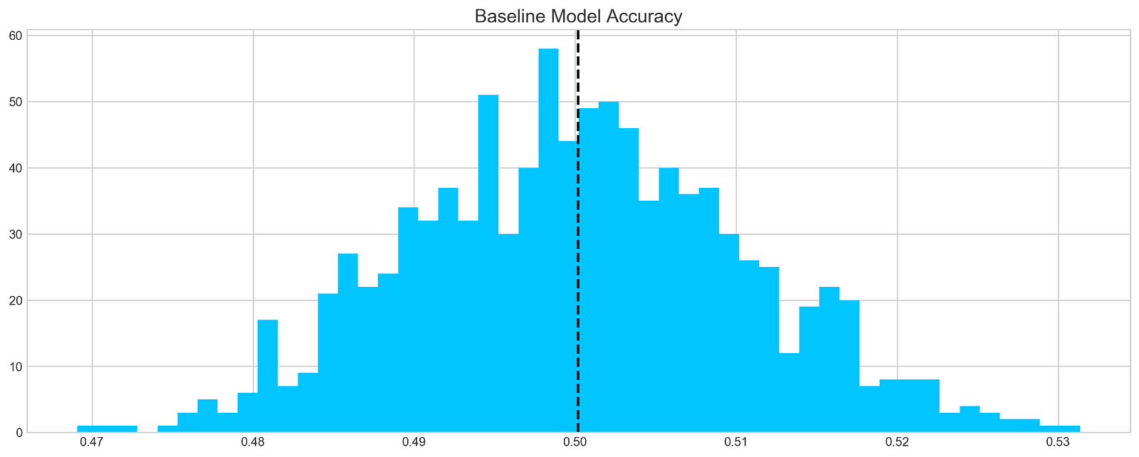
This code chunk works out forecasts using a basic model on a stock dataset, focusing specifically on the ‘tsla’ stock. It runs through 1000 iterations and adds the forecasts to a list named base_preds. Following the forecast generation, the code constructs a histogram to display the distribution of these forecasts.
The histogram offers a glimpse into the baseline model’s prediction accuracy for the stock returns. The dashed black line on the histogram depicts the average of the predictions. This graphical representation aids in grasping both the range and central tendency of the predictions made by the baseline model.
This piece of code plays a crucial role in assessing the baseline model’s performance and obtaining insights into its efficacy in predicting stock returns. By visually depicting the distribution of predictions, we can evaluate the precision and variability of the model.
In conclusion, it is evident that…
On average, a typical baseline model tends to achieve an accuracy of around 50%. This benchmark serves as a reference point for developing our more intricate models.
Let’s delve into ARIMA, a powerful tool used for time series analysis.
ARIMA, short for AutoRegressive Integrated Moving Average, is a powerful model used to understand various common temporal patterns found in time series data.
The parameter p signifies the count of lag observations accounted for in the model, known as the lag order. On the other hand, d represents how many times the raw observations undergo differencing, referred to as the degree of differencing. Lastly, q denotes the magnitude of the moving average window, also known as the order of the moving average.
To assess the effectiveness of the ARIMA model, we’ll divide the data into training and testing sets.
Prints number of entries and first-5 returns
print('Tesla historical data contains {} entries'.format(stocks['tsla'].shape[0]))
stocks['tsla'][['Return']].head()
The initial line outputs the count of records in the historical Tesla stock data. It achieves this by fetching the rows count from the ‘tsla’ dataset stored in stocks[‘tsla’].
Following that, the next line extracts the ‘Return’ column from the Tesla stock records and exhibits the initial few rows. This action involves utilizing double square brackets to isolate the dataset and calling the head() method to exhibit only the initial records.
Employing this snippet aids in swiftly summarizing the data, including the entry count and data configuration, for subsequent analysis or visualization purposes.
Autocorrelation is a statistical method used to evaluate the relationship between data points in a time series. It helps to identify patterns or trends in the data by measuring the similarity between observations at different time points. It is a valuable tool in fields like economics, finance, and signal processing for detecting hidden patterns and making predictions based on past data.
Let’s examine the Autocorrelation Function chart below. This graph illustrates the correlation between different data points in a time series. The initial value in the chart, which displays a perfect correlation (value = 1), should be disregarded as it simply reflects how a data point aligns with itself. The crucial aspect of this graph lies in uncovering how the initial data point relates to the subsequent ones. As evident, the correlation is notably weak, almost approaching zero. What does this signify for our analysis? Essentially, it renders ARIMA ineffective in this scenario since it relies on past data points to forecast future ones.
Plot autocorrelation function of Tesla stock returns
plt.rcParams['figure.figsize'] = (16, 3)
plot_acf(stocks['tsla'].Return, lags=range(300))
plt.show()
The purpose of this code snippet is to resize the figure for presenting a plot and then create an Autocorrelation Plot for the daily returns of Tesla (TSLA) stock.
Let’s delve into what each part of the code accomplishes:
1. Setting the default figure size to 16x3 inches using plt.rcParams[‘figure.figsize’].
2. Drawing an Autocorrelation Plot (ACF) for Tesla stock’s daily return data with lags ranging up to 300 by executing plot_acf(stocks[‘tsla’].Return, lags=range(300).
3. Exhibiting the plot on the screen with the plt.show() function.
An Autocorrelation Plot serves to visualize the autocorrelation within a time series dataset. In this instance, it aids in identifying potential autocorrelation within Tesla stock’s daily returns across various lags (up to 300 days here). This plot analysis allows us to discern trends and behaviors in stock returns, thus facilitating predictive modeling and forecasting efforts effectively.
In order to draw a conclusion, we will experiment with various sequences and assess their effectiveness based on the provided data.
Fits ARIMA model, makes stock return predictions
orders = [(0,0,0),(1,0,0),(0,1,0),(0,0,1),(1,1,0)]

train = list(stocks['tsla']['Return'][1000:1900].values)
test = list(stocks['tsla']['Return'][1900:2300].values)

all_predictions = {}

for order in orders:

    try:
        history = train.copy()
        order_predictions = []

        for i in range(len(test)):

            model = ARIMA(history, order=order) # defining ARIMA model
            model_fit = model.fit(disp=0) # fitting model
            y_hat = model_fit.forecast() # predicting 'return'
            order_predictions.append(y_hat[0][0]) # first element ([0][0]) is a prediction
            history.append(test[i]) # simply adding following day 'return' value to the model
            print('Prediction: {} of {}'.format(i+1,len(test)), end='\r')

        accuracy = accuracy_score(
            functions.binary(test),
            functions.binary(order_predictions)
        )
        print('                             ', end='\r')
        print('{} - {:.1f}% accuracy'.format(order, round(accuracy, 3)*100), end='\n')
        all_predictions[order] = order_predictions

    except:
        print(order, '<== Wrong Order', end='\n')
        pass
Initially, a list of orders is defined to encapsulate diverse combinations of the ARIMA model parameters (p, d, q).
Subsequently, each order is traversed one by one to fit an ARIMA model with that particular order.
Within the loop, the program utilizes the ARIMA function from a library (not disclosed) to shape a model and trains it on the available data via model.fit().
Following that, the trained model is leveraged to predict the upcoming return value, which is then appended to a collection of forecasts (order_predictions).
The accuracy of these predictions is then evaluated using the accuracy_score function on binary representations of the actual and forecasted values.
Throughout the process, the program showcases the outcomes, encompassing the order, accuracy rate, and any encountered discrepancies.
This section of code holds paramount importance in assessing and contrasting the efficacy of different ARIMA orders in predicting stock returns. By experimenting with diverse orders and gauging their precision, the program can pinpoint the optimal model order tailored for this specific prediction assignment. This iterative method plays a pivotal role in refining the ARIMA model’s hyperparameters to enhance forecast precision.
Forecast Evaluation
Plotting ARIMA predictions and annotations
fig = plt.figure(figsize=(16,4))
plt.plot(test, label='Test', color='#4ac2fb')
plt.plot(all_predictions[(0,1,0)], label='Predictions', color='#ff4e97')
plt.legend(frameon=True, loc=1, ncol=1, fontsize=10, borderpad=.6)
plt.title('Arima Predictions', fontSize=15)
plt.xlabel('Days', fontSize=13)
plt.ylabel('Returns', fontSize=13)

plt.annotate('',
             xy=(15, 0.05),
             xytext=(150, .2),
             fontsize=10,
             arrowprops={'width':0.4,'headwidth':7,'color':'#333333'}
            )
ax = fig.add_subplot(1, 1, 1)
rect = patches.Rectangle((0,-.05), 30, .1, ls='--', lw=2, facecolor='y', edgecolor='k', alpha=.5)
ax.add_patch(rect)

plt.axes([.25, 1, .2, .5])
plt.plot(test[:30], color='#4ac2fb')
plt.plot(all_predictions[(0,1,0)][:30], color='#ff4e97')
plt.tick_params(axis='both', labelbottom=False, labelleft=False)
plt.title('Lag')
plt.show()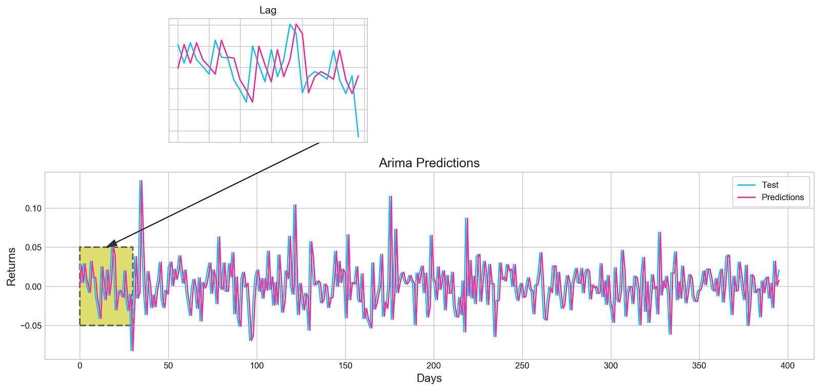
Utilizing the Matplotlib library in Python, this piece of code generates an intricate visualization.
Initially, a figure is crafted, specifying its size with plt.figure(figsize=(16,4)). Next, two distinct line plots, ‘Test’ and ‘Predictions,’ are incorporated into the figure utilizing plt.plot(), each assigned specific colors. To illuminate these lines, a legend is included, along with tailored titles, x-axis, and y-axis labels.
Further enhancing the visualization, an annotation is included to pinpoint a particular section on the graph. Subsequently, a subplot is introduced through fig.add_subplot(1, 1, 1), showcasing a rectangular patch with patches.Rectangle(), highlighting a specific region within the plot.
Expanding on the visualization, another subplot is fashioned using plt.axes([.25, 1, .2, .5]) to present a magnified view of the initial 30 data points. The ‘Test’ and ‘Predictions’ lines for the first 30 data points are delineated, concealing the axis labels via plt.tick_params(axis=’both’, labelbottom=False, labelleft=False). A distinct title is designated for this compact subplot.
This code serves to visually juxtapose the ‘Test’ data against predictions derived from an ARIMA model, accentuating precise areas of interest within the plot. By offering insights into the model’s predictions, it enables users to assess its performance visually.
Let’s dive into the concept of histograms.
Histogram plot of stock returns
plt.figure(figsize=(16,5))
plt.hist(stocks['tsla'][1900:2300].reset_index().Return, bins=20, label='True', facecolor='#4ac2fb')
plt.hist(all_predictions[(0,1,0)], bins=20, label='Predicted', facecolor='#ff4e97', alpha=.7)
plt.axvline(0, c='k', ls='--')
plt.title('ARIMA True vs Predicted Values Distribution', fontSize=15)
plt.legend(frameon=True, loc=1, ncol=1, fontsize=10, borderpad=.6)
plt.show()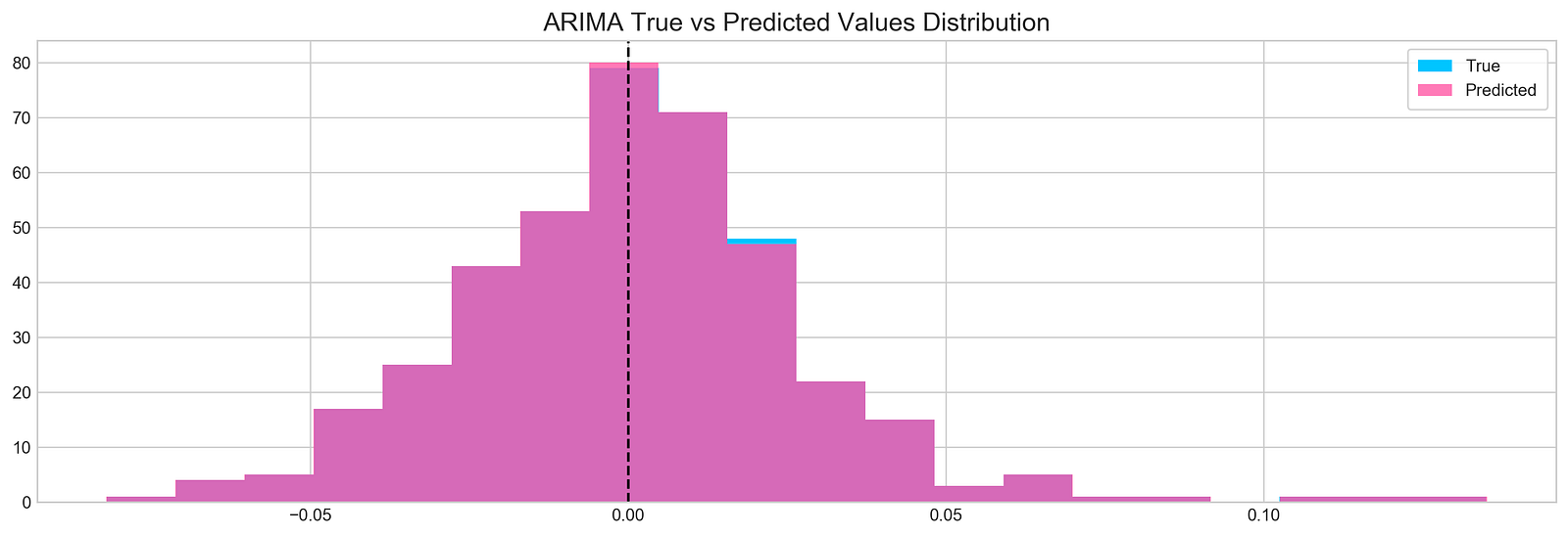
The following script creates a histogram to illustrate the comparison between real and forecasted values derived from a time series examination: