

Enhancing Financial Analysis and Modeling through Advanced Techniques
Exploring the Integration of Machine Learning and Statistical Tools in Stock Market Predictions

Starting with an initial model, analysts establish a baseline for subsequent comparisons. This is followed by the integration of the ARIMA approach, which leverages autoregressive integrated moving average models to forecast market trends. Additionally, sentiment analysis is incorporated, utilizing the mood of news and reports to predict market movements. The use of XGBoost for feature selection stands out as a method to enhance model performance through careful evaluation of feature importance.
Link to download the source code at the end of this article. Download entire code along with dataset.
The exploration continues into deep learning models, where architectures like LSTM (Long Short-Term Memory) networks are employed for their prowess in sequence prediction, and convolutional neural networks (CNNs) are applied for pattern recognition within stock data. Techniques such as utilizing combined stock data and leveraging Bayesian optimization are also explored to optimize deep learning models for maximum efficacy. Beyond automated methods, manual pattern recognition is used to analyze patterns without algorithmic assistance, and the implementation of Q-learning introduces reinforcement learning into developing sophisticated trading strategies.
By dissecting these methodologies, the article aims to provide a comprehensive overview of the sophisticated tools and techniques that are transforming financial analysis and investment strategies in today’s market.
Imports libraries and sets configurations.
import os
import pandas as pd
import matplotlib.pyplot as plt
import matplotlib.patches as patches
import seaborn as sns
import warnings
import numpy as np
from numpy import array
from importlib import reload # to reload modules if we made changes to them without restarting kernel
from sklearn.naive_bayes import GaussianNB
from xgboost import XGBClassifier # for features importance

warnings.filterwarnings('ignore')
plt.rcParams['figure.dpi'] = 227 # native screen dpi for my computer
In this Python script, various libraries are imported for conducting tasks related to data analysis, visualization, and modeling. Here’s the breakdown of each imported library and its purpose:
Firstly, importing ‘os’ enables Python to interact with the operating system for system-related operations.
The ‘pandas’ library, imported as ‘pd’, is crucial for data manipulation and analysis, offering powerful data structures like DataFrames for structured data handling.
The ‘matplotlib.pyplot’ library allows for creating a wide range of data visualizations such as plots and charts.
Using ‘matplotlib.patches as patches’ permits the drawing of shapes like rectangles and circles on plots.
By importing ‘seaborn as sns,’ a high-level interface for creating appealing statistical graphics is made available, building upon the functionality of Matplotlib.
The ‘warnings’ module aids in managing and suppressing warnings that may arise during code execution.
For scientific computing, ‘numpy as np’ is a fundamental package providing extensive support for arrays and matrices, while ‘from numpy import array’ directly imports the array function into the script’s workspace.
The ‘reload’ function from ‘importlib’ eliminates the need to restart the Python kernel when modules require reloading.
From ‘sklearn.naive_bayes’ comes the Gaussian Naive Bayes classifier, a tool from the scikit-learn machine learning library.
Also, the ‘XGBClassifier’ from ‘xgboost’ introduces the XGBoost classifier, featuring swift computation and high performance in gradient-boosted decision trees.
To silence any generated warnings, ‘warnings.filterwarnings(‘ignore’)’ sets up a filter to overlook them during execution.
The line ‘plt.rcParams[‘figure.dpi’] = 227' fine-tunes the DPI setting within Matplotlib, affecting the resolution and quality of generated plots.
Utilizing this code is vital for configuring the environment and bringing in critical libraries necessary for performing data analysis, visualization, and machine learning tasks effectively. Each library fulfills specific roles in facilitating data manipulation, visualization, and machine learning capabilities within Python. Importing these libraries establishes a solid foundation for carrying out data analysis and constructing machine learning models proficiently in a Python environment.
Importing modules for statistical analysis.
import statsmodels.api as sm
from statsmodels.tsa.arima_model import ARIMA
from statsmodels.tsa.statespace.sarimax import SARIMAX
from statsmodels.graphics.tsaplots import plot_pacf, plot_acf
from sklearn.metrics import mean_squared_error, confusion_matrix, f1_score, accuracy_score
from pandas.plotting import autocorrelation_plot
In this code snippet, a variety of functions and classes are imported from different libraries to facilitate tasks related to statistical modeling, time series analysis, and machine learning evaluation. Let’s delve into a brief rundown of each import statement:
1. Using an alias sm, the statsmodels library is imported, offering tools for estimating and interpreting statistical models.
2. Specifically, the ARIMA model class is imported from the time series analysis module within statsmodels, commonly utilized for time series analysis and forecasting.
3. The SARIMAX model class from statsmodels, incorporating seasonal components and enhancing the capabilities of the ARIMA model, is imported for advanced time series analysis.
4. Functions for plotting partial autocorrelation function (PACF) and autocorrelation function (ACF) plots, crucial in determining ARIMA model order in time series analysis, are imported from statsmodels.
5. From the scikit-learn library, evaluation metric functions such as mean squared error, confusion matrix, F1 score, and accuracy score are imported. These metrics play a pivotal role in assessing performance in machine learning models.
6. To visualize autocorrelation in time series data, the autocorrelation_plot function is imported directly from a Pandas DataFrame, aiding in identifying important time series characteristics.
These imports are essential for working with time series data, constructing models like ARIMA and SARIMAX, evaluating model efficacy, and portraying time series features graphically. Each imported module offers a distinct set of functions and classes tailored to various facets of time series analysis and forecasting.
Code for defining and optimizing deep learning models.
import tensorflow.keras as keras
from tensorflow.python.keras.optimizer_v2 import rmsprop
from functools import partial
from tensorflow.keras import optimizers
from tensorflow.keras.models import Sequential, Model
from tensorflow.keras.layers import Input, Flatten, TimeDistributed, LSTM, Dense, Bidirectional, Dropout, ConvLSTM2D, Conv1D, GlobalMaxPooling1D, MaxPooling1D, Convolution1D, BatchNormalization, LeakyReLU
from bayes_opt import BayesianOptimization

from tensorflow.keras.utils import plot_model
The following script includes the importation of a range of modules and functions from TensorFlow and other libraries to aid in the construction and enhancement of neural network models.
- tensorflow.keras happens to be TensorFlow’s rendition of the Keras API intended for the development of neural networks. Keras furnishes a user-friendly interface for creating and refining models.
- tensorflow.python.keras.optimizer_v2.rmsprop incorporates the RMSprop optimizer from TensorFlow for optimization purposes during training.
- functools.partial proves handy for crafting partial functions within Python.
- tensorflow.keras.optimizers brings in a variety of optimization algorithms tailored for training neural network models.
- tensorflow.keras.models, along with tensorflow.keras.layers, present classes and functions for model construction and defining different layers.
- bayes_opt.BayesianOptimization introduces the Bayesian Optimization library, which serves the purpose of hyperparameter tuning in machine learning models.
- tensorflow.keras.utils.plot_model offers a function to generate a visually descriptive representation of the neural network model architecture.
Through leveraging these imports, one would gain access to the essential tools and functions needed to effectively construct, train, and optimize neural network models within the TensorFlow framework.
Imports functions and plotting module.
import functions
import plotting
The code appears to be importing two modules or files labeled ‘functions’ and ‘plotting.’
The ‘functions’ module likely contains tailor-made functions crafted by the developer to carry out specific tasks required for the program. These functions help streamline the code, enhance code reusability, and create a more structured main program.
The ‘plotting’ module probably houses functions or classes associated with data visualization or creating graphs/charts. This module may offer ready-to-use functions for generating various types of plots, simplifying the data visualization process for the developer without the need to start from scratch.
By incorporating these modules, the main program gains access to the functions and classes defined in ‘functions’ and ‘plotting’ to efficiently execute the necessary operations and visualization tasks. It also aids in maintaining a tidy main program file and minimizing repetition by segregating distinct functionalities into individual modules.
Set random seed to 66.
np.random.seed(66)The code snippet establishes the seed value, 66, for the random number generator from the NumPy library. By defining a seed, it guarantees consistency in generating random numbers, producing the same sequence with each run. This practice holds significance in maintaining reproducibility in data analysis and scientific undertakings. Setting the seed allows others to replicate our outcomes effortlessly by adopting the identical seed value.
Let’s start by bringing in the data.
I’m setting up a dictionary called stocks to store and organize stock data, with the date feature serving as the index for easy reference.
Reads CSV stock data into dictionary.
files = os.listdir('data/stocks')
stocks = {}
for file in files:
    if file.split('.')[1] == 'csv':
        name = file.split('.')[0]
        stocks[name] = pd.read_csv('data/stocks/'+file, index_col='Date')
        stocks[name].index = pd.to_datetime(stocks[name].index)
The following script functions by scanning a directory named ‘data/stocks’ to compile a catalog of files and then constructs a ‘stocks’ dictionary where it captures the contents of each CSV file in the form of a pandas DataFrame.
Here’s the breakdown of its operation:
1. Initially, it retrieves a roster of files from the specific directory ‘data/stocks’ employing the os.listdir() function.
2. Subsequently, it proceeds to traverse each file within the acquired list.
3. With every file, the script verifies if it carries a ‘.csv’ extension by segmenting the filename and examining the latter part of the split outcome.
4. Upon confirming the presence of a ‘.csv’ extension, the file is loaded as a CSV file utilizing pd.read_csv(), and then the DataFrame is linked to the ‘stocks’ dictionary with the filename, minus the extension, serving as the designated key.
5. It designates the ‘Date’ column as the primary index for the DataFrame.
6. The conversion of the index column to a datetime format is carried out using pd.to_datetime().
This script is indispensable for loading numerous CSV files from a designated directory, converting them into pandas DataFrames, and collectively processing or assessing the data encapsulated in these files. The functionality provided by this script streamlines the process of importing multiple files and preparing them for subsequent structured analysis or manipulation.
Let’s start by discussing the baseline model.
The baseline model functions as a point of reference to compare against the more intricate models.
Generates random predictions to calculate accuracy.
def baseline_model(stock):
    baseline_predictions = np.random.randint(0, 2, len(stock))
    accuracy = accuracy_score(functions.binary(stock), baseline_predictions)
    return accuracy
The function called baseline_model serves the purpose of establishing a simple baseline prediction model for a stock. This model operates by producing random predictions, either 0 or 1, based on the input stock data. The mechanism of this function is as follows:
To begin with, it accepts the stock data as an input parameter. Subsequently, it generates an array containing random binary values that match the length of the stock data. Following this, it assesses the accuracy of these arbitrary baseline predictions against the actual stock data using the accuracy_score function. Lastly, it furnishes the accuracy metric of the baseline predictions.
This script proves to be beneficial for establishing a fundamental reference point to gauge the effectiveness of more sophisticated prediction models. It aids in determining whether the advanced models offer substantial predictions beyond what random chance would provide.
We aim for precision and correctness.
Calculates and prints baseline model accuracy.
baseline_accuracy = baseline_model(stocks['tsla'].Return)
print('Baseline model accuracy: {:.1f}%'.format(baseline_accuracy * 100))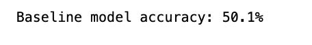
The following code snippet evaluates the effectiveness of a baseline model in predicting the returns of Tesla stock (‘TSLA’) based on the ‘Return’ column in the stocks dataframe. The baseline model likely makes predictions using average returns or a straightforward rule derived from the data.
To assess the accuracy of the baseline model, the code employs a predefined function called baseline_model. The function’s output, representing the accuracy, is then converted to a percentage by multiplying it by 100.
Subsequently, the code displays the accuracy of the baseline model as a percentage with one decimal place. This metric acts as a benchmark for comparing the performance of more sophisticated models against the basic baseline model. It aids in determining if advanced models exhibit significantly superior performance compared to the simplistic approach, shedding light on the efficacy of the model development process.
Generates and plots baseline model predictions.
base_preds = []
for i in range(1000):
    base_preds.append(baseline_model(stocks['tsla'].Return))

plt.figure(figsize=(16,6))
plt.style.use('seaborn-whitegrid')
plt.hist(base_preds, bins=50, facecolor='#4ac2fb')
plt.title('Baseline Model Accuracy', fontSize=15)
plt.axvline(np.array(base_preds).mean(), c='k', ls='--', lw=2)
plt.show()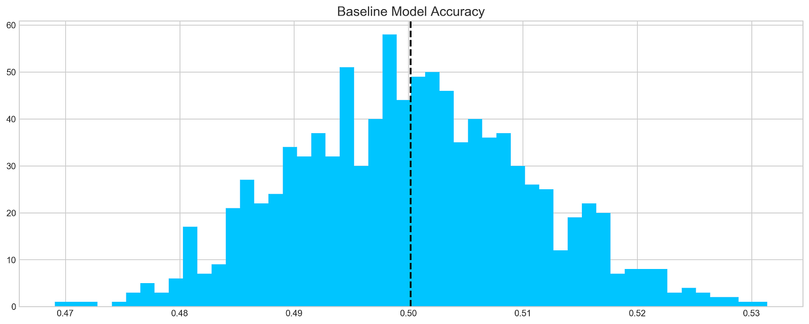
This code chunk works out forecasts using a basic model on a stock dataset, focusing specifically on the ‘tsla’ stock. It runs through 1000 iterations and adds the forecasts to a list named base_preds. Following the forecast generation, the code constructs a histogram to display the distribution of these forecasts.
The histogram offers a glimpse into the baseline model’s prediction accuracy for the stock returns. The dashed black line on the histogram depicts the average of the predictions. This graphical representation aids in grasping both the range and central tendency of the predictions made by the baseline model.
This piece of code plays a crucial role in assessing the baseline model’s performance and obtaining insights into its efficacy in predicting stock returns. By visually depicting the distribution of predictions, we can evaluate the precision and variability of the model.
In conclusion, it is evident that…
On average, a typical baseline model tends to achieve an accuracy of around 50%. This benchmark serves as a reference point for developing our more intricate models.
Let’s delve into ARIMA, a powerful tool used for time series analysis.
ARIMA, short for AutoRegressive Integrated Moving Average, is a powerful model used to understand various common temporal patterns found in time series data.
The parameter p signifies the count of lag observations accounted for in the model, known as the lag order. On the other hand, d represents how many times the raw observations undergo differencing, referred to as the degree of differencing. Lastly, q denotes the magnitude of the moving average window, also known as the order of the moving average.
To assess the effectiveness of the ARIMA model, we’ll divide the data into training and testing sets.
Prints number of entries and first-5 returns
print('Tesla historical data contains {} entries'.format(stocks['tsla'].shape[0]))
stocks['tsla'][['Return']].head()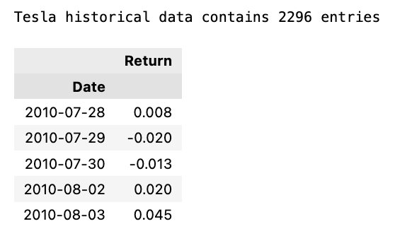
The initial line outputs the count of records in the historical Tesla stock data. It achieves this by fetching the rows count from the ‘tsla’ dataset stored in stocks[‘tsla’].
Following that, the next line extracts the ‘Return’ column from the Tesla stock records and exhibits the initial few rows. This action involves utilizing double square brackets to isolate the dataset and calling the head() method to exhibit only the initial records.
Employing this snippet aids in swiftly summarizing the data, including the entry count and data configuration, for subsequent analysis or visualization purposes.
Autocorrelation is a statistical method used to evaluate the relationship between data points in a time series. It helps to identify patterns or trends in the data by measuring the similarity between observations at different time points. It is a valuable tool in fields like economics, finance, and signal processing for detecting hidden patterns and making predictions based on past data.
Let’s examine the Autocorrelation Function chart below. This graph illustrates the correlation between different data points in a time series. The initial value in the chart, which displays a perfect correlation (value = 1), should be disregarded as it simply reflects how a data point aligns with itself. The crucial aspect of this graph lies in uncovering how the initial data point relates to the subsequent ones. As evident, the correlation is notably weak, almost approaching zero. What does this signify for our analysis? Essentially, it renders ARIMA ineffective in this scenario since it relies on past data points to forecast future ones.
Plot autocorrelation function of Tesla stock returns
plt.rcParams['figure.figsize'] = (16, 3)
plot_acf(stocks['tsla'].Return, lags=range(300))
plt.show()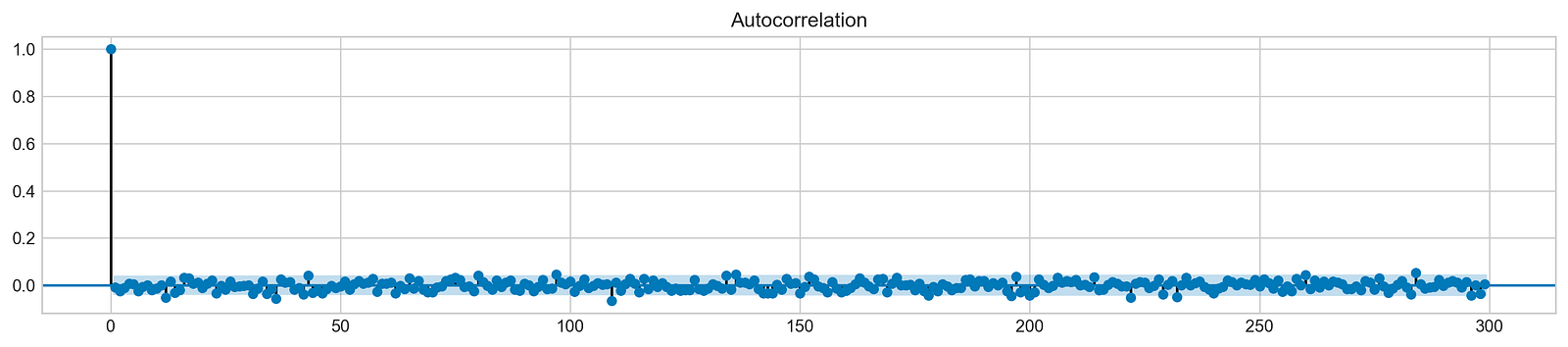
The purpose of this code snippet is to resize the figure for presenting a plot and then create an Autocorrelation Plot for the daily returns of Tesla (TSLA) stock.
Let’s delve into what each part of the code accomplishes:
1. Setting the default figure size to 16x3 inches using plt.rcParams[‘figure.figsize’].
2. Drawing an Autocorrelation Plot (ACF) for Tesla stock’s daily return data with lags ranging up to 300 by executing plot_acf(stocks[‘tsla’].Return, lags=range(300).
3. Exhibiting the plot on the screen with the plt.show() function.
An Autocorrelation Plot serves to visualize the autocorrelation within a time series dataset. In this instance, it aids in identifying potential autocorrelation within Tesla stock’s daily returns across various lags (up to 300 days here). This plot analysis allows us to discern trends and behaviors in stock returns, thus facilitating predictive modeling and forecasting efforts effectively.
In order to draw a conclusion, we will experiment with various sequences and assess their effectiveness based on the provided data.
Fits ARIMA model, makes stock return predictions
orders = [(0,0,0),(1,0,0),(0,1,0),(0,0,1),(1,1,0)]

train = list(stocks['tsla']['Return'][1000:1900].values)
test = list(stocks['tsla']['Return'][1900:2300].values)

all_predictions = {}

for order in orders:

    try:
        history = train.copy()
        order_predictions = []

        for i in range(len(test)):

            model = ARIMA(history, order=order) # defining ARIMA model
            model_fit = model.fit(disp=0) # fitting model
            y_hat = model_fit.forecast() # predicting 'return'
            order_predictions.append(y_hat[0][0]) # first element ([0][0]) is a prediction
            history.append(test[i]) # simply adding following day 'return' value to the model
            print('Prediction: {} of {}'.format(i+1,len(test)), end='\r')

        accuracy = accuracy_score(
            functions.binary(test),
            functions.binary(order_predictions)
        )
        print('                             ', end='\r')
        print('{} - {:.1f}% accuracy'.format(order, round(accuracy, 3)*100), end='\n')
        all_predictions[order] = order_predictions

    except:
        print(order, '<== Wrong Order', end='\n')
        pass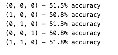
Initially, a list of orders is defined to encapsulate diverse combinations of the ARIMA model parameters (p, d, q).
Subsequently, each order is traversed one by one to fit an ARIMA model with that particular order.
Within the loop, the program utilizes the ARIMA function from a library (not disclosed) to shape a model and trains it on the available data via model.fit().
Following that, the trained model is leveraged to predict the upcoming return value, which is then appended to a collection of forecasts (order_predictions).
The accuracy of these predictions is then evaluated using the accuracy_score function on binary representations of the actual and forecasted values.
Throughout the process, the program showcases the outcomes, encompassing the order, accuracy rate, and any encountered discrepancies.
This section of code holds paramount importance in assessing and contrasting the efficacy of different ARIMA orders in predicting stock returns. By experimenting with diverse orders and gauging their precision, the program can pinpoint the optimal model order tailored for this specific prediction assignment. This iterative method plays a pivotal role in refining the ARIMA model’s hyperparameters to enhance forecast precision.
Forecast Evaluation
Plotting ARIMA predictions and annotations
fig = plt.figure(figsize=(16,4))
plt.plot(test, label='Test', color='#4ac2fb')
plt.plot(all_predictions[(0,1,0)], label='Predictions', color='#ff4e97')
plt.legend(frameon=True, loc=1, ncol=1, fontsize=10, borderpad=.6)
plt.title('Arima Predictions', fontSize=15)
plt.xlabel('Days', fontSize=13)
plt.ylabel('Returns', fontSize=13)

plt.annotate('',
             xy=(15, 0.05),
             xytext=(150, .2),
             fontsize=10,
             arrowprops={'width':0.4,'headwidth':7,'color':'#333333'}
            )
ax = fig.add_subplot(1, 1, 1)
rect = patches.Rectangle((0,-.05), 30, .1, ls='--', lw=2, facecolor='y', edgecolor='k', alpha=.5)
ax.add_patch(rect)

plt.axes([.25, 1, .2, .5])
plt.plot(test[:30], color='#4ac2fb')
plt.plot(all_predictions[(0,1,0)][:30], color='#ff4e97')
plt.tick_params(axis='both', labelbottom=False, labelleft=False)
plt.title('Lag')
plt.show()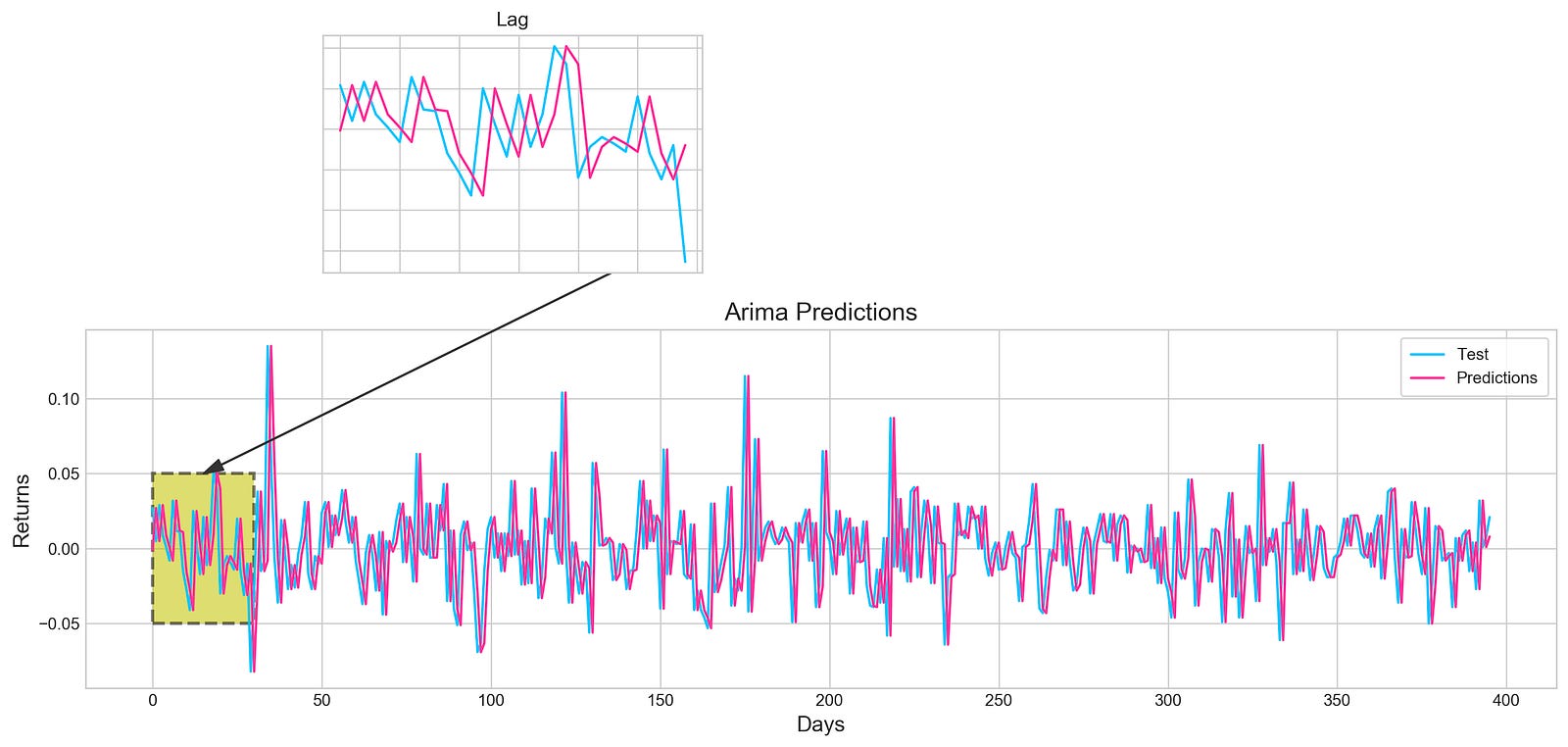
Utilizing the Matplotlib library in Python, this piece of code generates an intricate visualization.
Initially, a figure is crafted, specifying its size with plt.figure(figsize=(16,4)). Next, two distinct line plots, ‘Test’ and ‘Predictions,’ are incorporated into the figure utilizing plt.plot(), each assigned specific colors. To illuminate these lines, a legend is included, along with tailored titles, x-axis, and y-axis labels.
Further enhancing the visualization, an annotation is included to pinpoint a particular section on the graph. Subsequently, a subplot is introduced through fig.add_subplot(1, 1, 1), showcasing a rectangular patch with patches.Rectangle(), highlighting a specific region within the plot.
Expanding on the visualization, another subplot is fashioned using plt.axes([.25, 1, .2, .5]) to present a magnified view of the initial 30 data points. The ‘Test’ and ‘Predictions’ lines for the first 30 data points are delineated, concealing the axis labels via plt.tick_params(axis=’both’, labelbottom=False, labelleft=False). A distinct title is designated for this compact subplot.
This code serves to visually juxtapose the ‘Test’ data against predictions derived from an ARIMA model, accentuating precise areas of interest within the plot. By offering insights into the model’s predictions, it enables users to assess its performance visually.
Let’s dive into the concept of histograms.
Histogram plot of stock returns
plt.figure(figsize=(16,5))
plt.hist(stocks['tsla'][1900:2300].reset_index().Return, bins=20, label='True', facecolor='#4ac2fb')
plt.hist(all_predictions[(0,1,0)], bins=20, label='Predicted', facecolor='#ff4e97', alpha=.7)
plt.axvline(0, c='k', ls='--')
plt.title('ARIMA True vs Predicted Values Distribution', fontSize=15)
plt.legend(frameon=True, loc=1, ncol=1, fontsize=10, borderpad=.6)
plt.show()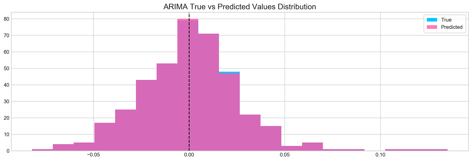
The following script creates a histogram to illustrate the comparison between real and forecasted values derived from a time series examination:
1. It initializes a plot with dimensions of 16x5 inches.
2. The plot showcases a histogram of the actual return data of a specific stock (TSLA) within the range of indices 1900 to 2300, employing 20 bins represented by bars colored in #4ac2fb.
3. Overlaid on this is a second histogram representing the predicted return values from the ARIMA model, featured in #ff4e97 color with 70% transparency.
4. A vertical dashed line is included at x=0 for points of reference.
5. The plot is labeled ‘ARIMA True vs Predicted Values Distribution’.
6. Additionally, a legend is incorporated on the plot to distinguish between the true and predicted values.
This code proves valuable for visually examining and contrasting the distribution of actual and predicted values derived from an ARIMA model. Through the use of histograms, it becomes easier to grasp the value spread and make visual comparisons. The axvline serves as a crucial point of reference at 0, indicating how data is dispersed around that particular mark. The legend simplifies the differentiation between actual and forecasted values within the visualization.
Making Sense of the Findings
Calculate and print binary classification metrics.
test_binary = functions.binary(stocks['tsla'][1900:2300].reset_index().Return)
train_binary = functions.binary(all_predictions[(0,1,0)])
tn, fp, fn, tp = confusion_matrix(test_binary, train_binary).ravel()
accuracy = accuracy_score(test_binary, train_binary)

print("True positive and Negative: {}".format((tp + tn)))
print("False Positive and Negative: {}".format((fp + fn)))
print("Accuracy: {:.1f}%".format(accuracy*100))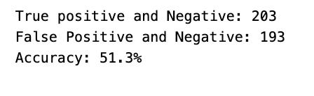
The snippet of code seems to be focused on assessing the performance metrics of a binary classification model on a test dataset. Let’s delve into what it accomplishes:
To start, it translates the stock returns for Tesla into binary form within a specified range and saves them in the test_binary variable.
Following that, it generates binary representations of the predictions from the all_predictions data and stores them in the train_binary variable.
Next, the script proceeds to compute the confusion matrix for both the test and train binary predictions. This matrix furnishes valuable insights into the model’s efficiency by revealing true positives, true negatives, false positives, and false negatives.
The values from the confusion matrix are then extracted into individual variables: tn, fp, fn, and tp.
The accuracy score is determined by comparing the binary predictions from the test and train sets and is kept in the accuracy variable.
Lastly, it showcases the combined sum of true positives and true negatives, the cumulative sum of false positives and false negatives, along with the accuracy of the model expressed in percentage form.
This code plays a pivotal role in evaluating the performance of a binary classification model on a dataset. By furnishing metrics like accuracy, true positives, true negatives, false positives, and false negatives, it aids in gauging the model’s predictive prowess. These metrics are instrumental in gauging the model’s accuracy and serve as a compass for refining the model further or benchmarking it against other models.
Exploring sentiment analysis is quite intriguing and can yield valuable insights.
The concept is to leverage news sentiment as a tool for forecasting next-day returns.
Reads a CSV file into DataFrame
tesla_headlines = pd.read_csv('data/tesla_headlines.csv', index_col='Date')The following snippet of code is designed to import a CSV file called ‘tesla_headlines.csv’ into a Pandas DataFrame. Each row in the DataFrame corresponds to a headline linked to Tesla. With the ‘index_col’ parameter, we specify that the DataFrame should use the ‘Date’ column from the CSV file as its index. This approach streamlines the organization of data and simplifies accessing information based on dates.
Employing this code enables us to transform the headline data into a structured format, facilitating seamless manipulation and analysis using the robust functionalities of the Pandas library in Python. Leveraging Pandas DataFrames empowers us to execute diverse tasks related to data manipulation, analysis, and visualization in a highly effective manner.
Joins Tesla stock data with headlines
tesla = stocks['tsla'].join(tesla_headlines.groupby('Date').mean().Sentiment)Combining data frames is a common practice in data analysis. In this scenario, the aim is to merge two data frames: one containing Tesla stock data labeled as ‘tsla’, and the other comprised of average sentiment scores from Tesla-related headlines grouped by date. This is typically achieved through the use of the join() function, which horizontally merges the data frames based on a shared column, most likely the ‘Date’ column.
This method of merging data frames is advantageous for integrating and examining disparate datasets holding interconnected information. By consolidating these datasets, analysts can conduct comprehensive evaluations that incorporate both Tesla’s stock performance and the sentiment reflected in news headlines concerning Tesla on corresponding dates. This approach enables the extraction of valuable insights into the potential impact of news sentiment on stock price fluctuations.
Replace missing values with 0
tesla.fillna(0, inplace=True)This snippet of code is designed to replace any NaN values in the DataFrame called “tesla” with zeros. By setting inplace=True, the adjustments are applied directly to the existing DataFrame, avoiding the creation of a new one.
Substituting missing values with zeros proves beneficial in situations where it is appropriate to interpret absent data as zero, particularly in mathematical computations or data assessments. Moreover, assigning zero could hold significance within the dataset. This approach aids in managing absent data, safeguarding against inaccuracies in computations or evaluations and maintaining the dataset’s coherence and entirety.
Plotting Tesla news sentiment and daily return
plt.style.use('seaborn-whitegrid')
plt.figure(figsize=(16,6))
plt.plot(tesla.loc['2019-01-10':'2019-09-05'].Sentiment.shift(1), c='#3588cf', label='News Sentiment')
plt.plot(tesla.loc['2019-01-10':'2019-09-05'].Return, c='#ff4e97', label='Return')
plt.legend(frameon=True, fancybox=True, framealpha=.9, loc=1)
plt.title('Tesla News Sentiment and Daily Return', fontSize=15)
plt.show()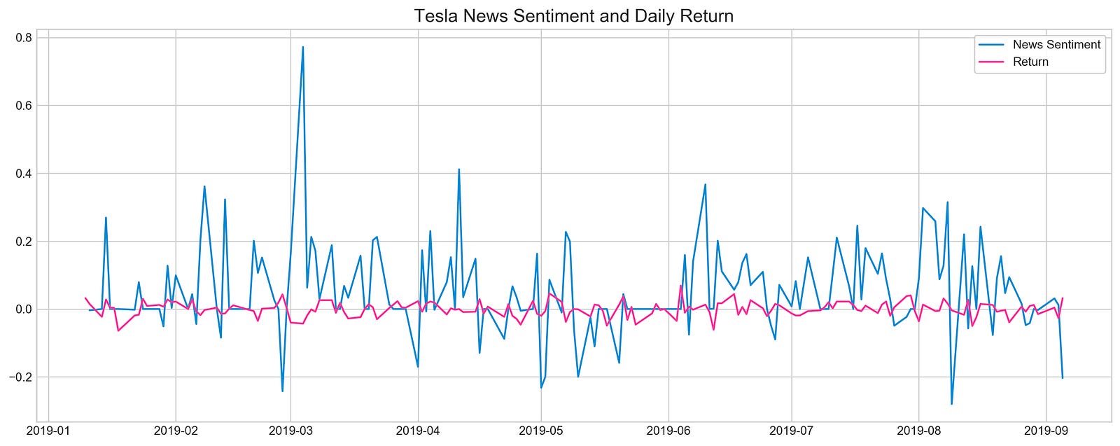
Utilizing matplotlib, this code excerpt generates a line plot to depict Tesla’s News Sentiment and Daily Return relationship. It customizes the visual style by setting it to ‘seaborn-whitegrid’ and specifies a figure size of 16x6 units with plt.figure(figsize=(16,6)). The plot showcases two datasets within the timeframe from ‘2019–01–10’ to ‘2019–09–05’:
1. A blue line plot representing sentiment data, shifted by 1-day to display previous day’s values (‘#3588cf’).
2. A pink line plot illustrating return data (‘#ff4e97’).
Following data plotting, the script includes a legend with customizable features like a framed, fancybox appearance, adjustable frame transparency, and specific location settings. To conclude, a title ‘Tesla News Sentiment and Daily Return’ with a font size of 15 is assigned to the plot.
The purpose of this code is to visually analyze the potential correlation or recurring patterns between Tesla’s News Sentiment and Daily Return during the outlined period. The plot acts as a valuable tool for analysts, traders, or researchers to interpret the data swiftly, extracting meaningful insights from the displayed information.
Calculates correlation between sentiment and returns
pd.DataFrame({
    'Sentiment': tesla.loc['2019-01-10':'2019-09-05'].Sentiment.shift(1),
    'Return': tesla.loc['2019-01-10':'2019-09-05'].Return}).corr()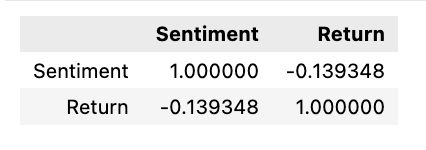
The following script generates a correlation matrix comparing two specific columns within a DataFrame. These columns contain sentiment and return data related to Tesla’s stock during a particular period, ranging from January 10, 2019, to September 5, 2019.
To break it down:
1. It initiates a DataFrame through the Pandas library, featuring columns labeled ‘Sentiment’ and ‘Return’.
2. The ‘Sentiment’ column is populated with sentiment values concerning Tesla’s stock within the specified date range. By utilizing the shift(1) function, the sentiment values are shifted by one position to synchronize the data for correlation analysis.
3. The ‘Return’ column is then populated with the corresponding return values of Tesla’s stock over the defined timeframe.
4. Afterward, the script employs the corr() function on this DataFrame to compute the correlation between the ‘Sentiment’ and ‘Return’ columns.
This code serves the purpose of examining the connection or correlation existing between sentiment values and stock returns associated with Tesla during a specific span. Grasping this correlation aids in making well-informed decisions or forecasts regarding stock performance based on the sentiments of investors or the general populace.
In conclusion,
There seems to be a misconception here about the relationship between news and price movement. In reality, when positive news is released, it typically causes prices to rise, not fall. So, the idea that prices move in the opposite direction of news is inaccurate.
Selecting features is a critical step in the process of modeling data effectively. When working with XGBoost, a popular machine learning algorithm, the selection of features can greatly impact the performance of the model. By carefully choosing the most relevant features, we can enhance the model’s accuracy and efficiency.
In this case, XGBoost will be leveraged to identify key features essential for neural networks. This approach could enhance model precision and optimize training. The training process will be executed using the scaled Tesla dataset.
Scale the TSLA stock data
scaled_tsla = functions.scale(stocks['tsla'], scale=(0,1))Utilizing a function called ‘scale’ from an external module or library labeled ‘functions,’ the code aims to re-scale the values within the ‘tsla’ column of a DataFrame named ‘stocks.’ Scaling serves as a fundamental preprocessing technique in data analysis and machine learning, facilitating the adjustment of data to conform to a specified range, often spanning from 0 to 1. This practice is instrumental in optimizing the efficacy and convergence of particular machine learning algorithms, particularly those sensitive to feature input scales.
In this scenario, it is probable that the ‘scale’ function is normalizing the values in the ‘tsla’ column of the ‘stocks’ DataFrame to a range between 0 and 1. This standardized data can subsequently be leveraged in subsequent analytical pursuits or modeling endeavors.
Prepares data for machine learning model
X = scaled_tsla[:-1]
y = stocks['tsla'].Return.shift(-1)[:-1]
The following code snippet has been designed to preprocess data for a machine learning model, specifically tailored for time series forecasting. Let’s break down each line:
1. Setting X = scaled_tsla[:-1]: In this line, a feature dataset named X is established by excluding the last row from the scaled_tsla dataset. Typically, each row in X represents a distinct time point (such as a day or an hour) containing scaled features relevant to that specific moment in time.
2. Defining y = stocks[‘tsla’].Return.shift(-1)[:-1]: This line constructs a target dataset denoted as y for the machine learning model. The ‘Return’ column from the ‘tsla’ stock data is selected, and the values are shifted by one time step using shift(-1) before excluding the final row. This adjustment ensures that the target values are aligned with the corresponding feature values in X. The primary objective is to forecast the future return based on the present features.
In the realm of time series forecasting, it is vital to synchronize the features and target appropriately to enable the model to learn and predict forthcoming values based on historical data patterns. By structuring X and y in this manner, the model can effectively grasp the underlying data patterns and generate accurate predictions.
Fits XGBoost classifier on dataset
xgb = XGBClassifier()
xgb.fit(X[1500:], y[1500:])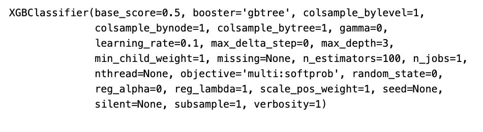
In this code snippet, an XGBoost classifier model is being trained with data X and target values y, with the first 1500 samples excluded. Here’s a breakdown of what the code accomplishes:
1. Initializing a new XGBoost classifier model by creating an instance of XGBClassifier().
2. Training the XGBoost classifier model using xgb.fit(X[1500:], y[1500:]). This line invokes the fit() method on the XGBoost classifier to facilitate model training. X represents the input features data, and y stands for the target labels. The code excludes the initial 1500 samples from the training data by slicing X and y with [1500:]. Such an approach proves beneficial when segregating data for training, testing, or validation purposes.
This code snippet serves as a valuable tool in machine learning endeavors, especially when aiming to train a model with a selected portion of the dataset, like dividing it into training and testing subsets. Training the model with a fraction of the data enables evaluation of its performance on fresh data and helps to deter overfitting.
Visualizes XGBoost feature importance for Tesla
important_features = pd.DataFrame({
                                    'Feature': X.columns,
                                    'Importance': xgb.feature_importances_}) \
                                    .sort_values('Importance', ascending=True)

plt.figure(figsize=(16,8))
plt.style.use('seaborn-whitegrid')
plt.barh(important_features.Feature, important_features.Importance, color="#4ac2fb")
plt.title('XGboost - Feature Importance - Tesla', fontSize=15)
plt.xlabel('Importance', fontSize=13)
plt.show()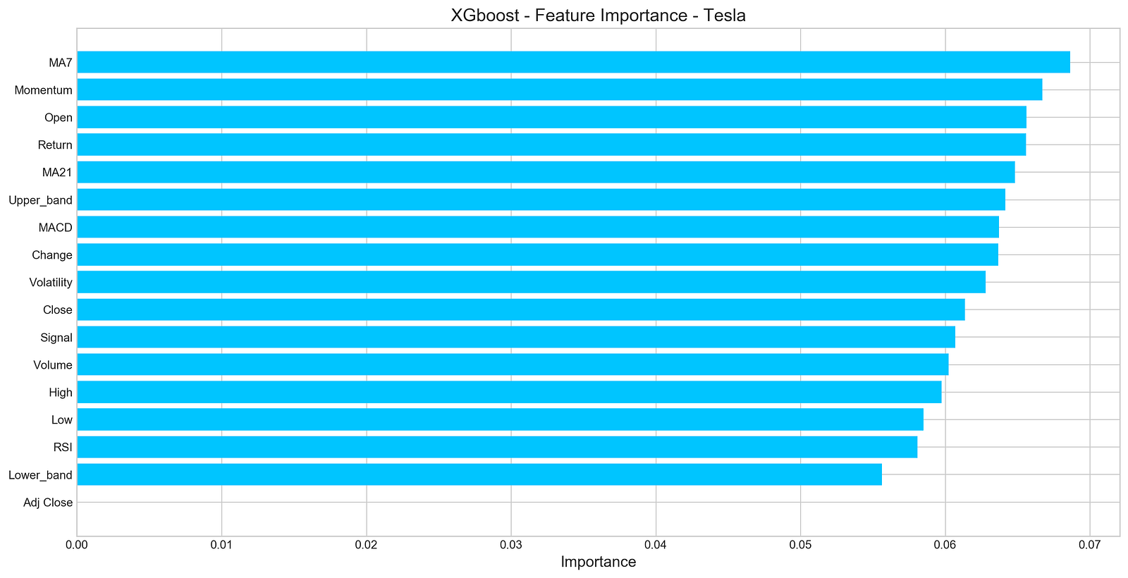
The provided code snippet offers a visual representation of the significance of various variables within a dataset by leveraging XGBoost.
Let’s delve into the functionalities of this code:
1. Establishes a DataFrame named ‘important_features’ comprising two columns: ‘Feature’ housing the feature names from the X dataframe (X.columns) and ‘Importance’ containing feature importances sourced from the XGBoost model (xgb.feature_importances_).
2. Organizes the ‘important_features’ DataFrame in ascending order based on the values in the ‘Importance’ column.
3. Generates a bar plot illustrating the importance of each individual feature, showcasing features along the y-axis and their respective importances along the x-axis.
4. Adopts the ‘seaborn-whitegrid’ style for an enhanced visual appeal of the plot.
5. Presents the bar plot with each feature’s importance denoted by a shade of blue (“#4ac2fb”).
6. Titles the plot as ‘XGboost — Feature Importance — Tesla’, designates ‘Importance’ for the x-axis label.
Recognizing feature importance is pivotal for elucidating the model’s forecasts and pinpointing the most influential features in forecasting the target variable. This visual aid facilitates the recognition of critical features and comprehension of their influence on the model’s outcomes. Moreover, it assists in feature curation and refinement to elevate the model’s efficacy and interpretability.
Number five on the list pertains to deep neural networks.
Let’s get the data ready — that’s the first step!
Scale, split, and prepare Tesla stock data
n_steps = 21
scaled_tsla = functions.scale(stocks['tsla'], scale=(0,1))

X_train, \
y_train, \
X_test, \
y_test = functions.split_sequences(

    scaled_tsla.to_numpy()[:-1],
    stocks['tsla'].Return.shift(-1).to_numpy()[:-1],
    n_steps,
    split=True,
    ratio=0.8
)
This code excerpt readies the data for a time series prediction model using a recurrent neural network (RNN) or a similar sequential model. Let’s dissect the code step by step:
1. Setting n_steps = 21 establishes the number of time steps (representing days) to be included in each input sample.
2. By invoking scaled_tsla = functions.scale(stocks[‘tsla’], scale=(0,1)), the ‘tsla’ stock data is standardized to a predefined range, typically spanning from 0 to 1. This normalization aids in hastening the model’s learning process and prevents any single feature from overpowering others.
3. Following that, the split_sequences function is invoked with the subsequent parameters:
- scaled_tsla.to_numpy()[:-1] represents the input sequences for the model, where each sample comprises a sequence of past stock prices (excluding the last data point for forecasting purposes).
- stocks[‘tsla’].Return.shift(-1).to_numpy()[:-1] denotes the target values for the model, which reflect the returns of the ‘tsla’ stock for the subsequent time step.
- n_steps signifies the number of time steps to be incorporated in each input sequence.
- split=True signals the intention to divide the data into training and testing datasets.
- ratio=0.8 dictates the split ratio between training and testing datasets (80% for training and 20% for testing).
Essentially, this code segment prepares historical stock price data pertaining to the ‘tsla’ stock for ingestion into a machine learning model designed for time series prediction. Through data normalization and segmentation into input sequences and target values, we are structuring the data suitably for the model to discern from. This code snippet is pivotal for efficiently preprocessing the data and ensuring that the model can identify patterns and furnish precise forecasts based on historical stock price data.
Let’s delve into the realm of LSTM networks.
Clears session and builds LSTM model
keras.backend.clear_session()

n_steps = X_train.shape[1]
n_features = X_train.shape[2]

model = Sequential()
model.add(LSTM(100, activation='relu', return_sequences=True, input_shape=(n_steps, n_features)))
model.add(LSTM(50, activation='relu', return_sequences=False))
model.add(Dense(10))
model.add(Dense(1))
model.compile(optimizer='adam', loss='mse', metrics=['mae'])
To kick things off, the keras.backend.clear_session() line acts as the key player here, wiping the slate clean by resetting the Keras session and thus ensuring a fresh start for each new model. By doing so, the model avoids any baggage from prior models, such as weights or biases, thereby maintaining a tidy memory space.
Next up, we set the scene by defining the number of time steps (referred to as n_steps) and the number of features (designated as n_features) present in the input data.
Moving along, we construct a Sequential model, a simple yet effective approach where layers are neatly stacked one after the other in a linear fashion.
Here’s where the magic unfolds — two LSTM (Long Short-Term Memory) layers step into the limelight. Known for handling long-term dependencies like a champ, the first LSTM layer boasts 100 units and dishes out sequences for the subsequent layer to feast on, while the second one shines with 50 units.
Not stopping there, we spice things up with a sprinkle of two Dense (fully connected) layers, sporting 10 and 1 units, respectively. The final Dense layer with a single unit takes center stage, primarily tailored for regression concerns housing a sole numerical target variable, promising a singular prediction output.
After this modeling masterpiece, it’s time to compile the model — cue the Adam optimizer, mean squared error (MSE) as the loss function, alongside mean absolute error (MAE) serving as a watchful eye during training. The Adam optimizer’s charm lies in its knack for adjusting the learning rate dynamically, fine-tuning the training process for optimal convergence.
Display summary of the model
model.summary()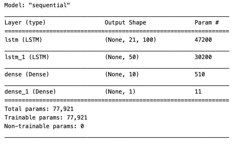
In the realm of machine learning, the model.summary() function plays a crucial role in presenting a brief yet insightful overview of a neural network model’s structure and parameters. This snapshot encapsulates essential details about each layer within the model, encompassing specifics like the layer type, output shape, as well as the count of parameters, both trainable and non-trainable, per layer.
Utilizing model.summary() permits a swift examination of your model’s architecture, aiding tremendously in tasks like debugging, comprehending the data flow across layers, and verifying the model’s intended configuration. This feature proves particularly invaluable for intricate neural networks with numerous layers, offering a convenient glimpse of the entire model’s composition.
Train LSTM model with visualization of loss
model.fit(X_train, y_train, epochs=100, verbose=0, validation_data=[X_test, y_test], use_multiprocessing=True)

plt.figure(figsize=(16,4))
plt.plot(model.history.history['loss'], label='Loss')
plt.plot(model.history.history['val_loss'], label='Val Loss')
plt.legend(loc=1)
plt.title('LSTM - Training Process')
plt.show()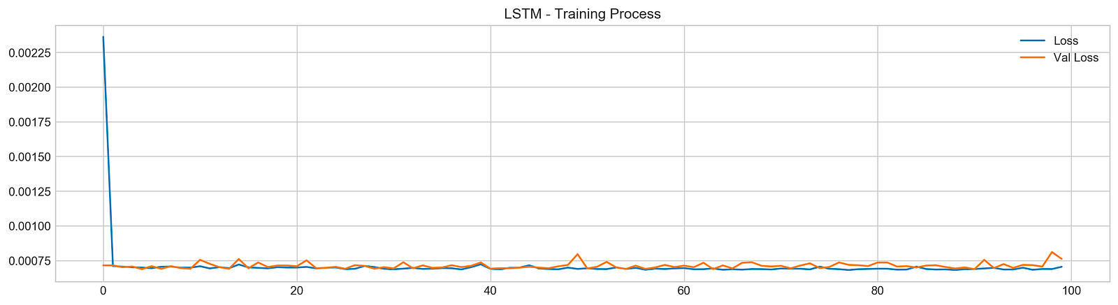
In this code snippet, a machine learning model is being trained over 100 epochs using the provided training data (X_train, y_train). The training advancement is monitored through tracking the loss values. Furthermore, it leverages the validation data (X_test, y_test) to assess the model’s performance as it progresses by evaluating the validation loss.
Following the training phase, Matplotlib is utilized to create a plot that visually represents the model’s training journey. The plot exhibits the evolution of both the training and validation losses across the epochs, enabling us to scrutinize the model’s performance and ascertain whether it exhibits signs of overfitting or underfitting.
Employing this code snippet is vital for overseeing the machine learning model’s training process, fine-tuning hyperparameters, and verifying that the model is effectively learning from the data without overfitting. Observing the training advancement aids in making well-informed decisions aimed at enhancing the model’s overall performance.
Evaluates model performance on test data
pred, y_true, y_pred = functions.evaluation(
                    X_test, y_test, model, random=False, n_preds=50,
                    show_graph=True)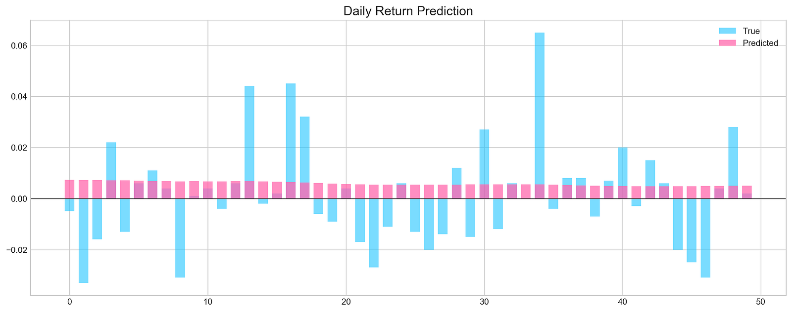
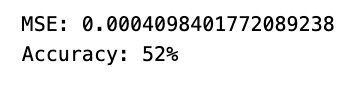
This segment utilize a custom function called functions.evaluation() to gauge the effectiveness of a machine learning model on a test dataset.
The function’s parameters and anticipated functionalities are described below:
- X_test and y_test: Represent the features and labels of the test dataset.
- model: Denotes the machine learning model under evaluation.
- random=False: This parameter determines whether the function should utilize random predictions for comparison. When set to True, the function may generate random predictions for evaluation purposes. If set to False, the model’s predictions will be used instead.
- n_preds=50: Specifies the quantity of predictions to generate if random predictions are activated.
- show_graph=True: Governs the potential display of a graph by the evaluation function. If set to True, the function may exhibit a graph to visually represent the evaluation outcomes.
The function presumably calculates assessment metrics such as accuracy, precision, recall, F1 score, among others, to evaluate the model’s performance. These metrics are derived by contrasting the model’s predictions or random predictions with the actual values.
Leveraging this bespoke evaluation function proves advantageous as it furnishes a comprehensive set of evaluation metrics and potential visual aids, streamlining the interpretation of the model’s efficacy. It establishes a uniform and reliable method for gauging the model’s performance across diverse datasets and models.
In conclusion,
The network failed to detect any discernible patterns in the data. As a result, its predictive capability is around 50%, essentially equivalent to making random guesses.
In the realm of deep learning, convolutional neural networks (CNNs) play a crucial role.
Initialises a convolutional neural network model
keras.backend.clear_session()

n_steps = X_train.shape[1]
n_features = X_train.shape[2]

model = Sequential()

model.add(Conv1D(filters=20, kernel_size=2, activation='relu', input_shape=(n_steps, n_features)))
model.add(MaxPooling1D(pool_size=2))
model.add(Flatten())
model.add(Dense(5, activation='relu'))
model.add(Dense(1))
model.compile(optimizer='adam', loss='mse', metrics=['mse'])
Above is a typical process illustrating the creation of a deep learning model using Keras with a TensorFlow backend. Here’s an outline of what it accomplishes:
To kick things off, the snippet leverages ‘keras.backend.clear_session()’ to reset the TensorFlow graph within the Keras session. This step proves handy when initiating a fresh model or conducting various experiments sans the baggage from earlier runs, ultimately freeing up memory and related resources associated with prior models.
Next in the sequence, the snippet proceeds to establish the structure of the neural network model:
- It defines the input shape by gauging the dimensions of the training data (X_train) to pinpoint the number of time steps and features.
- Sets up a 1D convolutional layer followed by a subsequent max-pooling layer.
- Flattens the convolutional layers’ output to seamlessly channel it into densely connected layers.
- Incorporates two dense layers (fully connected), featuring relu activation functions for the hidden layers and a linear activation function for the output layer.
- Wraps up by compiling the model with an Adam optimizer and a mean squared error (MSE) loss function.
By executing the above steps, the script shapes a convolutional neural network (CNN) architecture tailored for applications like time series forecasting or processing sequence data. The inclusion of clear_session() proves crucial in staving off conflicts that may arise when managing multiple models within a single script or notebook.
