

Enhancing Stock Market Predictions Using Machine Learning Techniques
Leveraging Ensemble Learning and Technical Indicators for Accurate Price Forecasting

Predicting stock market prices has always been tricky due to the market’s constant ups and downs. Even with methods like forecasting and diffusion modeling, nailing down accurate predictions is tough, and forecasting errors can lead to big investment risks.
Read the original research paper here: https://arxiv.org/pdf/1605.00003v1
Download link at the end of this article. Download the source code
To tackle these issues, the authors of this paper propose a fresh take by treating price forecasting as a classification problem, a common strategy in machine learning. They suggest using ensemble learning, a strong form of machine learning, to help reduce investment risks. Their model employs various technical indicators like the Relative Strength Index (RSI) and stochastic oscillator. Specifically, they use an ensemble of decision trees, which shows better results than existing methods according to promising Out of Bag (OOB) error estimates that suggest accurate predictions.
Stock prediction involves complex uncertainties
Predicting stock market prices is tough because of various uncertainties and factors like economic conditions, investor moods, and political events. These elements create a lot of volatility, particularly in the short term, though some stocks may show more stable trends over time. Because of this unpredictability, investing comes with high risks. A solid grasp of how prices might shift is vital for reducing these risks and increasing gains. Investors generally prefer stocks they believe will rise and shy away from those likely to drop.
To forecast stock trends, several approaches are used, notably Technical Analysis, Time Series Forecasting, Machine Learning, and modeling stock volatility with differential equations. We’ll focus on machine learning since traditional methods often struggle with large data sets. This modern approach moves away from older statistical techniques like time series models, allowing for better prediction by treating it as a classification problem.
The goal is to create a smart model that learns from past data to predict future price movements. Insights from these models can help investors make better choices. Researchers have looked into various algorithms like Support Vector Machines, Neural Networks, and Naive Bayesian Classifiers. In the next section, we’ll explore their findings and methodologies.
Forecasting Algorithms Challenge Efficient Market Hypothesis
Prediction algorithms for forecasting stock market trends challenge the Efficient Market Hypothesis (EMH), which claims stock prices reflect all available information. While the EMH is widely accepted, it has faced criticism as researchers use advanced algorithms to explore complex market interactions.
Various techniques like Support Vector Machine (SVM), Neural Networks, and Linear Regression have been tested for stock predictions. For instance, Li, Li, and Yang (2014) found that logistic regression had a 55.65% accuracy rate when analyzing how external factors affected U.S. stock prices from 2000 to 2014. Similarly, Dai and Zhang (2013) observed accuracy rates of 44.52% to 58.2% while working with 3M stock data, with their SVM model peaking at 79.3% for long-term predictions.
Further research includes Xinjie (2014) who used technical indicators for major stocks and Devi et al. (2015) who combined cuckoo search with SVM for better outcomes. Giacomel et al. (2015) proposed a neural network ensemble, while Boonpeng and Jeatrakul (2016) analyzed seven years of data from the Stock Exchange of Thailand.
A key takeaway from existing studies is that ensemble learning algorithms are often underused in stock market predictions. This study aims to fill that gap by using Random Forest, which combines predictions from multiple decision trees for improved accuracy. The following sections will cover data handling, error analysis, and a discussion of results, showing how this model can enhance stock market prediction methods.
Predicting stock trends with random forest
The study outlines a clear way to predict stock market trends using different techniques. At the heart of it is the random forest learning algorithm, which looks at past stock data to forecast price changes.
First, we collect time series data on stock prices and apply exponential smoothing to reduce noise and reveal clearer trends. Next, we pull out key technical indicators from this data that help us understand potential future price movements.
These indicators are then used to train the random forest algorithm. This method combines predictions from several decision trees for better accuracy. The following sections will break down each step, explaining how this approach aids in stock market predictions.
Exponential smoothing improves stock price predictions
Data preprocessing is key when analyzing historical stock data, especially with a technique called exponential smoothing. This method gives more weight to recent data while lessening the impact of older points. The smoothed value starts with the first observation, and for the following ones, you use the formula: St = α * Yt + (1 — α) * St-1, where α is a smoothing factor between 0 and 1. A higher α means less smoothing, so when it’s close to 1, the smoothed value closely matches the actual observation.
This approach helps filter out random noise in stock data, making it easier to spot long-term trends. After smoothing, various technical indicators are created from this data and compiled into a feature matrix for further analysis.
The goal is to predict future stock prices, specifically changes in closing prices. To do this, you define a target variable for day “i” as target I = Sign(closei+d — close I), where “d” is how many days ahead you’re predicting. A target of +1 means an expected price increase after “d” days, while -1 indicates a decrease. Each target I serves as a label for the corresponding row in the feature matrix, forming the basis for training the prediction model.
Feature extraction aids stock market predictions
Feature extraction means pulling key metrics from raw time series stock data to help predict market movements. These metrics, called technical indicators, are essential for investors looking to spot trends, whether they’re anticipating a rise (bullish signals) or a fall (bearish signals).
While the text mentions using some technical indicators for analysis, it doesn’t specify which ones. These indicators are crucial for helping investors make decisions since they provide clear data about market trends and potential price changes.
RSI indicates overbought or oversold stocks
The Relative Strength Index (RSI) is a popular tool in stock trading that helps you gauge if a stock is overbought or oversold. It’s calculated using a formula that looks at average gains and losses over 14 days, producing a score between 0 and 100.
For traders, understanding the RSI is key. A stock is overbought when its price surges due to high demand, suggesting it might be overpriced and due for a drop. On the flip side, a stock is oversold when its price plummets, often from panic selling, indicating it could be undervalued.
Interpreting the RSI is simple: a score above 70 means the stock may be overbought, while a score below 30 suggests it might be oversold. These levels can help traders make better decisions based on price trends.
Stochastic Oscillator measures price momentum
The Stochastic Oscillator is a tool for gauging a security’s price momentum. It’s calculated using the formula: %K = 100 × (C − L14) / (H14 − L14). Here, ‘C’ is the current closing price, ‘L14’ is the lowest price in the last 14 days, and ‘H14’ is the highest.
This oscillator tracks how quickly prices are changing, often signaling momentum shifts before actual price changes. It shows how the closing price compares to the recent low-high range, helping investors and analysts make better predictions about future price movements.
Williams %R indicates market momentum
Williams %R is a momentum indicator that measures a closing price in relation to the highest and lowest prices over a 14-day period. You can calculate it using this formula:
%R = (H14 − C) / (H14 − L14) * -100.
Here, “C” is the current closing price, “L14” is the lowest price in the past 14 days, and “H14” is the highest price during that time.
The values range from -100 to 0. A value above -20 suggests the asset might be overbought (potential sell signal), while a value below -80 signals it could be oversold (potential buy signal). This helps traders decide when to buy or sell based on market momentum.
MACD indicates market momentum and trends
The Moving Average Convergence Divergence (MACD) is a tool that helps traders spot market momentum and potential buy or sell signals. It calculates the difference between the 12-day and 26-day Exponential Moving Averages (EMAs) of a security’s closing prices: MACD = EMA12(C) − EMA26(C). A 9-day EMA of the MACD itself forms the Signal Line.
When the MACD drops below the Signal Line, it suggests a bearish trend, signalling it might be a good time to sell. If the MACD rises above the Signal Line, it indicates a bullish trend, hinting at a potential buying opportunity. So, monitoring the MACD and Signal Line can give traders helpful insights into market direction.
PROC measures price change percentage
The Price Rate of Change (PROC) measures the percentage change in a security’s closing price over a set time frame. You calculate it using this formula:
PROC(t) = [C(t) — C(t — n)] / C(t — n)
Here, C(t) is the current closing price, and C(t — n) is the closing price from ’n’ days ago. PROC helps traders and investors see how prices have shifted recently, aiding in trend analysis and decision-making.
OBV tracks stock trends using volume
The On Balance Volume (OBV) is a handy tool for spotting stock buying and selling trends by looking at trading volume. It helps track price movements and gauge market sentiment.
To calculate OBV, you compare the stock’s current closing price with the previous one. If it’s higher, you add the current trading volume; if it’s lower, you subtract it. If the prices are the same, the OBV stays put. This approach helps you see overall volume flow and spot potential market trends.
In short, the OBV is a useful indicator for traders and analysts to assess price strength based on volume, helping them make smarter trading choices.
Classes not linearly separable; use Random Forest
Before using the training data in the Random Forest Classifier, we check if the two classes of data can be separated by a line (or hyperplane). If you can find a way to split the data into two parts without overlap, we call it “linear separability.”
To test this, we create the convex hulls for each class. A convex hull is the smallest polygon that can fit around all the points. If the hulls overlap, the classes are not linearly separable. We use Principal Component Analysis to shrink the data to two dimensions for easier visualization.
Our analysis shows that the convex hulls almost overlap, meaning the classes aren’t linearly separable. This suggests Linear Discriminant Analysis wouldn’t work well. Instead, the Random Forest Classifier is a better option since it automatically picks out the most important features by using multiple decision trees. Next, we’ll cover some key terms to help understand how Random Forest works.
Key concepts in Random Forest classification
In machine learning, especially for classification tasks, it’s important to grasp a few key concepts.
First, a classification tree processes a dataset D={(xi,yi)}i=1n, where xi is a set of features and yi is the outcome. Each node in the tree makes a decision based on whether a feature value xi is less than a certain threshold k. The tree starts with all data points, dividing them into child nodes based on their classifications. This continues until nodes represent a single class. The goal is to group points in a way that reduces variability, often measured by Gini impurity.
Next, we have random vectors, written as X=(X1,…,Xd). These are arrays of random variables in probability space, showing the likelihood of X falling within a certain range. Each feature xi corresponds to a random variable with its own distribution, leading to a joint distribution for the entire vector X.
Lastly, the classifier hk(x)=h(x|θk) represents a decision tree k that results in a prediction. A random forest is made up of multiple classification trees, each using parameters chosen from a model random vector θ. Each classifier predicts a class based on training data, yielding outputs of y=+1 or y=−1 for the class of input data x.
In short, these concepts help clarify how Random Forests work by utilizing classification trees and random vectors.
Random Forest improves decision tree predictions
Random Forest is a machine learning method that builds on decision trees, which are great for predictions. But individual decision trees can easily overfit the training data, meaning they become too tailored to it and lose accuracy with new data. To fix this, Random Forest uses multiple trees trained on different subsets of data, sacrificing a little accuracy for better overall performance.
Each tree in a Random Forest learns from a unique sample of the training data, created through a process called bagging. This means randomly selecting data points, so each tree gets diverse information, which helps prevent overfitting. Trees split their nodes based on impurity measures like Gini impurity or Shannon entropy, which help assess how well the tree classifies data.
To find the best splits, the algorithm reduces impurity — basically, it seeks to clarify the classifications. By comparing the current node’s impurity to what it would be after a split, it gauges how much clearer the classification becomes.
Overall, Random Forest creates a collection of decision trees, enhancing prediction accuracy and stability while reducing the issues linked to single trees. The end result? A robust system for classification or regression that’s reliable and effective.
Tracing Random Forest algorithm decisions visually
Here, we explain how we trace the Random Forest (RF) algorithm with a test sample. First, we trained a Random Forest model using the Apple Dataset over 30 days. During this, we created 30 .dot files in graph description language (GDL) that show the structure and decision rules of each tree in the forest. You can find these files in the provided Google Drive link.
Next, we wrote a Python script to read the .dot files. This script helps us trace how the RF algorithm works with a specific test sample by visualizing the decisions made by each tree when classifying or predicting outcomes.
Graph Description Language simplifies graph representation
Graph Description Language (GDL) is a simple way to represent graphs that both people and computers can understand. You use it to describe all kinds of graphs, whether they’re directed or undirected.
To start a graph in GDL, you use the ‘graph’ keyword, and you list the nodes in curly braces. For undirected graphs, you connect nodes with a double hyphen (–), showing a mutual relationship. For directed graphs, arrows (->) show direction from one node to another.
Here’s an example:
graph graphname {
a −− b −− c ;
b −− d ;
}
In this example, “graphname” includes nodes ‘a’, ‘b’, ‘c’, and ‘d’. Nodes ‘a’, ‘b’, and ‘c’ are all connected, and ‘b’ is also connected to ‘d’. GDL makes it easy to visualize and communicate how nodes relate to each other.
Decision trees predict price rises effectively
In this analysis, we look at the outputs of three out of thirty decision trees in a predictive forest applied to a test sample with financial features like RSI, Stochastic Oscillator, and MACD.
Each tree followed a path in the data to predict price changes. Tree 0 went to Leaf Node 154, Tree 1 reached Leaf Node 115, and Tree 2 concluded at Leaf Node 135 — each predicting a price rise. In total, twenty-nine trees forecasted an increase, only one predicted otherwise, which aligns well with market behavior for the test sample.
The trees split the data based on certain features, but figuring out why certain splits are made can be tricky. It often requires understanding measures like Shannon Entropy and Gini impurity. This complexity can be daunting for those trying to dig deeper into how the algorithm works.
Also, more trees generally mean better predictions. The out-of-bag error decreases with the number of trees, suggesting that larger ensembles perform better. We’ll discuss these error rates and their implications in the following sections.
Out-of-bag error in Random Forests explained
This section covers out-of-bag (OOB) errors and how Random Forests converge, based on Breiman’s work from 2001. It starts by explaining a margin function that measures the difference between the correct class’s average prediction and the next best one, called mg(X,Y), where X represents features and Y represents true labels. An indicator function I shows if a condition is met.
The generalization error, or PE∗, is the chance that the margin function is negative, meaning the model is making errors on training data. This plays off the random sampling used to train each decision tree in the Forest.
Under the right conditions, this error converges to a function of probabilities based on the margin estimates from the ensemble of trees. Breiman provides the proof. To test these ideas on real data, researchers use OOB estimates, a solid way to gauge Random Forest performance.
Essentially, the average margin for the classifier group shows how much more certain the model is in its right predictions compared to others, highlighting the strength of Random Forests in machine learning.
Random Forest performance metrics explained
A Random Forest uses classification trees to assess the probability of correct classifications, and the margin function helps us see how confidently it predicts the right class versus a competing one.
Performance is linked to the expected value of the margin: a higher expected margin means better classification and fewer errors. Generalization error indicates the chance of misclassification, which can be bounded using Chebyshev’s inequality. This shows that as the Random Forest gets stronger, the chance of error decreases, highlighting its reliability.
Chebyshev’s inequality helps us understand how much a random variable can deviate from its expected value. Essentially, when the allowed deviation is larger, the chance of a significant mistake drops, improving predictive accuracy. Overall, this discussion highlights key aspects of Random Forest models and how concepts like Chebyshev’s inequality shed light on their effectiveness.
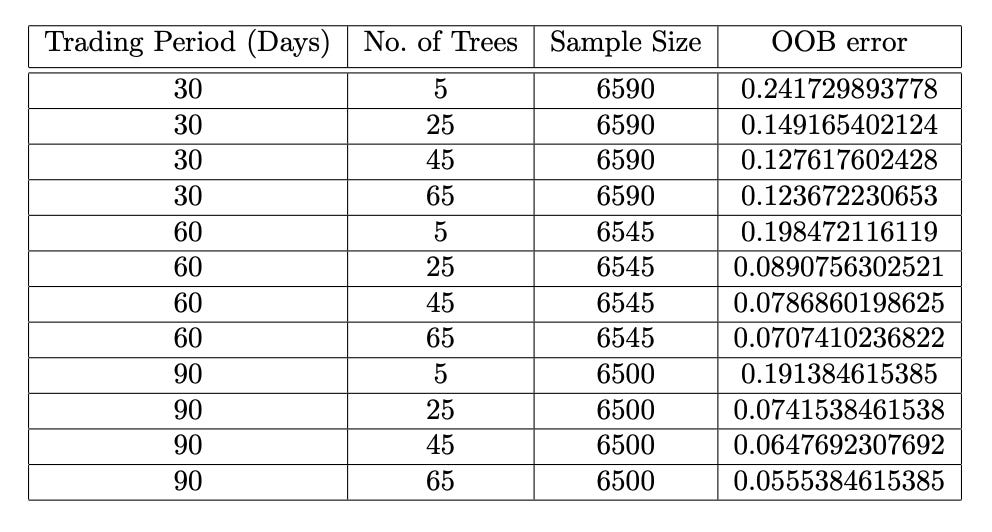
OOB error visualizes random forest performance
Out-of-bag (OOB) error visualization helps us gauge how well a random forest model performs. When building a random forest, we create multiple decision trees using different subsets of training data through a technique called bootstrapping. Some data points won’t be included in every tree’s training set, and these are the out-of-bag examples. The OOB error is the average error from trees that didn’t use a specific sample in their training, giving us an idea of how well the model can predict new data.
In a recent study using Apple Inc. (AAPL) data, researchers plotted OOB error against the number of decision trees. The graph showed that as more trees were added, the OOB error rate dropped significantly. However, after a certain number of trees, the error plateaus, suggesting that the model stabilizes and is less likely to overfit. This highlights how ensemble learning improves accuracy while reducing overfitting risks.
Predictive model improves stock trading insights
The predictive model gives valuable insights for stock trading. It predicts stock price movements with +1 for expected increases (suggesting a buy) and -1 for expected decreases (suggesting a sell). However, wrong predictions can lead to big losses, so it’s key to evaluate how reliable the model is.

To gauge its strength, we look at performance metrics like accuracy, precision, recall, and specificity. Accuracy shows how often the model is right, precision measures the correctness of positive predictions, recall assesses how well the model finds actual positive cases, and specificity checks its ability to identify negatives. These metrics are calculated using true positives, true negatives, false positives, and false negatives.

The model was tested on data from major companies like Apple, GE, and Samsung, across one to three-month trading periods. The results showed a positive trend, with metrics improving over time. For example, Samsung’s three-month accuracy hit 93.97%, with a recall of 0.95 and a specificity of 0.93. Apple and GE also showed strong results near 94%. These findings suggest the model is quite reliable for making stock trading decisions.
ROC curve evaluates the binary classification model
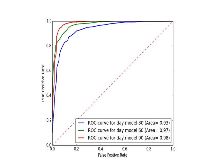
The Receiver Operating Characteristic (ROC) curve is a handy way to see how well a binary classification model works. It plots the True Positive Rate (sensitivity) against the False Positive Rate (1 minus specificity) at various thresholds. A curve that hugs the upper left corner shows a better model, while one near the 45-degree diagonal means the model is just guessing.
The area under the curve (AUC) is a key metric from the ROC curve. An AUC of 1 means a perfect classifier, while 0.5 means it’s no better than a random chance. In stock price predictions, the AUC shows how well the model forecasts price increases and decreases. In a comparison of three models across different datasets, all had AUCs above 0.9, proving they are great at classification.
Looking at the ROC curves for the Samsung dataset, the model trained on a 90-day period stands out as the best performer, confirming its effectiveness in distinguishing between classes.
Link to download source code:
