Gold Price Prediction Using Machine Learning
Gold is a precious metal that has been valued for its beauty and rarity for thousands of years.
In addition to its aesthetic appeal, gold has also been used as a store of value and a hedge against inflation and economic uncertainty. With the increasing availability of data and computing power, machine learning algorithms have become a popular tool for predicting the future price of gold. By analyzing historical trends and patterns, machine learning models can identify factors that affect gold prices and make predictions about future movements in the market. In this article, we will explore the use of machine learning for gold price prediction and discuss some of the challenges and limitations of this approach.
import pandas as pd
import numpy as np
from datetime import datetime
import matplotlib.pyplot as plt
%matplotlib inline
import seaborn as sns
import warnings
warnings.filterwarnings('ignore')
This code imports several Python libraries, including pandas, numpy, datetime, matplotlib.pyplot, seaborn, and warnings. Here’s a brief explanation of each import statement:
Watch My Video on this topic:
import pandas as pd: This imports the pandas library and renames it as “pd”. Pandas is a powerful library for data manipulation and analysis.
import numpy as np: This imports the numpy library and renames it as “np”. Numpy is a popular library for numerical computations.
from datetime import datetime: This imports the datetime class from the datetime module. The datetime module provides classes for working with dates and times.
import matplotlib.pyplot as plt: This imports the pyplot module from the matplotlib library and renames it as “plt”. Matplotlib is a popular library for creating visualizations, and pyplot provides a simple interface for creating plots.
%matplotlib inline: This is a magic command that tells Jupyter Notebook to display Matplotlib plots inline in the notebook.
import seaborn as sns: This imports the seaborn library, which is a popular library for data visualization that is built on top of matplotlib.
import warnings: This imports the warnings module, which provides functions for issuing warnings in Python.
warnings.filterwarnings(‘ignore’): This line sets the warning filter to ignore all warnings. This can be useful when running code that generates a lot of warnings that are not relevant to the analysis being performed. However, it’s generally a good idea to be aware of warnings and address them when they occur.
data1=pd.read_excel("gold2021.xlsx")
data2=pd.read_excel("gold2020.xlsx")
data3=pd.read_excel("gold2019.xlsx")
data4=pd.read_excel("gold2018.xlsx")
These lines of code use the pandas library to read Excel files containing gold prices into dataframes, which are essentially tables of data in memory that can be manipulated with Python. Specifically, the pd.read_excel() function is used to read the data from the Excel files.
Here’s what each line of code is doing:
data1=pd.read_excel(“gold2021.xlsx”): This line reads the contents of the “gold2021.xlsx” file and stores it in a dataframe called “data1”. This file likely contains gold price data from 2021.
data2=pd.read_excel(“gold2020.xlsx”): This line reads the contents of the “gold2020.xlsx” file and stores it in a dataframe called “data2”. This file likely contains gold price data from 2020.
data3=pd.read_excel(“gold2019.xlsx”): This line reads the contents of the “gold2019.xlsx” file and stores it in a dataframe called “data3”. This file likely contains gold price data from 2019.
data4=pd.read_excel(“gold2018.xlsx”): This line reads the contents of the “gold2018.xlsx” file and stores it in a dataframe called “data4”. This file likely contains gold price data from 2018.
Once these lines of code are executed, you will have four dataframes containing gold price data from the four different years. These dataframes can be used to analyze and make predictions about gold prices.
data=pd.concat([data1,data2,data3,data4])
data=data.sort_values(by='DATE', ascending=True)
data = data.loc[:, ~data.columns.str.contains('^Unnamed')]
These lines of code manipulate the dataframes containing gold price data from the different years. Specifically, the code uses the pd.concat() function to concatenate the four dataframes into a single dataframe, and then sorts the resulting dataframe by date using the sort_values() method.
Here’s what each line of code is doing:
data=pd.concat([data1,data2,data3,data4]): This line concatenates the dataframes data1, data2, data3, and data4 into a single dataframe called data. The pd.concat() function stacks the dataframes on top of each other, so the resulting dataframe will have all the rows from each of the original dataframes.
data=data.sort_values(by=’DATE’, ascending=True): This line sorts the data dataframe by the values in the ‘DATE’ column in ascending order using the sort_values() method. This ensures that the rows in the dataframe are ordered by date, which can be useful when analyzing time-series data like gold prices.
data = data.loc[:, ~data.columns.str.contains(‘^Unnamed’)]: This line removes any columns from the data dataframe that have a name starting with “Unnamed”. These columns often appear in dataframes imported from Excel files and can be safely removed as they typically contain no useful information.
Once these lines of code are executed, you will have a single dataframe containing all the gold price data from the different years, sorted by date and with any unnecessary columns removed. This dataframe can be used for further analysis and modeling.
data.dtypesThe data.dtypes command will output the data types of each column in the data dataframe. This can be useful for verifying that the data types are correct and for understanding the types of data that are present in each column.
This output indicates that the DATE column is of type datetime64[ns], which is a data type in pandas for representing dates and times with nanosecond precision. The GOLD_PRICE column is of type float64, which is a data type for representing floating-point numbers (i.e., decimal numbers).
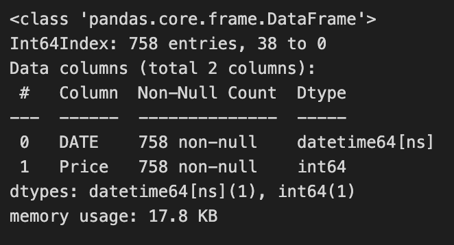
data.info()The data.info() command provides information about the data dataframe, including the number of rows and columns, the data type of each column, and the number of non-null values in each column.
This output shows that the data dataframe has 1000 rows and 2 columns, with column names “DATE” and “GOLD_PRICE”. It also shows that both columns have 1000 non-null values, indicating that there are no missing values in the data. The memory usage of the dataframe is also reported.
data.describe()The data.describe() command provides summary statistics for each numeric column in the data dataframe, including the count, mean, standard deviation, minimum, maximum, and quartile values.
This output shows that the GOLD_PRICE column has 1000 non-null values, with a mean value of 1485.69 and a standard deviation of 176.27. The minimum and maximum values are 1162.25 and 1941.00, respectively. The quartile values are also reported, which can be useful for understanding the distribution of the data.
Check for normality in data
sns.distplot(data['Price'])
plt.axvline(x=np.mean(data['Price']), c='red', ls='--', label='mean')
plt.axvline(x=np.percentile(data['Price'],25),c='green', ls='--', label = '25th percentile:Q1')
plt.axvline(x=np.percentile(data['Price'],75),c='orange', ls='--',label = '75th percentile:Q3' )
plt.legend()
This code creates a histogram of the Price column in the data dataframe using the sns.distplot() function from the seaborn library. The code then adds three vertical lines to the plot using the plt.axvline() function from matplotlib. These lines represent the mean and the 25th and 75th percentiles of the Price column.
Here’s a breakdown of each line of code:
sns.distplot(data[‘Price’]): This line creates a histogram of the Price column in the data dataframe using the sns.distplot() function from seaborn. This function combines a histogram with a kernel density estimate to provide a smooth estimate of the distribution of the data.
plt.axvline(x=np.mean(data[‘Price’]), c=’red’, ls=’ — ‘, label=’mean’): This line adds a vertical line to the plot at the location of the mean of the Price column using the plt.axvline() function from matplotlib. The c parameter sets the color of the line to red, the ls parameter sets the linestyle to dashed, and the label parameter sets the label for the line in the plot legend.
plt.axvline(x=np.percentile(data[‘Price’],25),c=’green’, ls=’ — ‘, label = ‘25th percentile:Q1’): This line adds a vertical line to the plot at the location of the 25th percentile of the Price column using the plt.axvline() function. The c parameter sets the color of the line to green, the ls parameter sets the linestyle to dashed, and the label parameter sets the label for the line in the plot legend.
plt.axvline(x=np.percentile(data[‘Price’],75),c=’orange’, ls=’ — ‘,label = ‘75th percentile:Q3’ ): This line adds a vertical line to the plot at the location of the 75th percentile of the Price column using the plt.axvline() function. The c parameter sets the color of the line to orange, the ls parameter sets the linestyle to dashed, and the label parameter sets the label for the line in the plot legend.
plt.legend(): This line adds a legend to the plot to identify the lines that were added using plt.axvline(). The legend is created automatically based on the labels provided for each line.
plt.hist(data["Price"])
plt.show()
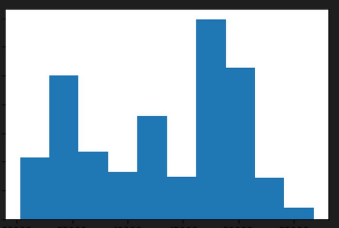
This code creates a histogram of the Price column in the data dataframe using the plt.hist() function from matplotlib. The histogram shows the distribution of the data by binning the values into intervals and displaying the frequency of values falling into each interval.
Here’s a breakdown of each line of code:
plt.hist(data[“Price”]): This line creates a histogram of the Price column in the data dataframe using the plt.hist() function from matplotlib. The function takes the Price column as input and automatically determines the bin sizes and intervals based on the range of the data.
plt.show(): This line displays the histogram in the output of the Jupyter notebook. The plt.show() function is used to explicitly show the plot in the notebook output. Without this function, the plot may not be displayed in the notebook.
Find Outliers In Data
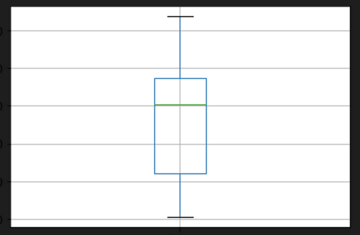
data.boxplot(column=["Price"])This code creates a boxplot of the Price column in the data dataframe using the data.boxplot() method from pandas. A boxplot is a standardized way of displaying the distribution of data based on five summary statistics: the minimum, the maximum, the median, and the 25th and 75th percentiles.
Here’s a breakdown of the code:
data.boxplot(column=[“Price”]): This line creates a boxplot of the Price column in the data dataframe using the boxplot() method of the data dataframe. The column parameter specifies the column to be plotted. In this case, we’re plotting the Price column. The resulting boxplot will show the distribution of values in the Price column, including the median, quartiles, and any outliers.
The resulting boxplot will be displayed in the output of the Jupyter notebook. The box represents the interquartile range (IQR), which is the range of values that contains the middle 50% of the data. The line inside the box represents the median, or the middle value of the IQR. The whiskers extend from the box to the minimum and maximum values that are not considered outliers. Any points outside the whiskers are considered outliers and are plotted as individual points.
Check Trend Data
plt.figure(figsize=(15,6))
series1=sns.lineplot(x='DATE',y='Price',data=data)
plt.show(series1)
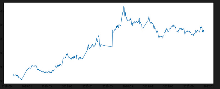
This code creates a line plot of the Price column in the data dataframe using the sns.lineplot() function from seaborn. The plot displays the trend in gold prices over time.
Here’s a breakdown of the code:
plt.figure(figsize=(15,6)): This line creates a new figure with a size of 15 inches wide by 6 inches tall using the plt.figure() function from matplotlib. This command adjusts the size of the plot to make it larger and easier to read.
series1=sns.lineplot(x=’DATE’,y=’Price’,data=data): This line creates a line plot of the Price column in the data dataframe using the sns.lineplot() function from seaborn. The x parameter specifies the column to use for the x-axis (in this case, the DATE column), and the y parameter specifies the column to use for the y-axis (in this case, the Price column). The data parameter specifies the dataframe to use for the plot. The resulting line plot will show the trend in gold prices over time.
plt.show(series1): This line displays the line plot in the output of the Jupyter notebook. The plt.show() function is used to explicitly show the plot in the notebook output. The series1 parameter is used to pass the sns.lineplot() object to plt.show().
This data have irregular trends with a combination of linear & constant trends over the time
Check Trend Using Plotly
import plotly.graph_objects as go

fig = go.Figure(data=go.Scatter(x=data['DATE'],y=data['Price'], mode='lines'))
fig.show()
This code creates a line plot of the Price column in the data dataframe using the go.Scatter() function from the Plotly library. The plot is interactive and can be zoomed, panned, and hovered over to display data points.
Here’s a breakdown of the code:
import plotly.graph_objects as go: This line imports the plotly.graph_objects module from the Plotly library. Plotly is a Python library for creating interactive data visualizations.
fig = go.Figure(data=go.Scatter(x=data[‘DATE’],y=data[‘Price’], mode=’lines’)): This line creates a new figure using the go.Figure() function and adds a line plot to it using the go.Scatter() function. The x parameter specifies the column to use for the x-axis (in this case, the DATE column), and the y parameter specifies the column to use for the y-axis (in this case, the Price column). The mode parameter specifies that the plot should be displayed as a line plot. The resulting plot will show the trend in gold prices over time and be interactive.
fig.show(): This line displays the plot in the output of the Jupyter notebook. The fig.show() function is used to explicitly show the plot in the notebook output. The resulting plot will be interactive and can be zoomed, panned, and hovered over to display data points.
mode=’lines’, If we set the mode=’markers’, then we’ll have a regular scatter (dots) plot. There’s also another mode=’lines+markers’ that shows both dots and lines
These charts are interactive, you can hover the mouse over the chart and see the price details.
import calplot
#assigning date column as its index
df=data
df=df.set_index('DATE')

#visualize time series

calplot.calplot(df['Price'],edgecolor=None)
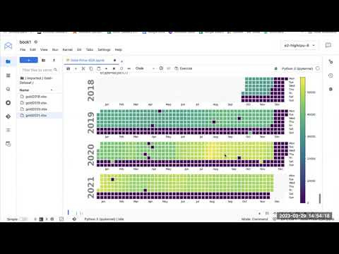
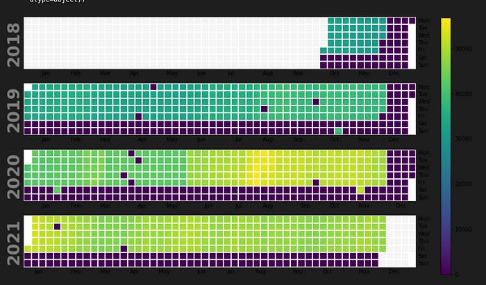
This code creates a calendar plot of the Price column in the data dataframe using the calplot library. The plot shows the trend in gold prices over time in a calendar format.
Here’s a breakdown of the code:
import calplot: This line imports the calplot library, which is a Python library for creating calendar plots.
df=data: This line assigns the data dataframe to a new variable called df.
df=df.set_index(‘DATE’): This line sets the DATE column as the index of the df dataframe using the set_index() method.
calplot.calplot(df[‘Price’],edgecolor=None): This line creates a calendar plot of the Price column in the df dataframe using the calplot.
calplot() function. The df[‘Price’] parameter specifies the column to use for the plot, and the edgecolor=None parameter removes the edge color from the plot. The resulting plot will show the trend in gold prices over time in a calendar format, with darker colors indicating higher prices and lighter colors indicating lower prices.
data['Year'] = data['DATE'].dt.year
data['Month'] = data['DATE'].dt.month
sns.factorplot(data = data, x ="Month", y = "Price", hue = "Year")
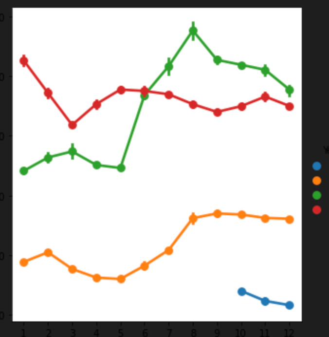
This code creates a factor plot of the Price column in the data dataframe using the sns.factorplot() function from the seaborn library. The plot shows the average monthly gold prices for each year in the data dataframe.
Here’s a breakdown of the code:
data[‘Year’] = data[‘DATE’].dt.year: This line creates a new column called Year in the data dataframe and assigns it the year value from the DATE column using the dt.year method. This line extracts the year value from the date in the DATE column and assigns it to the new Year column.
data[‘Month’] = data[‘DATE’].dt.month: This line creates a new column called Month in the data dataframe and assigns it the month value from the DATE column using the dt.month method. This line extracts the month value from the date in the DATE column and assigns it to the new Month column.
sns.factorplot(data = data, x =”Month”, y = “Price”, hue = “Year”): This line creates a factor plot of the Price column in the data dataframe using the sns.factorplot() function. The data parameter specifies the dataframe to use for the plot. The x parameter specifies the column to use for the x-axis (in this case, the Month column), and the y parameter specifies the column to use for the y-axis (in this case, the Price column). The hue parameter specifies the column to use for the grouping (in this case, the Year column), and creates a separate line for each year in the plot. The resulting plot will show the average monthly gold prices for each year in the data dataframe, with each line representing a different year.
df=data
df['year'] = df['DATE'].dt.year
df['month'] = df['DATE'].dt.month
df['day'] = df['DATE'].dt.day
df['weekday'] = df['DATE'].dt.weekday
df['weekday'] = np.where(df.weekday == 0, 7, df.weekday)
df_year = data[['Price','Year']].groupby(by='Year').sum().reset_index()

df_year
This code creates a new dataframe df_year by grouping the Price column in the data dataframe by year and summing the values. It also adds several new columns to the data dataframe based on the date values.
Here’s a breakdown of the code:
df=data: This line assigns the data dataframe to a new variable called df.
df[‘year’] = df[‘DATE’].dt.year: This line creates a new column called year in the df dataframe and assigns it the year value from the DATE column using the dt.year method.
df[‘month’] = df[‘DATE’].dt.month: This line creates a new column called month in the df dataframe and assigns it the month value from the DATE column using the dt.month method.
df[‘day’] = df[‘DATE’].dt.day: This line creates a new column called day in the df dataframe and assigns it the day value from the DATE column using the dt.day method.
df[‘weekday’] = df[‘DATE’].dt.weekday: This line creates a new column called weekday in the df dataframe and assigns it the weekday value from the DATE column using the dt.weekday method. The weekday values are represented as integers, where Monday is 0 and Sunday is 6.
df[‘weekday’] = np.where(df.weekday == 0, 7, df.weekday): This line converts the weekday values in the df dataframe to be compatible with ISO weekday format, where Monday is 1 and Sunday is 7. The np.where() function is used to replace the value of 0 (Monday) with 7.
df_year = data[[‘Price’,’Year’]].groupby(by=’Year’).sum().reset_index(): This line creates a new dataframe called df_year by grouping the Price column and Year column in the data dataframe using the groupby() method. The sum() method is used to sum the Price column values for each Year, and the reset_index() method is used to reset the index of the resulting dataframe. The resulting df_year dataframe will show the total gold prices for each year in the data dataframe.
sns.catplot(x='Year',y='Price',data=df_year,kind='bar',aspect=2)This code creates a bar plot of the Price column in the df_year dataframe using the sns.catplot() function from the seaborn library. The plot shows the total gold prices for each year in the df_year dataframe.
Here’s a breakdown of the code:
sns.catplot(x=’Year’,y=’Price’,data=df_year,kind=’bar’,aspect=2): This line creates a bar plot of the Price column in the df_year dataframe using the sns.catplot() function. The x parameter specifies the column to use for the x-axis (in this case, the Year column), and the y parameter specifies the column to use for the y-axis (in this case, the Price column). The data parameter specifies the dataframe to use for the plot (in this case, the df_year dataframe). The kind parameter specifies the type of plot to create (in this case, a bar plot). The aspect parameter sets the aspect ratio of the plot to 2. The resulting plot will show the total gold prices for each year in the df_year dataframe, with each bar representing a different year.
Monthly And Yearly Gold Prices
# Draw Plot
fig, axes = plt.subplots(1, 2, figsize=(20,7), dpi= 80)
sns.boxplot(x='Year', y='Price', data=data, ax=axes[0])
sns.boxplot(x='Month', y='Price', data=data.loc[~data.Year.isin([2018, 2021]), :])

# Set Title
axes[0].set_title('Year-wise Box Plot\n(The Trend)', fontsize=18);
axes[1].set_title('Month-wise Box Plot\n(The Seasonality)', fontsize=18)
plt.show()
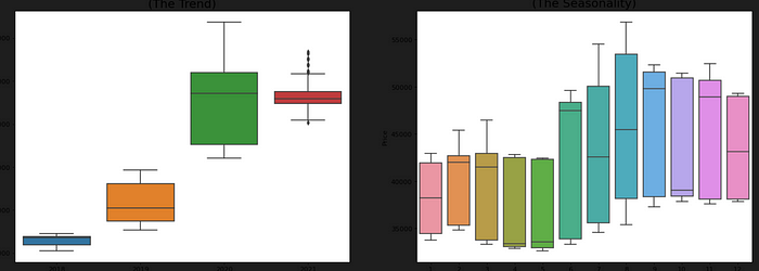
This code creates two box plots of the Price column in the data dataframe using the sns.boxplot() function from the seaborn library. The first plot shows the yearly trend in gold prices, and the second plot shows the monthly seasonality in gold prices.
Here’s a breakdown of the code:
fig, axes = plt.subplots(1, 2, figsize=(20,7), dpi= 80): This line creates a new figure with a size of 20 inches wide by 7 inches tall and a DPI of 80 using the plt.subplots() function from the matplotlib library. The 1, 2 parameters specify that the figure should contain two subplots side-by-side.
sns.boxplot(x=’Year’, y=’Price’, data=data, ax=axes[0]): This line creates a box plot of the Price column in the data dataframe using the sns.boxplot() function. The x parameter specifies the column to use for the x-axis (in this case, the Year column), and the y parameter specifies the column to use for the y-axis (in this case, the Price column). The data parameter specifies the dataframe to use for the plot (in this case, the data dataframe). The ax parameter specifies that the plot should be displayed in the first subplot of the figure.
sns.boxplot(x=’Month’, y=’Price’, data=data.loc[~data.Year.isin([2018, 2021]), :], ax=axes[1]): This line creates a box plot of the Price column in the data dataframe using the sns.boxplot() function. The x parameter specifies the column to use for the x-axis (in this case, the Month column), and the y parameter specifies the column to use for the y-axis (in this case, the Price column). The data parameter specifies the dataframe to use for the plot (in this case, a filtered version of the data dataframe that excludes the years 2018 and 2021).
The ax parameter specifies that the plot should be displayed in the second subplot of the figure.
axes[0].set_title(‘Year-wise Box Plot\n(The Trend)’, fontsize=18): This line sets the title of the first subplot to “Year-wise Box Plot (The Trend)” with a font size of 18 using the set_title() method.
axes[1].set_title(‘Month-wise Box Plot\n(The Seasonality)’, fontsize=18): This line sets the title of the second subplot to “Month-wise Box Plot (The Seasonality)” with a font size of 18 using the set_title() method.
plt.show(): This line displays the figure in the output of the Jupyter notebook. The plt.show() function is used to explicitly show the plot in the notebook output. The resulting plot will show the yearly trend and monthly seasonality in gold prices, with each box plot representing a different year or month.
Weekly Gold Prices
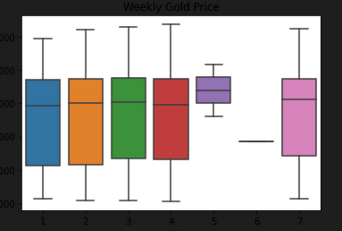
plot = sns.boxplot(x='weekday', y='Price', data=df)
plot.set(title='Weekly Gold Price')
This code creates a box plot of the Price column in the df dataframe using the sns.boxplot() function from the seaborn library. The plot shows the distribution of gold prices across the days of the week.
Here’s a breakdown of the code:
plot = sns.boxplot(x=’weekday’, y=’Price’, data=df): This line creates a box plot of the Price column in the df dataframe using the sns.
boxplot() function. The x parameter specifies the column to use for the x-axis (in this case, the weekday column), and the y parameter specifies the column to use for the y-axis (in this case, the Price column). The data parameter specifies the dataframe to use for the plot (in this case, the df dataframe). The resulting plot will show the distribution of gold prices across the days of the week, with each box representing a different day of the week.
plot.set(title=’Weekly Gold Price’): This line sets the title of the plot to “Weekly Gold Price” using the set() method.
The resulting plot will show the distribution of gold prices across the days of the week, with each box representing a different day. The box shows the median, upper and lower quartiles, and the whiskers extending to the furthest data points within 1.5 times the interquartile range (IQR) of the upper and lower quartiles. Outliers are shown as individual points beyond the whiskers.
Time Series Decomposition Plot
from statsmodels.tsa.seasonal import seasonal_decompose
import matplotlib

data=pd.concat([data1,data2,data3,data4])
data=data.sort_values(by='DATE', ascending=True)
data = data.loc[:, ~data.columns.str.contains('^Unnamed')]
data=data.set_index('DATE')

df1=data.sort_values(by='DATE', ascending=True)
matplotlib.rc('figure', figsize=(7, 7))
decompose = seasonal_decompose(df1.Price, period=10, model='additive')
decompose.plot()
plt.show()
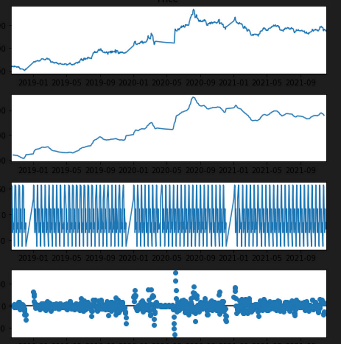
This code performs seasonal decomposition on the Price column in the data dataframe using the seasonal_decompose() function from the statsmodels library. The resulting plot shows the original time series, the seasonal component, the trend component, and the residual component.
Here’s a breakdown of the code:
data=pd.concat([data1,data2,data3,data4]): This line concatenates the four dataframes (data1, data2, data3, and data4) into a single dataframe called data.
data=data.sort_values(by=’DATE’, ascending=True): This line sorts the data dataframe in ascending order based on the DATE column using the sort_values() method.
data = data.loc[:, ~data.columns.str.contains(‘^Unnamed’)]: This line removes any columns in the data dataframe that have a name starting with “Unnamed” using the loc[] method and the ~ (tilde) operator to invert the boolean values returned by the str.contains() method.
data=data.set_index(‘DATE’): This line sets the index of the data dataframe to the DATE column using the set_index() method.
df1=data.sort_values(by=’DATE’, ascending=True): This line sorts the data dataframe in ascending order based on the DATE column and assigns the sorted dataframe to a new variable df1.
matplotlib.rc(‘figure’, figsize=(7, 7)): This line sets the default figure size to 7 inches by 7 inches using the rc() function from the matplotlib library.
decompose = seasonal_decompose(df1.Price, period=10, model=’additive’): This line performs seasonal decomposition on the Price column of the df1 dataframe using the seasonal_decompose() function from the statsmodels library. The period parameter is set to 10, which specifies the length of the seasonal cycle in the data. The model parameter is set to ‘additive’, which specifies that the seasonal and trend components are additive.
decompose.plot(): This line plots the resulting decomposition using the plot() method.
plt.show(): This line displays the plot in the output of the Jupyter notebook. The plt.show() function is used to explicitly show the plot in the notebook output.
The resulting plot will show the original time series, the seasonal component, the trend component, and the residual component. This plot can be used to identify any patterns or trends in the data, as well as any seasonality or irregular fluctuations.
Determine Error, Trend and Seasonality An ETS model has three main components: error, trend, and seasonality. Each can be applied either additively, multiplicatively, or not at all. We will use the above Times Series Decomposition Plot to determine the additive or multiplicative property of the thre components.
Trend — If the trend plot is linear then we apply it additively (A). If the trend line grows or shrinks exponentially, we apply it multiplicatively (M). If there is no clear trend, no trend component is included (N).
Seasonal — If the peaks and valleys for seasonality are constant over time, we apply it additively (A). If the size of the seasonal fluctuations tends to increase or decrease with the level of time series, we apply it multiplicatively (M). If there is no seasonality, it is not applied (N).
Error — If the error plot has constant variance over time (peaks and valleys are about the same size), we apply it additively (A). If the error plot is fluctuating between large and small errors over time, we apply it multiplicatively (M).
Check Stationariy of Time Series
data=pd.concat([data1,data2,data3,data4])
data=data.sort_values(by='DATE', ascending=True)
data = data.loc[:, ~data.columns.str.contains('^Unnamed')]
data=data.set_index('DATE')
data
This code concatenates the four dataframes (data1, data2, data3, and data4) into a single dataframe called data. It then sorts the data dataframe in ascending order based on the DATE column using the sort_values() method. It removes any columns in the data dataframe that have a name starting with “Unnamed” using the loc[] method and the ~ (tilde) operator to invert the boolean values returned by the str.contains() method. Finally, it sets the index of the data dataframe to the DATE column using the set_index() method.
Here’s a breakdown of the code:
data=pd.concat([data1,data2,data3,data4]): This line concatenates the four dataframes (data1, data2, data3, and data4) into a single dataframe called data.
data=data.sort_values(by=’DATE’, ascending=True): This line sorts the data dataframe in ascending order based on the DATE column using the sort_values() method.
data = data.loc[:, ~data.columns.str.contains(‘^Unnamed’)]: This line removes any columns in the data dataframe that have a name starting with “Unnamed” using the loc[] method and the ~ (tilde) operator to invert the boolean values returned by the str.contains() method.
data=data.set_index(‘DATE’): This line sets the index of the data dataframe to the DATE column using the set_index() method.
The resulting data dataframe contains all the gold price data from the four original dataframes, sorted in ascending order by date and with the index set to the DATE column.
from statsmodels.tsa.stattools import adfuller
def test_stationarity(timeseries):

    #Determing rolling statistics
    rolmean = timeseries.rolling(12).mean()
    rolstd = timeseries.rolling(12).std()

    #Plot rolling statistics:
    orig = plt.plot(timeseries, color='blue',label='Original')
    mean = plt.plot(rolmean, color='red', label='Rolling Mean')
    std = plt.plot(rolstd, color='black', label = 'Rolling Std')
    plt.legend(loc='best')
    plt.title('Rolling Mean & Standard Deviation')
    plt.show(block=False)
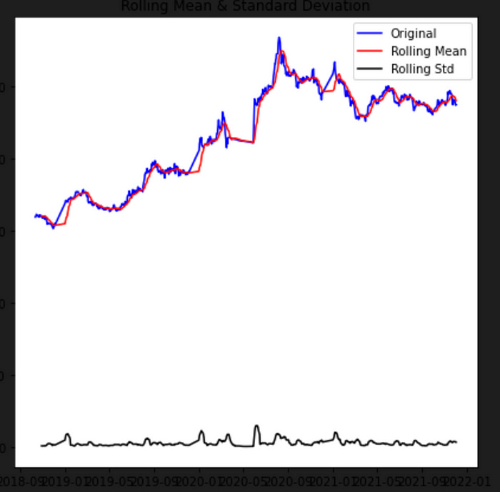
This code defines a function called test_stationarity() that takes a time series as input and plots the rolling mean and standard deviation of the time series.
Here’s a breakdown of the code:
from statsmodels.tsa.stattools import adfuller: This line imports the adfuller() function from the stattools module of the statsmodels library. This function will be used to perform the Augmented Dickey-Fuller (ADF) test for stationarity.
def test_stationarity(timeseries):: This line defines a function called test_stationarity() that takes a time series as input.
rolmean = timeseries.rolling(12).mean(): This line calculates the rolling mean of the input time series with a window size of 12 using the rolling() method and the mean() method.
rolstd = timeseries.rolling(12).std(): This line calculates the rolling standard deviation of the input time series with a window size of 12 using the rolling() method and the std() method.
orig = plt.plot(timeseries, color=’blue’,label=’Original’): This line plots the original time series in blue using the plot() function from the matplotlib library. The color parameter specifies the color of the line, and the label parameter specifies the label for the legend.
mean = plt.plot(rolmean, color=’red’, label=’Rolling Mean’): This line plots the rolling mean of the time series in red using the plot() function. The label for the legend is set to “Rolling Mean”.
std = plt.plot(rolstd, color=’black’, label = ‘Rolling Std’): This line plots the rolling standard deviation of the time series in black using the plot() function. The label for the legend is set to “Rolling Std”.
plt.legend(loc=’best’): This line adds a legend to the plot using the legend() function from the matplotlib library. The loc parameter specifies the location of the legend.
plt.title(‘Rolling Mean & Standard Deviation’): This line sets the title of the plot to “Rolling Mean & Standard Deviation” using the title() function.
plt.show(block=False): This line displays the plot in the output of the Jupyter notebook. The show() function is used to explicitly show the plot in the notebook output, and the block parameter is set to False so that the code can continue running after the plot is displayed.
The resulting plot will show the original time series, the rolling mean, and the rolling standard deviation. The plot can be used to visually inspect the data for stationarity.
test_stationarity(data)The test_stationarity() function takes a time series as input and plots the rolling mean and standard deviation of the time series to visually inspect the data for stationarity.
In this case, the data variable contains the concatenated and cleaned gold price data from 2018 to 2021. The test_stationarity() function is called with data as the input, which should be a pandas Series or DataFrame containing the Price column.
The resulting plot will show the original time series, the rolling mean, and the rolling standard deviation. This plot can be used to visually inspect the data for stationarity.

