

Leverage Powerful Tools and Techniques for Accurate Long-Term Forecasting
From Data Visualization to Statistical Analysis, Learn How to Forecast Like a Pro

Link to download the source code at the end of this article.
In today’s fast-paced financial markets, the ability to predict stock trends can provide a significant edge. Python, with its powerful libraries and tools, offers a robust platform for conducting long-term stock forecasting. This guide delves into the practical application of data visualization and statistical analysis to enhance your investment strategies.
Harnessing Python’s capabilities, we will explore how to effectively import, analyze, and visualize financial data. By leveraging libraries like Matplotlib, Seaborn, and Pandas, coupled with advanced statistical methods, you’ll learn how to generate insightful plots and forecasts. Whether you’re a seasoned investor or a data enthusiast, this comprehensive approach will equip you with the skills to make informed predictions and optimize your financial decisions.
This Python Notebook generates the plots and statistics featured in the paper titled Long-Term Stock Forecasting. The Python source code is thoroughly documented to facilitate understanding and customization. Note that this Notebook contains minimal explanations, as the detailed discussions are provided in the paper.
This Jupyter Notebook is implemented in Python version 3.6 and requires several packages for numerical computations and plotting. For installation instructions, please refer to the README file.
Readme File
Save this file as readme, and then run the program.
numpy       # Array-based computing.
scipy       # Scientific computing.
pandas      # Time-series computing.
matplotlib  # Basic plotting.
seaborn     # Extra plotting functions.
sklearn     # Machine Learning.
requests    # Download from the internet.
notebook    # Jupyter Notebook.
ipywidgets  # Interaction for Jupyter Notebook.
pygmo       # Multi-objective optimization.
statsmodels # Statistical modelling.
simfin      # Financial database.
numba       # Numba Jit compiler.
investops   # Investment tools.
Display plots within Jupyter notebook
%matplotlib inlineIn Python Jupyter notebooks, the %matplotlib inline magic command is used to display matplotlib plots directly below the code cell that generates them. This approach allows for easier data visualization and result interpretation as you work through your code. By utilizing %matplotlib inline, the need to call plt.show() after each plot is eliminated, simplifying the visualization process and enhancing the interactive data exploration experience. Overall, this directive improves the utility and readability of Jupyter notebooks when dealing with matplotlib plots.
Imports Python packages for data visualization
# Imports from Python packages.
import matplotlib.pyplot as plt
from matplotlib.ticker import FuncFormatter
from scipy.stats import ttest_rel, ttest_ind
import seaborn as sns
import pandas as pd
import numpy as np
import os
This code snippet is responsible for importing various Python packages essential for data visualization and statistical analysis. The package matplotlib.pyplot is widely used for creating visualizations, offering a MATLAB-like plotting framework to create different types of plots, charts, and figures. The matplotlib.ticker.FuncFormatter class from the same package allows customized formatting of tick values on plots.
The functions scipy.stats.ttest_rel and scipy.stats.ttest_ind from the scipy package are used for conducting statistical hypothesis tests, specifically the paired t-test and the independent t-test, respectively. The seaborn package, built on top of matplotlib, provides a higher-level interface for creating informative and attractive statistical graphics.
Onepagecode is a reader-supported publication. To receive new posts and support my work, consider becoming a free or paid subscriber.
The pandas package is used for data manipulation and analysis, providing powerful data structures like DataFrames, which facilitate easier handling of structured data. The numpy package caters to numerical computing, offering support for arrays, matrices, and mathematical functions essential for efficient numerical data operations. Lastly, the os package allows interaction with the operating system and is often used for handling file paths and directories in a platform-independent manner.
By importing these packages, you gain access to a wide range of functionalities for data analysis, visualization, and statistical testing, thereby making your data science tasks more efficient and streamlined.
Imports functions and data for finance operations
# Imports from FinanceOps.
from data_keys import *
from data import load_index_data, load_stock_data, load_usa_cpi
from returns import prepare_ann_returns, prepare_mean_ann_returns
from returns import reinvestment_growth, dividend_yield
This code snippet imports several functions and variables from different modules related to financial operations. By importing specific functions and variables, the current Python script can access and utilize the functionalities provided by those modules without the need to rewrite any code.
The script imports everything (*) from the data_keys module, which typically includes variables or constants related to data keys or identifiers. From the data module, it imports functions such as load_index_data, load_stock_data, and load_usa_cpi, which are responsible for handling data related to index, stock, and U.S. Consumer Price Index (CPI). Additionally, from the returns module, it imports functions like prepare_ann_returns, prepare_mean_ann_returns, reinvestment_growth, and dividend_yield. These functions probably deal with preparing annual returns, calculating mean annual returns, managing reinvestment growth, and computing dividend yields.
This organizational strategy promotes modularity, reusability, and readability in the codebase. By grouping related functions and variables into separate modules and importing them as needed, the code becomes easier to maintain and update. This approach also helps in avoiding redundant code and encapsulating related functionalities in a structured manner.
Creates directory for stock forecasting plots
# Create directory for plots if it does not exist already.
path_plots = 'plots/long-term_stock_forecasting/'
if not os.path.exists(path_plots):
    os.makedirs(path_plots)
This code snippet ensures the existence of a directory named ‘plots/long-term_stock_forecasting/’ in the current directory, creating it if necessary. It first sets the path for the directory to be created. Then, using the os.path.exists() function, it checks if the directory already exists in the current working directory. If it does not, the code employs os.makedirs() to create the directory, including any missing parent directories along the specified path.
This functionality addresses the need to maintain a specific directory structure for storing plots related to long-term stock forecasting. By preemptively creating the directory if it doesn’t exist, the code avoids potential errors during subsequent operations that involve saving or loading files in that directory, thus ensuring smooth execution of these tasks.
Defines tickers for stocks and indices
# Tickers for the stocks we consider.
ticker_PG = 'PG'
ticker_WMT = 'WMT'

# Tickers for the stock-indices we consider.
ticker_SP500 = 'S&P 500'
ticker_SP400 = 'S&P 400'
ticker_SP600 = 'S&P 600'

# Tickers for stock-index ETF's.
ticker_QQQ = 'QQQ'
ticker_VGK = "VGK"
ticker_EWO = "EWO"
ticker_EEM = "EEM"
The code snippet assigns variables to store ticker symbols for various stocks and stock indices. Ticker symbols, which are short alphabetic or alphanumeric codes, uniquely identify publicly traded securities and are vital for tracking specific stocks, indices, or ETFs during trading or financial analysis. Using variables to represent these ticker symbols in the code enhances readability, maintainability, and minimizes the risk of typographical errors when referencing these symbols across different parts of the program. In the financial industry, the accurate and consistent use of ticker symbols is essential for trading, analysis, and communication among market participants. Storing ticker symbols in variables streamlines development and ensures the consistent application of correct symbols.
Assign long titles to different symbols
# Long titles used in some plots.
title_PG = 'PG (Procter & Gamble)'
title_WMT = 'WMT (Walmart)'

# Long titles for stock-indices.
title_SP500 = 'S&P 500 (US Large-Cap)'
title_SP400 = 'S&P 400 (US Mid-Cap)'
title_SP600 = 'S&P 600 (US Small-Cap)'

# Long titles for ETF's.
title_QQQ = 'QQQ (NASDAQ 100 ETF)'
title_VGK = 'VGK (Europe Developed ETF)'
title_EWO = 'EWO (Austria ETF)'
title_EEM = 'EEM (Emerging Markets ETF)'
The provided code establishes variables with long titles for various stocks, stock indices, and ETFs. These extended titles contribute additional details beyond the simple stock ticker symbols, for instance, including the company names or their geographic focuses. This approach proves useful in contexts such as data visualizations, reports, or any situation where clarity and context are paramount. Utilizing these long titles alongside ticker symbols enables the audience to quickly grasp the significance of each item without needing to consult external sources. This practice significantly improves the readability and comprehension of the presented information.
Load various stock and index data
# Load data for the stocks.
df_PG = load_stock_data(ticker=ticker_PG, dividend_TTM=True)
df_WMT = load_stock_data(ticker=ticker_WMT, dividend_TTM=True)

# Load data for the stock-indices.
df_SP500 = load_index_data(ticker=ticker_SP500)
df_SP400 = load_index_data(ticker=ticker_SP400, book_value=False)
df_SP600 = load_index_data(ticker=ticker_SP600, book_value=False)

# Load data for ETF's which is treated like stock-data.
df_QQQ = load_stock_data(ticker=ticker_QQQ, earnings=False, book_value=False, dividend_TTM=True)
df_VGK = load_stock_data(ticker=ticker_VGK, earnings=False, book_value=False, dividend_TTM=True)
df_EWO = load_stock_data(ticker=ticker_EWO, earnings=False, book_value=False, dividend_TTM=True)
df_EEM = load_stock_data(ticker=ticker_EEM, earnings=False, book_value=False, dividend_TTM=True)

# Load data for Consumer Price Index (CPI).
df_CPI = load_usa_cpi()
The given code is designed to load financial data for various assets, including stocks, stock indices, and exchange-traded funds (ETFs), utilizing functions such as load_stock_data and load_index_data. Specifically, for individual stocks like Procter & Gamble (PG) and Walmart (WMT), the code loads data that includes dividends. For stock indices such as S&P 500, S&P 400, and S&P 600, it fetches index data, with additional parameters such as book value specified for indices like S&P 400 and S&P 600.
When it comes to ETFs including QQQ, VGK, EWO, and EEM, the code retrieves ETF data and takes into account particular parameters like earnings, book value, and dividends. Additionally, it loads data for the Consumer Price Index (CPI) using a function named load_usa_cpi. This data is essential for financial analysis, portfolio management, and investment decision-making. With this data available, analysts can undertake various calculations, make comparisons, and predict trends, thereby making informed decisions regarding the buying, selling, or holding of these financial assets.
Formats percentage with specified decimals
def pct_formatter(num_decimals=0):
    """Percentage-formatter used in plotting."""
    return FuncFormatter(lambda x, _: '{:.{}%}'.format(x, num_decimals))
The provided Python code defines a function called pct_formatter which is used for creating a percentage formatter in plotting contexts. This function accepts an optional parameter num_decimals to specify the number of decimal places to display in the percentage value. The primary outcome of calling pct_formatter is a FuncFormatter object, which is commonly used in plotting libraries such as Matplotlib to format tick labels.
This FuncFormatter object leverages a lambda function to format values as percentages, incorporating the specified number of decimal places. The utility of this code lies in its ability to customize the appearance of percentage values on plots, allowing for consistent formatting with fixed decimal places and the inclusion of a percentage symbol. By encapsulating the formatting logic within the pct_formatter function, it becomes straightforward to apply this consistent formatting across different plots, enhancing both readability and presentation.
Normalize an array of floats
def normalize(x):
    """Normalize the array of floats `x` to be between 0 and 1."""
    x_min = x.min()
    x_max = x.max()
    return (x - x_min) / (x_max - x_min)
The code defines a function called normalize that takes an array of floats, x, as input. The purpose of this function is to transform the values in the array so that they fall between 0 and 1. To achieve this, the function first identifies the minimum value (x_min) and maximum value (x_max) within the array. Each element in the array is then normalized by subtracting the minimum value and dividing by the range, which is the difference between the maximum and minimum values.
Normalization is a crucial preprocessing step in data analysis and machine learning tasks. It ensures that all features in the dataset are on the same scale, which is particularly important for algorithms that are sensitive to the scale of input data, such as neural networks and support vector machines. This prevents one feature from dominating others and enhances the performance of these algorithms.
Forecast stock returns using mathematical model
class ForecastModel:
    """
    Mathematical model used to forecast long-term stock returns.
    """

    def __init__(self, dividend_yield, sales_growth,
                 psales, years):
        """
        Create a new model and fit it with the given data.

        :param dividend_yield: Array with dividend yields.
        :param sales_growth: Array with one-year sales growth.
        :param psales: Array with P/Sales ratios.
        :param years: Number of years for annualized returns.
        """

        # Copy args to self.
        # Note the +1 for dividend yield and sales-growth
        # so we don't have to do it several times below.
        self.dividend_yield = np.array(dividend_yield) + 1
        self.sales_growth = np.array(sales_growth) + 1
        self.psales = psales
        self.years = years

        # Calculate the `a` parameter for the mean ann.return.
        self.a = self.mean_parameter()

        # Calculate the `b` parameter for the std.dev. ann.return.
        self.b = self.std_parameter()

    def forecast(self, psales_t):
        """
        Use the fitted model to forecast the mean and std.dev.
        for the future stock returns.

        :param psales_t: Array with different P/Sales ratios at buy-time.
        :return: Two arrays with mean and std.ann. for the ann. returns
                 for each of the psales_t values.
        """

        # Annualized psales_t which is used in both formulas.
        psales_t_ann = psales_t ** (1/self.years)

        # Forecast the mean and std.dev. for the ann. returns
        # for the different choices of P/Sales ratios at the
        # time of buying the stock.
        mean = self.a / psales_t_ann - 1.0
        std = self.b / psales_t_ann

        return mean, std

    def mean_parameter(self):
        """
        Estimate the parameter `a` used in the formula for the
        mean annualized return, given arrays with distributions
        for the dividend yield, sales-growth and P/Sales.

        :return: The parameter `a` for the mean return formula.
        """

        # We assume dividend_yield and sales_growth is already +1.
        a = np.mean(self.dividend_yield) \
          * np.mean(self.sales_growth) \
          * np.mean(self.psales ** (1/self.years))

        return a

    def std_parameter(self, num_samples=10000):
        """
        Estimate the parameter `b` used in the formula for the
        std.dev. annualized return, given arrays with distributions
        for the dividend yield, sales-growth and P/Sales.

        This is estimated using Monte Carlo simulation / resampling
        of the given data, which is assumed to be independent of
        each other and over time.

        :param num_samples: Number of Monte Carlo samples.
        :return: The parameter `b` for the std.dev. return formula.
        """

        # We could also calculate the parameter `b` using the data
        # and formula more directly, but this requires that all the
        # data-arrays have the same length, and this also assumes
        # that the data is *dependent* over time in the given order.
        # For the historical stock-data, the results seem to be quite
        # similar to the MC simulations.
        # return np.std( self.dividend_yield * self.sales_growth * self.psales ** (1/self.years) )

        # We will now do a Monte Carlo simulation / resampling
        # from the supplied arrays of data. For each year
        # we take e.g. 10k random samples and then we
        # calculate the annualized growth-rates. This gives
        # us different values for dividend yields and sales-growth
        # for each year, instead of just taking one random
        # number and using that for all the years.

        # Shape of arrays to sample.
        shape = (num_samples, self.years)
        num_samples_total = np.prod(shape)

        # Sample the dividend yield. We assume it is already +1.
        dividend_yield_sample = np.random.choice(self.dividend_yield, size=shape)
        # Compound the growth through the years.
        dividend_yield_sample = np.prod(dividend_yield_sample, axis=1)

        # Sample the sales-growth. We assume it is already +1.
        sales_growth_sample = np.random.choice(self.sales_growth, size=shape)
        # Compound the growth through the years.
        sales_growth_sample = np.prod(sales_growth_sample, axis=1)

        # Sample the P/Sales ratio at the time of selling.
        psales_sample = np.random.choice(self.psales, size=num_samples)

        # Combine the three samples.
        combined_sample = dividend_yield_sample * sales_growth_sample * psales_sample

        # Calculate the `b` parameter.
        b = np.std(combined_sample ** (1/self.years))

        return b

    def _ttest(self, err_forecast, err_baseline):
        """
        Perform a t-test on the residual errors of the
        forecasting model and the baseline to assess whether
        their means are equal.

        When the resulting p_value is close to zero, the means
        are unlikely to be equal.

        :param err_forecast:
            Residual errors for the forecasting model.

        :param err_baseline:
            Residual errors for the baseline.

        :return:
            p_value
        """

        if True:
            # Paired t-test.
            t_value, p_value = ttest_rel(a=err_forecast, b=err_baseline)
        else:
            # Un-paired / independent t-test.
            t_value, p_value = ttest_ind(a=err_forecast, b=err_baseline, equal_var=False)

        return p_value

    def MAE(self, psales_t, ann_rets):
        """
        Calculates the Mean Absolute Error (MAE) between the
        model's forecasted mean and the observed annualized returns.

        Also calculates the MAE between the baseline and the
        observed annualized returns.

        Also calculates the p-value that the forecasted and
        baseline MAE values are equal.

        :param psales_t:
            Array with different P/Sales ratios at buy-time.

        :param ann_rets:
            Array with the corresponding annualized returns.

        :return:
            mae_forecast: MAE between model's forecast and actual returns.
            mae_baseline: MAE between baseline and actual returns.
            p_value: p-value whether the two MAE values are equal.
        """

        # Forecast the mean and std.dev. for the stock returns,
        # from the historical P/Sales ratios.
        mean_forecast, std_forecast = self.forecast(psales_t=psales_t)

        # Errors between observed data and forecasting model.
        err_forecast = np.abs(ann_rets - mean_forecast)

        # Baseline errors between observed data and its mean.
        err_baseline = np.abs(ann_rets - np.mean(ann_rets))

        # Mean Absolute Errors (MAE).
        mae_forecast = np.mean(err_forecast)
        mae_baseline = np.mean(err_baseline)

        # Hypothesis test whether the two MAE values are equal.
        p_value = self._ttest(err_forecast=err_forecast,
                              err_baseline=err_baseline)

        return mae_forecast, mae_baseline, p_value

    def R_squared(self, psales_t, ann_rets):
        """
        Calculate the Coefficient of Determination R^2 for
        measuring the Goodness of Fit between the forecasted
        mean and the observed annualized returns.

        An R^2 value of one means there is a perfect fit and
        the forecasting model explains all of the variance
        in the data. An R^2 value of zero means the forecasting
        model does not explain any of the variance in the data.

        Note that because the forecasting model is non-linear,
        the R^2 can become negative if the model fits poorly
        on data with a large variance.

        :param psales_t:
            Array with different P/Sales ratios at buy-time.

        :param ann_rets:
            Array with the corresponding annualized returns.

        :return:
            R^2 value.
        """

        # Forecast the mean and std.dev. for the stock returns,
        # from the historical P/Sales ratios.
        mean_forecast, std_forecast = self.forecast(psales_t=psales_t)

        # Errors between observed data and forecasting model.
        err_forecast = (ann_rets - mean_forecast) ** 2

        # Baseline errors between observed data and its mean.
        err_baseline = (ann_rets - np.mean(ann_rets)) ** 2

        # Sum of Squared Errors (SSE) for the forecasting model.
        sse = np.sum(err_forecast)

        # Sum of Squared Errors (SST) for the baseline.
        sst = np.sum(err_baseline)

        # The R^2 value.
        R_squared = 1.0 - sse / sst

        return R_squared
The ForecastModel class is designed to create a mathematical model for predicting long-term stock returns based on inputs like dividend yields, sales growth, P/Sales ratios, and the number of years for annualized returns. The model is initialized with this data, calculating parameters ‘a’ and ‘b’ necessary for determining the mean and standard deviation of the forecasted annualized returns.
Key functionalities of the model include forecasting the mean and standard deviation of stock returns based on various P/Sales ratios at the time of purchase. It also estimates parameter ‘a’ for the mean return formula and parameter ‘b’ for the standard deviation return formula using Monte Carlo simulation. The model calculates the Mean Absolute Error (MAE) between its forecasted mean and the observed annualized returns, supported by a hypothesis test for the MAE values. Additionally, it measures the Goodness of Fit using the Coefficient of Determination R² between the forecasted mean and the observed annualized returns.
This code is vital for financial analysts, traders, or anyone interested in predicting stock market returns grounded on historical data and fundamental factors such as dividend yields, sales growth, and P/Sales ratios. By providing insights into potential returns and inherent risks, the model aids in making informed investment decisions. It offers a systematic approach to forecasting stock returns and evaluates the accuracy of predictions using metrics like MAE and R².
Onepagecode is a reader-supported publication. To receive new posts and support my work, consider becoming a free or paid subscriber.
Plot return curves for varying years
def plot_return_curves(years, a=1.0, filename=None, figsize=(10, 10)):
    """
    Plot the "return curves" for mean annualized return with
    different choices of years:

    ann_ret = a / (P/Sales ^ (1/year)) - 1

    :param years: Array of different years to plot.
    :param a: The `a` parameter in the formula above.
    :param filename: Full path to save figure to disk.
    :param figsize: Tuple with the figure-size.
    :return: None.
    """

    # Create a single plot.
    fig = plt.figure(figsize=figsize)
    ax = fig.add_subplot(211)

    # Array of values for the x-axis.
    psales = np.linspace(start=0.5, stop=2, num=100)

    # For each year in the given array.
    for year in years:
        # Calculate "return curve" values for the y-axis.
        ann_ret = a / (psales ** (1/year)) - 1.0

        # Set the label for this curve and plot it.
        label = "Year = {0}".format(year)
        ax.plot(psales, ann_ret, label=label)

    # Show the labels for all the curves.
    ax.legend()

    # Set the labels for the axes.
    ax.set_xlabel("P/Sales")
    ax.set_ylabel("Annualized Return")

    # Convert y-ticks to percentages.
    ax.yaxis.set_major_formatter(pct_formatter())

    # Show grid and mark the gain/loss lines.
    ax.grid()
    ax.axhline(0, color='black')
    ax.axvline(1, color='black')

    # Adjust padding.
    fig.tight_layout()

    # Save plot to a file?
    if filename is not None:
        fig.savefig(filename, bbox_inches='tight')

    return ax
The function plot_return_curves is designed to generate a plot of return curves for various years, taking several parameters: years (an array of different years to plot), a (a parameter used in the formula), filename (an optional path to save the figure as an image), and figsize (the size of the figure). It computes the annualized return values using the formula a(P/Sales)(1/year) — 1 for each year in the array, and plots these curves on a single graph to illustrate how the annualized return varies with different P/Sales values and years.
After plotting the curves, the function enhances the plot by adding labels, setting axis labels, converting y-axis ticks to percentages, and adding a grid. It also marks the gain/loss lines with a horizontal line at y=0 and a vertical line at x=1. Finally, it adjusts the padding and optionally saves the plot to a file if the filename parameter is provided.
This code is beneficial for visualizing the changes in annualized return (on the y-axis) against different P/Sales values (on the x-axis) over various years. It facilitates users in comparing and analyzing how differing parameters affect the annualized return, thereby assisting in making investment decisions or analyzing financial data.
Creates a plot of Return Curves
# Make the plot with Return Curves.
filename = os.path.join(path_plots, 'Return Curves.svg')
plot_return_curves(years=[1, 2, 3, 4, 5, 8, 10], filename=filename);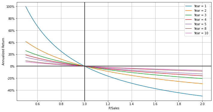
The provided code snippet is designed to generate a plot illustrating return curves over various time periods. It employs a function named plot_return_curves, to which it passes a list of years — [1, 2, 3, 4, 5, 8, 10] — and the filename where the plot will be saved as an SVG file. The function plot_return_curves creates plots showing return curves for the specified time periods, serving as a useful tool for visualizing how returns on investments or assets change over different holding durations.
Utilizing this code is essential for producing the return curve plot, which aids in analyzing investment or asset performance over different intervals. This visualization can offer valuable insights into how returns evolve over time, thereby supporting informed decisions regarding investment strategies or portfolio management.
Plot single data column with mean
def plot_with_mean_line(df, column, ax,
                        percentage=False, y_decimals=2):
    """
    Helper-function for plotting a single data-column and its mean.
    This function is used by the main plotting functions.

    :param df: Pandas DataFrame containing the given column.
    :param column: String with column-name to plot on y-axis.
    :param ax: Matplotlib Axis object.
    :param percentage: Show y-axis as percentage.
    :param y_decimals:
        Number of decimals to show if percentage is True.
    :return: None
    """

    # Make the basic plot.
    sns.lineplot(x=DATE, y=column, data=df.reset_index(),
                 ax=ax, label=column);

    # Mean of the data-column.
    mean = df[column].mean()

    # Create label for the mean.
    if percentage:
        # Convert y-ticks to percentages.
        ax.yaxis.set_major_formatter(pct_formatter(y_decimals))

        label_mean = 'Mean = {:.1%}'.format(mean)
    else:
        label_mean = 'Mean = {:.1f}'.format(mean)

    # Plot the mean of the given data-column.
    ax.axhline(mean, c='k', ls=':', label=label_mean)

    # Show the legend.
    ax.legend()
This helper function is designed to plot a single data column from a Pandas DataFrame along with its mean value. It takes as input the DataFrame, the column name to be plotted on the y-axis, a Matplotlib Axis object for rendering the plot, a flag indicating whether the y-axis should be shown as a percentage, and the number of decimal places to display if the percentage option is enabled.
Initially, the function creates a line plot of the specified column using Seaborn’s lineplot function. It then computes the mean of the column and prepares a label for the mean value. If the percentage flag is set to True, the function converts the y-axis ticks to percentages and formats the mean label accordingly. Subsequently, it plots a horizontal dashed line representing the mean value on the plot, along with the mean label, and then displays the plot’s legend.
This function proves useful in data visualization tasks, particularly when there is a need to easily visualize a data column along with its mean value in a plot. It streamlines the process of plotting data with the mean value highlighted, thereby facilitating easier analysis and interpretation.
Plot financial metrics for stocks
def plot_basic_data(title, df, log_shareprice=True,
                    filename=None, figsize=(10, 12.5)):
    """
    Create a plot with the basic financial data for a stock or index.

    :param title: Overall title for the plot.
    :param df: Pandas DataFrame with stock-data.
    :param log_shareprice: Use log-scale on y-axis for share-prices.
    :param filename: Full path to save figure to disk.
    :param figsize: Tuple with the figure-size.
    :return: Matplotlib Axis object.
    """

    # Select only the data we need.
    columns = [SALES_PER_SHARE, SHARE_PRICE, PSALES,
               SALES_GROWTH, DIVIDEND_YIELD]
    df2 = df[columns]

    # Remove rows for which there is missing data.
    df2 = df2.dropna()

    # Change the index into a normal column.
    df3 = df2.reset_index()

    # Create a new plot with sub-plot rows.
    plt.rc('figure', figsize=figsize)
    fig, axs = plt.subplots(nrows=4)

    # Set the main plot-title.
    axs[0].set_title(title)

    # Use log-scale on the y-axis for share-prices?
    if log_shareprice:
        axs[0].set_yscale('log')

    # Plot the Share-Price and Sales Per Share.
    sns.lineplot(data=df2[[SHARE_PRICE, SALES_PER_SHARE]], ax=axs[0])

    # Plot the P/Sales.
    plot_with_mean_line(df=df3, column=PSALES, ax=axs[1])

    # Plot the Sales Growth.
    plot_with_mean_line(df=df3, column=SALES_GROWTH, ax=axs[2],
                        percentage=True, y_decimals=0)

    # Plot the Dividend Yield.
    plot_with_mean_line(df=df3, column=DIVIDEND_YIELD, ax=axs[3],
                        percentage=True, y_decimals=1)

    # Adjust all the sub-plots.
    for ax in axs:
        # Don't show the x-axis label.
        ax.set_xlabel(None)

        # Show grid.
        ax.grid(which='both')

    # Adjust padding.
    fig.tight_layout()

    # Save plot to a file?
    if filename is not None:
        fig.savefig(filename, bbox_inches='tight')

    return fig
This code defines a function designed to create a comprehensive plot displaying essential financial data for a stock or index. The function accepts various parameters, including a title, a Pandas DataFrame containing the stock data, an optional log-scale setting for the y-axis of share prices, a filename for saving the plot, and the desired figure size.
The function begins by selecting specific columns from the provided DataFrame and removing any rows with missing data. After resetting the DataFrame’s index, it creates a new plot comprising multiple subplots. The main plot title is then set, and if specified, a log scale is applied to the y-axis for share prices.
The first subplot displays the share price and sales per share, while subsequent subplots are dedicated to different financial metrics. Specifically, the second subplot shows the Price to Sales (P/Sales) ratio, the third illustrates Sales Growth, and the fourth depicts the Dividend Yield. Each of these subplots is created by calling respective plotting functions.
To ensure clarity and organization, the function adjusts the subplots by removing x-axis labels, enabling grid display, and applying a tight layout. If a filename is provided, the function saves the plot to the specified file.
Overall, this function enables the visualization of crucial financial data related to a stock or index, facilitating better analysis and interpretation for investors or analysts. By presenting multiple financial metrics within a single, well-organized plot, it aids in comprehending the overall performance and trends of the stock or index.
Plot historical returns and P/S ratios with mathematical forecasts
def plot_ann_returns(ticker, df, years, years_range=0,
dividend_yield=None, sales_growth=None,
psales=None, psales_min=None, psales_max=None,
ax=None):
"""
Create a plot with the actual historical returns showing
the P/Sales ratios vs. future Annualized Returns.
Overlay this plot with the estimated mean and std.dev.
from the mathematical forecasting model.
The optional params are taken from the DataFrame `df`
if not supplied. This allows you to override some or
all of the data used in the forecasting model e.g.
to change assumptions about future sales-growth.
:param ticker: String with ticker for the stock or index.
:param df: Pandas DataFrame.
:param years: Number of investment years.
:param years_range:
If > 0 then plot the mean ann. returns between
years - years_range and years + years_range.
:param dividend_yield: (Optional) Array with dividend yields.
:param sales_growth: (Optional) Array with one-year sales growth.
:param psales: (Optional) Array with P/Sales ratios.
:param psales_min: (Optional) Min P/Sales for plotting curves.
:param psales_max: (Optional) Max P/Sales for plotting curves.
:param ax: (Optional) Matplotlib Axis object for the plot.
:return: None
"""
# Select only the data we need.
df2 = df[[TOTAL_RETURN, DIVIDEND_YIELD, SALES_GROWTH, PSALES]]
# Remove rows for which there is missing data.
df2 = df2.dropna()
# Create a new plot if no plotting-axis is supplied.
if ax is None:
fig = plt.figure(figsize=(10, 10))
ax = fig.add_subplot(211)
# Part of the title for the data's date-range.
start_date, end_date = df2.index[[0, -1]]
title_dates = "({0}-{1})".format(start_date.year, end_date.year)
# Get the actual ann. returns from the historic data.
if years_range > 0:
# Use the mean. ann. returns between [min_years, max_years].
min_years = years - years_range
if min_years < 1:
min_years = 1
max_years = years + years_range
# Get the mean ann.returns from the historic data.
x, y = prepare_mean_ann_returns(df=df2,
min_years=min_years,
max_years=max_years,
key=PSALES)
# First part of the plot-title.
title1 = "[{0}] {1}-{2} Year Mean Ann. Return {3}".format(ticker, min_years, max_years, title_dates)
# Label for the scatter-plot of actual returns.
label_returns = "Actual Returns (Mean)"
else:
# Get the ann.returns from the historic data.
x, y = prepare_ann_returns(df=df2, years=years, key=PSALES)
# First part of the plot-title.
title1 = "[{0}] {1}-Year Ann. Return {2}".format(ticker, years, title_dates)
# Label for the scatter-plot of actual returns.
label_returns = "Actual Returns"
# Get Dividend Yield if none provided.
if dividend_yield is None:
dividend_yield = df2[DIVIDEND_YIELD]
# Get Sales Growth if none provided.
if sales_growth is None:
sales_growth = df2[SALES_GROWTH]
# Get P/Sales if none provided.
if psales is None:
psales = df2[PSALES]
# Get min P/Sales for plotting if none provided.
if psales_min is None:
psales_min = np.min(psales)
# Get max P/Sales for plotting if none provided.
if psales_max is None:
psales_max = np.max(psales)
# Create the forecasting model and fit it to the data.
model = ForecastModel(dividend_yield=dividend_yield,
sales_growth=sales_growth,
psales=psales, years=years)
# Evenly spaced P/Sales ratios between historic min and max.
psales_t = np.linspace(start=psales_min, stop=psales_max, num=100)
# Use the model to forecast the mean and std ann.returns.
mean, std = model.forecast(psales_t=psales_t)
# Plot the mean ann.return with the R^2 for how well
# it fits the actual ann.return.
R_squared = model.R_squared(psales_t=x, ann_rets=y)
label = "Forecast Mean (R^2 = {0:.2f})".format(R_squared)
ax.plot(psales_t, mean, color="black", label=label)
# Plot one standard deviation.
color = "green"
alpha = 0.3
# Plot lines below and above mean.
ax.plot(psales_t, mean-std, color=color,
label="Forecast Mean $\pm$ 1 Std.Dev.")
ax.plot(psales_t, mean+std, color=color)
# Fill the areas.
ax.fill_between(psales_t, mean+std, mean-std,
color=color, edgecolor=color, alpha=alpha)
# Plot two standard deviations.
color = "red"
alpha = 0.1
# Plot lines below and above mean.
ax.plot(psales_t, mean-2*std, color=color,
label="Forecast Mean $\pm$ 2 Std.Dev.")
ax.plot(psales_t, mean+2*std, color=color)
# Fill the areas.
ax.fill_between(psales_t, mean-std, mean-2*std,
color=color, edgecolor=color, alpha=alpha)
ax.fill_between(psales_t, mean+std, mean+2*std,
color=color, edgecolor=color, alpha=alpha)
# Scatter-plot with the actual P/Sales vs. Ann.Returns.
# Each dot is colored according to its date (array-position).
# The dots are rasterized (turned into pixels) to save space
# when saving to vectorized graphics-file.
n = len(x)
c = np.arange(n) / n
ax.scatter(x, y, marker='o', c=c, cmap='plasma',
label=label_returns, rasterized=True)
# Plot mean of Ann.Returns. as horizontal dashed line.
y_mean = np.mean(y)
label = 'Actual Mean = {0:.1%}'.format(y_mean)
ax.axhline(y=y_mean, color="black", linestyle=":", label=label)
# Show the labels for what we have just plotted.
ax.legend()
# Create plot-title.
# Second part of the title. Formula for mean ann. return.
msg = "E[Ann Return] = {0:.2f} / (P/Sales ^ (1/{1})) - 1"
title2 = msg.format(model.a, years)
# Third part of the title. Formula for std.dev. ann. return.
msg = "Std[Ann Return] = {0:.3f} / (P/Sales ^ (1/{1}))"
title3 = msg.format(model.b, years)
# Combine and set the plot-title.
title = "\n".join([title1, title2, title3])
ax.set_title(title)
# Convert y-ticks to percentages.
ax.yaxis.set_major_formatter(pct_formatter())
# Set axes labels.
ax.set_xlabel("P/Sales")
ax.set_ylabel("Annualized Return")
# Show grid.
ax.grid()
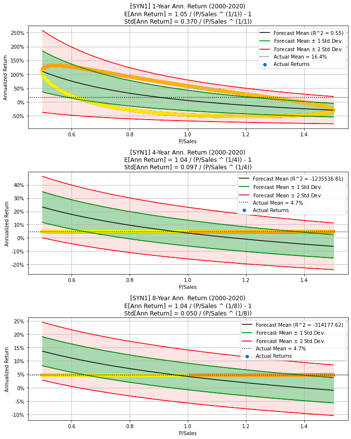
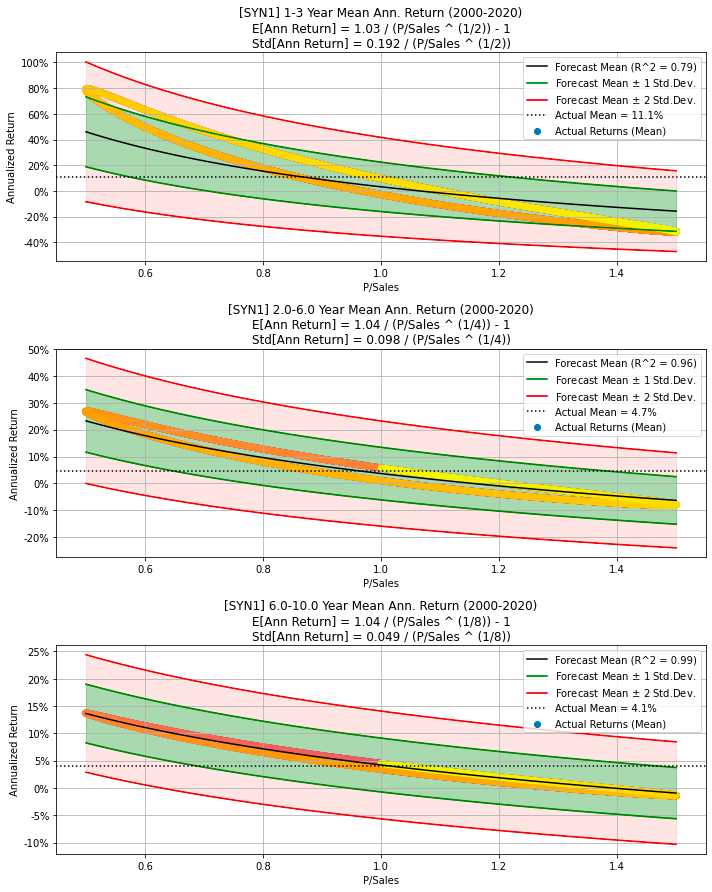
return axThe code defines a function called plot_ann_returns designed to create a visual representation of the relationship between Price-to-Sales ratios and future annualized returns for a given stock or index. This function accepts various parameters, including the stock ticker, a DataFrame containing relevant data, the number of investment years, and optional parameters such as dividend yield, sales growth, P/Sales ratios, and plotting axes.
Initially, the function selects the necessary columns from the DataFrame and removes any rows with missing data. If no axis is provided for plotting, it generates a new plot. It proceeds by calculating the actual annual returns based on historical data, either using the mean annual returns over a specified range of years or for a particular number of years. Additionally, the function collects supplementary data like dividend yield, sales growth, and P/Sales ratios if they are not provided explicitly.
The function then constructs a forecasting model based on the gathered data and fits it to the actual annual returns. It generates forecasts for the mean and standard deviation of annual returns across different Price-to-Sales ratios. Subsequently, the function plots the forecasted mean returns, standard deviation, actual data points, and other relevant information on the graph. It concludes by setting titles, labels, legends, formatting, and the grid for the plot before returning the axis.
This function is valuable for visualizing and analyzing the correlation between Price-to-Sales ratios and future annualized returns for a stock or index. It offers flexibility in customizing the data used for the forecasting model and provides a visual representation of potential returns based on various assumptions and historical data.
Create multiple sub-plots of annual returns
def plot_ann_returns_multi(years, years_range=0, filename=None,
                           figsize=None, *args, **kwargs):
    """
    Create plot with multiple sub-plots from `plot_ann_returns`
    for different years and years_range.

    :param years: List of years.
    :param years_range: Either integer or list of integers.
    :param filename: Full path to save figure to disk.
    :param figsize: Tuple with the figure-size.
    :return: Matplotlib Figure
    """

    # Number of sub-plots to create, one for each year.
    n = len(years)

    # Ensure `years_range` is a list or numpy array.
    if not isinstance(years_range, (list, np.ndarray)):
        years_range = np.repeat(years_range, repeats=n)

    # Figure size.
    if figsize is None:
        figsize = (10, 12.5 * n / 3)

    # Create new plot with sub-plots.
    fig, axs = plt.subplots(nrows=n, figsize=figsize)

    # Create each of the sub-plots.
    for ax, y, y_range in zip(axs, years, years_range):
        plot_ann_returns(ax=ax, years=y, years_range=y_range,
                         *args, **kwargs)

    # Adjust padding.
    fig.tight_layout()

    # Save plot to a file?
    if filename is not None:
        fig.savefig(filename, bbox_inches='tight')

    return fig
The code defines a function called plot_ann_returns_multi which is designed to create subplots for different years by utilizing another function named plot_ann_returns. The function accepts a list of years and optionally a list or integer representing the years_range. Additional optional parameters include the filename to save the plot and the figure size. Initially, it calculates the number of subplots required based on the number of years provided. It then ensures that the years_range is formatted as a list if it isn’t already one or a NumPy array.
Next, the function sets the figure size according to the number of subplots and the specified figure size. It proceeds to create subplots using plt.subplots and iterates over each subplot, invoking plot_ann_returns for every year and years_range specified. After generating all the subplots, it adjusts the padding with fig.tight_layout(). If a filename is provided, it saves the resulting figure to disk.
We should use this code when we need to plot multiple subplots for different years, with each subplot illustrating annual returns. This function streamlines the process of generating the subplots efficiently and in an organized fashion using the plot_ann_returns function.
Function creates multiple stock plots
def make_all_plots(title, ticker, df):
    """
    Create all the plots for a stock or stock-index.

    :param title: Long title for the stock.
    :param ticker: Ticker for the stock.
    :param df: Pandas DataFrame with data for the stock.
    :return: None
    """

    # Plot basic stock-data.
    filename = os.path.join(path_plots, ticker + ' Basic Data.svg')
    plot_basic_data(title=title, df=df, filename=filename);

    # Plot P/Sales vs. Ann.Returns for different years.
    filename = os.path.join(path_plots, ticker + ' Ann Returns.svg')
    plot_ann_returns_multi(filename=filename,
                           ticker=ticker, df=df,
                           years=[1, 5, 10]);

    # Plot P/Sales vs. Ann.Returns for different years and ranges.
    filename = os.path.join(path_plots, ticker + ' Ann Returns (Mean).svg')
    plot_ann_returns_multi(filename=filename,
                           ticker=ticker, df=df,
                           years=[3, 5, 8], years_range=[1, 1, 2]);

    # Show the plots.
    plt.show()
The code defines a function called make_all_plots that generates multiple plots for the visualization of stock data. It expects three parameters: title (the stock’s long title), ticker (the stock ticker symbol), and df (a Pandas DataFrame containing the stock data).
The function starts by plotting basic stock data using plot_basic_data, which typically includes stock price trends, volume, and other relevant information. It then generates a plot that compares the Price-to-Sales ratio versus Annual Returns for different years using the plot_ann_returns_multi function. This helps analyze how the stock’s performance correlates with its valuation metric. Another plot generated by plot_ann_returns_multi shows annual returns for different years and ranges, providing additional insights into the stock’s performance over multiple time horizons. Finally, all the plots are displayed to the user.
This function is beneficial for financial analysts, investors, or anyone interested in visualizing and analyzing stock data effectively. By generating these plots, users can gain insights into how a stock has performed over time relative to various metrics, aiding them in making more informed decisions about investing in or tracking the stock.
Plot subplots of financial data
def plot_ann_returns_error(ticker, df, years, years_range=0,
                           ax=None, filename=None, figsize=(10, 12.5)):
    """
    Create 4 sub-plots. The first compares the forecasted mean
    return to the actual return. The second plot is for the
    P/Sales ratio, the third plot is for the Sales Per Share,
    and the fourth is for the Sales Growth.

    :param ticker: String with ticker for the stock or index.
    :param df: Pandas DataFrame.
    :param years: Number of investment years.
    :param years_range:
        If > 0 then plot the mean ann. returns between
        years - years_range and years + years_range.
    :param filename: Filename for saving the plot.
    :param figsize: Figure size.
    :return: Matplotlib Figure object.
    """

    # Select only the data we need.
    df2 = df[[TOTAL_RETURN, DIVIDEND_YIELD, SALES_PER_SHARE,
              SALES_GROWTH, PSALES]]

    # Remove rows for which there is missing data.
    df2 = df2.dropna()

    # Create new plot with sub-plots.
    fig, axs = plt.subplots(nrows=4, figsize=figsize)

    # Part of the title for the data's date-range.
    start_date, end_date = df2.index[[0, -1]]
    title_dates = "({0}-{1})".format(start_date.year, end_date.year)

    # Get the actual ann. returns from the historic data.
    if years_range > 0:
        # Use the mean. ann. returns between [min_years, max_years].
        min_years = years - years_range
        if min_years < 1:
            min_years = 1
        max_years = years + years_range

        # Get the mean ann.returns from the historic data.
        x, y = prepare_mean_ann_returns(df=df2,
                                        min_years=min_years,
                                        max_years=max_years,
                                        key=PSALES)

        # First part of the plot-title.
        title1 = "[{0}] {1}-{2} Year Mean Ann. Return {3}".format(ticker, min_years, max_years, title_dates)
    else:
        # Get the ann.returns from the historic data.
        x, y = prepare_ann_returns(df=df2, years=years, key=PSALES)

        # First part of the plot-title.
        title1 = "[{0}] {1}-Year Ann. Return {2}".format(ticker, years, title_dates)

    # Create the forecasting model and fit it to the data.
    model = ForecastModel(dividend_yield=df2[DIVIDEND_YIELD],
                          sales_growth=df2[SALES_GROWTH],
                          psales=df2[PSALES], years=years)

    # Use forecasting model with historical P/Sales ratios
    # to get the forecasted mean and std.dev. ann. returns.
    mean, std = model.forecast(psales_t=x)

    # Plot the Actual vs. Forecasted mean return.
    data = \
    {
        'Actual Return': y,
        'Forecasted Mean Return': mean,
    }
    df3 = pd.DataFrame(data=data, index=df2.index)
    sns.lineplot(data=df3, ax=axs[0])
    # Hack to show the same Dates on the x-axis as plots below,
    # because sns.lineplot() removes the rows with NAN.
    sns.lineplot(x=df3.index, y=0, ax=axs[0], alpha=0)
    # Set label for y-axis.
    axs[0].set_ylabel('Annualized Return')
    # Convert y-ticks to percentages.
    axs[0].yaxis.set_major_formatter(pct_formatter())

    # Plot P/Sales.
    plot_with_mean_line(df=df2, column=PSALES, ax=axs[1])

    # Plot Sales Per Share.
    plot_with_mean_line(df=df2, column=SALES_PER_SHARE, ax=axs[2])

    # Plot Sales Growth.
    plot_with_mean_line(df=df2, column=SALES_GROWTH, ax=axs[3],
                        percentage=True, y_decimals=0)

    # Create plot-title.
    # Second part of the title. Formula for mean ann. return.
    msg = "Forecasted Mean Return = {0:.2f} / (P/Sales ^ (1/{1})) - 1"
    title2 = msg.format(model.a, years)
    # Combine and set the plot-title.
    title = "\n".join([title1, title2])
    axs[0].set_title(title)

    # Adjust all the sub-plots.
    for ax in axs:
        # Don't show the x-axis label.
        ax.set_xlabel(None)

        # Show grid.
        ax.grid(which='both')

    # Adjust padding.
    fig.tight_layout()

    # Save plot to a file?
    if filename is not None:
        fig.savefig(filename, bbox_inches='tight')

    return fig
The code defines a function designed to generate a comprehensive plot that compares forecasted and actual annual returns, Price-to-Sales (P/S) ratio, Sales Per Share, and Sales Growth for a given stock or index. The function requires several inputs, including the stock ticker, a pandas DataFrame containing pertinent financial data, the number of investment years, and optional parameters for customization.
Initially, the function filters the DataFrame to select only the necessary columns and removes any rows containing missing data. It then prepares the data for plotting, taking into account the specified investment years and any provided range. The next step involves creating a forecasting model based on historical data that includes Dividend Yield, Sales Growth, and the P/S ratio. This model is used to predict the mean and standard deviation of annual returns.
Subsequently, the function plots the actual versus forecasted mean return, P/S ratio, Sales Per Share, and Sales Growth with appropriate formatting. It generates a detailed title for the plot incorporating the stock ticker, investment years, and the date range of the available data. If a filename is provided, the function saves the plot to a file.
This function streamlines the process of visualizing and comparing various financial metrics over time, offering insights into the expected returns and performance of the stock or index. By automating data preparation, model fitting, and plotting, it facilitates the effective analysis and interpretation of financial data for the user.
Prints basic statistics of selected financial data
def print_stats(df):
    """Print basic statistics for the financial data in `df`."""

    # Get the data-columns we are interested in and remove NA.
    df2 = df[[SHARE_PRICE, TOTAL_RETURN,
              PSALES, SALES_GROWTH, DIVIDEND_YIELD]].dropna()

    # Print basic statistics.
    display(df2.describe())

    # Print the first rows.
    display(df2.head())

    # Print the last rows.
    display(df2.tail())
The print_stats function is designed to provide basic statistics for financial data contained within a DataFrame (df). Initially, the function selects specific columns of interest, such as SHARE_PRICE, TOTAL_RETURN, PSALES, etc., and removes any rows from these columns that contain missing values (NaN). The cleaned DataFrame is then subjected to descriptive statistical analysis using the describe() method, which outputs statistics including count, mean, standard deviation, minimum, maximum, and quartile values for each column. Subsequently, the function displays the first few rows of the cleaned DataFrame using the head() method and the last few rows using the tail() method. This procedure allows for a comprehensive and quick examination of essential financial data, facilitating an understanding of the distribution and characteristics of the financial variables. By considering only relevant columns devoid of missing values, the function ensures the reliability of the statistical analysis and presentation.
Generate synthetic stock data using parameters
def synth_data(num_years=20,
               psales_start=1.0, psales_end=1.0,
               psales_cycle_years=3,
               psales_cycle_scale=0.5,
               psales_rand_scale=0.5,
               sales_growth_start=0.05, sales_growth_end=0.05,
               sales_growth_rand_scale=0.02):
    """
    Generate synthetic stock-data for the P/Sales ratio,
    annual growth in Sales Per Share, and Share-Price.
    The Dividend Yield is set to zero.

    The P/Sales ratio has 3 components:
    - A value that changes linearly from start to end.
    - A sinus value that changes cyclically.
    - A random value with unpredictable noise.

    The annual growth in Sales Per Share has 2 components:
    - A value that changes linearly from start to end.
    - A random value with unpredictable noise.

    The Share-Price is the product of P/Sales * Sales Per Share.

    The scale of the components can be set as parameters.

    :param num_years:
        Number of years for the daily synthetic data.
    :param psales_start:
        Start-value for the linear component of P/Sales.
    :param psales_end:
        End-value for the linear component of P/Sales.
    :param psales_cycle_years:
        Period in years for a full sinus-cycle of P/Sales.
    :param psales_cycle_scale:
        Scale of the cyclical component of P/Sales.
    :param psales_random_scale:
        Scale of the random component of P/Sales.
    :param sales_growth_start:
        Start-value for the linear component of Sales Growth.
    :param sales_growth_end:
        End-value for the linear component of Sales Growth.
    :param sales_growth_rand_scale:
        Scale of the random component of Sales Growth.
    :return:
        Pandas DataFrame with synthetic data.
    """
    # Dates for the synthetic data starting on '2000-01-01'
    # and ending on e.g. '2020-01-01' for a 20-year period.
    date_index = pd.date_range(start='2000',
                               end=str(2000+num_years), freq='d')

    # Total number of steps or data-points.
    num_steps = len(date_index)

    # Index as fractional years ranging from zero to e.g. 20.
    index = np.arange(start=0, stop=num_steps) * num_years / num_steps

    # Linear component of P/Sales.
    psales = np.linspace(start=psales_start,
                         stop=psales_end, num=num_steps)

    # Add cyclical / sinus component to P/Sales.
    psales += psales_cycle_scale * np.sin(2 * np.pi * index / psales_cycle_years)

    # Add random component to P/Sales.
    # This is a "random walk" that is normalized to be between
    # 0 and 1 so it is easier to scale and therefore control
    # its impact on the overall P/Sales data.
    rand = np.random.normal(loc=0.0, scale=1.0, size=num_steps)
    rand = np.cumsum(rand)
    rand = normalize(rand)
    psales += psales_rand_scale * rand

    # Linear component of the Sales Growth.
    # Note: This has only one data-point per year.
    sales_growth_yearly = np.linspace(start=sales_growth_start,
                                      stop=sales_growth_end,
                                      num=num_years)

    # Add random component to the Sales Growth.
    sales_growth_yearly += sales_growth_rand_scale * np.random.normal(size=num_years)

    # Convert the Sales Growth to Sales Per Share starting at 1.
    # Note: This has only one data-point per year.
    sales_per_share_yearly = np.append(1.0, np.cumprod(1 + sales_growth_yearly[:-1]))

    # Interpolate the yearly data-points into daily data-points.
    # Note: This results in slight distortion of the annual growth
    # in Sales Per Share, but has the advantage of creating a
    # "smooth" plot instead of "stair-cases" in the Sales Growth.
    # We also use such linear interpolation on the real-world data
    # for Sales Per Share.
    years = np.linspace(start=0.0, stop=num_years, num=num_years)
    sales_per_share = np.interp(x=index, xp=years, fp=sales_per_share_yearly)
    sales_growth = np.interp(x=index, xp=years, fp=sales_growth_yearly)

    # Calculate daily Share-Price from P/Sales and Sales Per Share.
    share_price = psales * sales_per_share

    # Create Pandas DataFrame.
    # Note: We set the Dividend Yield to zero so the
    # Total Return is equal to the Share-Price.
    data = \
    {
        DATE: date_index,
        PSALES: psales,
        SALES_PER_SHARE: sales_per_share,
        SALES_GROWTH: sales_growth,
        SHARE_PRICE: share_price,
        TOTAL_RETURN: share_price,
        DIVIDEND_YIELD: 0,
    }
    df = pd.DataFrame(data=data).set_index(DATE)

    return df
The synth_data function generates synthetic stock data based on parameters such as the P/Sales ratio, annual growth in Sales Per Share, and Share Price. This artificial data mimics real historical stock data, making it useful for data analysis and modeling purposes.
The function constructs three main components for the data. The P/Sales Ratio consists of a linear component that changes from a start value to an end value, a sinusoidal component that changes cyclically over a specified period, and a random noise component to introduce unpredictability. The annual growth in Sales Per Share includes a linear component varying from a start value to an end value, coupled with a random noise component to add variability. The Share Price is calculated as the product of the P/Sales ratio and Sales Per Share.
Internally, the function leverages the numpy and pandas libraries to generate the synthetic data and package it into a Pandas DataFrame. The overall purpose of this code is to create a simulated dataset of stock-related metrics, which can be used for testing algorithms, conducting financial analysis, or training machine learning models without relying on real-world financial data. This synthetic data generation is particularly helpful when obtaining actual historical data is challenging or impractical.
A function generating synthetic stock data plots
def make_all_plots_synth(title, ticker, df, cycle_years,
                         plot_sales_growth=True):
    """
    Create all the plots for synthetic stock-data.

    :param title: Long title for the stock.
    :param ticker: Ticker for the stock.
    :param df: Pandas DataFrame with data for the stock.
    :param cycle_years:
        Period in years for a full sinus-cycle of P/Sales.
    :return: None
    """

    # Plot basic stock-data.
    filename = os.path.join(path_plots, ticker + ' Basic Data.svg')
    plot_basic_data(title=title, df=df, filename=filename);

    # Plot P/Sales vs. Ann.Returns for different years.
    filename = os.path.join(path_plots, ticker + ' Ann Returns.svg')
    plot_ann_returns_multi(filename=filename,
                           ticker=ticker, df=df,
                           years=[1, cycle_years, 2*cycle_years]);

    # Plot P/Sales vs. Ann.Returns for different years and ranges.
    filename = os.path.join(path_plots, ticker + ' Ann Returns (Mean).svg')
    plot_ann_returns_multi(filename=filename,
                           ticker=ticker, df=df,
                           years=[2, cycle_years, 2*cycle_years],
                           years_range=[1, cycle_years/2, cycle_years/2]);

    # Show the plots.
    plt.show()
This Python function generates multiple plots for synthetic stock data, taking parameters such as the title of the stock, stock ticker symbol, a Pandas DataFrame containing the stock data, and the cycle in years for a full sinus cycle of the Price-to-Sales (P/Sales) ratio. Initially, the function creates a plot of the basic stock data using the plot_basic_data function. It then generates two additional plots showing P/Sales versus Annual Returns for different years and ranges utilizing the plot_ann_returns_multi function. These plots provide insights into the relationship between P/Sales and annual returns for the specified stock. Finally, it displays all the generated plots with plt.show(). This code is beneficial for analyzing and visualizing synthetic stock data, helping to identify patterns or trends useful for making investment decisions or for further analysis.
Calculates full sinus-cycle duration in years
# Number of years for a full sinus-cycle of P/Sales.
cycle_years = 4
The code initializes a variable called cycle_years with the value of 4, representing the number of years required for a full sinusoidal cycle of P/Sales. In finance and economics, a sinusoidal cycle often illustrates periodic fluctuations in data such as sales or profits. By establishing cycle_years at 4, the code indicates that a complete sinusoidal pattern for P/Sales spans over a four-year period. This is valuable for financial analysts, economists, or others working with data featuring cyclical patterns. Explicitly defining the cycle length in years aids in modeling, analyzing, and predicting data behavior over time. Understanding the cycle duration is crucial for making business decisions, forecasting, and assessing trends in financial metrics like sales or profits.
Generates synthetic data for analysis
# Synthetic data with cyclical P/Sales and constant Sales Growth,
# and no random noise.

df = synth_data(num_years=20, psales_cycle_years=cycle_years,
                psales_cycle_scale=0.5, psales_rand_scale=0.0,
                sales_growth_rand_scale=0.0)

make_all_plots_synth(title='Synthetic Data 1', ticker='SYN1',
                     df=df, cycle_years=cycle_years,
                     plot_sales_growth=False)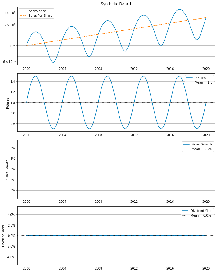
This code generates synthetic financial data representing cyclical Price/Sales (P/Sales) ratios and consistent sales growth over a specified number of years. The synth_data() function is utilized to create the synthetic data based on parameters such as the number of years, the cyclical nature of P/Sales ratios (including cyclical period and scale), and the random noise scale for both P/Sales and sales growth, although no random noise is added in this instance. After generating the synthetic data, the make_all_plots_synth() function is called to produce various plots visualizing the synthetic financial data, including P/Sales ratios and sales growth over time.
This approach allows for the creation of artificial financial datasets that mimic real-world patterns, which is useful for testing models, conducting simulations, or demonstrating concepts without relying on actual financial data. By using synthetic data, one can understand the behavior of financial metrics under controlled conditions, providing valuable insights and avoiding the complications associated with using real-world data.
Generates synthetic stock market data plots
# Synthetic data with partially random P/Sales and Sales Growth.

# Random seed to make these experiments repeatable.
np.random.seed(987654321)

df = synth_data(num_years=20, psales_cycle_years=cycle_years,
                psales_cycle_scale=0.5, psales_rand_scale=1.8,
                sales_growth_rand_scale=0.03)

make_all_plots_synth(title='Synthetic Data 2', ticker='SYN2',
                     df=df, cycle_years=cycle_years)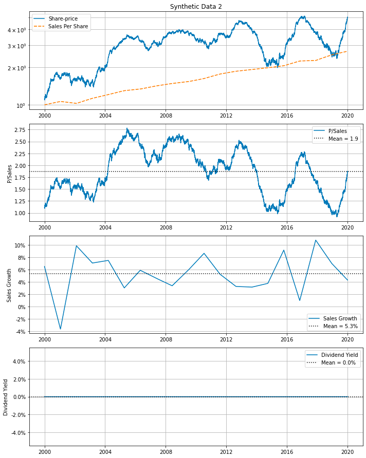
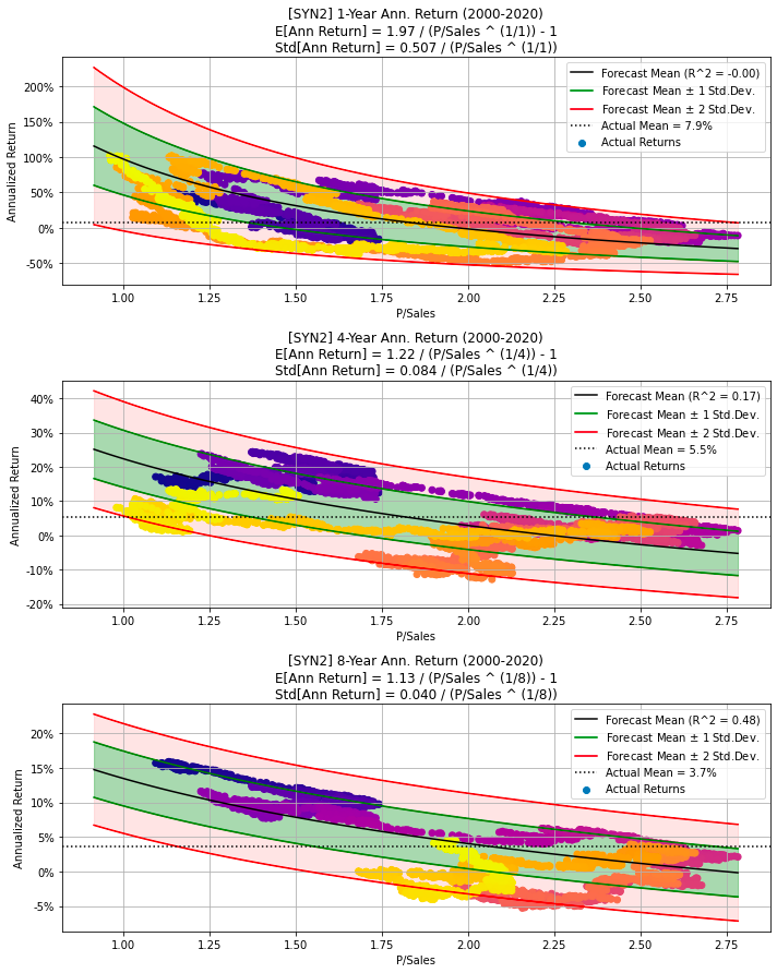
The provided code snippet generates synthetic data for a hypothetical company. Initially, it sets a random seed to ensure the experiments’ reproducibility. It then calls a function, synth_data, which creates synthetic data over a specified period — 20 years in this particular instance. The function generates partially random data for metrics like the Price-to-Sales ratio (P/Sales), Sales Growth, among others. Parameters such as psales_cycle_years, psales_cycle_scale, and psales_rand_scale control the randomness of P/Sales, while sales_growth_rand_scale influences the randomness of Sales Growth. This synthetic data is subsequently stored in a DataFrame named df.
Following data generation, the code calls another function, make_all_plots_synth, to create various visualizations based on the synthetic data. These plots include visual representations of P/Sales, Sales Growth, and other metrics of interest. The plots are given the title Synthetic Data 2 and use the ticker symbol SYN2 for the hypothetical company.
This code snippet is particularly useful for creating simulated data for various purposes such as testing, experimenting, or demonstrating. By generating synthetic data, users can analyze different scenarios, test models, or build visualizations without the need for real-world data. This approach is advantageous, especially when actual data is unavailable, sensitive, or insufficient for the desired analysis.
Generate synthetic financial data for 30 years, visualizes the data
# Synthetic data with partially random P/Sales and Sales Growth,
# and Sales Growth decreases linearly from 40% to 5%.
# Note the data-period is increased to 30 years.

# Random seed to make these experiments repeatable.
np.random.seed(987654321)

df = synth_data(num_years=30, psales_cycle_years=cycle_years,
                psales_cycle_scale=0.5, psales_rand_scale=1.8,
                sales_growth_start=0.4, sales_growth_end=0.05,
                sales_growth_rand_scale=0.03)

make_all_plots_synth(title='Synthetic Data 3', ticker='SYN3',
                     df=df, cycle_years=cycle_years)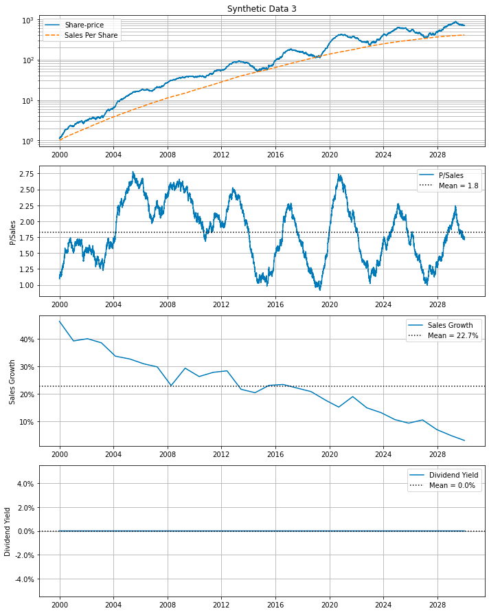
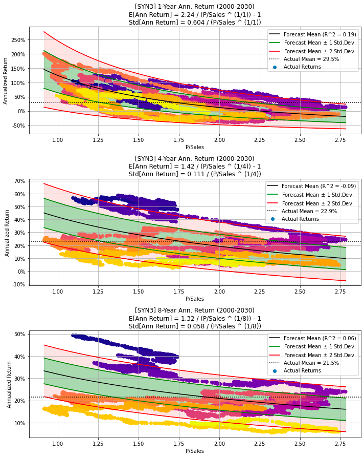
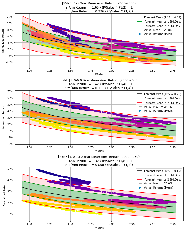
The provided code snippet generates synthetic financial data featuring a partially random Price-to-Sales ratio and a Sales Growth rate. By invoking the synth_data function, the code constructs a DataFrame encompassing 30 years of financial data. The Price-to-Sales ratio is crafted with both cyclical and random elements, whereas the Sales Growth rate starts at 40% and decreases linearly to 5% over this three-decade span.
A random seed is set at the beginning of the code to ensure that the generated data remains consistent across multiple runs, facilitating reproducibility and debugging. This synthetic data generation is particularly valuable for testing algorithms, developing predictive models, or carrying out financial analyses where real-world data may be confidential or not easily accessible.
Furthermore, the make_all_plots_synth function creates visual representations of the synthetic data, providing clear insights into financial trends and patterns over the given time period. These visualizations enhance the understanding and analysis of the generated data.
The S&P 500, also known as the Standard & Poor’s 500 Index, was introduced in 1957. It represents the 500 largest companies in the United States. The index dates back to 1923. Well-known companies like Apple (AAPL), Microsoft (MSFT), Amazon (AMZN), and Meta (META) are on the list. The S&P 500 companies’ market capitalization together equals roughly 80% of the total market capitalization in the US. To be in the S&P 500 index, a company must meet specific criteria, including a minimum of $14.6 billion in market capitalization, positive earnings from the last quarter and the sum of the previous four quarters, a minimum monthly trading volume of 250,000 shares over the past six months, at least 50% of shares outstanding publicly, and being headquartered in the US.
The weight of each company’s stock in the S&P 500 is proportional to its market value. Stocks with greater market capitalizations have more impact on the index’s price trends. The Vanguard 500 Index Fund (VFIAX) is a common method for investing in the S&P 500, representing its performance through a fund that strives to replicate the index by holding each constituent in similar proportions.
Generate plots for S&P 500 data
make_all_plots(title=title_SP500, ticker=ticker_SP500, df=df_SP500)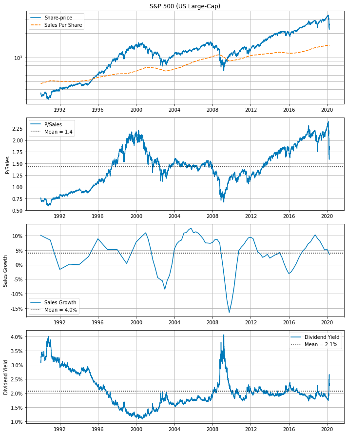
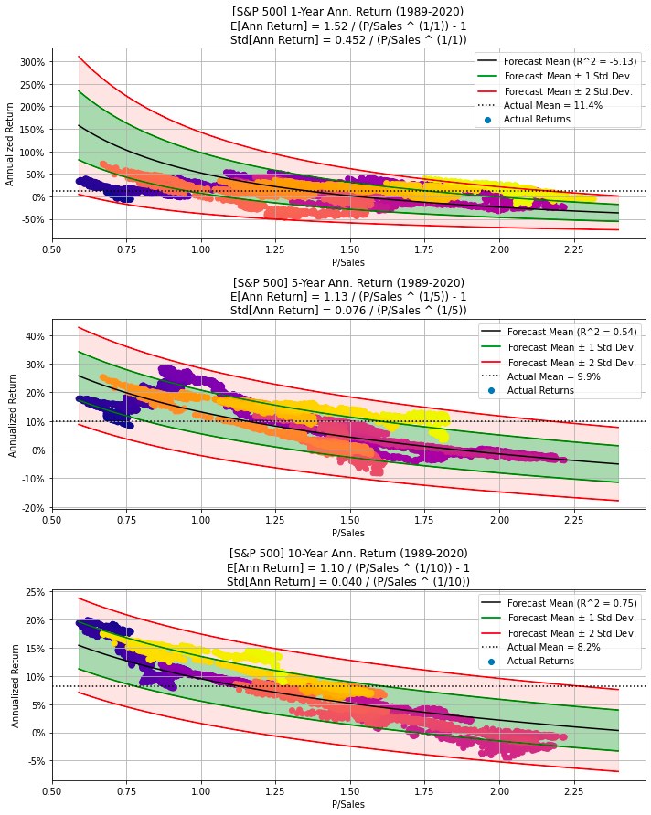
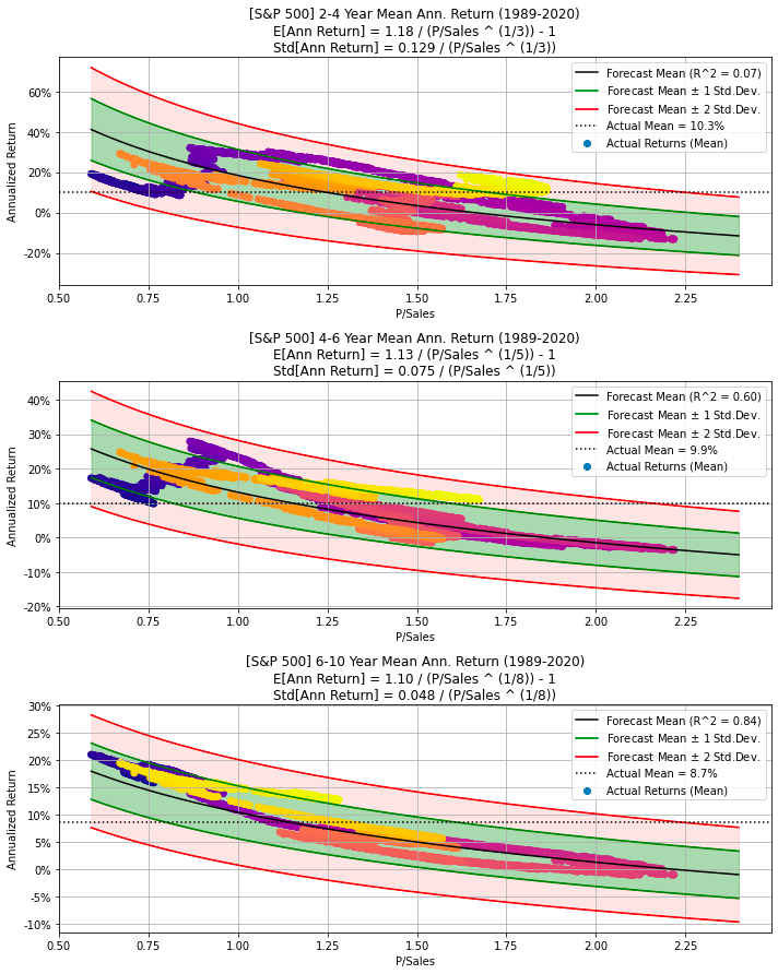
The code generates multiple plots related to the S&P 500 stock data by calling the function make_all_plots with parameters representing the title of the plot, the stock ticker symbol for the S&P 500 index (such as SPY), and the data frame containing the S&P 500 stock data. Within the make_all_plots function, it probably creates various visualizations, including line graphs, bar charts, scatter plots, and other types of charts, to represent the stock information effectively. These plots facilitate the analysis of performance, trends, and patterns in the S&P 500 stock data.
Utilizing this code is advantageous for anyone who needs to quickly visualize and comprehend the S&P 500 stock data without manually creating each plot individually. It offers a convenient and efficient method for generating multiple plots for analysis, making it easier to extract insights from the data.
Prints statistics for a DataFrame
print_stats(df=df_SP500)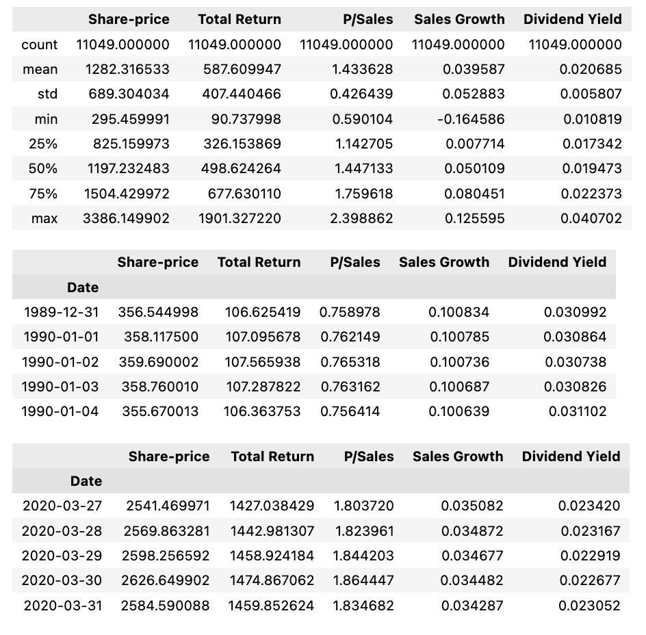
The code refers to a function named print_stats that takes a DataFrame as an argument, in this case, df_SP500. The function is probably designed to calculate and display statistics or summary information about the DataFrame passed to it. This could include metrics such as mean, median, standard deviation, and count. Utilizing this code is useful for obtaining a quick overview or summary of the data in the DataFrame without the need to manually calculate these statistics each time. This approach saves time and provides important insights into the data.