

Leveraging Python for Informed Stock Market Trading Strategies
Advanced Python Techniques for Financial Data Analysis

The link to download the source code zip file is at the end of this article.
In the dynamic world of stock trading, having a competitive edge is crucial. The amalgamation of data science and finance has given birth to powerful analytical tools, enabling traders to make informed decisions with precision. This comprehensive guide delves into the realm of Python-driven financial data analysis, offering a treasure trove of strategies and visualizations tailored to maximize trading success. Whether you’re a seasoned trader or a financial enthusiast, this article unveils sophisticated techniques that transform raw data into actionable insights.
Harnessing the capabilities of Python libraries such as yfinance, pandas, and matplotlib, we explore the intricacies of technical indicators and their applications in real-time trading scenarios. From calculating moving averages and Bollinger Bands to generating trading signals based on the Moving Average Convergence Divergence (MACD) and Relative Strength Index (RSI), this guide provides a step-by-step approach to implementing these strategies. Dive into the world of algorithmic trading and discover how to leverage Python’s robust analytical framework to stay ahead in the fast-paced stock market.
# Importing libs
import yfinance as yf

import numpy as np
import pandas as pd
import matplotlib as mpl
import matplotlib.pyplot as plt
import matplotlib.style as style
from matplotlib.dates import date2num, DateFormatter, WeekdayLocator, DayLocator, MONDAY
import seaborn as sns

import mplfinance as mpf
from mplfinance.original_flavor import candlestick_ohlc

from scipy import stats
from scipy.stats import zscore
from statsmodels.tsa.stattools import adfuller
from statsmodels.tsa.stattools import coint

import datetime
from datetime import date, timedelta

import warnings
warnings.filterwarnings('ignore')

%matplotlib inline
The code imports various libraries essential for data analysis and visualization. Yfinance is utilized to fetch historical market data from Yahoo Finance, while numpy supports large, multi-dimensional arrays and matrices, alongside offering mathematical functions for their manipulation. Pandas provides efficient data structures and tools for working with structured data. For visualization, matplotlib is a versatile library for creating static, animated, and interactive plots, and seaborn builds on it by offering a high-level interface to craft attractive and informative statistical graphics.
Additionally, mplfinance, which is based on matplotlib, is tailored for financial data visualization, offering tools to create detailed financial charts. Scipy is employed for scientific and technical computing, including modules for optimization, linear algebra, integration, and interpolation. Statsmodels offers a suite of classes and functions for estimating diverse statistical models and conducting statistical tests. The code also ensures efficient plotting by setting configurations to ignore warnings and displaying plots inline within a Jupyter notebook using %matplotlib inline.
With these libraries, you can conduct comprehensive financial data analysis, visualize data effectively, perform a range of statistical tests, and derive insightful decisions from the data fetched via yfinance.
ftse100_stocks = yf.download("AZN.L GSK.L ULVR.L BP.L SHEL.L HSBA.L", start=datetime.datetime(2014, 1, 1),
                                     end=datetime.datetime(2023, 12, 31), group_by='tickers')
ftse100_stocks.head(10)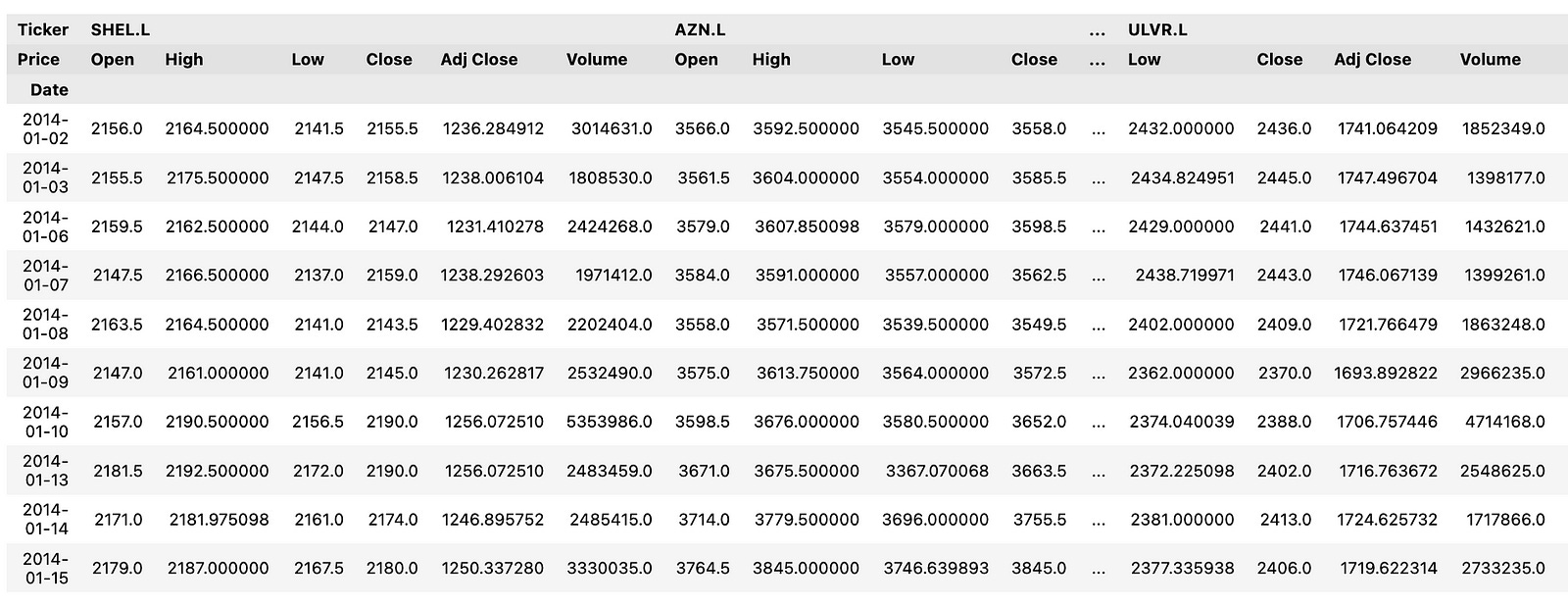
This code snippet employs the yfinance library to download historical stock price data for a selection of FTSE 100 companies. Initially, it imports the yf module from the yfinance library. It then proceeds to download historical stock market data for specified FTSE 100 companies — AstraZeneca (AZN.L), GlaxoSmithKline (GSK.L), Unilever (ULVR.L), BP (BP.L), Royal Dutch Shell (SHEL.L), and HSBC Holdings (HSBA.L) — covering the period from January 1, 2014, to December 31, 2023. The data is organized by tickers, where each row represents a specific stock, and the columns denote different attributes such as Open, High, Low, Close, Volume, and Adjusted Close.
This code is instrumental for fetching historical stock price data to facilitate analysis, visualization, or the construction of machine learning models aimed at forecasting stock prices. By utilizing this data, one can perform a variety of financial analyses, generate insights, and make well-informed investment decisions based on the trends and patterns observed in the historical stock prices.
def pandas_candlestick_ohlc(dat, stick="day", otherseries=None, txt=""):
    """
    Japanese candlestick chart showing OHLC prices for a specified time period

    :param dat: pandas DataFrame object with datetime64 index, and float columns "Open", "High", "Low", and "Close"
    :param stick: A string or number indicating the period of time covered by a single candlestick. Valid string inputs include "day", "week", "month", and "year", ("day" default), and any numeric input indicates the number of trading days included in a period
    :param otherseries: An iterable that will be coerced into a list, containing the columns of dat that hold other series to be plotted as lines
    :param txt: Title text for the candlestick chart

    :returns: a Japanese candlestick plot for stock data stored in dat, also plotting other series if passed.
    """
    sns.set(rc={'figure.figsize':(20, 10)})
    sns.set_style("whitegrid")  # Apply seaborn whitegrid style to the plots

    transdat = dat.loc[:, ["Open", "High", "Low", "Close"]].copy()

    if type(stick) == str and stick in ["day", "week", "month", "year"]:
        if stick != "day":
            if stick == "week":
                transdat['period'] = pd.to_datetime(transdat.index).map(lambda x: x.strftime('%Y-%U'))
            elif stick == "month":
                transdat['period'] = pd.to_datetime(transdat.index).map(lambda x: x.strftime('%Y-%m'))
            elif stick == "year":
                transdat['period'] = pd.to_datetime(transdat.index).map(lambda x: x.strftime('%Y'))

            grouped = transdat.groupby('period')
            plotdat = pd.DataFrame([{
                "Open": group.iloc[0]["Open"],
                "High": max(group["High"]),
                "Low": min(group["Low"]),
                "Close": group.iloc[-1]["Close"]
            } for _, group in grouped], index=pd.to_datetime([period for period, _ in grouped]))
        else:
            plotdat = transdat
            plotdat['period'] = pd.to_datetime(plotdat.index)
    elif type(stick) == int and stick >= 1:
        transdat['period'] = np.floor(np.arange(len(transdat)) / stick)
        grouped = transdat.groupby('period')
        plotdat = pd.DataFrame([{
            "Open": group.iloc[0]["Open"],
            "High": max(group["High"]),
            "Low": min(group["Low"]),
            "Close": group.iloc[-1]["Close"]
        } for _, group in grouped], index=[group.index[0] for _, group in grouped])
    else:
        raise ValueError('Valid inputs to argument "stick" include the strings "day", "week", "month", "year", or a positive integer')

    plotdat['date_num'] = date2num(plotdat.index.to_pydatetime())

    fig, ax = plt.subplots()
    ax.xaxis_date()
    ax.autoscale_view()
    plt.setp(plt.gca().get_xticklabels(), rotation=45, horizontalalignment='right')
    sns.set(rc={'figure.figsize':(20, 10)})
    candlestick_ohlc(ax, plotdat[['date_num', 'Open', 'High', 'Low', 'Close']].values, width=0.6/(24*60), colorup='g', colordown='r')

    if otherseries is not None:
        if type(otherseries) != list:
            otherseries = [otherseries]
        for series in otherseries:
            dat[series].plot(ax=ax, lw=1.3)

    plt.title(f"Candlestick chart of HSBA.L OHLC stock prices from 01 Jan 2014 - 31 Dec 2023", color = 'black', fontsize = 20)
    plt.xlabel('Date', color = 'black', fontsize = 15)
    plt.ylabel('Stock Price (p)', color = 'black', fontsize = 15)
    candlestick_ohlc(ax, plotdat[['date_num', 'Open', 'High', 'Low', 'Close']].values, width=20, colorup='g', colordown='r')

    plt.show()
The `pandas_candlestick_ohlc` function generates a Japanese candlestick chart for stock data stored in a pandas DataFrame. It accepts several parameters, including data, the time period covered by each candlestick, additional series to be plotted, and a title for the chart. Initially, the function sets the plotting style using seaborn and extracts the OHLC (Open, High, Low, Close) data from the input DataFrame. It then processes this data based on the specified ‘stick’ parameter, grouping the data accordingly and calculating the OHLC values for each group.
Once the data is prepared, the function creates a figure and axes for the plot, converts the dates to numerical format, and plots the candlesticks using the matplotlib finance module. If additional series are specified, these are plotted on the same graph. Lastly, the function sets the title and axis labels before displaying the candlestick chart.
This function is instrumental in visualizing OHLC stock prices in a sophisticated and informative manner, aiding in technical analysis and decision-making related to trading or investments. Candlestick charts offer a visual representation of price movements over time, displaying open, high, low, and close prices for each period. This information helps traders and analysts identify trends, patterns, and potential reversal points in the stock’s price behavior, providing valuable insights for strategic financial decisions.
# Plot candlestick chart for 10 year period from 20114-20223

pandas_candlestick_ohlc(hsba, stick="month")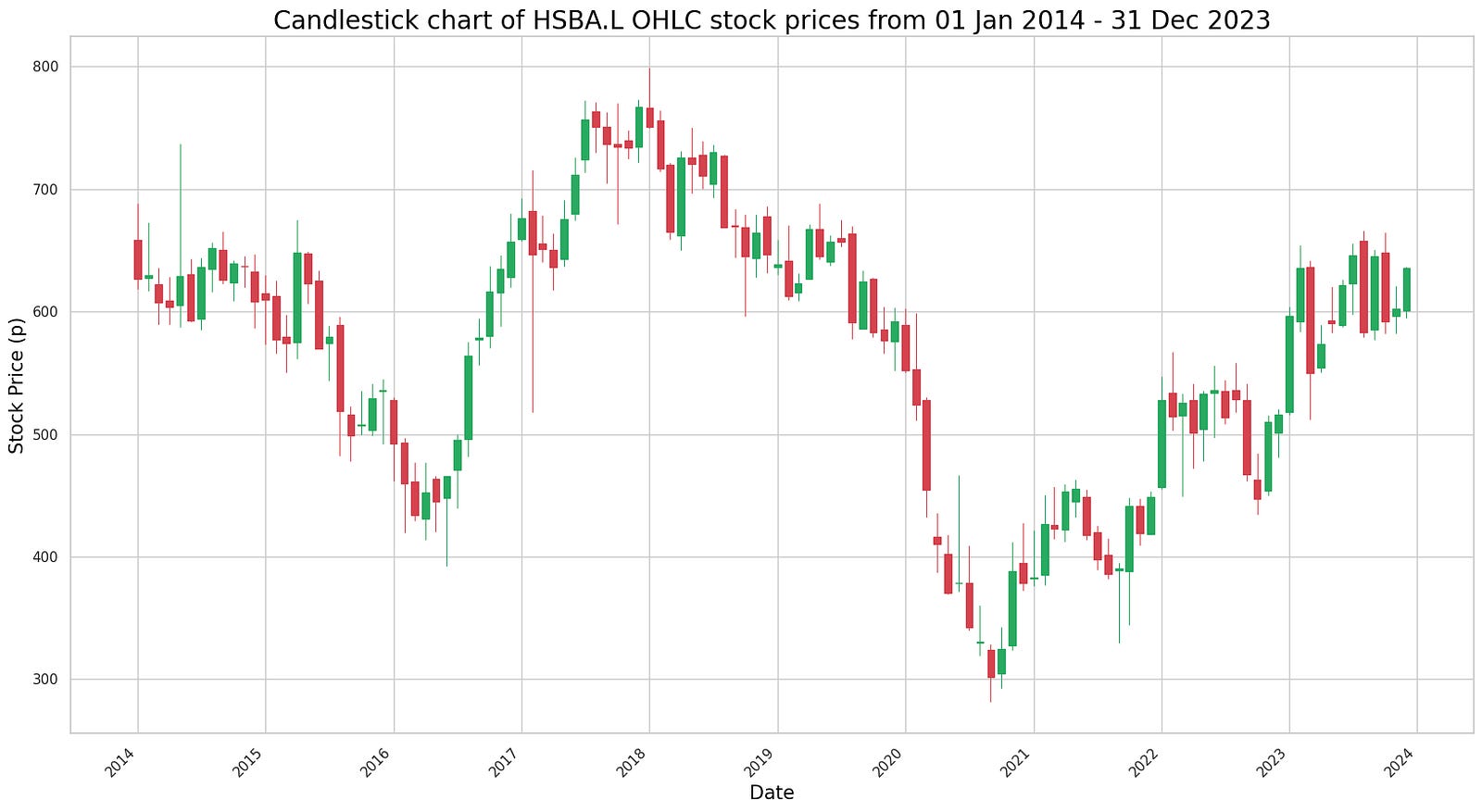
The code appears to be designed to plot a candlestick chart using OHLC (Open, High, Low, Close) data for a specific stock, likely identified as “hsba,” spanning a 10-year period from 2014 to 2023. The function pandas_candlestick_ohlc seems to be custom-made or part of a library specifically tailored for plotting candlestick charts.
Candlestick charts are a popular tool in technical analysis for financial markets, used to depict price movements over time. Each candlestick reflects the open, high, low, and close prices for a designated time period, which makes them effective for capturing market sentiment and trends.
By providing stock data and specifying the granularity of the candlesticks, in this instance “month,” the code generates a candlestick chart that illustrates the stock’s price behavior over the specified decade. This type of visualization aids traders and analysts in identifying patterns, observing trends, and spotting potential reversal signals in the stock’s price movement, thus supporting informed decision-making.
def sma():
  plt.figure(figsize=(15,9))
  ftse100_stocks[ticker]['Adj Close'].loc['2023-01-01':'2023-12-31'].rolling(window=20).mean().plot(label='20 Day Avg')
  ftse100_stocks[ticker]['Adj Close'].loc['2023-01-01':'2023-12-31'].plot(label=f"{label_txt}")
  plt.title(f"{title_txt}", color = 'black', fontsize = 20)
  plt.xlabel('Date', color = 'black', fontsize = 15)
  plt.ylabel('Stock Price (p)', color = 'black', fontsize = 15);
  plt.legend()
The provided code defines a function called `sma()` that generates a plot highlighting the 20-day simple moving average (SMA) of stock prices along with the actual stock prices for a specific stock ticker within the year 2023. First, the function initializes a new figure for the plot with a designated size. It then calculates the 20-day SMA of the stock prices for the given ticker over the period from January 1, 2023, to December 31, 2023.
Once the SMA values are computed, the function plots them on the graph, marking them as ’20 Day Avg’. Concurrently, it plots the actual stock prices for the same ticker and date range. To enhance clarity, the function sets the title of the plot along with the x-axis and y-axis labels, customizing these elements with the provided title text, and applying specific colors and font sizes. Additionally, a legend is added to the plot to clearly differentiate between the SMA line and the actual stock price line.
This type of analysis is particularly beneficial for observing stock price trends over time. By visualizing the moving average alongside the actual prices, one can smooth out the day-to-day price fluctuations, making it easier to discern underlying trends and potential trading signals. This form of technical analysis is regularly employed by investors to make well-informed investment decisions.
ticker = 'HSBA.L'
title_txt = "20-day Simple Moving Average for HSBA.L stock"
label_txt = "HSBA.L Adj Close"

sma()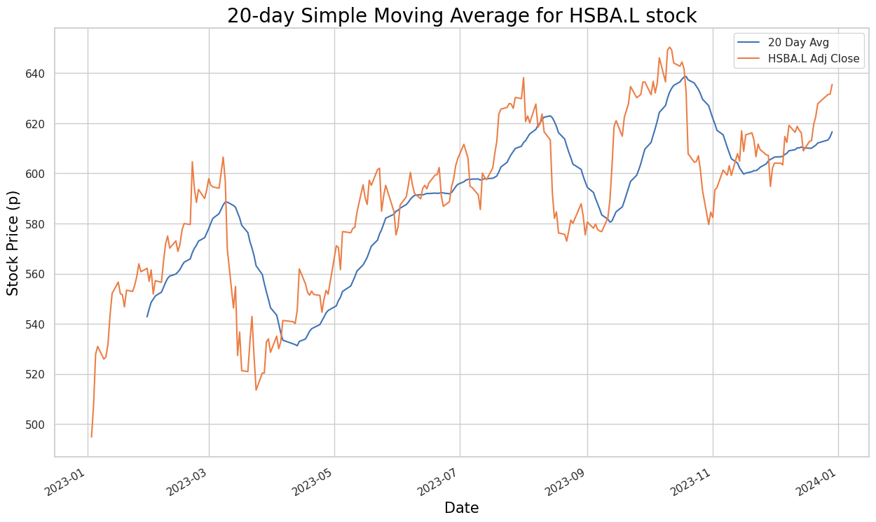
The provided code snippet defines variables for a stock ticker, title text, and label text associated with a simple moving average (SMA) calculation. Despite setting up these foundational elements, the snippet is incomplete as it lacks the actual implementation for computing the SMA.
To calculate the Simple Moving Average for a stock, the typical process involves fetching historical stock price data, selecting a specific time period such as 20 days, and calculating the average of the closing prices over that period. This calculation is then repeated for each subsequent trading day. The SMA is a valuable tool for identifying trends and potential reversal points in stock price movements.
In this snippet, the vital logic for the SMA calculation is missing. The function, presumably named sma(), which is called towards the end of the code, should perform the calculation, but it is absent in the provided code. Therefore, while the snippet sets up necessary information like the stock ticker (HSBA.L), title text, and label text, it falls short of executing the actual computation required to determine the 20-day Simple Moving Average.
def sma2():
  plt.figure(figsize=(15,9))
  ftse100_stocks[ticker]['Adj Close'].loc['2020-01-01':'2023-12-31'].rolling(window=20).mean().plot(label='20 Day Avg')
  ftse100_stocks[ticker]['Adj Close'].loc['2020-01-01':'2023-12-31'].rolling(window=50).mean().plot(label='50 Day Avg')
  ftse100_stocks[ticker]['Adj Close'].loc['2020-01-01':'2023-12-31'].rolling(window=200).mean().plot(label='200 Day Avg')
  ftse100_stocks[ticker]['Adj Close'].loc['2020-01-01':'2023-12-31'].plot(label=f"{label_txt}")
  plt.title(f"{title_txt}", color = 'black', fontsize = 20)
  plt.xlabel('Date', color = 'black', fontsize = 15)
  plt.ylabel('Stock Price (p)', color = 'black', fontsize = 15);
  plt.legend()
The code defines a function named `sma2` designed to plot stock price data alongside their simple moving averages (SMA). Initially, it generates a new figure for the plot with a specified size. Within a given date range from ‘2020–01–01’ to ‘2023–12–31’, the function calculates 20-day, 50-day, and 200-day SMAs for the stock prices. It then plots these SMAs on the same graph for easy comparison.
Subsequently, the function overlays the actual stock prices over the same date range on the plot, labeling the line according to the variable `ticker`. To enhance the plot’s readability, titles and labels are assigned to the x and y axes. Lastly, the function includes a legend to distinguish which line corresponds to which dataset.
Overall, this function aids in visualizing stock price trends over time and understanding their relationship to various moving average indicators, making it a valuable tool for technical analysis and informed decision-making in stock trading or investment.
ticker = 'HSBA.L'

title_txt = "20, 50 and 200 day moving averages for HSBA.L stock"
label_txt = "HSBA.L Adj Close"

sma2()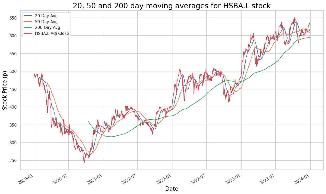
The code defines a few variables: `ticker` with the value “HSBA.L”, `title_txt` with the value “20, 50 and 200 day moving averages for HSBA.L stock”, and `label_txt` with the value “HSBA.L Adj Close”. The function `sma2()` is then called, though its implementation is not visible in the provided snippet. It is likely that the `sma2()` function calculates a moving average related to the stock data, probably using the ticker symbol “HSBA.L”, and may also utilize the title and label texts for display or labeling purposes.
Overall, this code seems to establish some initial variables and call a function to compute moving averages for the specific stock “HSBA.L”. Moving averages are a common tool in technical analysis used to understand trends and patterns in stock price movements over a specified period of time.
# For statisticcal accuracy we should plot the same 20, 50 and 200 day MA for a company of the same sector, however we happened to select HSBC - the only company from
# banking in the list of our honouran;e guinea pigs. So let us do a GlaxoSmithKline Adjusted Close price data for the same time period, just for the sake of it.

ticker = 'GSK.L'

title_txt = "20, 50 and 200 day moving averages for GSK.L stock"
label_txt = "GSK.L Adj Close"

sma2()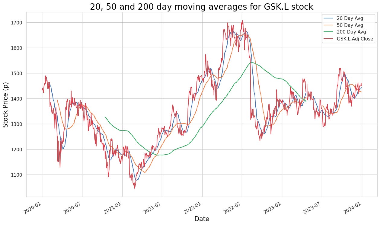
The provided code snippet seems intended to calculate and plot the 20, 50, and 200-day moving averages for the adjusted close price data of the GlaxoSmithKline (GSK.L) stock. However, it references a function named `sma2()`, which is neither defined nor included in the snippet. This omission renders the snippet incomplete, lacking the necessary details to compute the simple moving averages (SMAs) for the specified periods.
To complete the code and fulfill its intended purpose, you need to define the `sma2()` function to calculate the SMAs for the 20, 50, and 200-day periods using the historical adjusted close price data of GSK.L stock. Additionally, a plotting library or tool would be necessary to visualize these moving averages, allowing for better analysis and understanding of stock price trends over time.
Plotting moving averages is essential as they smooth out data fluctuations, providing a clearer indication of trends and making it easier to analyze and interpret stock price movements. This analysis is vital for making informed decisions in trading and investment strategies, leveraging historical performance data to guide future actions.
 # Calculate and add columns for moving averages of Adjusted Close price data

hsba_sma["20d"] = np.round(hsba_sma["Adj Close"].rolling(window = 20, center = False).mean(), 2)
hsba_sma["50d"] = np.round(hsba_sma["Adj Close"].rolling(window = 50, center = False).mean(), 2)
hsba_sma["200d"] = np.round(hsba_sma["Adj Close"].rolling(window = 200, center = False).mean(), 2)
This code calculates the moving averages of the Adjusted Close price data for a particular stock and creates three new columns (‘20d’, ‘50d’, and ‘200d’) in the ‘hsba_sma’ DataFrame to store the moving averages for 20, 50, and 200-day windows, respectively. The moving average is determined by averaging the Adjusted Close prices over a given window of time periods, which helps to smooth out short-term fluctuations and provides a clearer picture of the overall price trend. The function ‘np.round()’ rounds the calculated moving averages to two decimal places for improved readability.
Moving averages are crucial in the technical analysis of stocks as they help traders and investors identify trends, support and resistance levels, and potential buy or sell signals. By observing the crossovers and trends in the moving averages, traders are able to make informed decisions on buying or selling stocks.
txt = "20, 50 and 200 day moving averages for HSBA.L stock"

# Slice rows to plot data from 2019-20123
pandas_candlestick_ohlc(hsba_sma.loc['2019-01-01':'2023-12-31',:], otherseries = ["20d", "50d", "200d"])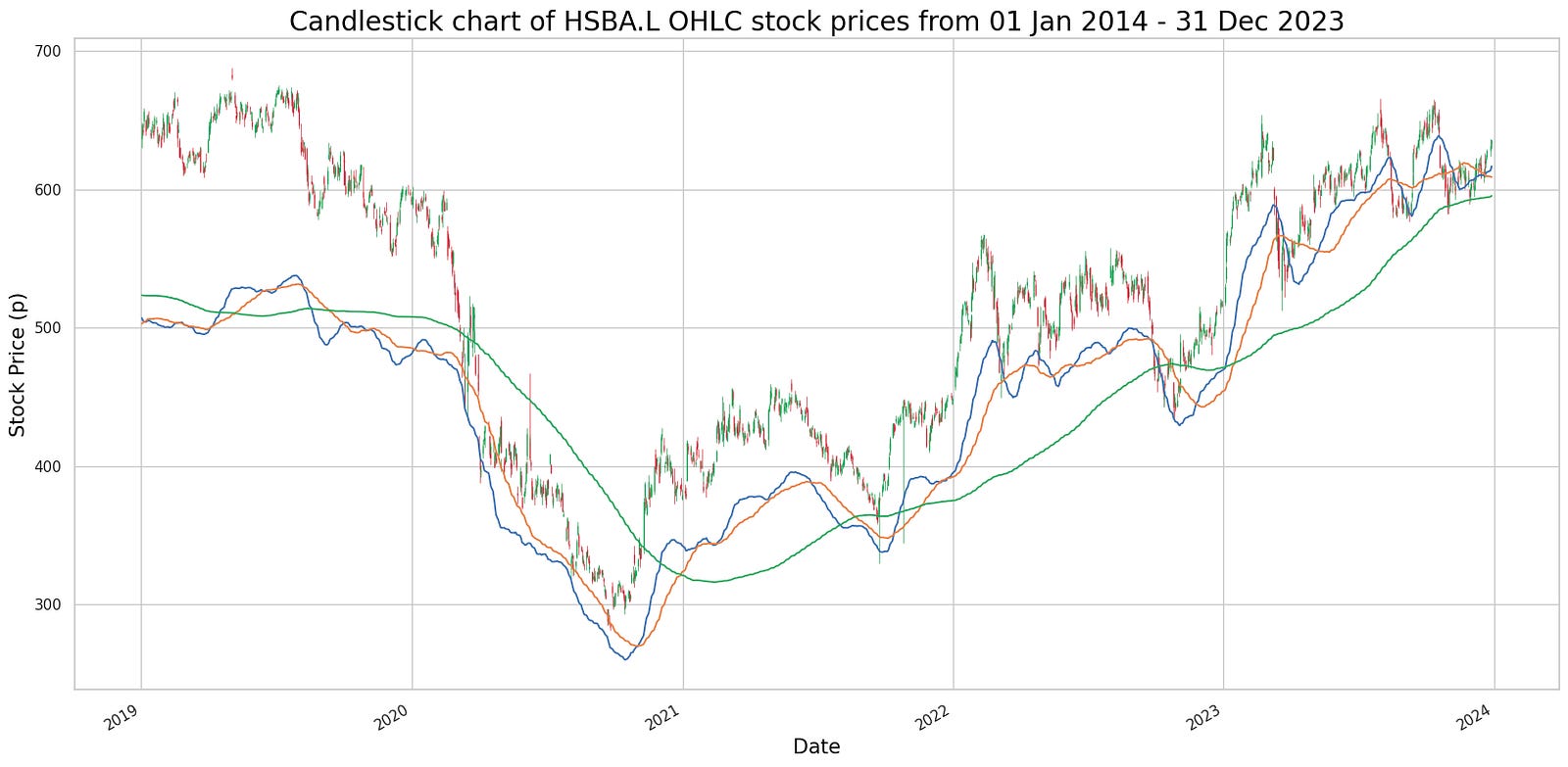
The provided code snippet is part of a more extensive program focused on data analysis and visualization, likely leveraging Python libraries such as pandas and matplotlib. It initializes a string ‘txt’ that contains information about the moving averages of a particular stock. Subsequently, it calls a function, presumably ‘pandas_candlestick_ohlc’, to extract and plot a slice of data from a DataFrame named ‘hsba_sma’ for the time frame between 2019 and 2023. This function’s primary purpose is to generate a candlestick chart for the specified stock within the given period.
In addition to plotting the candlestick chart, the function includes an ‘otherseries’ parameter to display the stock’s additional moving averages (20-day, 50-day, and 200-day) on the chart. This approach aims to visualize not just the stock’s daily movements but also provide further insights and trends through these moving averages. The code is designed to help traders and investors make more informed decisions by analyzing historical stock price movements and identifying trends that could influence future stock performance.
# Obtain signals with -1 indicating “sell”, 1 indicating “buy”, and 0 no action
# To ensure that all trades close out, temporarily change the regime of the last row to 0
regime_orig = hsba_sma.iloc[-1, 10]
hsba_sma.iloc[-1, 10] = 0
hsba_sma["Signal"] = np.sign(hsba_sma["Regime"] - hsba_sma["Regime"].shift(1))
# Restore original regime data
hsba_sma.iloc[-1, 10] = regime_orig
hsba_sma.tail()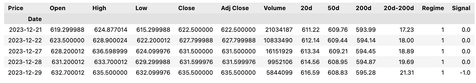
This code generates trading signals based on a strategy that uses a regime indicator (“Regime”) calculated elsewhere in the code. It compares the “Regime” column with its lagged values (shifted by one row) to identify changes. If the current regime value exceeds the previous one, a signal of 1 (buy) is generated. Conversely, if the current regime value is lower than the previous one, a signal of -1 (sell) is created. If there is no change in the regime value, the signal remains 0 (no action).
Before calculating the signals, the code temporarily changes the regime in the last row to 0 to ensure all trades are smoothly closed out. After generating the signals, the original regime value in the last row is restored. By automating this process, traders can efficiently implement and backtest trading strategies, facilitating the identification of potential buy and sell opportunities in the financial markets.
# Create a dataframe with trades, including the price at the trade and the regime under which the trade is made.

hsba_signals = pd.concat([
        pd.DataFrame({"Price": hsba_sma.loc[hsba_sma["Signal"] == 1, "Adj Close"],
                     "Regime": hsba_sma.loc[hsba_sma["Signal"] == 1, "Regime"],
                     "Signal": "Buy"}),
        pd.DataFrame({"Price": hsba_sma.loc[hsba_sma["Signal"] == -1, "Adj Close"],
                     "Regime": hsba_sma.loc[hsba_sma["Signal"] == -1, "Regime"],
                     "Signal": "Sell"}),
    ])
hsba_signals.sort_index(inplace = True)
hsba_signals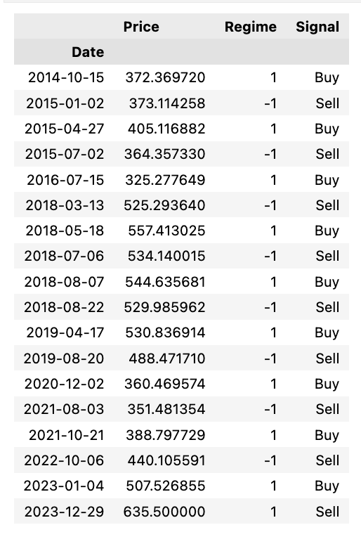
The code generates a dataframe to track trade signals for HSBC stock (HSBA) based on a particular trading strategy. Initially, it identifies the trading signals where the “Signal” column in the ‘hsba_sma’ dataframe has values of 1 (indicating buy signals) and -1 (indicating sell signals). For buy signals, it extracts the “Adj Close” price and the prevailing “Regime” during the trade, categorizing the “Signal” column as “Buy”. Similarly, for sell signals, it extracts the same information but categorizes the “Signal” column as “Sell”. These buy and sell dataframes are then combined into a single dataframe called ‘hsba_signals’. The final step is to sort this dataframe chronologically, ensuring that all trades are ordered by their occurrence in time.
By employing this code, traders and investors can systematically document and review their trades according to a specific strategy or signal. This structured approach facilitates the evaluation of their trading performance and the effectiveness of their strategies over time.
# Let's see the profitability of long trades

hsba_long_profits = pd.DataFrame({
        "Price": hsba_signals.loc[(hsba_signals["Signal"] == "Buy") &
                                  hsba_signals["Regime"] == 1, "Price"],
        "Profit": pd.Series(hsba_signals["Price"] - hsba_signals["Price"].shift(1)).loc[
            hsba_signals.loc[(hsba_signals["Signal"].shift(1) == "Buy") & (hsba_signals["Regime"].shift(1) == 1)].index
        ].tolist(),
        "End Date": hsba_signals["Price"].loc[
            hsba_signals.loc[(hsba_signals["Signal"].shift(1) == "Buy") & (hsba_signals["Regime"].shift(1) == 1)].index
        ].index
    })
hsba_long_profits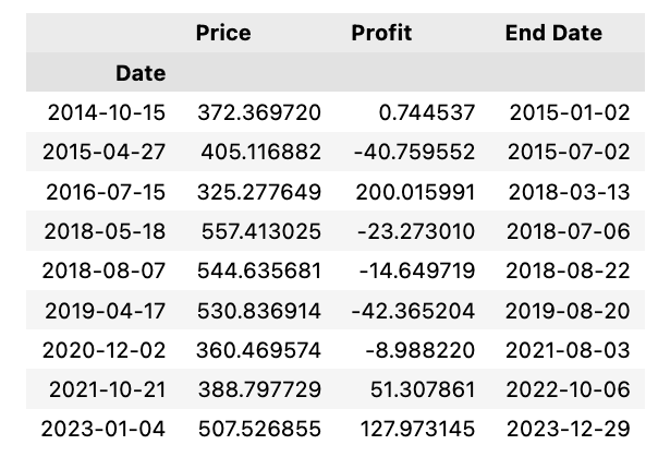
To analyze and visualize the profitability of long trades, a DataFrame named hsba_long_profits is created. This DataFrame comprises three columns: “Price,” “Profit,” and “End Date.” The “Price” column contains the prices at which a “Buy” signal was triggered, combined with a regime of 1, indicative of a long trade. The “Profit” column records the profits of each long trade by calculating the difference between the current and previous prices. The “End Date” column captures the index of the ending price for each profitable trade.
This code assists traders or analysts in assessing the returns from long trades, aiding in making well-informed decisions based on trade profitability. By identifying the precise buy points, the corresponding profits, and the dates when trades concluded, this analysis becomes vital for evaluating the effectiveness of trading signals and strategies.
# 20-day EMA for Adjusted Close price for 2023

def ewma():
  plt.figure(figsize=(15,9))
  ftse100_stocks[ticker]['Adj Close'].loc['2023-01-01':'2023-12-31'].ewm(20).mean().plot(label='20 Day Avg')
  ftse100_stocks[ticker]['Adj Close'].loc['2023-01-01':'2023-12-31'].plot(label=f"{label_txt}")
  plt.title(f"{title_txt}", color = 'black', fontsize = 20)
  plt.xlabel('Date', color = 'black', fontsize = 15)
  plt.ylabel('Stock Price (p)', color = 'black', fontsize = 15);
  plt.legend()
This code calculates the 20-day Exponential Weighted Moving Average (EWMA) for the Adjusted Close price of a stock over the year 2023. It begins by creating a plot figure with a specific size to ensure clarity and readability. The core calculation involves using the `ewm()` method to compute the 20-day EWMA for the Adjusted Close price of the stock within the specified date range. Subsequently, it plots the calculated 20-day average on a graph, alongside the actual Adjusted Close prices for the same period.
To enhance the interpretability of the graph, the code sets the title of the plot, along with labels for the x-axis and y-axis, and includes a legend. This ensures that the visualization is both informative and easy to understand. Utilizing the EWMA in financial analysis provides the advantage of smoothing out price data, which reduces the noise from short-term fluctuations and offers a clearer perspective on the underlying stock price trends. The EWMA method assigns more weight to recent data points, making it more responsive to price changes than simple moving averages. Visualizing the EWMA in conjunction with actual stock prices aids in identifying trends, thereby assisting in making well-informed decisions for stock trading and investment strategies.
ticker = 'HSBA.L'
title_txt = "20-day Exponential Moving Average for HSBA.L stock"
label_txt = "HSBA.L Adj Close"

ewma()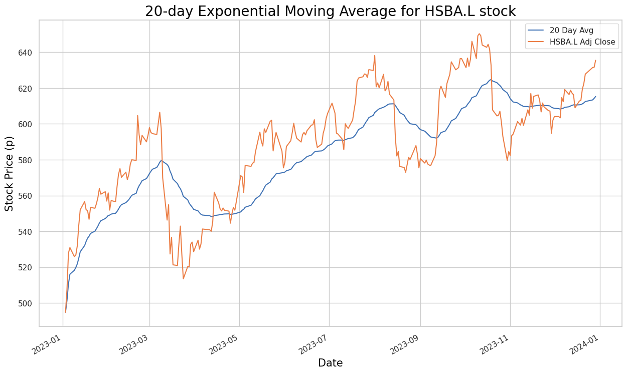
The code defines variables related to stock market data analysis. The `ticker` variable is set to ‘HSBA.L’, which likely represents a stock symbol on the London Stock Exchange. The `title_txt` variable holds a title for a plot or chart related to the 20-day Exponential Moving Average for the HSBA.L stock, while the `label_txt` variable defines the label for the adjusted closing price of the HSBA.L stock.
The last line of code calls the `ewma()` function to calculate the Exponential Weighted Moving Average (EWMA) for the specified stock data. The EWMA is a type of moving average that gives more weight to recent data points, making it sensitive to short-term price movements. Using this code, one can visualize and analyze the 20-day exponential moving average of the HSBA.L stock in relation to its adjusted closing prices. This analysis helps in identifying trends and making trading decisions based on the stock’s recent performance.
# 20-, 50- and 200-day EMA for Adjusted Close price for 2016-2019

def ewma2():
  plt.figure(figsize=(15,9))
  ftse100_stocks[ticker]['Adj Close'].loc['2019-01-01':'2023-12-31'].ewm(20).mean().plot(label='20 Day Avg')
  ftse100_stocks[ticker]['Adj Close'].loc['2019-01-01':'2023-12-31'].ewm(50).mean().plot(label='50 Day Avg')
  ftse100_stocks[ticker]['Adj Close'].loc['2019-01-01':'2023-12-31'].ewm(200).mean().plot(label='200 Day Avg')
  ftse100_stocks[ticker]['Adj Close'].loc['2019-01-01':'2023-12-31'].plot(label=f"{label_txt}")
  plt.title(f"{title_txt}", color = 'black', fontsize = 20)
  plt.xlabel('Date', color = 'black', fontsize = 15)
  plt.ylabel('Stock Price (p)', color = 'black', fontsize = 15);
  plt.legend()
This code segment is a function designed to calculate and plot Exponential Moving Averages (EMAs) of the adjusted close price for a stock over different periods, specifically the 20-day, 50-day, and 200-day EMAs. It first creates a plot area with a specific size using `plt.figure(figsize=(15,9))`. Next, it calculates the 20-day, 50-day, and 200-day exponential moving averages for the adjusted close price of a stock within the specified date range. Following this, the code plots these moving averages on the same plot, along with the adjusted close price itself.
To enhance the visual presentation, the function sets the title, x-axis label, and y-axis label for the plot with the specified title and formatting. A legend is also added to differentiate between the data series on the plot.
EMAs are used to smooth out price data to identify trends over a specified time period. The longer the time period, the smoother the line becomes and the slower it reacts to price changes. Plotting multiple EMAs of different time periods on the same chart can help in identifying potential buy or sell signals. This function can be useful for the technical analysis of stock prices and for making informed trading decisions by visualizing trends.
ticker = 'HSBA.L'
title_txt = "20, 50 and 200-day Exponential Moving Averages for HSBA.L stock"
label_txt = "HSBA.L Adj Close"

ewma2()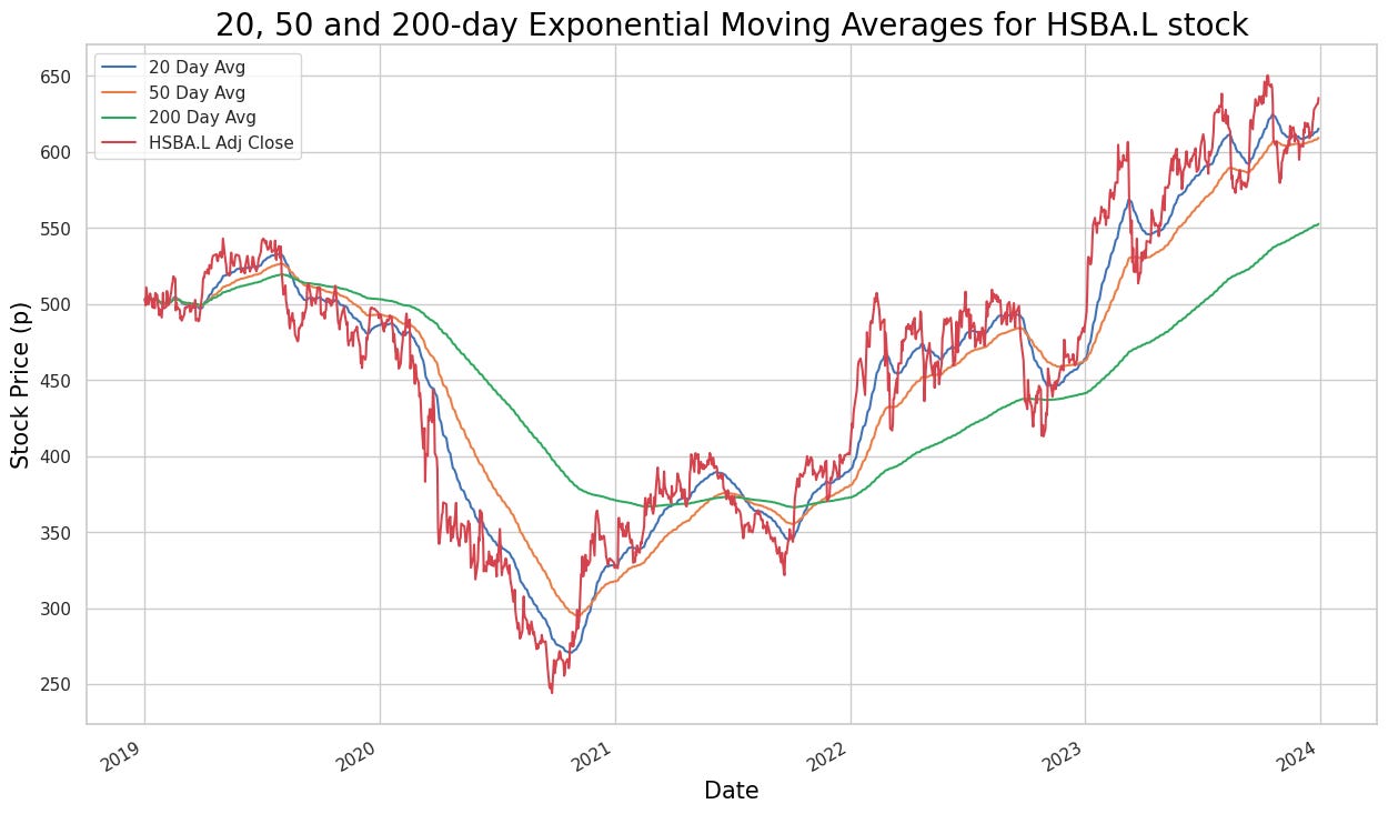
The code initializes variables named `ticker`, `title_txt`, and `label_txt`, and then calls a function, `ewma2()`, without any arguments. It appears that the `ewma2()` function, which is presumably defined elsewhere in the codebase, calculates and plots the exponential moving averages (EMAs) for the stock symbol ‘HSBA.L’. EMAs are utilized in technical analysis to smooth out price data and generate trading signals based on crossovers and trends. Specifically, the function calculates the 20-day, 50-day, and 200-day EMAs.
The `title_txt` variable contains the title for the chart, indicating the stock symbol and the type of moving averages being plotted. The `label_txt` variable likely holds the label or legend for the chart, which denotes the adjusted close price of the stock.
Running this code would result in a visualization of the exponential moving averages for the ‘HSBA.L’ stock, thereby aiding in the analysis of price trends and identifying potential trading opportunities.
def ewma3():
  sns.set(rc={'figure.figsize':(15, 9)})
  plt.plot(ftse100_stocks[ticker]['Adj Close'].loc['2023-05-01':'2023-10-31'], label=f"{label_txt}", color = 'blue')
  plt.plot(ShortEMA, label = 'Short/Fast EMA', color = 'red')
  plt.plot(MiddleEMA, label = 'Middle/Medium EMA', color = 'orange')
  plt.plot(LongEMA, label = 'Long/Slow EMA', color = 'green')
  plt.title(f"{title_txt}", color = 'black', fontsize = 20)
  plt.xlabel('Date', color = 'black', fontsize = 15)
  plt.ylabel('Stock Price (p)', color = 'black', fontsize = 15);
  plt.legend()
The function ewma3() is designed to create an Exponential Weighted Moving Average (EWMA) plot for financial time series data. Initially, it sets the figure size to 15 by 9 inches using sns.set(rc={‘figure.figsize’:(15, 9)}) for enhanced visualization. It then plots the adjusted closing prices of a specific stock (extracted from ftse100_stocks[ticker][‘Adj Close’] between ‘2023–05–01’ and ‘2023–10–31’) over the defined period. The plot also includes three Exponential Moving Averages (EMAs): the Short/Fast EMA shown in red, the Middle/Medium EMA in orange, and the Long/Slow EMA in green. Additionally, the function sets the title and axes labels according to the provided arguments (title and label_txt).
EMAs are widely used in the financial sector as technical indicators to analyze stock price trends, proving valuable for traders and analysts in identifying potential entry or exit points in the market. By encapsulating the plotting logic into a reusable function, ewma3() simplifies the creation of an EWMA plot, making it accessible for users analyzing financial time series data.
ticker = 'HSBA.L'
title_txt = "Triple Exponential Moving Average Crossover for HSBA.L stock"
label_txt = "HSBA.L Adj Close"

ewma3()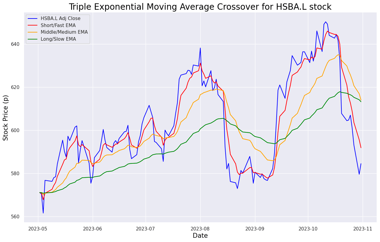
def buy_sell_ewma3(data):

  buy_list = []
  sell_list = []
  flag_long = False
  flag_short = False

  for i in range(0, len(data)):
    if data['Middle'][i] < data['Long'][i] and data['Short'][i] < data['Middle'][i] and flag_long == False and flag_short == False:
      buy_list.append(data['Adj Close'][i])
      sell_list.append(np.nan)
      flag_short = True
    elif flag_short == True and data['Short'][i] > data['Middle'][i]:
      sell_list.append(data['Adj Close'][i])
      buy_list.append(np.nan)
      flag_short = False
    elif data['Middle'][i] > data['Long'][i] and data['Short'][i] > data['Middle'][i] and flag_long == False and flag_short == False:
      buy_list.append(data['Adj Close'][i])
      sell_list.append(np.nan)
      flag_long = True
    elif flag_long == True and data['Short'][i] < data['Middle'][i]:
      sell_list.append(data['Adj Close'][i])
      buy_list.append(np.nan)
      flag_long = False
    else:
      buy_list.append(np.nan)
      sell_list.append(np.nan)

  return (buy_list, sell_list)
The function “buy_sell_ewma3” is designed to process a dataframe named “data” to automate stock trading decisions using Exponential Weighted Moving Average (EWMA) indicators. As it iterates over each row of the dataframe, the function assesses specific conditions to decide whether to buy or sell stock. These conditions hinge on the interactions between the Short, Middle, and Long EWMA values derived from the data. The function utilizes flags to track if a buy or sell action has already taken place.
When the predefined conditions are satisfied, the function appends the ‘Adj Close’ price to either the buy_list or the sell_list. This mechanism is integral to algorithmic trading strategies as it demonstrates a method for leveraging technical indicators to make informed buy or sell decisions. By automating these choices, traders are positioned to potentially exploit market movements with greater efficiency.
hsba_adj_6mo['Buy'] = buy_sell_ewma3(hsba_adj_6mo)[0]
hsba_adj_6mo['Sell'] = buy_sell_ewma3(hsba_adj_6mo)[1]
The code aims to add two new columns, ‘Buy’ and ‘Sell,’ to a DataFrame named ‘hsba_adj_6mo’ based on a predefined buying and selling strategy encapsulated in the function ‘buy_sell_ewma3’. This function seems to return a tuple containing buy signals as its first element and sell signals as its second element. The strategy likely leverages Exponential Weighted Moving Average (EWMA) indicators or other technical analysis tools to identify optimal points for buying and selling within the data stored in ‘hsba_adj_6mo’.
Adding ‘Buy’ and ‘Sell’ columns to the DataFrame facilitates the visualization of these strategic points, enhancing decision-making for trading or investment purposes. By systematically indicating when to execute buy or sell orders, this approach provides a structured methodology for trading based on historical data. Automating the signal generation process through this code helps streamline the analysis and makes the implementation of the strategy more efficient within the DataFrame.
def buy_sell_ewma3_plot():
  sns.set(rc={'figure.figsize':(18, 10)})
  plt.plot(ftse100_stocks[ticker]['Adj Close'].loc['2023-05-01':'2023-10-31'], label=f"{label_txt}", color = 'blue', alpha = 0.35)
  plt.plot(ShortEMA, label = 'Short/Fast EMA', color = 'red', alpha = 0.35)
  plt.plot(MiddleEMA, label = 'Middle/Medium EMA', color = 'orange', alpha = 0.35)
  plt.plot(LongEMA, label = 'Long/Slow EMA', color = 'green', alpha = 0.35)
  plt.scatter(hsba_adj_6mo.index, hsba_adj_6mo['Buy'], color = 'green', label = 'Buy Signal', marker = '^', alpha = 1)
  plt.scatter(hsba_adj_6mo.index, hsba_adj_6mo['Sell'], color = 'red', label = 'Buy Signal', marker='v', alpha = 1)
  plt.title(f"{title_txt}", color = 'black', fontsize = 20)
  plt.xlabel('Date', color = 'black', fontsize = 15)
  plt.ylabel('Stock Price (p)', color = 'black', fontsize = 15);
  plt.legend()
This code defines a function that creates a plot to visualize the adjusted closing prices of a stock along with its Exponential Moving Averages (EMAs). Initially, the figure size for the plot is set, ensuring a clear and sizeable viewing area. The function then plots the adjusted closing prices over a specified date range, providing a contextual backdrop of the stock’s performance. Subsequent to this, it plots the Short/Fast EMA, Middle/Medium EMA, and Long/Slow EMA on the same graph, thereby illustrating varying trends over different periods. Additionally, the plot includes markers indicating Buy and Sell signals based on specific conditions that are useful for traders.
To enhance readability, the plot features a title, as well as x-axis and y-axis labels, clearly defining the elements being presented. A legend is also displayed, differentiating between the closing prices and the various EMAs. This visual representation aids in analyzing stock price movements and EMA crossovers, which are essential for employing trading strategies. By understanding the historical data in relation to EMAs, traders can more effectively identify and act upon potential buy and sell signals.
ticker = 'HSBA.L'
title_txt = "Trading signals for HSBA.L stock"
label_txt = "HSBA.L Adj Close"

buy_sell_ewma3_plot()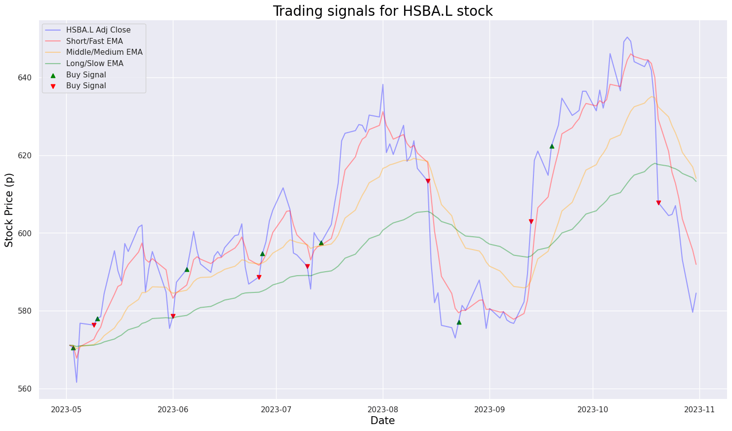
The code segment appears to be initializing some variables, namely ticker, title_txt, and label_txt, before calling a function named buy_sell_ewma3_plot(). From the variable names and the function, it can be inferred that the code is designed to generate trading signals for a particular stock, specifically HSBA.L, using Exponential Moving Averages (EMA). The function buy_sell_ewma3_plot() likely creates a visual graph displaying buy and sell signals derived from the EMA.
Using such code is common in stock trading and financial analysis as it helps create visual representations of trading strategies, signals, and technical indicators applied to historical stock price data. This type of analysis aids investors in making more informed decisions by visualizing trends and identifying potential buy/sell opportunities based on techniques like moving averages.
def exponential_smoothing(series, alpha):
    result = [series[0]] # first value is same as series
    for n in range(1, len(series)):
        result.append(alpha * series[n] + (1 - alpha) * result[n-1])
    return result

def plot_exponential_smoothing(series, alphas):
    plt.figure(figsize=(17, 8))
    for alpha in alphas:
        plt.plot(exponential_smoothing(series, alpha), label=f"Alpha {alpha}")
    plt.plot(series.values, "c", label = f"{label_txt}")
    plt.xlabel('Days', color = 'black', fontsize = 15)
    plt.ylabel('Stock Price (p)', color = 'black', fontsize = 15);
    plt.legend(loc="best")
    plt.axis('tight')
    plt.title(f"{title_txt}", color = 'black', fontsize = 20)
    plt.grid(True);
The exponential_smoothing function implements a technique called exponential smoothing, widely used in time series analysis to remove randomness and highlight trends in data. This function accepts a time series data (list or array) and a parameter alpha, which serves as the smoothing factor. The smoothing process involves taking the weighted average of the current data point and the previous smoothed value, with alpha acting as the weight for the current data point and 1 — alpha for the previous smoothed value. This process is repeated for each data point in the input series.
In the corresponding code, the plot_exponential_smoothing function utilizes the exponential_smoothing function to apply various levels of smoothing (different alphas) to a given time series data. It plots both the original series and the smoothed series for each alpha, aiding in comparing how different smoothing factors influence the trend representation of the data.
This code is beneficial for visualizing the effect of exponential smoothing on time series data, helping to understand how different smoothing levels impact trend representation. It proves useful in applications like forecasting, anomaly detection, and noise reduction in time series analysis.
ticker = 'HSBA.L'
title_txt = "Single Exponential Smoothing for HSBA.L stock using 0.05 and 0.3 as alpha values"
label_txt = "HSBA.L Adj Close"

plot_exponential_smoothing(ftse100_stocks[ticker]['Adj Close'].loc['2019-01-01':'2023-12-31'], [0.05, 0.3])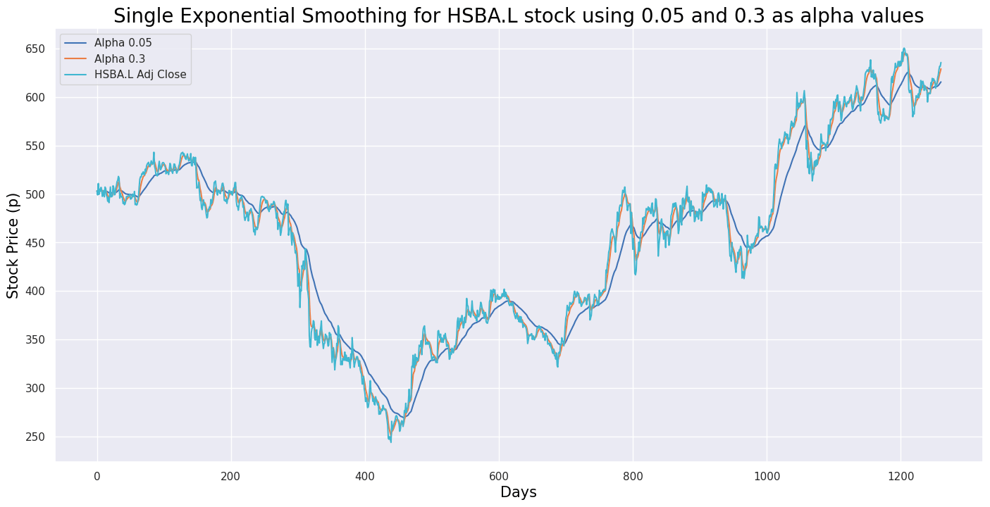
This code snippet creates a visualization for the single exponential smoothing forecast of HSBA.L stock using two different alpha values (0.05 and 0.3). It begins by defining the ticker symbol ‘HSBA.L’ to represent the stock of a particular company. The variable `title_txt` is set with a descriptive title for the visualization, while `label_txt` is designated for labeling the y-axis of the plot. The `plot_exponential_smoothing` function is then called with historical stock data of HSBA.L from January 1, 2019, to December 31, 2023, and an array of alpha values [0.05, 0.3] for the exponential smoothing model.
This code is crucial for visualizing forecasted values generated by the single exponential smoothing technique applied to the historical stock data of HSBA.L. Using different alpha values allows us to observe how the forecasted values change based on the smoothing factor, aiding in understanding and analyzing stock trends and thereby facilitating informed decision-making.
def double_exponential_smoothing(series, alpha, beta):
    result = [series[0]]
    for n in range(1, len(series)+1):
        if n == 1:
            level, trend = series[0], series[1] - series[0]
        if n >= len(series): # forecasting
            value = result[-1]
        else:
            value = series[n]
        last_level, level = level, alpha * value + (1 - alpha) * (level + trend)
        trend = beta * (level - last_level) + (1 - beta) * trend
        result.append(level + trend)
    return result

def plot_double_exponential_smoothing(series, alphas, betas):
    plt.figure(figsize=(17, 8))
    for alpha in alphas:
        for beta in betas:
            plt.plot(double_exponential_smoothing(series, alpha, beta), label=f"Alpha {alpha}, beta {beta}")
    plt.plot(series.values, label = f"{label_txt}")
    plt.xlabel('Days', color = 'black', fontsize = 15)
    plt.ylabel('Stock Price (p)', color = 'black', fontsize = 15)
    plt.legend(loc="best")
    plt.axis('tight')
    plt.title(f"{title_txt}", color = 'black', fontsize = 20)
    plt.grid(True)
This code implements the Double Exponential Smoothing technique for time series data, which is an extension of Single Exponential Smoothing that accounts for trends in the data. Its primary purpose is to forecast future values based on historical data points. The core function, `double_exponential_smoothing`, takes time series data as input along with two smoothing factors, alpha and beta. It then calculates the smoothed values utilizing the Double Exponential Smoothing formula by iterating through the data points and updating the level and trend components according to the provided alpha and beta values.
Additionally, the `plot_double_exponential_smoothing` function leverages the `double_exponential_smoothing` function to plot smoothed values for various combinations of alpha and beta parameters, offering a visual representation of how the technique performs with different smoothing factors. This visualization aids in understanding the impact of different parameter settings on the smoothing process.
Overall, this code is valuable for smoothing out noise and capturing underlying patterns in time series data, which is crucial for generating forecasts based on historical trends. It facilitates making informed predictions and identifying patterns that are beneficial for decision-making in diverse fields such as finance, sales forecasting, and resource planning.
ticker = 'HSBA.L'
title_txt = "Double Exponential Smoothing for HSBA.L stock with different alpha and beta values"
label_txt = "HSBA.L Adj Close"

plot_double_exponential_smoothing(ftse100_stocks[ticker]['Adj Close'].loc['2019-01-01':'2023-12-31'], alphas=[0.9, 0.02], betas=[0.9, 0.02])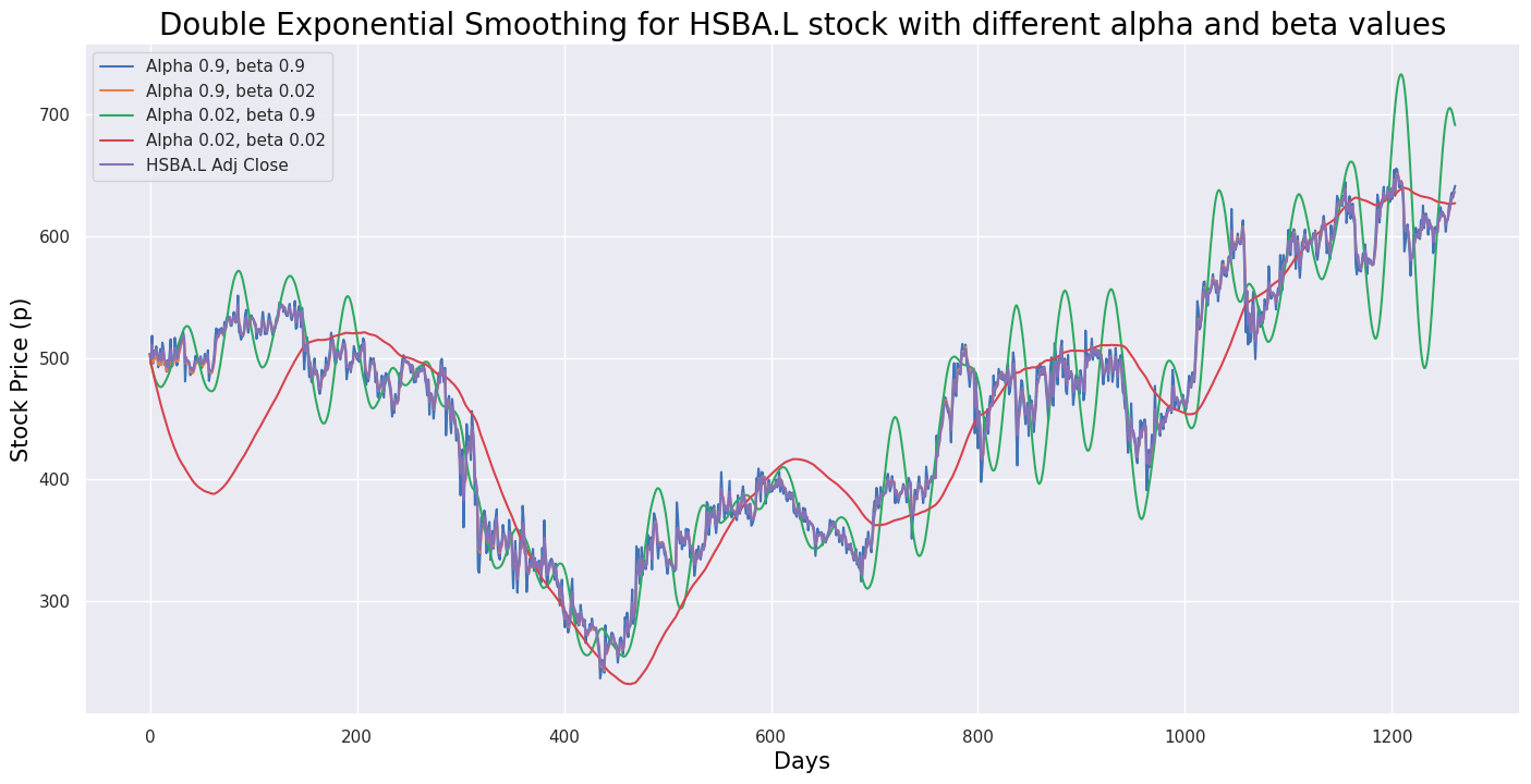
This code calculates the double exponential smoothing for the historical Adjusted Close prices of the stock with the ticker symbol ‘HSBA.L’ from January 1, 2019, to December 31, 2023. Double exponential smoothing is a method used in time series forecasting to capture trends and seasonality in the data by using two smoothing parameters, alpha and beta. The alpha parameter smooths the overall level of the time series, while the beta parameter smooths the trend component.
In the code, the function `plot_double_exponential_smoothing` is called with the historical Adjusted Close prices of the ‘HSBA.L’ stock and different values for both alpha and beta ([0.9, 0.02]). This function helps visualize the results of the double exponential smoothing. This code is valuable for analyzing and visualizing smoothed trends in stock prices, aiding in making informed investment decisions based on historical price patterns.
# Function to signal when to buy and sell

def buy_sell_macd(signal):
  Buy = []
  Sell = []
  flag = -1

  for i in range(0, len(signal)):
    if signal['MACD'][i] > signal['Signal Line'][i]:
      Sell.append(np.nan)
      if flag != 1:
        Buy.append(signal['Adj Close'][i])
        flag = 1
      else:
        Buy.append(np.nan)
    elif signal['MACD'][i] < signal['Signal Line'][i]:
      Buy.append(np.nan)
      if flag != 0:
        Sell.append(signal['Adj Close'][i])
        flag = 0
      else:
        Sell.append(np.nan)
    else:
      Buy.append(np.nan)
      Sell.append(np.nan)

  return (Buy, Sell)
The provided code defines a function named `buy_sell_macd` that processes a DataFrame called `signal`. This function iterates through each row of the DataFrame, comparing values in the ‘MACD’ column with those in the ‘Signal Line’ column. If the ‘MACD’ value exceeds the ‘Signal Line’ value, the function appends `np.nan` to the ‘Sell’ list and checks a flag to decide whether to append the ‘Adj Close’ value to the ‘Buy’ list or `np.nan`. Conversely, if the ‘MACD’ value is lower than the ‘Signal Line’ value, it appends `np.nan` to the ‘Buy’ list and performs a similar flag check for the ‘Sell’ list. When the ‘MACD’ value equals the ‘Signal Line’ value, it appends `np.nan` to both the ‘Buy’ and ‘Sell’ lists.
The main objective of this function is to generate buy and sell signals based on the Moving Average Convergence Divergence (MACD) indicator. By assessing the relationship between the MACD line and the Signal line, it identifies moments to buy (when the MACD crosses above the Signal) or sell (when the MACD crosses below the Signal) as part of a trading strategy.
This function is particularly beneficial for automating trading strategies that rely on technical analysis involving the MACD indicator. It simplifies the process of generating buy and sell signals based on pre-established conditions, thereby facilitating traders in implementing their strategies and making informed decisions in the market.
# Create buy and sell columns

a = buy_sell_macd(hsba_adj_3mo)
hsba_adj_3mo['Buy_Signal_Price'] = a[0]
hsba_adj_3mo['Sell_Signal_Price'] = a[1]
This code snippet adds ‘Buy_Signal_Price’ and ‘Sell_Signal_Price’ columns to a DataFrame named ‘hsba_adj_3mo’. It utilizes a custom function called ‘buy_sell_macd’ to calculate the buying and selling signals within the context of the Moving Average Convergence Divergence (MACD) indicator. The function computes these signals based on specific criteria or conditions, storing the results in a variable ‘a’, which is likely a tuple. The values from this tuple are then assigned to the ‘Buy_Signal_Price’ and ‘Sell_Signal_Price’ columns in the ‘hsba_adj_3mo’ DataFrame. This code is commonly used in financial analysis, particularly in algorithmic trading, to generate trading signals based on technical indicators like MACD. Adding these buy and sell signal columns allows analysts to visualize and interpret the signals, potentially aiding in better trading decisions.
# Plot buy and sell signals

def buy_sell_macd_plot():
  plt.figure(figsize=(20, 10))
  plt.scatter(hsba_adj_3mo.index, hsba_adj_3mo['Buy_Signal_Price'], color='green', label='Buy', marker='^', alpha=1)
  plt.scatter(hsba_adj_3mo.index, hsba_adj_3mo['Sell_Signal_Price'], color='red', label='Sell', marker='v', alpha=1)
  plt.plot(hsba_adj_3mo['Adj Close'], label='Adj Close Price', alpha = 0.35)
  plt.title(f"{title_txt}", color = 'black', fontsize = 20)
  plt.xlabel('Date', color = 'black', fontsize = 15)
  plt.ylabel('Adj Close Price')
  plt.legend(loc = 'upper left')
  plt.show()
The function buy_sell_macd_plot generates a plot to illustrate buy and sell signals in a financial dataset. It begins by creating a figure with a specific size for the plot. The function then adds scatter points for buy signals, represented by green upwards-pointing triangles, and sell signals, represented by red downwards-pointing triangles, based on the provided data points. Additionally, it plots the Adjusted Close Price line graph from the dataset, applying a specified transparency level. The plot includes a title, x-axis label, y-axis label, and legend to provide clarity and context. Finally, it displays the completed plot. This type of visualization is commonly used in financial analysis to represent buy and sell signals generated by technical indicators or trading strategies, allowing analysts to quickly assess the effectiveness of a strategy and make informed decisions.
ticker = 'HSBA.L'
title_txt = 'HSBA.L Adjusted Close Price Buy & Sell Signals'

buy_sell_macd_plot()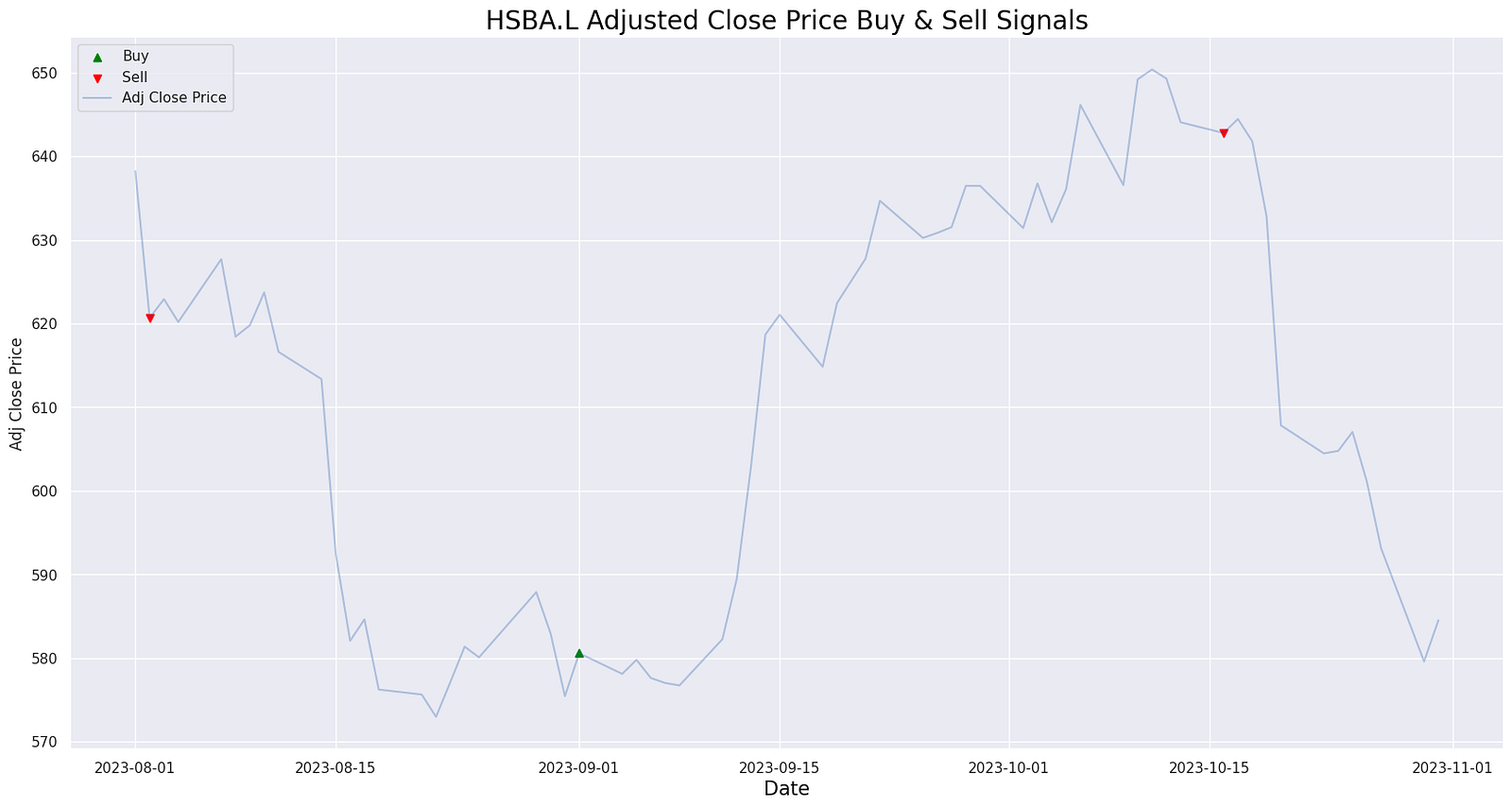
The provided code snippet appears to be part of a financial analysis or stock trading program. In this script, the string ‘HSBA.L’ is assigned to the variable `ticker`, and the string ‘HSBA.L Adjusted Close Price Buy & Sell Signals’ is assigned to the variable `title_txt`. The script then calls a function named `buy_sell_macd_plot()`, which is anticipated to generate a plot displaying buy and sell signals based on the Moving Average Convergence Divergence (MACD) indicator for the stock with the ticker symbol ‘HSBA.L’. This code is vital for producing buy and sell signals derived from the MACD indicator, aiding traders in making informed decisions about when to enter or exit trades involving this particular stock. Such analyses are crucial for making profitable trading decisions in the stock market.
# Plot corresponding RSI values and the significant levels

def rsi_sma():
  plt.figure(figsize=(20, 10))
  plt.title(f"{title_txt}", color = 'black', fontsize = 20)
  plt.plot(new_df.index, new_df['RSI'])
  plt.xlabel('Date', color = 'black', fontsize = 15)
  plt.axhline(0, linestyle='--', alpha = 0.5, color='gray')
  plt.axhline(10, linestyle='--', alpha = 0.5, color='orange')
  plt.axhline(20, linestyle='--', alpha = 0.5, color='green')
  plt.axhline(30, linestyle='--', alpha = 0.5, color='red')
  plt.axhline(70, linestyle='--', alpha = 0.5, color='red')
  plt.axhline(80, linestyle='--', alpha = 0.5, color='green')
  plt.axhline(90, linestyle='--', alpha = 0.5, color='orange')
  plt.axhline(100, linestyle='--', alpha = 0.5, color='gray')
  plt.show()
The function rsi_sma() is designed to plot Relative Strength Index (RSI) values along with significant levels on a graph, offering a visual aid for identifying overbought and oversold conditions of a security. It begins by creating a new figure with a specified size and title, followed by plotting the RSI values against their corresponding dates. To enhance the analysis, horizontal dashed lines at specific levels such as 30 and 70, commonly considered oversold and overbought thresholds, are added to the plot. Intermediate levels at 20, 80, and occasionally 10 and 90 are also included, each styled with different colors for easy distinction. The function concludes by displaying the plot, providing a quick reference for interpreting RSI values on a chart.
title_txt = 'HSBA.L RSI based on SMA'

rsi_sma()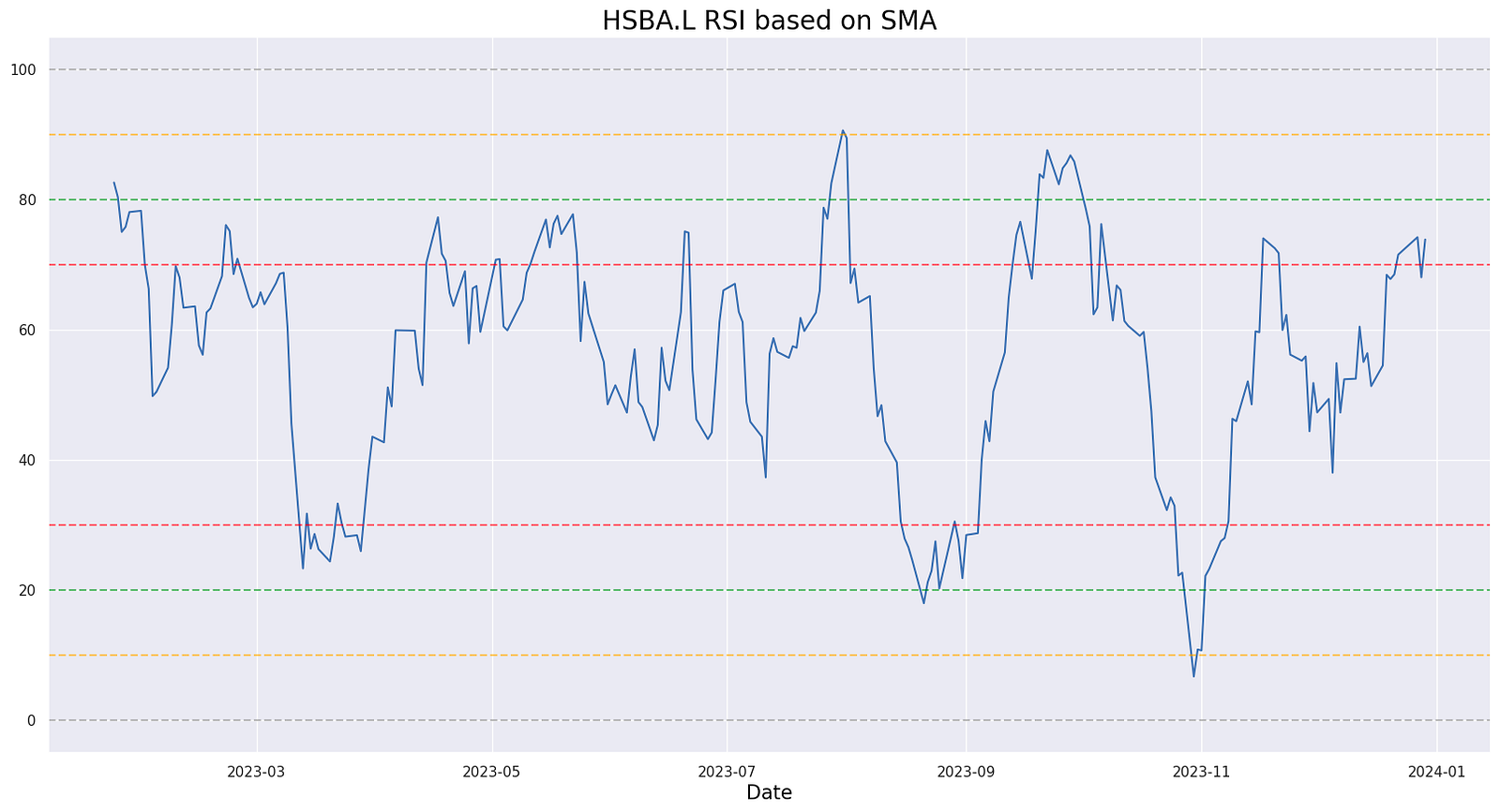
The code snippet in question appears to be setting a title for a visualization or report that refers to a Relative Strength Index (RSI) based on a Simple Moving Average (SMA). However, the actual function `rsi_sma()`, which presumably computes or displays this RSI based on an SMA, is not included in the provided code. To fully understand the functionality of the `rsi_sma()` function, we would need to see its implementation. It is likely a custom function that calculates the RSI using the SMA as a component or visualizes the RSI with respect to the SMA.
The purpose of this code is likely to generate a specific analysis or visual presentation related to the RSI indicator calculated based on the SMA, aiding in the technical analysis of financial data. This could be particularly useful in the context of analyzing stocks or other financial instruments. By assigning a title, the code ensures that when the result of the `rsi_sma()` function is displayed or saved, it is appropriately labeled for clarity and reference.
period = 14

# Calculate the EWMA average gain and average loss
AVG_Gain2 = up.ewm(span=period).mean()
AVG_Loss2 = down.abs().ewm(span=period).mean()

# Calculate the RSI based on EWMA
RS2 = AVG_Gain2 / AVG_Loss2
RSI2 = 100.0 - (100.0 / (1.0 + RS2))
This code calculates the Relative Strength Index (RSI) of a financial asset based on the Exponential Weighted Moving Average (EWMA) of the average gain and average loss over a given period. The ‘period’ variable is set to 14, a commonly used value for RSI calculations. The process involves computing the EWMA of the average gain and loss over the specified period — specifically, the average gain is derived from the exponential moving average of the positive price changes, while the average loss is the exponential moving average of the absolute value of the negative price changes.
Subsequently, the Relative Strength (RS) is determined by dividing the EWMA of the average gain by the EWMA of the average loss. This RS value facilitates the computation of the RSI through the formula: RSI = 100 — (100 / (1 + RS)). RSI, a momentum oscillator, measures the speed and change of price movements, with values ranging from 0 to 100. Typically, readings above 70 indicate overbought conditions, while readings below 30 signify oversold conditions.
Utilizing the EWMA for average gain and loss results in a smoother RSI curve, more resistant to short-term price fluctuations compared to simple moving averages. This characteristic reduces noise in the RSI signal, thereby providing more reliable trend indications.
# Plot corresponding RSI values and the significant levels

def rsi_ewma():
  plt.figure(figsize=(20, 10))
  plt.title(f"{title_txt}", color = 'black', fontsize = 20)
  plt.xlabel('Date', color = 'black', fontsize = 15)
  plt.plot(new_df2.index, new_df2['RSI2'])
  plt.axhline(0, linestyle='--', alpha = 0.5, color='gray')
  plt.axhline(10, linestyle='--', alpha = 0.5, color='orange')
  plt.axhline(20, linestyle='--', alpha = 0.5, color='green')
  plt.axhline(30, linestyle='--', alpha = 0.5, color='red')
  plt.axhline(70, linestyle='--', alpha = 0.5, color='red')
  plt.axhline(80, linestyle='--', alpha = 0.5, color='green')
  plt.axhline(90, linestyle='--', alpha = 0.5, color='orange')
  plt.axhline(100, linestyle='--', alpha = 0.5, color='gray')
  plt.show()
This function plots the Relative Strength Index (RSI) values and important levels on a graph. RSI, a technical indicator used to measure the speed and change of price movements, is often considered overbought when above 70 and oversold when below 30. The function leverages the Exponential Moving Average (EWMA) to calculate the RSI values.
In the plot, the RSI values are represented on the y-axis while the dates are on the x-axis. The graph includes horizontal lines at key RSI levels of 30 and 70 to mark the overbought and oversold levels. Additionally, horizontal lines at levels 20, 80, 10, 90, 0, and 100 are added for more detailed analysis. These levels assist traders in pinpointing potential buying or selling opportunities based on the RSI readings.
Overall, this code is valuable for visualizing RSI values and significant thresholds, thereby aiding in making informed decisions in trading or technical analysis.
