

Machine Learning Workflows for Quant Trading: KNN and Feature Selection
A complete guide to data preprocessing, cross-validation, and hyperparameter tuning in algorithmic trading

Use the button at the end of this to download the source code for this chapter
For the main model, we will use the simple k-nearest neighbors algorithm, or KNN. This method can be applied to both regression tasks and classification tasks.
In scikit-learn’s standard implementation, KNN looks for the k closest observations using Euclidean distance. For classification, it assigns the label that appears most often among those neighbors. For regression, it returns the average of the neighbors’ target values.
import warnings
warnings.filterwarnings('ignore')
The purpose here is simply to quiet down warning messages before the rest of the notebook runs. Importing the warnings module gives access to Python’s warning system, and setting it to ignore tells the environment not to display those notices during execution. That can make the notebook much cleaner to read, especially when later steps use libraries that may produce harmless or repetitive warnings. Since this cell only changes a setting and does not create any visible result, there is no output to show.
%matplotlib inline

from pathlib import Path
import numpy as np
import pandas as pd
import seaborn as sns
import matplotlib.pyplot as plt
from scipy.stats import spearmanr
from sklearn.neighbors import (KNeighborsClassifier,
                               KNeighborsRegressor)
from sklearn.model_selection import (cross_val_score,
                                     cross_val_predict,
                                     GridSearchCV)
from sklearn.feature_selection import mutual_info_regression
from sklearn.preprocessing import StandardScaler, scale
from sklearn.pipeline import Pipeline
from sklearn.metrics import make_scorer
from yellowbrick.model_selection import ValidationCurve, LearningCurve
The purpose of this cell is to gather all the tools needed for the modeling work that follows. It first turns on inline plotting so that any charts produced later will appear directly in the notebook rather than in a separate window. After that, it imports the standard libraries for handling files, numbers, tabular data, plotting, and a few statistical and machine-learning utilities.
The file-handling import is there so the notebook can refer to data paths cleanly. NumPy and pandas provide the core data manipulation features, while seaborn and matplotlib are used for visual inspection and charting. The Spearman correlation function is imported for checking monotonic relationships between variables, which is useful when exploring how house features relate to price.
The scikit-learn imports set up the main modeling workflow. The KNeighborsClassifier and KNeighborsRegressor classes provide the KNN models for classification and regression. The cross-validation tools are imported so models can be evaluated more reliably on held-out folds instead of only on the training data. GridSearchCV will later be used to search across different hyperparameter values. Mutual information regression is imported for ranking features by how informative they are about the target. StandardScaler and scale are included because KNN depends on distance calculations, so features need to be put on a common scale. Pipeline helps combine preprocessing and modeling into one clean object so scaling happens correctly inside cross-validation. The scorer utility will be used to define custom evaluation metrics. Finally, the Yellowbrick imports prepare visual diagnostics such as validation curves and learning curves, which help show how model performance changes as the model becomes more or less flexible.
There is no saved output because this cell only loads libraries and sets up the environment. Its effect is to prepare the notebook for the analysis that comes next.
sns.set_style('whitegrid')This line changes the plotting theme for seaborn so that any charts drawn after it use a white background with light grid lines. That makes graphs easier to read, especially when looking for trends, comparisons, or exact values on axes. Nothing is printed because the command only sets a style preference for future visualizations; it silently updates the plotting environment rather than producing a visible result right away.
Load the dataset
King County Housing Data
Data is sourced from kaggle
Fetch it with the API command below:
kaggle datasets download -d harlfoxem/housesalesprediction
DATA_PATH = Path('..', 'data')This line sets up a path object pointing to the parent directory’s data folder. The main idea is to create a reusable reference to where the dataset files live, instead of hardcoding a long file location each time a file is needed later. Because it only assigns a value and does not perform any printing, plotting, or loading, there is no visible output from the cell. The notebook will use this path afterward whenever it needs to locate files stored in that data directory.
house_sales = pd.read_csv('kc_house_data.csv')
house_sales = house_sales.drop(
    ['id', 'zipcode', 'lat', 'long', 'date'], axis=1)
house_sales.info()
<class 'pandas.core.frame.DataFrame'>
RangeIndex: 21613 entries, 0 to 21612
Data columns (total 16 columns):
# Column Non-Null Count Dtype
--- ------ -------------- -----
0 price 21613 non-null float64
1 bedrooms 21613 non-null int64
2 bathrooms 21613 non-null float64
3 sqft_living 21613 non-null int64
4 sqft_lot 21613 non-null int64
5 floors 21613 non-null float64
6 waterfront 21613 non-null int64
7 view 21613 non-null int64
8 condition 21613 non-null int64
9 grade 21613 non-null int64
10 sqft_above 21613 non-null int64
11 sqft_basement 21613 non-null int64
12 yr_built 21613 non-null int64
13 yr_renovated 21613 non-null int64
14 sqft_living15 21613 non-null int64
15 sqft_lot15 21613 non-null int64
dtypes: float64(3), int64(13)
memory usage: 2.6 MBThe first step here is to load the housing dataset from the CSV file into a pandas DataFrame, then remove a handful of columns that are not going to be used for modeling. Dropping the identifier, geographic location fields, and date helps simplify the table and leaves behind the numerical housing features that are more directly useful for prediction. After that, the information summary is printed so the dataset can be checked before any modeling begins.
The saved output is the result of that inspection. It shows that the cleaned DataFrame has 21,613 rows and 16 columns, with no missing values in any of the remaining columns. The summary also confirms the data types: most of the features are integers, while a few such as price, bathrooms, and floors are stored as floats. That quick check is useful because it tells us the dataset is complete, reasonably sized, and ready for the next preprocessing and modeling steps.
Feature Selection and Transformation
Asset prices often show long-tailed distributions
sns.distplot(house_sales.price)
sns.despine()
plt.tight_layout();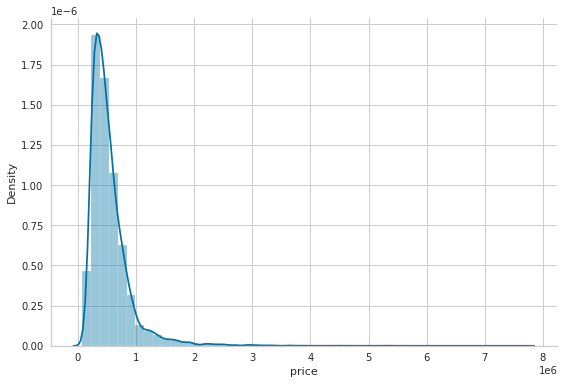
The point of this cell is to quickly inspect how house prices are distributed before any modeling decisions are made. Plotting the price column as a distribution gives an immediate sense of shape, spread, and skewness, which is useful because raw target values often need some transformation before they behave well in a machine learning workflow.
The first line draws a histogram with a smooth density curve on top of it. That combination lets you see both the rough frequency counts and the overall trend of the values. The saved plot shows a strong concentration of homes at the lower end of the scale and a long tail stretching to the right, which means the prices are heavily right-skewed. In other words, most houses are relatively inexpensive compared with a small number of very expensive ones. That kind of shape is common in real estate data and is one of the reasons a log transformation is often used later.
The next line removes the top and right borders of the plot to make it look cleaner and easier to read. The final layout adjustment tightens the spacing so the figure fits neatly in the notebook without clipping labels or leaving unnecessary whitespace.
Apply a log transformation
Useful when working with data that are heavily skewed.
X_all = house_sales.drop('price', axis=1)
y = np.log(house_sales.price)
The goal here is to separate the dataset into inputs and the target the model will try to learn. All of the housing features are collected into one dataframe by removing the price column, since price is what we want to predict rather than something we use as an input. At the same time, the price values themselves are transformed with a natural logarithm and stored as the target variable. That log transform is a common step with house prices because raw prices usually have a long right tail, with a few very expensive homes stretching the scale. Using the logarithm makes the target more balanced and often easier for a model to work with, especially when the analysis later measures errors and compares predictions across a wide range of home values. There is no displayed output because the cell is mainly preparing variables for later modeling steps rather than printing or plotting anything.
Ranking features with mutual information regression
See the sklearn documentation. This topic is discussed later in Chapter 6 of the book.
mi_reg = pd.Series(mutual_info_regression(X_all, y),
                   index=X_all.columns).sort_values(ascending=False)
mi_reg
sqft_living 0.347760
grade 0.342861
sqft_living15 0.269146
sqft_above 0.258574
bathrooms 0.202894
sqft_lot15 0.085729
bedrooms 0.079577
floors 0.078963
yr_built 0.076893
sqft_basement 0.069330
sqft_lot 0.062372
view 0.058605
waterfront 0.010809
yr_renovated 0.009336
condition 0.004629
dtype: float64The goal here is to measure how strongly each available housing feature is related to the log-transformed price, so the model can later focus on the most informative inputs. The mutual information regression function is applied to the full feature set and the target variable, and it assigns a score to each column based on how much knowing that feature reduces uncertainty about price. Unlike a simple correlation, this score can capture more general kinds of relationships, not just straight-line ones.
The result is then wrapped in a pandas Series so the scores can be matched back to the original column names, and the series is sorted from highest to lowest importance. That is why the saved output appears as a descending list of feature names with decimal scores next to them. The largest scores are for features like sqft_living and grade, which suggests those variables carry the most useful information about house price in this dataset. Features such as waterfront and condition appear near the bottom because, at least by this measure, they provide much less predictive signal than the top-ranked measurements.
X = X_all.loc[:, mi_reg.iloc[:10].index]This step narrows the feature set down to the ten variables that were ranked highest by mutual information with the target. The earlier analysis produced a sorted list of features, and this line uses the names of the top ten entries to pull just those columns out of the full feature table. The result is a smaller version of the predictors called X, which keeps the most informative housing characteristics and leaves out the rest. That kind of feature selection is useful here because KNN relies on distances between observations, so reducing the number of input variables can make the model simpler, less noisy, and often more effective. There is no printed output because the operation only creates a new dataframe for later modeling steps.
Scatter Plots for Two Variables
g = sns.pairplot(X.assign(price=y), y_vars=['price'], x_vars=X.columns)
sns.despine();
The purpose here is to visually compare the target, price, against each of the selected input features one at a time so you can get a quick sense of which variables seem most related to house value. By placing price into the same dataframe as the feature set and then asking seaborn for a pair plot with price as the y-axis and every feature column on the x-axis, the result is a row of scatter plots, each showing how one housing attribute lines up with the log-transformed price. Because there are ten feature columns being displayed, the saved figure is a wide strip of ten panels.
The output appears as a scatterplot matrix restricted to one target-versus-feature relationship per panel. That is why you see price on the vertical axis throughout, while the horizontal axis changes from one feature to the next, such as living area, grade, living area of nearby homes, above-ground square footage, bathrooms, lot size, bedrooms, floors, year built, and basement size. The points form different patterns depending on the feature: some show clear upward trends, which suggests a stronger positive association with price, while others look more scattered or clumped into vertical bands, which usually happens when a feature takes on only a limited set of values or has a weaker relationship with the target. Since the target has already been log-transformed, the vertical scale is compressed enough to make the patterns easier to compare visually.
The final call removes the top and right plot borders, which gives the figure a cleaner, less boxed-in appearance. That stylistic choice does not change the data at all, but it makes the relationships in the scatter plots easier to read.
Looking at Correlations
X.info()<class 'pandas.core.frame.DataFrame'>
RangeIndex: 21613 entries, 0 to 21612
Data columns (total 10 columns):
# Column Non-Null Count Dtype
--- ------ -------------- -----
0 sqft_living 21613 non-null int64
1 grade 21613 non-null int64
2 sqft_living15 21613 non-null int64
3 sqft_above 21613 non-null int64
4 bathrooms 21613 non-null float64
5 sqft_lot15 21613 non-null int64
6 bedrooms 21613 non-null int64
7 floors 21613 non-null float64
8 yr_built 21613 non-null int64
9 sqft_basement 21613 non-null int64
dtypes: float64(2), int64(8)
memory usage: 1.6 MBA quick structural check of the feature matrix is being done here before any modeling continues. The information summary shows that the data frame has 21,613 rows and 10 columns, so every house sale still has a complete set of selected features available. The listed columns are the ten predictors being kept for the model, and the non-null counts confirm that none of them have missing values. That matters because KNN relies on computing distances directly across rows, and missing entries would make those distance calculations problematic.
The output also shows the data types for each feature. Most of the variables are integers, such as square footage and year built, while a couple are floating-point values like bathrooms and floors. That mix is normal for housing data, and it gives a quick sense of which fields are discrete counts versus measurements that can vary more continuously. The final memory usage line simply summarizes how much space this compact modeling table takes up in memory, which is modest because the dataset has been reduced to just the most relevant features.
correl = X.apply(lambda x: spearmanr(x, y)[0])
correl.sort_values().plot.barh();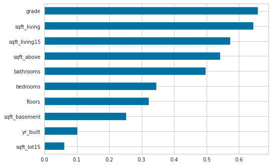
The goal here is to measure how strongly each selected housing feature moves with the target price, using Spearman correlation instead of plain linear correlation. Spearman’s method is useful because it looks at whether two variables rise and fall together in a monotonic way, which can be more informative when the relationship is not perfectly linear but still clearly ordered. Since the target has already been transformed earlier, this comparison is being made against the log price, which helps reduce the impact of extreme values.
The first step applies that correlation calculation feature by feature across the columns in X. For each column, Spearman’s correlation with y is computed, and only the correlation coefficient is kept. That produces one value per feature, giving a compact summary of how each predictor relates to price. After that, the results are sorted so the features can be viewed in order from weakest to strongest association.
The saved plot is the visual result of that sorting. Because the values are shown as a horizontal bar chart, it becomes easy to compare the features at a glance and see which ones are most connected to price. The strongest bars appear for variables like grade, sqftliving, sqftliving15, sqftabove, and bathrooms, which suggests these are among the most important predictors in the set. The shorter bars near the bottom, such as yrbuilt and sqft_lot15, indicate weaker monotonic relationships with price. The output looks this way because the chart is ordered by correlation value, so the least associated features are placed at one end and the most associated at the other, making the ranking visually obvious.