

Mastering Algo Trading: From Cointegration Tests to Live Signals
How to build a mean-reversion strategy and improve stock forecasting accuracy using Python.

Download source code link at the end of this article!
These are all of the files avilable to download:
➜  pairs-trading-algo-onepagecode tree
.
├── adf.ipynb
├── adf_explained.ipynb
├── combined_notebook_explained.ipynb
├── definitions.md
├── helper_methods.py
├── processing_tracker.json
├── requirements.txt
├── seed_db.py
├── seed_db_output.txt
├── signal_research.ipynb
├── visualizations.py
└── web_scraper.py

1 directory, 12 files
➜  pairs-trading-algo-onepagecode
How do you build an algo trading system that is both reproducible and robust? It starts with a clean architecture. In this post, I break down the entry points of a professional-grade trading script, detailing how to isolate data hygiene from strategy logic to avoid common pitfalls like look-ahead bias. We will look at how to leverage historical data for stock forecasting, using rolling statistics to generate dynamic Z-score thresholds. Finally, we will stress-test our algorithms against real-world scenarios—showing exactly how a well-coded stop-loss saves your capital when the market defies your forecast.
from datetime import date
from helper_methods import *
from visualizations import *
This tiny header tells you how the rest of the script will run: date provides a convenient, explicit handle for time-bounding runs and for timestamping outputs, while helper_methods and visualizations encapsulate the domain logic and presentation layers for our pairs trading workflow. In practice the narrative starts with the date value(s) you pass into the pipeline to define the sample window (start/end/run date). Using a date object at the top-level makes the code deterministic and reproducible: the same date input yields the same universe and backtest window, it is used to fetch historical data, to calculate rolling statistics on the same aligned time grid, and to label results and artifacts for traceability.
helper_methods is where the algorithmic meat lives: data ingestion, cleaning, statistical tests for pair selection, spread construction, signal generation, and backtesting/metrics. The reason we centralize these functions is separation of concerns — the main script orchestrates the steps, while helper_methods focuses on “how” to do each step robustly. Typical content you’ll rely on from that module includes time-series alignment and missing-data handling (forward/backward fill rules, trimming of NaNs) so that correlations and cointegration tests are not biased by misaligned timestamps; normalization and scaling of price series (e.g., log-prices or percent-changes) to keep subsequent statistics stable; pair selection logic (pre-filtering by liquidity/volume, correlation thresholds, and formal cointegration tests) to avoid spurious relationships; construction of the spread (linear combination using hedge ratio from OLS or Engle–Granger) and rolling statistics (mean, std) to produce z-scores — we do these to create stationary input for simple mean-reversion signals and to avoid non‑stationary leakage that would invalidate our thresholds.
After the spread and z-score are available, helper_methods will typically contain the trade signal logic and risk controls: entry/exit thresholds on the z-score, minimum hold times, stop-loss/take-profit levels, sizing rules (fixed fraction, dollar-neutral, or beta-neutraling), and realistic execution adjustments (slippage and per-trade commissions). Each of these decisions has a why: thresholds control false positives vs missed opportunities, sizing and stops manage tail risk and drawdown, and realistic execution assumptions prevent overstated backtest returns. The module should also provide backtesting mechanics — turning signals into orders, applying fills, tracking portfolio P&L, and producing performance metrics (Sharpe, max drawdown, win rate) so you can evaluate strategy robustness.
visualizations is the presentational counterpart: it consumes the outputs from helper_methods (raw price pairs, spread and z-score series, trade markers, and P&L series) and creates diagnostic charts. The purpose of those visualizations goes beyond aesthetics: plotting the raw pair prices with hedge ratio overlays helps validate the hedge relationship; a spread plus rolling mean/std chart shows whether your spread is stationary and whether chosen lookbacks make sense; plotting z-scores together with trade entry/exit points reveals if thresholds and trade durations are sensible; and cumulative P&L with drawdown plots highlights execution and sizing issues. Good visualization functions also make it easy to spot data quality problems early (bad timestamps, stale prices) that unit tests can miss.
A few practical guidelines that follow from this structure: keep helper_methods functions as pure and stateless as possible (input series → output metrics) so they’re easy to test and reuse; do all time-windowing based on the date(s) you imported rather than implicit “now” values to avoid lookahead; be explicit about lookbacks and rolling window sizes to avoid forward bias; and include execution assumptions in the same module so backtest and analytics match. Finally, treat visualizations as diagnostic tools, not decision logic — they should not change state but should make it easy to validate the decisions made by helper_methods.
In short, this import trio is the entry point to a disciplined pairs-trading pipeline: date controls reproducibility; helper_methods encapsulates the statistical and trading logic (data hygiene, cointegration, spread construction, signal and risk rules, backtest); and visualizations turn those outputs into human-readable diagnostics to validate assumptions and tune parameters.
Creating Database Tables
# IMPORTANT: THIS STEP WAS ALREADY DONE. THIS IS A VERY TIME CONSUMING CODE BLOCK
# DO NO UNCOMMENT AND RERUN
# from seed_db import seed_stock_info, seed_stock_coint_pairs
# seed_stock_info()
# seed_stock_coint_pairs()
This small commented-out block is a one-time, heavy-duty initialization step for the pairs-trading pipeline: it populates the database with the stock universe and then computes and stores candidate cointegrated pairs. The first function, seed_stock_info(), is responsible for building the foundational stock metadata and historical price records the rest of the system depends on — think tickers, exchange identifiers, adjusted price time series, and any canonical normalization (e.g., split/dividend adjustments). We do this up-front because downstream logic (pair selection, backtests, live signals) needs consistent, cleaned input and we want to avoid repeated network calls or inconsistent snapshots during analysis. The second function, seed_stock_coint_pairs(), reads those stored price series and performs the pairwise statistical work: it tests potential stock pairs for stationarity or cointegration (commonly via Engle–Granger or similar tests), computes associated metrics such as p-values, hedge ratios / regression coefficients, half-life or spread volatility, and then persists only the pairs that meet our thresholds into the DB as candidate mean-reverting relationships.
Why this is commented out and marked “do not rerun”: the work is expensive in both time and resources. There are two major cost drivers — data I/O (fetching and normalizing long price histories) and combinatorial testing: with N stocks the number of candidate pairs grows ~N(N−1)/2, each requiring statistical tests and regression. That can mean many hours of computation, heavy database writes, and possible API rate-limit issues if historical prices are pulled on demand. Because it mutates persistent state, re-running it without care could create duplicate entries, overwrite curated results, or stress external data providers. For reproducibility and efficiency we seed once, check the results, and then treat the output as canonical input for downstream tasks.
Operationally, treat these seed functions as a data engineering job rather than a unit-test: run them under controlled conditions (off-hours, with logging and checkpointing), or convert them to an idempotent migration that skips already-seeded records. If you ever need to refresh or extend the universe, prefer incremental runs (e.g., seed only new tickers or rerun cointegration tests only for newly added stocks) or implement batching/parallelization with careful rate-limit handling. Also consider persisting intermediate artifacts (downloaded price files, per-pair test results) so you can resume a partially completed run without repeating work. Finally, from the pairs-trading perspective the purpose of this block is strategic: precomputing and storing viable cointegrated pairs gives the trading system a fast, reliable candidate set to generate spread signals and execute mean-reversion strategies without incurring the latency or variability of on-the-fly statistical discovery.
These two functions create two database tables that can be accessed as DataFrames.
One DataFrame contains all stock prices over the time period:
stock_price_df = get_stock_prices_from_db()
stock_price_df.sample(5)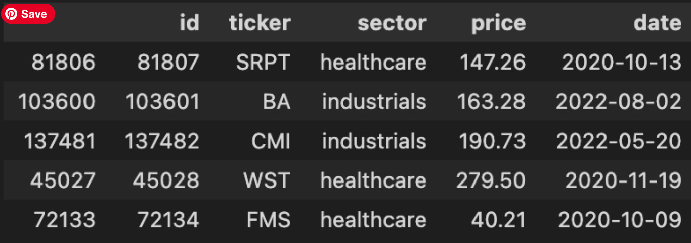
The first line calls a data-access helper to pull historical market data into a DataFrame; conceptually this is the handoff from persistence to the model pipeline. For pairs trading we expect this dataset to contain time series price observations (usually one row per timestamp per instrument, or a wide table with timestamps as the index and tickers as columns), plus whatever metadata the DB provides — e.g., symbol, timestamp, price type (close/adjusted_close), and possibly volume. That retrieval is the critical entry point: everything downstream (alignment of two candidate instruments, computation of returns, cointegration tests, spread construction and z‑scoring) depends on having the right timestamps, price type and consistent frequency.
The sample(5) call immediately after is not transforming the dataset; it’s a quick, non-deterministic inspection to validate assumptions about the returned data before any heavy processing. We use a random sample rather than head() because head() might always show the most recent or earliest rows which can hide data quality issues scattered elsewhere in time; sampling gives a quicker sense of column names, value formats, whether prices are adjusted, presence of NaNs, duplicate timestamps, and whether timestamps are timezone-aware or strings. That informs several “why” decisions: if prices are unadjusted we must adjust for corporate actions before computing log returns; if timestamps are irregular or missing dates we’ll need to reindex/resample or forward-fill to align paired series; if symbol names are embedded in rows (long format) we’ll pivot into a wide format keyed by timestamp so arithmetic between instruments is vectorized and aligned.
Operationally, after this sanity check we typically follow with deterministic, reproducible steps: verify and convert the timestamp to a datetime index, sort by time, pivot if needed, drop or impute NaNs in a principled way, and confirm the price field we’ll use (adjusted close is preferred for return calculations). A couple of cautions: sample() is randomized so add random_state if you need repeatable checks in debugging logs, and don’t rely on a tiny sample to prove data quality — use column-level checks and summary statistics before running cointegration tests. In short, this pair of lines is the gateway check: fetch the raw price universe, take a quick look to validate assumptions, and then decide the cleaning and alignment steps that are necessary for robust pairs trading signals.
The other DF lists all identified coint pairs.
stock_coint_df = get_stock_coint_pairs_from_db()
stock_coint_df.head(5)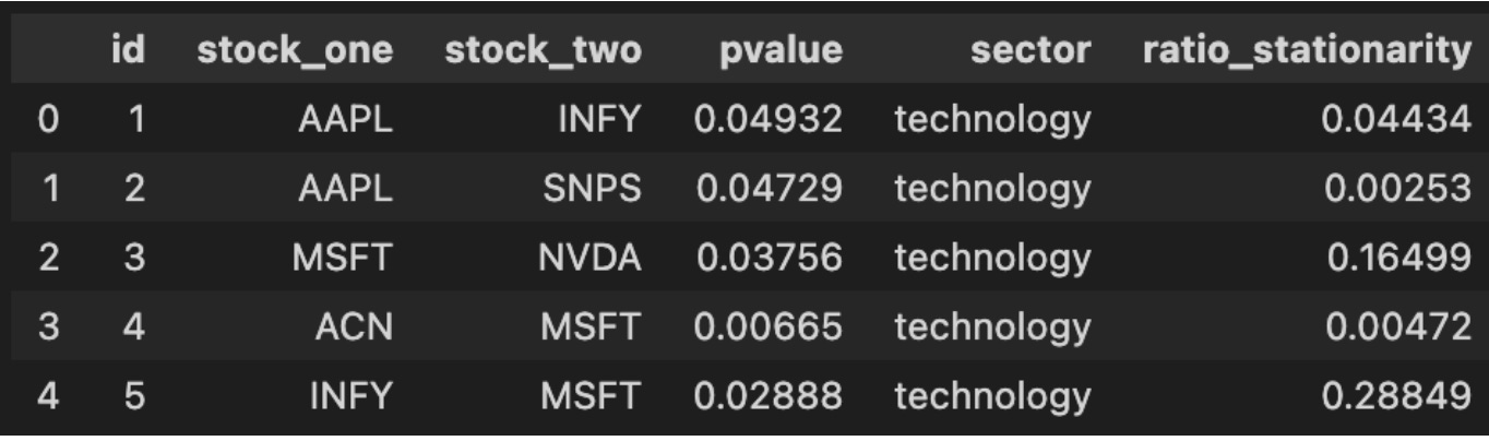
This tiny block is the checkpoint where your pairs-trading pipeline transitions from offline analysis and storage into live decision-making. The function get_stock_coint_pairs_from_db() encapsulates the work of retrieving precomputed cointegration results from your persistent store — it typically runs a query that returns candidate stock pairs along with the statistical metadata you need to decide whether to trade them (e.g., test statistic, p-value, estimated hedge ratio, half‑life or speed-of-mean-reversion, sample window start/end, and any quality flags). We fetch from the database rather than recomputing on the fly because cointegration tests across many ticker pairs are computationally expensive and because keeping results in DB preserves reproducibility and allows you to annotate or backfill manual QC decisions.
When the DataFrame is returned, the next line calls head(5) purely for quick inspection: you’re pulling the first five candidate rows to validate that the query returned the expected schema and to get an immediate feel for the top entries (for example, to confirm p-values are present and reasonable, hedge ratios are finite, and date fields align with the latest market data). At this stage you should be checking not just that rows exist but that the metadata matches your algorithmic thresholds — e.g., p-value below your significance cutoff, half‑life within a tradable range, and sufficient overlapping history between tickers. If any of those checks fail, downstream logic (selection, risk filters, or backtests) should either ignore those pairs or trigger a recompute/refresh.
Operationally, expect this DataFrame to be the input to the next steps of the pairs-trading workflow: compute the live spread using the stored hedge ratio (or recompute a rolling hedge ratio if you prefer), standardize it to a z-score using recent residuals, and apply your entry/exit rules, position sizing, and risk limits. Be mindful of two practical points: (1) currency, liquidity and corporate actions — a pair that was cointegrated historically may be invalid today if one symbol has been delisted, split, or has poor liquidity; and (2) statistical stability — many stored pairs should be periodically re-tested (recalculate cointegration, hedge ratio and half‑life) and your retrieval code should expose timestamps so you can schedule or force revalidation. Finally, treat the head(5) inspection as a developer check only — production code should validate schema and values programmatically, log any anomalies, and apply your selection filters consistently rather than relying on manual inspection.
We select the cointegrated pair with the lowest p-value to execute our trades.
index_of_chosen_pair = 0

stock_one, stock_two = stock_coint_df.sort_values(by=[’pvalue’, ‘ratio_stationarity’]).iloc[index_of_chosen_pair][[
    ‘stock_one’, ‘stock_two’]].to_numpy()
stock_one, stock_two
This small block’s purpose is to pick a single candidate pair from a scored list of cointegration candidates so downstream logic can build a pairs-trading strategy on that pair. We first define index_of_chosen_pair as a selection knob (0 here to choose the top-ranked candidate). The core decision happens in the sort: stock_coint_df.sort_values(by=[‘pvalue’, ‘ratio_stationarity’]) orders candidate pairs primarily by p-value and secondarily by a stationarity metric. Ordering by p-value first enforces statistical significance of the cointegration test (we prefer lower p-values), and using ratio_stationarity as the tiebreaker promotes pairs whose spread appears more stationary — a practical preference because a more stationary spread gives more reliable mean-reversion signals for entry/exit decisions.
After sorting, .iloc[index_of_chosen_pair] selects the single row corresponding to the chosen rank. From that row we take the ‘stock_one’ and ‘stock_two’ fields and convert them into a NumPy array before unpacking into the local variables stock_one and stock_two. That conversion is just a compact way to extract those two scalar values for downstream use (you could also use .at/.iat or .loc to extract each value directly). The final expression returning stock_one, stock_two is typically used for quick inspection in an interactive session.
A few practical notes and implicit assumptions: this code assumes stock_coint_df contains the expected columns and at least index_of_chosen_pair+1 rows — otherwise you’ll get a KeyError/IndexError. The sort order reflects a business rule: prioritize statistical significance, then stationarity strength; if you wanted a different ranking (for example, prioritize spread half-life or economic similarity), adjust the sort keys accordingly. For performance and clarity in production code, consider explicit existence checks for the DataFrame and columns, and prefer .at/.iat when extracting a single cell to avoid the intermediate array allocation.
The dataset is divided into four years of training data and one year of testing data.
pair_stock_price_df = stock_price_df[stock_price_df[’ticker’].isin([stock_one, stock_two])]


def gen_date(str_date): return date(*[int(n) for n in str_date.split(’-’)])
train_start_date = gen_date(TRAINING_DATE_RANGE[0])
train_end_date = gen_date(TRAINING_DATE_RANGE[1])
test_start_date = gen_date(TESTING_DATE_RANGE[0])
test_end_date = gen_date(TESTING_DATE_RANGE[1])

training_df = pair_stock_price_df[(pair_stock_price_df[’date’] >= train_start_date) & (
    pair_stock_price_df[’date’] <= train_end_date)]
training_df = training_df.set_index(’date’)

test_df = pair_stock_price_df[(pair_stock_price_df[’date’] >= test_start_date) & (
    pair_stock_price_df[’date’] <= test_end_date)]
test_df = test_df.set_index(’date’)

train_stock_one_price_series = training_df[training_df[’ticker’]
                                           == stock_one][’price’]
train_stock_two_price_series = training_df[training_df[’ticker’]
                                           == stock_two][’price’]

test_stock_one_price_series = test_df[test_df[’ticker’]
                                      == stock_one][’price’]
test_stock_two_price_series = test_df[test_df[’ticker’]
                                      == stock_two][’price’]
This block’s high-level purpose is to isolate the price time series for a single stock pair and split that data into training and testing windows so downstream pairs-trading logic (cointegration testing, spread construction, model training and backtesting) has the correctly scoped inputs. It begins by reducing the full market dataframe to only the two tickers that form the trading pair; this keeps subsequent operations focused and avoids accidental leakage from other securities. The explicit filtering up front also means the following date-range operations only scan a much smaller dataframe.
Next, the code converts the configured start/end strings into native date objects so comparisons against the dataframe’s date column are type-consistent. Using date objects rather than raw strings ensures the >= and <= comparisons behave as expected and makes the intent explicit: these ranges are calendar intervals. The TRAINING_DATE_RANGE and TESTING_DATE_RANGE are therefore interpreted as inclusive date boundaries for the model development and evaluation phases.
With those boundaries established, the script slices the pair-only dataframe into training and testing subsets by applying the date filters. It then sets the dataframe index to the date column. Setting the date as the index is important for time-series work: it simplifies alignment, resampling, time-based indexing, and any rolling/window calculations you will do later. It also prepares the data for straightforward merging or alignment between the two tickers’ series by a shared datetime index.
Finally, the code extracts the price Series for each ticker within each window. By filtering on the ticker column and selecting ‘price’, you get four Series objects: train/test for stock_one and stock_two, each indexed by date. Those Series are the immediate inputs you’ll feed into cointegration tests, spread computations, and the trading signals/backtest. Note that since the series are sliced independently, you should ensure they share the same index (same dates and sorted order) before computing pair statistics; any mismatched dates or missing observations will need to be handled (e.g., inner-join by date, forward/backfill, or explicit NA handling) to avoid misleading results during model training or evaluation.
In short: the code narrows the market data to the pair, enforces date-typed boundaries for train/test windows, makes time the index for time-series operations, and yields per-ticker price series for downstream pairs-trading steps — keeping the data scoped, aligned-ready, and separated for model development versus testing.
Before we begin training on the training data, let’s examine the two stock prices across the full five-year period.
plot_stock_pair(train_stock_one_price_series, stock_one,
                train_stock_two_price_series, stock_two)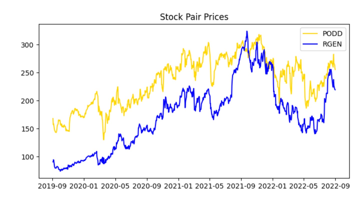
This single call is the visualization checkpoint for the training pair — it takes the two prepared price series (train_stock_one_price_series and train_stock_two_price_series) along with their identifiers and renders a diagnostic view so you can evaluate whether this candidate pair behaves like a viable mean-reverting pair. At a high level the function will align the two series in time, apply any necessary scaling or dual-axis mapping so both series are comparable on a single chart, and then plot them together (often with optional annotations such as rolling means, rolling standard deviations, or the spread). The core reason we do this here, using the training subset rather than the full history, is to avoid look‑ahead bias while we visually inspect the historical relationship that we will later quantify and backtest.
Why this matters for pairs trading: the plot is where you first check the assumptions you’ll later formalize with statistical tests. You want to see a stable linear relationship (or one that can be stabilized by a hedge ratio), periods of convergence after divergence, and no obvious structural break or persistent trending in one series that the other doesn’t share. The function’s normalization or dual-axis choices matter because raw price scales can hide relationships — plotting log prices or z‑scored series, or drawing the normalized spread, makes mean reversion and co-movement patterns visually apparent and prevents misleading interpretation caused by scale differences.
How you should use the output: start by confirming time alignment and that both series cover the same training window; then inspect whether deviations between the two appear to oscillate around a stable mean and whether the amplitude looks stationary. If the plot shows long trending apart without reversion, regime shifts, or clearly different volatility regimes, you should not proceed with this pair without further preprocessing (detrending, cointegration-adjusted hedge ratio, or excluding the problematic period). If the plot looks promising, the next steps are quantitative: run an OLS regression or Johansen test to estimate the hedge ratio and cointegration, compute the spread and its z-score, and calibrate entry/exit thresholds and stop-losses before backtesting.
Finally, treat this visualization as a diagnostic, not a decision-maker by itself. Good plotting short-circuits obvious problems and informs parameter choices (window sizes for rolling statistics, whether to use log returns, how aggressive thresholds should be given observed spread volatility), but the ultimate validation must come from properly out-of-sample backtests and statistical tests on the same training/validation split that this call is using.
The series appear cointegrated and move together; however, PODD’s price is generally slightly higher than RGEN’s. Normalize the data to compare prices on the same scale.
plot_stock_one_adjusted_pair(train_stock_one_price_series, stock_one,
                             train_stock_two_price_series, stock_two)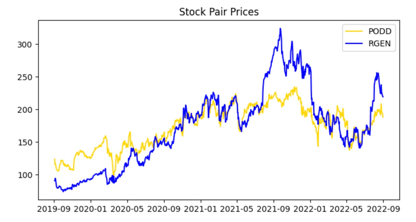
This single call is the visualization gate for the pair-selection and training pipeline: it takes the two cleaned, training-period price series plus their tickers and renders a diagnostic view that tells us whether these instruments behave like a valid pairs trade candidate. The function’s primary job is not just to draw lines, but to align and present the data in a way that highlights the relationship we care about — co-movement and mean reversion of the spread — so we can decide whether to proceed to parameter estimation and backtesting.
When the two series enter the function, the first logical step is to align them on a common timeline and handle any missing data so the visual comparison is meaningful. Because we passed “adjusted” series, we expect corporate-action adjustments (splits, dividends) to already be applied; the plot routine typically ensures both series share the same index, drops NaNs or forward/back fills in a controlled way, and trims to the training window. Next, the function normalizes or rescales the series for visual comparability — for example by rebasing both series to 1 on the first training date or plotting z‑scores — because absolute price levels might differ widely and would otherwise obscure relative movements that indicate cointegration or mean reversion.
The plotted output is organized to make the trading-relevant signals visible: you’ll see the two adjusted price paths over the training period (with tickers used for labels and title), and the routine often overlays or provides the option to show derived quantities such as the price ratio or the spread (possibly computed with a pre-estimated hedge ratio), and rolling statistics like a rolling mean and standard deviation. Those overlays let you visually assess whether the spread is stationary and mean-reverting, whether there are persistent structural shifts, and whether the spread’s volatility is stable enough to set entry/exit thresholds.
Why we do this now: before estimating a hedge ratio, running statistical tests, or committing to a backtest, a human-in-the-loop inspection reduces the chance of wasting effort on pairs that only look correlated over a short window or that exhibit regime changes. If the plot shows sustained co-movement and a visually stable spread, the next steps are to quantitatively estimate the hedge ratio (e.g., via OLS or cointegration regression), compute z‑scores for the spread, and define trading thresholds. If it does not, we either reject the pair or adjust preprocessing (different window, alternative normalization) and re-run the visualization.
This provides a clearer view and serves as a preliminary check that nothing in the data contradicts our assumption that the two stock prices are cointegrated. Next, examine the spread between the stocks by visualizing their ratio. Note that at this stage we restrict the analysis to the training data.
plot_stock_pair_ratio(train_stock_one_price_series, stock_one,
                      train_stock_two_price_series, stock_two)

# Note for Ryan, add something to the graph below marking we would trade at the high point near the beginning (2019), and at the low point near the end (2022)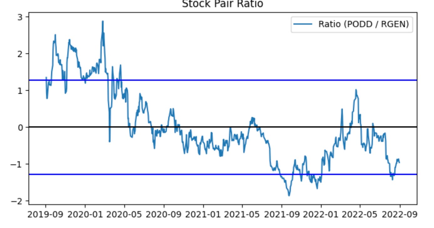
This single call is an exploratory visualization step in the pairs-trading workflow: it takes the historical price slices you designated as “training” for the two tickers and renders their relative path so you can judge whether the pair behaves like a mean-reverting relationship worth trading. The two series flow into the plotting routine, which should compute a relative measure (most commonly a price ratio or a residual spread after fitting a hedge ratio) across the training window, then draw that series along with reference lines such as the long-run mean and volatility bands. The visual summary is intentionally lightweight: it’s not executing trades, it’s surfacing the characteristic deviations and cyclicality that a pairs strategy relies on.
Why do we plot the ratio/spread? In pairs trading we pair a directional short and a directional long based on relative value: when the relative measure wanders far from its historical center we expect mean reversion, so extreme highs become short-entry signals on the rich leg and lows become long-entry signals on the cheap leg. The plot helps you see the size, frequency and persistence of those deviations so you can pick sensible entry/exit thresholds, confirm that deviations are large enough to overcome transaction costs, and eyeball stationarity/cointegration qualitatively before running formal tests. Good visual aids typically include the rolling mean and ±1/±2 standard deviation bands (or a rolling z-score) so you can quickly map a point on the curve to an expected z-score and hence to a trading decision.
The inline note about marking a high near 2019 and a low near 2022 is a request to annotate concrete example trades on this visualization: marking the 2019 peak would demonstrate a canonical short-rich/long-cheap entry, while marking the 2022 trough would show the opposite entry and the magnitude of subsequent reversion (or lack thereof). Annotating example entry points clarifies how the strategy would have behaved in-sample and is useful for communication and debugging — for example to verify that programmatic signal generation would have opened and closed positions where you expect, and to inspect realized returns and drawdowns around those events.
A few practical reminders tied to the plot’s role in the pipeline: make sure the plotted series are strictly from the training window to avoid lookahead bias; prefer using a hedge ratio (OLS or Kalman filter) or residual spread rather than a naïve price1/price2 ratio if the assets have different scales or a time-varying relationship; and use the visualization to set parameter choices (entry/exit z-scores, stop-loss, target) that you’ll then test in backtests. Finally, annotating the chart programmatically (vertical lines, marker symbols, and brief text labels for “enter short” / “enter long”) makes it easy to reproduce the same indicators in reports and to compare intended entries to the trades that the backtester actually executed.
The ratio does not appear perfectly stationary, which is common with real-world data. Approximately ~80% of observations fall between the blue lines (the z-score bounds), leaving about 20% outside those lines. An excursion beyond the blue lines therefore represents an irregular event. If the stationarity assumption for the ratio holds, we can trade during these irregular periods and profit when the ratio reverts to the normal range (between the blue lines). Concretely, sell the spread when the ratio exceeds the upper blue threshold, and buy the spread when it falls below the lower blue threshold (details on buying and selling the spread follow for readers unfamiliar with the terms).
Critically, predictions based on this plot suffer from look-ahead bias, a common form of data leakage in time-series work. To mitigate this, we will compute the z-score thresholds using rolling moving averages.
train_ratio = train_stock_one_price_series / train_stock_two_price_series
test_ratio = test_stock_one_price_series / test_stock_two_price_series
plot_mvg_avg_ratio(train_ratio, test_ratio)
Here we first construct the core quantity that a pairs-trading strategy typically monitors: the price ratio of the two instruments. For the training period we compute train_ratio = train_stock_one_price_series / train_stock_two_price_series, and for the out-of-sample evaluation period we compute test_ratio the same way. Framing the spread as a ratio (rather than an absolute difference) normalizes for scale — it captures the relative pricing relationship so the same rule can apply when the two tickers trade at very different price levels. In practice this ratio is the candidate “spread” whose stationarity and mean-reverting behavior we want to verify before committing capital.
Next, those two ratio series are passed to plot_mvg_avg_ratio, which by its name indicates we are visualizing the ratio together with its moving-average(s). The moving average is used as a smoothed estimate of the long-run relationship; plotting it over the raw ratio makes it easy to see persistent deviations (spikes away from the MA) that would generate trading signals in a mean-reversion framework. Doing this for both train and test periods side-by-side lets you validate two things: (1) during the training window the ratio displays the expected mean-reverting pattern used to tune window lengths and entry/exit thresholds, and (2) during the test window the relationship holds (or breaks), which flags regime shifts or model overfitting.
There are a few implicit, important operational considerations that motivate these steps. You must ensure the two series are properly aligned in time and cleaned of NaNs or zero prices before division, because misalignment or divisions by zero will distort the ratio. You should also test the ratio for stationarity (e.g., ADF test) because a non-stationary ratio undermines mean-reversion assumptions; if required, use log ratios or residuals from a cointegration regression instead. Finally, the moving-average window and any subsequent normalization (z-scoring using rolling mean/std) are design choices tied directly to trade frequency and risk — they determine how sensitive the strategy is to short-term noise versus persistent divergence. This snippet is the visualization and diagnostic first step that informs those downstream choices (window size, threshold levels, and whether the pair is tradable at all).
Using moving averages, the predictive power is reduced. In the first graph there was a clear period to sell high and another to buy low. The moving-average graph produces many trading signals, and the data often fluctuates around the blue lines. Without look-ahead bias, predictions are naturally weaker. Next, we evaluate how the training set performs when buying and selling the spread. To realize a profit, we must buy low and sell high.
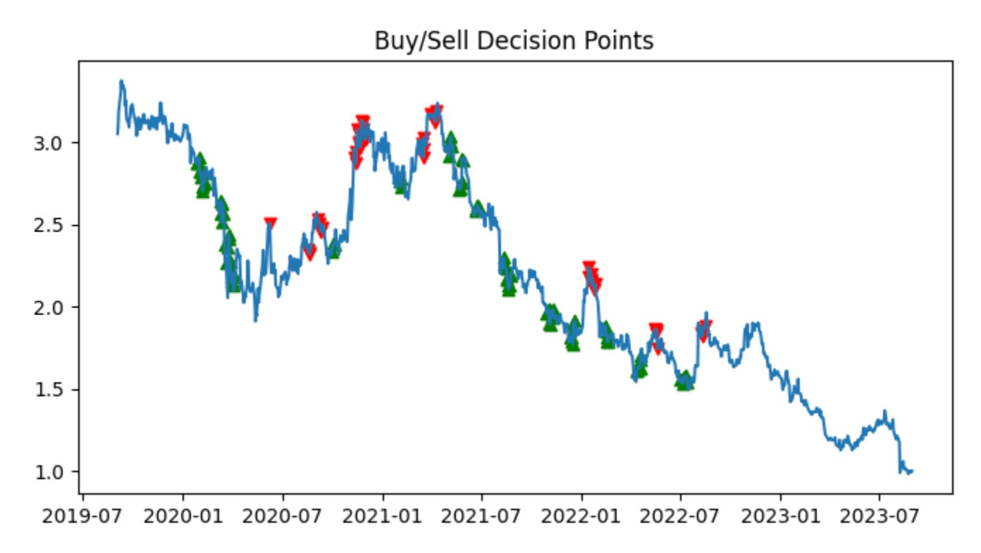
plot_trade_signals(train_ratio, test_ratio)This single call is the high-level entry point that runs the end-to-end signal-generation and visualization workflow for the pairs-trading experiment using the given train/test split. Conceptually the function takes your historical price series for the two instruments, slices the timeline into a calibration window (train_ratio) and an out‑of‑sample window (test_ratio), and then walks through the standard pairs-trading pipeline: estimate a hedged spread on the calibration data, choose mean‑reversion thresholds there, apply those thresholds to generate trades in the test period, compute the resulting P&L and performance metrics, and finally render a set of diagnostic plots that let you inspect whether the signals behaved as intended.
More concretely, in the calibration phase the function typically estimates the hedge relationship (for example via OLS regression or a cointegration/Johansen procedure) to produce a hedge ratio that neutralizes linear exposure between the two prices. It then transforms the raw spread into a normalized quantity (a z‑score or rolling‑demeaned series) so that fixed entry/exit thresholds are meaningful across time and scale. We do this normalization in the training window to avoid look‑ahead bias and to capture the historical volatility that sets sensible entry/exit bands; without that step thresholds would not correspond to consistent statistical significance and you’d risk either undertrading or generating spurious trades.
Once those parameters (hedge ratio, mean, volatility, and thresholds) are fixed from the training window, the function runs the signal logic on the test window: enter a long or short pair when the normalized spread crosses the entry thresholds, exit when it reverts inside the exit band (or when stop‑loss / time‑limit rules trigger), and size positions according to the hedge ratio and any risk sizing rules. These decision rules are what turn a spread exceedance into discrete buy/sell markers and a time series of positions; keeping the calibration confined to the training split is crucial so the test results reflect genuine out‑of‑sample performance rather than in‑sample fitting.
The plotting stage overlays these elements to make the story visible: you’ll typically see the two raw price series (or the synthetic hedged portfolio), the spread with the train/test boundary and horizontal threshold lines, buy/sell entry and exit markers, and cumulative returns or drawdown traces. Those visuals serve three purposes: (1) sanity‑checking that the hedge ratio actually neutralizes market exposure, (2) verifying that reversion events in the test set would have produced sensible entries/exits given the training calibration, and (3) diagnosing practical issues like regime shifts, frequent whipsaws, or structural breaks that suggest the model needs rolling recalibration or different threshold logic.
Finally, interpret the output with attention to overfitting risks and stationarity: strong in‑sample results with poor out‑of‑sample performance indicate that thresholds or the hedge ratio were tuned to noise in the training window. If you see many early exits or persistent deviations in the test window, consider adding rolling retraining, expanding the calibration window, accounting for transaction costs in the signal generation, or switching to robust cointegration techniques. The plot_trade_signals call is therefore both a validator (does our logic produce sensible trades?) and a diagnostic tool (what adjustments are needed before deploying a live pairs‑trading strategy?).
Green arrows indicate signals to buy the spread; red arrows indicate signals to sell the spread. When the z-score is below the band, stock 1 (PODD) is undervalued relative to stock 2 (RGEN), so the algorithm buys the spread (long PODD, short RGEN). When the z-score is above the band, stock 1 (PODD) is overvalued relative to stock 2 (RGEN), so the algorithm sells the spread (short PODD, long RGEN).
Each trade takes equal long and short positions of $100, which results in a $0 initial cash outlay. Empirically, the algorithm performed well, consistently buying low and selling high.
We will repeat this procedure on the test data. To avoid look-ahead bias, we use the z-score (blue line) threshold calculated from the training data. The algorithm is intended for future deployment, for which no z-score threshold is available at present.
plot_stock_pair_ratio(test_stock_one_price_series, stock_one,
                      test_stock_two_price_series, stock_two)
plot_mvg_avg_ratio(test_ratio, train_ratio)
plot_trade_signals(test_ratio, train_ratio)
These three calls are the visualization stages of a pairs‑trading workflow: first we inspect the raw relationship, then we overlay smoothed baselines derived from historical (training) behavior, and finally we apply that baseline to the out‑of‑sample (test) series to show concrete trade decisions. The intent is to validate that the two instruments form a stable, mean‑reverting spread in training, then to apply the learned baseline to live/out‑of‑sample data and visualize where the strategy would enter and exit positions.
plot_stock_pair_ratio(test_stock_one_price_series, stock_one, test_stock_two_price_series, stock_two) draws the raw price series (or their ratio) for the two tickers over the test period. The critical role of this plot is diagnostic: it shows whether the price relationship you modeled in training still holds in the test window, whether there are structural breaks, and whether the ratio exhibits visible mean reversion or trending behavior. In practice you want to check for large, persistent divergences, sudden regime changes, or serial trends that would invalidate an assumption of stationarity — if those appear here, your historical parameters (mean, variance, hedge ratio) may no longer be reliable.
plot_mvg_avg_ratio(test_ratio, train_ratio) overlays smoothed summaries of the spread/ratio — typically short and long moving averages computed on the test_ratio — and also plots the baseline statistics learned from train_ratio (for example the historical mean and perhaps ±1/±2 sigma bands). The “why” here is twofold: smoothing reduces high‑frequency noise so crossover or reversion signals are more robust, and comparing the test moving averages to the training baseline lets you see whether recent behavior has shifted relative to historical norms. If the test MA consistently sits away from the training mean, that indicates a drift or regime change; if the MAs converge and cross around the training mean, that supports mean‑reversion trading.
plot_trade_signals(test_ratio, train_ratio) translates those visual diagnostics into actionable signals. The function uses the training distribution (mean, volatility or other thresholds derived from train_ratio) as the reference and evaluates the test_ratio against that reference to decide entries and exits. Commonly this means computing a normalized score (z‑score = (test_ratio − train_mean)/train_std) or using MA crossovers and then emitting a short spread signal when the score exceeds an upper threshold (the numerator is rich relative to the denominator) and a long spread signal when it falls below a lower threshold. The plot marks entry points, exit points, and often the position direction (long spread vs short spread), and may also show stops or target exits. This visualization is essential: it makes explicit the mapping from statistical deviation to trading action and lets you audit whether signals are sensible given the spread dynamics and whether they cluster in low‑liquidity or high‑cost regions.
Together these plots form a feedback loop for pairs trading: the first checks the raw relationship, the second shows smoothed behavior and the historical baseline, and the third applies that baseline to create and inspect trade signals. Use them to validate stationarity assumptions, tune MA windows and threshold levels, and surface problems like regime shifts, persistent drift, or excessive signal churn before you move to execution or live P&L estimation.
Calculate the profit for this test.
profit = calculate_profit(test_stock_one_price_series ,test_stock_two_price_series, test_ratio, train_ratio)[0]
print(’The profit is ‘ + str(profit))
This small snippet is the tail end of a pairs-trading evaluation pipeline: it calls a helper, extracts the profit metric, and prints it. The two price series you pass in are the out-of-sample test series for each leg of the pair, and the two ratio arguments represent how the legs are being combined and/or how position sizes were estimated. Inside calculate_profit (the function this code delegates to) the usual flow for pairs trading would be to take those inputs, reconstruct the spread using a hedge ratio (either the supplied train_ratio or an internally estimated one), normalize that spread (e.g., compute a z‑score) so changes are comparable across time, generate entry/exit signals from threshold crossings, simulate applying the resulting long/short positions to the test price series, and accumulate per‑trade P&L after accounting for position sizing, transaction costs and any exit rules. The function returns one or more summary metrics (commonly something like cumulative profit, list of trades, and risk statistics), and this line takes the first element — usually the cumulative or net profit — assigning it to profit for immediate reporting.
Why this structure matters: separating training and testing behavior prevents look‑ahead bias — the model or hedge ratio should be fitted on historical (train) data and then applied to the unseen (test) series so the calculated profit is an out‑of‑sample estimate of strategy performance. Normalizing the spread or using a z‑score before generating trades ensures entry/exit thresholds behave consistently across regimes and prevents spurious signals when raw price differentials drift. Position sizing determined by the ratio inputs controls the notional balance between legs so the simulated P&L reflects the intended hedge exposure rather than raw price moves.
A couple of practical notes and improvements: indexing with [0] is brittle because it assumes a particular return ordering from calculate_profit; it’s clearer and safer to have calculate_profit return a named tuple or dict (e.g., {‘profit’: …, ‘trades’: …, ‘stats’: …}) or to unpack explicitly (profit, trades, stats = calculate_profit(…)). The current print is fine for quick debugging, but in a backtest or production run you’ll want structured logging or to write the metric into a results object so downstream code can consume it (and include context like date range, transaction-cost assumptions, and the ratios used). Finally, guard the call with assertions or exception handling so an unexpected return shape or runtime error inside calculate_profit fails clearly rather than producing an IndexError at the print line.
Our returns are strong for a single year of trading with no initial cash outlay. We closed the period with the spread appearing undervalued, which suggests the potential for additional gains in the coming months. Had we been willing to accept more risk, increasing both long and short position sizes to $1,000 per spread trade would have amplified profits roughly tenfold, and scaling to $1,000,000 per trade would have produced on the order of 10,000× the profit. We could also adjust the z‑score threshold (blue line) to trade more conservatively or more aggressively, depending on our risk tolerance.
profit_trend = calculate_profit(test_stock_one_price_series ,test_stock_two_price_series, test_ratio, train_ratio)[1][’Cumulative Profit’]
# TO DO FOR RYAN: compare profit trend to owning and holding $100 of SP500 (or whatever value makes sense)
This single line is pulling out the strategy’s realized cumulative-profit time series from the output of your backtest routine so you can evaluate performance over the test period. The calculate_profit function is being handed the two price series (the pair to trade) plus the train/test split parameters; in a pairs-trading workflow those ratios tell the function which portion of the historical data to use to learn the relationship (train_ratio) and which portion to simulate trades on (test_ratio). Internally, calculate_profit is expected to use the training window to estimate the hedge/cointegration relationship or hedge ratio, construct a spread, and then apply the trading rules (entry/exit thresholds, position sizing, stop-losses, etc.) to the test window to produce P&L for every time step.
The code then selects the second element of calculate_profit’s return value and accesses its ‘Cumulative Profit’ field. That implies calculate_profit returns a multi-part result (for example a tuple like (summary_metrics, time_series_df)), where the second element is a time-indexed object (DataFrame or dict-like) that contains a running sum of realized profits. Pulling ‘Cumulative Profit’ gives you the trajectory of total profit from the start of the test window forward — this is the natural thing to examine when you want to see whether the spread trading strategy actually generated positive wealth and when gains or drawdowns occurred.
Why we extract this series is important: cumulative profit is the simplest representation of realized economic value and is directly comparable to simple benchmarks such as buy-and-hold. The commented TODO correctly suggests benchmarking against owning $100 of the S&P 500 (or another baseline). Comparing the strategy’s cumulative profit to a buy-and-hold benchmark lets you judge whether the pairs strategy added alpha net of the market move, and whether it compensated for risk and turnover; it’s also a sanity check for structural problems (e.g., a strategy that profits only because the entire market rallied is not true pairs alpha).
A couple of practical notes on why you may want to refine this line: indexing with [1][‘Cumulative Profit’] is fragile because it assumes a specific return shape and column name — using a named return (or unpacking the tuple into named variables) makes the intent clearer and safer. Also confirm whether ‘Cumulative Profit’ is in nominal dollars or normalized to a starting capital; for fair benchmarking you should normalize both the strategy series and the benchmark to the same initial capital (e.g., $100) or present percentage cumulative returns. Finally, ensure the test/train split applied inside calculate_profit aligns with how you intend to simulate online parameter estimation (e.g., rolling re-estimation versus a single static estimate), since that choice materially changes the resulting profit trend and its comparability to buy-and-hold.
The algorithm performed well: the two stocks remained cointegrated during the test period, and the strategy generated a positive profit. Next, we examine what happens when the cointegration assumption does not hold.
dated_stock_price_df = stock_price_df.set_index(’date’)
non_coint_stock_one_series = dated_stock_price_df[dated_stock_price_df[’ticker’] == ‘HON’][’price’]
non_coint_stock_two_series = dated_stock_price_df[dated_stock_price_df[’ticker’] == ‘NVO’][’price’]
non_coint_stock_one = ‘HON’
non_coint_stock_two = ‘NVO’
test_stock_cointegration(non_coint_stock_one_series, non_coint_stock_two_series)
This small block is doing the preparatory work to take two time series of stock prices and feed them into a cointegration check — a gatekeeper step in a pairs-trading pipeline. The overall goal here is to determine whether HON and NVO share a stable long-run relationship in their price levels; if they do, we can construct a mean-reverting spread and base entry/exit rules on deviations from that equilibrium, and if they don’t, we should avoid treating them as a tradable pair.
Step by step: first the DataFrame is reindexed by date so subsequent selections and tests operate on time-indexed series. Using the date as the index is important because cointegration and related time-series tests assume temporal alignment and ordering; it also lets pandas align the two Series by date automatically when you pass them to downstream code. Next the code extracts the price column for each ticker, producing two Series that are indexed by date (one for HON and one for NVO). Note that the code selects raw price levels rather than returns — this is intentional: cointegration tests are designed to detect a stationary linear combination in levels (a long-run equilibrium), whereas testing returns would defeat that purpose because returns are typically stationary already and won’t reveal a price-level equilibrium.
The two ticker name variables are set purely for readability/labeling, and then test_stock_cointegration is called with the two Series. That function is the decision point: in practice it will run an Engle–Granger regression or a Johansen test, check the residuals for a unit root (e.g., ADF test) and return a p-value or boolean indicating whether a stationary spread exists. The business logic that follows depends on that outcome — if the pair is cointegrated you would estimate the hedge ratio from the cointegration regression, form the spread, standardize it (z-score) and use mean-reversion thresholds to enter and exit positions; if it’s not cointegrated you should reject the pair to avoid drifting exposures that can lead to large, unhedged losses.
A few practical cautions and why they matter: ensure both Series are sorted and have the same frequency and overlapping date ranges before testing (non-overlap or misalignment can invalidate the test because pandas will align by index and introduce NaNs); drop or impute NaNs consistently and be wary of duplicated dates. Sample size and structural breaks matter — cointegration tests require enough data and can be sensitive to regime changes — so consider rolling tests or subperiod checks. Finally, validate that prices are the intended input (log-prices are often used to stabilize variance), and always follow a positive cointegration signal with spread-stationarity checks and economic viability checks (transaction costs, liquidity) before putting a live pairs-trading strategy on top.
Two randomly selected stocks from different sectors — HON (Industrials) and NVO (Healthcare) — produced a cointegration test p-value of 0.59. Because this exceeds the 0.05 significance threshold, we conclude the two series are not cointegrated.
plot_stock_one_adjusted_pair(non_coint_stock_one_series, non_coint_stock_one,
                             non_coint_stock_two_series, non_coint_stock_two)
This single call is the visualization/diagnostic step that takes the two time series and their identifiers and produces an adjusted-overlay plot intended to reveal whether the candidate pair behaves like a tradable, mean-reverting pair. The four arguments are the aligned/prefiltered price (or log-price) series for stock one and stock two plus the human-readable names or tickers; the plotting helper uses the series inputs as the numerical data and the names for axis labels and legends so you can immediately see which line is which.
Internally the routine first makes the practical data decisions that matter for interpretation: it aligns the two series on their timestamps (dropping or forward-filling NaNs as configured) so the comparison is one-to-one across time, and it optionally normalizes one or both series (for example by dividing by an initial price or by z-scoring) so differences in absolute price level don’t dominate the visual comparison. Those steps are why we pass explicit series objects rather than raw arrays — alignment and missing-data handling are critical before computing any hedge relationship.
Next it computes the adjustment that lets you inspect the spread: typically this is an OLS regression of stock_one on stock_two (or vice versa depending on convention) to estimate a hedge ratio (beta) and intercept, and then either overlays the fitted values (beta * stock_two + intercept) on stock_one or builds the spread as stock_one − (beta * stock_two + intercept). The purpose of this regression-based scaling is not cosmetic — it removes the shared linear trend component so that any remaining residual series reveals true relative behavior. If the residual (the adjusted spread) is stationary and mean-reverting, that’s the signal you want for a pairs trade; if it drifts, the pair is non-cointegrated and should be avoided.
The plotting step then shows both the raw/adjusted series and the residual/spread (often as a separate subplot with a zero line), emphasizing visual diagnostics: whether the adjusted series tracks, how large and persistent the deviations are, whether the spread oscillates around a stable mean, and whether variance is roughly constant. Those visual cues map directly to trading decisions — a stable, mean-reverting spread suggests you can size a long-short hedge using the estimated beta and deploy entry/exit rules; a drifting or heteroskedastic spread flags the pair as unreliable. Finally, the function’s labels, legends and optional annotations (e.g., estimated beta, p-value from a stationarity test) provide quick context so you can move from visual inspection to either accept the pair for backtesting or reject it and try another candidate.
In this example, the data were not divided into training and test sets because the objective is not to evaluate real trading performance. Instead, the purpose is to demonstrate how this trading strategy fails when applied to two stocks that are not cointegrated.
non_coint_ratio = non_coint_stock_one_series / non_coint_stock_two_series
plot_mvg_avg_ratio(non_coint_ratio, non_coint_ratio)
plot_trade_signals(non_coint_ratio, non_coint_ratio)
print(’The profit is $’ + str(calculate_profit(non_coint_stock_one_series, non_coint_stock_two_series, non_coint_ratio, non_coint_ratio)[0]))

#add in the profit trend for this one. We should see that the strategy starts profitable, but then starts to lose money, and we cut it off
# calculate_profit(non_coint_stock_one_series, non_coint_stock_two_series, non_coint_ratio, non_coint_ratio)[1]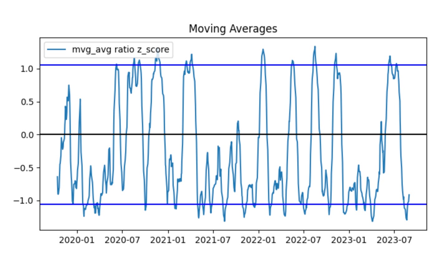
This block is the small end-to-end check that takes two non‑cointegrated price series, turns them into the simple price ratio we would use as a trading signal in a pairs strategy, visualizes the ratio and the resulting signals, and prints the simulated profit — essentially demonstrating how the strategy behaves on a bad (non‑cointegrated) pair.
First, non_coint_ratio = non_coint_stock_one_series / non_coint_stock_two_series computes the raw price ratio (stock A price divided by stock B price) at each timestamp. In pairs trading the ratio (or the spread) is our observable that we hope is mean‑reverting; we use it to decide when to long one leg and short the other. Here we explicitly use the raw ratio of a known non‑cointegrated pair so we can observe the failure modes.
Next, plot_mvg_avg_ratio(non_coint_ratio, non_coint_ratio) is called to visualize the ratio and its moving average (or smoothing) so we can see the “center” and deviations. The call passes the same series twice — which likely means either the plotting helper will compute its own moving average internally or we have not provided a precomputed smoothed series. The intent of this plot is diagnostic: to check whether a stable mean exists and whether deviations are transient (the prerequisite for a mean‑reversion trade). For a non‑cointegrated pair you should expect no stable long‑run center; the visual will show drift or non‑stationary behavior.
Then plot_trade_signals(non_coint_ratio, non_coint_ratio) overlays the entry/exit markers (long/short signals) derived from the ratio. Again the same series is provided twice; the plotting helper will use the provided series (or compute any internal moving average) to generate signals based on whatever thresholds or crossovers the helper implements. The purpose here is to inspect where the algorithm would have entered and exited trades so you can correlate those points with subsequent price behavior.
After visualization, the code calls calculate_profit(non_coint_stock_one_series, non_coint_stock_two_series, non_coint_ratio, non_coint_ratio)[0] and prints it. calculate_profit is the simulator that consumes both raw price series plus the signal inputs (ratio and — in this call — the same ratio again) to produce P&L. The function appears to return a compound result (likely total profit as the first element and a time series or equity curve as a second element); the code prints only the total profit. That printed value summarizes how the naive pairs strategy would have performed on this non‑cointegrated pair.
The commented line and its comment clarify the motivation: we should also inspect the profit trend (the equity curve) because non‑cointegrated pairs often show initial profitable spells, then persistent trending causes the strategy to lose money over time. That equity curve (presumably the second returned element from calculate_profit) is how you would detect that decline and decide to cut the strategy off or stop trading that pair.
A few practical notes (why this matters and what to change): pairs trading assumes a stationary spread, so running this pipeline on non‑cointegrated pairs is a deliberate negative test to observe regime breakdown. Passing the same ratio twice to plotting and profit functions is either a shortcut or a bug — usually you want to provide a smoothed ratio or z‑score as the second argument (so signals use a normalized, de‑trended metric). Also, to make this production‑ready, you should add a cointegration/stationarity test before deploying a pair, compute a proper z‑score (ratio minus moving mean, divided by rolling std), and incorporate stop‑losses, position sizing and a rule to stop trading the pair once its equity curve shows persistent deterioration.
When compared side-by-side, HON and NVO initially move together but begin to diverge at the start of 2023. The ratio z-scores are centered below zero, which indicates the series is not stationary, and their range is wider than in the previous example. These signs that the pair is not cointegrated are subtle — partly because the data are heavily smoothed by moving averages, and because cointegration tests such as the ADF can sometimes detect non-cointegration more reliably than visual inspection.
You will notice the algorithm stopped trading at the beginning of 2023. This occurred because we enforce a stop-loss when the ratio z-scores cross a predefined threshold. In other words, once the prices show signs of no longer being cointegrated, the strategy is halted and all positions are exited.
Next, we examine what would have happened if the strategy had not been stopped.
plot_trade_signals_no_stop_loss(non_coint_ratio, non_coint_ratio)
print(’The profit is $’ + str(calculate_profit_no_stop_loss(non_coint_stock_one_series, non_coint_stock_two_series, non_coint_ratio, non_coint_ratio)[0]))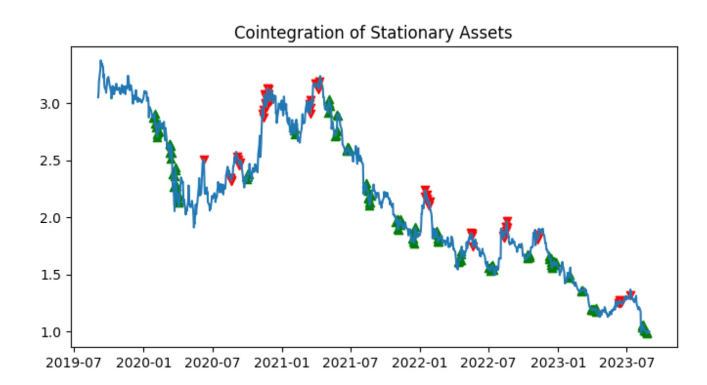
First we call plot_trade_signals_no_stop_loss(non_coint_ratio, non_coint_ratio). Conceptually this step is purely diagnostic: it renders the timing of trade entries and exits on top of the ratio (or whatever series the plotting function expects) so you can visually verify the signals the strategy will act on. The plotting function name tells you two important things: it expects a series that represents the relationship between the two instruments (the ratio or spread), and it uses the strategy’s raw signals to mark where it would open and close positions — and it does so without any stop-loss logic. Passing the same object for both arguments suggests this particular implementation either expects the ratio series twice (for example, one argument is the underlying series and the other is the precomputed signal derived from the same series) or that the entry/exit thresholds are encoded in that same object; in any case, the intent is to make the trade timing visible so you can check that signals align with your expectations before running P&L calculations.
Next, the print line invokes calculate_profit_no_stop_loss(non_coint_stock_one_series, non_coint_stock_two_series, non_coint_ratio, non_coint_ratio) and prints its first returned value. This function is where the economic simulation happens: it consumes the two price series for the pair (stock_one and stock_two) together with the ratio/spread (and again the same ratio passed twice here) and walks forward through time, opening and closing positions according to the signals derived from that ratio. Because it’s the “no_stop_loss” variant, the function will only close positions when the strategy’s explicit exit condition fires (or at the end of the backtest); it will not clip losses mid-flight. Inside that loop you should expect the function to compute position sizing for each leg (to maintain dollar- or beta-neutral exposure), translate price moves into profit and loss for each open trade, and accumulate realized and possibly unrealized P&L. Returning a sequence or tuple lets the caller access multiple outputs (total profit, trade list, equity curve, etc.); indexing [0] selects the primary numeric summary — in this case the total profit in dollars.
Finally, printing concatenates a label with that numeric profit so you get a human-readable single-line summary. The combination of plotting first and then computing profit is deliberate: visualize and sanity-check signals before trusting the P&L numbers. Also be mindful that running a pairs strategy on a non-cointegrated pair (as the variable name implies) — and doing so without stop-loss protection — materially increases tail risk because mean reversion assumptions may be invalid; that’s the practical reason you want both the visual check and careful profit analysis here.
Without a stop-loss, our profit was -$5,667; with a stop-loss, it was -$350. Exiting early limited the loss.