Mastering Financial Data Analysis with Python: A Comprehensive Guide
Exploring Python’s Versatility in Stock Market Analysis and Trading Strategy Development
In the fast-paced world of finance, the ability to efficiently analyze and interpret data is crucial. This comprehensive guide delves into the utilization of Python, a powerful programming language, in the realm of financial data analysis. We explore a variety of Python’s libraries such as Pandas, NumPy, and Matplotlib, demonstrating their effectiveness in handling stock market data, visualizing trends, and even constructing trading strategies. From fetching historical stock prices to backtesting investment strategies, this guide provides a hands-on approach to mastering financial data analysis and leveraging Python’s capabilities to make informed decisions in the stock market. Whether you’re a seasoned financial analyst or a budding investor, these insights and techniques will enhance your analytical skills and broaden your understanding of the financial market’s dynamics.
import pandas as pd
import numpy as np
import datetime
import matplotlib.pyplot as plt
The following code uses commonly used libraries in Python for manipulating data performing numerical computations, date time operations, data visualization. These include pas, numpy, datetime, matplotlib.pyplot. Pas offers powerful data structures such as DataFrames for organizing analyzing data, while numpy allows for efficient mathematical operations on arrays. The datetime module allows for manipulation calculations involving dates time, while matplotlib.pyplot is useful for creating various types of visualizations in Python, especially graphs charts for data.
Import Data
from pandas_datareader import data as pdr
import yfinance

aapl = pdr.get_data_yahoo('AAPL',
                          start=datetime.datetime(2006, 10, 1),
                          end=datetime.datetime(2012, 1, 1))
aapl.head()
This code uses pas_datareader to retrieve Apple Inc.’s historical stock price data from Yahoo Finance. It gets the daily data from October 2006 to January 2012 displays the first five rows of the dataframe. The yfinance library is used to access the data from Yahoo Finance instead of the default method used by pas_datareader.
import quandl
aapl = quandl.get("WIKI/AAPL", start_date="2006-10-01", end_date="2012-01-01")
aapl.head()
The number of text describes how a Python code snippet uses Qul library to extract historical stock market data for Apple Inc. from the WIKI database. The data covers the dates between October 1, 2006, January 1, 2012 is displayed in the first few rows as a preview.
Working With Time Series Data
aapl.index

aapl.columns

ts = aapl['Close'][-10:]

type(ts)
The following code snippet works with a pas DataFrame named aapl, likely representing stock market data for Apple Inc. The code selects the index using aapl.index the column names using aapl.columns, which include fields such as ‘Open’, ‘Close’, ‘High’, ‘Low’, ‘Volume’. It then assigns the last 10 entries from the ‘Close’ column to the variable ts determines its type using type(ts), which is likely a pas Series object. Note that the code is missing proper punctuation syntax, is intended as a conceptual explanation rather than executable code.
aapl['diff'] = aapl.Open - aapl.Close

del aapl['diff']
This snippet of code modifies a pas DataFrame called aapl by creating a new column called ‘diff’ that represents the difference between the ‘Open’ ‘Close’ values. After populating this column, it is immediately deleted from the DataFrame, leaving it in its original structure.
import matplotlib.pyplot as plt

aapl['Close'].plot(grid=True)

plt.show()
This code in creates a graph showing the closing prices of Apple Inc. stock using a pas DataFrame called aapl. The graph is accompanied by a grid for easier interpretation is displayed in a window for the user’s viewing. This could be helpful in analyzing the patterns of AAPL’s stock price over a period of time.
daily_close = aapl[['Adj Close']]

daily_pct_c = daily_close.pct_change()

daily_pct_c.fillna(0, inplace=True)

print(daily_pct_c)

daily_log_returns = np.log(daily_close.pct_change()+1)

print(daily_log_returns)
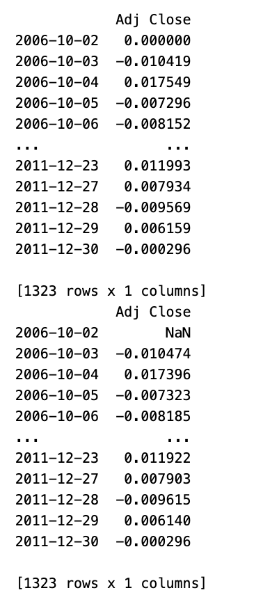
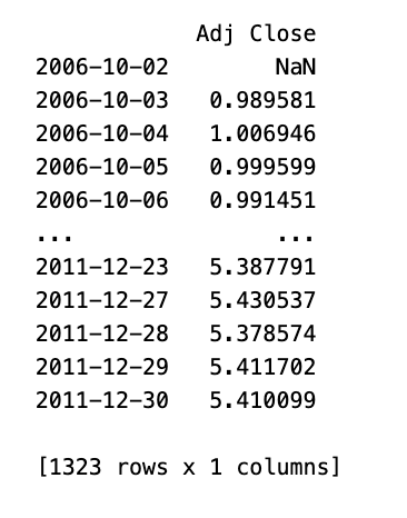
This code analyzes financial data from Apple Inc.’s stock, specifically the adjusted closing prices. The snippet uses the aapl dataframe selects the Adjusted Close column. It then calculates the daily percentage change replaces any missing values with 0. The resulting percentage change dataframe is printed to the console. Additionally, the snippet calculates daily log returns using the np.log() function prints the resulting dataframe. This code provides two different perspectives on the daily return characteristics of Apple’s stock.
monthly = aapl.resample('BM').apply(lambda x: x[-1])

monthly.pct_change()

quarter = aapl.resample("4M").mean()

quarter.pct_change()
This code works on a time series of data for the variable aapl, which most likely represents stock prices for Apple Inc. The code first resamples the data to get the last business day of each month then uses a lambda function to select the last data point for each month, creating a new time series called monthly. It then calculates the percentage change between each monthly data point to show the month-on-month growth or decline of aapl. Next, the original time series is resampled to calculate the average over four-month periods, creating a new time series called quarter. The code then calculates the percentage change between each four-month average, indicating the proportional increase or decrease over each four-month period. However, the results of these calculations are not stored or outputted unless further code is written to do so.
import matplotlib.pyplot as plt

daily_pct_c.hist(bins=50)

plt.show()

print(daily_pct_c.describe())
This code snippet imports the matplotlib.pyplot module as plt, allowing for the creation of visualizations in Python. The hist() method is called on a dataset represented by daily_pct_c, creating a histogram with 50 intervals. The histogram is then displayed using plt.show(). Finally, the descriptive statistics of the dataset are printed using the describe() method, providing insights into its distribution. Note: The first line of the code appears to have a syntax error should be written separately as import matplotlib.pyplot as plt.
cum_daily_return = (1 + daily_pct_c).cumprod()

print(cum_daily_return)
import matplotlib.pyplot as plt
cum_daily_return.plot(figsize=(12,8))
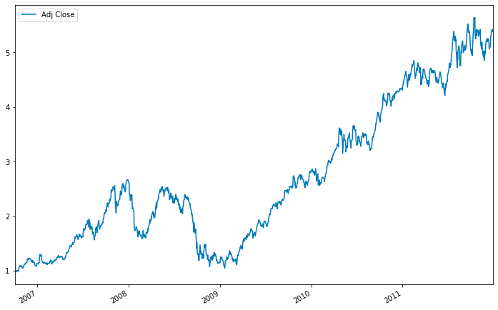
plt.show()The visible part of the code snippet is for data visualization with matplotlib library. It uses the plot method on a Pas DataFrame or Series called cum_daily_return to create a plot of cumulative daily returns. The figure size is set to 12 by 8 inches the plt.show() comm displays the plot. There may be missing parts in the code.
cum_monthly_return = cum_daily_return.resample("M").mean()

print(cum_monthly_return)
The following code takes cumulative daily returns from a financial dataset resamples them to determine the monthly average cumulative return. The resampling changes the frequency from daily to monthly computes the mean value of daily returns for each month. The resulting average monthly returns are then printed.
from pandas_datareader import data as pdr
import yfinance

def get(tickers, startdate, enddate):
    def data(ticker):
        return (pdr.get_data_yahoo(ticker, start=startdate, end=enddate))
    datas = map (data, tickers)
    return(pd.concat(datas, keys=tickers, names=['Ticker', 'Date']))

tickers = ['AAPL', 'MSFT', 'IBM', 'GOOG']
all_data = get(tickers, datetime.datetime(2006, 10, 1), datetime.datetime(2012, 1, 1))
all_data.head()
This code snippet in allows for the fetching of historical financial data from Yahoo Finance for a list of stock tickers. It uses the ‘pas_datareader’ library ‘yfinance’ as a data source. The function requires a list of tickers, start end dates as parameters uses a sub-function ‘data’ to retrieve data for each ticker. The function ‘map’ then applies it to each ticker, the resulting data is combined into a single DataFrame with a hierarchical index. A sample usage of the function is also provided, which fetches data for four tech companies displays the first few rows of the combined dataset.
daily_close_px = all_data[['Adj Close']].reset_index().pivot('Date', 'Ticker', 'Adj Close')

daily_pct_change = daily_close_px.pct_change()

daily_pct_change.hist(bins=50, sharex=True, figsize=(12,8))

plt.show()
This code analyses financial data by calculating the daily percentage change in adjusted closing prices of stocks presenting the results in a histogram. The code first takes a DataFrame named all_data with stock market data selects the ‘Adj Close’ column, which reflects the adjusted closing price of a stock considering factors like dividends stock splits. Then, it resets the index pivots the data, with each row representing a date each column representing a stock ticker. Using the pct_change() method, it computes the daily percentage change in stock prices displays it in a histogram with 50 bins. The histograms share the same x-axis for comparison are sized at 12x8 inches. To create the visual, the code likely utilizes the matplotlib library, commonly used for visualizations in Python. This code effectively summarizes presents the distribution of daily percentage changes in adjusted closing stock prices from a given dataset.


