
Mastering the Day Trading Using Neural Network & Deep Learning
Mastering the Day Trading Using Neural Network & Deep Learning
In today’s fast-paced financial markets, day trading has emerged as a popular and lucrative strategy for those seeking short-term gains.

With the rapid advancements in technology and the growing influence of artificial intelligence, traders are now leveraging the power of neural networks and deep learning to optimize their trading decisions. In this article, we introduce “Mastering the Day Trading Using Neural Network & Deep Learning,” a comprehensive guide that explores the fusion of sophisticated trading techniques and cutting-edge machine learning algorithms. We will delve into the intricacies of day trading, discuss the benefits of incorporating neural networks and deep learning, and provide practical insights to help you stay ahead of the curve in this competitive trading landscape. Join us as we unravel the secrets of mastering day trading with the assistance of advanced AI technologies.
Let’s begin,
Importing Libraries
import os
import pandas as pd
import matplotlib.pyplot as plt
import matplotlib.patches as patches
import seaborn as sns
import warnings
import numpy as np
from numpy import array
from importlib import reload # to reload modules if we made changes to them without restarting kernel
from sklearn.naive_bayes import GaussianNB
from xgboost import XGBClassifier # for features importance

warnings.filterwarnings('ignore')
plt.rcParams['figure.dpi'] = 227 # native screen dpi for my computer
Several Python libraries are imported and plotting configurations are set up in this code snippet.
It allows the code to manipulate files and directories by interacting with the operating system portablely.
Data structures are provided by the pandas library for efficiently storing and manipulating large datasets. Often used for cleaning, preprocessing, and analyzing tabular data, it is a popular tool for working with tabular data.
There are several types of visualizations that can be created with matplotlib, including line plots, scatter plots, and histograms. A rectangle, an ellipse, or a polygon can be created using the patches submodule.
With the seaborn library, you can create visually appealing and informative visualizations on top of matplotlib.
Warnings are suppressed by the warnings module during execution.
Numpy provides functions for manipulating arrays and matrices and is used in scientific computing. A lot of data manipulation is done with it using pandas.
Without restarting the kernel, the importlib module allows you to reload previously imported modules.
In the sklearn library, you can implement various algorithms for classification, regression, and clustering. A simple and commonly used algorithm for classification is imported in this code snippet, GaussianNB.
A popular tool for gradient boosting is the xgboost library, which contains the XGBClassifier class. In the case of classification tasks, the XGBClassifier implements gradient boosting specifically.
Last but not least, plt.rcParams determines the resolution of plots that will be generated by matplotlib.
# ARIMA, SARIMA
import statsmodels.api as sm
from statsmodels.tsa.arima_model import ARIMA
from statsmodels.tsa.statespace.sarimax import SARIMAX
from statsmodels.graphics.tsaplots import plot_pacf, plot_acf
from sklearn.metrics import mean_squared_error, confusion_matrix, f1_score, accuracy_score
from pandas.plotting import autocorrelation_plot
Statsmodels is a library that provides tools for statistical modeling and analysis, and this code snippet imports several classes and functions from it.
There are many functions and classes in the sm module that enable various types of statistical analysis in statsmodels.
Time series data can be fitted with ARIMA models using the Autoregressive Integrated Moving Average class. Based on a time series’ past behavior, ARIMA is a popular method for time series forecasting.
Data series are fitted with SARIMAX models using Seasonal Autoregressive Integrated Moving Averages. The SARIMA model takes into account seasonal variations in data as an extension of the ARIMA model.
A time series’ partial autocorrelation function (PACF) and autocorrelation function (ACF) can be plotted using plot_pacf and plot_acf functions. An ARIMA or SARIMA model can be derived from these plots by determining the order in which the AR and MA terms appear.
There are several metrics for evaluating the performance of machine learning models in the sklearn.metrics module, including mean_squared_error, confusion_matrix, and f1_score. These functions are imported from the sklearn.metrics module. Models such as ARIMA and SARIMA can also be evaluated using these metrics.
Various plotting tools from pandas are provided by the pandas.plotting module, including the autocorrelation_plot function. A time series’ autocorrelation function can help identify any autocorrelation in the data using this function.
# Tensorflow 2.0 includes Keras
import tensorflow.keras as keras
from tensorflow.python.keras.optimizer_v2 import rmsprop
from functools import partial
from tensorflow.keras import optimizers
from tensorflow.keras.models import Sequential, Model
from tensorflow.keras.layers import Input, Flatten, TimeDistributed, LSTM, Dense, Bidirectional, Dropout, ConvLSTM2D, Conv1D, GlobalMaxPooling1D, MaxPooling1D, Convolution1D, BatchNormalization, LeakyReLU
# Hyper Parameters Tuning with Bayesian Optimization (> pip install bayesian-optimization)
from bayes_opt import BayesianOptimization

from tensorflow.keras.utils import plot_model
TensorFlow 2.0’s Keras API is implemented in the tensorflow.keras module, which this code snippet imports.
Deep learning models are built and trained with the Keras module.
A neural network’s parameters are optimized during training using tensorflow.python.keras.optimizer_v2’s rmsprop optimizer.
Partial functions are imported from functools and used to create new functions that are partial applications of other functions. Pre-specifying some of a function’s arguments is useful for defining the function.
Deep learning models can be trained using various optimization algorithms provided in the optimizers module.
A Sequential class adds layers onto each other in a linear stack.
It allows layers to be connected in a variety of ways with a more complex neural network architecture defined by the Model class.
An input layer for a neural network is defined by the Input class.
Multidimensional inputs are flattened into 1D vectors using the Flatten layer.
An input sequence is applied a layer at each time step using the TimeDistributed layer.
Long Short-Term Memory (LSTM) cells are added to a neural network using the LSTM layer. In order to model sequences, LSTMs are commonly used as recurrent neural networks (RNNs).
Neural networks are enhanced with the Dense layer.
Bidirectional RNNs process input sequences in both forward and backward directions using the bidirectional layer.
During training, neurons are randomly dropped out of the Dropout layer to prevent overfitting.
LSTM convolutions can be added to neural networks using the ConvLSTM2D layer. Videos are typically analyzed with convolutional LSTMs.
1D convolutional neural networks (CNNs) use the Conv1D layer, GlobalMaxPooling1D layer, MaxPooling1D layer, and Convolution1D layer. Sequence modeling typically uses these layers.
A neural network’s activations are normalized using the BatchNormalization layer.
When the input value is negative, the LeakyReLU activation function allows a small negative slope.
Using Bayesian optimization, the BayesianOptimization class optimizes hyperparameters using the bayesian-optimization package. Using this method, you can determine the optimal hyperparameters for a neural network.
A neural network’s architecture can be visualized using the plot_model function.
Loading Data
Reading stocks’ data and keeping it in dictionary stocks. `Date` feature becomes index
files = os.listdir('data/stocks')
stocks = {}
for file in files:
    # Include only csv files
    if file.split('.')[1] == 'csv':
        name = file.split('.')[0]
        stocks[name] = pd.read_csv('data/stocks/'+file, index_col='Date')
        stocks[name].index = pd.to_datetime(stocks[name].index)
Data is read from multiple CSV files in a directory called ‘data/stocks’. It first lists all files in the directory and stores them in the files variable using the os.listdir() function. Stock data for each symbol is then stored in a dictionary stocks.
Using a for loop, the code iterates over each file in the list. Each file is checked by splitting the filename on the period (‘.’) and checking if the second part of the result is ‘csv’. In a CSV file, the code takes the first part of the resulting list and extracts the stock symbols from the filename. To make the DataFrame indexable, the index_col parameter is set to ‘Date’ in the pd.read_csv() function.
The resulting DataFrame is then converted to a DateTimeIndex using pd.to_datetime(), and the resulting DataFrame is stored in the stocks dictionary under the corresponding stock symbol key. When the loop is done, the stocks dictionary has a DataFrame for each stock symbol, with the date index and columns representing the open, high, low, close, and volume. This code snippet is commonly used in financial analysis and machine learning applications to create a dataset of stock price data for various symbols, which can be used to train and test predictive models.
Baseline Model
Baseline model would serve as a benchmark for comparing to more complex models.
def baseline_model(stock):
    '''
    \n\n
    Input: Series or Array
    Returns: Accuracy Score
    Function generates random numbers [0,1] and compares them with true values
    \n\n
    '''
    baseline_predictions = np.random.randint(0, 2, len(stock))
    accuracy = accuracy_score(functions.binary(stock), baseline_predictions)
    return accuracy
Using this code, you can create a Python function baseline_model(stock) that returns an accuracy score based on a series or array of data. With NumPy np.random.randint(), the function generates a series of random binary predictions with the same length as the input stock data. The function then converts the input data into binary form by using the helper function functions.binary(stock), which represents a positive value as 1 and a negative value as 0. The accuracy of the random binary predictions is computed using this binary representation.
By comparing the random binary predictions to the true binary representation of the input data, the function calculates the accuracy of the random binary predictions. Using some input features, this function serves as a simple baseline model for binary classification tasks. In order to evaluate the performance of more complex machine learning models, we can use the accuracy of this baseline model as a reference point.
Accuracy
baseline_accuracy = baseline_model(stocks['tsla'].Return)
print('Baseline model accuracy: {:.1f}%'.format(baseline_accuracy * 100))
Using the baseline_model() function and the ‘Return’ column of the TSLA stock data, which represents daily returns, this code snippet calculates the accuracy of the baseline model for the TSLA stock. With the print() function, the resulting accuracy is displayed on the console in a formatted string as a percentage with a decimal point using the baseline_accuracy variable.
You can use this code to quickly evaluate the performance of the baseline model on a particular stock or dataset. It may be necessary to refine the baseline model or to add feature engineering to improve performance if the accuracy of the baseline model is low. Alternatively, if the baseline model is highly accurate, it may indicate that the task is relatively simple and a comparison with other baseline models is needed to determine the best approach.
Accuracy Distribution
base_preds = []
for i in range(1000):
    base_preds.append(baseline_model(stocks['tsla'].Return))

plt.figure(figsize=(16,6))
plt.style.use('seaborn-whitegrid')
plt.hist(base_preds, bins=50, facecolor='#4ac2fb')
plt.title('Baseline Model Accuracy', fontSize=15)
plt.axvline(np.array(base_preds).mean(), c='k', ls='--', lw=2)
plt.show()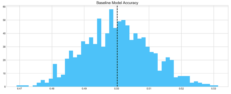
Based on 1000 random samples of TSLA stock return data, this code snippet creates a histogram of the accuracy scores generated by the baseline model. In order to store the accuracy scores, the code first creates an empty list called base_preds. As a result, the baseline_model() function is called 1000 times on the ‘Return’ column of the TSLA stock data, appending the accuracy score to the base_preds list each time.
In the next step, the code creates a blue histogram of the base_preds data using plt.hist() from the matplotlib library. In this case, “Baseline Model Accuracy” is set as the title of the histogram by using plt.title(). Using plt.axvline(), the code adds a vertical line to the histogram to indicate the baseline model’s mean accuracy score. It is displayed as a black dashed line with a thickness of 2 using np.array(base_preds).mean().
Lastly, the histogram is displayed using plt.show(). This code can be used to visualize how well the baseline model performs on average based on the distribution of its accuracy scores. The baseline model may be a good starting point if the distribution is centered around a high accuracy score. To achieve better performance, more sophisticated models or feature engineering may be required if the distribution is widely spread or centered around a low accuracy score.
Baseline model on average has 50% accuracy. We take this number as a guideline for our more complex models
ARIMA
AutoRegressive Integrated Moving Average (ARIMA) is a model that captures a suite of different standard temporal structures in time series data.
- p: The number of lag observations included in the model, also called the lag order.
- d: The number of times that the raw observations are differenced, also called the degree of differencing.
- q: The size of the moving average window, also called the order of moving average.
We will split train and test data to evaluate performance of ARIMA model.
print('Tesla historical data contains {} entries'.format(stocks['tsla'].shape[0]))
stocks['tsla'][['Return']].head()
By accessing the ‘shape[0]’ attribute of the ‘tsla’ DataFrame and formatting the result with a string literal and the print() function, this code snippet prints the number of entries in the historical TSLA stock data. Using the double bracket notation ([[‘Return’]]), it accesses the first five rows of the ‘Return’ column in the ‘tsla’ DataFrame and calls the .head() function.
In order to ensure that the TSLA stock data has been read in correctly and that the desired columns are present, this code can be used. To get an idea of the data structure and values, use .head() to display the first few rows of the DataFrame using the .shape attribute.
Autocorrelation
Let’s take a look at the `Autocorrelation Function` below. The graph shows how time series **data points** correlate between each other. We should ignore first value in the graph that shows perfect correlation (value = 1), because it tells how **data point** is correlated to itself. What’s important in this graph is how **first** data point is correlated to **second**, **third** and so on. We can see that it’s so weak, it’s close to zero. What does it mean to our analysis? It means that ARIMA is pretty much useless here, because it uses previous data points to predict following.
plt.rcParams['figure.figsize'] = (16, 3)
plot_acf(stocks['tsla'].Return, lags=range(300))
plt.show()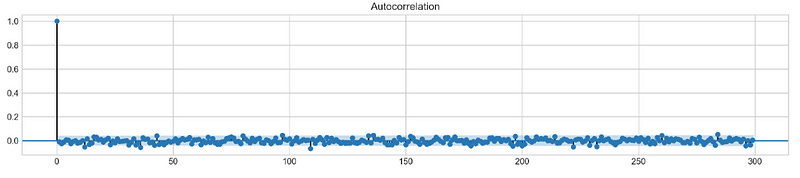
By using the plt.rcParams[‘figure.figsize’] parameter, Matplotlib plots will have a figure size of 16 inches by 3 inches. A plot_acf() function from the statsmodels.graphics.tsaplots module is then used to estimate the autocorrelation for TSLA stock ‘Return’ column. Autocorrelation is shown with lags set to a range(300) for a maximum of 300 lags. Plotting the autocorrelation is completed by calling plt.show().
The autocorrelation plot is commonly used to visualize the correlation between a series and its lags in time series analysis. It is possible to detect seasonal patterns or dependencies in the TSLA stock returns using the autocorrelation plot. An autoregressive (AR) or seasonal autoregressive (SAR) model may be appropriate if the data show significant autocorrelations at certain lags.
To make a conclusion we’re going to try different orders and see how well they perform on a given data.
# ARIMA orders
orders = [(0,0,0),(1,0,0),(0,1,0),(0,0,1),(1,1,0)]

# Splitting into train and test sets
train = list(stocks['tsla']['Return'][1000:1900].values)
test = list(stocks['tsla']['Return'][1900:2300].values)

all_predictions = {}

for order in orders:

    try:
        # History will contain original train set,
        # but with each iteration we will add one datapoint
        # from the test set as we continue prediction
        history = train.copy()
        order_predictions = []

        for i in range(len(test)):

            model = ARIMA(history, order=order) # defining ARIMA model
            model_fit = model.fit(disp=0) # fitting model
            y_hat = model_fit.forecast() # predicting 'return'
            order_predictions.append(y_hat[0][0]) # first element ([0][0]) is a prediction
            history.append(test[i]) # simply adding following day 'return' value to the model
            print('Prediction: {} of {}'.format(i+1,len(test)), end='\r')

        accuracy = accuracy_score(
            functions.binary(test),
            functions.binary(order_predictions)
        )
        print('                             ', end='\r')
        print('{} - {:.1f}% accuracy'.format(order, round(accuracy, 3)*100), end='\n')
        all_predictions[order] = order_predictions

    except:
        print(order, '<== Wrong Order', end='\n')
        pass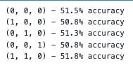
The following code snippet defines a list of orders that will be tested against the ARIMA model. A tuple of three integers is used for the orders: p for the autoregressive model (AR), d for the differencing model, and q for the moving average model.
Data in the TSLA stock ‘Return’ column is then split into training and testing sets. Data from the first 900 days are defined as the training set, while data from the next 400 days are defined as the testing set.
A dictionary all_predictions is created to store predictions for each ARIMA order next.
Based on the ARIMA model, the code predicts the next day’s return for each order in the orders list. In order to predict the next day’s return, the model is fitted with the training data up until the current time step.
Order_predictions are then updated with the predicted return, and the training set is updated with the value for the following day.
A model’s accuracy is calculated using the accuracy_score() function in the sklearn.metrics module after all predictions have been made. Calculating accuracy requires converting the true and predicted returns into binary form using the functions.binary() helper function.
The predicted returns are stored in the all_predictions dictionary under the order key along with the accuracy score and order.
Testing different ARIMA orders on the testing set can be done using this code. In order to make predictions on new data, the accuracy scores can be used to select the best ARIMA model order. The ARIMA model may not be suitable for modeling the data if accuracy scores are consistently low, and other models should be considered instead.
Review Predictions
# Big Plot
fig = plt.figure(figsize=(16,4))
plt.plot(test, label='Test', color='#4ac2fb')
plt.plot(all_predictions[(0,1,0)], label='Predictions', color='#ff4e97')
plt.legend(frameon=True, loc=1, ncol=1, fontsize=10, borderpad=.6)
plt.title('Arima Predictions', fontSize=15)
plt.xlabel('Days', fontSize=13)
plt.ylabel('Returns', fontSize=13)

# Arrow
plt.annotate('',
             xy=(15, 0.05),
             xytext=(150, .2),
             fontsize=10,
             arrowprops={'width':0.4,'headwidth':7,'color':'#333333'}
            )
# Patch
ax = fig.add_subplot(1, 1, 1)
rect = patches.Rectangle((0,-.05), 30, .1, ls='--', lw=2, facecolor='y', edgecolor='k', alpha=.5)
ax.add_patch(rect)

# Small Plot
plt.axes([.25, 1, .2, .5])
plt.plot(test[:30], color='#4ac2fb')
plt.plot(all_predictions[(0,1,0)][:30], color='#ff4e97')
plt.tick_params(axis='both', labelbottom=False, labelleft=False)
plt.title('Lag')
plt.show()
As well as a large plot showing the actual and predicted returns for the TSLA stock, this code snippet also displays a smaller plot showing the first 30 days of the testing set. The first step is to create a 16-inch x 4-inch figure using fig = plt.figure(figsize=(16,4)). After that, plt.plot(test, label=’Test’, color=’#4ac2fb’) plots the actual returns, while plt.plot(all_predictions[(0,1,0)], label=’Predictions’, color=’#ff4e97') plots the predicted returns for the ARIMA model.
By using plt.legend(), the labeled and colored lines are displayed with a legend. In this example, plt.title() is used to set the title, and plt.xlabel() and plt.ylabel() are used to set the axes and labels. The plot is highlighted with an arrow using plt.annotate(), and the plot’s section is indicated with a yellow patch using patches.Rectangle().
Plot.axes() is used to create a smaller plot at [.25, 1, .2, .5] with the location and size specified. Plat.plot() is used to plot the first 30 days of the testing set and outcomes, and plt.tick_params() is used to remove the labels on the x- and y-axes. Lastly, plt.show() is used to display the plots. Visualize the ARIMA model’s predictions and compare them to the actual returns of TSLA stock using this code. An overview is provided by the large plot, whereas a closer look is provided by the smaller plot. You can use the arrow and patch to highlight specific features of the plot, including a turning point or a key section.
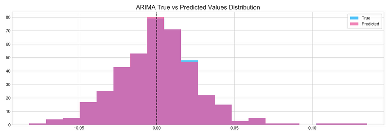
Histogram
plt.figure(figsize=(16,5))
plt.hist(stocks['tsla'][1900:2300].reset_index().Return, bins=20, label='True', facecolor='#4ac2fb')
plt.hist(all_predictions[(0,1,0)], bins=20, label='Predicted', facecolor='#ff4e97', alpha=.7)
plt.axvline(0, c='k', ls='--')
plt.title('ARIMA True vs Predicted Values Distribution', fontSize=15)
plt.legend(frameon=True, loc=1, ncol=1, fontsize=10, borderpad=.6)
plt.show()