


Monthly Milk Production — Time Series Forecasting Project
Monthly Milk Production — Time Series Forecasting Project
Milk is one of the most important and widely consumed agricultural products in the world. It is not only a significant source of nutrition but also plays a crucial role in the global economy.

Accurate forecasting of milk production is therefore essential for dairy farmers, milk processing companies, and policymakers to make informed decisions. By using advanced statistical and machine learning techniques, forecasting milk production can help to optimize production processes, reduce wastage, and ensure a stable supply of milk in the market. In this article, we will explore the different methods used for forecasting milk production and the importance of accurate forecasting in the dairy industry.
Importing Libraries
import numpy as np
import pandas as pd
import matplotlib.pyplot as plt
import seaborn as sns
import os


import statsmodels.api as sm
from statsmodels.tsa.seasonal import seasonal_decompose
from statsmodels.tsa.stattools import adfuller
from statsmodels.tsa.statespace.sarimax import SARIMAX
from statsmodels.graphics.tsaplots import plot_acf, plot_pacf
from pandas.plotting import autocorrelation_plot
from sklearn.metrics import mean_squared_error, r2_score, mean_absolute_error, median_absolute_error, mean_squared_log_error

!pip install pmdarima --quiet
import pmdarima as pm

%matplotlib inline

import warnings
warnings.filterwarnings('ignore')
This code snippet is written in Python and imports various libraries for data manipulation, visualization, and time series analysis. Let me explain each library and their purpose:
numpy (imported as np): A popular library for numerical computing in Python, often used for working with arrays and matrices.
pandas (imported as pd): A powerful library for data manipulation and analysis, used for working with structured data (e.g., data in tables).
matplotlib.pyplot (imported as plt): A plotting library for creating static, interactive, and animated visualizations in Python.
seaborn (imported as sns): A statistical data visualization library based on Matplotlib that provides a high-level interface for creating informative and attractive statistical graphics.
os: A module in Python that provides functions for interacting with the operating system, such as file handling.
statsmodels.api (imported as sm): A library for statistical modeling, hypothesis testing, and data exploration in Python. It provides classes and functions for estimating many different statistical models.
statsmodels.tsa.seasonal: Contains functions for decomposing time series data into trend, seasonal, and residual components.
statsmodels.tsa.stattools: Provides various statistical tools for time series analysis, including the Augmented Dickey-Fuller test (adfuller) for stationarity.
statsmodels.tsa.statespace.sarimax: Implements the Seasonal AutoRegressive Integrated Moving Average with eXogenous regressors model (SARIMAX) for time series analysis.
statsmodels.graphics.tsaplots: Contains functions for plotting autocorrelation (plot_acf) and partial autocorrelation (plot_pacf) functions.
pandas.plotting: Provides utilities for creating plots related to pandas data structures, such as the autocorrelation_plot.
sklearn.metrics: Contains performance metric functions such as mean squared error, R² score, mean absolute error, median absolute error, and mean squared log error.
pmdarima (imported as pm): A library that provides a convenient interface to perform end-to-end time series analysis, including model selection and diagnostics.
The code snippet also includes the following:
%matplotlib inline: A Jupyter Notebook magic command that sets the backend of Matplotlib to the ‘inline’ backend, which means that the output of plotting commands will be displayed inline within the notebook.
warnings.filterwarnings(‘ignore’): Suppresses warnings, which can be useful to declutter the output when running the code.
Additionally, the !pip install pmdarima — quiet command is used to install the pmdarima library if it is not already installed, with the — quiet flag ensuring that the installation runs with minimal output.
Load Dataset
df = pd.read_csv('/kaggle/input/practice/monthly_milk_production.csv', parse_dates = ['Date'], index_col = 'Date')
df.head()
This code snippet reads a CSV file named ‘monthly_milk_production.csv’ located in the ‘/kaggle/input/practice/’ directory and stores it in a pandas DataFrame called df. Here’s a breakdown of the code:
pd.read_csv(): This function is used to read a CSV file and convert it into a pandas DataFrame. The first argument is the file path.
parse_dates=[‘Date’]: This optional argument is used to specify a list of column names that should be parsed as dates. In this case, the ‘Date’ column is parsed as a datetime object, which makes it easier to work with time series data.
index_col=’Date’: This optional argument sets the ‘Date’ column as the index of the DataFrame. This is useful for time series analysis, as it allows you to efficiently access and manipulate data based on date-time values.
df.head(): This function returns the first five rows of the DataFrame df. It’s useful for getting a quick glimpse of the data and ensuring it was read correctly.
In summary, this code snippet reads a CSV file containing monthly milk production data, converts the ‘Date’ column to a datetime object, sets it as the DataFrame index, and then displays the first five rows of the resulting DataFrame.
df.tail()This line is used to see the tail of the dataset so we can see how our dataset looks like.
df.shapeRunning df.shape returns a tuple that shows the dimensions (i.e., the number of rows and columns) of the DataFrame df. The output is in the format (number of rows, number of columns). For example, if df has 168 rows and 1 column, running df.shape would return (168, 1).
By checking the shape of the DataFrame, you can quickly determine the size of the dataset you are working with and ensure that it has been loaded correctly.
168 monthly milk production records are present from Jan 1962 — Dec 1975.
df.describe()The df.describe() method is used to generate a summary of various descriptive statistics for each numeric column in the DataFrame df. By default, it includes the following statistics:
count: the total number of non-missing values.
mean: the mean (average) value.
std: the standard deviation.
min: the minimum value.
25%: the 25th percentile value (also known as the first quartile).
50%: the 50th percentile value (also known as the median or second quartile).
75%: the 75th percentile value (also known as the third quartile).
max: the maximum value.
The output will be a new DataFrame where each row corresponds to one of these statistics and each column corresponds to a numeric column in the original df DataFrame.
By running df.describe(), you’ll get a summary of the descriptive statistics for the numeric columns in the DataFrame, which can provide useful insights into the distribution and general properties of the data.
df.isna().sum()
This line of code checks if there are any missing (NaN) values in the df DataFrame and returns the total count of missing values for each column:
df.isna(): This method returns a DataFrame with the same shape as df, where each element is a boolean value that indicates whether the corresponding element in df is a missing value (True if the value is missing, False otherwise).
.sum(): This method calculates the sum of True values (treated as 1) for each column, resulting in a Series with the total count of missing values for each column.
By running df.isna().sum(), you’ll get a Series that shows the total number of missing values for each column in the DataFrame. If any columns have missing values, you might need to handle them by dropping the rows with missing values or imputing the missing values with an appropriate strategy (mean, median, etc.) before performing any analysis or modeling.
No null values are present.
df.plot(figsize = (10,5))
plt.title('Monthly Milk Production')
plt.show()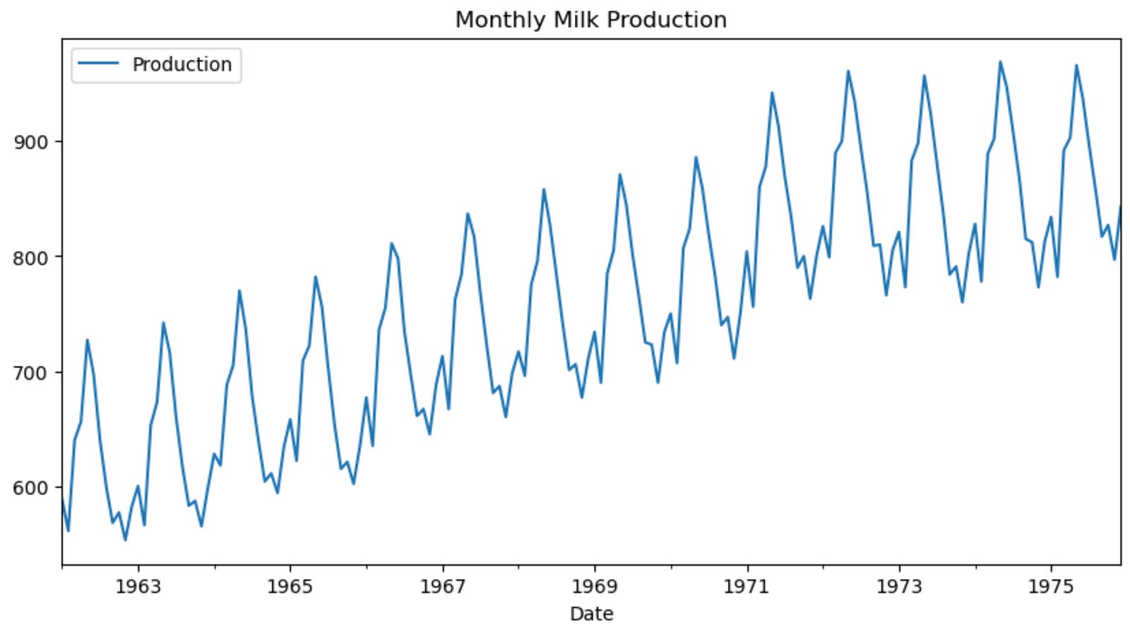
This code snippet creates a line plot of the df DataFrame using the plot() method, sets the title of the plot, and then displays it. Here’s a breakdown of the code:
df.plot(figsize=(10, 5)): This line of code calls the plot() method on the DataFrame df to create a line plot. The figsize argument is set to (10, 5), which specifies the width and height of the plot in inches.
plt.title(‘Monthly Milk Production’): This line of code sets the title of the plot using the title() function from the matplotlib.pyplot library. The title is set to ‘Monthly Milk Production’.
plt.show(): This line of code displays the plot. This function is necessary to show the plot when using a script, although it’s not always needed in Jupyter Notebooks because plots are often displayed automatically. However, it’s good practice to include it to ensure the plot is displayed correctly.
In summary, this code snippet creates a line plot of the monthly milk production data stored in the df DataFrame, sets the plot’s title to ‘Monthly Milk Production’, and then displays the plot.
We can observe that there is an increasing trend and very strong seasonality in our data.
fig, (ax1, ax2) = plt.subplots(nrows = 2, ncols = 1, sharex = False, sharey = False, figsize = (10,5))
df.hist(ax = ax1)
df.plot(kind = 'kde', ax = ax2)
plt.show()
This code snippet creates two subplots in a single figure — a histogram and a kernel density estimation (KDE) plot — for the data in the df DataFrame. Here’s a breakdown of the code:
fig, (ax1, ax2) = plt.subplots(nrows=2, ncols=1, sharex=False, sharey=False, figsize=(10, 5)): This line creates a figure with two subplots arranged vertically, one on top of the other. The nrows and ncols arguments specify the number of rows and columns, respectively, for the subplots. The sharex and sharey arguments are set to False, which means that each subplot has its own x and y axis. The figsize argument sets the width and height of the entire figure in inches.
df.hist(ax=ax1): This line creates a histogram of the data in the df DataFrame and plots it in the first subplot (ax1). The ax argument specifies which axes object to use for the plot.
df.plot(kind=’kde’, ax=ax2): This line creates a KDE plot of the data in the df DataFrame and plots it in the second subplot (ax2). The kind argument is set to ‘kde’ to specify that the plot should be a KDE plot. The ax argument specifies which axes object to use for the plot.
plt.show(): This line displays the figure with the two subplots. As mentioned earlier, this function is necessary to show the plot when using a script, but it may not be required in Jupyter Notebooks. However, it’s good practice to include it to ensure the plot is displayed correctly.
In summary, this code snippet creates a figure with two subplots: a histogram and a KDE plot of the data in the df DataFrame. These plots can be helpful for understanding the distribution of the data.
decomposition = seasonal_decompose(df['Production'], period = 12, model = 'additive')
plt.rcParams['figure.figsize'] = 10, 5
decomposition.plot()
plt.show()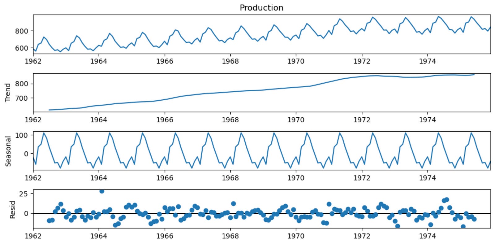
This code snippet decomposes the time series data in the ‘Production’ column of the df DataFrame into its trend, seasonal, and residual components using the seasonal_decompose function from the statsmodels.tsa.seasonal module. Then, it plots the decomposition results. Here’s a breakdown of the code:
decomposition = seasonal_decompose(df[‘Production’], period=12, model=’additive’): This line calls the seasonal_decompose function on the ‘Production’ column of the df DataFrame. The period argument is set to 12, which indicates the seasonal frequency of the data (in this case, monthly data with a yearly seasonality). The model argument is set to ‘additive’, which assumes that the time series can be decomposed into the sum of its trend, seasonal, and residual components.
plt.rcParams[‘figure.figsize’] = 10, 5: This line sets the default figure size for Matplotlib plots to 10 inches wide and 5 inches tall. The plt.rcParams dictionary allows you to configure global settings for Matplotlib, such as the default figure size.
decomposition.plot(): This line creates a plot of the decomposition results. The plot will contain four subplots: the original time series, the trend component, the seasonal component, and the residual component.
plt.show(): This line displays the figure with the decomposition plots. As mentioned earlier, this function is necessary to show the plot when using a script, but it may not be required in Jupyter Notebooks. However, it’s good practice to include it to ensure the plot is displayed correctly.
In summary, this code snippet decomposes the ‘Production’ time series data into its trend, seasonal, and residual components using an additive model with a period of 12, and then plots the decomposition results.
The decomposition of time series is a statistical method to deconstruct time series into its trend, seasonal and residual components:
- Trend: This is the general, long term tendency of the data to increase or decrease with time.
- Seasonality: It is the non-random component that repeats itself at regular intervals.
- Residual: It is the random, unpredictable variation in the series that is not accounted for by the trend or seasonality. It is the difference between the observed value of the time series and the predicted value based on the trend and seasonality.
Model Parameter of Seasonal Decomposition.
- In an additive model, the trend, seasonality and residuals components are added together to form the time series. It is used when the magnitude of the seasonal fluctuations is constant over time and is independent of the level of the time series.<br>
- In a multiplicative model, the trend, seasonality and residuals components are multiplied together to form the time series. It is used when the seasonal fluctuations increase or decrease in proportion to the level of time series.
Modelling Procedure:
- Remove the trend, if any, by applying transformation techniques
- Detect whether time series is stationary
- Plot ACF and PACF graph to estimate order of Moving Average or Auto Regressive processes
- Try different combination of orders and select the model with lowest AIC Score (Akaike Information Criteria)
Check for residuals or error
Predict the forecast
fig, (ax1, ax2) = plt.subplots(nrows = 2, ncols = 1, sharex = False, sharey = False, figsize = (10,5))

ax1 = plot_acf(df['Production'], lags = 40, ax = ax1)
ax2 = plot_pacf(df['Production'], lags = 40, ax = ax2)

plt.subplots_adjust(hspace = 0.5)
plt.show()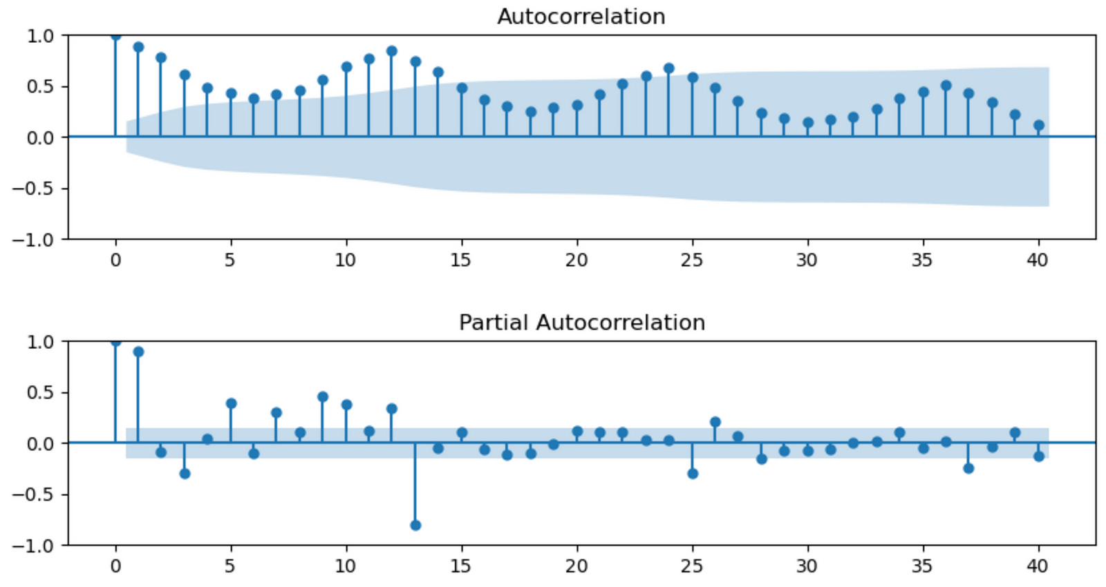
This code snippet creates a figure with two subplots showing the autocorrelation function (ACF) and partial autocorrelation function (PACF) plots of the ‘Production’ column in the df DataFrame. These plots help in determining the order of autoregressive (AR) and moving average (MA) terms for time series models like ARIMA. Here’s a breakdown of the code:
fig, (ax1, ax2) = plt.subplots(nrows=2, ncols=1, sharex=False, sharey=False, figsize=(10, 5)): This line creates a figure with two subplots arranged vertically, one on top of the other. The nrows and ncols arguments specify the number of rows and columns, respectively, for the subplots. The sharex and sharey arguments are set to False, which means that each subplot has its own x and y axis. The figsize argument sets the width and height of the entire figure in inches.
ax1 = plot_acf(df[‘Production’], lags=40, ax=ax1): This line calls the plot_acf function from the statsmodels.graphics.tsaplots module on the ‘Production’ column of the df DataFrame. It calculates the autocorrelation function and creates a plot with 40 lags. The ax argument specifies which axes object to use for the plot (ax1).
ax2 = plot_pacf(df[‘Production’], lags=40, ax=ax2): This line calls the plot_pacf function from the statsmodels.graphics.tsaplots module on the ‘Production’ column of the df DataFrame. It calculates the partial autocorrelation function and creates a plot with 40 lags. The ax argument specifies which axes object to use for the plot (ax2).
plt.subplots_adjust(hspace=0.5): This line adjusts the spacing between the subplots. The hspace argument is set to 0.5, which determines the height space between subplots in the same column.
plt.show(): This line displays the figure with the ACF and PACF subplots. As mentioned earlier, this function is necessary to show the plot when using a script, but it may not be required in Jupyter Notebooks. However, it’s good practice to include it to ensure the plot is displayed correctly.
In summary, this code snippet creates a figure with two subplots: the ACF and PACF plots of the ‘Production’ time series data. These plots help identify the appropriate order of AR and MA terms for time series models like ARIMA.
We can see that both ACF and PACF plots do not show a quick cut off into the 95% confidence interval area (in blue) meaning that the time series is not stationary.
ADF Test
Augmented Dickey-Fuller Test is used to check the stationality of data.
- Null Hypothesis: Unit root exists, time series is not stationary
- Alternate Hypothesis: Unit root does not exist, time series is stationary
def adfuller_test(production):
    result = adfuller(production)
    labels = ['ADF Test Statistic','p-value','#Lags Used','#Observation Used']
    for value,label in zip(result,labels):
        print(label  + ': ' + str(value))
    if result[1]<=0.05:
        print('Strong evidence against the null hypothesis, hence REJECT Ho. and the series is Stationary')
    else:
        print('Weak evidence against null hypothesis, hence ACCEPT Ho. and the series is Not Stationary.')
This code snippet defines a Python function called adfuller_test() that takes a time series as input (in this case, named production) and performs the Augmented Dickey-Fuller (ADF) test on it. The ADF test is a statistical test used to determine if a time series is stationary or not. Stationarity is an important assumption in time series analysis, as it affects the choice of models and forecasting methods.
Here’s a breakdown of the code:
def adfuller_test(production):: This line defines the function adfuller_test() with a single input argument, production, which represents the time series data to be tested for stationarity.
result = adfuller(production): This line calls the adfuller function from the statsmodels.tsa.stattools module on the input time series data production. The function returns a tuple containing the ADF test statistic, p-value, number of lags used, and number of observations used in the test.
labels = [‘ADF Test Statistic’,’p-value’,’#Lags Used’,’#Observation Used’]: This line defines a list of labels corresponding to the values returned by the adfuller() function.
The for loop iterates through the result tuple and the labels list, printing the label and the corresponding value for each element in the tuple.
The if statement checks if the p-value (which is the second element in the result tuple, accessed using result[1]) is less than or equal to 0.05. If the p-value is less than or equal to 0.05, there is strong evidence against the null hypothesis (which states that the time series has a unit root and is non-stationary), so the null hypothesis is rejected, and the time series is considered stationary. Otherwise, there is weak evidence against the null hypothesis, so it is accepted, and the time series is considered non-stationary.
In summary, the adfuller_test() function performs the ADF test on a given time series and prints the test results, including the test statistic, p-value, number of lags used, and number of observations used. Based on the p-value, it determines whether the time series is stationary or not.
adfuller_test(df['Production'])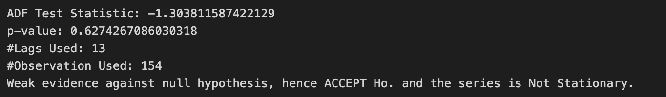
This line of code calls the adfuller_test() function you defined earlier and passes the ‘Production’ column of the df DataFrame as input. The function will perform the Augmented Dickey-Fuller (ADF) test on the ‘Production’ time series and print the test results, including the test statistic, p-value, number of lags used, and number of observations used. Based on the p-value, it will also determine whether the ‘Production’ time series is stationary or not.
To see the output of this line, you would need to run the code in a Python environment (such as a Jupyter Notebook or an IDE like PyCharm). The output will provide insights into the stationarity of the ‘Production’ time series, which can help you determine the appropriate time series modeling and forecasting techniques to use.
df1 = df.diff().diff(12).dropna()This line of code performs two differencing operations on the ‘Production’ column of the df DataFrame and stores the result in a new DataFrame called df1. Here’s a breakdown of the code:
df.diff(): This method calculates the first-order difference of the ‘Production’ time series by subtracting the previous value from the current value. This operation is often used to make a non-stationary time series stationary by removing trends.
.diff(12): This method is chained to the previous one and calculates the seasonal difference of the first-order differenced time series. The 12 argument indicates the seasonal period (monthly data with a yearly seasonality). Seasonal differencing is used to remove seasonality from the time series.
.dropna(): This method is chained to the previous ones and removes any rows with missing values (NaN) resulting from the differencing operations. This is necessary because the differencing operations create missing values at the beginning of the time series.
In summary, this line of code calculates the first-order difference and seasonal difference of the ‘Production’ time series to make it stationary, removes any rows with missing values, and stores the resulting time series in a new DataFrame called df1.
We can apply differencing to make time series stationary by subtracting the previous observations from the current observations. Doing so we will eliminate trend and seasonality, and stabilize the mean of time series. Due to both trend and seasonal components, we apply one non-seasonal diff() and one seasonal differencing diff(12).
adfuller_test(df1['Production'])
This line of code calls the adfuller_test() function you defined earlier and passes the ‘Production’ column of the df1 DataFrame as input. The function will perform the Augmented Dickey-Fuller (ADF) test on the differenced ‘Production’ time series and print the test results, including the test statistic, p-value, number of lags used, and number of observations used. Based on the p-value, it will also determine whether the differenced ‘Production’ time series is stationary or not.
Running this line of code in a Python environment (such as a Jupyter Notebook or an IDE like PyCharm) will provide insights into the stationarity of the differenced ‘Production’ time series after the first-order and seasonal differencing. If the p-value indicates that the time series is now stationary, you can proceed with time series modeling and forecasting techniques that require stationarity, such as ARIMA.
The given time series is stationary because.
- ADF Statistics Value is Negative.
- P-Value is less than 0.05.
This statisfies the alternate hypothesis of ADF Test that no unit root exists and time series is stationary.
df1.plot(figsize=(10,5))
plt.title('Monthly Milk Production')
plt.show()
This code snippet plots the differenced ‘Production’ time series stored in the df1 DataFrame. Here’s a breakdown of the code:
df1.plot(figsize=(10, 5)): This line calls the plot() method on the df1 DataFrame, creating a line plot of the differenced ‘Production’ time series. The figsize argument sets the width and height of the plot in inches (10 inches wide and 5 inches tall).
plt.title(‘Monthly Milk Production’): This line sets the title of the plot to ‘Monthly Milk Production’.
plt.show(): This line displays the figure with the plot. As mentioned earlier, this function is necessary to show the plot when using a script, but it may not be required in Jupyter Notebooks. However, it’s good practice to include it to ensure the plot is displayed correctly.
In summary, this code snippet creates a line plot of the differenced ‘Production’ time series, which should display the time series after applying the first-order and seasonal differencing operations. The plot can help you visually assess the stationarity of the transformed data.
fig, (ax1, ax2) = plt.subplots(nrows = 2, ncols = 1, sharex = False, sharey = False, figsize = (10,5))

ax1 = autocorrelation_plot(df['Production'], ax = ax1)
ax1.set_title('Non - Stationary Data')

ax2 = autocorrelation_plot(df1['Production'], ax = ax2)
ax2.set_title('Stationary Data')

plt.subplots_adjust(hspace = 0.5)
plt.show()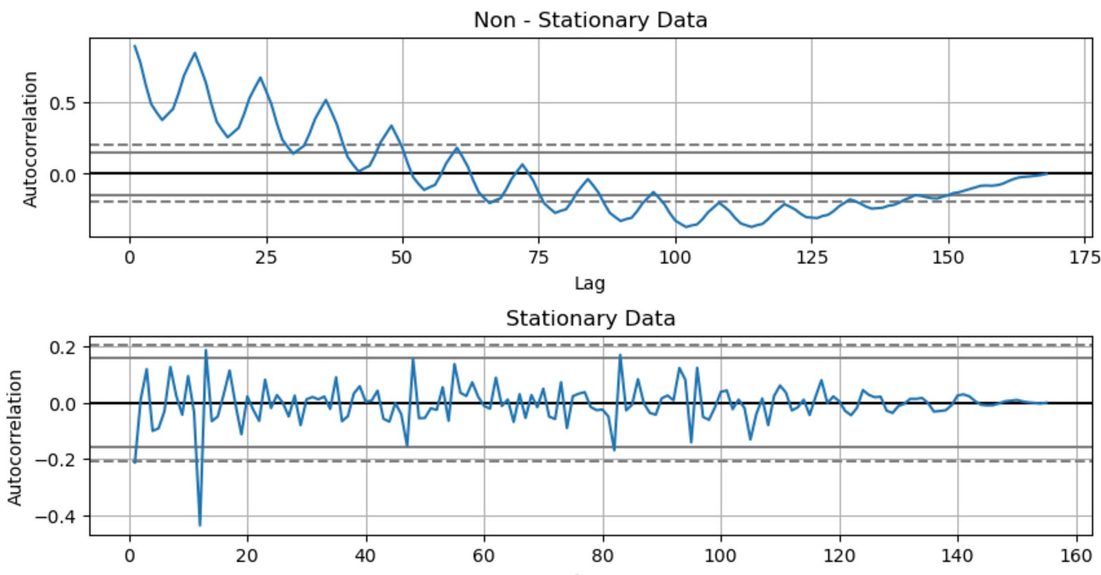
This code snippet creates a figure with two subplots displaying the autocorrelation plots of the original ‘Production’ time series data (non-stationary data) and the differenced ‘Production’ time series data (stationary data) stored in the df and df1 DataFrames, respectively. Here’s a breakdown of the code:
fig, (ax1, ax2) = plt.subplots(nrows=2, ncols=1, sharex=False, sharey=False, figsize=(10, 5)): This line creates a figure with two subplots arranged vertically, one on top of the other. The nrows and ncols arguments specify the number of rows and columns, respectively, for the subplots. The sharex and sharey arguments are set to False, which means that each subplot has its own x and y axis. The figsize argument sets the width and height of the entire figure in inches.
ax1 = autocorrelation_plot(df[‘Production’], ax=ax1): This line calls the autocorrelation_plot() function from the pandas.plotting module on the original ‘Production’ column of the df DataFrame. It creates an autocorrelation plot using the ax1 axes object.
ax1.set_title(‘Non — Stationary Data’): This line sets the title of the first subplot (the autocorrelation plot for the original data) to ‘Non — Stationary Data’.
ax2 = autocorrelation_plot(df1[‘Production’], ax=ax2): This line calls the autocorrelation_plot() function on the differenced ‘Production’ column of the df1 DataFrame. It creates an autocorrelation plot using the ax2 axes object.
ax2.set_title(‘Stationary Data’): This line sets the title of the second subplot (the autocorrelation plot for the differenced data) to ‘Stationary Data’.
plt.subplots_adjust(hspace=0.5): This line adjusts the spacing between the subplots. The hspace argument is set to 0.5, which determines the height space between subplots in the same column.
plt.show(): This line displays the figure with the two autocorrelation plots. As mentioned earlier, this function is necessary to show the plot when using a script, but it may not be required in Jupyter Notebooks. However, it’s good practice to include it to ensure the plot is displayed correctly.
In summary, this code snippet creates a figure with two subplots: the autocorrelation plots of the original (non-stationary) and differenced (stationary) ‘Production’ time series data. These plots can help you visually compare the autocorrelation patterns in the non-stationary and stationary time series data.
fig, (ax1, ax2) = plt.subplots(nrows = 2, ncols = 1, sharex = False, sharey = False, figsize = (10,5))

ax1 = plot_acf(df1['Production'], lags = 40, ax = ax1)
ax2 = plot_pacf(df1['Production'], lags = 40, ax = ax2)

plt.subplots_adjust(hspace = 0.5)
plt.show()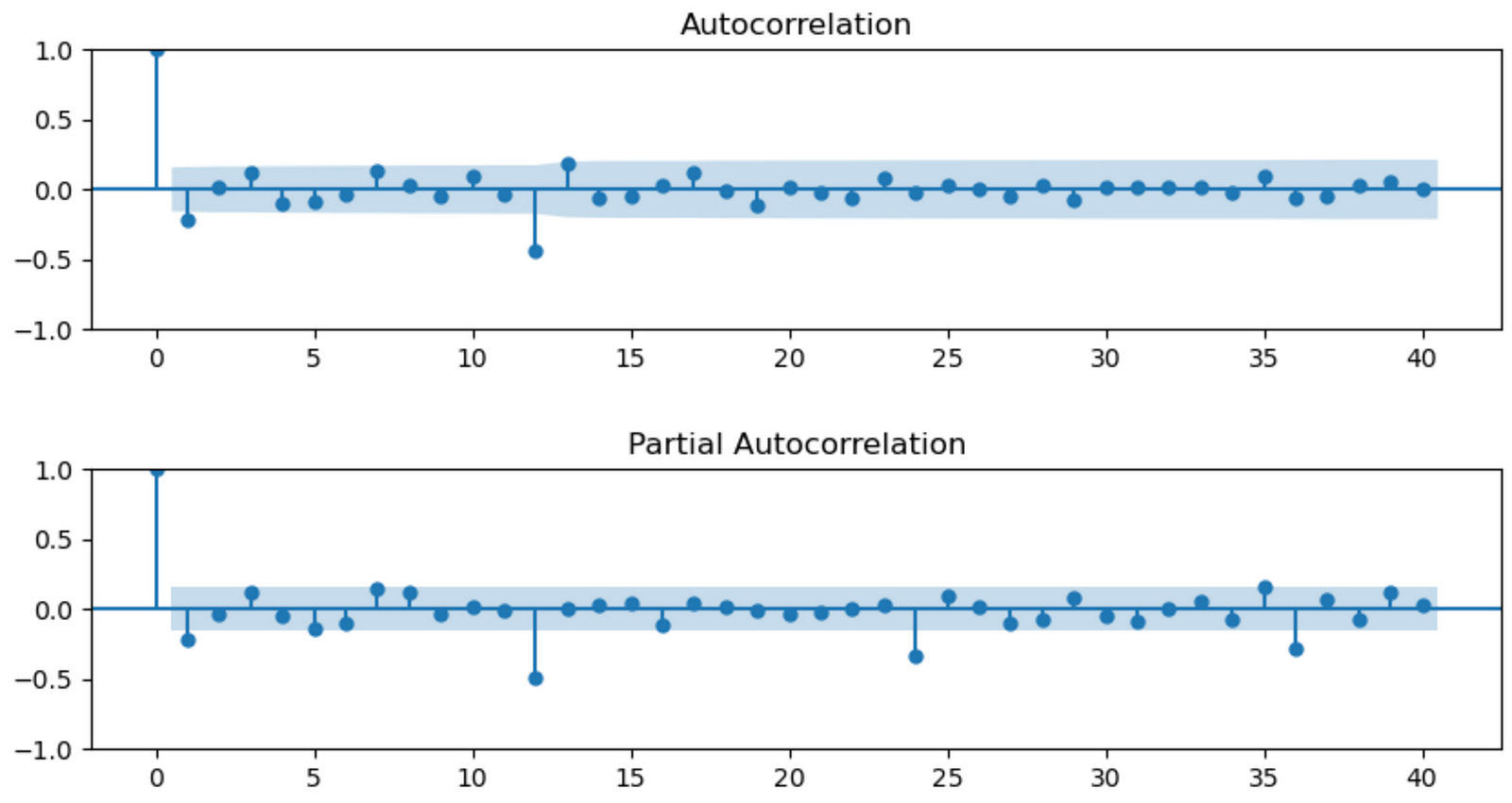
Model Parameter Estimation
This code snippet creates a figure with two subplots displaying the autocorrelation function (ACF) and partial autocorrelation function (PACF) plots of the differenced ‘Production’ time series data stored in the df1 DataFrame. Here’s a breakdown of the code:
fig, (ax1, ax2) = plt.subplots(nrows=2, ncols=1, sharex=False, sharey=False, figsize=(10, 5)): This line creates a figure with two subplots arranged vertically, one on top of the other. The nrows and ncols arguments specify the number of rows and columns, respectively, for the subplots. The sharex and sharey arguments are set to False, which means that each subplot has its own x and y axis. The figsize argument sets the width and height of the entire figure in inches.
ax1 = plot_acf(df1[‘Production’], lags=40, ax=ax1): This line calls the plot_acf() function from the statsmodels.graphics.tsaplots module on the differenced ‘Production’ column of the df1 DataFrame. It creates an autocorrelation function (ACF) plot with 40 lags using the ax1 axes object.
ax2 = plot_pacf(df1[‘Production’], lags=40, ax=ax2): This line calls the plot_pacf() function from the statsmodels.graphics.tsaplots module on the differenced ‘Production’ column of the df1 DataFrame. It creates a partial autocorrelation function (PACF) plot with 40 lags using the ax2 axes object.
plt.subplots_adjust(hspace=0.5): This line adjusts the spacing between the subplots. The hspace argument is set to 0.5, which determines the height space between subplots in the same column.
plt.show(): This line displays the figure with the two ACF and PACF plots. As mentioned earlier, this function is necessary to show the plot when using a script, but it may not be required in Jupyter Notebooks. However, it’s good practice to include it to ensure the plot is displayed correctly.
In summary, this code snippet creates a figure with two subplots: the ACF and PACF plots of the differenced ‘Production’ time series data. These plots can help you determine the appropriate lag values for autoregressive (AR) and moving average (MA) components when fitting time series models, such as ARIMA or SARIMA.
model = pm.auto_arima(df['Production'], d = 1, D = 1,
                      seasonal = True, m = 12,
                      start_p = 0, start_q = 0, max_order = 6, test = 'adf', trace = True)
This line of code uses the auto_arima() function from the pmdarima package to automatically find the best-fitting ARIMA model for the ‘Production’ time series data stored in the df DataFrame. The function searches through various combinations of ARIMA parameters (p, d, q) and seasonal parameters (P, D, Q, m) to find the model with the lowest Akaike Information Criterion (AIC). Here’s a breakdown of the function arguments: