Pre Model Algorithm
In this part, I will introduce you to the pre-model algorithm and describe how principal component analysis is implemented (1–3).

The pre-model algorithm in a nutshell
To prepare data for prediction modeling, unsupervised learning algorithms are sometimes used as an extension of the data scrubbing process. Instead of providing actionable insight into the data, unsupervised algorithms clean or reshape it.
As discussed in the previous chapter, dimension reduction techniques and k-means clustering are examples of pre-model algorithms. In this chapter, we examine both algorithms.
PCA
In dimension reduction, PCA is one of the most popular techniques. It reduces data complexity dramatically and makes data easier to visualize in fewer dimensions by using general factor analysis.
A PCA aims to minimize the number of variables in the dataset while preserving as much information as possible. The PCA method recreates dimensions by combining features into linear combinations called components rather than removing individual features. You can then drop components that have little impact on data variability by ranking those that contribute the most to patterns in the data.
PCA aims to maximize variance along the first axis by placing the axis in the direction of the greatest variance of the data points. In order to create the first two components, a second axis is placed perpendicular to the first axis.
According to the position of the first axis, the second axis is positioned in a two-dimensional setting. When the second axis is perpendicular to the first axis in a three-dimensional space, it’s important to position it so it maximizes the variance on its axis. The following figure illustrates PCA in a two-dimensional space.
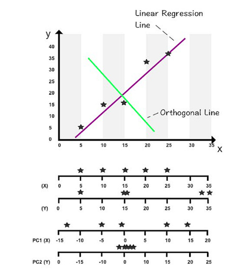
A horizontal axis is shown above. X and Y values are measured on the first two axes. X and Y values are measured by the second two axes when rotated 90 degrees. By using the orthogonal line as an artificial y-axis, it is possible to visualize the rotated axes. The linear regression line takes on the role of the x-axis in the following figure.
The first two components of this dataset can be found on these two new axes. The PC1 axis and PC2 axis are the new axes.
You can see a new range of variance among the data points by using PC1 and PC2 values (depicted on the third and fourth axes). On the first axis, PC1’s variance has increased compared to its original x values. As all the data points are close to zero and virtually stacked on top of each other, the variance in PC2 has shrunk significantly.
You can concentrate on studying PC1’s variance since PC2 contributes the least to overall variance. Despite not containing 100% of the original information, PC1 captures the variables that most impact data patterns while also minimizing computation time.
Before selecting one principal component, we divided the dataset into two components. Another option is to select two or three principal components that contain 75% of the original data out of a total of ten components. The purpose of data reduction and maximizing performance would be defeated if we insisted on 100% of the information. There is no well-accepted method for determining how many principal components are needed to represent data optimally. The number of components to analyze is a subjective decision based on the dataset size and the extent to which the data needs to be shrunk.
You will reduce a dataset to its two principal components in this coding exercise. In this exercise, we will use the Advertising Dataset.
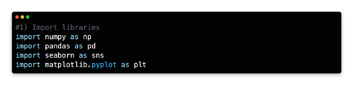
1: Import Libraries
NumPy, Pandas, Seaborn, Matplotlib Pyplot, and Matplotlib inline are a few Python libraries we will need to import first. In a Jupyter notebook, enter the following code to import each library.
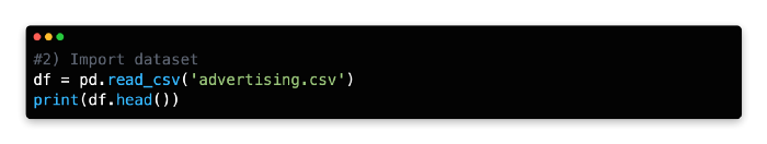
2: Import Datasets
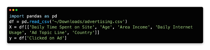
In the next step, the dataset will be imported into the same cell. Once you log in to Kaggle, you can download the Advertising Dataset as a zip file. After downloading the CSV file, unzip it and import it into Jupyter Notebook using pd.read_csv() and adding the path for the file directory.
Using this command, a Pandas data frame will be created from the dataset. From the top menu, select “Cell” > “Run All” to review the data frame or use the head() command and click “Run.”
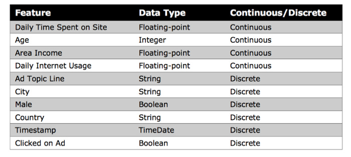
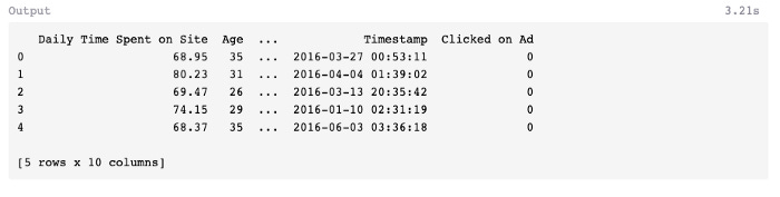
A few of the features of this dataset are shown below, including Daily Time Spent on Site, Age, Area Income, Daily Internet Usage, Ad Topic Line, City, Male, Country, Timestamp, and Clicked on Ad.
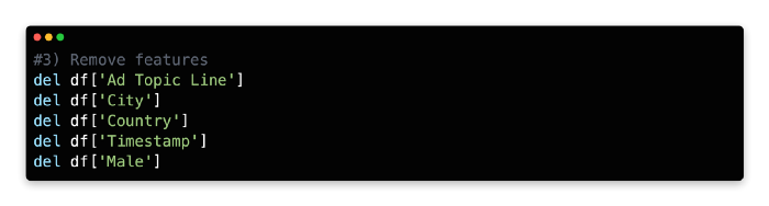
3: Remove Features
This algorithm cannot parse non-numerical features, such as Ad Topic Line, City, Country, and Timestamp, so you must remove them. Although Timestamp values are expressed in numbers, their special formatting makes it impossible to use this method to calculate mathematical relationships between variables.
Our model only examines continuous input features, so you need to remove the discrete variable Male, expressed as an integer (0 or 1).
We’ll remove these five features using the del function and the columns we’d like to remove using the remove function.
PCA Implementation Steps: 4 to 6
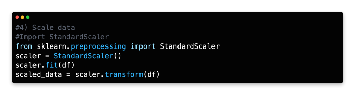
Scale Data
StandardScaler standardizes features by scaling to unit variance and assuming zero as the mean for all variables in Scikit-learn. A data frame with transformed values is created based on the mean and standard deviation that are then stored and used later with the transform method.
When StandardScaler has been imported, it can be assigned as a new variable, adapted to the data frame’s features, and transformed.
Data features are rescaled and standardized using StandardScaler in combination with PCA and other algorithms, such as k-nearest neighbors and support vector machines. A dataset can, for example, adopt the properties of a normal distribution when these two parameters are combined.
In the absence of standardization, the PCA algorithm will likely focus on features that maximize variance. The effect may be exaggerated by another factor, however. As you measure Age in days rather than years, you will notice that the variance changes dramatically. Left unchecked, this type of formatting could mislead a selection process that maximizes variance in selecting components. The StandardScaler rescales and standardizes variables to avoid this problem.
The scale of the variables may not require standardization if they are relevant to your analysis or consistent.
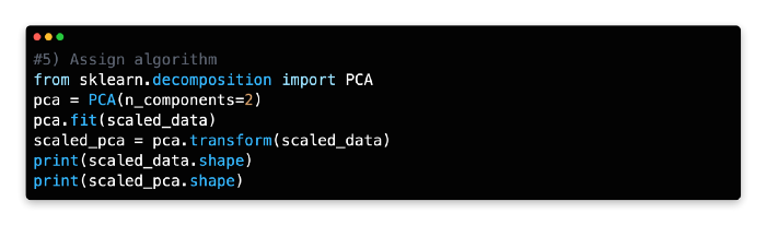
5: Assign Algorithm
The PCA algorithm can now be imported from Scikit-learn’s decomposition library after we’ve laid the groundwork.
Please pay attention to the next line of code, as it reshapes the features of the data frame into components. You will need to identify the components that have the greatest impact on data variability for this exercise. Choosing two components (n_components=2) instructs PCA to find the two components best explaining the data variability. Depending on your needs, you can modify the number of components, but two components are the easiest to interpret and visualize.
With the transform method, you can recreate the data frame’s values using the two components fitted to the scaled data.
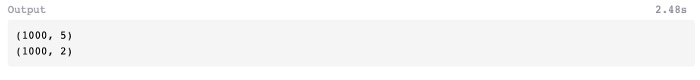
To compare the two datasets, let’s use the shape command to check the transformation.
The scaled PCA data frame can now be queried for its shape.
As you can see, the PCA has compressed the scaled data frame from 1,000 rows and 5 columns to 1,000 rows and 2 columns.
6: Visualize the Plot
We can visualize the two principal components on a two-dimensional scatterplot using the Python plotting library Matplotlib, with principal component 1 marked on the x-axis and principal component 2 marked on the y-axis. In the first version of the code, you will visualize the two principal components without a color legend.
Plot 1:
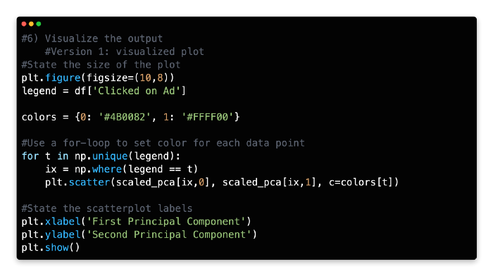
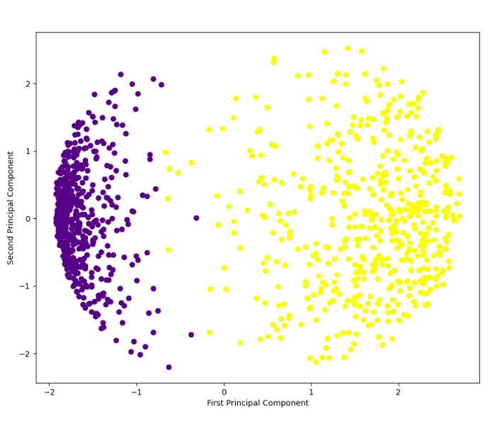
Each component is color-coded to indicate whether the user clicked on the ad or did not click on it. Rather than representing a single variable, components represent a combination of variables.
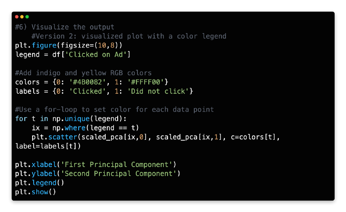
A color legend can also be added to the code. Rapidtables provides RGB color codes and Python for-loops for this more advanced set of code.
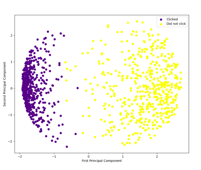
With the help of a color legend in the top right corner, you can clearly see the separation of outcomes. With PCA output in hand, supervised learning techniques like logistic regression or k-nearest neighbors can be used to further analyze the data.
K-Means Clustering Implementation Steps: 1 to 3
K-means clustering is another method for reducing data complexity by identifying groups of data points without knowing the class of the data.
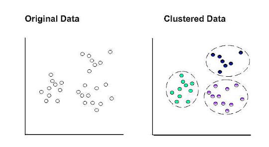
In K-means clustering, k represents the number of clusters within the dataset. For example, setting k to “3” separates the data into three clusters.
A cluster’s centroid becomes the epicenter when a data point is assigned to it at random. Those points that do not have a centroid are assigned to the closest centroid. A new cluster’s mean is used to update the centroid coordinates. A new cluster may be formed based on comparative proximity with a different centroid as a result of this update. It is then necessary to recalculate and update the centroid coordinates.
In the final set of clusters, all data points remain within the same cluster after the centroid coordinates are updated.
Exercise
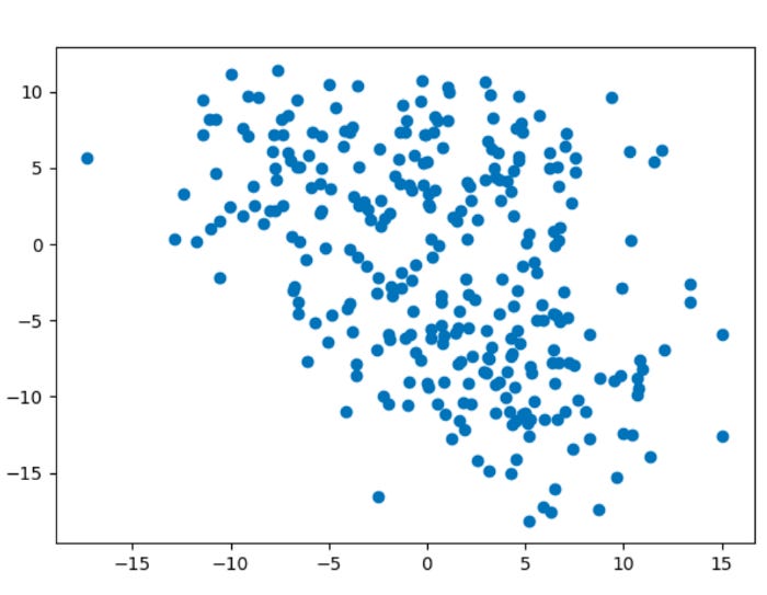
The purpose of this exercise is to create an artificial dataset and use k-means clustering to divide the data into four natural groups.
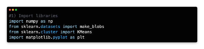
1: Import libraries
Scikit-learn’s make_blobs algorithm was used to generate the artificial dataset for this exercise. A Matplotlib Pyplot and Matplotlib inline visualization will be created for this exercise.
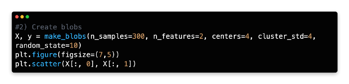
2: Create Blobs
As an alternative to importing a dataset, we generated an artificial dataset with 300 samples, 2 features, and four centers, with a cluster standard deviation of 4.
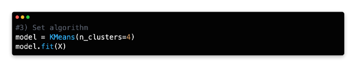
3: Set Algorithm
To discover groups of data points with similar attributes, you want to use k-means clustering. Before fitting the model to the artificial data (X), create a new variable (model) and call the KMeans algorithm from Scikit-learn.
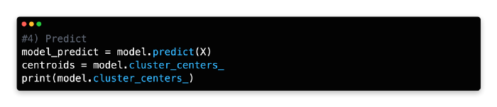
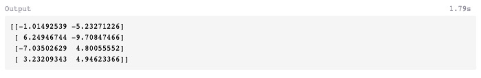
4: Predict
You can run the model and generate the centroid coordinates using cluster_centers by using the predict function under the new variable (model_predict).
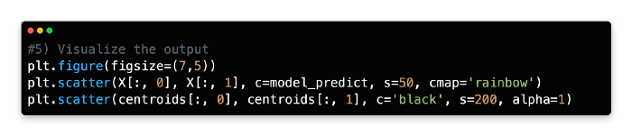
5: Visualise the Output
The clusters will now be plotted using two sets of elements on a scatterplot. Under the variable named model_predict, you will find four color-coded clusters produced by the k-means model. A second variable, centroids, stores the cluster centroids.
There are black centroids with marker sizes of 200 and alphas of 1. It can take any float number between 0 and 1.0, where 0 represents maximum transparency and 1 represents maximum opaqueness. You need the alpha to be 1 (opaque) since you are superimposing the four cluster centroids over them.
You can find more information about the scatterplot features in Matplotlib here.
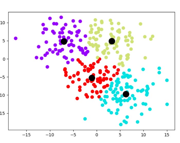
The k-means clustering method has enabled you to identify four previously unknown groupings within our dataset and streamline 300 data points into four centroids for generalization.
In the previous chapter, we discussed k-means clustering as a method to reduce a very large dataset into manageable cluster centroids for supervised learning.
A supervised learning technique or another unsupervised learning technique may be used to further analyze the data points within each cluster. One of the identified clusters may even benefit from k-means clustering, which is useful for tasks such as identifying customer subsets in market research.
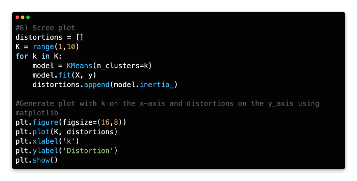
6: Scree Plot
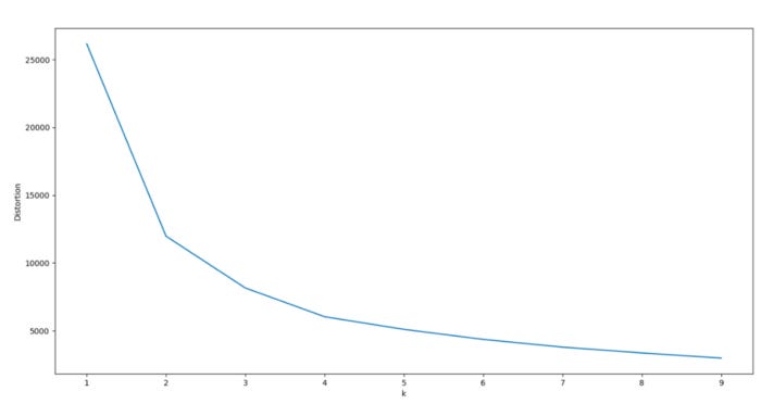
Consider analyzing a scree plot for guidance when optimizing k. Scree plots illustrate scattering (variance) by comparing the distortion between different cluster variations. Based on the Euclidean distance between the centroid and the other points in a cluster, distortion is calculated as the average of the squared distance between those points.
In order to determine the optimal number of clusters, one must determine the value of k where distortion gradually subsides on the left side of the scree plot, without reaching a point where cluster variations are negligible on the right. From the optimal data point (the “elbow”), distortion should decrease linearly to the right.
For our model, 3 or 4 clusters appear to be the optimal number. Due to a pronounced drop-off in distortion, these two cluster combinations have a significant kink to the left.
The right side of the graph also exhibits a linear decline, especially for k = 4. As the dataset was generated artificially with 4 centers, this makes sense.
Using Python, you can calculate the distortion values for each k value by iterating through the values of k from 1 to 10. To plot the screen plot, Python and Matplotlib must be used with the for loop function.
Find distortion values for each value of k using a for loop with a range of 1–10.
Split Validation
A technique called split validation is crucial to machine learning, as it allows the data to be partitioned into two distinct sets.
In order to develop a prediction model, the first set of data is called the training data.
Testing the model’s accuracy from the training data is done using the second set of data.
In most cases, the training data is larger than the test data by 70/30 or 80/20. The model is ready to generate predictions using new input data once it has been optimized and validated.
Models are built from the training data only, even though they are used on both training and test sets.
Models are created using test data as input, but they should never be decoded or used to make predictions. The validation set is sometimes used by data scientists because the test data cannot be used to build and optimize the model.
Using the validation set as feedback, the prediction model can optimize its hyperparameters after building an initial model based on the training set. Afterward, the prediction error of the final model is assessed using the test set.
Validation and test data can be reused as training data to maximize data utility. In order to optimize the model just before it is used, used data would be bundled with the original training data.
Train and test set
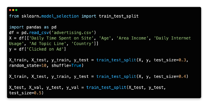
Python’s train_test_split library requires an initial import of sklearn.model_selection in order to perform split validation.

The x and y values need to be set before using this code library.
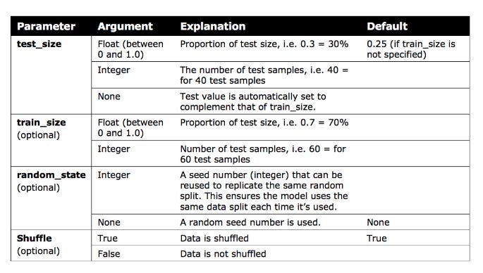
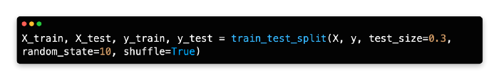
A random seed of 10 is ‘bookmarked’ for future code replication so that the training/test data is split 70/30 and shuffled.
Train Test Split can be explained in more detail by following the provided link.
Validation set
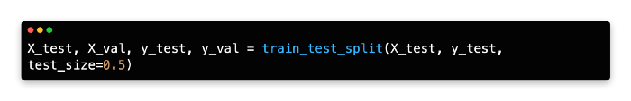
In the current version of Scikit-learn, there is no function to create a three-way split between train/validation/test.
As demonstrated below, one quick solution is to split the test data into two partitions.
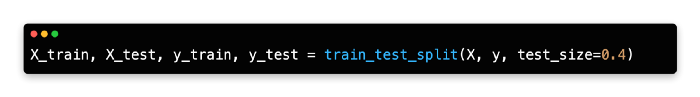
Data for training is set to 60%, while data for testing is set to 40%. A 50/50 split is then performed so that the test data and validation set represent 20% of the original data each.
Introduction To Model Design
It’s helpful to take a step back and look at the entire process of building a machine learning model before diving into specific supervised learning algorithms. Several steps discussed in previous chapters will be reviewed and new methods will be introduced, such as evaluating and predicting.
The 10 steps follow a relatively fixed sequence inside your development environment. From start to finish, you will find it easy to design your own machine learning models with this framework.
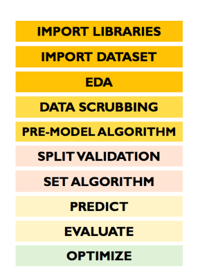
The following steps are involved in the model design:
Import libraries
Import dataset
Exploratory data analysis
Data scrubbing
Pre-model algorithm
Split validation
Set algorithm
Predict
Evaluate
Optimize
Import Libraries
It’s crucial to import libraries before calling any specific functions in Python, since the interpreter works from top to bottom. Using Python without Seaborn and Matplolib will not allow you to create a heatmap or pair plot, for example.
Your notebook doesn’t have to have the libraries at the top. When importing algorithms-based libraries, some data scientists prefer to import them before references to them in code sections where they are used.
Import Datasets
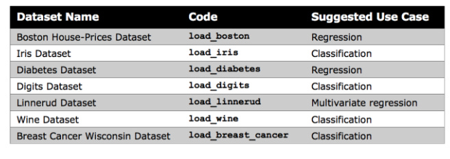
Kaggle or your organization’s records are generally used to import datasets. Kaggle offers a wide selection of datasets, but Scikit-learn provides several small built-in datasets that don’t require external downloads.
For beginners, these datasets are useful for understanding new algorithms, as noted by Scikit-learn. In your notebook, you can directly import Scikit-learn’s datasets.

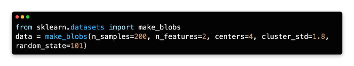
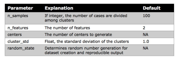
Make Blobs
The k-means clustering lesson uses Scikit-learn’s make blobs function to generate a random dataset. Rather than offering meaningful insights, this data can help gain confidence in a new algorithm.