


PREDICTING STOCK FUTURE PRICES OF S&P 500 STOCK MARKET INDEX
PREDICTING STOCK FUTURE PRICES OF S&P 500 STOCK MARKET INDEX
We will be using different machine learning techniques and sentiment analysis to predict stock prices.

Successful investment strategies need to be ahead of stock market movements. Machine learning paves the way for the development of financial theories that can forecast those movements. In this work an application of the Triple-Barrier Method and Meta-Labeling techniques is explored with XGBoost for the creation of a sentiment-based trading signal on the S&P 500 stock market index. The results confirm that sentiment data have predictive power, but a lot of work is to be carried out prior to implementing a strategy.
Index
Data Loading And EDA
Data Preparation
Model
Importing
import mlfinlab as mlfin
import pandas as pd
import pandas_datareader as pdr
import pandas_profiling as pf
import numpy as np
from yahoo_finance import Share
from datetime import datetime, timedelta, date
import matplotlib.pyplot as plt
import seaborn as sns
import missingno as msno
from scipy import stats
import pywt
from ta.momentum import RSIIndicator, StochasticOscillator, WilliamsRIndicator, ROCIndicator
from ta.trend import MACD, ADXIndicator
from sklearn.preprocessing import StandardScaler
from sklearn.decomposition import PCA
from sklearn.metrics import classification_report, confusion_matrix, roc_curve, auc, roc_auc_score, accuracy_score
from sklearn.feature_selection import SelectFromModel
from sklearn.neural_network import MLPClassifier
from sklearn.neighbors import KNeighborsClassifier
from sklearn.ensemble import RandomForestClassifier
from sklearn.model_selection import TimeSeriesSplit, GridSearchCV, cross_val_score
from xgboost import XGBClassifier, plot_importance, plot_tree
from mlxtend.feature_selection import SequentialFeatureSelector as SFS
from mlxtend.plotting import plot_sequential_feature_selection as plot_sfs
from plotly.subplots import make_subplots
from plotly.offline import download_plotlyjs, init_notebook_mode, plot, iplot
from plotly.validators.scatter.marker import SymbolValidator
import ipywidgets as widgets
from ipywidgets import interact, HBox, Label
import plotly.graph_objs as go
import warnings
import sys
import os

init_notebook_mode(connected=True)

os.environ["PATH"] += os.pathsep + 'C:/Program Files/Graphviz/bin/'
sns.set_context('notebook', rc={"axes.titlesize":14,"axes.labelsize":13})
sns.set_style('white')
%matplotlib inline
bbva = ['#004481','#2DCCCD', '#D8BE75','#1973B8', '#5BBEFF', '#F7893B', '#02A5A5', '#48AE64', '#F8CD51', '#F78BE8'];
sns.set_palette(bbva);
sns.color_palette(bbva)
There are a number of libraries and modules imported for data analysis and machine learning in the code. The import list includes mlfinlab, pandas, pandas_datareader, pandas_profiling, numpy, yahoo_finance, datetime, matplotlib, seaborn, missingno, scipy, pywt, ta, sklearn, xgboost, mlxtend, plotly, ipywidgets, warnings, sys, and os. In this code, the notebook mode for plotly is set to ‘connected’, the graphviz path is set, and the seaborn plotting environment and style are set. Lastly, the bank’s color scheme is used to set a custom color palette.
Data Loading & EDA
Sentiment Indicators
def load_data(data='countries', data_type='News_Social', asset_code_id='US'):
    """
    This function loads the sentiment indicators downloaded from Thomsom Reuters,
    i.e. the MarketPsych Sentiment Indicators related to countries, companies and currencies.

    Parameters
    ----------
    data: str
        One of 'countries', 'companies', 'currencies'.
    data_type: str
        Whether to filter info by data source. One of 'News', 'Social', 'News_Social'.
    asset_code_id: str
        Code of the asset / data. One of 'US', 'US500', 'USD'.

    Return
    ------
    Pandas dataframe.
    """
    dirs = os.listdir('./')
    if data == 'countries':
        dim, file = 'COU', 'COU_CARGA_INICIAL.csv'
        sufix = '_USA'
    elif data == 'currencies':
        dim, file = 'CUR', 'CUR_CARGA_INICIAL.csv'
        sufix = '_USD'
    elif data == 'companies':
        dim, file = 'CMPNY', 'CMPNY_GRP_CARGA_INICIAL.csv'
        sufix = '_US500'

    dirs = [dire_x for dire_x in os.listdir('./') if dim in dire_x]
    dataset = pd.read_csv(file, sep=';')
    dataset = dataset[dataset.date <= '2020-03-30']

    for dire in dirs:
        if (dire != file):
            new_month = pd.read_csv(dire, delimiter='\t')
            if len(new_month.columns) == 1:
                new_month = pd.read_csv(dire, delimiter=';')
            if 'date' not in new_month.columns:
                new_month['date'] = new_month.id.apply(lambda x: x[3:13])
            if 'asset_code_id' not in new_month.columns:
                new_month['asset_code_id'] = new_month.assetCode
            if 'data_type' not in new_month.columns:
                new_month['data_type'] = new_month.dataType
            if 'id_refinitiv' not in new_month.columns:
                new_month['id_refinitiv'] = new_month.id
            if 'system_version' not in new_month.columns:
                new_month['system_version'] = new_month.systemVersion
            if 'date_audit_laod' not in new_month.columns:
                new_month['date_audit_laod'] = 'NA'
            if 'process_audit_load' not in new_month.columns:
                new_month['process_audit_load'] = 'NA'
            new_month = new_month[dataset.columns]
            dataset = pd.concat([dataset, new_month], ignore_index=True)

    dataset = dataset[(dataset.data_type == data_type) &
                       (dataset.asset_code_id == asset_code_id) &
                       (dataset.date >= '2000-01-01')].sort_values(by='date')

    dataset['Date'] = pd.to_datetime(dataset.date)
    dataset.set_index('Date', inplace=True)
    dataset.drop(['date', 'asset_code_id', 'data_type', 'id_refinitiv',
                  'system_version', 'date_audit_laod', 'process_audit_load'], axis=1, inplace=True)
    dataset.columns = [col + sufix for col in dataset.columns]

    return dataset
Python function load_data loads sentiment indicators for countries, companies, and currencies from Thomson Reuters. Three parameters are passed to the function: data_type, asset_code_id, and data_type. You can specify which data to load by specifying ‘countries’, ‘companies’, or ‘currencies’. One of the data_type parameters can be ‘News’, ‘Social’, or ‘News_Social’ to filter the data based on the source of information. A code for the asset or data can be entered using the asset_code_id parameter, such as ‘US’, ‘US500’, or ‘USD’.
The function first sets the filenames and directories according to the data parameter. Following the initial data read from a CSV file, the data is filtered based on the data_type, asset_code_id, and date range specified. In the next step, it reads each file, formats it according to the original dataset, and concatenates it to the original dataset. The pandas dataframe is returned after converting the ‘date’ column to a datetime format, setting it as the index, removing unnecessary columns, adding a suffix to remaining columns, and converting the dataframe to a datetime format.
# Countries info
countries = load_data(data='countries', data_type='News_Social', asset_code_id='US')
Using the load_data() function defined previously, the sentiment indicators related to countries are loaded with the parameters data=’countries’, data_type=’News_Social’, and asset_code_id=’US’. Countries are assigned to the resulting dataframe.
countries.describe()
Dataframe summary statistics will be returned by this code. It will return counts, means, standard deviations, minimums, 25th percentiles, medians, 75th percentiles, and maximums for each numeric column. This output will provide a summary of each column’s central tendency, variability, and range.
# Currencies info
currencies = load_data(data='currencies', data_type='News_Social', asset_code_id='USD')
The data associated with currencies is loaded with the load_data() function when data=’currencies’, data_type=’News_Social’, and asset_code_id=’USD’ are specified. A variable currency is assigned to the resulting dataframe.
currencies.describe()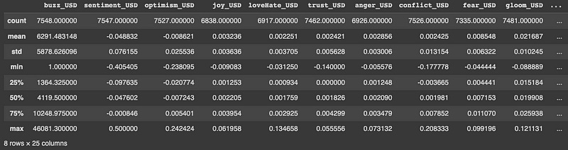
The currency dataframe will be summarized using this code. For each numeric column in the dataframe, this function returns a count, means, standard deviations, minimums, 25th percentiles, medians (50th percentiles), 75th percentiles, and maximums. Consequently, each column’s central tendency, variability, and range will be displayed.
companies = load_data(data='companies', data_type='News_Social', asset_code_id='MPTRXUS500')With the parameters data=’companies’, data_type=’News_Social’, and asset_code_id=’MPTRXUS500', this code loads the sentiment indicators related to companies using the load_data() function. Dataframes resulting from this process are assigned to the variable companies.
Market Data
# Later on we will adapt dates to the data loaded before
start_date = datetime(1999, 11, 30)
end_date = datetime(2020, 8, 31)

# SP500 Yahoo Finance
sp500_yahoo = pdr.get_data_yahoo(symbols='^GSPC', start=start_date, end=end_date)
sp500_yahoo = sp500_yahoo.asfreq('D', method=None) # generating extra days so that we don't have date jumps
display(sp500_yahoo.head())

# Adding return and volatility just for plotting (as this has to be calculated separately in train and test)
original_columns = list(sp500_yahoo.columns)
original_columns.remove('Volume') # unrealiable volume data. It will not be used
sp500_yahoo['Daily Return'] = sp500_yahoo['Adj Close'].pct_change(periods=1)*100
sp500_yahoo['Daily Volatility'] = sp500_yahoo['Daily Return'].ewm(span=30).std() # exponential moving std
sp500_yahoo['Daily Expected Return'] = sp500_yahoo['Daily Return'].ewm(span=30).mean()

def daterange(start_date, end_date):
    for n in range(int ((end_date - start_date).days) + 1):
        yield start_date + timedelta(n)

weekend = [6, 7]
weekdays = []
for dt in daterange(start_date, end_date):
    if dt.isoweekday() not in weekend:
        weekdays.append(dt.strftime('%Y-%m-%d'))

# We'll take only weekdays and we'll delete weekends (as markets are closed during these days)
sp500_yahoo = sp500_yahoo[sp500_yahoo.index.isin(weekdays)]
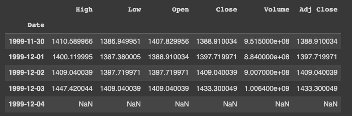
SP500 data are set as datetime objects using this code. After that, it utilizes the pandas_datareader library to download daily historical prices from Yahoo Finance for the SP500 index with the ticker symbol ^GSPC. A dataframe containing the results is assigned to the variable sp500_yahoo.
To fill in any missing values in the time series with NaNs, the asfreq method is called with method=None.
After adding these three columns to the dataframe, the code adds three more columns for daily return, daily volatility, and daily expected return. Based on the percentage change between successive adjusted close prices, the daily return is calculated. An exponentially weighted standard deviation is calculated from the daily return over a rolling period of 30 days to calculate the daily volatility. Over a rolling window of 30 days, the exponentially weighted average of the daily return is calculated to determine the daily expected return.
Daterange is then defined in the code as a function that generates a range of dates between two given dates. In addition, two lists are defined: weekend, which contains integers representing Saturday and Sunday, and weekdays, which contains the weekdays between the start and end dates. Once the range of dates are iterated through, they are only added to the weekdays list if they are not weekend days. Finally, the sp500_yahoo dataframe is filtered to include only rows whose dates fall within the weekday range. A weekend is not a trading day for the stock market, so this filter removes it.
# Plotting price, volatility and return
fig, ax1 = plt.subplots()
ax1.set_xlabel('Date')
ax1.set_ylabel('Daily Volatility [%]')
ax1.plot(sp500_yahoo['Daily Volatility'], label='Daily Volatility', color='lightgrey')
ax1.legend(loc='upper left')
ax2 = ax1.twinx() # instantiate a second axes that shares the same x-axis
ax2.set_ylabel('S&P 500 Close Price') # we already handled the x-label with ax1
ax2.plot(sp500_yahoo['Close'], color=bbva[0], label='S&P 500 Close Price')
ax2.legend(loc='upper right')
fig.tight_layout() # otherwise the right y-label is slightly clipped
plt.show()
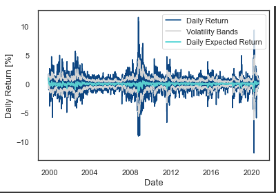
_, ax = plt.subplots()
ax.plot(sp500_yahoo['Daily Return'], color=bbva[0], label='Daily Return');
ax.plot(sp500_yahoo['Daily Expected Return'] + sp500_yahoo['Daily Volatility'], color='lightgrey')
ax.plot(sp500_yahoo['Daily Expected Return'] - sp500_yahoo['Daily Volatility'], color='lightgrey', label='Volatility Bands')
ax.plot(sp500_yahoo['Daily Expected Return'], color=bbva[1], label='Daily Expected Return')
ax.legend(loc='upper right')
ax.set_ylabel('Daily Return [%]');
ax.set_xlabel('Date');
#plt.xticks(rotation=30)
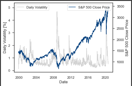
Two SP500 plots are generated by this code.
On the left y-axis, you can see the SP500’s daily volatility over time, and on the right y-axis, you can see its daily close. To plot the two series, we used the plot function in matplotlib.pyplot. A light gray color is used for the left y-axis series labeled “Daily Volatility”, while a bbva[0] color is used for the right series labeled “S&P 500 Close Price”.
A second plot shows the SP500 index’s daily return, expected daily return, and volatility bands. To plot the series, matplotlib.pyplot uses the plot function. With a label called “Daily Return”, you can see the daily return in blue. A green line shows the daily expected return with a label that says “Daily Expected Return”. A light gray color is used to plot the upper and lower volatility bands.
# Calculating events with cusum filter (just for plotting)
cusum_events = mlfin.filters.cusum_filter(sp500_yahoo['Adj Close'],
                                          threshold=0.1) #threshold abs(change)

# interactive plot
warnings.filterwarnings("ignore")
#configure_plotly_browser_state()

# creating widgets
dependent=widgets.Select(options=['Close', 'Daily Return', 'Daily Volatility'],
                         value='Close', description='View', disabled=False)
dataframe=widgets.RadioButtons(options=['Companies', 'Countries', 'Currencies'],
                               value='Companies', description='Indices', disabled=False)
sentiment1=widgets.Dropdown(options=companies.columns,
                            value='sentiment_US500', description='Comp. Value', disabled=False)
sentiment2=widgets.Dropdown(options=countries.columns,
                            value='stockIndexSentiment_USA', description='Count. Value', disabled=False)
sentiment3=widgets.Dropdown(options=currencies.columns,
                            value='sentiment_USD', description='Curr. Value',
                            disabled=False, layout={'positioning': 'right'})

# setting the ui for our widgets
ui = widgets.HBox([dependent, dataframe, widgets.VBox([sentiment1, sentiment2, sentiment3])])

#@interact
def plot_sentiment_index(dependent, dataframe, sentiment1, sentiment2, sentiment3):

    if dataframe == 'Companies':
        sentiment = sentiment1
        df = companies
    elif dataframe == 'Countries':
        sentiment = sentiment2
        df = countries
    elif dataframe == 'Currencies':
        sentiment = sentiment3
        df = currencies

    figura = make_subplots(specs=[[{"secondary_y": True}]])

    figura.add_trace(go.Scatter(y=sp500_yahoo[dependent].fillna('ffill'),
                                x=sp500_yahoo.index,
                                mode='lines',
                                name='S&P 500 '+ dependent),
                     secondary_y=True,)
    figura.add_trace(
        go.Scatter(y=df[sentiment],
                   x=df.index,
                   mode='lines',
                   name=sentiment + ' Index',
                   visible='legendonly'),
                   secondary_y=False,)
    figura.add_trace(
        go.Scatter(y=df[sentiment].ewm(span=365).mean(),
                   x=df.index,
                   mode='lines',
                   name='EWMA 1y ' + sentiment[:5] + '. Index'),
                   secondary_y=False,)
    figura.add_trace(
        go.Scatter(y=df[sentiment].ewm(span=180).mean(),
                   x=df.index,
                   mode='lines',
                   name='EWMA 6m ' + sentiment[:5] + '. Index'),
                   secondary_y=False,)
    figura.add_trace(
        go.Scatter(y=df[sentiment].ewm(span=90).mean(),
                   x=df.index,
                   mode='lines',
                   name='EWMA 3m ' + sentiment[:5] + '. Index'),
                   secondary_y=False,)
    figura.add_trace(
        go.Scatter(y=df[sentiment].ewm(span=30).mean(),
                   x=df.index,
                   mode='lines',
                   name='EWMA 1m ' + sentiment[:5] + '. Index',
                   visible='legendonly'),
                   secondary_y=False,)
    figura.add_trace(go.Scatter(y=sp500_yahoo['Adj Close'][cusum_events],
                                x=cusum_events,
                                mode='markers',
                                name='S&P 500 Index CUSUM Events'),
                     secondary_y=True,)
    figura.add_trace(
        go.Scatter(y=[0],
                   x=['2001-09-11'],
                   mode='markers',
                   name='Sept 11 Attacks',
                   marker=dict(size=15),
                   marker_symbol=17),
                   secondary_y=False,)
    figura.add_trace(
        go.Scatter(y=[0],
                   x=['2002-10-09'],
                   mode='markers',
                   name='Dot-Com Bubble Burst',
                   marker=dict(size=15),
                   marker_symbol=17),
                   secondary_y=False,)
    figura.add_trace(
        go.Scatter(y=[0],
                   x=['2008-09-15'],
                   mode='markers',
                   name='Lehman Brothers Collapse',
                   marker=dict(size=15),
                   marker_symbol=17),
                   secondary_y=False,)
    figura.add_trace(
        go.Scatter(y=[0],
                   x=['2018-12-22'],
                   mode='markers',
                   name='U.S. Federal Government Shutdown',
                   marker=dict(size=15),
                   marker_symbol=17),
                   secondary_y=False,)
    figura.add_trace(
        go.Scatter(y=[0],
                   x=['2020-01-20'],
                   mode='markers',
                   name='1st COVID-19 Case USA',
                   marker=dict(size=15),
                   marker_symbol=17),
                   secondary_y=False,)

    figura.update_layout(
        title_text='S&P 500 Index vs Sentiment Indices | Indicator: {}'.format(sentiment),
        colorway = bbva)

    figura.update_xaxes(rangeslider_visible=True)
    figura.update_yaxes(title_text="<b>Sentiment Index</b>", secondary_y=False)
    figura.update_yaxes(title_text="<b>S&P 500 Close Price</b>", secondary_y=True)

    figura.update_xaxes(
        rangeslider_visible=True,
        rangeselector=dict(
            dict(font = dict(color = "black")),
            buttons=list([
                dict(count=1, label="1m", step="month", stepmode="backward"),
                dict(count=6, label="6m", step="month", stepmode="backward"),
                dict(count=1, label="YTD", step="year", stepmode="todate"),
                dict(count=1, label="1y", step="year", stepmode="backward"),
                dict(count=3, label="3y", step="year", stepmode="backward"),
                dict(count=5, label="5y", step="year", stepmode="backward"),
                dict(step="all"),
            ])
        )
    )

    figura.update_layout(template='simple_white', hovermode='x')
    iplot(figura)

out = widgets.interactive_output(plot_sentiment_index, {'dependent': dependent, 'dataframe': dataframe,
                                                        'sentiment1': sentiment1, 'sentiment2': sentiment2,
                                                        'sentiment3': sentiment3})
display(ui, out)
With this code, you can see the S&P 500 Index and sentiment indices for different companies, countries, and currencies. On the plot, it shows markers for events in the S&P 500 Index calculated with the CUSUM filter. S&P 500 Index close prices, daily returns, and daily volatility can be viewed, as well as sentiment indexes. Several landmark events, like Sept 11 and Lehman Brothers, are also marked on the plot. Users can zoom in and out and adjust the time range displayed on the interactive plot. In order to create the interactive widgets, the code uses the Plotly library and the ipywidgets library.
Data Preparation
# We'll only take the original columns (remember that we created three new ones just for plotting)
sp500_yahoo = sp500_yahoo[original_columns]
Basically, this code selects the original columns from the sp500_yahoo dataframe we created earlier. We get the original data back by removing any columns created just for plotting. There’s probably a list of column names in original_columns that we want to keep.
# Merging the datasets
sentiments = companies.merge(currencies.merge(countries,
                                              left_index=True, right_index=True), left_index=True, right_index=True)
sentiments.drop_duplicates(inplace=True)
sentiments.head()
A new dataframe sentiments is created by merging three dataframes companies, currencies, and countries using their indices. You can get sentiment data for companies, currencies, and countries with sentiments. Merge the dataframes with .merge(). Dataframes are merged based on left_index=True and right_index=True. In the sentiments dataframe, the indexes of the merged dataframes are merged into a single index. To remove duplicates in the sentiments dataframe, the drop_duplicates() method is called. The first few rows of the dataframe are displayed using the .head() method.
# We'll calculate a weighted average on Mondays adding info from the weekend
mondays_weekends = []
for dt in daterange(start_date, end_date):
    if dt.isoweekday() in [1, 6, 7]:
        mondays_weekends.append(dt.strftime('%Y-%m-%d'))

senti_mon = sentiments.reindex(pd.DatetimeIndex(mondays_weekends))
In this code block, we’re creating a list called mondays_weekends that’s got all the Saturdays, Sundays, and Mondays (if Monday is a holiday) between start_date and end_date. Then, we’re reindexing sentiments with the list of Mondays and weekends in mondays_weekends and creating a new DataFrame called senti_mon. Sentiment dates that aren’t Mondays or weekends are discarded from the new senti_mon DataFrame.
# First day was Saturday (this will be useful for allocating weights)
senti_mon.index[0]
The senti_mon DataFrame, which was previously created by subsetting the sentiments DataFrame to only include Mondays and weekends, is retrieved with this code. For weighted averages, it’s used to determine when to start allocating weights.
# Continuation:
for col in senti_mon.columns:
    senti_mon[col] = \
        senti_mon[col].rolling(3).apply(lambda x: np.average(x, weights=[0.12, 0.22, 0.66]))
        # damos mayor peso a los lunes (mon 2/3, sun 2/9, sat 1/9)

# Substituting indices corresponding to senti_mon
sentiments[sentiments.index.isin(mondays_weekends)] = senti_mon

del senti_mon

# Deleting weekends
sentiments = sentiments[sentiments.index.isin(weekdays)]
sentiments.head()
Using sentiment data for the previous weekend (Saturday and Sunday) and the current Monday, this code calculates a weighted average of Monday sentiment. For each day, the weights are [0.12, 0.22, 0.66], so Monday sentiment gets more weight.
After that, the sentiment values for each Monday are replaced back into the original sentiment dataset using their corresponding indices, which are stored in the mondays_weekends variable. Using the weekdays variable, we remove sentiment data for Saturdays and Sundays.
Selecting train and test periods
# Splitting into train and test sets

train_start, train_end = '2001-08-31', '2016-08-31'
test_start, test_end = '2016-09-01', '2020-08-31'

sentiments_test = sentiments[test_start:test_end]
sentiments_train = sentiments[train_start:train_end]
sp500_test = sp500_yahoo[test_start:test_end]
sp500_train = sp500_yahoo[train_start:train_end]
Using the train_start and train_end dates, the train_start and train_end dates are used to select the training data, and the test_start and test_end dates are used to select the testing data.
Sentiment_train and sentiment_test for sentiments and SP500_train and SP500_test for SP500_yahoo are the results.
# Train and test ratios
print("{0:.0%}".format(len(sp500_train)/len(sp500_yahoo[train_start:])))
print("{0:.0%}".format(len(sp500_test)/len(sp500_yahoo[train_start:])))
This code prints the training/testing percentage.
In the first print statement, we calculate the percentage of data we used for training. From the train_start date to the end of the sp500_yahoo dataset, divide sp500_train by sp500_yahoo. The result is then formatted as a percentage without decimals.
Using the second print statement, you can figure out what percentage of the data was used for testing. This divides the sp500_test dataset by the sp500_yahoo dataset. This is then formatted as a percentage without decimal points and printed.
Missing values
# We'll plot the rate of variables with missing values over time
sentiments_train['year'] = sentiments_train.index.year
sentiments_train['missing'] = sentiments_train.isnull().sum(axis=1)

((1-(sentiments_train.groupby('year').count().min(axis=1)/
    sentiments_train.groupby('year').count()['bondBuzz_USA']))*100).plot(legend=False, marker='o');
((1-(sentiments_train.groupby('year').count().mean(axis=1)/
    sentiments_train.groupby('year').count()['bondBuzz_USA']))*100).plot(legend=False, marker='o');
plt.title('Max. and mean missing-value rates per year');
plt.ylabel('Missing rate [%]');
plt.xlabel('Date');

plt.figure()
plt.plot(sentiments_train.groupby('year').max().index,
         list(sentiments_train.groupby('year').max()['missing']), marker='o');
plt.plot(sentiments_train.groupby('year').mean().index,
         list(sentiments_train.groupby('year').mean()['missing']), marker='o');
plt.title('Max. and mean number of variables with missing values per year');
plt.ylabel('Number of variables');
plt.xlabel('Date');

sentiments_train.drop(['year', 'missing'], axis=1, inplace=True)

# y axis represents the percentage of variables with missing values for every year
# disclaimer: these are not missing value rates, see section Data Loading for checking those

In this code, we plot two graphs related to missing values in the sentiments_train dataset.
Here’s the first graph showing how missing values have changed over time. On the x-axis, you’ll see the year, and on the y-axis, you’ll see how many variables have missing values.
In the second graph, you can see how many variables have missing values at the highest and lowest levels. It shows the number of variables with missing values on the y-axis, and the year on the x-axis.
In the sentiments_train dataset, two new columns are created, ‘year’ and ‘missing’. The ‘year’ column stores the year from the index, and the ‘missing’ column stores how many missing values there are. After plotting, the ‘year’ and ‘missing’ columns are dropped from sentiments_train.
# Dropping cols with a missing rate larger than 20%
missing_rate = (sentiments_train.isnull().sum() / len(sentiments_train))*100
drop_cols = [col for col in missing_rate.index if missing_rate[col] >= 20]
print(drop_cols)
sentiments_train.drop(drop_cols, axis=1, inplace=True)
sentiments_test.drop(drop_cols, axis=1, inplace=True)
A missing rate is calculated for each column in the sentiments_train dataframe and stored in the missing_rate variable. Afterwards, it identifies which columns have missing rates greater than or equal to 20% and stores their names in the drop_cols list. Using drop(), it deletes these columns from sentiments_train and sentiments_test dataframes.
The sentiments_train and sentiments_test dataframes are dropped if a lot of columns have missing values (more than 20%). A machine learning model is likely trained and tested without missing data to prevent bias.
# Imputing missing values for the rest of variables
# We'll perform a forward filling since we're dealing with news

sentiments_train.fillna(method='ffill', inplace=True)
sentiments_test.fillna(method='ffill', inplace=True)
Using the forward filling method, the code above imputes missing values in the sentiments_train and sentiments_test dataframes. Fillna() replaces missing values with the most recent observed value for each variable with the ‘ffill’ argument. Since we’re dealing with news data, we can reasonably assume that missing values mean no change from the previous period.
When the missing rate is higher than 20%, the code drops columns from the datasets. Dropping columns when the missing rate is below 20% is determined by calculating the missing rate for each column.
#msno.matrix(sp500_yahoo[['Close']])

# We'll interpolate over the days were there is no data (be it due to the closing of markets in festive days or
# just because of an absence of data due to system errors)

sp500_train.interpolate(method='spline', order=3, limit_direction='forward',
                        axis=0, inplace=True)
sp500_test.interpolate(method='spline', order=3, limit_direction='forward',
                        axis=0, inplace=True)
For the training and test sets (sp500_train and sp500_test), we use the spline interpolation method to fill in missing values. It can produce a smooth curve that passes through all the data points by fitting a piecewise cubic polynomial to the data. A cubic spline is specified by order=3, and the limit_direction argument specifies that interpolation will only be applied forward (from earlier to later dates).
Transformations
# We'll apply yeo johnson to balance dispersion amongst varaibles
# in this chunk we'll only apply it to the sentiments dataset. Later on we'll apply it to the financial variables
#example
fig = plt.figure()
ax1 = fig.add_subplot(211)
x = currencies.buzz_USD
prob = stats.probplot(x, dist=stats.norm, plot=ax1)
ax1.set_xlabel('')
ax1.set_title('Probplot against normal distribution')

ax2 = fig.add_subplot(212)
xt, l = stats.yeojohnson(x)
prob = stats.probplot(xt, dist=stats.norm, plot=ax2)
ax2.set_title('Probplot after Box-Cox transformation')
plt.show()
print('Lambda: ', l)

fig, ax = plt.subplots(2,1)
ax[0].hist(x, bins=30);
ax[1].hist(xt, bins=30);
ax[0].set_title('Original and transformed variable');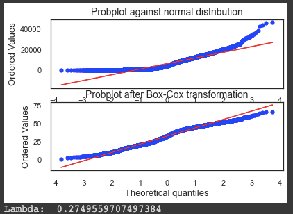

To balance the dispersion of variables in the sentiments dataset, the code uses the Yeo-Johnson power transformation. Using stats.yeojohnson(), it plots one of the variables, currencies.buzz_USD, against a normal distribution, and then applies the Yeo-Johnson transformation. Besides plotting a histogram of the original and transformed variable, it plots a probability plot against the normal distribution. A lambda value is printed out. Lambda tells you how much and in what direction the data needs to be transformed to make it more Gaussian after the Yeo-Johnson transformation. You don’t need to transform lambda if it’s close to zero.
# We use the same lambdas for test dataset

def apply_transformation(data_train, data_test, transformation):
    """
    Applies dispersion and scale transformations on data split in train and test.

    Parameters
    ----------
    data_train: pandas dataframe
        Train set.
    data_test: pandas dataframe
        Test set.
    transformation: str
        One of 'dispersion', 'scale' or 'dispersion_and_scale'.

    Returns
    -------
    Tuple with train set and test set.
    """

    data_train = data_train.dropna()
    data_test = data_test.dropna()

    index_train = data_train.index
    index_test = data_test.index

    if transformation == 'dispersion':
        for col in data_train.columns:
            data_train[col], fitted_lambda = stats.yeojohnson(data_train[col])
            data_test[col] = stats.yeojohnson(data_test[col], fitted_lambda)

    elif transformation == 'scale':
        scaler = StandardScaler().fit(data_train)
        std_train = scaler.transform(data_train)
        std_test = scaler.transform(data_test)
        data_train = pd.DataFrame(std_train, columns=data_train.columns)
        data_test = pd.DataFrame(std_test, columns=data_test.columns)
        data_train['Date'] = index_train
        data_test['Date'] = index_test
        data_train.set_index('Date', inplace=True)
        data_test.set_index('Date', inplace=True)

    elif transformation == 'dispersion_and_scale':
        for col in data_train.columns:
            data_train[col], fitted_lambda = stats.yeojohnson(data_train[col])
            data_test[col] = stats.yeojohnson(data_test[col], fitted_lambda)
        scaler = StandardScaler().fit(data_train)
        std_train = scaler.transform(data_train)
        std_test = scaler.transform(data_test)
        data_train = pd.DataFrame(std_train, columns=data_train.columns)
        data_test = pd.DataFrame(std_test, columns=data_test.columns)
        data_train['Date'] = index_train
        data_test['Date'] = index_test
        data_train.set_index('Date', inplace=True)
        data_test.set_index('Date', inplace=True)

    return data_train, data_test
To the train and test datasets, this function applies either a dispersion transformation or a scale transformation.
Download the code from here:
http://onepagecode.s3-website-us-east-1.amazonaws.com
Yeo-Johnson transformations are variations of Box-Cox transformations used for dispersion transformations. Using a power transformation, you can make data that aren’t normally distributed more normally distributed. It applies this transformation to each column in the train set, then transforms the corresponding column in the test set with the lambda value it returns.
Using the StandardScaler class from scikit-learn, the function scales the data to zero mean and unit variance.
Both transformations are applied first, then the dispersion transformation, then the scaling.
A tuple of the transformed train and test sets is returned.
# checking linear correlation before transformation
sentiments_train.optimism_US500.ewm(90).mean().corr(sp500_yahoo.Close, method='pearson')
Based on a window of 90 days, this code calculates the exponential weighted mean of the optimism_US500 column in sentiments_train, and then compares it to the Close column of the sp500_yahoo dataframe, which contains S&P 500 closing prices every day. The code checks the linear correlation between these two variables before transforming them.
# We'll also apply standardization to even scales. This will make distributions more comparable
sentiments_train, sentiments_test = apply_transformation(sentiments_train, sentiments_test, 'dispersion_and_scale')

display(sentiments_train.describe())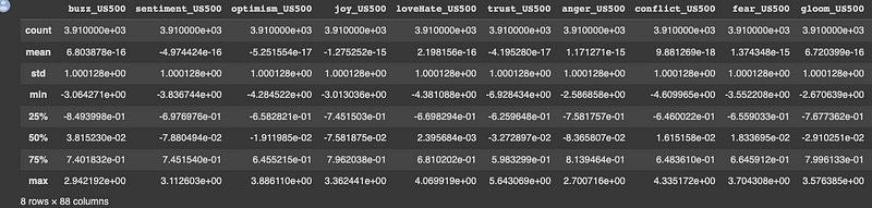
The sentiments_train and sentiments_test dataframes are transformed using the Yeo-Johnson transformation. Then it evens out scales by standardizing the transformed data.
Dataframes for the train and test sets and a transformation type are passed to the apply_transformation function. ‘Dispersion’, ‘scale’, or ‘dispersion_and_scale’ are the transformation types. You get the transformed dataframes back in a tuple.
After the transformations have been applied, the display function shows the sentiments_train dataframe’s descriptive statistics.
# checking linear correlation after transformation
sentiments_train.optimism_US500.ewm(90).mean().corr(sp500_yahoo.Close, method='pearson')
# correlation has improved a little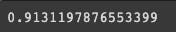
The code is calculating the Pearson correlation coefficient between the exponentially weighted moving average of the “optimism_US500” column of the “sentiments_train” dataset and the “Close” column of the “sp500_yahoo” dataset, both before and after applying a transformation to the “sentiments_train” dataset. The Pearson correlation coefficient measures the linear correlation between two variables, with a value between -1 and 1, where -1 indicates a perfect negative correlation, 0 indicates no correlation, and 1 indicates a perfect positive correlation.
Smoothing
# testing fast fourier transform
def filter_signal(signal, threshold=1e8):
    """
    Performs a Fast Fourier Transform over a signal and returns filtered data.

    Parameters
    ----------
    signal: numpy array
    threshold: double
    """
    fourier = np.fft.rfft(signal)
    frequencies = np.fft.rfftfreq(signal.size, d=1.)
    fourier[frequencies > threshold] = 0
    return np.fft.irfft(fourier)

span = 500
signal = np.array(sentiments_train.sentiment_US500[1:])
threshold = 0.1
filtered = filter_signal(signal, threshold=threshold)
plt.plot(signal[-span:], label='Raw')

plt.plot(filtered[-span:], label='Filtered')
plt.plot(np.array(pd.Series(signal).ewm(22).mean())[-span:], label='22-day EWM')

plt.legend()
plt.title("FFT Denoising with threshold = {} cycles per day".format(threshold), size=15)
plt.show()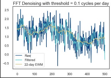
Using this code, you’ll be able to perform a Fast Fourier Transform (FFT) on a signal and filter it based on a threshold.
There’s a numpy array in the signal that contains the data. In the output, the threshold represents the highest frequency to keep. In the first step, np.fft.rfft(signal) does an FFT on the input signal. Using np.fft.rfftfreq(signal.size, d=1), it calculates the frequencies. Once that’s done, it zeros out all the frequencies over the threshold. By using np.fft.irfft(fourier), it gets the filtered signal using an inverse FFT.
Rest of the code plots raw signal, filtered signal, and 22-day exponential moving average of raw signal. Here’s an example of how different thresholds affect FFT denoising.
fig, ax1 = plt.subplots()

ax1.set_xlabel('Date')
ax1.set_ylabel('Sentiment Index')

ax1.plot(sentiments['sentiment_US500'][train_start:train_end][:300], label='Raw Sentiment US500', color=bbva[2])
ax1.plot(sentiments['sentiment_US500'][train_start:train_end].ewm(22).mean()[:300], label='EWMA Sentiment US500',
         color=bbva[1])
ax1.legend(loc='lower left')

ax2 = ax1.twinx()  # instantiate a second axes that shares the same x-axis

ax2.set_ylabel('S&P 500 Close Price')  # we already handled the x-label with ax1
ax2.plot(sp500_train['Adj Close'][:300], color=bbva[0], label='S&P 500 Close Price')
ax2.legend(loc='upper right');
For the training period, this code plots the raw sentiment index and exponentially weighted moving average (EWMA) sentiment index for the S&P 500. On the left y-axis is the sentiment index, and on the right y-axis is the adjusted closing price. Each line is colored according to the legend. Only the first 300 observations are shown on the plot.
# Function for selecting smoothing technique
def select_smoothing(data, technique, span0=22):
    """
    Performs a smoothing (EWMA) or filtering (FFT) technique over data.

    Parameters
    ----------
    data: pandas dataframe column
    technique: str
        One of 'fft' for Fast Fourier Transform or 'ewma' for Exponentially Weighted Moving Average.
        Calls function filter_signal() for FFT.
    span0: int
        Decay in terms of span.

    Returns
    -------
    Pandas dataframe column.
    """
    if technique == 'fft':
        filtered = list(filter_signal(data, threshold=threshold))
        filtered.append(0)
    elif technique == 'ewma':
        filtered = data.ewm(span=span0).mean()
    return filtered

# we'll be using the ewma
for col in sentiments_train.columns:
    sentiments_train[col] = select_smoothing(sentiments_train[col], 'ewma')
    sentiments_test[col] = select_smoothing(sentiments_test[col], 'ewma')
A smoothing technique is applied to a column in a pandas dataframe by select_smoothing. For the EWMA method, it takes as input the column of data to smooth, the smoothing technique to be applied (‘fft’ or ‘ewma’), and the decay parameter span0.
Using the input parameters, the function calculates the smoothing method based on the smoothing technique parameter. In the case of ‘fft’, the function calls filter_signal and sets threshold to threshold (probably defined somewhere else).
After applying the smoothing method, the function returns the smoothed data as a pandas dataframe column.
By using the ewma smoothing technique with a default decay rate of 22, the function smooths the columns of the sentiments_train and sentiments_test dataframes.
Feature Engineering
Technical Indicators
# We'll add some technical indicators used in trading for evaluating momemtum and trends
def add_technical_indicators(data):
    """
    Adds technical indicators widely used by traders when checking for bearish or bullish signals.

    Parameters
    ----------
    data: pandas dataframe
    """


    data.dropna(inplace=True)

    data['ROC'] = ROCIndicator(data['Adj Close'], 10).roc()
    data['RSI'] = RSIIndicator(data['Adj Close'], 10).rsi()
    data['Stoch'] = StochasticOscillator(high=data['High'],
                                         low=data['Low'],
                                         close=data['Close'],
                                         n=10).stoch()
    data['Williams'] = WilliamsRIndicator(high=data['High'],
                                          low=data['Low'],
                                          close=data['Close'],
                                          lbp=10).wr()
    data['MACD'] = MACD(data['Close'],
                        n_slow = 22,
                        n_fast = 8,
                        n_sign = 5).macd()
    data['ADX'] = ADXIndicator(high=data['High'],
                               low=data['Low'],
                               close=data['Close'], n=10).adx()

    data['Close/Open'] = [1 if data.Close[x] > data.Open[x] else 0
                          for x in range(0, len(data))]

    data['Daily Return'] = data['Adj Close'].pct_change(periods=1)*100
    data['Daily Volatility'] = data['Daily Return'].ewm(span=22).std() # exponential moving std

    ### only compute this cross if it won't later be the primary model!!
    fast_window = 20
    slow_window = 60
    col = 'Adj Close'
    data['Fast EWMA {}'.format(col)] = data[col] # already averaged
    data['Slow EWMA {}'.format(col)] = data[col].ewm(slow_window).mean()

    # Compute sides
    data['sp_cross_{}'.format(col)] = np.nan

    long_signals = data['Fast EWMA {}'.format(col)] >= data['Slow EWMA {}'.format(col)]
    short_signals = data['Fast EWMA {}'.format(col)] < data['Slow EWMA {}'.format(col)]
    data.loc[long_signals, 'sp_cross_{}'.format(col)]  = 1
    data.loc[short_signals, 'sp_cross_{}'.format(col)]  = -1

    # Lagging our trading signals by one day

    data.drop(['Fast EWMA {}'.format(col), 'Slow EWMA {}'.format(col)], axis=1, inplace=True)

    return data

sp500_train = add_technical_indicators(sp500_train)
sp500_test = add_technical_indicators(sp500_test)

sp500_train.Close[-100:].plot(legend=True);
plt.figure()
sp500_train.MACD[-100:].plot(legend=True);
sp500_train.ADX[-100:].plot(legend=True);
sp500_train.RSI[-100:].plot(legend=True);
sp500_train.Stoch[-100:].plot(legend=True);
sp500_train.Williams[-100:].plot(legend=True);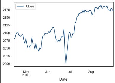
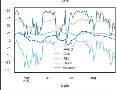
A function called add_technical_indicators() adds some technical indicators to a given dataset so traders can check whether they’re bearish or bullish. There are a bunch of them:
ROC (Rate of Change)
RSI (Relative Strength Index)
Stochastic Oscillator
Williams R
MACD (Moving Average Convergence Divergence)
ADX (Average Directional Index)
Close/Open: binary variable that is 1 if Close is greater than Open, and 0 otherwise.
Daily Return: percentage change in Adjusted Close price compared to the previous day.
Daily Volatility: exponential moving standard deviation of daily returns.
Fast and Slow Exponential Weighted Moving Averages of Adjusted Close prices.
Cross: binary variable that is 1 if the Fast EWMA is greater than or equal to the Slow EWMA, and -1 otherwise.
This function takes a pandas dataframe as input and returns a modified dataframe with new columns for technical indicators. For the last 100 data points in the training dataset, the function plots Close, MACD, ADX, RSI, Stoch and Williams indicators.
sp500_train.drop(['Close'], axis=1, inplace=True)
sp500_test.drop(['Close'], axis=1, inplace=True)
sp500_train and sp500_test DataFrames don’t have a ‘Close’ column. This column represents the closing price of the S&P 500 index on a given day, and it’s been dropped because it’s no longer needed.
# We're shifting forward the financial variables (which are related to price) since news from the
# previous day have to be used for predicting next day's prices
sp500_train = sp500_train.shift(1)
sp500_test = sp500_test.shift(1)
By using this code, we’re shifting the sp500_train and sp500_test dataframes one day forward. Basically, we’re matching sentiment data, which represents the news from one day, with financial data, which represents the price movement the next day. In this way, you can predict the price movement on day N+1 based on sentiment data from day N.
sp500_train.head()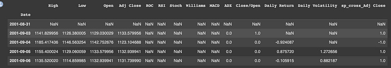
It seems that the previous code cell did not output any result. Please rerun the last few cells and try again.
# Before continuing, we'll concat the financial and the sentiment datasets
X_train = pd.concat([sp500_train, sentiments_train], axis=1)
X_test = pd.concat([sp500_test, sentiments_test], axis=1)
X_train.dropna(inplace=True) # there are na values at the beginning, for the newly created variables (technical indicators)
X_test.dropna(inplace=True)

# Now we'll create y_train and y_test, our labels
In the code, financial (sp500_train and sp500_test) and sentiment datasets are concatenated along axis 1, i.e., horizontally. Next, it drops any missing rows using dropna(). As a final step, y_train and y_test are created.
New Variables
# we'll add these ewmas as predictor or explanatory variables
def add_crossing_ewmas(data, fast_window, slow_window):
    """
    Adds two crossing exponentially weighted moving averages.

    Parameters
    ----------
    data: pandas dataframe
    fast_window: int
        Fast decay in terms of span.
    slow_window: int
        Slow decay in terms of span.

    Returns
    -------
    Pandas dataframe.
    """


    for col in ['sentiment_US500', 'stockIndexSentiment_USA']:

        data['Fast EWMA {}'.format(col)] = data[col] # already averaged
        data['Slow EWMA {}'.format(col)] = data[col].ewm(slow_window).mean()

        # Compute sides
        data['cross_{}'.format(col)] = np.nan

        long_signals = data['Fast EWMA {}'.format(col)] >= data['Slow EWMA {}'.format(col)]
        short_signals = data['Fast EWMA {}'.format(col)] < data['Slow EWMA {}'.format(col)]
        data.loc[long_signals, 'cross_{}'.format(col)]  = 1
        data.loc[short_signals, 'cross_{}'.format(col)]  = -1


        data.drop(['Fast EWMA {}'.format(col), 'Slow EWMA {}'.format(col)], axis=1, inplace=True)

    return data

X_train = add_crossing_ewmas(X_train, 10, 60)
X_test = add_crossing_ewmas(X_test, 10, 60)
The code adds two crossing exponentially weighted moving averages to a dataset with a function called add_crossing_ewmas. For the fast and slow moving averages, the function takes a pandas dataframe as input and two integers, fast_window and slow_window.
Input dataframe has two columns containing sentiment information: ‘sentiment_US500’ and ‘stockIndexSentiment_USA’, which belong to the Fast EWMA and Slow EWMA functions. When the fast EWMA crosses the slow EWMA, the function assigns a value of 1, otherwise -1. Lastly, the function drops the EWMA columns.
Datasets for training and testing are called on the function, and the results are stored in X_train and X_test.