

Predicting Tesla: Machine Learning Meets Stock Market Strategies
Discover How Cutting-Edge Algorithms and Trading Strategies Can Turn Historical Data Into Profitable Insights

Source code link at the end.
In the fast-paced world of stock trading, the ability to predict market movements can offer a significant edge. This article dives into the intersection of machine learning and technical analysis to forecast Tesla’s stock performance. By combining advanced algorithms like ARIMA, LSTM, and XGBoost with classic trading indicators such as Moving Averages, RSI, and Bollinger Bands, the aim is to reveal patterns and insights hidden within historical data. Additionally, sentiment analysis on Tesla’s news headlines adds another layer of predictive power, offering a comprehensive approach to stock market forecasting.
import pandas_datareader as pdr
import os
import numpy as np
import pandas as pd
import matplotlib.pyplot as plt
import seaborn as sns
import warnings
from importlib import reload
from features_engineering import ma7, ma21, rsi, macd, bollinger_bands, momentum, get_tesla_headlines

from bs4 import BeautifulSoup
import requests
from nltk.sentiment.vader import SentimentIntensityAnalyzer
warnings.filterwarnings('ignore')
plt.rcParams['figure.dpi'] = 227 # native screen dpi for my computer
As part of a stock forecasting project that includes feature engineering, this code snippet sets up the environment. Pandas_datareader fetches financial data, numpy and pandas manipulate data, and matplotlib and seaborn plot and chart. In addition, it computes technical indicators like moving averages, relative strength index, moving average convergence divergence, and Bollinger Bands, which are critical for feature engineering.
For web scraping and sentiment analysis, the code imports BeautifulSoup for HTML parsing, requests for HTTP requests, and SentimentIntensityAnalyzer from the NLTK library for analyzing Tesla news headline sentiment. Matplotlib figures are set to 227 DPI by default to enhance visual display quality. Warnings are suppressed.
tsla_df = pdr.get_data_yahoo('tsla', '1980')
tsla_df.to_csv('data/raw_stocks.csv')
Tesla’s historical stock data can be retrieved from Yahoo Finance using the pandas_datareader library. This function retrieves Tesla data since 1980, including daily stock prices, volume, and other financial metrics. In the data directory, the data is saved as raw_stocks.csv for offline analysis and processing.
tsla_df.head()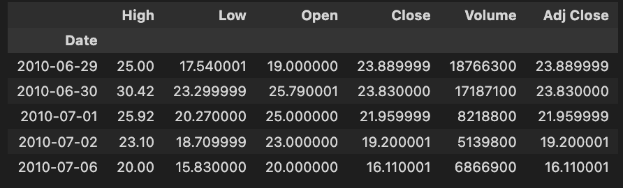
The code snippet tsla_df.head() shows the first rows of a DataFrame called tsla_df containing historical Tesla stock data. It allows users to quickly inspect the DataFrame’s structure and contents.
High, Low, Open, Close, Volume, and Adjust Close are included in the output. There are rows for each date, indicating key metrics for Tesla’s stock. High represents the highest price for the day, while Low indicates the lowest price. The Open column shows the opening price, and the Close column shows the closing price. Shares traded and adjusted closing prices, based on dividends and stock splits, are represented by the Volume column.
In June 2010, Tesla’s stock reached a high of 25.00, a low of 17.54, opened at 19.00, closed at 23.89, and traded 1,876,630 shares. Stock forecasting models use this data to analyze and predict future stock performance based on historical context and trends. A structured format helps analysts and data scientists identify patterns and make informed decisions.
tesla_df.describe()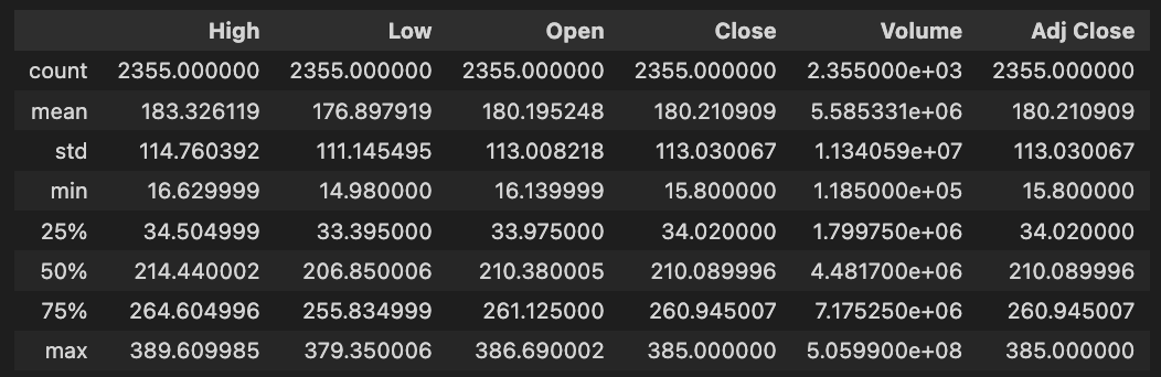
DataFrame tesla_df.describe() generates descriptive statistics for Tesla’s historical stock data. With this method, NaN values are excluded from key statistical measures for each numerical column, including High, Low, Open, Close, Volume, and Adjusted Close.
In the dataset, there are 2,355 entries per column. High prices average about 183.33, with a standard deviation of about 114.76. Tesla’s stock price fluctuates between 16.63 and 389.61. Close prices average around 180.21, with maximums of 385.00.
Approximately 5.58 million shares were traded on average, with a maximum volume of 505.99 million shares, indicating significant trading activity. Assuming dividends and stock splits, the Adjusted Close price averages 180.21, with a maximum of 385.00. The quartiles for each column provide insights into data distribution, trends, and potential outliers. To develop stock forecasting models, this descriptive analysis is essential for understanding Tesla’s historical stock performance.
print('No missing data') if sum(tesla_df.isna().sum()) == 0 else tesla_df.isna().sum()Using the tesla_df DataFrame, which is used for feature engineering in stock forecasting models, the code checks for missing data. In order to count missing values per column and to total these counts, it uses the isna() method. The column counts are displayed if there are no missing values; otherwise, the column count is printed. To build accurate stock forecasting models, it is essential to ensure that there are no missing values in the data.
#del stocks
files = os.listdir('data/raw_stocks')
stocks = {}
for file in files:
    name = file.lower().split('.')[0]
    stocks[name] = pd.read_csv('data/raw_stocks/'+file)

    # Return Feature
    stocks[name]['Return'] = round(stocks[name]['Close'] / stocks[name]['Open'] - 1, 3)
    # Change Feature
    # Change of the price from previous day, absolute value
    stocks[name]['Change'] = (stocks[name].Close - stocks[name].Close.shift(1)).fillna(0)
    # Date Feature
    stocks[name]['Date'] = pd.to_datetime(stocks[name]['Date'])
    stocks[name].set_index('Date', inplace=True)
    # Volatility Feature
    stocks[name]['Volatility'] = stocks[name].Close.ewm(21).std()
    # Moving Average, 7 days
    stocks[name]['MA7'] = ma7(stocks[name])
    # Moving Average, 21 days
    stocks[name]['MA21'] = ma21(stocks[name])
    # Momentum
    stocks[name]['Momentum'] = momentum(stocks[name].Close, 3)
    # RSI (Relative Strength Index)
    stocks[name]['RSI'] = rsi(stocks[name])
    # MACD - (Moving Average Convergence/Divergence)
    stocks[name]['MACD'], stocks[name]['Signal'] = macd(stocks[name])
    # Upper Band and Lower Band for Bollinger Bands
    stocks[name]['Upper_band'], stocks[name]['Lower_band'] = bollinger_bands(stocks[name])
    stocks[name].dropna(inplace=True)
    # Saving
    stocks[name].to_csv('data/stocks/'+name+'.csv')

stocks['tsla'].head()
A dictionary is initialized with an empty stock name for each file in the data/raw_stocks directory to store the stock data. This code loads and preprocesses stock data. Using Pandas, it reads the CSV file into a DataFrame and stores the stock name. It then converts the filename to lowercase and removes the extension for each file.
A daily return is calculated by dividing the closing price by the opening price, subtracting one, and rounding to three decimal places for every stock. Daily price changes are calculated as the difference between the closing prices of the previous and current days. For better chronological handling, the Date column is converted to a Pandas datetime object and set as the index.
Extensive weighted moving standard deviation is used to estimate volatility. Using separate functions, two moving averages are calculated: one for 7 days and another for 21 days. The Relative Strength Index identifies overbought or oversold conditions based on closing prices over a 3-day period. Custom functions are used to determine the Moving Average Convergence/Divergence line, Signal line, and Bollinger Bands.
We remove NaN values from all features after creating them. In the data/stocks directory, the updated DataFrames for each stock are saved as CSV files. In the last line, we show the first few rows of the Tesla DataFrame as a preview.
headlines_list, dates_list = [], []
for i in range(1, 120):
    headlines, dates = get_tesla_headlines("https://www.nasdaq.com/symbol/tsla/news-headlines?page={}".format(i))
    headlines_list.append(headlines)
    dates_list.append(dates)
    time.sleep(1)
From a Nasdaq news page, this code snippet scrapes headlines and dates about Tesla. A loop runs from 1 to 119, requesting the news page for each page number. In the get_tesla_headlines function, the headlines and associated dates are retrieved for the current page. The retrieved headlines and dates are added to headlines_list. A one-second delay between each request helps maintain respectful interaction with the source website and minimizes the risk of blocking.
tesla_headlines = pd.DataFrame({'Title': [i for sub in headlines_list for i in sub], 'Date': [i for sub in dates_list for i in sub[:10]]})Two columns are created in the Pandas DataFrame tesla_headlines: Title and Date. The Title column is filled by flattening headlines_list. In order to ensure that the dates correspond correctly to the headlines, a similar method is used for iterating through dates_list, capturing the first ten entries from each sublist. By merging the two lists, we create a structured format suitable for further analysis or stock forecasting operations.
sid = SentimentIntensityAnalyzer()Using this line of code, the VADER sentiment analysis tool initializes the SentimentIntensityAnalyzer class. By assessing whether sentiment is positive, negative, or neutral, it provides a score based on that sentiment. Through an instance called sid, you can analyze various text inputs and extract sentiment scores, which can be helpful for understanding market sentiment and improving stock forecasting.
tesla_headlines['Sentiment'] = tesla_headlines['Title'].map(lambda x: sid.polarity_scores(x)['compound'])
tesla_headlines.Date = pd.to_datetime(tesla_headlines.Date)
tesla_headlines.to_csv('data/tesla_headlines.csv')
A DataFrame with headlines about Tesla is processed in this code. A sentiment score is obtained for each headline by applying sentiment analysis to the Title column using sid.polarity_scores(x)[‘compound’]. Sentiment is a new column that summarizes the overall sentiment, ranging from negative to positive. In order to ensure compatibility with any future time-series analysis, the Date column is converted to a datetime format. A CSV file named tesla_headlines.csv is created to preserve the results for further analysis or training of the model.
tesla_headlines.head()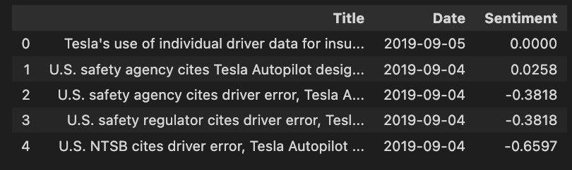
In the code snippet tesla_headlines.head(), the first few rows are displayed from a DataFrame named tesla_headlines, which contains news headlines and associated metadata. Each headline is represented by a different entry. In the first column, titled Title, the headlines are contained, with the first mentioning Tesla’s insurance use of individual driver data, while others refer to safety agency citations about Tesla’s Autopilot. This column indicates the publication dates, from September 4 to September 5, 2019, which is important for analyzing stock forecasting trends.
From negative to positive, the Sentiment column measures each headline’s sentiment. 0 indicates neutral sentiment, while negative scores such as -0.3818 and -0.6597 indicate negative sentiment. In order to understand how news impacts stock prices, sentiment analysis is crucial, as negative headlines may predict a decline in stock value, whereas positive headlines may signal an increase.
In general, this code snippet and its output are important for stock forecasting projects focusing on feature engineering, as they enable a structured analysis of Tesla stock performance based on news sentiment, which can enhance trading strategies and predictive models.
Exploratory Data Analysis
Importing Libraries
import os
import pandas as pd
import matplotlib.pyplot as plt
import seaborn as sns
import warnings
import plotting
import statsmodels.api as sm
from importlib import reload
import numpy as np
import operator
warnings.filterwarnings('ignore')
plt.rcParams['figure.dpi'] = 227 # native screen dpi for my computer
For data analysis and visualization, this code snippet imports several libraries. OS is used to interact with the operating system, primarily to manipulate file paths. Pandas helps manipulate and analyze dataframes efficiently. The plotting is done with Matplotlib.pyplot and seaborn, with seaborn adding enhanced statistical graphics. Warnings suppress warning messages, ensuring cleaner output. It appears that plotting is a custom module with specific functions. Statsmodels.api provides a statistical model for testing hypotheses on stock data. Importlib.reload allows reloading a modified module without restarting Python. Numpy handles numerical operations, which are important for large datasets. Operator provides efficient comparison and logic functions. Lastly, the configuration line sets the default plot resolution to 227 dots per inch for sharp and clear visualization.
Retriving Data
files = os.listdir('data/stocks')
stocks = {}
for file in files:
    # Include only csv files
    if file.split('.')[1] == 'csv':
        name = file.split('.')[0]
        stocks[name] = pd.read_csv('data/stocks/'+file, index_col='Date')
        stocks[name].index = pd.to_datetime(stocks[name].index)
To store data from CSV files, this code snippet first lists all files in the data/stocks directory and creates a dictionary called stocks. Each file name in the file list is then iterated through, checking for .csv extensions. Using pd.read_csv to read a valid CSV file, it indexes the stock name using the Date column. In order to simplify date manipulations and time series operations, the code converts the index to a datetime format using pd.to_datetime. Finally, the DataFrame is stored in the stocks dictionary using the stock name as the key.
List of Stock
print('List of stocks:', end=' ')
for i in stocks.keys():
    print(i.upper(), end=' ')
It first prints the string List of stocks followed by a space to provide context for the output. A for loop iterates over the keys of the stock dictionary, converting each stock symbol to uppercase using the upper method and printing it with a space afterwards. In the print function, end=’ ‘ keeps the output on one line.
CSCO, ORCL, and EBAY all appear in uppercase, as is standard for stock symbols. Various companies are featured on the list, representing a diverse selection. By using this output, users can easily identify stocks relevant to exploratory data analysis for stock forecasting. The code is effective in formatting and presenting the stock symbols, highlighting the analysis scope clearly.
stocks[‘tsla’].head()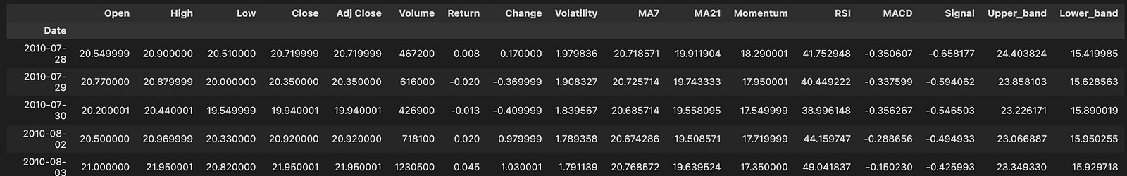
Using stocks[‘tsla’].head(), you can retrieve the first five rows of data for Tesla stock from a DataFrame named stocks.
There are multiple columns in the output representing stock data attributes. A stock’s performance is analyzed using standard stock market data such as Open, High, Low, Close, Adjusted Close, and Volume. An open price indicates an opening price, a close price indicates a closing price, and a volume shows the number of shares traded.
For trend analysis and prediction, the output includes calculated metrics such as Return, Change, Volatility, Moving Averages, and Momentum. The return shows the percentage change in stock price, volatility measures price variation, Moving Averages smooth out price data to highlight trends, and momentum measures price movement strength.
Last but not least, the output includes technical indicators like RSI, MACD, and Bollinger Bands. The RSI can be used to determine overbought or oversold conditions, while MACD can indicate trend reversals.
Check for Correlation
stocks['tsla'].corr()[['Return']].sort_values(by='Return', ascending=False)[:5]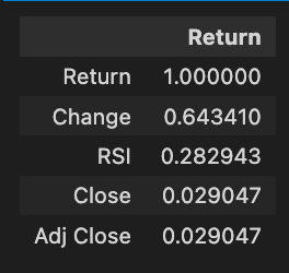
A correlation matrix is obtained and the relationships between Tesla stock return and metrics such as change, RSI, close, and adjusted close are analyzed. A perfect correlation value of 1.000000 is achieved between the return and itself. Statistically, the change metric correlates with the return with 0.643410, indicating that as the stock price changes, the return tends to increase as well. With a correlation of 0.282943, the RSI indicates a weaker prediction of Tesla’s returns. It is not significant to predict return by the close and adjusted close prices, which exhibit a correlation of 0.029047. Higher correlations indicate more reliable predictors of future returns, providing valuable insights for forecasting and investment decisions.
plt.rcParams['figure.dpi'] = 227
plt.figure(figsize=(18,14))
sns.heatmap(stocks['tsla'].corr(), annot=True, fmt='.2f')
plt.ylim(17, 0)
plt.title('Correlation Between Tesla Features', fontSize=15)
plt.show()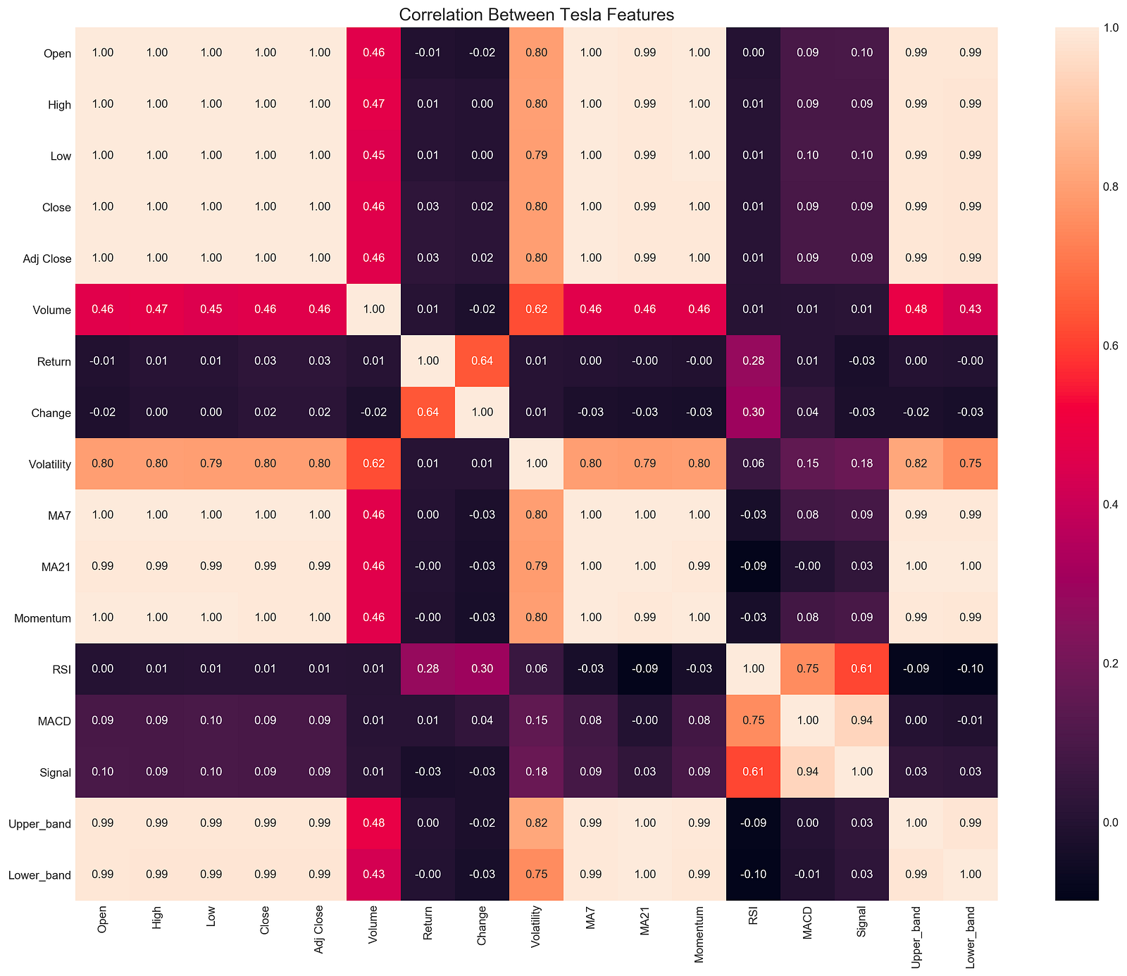
With this code snippet, you can analyze Tesla’s stock data for correlations. It sets the DPI to 227 for high-quality output and creates a large figure with plt.figure. Seaborn’s sns.heatmap function generates a heatmap of the correlation matrix derived from stocks[‘tsla’].corr(), which calculates pairwise correlations between DataFrame columns.
An analysis of correlation coefficients between -1 and 1 shows strong positive correlations, strong negative correlations, and no correlations. Using plt.ylim(17, 0), the y-axis is reversed, and the title provides context. The annotations are formatted to two decimal places for easy interpretation.
The correlation between volatility and open prices is significant at 0.80, suggesting that volatility leads to higher opening prices. There is a perfect correlation of 1.00 between MA7 and MA21 moving averages, indicating consistent moves. The correlation between change and return is 0.64, suggesting that stock price changes and returns are closely related. Other features like RSI and MACD show varying degrees of correlation, which can help traders and analysts understand market dynamics.
An exploratory data analysis heatmap is a valuable tool for identifying relationships between stock features that can be used to build trading strategies.
Bollinger Bands, RSI, MACD, Volume
plotting.bollinger_bands(stocks['tsla'].loc['2018':'2018'])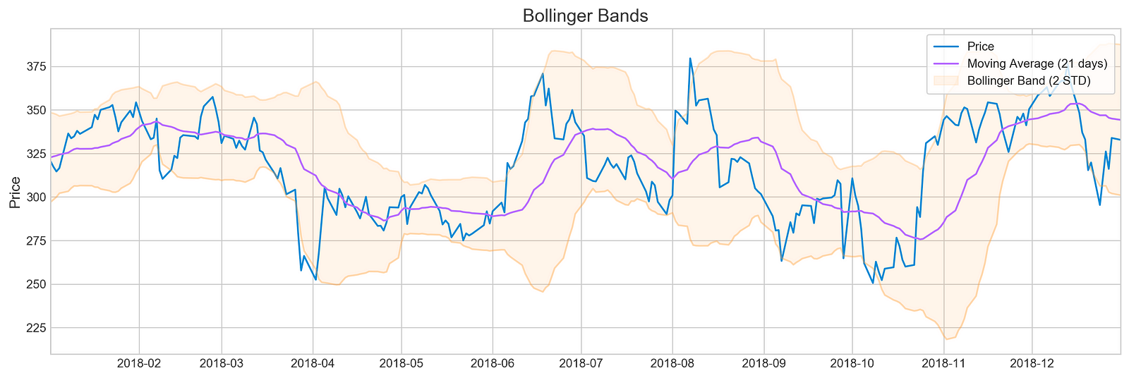
For Tesla’s stock prices in 2018, the code snippet visualizes Bollinger Bands using a plotting library’s bollinger_bands function. A Bollinger Band is made up of the middle band, which is the moving average, and two outer bands, which are standard deviations from it. For a clearer view of the stock’s trend, the moving average is calculated over 21 days.
There are three components in the output image: the stock price, a moving average, and Bollinger Bands. The blue line illustrates Tesla’s stock price over time. By averaging stock prices for the specified period, the purple line indicates the 21-day moving average. Symbolizing the stock’s volatility, the Bollinger Bands are situated two standard deviations above and below the moving average. Overbought may indicate oversold, while oversold may indicate overbought. A comparison of the output indicates periods of high volatility, when the price deviates significantly from the moving average, as well as periods of relative stability. Trading decisions can be based on historical performance and volatility with this visualization. It provides an effective tool to analyze Tesla’s stock behavior in 2018 and inform investment strategies.
plotting.rsi(stocks['tsla'].loc['2018':'2018'])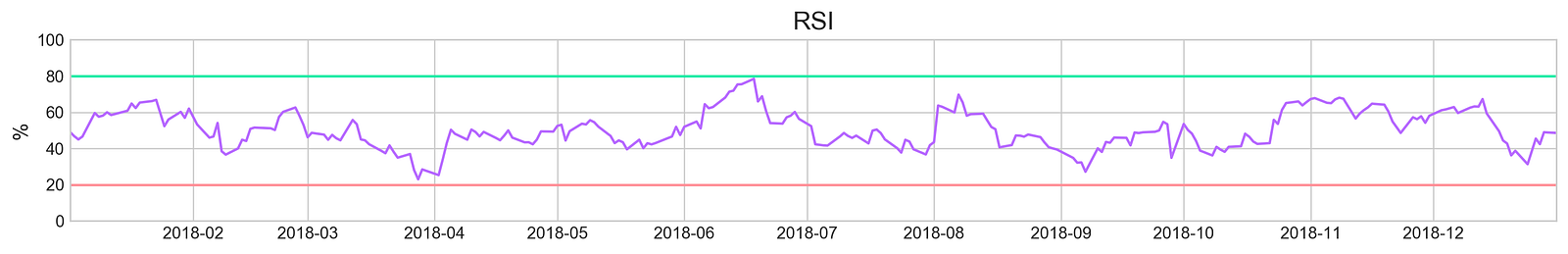
With the plotting.rsi function, the RSI is visualized for Tesla’s stock data in 2018. RSI is a momentum oscillator that can be used to identify overbought or oversold market conditions based on price movements. A line graph of Tesla RSI values for the year is generated from a subset of Tesla stock data filtered for 2018. A horizontal line at 30% and 70% represents the RSI threshold in RSI analysis, while a y-axis indicates the RSI percentage from 0 to 100. As a result of an RSI above 70, the stock may be overbought, signaling a price correction, and as a result of a value below 30, the stock may be oversold, signaling an increase in price. Throughout the year, RSI fluctuations. There are times when Tesla’s stock crosses the 70% line, suggesting overbought, and other times when it dips below 30%, suggesting oversold. By reflecting 2018’s market sentiment and performance, this visualization provides traders with valuable insights.
plotting.macd(stocks['tsla'].loc['2018':'2018'])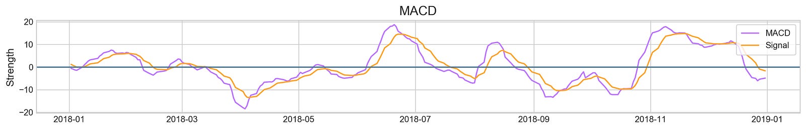
By extracting specific data and creating a visual representation, the code snippet analyzes Tesla’s stock performance for 2018. MACD and signal lines are shown in purple. The MACD line indicates momentum by comparing the 12-day and 26-day exponential moving averages. Bullish momentum is indicated by values above zero, while bearish momentum is indicated by values below zero. EMA crossovers above or below the signal line indicate buying, while crossovers below indicate selling. MACD values are interpreted using the horizontal blue line at zero. Throughout 2018, MACD values fluctuate around this baseline, reflecting periods of bullish and bearish momentum. Investors can use this interaction between MACD and signal lines to make informed decisions based on momentum and potential future movements.
plotting.volume(stocks['tsla'].loc['2018':'2018'])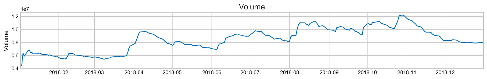
A plotting.volume function visualizes Tesla’s trading volume from January 1, 2018, to December 31, 2018. Data from the stocks DataFrame is filtered to include only the entries from January 1, 2018, to December 31, 2018. With trading volume in millions and time on the x-axis, this line graph covers the entire year and illustrates the stock’s trading activity. Trading volume is represented by peaks, indicating periods of high interest or significant market events, and troughs, indicating periods of low activity. By analyzing trading volume, analysts can identify trends and patterns that could influence future stock forecasts and investments. Observing these patterns helps analysts gain insights into market behavior and stock performance.
plt.figure(figsize=(14,5))
plt.style.use('seaborn-whitegrid')
for i in range(1,13):
    volatility = stocks['tsla'][stocks['tsla'].index.month==i].Return
    sns.distplot(volatility, hist=False, label=i)
    plt.legend(frameon=True, loc=1, ncol=3, fontsize=10, borderpad=.6, title='Months')
plt.axvline(stocks['tsla'].Return.mean(), color='#666666', ls='--', lw=2)
plt.xticks(plt.xticks()[0] + stocks['tsla'].Return.mean())
plt.title('Tesla Return by Month', fontSize=14)
plt.show()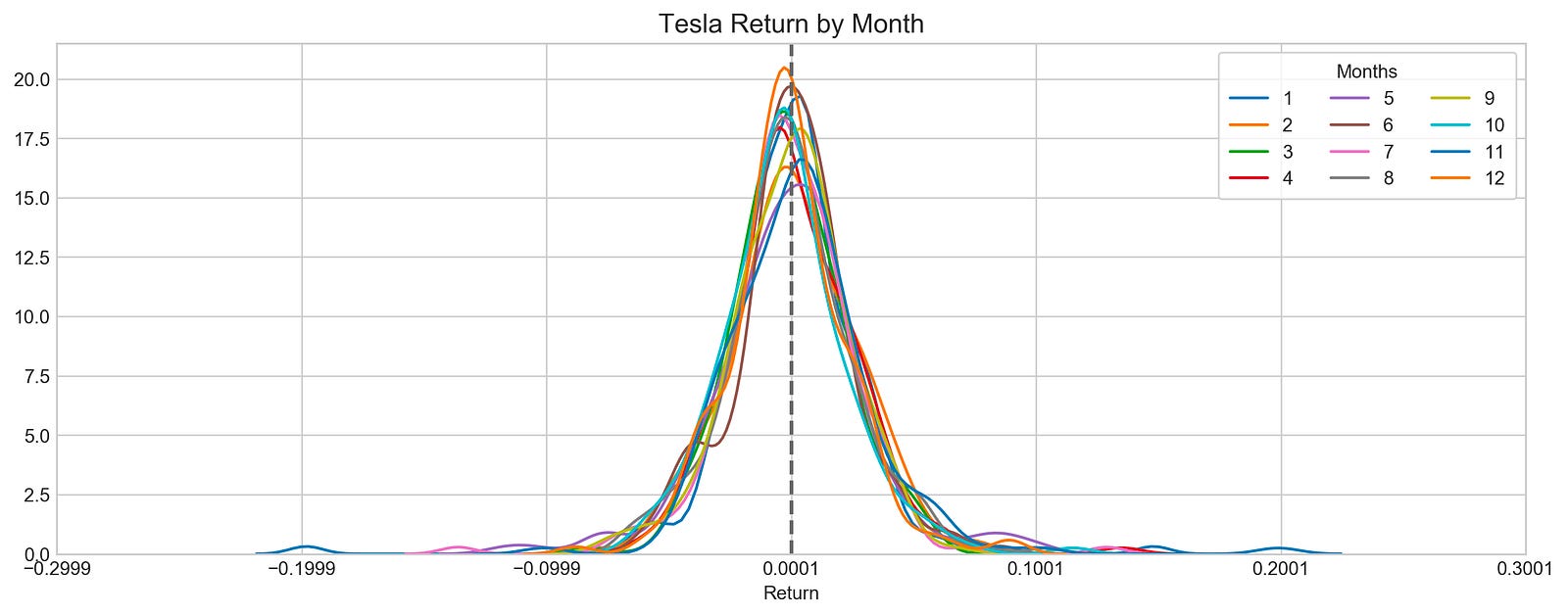
With this code, Tesla’s stock returns are visualized. The code starts by creating a figure with specific dimensions and an appealing style, and then loops through each month and extracts Tesla’s stock returns. Each month is represented in a different color in the sns.distplot function, which allows for comparative analysis of distribution.
As a reference point, a vertical dashed line indicates the mean return, which serves as a reference point to evaluate the data. The plot title indicates that it visualizes Tesla’s returns by month. The x-ticks are adjusted to center around the mean return for better clarity. Each month’s data is represented by distinct curves, revealing Tesla’s returns distribution. A curve’s peak indicates its most common return value, while its spread indicates its volatility. By comparing each month’s distribution with the overall average, the vertical mean line allows Tesla’s stock performance to be understood and exploratory data analysis for forecasting can be performed.
plotting.compare_stocks(stocks, value='Return', by='day', scatter=False)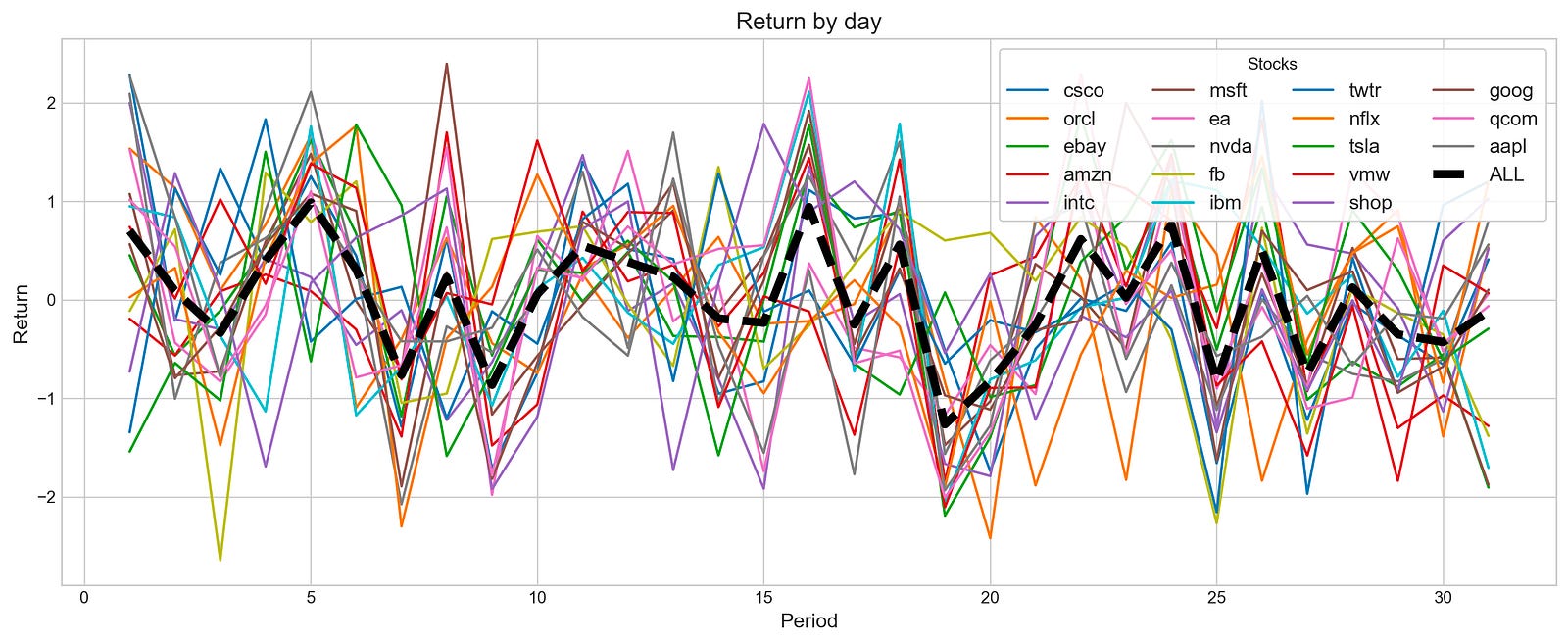
With a value parameter of Return and a by parameter of day, this function creates a line plot to visualize the daily return fluctuations over a specified period for various stocks. By setting the scatter parameter to False, a line plot is produced, which is more effective for observing trends.
Multiple lines appear in the output image, each representing a stock’s daily return. The x-axis shows the days, and the y-axis shows the percentage change in the stock price. A bold black line labeled ALL indicates the aggregate returns of all stocks, highlighting overall performance trends. As the lines display significant fluctuations, it is possible to observe stock return volatility over time. In general, the black line emphasizes general trends, revealing periods of growth and decline across stocks. This visualization aids investors and analysts in assessing individual stock performances according to market behavior.
stocks_return_correlation = {}

plt.rcParams['figure.dpi'] = 227
plt.figure(figsize=(16,6))
plt.style.use('seaborn-whitegrid')
for i in stocks:
    stocks_return_correlation[i] = stocks[i].loc['2018-9':'2018-10'].Return
    plt.plot(stocks[i].loc['2018-9':'2018-10'].Return, label=i)
    plt.legend(frameon=True, loc=1, ncol=4, fontsize=10, borderpad=.6)
plt.title('Stocks Return - September 2018', fontSize=15)
plt.xlabel('Date', fontSize=13)
plt.ylabel('Return', fontSize=13)
plt.axhline(0, c='k', lw=2, ls='--')
plt.show()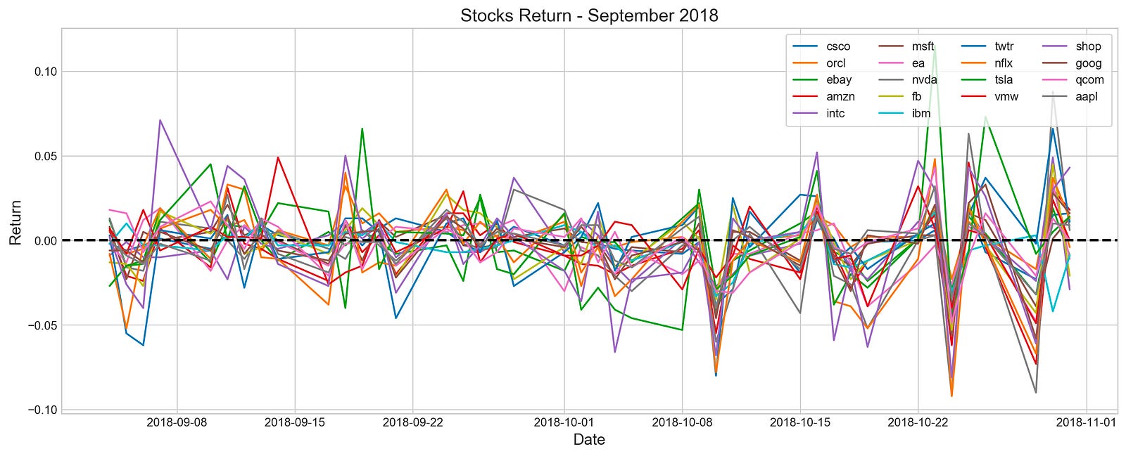
In this code, various stocks’ returns from September to October are visualized. A dictionary is created to store return data, and the plot’s resolution and style are configured, and then iteratively retrieves return data from a list of stocks and plots it on a graph. Legends display stock names, and axes are labeled, and the baseline return is represented by a horizontal line at zero.
Line graphs illustrate the daily returns of multiple stocks during the selected period. Each line is colored differently to make identification easier. The x-axis shows dates, while the y-axis shows return values, with a dashed horizontal line at zero indicating positive or negative returns. Stock returns fluctuate around the zero line, indicating periods of gains and losses. The data provides insights into stock performance trends and correlations during this timeframe, which can be used for stock forecasting exploratory data analysis.
plt.figure(figsize=(18,12))
sns.heatmap(pd.DataFrame(stocks_return_correlation).corr(), annot=True)
plt.ylim(17, 0)
plt.title('Correlation Between NASDAQ Stocks', fontSize=15)
plt.show()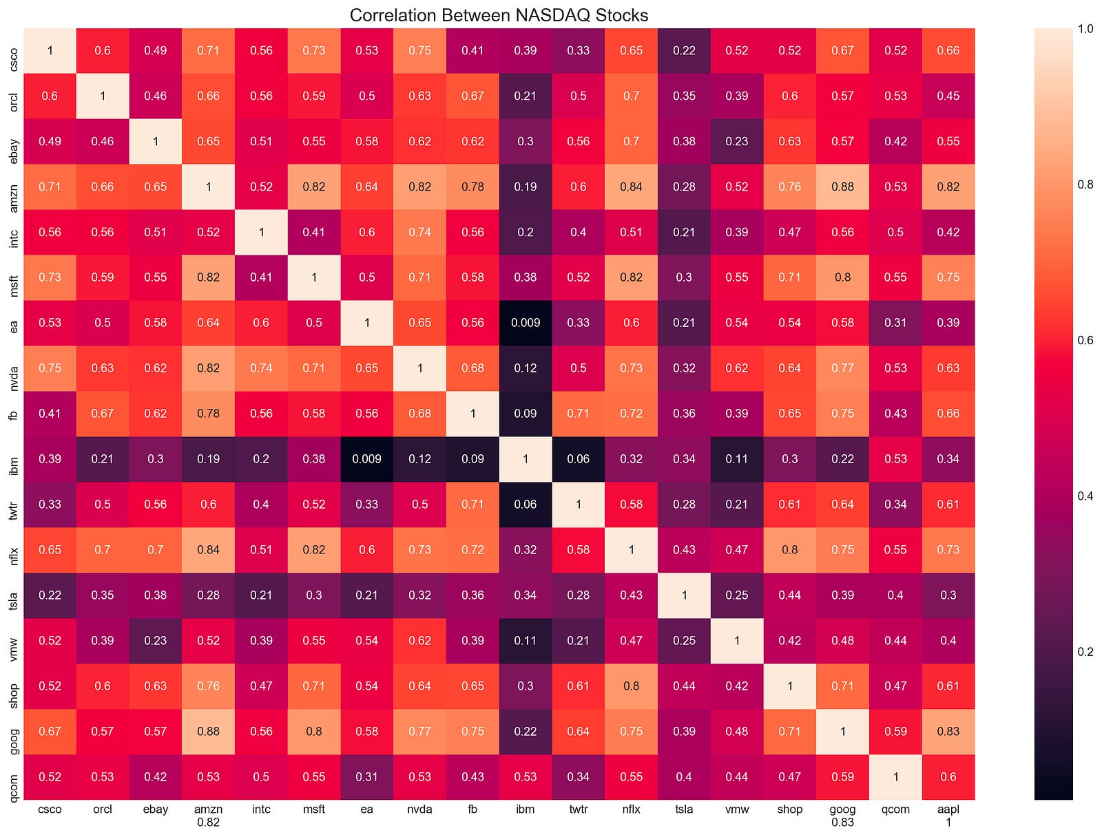
The code snippet generates a heatmap to visualize the correlation between NASDAQ stock returns. Heatmaps are generated using the Seaborn library’s heatmap function based on the correlation matrix from stock returns. With the annot parameter set to true, correlation coefficients are displayed directly on the heatmap.
With plt.ylim(17, 0), the y-axis limits are flipped to place the first stock at the top of the heatmap. The title, Correlation Between NASDAQ Stocks, is displayed in a font size of 15. The heatmap is rendered using plt.show(). Each cell on the output matrix indicates the correlation coefficient between two stocks. 0 is a minimal correlation, -1 indicates a perfect negative correlation, and 1 indicates a perfect positive correlation. The color gradient visually represents these correlations, with darker shades indicating stronger correlations. Amazon and Microsoft have a high positive correlation of 0.82, whereas EA and NVA have a low correlation of 0.009, showing minimal movement correlation. Assisting portfolio diversification and risk management strategies, this visualization highlights stocks with similar or different behaviors.
stocks_corr = {}

for i in stocks:
    stock1 = stocks[i].loc['2018':'2019'].Return
    c = {}
    for j in stocks:
        stock2 = stocks[j].loc['2018':'2019'].Return
        if i != j :
            c[j] = np.corrcoef(stock1, stock2)[0][1]
    m = max(c.items(), key=operator.itemgetter(1))
    stocks_corr[(i+"-"+m[0])] = [m[1]]
Stocks_corr contains an empty dictionary to store the results. It loops through the stocks collection by retrieving the return values for each stock for the specified years and storing them as stock1. Another empty dictionary, c, is created to hold correlation values between this stock and all others.
A correlation coefficient between stock1 and stock2 is calculated in the inner loop, and stored in the dictionary c with stock2 as a key if the stocks are not the same. The code analyzes all stocks based on the current stock and finds the stock with the highest correlation value by using max() and operator.itemgetter(1). Stocks_corr contains the maximum correlation and its corresponding stock in a dictionary with a key format stock1-stock2 and correlation values. Based on the maximum correlation between two stocks during the specified time frame, this code reveals how closely these stocks move together.
pd.DataFrame(stocks_corr).T.sort_values(by=0, ascending=False).head(10)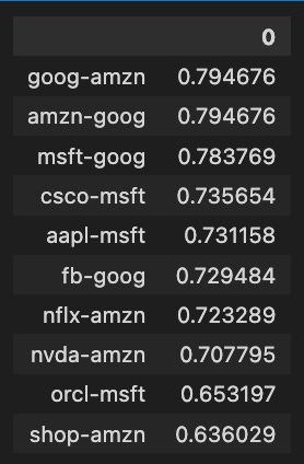
The code snippet analyzes a correlation matrix of stock returns, focusing on the relationships between different stocks. Afterward, the top ten pairs of stocks with the highest correlation coefficients are retrieved using a pandas DataFrame, transposed, and sorted descendingly based on the first column.
Among the ten highest correlation values between stock pairs, Amazon-Google, and Amazon-Amazon have a correlation value of approximately 0.7947, indicating a strong positive relationship. There are also strong correlations between Microsoft-Google and Cisco-MSFT, with correlation values of 0.7837 and 0.7356, respectively. Higher correlation coefficients indicate stronger relationships, ranging from approximately 0.6360 to 0.7947. In addition to helping investors and analysts identify stocks that move together, this analysis also provides insight into market trends and economic impacts on related stocks.
plt.figure(figsize=(16,6))

s = stocks['tsla'].loc['2018-7':'2018']
u = s.High.ewm(7).mean()
l = s.Low.ewm(7).mean()
plt.fill_between(s.index, u, l, color='#af43af', alpha=0.1, label='High / Low')
plt.plot(s.Close, color='#aa43af', label='Price')
plt.plot(s.Close.ewm(7).mean(), color='#ff43af', label='Moving Average (7 Days)')
plt.legend(frameon=True, loc=1, borderpad=.6)
plt.title('Tesla Close and High-Low', fontSize=15)
plt.show()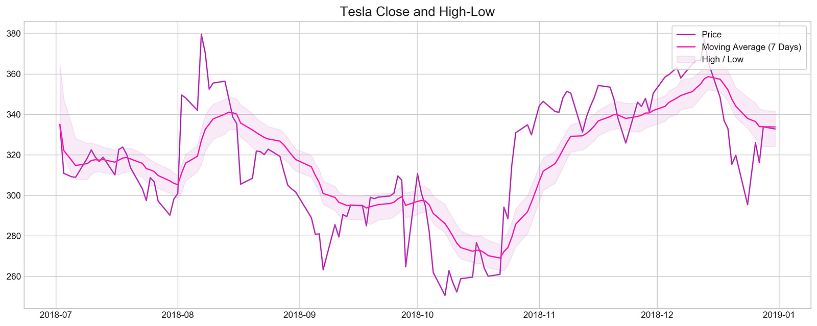
By setting the figure size to ensure clarity, the code visualizes Tesla’s closing prices and high-low ranges during 2018. The stock data is filtered to include only dates from July 2018 through December 2018. By smoothing out short-term fluctuations, this code highlights longer-term trends by calculating exponential moving averages over a seven-day period. To illustrate stock volatility during this period, the fill_between function shades an area between the high and low EMAs. For easy comparison with the high-low range, the closing prices are plotted in darker purple, while the seven-day moving average is highlighted in bright pink. Tesla’s stock behavior from mid-to-late 2018 can be understood by the plot title and overall layout, which illustrate the relationship between closing prices and high-low ranges.
z = lambda x: (x - x.mean()) / x.std()

plt.hist(z(stocks['tsla'].Return), bins=30)
plt.title('Tesla Return Distribution', fontSize=15)
plt.show()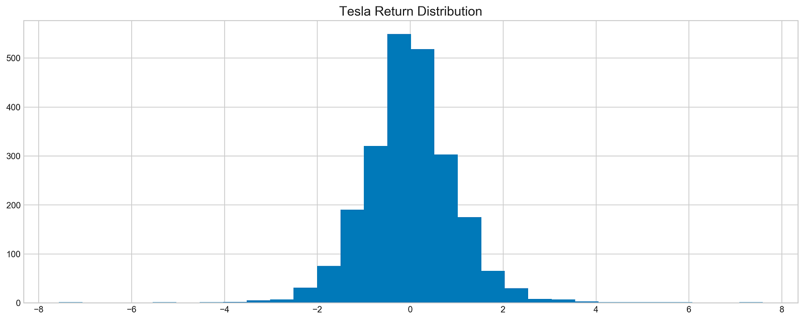
Tesla stock returns are standardized by subtracting the mean and dividing by the standard deviation in the code. This results in a dataset with a mean of 0 and a standard deviation of 1, making it easy to compare returns. A histogram illustrating how these standardized returns are distributed is generated by plt.hist using the Tesla stock DataFrame ‘Return’ column. For clarity, the title, Tesla Return Distribution, labels the plot. The x-axis shows the standardized return values, and the y-axis shows the frequency of occurrences for each bin. An approximately normal distribution can be seen in the histogram, where the majority of returns cluster around the mean. Tesla’s stock returns will be better understood with this visualization, which provides insight for exploratory data analysis.
plt.figure(figsize=(16,6))
plt.rcParams['figure.dpi'] = 227
sm.qqplot(stocks['tsla'].Return, line='s', scale=1)
plt.rcParams['figure.figsize'] = [16.0, 6.0]
plt.title('Normality', fontSize=15)
plt.show()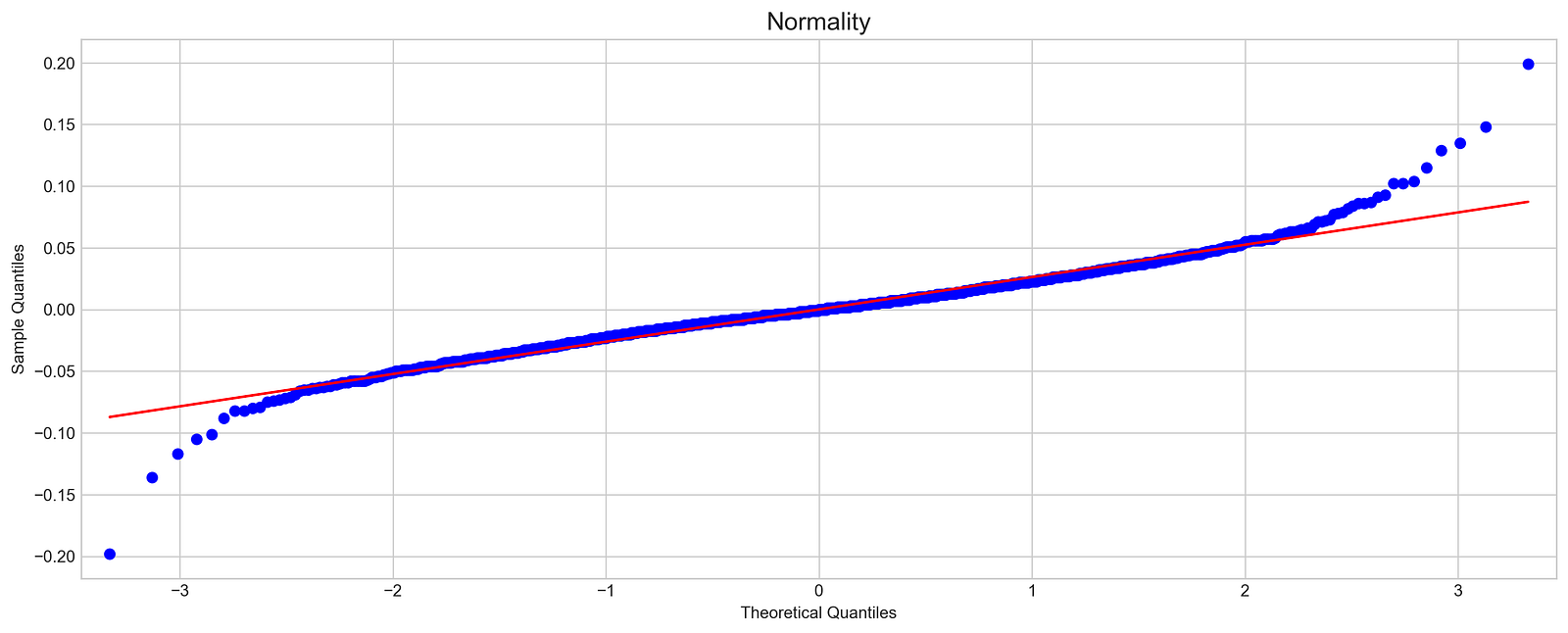
In this code, the normality of Tesla stock returns is assessed with a quantile-quantile plot. A standard normal distribution is used to compare Tesla returns to a sample quantile plot of 16 by 6 inches. The scale is set appropriately for the data, and a reference line indicates where data points would fall if they were normally distributed.
Using the QQ plot, Tesla’s sample quantiles and theoretical normal distribution quantiles are plotted. The blue dots represent Tesla’s sample quantiles and the red line represents the expected ones. The blue points align closely with the red line, indicating a normal distribution; however, in this case, the blue points diverge from the line, particularly at the extremes, suggesting Tesla’s returns are not normal. For stock forecasting, this deviation indicates skewness or kurtosis, which affects assumptions. This diagnostic tool is essential for exploratory data analysis in finance for determining the normality of stock returns.
Machine Learning For Stock Forecasting
import os
import pandas as pd
import matplotlib.pyplot as plt
import matplotlib.patches as patches
import seaborn as sns
import warnings
import numpy as np
from numpy import array
from importlib import reload # to reload modules if we made changes to them without restarting kernel
from sklearn.naive_bayes import GaussianNB
from xgboost import XGBClassifier # for features importance

warnings.filterwarnings('ignore')
plt.rcParams['figure.dpi'] = 227 # native screen dpi for my computer
For stock price forecasting, this snippet creates an environment. To manage files, pandas handles tabular data, matplotlib.pyplot and seaborn create visualizations, warnings suppress non-critical messages, and numpy manipulates arrays and numerical values. Moreover, it imports GaussianNB from sklearn.naive_bayes for Bayesian classification and XGBClassifier from xgboost for determining feature importance and modeling structured data. For clearer visualizations, the code suppresses warnings and adjusts figure resolution to match the screen’s native DPI.
# ARIMA, SARIMA
import statsmodels.api as sm
from statsmodels.tsa.arima_model import ARIMA
from statsmodels.tsa.statespace.sarimax import SARIMAX
from statsmodels.graphics.tsaplots import plot_pacf, plot_acf
from sklearn.metrics import mean_squared_error, confusion_matrix, f1_score, accuracy_score
from pandas.plotting import autocorrelation_plot
For time series forecasting, this code snippet imports essential libraries. A variety of statistical models are accessed through statsmodels.api, including ARIMA from statsmodels.tsa.arima_model and SARIMA from statsmodels.tsa.statespace.sarimax, for analysis and forecasting time series data.
As part of the snippet, plot_pacf and plot_acf plot partial autocorrelation and autocorrelation functions, which can be used to determine the model parameters. Functions from sklearn.metrics are imported for performance metrics, such as mean_squared_error, confusion_matrix, and f1_score, for classification tasks of time series.
A time series model can be built and evaluated by using autocorrelation_plot from pandas.plotting to visualize how current values relate to past values.
# Tensorflow 2.0 includes Keras
import tensorflow.keras as keras
from tensorflow.python.keras.optimizer_v2 import rmsprop
from functools import partial
from tensorflow.keras import optimizers
from tensorflow.keras.models import Sequential, Model
from tensorflow.keras.layers import Input, Flatten, TimeDistributed, LSTM, Dense, Bidirectional, Dropout, ConvLSTM2D, Conv1D, GlobalMaxPooling1D, MaxPooling1D, Convolution1D, BatchNormalization, LeakyReLU
# Hyper Parameters Tuning with Bayesian Optimization (> pip install bayesian-optimization)
from bayes_opt import BayesianOptimization

from tensorflow.keras.utils import plot_model
For stock price forecasting, this snippet sets up an environment for TensorFlow and Keras machine learning. TensorFlow’s Keras API facilitates model construction and training, while the RMSprop optimizer adjusts learning rates based on recent gradients. A neural network must import several Keras layers. The Bidirectional wrapper enables LSTMs to learn from both past and future states, improving their temporal understanding of sequence data, relevant to time series forecasting like stock prices. Stock data analysis relies heavily on convolutional layers, such as Conv1D and ConvLSTM2D, for identifying patterns in contiguous data points.
A variety of additional layers, including Dropout, which mitigates overfitting by randomly disabling input units during training, and BatchNormalization, which normalizes layer inputs to speed up and stabilize training. This import focuses on optimizing hyperparameters, making it easier to identify optimal model parameter values. In addition, plot_model helps clarify the connections between layers, which is crucial to developing a sophisticated stock price forecasting model.
np.random.seed(66)By using np.random.seed(66), NumPy’s random number generator ensures reproducibility. The seed is set to 66 to guarantee a sequence of random numbers every time the code is run. It provides consistent results across multiple runs, which is essential for machine learning projects involving random data sampling.
files = os.listdir('data/stocks')
stocks = {}
for file in files:
    # Include only csv files
    if file.split('.')[1] == 'csv':
        name = file.split('.')[0]
        stocks[name] = pd.read_csv('data/stocks/'+file, index_col='Date')
        stocks[name].index = pd.to_datetime(stocks[name].index)
The code retrieves a list of all files in the data/stocks directory and creates a dictionary named stocks to store stock price data. By examining the part before the extension, the code determines whether the file extension is csv. If the file is a CSV, it extracts the stock name, reads the data into a pandas DataFrame, and converts the index to datetime. Each stock’s DataFrame is indexed by date in the stocks dictionary.
def baseline_model(stock):
    '''
    \n\n
    Input: Series or Array
    Returns: Accuracy Score
    Function generates random numbers [0,1] and compares them with true values
    \n\n
    '''
    baseline_predictions = np.random.randint(0, 2, len(stock))
    accuracy = accuracy_score(functions.binary(stock), baseline_predictions)
    return accuracy
As an input, stock, that can be a Pandas Series or NumPy array of actual stock price data, it creates a simple benchmark for evaluating stock price predictions. To indicate whether the stock price increased or decreased, the function generates an array of random integers, either 0 or 1, matching the size of the input stock. Using accuracy_score, the function calculates the proportion of correct predictions from the random predictions. The accuracy score is a basic measure for assessing the performance of future models.
baseline_accuracy = baseline_model(stocks['tsla'].Return)
print('Baseline model accuracy: {:.1f}%'.format(baseline_accuracy * 100))
A baseline model of Tesla’s stock returns is calculated using stocks[‘tsla’].Return. Based on this data, the function baseline_model predicts stock price movements, and the accuracy is displayed as a percentage. This model predicted stock price movements slightly better than random guessing with an accuracy of 50.1%. In stock price forecasting, an accuracy around 50% suggests the model does not perform significantly better than chance, highlighting the difficulties in this area and serving as a benchmark for evaluating more advanced models in the future.
base_preds = []
for i in range(1000):
    base_preds.append(baseline_model(stocks['tsla'].Return))

plt.figure(figsize=(16,6))
plt.style.use('seaborn-whitegrid')
plt.hist(base_preds, bins=50, facecolor='#4ac2fb')
plt.title('Baseline Model Accuracy', fontSize=15)
plt.axvline(np.array(base_preds).mean(), c='k', ls='--', lw=2)
plt.show()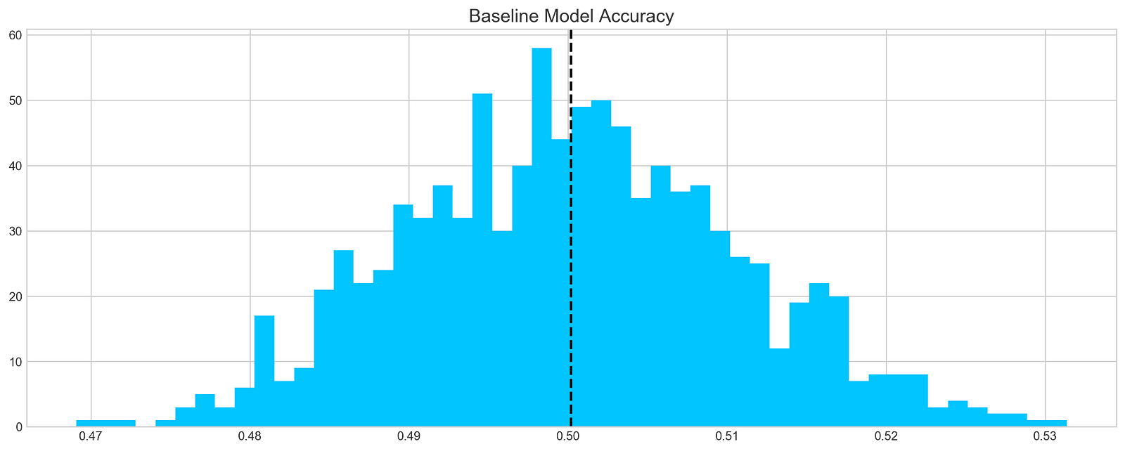
A baseline model is applied 1000 times to Tesla stock returns and the predictions are stored in a list called base_preds. By using the baseline_model function and ‘tsla’ column from the stocks DataFrame, the model’s predictive accuracy can be evaluated over multiple runs, with a histogram illustrating the prediction distribution. A dashed vertical line represents the mean of predictions, providing a reference point for evaluating model performance. It features 50 bins, with the x-axis showing predicted accuracy values and the y-axis showing frequency. According to the histogram, predictions cluster around a mean of 0.50, which suggests the model is around 50% accurate, slightly better than random guessing. There is some variability with a significant peak around 0.48 and 0.50. This distribution provides insight into the model’s accuracy and reliability, and identifies areas for improvement.
print('Tesla historical data contains {} entries'.format(stocks['tsla'].shape[0]))
stocks['tsla'][['Return']].head()
Based on the stocks dictionary, the code prints the number of entries in Tesla’s historical stock data. The associated DataFrame contains 2296 rows, which indicates the number of days for which historical data can be analyzed. Using the head method, the code displays the first few entries of the Tesla DataFrame’s Return column. From July 28, 2010, this output shows Tesla’s daily percentage changes. For example, a return of 0.008 on July 28 indicates a 0.8% increase in the stock price, while a return of -0.020 on July 29 indicates a 2% decrease. A deep understanding of the stock’s historical volatility and performance trends is crucial for developing machine learning predictive models. The analysis of these returns can reveal patterns that may affect future price movements, making this information valuable for forecasting.
plt.rcParams['figure.figsize'] = (16, 3)
plot_acf(stocks['tsla'].Return, lags=range(300))
plt.show()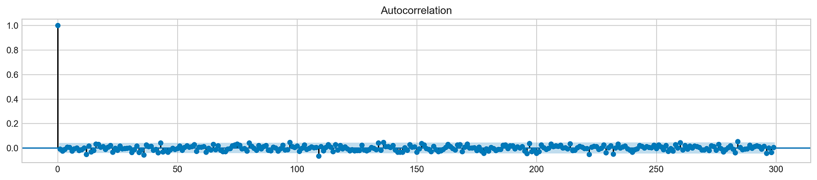
Using this code snippet, a 16-inch square plot is generated. It analyzes Tesla’s stock returns using autocorrelation functions (ACFs), focusing on the first 300 lags. By measuring the correlation between a time series and its past values, the ACF plot identifies patterns underlying the data. On the x-axis are lag values, and on the y-axis are autocorrelation coefficients. During lag 0, the first bar indicates a perfect correlation of 1, which means the returns are perfectly correlated with themselves. As the lags increase, the autocorrelation values decrease sharply and stabilize around zero, indicating minimal correlation over extended periods. The results suggest that past returns are not predictable.
It implies that the returns are likely to be independent over time, a characteristic of financial time series. This independence is vital for stock price modeling and forecasting, as it suggests that traditional time series models may struggle to capture significant autocorrelation in the data. Stock price forecasting machine learning models must be based on understanding this behavior.
# ARIMA orders
orders = [(0,0,0),(1,0,0),(0,1,0),(0,0,1),(1,1,0)]

# Splitting into train and test sets
train = list(stocks['tsla']['Return'][1000:1900].values)
test = list(stocks['tsla']['Return'][1900:2300].values)

all_predictions = {}

for order in orders:

    try:
        # History will contain original train set,
        # but with each iteration we will add one datapoint
        # from the test set as we continue prediction
        history = train.copy()
        order_predictions = []

        for i in range(len(test)):

            model = ARIMA(history, order=order) # defining ARIMA model
            model_fit = model.fit(disp=0) # fitting model
            y_hat = model_fit.forecast() # predicting 'return'
            order_predictions.append(y_hat[0][0]) # first element ([0][0]) is a prediction
            history.append(test[i]) # simply adding following day 'return' value to the model
            print('Prediction: {} of {}'.format(i+1,len(test)), end='\r')

        accuracy = accuracy_score(
            functions.binary(test),
            functions.binary(order_predictions)
        )
        print('                             ', end='\r')
        print('{} - {:.1f}% accuracy'.format(order, round(accuracy, 3)*100), end='\n')
        all_predictions[order] = order_predictions

    except:
        print(order, '<== Wrong Order', end='\n')
        pass
In this code, ARIMA orders are defined, which combine parameters for autoregressive, differencing, and moving average components to forecast Tesla’s stock price returns. Training and testing sets are divided into two sets: 1000 to 1900 returns, and 1900 to 2300 returns. For each order, the ARIMA model is fitted to the training data, and predictions are made for the test set, updating with actual returns.
An error during model fitting is caught and indicates the order is invalid during execution. A binary accuracy score evaluates prediction accuracy by comparing predicted values against actual test values. Approximately 50.8% to 51.5% of predictions are accurate, indicating modest performance. While ARIMA captures some data patterns, it may not perform well for this dataset. As different parameter combinations can yield different accuracy levels, the findings emphasize the importance of model selection and tuning in time series forecasting.
# Big Plot
fig = plt.figure(figsize=(16,4))
plt.plot(test, label='Test', color='#4ac2fb')
plt.plot(all_predictions[(0,1,0)], label='Predictions', color='#ff4e97')
plt.legend(frameon=True, loc=1, ncol=1, fontsize=10, borderpad=.6)
plt.title('Arima Predictions', fontSize=15)
plt.xlabel('Days', fontSize=13)
plt.ylabel('Returns', fontSize=13)

# Arrow
plt.annotate('',
             xy=(15, 0.05),
             xytext=(150, .2),
             fontsize=10,
             arrowprops={'width':0.4,'headwidth':7,'color':'#333333'}
            )
# Patch
ax = fig.add_subplot(1, 1, 1)
rect = patches.Rectangle((0,-.05), 30, .1, ls='--', lw=2, facecolor='y', edgecolor='k', alpha=.5)
ax.add_patch(rect)

# Small Plot
plt.axes([.25, 1, .2, .5])
plt.plot(test[:30], color='#4ac2fb')
plt.plot(all_predictions[(0,1,0)][:30], color='#ff4e97')
plt.tick_params(axis='both', labelbottom=False, labelleft=False)
plt.title('Lag')
plt.show()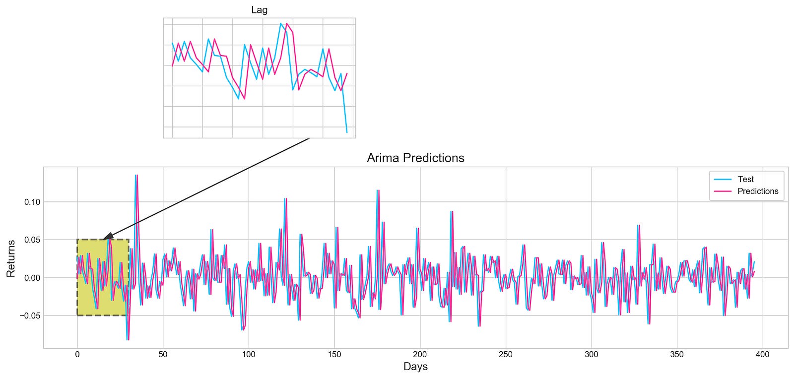
By using the ARIMA model, this code snippet visualizes stock price forecasting. The model performance can be evaluated directly by comparing the actual test data in blue with the predicted values in pink over a specified period. An annotation arrow points out a specific area of interest on the main plot, which identifies days where predictions may differ from actual values. It is highlighted by a shaded rectangle. A smaller inset plot provides a zoomed-in view of both test data and predictions for the first 30 days, allowing you to see early performance in detail. Since tick labels are not present in the inset plot, it is easier to see trends rather than specific values. This output demonstrates the relationship between the ARIMA model’s predictions and actual stock returns, which enhances understanding of the model’s accuracy. By using visual elements, key insights become clearer.
plt.figure(figsize=(16,5))
plt.hist(stocks['tsla'][1900:2300].reset_index().Return, bins=20, label='True', facecolor='#4ac2fb')
plt.hist(all_predictions[(0,1,0)], bins=20, label='Predicted', facecolor='#ff4e97', alpha=.7)
plt.axvline(0, c='k', ls='--')
plt.title('ARIMA True vs Predicted Values Distribution', fontSize=15)
plt.legend(frameon=True, loc=1, ncol=1, fontsize=10, borderpad=.6)
plt.show()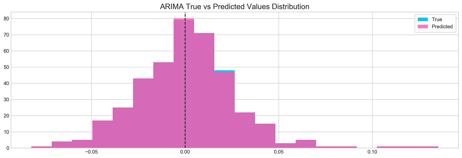
Tesla stock’s true and predicted return values are visualized with the code snippet, which uses data from indices 1900 to 2300. Figure size is set to 16 by 5 for better visualization. A true return histogram with 20 bins in blue, taken from Tesla DataFrame Return column, is shown. In semi-transparent pink, predicted returns are overlayed on the first histogram. The alpha parameter is set to 0.7 for transparency. A vertical line at x equals 0 serves as a reference for the break-even return level. The title ARIMA True vs Predicted Values Distribution provides context, and the legend in the upper right corner distinguishes between true and predicted values. Two overlapping histograms appear, with blue bars representing true returns around zero and pink bars indicating predicted returns. Predictions and actual returns can be assessed immediately with this visualization, highlighting areas of agreement and divergence.
test_binary = functions.binary(stocks['tsla'][1900:2300].reset_index().Return)
train_binary = functions.binary(all_predictions[(0,1,0)])
tn, fp, fn, tp = confusion_matrix(test_binary, train_binary).ravel()
accuracy = accuracy_score(test_binary, train_binary)

print("True positive and Negative: {}".format((tp + tn)))
print("False Positive and Negative: {}".format((fp + fn)))
print("Accuracy: {:.1f}%".format(accuracy*100))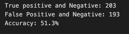
This code snippet is part of a machine learning project that evaluates a binary classification model to predict stock prices. Functions.binary is used to generate binary labels for the test and training datasets. Tesla’s stock prices are used in the test dataset, while model predictions are used in the training dataset.
Using the confusion_matrix function, the code calculates a confusion matrix that provides details about the model. In order to assess the model’s accuracy in predicting stock price movements, four key metrics are extracted from the confusion matrix: false negatives, false positives, false negatives, and true positives.
Model output indicates 203 instances were correctly classified as true positives or true negatives, but 193 instances were misclassified. With an accuracy of 51.3%, the model’s predictions are only marginally better than random guessing. The performance of the model or the features used for training need to be improved. This study highlights the difficulties of accurately forecasting stock prices and the need for further improvement.
tesla_headlines = pd.read_csv('data/tesla_headlines.csv', index_col='Date')The pd.read_csv function loads a CSV file named tesla_headlines.csv into a pandas DataFrame. With the index_col argument set to Date, the CSV index will be the Date column. By allowing easy access to data based on dates, the DataFrame will contain Tesla headlines indexed by date, simplifying trends analysis.
tesla = stocks['tsla'].join(tesla_headlines.groupby('Date').mean().Sentiment)Stock price data and sentiment scores are combined in this code. Stock price data, stored in stocks[‘tsla’], includes historical stock prices indexed by date. Using groupby and mean functions, the code calculates the average sentiment score for each date from the tesla_headlines DataFrame. Based on the data, the join method merges stock price data with sentiment scores. In tesla, stock prices and sentiment scores are collected for each date, enabling further analysis of the relationship between sentiment and stock prices.
plt.style.use('seaborn-whitegrid')
plt.figure(figsize=(16,6))
plt.plot(tesla.loc['2019-01-10':'2019-09-05'].Sentiment.shift(1), c='#3588cf', label='News Sentiment')
plt.plot(tesla.loc['2019-01-10':'2019-09-05'].Return, c='#ff4e97', label='Return')
plt.legend(frameon=True, fancybox=True, framealpha=.9, loc=1)
plt.title('Tesla News Sentiment and Daily Return', fontSize=15)
plt.show()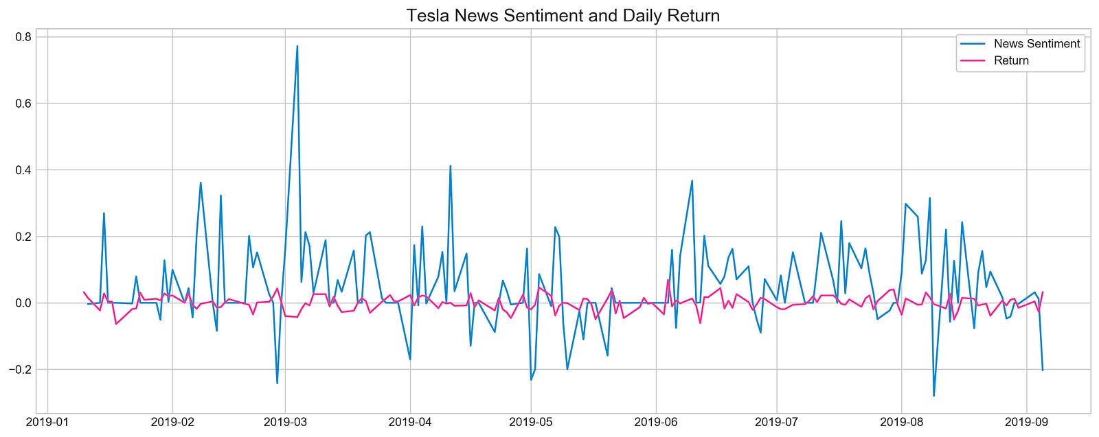
The code snippet uses Matplotlib to visualize Tesla’s news sentiment and its daily returns from January 10, 2019, to September 5, 2019. The plot is designed to be easily readable at 16 by 6 inches. A blue line represents news sentiment, shifted by one day for alignment with daily returns, and a pink line represents daily returns. This plot emphasizes sentiment and daily returns, as indicated by the legend and title. In the blue line, significant variability with significant peaks coincides with major news events or announcements during the specified timeframe. The pink line illustrating daily returns is less volatile, suggesting sentiment spikes don’t always coincide with stock returns. By demonstrating the dynamics between investor behavior and stock performance, this visualization offers insight into how news influences investor behavior.
pd.DataFrame({
    'Sentiment': tesla.loc['2019-01-10':'2019-09-05'].Sentiment.shift(1),
    'Return': tesla.loc['2019-01-10':'2019-09-05'].Return}).corr()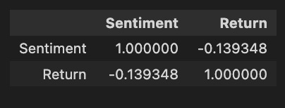
Pandas is used to create a DataFrame, focusing on two key variables from a dataset named Tesla: Sentiment and Return. The Sentiment data is derived from the Sentiment column of the Tesla DataFrame for the date range between January 10, 2019, and September 5, 2019, aligned with subsequent returns. Return data is taken directly from the same date range without shifting. The code calculates the correlation matrix between sentiment and stock returns following construction of the DataFrame. Sentiment has a perfect correlation matrix of 1.0 with itself, as expected. It indicates a weak negative correlation between sentiment and return, with sentiment tending to lower returns as sentiment increases, but the relationship is not strong enough to predict. Although the weak correlation suggests that other factors also significantly impact stock returns, this analysis offers insight into how market sentiment might influence stock performance.
# Initializing and fitting a model
xgb = XGBClassifier()
xgb.fit(X[1500:], y[1500:])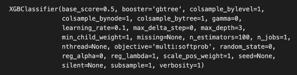
The code snippet initializes and fits an XGBoost classifier known as XGBClassifier, a widely used machine learning model for classification tasks. Starting from the 1500th index, the model is trained on a dataset with X representing the features and y representing the target labels, excluding the first 1500 samples. Performance parameters for the XGBClassifier are revealed in the output. The base_score is set to 0.5, the initial prediction score for all instances. The booster is set to gbtree, indicating the tree-based boosting method. 0.1 affects the step size at each iteration to minimize the loss function, with a lower rate improving performance but requiring more boosting rounds. A max_depth of 3 limits the tree depth and reduces overfitting risks, while n_estimators of 100 indicate 100 boosting rounds will be performed. Complexity and performance are also managed by parameters like min_child_weight, gamma, and subsample.
important_features = pd.DataFrame({
                                    'Feature': X.columns,
                                    'Importance': xgb.feature_importances_}) \
                                    .sort_values('Importance', ascending=True)

plt.figure(figsize=(16,8))
plt.style.use('seaborn-whitegrid')
plt.barh(important_features.Feature, important_features.Importance, color="#4ac2fb")
plt.title('XGboost - Feature Importance - Tesla', fontSize=15)
plt.xlabel('Importance', fontSize=13)
plt.show()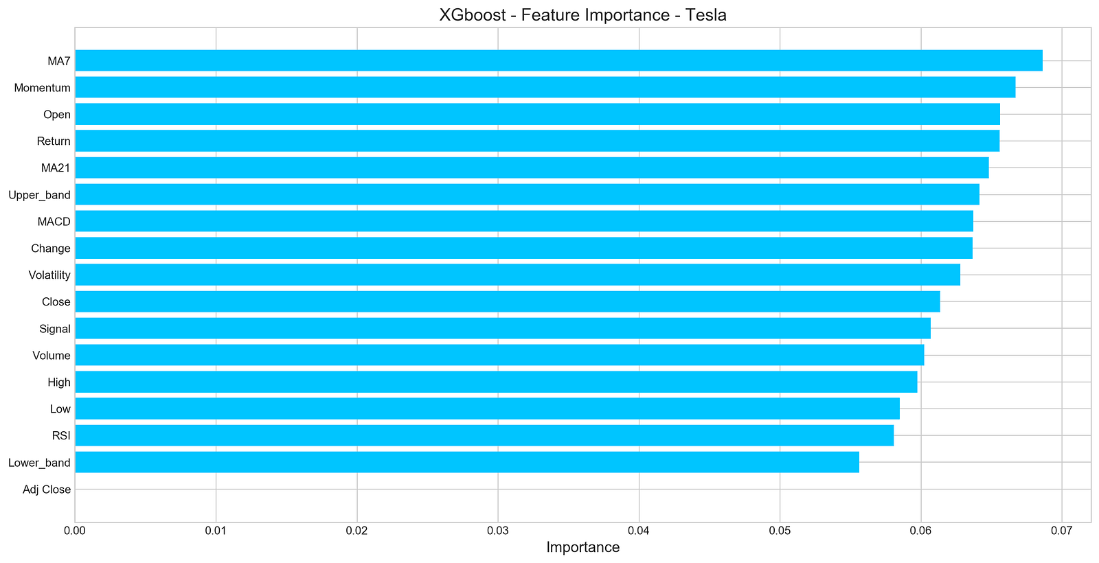
An XGBoost model for forecasting Tesla’s stock price uses a horizontal bar chart to visualize the importance of features. In this DataFrame, each feature is paired with its importance score, and their importance score is sorted in ascending order. It displays features on the y-axis and their importance scores on the x-axis using Matplotlib with a clean aesthetic from the seaborn-whitegrid style. According to the title, the chart focuses on the importance of features for Tesla’s XGBoost model, and the x-axis indicates the importance of features. According to the output, MA7 and Momentum have the highest importance scores, indicating they are important for predicting Tesla’s stock price. However, features like Adj Close and Lower_band have lower importance scores, suggesting that they contribute less to model predictions. Through this visualization, the most influential features are identified, aiding in further analysis and potential feature selection.
n_steps = 21
scaled_tsla = functions.scale(stocks['tsla'], scale=(0,1))

X_train, \
y_train, \
X_test, \
y_test = functions.split_sequences(

    scaled_tsla.to_numpy()[:-1],
    stocks['tsla'].Return.shift(-1).to_numpy()[:-1],
    n_steps,
    split=True,
    ratio=0.8
)
As a result of this code, Tesla’s stock price data can be used to develop a time series forecasting model. By setting the variable n_steps to 21, the model will take into account the past 21 days of stock prices when predicting the next day’s price. In order to improve the model’s performance and learning efficiency, Tesla stock prices are normalized using a normalization function.
In order to ensure that only relevant prices are used for prediction, a function converts scaled prices into NumPy arrays and excludes the last value from the training and testing datasets. By shifting the returns by -1 and excluding the last entry, the model can predict the return for the next time step based on the target variable. By setting split=True, the data is divided into training and testing sets based on the number of time steps in each input sequence. In this example, 80% of the data is allocated to training, and 20% is allocated to testing. By scaling and organizing the data into sequences, this process effectively prepares the data for forecasting stock prices.
keras.backend.clear_session()

n_steps = X_train.shape[1]
n_features = X_train.shape[2]

model = Sequential()
model.add(LSTM(100, activation='relu', return_sequences=True, input_shape=(n_steps, n_features)))
model.add(LSTM(50, activation='relu', return_sequences=False))
model.add(Dense(10))
model.add(Dense(1))
model.compile(optimizer='adam', loss='mse', metrics=['mae'])
Initially, we clear Keras sessions to avoid errors from old models and reset any previous model configurations. In our next step, we explain how n_steps and n_features are derived from the shape of the training data, indicating how many features there are per time step in our data. To stack layers linearly, we initialize a sequential model. In this layer, we set return_sequences to true, allowing it to output the entire sequence for the next LSTM layer. The first layer is an LSTM layer with 100 units and a ReLU activation function that addresses vanishing gradients. In the second LSTM layer, return_sequences are set to false for 50 units, which produce only the last output to reduce dimensionality and summarize information.
The LSTM layers are followed by a Dense layer with 10 units as a fully connected layer, followed by a final Dense layer with one unit, which is used as the output layer to predict stock prices based on the processed data. During training, we track Mean Absolute Error as a performance metric, and compile the model using Adam optimizer. We set the loss function to Mean Squared Error, suitable for regression tasks.
model.summary()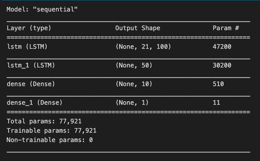
Using model.summary(), Keras models are summarized, highlighting their architecture and number of trainable parameters. For a stock price forecasting project, the summary outlines a sequential model based on LSTM layers, an ideal method for time series data. The model has four layers. The first layer is an LSTM with an output shape of (None, 21, 100), indicating it processes sequences of length 21 and produces a 100-dimensional feature vector for each time step, with 47,200 parameters. The second LSTM layer has an output shape of (None, 50), reducing the output to 50 features and comprising 30,200 parameters.
The model also includes two Dense layers. The first Dense layer outputs a 10-dimensional vector (None, 10) and has 510 parameters, while the final Dense layer predicts a single value (None, 1) representing the stock price, with only 11 parameters.
In total, the model has 77,921 trainable parameters that will be adjusted during training to reduce prediction errors. This architecture effectively captures the temporal dependencies in stock price data, facilitating the forecasting of future prices based on historical trends.
model.fit(X_train, y_train, epochs=100, verbose=0, validation_data=[X_test, y_test], use_multiprocessing=True)

plt.figure(figsize=(16,4))
plt.plot(model.history.history['loss'], label='Loss')
plt.plot(model.history.history['val_loss'], label='Val Loss')
plt.legend(loc=1)
plt.title('LSTM - Training Process')
plt.show()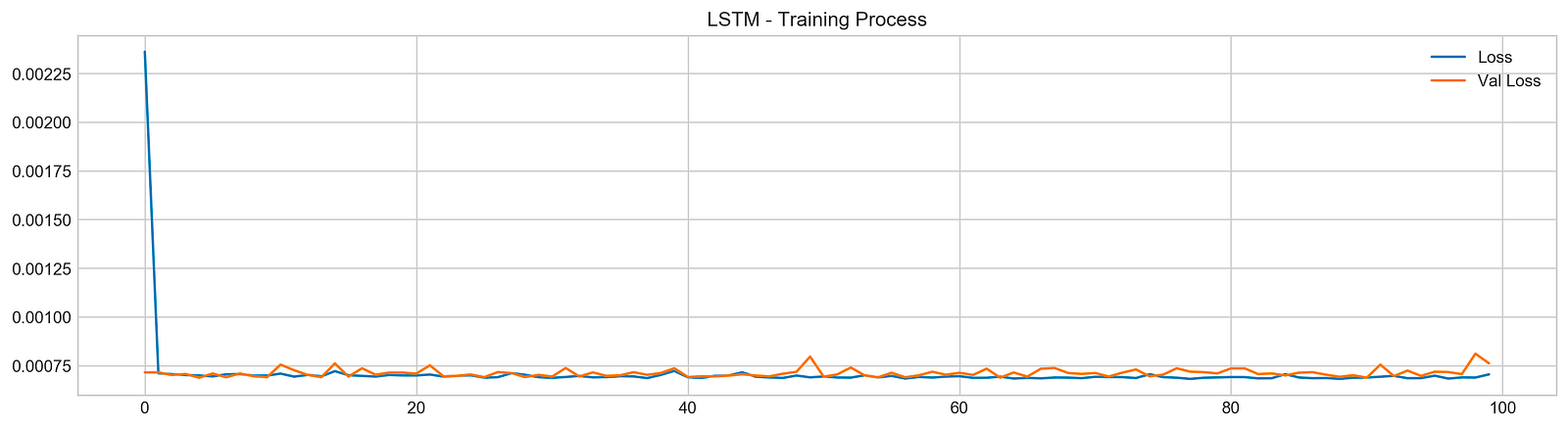
The code snippet trains a Long Short-Term Memory (LSTM) network for stock price forecasting using a dataset. The model is trained with the model.fit function, using training data X_train and y_train, and running for 100 epochs. Validation data X_test and y_test is used to evaluate the model’s performance on new data. The verbose parameter is set to zero to suppress output during training, and multiprocessing is enabled to speed up the process.
After training, the code generates a plot that visualizes the training process, showing the training loss and validation loss over the epochs. The training loss, represented by a blue line, illustrates how well the model fits the training data, while the validation loss, shown in orange, reflects performance on the validation set.
In the plot, both losses start high and decrease significantly during the initial epochs, indicating effective learning. As training continues, both losses stabilize at lower values, suggesting diminishing returns from further training. The convergence of the two lines towards the end indicates good generalization, with no significant overfitting. This outcome is favorable, indicating the model is likely to perform well on unseen data, which is essential for accurate stock price forecasting.
pred, y_true, y_pred = functions.evaluation(
                    X_test, y_test, model, random=False, n_preds=50,
                    show_graph=True)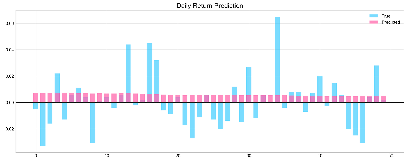
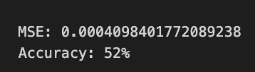
The code executes a function called evaluation, which assesses the performance of a machine learning model for stock price forecasting. It takes X_test and y_test as the test dataset and true labels, respectively, and model as the trained machine learning model. The parameters random is set to false, indicating that random sampling will not be used, and n_preds is set to 50, meaning predictions will be generated for 50 instances. The argument show_graph is true, prompting the function to visualize the results.
The evaluation produces a graphical representation comparing the model’s predictions to actual values. The chart features light blue bars for true daily returns and pink bars for predicted daily returns. The x-axis shows the index of the predictions, while the y-axis displays the magnitude of the returns, with a horizontal line at zero indicating no stock price change.
The graph shows instances where predicted values align closely with true values, especially in the early series. However, significant discrepancies arise in later predictions, suggesting that the model performs well in some cases but struggles in others. The Mean Squared Error value of approximately 0.0005 reflects the average squared difference between predicted and actual values, indicating overall accuracy. An accuracy of 52% implies the model’s predictions are slightly better than random guessing, suggesting opportunities for improvement.
keras.backend.clear_session()

n_steps = X_train.shape[1]
n_features = X_train.shape[2]

model = Sequential()

model.add(Conv1D(filters=20, kernel_size=2, activation='relu', input_shape=(n_steps, n_features)))
model.add(MaxPooling1D(pool_size=2))
model.add(Flatten())
model.add(Dense(5, activation='relu'))
model.add(Dense(1))
model.compile(optimizer='adam', loss='mse', metrics=['mse'])
The keras.backend.clear_session function is called to clean the current Keras session, preventing clutter from prior model definitions or training runs, which is especially important when conducting multiple experiments. The number of time steps and features in the training data is determined using X_train.shape, where n_steps indicates the length of the input sequences and n_features signifies the number of features for each step.
A sequential model is created using Keras, where each layer’s output serves as the input for the subsequent layer. The first layer is a 1D convolutional layer with 20 filters and a kernel size of 2, designed to extract features from time series data. The relu activation function introduces non-linearity, allowing the model to learn complex patterns, while the input_shape parameter sets the shape of the input data to n_steps and n_features.
Following the convolutional layer, a max pooling layer is added to down-sample the features, which reduces dimensionality while retaining the most important information. The pooled output is then flattened into a 1D array to prepare for the ensuing dense layer. A dense layer with 5 units and relu activation is included for further feature processing, followed by another dense layer with a single unit for the final stock price prediction.
The model is compiled using the Adam optimizer, which is effective for training deep learning models, with mean squared error as both the loss function and evaluation metric. This configuration is standard for regression tasks such as stock price forecasting.
model.summary()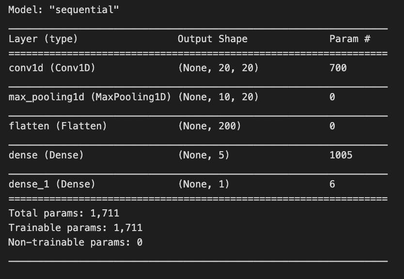
The model.summary() function displays an overview of a Keras model’s architecture and parameters. In a stock price forecasting project, this summary outlines a sequential model tailored for processing time series data. The model begins with a 1D convolutional layer that has an output shape of (None, 20, 20) and contains 700 parameters. The None indicates flexibility in batch sizes, while the dimensions signify that the model is handling sequences of length 20 with 20 features. The parameters consist of weights and biases learned during training.
Next is a max pooling layer that reduces data dimensionality, outputting a shape of (None, 10, 20) and having no parameters, as it applies a fixed operation without learning weights. This is followed by a flatten layer that converts the 3D array from the pooling layer into a 1D array for the subsequent dense layers, producing an output of (None, 200) without parameters.
The model incorporates two dense layers. The first dense layer generates an output shape of (None, 5) with 1,005 parameters, allowing it to learn complex representations. The final dense layer, which outputs a single value (None, 1), has 6 parameters and is likely used for the final prediction, such as stock price forecasting.
In total, the model contains 1,711 trainable parameters, indicating that every component is designed to learn from the data. The architecture is characteristic of time series tasks, where convolutional layers capture local patterns, and dense layers synthesize these patterns into predictions.
model.fit(X_train, y_train, epochs=25, verbose=0, validation_data=[X_test, y_test], use_multiprocessing=True)

plt.figure(figsize=(16,4))
plt.plot(model.history.history['loss'], label='Loss')
plt.plot(model.history.history['val_loss'], label='Val Loss')
plt.legend(loc=1)
plt.title('Conv - Training Process')
plt.show()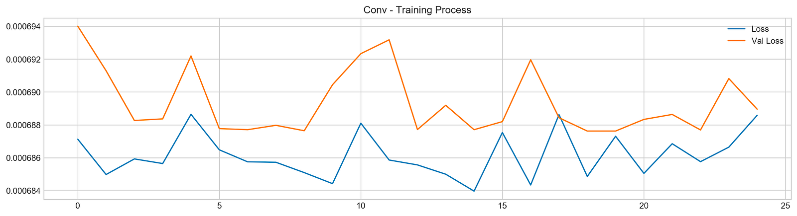
The code initiates the training of a machine learning model using the fit method, typically found in deep learning frameworks like TensorFlow or Keras. The model is trained on the training dataset X_train with corresponding labels y_train for 25 epochs. The verbose parameter is set to 0 to suppress output during training, and the validation_data option allows the model to evaluate its performance on a separate test dataset X_test and y_test after each epoch. The use_multiprocessing parameter is set to true to enable parallel processing, which can expedite the training by utilizing multiple CPU cores.
The subsequent code generates a plot to visualize the training process, creating a figure that displays two lines: one for training loss and the other for validation loss across epochs. The blue line represents training loss, indicating how well the model fits the training data, while the orange line represents validation loss, showing the model’s performance on unseen data.
Analyzing the output graph provides insights into model performance. The training loss typically trends downward, suggesting that the model is improving its fit to the training data. However, the validation loss’s behavior is key; if it decreases initially but then increases, this may indicate that the model is starting to overfit, performing well on training data but poorly on validation data. In this case, the loss curves fluctuate, with the validation loss showing peaks and valleys, indicating variability in the model’s performance.
pred, y_true, y_pred = functions.evaluation(
                    X_test, y_test, model, random=False, n_preds=50,
                    show_graph=True)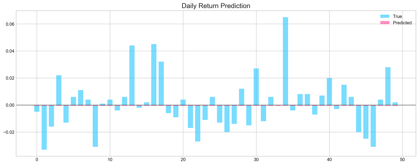
The code snippet runs a function that evaluates a machine learning model’s performance in forecasting stock prices. It uses test data, including features X_test, true labels y_test, and the trained model. The function makes predictions without randomness, specifies a prediction count of 50, and generates a graph for results visualization. It returns predictions, true values, and predicted values.
The output graph displays daily return predictions, contrasting true values with the model’s predictions. Blue bars represent actual daily returns, and the pink line shows predicted returns. The x-axis reflects the prediction index, and the y-axis indicates return values. The graph reveals that while some predictions closely match true values, there are significant discrepancies in certain ranges.
The Mean Squared Error (MSE) at the bottom quantifies the average squared difference between predicted and true values, with a lower MSE indicating better accuracy. The accuracy percentage, at 46%, suggests the model’s predictions are marginally better than random guessing, signaling areas needing improvement in training or feature selection.
all_stocks = pd.concat(stocks,ignore_index=True)This code uses the pandas library to concatenate a list of DataFrames named stocks into a single DataFrame using the pd.concat() function. The argument ignore_index=True instructs pandas to reset the index of the resulting DataFrame, ensuring a clean and continuous index.
scaled_all = functions.scale(all_stocks, scale=(0,1))

n_steps = 21
X_train, y_train, X_test, y_test = functions.split_sequences(
                        scaled_all.to_numpy()[:-1],
                        all_stocks['Return'].shift(-1).to_numpy()[:-1], n_steps, split=True, ratio=0.8)
This snippet performs two main operations to prepare a dataset for training a machine learning model to forecast stock prices. First, it scales the stock price data to normalize the values, which can enhance model performance by ensuring that all features contribute equally to distance calculations. The scaling function takes the all_stocks DataFrame and scales the data to a range between 0 and 1.
Next, the code splits the scaled dataset into training and test sets. It uses a parameter of 21 time steps, allowing the model to utilize the previous 21 stock price entries to predict the next one. The input data consists of all scaled prices except the last entry, while the target variable is the next day’s return. The split ratio of 0.8 ensures that 80% of the data is used for training and 20% for testing, allowing the model to learn from historical data and be evaluated on unseen data.
keras.backend.clear_session()

n_steps = X_train.shape[1]
n_features = X_train.shape[2]

model = Sequential()
model.add(Conv1D(filters=500, kernel_size=10, activation='relu', input_shape=(n_steps, n_features)))
model.add(MaxPooling1D(pool_size=10))
model.add(Flatten())
model.add(Dense(500, activation='relu'))
model.add(Dense(100, activation='relu'))
model.add(Dense(1, activation='sigmoid'))
model.compile(optimizer='adam', loss='mse')
This code snippet sets up a convolutional neural network using Keras for stock price forecasting. It begins by clearing any previous models in memory to prevent issues when creating new ones. The number of time steps and features is determined from the training data, where n_steps indicates the length of the input sequence and n_features signifies the number of features at each time step.
A sequential model is initialized, allowing layers to be added sequentially. The first layer is a 1D convolutional layer with 500 filters and a kernel size of 10, using the ReLU activation function to capture complex patterns. The input shape is defined to match the training data structure.
Next, a max pooling layer reduces the dimensionality of the data while preserving essential features, enhancing computational efficiency. The output from the pooling layer is then flattened into a 1D vector to prepare it for the dense layers.
Two dense layers follow, the first with 500 units using ReLU, and the second with 100 units, also using ReLU, serving as an intermediary before the final output. The last layer is a dense layer with a single unit and a sigmoid activation function, which consolidates the learned features into a single output typical for regression tasks predicting continuous values.
The model is compiled using the Adam optimizer and the mean squared error loss function. Adam adjusts the learning rate during training, while the mean squared error measures the average squared difference between predicted and actual values, guiding the model to minimize these discrepancies.
model.fit(X_train, y_train, epochs=25, verbose=0, validation_data=[X_test, y_test], use_multiprocessing=True)

plt.figure(figsize=(16,4))
plt.plot(model.history.history['loss'], label='Loss')
plt.plot(model.history.history['val_loss'], label='Val Loss')
plt.legend(loc=1)
plt.show()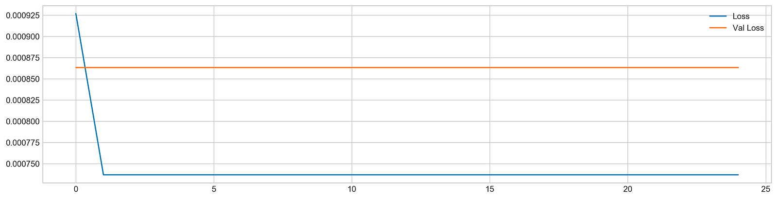
The code snippet begins the training of a machine learning model using the fit method, which is standard in deep learning frameworks like TensorFlow or Keras. The model is trained on the training dataset using X_train and y_train for 25 epochs, meaning it processes the entire dataset 25 times. The verbose parameter is set to zero to suppress output during training, and the validation_data option allows the model to assess its performance on a separate test dataset, X_test and y_test, after each epoch. The use_multiprocessing option is enabled to facilitate parallel processing, which can expedite the training by leveraging multiple CPU cores.
After training, the code creates a plot to visualize the loss metrics across the epochs. This plot displays training loss in blue and validation loss in orange, with the y-axis indicating loss values; lower values reflect better model performance. Initially, the training loss is high but decreases significantly in the first few epochs, showing effective learning. In contrast, the validation loss remains relatively stable without a similar decline, indicating the model may struggle to generalize to unseen data. This suggests a risk of overfitting, where the model excels on training data but does not learn the patterns effectively for validation data. The observable gap between the training and validation loss lines indicates the necessity for further adjustments to enhance the model’s performance on new data.
# Evaluation
pred, y_true, y_pred = functions.evaluation(
                    X_test, y_test, model, random=True, n_preds=100,
                    show_graph=True)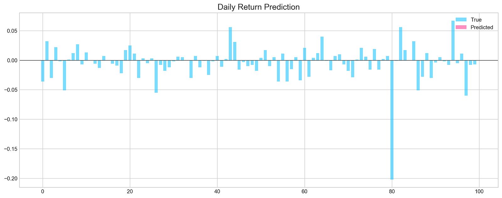
The code snippet is part of a machine learning evaluation process for assessing a model that predicts stock price movements. The function evaluation takes parameters including the test dataset, true labels, the trained model, and options for random shuffling, the number of predictions, and whether to display a graph. The output is a graphical representation of the model’s predictions compared to actual values. The chart titled Daily Return Prediction shows the true daily returns in light blue and predicted daily returns in pink, with the x-axis representing prediction indices and the y-axis showing return values.
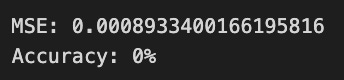
The graph indicates that predicted returns fluctuate around the zero line, suggesting the model is trying to track daily price movements. However, there are significant discrepancies between predicted and true values in some areas, indicating the model may not accurately capture the stock price patterns. The Mean Squared Error of approximately 0.000893 reflects the average squared difference between predicted and actual values, while an accuracy of 0% points to unreliable predictions, suggesting the need for model refinement. This evaluation highlights both the model’s potential and its limitations in forecasting stock price movements.
def create_model(d1, d2, filters, pool, kernel):
    keras.backend.clear_session()

    d1 = int(d1)
    d2 = int(d2)
    filters = int(filters)
    kernel = int(kernel)
    pool = int(pool)

    n_steps = X_train.shape[1]
    n_features = X_train.shape[2]
    model = Sequential()
    model.add(Conv1D(filters=filters, kernel_size=kernel, activation='relu', input_shape=(n_steps, n_features)))
    model.add(MaxPooling1D(pool_size=pool))
    model.add(Flatten())
    model.add(Dense(d1, activation='relu'))
    model.add(Dense(d2, activation='relu'))
    model.add(Dense(1))
    model.compile(optimizer='adam', loss='mse', metrics=['mse'])
    model.fit(X_train, y_train, epochs=4, verbose=0, validation_data=[X_test, y_test], use_multiprocessing=True)
    score = model.evaluate(X_test, y_test, verbose=0)
    return score[1]
This function builds and trains a convolutional neural network model for stock price forecasting using Keras. It clears any existing sessions in Keras to ensure a fresh model creation and converts the input parameters d1, d2, filters, pool, and kernel into integers to define the model architecture. It reads the shape of the training data to determine the number of time steps and features.
The model is created as a sequential stack of layers. It starts with a 1D convolutional layer that uses the specified number of filters, kernel size, and ReLU activation, processing the input shape. This is followed by a max pooling layer that reduces the dimensionality of the output. The output is then flattened into a 1D vector to prepare for the subsequent dense layers. Two dense layers are added, each applying ReLU activation, with the number of neurons defined by d1 and d2. A final dense layer with a single output neuron is included, suitable for regression tasks like stock price prediction.
The model is compiled with the Adam optimizer and mean squared error as the loss function. It is trained on the training data for four epochs, with validation data for performance monitoring. After training, the model is evaluated on the test set, returning the mean squared error score to assess model performance.
def bayesian_optimization():

    pbounds = {
        'filters': (1, 10),
        'd1': (160, 250),
        'd2': (10, 40),
        'kernel': (2,10),
        'pool': (2, 10)
    }

    optimizer = BayesianOptimization(
        f = create_model,
        pbounds = pbounds,
        random_state = 1,
        verbose = 2
    )
    optimizer.maximize(init_points=5, n_iter=5)
    print(optimizer.max)
This function optimizes hyperparameters using Bayesian optimization. We start by defining the bounds for various hyperparameters in the pbounds dictionary: filters can range from 1 to 10, d1 from 160 to 250, d2 from 10 to 40, kernel from 2 to 10, and pool from 2 to 10. We then initialize the Bayesian optimizer with the create_model function we aim to optimize. The pbounds dictionary indicates the range for hyperparameter variation, random_state ensures repeatability, and verbose controls the information output during the process.
Next, we invoke the maximize method on the optimizer, which initiates the optimization process with five initial points followed by an additional five iterations to fine-tune the hyperparameters. After completing the optimization, we retrieve and print the best hyperparameter set found, which provides the values that yield optimal performance for building an effective stock price forecasting model.
n_steps = 21
scaled_tsla = functions.scale(stocks['tsla'], scale=(0,1))

X_train, \
y_train, \
X_test, \
y_test = functions.split_sequences(

    scaled_tsla.to_numpy()[:-1],
    stocks['tsla'].Return.shift(-1).to_numpy()[:-1],
    n_steps,
    split=True,
    ratio=0.8
)
This code snippet prepares data for training and testing a machine learning model designed to predict stock prices. The variable n_steps is set to 21, indicating the model will use 21 previous time steps for predictions. The variable scaled_tsla contains Tesla’s stock prices scaled to a range between 0 and 1, which helps normalize the data for easier learning by the model. The function split_sequences divides the scaled stock data into training and test sets, creating sequences of data that are n_steps long. The slicing operation excludes the last entry to prevent predicting a future value not present in the input data. The split parameter is set to True, which partitions the data into 80% for training and 20% for testing.
bayesian_optimization()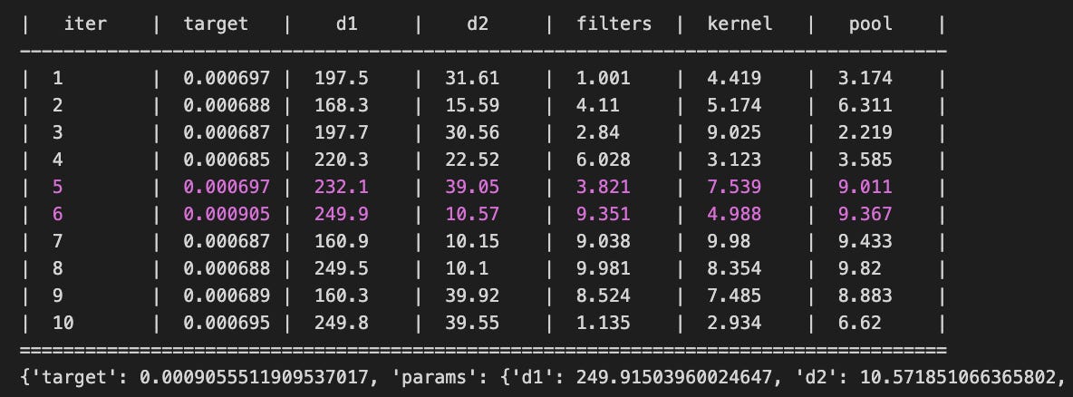
The bayesian_optimization function optimizes hyperparameters for machine learning models used in stock price forecasting. It finds the optimal combination of parameters that minimize or maximize an objective function, typically related to the accuracy of stock price predictions. The function outputs a table summarizing the results of each optimization iteration. Each row includes the iteration number, the target value representing the performance metric, and the values of hyperparameters such as d1, d2, filters, kernel, and pool. Lower target values generally indicate better model performance with the given parameters.
The final output includes the best parameters found during the optimization and their corresponding target value. For example, the parameters d1 equal to 249.915, d2 equal to 10.572, and filters equal to 9.351 yielded the best performance according to the target metric. This information is vital for practitioners, assisting them in configuring models for optimal performance and improving the accuracy of stock price forecasts. The iterative output demonstrates an organized exploration of the hyperparameter space, allowing a systematic approach to identifying effective model settings.
n_steps = X_train.shape[1]
n_features = X_train.shape[2]
keras.backend.clear_session()
model = Sequential()
model.add(Conv1D(filters=9, kernel_size=5, activation='relu', input_shape=(n_steps, n_features)))
model.add(MaxPooling1D(pool_size=9))
model.add(Flatten())
model.add(Dense(250, activation='relu'))
model.add(Dense(10, activation='relu'))
model.add(Dense(1))
model.compile(optimizer='adam', loss='mse', metrics=['mse'])
You are setting up a convolutional neural network for stock price forecasting using Keras. First, determine the number of timesteps and features from your training data. Clear any existing Keras session to avoid memory issues. Next, create a new Sequential model, starting with a 1D convolutional layer that has 9 filters and a kernel size of 5, allowing it to learn various features from the input data. The ReLU activation function is applied for non-linearity.
You then add a max pooling layer with a pool size of 9 to reduce the spatial dimensions and computations. Flatten the data to convert the 2D feature maps into a 1D array, and add a dense layer with 250 units using ReLU activation for higher-level representations. Another dense layer with 10 units and ReLU activation follows, leading to a final output layer with one unit, appropriate for regression tasks like stock price prediction.
Compile the model using the Adam optimizer for efficiency and mean squared error as the loss function, which minimizes prediction errors while also being tracked as a metric during training.
model.fit(X_train, y_train, epochs=100, verbose=0, validation_data=[X_test, y_test], use_multiprocessing=True)

plt.figure(figsize=(16,4))
plt.plot(model.history.history['loss'], label='Loss')
plt.plot(model.history.history['val_loss'], label='Val Loss')
plt.legend(loc=1)
plt.show()

# Evaluation
pred, y_true, y_pred = functions.evaluation(
                    X_test, y_test, model, random=True, n_preds=100,
                    show_graph=True)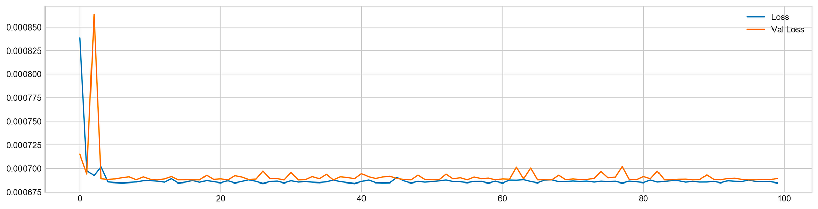
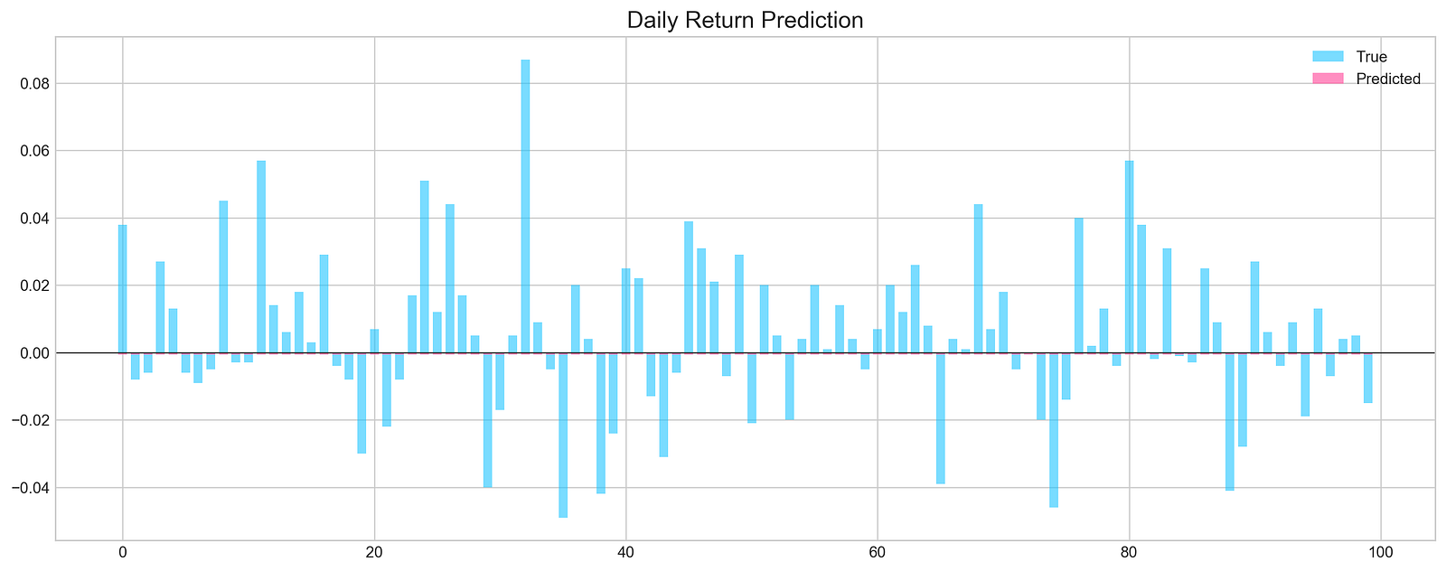
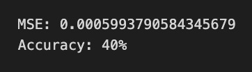
The code trains a machine learning model to predict daily stock price returns using stock price data. The model is trained with the model.fit function for 100 epochs on the training dataset, X_train and y_train, while the verbose=0 parameter suppresses output. The validation_data parameter evaluates the model’s performance on a separate test dataset, X_test and y_test, and the use_multiprocessing=True option speeds up training through parallel processing.
After training, the loss for both training and validation data is visualized over the epochs. The training loss, shown in blue, decreases over time and stabilizes at a lower value than the validation loss, depicted in orange. This discrepancy indicates possible overfitting, as the validation loss fluctuates and does not decrease consistently.
Subsequently, the model’s predictions on the test set are evaluated using the functions.evaluation function, which produces a bar graph comparing true daily returns in light blue with predicted returns in pink. This visualization allows for an assessment of the model’s performance, with aligned predicted and true values indicating effective pattern recognition in the stock price data.
The training and evaluation process reveals insights into the model’s prediction capabilities, pointing out strengths and areas for improvement, especially concerning overfitting and accuracy of predictions.
plt.figure(figsize=(16,5))
plt.style.use('seaborn-whitegrid')
plt.plot(stocks['tsla'][2000:2100].Return, label='Stock', c='#4ac2fb')
plt.plot(stocks['tsla'][2001:2010].Return, lw=3, label='Pattern (9 days)', c='#ff4e97')
plt.legend(frameon=True, fancybox=True, framealpha=.9, loc=1)
plt.title('Patterns in Testing Set', fontSize=15)
plt.ylabel('Return')
plt.show()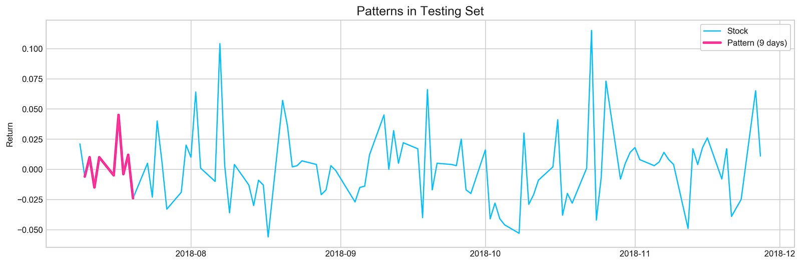
The code creates a visual representation of Tesla’s stock returns over a specific time range, focusing on a particular pattern in the data. The figure size is set to 16 by 5 inches for an optimal display of time series data, with the style configured to seaborn-whitegrid to enhance readability.
The first line on the plot represents the overall stock returns from the Tesla dataset, specifically from the 2000th to the 2100th entry, and is colored light blue. The second line highlights a nine-day pattern from the 2001st to the 2010th entry, appearing thicker and in pink to draw attention. A legend distinguishes between the overall stock returns and the nine-day pattern, while the title Patterns in Testing Set indicates the analysis’s broader context in machine learning for stock price forecasting. The y-axis is labeled Return, denoting the values plotted represent stock returns over time.
The resulting image outlines Tesla’s stock return fluctuations during the selected period. The light blue line illustrates the overall trend, while the pink line marks a specific pattern of interest. Analyzing the relationship between these lines offers insights into how short-term patterns correlate with long-term trends, which is essential for effective stock price forecasting.
binary_return = functions.binary(stocks['tsla'].Return.values)

binary_train = binary_return[:2000]
binary_test = binary_return[2000:]

step = 9 # length of the pattern we're trying to find (ex.: [0,0,1,0,1,1,0,1,0])
check_step = step + 1 # value we're trying to predict (value that goes after pattern [0 or 1])
total_predictions = []

# Here we loop through test set (or part of it)
# and pick a pattern with length 'step'
for i in range(10):
    if i + check_step >= len(binary_test):
        break
    found_patterns = []
    sample = binary_test[i:i+step]
    sample_check = binary_test[i+check_step]

    # Looking for patterns in training set
    # that matches with pattern from testing set
    for j in range(len(binary_train)-check_step):
        if accuracy_score( binary_train[j:j+step], sample ) == 1.0:
            found_patterns.append(i)

    p = []
    prediction = None
    if len(found_patterns) != 0:
        for k in found_patterns:
            p.append( binary_train[k+check_step] )

        prediction = sum(p)/len(p)
        if sample_check == prediction:
            total_predictions.append(1)
        else:
            total_predictions.append(0)

accuracy = sum(total_predictions)/len(total_predictions)
print('Accuracy:', accuracy)
The code predicts stock price movements for Tesla using historical return data by converting stock returns into a binary format, assigning each return a value of 0 or 1. The dataset is divided into a training set, comprising the first 2000 entries, and a testing set with the remaining data. The prediction process identifies patterns in the training data that correspond to segments of the testing data, utilizing a specified pattern length to extract these segments. For each segment, the code checks for matching patterns in the training set. If a match occurs, it collects subsequent training values to predict the next value in the testing set.
Predictions are compared to actual values in the testing set, and correct predictions are counted. The model’s accuracy is calculated as the ratio of correct predictions to the total number of predictions made. The output shows an accuracy of 0.7, indicating the model accurately predicted the next value 70% of the time. This suggests the model possesses some predictive capability, while also indicating potential for improvement. The results underscore the value of utilizing historical patterns in stock price movements for future predictions, a fundamental aspect of machine learning in finance.
start = 1
window = 9
a = []

sample = binary_test[start:start+window]
for i in range(len(binary_train)-window):
    if accuracy_score(binary_train[i:i+window], sample) == 1.0: a.append(i)

plt.figure(figsize=(16,5))
plt.plot(stocks['tsla'][2000+start:start+2010].Return.values, label='TRUE', ls='--', lw=3, c='k')
[plt.plot(stocks['tsla'].Return[i:i+10].values, label=i) for i in a]
plt.axhline(0, c='k')
plt.title('Matched Patterns', fontSize=15)
plt.xlabel('Day', fontSize=13)
plt.ylabel('Return', fontSize=13)
plt.legend()
plt.show()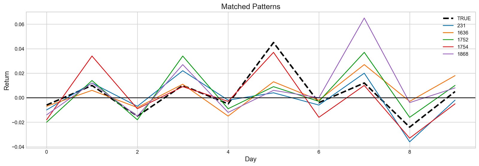
The code snippet identifies and visualizes patterns in Tesla stock price returns. It establishes a starting point and window size for the analysis. The variable sample captures a segment of binary test data, which represents stock returns over a specific period. The code then iterates through the binary_train dataset to find segments matching the sample with perfect accuracy, indicated by an accuracy score of 1.0. When a match is found, its index is added to the list a.
For visualization, Matplotlib is used to plot the returns of the stock. The sample is displayed as a dashed black line, serving as the reference pattern. Matched patterns from the training data are shown as colorful lines, each labeled with their indices, while a horizontal line at zero indicates the baseline return for comparison.
The output image illustrates the matched patterns over ten days. The black dashed line represents the reference pattern, and the colorful lines show similar segments from the training data. The graph reveals fluctuations of the matched patterns in relation to the reference, with some lines closely following the same trajectory, indicating similar return behaviors.
indexes = stocks['tsla'][2001:2011].Return.index

plt.figure(figsize=(16,5))
plt.plot(stocks['tsla'][2000:2020].Return, label='Stock', c='#4ac2fb')
plt.plot(stocks['tsla'][2001:2011].Return, lw=3, label='Pattern (9 days)', c='#ff4e97')
plt.plot(stocks['tsla'][2010:2011].Return, 'h', c='#cc3d78')

for i in a:
    ret = stocks['tsla'][i:i+10].set_index(indexes).Return
    plt.plot(ret, lw=1, c='#b7de24')
    plt.plot(ret[9:], 'h', c='#96b71c')
    #print(ret[9:])

plt.plot([],[], label='Found Patterns', c='#b7de24') # dummy plot for legend

plt.axhline(0, c='k', lw=2, ls='--')
plt.legend(frameon=True, fancybox=True, framealpha=.9, loc=1)
plt.title('Matching Patterns from Training Set', fontSize=15)
plt.ylabel('Return')
plt.show()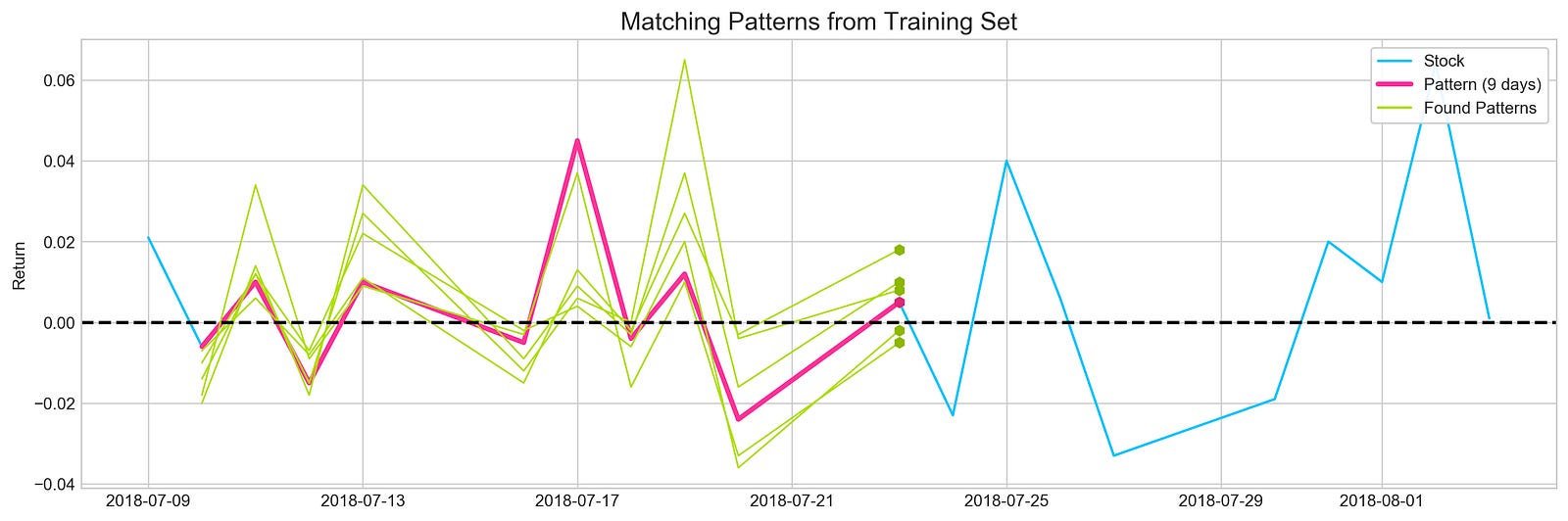
The Python code visualizes Tesla’s stock return patterns from 2000 to 2020 using the Matplotlib library. It extracts return data from 2001 to 2011, stores the indices in a variable, and sets up a plot to display the overall stock returns from 2000 to 2020 in blue. A specific 9-day return pattern from 2001 to 2011 is highlighted in pink, and a specific return value from 2010 is marked with a hexagon.
A loop processes indices for further analysis, extracting 10-day return segments and plotting them in green while marking the end of each segment with a hexagon. A horizontal dashed line at y equals zero indicates the divide between positive and negative returns. The legend differentiates the overall stock returns, the highlighted 9-day pattern, and other identified patterns.
The output image illustrates stock return fluctuations over the period, with the blue line showing the overall trend, the pink line representing the 9-day pattern, and green lines depicting various segments that resemble this pattern.
profit, trades = functions.macd_trading(stocks['tsla'].loc['2018':'2018'])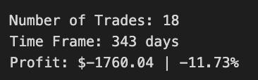
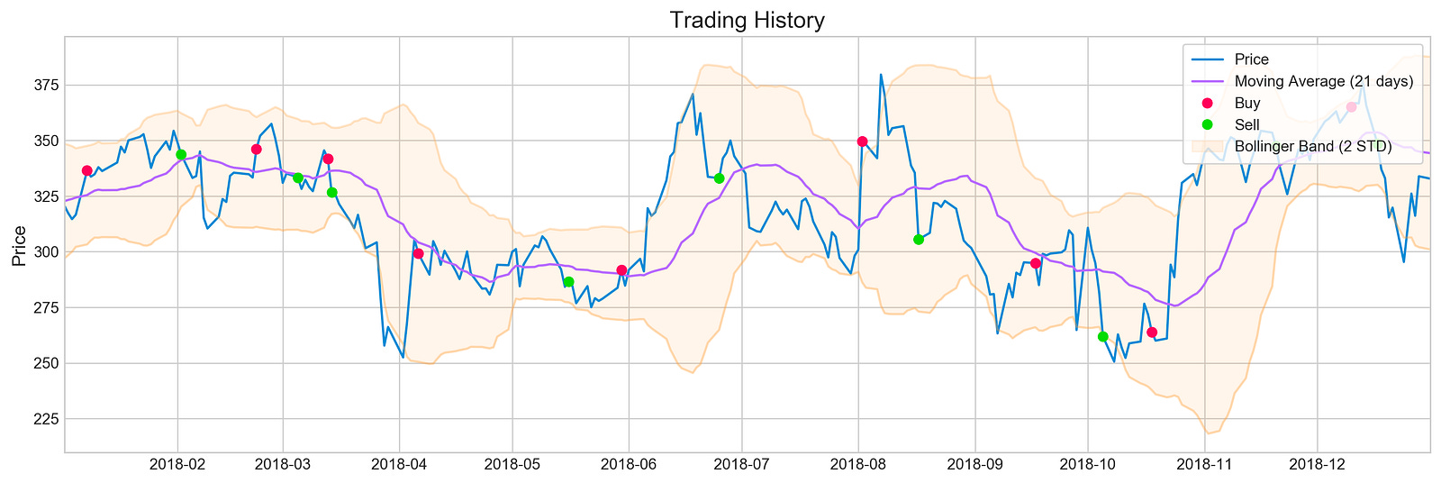
The code utilizes the macd_trading function from the functions module on Tesla stock data from 2018. This function implements a trading strategy based on the Moving Average Convergence Divergence (MACD) indicator, which helps identify potential buy and sell signals. The output includes profit, indicating the financial outcome of the strategy, and trades, representing the number of transactions executed.
The accompanying image visualizes the trading history for Tesla stock throughout 2018. It features a blue line for the stock price, a purple line for the 21-day moving average, and shaded areas for the Bollinger Bands that measure market volatility. Red and green markers denote buy and sell signals, respectively. The chart summarizes 18 trades over 343 days, resulting in a total profit of -160.041, equating to a loss of approximately 11.73%.
This analysis shows the MACD trading strategy’s performance during this period, indicating that despite the number of trades, the overall outcome was negative. The visual elements of the chart contextualize trading decisions and illustrate how price movements corresponded with signals generated by the MACD strategy, providing insights into the challenges of achieving profitability in stock trading.
companies = [i for i in stocks]
returns = []
for i in stocks:
    profit, trades = functions.macd_trading(
        stocks[i].loc['2018':'2018'],
        budget=5000,
        show_graph=False,
        show_return=False
    )
    returns.append(round(profit*100 / 5000, 2))
This code snippet begins by creating a list named companies that contains the items from the stocks collection, effectively copying stocks into companies. An empty list called returns is then initialized to hold the percentage returns for each company’s trading strategy based on profits from the MACD trading function.
A loop iterates over each stock in stocks, calling the macd_trading function for each one. This function implements a trading strategy based on the MACD indicator, using a specified timeframe limited to the year 2018 and a budget of $5,000 without generating graphs or displaying returns. After running the MACD trading function, it returns two values: profit and trades. The profit is used to calculate the return as a percentage of the initial budget by multiplying it by 100 and dividing by 5,000. The result is rounded to two decimal places and appended to the returns list, providing an overview of each stock’s trading strategy returns for that year based on the fixed budget.
pd.DataFrame({'Company': companies, 'Return (%)': returns}).sort_values(by='Return (%)', ascending=False)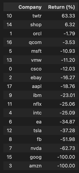
The code snippet utilizes the pandas library to create a DataFrame that organizes data in a tabular format. It takes two lists: one for company names and another for their corresponding percentage returns. The DataFrame is sorted in descending order based on the Return percentage, making it easy to identify companies with the highest returns. The output presents a ranked list of companies and their returns, showing that Twitter has a notable return of 63.33%, while companies like Amazon and Google report a return of -100%, indicating a total loss. Other companies such as Facebook and NVIDIA also show significant negative returns of -51.98% and -62.73%, respectively. This sorted DataFrame efficiently highlights both the best and worst performers, serving as a useful resource for investors and analysts assessing stock performance.
# Tesla
profit, trades = functions.bb_trading(stocks['tsla'].loc['2018':'2018'], u=0.03, l=0.03)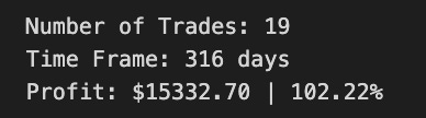
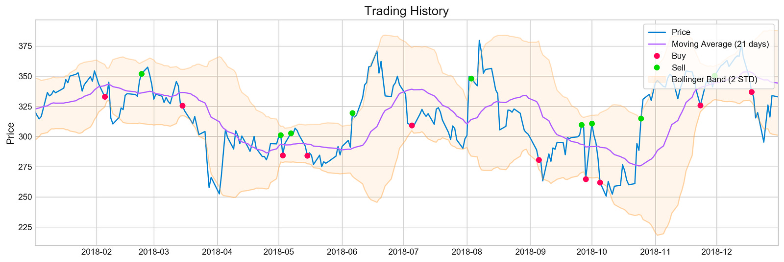
The code snippet uses the bb_trading function to analyze Tesla’s stock data for 2018 with a trading strategy based on Bollinger Bands. The parameters indicate that the upper and lower bands are set at 3% above and below the moving average. This strategy helps identify potential buy and sell signals based on price movements relative to these bands.
The output visualizes the trading history, showing the stock price over time along with a 21-day moving average and the Bollinger Bands. The blue line represents the stock price, the purple line indicates the moving average, and the shaded area around the moving average illustrates the Bollinger Bands, which adjust based on market volatility. Buy signals are indicated by red dots for prices that dipped below the lower band, while green dots represent sell signals for prices that rose above the upper band.
The summary shows a total of 19 trades executed over 316 days, resulting in a profit of $1,532.70, corresponding to a return of 102.22%. This metric underscores the effectiveness of the trading strategy during this period, demonstrating how Bollinger Bands can inform trading decisions based on historical price data. The combination of visual representation and performance metrics offers a clear understanding of the trading strategy’s application and outcomes.
companies = [i for i in stocks]
returns = []
for i in stocks:
    profit, trades = functions.bb_trading(
        stocks[i].loc['2018':'2018'],
        budget=5000,
        u=0.03,
        l=0.03,
        show_graph=False,
        show_return=False
    )
    returns.append(round(profit*100 / 5000, 2))
We start by creating a list called companies that contains all the stock symbols from the stocks variable for easy access. Next, we initialize an empty list named returns to hold the profit percentages for each company’s trading, which will be calculated using the bb_trading function.
