

Predicting the Market: A Hands-On Guide to Time-Series Forecasting with Python
Build, train, and evaluate LSTM and GRU deep learning models from scratch using Keras, Pandas, and Plotly.

Get the source code by clicking the download button at the end of this article!
Long Short-Term Memory (LSTM) networks are a special kind of recurrent neural network (RNN) capable of learning long-term dependencies, making them ideal for time-series forecasting. But how do you actually apply them to noisy, real-world financial data?
This comprehensive tutorial demystifies the process. We will dive deep into the practical application of LSTMs and their popular cousin, GRUs (Gated Recurrent Units), to forecast stock prices.
We’ll start with a raw dataset and walk through every essential step: data normalization, creating time-stepped datasets, building a Sequential model in Keras, compiling and training, and, most importantly, interpreting the results. You won’t just copy code; you’ll understand why we reshape our data, how to evaluate a forecasting model, and what each line of our Python script is doing.
import pandas as pd
import numpy as np
import math
import datetime as dt
from sklearn.metrics import mean_squared_error, mean_absolute_error, explained_variance_score, r2_score
from sklearn.metrics import mean_poisson_deviance, mean_gamma_deviance, accuracy_score
from sklearn.preprocessing import MinMaxScaler

import tensorflow as tf
from tensorflow.keras.models import Sequential
from tensorflow.keras.layers import Dense
from tensorflow.keras.layers import LSTM, GRU

from itertools import cycle

# ! pip install plotly
import plotly.graph_objects as go
import plotly.express as px
from plotly.subplots import make_subplots
We’re building a program that will load, prepare, learn from, and visualize time-series financial data so we can forecast prices; each import is like gathering tools on the workbench. pandas as pd gives us DataFrame objects to hold tabular data — think of a DataFrame as a spreadsheet you can script. numpy as np provides fast numerical arrays and math operations for calculations. import math brings in basic mathematical helpers, and import datetime as dt lets us handle timestamps and calendar math for time-indexed prices.
The sklearn.metrics imports are a set of judges for our model’s performance: mean_squared_error, mean_absolute_error, explained_variance_score, r2_score, mean_poisson_deviance, mean_gamma_deviance, and accuracy_score each measure different aspects of how close predictions are to reality. from sklearn.preprocessing import MinMaxScaler is a tool that rescales features into a fixed range; scaling is like adjusting ingredient amounts so recipes stay in balance and models learn more reliably.
import tensorflow as tf loads the deep-learning framework, and from tensorflow.keras.models import Sequential brings in a simple way to stack layers — a Sequential model is a reusable recipe card where layers are steps. The Dense layer is a basic fully connected chef that mixes inputs; LSTM and GRU are specialist chefs that remember sequence order — an LSTM or GRU is a recurrent neural network layer designed to capture temporal dependencies in time series.
from itertools import cycle provides a small utility to repeat through items like cycling through colors. The commented line # ! pip install plotly is a reminder to install the plotting library if needed. Finally, plotly imports (graph_objects as go, express as px, make_subplots) give interactive visualization tools for exploring predictions and actual prices. All these pieces together prepare us to preprocess stock data, train sequence models, evaluate them, and visualize forecasts for the larger goal of market prediction.
Importing the dataset means loading historical stock data into your project so the model has something to learn from. This data usually comes from a CSV file, a database, or an API (an API is just a way for programs to ask a service for data). Typical fields are date/time, open/high/low/close prices, and volume. Getting these basics right matters because the model learns patterns from past prices.
You’ll usually read the file into a *DataFrame*, which is just a smart table that makes it easy to slice and inspect rows and columns. Parse the date column into real timestamps, set it as the index, and ensure the time frequency is consistent (e.g., daily or minute bars). Also adjust for stock splits and dividends if needed so prices are comparable over time. Doing this prepares the data for feature creation and reliable training.
After import, check for missing values, duplicate rows, and out-of-order timestamps. Watch out for look-ahead bias — don’t let future information slip into past rows, because that will make your model unrealistically optimistic. Finally, save a cleaned copy so you can reproduce results and move on confidently to feature engineering and model training.
# Import dataset
bist100 = pd.read_csv(”/kaggle/input/forerrrx/EURUSD_historical_data (3).csv”)
bist100.head()
We start with a little note that reads “# Import dataset” — think of comments as sticky notes you leave for yourself or your teammates to explain what you’re about to do. The next line uses pandas’ read_csv to open a stored table: pd.read_csv(“/kaggle/input/forerrrx/EURUSD_historical_data (3).csv”) reads the CSV file from the Kaggle input folder and loads it into memory as a variable named bist100. A DataFrame is a two-dimensional labeled data structure, like an in-memory spreadsheet that lets you slice and inspect rows and columns easily — that’s the key concept right where it appears. Naming the variable bist100 while the file is named EURUSD_historical_data is a small mismatch to note; clear names help your future self know whether you’re working with BIST-100 or EUR/USD data.
Finally, bist100.head() peeks at the first few rows (by default five), much like flipping to the first page of a recipe to see the ingredients and portions before you start cooking. That quick preview lets you confirm column names, data types, date formatting, and whether there are missing values or obvious problems that need cleaning. In the larger project of forecasting the market with machine learning, this gentle first look is the kitchen inspection that tells you what preprocessing and feature selection will be needed before you build models.
Give your columns clear, consistent names. Columns are the labeled fields in your data table (a DataFrame is just a smart table), and renaming them makes the data easier to read and work with.
This helps prevent bugs in your forecasting pipeline, makes feature engineering and merging simpler, and ensures your model gets the exact inputs it expects. As a quick rule, use short, lowercase names with underscores instead of spaces so your code and collaborators stay happy.
# Rename columns
bist100.rename(columns={”Date”:”date”,”Open”:”open”,”High”:”high”,”Low”:”low”,”Close”:”close”}, inplace= True)
bist100.head()
Think of the DataFrame as a pantry full of jars labeled by whatever came from the supplier; here you’re tidying those labels so your recipes read easily. The first line takes the DataFrame named bist100 and asks pandas to rename a set of columns, mapping “Date” to date, “Open” to open, “High” to high, “Low” to low and “Close” to close, so later code can refer to friendly, consistent names without worrying about capitalization or spaces. The mapping is passed as a dictionary under the columns parameter, and inplace=True tells pandas to modify the original DataFrame rather than return a new copy — this is a key concept: using inplace=True changes the object in place instead of producing a separate object you’d have to reassign.
After relabeling, the second line calls head() to take a quick look at the top rows, like peeking into the pantry to confirm the new labels are correct and the contents look as expected. head() is a lightweight, non-destructive way to inspect the first few records and verify the date and OHLC (open-high-low-close) fields are in place and formatted predictably.
With tidy, predictable column names and a quick visual check, you’ve prepared a clean starting point for parsing dates, engineering features, and feeding data into your forecasting models.
Dates often come in as plain text like “2021–02–03”, but for forecasting we need them as real dates — *datetime* objects that your tools understand. Converting a date string to a date format means turning that text into a proper date value so you can sort, resample, and pull out parts like month or weekday.
This step matters because time is the backbone of any stock forecast. If dates stay as text, models can’t learn trends over time, and operations like “get the last 30 days” will break. Converting first also makes it easy to split data by time for training and testing, which prevents look-ahead bias.
In practice you can use a converter like pandas.to_datetime (or Python’s datetime.strptime) to parse strings into datetime objects; you can give a format to speed things up and use errors=’coerce’ to flag bad rows. It’s also helpful to set the date column as the index for time-series functions and to normalize or set timezones if you have mixed sources.
Finally, check the result: confirm the column’s dtype is a datetime, handle any missing or mis-parsed values, and make sure all files use the same date format before modeling.
# convert date field from string to Date format and make it index
bist100[’date’] = pd.to_datetime(bist100.date)
bist100.head()
Think of the goal like preparing a journal of market events: every row needs a real, machine-readable timestamp so we can line entries up, slice by time, and feed sequences into a forecasting model. The comment tells that intention — turn the date column from plain text into actual dates and make it the table’s timeline index.
The first line assigns back to the date column the result of pd.to_datetime(bist100.date). Here pd is pandas and to_datetime is the parser that converts human-readable strings into pandas’ datetime dtype; a key concept: having a datetime type allows the table to understand ordering, arithmetic (like differences), and time-based grouping. Converting the column is like replacing handwritten date labels with synchronized wristwatches so every entry ticks in the same cadence.
The second line, bist100.head(), is a quick peek at the first few rows to verify the change — like opening the journal to the first page to make sure the timestamps look right. The comment also mentions making the date the index; that crucial next step (so rows are keyed by time) would be done with set_index(‘date’, inplace=True) if you want the DataFrame to behave as a time series.
With properly-typed dates (and then a DateTimeIndex), you can safely create lagged features, rolling statistics, and time-respecting train/test splits needed for robust stock-market forecasting.
Sorting your dataset by date just means putting the rows in time order so the oldest records come first and the newest last. For stock-forecasting models this matters a lot: the model must only see past prices when learning, and later we’ll create lagged features (past values) that assume the rows are chronological.
First make sure the column with dates is actually a *datetime* type — that’s a way programming tools store dates, not just plain text. If your dates are strings like “01/02/2020,” they can be ambiguous (is that Jan 2 or Feb 1?), so parse them into a standard form like YYYY-MM-DD to avoid mistakes. Time zones can matter too if your data mixes exchanges.
Then sort the table by that datetime column in ascending order so time flows top to bottom. After sorting, it helps to set the date as the table’s index or to reset the row numbers, because many time-series functions expect dates as an index.
Also check for duplicate or missing dates before you train the model: duplicates can leak future info, and gaps may affect moving averages and resampling. Sorting by date is a small step, but it prevents subtle bugs and keeps your forecasts honest.
bist100.sort_values(by=’date’, inplace=True)
bist100.head()
We have a table named bist100 that holds time-stamped market records, and our little story here is about putting those pages in the right order and taking a quick peek. The first line, bist100.sort_values(by=’date’, inplace=True), walks through the rows and rearranges them so the ‘date’ column runs from earliest to latest — imagine shuffling a stack of daily reports into chronological order so nothing from the future slips before the past. The argument inplace=True tells pandas to overwrite the original table rather than making a duplicate; a key concept: an in-place operation modifies the original object instead of returning a new one. The second line, bist100.head(), is like flipping open the freshly ordered ledger and looking at the first few pages to make sure the sorting worked as expected; head() returns the top rows for a quick sanity check and does not alter the data. These two steps ensure your time series is properly ordered before you build features or split train and test sets, which is essential to avoid lookahead bias when you move on to machine learning forecasting.
bist100.shape
Imagine you’re about to cook a complex dish and the first thing you do is check how many ingredients and how many measurements you have on the counter. Calling bist100.shape is exactly that: it asks the data structure how many rows and how many columns it contains. Key concept: shape is a property that returns a tuple describing the dimensions (rows, columns) of a tabular object like a DataFrame or array.
When you run that line, you get a quick snapshot — rows typically correspond to time steps or daily observations of the BIST100 index, and columns represent features such as open, high, low, close prices, volume, or engineered indicators. Knowing the dimensions helps you decide the next step: whether you have enough historical points to train a model, whether you need to reshape data for a neural network that expects a particular input shape, or how to split the dataset into training and testing parts.
It also helps catch surprises early — an unexpected single column, reversed dimensions, or zero rows signals a problem before you spend time building pipelines. In short, checking the shape is a small, confident inspection that informs feature engineering, scaling, and model-input design as you move forward with forecasting the market.
We want the *duration* of the dataset, which just means the time span from the oldest to the newest record. A dataset is your collection of historical stock prices. Knowing the span helps you see if you have enough history to capture trends and seasonality for forecasting.
To get it, pick the column with timestamps and convert it to real dates if needed. A DataFrame is just a smart table, so you would take the smallest date (the start) and the largest date (the end) and subtract them to get the difference. Express that difference in days, months, or years depending on what matters for your model.
Also check for gaps or different frequencies: trading days skip weekends and holidays, and intraday data has many more points per day. Timezone or timestamp formats can make start/end look wrong, so normalize them first. Knowing the duration helps you choose model lookback windows and how to split train/test sets, which makes your forecasts more reliable.
print(”Starting date: “,bist100.iloc[0][0])
print(”Ending date: “, bist100.iloc[-1][0])
print(”Duration: “, bist100.iloc[-1][0]-bist100.iloc[0][0])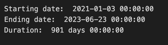
We’re taking a quick, friendly inventory of our dataset’s timeline so we know the time window we’ll teach the model about. The first line announces the starting date by calling print with a label and then pointing into the table with bist100.iloc[0][0]; think of iloc as a pointer that says “row number, column number” so iloc[0][0] is the very first cell in the first row, like reading the top-left entry of a ledger. The second line does the same for the ending date but uses iloc[-1][0], where the -1 is a Python shortcut that means “the last row,” like flipping to the final page of the ledger.
The third line prints the duration by subtracting the start date from the end date, which is like asking “how many pages lie between these two dates?” In pandas, subtracting two datetimes yields a Timedelta, a built-in way to represent an interval; this is a key concept because knowing the span of your data helps you choose appropriate training windows and evaluate seasonality. Each print simply writes those values to the console so we can eyeball them and sanity-check our timeline before moving on.
Having these three lines run is a small, crucial checkpoint that tells us whether our historical window is sensible for the forecasting tasks ahead — it helps shape how we prepare features, split train/test sets, and handle temporal patterns in the stock market model.
We take the stock close value (the price at market close) and normalize it — that just means we squash the numbers into a 0-to-1 scale so they’re easier for a machine learning model to handle. This prevents huge price differences from dominating learning and helps training be more stable and faster.
Do the scaling by subtracting the minimum close in your training set and dividing by the range (max − min). Save those min and max values so you can apply the same transform to new data and *invert* the transform on model outputs to get real prices back. Important practical tip: compute min and max only on the training data to avoid leaking future information into the model; if new prices fall outside the original range, either clip them or update your scaler carefully.
closedf = bist100[[’date’,’close’]]
print(”Shape of close dataframe:”, closedf.shape)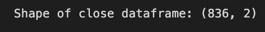
We start by creating a smaller table called closedf from our larger bist100 table by asking for only the ‘date’ and ‘close’ columns; think of it as taking a cookbook and copying out just the two recipe cards we need for today’s dish. A DataFrame is like a spreadsheet or table in memory where each column holds a kind of information and each row is one record, and here we intentionally keep only the time labels and the closing prices because those are the core ingredients for time-series forecasting.
Next we print the shape of closedf with a friendly message so we can immediately see how many rows and columns we have: the shape attribute returns a tuple (rows, columns) that tells us the table’s dimensions at a glance. Printing shape is like checking the size of your batter before you bake — it confirms you have the expected number of observations and the right number of features, which helps catch problems early such as missing data or an accidental extra column.
By selecting date and close and verifying the dimensions, we’re creating a clean, focused dataset ready for the next steps of cleaning, feature engineering, and feeding into the machine learning models that will help forecast future market moves.
close_stock = closedf.copy()
del closedf[’date’]
scaler=MinMaxScaler(feature_range=(0,1))
closedf=scaler.fit_transform(np.array(closedf).reshape(-1,1))
print(closedf.shape)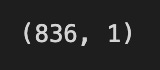
We want the closing prices ready for a machine-learning model, and the first line makes a safe photocopy of the original table so you can always look back at raw values; think of it as keeping an original receipt before you start editing. Removing the ‘date’ column strips away non-numeric bookkeeping so only the numbers remain for mathematical processing — many preprocessing tools expect pure numeric input. Next, a scaler object is created with MinMaxScaler(feature_range=(0,1)); normalization rescales values into a standard range so different magnitudes don’t dominate learning and many models train faster and more stably. The subsequent line turns the remaining data into a one-column numeric array and reshapes it into a tall column (reshape(-1,1) makes a single-feature column), then fit_transform both learns the minimum and maximum from your data and applies the linear stretch so every value sits between 0 and 1. Finally, print(shape) is a quick check — like glancing at the page count — to confirm how many rows (time steps) you have and that there’s exactly one feature column. Altogether, these steps protect your raw data, remove irrelevant fields, and prepare scaled numeric inputs that are ready to be fed into your forecasting model.
We split our dataset so the model can learn from examples and then be tested on data it hasn’t seen. The training set is where the model learns patterns, and the testing set is what we use to check how well those patterns work. Use 65:35 for training versus testing — that means 65% of the data is for learning and 35% is held back to evaluate performance. This ratio gives the model enough history to learn from while keeping a solid chunk to judge how it might do in the real world.
For stock-market forecasting, keep the time order when you split the data — don’t shuffle older and newer rows together — because using future data to train would be like peeking at tomorrow’s prices. That precaution prevents unrealistic results and prepares you for a realistic test of how the model would behave on new, live market data.
training_size=int(len(closedf)*0.65)
test_size=len(closedf)-training_size
train_data,test_data=closedf[0:training_size,:],closedf[training_size:len(closedf),:1]
print(”train_data: “, train_data.shape)
print(”test_data: “, test_data.shape)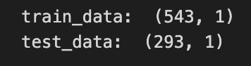
Imagine you’re preparing a deck of daily closing prices and you want to set aside most of the cards to practice your model, keeping the rest to see how well it learned; the first line figures out how many cards go into the practice pile by taking 65% of the total number of entries and converting that to an integer so you have a whole number of rows. The next line computes how many cards are left for testing by subtracting the training count from the total, which ensures your two piles add up to the full dataset — splitting data into training and test sets is a key concept for evaluating generalization.
Then you actually cut the deck: the left-hand of the assignment takes the first group of rows from the start up to the training count as the training set, and the right-hand grabs the remainder starting at that index as the test set; slicing here is like cutting the stack at a chosen point so each new stack preserves the original order. Notice the subtle detail that the training slice keeps all columns while the test slice requests only the first column, so the shapes might differ — shape prints will reveal the number of rows and columns so you can confirm the split. The print lines simply display those shapes, giving you quick feedback that your split behaved as intended.
By checking those shapes before you build models, you make sure your forecasting pipeline has the right-sized training and validation piles to learn and be evaluated.
For time-series forecasting you must reshape your raw stock data so the model sees past values in order, because time-series means the order of observations matters. This prepares the model to learn patterns that unfold over time, like trends or repeated daily swings.
Pick a lookback window (how many past time steps to use) and a forecast horizon (how far ahead to predict). The lookback window makes each input a short history the model can learn from, and the horizon decides whether you predict the next minute, next day, or several steps ahead.
Turn the series into overlapping input-output pairs: each sample is a slice of consecutive past values and a matching future target. The resulting shape is usually (samples, timesteps, features), which is what most ML models expect.
Split data by time into training, validation, and test sets — never shuffle across time — so you don’t accidentally let future information leak into training. This mimics how you’ll use the model in real trading: training on the past, predicting the future.
Clean and scale features first. Fill or remove missing values, add relevant inputs like volume or technical indicators, and scale using a transformer fit on the training set only. Scaling keeps large numbers from dominating learning and makes training more stable.
Optionally make stationary features (like percent changes) if your model struggles with trends. This often helps models focus on predictable patterns instead of long-term drift.
# convert an array of values into a dataset matrix
def create_dataset(dataset, time_step=1):
    dataX, dataY = [], []
    for i in range(len(dataset)-time_step-1):
        a = dataset[i:(i+time_step), 0]   ###i=0, 0,1,2,3-----99   100
        dataX.append(a)
        dataY.append(dataset[i + time_step, 0])
    return np.array(dataX), np.array(dataY)
Think of the function as a reusable recipe card named create_dataset that turns a long timeline of prices into many little meal-prep boxes: each box holds a fixed number of past days (the ingredients) and the single next day we want to predict (the finished dish). The def line declares the recipe card with two inputs: dataset (the timeline) and time_step (how many past days to use), and time_step defaults to 1 so you can call it quickly for one-step windows. The next line creates two empty baskets, dataX and dataY, where inputs and labels will be collected.
The for loop is like repeating a recipe step for every valid starting point: range(len(dataset)-time_step-1) moves a window along the series but stops early so we never reach past the end of the timeline — that off-by-one safety prevents index errors. Inside the loop, the slice a = dataset[i:(i+time_step), 0] pulls out a contiguous block of time_step rows from column zero; slicing is like taking the last N ingredients from the fridge. The function then appends that block to dataX and appends the immediate next value dataset[i + time_step, 0] to dataY — those pairs become input and target.
Finally, return np.array(dataX), np.array(dataY) converts the baskets into numpy arrays that machine learning libraries expect. In short, the routine converts a raw time series into supervised input-output pairs so your model can learn to forecast the stock’s next value from the previous time_step values.
# reshape into X=t,t+1,t+2,t+3 and Y=t+4
time_step = 15
X_train, y_train = create_dataset(train_data, time_step)
X_test, y_test = create_dataset(test_data, time_step)

print(”X_train: “, X_train.shape)
print(”y_train: “, y_train.shape)
print(”X_test: “, X_test.shape)
print(”y_test”, y_test.shape)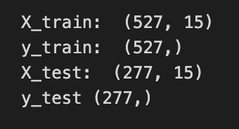
Imagine you’re building little stories from a long stock price history so the model can learn “what usually comes next.” The comment at the top shows a simple example: take times t, t+1, t+2, t+3 as the input story and predict t+4 as the next beat; here we generalize that idea by picking time_step = 15, which means each input will be a sequence of the last 15 observations. A function call is like a reusable recipe card, and create_dataset(train_data, time_step) follows that recipe to slice the training series into many overlapping 15-step input sequences (X_train) and their matching single-step targets (y_train), and the same happens with the test data to produce X_test and y_test. The print statements then show the shape of each array so you can inspect what you made; shape is simply the set of dimensions that tells you how many examples you have and how many timesteps (and features) each example contains. Seeing the shapes confirms that you produced the right number of training and test samples and that each input has the expected 15-step context. Those prepared X and y arrays are the packaged examples you’ll feed into a sequential model (like an LSTM) so it can learn to forecast future stock movements.
LSTM stands for Long Short-Term Memory. It’s a kind of neural network that looks at things in order — like a list of past stock prices — and keeps a flexible memory of what it saw. Think of it as a smart sequence reader that can remember both recent blips and longer trends.
People use LSTMs for stock forecasting because they can learn patterns that stretch over time. They solve the “vanishing gradient” problem, which is when older signals get too weak for the model to learn from; in plain terms, LSTMs help the model actually learn from things that happened many steps ago. This matters because market moves often depend on both short-term noise and longer-term shifts.
In a forecasting project, an LSTM needs clean, scaled data and a sensible way to feed it windows of past values (for example, the last 60 minutes or 30 days). It’s a powerful tool for spotting temporal patterns, but it’s not a crystal ball: you still need good features, careful validation, and risk-aware decisions to turn its signals into a usable strategy.
# reshape input to be [samples, time steps, features] which is required for LSTM
X_train =X_train.reshape(X_train.shape[0],X_train.shape[1] , 1)
X_test = X_test.reshape(X_test.shape[0],X_test.shape[1] , 1)

print(”X_train: “, X_train.shape)
print(”X_test: “, X_test.shape)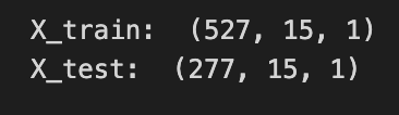
Imagine you’re arranging ingredients before baking: you have many small sequences of prices, and the LSTM wants each sequence stacked into neat trays with three layers — how many trays (samples), how many slices in each tray (time steps), and how many different ingredients per slice (features). The comment explains that reshaping organizes the data into [samples, time steps, features], which LSTM layers require to understand temporal order; key concept: LSTM expects a 3D tensor where the network can step through time.
The first line takes the training set and reshapes it by keeping the number of samples (X_train.shape[0]) and the number of time steps (X_train.shape[1]) the same, then adds a final dimension of 1 to indicate there’s a single feature per time step — think of adding a singleton slot for one ingredient. The next line does the same for the test set, so both training and test data share the same tray layout for the model.
The print statements are a quick kitchen check: they show the shapes so you can confirm the trays are arranged correctly before cooking. Seeing something like (num_samples, time_steps, 1) reassures you that each sequence is ready to be fed into the LSTM.
By reshaping and verifying, you’re preparing the temporal inputs properly so the model can learn patterns in past prices and help forecast future stock movements.
An LSTM model structure means the layout of a special neural network called a Long Short-Term Memory network, which is just a model that can remember information across time steps — useful for stock prices because they’re sequences of numbers. Think of it as a pipeline: you feed in past price data, the LSTM layers process the sequence and keep useful memory, and a final layer turns that memory into a prediction (like the next price or the next return).
LSTMs use simple building blocks called gates (forget, input, output) that decide what to remember or discard; these are just small rules inside the network that protect important signals from being lost. We often add things like dropout (a gentle regularizer that prevents overfitting) and a dense output layer (a simple predictor) to finish the model.
Choosing the right structure — how many LSTM layers, how long the input window, and what the output looks like — matters because it controls how much past information the model can use and how well it generalizes to new market moves.
tf.keras.backend.clear_session()
model=Sequential()
model.add(LSTM(32,return_sequences=True,input_shape=(time_step,1)))
model.add(LSTM(32,return_sequences=True))
model.add(LSTM(32))
model.add(Dense(1))
model.compile(loss=’mean_squared_error’,optimizer=’adam’)
We’re building a small neural recipe meant to taste patterns in time so it can predict the next stock price. The first line clears the Keras session like wiping the whiteboard clean so previous models or weights won’t interfere with the new build.
Creating model = Sequential() starts a simple stack where layers are added one after another; Sequential is a model type that lets you compose layers in a straight line. The first model.add(LSTM(32, return_sequences=True, input_shape=(time_step,1))) places an LSTM with 32 memory cells that accepts sequences of length time_step with one feature per step; an LSTM is a recurrent unit that learns temporal dependencies by carrying and updating a memory across time. Setting return_sequences=True is like telling the chef to pass the whole prepared sequence forward rather than a single summary, so the next layer can keep working on each time step.
The next model.add(LSTM(32, return_sequences=True)) repeats that role, refining temporal features and still handing full sequences onward, and model.add(LSTM(32)) is the final LSTM chef that reduces the sequence into a compact summary vector. model.add(Dense(1)) places a simple fully connected layer that maps that summary to a single numeric prediction; a Dense layer is a layer where every input is connected to every output.
Finally, model.compile(loss=’mean_squared_error’, optimizer=’adam’) sets how we measure mistakes (MSE measures average squared error) and which learning rule adjusts the weights (Adam is an efficient gradient-based optimizer). With the model compiled, it’s ready to be trained on historical prices toward forecasting future market movements.
model.summary()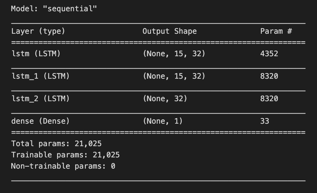
Imagine we’re building a forecasting chef’s special that predicts stock prices: the model is our multi-step recipe card with layers as ingredients and learnable weights as the quantities we hope the kitchen will tune. When you call model.summary(), you’re holding that recipe up to the light and reading every line on it — layer names, the shape of their outputs (how many servings each step produces), the number of parameters in each layer (how many knobs the kitchen staff can tweak), and the totals for trainable versus non-trainable parameters. A key concept: the number of parameters measures model capacity, which affects how well it can fit patterns versus how easily it might overfit.
That single line doesn’t change the recipe; it’s a gentle inspection tool that prints a concise blueprint so you can confirm the layer order, check that the input and output shapes match your time-series framing (for example, that the final layer outputs the right number of forecast steps), and assess whether the model is too massive or too tiny for your available market data. Think of it as a sanity check before you start the long training run — catching shape mismatches or unexpectedly huge parameter counts early saves time. By reading the summary, you make sure the architecture aligns with your forecasting goals: the right temporal layers, the proper output shape, and a reasonable capacity for learning market patterns.
model.fit(X_train,y_train,validation_data=(X_test,y_test),epochs=200,batch_size=5,verbose=1)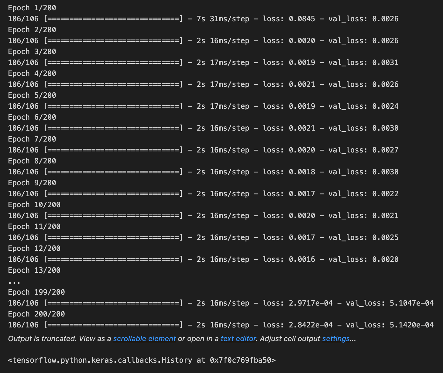
Imagine we’re teaching a student how to predict tomorrow’s stock movement by showing examples until they get better; the line here is the moment we sit down and train our model, where fit is the teacher’s method that adjusts the model’s internal rules by looking at examples and their correct answers. We hand the teacher the examples X_train (the input features like past prices and indicators) and y_train (the targets we want it to predict), and it uses those pairs to learn the mapping from inputs to future prices. We also give validation_data as (X_test, y_test) so the teacher can check progress on unseen examples after each learning pass without using those to change its answers; validation is a quick check to see if learning is generalizing beyond the examples used for practice. Epochs=200 means the model will review the whole training set 200 times; an epoch is one full pass through all the training examples. Batch_size=5 tells the teacher to update its knowledge after seeing 5 examples at a time instead of waiting for the whole class; a batch is a small group of examples used to compute a learning step. verbose=1 turns on a progress display so we can watch loss and accuracy evolve as the model learns. After these runs, the model’s weights reflect patterns it found in historical data, ready to be evaluated and used in the larger stock-forecasting pipeline.
### Lets Do the prediction and check performance metrics
train_predict=model.predict(X_train)
test_predict=model.predict(X_test)
train_predict.shape, test_predict.shape
We want to turn our trained model into actual forecasts and then see how well it did, so the first two lines are like taking the recipe card off the shelf and using it to bake two batches: one batch from the training ingredients and one from the test ingredients. The model.predict call is a function being reused to apply the learned transformation to new input arrays; prediction (inference) is applying the learned mapping from inputs to outputs so the model can produce numerical forecasts. By running train_predict = model.predict(X_train) you ask the model to recreate its outputs on the same examples it learned from, which helps reveal how tightly it fitted the training data. Running test_predict = model.predict(X_test) asks it to forecast on held-out examples it hasn’t seen during learning, which shows generalization to new market conditions.
Finally, train_predict.shape, test_predict.shape is a quick check of the output “yield” — it returns the dimensions (how many forecasts and how many values per forecast), letting you confirm the predictions align with the expected number of samples and target format before computing errors. If the shapes look right, you can then invert any scaling and compare predictions to true prices to compute metrics and judge overfitting, underfitting, and real forecasting skill for the stock market project.
# Transform back to original form

train_predict = scaler.inverse_transform(train_predict)
test_predict = scaler.inverse_transform(test_predict)
original_ytrain = scaler.inverse_transform(y_train.reshape(-1,1))
original_ytest = scaler.inverse_transform(y_test.reshape(-1,1))
What we’re doing here is taking numbers the model worked with behind the scenes and turning them back into real stock prices so they make sense to us. The first line asks the scaler to reverse the normalization on the model’s training-set predictions — think of it like converting a recipe written in ‘per-portion’ units back into actual cups for the whole cake. Feature scaling is when we rescale numbers to a common range to help models learn more effectively. The second line does the exact same reversal for the test-set predictions so both sets live in the same real-world units.
The third and fourth lines take the true target values from training and test sets and convert them back as well; before reversing we reshape each one with reshape(-1,1), which turns a flat list into a one-column table because the scaler expects two-dimensional input, like arranging ingredients into the right-sized bowls before measuring. Doing the inverse transform on both predictions and actual values lets you compare apples to apples — you can compute errors, plot predicted versus actual prices, and interpret results in dollars instead of scaled units.
By undoing the scaling, you prepare everything for evaluation and visualization, which is the final step before deciding if the forecasting model is ready to support real trading or further refinement.
RMSE, MSE and MAE are common ways to measure how wrong a model is when it predicts numbers, like stock prices. Quantitative data just means numbers, so these metrics tell you how far your predictions land from the actual prices. They give a single number you can use to compare models and track improvement.
MSE (Mean Square Error) is the average of the squared differences between predicted and actual values — squaring makes bigger mistakes count much more. RMSE (Root Mean Square Error) is just the square root of MSE, so it brings that measure back to the same units as the stock price and is easier to interpret. MAE (Mean Absolute Error) is the average of the absolute differences, so it treats all mistakes evenly and is less affected by rare big errors. For stock forecasting, RMSE highlights models that avoid huge misses, while MAE gives a straightforward average error in the same units you care about.
# Evaluation metrices RMSE and MAE
print(”Train data RMSE: “, math.sqrt(mean_squared_error(original_ytrain,train_predict)))
print(”Train data MSE: “, mean_squared_error(original_ytrain,train_predict))
print(”Test data MAE: “, mean_absolute_error(original_ytrain,train_predict))
print(”-------------------------------------------------------------------------------------”)
print(”Test data RMSE: “, math.sqrt(mean_squared_error(original_ytest,test_predict)))
print(”Test data MSE: “, mean_squared_error(original_ytest,test_predict))
print(”Test data MAE: “, mean_absolute_error(original_ytest,test_predict))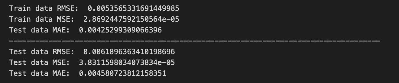
We’re trying to measure how close our model’s guesses are to the real stock values, printing a few error scores so we can judge performance. The first print call shows “Train data RMSE:” followed by math.sqrt(mean_squared_error(original_ytrain, train_predict)); mean_squared_error is a little recipe card that averages the squared differences between actual and predicted values, and taking math.sqrt turns that into RMSE so the error is back in the same units as the prices (RMSE is the square-root of average squared error, a single-sentence key concept: RMSE penalizes larger errors more strongly). The next print shows “Train data MSE:” and directly prints mean_squared_error(original_ytrain, train_predict) so you see the raw average of squared errors, which highlights variance in mistakes. The third print labels “Test data MAE:” but calls mean_absolute_error(original_ytrain, train_predict) — mean_absolute_error averages absolute differences, and a one-line note: MAE gives the average size of errors and is less sensitive to outliers than MSE; here the arguments appear to still reference training data, which is likely a copy-paste mistake if the intent was to evaluate test performance. A long dashed line is printed to separate train and test reports like drawing a divider on a scorecard. The final three prints compute test RMSE, test MSE, and test MAE using original_ytest and test_predict so you can compare how errors behave on unseen data. Together, these numbers help you decide whether your forecasting recipe for stock prices is reliable or needs refinement.
The explained variance score tells you how much of the ups and downs in the real data your model captures. It’s calculated as 1 minus the variance of the prediction errors divided by the variance of the actual values. Here, the variance of the prediction errors means the spread (squares of standard deviations) of the differences between what you predicted and what actually happened, and the variance of the actual values means the spread of the real numbers you’re trying to forecast.
Scores close to 1.0 are what you want — they mean the error spread is small compared with how much the real data moves. In stock forecasting this helps you see whether your model is explaining real market movements or just noise. A helpful thing to know: the score can be low or even negative if your predictions are more scattered than the actual values, which tells you the model is worse than just guessing the average.
print(”Train data explained variance regression score:”, explained_variance_score(original_ytrain, train_predict))
print(”Test data explained variance regression score:”, explained_variance_score(original_ytest, test_predict))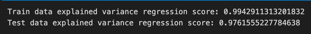
Imagine you’re on stage showing how well your forecasting recipe worked: each print line announces a score so everyone can see how faithful the model’s predictions were. The first line calls the printer to display a labeled message for the training set and hands explained_variance_score two things — original_ytrain, the real historical prices we trained on, and train_predict, the model’s predicted prices for those same days — like comparing the original song to the cover version to see how much of the tune was preserved. A function is like a reusable recipe card, and explained_variance_score is that card which measures how much of the target’s variability your predictions capture; in one simple sentence: explained variance quantifies the proportion of the original data’s spread that your model successfully explains, with 1 meaning perfect capture, 0 meaning no better than predicting the mean, and negative meaning worse than that.
The second line repeats the announcement for the test set, pairing original_ytest (unseen true values) with test_predict (model forecasts on new data) so you can compare generalization versus memorization — if the train score is high but the test score drops, think of a recipe that only works in your own kitchen. Printing both scores side by side gives a quick, human-readable check of overfitting and practical usefulness, which is exactly the kind of feedback you need when polishing a stock market forecasting model.
R-squared (R²) tells you how much of the ups and downs in what you’re trying to predict are explained by the things you used to predict it. In plain words: if the dependent variable is the stock price (what you’re predicting) and the independent variables are your indicators (what you feed the model), R² shows the proportion of the price movement those indicators account for. Proportion means if R² = 0.8, the model explains 80% of the variation.
R² ranges from 1 downwards: 1 = Best — the model explains all the variation. 0 or < 0 = worse — a score of zero means the model explains none of the variation, and a negative R² means the model is actually worse than always predicting the average. This helps you quickly compare models and spot when a model is just chasing noise instead of real signals.
In stock forecasting, remember markets are noisy, so R² is often low; it’s a handy check, but not the whole story. Use it alongside other metrics and domain knowledge to judge whether a model is useful in practice.
print(”Train data R2 score:”, r2_score(original_ytrain, train_predict))
print(”Test data R2 score:”, r2_score(original_ytest, test_predict))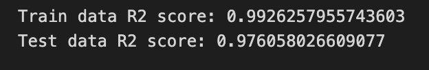
Imagine we’re taking a quick report card for our model so we know how well it learned the market patterns. The first line prints a label “Train data R2 score:” and then calls r2_score with original_ytrain and train_predict; original_ytrain are the true target values the model trained on, and train_predict are the model’s guesses for those same examples. R² (R-squared) score is the proportion of variance in the true values that the model’s predictions explain, with 1 meaning perfect explanation and lower or negative values indicating poorer fit. Think of r2_score as a ruler that measures how closely the model’s map matches the training terrain.
The second line does the same for the held-out test set: it prints “Test data R2 score:” and computes r2_score(original_ytest, test_predict), where original_ytest are unseen true values and test_predict are the model’s forecasts for them — this is like comparing how well you perform in rehearsal (train) versus in the real concert (test). By showing both numbers side by side you can spot overfitting if the training score is high but the test score drops, or underfitting if both are low; those insights tell you whether to collect more data, add features, or change the model. These printed R² values are simple, immediate feedback that guide the next steps in building a robust stock-forecasting model.
Regression loss is the number we give a model during training to tell it how wrong its predictions are. *Deviance* is just a particular kind of error that compares the model’s predicted probability shape to the actual outcomes, so lower deviance means the model’s predictions fit reality better. Picking the right deviance helps a model learn patterns that match how your data actually behaves.
Mean Gamma deviance regression loss (MGD) is a loss for data that are positive and continuous and often skewed — think trade sizes or volatility magnitudes, not counts. The Gamma assumption means the loss cares about relative differences (predicting twice too large is penalized more than a small absolute error), which can be useful when values span several orders of magnitude.
Mean Poisson deviance regression loss (MPD) is a loss for count data, like the number of trades or events in a time window. The Poisson assumption models how counts fluctuate and penalizes errors in a way that fits discrete, nonnegative counts. Choosing MGD or MPD because they match your data type usually gives more realistic stock-market forecasts than using a generic loss.
print(”Train data MGD: “, mean_gamma_deviance(original_ytrain, train_predict))
print(”Test data MGD: “, mean_gamma_deviance(original_ytest, test_predict))
print(”----------------------------------------------------------------------”)
print(”Train data MPD: “, mean_poisson_deviance(original_ytrain, train_predict))
print(”Test data MPD: “, mean_poisson_deviance(original_ytest, test_predict))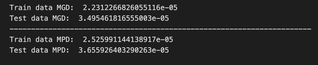
We’re trying to measure how well our model’s guesses match reality, so the first print says “Train data MGD:” and then calls mean_gamma_deviance(original_ytrain, train_predict). A function is like a reusable recipe card that takes ingredients and returns a result, so mean_gamma_deviance is a recipe that computes the average gamma deviance — a deviance is a numerical measure of how far predictions are from observations under a specific distributional assumption. By passing original_ytrain (the true values we trained on) and train_predict (the model’s guesses on that same data), we get a sense of fit on familiar ground.
The next line repeats that measure but on the test set: “Test data MGD:” with mean_gamma_deviance(original_ytest, test_predict) tells us how well the same recipe fares on new, unseen data, which is our check for generalization. The dashed print acts like a visual divider on a scoreboard so we can clearly separate different kinds of metrics.
After the divider we repeat the pattern with a different recipe card: “Train data MPD:” calls mean_poisson_deviance(original_ytrain, train_predict) and “Test data MPD:” calls mean_poisson_deviance(original_ytest, test_predict). Using both gamma and Poisson deviances lets us compare which distributional assumption yields better alignment between predictions and reality. Together, these lines give us quick, readable diagnostics to choose and refine models as we pursue more reliable stock market forecasts.
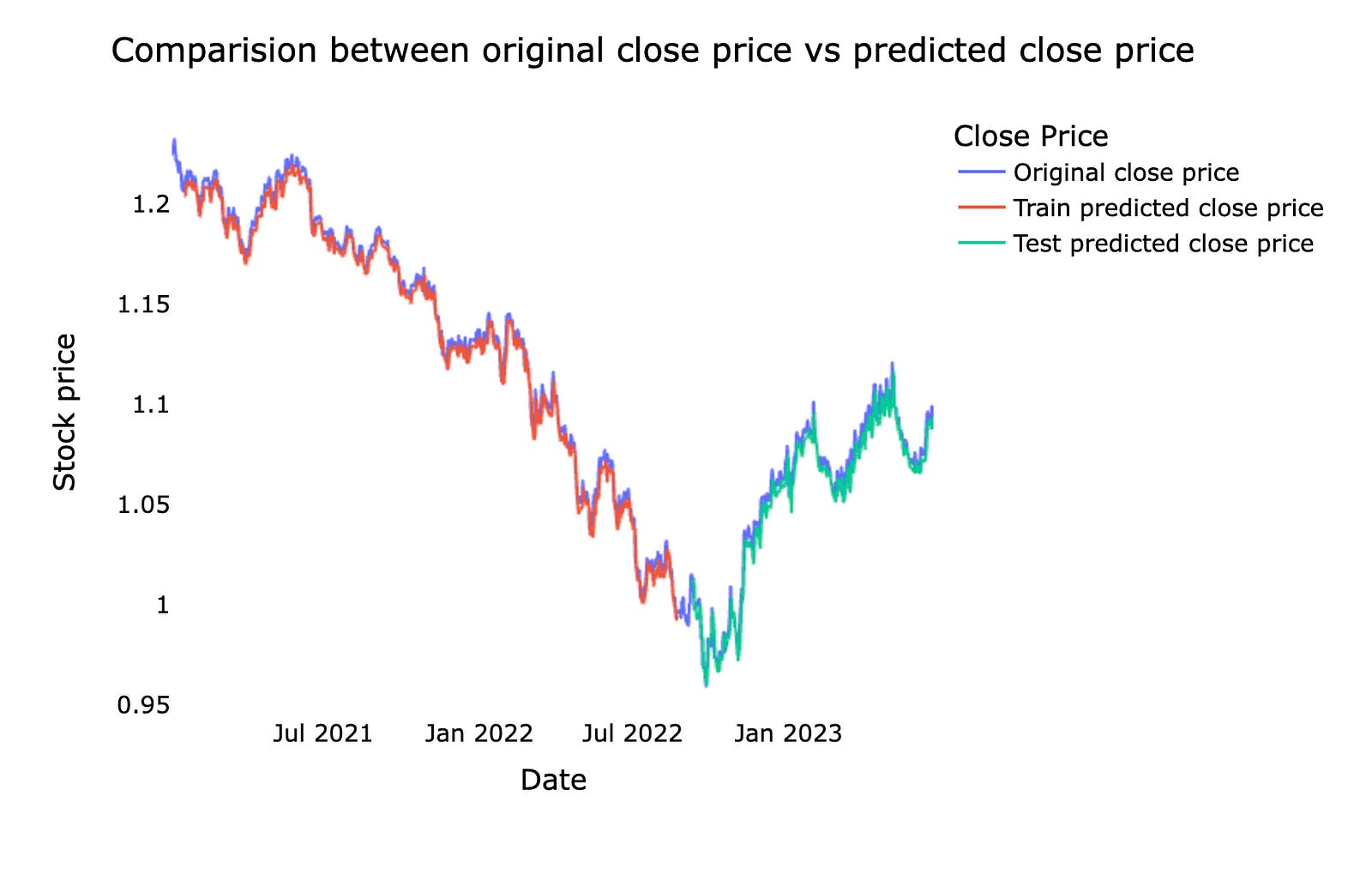
This is a comparison between the original stock *close price* — the actual price at the market close — and the *predicted close price* from our machine learning model. We usually show them together on a chart so you can easily see where the model follows the real market and where it diverges.
Doing this comparison helps us judge how well the forecast is working and where it needs fixing. Seeing the gaps on a chart makes it easier to spot consistent lags, missed spikes, or periods of high error, which guides how we tune the model and manage risk in real trading.
# shift train predictions for plotting

look_back=time_step
trainPredictPlot = np.empty_like(closedf)
trainPredictPlot[:, :] = np.nan
trainPredictPlot[look_back:len(train_predict)+look_back, :] = train_predict
print(”Train predicted data: “, trainPredictPlot.shape)

# shift test predictions for plotting
testPredictPlot = np.empty_like(closedf)
testPredictPlot[:, :] = np.nan
testPredictPlot[len(train_predict)+(look_back*2)+1:len(closedf)-1, :] = test_predict
print(”Test predicted data: “, testPredictPlot.shape)

names = cycle([’Original close price’,’Train predicted close price’,’Test predicted close price’])


plotdf = pd.DataFrame({’date’: close_stock[’date’],
                       ‘original_close’: close_stock[’close’],
                      ‘train_predicted_close’: trainPredictPlot.reshape(1,-1)[0].tolist(),
                      ‘test_predicted_close’: testPredictPlot.reshape(1,-1)[0].tolist()})

fig = px.line(plotdf,x=plotdf[’date’], y=[plotdf[’original_close’],plotdf[’train_predicted_close’],
                                          plotdf[’test_predicted_close’]],
              labels={’value’:’Stock price’,’date’: ‘Date’})
fig.update_layout(title_text=’Comparision between original close price vs predicted close price’,
                  plot_bgcolor=’white’, font_size=15, font_color=’black’, legend_title_text=’Close Price’)
fig.for_each_trace(lambda t:  t.update(name = next(names)))

fig.update_xaxes(showgrid=False)
fig.update_yaxes(showgrid=False)
fig.show()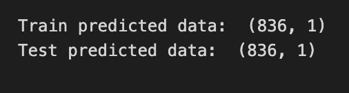
We’re trying to take the model’s train and test forecasts and lay them onto the original time line so we can see how well the model follows the real closing prices. First, look_back = time_step stores how many past points the model used — think of it as the number of recipe steps needed before you can make a prediction. trainPredictPlot = np.empty_like(closedf) creates a blank canvas the same shape as the original data, and filling it with np.nan leaves empty spaces where no prediction exists; those NaNs act like gaps so plotted lines only appear where we place predictions. The slice trainPredictPlot[look_back:len(train_predict)+look_back, :] = train_predict shifts the training predictions forward by look_back so they align with the dates the model actually predicted, and print shows the array shape so you can sanity-check sizes.
The test section repeats the same idea with another blank canvas, but the slice uses len(train_predict)+(look_back*2)+1:len(closedf)-1 to place test predictions after the training window and the necessary offsets — it’s just careful bookkeeping to line dates and forecasts up. names = cycle([…]) prepares a repeating set of labels to assign to plotted lines, like name tags on a roll.
A DataFrame is assembled with date, original_close, and flattened prediction arrays (reshape(1,-1)[0].tolist() unwraps a 2D array into a 1D list for each column). Plotly Express draws a multi-line chart, update_layout polishes title and styling, for_each_trace with next(names) renames the traces so the legend reads clearly, and the axes gridlines are removed before showing the interactive figure. The final plot gives an intuitive visual comparison of actual vs predicted prices — an essential diagnostic when forecasting stocks with machine learning.
Now we ask the model to predict the next 10 days. By that I mean we want the model to forecast what the stock might do over the upcoming 10-day period — the model will produce a short sequence of future values. This gives a focused, near-term view we can actually act on.
Doing a 10-day forecast is useful because it keeps the horizon short and realistic for traders and for checking how well the model works. After we get these predictions we can compare them to the real prices to see where the model succeeds or needs tuning, which helps us improve future forecasts.
x_input=test_data[len(test_data)-time_step:].reshape(1,-1)
temp_input=list(x_input)
temp_input=temp_input[0].tolist()

from numpy import array

lst_output=[]
n_steps=time_step
i=0
pred_days = 10
while(i<pred_days):

    if(len(temp_input)>time_step):

        x_input=np.array(temp_input[1:])
        #print(”{} day input {}”.format(i,x_input))
        x_input = x_input.reshape(1,-1)
        x_input = x_input.reshape((1, n_steps, 1))

        yhat = model.predict(x_input, verbose=0)
        #print(”{} day output {}”.format(i,yhat))
        temp_input.extend(yhat[0].tolist())
        temp_input=temp_input[1:]
        #print(temp_input)

        lst_output.extend(yhat.tolist())
        i=i+1

    else:

        x_input = x_input.reshape((1, n_steps,1))
        yhat = model.predict(x_input, verbose=0)
        temp_input.extend(yhat[0].tolist())

        lst_output.extend(yhat.tolist())
        i=i+1

print(”Output of predicted next days: “, len(lst_output))
Imagine you’re preparing the last few days of price history as ingredients for a prediction recipe: x_input = test_data[len(test_data)-time_step:].reshape(1,-1) slices the final time_step elements and reshapes them into a single-row array so the model gets a two-dimensional input it expects. Turning that row into a plain Python list happens in two gentle steps: temp_input = list(x_input) makes a list containing the row, then temp_input = temp_input[0].tolist() extracts that row as a simple list of numbers you can append to — like laying out the ingredients on the counter. The import from numpy is a small housekeeping line that brings the array constructor into scope, though here you mostly rely on np already available.
You create an empty jar to collect results with lst_output = [] and set n_steps = time_step so the recipe card (n_steps) matches your sliding window size; a sliding window repeatedly feeds the model the most recent time_step values to predict the next value. Counters i = 0 and pred_days = 10 prepare to run the prediction loop for ten future days. The while loop repeats the prediction step like following a recipe multiple times. Inside, if(len(temp_input) > time_step) you keep the window size constant by taking temp_input[1:] as the latest n_steps ingredients, reshape it to (1, n_steps, 1) because the model expects samples × timesteps × features, then call yhat = model.predict(x_input, verbose=0) to get the next price from the trained oracle. You append that new forecast into temp_input and drop the oldest element so the window slides forward, and also extend lst_output so you record every prediction. The else branch handles the very first prediction when the list is exactly time_step long by reshaping and predicting similarly. Finally the print reports how many days were forecasted. Together these steps produce a chain of next-day forecasts you can later invert and plot against real prices as part of the larger stock market forecasting project.
We’ll plot the last 15 days of real stock prices and the next 10 days the model predicts. *Predicted* means the machine learning model estimated future prices from past data, so the chart shows what actually happened recently and what the model expects next. Seeing them side by side makes it easy to judge whether the model is following the recent market movement.
Make sure the chart has time on the x‑axis and price on the y‑axis, and clearly labels which line is actual vs predicted. This small, focused view helps you spot where the model lags (reacts too slowly) or overshoots (predicts too high or low), which tells you what to tweak next.
Using the last 15 days and the next 10 days keeps things practical: it focuses on near‑term behavior that matters for short‑term trading decisions and makes errors easier to spot quickly. This quick visual check is a simple but powerful step before digging into metrics or retraining the model.
last_days=np.arange(1,time_step+1)
day_pred=np.arange(time_step+1,time_step+pred_days+1)
print(last_days)
print(day_pred)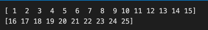
Imagine you have a little ruler of days: one part marks the recent chunk of history your model looked at, and the next marks the future days you want to forecast. The first line, last_days = np.arange(1, time_step + 1), creates that history ruler from day 1 up through the last day the model used; np.arange generates an evenly spaced sequence of numbers between a start and an exclusive end, so adding 1 lets the final day be included. Think of np.arange as writing consecutive page numbers in a notebook: you tell it where to start and just past where you want to stop. The second line, day_pred = np.arange(time_step + 1, time_step + pred_days + 1), writes the next block of page numbers immediately after the history block — these are the future day indices your model will predict. By offsetting the start by time_step + 1 you ensure there’s no overlap: the last known day and the first predicted day sit side by side on the timeline. The two print statements then lay those rulers out on the table so you can inspect them in the console; printing is simply a quick way to verify your axes before plotting. Together, these lines prepare the x-axis labels that will let you align past prices with predicted prices when you visualize and evaluate your forecasting model.
temp_mat = np.empty((len(last_days)+pred_days+1,1))
temp_mat[:] = np.nan
temp_mat = temp_mat.reshape(1,-1).tolist()[0]

last_original_days_value = temp_mat
next_predicted_days_value = temp_mat

last_original_days_value[0:time_step+1] = scaler.inverse_transform(closedf[len(closedf)-time_step:]).reshape(1,-1).tolist()[0]
next_predicted_days_value[time_step+1:] = scaler.inverse_transform(np.array(lst_output).reshape(-1,1)).reshape(1,-1).tolist()[0]

new_pred_plot = pd.DataFrame({
    ‘last_original_days_value’:last_original_days_value,
    ‘next_predicted_days_value’:next_predicted_days_value
})

names = cycle([’Last 15 days close price’,’Predicted next 10 days close price’])

fig = px.line(new_pred_plot,x=new_pred_plot.index, y=[new_pred_plot[’last_original_days_value’],
                                                      new_pred_plot[’next_predicted_days_value’]],
              labels={’value’: ‘Stock price’,’index’: ‘Timestamp’})
fig.update_layout(title_text=’Compare last 15 days vs next 10 days’,
                  plot_bgcolor=’white’, font_size=15, font_color=’black’,legend_title_text=’Close Price’)

fig.for_each_trace(lambda t:  t.update(name = next(names)))
fig.update_xaxes(showgrid=False)
fig.update_yaxes(showgrid=False)
fig.show()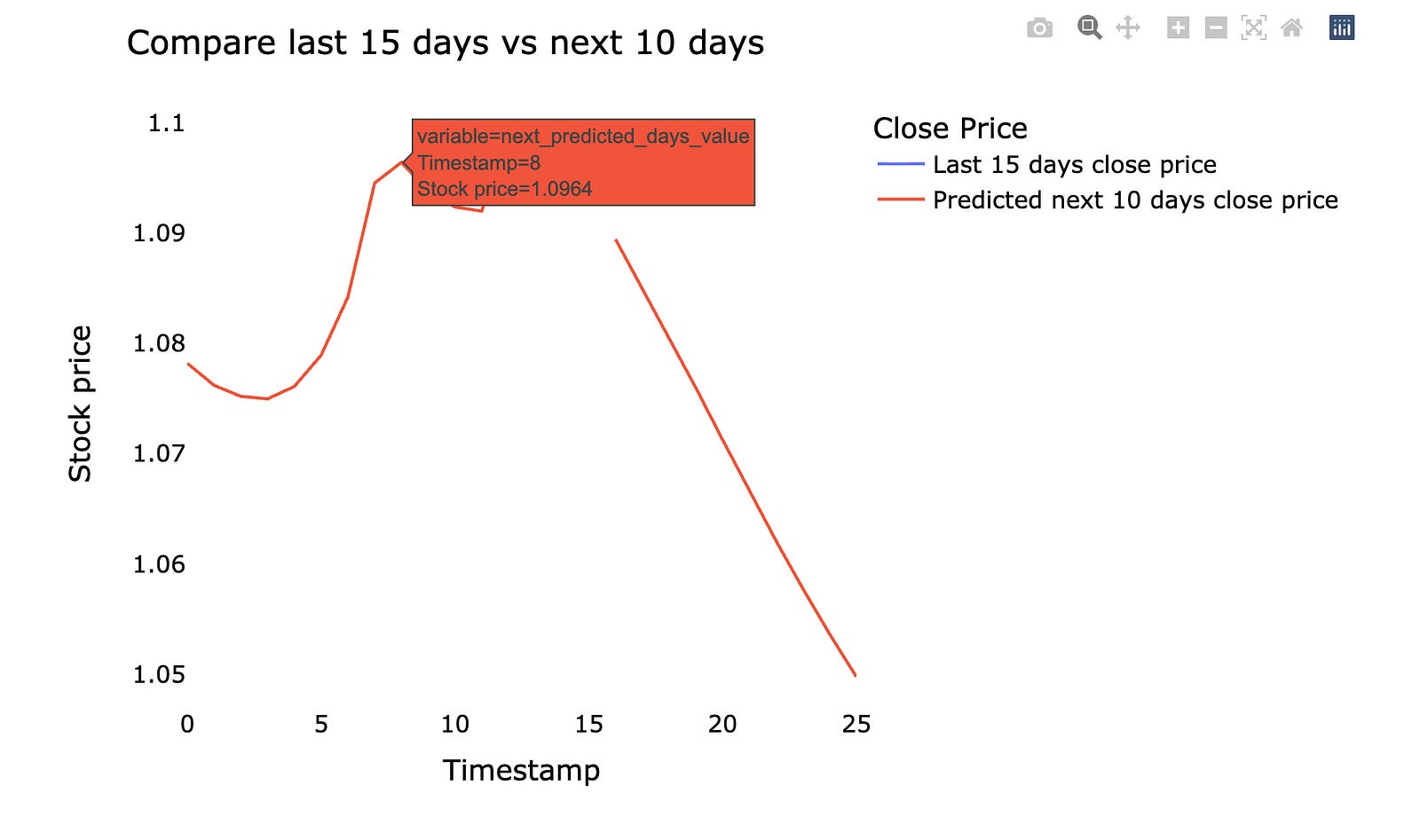
Imagine you want a clean canvas that holds both the recent true prices and the upcoming predicted prices so you can draw them side by side — the first line makes that canvas by creating an array sized to hold the past and future points, and the next line fills every slot with NaN so empty spots are explicit placeholders. The reshape and tolist operations then flatten that canvas into a simple Python list, which is easier to fill by position; think of reshape as rearranging ingredients on a tray so they match the shape your recipe expects. Assigning the same list to two names gives you two handles on the same tray — a key concept: lists are mutable and assignment copies a reference, not the underlying content, so changes through one name affect the other unless you explicitly copy.
Next, the program replaces the first chunk of slots with the original recent close prices: scaler.inverse_transform converts scaled values back to real dollar amounts (inverse scaling returns things to their natural units), reshape and tolist massage the numbers into the exact list shape needed, and slice assignment pastes them into the beginning of the canvas like laying out the last days on the left. Then the later slice is filled with the model’s predicted outputs after the same inverse scaling and reshaping, placing the forecast to the right. A DataFrame is built to pair these two labeled sequences, and a line figure is created plotting both series against the index. The layout calls tune title, colors, fonts and legend, while renaming each trace using a repeating name generator feels like labeling two pens with friendly tags; finally the grid lines are turned off to declutter and the figure is shown. The result is a direct visual comparison of recent reality and your model’s near-future forecast for the project’s stock predictions.
We’ll plot the *whole closing stock price* — that means the final price of each trading day — and overlay the model’s *prediction*, which is the forecasted price from our machine learning model. Seeing the entire series at once makes it easier to spot long-term trends and big misses.
A simple line chart lets you compare real prices and predicted prices side by side. This helps you judge whether the model follows the market rhythm or drifts away. If the prediction lags or jumps, the plot shows where and when that happens.
Doing this prepares you for improving the model: you can spot patterns to fix, decide if you need more data, or change how the model learns. Visual checks are a quick, intuitive way to understand model performance before digging into numbers and metrics.
lstmdf=closedf.tolist()
lstmdf.extend((np.array(lst_output).reshape(-1,1)).tolist())
lstmdf=scaler.inverse_transform(lstmdf).reshape(1,-1).tolist()[0]

names = cycle([’Close price’])

fig = px.line(lstmdf,labels={’value’: ‘Stock price’,’index’: ‘Timestamp’})
fig.update_layout(title_text=’Plotting whole closing stock price with prediction’,
                  plot_bgcolor=’white’, font_size=15, font_color=’black’,legend_title_text=’Stock’)

fig.for_each_trace(lambda t:  t.update(name = next(names)))

fig.update_xaxes(showgrid=False)
fig.update_yaxes(showgrid=False)
fig.show()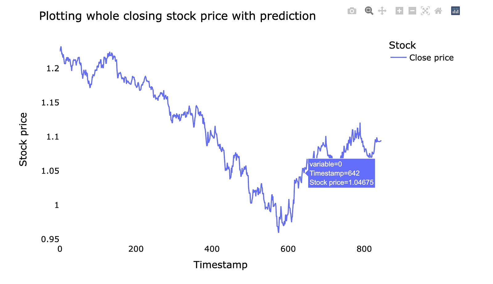
We begin by turning the historical closing-price column into a plain list so we can treat past values like a string of beads we can append to: lstmdf = closedf.tolist(). Next we glue the model’s predicted outputs onto the end of that bead string with lstmdf.extend((np.array(lst_output).reshape(-1,1)).tolist()). Reshape is arranging elements into the right rows and columns so the predictions match the expected shape for extension, like putting cookies on a tray before you bake them.
After stitching history and forecast together we need to convert from the scaled numbers back to real prices: lstmdf=scaler.inverse_transform(lstmdf).reshape(1,-1).tolist()[0]. inverse_transform reverses the feature scaling so values return to their original monetary units, letting us read prices as dollars instead of normalized numbers. The extra reshape and tolist just flatten the result into a single Python list ready for plotting.
To give the plotted lines a friendly name we create a cycler of labels: names = cycle([‘Close price’]), which will repeatedly supply “Close price” if multiple traces appear. Then we draw the timeline with fig = px.line(lstmdf, labels={‘value’: ‘Stock price’,’index’: ‘Timestamp’}), where the plot function is like taking the numeric beads and stringing them onto an x–y frame with axis labels to explain what each axis means.
We polish the presentation with fig.update_layout(…) to set the title, background, and fonts, and then walk through each drawn trace with fig.for_each_trace(lambda t: t.update(name = next(names))) — this is like moving from painting to painting and affixing the correct caption from our label cycle. We remove gridlines for a cleaner look with fig.update_xaxes(showgrid=False) and fig.update_yaxes(showgrid=False), and finally reveal the figure with fig.show(). The whole flow stitches history and prediction, rescales to real prices, and displays a clean chart so you can visually judge how the forecast lines up with past closing prices — exactly the kind of view you need when evaluating a stock forecasting model.
LSTM + GRU refers to two popular sequence models we use for forecasting, especially in time-based problems like stock prices. *LSTM* stands for Long Short-Term Memory, which is a type of recurrent neural network that keeps a kind of “memory” so it can remember things from many steps back. *GRU* means Gated Recurrent Unit, a simpler cousin that uses fewer parts to do a similar job and usually trains faster.
We turn to these models because stock data is a time series — numbers that depend on what happened before — and ordinary neural nets don’t keep track of order well. LSTMs and GRUs use gates (simple rules that let information in or out) to avoid the common training problem called the *vanishing gradient* — that’s when the model forgets long-ago events while learning.
People often combine or compare LSTM and GRU: you can stack one on top of the other, or train both and ensemble their predictions. LSTM tends to capture more complex patterns but needs more data and compute. GRU is lighter and often nearly as good, so trying both helps you find the sweet spot for your dataset and resources.
Practical tip: always validate on truly unseen time periods and avoid look-ahead bias (don’t let future info leak into training), because that’s the most common trap in stock forecasting.
# reshape input to be [samples, time steps, features] which is required for LSTM
X_train =X_train.reshape(X_train.shape[0],X_train.shape[1] , 1)
X_test = X_test.reshape(X_test.shape[0],X_test.shape[1] , 1)

print(”X_train: “, X_train.shape)
print(”X_test: “, X_test.shape)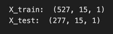
We want the model to see each stock sequence as a little stack of time-ordered observations, so the first two lines are about reshaping the training and test arrays into that 3‑dimensional shape. Think of reshaping like taking flat ingredients and arranging them onto trays: X_train.shape[0] is how many trays (samples) you have, X_train.shape[1] is how many bites or time steps go on each tray, and the final 1 says “one ingredient per bite” — that extra dimension is the feature count. An LSTM expects inputs as (samples, time steps, features), so here we explicitly create that structure by calling reshape with (X_train.shape[0], X_train.shape[1], 1) and the same for X_test.
Calling reshape doesn’t change the underlying numbers, it just reorganizes how they’re presented to the model, much like slicing a cake differently without baking a new one. The print lines are simple checkpoints: they display the new shapes so you can verify that you indeed have N samples, T time steps, and 1 feature per step — a sanity check before training. Seeing the shapes as expected gives confidence that the sequence data will flow correctly into the LSTM.
Getting this shape right is a small but crucial step toward letting the recurrent network learn temporal patterns for the stock forecasting task.
Our model takes past market data and turns it into a prediction. The inputs, called *features*, are things like past prices, trading volume, and simple technical indicators; a feature is just a piece of information the model looks at. The output, called the *target*, is what we want to predict — usually the next price or a direction (up or down). Saying this makes it clear what goes in and what comes out.
Under the hood we chain three steps: prepare the data, learn patterns, and check results. Preparing the data means cleaning gaps, scaling numbers so one big number doesn’t dominate, and creating time-lagged features (using yesterday’s price to help predict today). This step matters because messy inputs make even smart models fail.
The learning step uses a machine learning algorithm that finds relationships between features and the target; common choices are tree-based models or simple neural networks. We guard against overfitting — when a model memorizes noise instead of real patterns — by holding back a validation set, which is just a slice of data the model never sees during training. Finally, we evaluate performance with realistic metrics so we know if the model’s predictions could help in real trading.
tf.keras.backend.clear_session()
model=Sequential()
model.add(LSTM(32,return_sequences=True,input_shape=(time_step,1)))
model.add(LSTM(32,return_sequences=True))
model.add(GRU(32,return_sequences=True))
model.add(GRU(32))
model.add(Dense(1))
model.compile(loss=’mean_squared_error’,optimizer=’adam’)
We start by wiping the Keras workspace with tf.keras.backend.clear_session(), which is like clearing your whiteboard so old models don’t leave stray chalk marks that could confuse new training. Then model = Sequential() creates a simple, ordered stack where each layer is a recipe card placed in sequence; Sequential means data flows from one card to the next in order.
The first model.add(LSTM(32, return_sequences=True, input_shape=(time_step,1))) places an LSTM layer with 32 memory cells that looks at sequences of length time_step with a single feature per step; an LSTM is a memory-enabled layer that helps the network remember patterns over time. return_sequences=True makes the layer hand out a value for every time step instead of a single summary, so later layers can keep seeing the whole temporal story. Adding a second LSTM with return_sequences=True deepens the memory processing so the network can learn more complex temporal features across layers.
Next two GRU layers are like a simpler, faster memory card: the first GRU keeps returning sequences so the temporal signal continues flowing, while the second GRU omits return_sequences and produces a single condensed vector summarizing the sequence. model.add(Dense(1)) is a final linear recipe step that turns that summary into one number — our predicted next price. Finally, model.compile(loss=’mean_squared_error’, optimizer=’adam’) tells the model how to judge mistakes (MSE penalizes larger errors) and which strategy to use to tweak the recipes (Adam adapts learning rates during training).
Together, these layers form a temporal funnel that turns past price sequences into a forecast useful for stock-market prediction.
model.summary()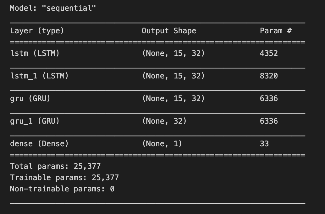
Think of your neural network as a layered cake you’ve just assembled: each layer is a different flavor, each connection a frosting ribbon, and you’re about to read the label to make sure you baked what you intended. model.summary() is that label-reading moment — when you ask the program to print a tidy description of the network so you can inspect its layers, the shape of the output at each step, and how many adjustable knobs (parameters) live in each part. A function is a reusable recipe card. Calling this particular recipe card causes the model object to list its architecture, show which parts are trainable, and give totals for parameters, which helps you judge capacity, performance cost, and risk of overfitting. Practically, you’d run model.summary() after defining the network and before training to catch mismatched dimensions, unexpectedly huge layers, or to document the design for collaborators. It’s a quick sanity check and a lightweight design review that saves time once you start feeding time-series data. By glancing at that summary you can decide whether to simplify, regularize, or deepen the network to better forecast stock market behavior.
model.fit(X_train,y_train,validation_data=(X_test,y_test),epochs=200,batch_size=5,verbose=1)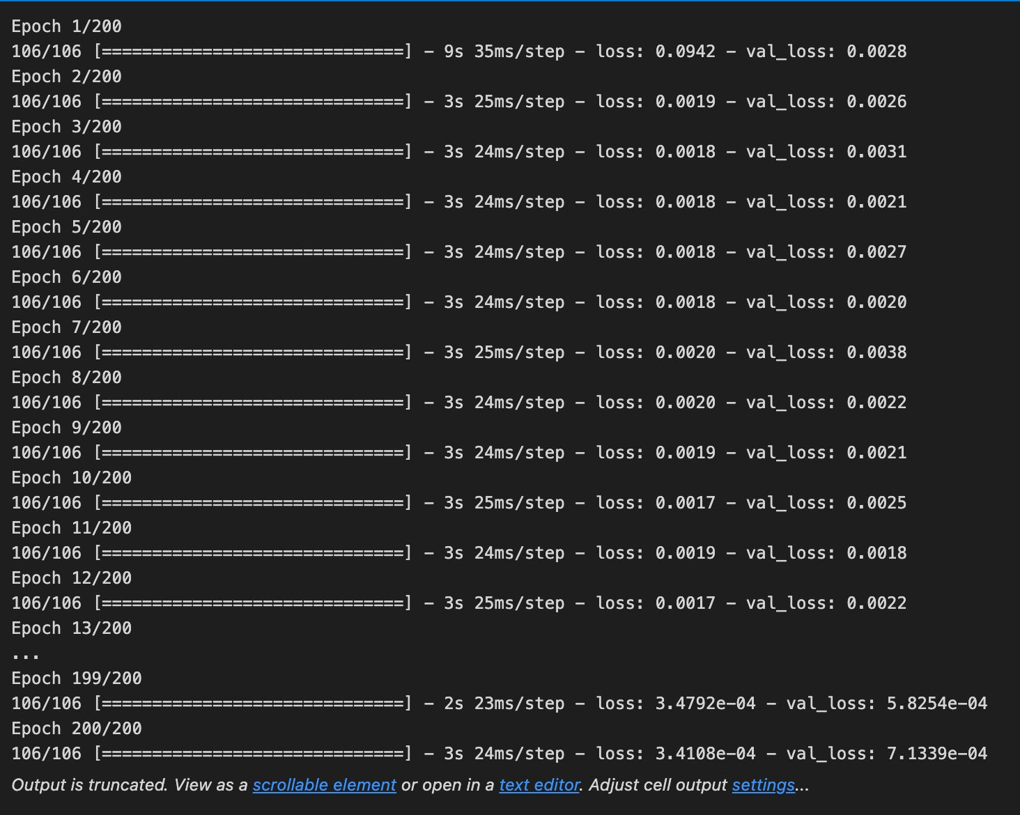
Imagine you have a student (the model) who needs to learn to predict stock prices from examples; calling model.fit starts the classroom session where you show the student pairs of inputs and correct answers so it can learn patterns. X_train and y_train are the training examples and their true targets — think of them as practice problems and answer keys that the student studies; a key concept: the model adjusts its internal parameters to reduce mistakes on these examples. validation_data=(X_test,y_test) hands the student a separate quiz set to take while learning so you can monitor how well it generalizes to unseen data; a key concept: validation data helps detect overfitting, when the student memorizes practice problems but fails on new ones. epochs=200 means the teacher will repeat the whole teaching book 200 times so the student gets many passes over the material; a key concept: an epoch is one full pass through the training set. batch_size=5 tells the teacher to grade and update the student’s understanding after every small group of five problems, which makes learning smoother and more efficient than updating after each problem or waiting until the whole book is done. verbose=1 simply controls the classroom display so you can watch progress updates. Altogether, this line runs the training loop that shapes the model into a forecasting tool, gradually tuning it so it can help predict stock movements.
### Lets Do the prediction and check performance metrics
train_predict=model.predict(X_train)
test_predict=model.predict(X_test)
train_predict.shape, test_predict.shape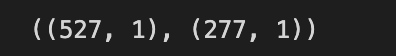
We start with a single-line note that tells us our goal: run the model to make forecasts and then check how well those forecasts perform, like announcing we’re about to taste the dish after cooking. The first active line calls model.predict(X_train), which is like taking the recipe card (the trained model with its learned weights) and applying it to the training ingredients (X_train) to produce predicted outcomes; predict performs inference, the process of using learned parameters to generate outputs. The second line does the same on X_test, treating the unseen validation ingredients the same way to see how well the recipe generalizes beyond what it learned during training. Finally, the expression train_predict.shape, test_predict.shape asks each prediction array to report its dimensions — shape tells you the size and structure (for example, number of predicted time steps and output columns), much like checking the size of two baking trays before you try to combine them. That shape check is a small but crucial sanity check so subsequent steps — scoring errors, inverse-scaling, or plotting — won’t misalign arrays. Together, these lines move us from learning to actual forecasting and verification, the next steps being performance metrics that tell us whether our model can help forecast stock prices reliably.
# Transform back to original form

train_predict = scaler.inverse_transform(train_predict)
test_predict = scaler.inverse_transform(test_predict)
original_ytrain = scaler.inverse_transform(y_train.reshape(-1,1))
original_ytest = scaler.inverse_transform(y_test.reshape(-1,1))
Imagine we had shrunk every price and target into a neat, tiny language so the model could learn easily; here we’re asking that language to speak back in plain dollars. The scaler is our translator that normalized the numbers before training; normalization is scaling features to a common range for stable learning. The first two lines call the translator’s reverse operation on the model’s outputs so that train_predict and test_predict are converted from the small, learned range back into the original price units.
The next two lines do the same for the true values we held out: y_train and y_test. Because the translator expects a column of numbers rather than a single flat list, we reshape each array into a column with reshape(-1, 1) — think of turning a row of ingredients into a single vertical stack so the translator can process them correctly. The inverse_transform then maps those columns back to original scale so the ground truth and predictions speak the same language.
By restoring both predictions and actuals to their original magnitudes, we can now compute meaningful errors, plot predicted prices against real prices, and tell whether the model’s forecasts would have been useful for real trading decisions in the larger stock-market forecasting project.
This chart shows a comparison between the original stock *close price* and the predicted close price. A *close price* is simply the price at the end of the trading day, and the *predicted* price comes from our machine‑learning model that learned from past data. Seeing both lines together helps you tell where the model tracks the market and where it doesn’t.
Look for overlaps, consistent delays (called *lag*, which means the prediction is late), or big misses around spikes. This check helps you judge model accuracy and decide the next step — for example, tune the model, add features, or get more data to improve forecasts.
# shift train predictions for plotting

look_back=time_step
trainPredictPlot = np.empty_like(closedf)
trainPredictPlot[:, :] = np.nan
trainPredictPlot[look_back:len(train_predict)+look_back, :] = train_predict
print(”Train predicted data: “, trainPredictPlot.shape)

# shift test predictions for plotting
testPredictPlot = np.empty_like(closedf)
testPredictPlot[:, :] = np.nan
testPredictPlot[len(train_predict)+(look_back*2)+1:len(closedf)-1, :] = test_predict
print(”Test predicted data: “, testPredictPlot.shape)

names = cycle([’Original close price’,’Train predicted close price’,’Test predicted close price’])

plotdf = pd.DataFrame({’date’: close_stock[’date’],
                       ‘original_close’: close_stock[’close’],
                      ‘train_predicted_close’: trainPredictPlot.reshape(1,-1)[0].tolist(),
                      ‘test_predicted_close’: testPredictPlot.reshape(1,-1)[0].tolist()})

fig = px.line(plotdf,x=plotdf[’date’], y=[plotdf[’original_close’],plotdf[’train_predicted_close’],
                                          plotdf[’test_predicted_close’]],
              labels={’value’:’Stock price’,’date’: ‘Date’})
fig.update_layout(title_text=’Comparision between original close price vs predicted close price’,
                  plot_bgcolor=’white’, font_size=15, font_color=’black’, legend_title_text=’Close Price’)
fig.for_each_trace(lambda t:  t.update(name = next(names)))

fig.update_xaxes(showgrid=False)
fig.update_yaxes(showgrid=False)
fig.show()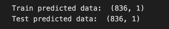
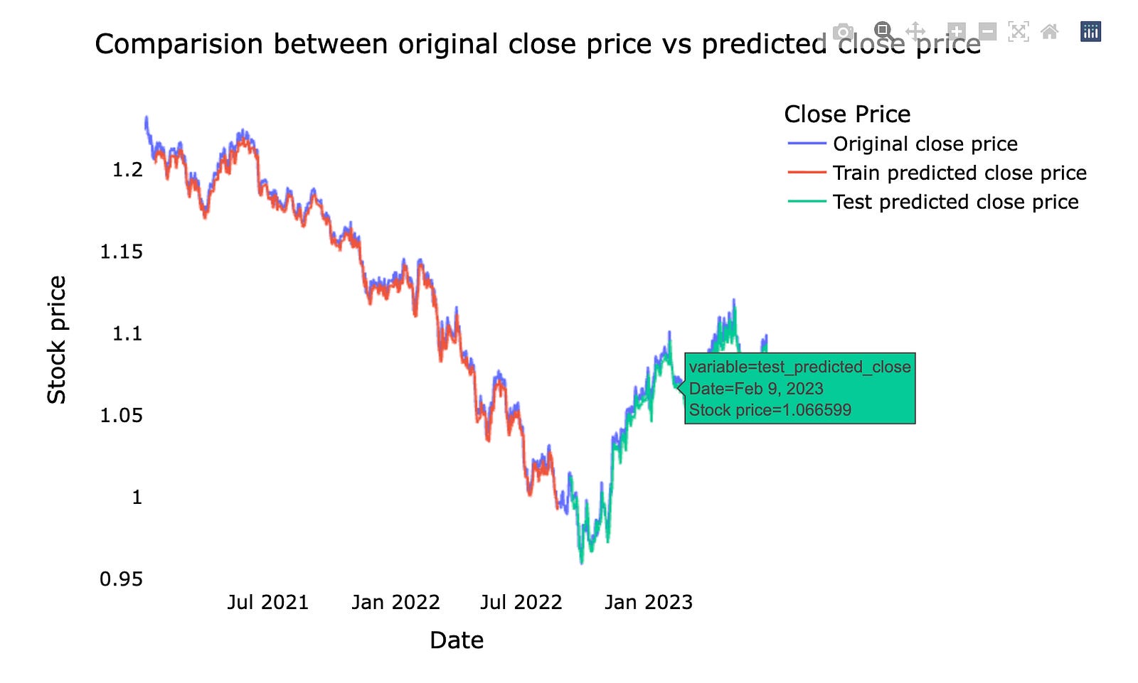
Imagine you have a timeline of actual closing prices and two sets of predictions from your model, and you want to lay them on the same calendar so you can visually compare them. The program starts by creating a blank canvas the same shape as the original series and fills it with NaNs, which is like leaving empty calendar slots; a key concept is alignment: we pad predictions with NaNs so plotted lines fall at the correct time indices relative to the original series. The first block takes the training predictions and pastes them into the canvas starting after the look_back period, sliding the train predictions into the right dates. Printing the shape is a quick check that the alignment array matches expectations.
The next block does the same for test predictions but places them further along the timeline — think of moving sticky notes forward past the training window plus a buffer — and another shape print verifies it. The names cycle is simply a rotating list of labels so each plotted line gets a friendly title.
A new table (DataFrame) is assembled like a tidy spreadsheet: dates, original closes, and the two aligned prediction arrays flattened into lists so every date has either a real value or a blank. The line plot call draws all three series together; plotting multiple columns at once is like drawing three colored threads over the same cloth. Labels and layout tweaks make the chart readable and attractive, and the for_each_trace step iterates over traces to assign the rotating names — a gentle loop that renames each line. Finally, gridlines are turned off for clarity and the figure is displayed.
Seeing predictions aligned with actuals is a simple but powerful check that feeds straight into improving the forecasting model.
Here we ask the model to forecast the next 10 days — that means we try to predict the market values or returns for the coming ten trading days. Saying “next 10 days” just means we’re making ten future estimates in a row, not that the model sees those days now.
Predicting a ten-day horizon is useful because it’s short enough to stay relevant for trading, but long enough to smooth out one-day noise. This step prepares us to evaluate how well the model handles short-term trends and to make practical decisions like position sizing or risk limits.
x_input=test_data[len(test_data)-time_step:].reshape(1,-1)
temp_input=list(x_input)
temp_input=temp_input[0].tolist()

from numpy import array

lst_output=[]
n_steps=time_step
i=0
pred_days = 10
while(i<pred_days):

    if(len(temp_input)>time_step):

        x_input=np.array(temp_input[1:])
        #print(”{} day input {}”.format(i,x_input))
        x_input = x_input.reshape(1,-1)
        x_input = x_input.reshape((1, n_steps, 1))

        yhat = model.predict(x_input, verbose=0)
        #print(”{} day output {}”.format(i,yhat))
        temp_input.extend(yhat[0].tolist())
        temp_input=temp_input[1:]
        #print(temp_input)

        lst_output.extend(yhat.tolist())
        i=i+1

    else:

        x_input = x_input.reshape((1, n_steps,1))
        yhat = model.predict(x_input, verbose=0)
        temp_input.extend(yhat[0].tolist())

        lst_output.extend(yhat.tolist())
        i=i+1

print(”Output of predicted next days: “, len(lst_output))
We start by gathering the last time_step values from the test set and shaping them into a single row so we have a clean starting “recipe card” of recent prices: x_input = test_data[len(test_data)-time_step:].reshape(1,-1). Turning that array into a simple Python list (temp_input=list(x_input); temp_input=temp_input[0].tolist()) makes it easy to append new predicted values as we go — think of temp_input as a rolling tray holding the latest N ingredients. The line from numpy import array brings a numpy constructor into the namespace but in this scene it isn’t actually used later.
We prepare an empty bowl for results (lst_output=[]), fix n_steps to the window size, and set i and pred_days to control how many future days we want to produce. The while loop repeats the prediction step pred_days times; a loop is like repeating a recipe step until you have enough portions.
Inside the loop we check whether our rolling tray has become longer than the window. If it is, we drop the oldest item by slicing and form x_input from the most recent n_steps values, then reshape twice into shape (1, n_steps, 1) because recurrent models like LSTM expect a 3D tensor: (samples, timesteps, features). We call model.predict(x_input, verbose=0) to get the next predicted value — think of the model as a learned oracle that tastes the current ingredients and suggests the next spice. We then append that prediction to temp_input and slide the tray forward (temp_input=temp_input[1:]) so the window stays the same size, and we also add the new prediction to lst_output.
The else branch handles the very first prediction when we still only have the initial input shaped earlier, but the steps are the same: reshape, predict, append. After the loop we print how many future points were generated. Altogether, this routine rolls a sliding window forward and asks the model for successive forecasts, building a short multi-day projection for your stock market forecasting pipeline.
We’ll draw a simple chart that shows the last 15 days and the next predicted 10 days. By *predicted* I mean the prices your machine learning model forecasts for the coming days, and the last 15 days are the real recent prices we actually observed.
Seeing both on one plot helps you quickly compare the model’s short-term forecast to the most recent trend. This visual check makes it easier to spot when the model drifts away from reality and tells you if you should retrain the model, add features, or be cautious before trading.
last_days=np.arange(1,time_step+1)
day_pred=np.arange(time_step+1,time_step+pred_days+1)
print(last_days)
print(day_pred)
Imagine we’re setting up two little calendars: one that lists the recent days we used to learn patterns, and one that lists the future days we want to forecast. The first line asks numpy to create a sequence from 1 up through time_step, like writing numbers on a recipe card for the last few steps you followed; np.arange is a reusable recipe card that returns a sequence of numbers, and because its stop value is exclusive we add 1 so the last day is included. The second line builds the next sequence starting at time_step+1 and running through time_step+pred_days, giving you labeled positions for each day you plan to predict so the model knows which future slots correspond to forecasts. Printing each array is like holding up the two calendars to the class: you quickly verify the recent window and the prediction horizon are numbered as expected so nothing is off-by-one. Key concept: when preparing inputs and targets for a forecasting model, clear indexing of past and future time steps prevents misalignment between features and labels. By giving the model consistent day indices for training and for the horizon you want to predict, these lines help stitch the data timeline together for the rest of the machine learning pipeline.
temp_mat = np.empty((len(last_days)+pred_days+1,1))
temp_mat[:] = np.nan
temp_mat = temp_mat.reshape(1,-1).tolist()[0]

last_original_days_value = temp_mat
next_predicted_days_value = temp_mat

last_original_days_value[0:time_step+1] = scaler.inverse_transform(closedf[len(closedf)-time_step:]).reshape(1,-1).tolist()[0]
next_predicted_days_value[time_step+1:] = scaler.inverse_transform(np.array(lst_output).reshape(-1,1)).reshape(1,-1).tolist()[0]

new_pred_plot = pd.DataFrame({
    ‘last_original_days_value’:last_original_days_value,
    ‘next_predicted_days_value’:next_predicted_days_value
})
names = cycle([’Last 15 days close price’,’Predicted next 10 days close price’])

fig = px.line(new_pred_plot,x=new_pred_plot.index, y=[new_pred_plot[’last_original_days_value’],
                                                      new_pred_plot[’next_predicted_days_value’]],
              labels={’value’: ‘Stock price’,’index’: ‘Timestamp’})
fig.update_layout(title_text=’Compare last 15 days vs next 10 days’,
                  plot_bgcolor=’white’, font_size=15, font_color=’black’, legend_title_text=’Close Price’)
fig.for_each_trace(lambda t:  t.update(name = next(names)))

fig.update_xaxes(showgrid=False)
fig.update_yaxes(showgrid=False)
fig.show()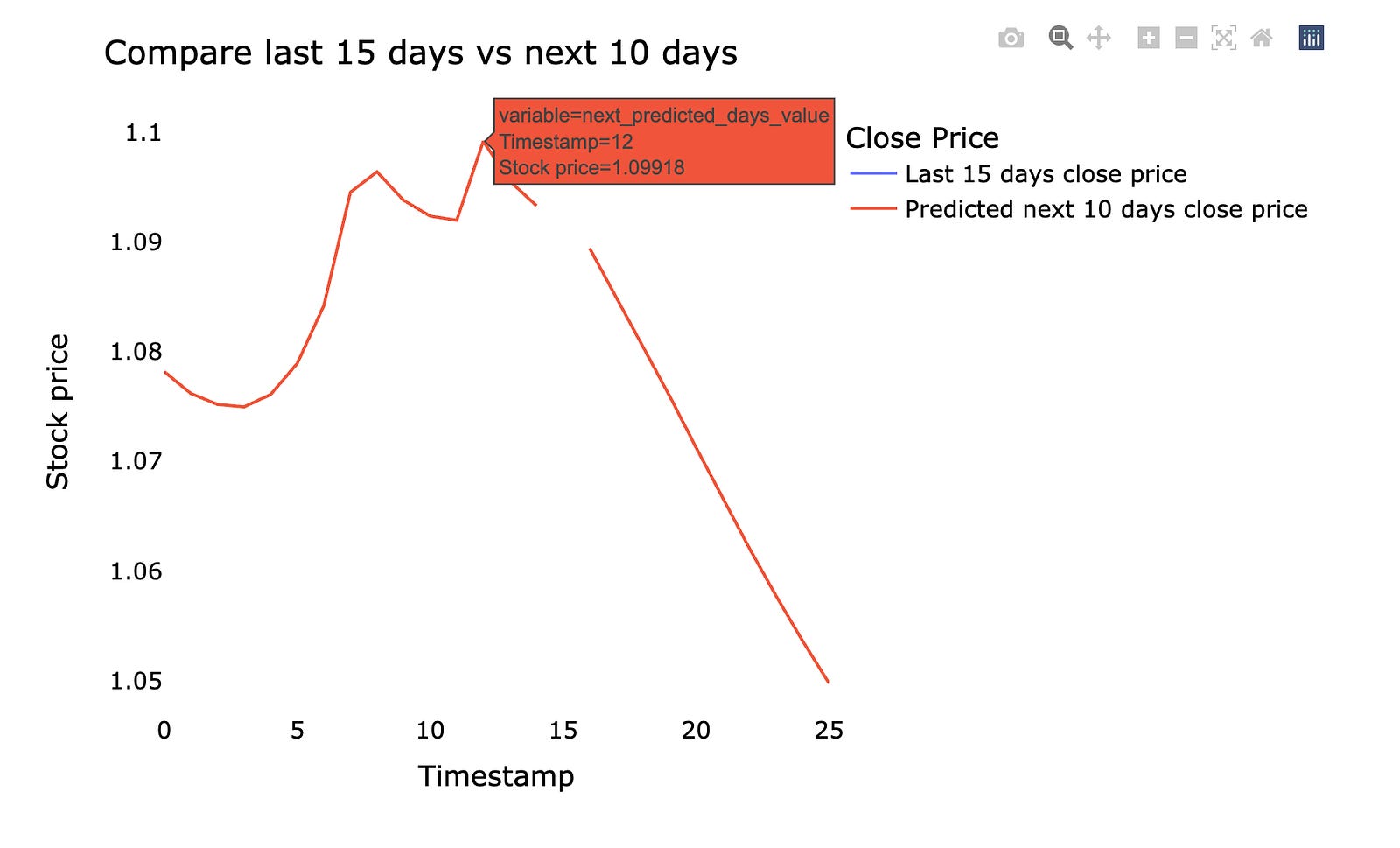
We’re building a little staging area to draw a clean comparison between recent real closing prices and the model’s upcoming predictions, then plotting them so we can visually judge how the forecast lines up with reality. First, an array sized to hold the last days plus the prediction days is created and filled with NaNs so the timeline has blank placeholders; think of it as laying out an empty timeline on a table. That array is reshaped into a single row and converted to a Python list so it’s easy to slice and replace values. Two variables are then set to that list to represent the last original days and the next predicted days; a quick note about mutability: lists are shared by reference, so giving two names to the same list means updates through one name affect the other, which can be an unintended side effect if you meant independent copies. The script fills the initial portion of the list with the last observed closes restored to their original scale using the scaler’s inverse_transform (rescaling is the process of undoing normalization so values are interpretable), and it fills the later portion with inverse-transformed model outputs reshaped into a row and converted to a list so they slot neatly into the timeline. A DataFrame is constructed with those two timelines as columns, and a cycle of human-friendly labels is prepared like a stack of sticky notes to apply to the plotted lines. An interactive line figure is made from the DataFrame, layout and styling are adjusted for clarity, each trace is renamed by consuming the label cycle, gridlines are turned off for a cleaner look, and the figure is shown. The result is a direct visual comparison of the last 15 actual closes versus the next 10 predicted closes — exactly the kind of feedback you need when refining a stock market forecasting model.
We plot the whole closing stock price — the final price at the end of each trading day — together with the model’s prediction, which is the forecasted price from our machine learning model. This puts actual and predicted values on the same chart so you can see how they move over time.
Seeing the entire series at once helps you spot where the model follows the market and where it misses. It’s a simple visual check before doing formal evaluation, and it helps you decide what to tweak in the model or data.
lstmgrudf=closedf.tolist()
lstmgrudf.extend((np.array(lst_output).reshape(-1,1)).tolist())
lstmgrudf=scaler.inverse_transform(lstmgrudf).reshape(1,-1).tolist()[0]

names = cycle([’Close price’])

fig = px.line(lstmgrudf,labels={’value’: ‘Stock price’,’index’: ‘Timestamp’})
fig.update_layout(title_text=’Plotting whole closing stock price with prediction’,
                  plot_bgcolor=’white’, font_size=15, font_color=’black’, legend_title_text=’Stock’)
fig.for_each_trace(lambda t:  t.update(name = next(names)))

fig.update_xaxes(showgrid=False)
fig.update_yaxes(showgrid=False)
fig.show()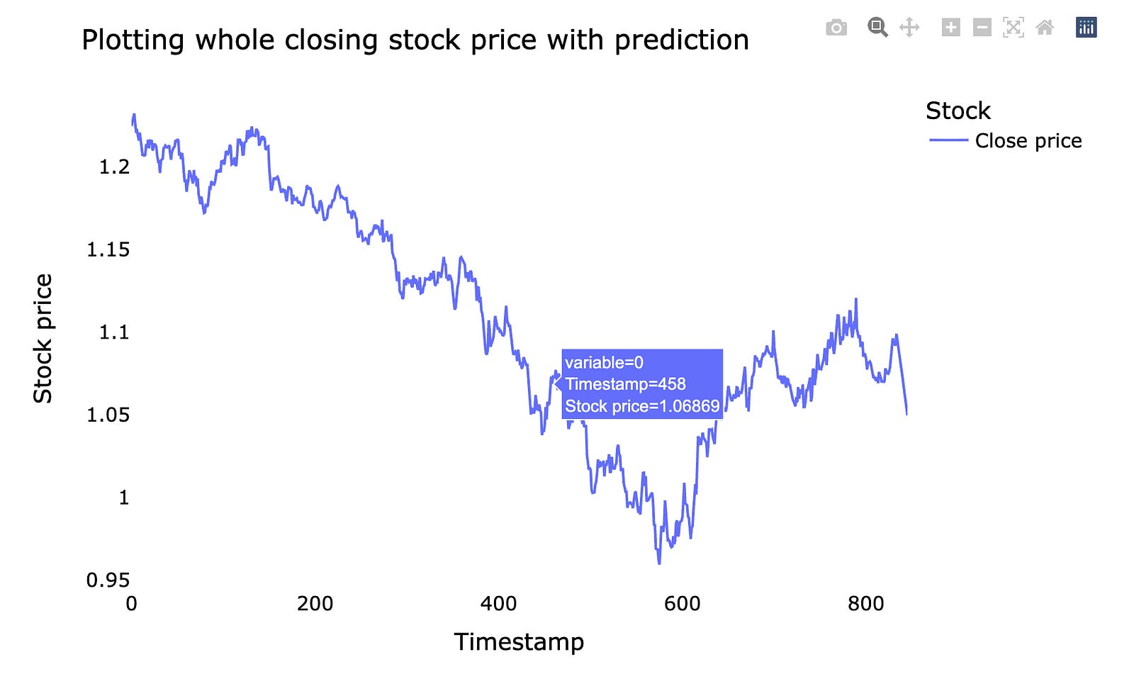
Imagine you have a list of real closing prices and a small pile of predicted numbers, and you want to stitch them together and see how the forecast sits next to history. First the historical closes are turned into a plain Python list so they can be combined easily. The predicted output is converted into a column vector with reshape(-1,1) so it matches the two-dimensional shape many tools expect, then turned into nested lists and appended to the historical list; that puts past and predicted values in one long sequence like laying old and new tiles on the same floor. Next, the scaler’s inverse_transform is used to undo earlier normalization and return values to real price units — this is important because scaling is a preprocessing step that changes numeric ranges, and inverse_transform reverses that change so our plot shows actual dollars. The result is reshaped and flattened back into a simple sequence for plotting.
To label the plot we create a small repeating name source so each trace can receive a friendly legend label. A line figure is then drawn from the combined price sequence with axis labels mapped to “Stock price” and “Timestamp,” and the layout is tuned with a clear title, white background, font settings, and legend text. Each trace is renamed from the cycling names, grid lines are turned off for a cleaner look, and the figure is shown interactively. Together, these steps let you visually compare past closing prices and the model’s forecast — a key step when evaluating stock-market predictions.
