

Quant Toolkit: Signal Engineering, Bounding, and Systematic Asset Allocation — EP-1/365
A Quantitative Study on Bond Flow Anomalies and Volatility-Normalized Portfolio Construction.

Use the button at the end to download source code, all of jupyter notebook and python files.
This article explores the implementation of a multi-factor algorithmic framework designed to capture persistent market inefficiencies across fixed income, equities, and digital assets. We begin by isolating microstructure-driven anomalies, specifically the “Window Dressing” effect in the bond market, utilizing Day of Trading Month (DOTM) temporal filters to exploit non-economic institutional flows. Transitioning from behavioral finance to systematic portfolio construction, we provide a rigorous comparative analysis of risk-premia harvesting techniques, evaluating the impact of monthly rebalancing and dollar-cost averaging on long-term Sharpe ratios and Max Drawdown profiles.
The latter half of the study shifts focus to signal engineering and normalization. We detail the transition from raw time-series momentum to volatility-normalized signals, demonstrating the use of non-linear “squashing” functions — specifically hyperbolic tangent ($tanh$) transformations — to mitigate tail risk and prevent outlier-driven leverage spikes. By the conclusion of this technical guide, readers will have a blueprint for building a robust backtesting pipeline that integrates calendar-based seasonality, cross-asset diversification, and bounded signal logic for algorithmic execution.
Window dressing refers to portfolio managers reshaping their holdings near reporting dates (typically month-end, quarter-end, or year-end) to make portfolios appear safer, cleaner, or more conservative than they actually are.
Elevator pitch
What causes the inefficiency?
The inefficiency arises when large institutional investors make non-economic trades near reporting dates to improve the appearance of their reported holdings. Bond managers often rotate into safer, more liquid securities — for example, short-duration Treasuries — while selling higher-yielding or longer-duration positions to reduce perceived risk on paper. Because these shifts are driven by incentives, compliance rules, and reporting optics rather than fundamentals, they temporarily distort yields, credit spreads, and liquidity, producing a predictable but short-lived mispricing.
Why isn’t it fully arbitraged away?
Even well-informed market participants cannot fully eliminate the effect because the flows are large, price-insensitive, and occur at times when arbitrage capital is constrained. Period-end balance-sheet limits, tighter repo conditions, and regulatory ratios reduce the ability of hedge funds or dealers to take the opposing side. The inefficiencies are small, fleeting, and operationally costly to trade, so professional arbitrageurs only partially offset them. Consequently, forced period-end behavior by large institutions outweighs corrective pressure from arbitrage, allowing the effect to persist.
How might a retail investor harness it?
A retail investor can potentially benefit by timing bond allocations around quarter-end to capture predictable post-window-dressing reversals. High-yield and BBB-rated bonds are often sold into quarter-end and then recover as institutional flows normalize, offering better entry points just after reporting dates. Conversely, short-duration government bonds tend to be overbought before quarter-end and become slightly cheaper afterward. This approach aligns purchases with flow-driven mean reversion rather than attempting to arbitrage transient spreads.
Analysis
The analysis will proceed as follows, using the TLT ticker with visualizations to illustrate the window-dressing effect:
Load OHLCV returns.
Add DOM (day of month) and DOTM (day of trading month) columns.
Compute average returns by DOM and DOTM and plot bar charts/histograms.
Split observations into First 5 Days / Middle Days / Last 5 Days and compare group statistics.
Calculate cumulative mean log-returns by DOM and DOTM and plot them.
Backtest
Backtest the signal: short at the start of the trading month (close the early-month short around day 7) and go long around mid-month (DOTM ≈ 15) through month end. Compute total and annualized return, annualized volatility, Sharpe ratio, and maximum drawdown.
Plot cumulative performance for the strategy, buy-and-hold, and the short/long legs separately.
Calculate rolling 1-year metrics (annualized return, volatility, Sharpe) and summarize results.
import pandas as pd
import matplotlib.pyplot as plt
import numpy as np

df = pd.read_csv(”C:\\Users\\blazo\\Documents\\Misc\\QJ\\quant-journey\\data\\returns\\returns_TLT.csv”)

df[’Date’] = pd.to_datetime(df[’Date’])
df[’DOM’] = df[’Date’].dt.day
df[’DOTM’] = df.groupby(df[’Date’].dt.to_period(’M’)).cumcount() + 1
The snippet loads a CSV of returns and immediately converts the Date column into a true datetime type so downstream temporal operations are reliable. Converting to datetime is necessary here because the next two features use pandas’ .dt accessor and period-based grouping; with a string Date you wouldn’t be able to ask “what day of the month is this?” or group cleanly by calendar month. In the quant context this ensures any calendar-based analysis (seasonality, turn-of-month effects, monthly P&L aggregation) is operating on bona fide timestamps rather than fragile strings.
Next the code derives DOM (day of month) by pulling the calendar day number from each timestamp. DOM is the raw calendar day (1–31) and is useful when you want to study returns tied to calendar dates (for example, end-of-month trade windows, specific-day corporate actions, or dividends that occur on fixed calendar dates). Because DOM is based on the calendar day it does not account for weekends or market holidays; DOM will be the same whether a date is a trading day or not, so use it when you explicitly want calendar-day behavior.
The DOTM column is an ordinal index of the observation within each calendar month: it groups all rows by month (using Date.to_period(‘M’) which collapses the timestamp to a month period) and then uses cumcount() to number rows within that group, adding 1 because cumcount starts at zero. DOTM therefore gives you the “nth trading/day row in this month” — in practice, with daily returns data this corresponds to trading-day number within the month, which is exactly what you need for analyses like “first N trading days” or “compare performance on trading day 1 vs trading day 20” in intramonth strategies. Using to_period(‘M’) ensures grouping is by calendar month boundary (ignoring the day components), so months with different numbers of days are handled consistently.
A few practical notes tied to why these choices matter in quant workflows: the correctness of DOTM relies on the rows being chronologically ordered within each month — if the CSV is not sorted you should sort by Date before grouping to avoid misnumbering. Also, since weekends and holidays are typically absent from return series, DOTM will reflect trading-day ordinal rather than contiguous calendar days, which is usually what you want for signal timing and backtests; but if you intended true calendar-day indices you would need a different approach. Finally, these engineered features make it straightforward to compute conditional statistics (mean return by DOTM, hit-rate by DOM, or whether certain intramonth windows consistently outperform) and to implement calendar-based execution rules or rebalancing logic in downstream quant models.
# Calculate average return for each day of the month
avg_return_dom = df.groupby(’DOM’)[’Return’].mean()

# Calculate average return for each day of the trading month
avg_return_dotm = df.groupby(’DOTM’)[’Return’].mean()

# Create histograms for average returns
fig, (ax1, ax2) = plt.subplots(1, 2, figsize=(15, 5))

# Histogram for Day of Month
ax1.bar(avg_return_dom.index, avg_return_dom.values)
ax1.set_xlabel(’Day of Month’)
ax1.set_ylabel(’Average Return’)
ax1.set_title(’Average Return by Day of Month (DOM)’)
ax1.axhline(y=0, color=’r’, linestyle=’--’, alpha=0.5)
ax1.grid(True, alpha=0.3)

# Histogram for Day of Trading Month
ax2.bar(avg_return_dotm.index, avg_return_dotm.values)
ax2.set_xlabel(’Day of Trading Month’)
ax2.set_ylabel(’Average Return’)
ax2.set_title(’Average Return by Day of Trading Month (DOTM)’)
ax2.axhline(y=0, color=’r’, linestyle=’--’, alpha=0.5)
ax2.grid(True, alpha=0.3)

plt.tight_layout()
plt.show()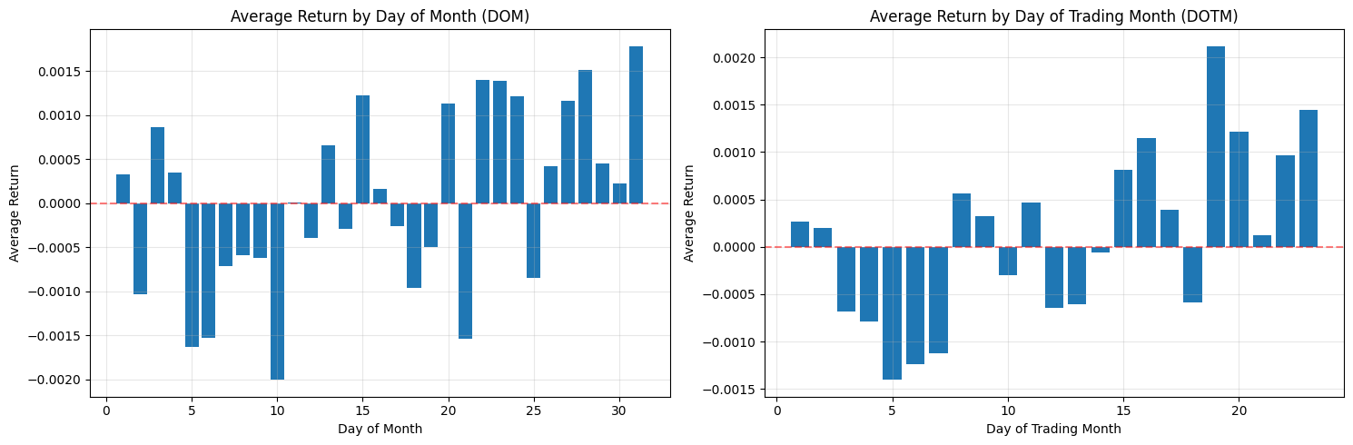
This block is performing a simple but important diagnostic for calendar effects: it computes and plots average returns conditioned on two different “day within month” definitions so you can visually inspect whether certain days consistently produce positive or negative returns — a potential tradable edge.
First, the code reduces noise by aggregating returns across observations: avg_return_dom = df.groupby(‘DOM’)[‘Return’].mean() collapses the universe of returns into a single mean for each calendar day-of-month (1–31). The motivation is to reveal persistent calendar-level effects such as turn-of-month, end-of-quarter or tax/holiday-related flows that are tied to calendar dates. Taking the mean is a basic signal-extraction step: random intraday or idiosyncratic noise tends to cancel out across many observations, leaving systematic patterns if they exist. The second grouping, avg_return_dotm = df.groupby(‘DOTM’)[‘Return’].mean(), does the same aggregation but uses the trading-day-within-month index (1..N trading days). DOTM normalizes across months that have different numbers of calendar days and holiday schedules, so it isolates effects tied to the trading-cycle (e.g., “first trading day of the month” or “last trading day”) rather than raw calendar dates.
Next, the code visualizes these two series side-by-side so you can compare their shapes and magnitudes. Plotting them as bar charts makes it easy to see which specific day bins have positive vs negative average returns, and the axhline at y=0 emphasizes the profit/loss baseline. Presenting DOM and DOTM adjacent to each other is deliberate: some effects are calendar-based (DOM) and others are trading-cycle based (DOTM); seeing both helps you decide which is conceptually appropriate for a trading rule. The grid and layout choices are purely for legibility so that you can quickly scan for notable deviations from zero.
A few important practical caveats and why they matter for quant trading: a raw mean can be dominated by outliers or by unequal sample sizes across bins, so you must check counts per bin and the variance within each bin before converting these observations into trading rules. Consider adding error bars (standard error or bootstrap confidence intervals), medians, or winsorization to guard against outliers; consider weighting by volume if larger trades should matter more. Also test statistical significance (t-tests, bootstrap) and control for multiple comparisons — many day-bins means a higher false-positive risk. Verify effects are stable out-of-sample, across different symbols and time periods, and robust to transaction costs, slippage, and liquidity constraints before deploying. Finally, be mindful of data issues that can produce spurious patterns (lookahead, survivorship bias, misaligned corporate actions); ensure DOM/DOTM are computed consistently and that missing bins (e.g., no 31st in some months) are handled explicitly.
In short: this code is a first-pass exploratory step to detect calendar or trading-day seasonality by averaging returns by two different “day” definitions and plotting them for visual inspection. If you find promising signals, the next steps are to quantify significance, control for confounders, test robustness, and simulate realistic P&L with costs before using any signal in a live quant strategy.
# Split data based on DOM (Day of Month)
df[’DOM_Group’] = pd.cut(df[’DOM’], bins=[0, 5, 26, 31], labels=[’First 5 Days’, ‘Middle Days’, ‘Last 5 Days’])

# Split data based on DOTM (Day of Trading Month)
df[’DOTM_Group’] = pd.cut(df[’DOTM’], bins=[0, 5, 18, 23], labels=[’First 5 Days’, ‘Middle Days’, ‘Last 5 Days’])

# Calculate average returns for each group
dom_group_returns = df.groupby(’DOM_Group’, observed=True)[’Return’].mean()
dotm_group_returns = df.groupby(’DOTM_Group’, observed=True)[’Return’].mean()

# Create histograms for grouped returns
fig, (ax1, ax2) = plt.subplots(1, 2, figsize=(15, 5))

# Histogram for DOM Groups
ax1.bar(range(len(dom_group_returns)), dom_group_returns.values)
ax1.set_xticks(range(len(dom_group_returns)))
ax1.set_xticklabels(dom_group_returns.index)
ax1.set_xlabel(’DOM Group’)
ax1.set_ylabel(’Average Return’)
ax1.set_title(’Average Return by DOM Group’)
ax1.axhline(y=0, color=’r’, linestyle=’--’, alpha=0.5)
ax1.grid(True, alpha=0.3)

# Histogram for DOTM Groups
ax2.bar(range(len(dotm_group_returns)), dotm_group_returns.values)
ax2.set_xticks(range(len(dotm_group_returns)))
ax2.set_xticklabels(dotm_group_returns.index)
ax2.set_xlabel(’DOTM Group’)
ax2.set_ylabel(’Average Return’)
ax2.set_title(’Average Return by DOTM Group’)
ax2.axhline(y=0, color=’r’, linestyle=’--’, alpha=0.5)
ax2.grid(True, alpha=0.3)

plt.tight_layout()
plt.show()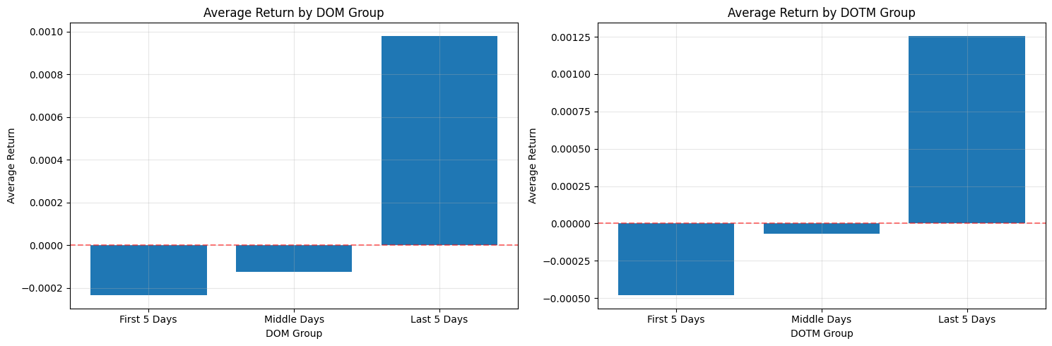
This block is designed to surface simple calendar-driven return patterns that you can exploit or control for in a quant trading strategy. It first discretizes two different day-of-period features into coarse buckets: DOM (calendar Day Of Month) and DOTM (Day Of Trading Month). The pd.cut calls create categorical bins with three labels — “First 5 Days”, “Middle Days”, and “Last 5 Days” — using the numeric bin edges you provided. Note the semantics of pd.cut: with the default right=True, a bin like (0, 5] will contain days 1–5 if your day numbering starts at 1. This discretization is purposeful: we want to compress daily noise into a few interpretable regimes where behavioral or institutional effects (e.g., month-begin flows, mid-month rebalancing, end-of-month window dressing) may produce systematic return differences.
After creating those categorical groups, the code computes the mean return within each bucket via groupby(…)[‘Return’].mean(). The groupby uses observed=True which tells pandas to only include categories actually present in the data in the result (useful when your categories are from a Categorical dtype and you don’t want empty categories cluttering the output). Using the mean as the summary metric is a pragmatic choice: it gives a simple, directionally intuitive metric of whether a bucket is net positive or negative on average. That said, the mean is sensitive to outliers and uneven sample sizes across buckets; for production analyses you’ll want to complement this with counts, medians, and confidence intervals (or bootstrap t-stats) to judge statistical robustness before acting on any signal.
The visualization maps those aggregated means to side-by-side bar charts so you can compare DOM and DOTM effects visually. Each axis uses a simple integer x-position (range(len(…))) and then replaces tick labels with the categorical group names so the bars align with the interpreted buckets. A red dashed horizontal line at y=0 is included as an explicit reference for sign (positive vs. negative average return), and faint gridlines make small differences easier to read. Tight layout is applied to avoid label overlap in the figure. This plotting choice emphasizes magnitude and sign, which is usually sufficient for an initial exploratory check of calendar effects.
There are a few practical caveats tied to the “why” behind these decisions. Because your bin edges differ between DOM and DOTM, ensure those ranges actually match the distribution of values in your dataset: pd.cut will produce NaNs for values outside the provided bins, and the DOTM bins ending at 23 suggest you may be excluding later trading days if DOTM can reach higher values. Also check bucket sample sizes — a large mean driven by a handful of observations is unreliable for trading decisions. Consider swapping or augmenting mean with median, trimmed mean, or winsorization to reduce outlier influence, and add counts and standard errors to the plot or table to evaluate significance before deploying a timing rule.
In terms of quant-trading implications: this code is a diagnostic step to detect calendar seasonality that could justify timing overlays, regime-aware position sizing, or risk-management rules. If you observe a consistent, statistically significant pattern (for example, persistently positive returns in the first five trading days), you could implement a lightweight timing signal that increases exposure in that regime — but only after backtesting with transaction costs, conditioning on other known factors, and confirming the effect out-of-sample.
# Calculate cumulative mean log returns by DOM
cumulative_mean_dom = df.groupby(’DOM’)[’LogReturn’].mean().cumsum()

# Calculate cumulative mean log returns by DOTM
cumulative_mean_dotm = df.groupby(’DOTM’)[’LogReturn’].mean().cumsum()

# Create plots for cumulative mean log returns
fig, (ax1, ax2) = plt.subplots(1, 2, figsize=(15, 5))

# Plot for Day of Month
ax1.plot(cumulative_mean_dom.index, cumulative_mean_dom.values, marker=’o’, linewidth=2)
ax1.set_xlabel(’Day of Month’)
ax1.set_ylabel(’Cumulative Mean Log Return’)
ax1.set_title(’Cumulative Mean Log Returns by Day of Month (DOM)’)
ax1.axhline(y=0, color=’r’, linestyle=’--’, alpha=0.5)
ax1.grid(True, alpha=0.3)

# Plot for Day of Trading Month
ax2.plot(cumulative_mean_dotm.index, cumulative_mean_dotm.values, marker=’o’, linewidth=2)
ax2.set_xlabel(’Day of Trading Month’)
ax2.set_ylabel(’Cumulative Mean Log Return’)
ax2.set_title(’Cumulative Mean Log Returns by Day of Trading Month (DOTM)’)
ax2.axhline(y=0, color=’r’, linestyle=’--’, alpha=0.5)
ax2.grid(True, alpha=0.3)

plt.tight_layout()
plt.show()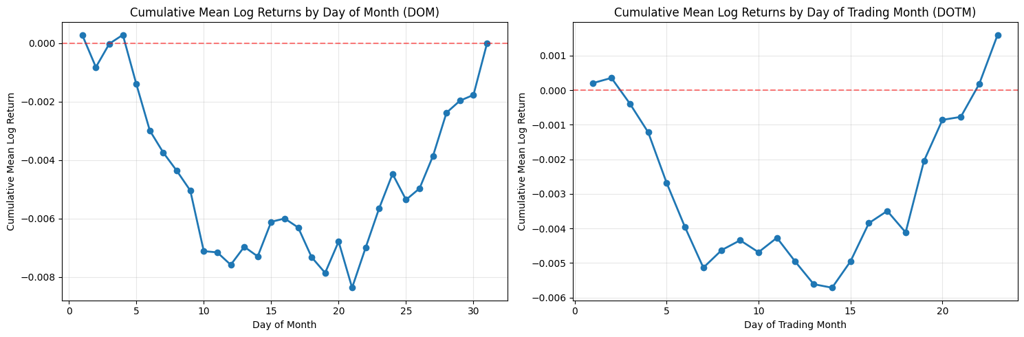
This block takes per-row log returns and converts them into two simple, visual seasonality diagnostics: one indexed by calendar day-of-month (DOM) and one by trading-day-of-month (DOTM). The first step groups the returns by the chosen bucket (DOM or DOTM) and computes the mean log return for each bucket. Averaging within buckets gives a single summary statistic per day index — effectively the expected log-return when that bucket occurs. The code then runs a cumulative sum over those bucket means. Because these are log returns, summing them across successive buckets corresponds to the log of a compounded return across those buckets, so cumsum is a natural way to show the accumulated directional effect as you move through the month.
Using log returns and cumsum is purposeful: log returns add under composition, so the plotted cumulative mean is interpretable as the expected aggregate log performance across the sequence of day buckets. That makes it easier to reason about persistent small biases (for example, if the first five trading days each have slightly positive mean log returns, their sum will show a clear upward drift). If you wanted multiplicative returns instead, you would exponentiate the cumsum to get the expected gross return multiplier over the sequence.
The distinction between DOM and DOTM matters for quant trading signals. DOM groups by calendar date (1–31), which can reveal calendar-driven effects (end-of-month window dressing, payroll dates, etc.) but is influenced by weekends and holidays. DOTM groups by trading-day index inside a month (1st trading day, 2nd trading day, …), which normalizes away non-trading days and is usually more directly actionable for intramonth timing because it reflects the sequence of tradable opportunities. Be aware that group sizes vary: some DOM buckets will have fewer observations (e.g., 31st), and DOTM buckets may have heterogeneous sample counts across months — the code uses simple means and does not weight or adjust for unequal sample sizes.
Before plotting, ensure the bucket indices are ordered; groupby typically returns sorted group keys, but you should explicitly sort if custom indices are possible. The visualization plots each cumulative-mean series with markers and a line so you can see both discrete bucket jumps and the overall trajectory. The horizontal zero line highlights whether cumulative bias crosses into net positive or negative territory; small oscillations around zero indicate no persistent intramonth edge, while monotonic movement suggests a potentially exploitable seasonality. Grid and layout choices are purely presentational but help with reading small differences across buckets.
A few practical caveats for using these outputs in a trading strategy: the mean-based cumsum does not provide uncertainty bounds or significance testing, so apparent edges may be noise — you should overlay standard errors, bootstrap confidence intervals, or t-tests and verify effect stability out of sample. Also check bucket sample counts and consider winsorizing or trimming outliers; transaction costs, liquidity, and market impact will materially affect whether a small mean edge is tradable. Finally, confirm there is no look-ahead or survivorship bias in the input dataframe, and consider repeating the analysis on rolling windows to test time stability before embedding any signal into execution logic.
Short actionable suggestions: explicitly sort the indices before plotting, annotate or plot bucket counts to see where sample sizes are thin, add confidence bands (e.g., +/- standard error) around the cumulative curve, and convert cumsum to exp(cumsum) if you need to present multiplicative returns to stakeholders or for position-sizing calculations. These steps help turn the plotted diagnostic into a robust input for intramonth timing decisions in a quant strategy.
Backtest
Guidelines for evaluating strategies using historical data.
# Create a copy of the dataframe for backtesting
backtest_df = df.copy()

# Initialize position and portfolio value columns
backtest_df[’Position’] = 0  # 0 = no position, -1 = short, 1 = long
backtest_df[’Strategy_Return’] = 0.0

# Define the trading strategy based on DOTM
# Short from day 1 to day 6 (close on day 7)
# Long from day 15 to end of month
backtest_df.loc[(backtest_df[’DOTM’] >= 1) & (backtest_df[’DOTM’] <= 6), ‘Position’] = -1
backtest_df.loc[backtest_df[’DOTM’] >= 15, ‘Position’] = 1

# Calculate strategy returns (position * return)
backtest_df[’Strategy_Return’] = backtest_df[’Position’] * backtest_df[’Return’]

# Calculate cumulative returns
backtest_df[’Cumulative_Strategy_Return’] = (1 + backtest_df[’Strategy_Return’]).cumprod()

# Calculate performance metrics
total_return = backtest_df[’Cumulative_Strategy_Return’].iloc[-1] - 1
total_profit = total_return * 100  # in percentage

# Calculate annualized return
n_years = (backtest_df[’Date’].iloc[-1] - backtest_df[’Date’].iloc[0]).days / 365.25
annualized_return = (1 + total_return) ** (1 / n_years) - 1

# Calculate annualized volatility
annual_vol = backtest_df[’Strategy_Return’].std() * np.sqrt(252)

# Calculate Sharpe ratio (assuming 0% risk-free rate)
annual_sharpe = annualized_return / annual_vol if annual_vol != 0 else 0

# Calculate maximum drawdown
cumulative_returns = backtest_df[’Cumulative_Strategy_Return’]
running_max = cumulative_returns.cummax()
drawdown = (cumulative_returns - running_max) / running_max
max_drawdown = drawdown.min()

# Print results
print(”=” * 60)
print(”BACKTEST RESULTS”)
print(”=” * 60)
print(f”Strategy: Short DOTM 1-6, Long DOTM 15+”)
print(f”Period: {backtest_df[’Date’].iloc[0].date()} to {backtest_df[’Date’].iloc[-1].date()}”)
print(f”Number of years: {n_years:.2f}”)
print(”-” * 60)
print(f”Total Return: {total_return * 100:.2f}%”)
print(f”Annualized Return: {annualized_return * 100:.2f}%”)
print(f”Annualized Volatility: {annual_vol * 100:.2f}%”)
print(f”Sharpe Ratio: {annual_sharpe:.3f}”)
print(f”Maximum Drawdown: {max_drawdown * 100:.2f}%”)
print(”=” * 60)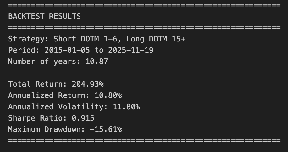
This block implements a simple rule-based backtest that shorts the asset during the first trading days of each month (DOTM 1–6) and goes long from the middle of the month onward (DOTM >= 15). It starts by making a defensive copy of the input dataframe so the original market data remains unchanged for other analyses; that copy becomes the working dataset for all subsequent calculations.
Next it creates two new columns to hold the trading state and profit-and-loss: a discrete Position column with values -1, 0, or +1, and a Strategy_Return column initialized to zero. The code then assigns positions deterministically from the DOTM field: set Position = -1 when DOTM is between 1 and 6 (short at month-start), set Position = +1 when DOTM >= 15 (long from mid-month onward), and leave Position = 0 otherwise. The choice to use DOTM windows defines the strategy’s regime timing — days 7–14 are intentionally neutral — and those windows are applied across every row to produce a time series of exposures.
With exposure defined, the Strategy_Return for each row is computed as Position * Return. Here Return is expected to be the asset’s simple period return; multiplying by the position turns that into the strategy’s realized return for the period (positive if returns align with the position, negative if they don’t). This approach assumes the position is held through the period represented by Return and that returns scale linearly with position (i.e., no leverage or position sizing multipliers beyond ±1).
Cumulative performance is then built via compounding: the code forms (1 + Strategy_Return) and takes a cumulative product. This produces a growth-of-1 time series that represents the portfolio value trajectory under continuous compounding of discrete period returns, which is appropriate when you want to observe total performance over time including compounding effects.
The code extracts a set of common performance metrics from that trajectory. Total return is the final cumulative value minus one; annualized return is obtained by treating total return as a multi-year geometric return and raising (1 + total_return) to the power 1 / n_years, where n_years is computed as the calendar-day span divided by 365.25. Annualized volatility is estimated by taking the standard deviation of the daily Strategy_Return series and scaling by sqrt(252) to annualize under the conventional trading-day assumption. The Sharpe ratio is then computed as annualized_return / annual_vol, implicitly treating the risk-free rate as zero; the code guards against division by zero by returning zero if annual_vol is zero.
Maximum drawdown is computed from the cumulative strategy curve by tracking the running maximum and measuring the percentage drop from that peak to the current value; the most negative of those values is the max drawdown, which captures the strategy’s worst peak-to-trough loss over the backtest. Finally, the script prints a concise summary including period, years, total and annualized returns, annualized volatility, Sharpe, and max drawdown.
A few practical caveats implicit in these choices: returns are treated as simple returns and positions are applied directly to those returns (no transaction costs, slippage, overnight risk adjustments, or explicit entry/exit timing corrections are included), the annualization uses calendar span for years and 252 for volatility which can mismatch if your data includes non-standard trading frequencies, and position logic assumes DOTM is correctly aligned with returns (you may need to shift positions by one row if signals are generated at close and positions are entered the next open). Depending on the use case, consider adding transaction cost modeling, position sizing, and careful alignment of signal and execution timestamps before assessing real-world feasibility.
# Calculate separate performance for short and long positions
short_df = backtest_df[backtest_df[’Position’] == -1].copy()
long_df = backtest_df[backtest_df[’Position’] == 1].copy()

# Calculate cumulative returns for short and long separately
short_df[’Cumulative_Short_Return’] = (1 + short_df[’Strategy_Return’]).cumprod()
long_df[’Cumulative_Long_Return’] = (1 + long_df[’Strategy_Return’]).cumprod()

# Plot the performance
fig, ax = plt.subplots(figsize=(15, 8))

# Plot strategy performance
ax.plot(backtest_df[’Date’], backtest_df[’Cumulative_Strategy_Return’],
    label=’Strategy (Short DOTM 1-6 + Long DOTM 15+)’, linewidth=2, color=’blue’)

# Plot short performance
ax.plot(short_df[’Date’], short_df[’Cumulative_Short_Return’],
    label=’Short Performance (DOTM 1-6)’, linewidth=1.5, color=’red’, alpha=0.7)

# Plot long performance
ax.plot(long_df[’Date’], long_df[’Cumulative_Long_Return’],
    label=’Long Performance (DOTM 15+)’, linewidth=1.5, color=’green’, alpha=0.7)


ax.set_xlabel(’Date’, fontsize=12)
ax.set_ylabel(’Cumulative Return’, fontsize=12)
ax.set_title(’Strategy Performance: Short vs Long vs Combined’, fontsize=14, fontweight=’bold’)
ax.legend(loc=’best’, fontsize=10)
ax.grid(True, alpha=0.3)
ax.axhline(y=1, color=’black’, linestyle=’-’, alpha=0.3, linewidth=0.5)

plt.tight_layout()
plt.show()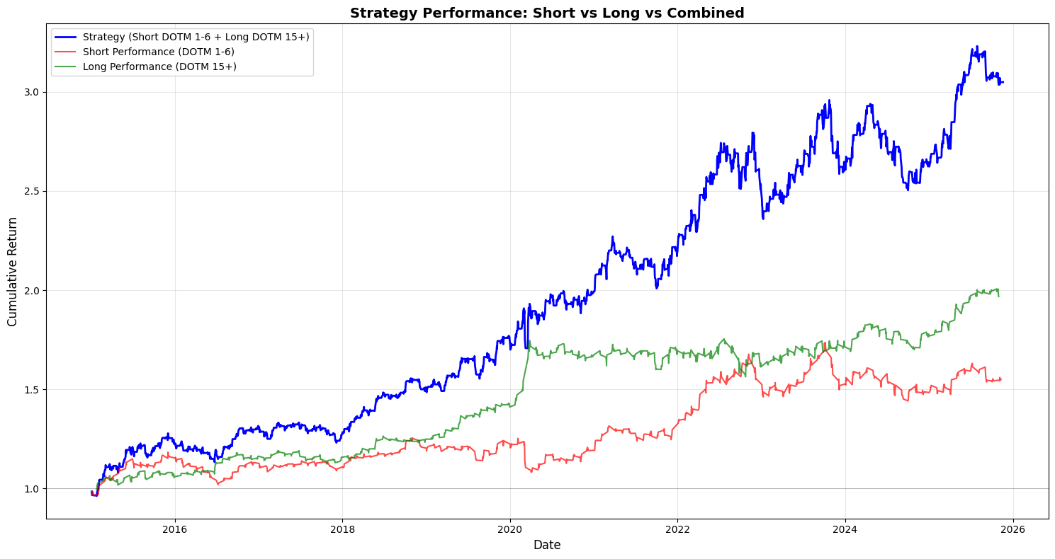
This block takes the backtest output and separates, visualizes, and compares the compounding performance of the short and long legs so you can attribute the combined strategy P&L to each side over time.
First, the code isolates the lifecycle records for the short and long legs by filtering the backtest dataframe on the Position column (Position == -1 for shorts and == 1 for longs). We make explicit copies to avoid chained-assignment issues and to ensure subsequent column additions don’t affect the original dataframe unexpectedly. This split is driven by the business rule that DOTM 1–6 exposures are treated as the short leg and DOTM 15+ exposures as the long leg; separating the rows lets us compute each leg’s realized performance independently, which is essential for attribution and risk diagnostics in a multi-leg options strategy.
Next, cumulative returns for each leg are computed with (1 + Strategy_Return).cumprod(). Using cumprod models compounding correctly — it rolls forward the growth of a $1 (or 100%) base investment by multiplying period returns rather than summing them, so you see the true compounded P&L path of each leg. This works whether Strategy_Returns are positive or negative (short returns will be negative when they lose money), so the resulting series shows the time evolution of capital if you had only run that leg. Note that the combined strategy line is plotted from backtest_df[‘Cumulative_Strategy_Return’], which implies the combined cumulative series was precomputed earlier; plotting all three on the same axes allows visual inspection of how much each leg contributes to divergence from the combined path.
The plotting section then lays out the visual story: a larger, thicker blue line for the full strategy (to emphasize the primary metric), and thinner, semi-transparent red and green lines for the short and long legs respectively. The baseline y=1 is drawn so you can immediately see when each leg or the combined strategy has broken even relative to the starting capital. Labels, legend, grid and a tight layout are applied to make trends and crossovers clear at a glance. Alpha and linewidth choices are purely presentational but purposeful: the combined strategy is highlighted as the main outcome while the legs are shown as supportive, slightly de-emphasized traces.
A few practical notes relevant to quant backtesting: because the code filters rows by Position, any dates where the strategy is flat (Position == 0 or missing) will not appear in the leg-specific curves — this can create discontinuities if you expect continuous time series. If you want continuous leg-level curves that hold prior capital forward when flat, you should reindex to the full date index and forward-fill or explicitly align on the same timeline as the combined series. Also confirm that Strategy_Return already reflects trade-level signs (i.e., short returns are recorded from the perspective of the strategy, not instrument price moves); otherwise you must flip signs before compounding. Finally, remember to incorporate transaction costs, borrow costs for shorts, and differing notional sizing across legs before drawing conclusions — the visual attribution is only as accurate as the underlying return series.
# Calculate rolling metrics with a 252-day window (1 year)
window = 252

# Calculate rolling annualized return
backtest_df[’Rolling_Return’] = backtest_df[’Strategy_Return’].rolling(window=window).apply(
    lambda x: (1 + x).prod() ** (252 / len(x)) - 1 if len(x) == window else np.nan
)

# Calculate rolling annualized volatility
backtest_df[’Rolling_Vol’] = backtest_df[’Strategy_Return’].rolling(window=window).std() * np.sqrt(252)

# Calculate rolling Sharpe ratio
backtest_df[’Rolling_Sharpe’] = backtest_df[’Rolling_Return’] / backtest_df[’Rolling_Vol’]

# Create plots for rolling metrics
fig, (ax1, ax2, ax3) = plt.subplots(3, 1, figsize=(15, 12))

# Plot rolling annualized return
ax1.plot(backtest_df[’Date’], backtest_df[’Rolling_Return’] * 100, linewidth=1.5, color=’blue’)
ax1.axhline(y=annualized_return * 100, color=’red’, linestyle=’--’, alpha=0.7, label=’Overall Annualized Return’)
ax1.set_ylabel(’Return (%)’, fontsize=11)
ax1.set_title(’Rolling 1-Year Annualized Return’, fontsize=13, fontweight=’bold’)
ax1.grid(True, alpha=0.3)
ax1.legend()

# Plot rolling annualized volatility
ax2.plot(backtest_df[’Date’], backtest_df[’Rolling_Vol’] * 100, linewidth=1.5, color=’orange’)
ax2.axhline(y=annual_vol * 100, color=’red’, linestyle=’--’, alpha=0.7, label=’Overall Annualized Vol’)
ax2.set_ylabel(’Volatility (%)’, fontsize=11)
ax2.set_title(’Rolling 1-Year Annualized Volatility’, fontsize=13, fontweight=’bold’)
ax2.grid(True, alpha=0.3)
ax2.legend()

# Plot rolling Sharpe ratio
ax3.plot(backtest_df[’Date’], backtest_df[’Rolling_Sharpe’], linewidth=1.5, color=’green’)
ax3.axhline(y=annual_sharpe, color=’red’, linestyle=’--’, alpha=0.7, label=’Overall Sharpe Ratio’)
ax3.axhline(y=0, color=’black’, linestyle=’-’, alpha=0.3, linewidth=0.5)
ax3.set_xlabel(’Date’, fontsize=11)
ax3.set_ylabel(’Sharpe Ratio’, fontsize=11)
ax3.set_title(’Rolling 1-Year Sharpe Ratio’, fontsize=13, fontweight=’bold’)
ax3.grid(True, alpha=0.3)
ax3.legend()

plt.tight_layout()
plt.show()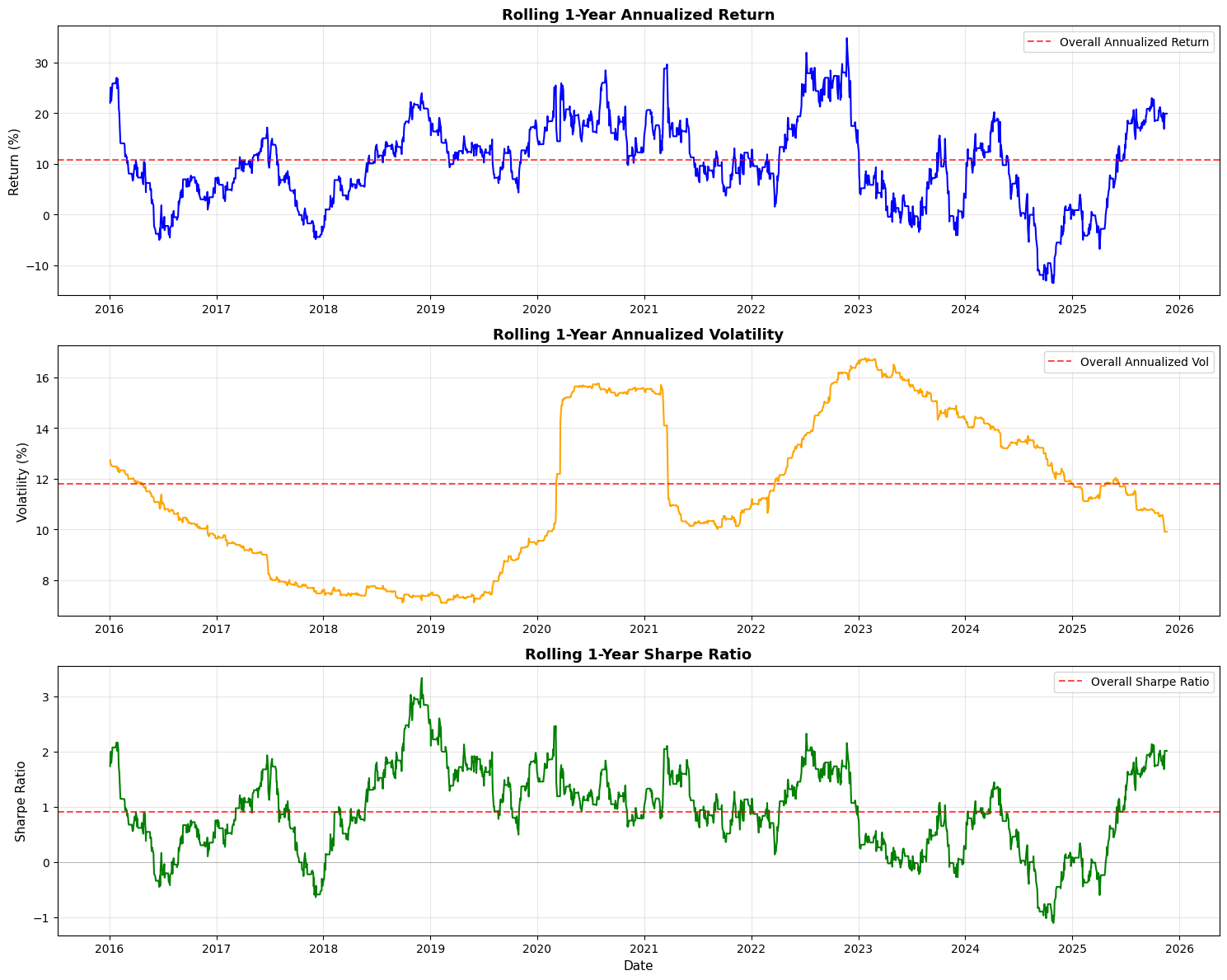
This block computes and visualizes time-varying performance metrics for a trading strategy using a one-year (252 trading day) rolling window so you can see how returns, risk, and risk-adjusted performance evolve over time. The high-level goal is to move beyond single aggregate numbers and detect regime changes, drawdown periods, or improving/declining performance that would inform position sizing, risk limits, or strategy retirement decisions.
First, the code defines a 252-day window and then builds a rolling annualized return. For each full window it compounds the daily strategy returns by taking the product of (1 + daily_return) and annualizing that cumulative growth with the exponent 252 / len(x). The len(x) == window check ensures you only compute the annualized figure when you have a complete one-year sample (otherwise you set NaN) — this avoids artificially inflating or misrepresenting a partial-period annualization. Note this approach assumes the series contains simple (period) returns; if you were using log returns you would sum and exponentiate instead. Also, using product((1 + x)) directly captures geometric compounding, which is what you want for realized return over multiple periods.
Next, the code computes a rolling annualized volatility by taking the sample standard deviation over each 252-day window and scaling it by sqrt(252). This uses the usual square-root-of-time rule to convert daily volatility to an annualized figure; the underlying assumption is i.i.d. or at least that scaling is a reasonable approximation over the window. Be aware of nuances: rolling.std() uses pandas’ default degrees-of-freedom (ddof) behavior which affects small-sample bias and how NaNs are handled, and missing or irregularly spaced dates can distort the interpretation because the window is row-count based rather than calendar-time based.
The rolling Sharpe is then computed as the ratio of the rolling annualized return to the rolling annualized volatility. This yields a time series of risk-adjusted performance. Two important practical caveats: first, this formula implicitly treats the returns as excess returns (i.e., already net of a risk-free rate); if they are raw returns you should subtract an appropriate risk-free rate (or better, a time series of short-rates) before forming the Sharpe. Second, dividing by volatility can produce very large or undefined values if volatility is near zero or NaN, so it’s common in production code to guard or clip volatility to avoid spurious infinite Sharpe values.
Finally, the code creates three stacked plots (return, volatility, Sharpe) to visualize these rolling metrics. Each plot multiplies the return/volatility series by 100 to show percentages, draws a horizontal dashed red line representing the overall (full-sample) annualized metric for easy reference, and includes basic labeling and grids so you can visually compare short-term dynamics to the long-run average. Using the Date column for the x-axis is fine but remember the rolling window was row-based; if your timestamps contain gaps (weekends, holidays, missing days), consider a time-based rolling window (e.g., 252 trading-day calendar approximation or rolling with an offset) or ensure the DataFrame only contains trading days. Also note a performance consideration: the rolling.apply with a Python lambda is easy to reason about but not the fastest for large datasets — you can vectorize the annualized return via rolling sum of log(1+returns) or use optimized libraries if speed matters.
In short: this code produces a clear, geometrically compounded, one-year rolling view of return, volatility, and Sharpe to monitor how the strategy’s realized performance and risk profile change over time, while leaving a few practical knobs you’ll likely want to tighten for production: risk-free adjustment, NaN/zero-vol handling, choice of return type (simple vs log), and possibly more efficient vectorized computation or calendar-aware rolling windows.
Risk Premia Harvesting — Buy & Hold Strategy
Overview
This notebook implements a simple buy-and-hold strategy designed to capture risk premia from a diversified portfolio. The method is straightforward: buy the portfolio assets at the start of the period and hold them for the entire horizon (approximately 10 years) without rebalancing.
Portfolio composition:
SPY (S&P 500 ETF): 50%
TLT (Long-term Treasury ETF): 35%
GLD (Gold ETF): 15%
Initial capital: $10,000.00
Target outputs
Performance metrics
Annualized return
Annualized volatility
Sharpe ratio
Maximum drawdown
Visualizations
Equity curves (total portfolio and individual assets)
1-year rolling annualized return
1-year rolling annualized volatility
1-year rolling Sharpe ratio
Implementation steps
1. Data acquisition
Load historical price data for SPY, TLT, and GLD.
2. Data preparation
Remove rows with missing data.
Ensure all tickers share a common date index.
3. Portfolio initialization
Set initial capital and asset weights.
Select the first trading date.
Calculate dollar allocation per asset.
Determine the number of shares to purchase for each asset.
4. Equity curve construction
Calculate daily equity for each asset.
Compute total portfolio equity.
Consolidate results into a single DataFrame.
5. Returns calculation
Compute daily returns for the portfolio.
Compute daily returns for each individual asset.
6. Performance statistics
Calculate annualized return.
Calculate annualized volatility.
Calculate the Sharpe ratio.
Calculate maximum drawdown.
7. Static visualizations
Plot all equity curves on a single chart.
8. Rolling performance analysis
Generate a 1-year rolling annualized return chart.
Generate a 1-year rolling annualized volatility chart.
Generate a 1-year rolling Sharpe ratio chart.
# Imports
import pandas as pd
import numpy as np
import matplotlib.pyplot as plt

# 1. Data Acquisition

spy_returns = pd.read_csv(”C:\\Users\\blazo\\Documents\\Misc\\QJ\\quant-journey\\data\\returns\\returns_SPY.csv”, index_col=0, parse_dates=True)
tlt_returns = pd.read_csv(”C:\\Users\\blazo\\Documents\\Misc\\QJ\\quant-journey\\data\\returns\\returns_TLT.csv”, index_col=0, parse_dates=True)
gld_returns = pd.read_csv(”C:\\Users\\blazo\\Documents\\Misc\\QJ\\quant-journey\\data\\returns\\returns_GLD.csv”, index_col=0, parse_dates=True)

# 2. Data Preparation

# Combine all returns into a single DataFrame
close_df = pd.DataFrame({
    ‘SPY’: spy_returns[’Close’],
    ‘TLT’: tlt_returns[’Close’],
    ‘GLD’: gld_returns[’Close’]
})

# Drop rows with any missing data
close_df = close_df.dropna()
This block is the initial ingestion and alignment step for your time series inputs — the moment when raw source files become a single, clean panel you can use for portfolio construction, risk calculations, or backtests.
First, each CSV is read into a pandas object with the first column parsed as the datetime index. Using index_col=0 and parse_dates ensures the series are true time series (dtype datetime64) so downstream operations like resampling, rolling windows, alignment, or plotting behave correctly. Because you read one file per asset, each resulting object is keyed by date and contains whatever column structure is in the CSV; here the code pulls the ‘Close’ column from each file. Note: the filenames include “returns” which suggests these files may already contain return series, but the code selects a column named ‘Close’ — you should double-check whether those CSVs actually hold raw prices or returns. If they are prices, you must convert them to returns before any volatility/correlation calculations; if they are returns, treating them as a ‘Close’ series is fine but the naming is confusing and worth clarifying.
When the three asset series are combined into close_df via a dict, pandas aligns them by their datetime index. That alignment uses the union of all dates by default, so if one asset is missing a date (e.g., different listing dates, exchange holidays, or sparse data), the combined DataFrame will contain NaNs at those timestamps. The immediate dropna() removes any row that contains a missing value across any asset — turning that union-of-dates view into an intersection. This is deliberate: many quantitative computations (covariance matrices, standardized returns, rolling correlations, portfolio returns computed as a weighted sum) assume that observations are synchronous across assets. Keeping rows with missing values would either force you to impute (which can introduce bias or spurious signals) or to add special-case logic everywhere; dropping them here keeps the dataset clean and avoids subtle errors in downstream math.
Two practical implications to keep in mind for quant work: (1) dropping rows reduces sample length and can bias the dataset if one asset has materially different trading history — if that matters for your strategy you may prefer an explicit join strategy (e.g., pd.concat with join=’inner’ or controlled imputation). (2) confirm that the time ordering is correct and that there are no duplicate timestamps; many downstream algorithms assume strictly increasing, unique indices. Finally, consider making the file paths and the column you select configurable, and add an assertion or small sanity checks (like checking whether the values look like prices vs returns, and that the index is sorted) so you don’t accidentally feed raw prices into return-based logic later.
# 3. Portfolio Initialization

# Set initial capital and asset weights
initial_capital = 10000.00
weights = {
    ‘SPY’: 0.50,
    ‘TLT’: 0.35,
    ‘GLD’: 0.15
}

# Select the first trading date
first_date = close_df.index[0]
print(f”First trading date: {first_date}”)

# Calculate dollar allocation per asset
allocations = {
    ‘SPY’: initial_capital * weights[’SPY’],
    ‘TLT’: initial_capital * weights[’TLT’],
    ‘GLD’: initial_capital * weights[’GLD’]
}

print(f”\nDollar allocations:”)
for ticker, amount in allocations.items():
    print(f”  {ticker}: ${amount:,.2f}”)

# Get initial prices
initial_prices = close_df.loc[first_date]
print(f”\nInitial prices on {first_date}:”)
for ticker, price in initial_prices.items():
    print(f”  {ticker}: ${price:.2f}”)

# Determine the number of shares for each asset
shares = {
    ‘SPY’: allocations[’SPY’] / initial_prices[’SPY’],
    ‘TLT’: allocations[’TLT’] / initial_prices[’TLT’],
    ‘GLD’: allocations[’GLD’] / initial_prices[’GLD’]
}

print(f”\nNumber of shares purchased:”)
for ticker, num_shares in shares.items():
    print(f”  {ticker}: {num_shares:.4f} shares”)

# Calculate actual invested amount (accounting for fractional shares)
total_invested = sum(shares[ticker] * initial_prices[ticker] for ticker in shares.keys())
print(f”\nTotal invested: ${total_invested:,.2f}”)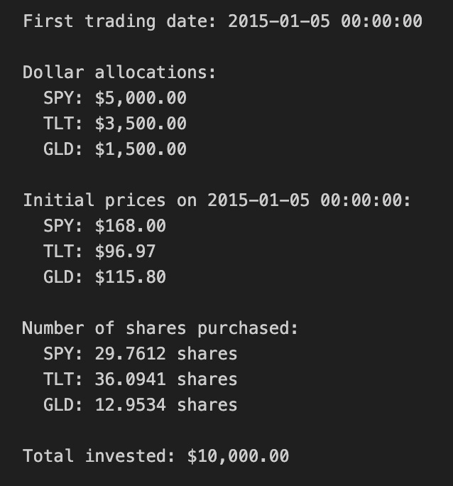
This block initializes a simulated portfolio for a quant trading backtest by turning a target capital and percentage weights into concrete position sizes on the first available market date. It begins with a stated initial capital and a dictionary of target portfolio weights for three tickers; those weights express the intended risk or exposure mix (equities via SPY, long-duration bonds via TLT, and gold via GLD). Using the first timestamp from the price DataFrame (close_df.index[0]) establishes the consistent starting point for the strategy so all allocations are priced off the same snapshot; the code prints that date for transparency and reproducibility.
Next, the code converts percentage weights into dollar allocations by multiplying each weight by the initial capital. This step is fundamental: quant strategies operate on dollars (or shares), so the abstract weight vector must be mapped to monetary amounts to create tradable positions. The explicit allocations are printed so you can verify the capital partitioning before any orders are modeled or executed.
With dollar allocations known, the code pulls the actual close prices on the chosen start date from close_df. Using actual market prices is crucial because the number of shares you can buy depends on the market price at execution: weights alone don’t tell you how many shares to trade. The code prints these prices to provide visibility into the price basis used for sizing.
The share-sizing step divides each asset’s dollar allocation by its initial price to compute the number of shares to purchase. This approach assumes fractional shares are allowable (the result is a floating-point number). In a backtest that models fractional shares, this directly maps target exposure to precise notional positions and keeps the realized portfolio close to the intended weights. If you were modeling integer-share trading on an exchange that doesn’t support fractions, you’d need to floor/round shares and track any leftover cash; the code intentionally does not do that here.
Finally, total_invested recomputes the actual dollars deployed by summing shares times their prices. In an ideal fractional-share scenario this equals the initial capital (up to floating-point precision), but the explicit recomputation is a useful sanity check to surface NaNs, price mismatches, or weight-sum errors early. The prints let you confirm no capital was inadvertently left unused or oversubscribed.
Practical caveats for quant trading: this snippet assumes the weight vector sums to 1 and that close_df has valid, non-NaN prices on the first date — both should be validated upstream. It also omits transaction costs, spreads, execution slippage, and market impact, which in live trading can meaningfully change realized exposure; incorporate those in later order-execution modeling. Lastly, if you plan to rebalance, track cash leftover from integer-share constraints or explicitly model fractional-share execution and any rounding policy at each rebalance to keep simulated P&L realistic.
# 4. Equity Curve Construction

# Calculate daily equity for each asset
equity_df = pd.DataFrame(index=close_df.index)

for ticker in [’SPY’, ‘TLT’, ‘GLD’]:
    equity_df[f’{ticker}_equity’] = shares[ticker] * close_df[ticker]

# Compute total portfolio equity
equity_df[’total_equity’] = equity_df[’SPY_equity’] + equity_df[’TLT_equity’] + equity_df[’GLD_equity’]

# 5. Returns Calculation

# Compute portfolio daily returns
returns_df = pd.DataFrame(index=close_df.index)
returns_df[’portfolio_return’] = equity_df[’total_equity’].pct_change()

# Compute individual asset daily returns
returns_df[’SPY_return’] = equity_df[’SPY_equity’].pct_change()
returns_df[’TLT_return’] = equity_df[’TLT_equity’].pct_change()
returns_df[’GLD_return’] = equity_df[’GLD_equity’].pct_change()

# Drop the first row (NaN due to pct_change)
returns_df = returns_df.dropna()

# 6. Performance Statistics

# Assume 252 trading days per year
trading_days = 252

# Calculate annualized return
total_return = (equity_df[’total_equity’].iloc[-1] / equity_df[’total_equity’].iloc[0]) - 1
num_years = len(returns_df) / trading_days
annualized_return = (1 + total_return) ** (1 / num_years) - 1

# Calculate annualized volatility
annualized_volatility = returns_df[’portfolio_return’].std() * np.sqrt(trading_days)

# Calculate Sharpe ratio (assuming 0% risk-free rate)
risk_free_rate = 0.0
sharpe_ratio = (annualized_return - risk_free_rate) / annualized_volatility

# Calculate maximum drawdown
cumulative_returns = (1 + returns_df[’portfolio_return’]).cumprod()
running_max = cumulative_returns.cummax()
drawdown = (cumulative_returns - running_max) / running_max
max_drawdown = drawdown.min()

# Display equity curve summary
print(”=” * 50)
print(”EQUITY CURVE SUMMARY”)
print(”=” * 50)
print(f”Initial portfolio value: ${equity_df[’total_equity’].iloc[0]:,.2f}”)
print(f”Final portfolio value: ${equity_df[’total_equity’].iloc[-1]:,.2f}”)
print(f”Total return: ${equity_df[’total_equity’].iloc[-1] - equity_df[’total_equity’].iloc[0]:,.2f}”)
print(f”Total return %: {((equity_df[’total_equity’].iloc[-1] / equity_df[’total_equity’].iloc[0]) - 1) * 100:.2f}%”)
print(”\n”)

# Display results
print(”=” * 50)
print(”PORTFOLIO PERFORMANCE STATISTICS”)
print(”=” * 50)
print(f”Period: {equity_df.index[0].strftime(’%Y-%m-%d’)} to {equity_df.index[-1].strftime(’%Y-%m-%d’)}”)
print(f”Number of years: {num_years:.2f}”)
print(f”\nAnnualized Return: {annualized_return:.2%}”)
print(f”Annualized Volatility: {annualized_volatility:.2%}”)
print(f”Sharpe Ratio: {sharpe_ratio:.4f}”)
print(f”Maximum Drawdown: {max_drawdown:.2%}”)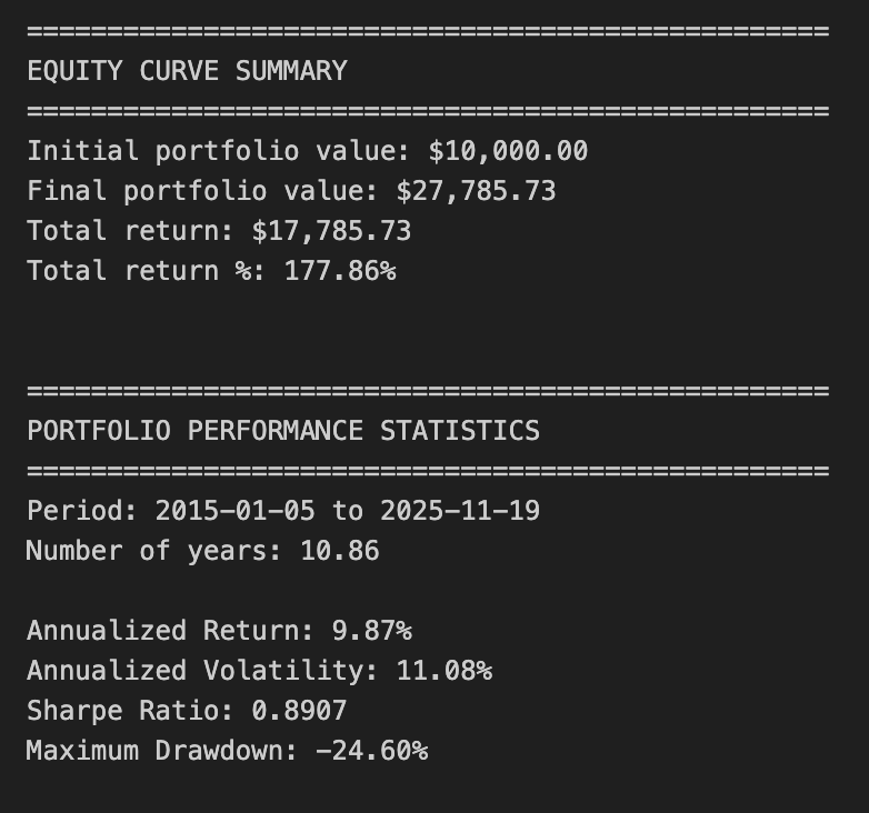
This block constructs a simple equity curve for a three-asset portfolio, derives daily returns from that curve, and computes standard performance metrics used in quantitative trading to summarize risk and return. The overall goal is to translate per-asset positions into a time series of portfolio value, then convert that into annualized return, volatility, Sharpe ratio and maximum drawdown so you can judge whether the allocation/strategy meets your objectives.
First, the code builds equity_df by taking the current close price for each asset and multiplying by shares[ticker]. That produces a per-asset dollar-value time series (e.g., SPY_equity = shares[‘SPY’] * SPY_price). Implicit in this step is the assumption that shares[…] are fixed quantities through time (no rebalancing or partial execution adjustments). This is important: the equity curve reflects price movement only; if you expect dynamic position sizing or intraperiod trades, you’d need to update shares over time or compute P&L differently.
Next it sums the three per-asset series into total_equity. That total is the portfolio-level mark-to-market at each timestamp and is the primary series used for portfolio returns and most metrics. Converting to returns is done with .pct_change(): portfolio_return = total_equity.pct_change() and the same for each asset. pct_change computes the period-over-period relative change (d_t = V_t/V_{t-1} — 1), which is the right measure when positions are constant and you want simple daily returns. The first row is NaN because there is no prior period to compare to, so the code drops that row with dropna() to keep the subsequent statistics clean.
For performance statistics the code follows standard quant practice: compute total_return as the simple cumulative return across the whole sample (final / initial — 1), then convert that to an annualized return using a geometric (compound) formula. It derives num_years as len(returns_df)/252 assuming 252 trading days per year, then computes annualized_return = (1 + total_return) ** (1 / num_years) — 1. Using the geometric mean (instead of arithmetic average) properly accounts for compounding across the sample period, which is what you want for multi-period portfolio performance.
Volatility is annualized by taking the standard deviation of daily portfolio returns and scaling by sqrt(trading_days). That reflects the usual conversion from daily to annualized volatility under the Brownian-motion-like scaling assumption. Note a subtlety: pandas Series.std() uses ddof=1 (sample standard deviation) by default; that’s common but something to be aware of if you want population volatility (ddof=0) for very short samples. The Sharpe ratio is then computed as (annualized_return — risk_free_rate) / annualized_volatility using risk_free_rate = 0.0 in this code. Setting the risk-free rate to zero is a simplification — in live performance reporting you should use an appropriate short-term rate to avoid overstating real excess return.
Maximum drawdown is calculated from the cumulative return path: cumulative_returns = (1 + daily_returns).cumprod() gives a running wealth index, running_max = cumulative_returns.cummax() gives the historical highs, and drawdown = (cumulative_returns — running_max) / running_max gives the percentage decline from peak at every point. Taking drawdown.min() yields the worst (most negative) drawdown. This approach correctly measures peak-to-trough losses, which is critical for risk assessment in quant strategies because it captures path dependency that volatility alone misses.
Finally, the code prints a concise summary of initial vs final portfolio value, total dollar and percentage return, the period and number of years, and the key metrics. A few practical caveats to bear in mind: because shares are treated as constant, this performance reflects a buy-and-hold weighting — if your strategy rebalances or changes exposures you must recompute positions over time; num_years derived from a fixed 252 trading days may be slightly imprecise for irregular calendars or missing dates (using actual date differences can be more accurate); and division-by-zero or extremely low volatility can make Sharpe unstable. Also consider using a non-zero risk-free rate, handling fees/transaction costs, and ensuring returns are computed on the same calendar (business days) as your price series when moving from backtest to production reporting.
# 7. Static Visualizations

# Create figure and axis
fig, ax = plt.subplots(figsize=(14, 8))

# Plot equity curves
ax.plot(equity_df.index, equity_df[’total_equity’], label=’Total Portfolio’, linewidth=2.5, color=’black’)
ax.plot(equity_df.index, equity_df[’SPY_equity’], label=’SPY (50%)’, linewidth=1.5, alpha=0.7, color=’blue’)
ax.plot(equity_df.index, equity_df[’TLT_equity’], label=’TLT (35%)’, linewidth=1.5, alpha=0.7, color=’green’)
ax.plot(equity_df.index, equity_df[’GLD_equity’], label=’GLD (15%)’, linewidth=1.5, alpha=0.7, color=’gold’)

# Formatting
ax.set_title(’Buy & Hold Portfolio - Equity Curves’, fontsize=16)
ax.set_xlabel(’Date’, fontsize=12)
ax.set_ylabel(’Equity ($)’, fontsize=12)
ax.legend(loc=’best’, fontsize=10)
ax.grid(True, alpha=0.3)

# Format y-axis as currency
ax.yaxis.set_major_formatter(plt.FuncFormatter(lambda x, p: f’${x:,.0f}’))

# Rotate x-axis labels
plt.xticks(rotation=45)
plt.tight_layout()
plt.show()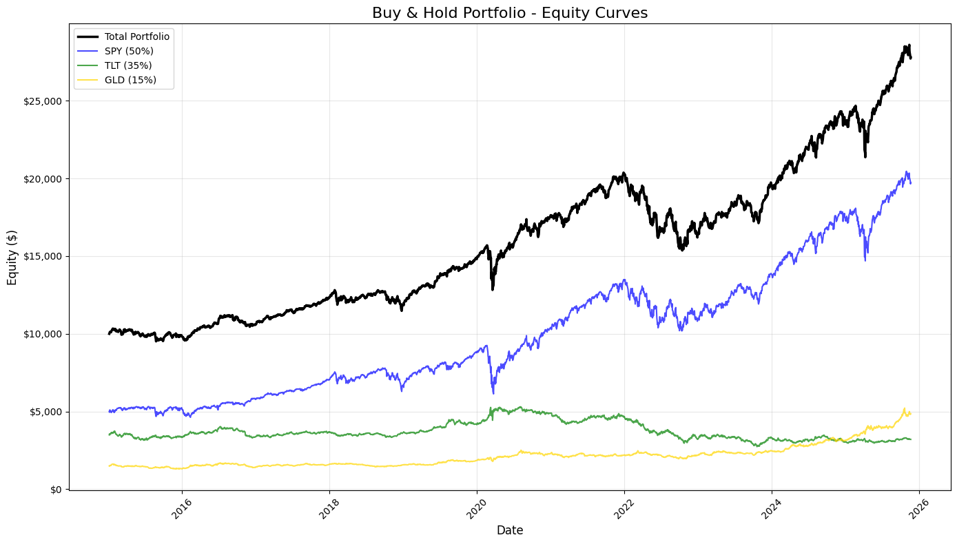
This block produces a static, publication-quality chart that contrasts the total portfolio equity against the three underlying buy-and-hold components over time. It consumes equity_df — a time-indexed DataFrame whose columns represent cumulative dollar equity for the blended portfolio and for each asset (SPY, TLT, GLD) given their target allocations. Chronologically, the code first creates a plotting canvas sized for legibility, then draws four time series: the consolidated portfolio (“total_equity”) and each asset-specific equity curve. Plotting the total portfolio alongside the components makes the relationship between allocation and aggregate performance explicit: you can see when one asset’s gains or losses dominate the portfolio and how diversification smooths or amplifies moves.
Styling choices carry informational intent. The total portfolio is drawn thicker and in black to visually prioritize it as the primary metric of interest, while the component curves are thinner, semi-transparent, and colored to remain visible but secondary. The labels include the target weights (50% SPY, 35% TLT, 15% GLD) so viewers immediately understand that these traces are not raw index values but position-level equity given those allocations. Using alpha transparency on the component traces reduces visual clutter where lines overlap, and distinct colors help track each asset through different market regimes.
Formatting is deliberate to improve interpretability for trading analysis. A descriptive title and axis labels orient the viewer to timeframe and monetary scale. The legend is placed automatically to minimize overlap with data, and a subtle grid enhances the ability to read relative moves and turning points without dominating the chart. The y-axis is formatted as currency — converting raw numeric ticks into dollar-formatted labels — because investment performance is more actionable and intuitive when expressed in dollars rather than raw numbers or percentages for this style of equity-curve presentation. Rotating x-axis labels and applying tight_layout prevent tick labels and other annotations from being clipped, which is important when dates are dense over long backtests.
From a quant-trading perspective, this visualization is an early diagnostic tool: it shows realized dollar P&L paths, highlights periods where one asset drives portfolio returns, and helps surface regime shifts, drawdowns, and the effectiveness of the static allocation. When you inspect these curves, you’re looking for divergence between the portfolio and its components (indicating concentration or hedging effects), persistent under- or out-performance relative to the major component, and visually-identifiable drawdown recoveries. Finally, plt.show() renders the figure for review; for iterative analysis you might keep this as a static snapshot for reporting, or extend it with overlays (drawdown shading, rolling volatility) or interactive tools for deeper investigation.
# 8. Rolling Performance Analysis
# Define rolling window (252 trading days = 1 year)
window = 252
# Calculate rolling metrics
rolling_return = returns_df[’portfolio_return’].rolling(window=window).apply(
lambda x: (1 + x).prod() ** (252 / len(x)) - 1
)
rolling_volatility = returns_df[’portfolio_return’].rolling(window=window).std() * np.sqrt(252)
rolling_sharpe = rolling_return / rolling_volatility
# Create subplots
fig, axes = plt.subplots(3, 1, figsize=(14, 12))
# 1. Rolling 1-Year Annualized Return
axes[0].plot(rolling_return.index, rolling_return * 100, linewidth=2, color=’blue’)
axes[0].axhline(y=rolling_return.mean() * 100, color=’red’, linestyle=’--’, linewidth=1, alpha=0.5, label=’Return = Mean’)
axes[0].set_title(’Rolling 1-Year Annualized Return’, fontsize=14, fontweight=’bold’)
axes[0].set_ylabel(’Return (%)’, fontsize=12)
axes[0].grid(True, alpha=0.3)
axes[0].set_xlabel(’Date’, fontsize=12)
# 2. Rolling 1-Year Annualized Volatility
axes[1].plot(rolling_volatility.index, rolling_volatility * 100, linewidth=2, color=’orange’)
axes[1].axhline(y=rolling_volatility.mean() * 100, color=’red’, linestyle=’--’, linewidth=1, alpha=0.5, label=’Volatility = Mean’)
axes[1].set_title(’Rolling 1-Year Annualized Volatility’, fontsize=14, fontweight=’bold’)
axes[1].set_ylabel(’Volatility (%)’, fontsize=12)
axes[1].grid(True, alpha=0.3)
axes[1].set_xlabel(’Date’, fontsize=12)
# 3. Rolling 1-Year Sharpe Ratio
axes[2].plot(rolling_sharpe.index, rolling_sharpe, linewidth=2, color=’green’)
axes[2].axhline(y=rolling_sharpe.mean(), color=’red’, linestyle=’--’, linewidth=1, alpha=0.5, label=’Sharpe = Mean’)
axes[2].set_title(’Rolling 1-Year Sharpe Ratio’, fontsize=14, fontweight=’bold’)
axes[2].set_ylabel(’Sharpe Ratio’, fontsize=12)
axes[2].grid(True, alpha=0.3)
axes[2].set_xlabel(’Date’, fontsize=12)
axes[2].legend(loc=’best’, fontsize=10)
# Format x-axis for all subplots
for ax in axes:
ax.tick_params(axis=’x’, rotation=45)
plt.tight_layout()
plt.show()
# Print summary statistics for rolling metrics
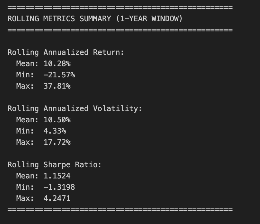
print(”\n” + “=” * 50)
print(”ROLLING METRICS SUMMARY (1-YEAR WINDOW)”)
print(”=” * 50)
print(”\nRolling Annualized Return:”)
print(f” Mean: {rolling_return.mean():.2%}”)
print(f” Min: {rolling_return.min():.2%}”)
print(f” Max: {rolling_return.max():.2%}”)
print(”\nRolling Annualized Volatility:”)
print(f” Mean: {rolling_volatility.mean():.2%}”)
print(f” Min: {rolling_volatility.min():.2%}”)
print(f” Max: {rolling_volatility.max():.2%}”)
print(”\nRolling Sharpe Ratio:”)
print(f” Mean: {rolling_sharpe.mean():.4f}”)
print(f” Min: {rolling_sharpe.min():.4f}”)
print(f” Max: {rolling_sharpe.max():.4f}”)
print(”=” * 50)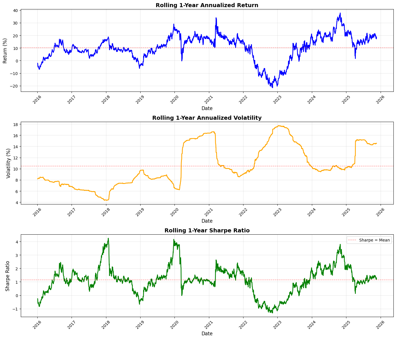
This block performs a standard rolling (time-windowed) performance analysis of a portfolio so you can see how annualized return, volatility, and risk‑adjusted return (Sharpe) evolve through time — a common monitoring and diagnostic tool in quant trading to detect regime changes, strategy deterioration, or risk concentration.
We start by defining the lookback window as 252 trading days (one nominal trading year). For rolling annualized return, the code takes the series of simple daily portfolio returns and, within each 252-day window, computes the compounded growth factor via (1 + r).prod(). That product gives the cumulative gross return over the window; raising it to the power (252 / len(x)) annualizes that multi-day return to a 1‑year equivalent and subtracting 1 converts back to a net annualized return. Using the product of (1 + r) preserves compounding (important for realistic performance comparison across windows) and the exponent rescales the realized holding-period return to an annual basis so values at different dates are comparable.
Volatility is computed as the rolling sample standard deviation of daily returns in the same window, then scaled by sqrt(252) to annualize. This follows the Brownian-motion style scaling commonly used in practice — it gives you an annualized dispersion measure that’s directly comparable to the annualized return above. The rolling Sharpe ratio is simply the pointwise ratio of the two series (annualized return divided by annualized volatility). Note this implementation assumes a zero risk‑free rate and that volatility is nonzero; in production you’ll likely want to subtract a rolling/constant risk‑free rate and guard against division by (near) zero volatility.
Next the code visualizes those three rolling series in vertically stacked subplots: annualized return, annualized volatility, and Sharpe. For return and volatility the plots scale to percent for readability (multiplying by 100), and each panel draws a dashed horizontal line at the series mean to provide a simple benchmark. Plot styling (line widths, colors, grid, titles, labels) is there to make trends, regime shifts, and excursions above/below long-run averages easy to spot. The code rotates x‑ticks and uses tight_layout to keep date labels legible and avoid overlap.
Finally, the script prints a compact summary of the rolling statistics (mean, min, max) for each metric so you get quick numeric checkpoints alongside the visual diagnostics. A few practical caveats to keep in mind: pandas.rolling with window=252 produces NaNs for the first 251 rows unless min_periods is changed, and the lambda uses len(x) so partial-window annualization only happens if you explicitly allow fewer than 252 observations; pandas.Series.std defaults to sample std (ddof=1), which may or may not be what you expect; and the Sharpe here ignores a risk‑free rate and can be unstable if volatility is very low. Also consider whether simple returns are the right primitive (vs. log returns) for your downstream analysis, and remember to watch for typical quant pitfalls such as look‑ahead bias, survivor bias, and non‑synchronous data when interpreting rolling behavior.
Risk-Premia Harvesting — Buy-and-Hold Strategy with Monthly Rebalancing
Overview
This notebook implements a buy-and-hold strategy with monthly rebalancing to harvest risk premia from a diversified portfolio. Rather than remaining unadjusted, the portfolio is rebalanced to target weights at each month end to maintain consistent risk exposure over the investment horizon (approximately 10 years).
Portfolio composition:
SPY (S&P 500 ETF): 50%
TLT (Long-term Treasury ETF): 35%
GLD (Gold ETF): 15%
Initial capital: $10,000.00
Rebalancing frequency: Monthly (end of month)
Target Outputs
Performance metrics
Annualized return
Annualized volatility
Sharpe ratio
Maximum drawdown
Visualizations
Equity curves (total portfolio and individual assets)
1-year rolling annualized return
1-year rolling annualized volatility
1-year rolling Sharpe ratio
Implementation steps
1. Data acquisition
Load historical price data for SPY, TLT, and GLD.
2. Data preparation
Remove rows with missing data.
Align all tickers to the same date index.
Identify month-end dates for rebalancing.
3. Portfolio initialization
Set the initial capital and target asset weights.
Choose the initial trading date.
Calculate dollar allocation per asset using the target weights.
Determine the number of shares for each asset.
4. Equity curve construction with monthly rebalancing
Calculate daily equity for each asset based on current holdings.
Compute total portfolio equity daily.
At each month end:
Calculate the current portfolio value.
Rebalance by adjusting share quantities to restore target weights.
Update holdings for the next period.
Consolidate results into a single DataFrame.
5. Returns calculation
Compute portfolio daily returns.
Compute individual asset daily returns.
6. Performance statistics
Calculate annualized return.
Calculate annualized volatility.
Calculate the Sharpe ratio.
Calculate maximum drawdown.
7. Static visualizations
Plot all equity curves on a single chart.
8. Rolling performance analysis
Generate a 1-year rolling annualized return chart.
Generate a 1-year rolling annualized volatility chart.
Generate a 1-year rolling Sharpe ratio chart.
# Imports
import pandas as pd
import numpy as np
import matplotlib.pyplot as plt

# 1. Data Acquisition

spy_returns = pd.read_csv(”C:\\Users\\blazo\\Documents\\Misc\\QJ\\quant-journey\\data\\returns\\returns_SPY.csv”, index_col=0, parse_dates=True)
tlt_returns = pd.read_csv(”C:\\Users\\blazo\\Documents\\Misc\\QJ\\quant-journey\\data\\returns\\returns_TLT.csv”, index_col=0, parse_dates=True)
gld_returns = pd.read_csv(”C:\\Users\\blazo\\Documents\\Misc\\QJ\\quant-journey\\data\\returns\\returns_GLD.csv”, index_col=0, parse_dates=True)

# 2. Data Preparation

# Combine all returns into a single DataFrame
close_df = pd.DataFrame({
    ‘SPY’: spy_returns[’Close’],
    ‘TLT’: tlt_returns[’Close’],
    ‘GLD’: gld_returns[’Close’]
})

# Drop rows with any missing data
close_df = close_df.dropna()

# Identify month-end dates for rebalancing
month_end_dates = close_df.resample(’ME’).last().index

# Create a boolean column to mark rebalancing dates
close_df[’is_rebalance_date’] = close_df.index.isin(month_end_dates)
This block performs the initial data ingestion and alignment you need before any portfolio logic or backtest runs, and it explicitly sets up the monthly rebalancing signal you’ll use for the strategy. First, three CSV files are read into time-indexed pandas Series/DataFrames with parse_dates so the index is a DatetimeIndex; this is important because all subsequent resampling and calendar-aware operations depend on a proper date index. The code then constructs a single DataFrame (close_df) that pulls the ‘Close’ column from each source into parallel columns named by ticker. Whether those CSVs hold prices or precomputed returns, treating them as aligned series under the same index is the goal: downstream code will compute portfolio-level metrics and make trading decisions assuming each row represents the same trading timestamp across all assets.
Next, close_df = close_df.dropna() enforces that every row used in the backtest contains data for all three assets. This is a deliberate choice to avoid partial observations that would otherwise produce misleading portfolio weights, erroneous return calculations, or hidden look-ahead/forward-fill artifacts. It reduces the usable sample to the intersection of the three asset calendars, which is usually what you want for clean portfolio calculations; if you need to preserve data when one asset is missing you would instead handle NaNs explicitly (forward-fill, imputation, or hybrid logic), but that would introduce its own assumptions.
To implement monthly rebalancing, the code resamples the cleaned series with .resample(‘ME’).last() — resampling at ‘ME’ (month end) and then taking the last available observation in each month returns the last trading-day timestamp of each calendar month, not the calendar date itself if markets were closed. That choice ensures rebalances occur on the last available market day for each month (which is the usual practical convention for monthly rebalance schedules). Finally, close_df[‘is_rebalance_date’] = close_df.index.isin(month_end_dates) marks those rows with a boolean flag so later logic can trigger weight updates or trade execution only on flagged dates. Using .isin on the existing index is robust because month_end_dates were derived from the same index, so the flag will be True exactly on the last trading-day rows and False elsewhere.
Put together, this block synchronizes the asset histories, removes incomplete observations to avoid subtle calculation bugs, and creates an explicit, reproducible monthly rebalancing signal that downstream portfolio logic will use to decide when to adjust positions. A couple of practical checks to keep in mind: confirm that the CSV ‘Close’ column really contains the data type you expect (price vs. return), and be aware that dropna reduces sample size if asset calendars differ — if that’s undesirable, handle missing data explicitly before computing portfolio returns.
# 3. Portfolio Initialization

# Set initial capital and asset weights
initial_capital = 10000.00
weights = {
    ‘SPY’: 0.50,
    ‘TLT’: 0.35,
    ‘GLD’: 0.15
}

# Select the first trading date
first_date = close_df.index[0]
print(f”First trading date: {first_date}”)

# Calculate dollar allocation per asset
allocations = {
    ‘SPY’: initial_capital * weights[’SPY’],
    ‘TLT’: initial_capital * weights[’TLT’],
    ‘GLD’: initial_capital * weights[’GLD’]
}

print(f”\nDollar allocations:”)
for ticker, amount in allocations.items():
    print(f”  {ticker}: ${amount:,.2f}”)

# Get initial prices
initial_prices = close_df.loc[first_date]
print(f”\nInitial prices on {first_date}:”)
for ticker, price in initial_prices.items():
    print(f”  {ticker}: ${price:.2f}”)

# Determine the number of shares for each asset
shares = {
    ‘SPY’: allocations[’SPY’] / initial_prices[’SPY’],
    ‘TLT’: allocations[’TLT’] / initial_prices[’TLT’],
    ‘GLD’: allocations[’GLD’] / initial_prices[’GLD’]
}

print(f”\nNumber of shares purchased:”)
for ticker, num_shares in shares.items():
    print(f”  {ticker}: {num_shares:.4f} shares”)

# Calculate actual invested amount (accounting for fractional shares)
total_invested = sum(shares[ticker] * initial_prices[ticker] for ticker in shares.keys())
print(f”\nTotal invested: ${total_invested:,.2f}”)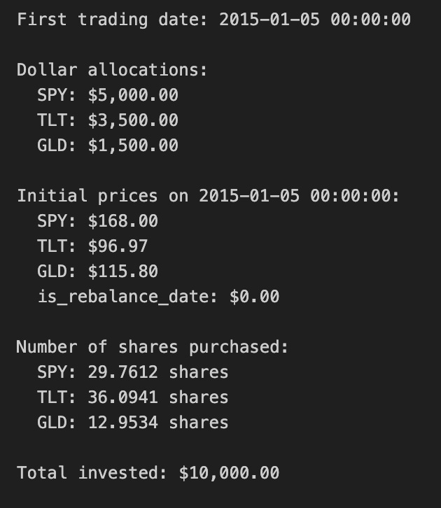
This block establishes the starting portfolio for the backtest: it converts a set of target asset weights into actual positions measured in shares, using the first available close prices and a fixed initial capital. We begin by expressing the investment intention in two places: initial_capital (the cash we will deploy) and weights (the percentage of that capital allocated to each ticker). Using percentages keeps the strategy scale-independent and specifies the desired exposure mix — here 50% equity (SPY), 35% long-duration bonds (TLT), and 15% gold (GLD). Implicitly this assumes the weights sum to 1.0 so the entire capital is intended to be invested across these assets.
The code then selects first_date as the earliest timestamp in close_df. This is the deterministic anchor for portfolio construction: we use the market prices on that date to turn dollar allocations into tradable quantities. It’s important that this index row is valid (no NaNs, and represents a real trading close); otherwise the subsequent arithmetic will be wrong or raise errors. Printing first_date is purely diagnostic to confirm the starting point of the simulation.
Next, allocations are computed by multiplying initial_capital by each asset’s weight. This converts the abstract weight vector into concrete dollar amounts to spend on each asset. Converting to dollars at the outset is necessary because market prices are denominated in currency, and share counts must be derived from dollars divided by price.
The code reads initial_prices from close_df.loc[first_date], which gives the closing price per share for each ticker on the start date. Dividing the dollar allocation by these prices yields shares for each asset. In this implementation shares are floating-point (fractional) numbers; that choice simplifies backtesting math and ensures the capital is fully invested according to the intended weights. The trade-off is that fractional-share execution ignores real-world constraints such as minimum lot sizes, integer-share rounding, transaction costs, and market impact.
Finally, total_invested recomputes the portfolio value by summing price * shares across tickers. This acts as a sanity check: with fractional shares and no rounding/fees, total_invested should equal initial_capital (subject to floating-point precision). Calculating and printing total_invested lets you quickly verify that the conversion from weights -> dollars -> shares behaved as intended and shows if any cash remains uninvested. Throughout, the code assumes immediate execution at close prices and no trading frictions; for production-grade backtests you would want to add checks for missing prices, enforce integer-share rounding or simulate order fills, and account for commissions/slippage before deciding the final executed shares.
# 4. Equity Curve Construction with Monthly Rebalancing

# Initialize tracking dictionaries
current_shares = shares.copy()
equity_data = []

# Iterate through each date
for date in close_df.index:
    # Get current prices
    current_prices = close_df.loc[date, [’SPY’, ‘TLT’, ‘GLD’]]

    # Calculate daily equity for each asset based on current holdings
    spy_equity = current_shares[’SPY’] * current_prices[’SPY’]
    tlt_equity = current_shares[’TLT’] * current_prices[’TLT’]
    gld_equity = current_shares[’GLD’] * current_prices[’GLD’]

    # Compute total portfolio equity daily
    total_equity = spy_equity + tlt_equity + gld_equity

    # Store the equity values
    equity_data.append({
        ‘Date’: date,
        ‘SPY_equity’: spy_equity,
        ‘TLT_equity’: tlt_equity,
        ‘GLD_equity’: gld_equity,
        ‘total_equity’: total_equity
    })

    # At each month-end: rebalance
    if close_df.loc[date, ‘is_rebalance_date’]:
        # Calculate current portfolio value
        portfolio_value = total_equity

        # Rebalance: adjust share quantities to match target weights
        current_shares[’SPY’] = (portfolio_value * weights[’SPY’]) / current_prices[’SPY’]
        current_shares[’TLT’] = (portfolio_value * weights[’TLT’]) / current_prices[’TLT’]
        current_shares[’GLD’] = (portfolio_value * weights[’GLD’]) / current_prices[’GLD’]

# Consolidate results into a unified DataFrame
equity_df = pd.DataFrame(equity_data)
equity_df.set_index(’Date’, inplace=True)

# 5. Returns Calculation

# Compute portfolio daily returns
returns_df = pd.DataFrame(index=close_df.index)
returns_df[’portfolio_return’] = equity_df[’total_equity’].pct_change()

# Compute individual asset daily returns
returns_df[’SPY_return’] = equity_df[’SPY_equity’].pct_change()
returns_df[’TLT_return’] = equity_df[’TLT_equity’].pct_change()
returns_df[’GLD_return’] = equity_df[’GLD_equity’].pct_change()

# Drop the first row (NaN due to pct_change)
returns_df = returns_df.dropna()

# 6. Performance Statistics

# Assume 252 trading days per year
trading_days = 252

# Calculate annualized return
total_return = (equity_df[’total_equity’].iloc[-1] / equity_df[’total_equity’].iloc[0]) - 1
num_years = len(returns_df) / trading_days
annualized_return = (1 + total_return) ** (1 / num_years) - 1

# Calculate annualized volatility
annualized_volatility = returns_df[’portfolio_return’].std() * np.sqrt(trading_days)

# Calculate Sharpe ratio (assuming 0% risk-free rate)
risk_free_rate = 0.0
sharpe_ratio = (annualized_return - risk_free_rate) / annualized_volatility

# Calculate maximum drawdown
cumulative_returns = (1 + returns_df[’portfolio_return’]).cumprod()
running_max = cumulative_returns.cummax()
drawdown = (cumulative_returns - running_max) / running_max
max_drawdown = drawdown.min()

# Display equity curve summary
print(”=” * 50)
print(”EQUITY CURVE SUMMARY”)
print(”=” * 50)
print(f”Initial portfolio value: ${equity_df[’total_equity’].iloc[0]:,.2f}”)
print(f”Final portfolio value: ${equity_df[’total_equity’].iloc[-1]:,.2f}”)
print(f”Total return: ${equity_df[’total_equity’].iloc[-1] - equity_df[’total_equity’].iloc[0]:,.2f}”)
print(f”Total return %: {((equity_df[’total_equity’].iloc[-1] / equity_df[’total_equity’].iloc[0]) - 1) * 100:.2f}%”)
print(”\n”)

# Display results
print(”=” * 50)
print(”PORTFOLIO PERFORMANCE STATISTICS”)
print(”=” * 50)
print(f”Period: {equity_df.index[0].strftime(’%Y-%m-%d’)} to {equity_df.index[-1].strftime(’%Y-%m-%d’)}”)
print(f”Number of years: {num_years:.2f}”)
print(f”\nAnnualized Return: {annualized_return:.2%}”)
print(f”Annualized Volatility: {annualized_volatility:.2%}”)
print(f”Sharpe Ratio: {sharpe_ratio:.4f}”)
print(f”Maximum Drawdown: {max_drawdown:.2%}”)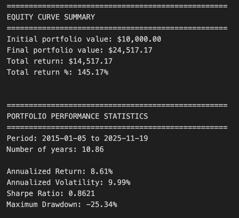
This block constructs an equity curve for a three-asset portfolio with monthly rebalancing, converts that curve into returns, and then derives standard performance statistics used in quant trading. The story begins with a snapshot of current holdings (current_shares) and an empty list (equity_data) that will collect daily portfolio-level and asset-level dollar values. We then iterate chronologically over each date in the price series. For each date we read the closing prices for SPY, TLT and GLD and multiply those prices by the current share quantities to produce three asset-level equity amounts. Summing those gives the total portfolio equity for that day. Those daily dollar values are appended to equity_data so we have a full time series of how much each asset and the whole portfolio are worth on each date.
A key business rule occurs at the end of each month as flagged by is_rebalance_date: after we record that day’s equity, we convert the total portfolio dollar value into target dollar allocations (portfolio_value * target weight) and then into new share quantities by dividing each dollar target by that asset’s current price. That arithmetic is why shares are recalculated as (portfolio_value * weight) / price — it enforces the target allocation in dollar terms at the observed price, which is the typical rebalancing action in allocation-driven strategies. Note the order: the code records the pre‑rebalance equity for the date and then updates current_shares, so the rebalancing affects subsequent days’ equity and returns. Also note the implementation assumes fractional shares, ignores transaction costs, slippage, and dividends, and uses the same closing price for both measuring equity and executing the rebalance; these assumptions simplify the simulation but can bias results relative to real trading.
After the loop the list of daily records is turned into equity_df (Date as index), producing a clean daily time series of SPY/TLT/GLD dollar exposures and total portfolio equity. The returns block then computes simple daily returns by taking percent changes of the total equity series and of each asset-equity series. Using equity-based pct_change means returns reflect the combined effect of price moves and rebalancing (since equity already incorporates share changes). The first row is dropped because pct_change produces NaN for the initial observation.
The performance-statistics section converts those daily returns into standard annualized metrics for reporting. Total return is computed from the first and last total_equity points, then annualized via the geometric relationship (1 + total_return)^(1/num_years) — 1, where num_years is approximated as len(returns_df) / 252. Volatility is estimated as the standard deviation of daily portfolio returns scaled by sqrt(252) to annualize. Sharpe ratio is computed as the excess annualized return divided by the annualized volatility, with a risk-free rate set to zero (a common simplifying assumption; change the risk_free_rate to incorporate treasury yields). Maximum drawdown is calculated from the cumulative gross return series: we track the running maximum of cumulative returns and measure percentage declines from that peak, taking the minimum value as the worst drawdown — this gives a forward-looking measure of capital preservation risk important in allocation strategies.
Finally, there are a few practical caveats and improvement opportunities to keep in mind for production-level quant work: account for transaction costs, bid‑ask spreads and slippage; model discrete share limitations or minimum lot sizes; include dividends and interest where relevant; consider using business-day/year conventions (or exact calendar days) when computing num_years to avoid small annualization bias; consider log returns for some risk models; and vectorize the loop for performance if you scale beyond a handful of assets. Overall, this block gives a straightforward, transparent simulation of monthly-rebalanced allocation performance suitable for backtesting allocation decisions, with interpretable dollar-equity tracking and standard performance outputs used to evaluate strategy efficacy.
# 7. Static Visualizations

# Create figure and axis
fig, ax = plt.subplots(figsize=(14, 8))

# Plot equity curves
ax.plot(equity_df.index, equity_df[’total_equity’], label=’Total Portfolio’, linewidth=2.5, color=’black’)
ax.plot(equity_df.index, equity_df[’SPY_equity’], label=’SPY (50%)’, linewidth=1.5, alpha=0.7, color=’blue’)
ax.plot(equity_df.index, equity_df[’TLT_equity’], label=’TLT (35%)’, linewidth=1.5, alpha=0.7, color=’green’)
ax.plot(equity_df.index, equity_df[’GLD_equity’], label=’GLD (15%)’, linewidth=1.5, alpha=0.7, color=’gold’)

# Formatting
ax.set_title(’Buy & Hold Portfolio - Equity Curves’, fontsize=16)
ax.set_xlabel(’Date’, fontsize=12)
ax.set_ylabel(’Equity ($)’, fontsize=12)
ax.legend(loc=’best’, fontsize=10)
ax.grid(True, alpha=0.3)

# Format y-axis as currency
ax.yaxis.set_major_formatter(plt.FuncFormatter(lambda x, p: f’${x:,.0f}’))

# Rotate x-axis labels
plt.xticks(rotation=45)
plt.tight_layout()
plt.show()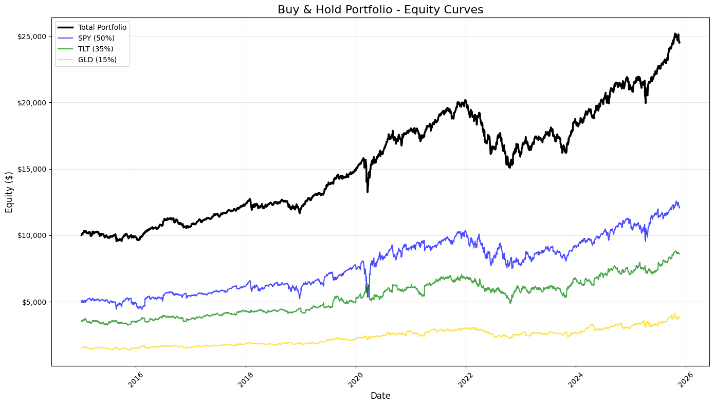
This block builds a compact, publication-ready snapshot of the backtest’s buy-and-hold performance so you can quickly judge portfolio behavior and the contributions of each asset. It starts by creating a plotting canvas (fig, ax) sized to fit time-series labels; the plot’s x-axis is the DataFrame index (dates) and the y-values come from four columns on equity_df: total_equity, SPY_equity, TLT_equity, and GLD_equity. Plotting is done in a deliberate order and with deliberate visual weights: the total portfolio curve is drawn first with a thicker, black line to make the aggregate outcome visually dominant, while the three component curves use thinner lines, semi-transparency (alpha) and distinct colors so you can compare their trajectories without them overpowering the composite line. The column names and the legend labels encode the strategic allocation (50% SPY, 35% TLT, 15% GLD), so these series let you see how each sleeve drifts relative to its target and how that drift affects total equity over time.
After the curves are drawn, the code applies a set of visual and informational refinements that are important for interpretation and reproducibility. A clear title and axis labels explain what the chart measures, and a legend placed automatically (loc=’best’) ensures you can map colors back to assets without manual position tuning. A lightly-rendered grid (low alpha) aids in reading levels and slopes without cluttering the view. Crucially for financial interpretation, the y-axis is formatted as currency via a FuncFormatter that removes fractional cents and adds commas and a dollar sign, which makes returns, drawdowns and absolute equity levels immediately readable and comparable at a glance.
Finally, small layout and display calls prevent label overlap and ensure the time tick labels remain legible: x-ticks are rotated to avoid collision, tight_layout reduces clipping around the figure margins, and show renders the static image. In the context of quant trading, this static visualization serves multiple practical purposes: it’s a sanity check that your P&L aggregation and per-asset accounting are correct, it reveals regime changes, relative contribution and concentration risks, and it provides a quick basis for further diagnostic work (drawdown analysis, turnover checks, or strategy refinement).
# 8. Rolling Performance Analysis

# Define rolling window (252 trading days = 1 year)
window = 252

# Calculate rolling metrics
rolling_return = returns_df[’portfolio_return’].rolling(window=window).apply(
    lambda x: (1 + x).prod() ** (252 / len(x)) - 1
)

rolling_volatility = returns_df[’portfolio_return’].rolling(window=window).std() * np.sqrt(252)

rolling_sharpe = rolling_return / rolling_volatility

# Create subplots
fig, axes = plt.subplots(3, 1, figsize=(14, 12))

# 1. Rolling 1-Year Annualized Return
axes[0].plot(rolling_return.index, rolling_return * 100, linewidth=2, color=’blue’)
axes[0].axhline(y=rolling_return.mean() * 100, color=’red’, linestyle=’--’, linewidth=1, alpha=0.5, label=’Return = Mean’)
axes[0].set_title(’Rolling 1-Year Annualized Return’, fontsize=14, fontweight=’bold’)
axes[0].set_ylabel(’Return (%)’, fontsize=12)
axes[0].grid(True, alpha=0.3)
axes[0].set_xlabel(’Date’, fontsize=12)

# 2. Rolling 1-Year Annualized Volatility
axes[1].plot(rolling_volatility.index, rolling_volatility * 100, linewidth=2, color=’orange’)
axes[1].axhline(y=rolling_volatility.mean() * 100, color=’red’, linestyle=’--’, linewidth=1, alpha=0.5, label=’Volatility = Mean’)
axes[1].set_title(’Rolling 1-Year Annualized Volatility’, fontsize=14, fontweight=’bold’)
axes[1].set_ylabel(’Volatility (%)’, fontsize=12)
axes[1].grid(True, alpha=0.3)
axes[1].set_xlabel(’Date’, fontsize=12)

# 3. Rolling 1-Year Sharpe Ratio
axes[2].plot(rolling_sharpe.index, rolling_sharpe, linewidth=2, color=’green’)
axes[2].axhline(y=rolling_sharpe.mean(), color=’red’, linestyle=’--’, linewidth=1, alpha=0.5, label=’Sharpe = Mean’)
axes[2].set_title(’Rolling 1-Year Sharpe Ratio’, fontsize=14, fontweight=’bold’)
axes[2].set_ylabel(’Sharpe Ratio’, fontsize=12)
axes[2].grid(True, alpha=0.3)
axes[2].set_xlabel(’Date’, fontsize=12)
axes[2].legend(loc=’best’, fontsize=10)

# Format x-axis for all subplots
for ax in axes:
    ax.tick_params(axis=’x’, rotation=45)

plt.tight_layout()
plt.show()

# Print summary statistics for rolling metrics
print(”\n” + “=” * 50)
print(”ROLLING METRICS SUMMARY (1-YEAR WINDOW)”)
print(”=” * 50)
print(”\nRolling Annualized Return:”)
print(f”  Mean: {rolling_return.mean():.2%}”)
print(f”  Min:  {rolling_return.min():.2%}”)
print(f”  Max:  {rolling_return.max():.2%}”)

print(”\nRolling Annualized Volatility:”)
print(f”  Mean: {rolling_volatility.mean():.2%}”)
print(f”  Min:  {rolling_volatility.min():.2%}”)
print(f”  Max:  {rolling_volatility.max():.2%}”)

print(”\nRolling Sharpe Ratio:”)
print(f”  Mean: {rolling_sharpe.mean():.4f}”)
print(f”  Min:  {rolling_sharpe.min():.4f}”)
print(f”  Max:  {rolling_sharpe.max():.4f}”)
print(”=” * 50)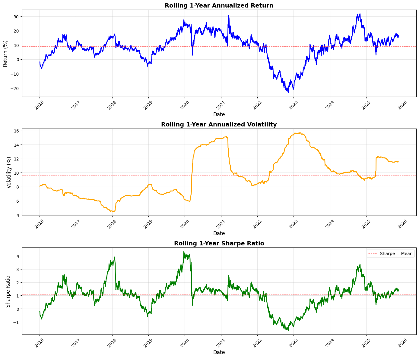
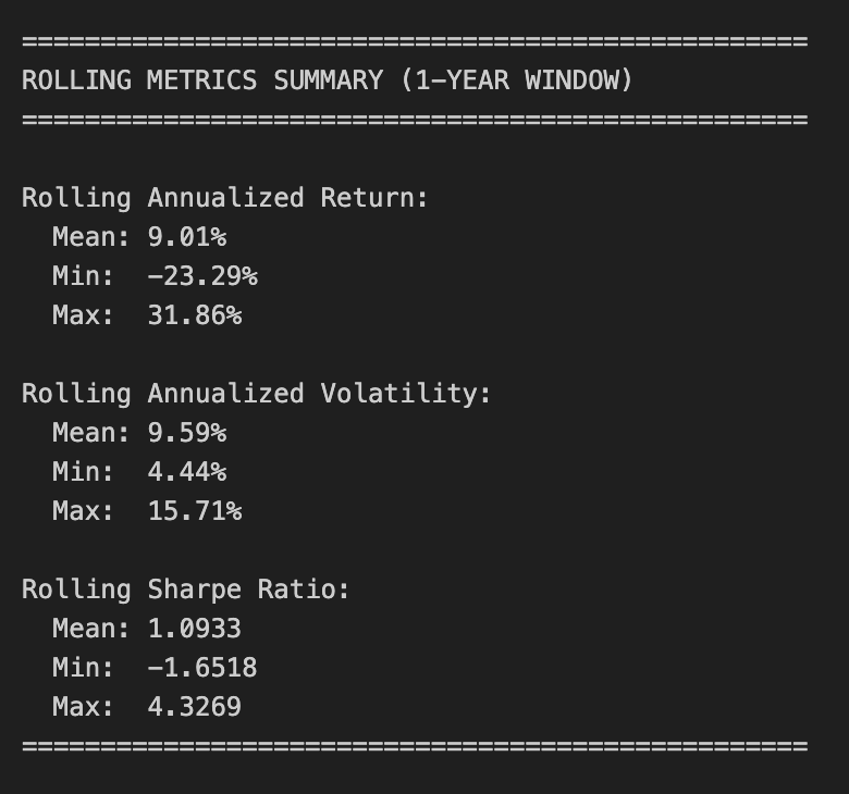
This block implements a rolling, 1-year performance analysis of the strategy’s daily portfolio returns so you can see how annualized return, annualized volatility, and the resulting Sharpe ratio evolve over time — a common way in quant trading to discover regime shifts, persistence of edge, or changing risk characteristics.
We start by defining the rolling window as 252 trading days (a standard convention to approximate one calendar year of market days). For the rolling annualized return we compute the geometric return over each window: we take the product of (1 + daily_return) across the window to capture compounding, then raise that product to the power 252 / len(x) and subtract 1 to annualize. Using the geometric (compounded) return is important because it reflects the actual multiplicative growth of capital over the window; an arithmetic average would misstate realized growth, especially when returns are volatile. The lambda uses len(x) so the exponent adapts if the window is shorter (e.g., at the very start if you allow partial windows), but in practice with a fixed rolling length you’ll only get values once the full window is available unless min_periods is changed.
Volatility is computed as the rolling standard deviation of daily returns multiplied by sqrt(252) to annualize. This follows the usual time-scaling for independent returns: daily std * sqrt(days per year) gives an annualized volatility estimate, which allows direct comparison with the annualized return. Dividing the annualized return series by the annualized volatility gives the rolling Sharpe ratio. Note that this implementation assumes a zero risk-free rate (i.e., the numerator is raw annualized return). Because both numerator and denominator are on an annualized scale, the resulting Sharpe is dimensionless and comparable across windows.
The visualization is deliberately separated into three stacked subplots so each metric can be read in isolation (return and volatility are on percentage scales while Sharpe is unitless). Returns and volatilities are multiplied by 100 for readability and plotted with distinct colors. Each plot draws a dashed horizontal line at the respective series mean to provide a simple benchmark of typical performance; that helps you visually detect when the strategy is performing above or below its historical average. Gridlines, axis labels, and rotated x-ticks improve readability for time series inspection, and tight_layout prevents overlap. The legend is included on the Sharpe plot since that’s the most common place to annotate performance thresholds.
Finally, the code prints summary statistics (mean, min, max) for each rolling metric to give a concise numerical snapshot of the distribution of rolling outcomes. Be aware of a few practical caveats when interpreting these numbers: the rolling calculations produce NaNs for early indices before a full window is available (pandas ignores NaNs in mean/min/max unless otherwise specified), the Sharpe here ignores any risk-free subtraction and therefore may overstate risk-adjusted performance if a non-negligible risk-free rate exists, and the volatility calculation uses the default degrees-of-freedom which you may want to adjust depending on your estimator choice. If you need more robust inference you might also consider adjusting min_periods, handling missing daily returns explicitly, or using overlapping-window bias corrections — but as-is this block gives a straightforward, standard view of how annualized return, risk, and reward-per-unit-risk have evolved through time for the portfolio.
The Risk Premia Harvesting strategy is designed as a long-term investment approach centered on the principles of dollar-cost averaging. By committing a fixed monthly deposit of $100.00, the strategy seeks to capture market risk premia across a diversified set of asset classes over a 10-year horizon. The portfolio follows a static allocation model: 50% is directed toward the S&P 500 (SPY), 35% toward Long-term Treasuries (TLT), and 15% toward Gold (GLD). Notably, this is a “buy-and-hold” implementation where new capital is added at the start of every month without any periodic rebalancing or selling of existing positions.
Performance Targets and Analytical Outputs
The primary objective of this notebook is to provide a comprehensive evaluation of the strategy’s risk-adjusted performance. To achieve this, the system calculates several key financial metrics, including the Annualized Return, Volatility, Sharpe Ratio, and Maximum Drawdown. Beyond these figures, the output tracks the total capital invested versus the final portfolio value to demonstrate the compounding effect. The analysis is supported by extensive visualizations, ranging from equity curves for both individual assets and the total portfolio to rolling 1-year windows that highlight how returns and risk evolved throughout the decade.
Data Preparation and Investment Logic
The implementation begins with the acquisition and cleaning of historical price data for the three target ETFs, ensuring all tickers share a synchronized date index. The core logic hinges on identifying the first trading day of each month to trigger the investment. For every deposit, the $100.00 is split according to the predefined ratios — $50, $35, and $15 — to purchase shares at the prevailing market price. The system maintains a running total of cumulative shares held for each asset, which serves as the foundation for the subsequent equity calculations.
Equity Construction and Risk Analysis
Once the investment schedule is established, the daily equity for each asset is calculated by multiplying the cumulative shares held by the daily closing prices. These figures are then aggregated to construct the total portfolio equity curve and compared against the cumulative capital invested. After establishing the daily returns, the strategy undergoes a rigorous statistical review to determine its efficiency. Finally, rolling performance charts for returns, volatility, and the Sharpe ratio are generated to provide insight into the strategy’s stability and how it weathered different market cycles over the 10-year period.
# Imports
import pandas as pd
import numpy as np
import matplotlib.pyplot as plt

# 1. Data Acquisition

spy_returns = pd.read_csv(”C:\\Users\\blazo\\Documents\\Misc\\QJ\\quant-journey\\data\\returns\\returns_SPY.csv”, index_col=0, parse_dates=True)
tlt_returns = pd.read_csv(”C:\\Users\\blazo\\Documents\\Misc\\QJ\\quant-journey\\data\\returns\\returns_TLT.csv”, index_col=0, parse_dates=True)
gld_returns = pd.read_csv(”C:\\Users\\blazo\\Documents\\Misc\\QJ\\quant-journey\\data\\returns\\returns_GLD.csv”, index_col=0, parse_dates=True)

# 2. Data Preparation

# Combine all returns into a single DataFrame
close_df = pd.DataFrame({
    ‘SPY’: spy_returns[’Close’],
    ‘TLT’: tlt_returns[’Close’],
    ‘GLD’: gld_returns[’Close’]
})

# Drop rows with any missing data
close_df = close_df.dropna()

# Identify month-start dates (first trading day of each month)
month_start_dates = close_df.resample(’MS’).first().index

# Create a boolean column to mark investment dates
close_df[’is_first_trading_day’] = close_df.index.isin(month_start_dates)
This block begins by loading three time series files (one per asset) and preparing a unified, clean table that we can use to drive a monthly allocation or trading rule. Each CSV is parsed with its date column promoted to the DataFrame index so the subsequent operations operate on a DatetimeIndex; the code then pulls the ‘Close’ series from each file into a single DataFrame with columns labeled by ticker. Combining into one DataFrame is deliberate: it aligns the three asset series on the same row-level timestamps so any cross-asset calculations (correlations, relative strength, portfolio weights, etc.) are vectorized, consistent, and free of implicit misalignment.
Next, the code drops any rows containing missing values. This is an important data-cleaning step for quant strategies because missing entries can silently shift signals, cause NaNs in downstream arithmetic, or break optimizers and backtests. By removing rows where any asset is missing, we ensure every observation represents a synchronized market snapshot across all assets — at the cost of possibly trimming a few dates at the start/end or around corporate events.
The code then identifies the first trading-day observation for each calendar month. It uses resample(‘MS’).first() on the combined series: resample with the month-start frequency groups the data into calendar-month buckets and selecting first() yields the first available market observation inside each month (which correctly accounts for weekends and holidays when the calendar first is not tradable). The resulting index is the set of timestamps we want to treat as “month-start” trading opportunities.
Finally, the script marks those timestamps in the main table by creating a boolean column is_first_trading_day via index membership. That boolean is a simple mask you can use to trigger monthly actions — rebalancing, signal evaluation, order placement, or recording snapshots — so the strategy executes deterministically at the first available trading day of each month. A couple of practical caveats: this approach assumes the CSVs are sorted and share the same trading calendar; dropna may remove a month-start if one asset is missing on that day (so you might prefer forward/backfill or more nuanced handling depending on your data quality requirements), and time zones or intraday timestamps would need additional normalization if present.
# 3. Monthly Investment Logic

# Define monthly deposit amount and allocation ratios
monthly_deposit = 100.00
allocation_ratios = {
    ‘SPY’: 0.50,  # $50 per month
    ‘TLT’: 0.35,  # $35 per month
    ‘GLD’: 0.15   # $15 per month
}

# Identify first trading day of each month
# Get the first available trading day for each month
month_start_dates = close_df.groupby(close_df.index.to_period(’M’)).apply(lambda x: x.index[0])

# Create a boolean column to mark monthly investment dates
close_df[’is_investment_date’] = close_df.index.isin(month_start_dates)

# Initialize tracking for cumulative shares
cumulative_shares = {
    ‘SPY’: 0.0,
    ‘TLT’: 0.0,
    ‘GLD’: 0.0
}

# Track shares purchased each month for transparency
monthly_purchases = []

# Iterate through each date to build cumulative shares
for date in close_df.index:
    # Check if this is an investment date (first trading day of the month)
    if close_df.loc[date, ‘is_investment_date’]:
        # Get current prices
        current_prices = close_df.loc[date, [’SPY’, ‘TLT’, ‘GLD’]]

        # Calculate shares purchased for each asset based on that day’s price
        shares_purchased = {
            ‘SPY’: (monthly_deposit * allocation_ratios[’SPY’]) / current_prices[’SPY’],
            ‘TLT’: (monthly_deposit * allocation_ratios[’TLT’]) / current_prices[’TLT’],
            ‘GLD’: (monthly_deposit * allocation_ratios[’GLD’]) / current_prices[’GLD’]
        }

        # Track cumulative shares held for each asset
        cumulative_shares[’SPY’] += shares_purchased[’SPY’]
        cumulative_shares[’TLT’] += shares_purchased[’TLT’]
        cumulative_shares[’GLD’] += shares_purchased[’GLD’]

        # Record the purchase for analysis
        monthly_purchases.append({
            ‘Date’: date,
            ‘SPY_shares’: shares_purchased[’SPY’],
            ‘TLT_shares’: shares_purchased[’TLT’],
            ‘GLD_shares’: shares_purchased[’GLD’],
            ‘SPY_price’: current_prices[’SPY’],
            ‘TLT_price’: current_prices[’TLT’],
            ‘GLD_price’: current_prices[’GLD’],
            ‘SPY_cumulative’: cumulative_shares[’SPY’],
            ‘TLT_cumulative’: cumulative_shares[’TLT’],
            ‘GLD_cumulative’: cumulative_shares[’GLD’]
        })

# Convert monthly purchases to DataFrame for analysis
purchases_df = pd.DataFrame(monthly_purchases)
purchases_df.set_index(’Date’, inplace=True)

# Display summary
print(”=” * 50)
print(”MONTHLY INVESTMENT SUMMARY”)
print(”=” * 50)
print(f”Monthly deposit: ${monthly_deposit:.2f}”)
print(f”Allocation: SPY {allocation_ratios[’SPY’]:.0%}, TLT {allocation_ratios[’TLT’]:.0%}, GLD {allocation_ratios[’GLD’]:.0%}”)
print(f”Number of monthly investments: {len(purchases_df)}”)
print(f”Total capital invested: ${monthly_deposit * len(purchases_df):,.2f}”)
print(f”\nFinal cumulative shares:”)
print(f”  SPY: {cumulative_shares[’SPY’]:.4f} shares”)
print(f”  TLT: {cumulative_shares[’TLT’]:.4f} shares”)
print(f”  GLD: {cumulative_shares[’GLD’]:.4f} shares”)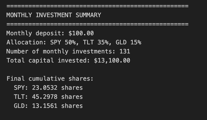
This block implements a simple, reproducible monthly dollar-cost averaging (DCA) procedure across three assets (SPY, TLT, GLD) and records both the per-month purchases and the running totals of shares held. It starts by defining the business parameters: a fixed monthly cash contribution and allocation ratios that split that contribution into dollar amounts for each asset. These ratios encode the portfolio policy (50/35/15 here) so every contribution translates to fixed dollar amounts per asset each month, which is important for enforcing a consistent exposure strategy rather than market-timing behavior.
To determine the exact execution dates, the code finds the first available trading day in each month from the price series. Concretely, it groups the price index by month and picks the first index entry per group; this produces realistic, tradable dates (avoiding weekends and holidays) and avoids look-ahead bias that would come from using calendar dates with no market data. It then marks those rows in the price DataFrame with a boolean flag so the later loop can cheaply check whether to transact on any given row.
The heart of the logic is the per-date loop: whenever a row is an investment date, it reads that day’s close prices and converts the allocated dollar amounts into shares by dividing dollars by price. That numerator is simply monthly_deposit × allocation_ratio for each asset. The code allows fractional shares (floating point arithmetic), which is fine for simulation and keeps the math continuous. After computing the incremental shares purchased, it immediately updates a running cumulative_shares dictionary so the simulation always knows total holdings after each purchase. Each transaction is appended to monthly_purchases with a full audit trail — date, per-asset shares bought, the prices used, and the new cumulative totals — which preserves the transaction history needed for downstream analysis (cash flow timing, cost basis, realized/unrealized P&L, etc.).
Finally, the transactional list is converted into a DataFrame and a brief summary is printed. The summary reports the number of monthly investments (which times the monthly deposit yields total capital put to work) and the final cumulative shares for each asset, which are the primary state needed to compute final portfolio value by multiplying by a chosen price (e.g., the last available close). Operationally, this block is intentionally minimal: it simulates recurring contributions and position accumulation without modeling execution costs, slippage, partial fills constraints, or any rebalancing. Those are important considerations for a fuller quant trading backtest, but are omitted here to focus on the canonical DCA exposure and to provide clear per-period transaction records for subsequent performance and risk analysis.
# 4. Equity Curve Construction

# Initialize equity tracking
equity_data = []

# Track cumulative shares at each point in time
current_cumulative_shares = {
    ‘SPY’: 0.0,
    ‘TLT’: 0.0,
    ‘GLD’: 0.0
}

# Track total capital invested
total_invested = 0.0

# Iterate through each date
for date in close_df.index:
    # Check if this is an investment date - update cumulative shares
    if close_df.loc[date, ‘is_investment_date’]:
        # Get current prices
        current_prices = close_df.loc[date, [’SPY’, ‘TLT’, ‘GLD’]]

        # Calculate shares purchased for each asset
        shares_purchased = {
            ‘SPY’: (monthly_deposit * allocation_ratios[’SPY’]) / current_prices[’SPY’],
            ‘TLT’: (monthly_deposit * allocation_ratios[’TLT’]) / current_prices[’TLT’],
            ‘GLD’: (monthly_deposit * allocation_ratios[’GLD’]) / current_prices[’GLD’]
        }

        # Update cumulative shares
        current_cumulative_shares[’SPY’] += shares_purchased[’SPY’]
        current_cumulative_shares[’TLT’] += shares_purchased[’TLT’]
        current_cumulative_shares[’GLD’] += shares_purchased[’GLD’]

        # Update total invested
        total_invested += monthly_deposit

    # Get current prices for equity calculation
    current_prices = close_df.loc[date, [’SPY’, ‘TLT’, ‘GLD’]]

    # Calculate daily equity for each asset (cumulative shares × daily price)
    spy_equity = current_cumulative_shares[’SPY’] * current_prices[’SPY’]
    tlt_equity = current_cumulative_shares[’TLT’] * current_prices[’TLT’]
    gld_equity = current_cumulative_shares[’GLD’] * current_prices[’GLD’]

    # Compute total portfolio equity
    total_equity = spy_equity + tlt_equity + gld_equity

    # Store the equity values and cumulative capital invested
    equity_data.append({
        ‘Date’: date,
        ‘SPY_equity’: spy_equity,
        ‘TLT_equity’: tlt_equity,
        ‘GLD_equity’: gld_equity,
        ‘total_equity’: total_equity,
        ‘capital_invested’: total_invested
    })

# Consolidate results into a unified DataFrame
equity_df = pd.DataFrame(equity_data)
equity_df.set_index(’Date’, inplace=True)

# 5. Returns Calculation

# Compute portfolio daily returns
returns_df = pd.DataFrame(index=close_df.index)
returns_df[’portfolio_return’] = equity_df[’total_equity’].pct_change()

# Compute individual asset daily returns
returns_df[’SPY_return’] = equity_df[’SPY_equity’].pct_change()
returns_df[’TLT_return’] = equity_df[’TLT_equity’].pct_change()
returns_df[’GLD_return’] = equity_df[’GLD_equity’].pct_change()

# Drop the first row (NaN due to pct_change)
returns_df = returns_df.dropna()

# 6. Performance Statistics

# Assume 252 trading days per year
trading_days = 252

# Calculate annualized return
total_return = (equity_df[’total_equity’].iloc[-1] / equity_df[’total_equity’].iloc[0]) - 1
num_years = len(returns_df) / trading_days
annualized_return = (1 + total_return) ** (1 / num_years) - 1

# Calculate annualized volatility
annualized_volatility = returns_df[’portfolio_return’].std() * np.sqrt(trading_days)

# Calculate Sharpe ratio (assuming 0% risk-free rate)
risk_free_rate = 0.0
sharpe_ratio = (annualized_return - risk_free_rate) / annualized_volatility

# Calculate maximum drawdown
cumulative_returns = (1 + returns_df[’portfolio_return’]).cumprod()
running_max = cumulative_returns.cummax()
drawdown = (cumulative_returns - running_max) / running_max
max_drawdown = drawdown.min()

# Display equity curve summary
print(”=” * 50)
print(”EQUITY CURVE SUMMARY”)
print(”=” * 50)
print(f”Initial portfolio value: ${equity_df[’total_equity’].iloc[0]:,.2f}”)
print(f”Final portfolio value: ${equity_df[’total_equity’].iloc[-1]:,.2f}”)
print(f”Total return: ${equity_df[’total_equity’].iloc[-1] - equity_df[’total_equity’].iloc[0]:,.2f}”)
print(f”Total return %: {((equity_df[’total_equity’].iloc[-1] / equity_df[’total_equity’].iloc[0]) - 1) * 100:.2f}%”)
print(”\n”)

# Display results
print(”=” * 50)
print(”PORTFOLIO PERFORMANCE STATISTICS”)
print(”=” * 50)
print(f”Period: {equity_df.index[0].strftime(’%Y-%m-%d’)} to {equity_df.index[-1].strftime(’%Y-%m-%d’)}”)
print(f”Number of years: {num_years:.2f}”)
print(f”\nAnnualized Return: {annualized_return:.2%}”)
print(f”Annualized Volatility: {annualized_volatility:.2%}”)
print(f”Sharpe Ratio: {sharpe_ratio:.4f}”)
print(f”Maximum Drawdown: {max_drawdown:.2%}”)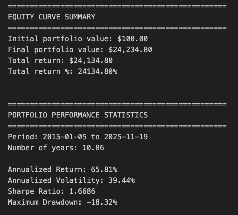
This block’s goal is to convert a sequence of periodic deposits and daily prices into a time series of portfolio value (the equity curve) and then extract standard performance metrics used in quant trading. At the top we set up three state variables: a list to accumulate daily equity snapshots, a dictionary to track cumulative shares held in each ticker, and a scalar that accumulates the total cash invested over time. Those state variables are necessary because the strategy is modeled as discrete purchases on certain dates (is_investment_date) and then mark-to-market between purchases; we track shares rather than re-allocating dollar balances each day so that the path-dependence (weight drift due to price moves) is accurately reflected.
The core loop iterates over each calendar date in the price series. On days flagged as investment dates, the code computes how many shares to buy in each instrument by allocating the monthly_deposit according to allocation_ratios and dividing the dollar allocation by that day’s price. We immediately add those purchased fractional shares to the running cumulative_shares dictionary and increment total_invested by the deposit amount. The reason we do this share-level accounting is to capture both the timing of cash flows (monthly deposits) and the effect of subsequent price changes on those specific share lots, which matters when evaluating dollar P&L, drawdowns, and realized vs. unrealized performance in a buy-and-hold or contribution-style strategy.
After handling any purchases for the date, the code computes mark‑to‑market equity for each asset by multiplying cumulative shares by that day’s closing price, then sums those to form total_equity. Each day’s per-asset and total portfolio equity plus the cumulative capital_contributed are appended to equity_data. By storing both total_equity and capital_invested you keep both value-based and capital-based denominators available for downstream metrics (e.g., total ROI vs. return-on-capital).
Once the loop completes, equity_data is turned into a DataFrame indexed by Date — the canonical equity curve. The next section computes daily arithmetic returns via percent change on the total_equity and on each asset’s equity. Computing pct_change on equity (rather than on prices) yields portfolio-level returns that implicitly include the timing of contributions because equity changes when new capital is added; you should be aware this produces a money-weighted view and can complicate some performance measures if many deposits occur during the period. The code drops the initial NaN that arises from pct_change.
The performance block then converts those daily returns into commonly used annualized metrics assuming 252 trading days. Annualized return is computed by taking the total realized growth from first to last total_equity and annualizing geometrically by the number of years implied by trading-day count; this is a simple CAGR calculation which assumes you want a time-weighted growth rate of portfolio value. Annualized volatility is the standard deviation of daily portfolio returns scaled by sqrt(252). The Sharpe ratio is computed using a zero risk-free rate; this is a convention for quick comparisons but you should substitute an appropriate risk-free rate for production analysis. Maximum drawdown is computed from the cumulative product of (1 + daily return) and the running maximum; this produces the largest peak-to-trough percentage decline in the portfolio value path and is an essential risk metric for quant strategies.
A few practical caveats and rationale: the code uses the first total_equity value as the starting base for total_return — if the first rows precede any investment (i.e., equity starts at zero), you will get divide-by-zero or misleading returns, so you should ensure the equity series begins after an initial deposit or explicitly initialize a starting cash balance. Also, because we model fractional shares and ignore transaction costs, slippage, and cash leftover from rounding, the results represent an idealized implementation; including fees and realistic execution will reduce reported returns and change drawdown behavior. Finally, the chosen metrics (CAGR, annualized volatility, Sharpe, max drawdown) are appropriate for preliminary strategy evaluation, but consider complementary measures for a production-grade backtest: money-weighted IRR vs. time-weighted return, rolling Sharpe, turnover, drawdown duration, and attribution by asset to understand where returns and risks are coming from.
# 7. Static Visualizations

# Create figure and axis
fig, ax = plt.subplots(figsize=(14, 8))

# Plot equity curves
ax.plot(equity_df.index, equity_df[’total_equity’], label=’Total Portfolio’, linewidth=2.5, color=’black’)
ax.plot(equity_df.index, equity_df[’SPY_equity’], label=’SPY (50%)’, linewidth=1.5, alpha=0.7, color=’blue’)
ax.plot(equity_df.index, equity_df[’TLT_equity’], label=’TLT (35%)’, linewidth=1.5, alpha=0.7, color=’green’)
ax.plot(equity_df.index, equity_df[’GLD_equity’], label=’GLD (15%)’, linewidth=1.5, alpha=0.7, color=’gold’)

# Formatting
ax.set_title(’Buy & Hold Portfolio - Equity Curves’, fontsize=16)
ax.set_xlabel(’Date’, fontsize=12)
ax.set_ylabel(’Equity ($)’, fontsize=12)
ax.legend(loc=’best’, fontsize=10)
ax.grid(True, alpha=0.3)

# Format y-axis as currency
ax.yaxis.set_major_formatter(plt.FuncFormatter(lambda x, p: f’${x:,.0f}’))

# Rotate x-axis labels
plt.xticks(rotation=45)
plt.tight_layout()
plt.show()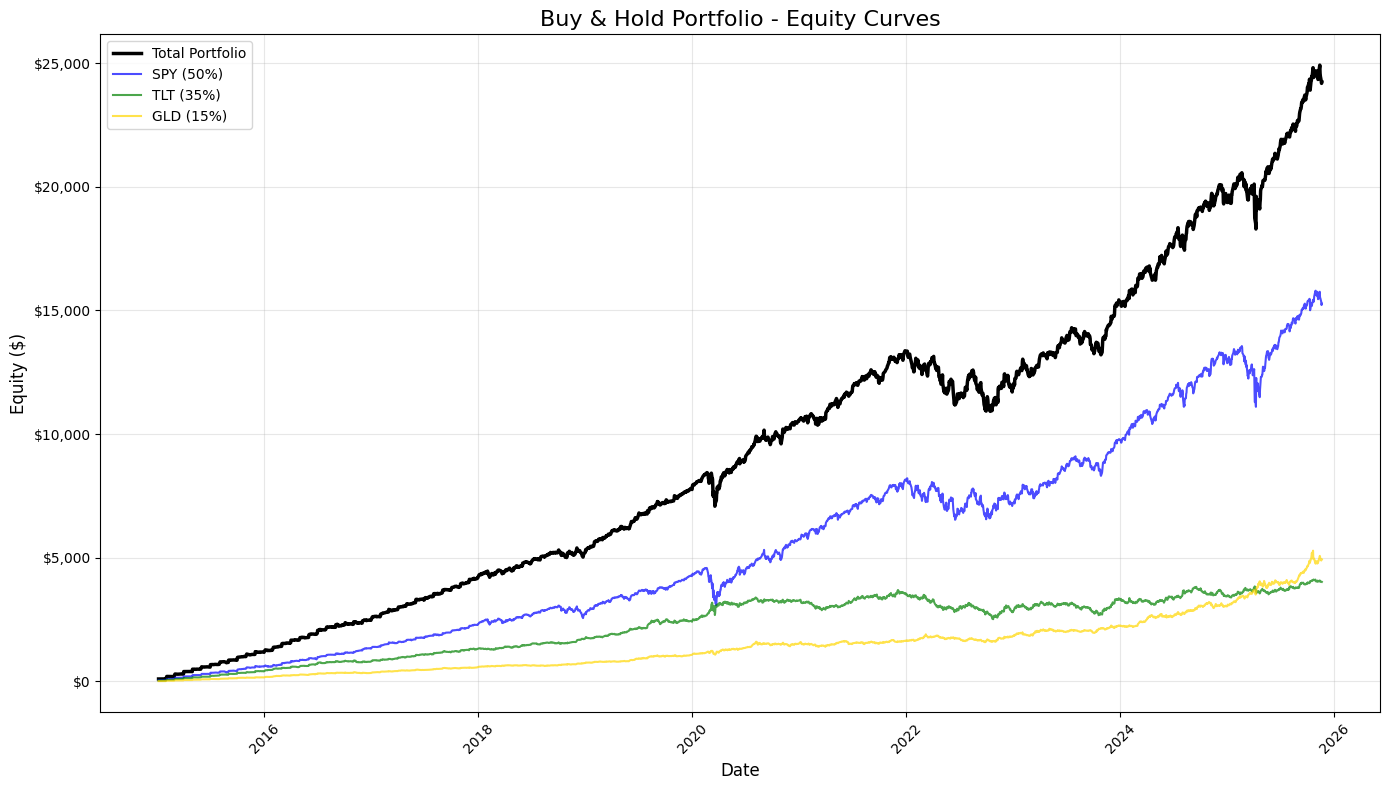
This block builds a single, static visualization that juxtaposes the equity evolution of the overall buy‑and‑hold portfolio against the equity curves of each constituent holding so you can visually validate performance and attribution over time. It uses the DataFrame index (presumably a datetime index) as the x-axis so time is continuous and aligned across series; from that it draws four series: the aggregated portfolio equity (total_equity) and the three component equities (SPY, TLT, GLD) whose labels include the static allocation weights. Emphasizing the total portfolio with a thicker, darker line and giving the components thinner, semi‑transparent lines makes it immediately clear which line is primary (the portfolio) and which are contributors, helping your eye pick out when a single asset dominates returns or when diversification smooths moves.
The specific visual encodings are chosen to support quick interpretation: different colors for immediate identification, a larger linewidth and solid black color for the portfolio to denote importance, and alpha < 1 for the components so overlapping regions remain readable. Using the index directly means the plot will respect trading calendar gaps and varying time intervals, which matters when you’re inspecting performance around market events. The legend is placed with loc=’best’ to avoid covering data, and the grid with reduced opacity provides reference lines without overpowering the time series — useful when scanning for drawdown depths or regime changes.
Formatting choices improve readability for financial audiences: the title and axis labels explicitly state the chart’s purpose, and the y-axis is formatted with a currency formatter (FuncFormatter producing $ and thousands separators) so dollar magnitudes are obvious at a glance and you avoid raw scientific notation or unreadable float strings. Rotating the x‑tick labels prevents overlap on dense time series, and tight_layout is applied to ensure labels, ticks, and legend have enough room so nothing gets clipped when rendered. Finally, plt.show() triggers rendering of the constructed figure for interactive or scripted sessions.
In the quant trading workflow this plot serves as a fast sanity check and a reporting artifact: it reveals how the static allocation translated into dollar performance, highlights periods where a single asset drove portfolio returns or losses, and helps you visually validate that upstream calculations (position sizing, P&L aggregation, rebalancing assumptions) are correct before you proceed to numerical metrics like CAGR, Sharpe, or drawdown tables.
# 8. Rolling Performance Analysis

# Define rolling window (252 trading days = 1 year)
window = 252

# Calculate rolling metrics
rolling_return = returns_df[’portfolio_return’].rolling(window=window).apply(
    lambda x: (1 + x).prod() ** (252 / len(x)) - 1
)

rolling_volatility = returns_df[’portfolio_return’].rolling(window=window).std() * np.sqrt(252)

rolling_sharpe = rolling_return / rolling_volatility

# Create subplots
fig, axes = plt.subplots(3, 1, figsize=(14, 12))

# 1. Rolling 1-Year Annualized Return
axes[0].plot(rolling_return.index, rolling_return * 100, linewidth=2, color=’blue’)
axes[0].axhline(y=rolling_return.mean() * 100, color=’red’, linestyle=’--’, linewidth=1, alpha=0.5, label=’Return = Mean’)
axes[0].set_title(’Rolling 1-Year Annualized Return’, fontsize=14, fontweight=’bold’)
axes[0].set_ylabel(’Return (%)’, fontsize=12)
axes[0].grid(True, alpha=0.3)
axes[0].set_xlabel(’Date’, fontsize=12)

# 2. Rolling 1-Year Annualized Volatility
axes[1].plot(rolling_volatility.index, rolling_volatility * 100, linewidth=2, color=’orange’)
axes[1].axhline(y=rolling_volatility.mean() * 100, color=’red’, linestyle=’--’, linewidth=1, alpha=0.5, label=’Volatility = Mean’)
axes[1].set_title(’Rolling 1-Year Annualized Volatility’, fontsize=14, fontweight=’bold’)
axes[1].set_ylabel(’Volatility (%)’, fontsize=12)
axes[1].grid(True, alpha=0.3)
axes[1].set_xlabel(’Date’, fontsize=12)

# 3. Rolling 1-Year Sharpe Ratio
axes[2].plot(rolling_sharpe.index, rolling_sharpe, linewidth=2, color=’green’)
axes[2].axhline(y=rolling_sharpe.mean(), color=’red’, linestyle=’--’, linewidth=1, alpha=0.5, label=’Sharpe = Mean’)
axes[2].set_title(’Rolling 1-Year Sharpe Ratio’, fontsize=14, fontweight=’bold’)
axes[2].set_ylabel(’Sharpe Ratio’, fontsize=12)
axes[2].grid(True, alpha=0.3)
axes[2].set_xlabel(’Date’, fontsize=12)
axes[2].legend(loc=’best’, fontsize=10)

# Format x-axis for all subplots
for ax in axes:
    ax.tick_params(axis=’x’, rotation=45)

plt.tight_layout()
plt.show()

# Print summary statistics for rolling metrics
print(”\n” + “=” * 50)
print(”ROLLING METRICS SUMMARY (1-YEAR WINDOW)”)
print(”=” * 50)
print(”\nRolling Annualized Return:”)
print(f”  Mean: {rolling_return.mean():.2%}”)
print(f”  Min:  {rolling_return.min():.2%}”)
print(f”  Max:  {rolling_return.max():.2%}”)

print(”\nRolling Annualized Volatility:”)
print(f”  Mean: {rolling_volatility.mean():.2%}”)
print(f”  Min:  {rolling_volatility.min():.2%}”)
print(f”  Max:  {rolling_volatility.max():.2%}”)

print(”\nRolling Sharpe Ratio:”)
print(f”  Mean: {rolling_sharpe.mean():.4f}”)
print(f”  Min:  {rolling_sharpe.min():.4f}”)
print(f”  Max:  {rolling_sharpe.max():.4f}”)
print(”=” * 50)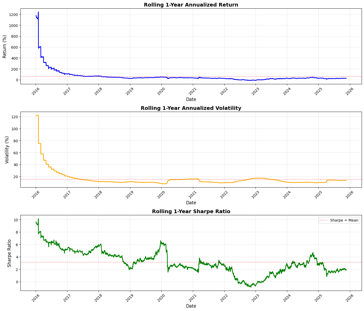
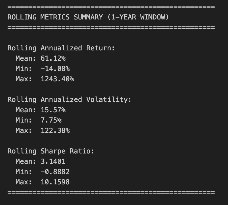
This block computes and visualizes one-year rolling performance metrics for a portfolio so you can see how returns, risk, and risk-adjusted performance evolve over time — information you use to detect regime shifts, validate signal stability, and guide sizing or strategy changes.
We start by choosing a 252-trading-day window (one year) because daily returns are being analyzed; that window is a convention that balances responsiveness to recent behaviour against statistical noise. For rolling annualized return we compute the geometric (compounded) return over the window: we take the product of (1 + daily_return) across the window and raise it to the power 252 / N to annualize. Using the compounded product rather than an arithmetic mean is intentional: it reflects actual portfolio growth over the period and correctly accounts for the multiplicative nature of returns. The code uses a rolling.apply with a lambda to do this; note that with the default rolling behavior you’ll get NaNs for the first ~251 rows until a full window is available, and if you ever change min_periods the lambda’s exponent (252 / len(x)) keeps the annualization correct even for partial windows.
Rolling volatility is computed as the rolling standard deviation of daily returns multiplied by sqrt(252) to annualize. This is the standard annualization under the usual IID/incremental-return assumption; be mindful that this assumes returns are independent and that volatility scales with sqrt(time), which can be imperfect in volatile or autocorrelated markets. Pandas’ std uses a sample estimator (ddof=1) by default — if you want a population estimator you should set ddof=0 explicitly.
The rolling Sharpe ratio is then produced as the elementwise ratio of the rolling annualized return to the rolling annualized volatility. This implementation omits any subtraction of a risk-free rate, so it’s effectively an excess-return-free Sharpe; that’s a conscious simplification for quick diagnostics, but if you need a more accurate risk-adjusted measure you should subtract a short-term risk-free yield (appropriately annualized) from the rolling_return before dividing. Also be aware of edge cases: whenever volatility is zero (or extremely small) the ratio will be infinite or numerically unstable, so handling or filtering such cases may be necessary for robust downstream logic.
The visualization creates three stacked subplots — annualized return, annualized volatility, and Sharpe — plotted over time. Return and volatility are scaled to percent for readability (multiplied by 100), while Sharpe is left in ratio units. Each plot draws a dashed horizontal line at the metric’s overall mean to give an immediate visual baseline for whether the recent window is better or worse than typical. Gridlines, axis labels, rotated x‑ticks, and tight layout are used to improve readability for presentations or quick reviews. The legend and titles make each metric’s purpose explicit so the chart can be interpreted at a glance.
Finally, the code prints summary statistics (mean, min, max) for each rolling series so you can quantify the range and central tendency of these moving diagnostics. Those summaries help answer questions like “How often has the strategy delivered positive annualized returns in any rolling year?” or “How large is the variability in realized Sharpe?”, which feed directly into risk budgeting, drawdown planning, and strategy selection decisions in a quant trading workflow.
Practical considerations: be explicit about whether you want to subtract a risk-free rate for Sharpe; decide whether to allow partial windows (min_periods) or accept initial NaNs; and remember the statistical assumptions behind annualization (IID, sqrt scaling). These choices materially affect interpretation and any automated rules you derive from these rolling metrics.
# Imports & Parameters
import yfinance as yf
import numpy as np
import pandas as pd
import matplotlib.pyplot as plt

# Parameters
START_DATE = ‘2020-01-01’
TICKERS = [
    ‘BTC-USD’, ‘ETH-USD’,
    #’XRP-USD’, ‘BNB-USD’, ‘SOL-USD’,
    #’TRX-USD’, ‘ADA-USD’, ‘DOGE-USD’, ‘ZEC-USD’, ‘LINK-USD’
]

SUB_PLOTS_X = 1
SUB_PLOTS_Y = 2
This small block is purely the setup you use before you fetch, process and visualize market time series for a quant-trading workflow. At a high level it declares the libraries you’ll rely on (data access, numeric/time-series manipulation, and plotting) and the key run-time parameters that control the historical window, the universe of assets, and the plot layout. Those parameters then drive every downstream step — how much data you request from the market API, how you align and clean the series, what you compute for signals/metrics, and how you display results.
The imports establish roles: yfinance is the market-data client you’ll use to pull historical time series from Yahoo Finance; it handles the HTTP requests and returns pandas-compatible objects. Numpy is there for efficient numerical operations and vectorized math (useful for returns, rolling statistics, optimization routines). Pandas is the core for indexed time‑series manipulation — alignment, resampling, forward/back-filling, and group operations — which is essential for constructing features and handling missing ticks across assets. Matplotlib is included for creating diagnostics and strategy visualization (price, indicators, drawdowns, exposure), which you’ll use to inspect and validate signals and backtest behavior.
START_DATE defines the backtest/training window start. Choosing ‘2020–01–01’ fixes the lower bound for history requests and therefore impacts sample size, regime coverage, and survivorship bias. In quant trading this choice matters for statistical robustness (longer windows give more data but may include outdated regimes), for avoiding look‑ahead/peeking, and for ensuring that training and test periods are separated appropriately. Practically, this parameter will be passed to yfinance when calling download or history so it controls how many rows come back and therefore how much data your feature engineering and risk calculations must handle.
TICKERS is the trading universe you will request. Here it contains two crypto tickers (BTC-USD and ETH-USD) and several other crypto tickers are commented out. Keeping extra tickers commented is a lightweight way to iterate: start with a minimal universe for quicker local development and enable more assets as you scale or test cross-sectional behavior. From a quant perspective the size and composition of this list directly affect correlation structure, required memory, computational time for cross-asset statistics, and the complexity of handling missing data and different liquidity profiles. Also note that some tickers (especially altcoins) may have sparse or inconsistent history on Yahoo, so you’ll need to detect and clean NaNs or handle differing start dates when you align data across the universe.
SUB_PLOTS_X and SUB_PLOTS_Y set the intended plotting grid. Conceptually they control how many subplot columns and rows you’ll create to display multiple series or indicator panels per asset. Be careful with naming: matplotlib.subplots expects (nrows, ncols), so ensure you map these variables correctly when creating figures — otherwise the visual layout will be transposed from your intention. The plotting layout matters operationally because consistent, readable diagnostics are critical for interpreting signal behavior, spotting data errors (e.g., misaligned timestamps, stale prices), and communicating strategy performance.
Finally, a few practical implications for the downstream pipeline: yfinance defaults to daily bars unless you specify an interval, and crypto data on Yahoo may not include the same “Adjusted Close” semantics as equities, so you should explicitly decide which price series (Close vs Adj Close) to use. You’ll also need to handle missing values, normalize time zones, and possibly resample to a strategy-consistent frequency before computing returns, indicators, or risk metrics. The chosen START_DATE and TICKERS therefore cascade into data volume, cleaning needs, and the statistical validity of any backtest or ML model you build.
# Download data for all tickers
data = yf.download(TICKERS, start=START_DATE, auto_adjust=True, progress=False)

# Calculate returns for each ticker
returns = data[’Close’].pct_change()

# Calculate log returns
log_returns = np.log(data[’Close’] / data[’Close’].shift(1))

# Add multi-level column names to returns DataFrames
returns.columns = pd.MultiIndex.from_product([[’Returns’], returns.columns])
log_returns.columns = pd.MultiIndex.from_product([[’LogReturns’], log_returns.columns])

# Add Day of the Week column - FIX: Use Series instead of DataFrame constructor
day_of_week = pd.Series(data.index.day_name(), index=data.index, name=’DayOfWeek’)
day_of_week = day_of_week.to_frame()
day_of_week.columns = pd.MultiIndex.from_product([[’DayOfWeek’], [’DayOfWeek’]])

# Concatenate with original data
data = pd.concat([data, returns, log_returns, day_of_week], axis=1)
The block begins by pulling a continuous, corporate-action-adjusted time series for every ticker in TICKERS. Using auto_adjust=True is important for quant workflows because it rewrites prices to reflect splits and dividends, so subsequent return calculations measure the economic return to a holder rather than raw, unadjusted price jumps. The download result is a wide DataFrame keyed by OHLCV fields and by ticker, indexed by trading date — this is the primary source table we will enrich with computed features.
Next the code derives two types of returns from the Close price: simple percentage change (returns) and log returns. The percentage change (pct_change) gives the familiar day-over-day percent move, which is intuitive for performance reporting and for constructing dollar- or percentage-weighted portfolio P&L. The log return (log of price ratio) is computed because log returns are time-additive — log returns over consecutive periods sum to the log return over the aggregate period — and they are often more convenient for statistical modeling and for assuming approximate normality in error terms. Both are computed relative to the prior row, so the first row per series will be NaN. Keeping both measures gives flexibility: percent returns for human interpretation and granular portfolio calculations, log returns for aggregation and many modeling assumptions.
The code then namespaces these return DataFrames by giving them a two-level column index where the top level indicates the feature group (‘Returns’ or ‘LogReturns’) and the second level is the ticker. This MultiIndex pattern intentionally avoids column-name collisions with the original OHLCV fields, makes downstream column selection easier (you can slice by the top-level group), and establishes semantic structure that is helpful when storing or exporting the dataset. Using from_product ensures a consistent ordering and shape across the feature groups.
There is a small but important data-shaping fix for the day-of-week feature. Instead of building a DataFrame from scratch (which can accidentally misalign indices), the code constructs a Series from the index.day_name() with the same index as the price data and then converts that Series into a DataFrame. This preserves the date alignment and avoids subtle bugs where the row labels no longer match trading dates. The day-of-week column is also promoted to a MultiIndex with a group label (‘DayOfWeek’) so it fits the same namespacing convention as the return features.
Finally, the script concatenates the original price table with the returns and day-of-week feature along the column axis. Because concatenation is performed on the index, all columns remain date-aligned; missing values (e.g., first-row returns) propagate as NaN, explicitly signaling where data is undefined. The resulting wide DataFrame contains OHLCV, a structured set of returns, log returns, and a calendar feature — a compact, aligned dataset ready for downstream quant tasks like feature selection, conditioning, building factor exposures, or input to statistical models.
A couple of practical implications for quant work: you should explicitly handle the NaNs created by pct_change/shift (drop the first row, fill, or align with your trade logic), and you may want to convert DayOfWeek into dummy variables or cyclical encodings if it will be used in predictive models. Also consider resampling or forward-filling if you later join this with lower-frequency signals or with tickers that have different trading calendars.
# Plot cumulative returns and display summary statistics - annualized returns and volatility, Sharpe ratio and drawdown

cumulative_returns = (1 + data[’Returns’]).cumprod() - 1

fig, axes = plt.subplots(SUB_PLOTS_Y, SUB_PLOTS_X, figsize=(14, 10))
axes = axes.flatten()

for idx, ticker in enumerate(TICKERS):
    cumulative_returns[ticker].plot(ax=axes[idx], title=f’{ticker} Cumulative Returns’)
    axes[idx].set_xlabel(’Date’)
    axes[idx].set_ylabel(’Cumulative Returns’)

plt.tight_layout()
plt.show()

# Calculate and display summary statistics
trading_days = 365  # Crypto markets trade 365 days a year

summary_stats = pd.DataFrame(index=TICKERS)

for ticker in TICKERS:
    returns_series = data[’Returns’][ticker]

    # Annualized returns
    annualized_return = returns_series.mean() * trading_days

    # Annualized volatility
    annualized_volatility = returns_series.std() * np.sqrt(trading_days)

    # Sharpe ratio
    sharpe_ratio = annualized_return / annualized_volatility

    # Maximum drawdown
    cumulative = (1 + returns_series).cumprod()
    running_max = cumulative.cummax()
    drawdown = (cumulative - running_max) / running_max
    max_drawdown = drawdown.min()

    summary_stats.loc[ticker, ‘Annualized Return’] = annualized_return
    summary_stats.loc[ticker, ‘Annualized Volatility’] = annualized_volatility
    summary_stats.loc[ticker, ‘Sharpe Ratio’] = sharpe_ratio
    summary_stats.loc[ticker, ‘Max Drawdown’] = max_drawdown

print(summary_stats.to_string())
This block has two connected responsibilities: first, visualize each asset’s path of cumulative returns so you can eyeball performance over time; second, compute a compact set of annualized performance and risk metrics that are commonly used in quant trading: annualized return, annualized volatility, Sharpe ratio, and maximum drawdown.
We start by turning the period returns into a cumulative growth series. The expression (1 + returns).cumprod() builds the time series that represents how a $1 investment would grow if you reinvested returns each period; subtracting 1 converts that series back into “percent return since start,” which is a more intuitive scale for plotting. Showing cumulative returns lets you immediately see compounding effects, regime changes, and long-term trend differences between tickers — information that raw period returns can obscure.
The plotting code lays out a grid of subplots (SUB_PLOTS_Y by SUB_PLOTS_X) and flattens the axes array so each ticker gets its own panel. Looping over the tickers, the code plots the cumulative-return series for each asset and labels the axes. This separation is helpful in quant workflows because you often want to visually inspect each instrument for outliers, persistent trends, or structural breaks before relying on numeric summaries.
Next we compute summary statistics. trading_days is set to 365 because these are crypto instruments that trade every day; that choice is important because both annualized return and annualized volatility scale with the number of trading periods per year. For each ticker we take the observed period returns series and compute an annualized return as mean_return * trading_days — a simple arithmetic annualization that assumes returns are roughly stationary and that period means scale linearly in time (this is standard for short-period returns but is an approximation for larger returns). Annualized volatility is computed as std_dev * sqrt(trading_days), which follows the square-root-of-time rule that underlies diffusion models and is widely used to scale short-term volatility to an annualized number.
The Sharpe ratio is computed by dividing the annualized return by the annualized volatility. Note the code treats the risk-free rate as zero (so this is a basic Sharpe-like metric); in production you may want to subtract an explicit short-term risk-free rate or use excess returns instead. Also be aware that if the volatility is zero (or near zero) the ratio becomes unstable, and pandas’ std uses the sample standard deviation (ddof=1) by default — both points matter when interpreting or displaying results.
For drawdown we reconstruct a cumulative wealth series (this time without the final -1; the ratio-based drawdown calculation doesn’t require that shift), compute the running maximum of that cumulative series, and then measure drawdown as (current_cumulative — running_max) / running_max. The minimum of that series is the maximum drawdown — the worst peak-to-trough percentage decline over the sample. Using the running max isolates true drawdown behavior (it finds historical peaks and measures subsequent declines), which is a critical risk metric in quant trading because it captures realized capital loss and recovery difficulty.
Finally, results are populated into a summary_stats DataFrame keyed by ticker and printed. A few practical caveats: the arithmetic annualization assumes returns are additive and stationary (log returns avoid some of those approximations), the hard-coded trading_days should match the actual data frequency (for hourly or minute returns derive periods per year instead), and you should handle NaNs and zero volatility explicitly when deploying this in a pipeline. Overall, this block gives you quick, interpretable visual and numeric diagnostics to compare strategy performance and risk across assets in a quant trading context.
# Calculate average volume per day of the week for each asset

# Create a DataFrame to store average volume by day of week
volume_by_day = pd.DataFrame(index=[’Monday’, ‘Tuesday’, ‘Wednesday’, ‘Thursday’, ‘Friday’, ‘Saturday’, ‘Sunday’])

for ticker in TICKERS:
    # Get volume data for this ticker
    volume_data = data[’Volume’][ticker].copy()

    # Create a temporary DataFrame with volume and day of week
    temp_df = pd.DataFrame({
        ‘Volume’: volume_data,
        ‘DayOfWeek’: data[(’DayOfWeek’, ‘DayOfWeek’)]
    })

    # Calculate average volume by day of week
    avg_volume = temp_df.groupby(’DayOfWeek’)[’Volume’].mean()

    # Add to results DataFrame
    volume_by_day[ticker] = avg_volume

# Reorder rows to start with Monday
day_order = [’Monday’, ‘Tuesday’, ‘Wednesday’, ‘Thursday’, ‘Friday’, ‘Saturday’, ‘Sunday’]
volume_by_day = volume_by_day.reindex(day_order)

# Create a visualization
fig, axes = plt.subplots(SUB_PLOTS_Y, SUB_PLOTS_X, figsize=(16, 12))
axes = axes.flatten()

for idx, ticker in enumerate(TICKERS):
    volume_by_day[ticker].plot(kind=’bar’, ax=axes[idx], title=f’{ticker} - Avg Volume by Day’)
    axes[idx].set_xlabel(’Day of Week’)
    axes[idx].set_ylabel(’Average Volume’)
    axes[idx].tick_params(axis=’x’, rotation=45)

plt.tight_layout()
plt.show()
This block computes and visualizes the typical intraday liquidity profile for each asset by averaging daily traded volume across weekdays. In quant trading, this is useful for understanding recurring liquidity patterns (e.g., higher volume on Tuesdays) that affect execution costs, slippage, and signal reliability. The end result is a per-ticker series of seven average-volume values — one for each day of the week — and a grid of bar charts so you can quickly compare patterns across tickers.
For each ticker the loop first extracts that ticker’s volume series from your master `data` object. It then constructs a two-column temporary DataFrame that pairs each volume observation with its corresponding day-of-week label. Doing this alignment explicitly ensures that the group operation aggregates volumes using the same date index and that day-of-week labels travel with the right observations; the temporary copy also avoids unintentional modification of the original series. The code groups the temporary table by the day label and takes the mean of volume for each group, producing the average traded volume for that ticker on Monday, Tuesday, etc. (Note: pandas.mean by default skips NaNs, so missing trading days won’t break aggregation, but they will influence the estimate if entire weekdays are absent.)
Those per-ticker averages are collected into a DataFrame whose rows represent weekdays and whose columns are tickers. The subsequent reindexing step enforces the conventional weekday order starting with Monday — otherwise pandas might order by the labels’ appearance or alphabetically, which would make visual comparison across tickers confusing. Including all seven weekdays in the index is a deliberate choice: for assets that trade on weekends (crypto, some OTC instruments) you’ll see nonzero Saturday/Sunday bars, and for typical equities those rows will often be NaN or omitted prior to reindexing; reindexing keeps layout consistent across tickers.
The plotting section creates a grid of subplots sized by the SUB_PLOTS_X and SUB_PLOTS_Y parameters, flattens the axes array for straightforward iteration, and draws a bar chart per ticker. Each chart is labeled with axis titles and rotates x tick labels for readability. This visualization approach makes it easy to scan many tickers in parallel and to spot anomalies (e.g., an unexpectedly high average on a single weekday that could indicate a data problem or a real liquidity characteristic).
A few implementation nuances to keep in mind: accessing `data[(‘DayOfWeek’, ‘DayOfWeek’)]` suggests a MultiIndex column structure for the master DataFrame — make sure the day-of-week series aligns index-wise with each ticker’s volume series (same timezone, same calendar). The mean is sensitive to outliers and to the presence of few observations on a given weekday; if you expect outliers or sparse weekday coverage, consider median aggregation, trimming, or requiring a minimum count per weekday before trusting the average. Finally, when using these averages in execution or signal logic, you may want to normalize by total volume or convert to percent-of-daily-volume, and account for market-specific calendars so weekend rows don’t produce misleading signals.
# Calculate average returns by day of week for each ticker
returns_by_day = pd.DataFrame(index=[’Monday’, ‘Tuesday’, ‘Wednesday’, ‘Thursday’, ‘Friday’, ‘Saturday’, ‘Sunday’])

for ticker in TICKERS:
    # Get returns data for this ticker
    returns_data = data[’Returns’][ticker].copy()

    # Create a temporary DataFrame with returns and day of week
    temp_df = pd.DataFrame({
        ‘Returns’: returns_data,
        ‘DayOfWeek’: data[(’DayOfWeek’, ‘DayOfWeek’)]
    })

    # Calculate average returns by day of week
    avg_returns = temp_df.groupby(’DayOfWeek’)[’Returns’].mean()

    # Add to results DataFrame
    returns_by_day[ticker] = avg_returns

# Reorder rows to start with Monday
returns_by_day = returns_by_day.reindex(day_order)

# Create individual plots for each ticker
fig, axes = plt.subplots(SUB_PLOTS_Y, SUB_PLOTS_X, figsize=(16, 12))
axes = axes.flatten()

for idx, ticker in enumerate(TICKERS):
    returns_by_day[ticker].plot(kind=’bar’, ax=axes[idx], title=f’{ticker} - Avg Returns by Day’, color=’steelblue’)
    axes[idx].set_xlabel(’Day of Week’)
    axes[idx].set_ylabel(’Average Returns’)
    axes[idx].tick_params(axis=’x’, rotation=45)
    axes[idx].axhline(y=0, color=’red’, linestyle=’--’, linewidth=0.8)

plt.tight_layout()
plt.show()

# Create a combined plot showing the average returns across all tickers by day of week
average_returns_all = returns_by_day.mean(axis=1)

fig, ax = plt.subplots(figsize=(12, 6))

average_returns_all.plot(kind=’bar’, ax=ax, color=’steelblue’, width=0.6)
ax.set_title(’Average Returns by Day of Week - All Tickers Combined’, fontsize=14, fontweight=’bold’)
ax.set_xlabel(’Day of Week’, fontsize=12)
ax.set_ylabel(’Average Returns’, fontsize=12)
ax.axhline(y=0, color=’red’, linestyle=’--’, linewidth=0.8)
ax.tick_params(axis=’x’, rotation=45)

plt.tight_layout()
plt.show()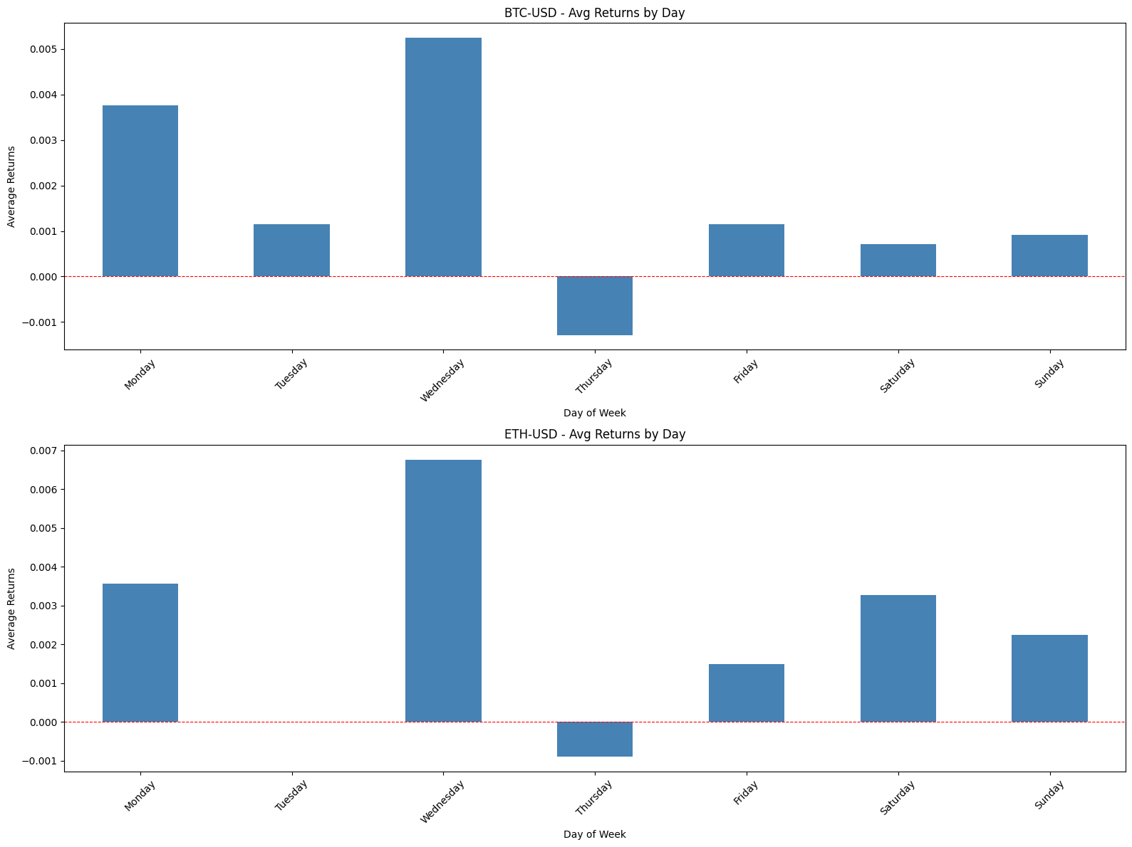
This block computes and visualizes a simple day-of-week effect for each ticker and for the universe as a whole. The high-level goal is to summarize intraday seasonality by measuring the mean return associated with each weekday so we can detect persistent patterns (for example, whether Mondays tend to be negative on average) that could inform timing, risk controls, or signal design in a quant strategy.
We start by preparing a results DataFrame whose rows are weekday labels. For each ticker we take the prepared returns series (copied to avoid side effects) and combine it with the precomputed day-of-week labels into a temporary two-column DataFrame. The code groups that temporary DataFrame by DayOfWeek and computes the mean of Returns. This produces the average return for each weekday for that ticker; using the group mean reduces the time series into a compact, interpretable metric that highlights cross-sectional seasonality while smoothing idiosyncratic noise.
Those per-ticker average series are then added as columns to the results DataFrame, so the final returns_by_day has weekdays on the index and tickers as columns. Reindexing by day_order enforces a consistent chronological row order (Monday→Sunday) regardless of how days appeared in the source data; this is important for readable plots and for correct aggregation across tickers later. Note that if a weekday lacks observations for a given ticker the corresponding cell will be NaN, which preserves the fact that the mean is undefined rather than masking sparse data.
Visualization is done in two stages. First, the code creates a grid of subplots and plots each ticker’s weekday averages as a separate bar chart. Each subplot is labeled and rotated for readability and includes a dashed horizontal line at zero so you can immediately see whether a weekday’s average is positive or negative. The subplot grid is flattened to iterate consistently over tickers; tight_layout is called to avoid label overlap. This per-ticker view is useful for vetting whether a pattern is consistent across names or driven by one or two outliers.
Second, the code computes average_returns_all by taking the mean across tickers for each weekday (mean across columns). This produces a single aggregated weekday profile that treats every ticker equally (an unweighted cross-sectional average) and is plotted as a standalone bar chart with the same zero reference line. That combined chart is valuable for strategy-level decisions — for example, whether to bias intraday execution or position sizing based on typically stronger or weaker days — but be aware it implicitly assumes equal weighting across tickers rather than weighting by liquidity, market cap, or vol.
A couple of practical caveats to keep in mind: weekend days may have few or no observations in many datasets, so their averages can be unreliable; NaNs from missing days should be handled explicitly if you plan to use these numbers in downstream calculations. Also, the cross-ticker mean hides heterogeneity — if you want a portfolio-level signal, consider alternative aggregations (weighted means, median, or trimming outliers) and ensure you have sufficient sample sizes per weekday before acting on these results.
# Define time periods
periods = {
    ‘2020-2022’: (’2020-01-01’, ‘2022-12-31’),
    ‘2023-Onward’: (’2023-01-01’, ‘2025-12-31’)
}

# Calculate average returns by day of week for each period
for period_name, (start_date, end_date) in periods.items():
    print(f”\n{’=’*80}”)
    print(f”Period: {period_name}”)
    print(f”{’=’*80}\n”)

    # Filter data for this period
    period_data = data.loc[start_date:end_date]

    # Calculate returns by day of week for this period
    returns_by_day_period = pd.DataFrame(index=day_order)

    for ticker in TICKERS:
        # Get returns data for this ticker in this period
        returns_data_period = period_data[’Returns’][ticker].copy()

        # Create a temporary DataFrame with returns and day of week
        temp_df_period = pd.DataFrame({
            ‘Returns’: returns_data_period,
            ‘DayOfWeek’: period_data[(’DayOfWeek’, ‘DayOfWeek’)]
        })

        # Calculate average returns by day of week
        avg_returns_period = temp_df_period.groupby(’DayOfWeek’)[’Returns’].mean()

        # Add to results DataFrame
        returns_by_day_period[ticker] = avg_returns_period

    # Reorder rows to start with Monday
    returns_by_day_period = returns_by_day_period.reindex(day_order)

    # Create individual plots for each ticker
    fig, axes = plt.subplots(SUB_PLOTS_Y, SUB_PLOTS_X, figsize=(16, 12))
    axes = axes.flatten()

    for idx, ticker in enumerate(TICKERS):
        returns_by_day_period[ticker].plot(kind=’bar’, ax=axes[idx],
                                           title=f’{ticker} - Avg Returns by Day ({period_name})’,
                                           color=’steelblue’)
        axes[idx].set_xlabel(’Day of Week’)
        axes[idx].set_ylabel(’Average Returns’)
        axes[idx].tick_params(axis=’x’, rotation=45)
        axes[idx].axhline(y=0, color=’red’, linestyle=’--’, linewidth=0.8)

    plt.tight_layout()
    plt.show()

    # Create a combined plot showing the average returns across all tickers by day of week
    average_returns_all_period = returns_by_day_period.mean(axis=1)

    fig, ax = plt.subplots(figsize=(12, 6))

    average_returns_all_period.plot(kind=’bar’, ax=ax, color=’steelblue’, width=0.6)
    ax.set_title(f’Average Returns by Day of Week - All Tickers Combined ({period_name})’,
                 fontsize=14, fontweight=’bold’)
    ax.set_xlabel(’Day of Week’, fontsize=12)
    ax.set_ylabel(’Average Returns’, fontsize=12)
    ax.axhline(y=0, color=’red’, linestyle=’--’, linewidth=0.8)
    ax.tick_params(axis=’x’, rotation=45)

    plt.tight_layout()
    plt.show()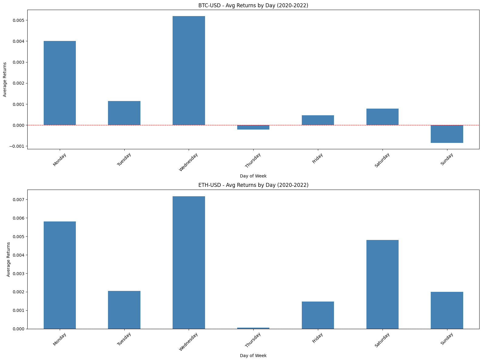
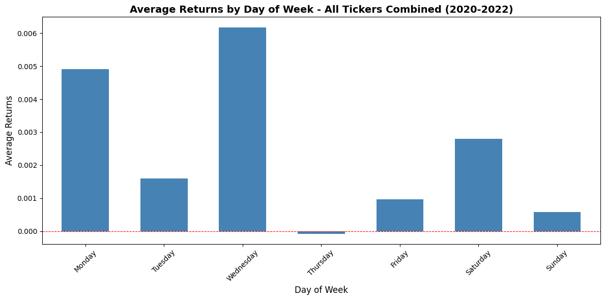
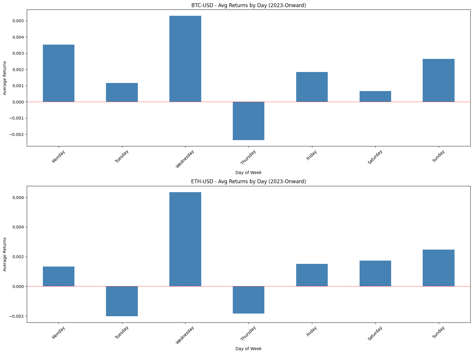
This block is designed to measure and visualize day-of-week return patterns for a universe of tickers across two distinct calendar regimes so you can spot structural differences in intraday/week patterns that matter for strategy design. It first defines two date ranges — effectively a training vs. “after” period — so we can compare the same analysis before and after a potential regime change (e.g., pandemic, macro shift, or market structural change). For each period it filters the master time-series DataFrame by date, producing a period-specific view that the rest of the code operates on.
Inside the period loop the code constructs a results table of average returns by weekday for every ticker. For each ticker we copy the ticker’s returns series (copy() avoids chained-assignment/view pitfalls) and pair those returns with the corresponding DayOfWeek labels pulled from the period slice. The DayOfWeek accessor is written with a tuple-like column selector, which implies the source DataFrame uses a MultiIndex for columns; that series is used so returns are grouped by weekday rather than by calendar date. Grouping by ‘DayOfWeek’ and taking the mean produces the per-ticker average return for each weekday; those per-ticker series are inserted as columns into a DataFrame whose rows are ordered by a pre-defined day_order so weekdays are consistently shown Monday → Friday rather than alphabetically. Keeping a consistent row ordering is important for visual comparison across tickers and between periods.
After the per-ticker aggregation is complete, the code creates individual bar charts for each ticker in a grid of subplots. Flattening the axes array and iterating by index maps each ticker to one subplot so you can visually inspect whether particular tickers exhibit a strong positive or negative bias on specific weekdays. Visual choices — rotating x-ticks for readability, adding a horizontal red dashed line at y=0, and labeling axes — are intentional: the zero line makes it immediately clear which weekdays are net positive or negative, and consistent styling across tickers simplifies pattern recognition when scanning the grid.
With the per-ticker views done, the code then computes a cross-sectional average across all tickers for each weekday by calling mean(axis=1) on the aggregated DataFrame. This combined series represents an equally weighted market- or universe-level weekday signal; by averaging across tickers you get a compact signal that helps answer the question, “Is there a systematic weekday effect across the universe, or are effects idiosyncratic?” Note that pandas’ mean ignores NaNs by default, so if a particular ticker lacks data for a weekday it won’t bias the mean but will reduce the effective sample size for that day. If you want a median or a liquidity-weighted average instead, you would need to swap the aggregation method here.
Finally, the combined series is plotted as a single bar chart for the period so you can compare the aggregate weekday profile between the defined periods. The overall pattern returned by these charts informs quant decisions: persistent weekday effects could justify weekday-aware alpha signals or execution timing rules, while a change between periods indicates a structural shift that should trigger revalidation of models or recalibration of intraday scheduling. Small implementation notes to keep in mind: the code assumes SUB_PLOTS_X and SUB_PLOTS_Y produce enough axes for all tickers, and missing days for a given ticker will appear as NaN rows unless filled; also, the current combination uses equal weighting, which may be fine for signal discovery but should be revisited if you want portfolio-level P&L implications where volatility or market-cap weighting matters.
# Create a trading strategy that buys on Monday, Wednesday, Friday, and Saturday
trading_days = [’Monday’, ‘Wednesday’, ‘Friday’, ‘Saturday’]

# Create a DataFrame to store strategy returns
strategy_returns = pd.DataFrame(index=data.index, columns=TICKERS)

for ticker in TICKERS:
    # Get the day of week for each date
    ticker_day = data[(’DayOfWeek’, ‘DayOfWeek’)]

    # Get returns for this ticker
    ticker_returns = data[’Returns’][ticker].copy()

    # Apply strategy: only take returns on trading days, otherwise 0
    strategy_returns[ticker] = ticker_returns.where(ticker_day.isin(trading_days), 0)
    strategy_returns[ticker] = strategy_returns[ticker].fillna(0)

# Calculate cumulative returns for the strategy
strategy_cumulative = (1 + strategy_returns).cumprod() - 1

# Plot strategy vs buy & hold
fig, axes = plt.subplots(len(TICKERS), 1, figsize=(14, 6 * len(TICKERS)))
if len(TICKERS) == 1:
    axes = [axes]

for idx, ticker in enumerate(TICKERS):
    # Plot strategy cumulative returns
    strategy_cumulative[ticker].plot(ax=axes[idx], label=’Strategy (Mon/Wed/Fri/Sat)’, linewidth=2)

    # Plot buy & hold cumulative returns
    cumulative_returns[ticker].plot(ax=axes[idx], label=’Buy & Hold’, linewidth=2, alpha=0.7)

    axes[idx].set_title(f’{ticker} - Strategy vs Buy & Hold’)
    axes[idx].set_xlabel(’Date’)
    axes[idx].set_ylabel(’Cumulative Returns’)
    axes[idx].legend()
    axes[idx].grid(alpha=0.3)

plt.tight_layout()
plt.show()

# Calculate summary statistics for the strategy
strategy_summary = pd.DataFrame(index=TICKERS)

for ticker in TICKERS:
    strat_returns = strategy_returns[ticker]
    bh_returns = data[’Returns’][ticker]

    # Strategy metrics
    strat_annual_return = strat_returns.mean() * 365
    strat_annual_vol = strat_returns.std() * np.sqrt(365)
    strat_sharpe = strat_annual_return / strat_annual_vol

    strat_cumulative = (1 + strat_returns).cumprod()
    strat_running_max = strat_cumulative.cummax()
    strat_drawdown = (strat_cumulative - strat_running_max) / strat_running_max
    strat_max_drawdown = strat_drawdown.min()

    # Buy & Hold metrics
    bh_annual_return = bh_returns.mean() * 365
    bh_annual_vol = bh_returns.std() * np.sqrt(365)
    bh_sharpe = bh_annual_return / bh_annual_vol

    bh_cumulative = (1 + bh_returns).cumprod()
    bh_running_max = bh_cumulative.cummax()
    bh_drawdown = (bh_cumulative - bh_running_max) / bh_running_max
    bh_max_drawdown = bh_drawdown.min()

    # Total returns
    strat_total = strategy_cumulative[ticker].iloc[-1]
    bh_total = cumulative_returns[ticker].iloc[-1]

    # Store results
    strategy_summary.loc[ticker, ‘Strategy Ann. Return’] = strat_annual_return
    strategy_summary.loc[ticker, ‘B&H Ann. Return’] = bh_annual_return
    strategy_summary.loc[ticker, ‘Strategy Ann. Vol’] = strat_annual_vol
    strategy_summary.loc[ticker, ‘B&H Ann. Vol’] = bh_annual_vol
    strategy_summary.loc[ticker, ‘Strategy Sharpe’] = strat_sharpe
    strategy_summary.loc[ticker, ‘B&H Sharpe’] = bh_sharpe
    strategy_summary.loc[ticker, ‘Strategy Max DD’] = strat_max_drawdown
    strategy_summary.loc[ticker, ‘B&H Max DD’] = bh_max_drawdown
    strategy_summary.loc[ticker, ‘Strategy Total Return’] = strat_total
    strategy_summary.loc[ticker, ‘B&H Total Return’] = bh_total

print(”\nStrategy vs Buy & Hold Summary Statistics:”)
print(strategy_summary.to_string())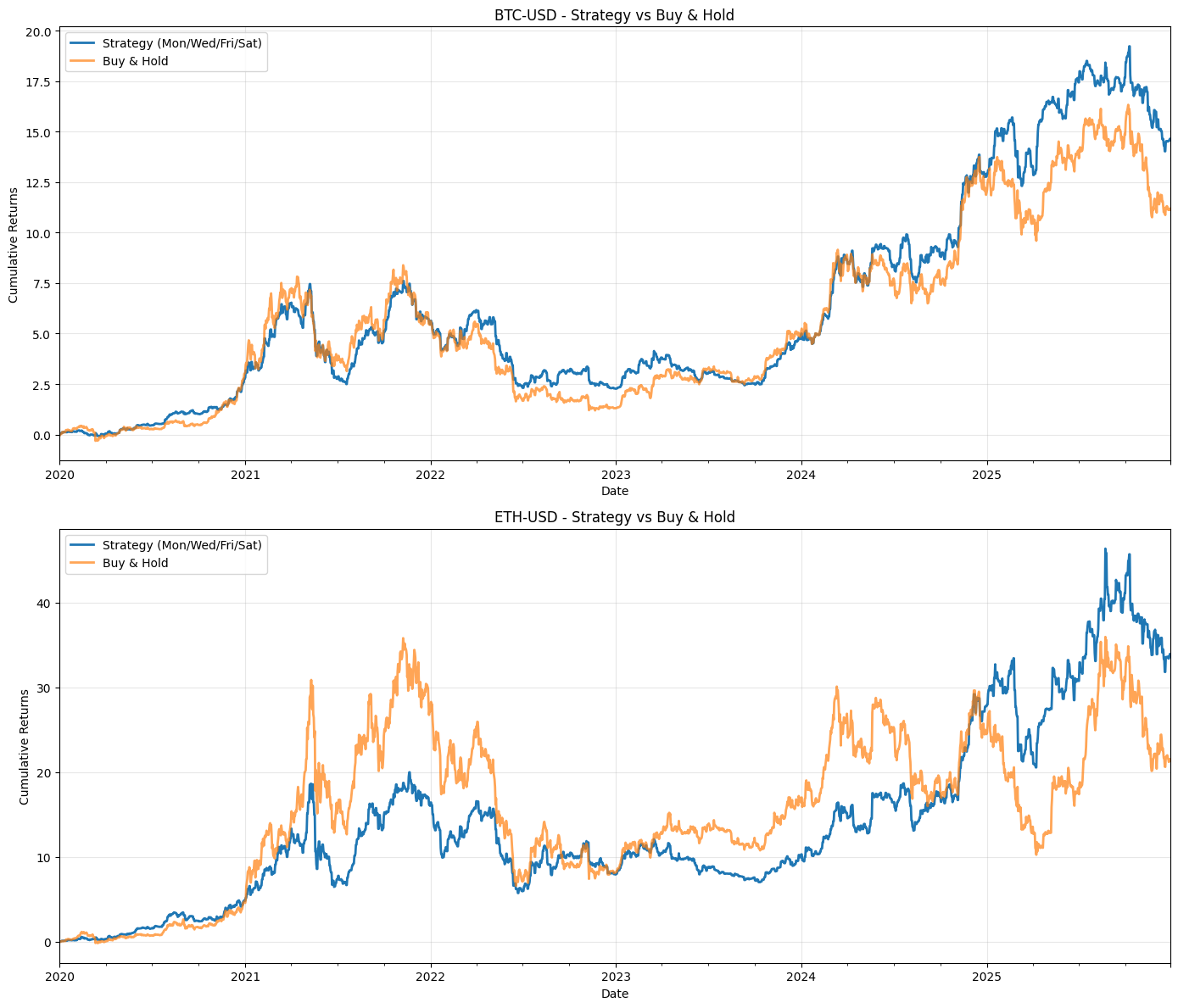

This block implements a simple rule-based quant strategy that only “takes” daily returns on a fixed set of weekdays (Mon/Wed/Fri/Sat), compares the resulting performance to a buy & hold benchmark, plots both equity lines per ticker, and computes a handful of summary performance metrics. The overall flow is: build a masked returns series that equals the original daily return on allowed trading days and zero otherwise, convert those daily returns into a cumulative wealth process, visualize strategy vs buy & hold, and compute annualized return/volatility/Sharpe and drawdown statistics for each ticker.
First, the code defines the trading rule (the list trading_days). It then allocates strategy_returns as a DataFrame with the same index as the price/returns data and the same tickers, which will hold the per-day strategy P&L for each ticker. Inside the loop over tickers the code pulls the weekday series (ticker_day) and the raw daily returns for the current ticker (ticker_returns). It then applies the rule: strategy_returns for that ticker is ticker_returns where the weekday is one of the allowed trading_days, otherwise it is set to 0. Any NaNs are replaced with 0 so that missing data does not propagate into the P&L. In effect this mask implements the trading decision “be exposed and earn the instrument’s daily return on these weekdays; be flat (zero return) on all other dates,” which is why the code uses .where rather than a cumulative position or forward-fill — we’re modeling discrete per-day exposure, not continuous holding across non-trading days.
After building the masked returns, the code computes the strategy’s cumulative returns via (1 + strategy_returns).cumprod() — 1. That turns the daily return series into a net cumulative return time series (i.e., wealth growth minus 1). This series is used for plotting. The plotting block creates a panel per ticker and overlays the strategy cumulative return and the precomputed buy & hold cumulative_returns series so you can visually compare equity curves, with standard labels, grid, and layout adjustments.
The final block computes summary statistics per ticker. For both the strategy and buy & hold it annualizes the mean return and the volatility by multiplying the daily mean by 365 and the daily std by sqrt(365) respectively — then forms a simple Sharpe as the ratio of annualized return to annualized vol (note: no risk-free rate is subtracted). It constructs a cumulative wealth series (1 + returns).cumprod() for drawdown calculations and then computes running maximum (cummax) and instantaneous drawdown as (current — running_max) / running_max; the maximum drawdown is the minimum of that series. Total returns are taken from the final value of the plotted cumulative series. Those metrics are written into strategy_summary for easy tabular comparison.
A few practical notes and caveats to be aware of: the code treats non-trading days as zero return, which models exiting positions between trading days rather than holding across them; that is a behavioral/assumption choice and has large effects on performance if returns have significant overnight or weekend components. The use of “Saturday” suggests this could be intended for 24/7 assets (e.g., crypto) — if you’re working with equities you’ll want to remove weekend days and use business-day logic. Annualization uses 365 days; for many assets you should use the appropriate convention (e.g., 252 trading days for equities). The Sharpe calculation omits a risk-free rate and any adjustment for differing sample frequencies; include a risk-free rate if you want excess returns. There’s a small internal inconsistency in how cumulative series are handled (the plotting cumulative subtracts 1 but the drawdown routine uses the raw cumprod level), which won’t break the math if you consistently think in terms of the wealth index, but it’s clearer to standardize on a single base (e.g., start wealth = 1 and keep wealth-series without subtracting 1 until presentation). Finally, this per-ticker loop is fine for a modest number of tickers, but you can vectorize the weekday mask once outside the loop (weekday boolean mask broadcast across columns) to avoid repeated identical reads of the DayOfWeek column and speed up large-universe backtests. Also consider adding transaction costs, slippage, and position sizing to move from a gross-return toy strategy to a more realistic trading simulation.
# Create an equally weighted portfolio strategy
# Calculate portfolio returns (equally weighted across all tickers)
portfolio_strategy_returns = strategy_returns.mean(axis=1)

# Calculate cumulative returns for portfolio
portfolio_strategy_cumulative = (1 + portfolio_strategy_returns).cumprod()

# Calculate portfolio metrics
# Strategy metrics
portfolio_strat_annual_return = portfolio_strategy_returns.mean() * 365
portfolio_strat_annual_vol = portfolio_strategy_returns.std() * np.sqrt(365)
portfolio_strat_sharpe = portfolio_strat_annual_return / portfolio_strat_annual_vol

portfolio_strat_running_max = portfolio_strategy_cumulative.cummax()
portfolio_strat_drawdown = (portfolio_strategy_cumulative - portfolio_strat_running_max) / portfolio_strat_running_max
portfolio_strat_max_drawdown = portfolio_strat_drawdown.min()

portfolio_strat_total = portfolio_strategy_cumulative.iloc[-1] - 1

# Calculate time period
start = data.index[0]
end = data.index[-1]
num_years = (end - start).days / 365.25

# Print formatted results
print(”=” * 60)
print(”BACKTEST RESULTS”)
print(”=” * 60)
print(”Strategy:”)
print(” * Equally weighted portfolio across all tickers”)
print(” * Long only on Monday, Wednesday, Friday, Saturday”)
print(f”Period: {start.strftime(’%Y-%m’)} to {end.strftime(’%Y-%m’)}”)
print(f”Number of years: {num_years:.2f}”)
print(”-” * 60)
print(f”Total Return: {portfolio_strat_total * 100:.2f}%”)
print(f”Annualized Return: {portfolio_strat_annual_return * 100:.2f}%”)
print(f”Annualized Volatility: {portfolio_strat_annual_vol * 100:.2f}%”)
print(f”Sharpe Ratio: {portfolio_strat_sharpe:.3f}”)
print(f”Maximum Drawdown: {portfolio_strat_max_drawdown * 100:.2f}%”)
print(”=” * 60)
This block takes per-ticker strategy returns and turns them into a single, easily interpretable performance summary for an equally weighted portfolio — the kind of high-level report you use to judge whether a rule-based quant strategy is delivering attractive risk-adjusted returns and acceptable drawdown.
It begins by collapsing the cross-section of ticker returns into one portfolio return time series via a simple arithmetic mean across columns (mean(axis=1)). That implements equal weighting: each ticker contributes equally to the portfolio each period. We do this because the strategy specification is “equally weighted across all tickers,” and averaging is the natural way to implement that when you already have per-ticker period returns. Using arithmetic returns here preserves the period-by-period realized P&L contributions before compounding.
Next, cumulative performance is built by compounding those period returns: (1 + r).cumprod(). This multiplicative aggregation reflects how equity curves actually grow — each period’s gain or loss scales the current capital rather than adding linearly — and gives you the portfolio growth factor over time that you can plot or evaluate at the end of the backtest.
The code then computes standard scalar performance metrics by annualizing the moments of the period returns. It treats the input returns as daily by scaling mean returns by 365 and scaling volatility by sqrt(365) (annual_vol = std * sqrt(N)). The Sharpe ratio is computed as annualized return divided by annualized volatility, implicitly assuming a zero risk-free rate. These transformations answer “how much return per unit of variability would an investor expect over a year?” — a core question in quant evaluation. Note the implicit assumptions: the returns are daily and uncorrelated across days for straightforward sqrt(N) scaling, and the risk-free rate is omitted; if you want a classic excess-return Sharpe, subtract the risk-free rate before annualizing.
Risk along the equity curve is captured by drawdown calculations. The running maximum of the cumulative series gives the highest historical portfolio level up to each date; drawdown is then the percent gap from that peak to the current level ((current — running_max) / running_max). The worst (most negative) drawdown over the sample is taken as max drawdown. This is important in quant trading because a strategy with attractive mean returns can still be unacceptable if it exposes capital to long, deep drawdowns that could force deleveraging or strategy abandonment.
Total return is reported as the final cumulative growth minus one (final_value — 1) to give a convenient percent return over the whole backtest. The code also computes the sample length in years from the first and last timestamps using days/365.25 to account for leap years on average; that number is useful for normalizing or contextualizing the annualized metrics and for reporting how long the strategy was observed.
Finally, the block prints a compact backtest report: period, years, total return, annualized return, annualized volatility, Sharpe, and maximum drawdown. The printed note that the strategy is “Long only on Monday, Wednesday, Friday, Saturday” is a business-context label describing the trading rule that produced the input returns; the code itself doesn’t enforce those day rules here — it just summarizes the results of whatever upstream logic produced strategy_returns. A couple of practical caveats to keep in mind when using this block in production: ensure your returns series has consistent frequency and no unintended NaNs before annualizing, decide whether to use trading days (≈252) vs. calendar days (365) for scaling, and consider subtracting a risk-free rate (or using return metrics based on log-returns) if you need stricter attribution or statistical properties.
# Create strategy performance and drawdown plots
fig, (ax1, ax2) = plt.subplots(2, 1, figsize=(14, 10), gridspec_kw={’height_ratios’: [2, 1]})

# Plot 1: Cumulative Returns (Equity Curve)
ax1.plot(portfolio_strategy_cumulative.index, portfolio_strategy_cumulative,
         linewidth=2, label=’Strategy’, color=’darkblue’)
ax1.set_ylabel(’Cumulative Return’, fontsize=12)
ax1.set_title(’Strategy Performance: Cumulative Returns’, fontsize=14, fontweight=’bold’)
ax1.legend(fontsize=11, loc=’upper left’)
ax1.grid(True, alpha=0.3)
ax1.axhline(y=1, color=’gray’, linestyle=’--’, linewidth=1, alpha=0.5)

# Plot 2: Drawdown
ax2.fill_between(portfolio_strat_drawdown.index, portfolio_strat_drawdown * 100, 0,
                 color=’red’, alpha=0.3, label=’Drawdown’)
ax2.plot(portfolio_strat_drawdown.index, portfolio_strat_drawdown * 100,
         linewidth=1.5, color=’darkred’)
ax2.set_xlabel(’Date’, fontsize=12)
ax2.set_ylabel(’Drawdown (%)’, fontsize=12)
ax2.set_title(’Strategy Drawdown’, fontsize=14, fontweight=’bold’)
ax2.legend(fontsize=11, loc=’lower left’)
ax2.grid(True, alpha=0.3)

# Add annotation for max drawdown
max_dd_date = portfolio_strat_drawdown.idxmin()
ax2.annotate(f’Max DD: {portfolio_strat_max_drawdown*100:.2f}%’,
             xy=(max_dd_date, portfolio_strat_drawdown.min()*100),
             xytext=(10, 10), textcoords=’offset points’,
             bbox=dict(boxstyle=’round,pad=0.5’, facecolor=’yellow’, alpha=0.7),
             arrowprops=dict(arrowstyle=’->’, connectionstyle=’arc3,rad=0’))

plt.tight_layout()
plt.show()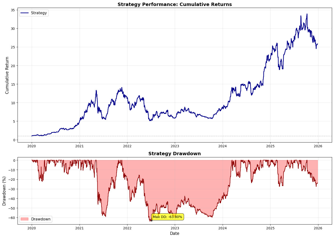
This block builds a two-panel figure that communicates both the strategy’s equity curve and its drawdown profile, so you can judge returns and risk side‑by‑side. First, it creates a vertically stacked subplot layout with a larger upper panel (height ratio 2:1) for the cumulative returns and a smaller lower panel for drawdowns; that sizing intentionally emphasizes the equity curve while reserving visible space to inspect drawdown behavior without dominating the page.
The top panel plots the time series of portfolio_strategy_cumulative against its datetime index. The expectation here is that this cumulative series is normalized to a starting value of 1 (100%), which is why a horizontal reference line is drawn at y=1 — that line represents the starting capital or break‑even baseline. Styling choices (line width, color, legend, grid) are about making trajectory, trend changes and inflection points easy to scan visually. Showing the full cumulative path lets you see compounding effects, entry/exit regime changes, and whether the strategy achieves persistent growth versus episodic spikes.
The lower panel visualizes drawdown over the same index; drawdown is plotted and filled between the drawdown curve and zero to emphasize the area of capital erosion. Multiplying the drawdown series by 100 converts it to percent terms for readability, so areas and tick values are interpreted as percent losses from peak rather than raw return units. Using a translucent fill with a darker outline (fill_between + plot) makes both the magnitude (area) and the time/location (line) of drawdowns clear. The legend, axis labels, and grid mirror the top plot to keep both panels immediately interpretable together.
The code then annotates the maximum drawdown point to call out the single worst peak‑to‑trough loss and its timing. It finds the date of the deepest drawdown using idxmin() on the drawdown series (which returns the index where the series attains its minimum value); the displayed text uses portfolio_strat_max_drawdown multiplied by 100 and formatted to two decimal places. This annotation, with a boxed label and an arrow, directs attention to the strategy’s most severe historical loss — a critical metric for risk management, sizing decisions, and comparing strategies.
From a quant trading perspective this visualization serves two complementary diagnostic functions: the equity curve shows realized compounded performance and serial patterning (e.g., long flat periods, abrupt jumps), while the drawdown plot quantifies downside risk, duration and recovery behavior. Together they help you evaluate whether returns are stable, whether drawdowns are clustered in certain market regimes, and whether your stop‑loss / allocation rules are adequate given the magnitude and frequency of declines.
A couple of practical checks to keep in mind: confirm the sign convention and units of the drawdown series (the code assumes drawdowns are non‑positive values and converts them to percent for display), and confirm that cumulative returns are normalized as expected (starting at 1) so the horizontal line at y=1 is meaningful. The tight_layout() call finalizes spacing so labels and annotations don’t overlap, and plt.show() renders the figure for inspection. Overall, this block is about making performance and risk immediately visible and comparable so you can iterate on strategy logic and risk controls with informed, visual feedback.
# Calculate 1-year rolling metrics for the portfolio strategy
rolling_window = 365  # 365 days = 1 year

# 1-year rolling return (annualized)
rolling_return = portfolio_strategy_returns.rolling(window=rolling_window).apply(
    lambda x: (1 + x).prod() - 1
)

# 1-year rolling volatility (annualized)
rolling_vol = portfolio_strategy_returns.rolling(window=rolling_window).std() * np.sqrt(365)

# 1-year rolling Sharpe ratio
rolling_sharpe = rolling_return / rolling_vol

# Create the plots
fig, axes = plt.subplots(3, 1, figsize=(14, 12))

# Plot 1: Rolling Return
ax1 = axes[0]
ax1.plot(rolling_return.index, rolling_return * 100,
         linewidth=1.5, color=’darkblue’, label=’1-Year Rolling Return’)
ax1.axhline(y=portfolio_strat_annual_return * 100, color=’red’, linestyle=’--’, linewidth=1.5,
            label=f’Mean: {portfolio_strat_annual_return * 100:.2f}%’)
ax1.set_ylabel(’Return (%)’, fontsize=12)
ax1.set_title(’1-Year Rolling Annualized Return’, fontsize=14, fontweight=’bold’)
ax1.legend(fontsize=10)
ax1.grid(True, alpha=0.3)

# Plot 2: Rolling Volatility
ax2 = axes[1]
ax2.plot(rolling_vol.index, rolling_vol * 100,
         linewidth=1.5, color=’darkgreen’, label=’1-Year Rolling Volatility’)
ax2.axhline(y=portfolio_strat_annual_vol * 100, color=’red’, linestyle=’--’, linewidth=1.5,
            label=f’Mean: {portfolio_strat_annual_vol * 100:.2f}%’)
ax2.set_ylabel(’Volatility (%)’, fontsize=12)
ax2.set_title(’1-Year Rolling Annualized Volatility’, fontsize=14, fontweight=’bold’)
ax2.legend(fontsize=10)
ax2.grid(True, alpha=0.3)

# Plot 3: Rolling Sharpe Ratio
ax3 = axes[2]
ax3.plot(rolling_sharpe.index, rolling_sharpe,
         linewidth=1.5, color=’darkorange’, label=’1-Year Rolling Sharpe Ratio’)
ax3.axhline(y=portfolio_strat_sharpe, color=’red’, linestyle=’--’, linewidth=1.5,
            label=f’Mean: {portfolio_strat_sharpe:.2f}’)
ax3.axhline(y=0, color=’gray’, linestyle=’-’, linewidth=0.8, alpha=0.5)
ax3.set_xlabel(’Date’, fontsize=12)
ax3.set_ylabel(’Sharpe Ratio’, fontsize=12)
ax3.set_title(’1-Year Rolling Sharpe Ratio’, fontsize=14, fontweight=’bold’)
ax3.legend(fontsize=10)
ax3.grid(True, alpha=0.3)

plt.tight_layout()
plt.show()
This block computes and visualizes one‑year rolling performance metrics for a portfolio: the trailing one‑year return, the annualized volatility over the trailing year, and the corresponding rolling Sharpe ratio, then plots them in three stacked charts. The high‑level intent is to show how the strategy’s realized performance evolves over time on a one‑year lookback so you can inspect regime changes, volatility spikes, and how risk‑adjusted returns move relative to long‑run averages.
We start by fixing the rolling window to 365 days; that choice means every window covers roughly a calendar year, so the cumulative return across that window is the one‑year return (if your input series are daily simple returns). The rolling_return calculation multiplies (1 + daily_return) across the 365‑day window and subtracts one: (1 + x).prod() — 1. Using the product directly preserves compounding (we are computing the realized cumulative return over the last year). This is appropriate for a one‑year window because the product gives the actual annual return; if you later change the window length or your return frequency, you must adjust the interpretation or annualize differently.
Rolling volatility is computed as the standard deviation of the same daily returns over the 365‑day window, scaled by sqrt(365) to annualize: rolling_vol = rolling_std * sqrt(365). That follows the usual diffusion scaling rule (vol scales with the square root of time) and gives you a volatility number on the same annualized basis as the rolling return so they’re comparable. Note that pandas’ std uses the sample standard deviation (ddof=1) by default; depending on your reporting conventions you may want ddof=0 for population std or to use a trading‑day count (e.g., 252) instead of 365.
The rolling Sharpe is simply the ratio rolling_return / rolling_vol. This yields a trailing one‑year, annualized risk‑adjusted metric. Two practical caveats: first, this assumes a zero risk‑free rate (no adjustment made); if you want an excess‑return Sharpe, subtract the risk‑free return over the same window before dividing. Second, dividing by very small vol values can produce noisy or extreme Sharpe estimates, so in production you should guard against near‑zero denominators (e.g., require a minimum vol, clip extremes, or drop NaNs).
The plotting section creates a 3×1 figure to display the three series aligned on the same time index for visual inspection. For returns and volatility the series are multiplied by 100 to show percentages on the y‑axis; for each subplot we add a horizontal dashed red line representing the long‑term mean (portfolio_strat_annual_return, portfolio_strat_annual_vol, portfolio_strat_sharpe) so you can immediately compare current rolling behavior to the overall average. The Sharpe plot also includes a gray zero line to highlight when risk‑adjusted performance is positive versus negative. Axis labels, titles, legends, and light gridlines are used to make the charts readable and to emphasize the annualized units.
A few operational notes and improvements to consider: rolling.apply with a Python lambda that computes a product can be slower than vectorized approaches; if performance matters, compute rolling sums of log returns and exponentiate (exp(sum(log(1+r)))) — 1 for numerical stability, or implement the product with numpy and raw arrays. Ensure your returns series frequency matches the 365‑day assumption — for a strategy sampled only on trading days you may want window=252 and sqrt(252) for annualization. Handle edge cases explicitly: supply min_periods to rolling so the early windows are well defined or intentionally left NaN, and decide how to treat non‑trading dates or missing data. Finally, if you need a Sharpe that accounts for time‑varying risk‑free rates or overlapping windows, incorporate those adjustments before plotting so the visuals match the performance definition used in reporting.
# Download data for all tickers and add features
data = yf.download(TICKERS, start=START_DATE, end=END_DATE, auto_adjust=True, progress=False)

# Returns
returns = data[’Close’].pct_change()
returns.columns = pd.MultiIndex.from_product([[’Returns’], returns.columns])

# Log Returns
log_returns = np.log(data[’Close’] / data[’Close’].shift(1))
log_returns.columns = pd.MultiIndex.from_product([[’LogReturns’], log_returns.columns])

# Next day returns (shifted returns)
next_day_returns = returns.shift(-1)
next_day_returns.columns = pd.MultiIndex.from_product([[’NextDayReturns’], TICKERS])

# 20-day momentum (cumulative return over past 20 days)
momentum_20d = data[’Close’].pct_change(periods=20)
momentum_20d.columns = pd.MultiIndex.from_product([[’Momentum20D’], momentum_20d.columns])

# Concatenate with original data
data = pd.concat([data, returns, log_returns, momentum_20d], axis=1)
The block begins by pulling adjusted price series for all tickers into a single DataFrame so every subsequent feature is built from the same, split/dividend-corrected source. auto_adjust=True ensures the Close prices reflect corporate actions (splits/dividends), which prevents artificial jumps in returns and keeps features and labels consistent over time — a crucial detail in quant trading where structural artifacts would otherwise create spurious signals.
Next, the code derives simple percentage returns from Close prices. pct_change() produces day-over-day fractional changes which are a direct, interpretable measure of realized price movement and are commonly used as model inputs and for risk calculations. The code then wraps those columns with a two-level column index (MultiIndex) whose top level is ‘Returns’. That naming convention is practical: it groups related columns together, avoids name collisions with raw price columns, and makes downstream slicing (e.g., selecting all returns features) straightforward.
After that, log returns are computed. Log returns (log(current/previous)) are used because they are additive over time (convenient for aggregating returns across intervals), tend to be more symmetric for modeling, and map multiplicative price dynamics into an additive form that is often better behaved for many statistical models. The log-return columns are likewise labeled under a ‘LogReturns’ top-level so they’re clearly separated from simple returns.
The code also prepares the supervised learning target: next_day_returns = returns.shift(-1). By shifting returns up by one row you align tomorrow’s return with today’s features — i.e., you can use today’s prices and factors to predict the return that will be observed the next trading day. This is the usual pattern for label construction in daily-aligned quant strategies. Note the final row becomes NaN for next-day labels (no future day), which you will need to drop or mask before training/evaluation.
A longer-horizon technical feature is created next: a 20-day momentum defined as pct_change(periods=20), which computes the cumulative percent change over the previous 20 trading days (roughly one month). Momentum over this window is a common cross-sectional and time-series factor: it captures recent trend persistence and is often predictive of short- to medium-term returns. Labelling these columns under ‘Momentum20D’ keeps them distinct and discoverable among other features.
Finally, the script concatenates the raw OHLCV data and the newly engineered feature blocks into a single DataFrame so each timestamp’s row contains both the prices and all engineered features and labels. At this point you should be aware of NaNs introduced by shifts and pct_change (they occur at the top or bottom of the series depending on the operation) and plan for handling them (e.g., drop, forward/backfill, or mask during training). The MultiIndex layout makes it easy to extract groups (raw prices vs returns vs momentum vs targets) for feature selection, scaling, and model input pipelines in the broader quant workflow.
# Momentum vs Log Returns Scatter Plots with Regression Lines

# Create subplots
fig, axes = plt.subplots(SUB_PLOTS_X, SUB_PLOTS_Y, figsize=(8, 4))

# Iterate through each ticker
for idx, ticker in enumerate(TICKERS):
    ax = axes[idx]

    # Prepare data for this ticker
    df_clean = pd.DataFrame({
        ‘momo20’: momentum_20d[(’Momentum20D’, ticker)],
        ‘log_return’: log_returns[(’LogReturns’, ticker)]
    }).dropna()

    # Fit regression model using numpy
    X = df_clean[’momo20’].values
    y = df_clean[’log_return’].values

    # Add constant term (intercept)
    X_with_const = np.column_stack([np.ones(len(X)), X])

    # Calculate coefficients using least squares
    coeffs = np.linalg.lstsq(X_with_const, y, rcond=None)[0]
    intercept, slope = coeffs

    # Calculate R-squared
    y_pred = intercept + slope * X
    ss_res = np.sum((y - y_pred) ** 2)
    ss_tot = np.sum((y - np.mean(y)) ** 2)
    r_squared = 1 - (ss_res / ss_tot)

    # Create grid for prediction
    x_grid = np.linspace(X.min(), X.max(), 200)
    y_grid = intercept + slope * x_grid

    # Calculate standard error and confidence intervals
    n = len(X)
    residuals = y - y_pred
    mse = np.sum(residuals ** 2) / (n - 2)
    se = np.sqrt(mse * (1/n + (x_grid - X.mean())**2 / np.sum((X - X.mean())**2)))
    ci_margin = 1.96 * se  # 95% confidence interval

    # Plot scatter and regression line
    ax.scatter(X, y, s=10, color=’black’, alpha=0.5)
    ax.plot(x_grid, y_grid, color=’blue’, linewidth=1.5, label=’Regression Line’)
    ax.fill_between(x_grid, y_grid - ci_margin, y_grid + ci_margin, color=’gray’, alpha=0.5, label=’95% CI’)

    ax.set_xlabel(’20-Day Momentum’)
    ax.set_ylabel(’Log Returns’)
    ax.set_title(f’{ticker}: Momentum vs Log Returns’)
    #ax.legend()
    ax.grid(True, alpha=0.2, color=’lightgray’)

plt.tight_layout()
plt.show()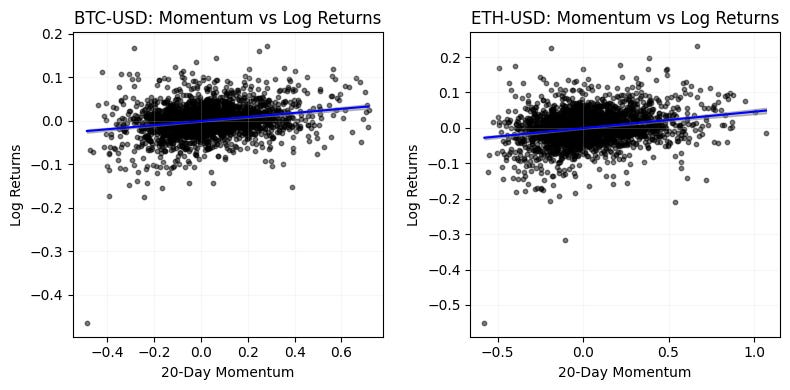
This block produces a diagnostic scatterplot for each ticker that visualizes and quantifies the (simple) linear relationship between a 20-day momentum signal and subsequent log returns — an archetypal step in exploratory quant research to see whether a candidate signal has predictive value. For each ticker we first construct a cleaned two-column DataFrame from the momentum and log-return sources and drop rows with NaNs so the regression uses only aligned, non-missing observations; this prevents misalignment or accidental look-ahead and ensures the sample reflects the actual paired observations used for model-fitting and plotting.
The code fits an ordinary least squares line by explicitly adding a constant column and solving the normal equations via numpy.linalg.lstsq, returning an intercept and slope. Including an intercept lets the model capture a non-zero baseline return, which is important in finance where mean returns are rarely exactly zero. After obtaining coefficients we compute fitted values and residuals; from those we derive R-squared as 1 — ss_res/ss_tot so you get a concise measure of how much of the return variance the linear momentum predictor explains (with the usual caution that R-squared in noisy financial data tends to be small).
To visualize the fitted relationship smoothly the script constructs an evenly spaced x_grid spanning the observed momentum range and evaluates the regression line on that grid. It also computes pointwise 95% confidence bands around the predicted mean response: the standard error formula combines the mean-squared error (computed with n-2 degrees of freedom) and the usual (1/n + (x — x̄)² / Sxx) term to reflect higher uncertainty farther from the sample mean. The bands are formed using 1.96·se, which is the conventional normal-approximation multiplier for a 95% interval; for small samples you would prefer the t-distribution multiplier instead.
Finally, each axis shows the raw scatter (to inspect dispersion and outliers), the regression line, and a shaded confidence region so you can immediately see effect size, uncertainty, and any nonlinearity or heteroskedasticity. This visual plus the R-squared gives a quick assessment of whether the momentum signal displays a stable linear relationship with returns, but you should treat it as exploratory: OLS assumptions (independence, homoskedasticity, no serial correlation) are often violated in time series returns. For more robust inference in a production quant pipeline consider time-aware validation (rolling windows / out-of-sample testing), Newey–West or HAC standard errors, block or stationary bootstrap for confidence intervals, using statsmodels for p-values and diagnostics, and adjustments for multiple tickers/tailoring to avoid data-snooping. These steps will help decide whether the observed relationship is actionable for trading (signal inclusion, sizing, and risk controls) rather than a sample artifact.
# Next Day Returns by Momentum Sign

# Create subplots for momentum analysis
fig, axes = plt.subplots(SUB_PLOTS_X, SUB_PLOTS_Y, figsize=(8, 4))
fig.suptitle(’Mean Next Day Returns by 20-Day Momentum Sign’, fontsize=14, y=0.95)

# Iterate through each ticker
for idx, ticker in enumerate(TICKERS):
    ax = axes[idx]

    # Prepare data for this ticker
    df_analysis = pd.DataFrame({
        ‘momo20’: momentum_20d[(’Momentum20D’, ticker)],
        ‘next_day_return’: next_day_returns[(’NextDayReturns’, ticker)]
    }).dropna()

    # Split into positive and negative momentum
    positive_momo_returns = df_analysis[df_analysis[’momo20’] > 0][’next_day_return’]
    negative_momo_returns = df_analysis[df_analysis[’momo20’] < 0][’next_day_return’]

    # Calculate means
    mean_positive = positive_momo_returns.mean()
    mean_negative = negative_momo_returns.mean()

    # Create histogram
    ax.bar([’Negative Momentum\n(momo20 < 0)’, ‘Positive Momentum\n(momo20 > 0)’],
           [mean_negative, mean_positive],
           color=[’lightcoral’, ‘lightblue’],
           alpha=1)

    ax.set_ylabel(’Mean Next Day Returns’)
    ax.set_title(f’{ticker}’)
    ax.axhline(y=0, color=’black’, linestyle=’--’, alpha=0.5)

    # Add value labels on bars
    ax.text(0, mean_negative, f’{mean_negative:.6f}’,
            ha=’center’, va=’bottom’ if mean_negative > 0 else ‘top’)
    ax.text(1, mean_positive, f’{mean_positive:.6f}’,
            ha=’center’, va=’bottom’ if mean_positive > 0 else ‘top’)

plt.tight_layout()
plt.show()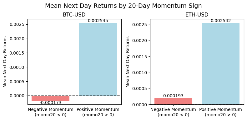
This block takes per-ticker 20-day momentum and the corresponding next-day returns, groups observations by the sign of the momentum, computes the average next-day return for each group, and visualizes those two conditional means so you can quickly see whether positive or negative momentum historically corresponds to higher next-day returns. The high-level intent is to evaluate a simple, sign-based momentum signal as a potential trading rule: if positive 20-day momentum is associated with positive average next-day returns (and larger than the negative-momentum bucket), that suggests a short-term continuation effect you might be able to exploit; the opposite pattern suggests mean reversion.
Concretely, for each ticker the code extracts the ticker-specific series from the precomputed momentum_20d and next_day_returns objects, aligns them into a two-column DataFrame, and drops missing pairs so every sample has both a momentum value and a next-day return. This alignment ensures we compute conditional statistics only on valid, paired observations rather than mixing stale or incomplete rows. The DataFrame is then split into two buckets by momentum sign: strictly greater than zero (positive momentum) and strictly less than zero (negative momentum). Note that zeros are implicitly excluded by these strict inequalities — this is an explicit design choice that simplifies the analysis to a binary sign test, but may drop neutral days; if zeros are frequent you should consider handling them explicitly or using non-strict comparisons.
For each bucket the code computes the arithmetic mean of the next-day returns. The mean is a straightforward summary statistic that estimates the expected one-day return conditional on the sign of 20-day momentum; it is useful for a simple trading-rule back-of-envelope (long when momo > 0, short when momo < 0). Be aware of the usual caveats: sample size differences and outliers can distort the mean, and statistical significance is not assessed here. If you move from exploratory plotting to strategy design, add counts, confidence intervals, or hypothesis tests and consider robust statistics (trimmed mean, median) and risk-adjusted measures.
The plotting step creates a small bar chart per ticker showing the two conditional means side-by-side, with a horizontal zero line to emphasize whether the bucket’s expected return is positive or negative. Bars are colored differently for visual clarity and annotated with the numeric mean placed above or below each bar depending on the mean’s sign so the labels don’t overlap the bars. The charts are arranged in a subplot grid so you can scan multiple tickers quickly; the top-level title clarifies that this is a “mean next day returns by 20-day momentum sign” analysis. Finally, the code calls tight_layout and show to produce a clean figure.
Operational considerations: ensure the subplot grid matches the number of tickers (or flatten/reshape axes appropriately) to avoid indexing errors, and be explicit about how zero-momentum days are treated. Also add sample-size annotations or statistical tests if you want to go beyond visual inspection and claim a tradable edge; for live strategy development, complement these unconditional means with transaction costs, slippage, and out-of-sample validation.
# Next Day Returns by Momentum Quintiles (mean)

# Create subplots for quintile analysis
fig, axes = plt.subplots(SUB_PLOTS_X, SUB_PLOTS_Y, figsize=(8, 4))
fig.suptitle(’Mean Next Day Returns by 20-Day Momentum Quintile’, fontsize=14, y=0.95)

# Iterate through each ticker
for idx, ticker in enumerate(TICKERS):
    ax = axes[idx]

    # Prepare data for this ticker
    df_quintile = pd.DataFrame({
        ‘momo20’: momentum_20d[(’Momentum20D’, ticker)],
        ‘next_day_return’: next_day_returns[(’NextDayReturns’, ticker)]
    }).dropna().copy()

    # Create quintiles based on 20-day momentum
    df_quintile[’quintile’] = pd.qcut(df_quintile[’momo20’], q=5, labels=[’Q1 (Lowest)’, ‘Q2’, ‘Q3’, ‘Q4’, ‘Q5 (Highest)’])

    # Calculate mean next day return for each quintile
    quintile_means = df_quintile.groupby(’quintile’, observed=True)[’next_day_return’].mean()

    # Create histogram
    colors = [cm.Blues(x) for x in np.linspace(1, 0.3, 5)]
    ax.bar(range(len(quintile_means)), quintile_means.values, color=colors, alpha=1, zorder=2)

    ax.set_xticks(range(len(quintile_means)))
    ax.set_xticklabels(quintile_means.index, rotation=0, fontsize=8)
    ax.set_xlabel(’20-day Momentum Quintile’)
    ax.set_ylabel(’Mean Next Day Returns’)
    ax.set_title(f’{ticker}’)
    ax.axhline(y=0, color=’black’, linestyle=’-’, alpha=1, linewidth=0.75, zorder=3)
    ax.grid(True, alpha=0.3, axis=’y’, zorder=1)

    # Add value labels on bars
    for i, v in enumerate(quintile_means.values):
        ax.text(i, v, f’{v:.5f}’, ha=’center’, va=’bottom’ if v > 0 else ‘top’, fontsize=8)

plt.tight_layout()
plt.show()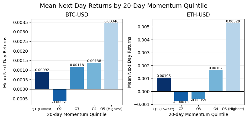
This block is building a small multiples chart that summarizes how next-day returns vary across 20-day momentum quintiles for each ticker — essentially a quick, visual test of short-horizon momentum predictability. It starts by allocating a grid of subplots sized to hold one panel per ticker and gives the figure a descriptive title so the reader immediately understands the metric being analyzed.
For each ticker the code constructs a focused DataFrame with two aligned series: the 20-day momentum and the corresponding next-day return. The explicit construction and subsequent dropna ensure each row represents a valid (momentum, next-day-return) observation; using .copy() avoids chained-assignment pitfalls when we mutate the DataFrame later. We then partition the observations into five equal-sized buckets with pd.qcut, labeling them from “Q1 (Lowest)” to “Q5 (Highest)”. Using quantile buckets (rather than fixed-width bins) forces roughly equal counts per bucket, which stabilizes the mean estimates across groups and makes it easier to compare across tickers with different return distributions.
Next the code computes the mean next-day return within each quintile via groupby(…)[‘next_day_return’].mean(). The observed=True argument for groupby on the categorical quintile ensures the result contains only the quintiles that actually appear in the data (avoiding empty categories), which is useful if a ticker has too few unique momentum values to form all five buckets. The mean is chosen here as a straightforward summary statistic to reveal direction and magnitude of any monotonic relationship between momentum and subsequent returns; be aware that means are sensitive to outliers and non-normal returns, so median, winsorized means, or bootstrapped confidence intervals are useful alternatives when you want robustness.
Visualization: each quintile’s mean return is drawn as a bar with a small color ramp from the Blues colormap. The bars are plotted in the natural order of the quintile index so the left-to-right axis corresponds to increasing 20-day momentum. A horizontal zero line is drawn and the y-grid is placed behind the bars to make positive/negative regimes immediately obvious; zorder parameters enforce the visual stacking (grid → bars → zero line). Tick labels, axis labels, and a per-panel title (the ticker) make each subplot self-contained for rapid scanning across the universe. Finally, the code annotates each bar with a numeric label and chooses vertical alignment depending on sign (place the label above positive bars and below negative ones) to avoid overlap and improve legibility.
A few practical notes relevant to production/analysis: pd.qcut will fail or produce unexpected buckets if there are too many tied momentum values or fewer than q distinct values — handle small-sample tickers explicitly (e.g., fallback to pd.cut, fewer quantiles, or drop the ticker). Ensure the subplot grid matches len(TICKERS) or you can get indexing errors; if you might have a variable number of tickers, compute rows/cols dynamically. Consider adding sample counts per quintile and confidence intervals (bootstrap or standard errors) if you need to judge statistical significance rather than just point estimates. Overall, this chart is a diagnostic for quant research: it reveals whether higher 20-day momentum corresponds to systematically higher (or lower) next-day returns and helps decide whether to construct momentum-based signal weights or to further investigate persistence and transaction-cost-adjusted profitability.
Simple binary strategy
# Backtest: Simple Binary Strategy

# Create subplots
fig, axes = plt.subplots(SUB_PLOTS_X, SUB_PLOTS_Y, figsize=(12, 6))
fig.suptitle(’Momentum Strategy Backtest: Equity Curves’, fontsize=14, y=0.98)

# Iterate through each ticker
for idx, ticker in enumerate(TICKERS):
    ax = axes[idx]

    # Prepare data for this ticker
    df_backtest = pd.DataFrame({
        ‘next_day_returns’: next_day_returns[(’NextDayReturns’, ticker)],
        ‘momo20’: momentum_20d[(’Momentum20D’, ticker)]
    }).dropna().copy()

    # Benchmark: Buy and Hold (using next day returns for fair comparison)
    df_backtest[’benchmark_equity’] = (1 + df_backtest[’next_day_returns’]).cumprod()

    # Strategy 1: Long only when momentum is positive
    df_backtest[’strategy1_returns’] = df_backtest[’next_day_returns’].where(
        df_backtest[’momo20’] > 0, 0
    )
    df_backtest[’strategy1_equity’] = (1 + df_backtest[’strategy1_returns’]).cumprod()

    # Strategy 2: Long/Short based on momentum sign
    df_backtest[’strategy2_returns’] = df_backtest[’next_day_returns’].where(
        df_backtest[’momo20’] > 0, -df_backtest[’next_day_returns’]
    )
    df_backtest[’strategy2_equity’] = (1 + df_backtest[’strategy2_returns’]).cumprod()

    # Plot equity curves
    ax.plot(df_backtest.index, df_backtest[’benchmark_equity’],
            label=’Buy & Hold’, color=’black’, linewidth=1.5, alpha=0.7)
    ax.plot(df_backtest.index, df_backtest[’strategy1_equity’],
            label=’Long Only (Momo > 0)’, color=’blue’, linewidth=1.5, alpha=0.7)
    ax.plot(df_backtest.index, df_backtest[’strategy2_equity’],
            label=’Long/Short’, color=’red’, linewidth=1.5, alpha=0.7)

    ax.set_xlabel(’Date’)
    ax.set_ylabel(’Equity (Starting $1)’)
    ax.set_title(f’{ticker}’)
    ax.legend(loc=’best’, fontsize=9)
    ax.grid(True, alpha=0.3)

plt.tight_layout()
plt.show()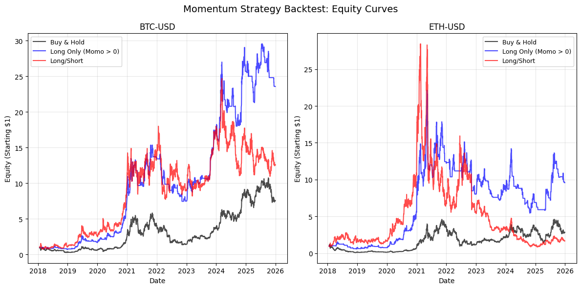
This block implements a straightforward backtest that compares a buy-and-hold benchmark to two momentum-based strategies on a per-ticker basis, and then plots their cumulative equity curves. The main design goal is to measure how simple sign-based momentum signals (20-day momentum here) would have performed relative to just holding the asset, using next-day returns so the tests avoid look-ahead bias and reflect realistic trade timing.
For each ticker the code first aligns the two input series into a single DataFrame and drops NA rows so every row has both a momentum signal and the following-day return. Constructing this DataFrame explicitly (and calling .copy()) prevents pandas alignment surprises and avoids SettingWithCopy issues; dropping missing values ensures the equity calculations are computed only on valid signal/return pairs. Using next-day returns is deliberate: the momentum indicator is evaluated on the close of day t and the trade outcome is the return from t to t+1, which models a rule where you observe the signal and then take a position for the next trading period.
The benchmark equity is created by cumulatively compounding (1 + return) across rows, which gives an equity curve starting at 1 that is directly comparable to the strategy curves. Compounding is done because it is the natural aggregation for multiplicative returns and makes relative performance straightforward to read on the same axis.
Strategy 1 (Long Only) uses a binary rule: if the 20-day momentum is positive, you go long for the next day; otherwise you hold cash (represented here as zero return). Technically the code uses pandas .where to keep the next-day return when momo > 0 and set it to 0 when momo <= 0. The choice to set the exposure to zero on non-positive momentum isolates the directional benefit of momentum without introducing short exposure, and implicitly models no leverage and full notional when long.
Strategy 2 (Long/Short) is similarly binary but symmetric: when momentum is positive it keeps the next-day return; when momentum is non-positive it inverts the return (i.e., takes -return), which models a fully funded short position of the same notional as the long position. This produces higher expected dispersion — it can remove market beta if the momentum signal is strong, but it also increases volatility and tail risk relative to the long-only variant because you are always fully exposed (either long or short).
Each strategy’s series of per-period returns is turned into an equity curve via cumulative product of (1 + returns), producing curves that start at $1. The plotting loop draws the benchmark, the long-only equity, and the long/short equity for each ticker on separate subplots, labeling axes and adding a legend so you can visually compare the trajectories and drawdowns across tickers. Using subplots per ticker helps you inspect cross-sectional behavior: whether momentum works consistently, only in certain regimes, or exhibits divergent behavior across assets.
Finally, note the implicit assumptions embedded in this implementation: equal full notional exposure when long or short (no position-sizing or volatility scaling), no transaction costs or slippage, daily rebalancing at the close-to-close frequency, and a simple zero threshold on momentum (no hysteresis or minimum effect size). Those simplifications are fine for a first-pass comparative backtest, but you should be explicit about them when interpreting results and consider adding costs, leverage constraints, and risk management if you want the results to better reflect tradable performance.
# Plot 20-day momentum for both tickers
fig, axes = plt.subplots(SUB_PLOTS_X, SUB_PLOTS_Y, figsize=(8, 4))
fig.suptitle(’20-Day Momentum Over Time’, fontsize=14, y=0.98)

for idx, ticker in enumerate(TICKERS):
    ax = axes[idx]

    ax.plot(momentum_20d.index, momentum_20d[(’Momentum20D’, ticker)],
            linewidth=1, alpha=0.7, color=’blue’)
    ax.axhline(y=0, color=’red’, linestyle=’--’, alpha=0.5, linewidth=1)

    ax.set_xlabel(’Date’)
    ax.set_ylabel(’20-Day Momentum’)
    ax.set_title(f’{ticker}’)
    ax.grid(True, alpha=0.2, color=’lightgray’)

    # Format x-axis to show only last 2 digits of year
    ax.xaxis.set_major_formatter(plt.matplotlib.dates.DateFormatter(”’%y”))

plt.tight_layout()
plt.show()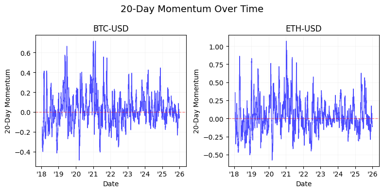
The block begins by allocating a figure and a grid of subplots sized to fit two (or however many) small panels — this is setting up a compact, side-by-side comparison so we can visually compare the same indicator across tickers without different scales or layout differences. The suptitle anchors the whole figure with a descriptive caption (“20-Day Momentum Over Time”) and the y offset is nudged slightly down so it doesn’t collide with subplot content; in short, we want a clean, single label that makes the chart’s purpose immediately obvious when reviewing backtest outputs or signal charts.
Inside the loop we iterate over the tickers and pick the corresponding Axes object for each iteration. The plotted series comes from momentum_20d.index (the date index) and the DataFrame column keyed as (‘Momentum20D’, ticker), which implies the momentum values are stored in a MultiIndex column layout — this keeps the indicator name and the ticker aligned and prevents accidental mixing of series. Using the DataFrame index ensures correct chronological alignment so day-to-day signal changes are plotted in temporal order, which is essential when visually inspecting signal stability or regime shifts.
We draw the momentum line with modest linewidth and a semi-transparent alpha to keep the trace visible without overwhelming the panel; consistent color and stroke weight make it easier to compare amplitude and volatility across tickers. Immediately after plotting the series we add a horizontal dashed line at y=0 in red: that zero baseline is the critical decision threshold for a momentum strategy — values above zero usually imply positive momentum (a long bias) and below zero imply negative momentum (a short or neutral bias). Putting that baseline on every subplot makes quick visual gating and cross-ticker comparisons straightforward.
Labels and subplot titles are set per panel so each small chart is self-describing when reviewed independently, which is helpful when assembling composite reports or when multiple people inspect a result; the grid with low alpha and light gray color is a visual aid that improves readability of the series without creating visual clutter. The x-axis is formatted to show only the last two digits of the year (“‘%y”), a deliberate readability choice for monthly-to-yearly plots so tick labels don’t dominate the horizontal space and you can quickly see the time period without long strings.
Finally, tight_layout is called to remove overlaps between subplots and axes annotations, and plt.show() renders the figure. One practical note: this code assumes axes is indexable as a one-dimensional array (i.e., the subplot configuration produces a flat list of axes equal to the number of tickers); if you change SUB_PLOTS_X/Y you should ensure the indexing logic still maps to the correct axes. Overall, the visualization is designed to make a momentum signal’s sign, magnitude, and temporal evolution immediately apparent for trading decisions and for validating the behavior of your 20-day momentum signal across instruments.
# Volatility-normalized momentum
volatility_20d = momentum_20d[’Momentum20D’].rolling(window=20).std()
volatility_20d.columns = pd.MultiIndex.from_product([[’Volatility20D’], volatility_20d.columns])

# Normalized momentum = momentum / volatility
# Extract the ticker-level data for both to align them properly
momentum_values = momentum_20d[’Momentum20D’]
volatility_values = volatility_20d[’Volatility20D’]

normalized_momentum_20d = momentum_values / volatility_values
normalized_momentum_20d.columns = pd.MultiIndex.from_product([[’NormalizedMomentum20D’], TICKERS])

# Add to data
data = pd.concat([data, volatility_20d, normalized_momentum_20d], axis=1)

# Plot normalized momentum for both tickers
fig, axes = plt.subplots(SUB_PLOTS_X, SUB_PLOTS_Y, figsize=(8, 4))
fig.suptitle(’Volatility-Normalized 20-Day Momentum Over Time’, fontsize=14, y=0.98)

for idx, ticker in enumerate(TICKERS):
    ax = axes[idx]

    ax.plot(normalized_momentum_20d.index, normalized_momentum_20d[(’NormalizedMomentum20D’, ticker)],
            linewidth=1, alpha=0.7, color=’blue’)
    ax.axhline(y=0, color=’red’, linestyle=’--’, alpha=0.5, linewidth=1)

    ax.set_xlabel(’Date’)
    ax.set_ylabel(’Normalized Momentum’)
    ax.set_title(f’{ticker}’)
    ax.grid(True, alpha=0.2, color=’lightgray’)

    # Format x-axis to show only last 2 digits of year
    ax.xaxis.set_major_formatter(plt.matplotlib.dates.DateFormatter(”’%y”))

plt.tight_layout()
plt.show()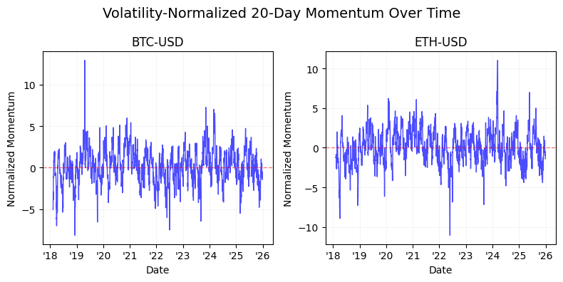
This block takes a raw 20-day momentum signal and turns it into a risk‑adjusted, comparable trading signal, then adds it to the pipeline and visualizes it per ticker. First, the code measures the short‑term variability of the momentum itself by computing a 20‑day rolling standard deviation of the Momentum20D series. That rolling std is the empirical volatility of the momentum signal over a recent window; using a rolling std here intentionally captures how noisy or reliable the signal has been recently so we can scale the signal by its recent uncertainty. Because the rolling window produces NaNs for the first 19 rows (no full window), that behavior implicitly enforces a warm-up period where the normalized signal is not available — something to account for in any downstream backtest or live logic.
Next, the code aligns the momentum and its volatility at the ticker level and divides momentum by its volatility to produce a normalized momentum series. Dividing the raw momentum by its rolling volatility accomplishes a Sharpe‑like, unitless measure: large momentum in a high‑volatility context is downweighted, and the same raw momentum in a low‑volatility context is amplified. That normalization is central to cross‑sectional quant trading because it lets you compare signals between assets with very different volatilities and apply common decision rules or thresholding (e.g., take long when normalized momentum exceeds +x, short when below −x). Practically, you must be mindful of zero or near‑zero volatilities (division by zero); in a production pipeline you should replace zeros with a small epsilon or otherwise handle those rows to avoid exploding values.
After creating the NormalizedMomentum20D frame, the code concatenates both the volatility and normalized momentum back into the main data store so later stages (ranking, portfolio construction, risk checks) have access to both the raw and scaled signals. This keeps the pipeline self‑contained: you can use the volatility for risk-weighting or for behavior checks, and the normalized momentum directly for trade signals.
Finally, the block visualizes the normalized momentum per ticker. It creates subplots (one per ticker as controlled by SUB_PLOTS_X/SUB_PLOTS_Y), plots the time series of the normalized momentum, and overlays a horizontal zero line as the natural decision boundary between long and short regimes. Presentation choices — line alpha, grid, and tight layout — are there to make the time series readable and to ensure titles/labels don’t overlap; the date formatter is set to show only the last two digits of the year, making long time ranges compact on the x‑axis. Overall, this sequence converts a raw momentum indicator into a volatility‑adjusted, comparable signal suitable for cross‑asset ranking and rule‑based trade generation, while also recording and visualizing the components you’d want to audit in a trading workflow.
Bounding using tanh squashing
# Bounded signal using tanh squashing with k=2
k = 1
bounded_signal = np.tanh(normalized_momentum_20d / k)
bounded_signal.columns = pd.MultiIndex.from_product([[’BoundedSignal’], TICKERS])

# Plot bounded signal for both tickers
fig, axes = plt.subplots(SUB_PLOTS_X, SUB_PLOTS_Y, figsize=(8, 4))
fig.suptitle(f’Bounded Signal (tanh, k={k}) Over Time’, fontsize=14, y=0.98)

for idx, ticker in enumerate(TICKERS):
    ax = axes[idx]

    ax.plot(bounded_signal.index, bounded_signal[(’BoundedSignal’, ticker)],
            linewidth=1, alpha=0.7, color=’blue’)
    ax.axhline(y=1, color=’green’, linestyle=’--’, alpha=0.5, linewidth=1)
    ax.axhline(y=0, color=’black’, linestyle=’--’, alpha=0.5, linewidth=1)
    ax.axhline(y=-1, color=’red’, linestyle=’--’, alpha=0.5, linewidth=1)

    ax.set_xlabel(’Date’)
    ax.set_ylabel(’Bounded Signal’)
    ax.set_title(f’{ticker}’)
    ax.grid(True, alpha=0.2, color=’lightgray’)
    ax.set_ylim([-1.1, 1.1])

    # Format x-axis to show only last 2 digits of year
    ax.xaxis.set_major_formatter(plt.matplotlib.dates.DateFormatter(”’%y”))

plt.tight_layout()
plt.show()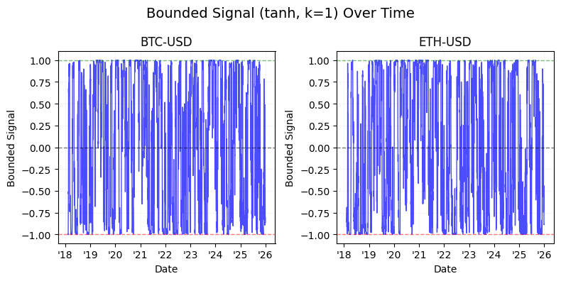
This block takes a pre-computed, normalized momentum series and turns it into a bounded trading signal, then visualizes that signal for each ticker. The key transformation is bounded_signal = tanh(normalized_momentum_20d / k): by applying a hyperbolic tangent we map an unbounded input to the interval (-1, 1). That matters in quant trading because downstream logic (position sizing, risk limits, portfolio construction) often requires limited exposures — tanh is a smooth, monotonic squashing function that preserves the ordering of signals (so rankings and directional intent remain intact) while capping extreme values so outliers cannot drive outsized position sizes or leverage spikes. The division by k is a simple sensitivity control: smaller k amplifies the input and pushes tanh toward its saturation plateaus (more clipping), while larger k compresses the input and keeps the mapping closer to linear (less clipping). Note the inline comment says k=2 but the code sets k=1; that difference changes how aggressively the signal saturates and should be set deliberately.
After computing the squeezed signal, the code assigns a MultiIndex column name ([‘BoundedSignal’, ticker]) so the result fits nicely into a panel-style DataFrame convention often used when handling multiple instruments. This naming makes downstream selection and plotting consistent with other multi-field dataframes (e.g., Price / Momentum / Signal).
The plotting section creates subplots and then, for each ticker, draws the bounded signal over time. Each axis plots the bounded series, and horizontal reference lines at +1, 0, and -1 make the effective caps and neutral level visually explicit — green for the long cap, black for neutral, red for the short cap. The plot styling choices (alpha, linewidth, grid, and a slightly expanded y-limits of [-1.1, 1.1]) are practical: they improve readability while showing the saturation behavior around the ±1 boundaries. The x-axis is formatted to show only the last two digits of the year (“‘%y”), which keeps the time axis compact and readable in multi-panel layouts. Finally, tight_layout is used to avoid overlapping labels and plt.show() renders the figure.
Operationally, this pattern is useful as the final step before converting signals into position sizes or order instructions. Using tanh gives you a stable, bounded signal that reacts linearly for small, informative momentum values (so you still get proportional sizing near zero) but limits the influence of extreme momentum readings. Two practical caveats: tune k deliberately based on your normalized input distribution (and be aware the comment/code mismatch); and remember that the nonlinearity will change the distributional properties of your signal (e.g., compressing tails and potentially altering mean/skew), so re-evaluate any risk or execution logic that assumed linearity.
# Backtest: Bounded Signal Strategy with tanh squashing

# Create subplots
fig, axes = plt.subplots(SUB_PLOTS_X, SUB_PLOTS_Y, figsize=(8, 4))
fig.suptitle(’Momentum Strategy Backtest: Equity Curves (Bounded Signal w/ tanh)’, fontsize=14, y=0.98)

# Iterate through each ticker
for idx, ticker in enumerate(TICKERS):
    ax = axes[idx]

    # Prepare data for this ticker
    df_bounded = pd.DataFrame({
        ‘next_day_returns’: next_day_returns[(’NextDayReturns’, ticker)],
        ‘bounded_signal’: bounded_signal[(’BoundedSignal’, ticker)]
    }).dropna().copy()

    # Benchmark: Buy and Hold
    df_bounded[’benchmark_equity’] = (1 + df_bounded[’next_day_returns’]).cumprod()

    # Strategy: Bounded signal - long only (only take position when signal > 0)
    df_bounded[’returns_k’] = df_bounded[’next_day_returns’] * df_bounded[’bounded_signal’].clip(lower=0)
    df_bounded[’equity_k’] = (1 + df_bounded[’returns_k’]).cumprod()

    # Strategy: Bounded signal - long/short (use signal as weight)
    df_bounded[’returns_bounded_ls’] = df_bounded[’next_day_returns’] * df_bounded[’bounded_signal’]
    df_bounded[’equity_bounded_ls’] = (1 + df_bounded[’returns_bounded_ls’]).cumprod()

    # Plot equity curves
    ax.plot(df_bounded.index, df_bounded[’benchmark_equity’],
            label=’Buy & Hold’, color=’black’, linewidth=1.5, alpha=0.7)
    ax.plot(df_bounded.index, df_bounded[’equity_k’],
            label=’Bounded Signal (Long only)’, color=’green’, linewidth=1.5, alpha=0.7)
    ax.plot(df_bounded.index, df_bounded[’equity_bounded_ls’],
            label=’Bounded Signal (Long/Short)’, color=’blue’, linewidth=1.5, alpha=0.7)

    ax.set_xlabel(’Date’)
    ax.set_ylabel(’Equity (Starting $1)’)
    ax.set_title(f’{ticker}’)
    ax.legend(loc=’best’, fontsize=9)
    ax.grid(True, alpha=0.3)

    # Format x-axis to show only last 2 digits of year
    ax.xaxis.set_major_formatter(plt.matplotlib.dates.DateFormatter(”’%y”))

plt.tight_layout()
plt.show()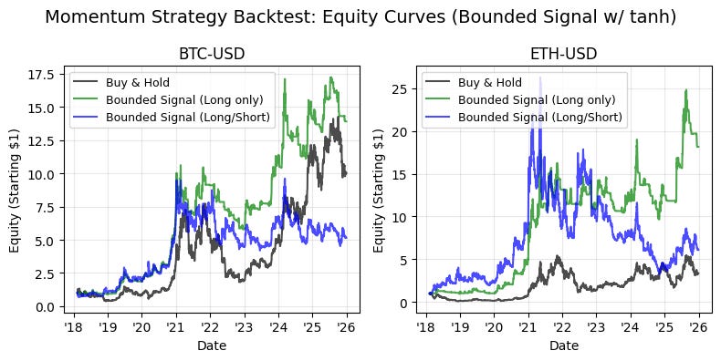
This block is a backtest visualization for a momentum-based strategy where raw signals have been squashed (e.g., with tanh) into a bounded range. It constructs one subplot per ticker and plots three equity curves — a buy-and-hold benchmark, a long-only variant of the bounded-signal strategy, and a long/short variant that uses the bounded signal as a weight. The overall aim is to compare how bounding the signal affects realized returns and risk relative to simply holding the asset.
For each ticker we first assemble a working DataFrame that pairs the next-day returns with the precomputed bounded signal. Using dropna() ensures we only operate on aligned, valid rows and .copy() avoids chained-assignment pitfalls downstream. This alignment is critical: next_day_returns represent the P&L the strategy will actually realize, and bounded_signal is the exposure determined at the close (after squashing with tanh). Ensuring these two series are aligned and clean prevents look-ahead bias and misapplied returns.
The buy-and-hold benchmark is computed by cumulatively compounding (1 + next_day_returns), starting from 1. This gives a baseline growth curve that reflects simply owning the asset without any active exposure decisions. Using cumulative product is the standard way to visualize compounded portfolio growth over time when returns are applied multiplicatively.
The first strategy curve implements a long-only interpretation of the bounded signal. The code clips the bounded signal at zero (clip(lower=0)) so any negative values — which would indicate a short or negative conviction — are treated as zero exposure. Multiplying next-day returns by this clipped signal converts a normalized signal into a realized P&L contribution: if the signal is 0.5 you take a half-sized long exposure and therefore capture half the asset return that day. The resulting time series is then compounded to produce an equity curve. The reason for clipping is purely risk/mandate driven: a fund constrained to long-only must ignore negative signals rather than invert them.
The second strategy curve uses the bounded signal directly as a weight, allowing negative values to produce short exposure. This long/short variant therefore captures both positive and negative convictions; negative signal values multiplied by positive asset returns produce negative contributions (i.e., short losses) and vice versa. Because the signal has been squashed into a bounded range (typically [-1, 1] via tanh), the strategy’s per-period leverage is constrained, which reduces tail risk and prevents extreme position sizing that could otherwise arise from raw, unbounded model outputs.
Plotting overlays the three cumulative equity traces per ticker so you can visually compare absolute performance and drawdown dynamics. Formatting choices (start-at-1 compounding, consistent colors/labels, date formatting to two-digit years) are aimed at quick, side-by-side interpretation across multiple tickers. Note the implicit assumptions here: returns are applied with full reinvestment and no transaction costs, slippage, or margin/leverage constraints — all of which materially affect real-world implementation. Also, the simple multiplication of signal×return assumes the signal is already scaled to the desired notional exposure; you may want additional normalization (e.g., volatility targeting, turnover penalties, or position caps) in a production strategy.
In short, this code turns bounded signals into tradable exposures, compares long-only versus long/short behavior, and uses cumulative return plots to expose how tanh-bounded signals moderate realized performance and risk relative to buy-and-hold. For production-grade analysis, consider adding transaction cost models, position-scaling logic, and risk-adjusted performance metrics (Sharpe, max drawdown) to complement these equity-curve visuals.
Bounding with Fixed Limits (-1.5 and 1.5)
# Bounded signal using fixed limits -2, 2 and scaled by 0.75
lower_limit = -2
upper_limit = 2
scale_factor = 0.75

bounded_signal_fixed = normalized_momentum_20d.clip(lower=lower_limit, upper=upper_limit) * scale_factor
bounded_signal_fixed.columns = pd.MultiIndex.from_product([[’BoundedSignalFixed’], TICKERS])

# Plot bounded signal for both tickers
fig, axes = plt.subplots(SUB_PLOTS_X, SUB_PLOTS_Y, figsize=(8, 4))
fig.suptitle(f’Bounded Signal (fixed limits [{lower_limit}, {upper_limit}], scaled by {scale_factor}) Over Time’, fontsize=14, y=0.98)

for idx, ticker in enumerate(TICKERS):
    ax = axes[idx]

    ax.plot(bounded_signal_fixed.index, bounded_signal_fixed[(’BoundedSignalFixed’, ticker)],
            linewidth=1, alpha=0.7, color=’blue’)
    ax.axhline(y=upper_limit * scale_factor, color=’green’, linestyle=’--’, alpha=0.5, linewidth=1)
    ax.axhline(y=0, color=’black’, linestyle=’--’, alpha=0.5, linewidth=1)
    ax.axhline(y=lower_limit * scale_factor, color=’red’, linestyle=’--’, alpha=0.5, linewidth=1)

    ax.set_xlabel(’Date’)
    ax.set_ylabel(’Bounded Signal’)
    ax.set_title(f’{ticker}’)
    ax.grid(True, alpha=0.2, color=’lightgray’)
    ax.set_ylim([lower_limit * scale_factor * 1.1, upper_limit * scale_factor * 1.1])

    # Format x-axis to show only last 2 digits of year
    ax.xaxis.set_major_formatter(plt.matplotlib.dates.DateFormatter(”’%y”))

plt.tight_layout()
plt.show()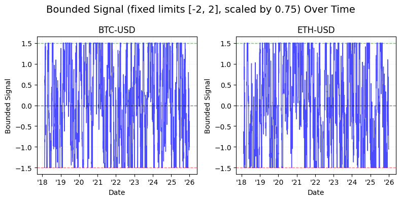
We start by establishing the operational constraints for the signal: fixed hard bounds at -2 and +2 and a conservative amplitude reduction via a scale factor of 0.75. The incoming data, normalized_momentum_20d, is assumed to be a per-ticker time series already normalized to a consistent scale; the clip(…) call enforces hard limits so any extreme momentum values are truncated to the interval [-2, 2]. Immediately multiplying by scale_factor reduces the magnitude of every clipped value by 25%, which is a deliberate risk-control choice — it prevents subsequent components (position sizing logic, leverage calculations, or order sizing) from acting on full clipped extremes and thus reduces tail exposure and potential turnover impact.
After computing the bounded-and-scaled signal, the code sets a MultiIndex column label with a top-level name (‘BoundedSignalFixed’) and the tickers underneath. This naming convention keeps the derived signal distinct from other signals in the same DataFrame and makes it straightforward to reference the exact series later via the tuple key (‘BoundedSignalFixed’, ticker).
The remaining block is a visualization and sanity-check. A small subplots grid is created for compact side-by-side inspection across tickers; the figure title documents the bounding parameters so the display is self-describing. In the per-ticker loop the code pulls the time series for that ticker and plots it. The three horizontal dashed lines represent the scaled upper limit, the zero baseline, and the scaled lower limit; these lines make it easy to see how often and by how much the signal saturates at the hard bounds and how centered the signal is around zero. Visual choices (thin lines, reduced alpha) are purely for readability — they keep the guideline lines visible but not dominant.
Axis configuration reinforces interpretation: y-limits are set slightly beyond the scaled bounds (10% padding) to avoid clipping the guideline lines and to give visual breathing room when the series exactly hits the limits. The x-axis date formatter shortens years to two digits, making long time ranges more compact and easier to read in a small subplot. Finally, tight_layout and show() finalize the display.
From a quant trading perspective, this entire sequence is a protective preprocessing step: normalize upstream, then hard-bound and scale the signal so downstream portfolio construction sees bounded, conservative inputs. The plot is the operational check — it quickly answers whether the bounding is frequently active (which would indicate either extreme momentum behavior or overly tight bounds) and whether scaling is producing the intended reduction in amplitude before you turn these signals into positions or orders.
# Backtest: Bounded Signal Strategy with fixed limits

# Create subplots
fig, axes = plt.subplots(SUB_PLOTS_X, SUB_PLOTS_Y, figsize=(8, 4))
fig.suptitle(’Momentum Strategy Backtest: Equity Curves (Bounded Signal Fixed)’, fontsize=14, y=0.98)

# Iterate through each ticker
for idx, ticker in enumerate(TICKERS):
    ax = axes[idx]

    # Prepare data for this ticker
    df_bounded_fixed = pd.DataFrame({
        ‘next_day_returns’: next_day_returns[(’NextDayReturns’, ticker)],
        ‘bounded_signal_fixed’: bounded_signal_fixed[(’BoundedSignalFixed’, ticker)]
    }).dropna().copy()

    # Benchmark: Buy and Hold (= 100% long)
    df_bounded_fixed[’benchmark_equity’] = (1 + df_bounded_fixed[’next_day_returns’]).cumprod()

    # Strategy: Bounded signal - long only (only take position when signal > 0)
    df_bounded_fixed[’returns_k’] = df_bounded_fixed[’next_day_returns’] * df_bounded_fixed[’bounded_signal_fixed’].clip(lower=0)
    df_bounded_fixed[’equity_k’] = (1 + df_bounded_fixed[’returns_k’]).cumprod()

    # Strategy: Bounded signal - long/short (use signal as weight)
    df_bounded_fixed[’returns_bounded_ls’] = df_bounded_fixed[’next_day_returns’] * df_bounded_fixed[’bounded_signal_fixed’]
    df_bounded_fixed[’equity_bounded_ls’] = (1 + df_bounded_fixed[’returns_bounded_ls’]).cumprod()

    # Plot equity curves
    ax.plot(df_bounded_fixed.index, df_bounded_fixed[’benchmark_equity’],
            label=’Buy & Hold’, color=’black’, linewidth=1.5, alpha=0.7)
    ax.plot(df_bounded_fixed.index, df_bounded_fixed[’equity_k’],
            label=’Bounded Signal (Long only)’, color=’green’, linewidth=1.5, alpha=0.7)
    ax.plot(df_bounded_fixed.index, df_bounded_fixed[’equity_bounded_ls’],
            label=’Bounded Signal (Long/Short)’, color=’blue’, linewidth=1.5, alpha=0.7)

    ax.set_xlabel(’Date’)
    ax.set_ylabel(’Equity (Starting $1)’)
    ax.set_title(f’{ticker}’)
    ax.legend(loc=’best’, fontsize=9)
    ax.grid(True, alpha=0.3)

    # Format x-axis to show only last 2 digits of year
    ax.xaxis.set_major_formatter(plt.matplotlib.dates.DateFormatter(”’%y”))

plt.tight_layout()
plt.show()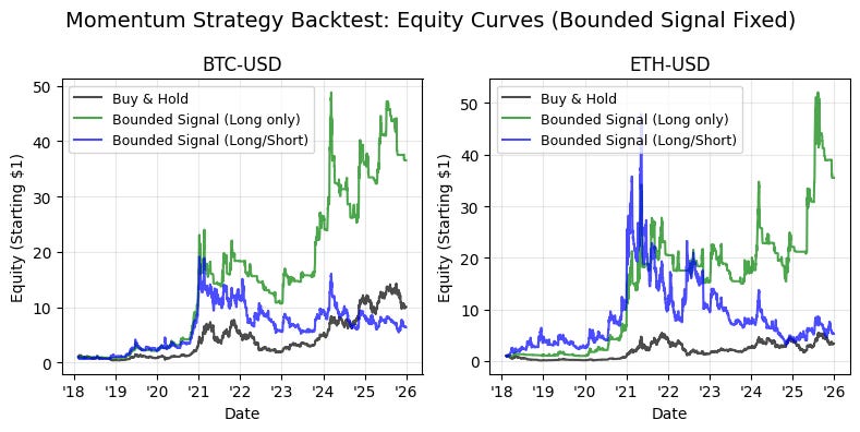
The block implements a small backtest visualization for a “bounded signal” momentum strategy, comparing two signal interpretations (long-only and long/short) against a buy-and-hold benchmark for each ticker. The outer loop iterates tickers and builds a per-ticker DataFrame that aligns the precomputed next-day returns with the precomputed bounded signal (the fixed, capped signal). We drop missing rows and copy the slice so downstream operations are applied to a clean, self-contained frame; this alignment is important because the signal is intended to be applied to the next day’s return, and any misalignment or NaNs would otherwise bias the cumulative performance calculation.
For the benchmark we simply assume a full 100% long position at all times: benchmark_equity = (1 + next_day_returns).cumprod(). Using a cumulative product starting from 1 models a single-dollar investment that is fully exposed to the asset each day, so the curve is the baseline against which the strategy’s path is compared. This is the simplest reference that shows whether systematically trading signals add or subtract value relative to passive ownership.
The first strategy variant is the bounded signal applied in a long-only manner. Here we multiply the next-day returns by bounded_signal_fixed.clip(lower=0). The clip(lower=0) step enforces that any negative signal is treated as zero exposure — we never go short — so the strategy only takes positive bets. Multiplying the return by the clipped signal converts the signal into a position weight for the next-day return: a signal of 0.5 means we are half-exposed, 1.0 means fully exposed, etc. The subsequent cumulative product (1 + returns_k).cumprod() builds the equity curve assuming the signal weight directly scales exposure; note that this implies no explicit transaction costs, no transaction frictions, and no separate risk-targeting beyond the raw signal magnitude.
The second strategy variant keeps the bounded signal as-is and treats it as a signed weight (long/short). returns_bounded_ls = next_day_returns * bounded_signal_fixed allows negative signal values to produce negative returns (i.e., short exposure), so the equity curve reflects both positive and negative positions. This variant is useful when the bounded signal has been symmetrically scaled (for example into [-1, 1]) to represent both conviction and direction. As with the long-only curve, the equity is (1 + returns).cumprod(), so the same starting capital and compounding assumption keep the curves directly comparable.
All three series are plotted on per-ticker subplots so you can visually assess relative performance, path dependence, and timing — for example, whether the bounded signal reduces drawdowns, accelerates upside, or merely changes volatility. The axes are labeled and a compact legend is shown so you can read each curve easily; the x-axis formatter shortens years to two digits to keep the date axis readable in small subplots. A couple of implicit modeling decisions to note: the code assumes returns are applied next day (signal is predictive and used as a weight one period forward), signal magnitudes map directly to capital exposure (so magnitudes >1 imply leverage), and there are no transaction costs, slippage, or position-sizing rules beyond the signal itself. Those simplifying assumptions make the plots a clean comparison of signal value, but you should extend the backtest to include costs and risk-targeting before drawing production conclusions.
