

Quant Trading 101: Pairs & Allocations
The essential Python guide to modern Quant Trading systems.

Download entire code using the button at the end of this article!
In the modern financial landscape, the ability to test hypotheses against historical data is a significant edge. This article explores the dual pillars of quant trading: short-term tactical opportunities and long-term strategic positioning. We first examine a statistical arbitrage model, demonstrating how to capitalize on price divergences between highly correlated assets like Coca-Cola and Pepsi. We then pivot to portfolio management, applying mathematical optimization to construct a ‘Max Sharpe’ global portfolio. Readers can expect a comprehensive walkthrough of the entire research pipeline — from cleaning raw financial data to interpreting risk-adjusted returns — offering a clear blueprint for building your own systematic trading models.
This is an illustrative pairs-trading example using Coca‑Cola (KO) and PepsiCo (PEP). Although the two companies differ fundamentally — KO has roughly half the sales of PEP but a higher net income — both manufacture, distribute, and sell soft beverages.
The market already incorporates past information. If new information is released that affects both companies (for example, new regulations in the beverage sector), it is expected to impact them similarly, so their prices should move in the same direction.
This strategy assumes that when prices diverge from their historical equilibrium (measured here by rolling correlation), the company that traded at a lower valuation over the prior week will revert and “catch up” during the trading session. Positions are opened at the market open and closed at the market close. (Slippage and transaction costs can be incorporated but are not accounted for here.)
# python 3.7

# For yahoo finance
import io
import re
import requests

# The usual suspects
import numpy             as np
import pandas            as pd
import matplotlib.pyplot as plt

# Fancy graphics
plt.style.use(’seaborn’)

# Getting Yahoo finance data
def getdata(tickers,start,end,frequency):
    OHLC = {}
    cookie = ‘’
    crumb = ‘’
    res = requests.get(’https://finance.yahoo.com/quote/SPY/history’)
    cookie = res.cookies[’B’]
    pattern = re.compile(’.*”CrumbStore”:\{”crumb”:”(?P<crumb>[^”]+)”\}’)
    for line in res.text.splitlines():
        m = pattern.match(line)
        if m is not None:
            crumb = m.groupdict()[’crumb’]
    for ticker in tickers:
        url_str = “https://query1.finance.yahoo.com/v7/finance/download/%s”
        url_str += “?period1=%s&period2=%s&interval=%s&events=history&crumb=%s”
        url = url_str % (ticker, start, end, frequency, crumb)
        res = requests.get(url, cookies={’B’: cookie}).text
        OHLC[ticker] = pd.read_csv(io.StringIO(res), index_col=0,
                                   error_bad_lines=False).replace(’null’, np.nan).dropna()
        OHLC[ticker].index = pd.to_datetime(OHLC[ticker].index)
        OHLC[ticker] = OHLC[ticker].apply(pd.to_numeric)
    return OHLC

# Assets under consideration
tickers = [’PEP’,’KO’]

data = None
while data is None:
    try:
        data = getdata(tickers,’946685000’,’1687427200’,’1d’)
    except:
         pass

KO = data[’KO’]
PEP = data[’PEP’]
This block is a small data-ingest pipeline whose goal is to produce clean, time-indexed OHLC (open/high/low/close/volume) DataFrames for the two candidate tickers so we can do pairs-trading analysis (spread construction, cointegration tests, backtests, etc.). The logic proceeds in two phases: first, a short handshake with Yahoo Finance to obtain the ephemeral download token (crumb + cookie), and second, a per-ticker CSV download and sanitization into Pandas DataFrames.
We start by requesting the HTML for a Yahoo historical page (here SPY is used as a stable page) to extract the crumb and cookie that Yahoo embeds in the page and requires for programmatic CSV downloads. The code reads the response cookies and scans the page text with a regex for the “CrumbStore” value. That crumb is an anti-scraping token that changes periodically; pairing it with the cookie value is necessary to build a valid CSV-download URL for the historical price API endpoint. This step explains why we don’t just call a static URL — Yahoo requires these values as part of the authenticated CSV download flow.
Once the crumb and cookie are obtained, the function iterates over the requested tickers and constructs a query URL that includes period1/period2 (Unix-epoch seconds) and an interval (e.g., “1d”). It issues a GET to the Yahoo CSV download endpoint while sending the cookie back in the request. The response text is the CSV content, which the code passes into pandas.read_csv via an in-memory StringIO buffer. This yields a tabular OHLC dataset per ticker with the first column (date) set as the index.
After reading, there’s a small but important sanitization pipeline: replace ‘null’ strings with np.nan, drop any rows that contain NaNs, convert the index to pandas datetime objects, and coerce every column to numeric types. Each of these transformations has a purpose for downstream quant workflows: coercing numeric types ensures arithmetic (returns, spreads, regressions) behaves correctly and prevents subtle dtype bugs; datetime indices allow alignment, resampling, and time-based joins; and removing nulls gives you contiguous numeric series for statistical tests. That said, dropping rows with NaNs silently can be dangerous for pairs trading because it may cause the two series to be misaligned or reduce overlapping observations asymmetrically — for pairs analysis you typically want to align both tickers on a common date index (inner join on the two date indices) and often prefer the ‘Adj Close’ column to account for dividends and splits.
Surrounding this, the module runs getdata inside a loop that retries until it succeeds. That’s a pragmatic way to handle transient network failures or occasional scraping hiccups when extracting crumb/cookie, but it’s also brittle: there’s no backoff, no max retry count, and the bare except hides the failure reason. In production you’d want to limit retries, log exceptions, and surface meaningful errors. Also note the implementation relies on HTML parsing with a regex and the cookie key ‘B’ — both of which are fragile because Yahoo can (and does) change page structure and cookie naming. A more robust approach is to use a maintained client library (e.g., yfinance) or an authenticated data vendor.
Finally, for pairs-trading specifically, remember to: 1) use adjusted-close prices for constructing spreads and estimating cointegration or hedge ratios, 2) align the two DataFrames on the same date index (inner join) so you only compare overlapping history, 3) examine the effect of dropping NaNs (or prefer forward/backward fill only when appropriate), and 4) consider adding logging, retry limits, and sanity checks (minimum overlap, no duplicate dates) to make the download stage production-ready.
#tc = -0.0005 # Transaction costs

pairs = pd.DataFrame({’TPEP’:PEP[’Close’].shift(1)/PEP[’Close’].shift(2)-1,
                      ‘TKO’:KO[’Close’].shift(1)/KO[’Close’].shift(2)-1})

# Criteria to select which asset we’re gonna buy, in this case, the one that had the lowest return yesterday
pairs[’Target’] = pairs.min(axis=1)

# Signal that triggers the purchase of the asset
pairs[’Correlation’] = ((PEP[’Close’].shift(1)/PEP[’Close’].shift(20)-1).rolling(window=9)
                        .corr((KO[’Close’].shift(1)/KO[’Close’].shift(20)-1)))

Signal = pairs[’Correlation’] < 0.9

# We’re holding positions that weren’t profitable yesterday
HoldingYesterdayPosition = ((pairs[’Target’].shift(1).isin(pairs[’TPEP’]) &
                             (PEP[’Close’].shift(1)/PEP[’Open’].shift(1)-1 < 0)) |
                            (pairs[’Target’].shift(1).isin(pairs[’TKO’]) &
                             (KO[’Close’].shift(1)/KO[’Open’].shift(1)-1 < 0))) # if tc, add here

# Since we aren’t using leverage, we can’t enter on a new position if
# we entered on a position yesterday (and if it wasn’t profitable)
NoMoney = Signal.shift(1) & HoldingYesterdayPosition

pairs[’PEP’] = np.where(NoMoney,
                        np.nan,
                        np.where(PEP[’Close’]/PEP[’Open’]-1 < 0,
                                 PEP[’Close’].shift(-1)/PEP[’Open’]-1,
                                 PEP[’Close’]/PEP[’Open’]-1))

pairs[’KO’] = np.where(NoMoney,
                       np.nan,
                       np.where(KO[’Close’]/KO[’Open’]-1 < 0,
                                KO[’Close’].shift(-1)/KO[’Open’]-1,
                                KO[’Close’]/KO[’Open’]-1))

pairs[’Returns’] = np.where(Signal,
                            np.where(pairs[’Target’].isin(pairs[’TPEP’]),
                                      pairs[’PEP’],
                                      pairs[’KO’]),
                             np.nan) # if tc, add here

pairs[’CumulativeReturn’] = pairs[’Returns’].dropna().cumsum()
This block implements a simple, rule-based pairs-trading backtest that selects which of two stocks (PEP or KO) to go long on each day, applies a correlation filter to avoid trading overly co-moving pairs, enforces a crude money/position constraint, and computes realized returns with a small intraday/overnight holding convention. The overall strategy objective is to buy the pair member that underperformed recently (expecting mean reversion) while avoiding trades when the pair behaves too similarly or when capital is tied up by an unprofitable prior trade.
First, the code constructs short-horizon historical returns used for selection: ‘TPEP’ and ‘TKO’ are yesterday’s daily returns (close at t-1 over close at t-2 minus 1). Using shifted prices ensures the selection logic only uses information that would have been available before the trading decision on day t, i.e., no lookahead for the selection step. The strategy’s buy candidate for each date is then the asset with the lower return yesterday (pairs[‘Target’] = min). The motivation is a mean-reversion heuristic: we target the most recently weak performer for a long entry in expectation of a bounce.
Next, the code computes a rolling correlation between longer-window returns of the two assets and uses that correlation as a trade-quality filter. Each series used for the correlation is a longer-term return ending yesterday (close.shift(1)/close.shift(20)-1), and the 9-period rolling correlation of these values measures recent co-movement. The Signal is True when that correlation is below 0.9 — in other words, only enter trades when the two instruments are not almost perfectly correlated. The practical why here is to avoid entering pairs trades when the two names move nearly identically, because our mean-reversion bet on relative divergence is less likely to work in that regime.
The code then identifies whether we “held an unprofitable position yesterday.” It checks yesterday’s target (Target.shift(1)) to see which ticker was chosen and whether that ticker’s intraday P&L yesterday (close.shift(1)/open.shift(1)-1) was negative. This captures cases where we had a position that finished the day underwater. The reason for flagging these is a capital constraint: the strategy is non-leveraged, so if yesterday’s trade both triggered the signal and ended up losing money, the implementation forbids opening a new position today (NoMoney = Signal.shift(1) & HoldingYesterdayPosition). Conceptually this prevents committing the same capital to a fresh trade on the next day while still carrying an unprofitable position — a simple risk/cash-management rule.
The next block constructs per-asset realized returns under the strategy’s execution rules and the NoMoney constraint. If NoMoney is true for that date we set the asset return to NaN (we cannot trade that day). Otherwise, for each asset we look at the intraday return (close/open). If intraday return is non-negative, the realized return for a position opened at the day’s open is simply close/open — 1. If the intraday return is negative, the code uses the next day’s close divided by today’s open (close.shift(-1)/open — 1) instead — this models a tactical choice to carry a losing intraday position through to the following day’s close in the hope of recovery, rather than closing at a loss at today’s close. Note that this uses future data to compute realized returns for backtesting (intentionally modeling the hold-to-next-close behavior); the rationale is to capture the practical execution rule that losing intraday positions are not cut at close but are held overnight.
Finally, the strategy’s daily return is assembled: if the correlation Signal is True on that date, pick the return corresponding to the chosen target (PEP if Target refers to TPEP, otherwise KO); if the Signal is False, the strategy takes no position (NaN return). The cumulative performance is then computed as a simple cumulative sum over the non-null returns. The code also leaves a commented hook for transaction costs (tc) so you can subtract costs when entering/exiting positions — where to apply them is indicated in the places that build HoldingYesterdayPosition and Returns.
In summary: this is a mean-reversion pairs rule that picks yesterday’s laggard, filters by recent inter-stock correlation to avoid trading when the pair moves in lockstep, enforces a no-new-entry constraint when an unprofitable prior day’s trade is still outstanding (reflecting a no-leverage capital limit), and models a specific execution convention of holding losing intraday positions to the next day’s close. Keep in mind the practical implications: the use of shift(-1) models overnight carry and is valid for historical simulation but must be aligned with how you would actually execute orders in live trading; also consider explicitly adding transaction costs and slippage where indicated to avoid overstating expected returns.
# Pepsi returns
ReturnPEP = PEP[’Close’]/PEP[’Open’]-1
BuyHoldPEP = PEP[’Adj Close’]/float(PEP[’Adj Close’][:1])-1

# Coca Cola returns
ReturnKO = KO[’Close’]/KO[’Open’]-1
BuyHoldKO = KO[’Adj Close’]/float(KO[’Adj Close’][:1])-1

# Benchmark
ReturnBoth = (ReturnPEP+ReturnKO)/2
BuyHoldBoth = ((BuyHoldPEP+BuyHoldKO)/2).fillna(method=’ffill’)
First, the code produces two complementary return series for each stock because we need both a per-period trading return and a long-only benchmark for performance comparison. For Pepsi (PEP) the line computing ReturnPEP uses Close/Open — 1, which yields the intraday return realized between the market open and the market close for each day. This is useful when modeling a pairs trading strategy that takes positions and closes them within the same trading day or when you want to isolate the price movement during market hours (it deliberately excludes overnight moves). The BuyHoldPEP series is constructed by normalizing the adjusted close price to its value on the first observation: Adj Close / first_adj_close — 1. Using the adjusted close here is important because it folds dividends and splits into the price series, so the buy-and-hold series reflects total shareholder returns over time. The float(…) around the first element ensures you divide by a scalar (the initial price) rather than a one-row Series, producing a clean normalized cumulative return.
The exact same logic is applied to Coca‑Cola (KO): ReturnKO is the daily open-to-close return and BuyHoldKO is the cumulative, adjusted buy-and-hold return starting from the first date. Having both stocks expressed in the same return formats lets you compare them directly and combine them into a pair-level benchmark.
Next, the code builds simple equal-weighted pair benchmarks. ReturnBoth is the arithmetic average of the two intraday returns, (ReturnPEP + ReturnKO) / 2, which represents the return of an equal-weighted portfolio that holds both names intraday. BuyHoldBoth is the average of the two normalized adjusted-close buy-and-hold returns, which serves as a long-only benchmark for the pair. The .fillna(method=’ffill’) on BuyHoldBoth is applied to forward-fill missing values so the benchmark remains continuous when one series has NaNs (for example because of differing start dates or occasional data gaps); this choice preserves a continuous baseline for performance comparisons but also masks gaps, so it should be used consciously.
Why this matters for pairs trading: you typically need both short-term returns (to assess what an intraday or short-lived trade captured) and a buy-and-hold baseline (to compare whether your mean-reversion or hedged strategy actually outperformed a naïve equal-weighted hold). A few practical caveats and suggested improvements: ensure the two Series are aligned on the same trading calendar before averaging (reindex/inner-join if necessary), consider using adjusted intraday returns if corporate actions affect open or close differently, and decide how to handle NaNs consistently (forward-fill can hide structural data issues). Also consider whether log returns are preferable for aggregation and whether you want to include overnight returns depending on your strategy horizon.
returns = pairs[’Returns’].dropna()
cumulret = pairs[’CumulativeReturn’].dropna()
fig, ax = plt.subplots(figsize=(16,6))
hist1, bins1 = np.histogram(ReturnBoth.dropna(), bins=50)
width = 0.7 * (bins1[1] - bins1[0])
center = (bins1[:-1] + bins1[1:]) / 2
ax.bar(center, hist1, align=’center’, width=width, label=’50/50 Returns’)
hist2, bins2 = np.histogram(returns, bins=50)
ax.bar(center, hist2, align=’center’, width=width, label=’Pairs Trading’)
plt.legend()
plt.show()
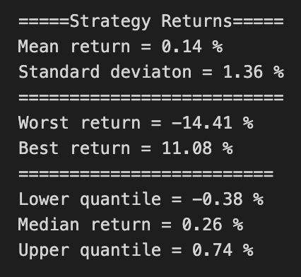
print(’=====Strategy Returns=====’)
print(’Mean return =’,round((returns.mean())*100,2),”%”)
print(’Standard deviaton =’,round((returns.std())*100,2),”%”)
print(”==========================”)
print(’Worst return =’,round((min(returns))*100,2),”%”)
print(’Best return =’,round((max(returns))*100,2),”%”)
print(”=========================”)
print(’Lower quantile =’,round((returns.quantile(q=0.25))*100,2),”%”)
print(’Median return =’,round((returns.quantile(q=0.5))*100,2),”%”)
print(’Upper quantile =’,round((returns.quantile(q=0.75))*100,2),”%”)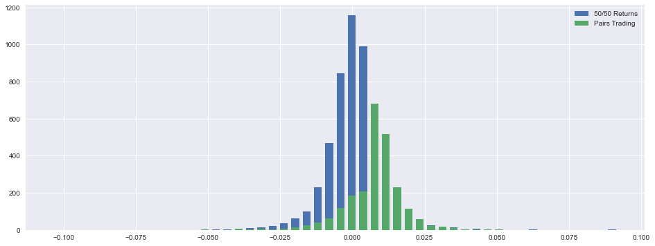
This block starts by isolating the cleaned per-period returns for the pairs trading strategy (returns) and the cumulative P&L series (cumulret) by dropping any NaNs — a necessary step so the subsequent histograms and summary statistics aren’t biased or broken by missing values. The cumulative series is pulled out because you typically want both the per-period distribution and the time-series P&L for a full risk/return picture, although in this snippet cumulret is not used further.
Next the code builds a visual comparison between two return distributions: a baseline labeled “50/50 Returns” (ReturnBoth) and the actual pairs strategy (returns). It computes a histogram for the baseline using numpy.histogram to obtain counts (hist1) and bin edges (bins1), derives a bar width equal to 70% of a bin’s width, and computes the bin centers so bars are centered correctly on the x-axis. Using these centers and width it draws a bar plot for the baseline. Then it computes another histogram for the pairs returns (hist2) but reuses the same centers and width when drawing the second set of bars. Conceptually this is trying to put the two distributions on the same x-grid so you can visually compare shape, skew and tail behavior — important for pairs trading because you want to see whether the strategy has fatter tails, larger negative skew, or different central tendency than a naive 50/50 allocation.
A key practical point and potential bug: hist2 is computed with its own bins2 but then plotted using centers derived from bins1. If the two histograms use different bin edges, counts in hist2 will be misaligned when plotted on centers from bins1. To compare distributions correctly you should either compute both histograms with the same bins (e.g., np.histogram(…, bins=bins1)) or compute normalized densities (density=True) so you’re comparing shapes rather than raw counts — and explicitly normalize counts if the sample sizes differ. Also consider plotting with alpha/transparency and different colors, or plotting probability densities rather than raw counts, so the overlay is interpretable; the width choice (0.7 * binwidth) is a deliberate visual choice to leave small gaps between bars.
Finally the code prints simple summary statistics for the pairs strategy: mean and standard deviation of per-period returns, minimum and maximum observed returns, and the 25th/50th/75th quantiles. The values are scaled by 100 and rounded to display percentages, which gives quick diagnostic metrics: the mean indicates the strategy’s average per-period edge, the standard deviation measures volatility (the basic risk), worst/best show observed single-period tail outcomes, and the quantiles expose asymmetric tail risk (e.g., how bad the lower quartile is). In a pairs-trading context you should interpret these alongside sample frequency — if these are daily returns, annualize the mean (multiply by ~252) and scale volatility by sqrt(252) for annualized risk metrics — and compute complementary measures such as Sharpe ratio and max drawdown for a fuller risk assessment.
Recommended improvements: compute both histograms with identical bins or use density=True so the comparison is valid; normalize counts if sample sizes differ; show sample sizes in the legend/labels; add axis labels and a title indicating the return-period (daily/weekly) and whether values are in percent; and use the cumulative P&L (cumulret) or drawdown calculations to contextualize distributional findings with realized performance over time.
# Some stats, this could be improved by trying to estimate a yearly sharpe, among many others
executionrate = len(returns)/len(ReturnBoth)

maxdd = round(max(np.maximum.accumulate(cumulret)-cumulret)*100,2)

mask = returns<0
diffs = np.diff(mask.astype(int))
start_mask = np.append(True,diffs==1)
mask1 = mask & ~(start_mask & np.append(diffs==-1,True))
id = (start_mask & mask1).cumsum()
out = np.bincount(id[mask1]-1,returns[mask1])
badd = round(max(-out)*100,2)

spositive = returns[returns > 0]
snegative = -returns[returns < 0]
winrate = round((len(spositive)/(len(spositive)+len(snegative)))*100,2)

beta = round(returns.corr(ReturnBoth),2)

sharpe = round((float(cumulret[-1:]))/cumulret.std(),2)

tret = round((float(cumulret[-1:]))*100,2)
This block is computing a handful of performance and risk summary statistics for a pairs-trading run; I’ll walk through the data flow and the intentions behind each calculation so you can see what signals it gives and where it’s brittle.
First, executionrate = len(returns)/len(ReturnBoth) is a simple coverage metric: it measures the fraction of available observations (ReturnBoth presumably represents the full opportunity set or price-index length) for which the strategy actually produced a return (i.e., executed a trade). This tells you how often the pair was tradable under your entry rules and is useful for capacity and turnover considerations.
Next, maxdd = round(max(np.maximum.accumulate(cumulret)-cumulret)*100,2) computes the maximum drawdown from the cumulative-return series cumulret. np.maximum.accumulate(cumulret) builds the running peak; subtracting the current cumulative return gives the drawdown at each point, and taking the maximum yields the worst peak-to-trough loss. The result is scaled to percent. Using cumulative P&L here is the correct concept for drawdown: drawdown is inherently path-dependent, and this gives you the largest historical decline in the equity curve which is essential for sizing and risk limits.
The next chunk identifies consecutive losing-trade runs and computes the worst cumulative loss across those runs. mask = returns < 0 marks losing trades. diffs = np.diff(mask.astype(int)) detects transitions between non-loss and loss (diff==1 marks starts of loss runs) and between loss and non-loss (diff==-1 marks ends). start_mask = np.append(True, diffs==1) and the subsequent mask1 construction are trying to mark the actual indices that belong to contiguous loss segments while handling boundary conditions (first element and transitions). id = (start_mask & mask1).cumsum() then assigns a group id to each element in a loss run by cumulatively incrementing on each start; np.bincount(id[mask1]-1, returns[mask1]) sums returns per losing-run group (the -1 adjusts the ids to zero-based indexing). Finally, badd = round(max(-out)*100,2) takes the most-negative group sum (converted to a positive magnitude and percent) and reports it as the worst cumulative loss across contiguous losing trades. The reason for this calculation is practical: in pairs trading you often want to know not just single-trade losses but how large a streak of consecutive losses can be, because streaks determine drawdown and client tolerance and can break mean-reversion assumptions.
After that, spositive and snegative split returns into wins and losses (snegative negates losses so both are positive magnitudes). winrate is then the percent of trades that are winners. This combination (win rate together with average win and average loss — note average magnitudes aren’t computed here but would be helpful) gives you the strategy’s basic expectancy profile, which matters for position sizing and setting stop/target logic in a mean-reversion/pairs framework.
beta = round(returns.corr(ReturnBoth),2) computes the correlation between the strategy returns and the ReturnBoth series. In pairs trading, this tells you how dependent your P&L is on the broader reference series (for example the combined pair or market return). A high correlation indicates that your “relative” trades are still driven by the same underlying directional moves and may not be fully market-neutral.
The sharpe line is a simplistic proxy: sharpe = round((float(cumulret[-1:]))/cumulret.std(),2) divides the final cumulative return by the standard deviation of the cumulative-return path. Conceptually this is meant to be a reward-to-variability metric, but it’s nonstandard: Sharpe should be based on the return series (typically mean(return)/std(return)) and include appropriate time-scaling (annualization). Using std(cumulret) rather than std(returns) underweights the true variability and will produce misleading values. Consider replacing it with an annualized mean(returns)/std(returns) times sqrt(N_periods_per_year) for a proper Sharpe.
Finally, tret = round((float(cumulret[-1:]))*100,2) reports the total cumulative return as a percent. That’s the headline P&L number and together with maxdd and badd gives a basic risk/return picture.
plt.figure(figsize=(16,6))
plt.plot(BuyHoldBoth*100, label=’Buy & Hold 50/50’)
plt.plot(cumulret*100, label=’Pairs Trading’, color=’coral’)
plt.xlabel(’Time’)
plt.ylabel(’Returns (in %)’)
plt.margins(x=0.005,y=0.02)
plt.axhline(y=0, xmin=0, xmax=1, linestyle=’--’, color=’k’)
plt.legend()
plt.show()

print(”Cumulative Return = “,tret,”%”)
print(”=========================”)
print(”Execution Rate = “,round(executionrate*100,2),”%”)
print(”Win Rate = “,winrate,”%”)
print(”=========================”)
print(”Maximum Loss = “,maxdd,”%”)
print(”Maximum Consecutive Loss = “,badd,”%”)
print(”=========================”)
print(”Beta = “,beta)
print(”Sharpe = “,sharpe)
# Return (”alpha”) decay is pretty noticeable from 2011 onwards, most likely due to overfitting, they’re not reinvested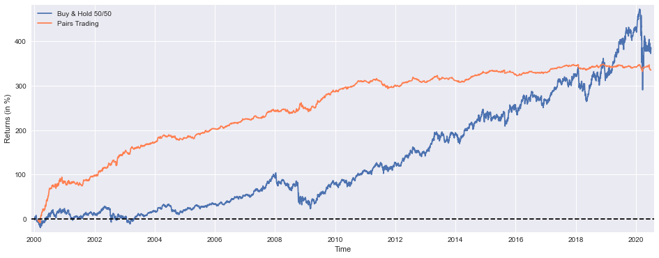
This block is first creating a visual comparison between two performance traces: a benchmark “buy & hold 50/50” portfolio and the pairs-trading strategy’s cumulative returns. The plotted series are scaled to percentage points (hence the *100) so the scale is immediately interpretable as percent cumulative return. Plotting both series on the same axes allows you to see relative performance over time — not just end values — which is important for pairs trading because the strategy’s value comes from consistent, market-neutral capture of mean reversion rather than trying to ride the market trend. The plot margins and the thin horizontal zero line are deliberate: the margins prevent clipping at the plot edges and the zero line gives a clear visual reference for when each series is producing positive vs. negative cumulative returns. The legend and axis labels make the comparison explicit; together these choices let you quickly assess periods where pairs trading outperformed or underperformed the static 50/50 exposure.
After the visual, the code prints a compact set of diagnostic metrics that explain different aspects of the strategy’s behavior. “Cumulative Return” (tret) is the ultimate profitability metric — it tells you how much the strategy would have grown total capital over the backtest window. The “Execution Rate” describes how often the strategy actually opens trades relative to possible signals; this is crucial operationally because a low execution rate can mean the strategy is fragile or overly specific (and vulnerable to look-ahead/overfitting), while a very high rate might indicate excessive turnover and higher transaction costs. Rounding the execution rate to two decimal places is just for readable reporting, but the metric itself is used to judge whether signal thresholds or filters are too tight or too loose.
“Win Rate” reports the fraction of trades that were profitable. In pairs trading, win rate often trades off with average gain per trade (many small wins vs. fewer larger wins), so you shouldn’t judge the strategy solely by win rate; combine it with return magnitude and drawdown to understand whether losses are acceptable in size and frequency. The printed “Maximum Loss” (maxdd) and “Maximum Consecutive Loss” (badd) quantify tail risk and streak vulnerability: max drawdown tells you the worst peak-to-trough capital erosion, which is critical for risk budgeting and stop rules, while consecutive loss streaks probe psychological and liquidity tolerances — pairs strategies can have long losing streaks even if they are profitable on average.
Finally, the code prints two standard risk-adjusted and exposure metrics: beta and Sharpe. Beta measures residual market exposure — for a properly implemented market-neutral pairs strategy you generally expect a beta near zero; a non-zero beta indicates that the hedge ratios or formation/pair-selection procedures are allowing systematic market risk through, which can explain periods of correlated drawdown. Sharpe summarizes risk-adjusted return and helps compare the strategy to alternatives or to changes in parameters; a low Sharpe may indicate insufficient edge after costs and volatility.
BuyHoldBothYTD = (((PEP[’Adj Close’][-252:]/float(PEP[’Adj Close’][-252])-1)+(KO[’Adj Close’][-252:]/float(KO[’Adj Close’][-252])-1))/2).fillna(method=’ffill’)
StrategyYTD = returns[-92:].cumsum()

plt.figure(figsize=(16,6))
plt.plot(BuyHoldBothYTD*100, label=’Buy & Hold 50/50’)
plt.plot(StrategyYTD*100, label=’Pairs Trading’, color=’coral’)
plt.xlabel(’Time’)
plt.ylabel(’Returns (in %)’)
plt.margins(x=0.005,y=0.02)
plt.axhline(y=0, xmin=0, xmax=1, linestyle=’--’, color=’k’)
plt.legend()
plt.show()

print(’Buy & Hold 50/50 YTD Performance (at 1 July 2020) =’,round(float(BuyHoldBothYTD[-1:]*100),1),’%’)
print(’Strategy YTD Performance =’,round(float(StrategyYTD[-1:]*100),1),’%’)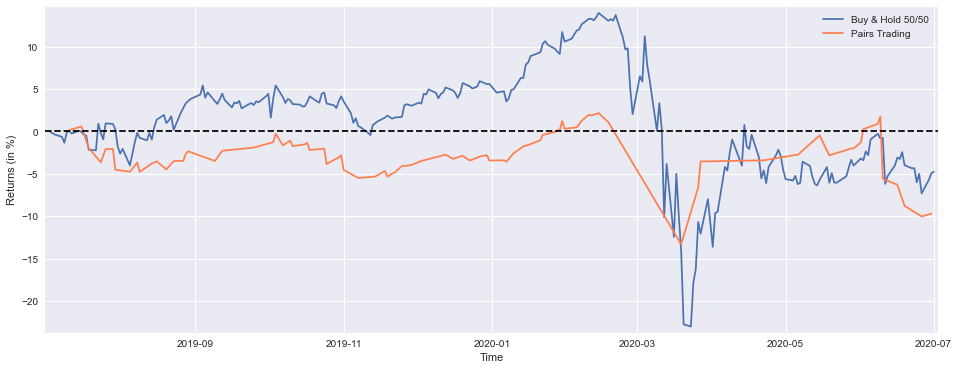

This block is producing a direct, visual comparison between a simple 50/50 buy-and-hold portfolio of PEP and KO and the pairs-trading strategy’s recent performance, then printing the year-to-date (YTD) numbers. The first expression constructs the buy-and-hold series: for each stock we take the slice covering roughly one trading year (the last 252 rows), compute each day’s return relative to the price at the start of that slice (price / start_price — 1) and then average the two stocks to form an equal-weight (50/50) portfolio return for every date. That averaging implements a static, equal-weight exposure rather than a market-value-weighted or dynamically rebalanced one, which is exactly what you want to compare against a strategy that actively trades the pair. The .fillna(method=’ffill’) call forward-fills any gaps so that plotting doesn’t break if there are isolated missing values (for example around corporate actions or calendar misalignment); note that forward-filling masks missing data, so it’s a pragmatic choice for visualization but you should confirm there aren’t systemic alignment problems in the raw series.
Next, StrategyYTD = returns[-92:].cumsum() takes the strategy’s recent returns and builds a cumulative series over the last 92 trading days. The slice length (92) is shorter than the buy-and-hold slice (252), so the plotted strategy curve will only appear over the most recent portion of the buy-and-hold curve; this is important to notice when you visually compare the two. The use of cumsum() implies that the stored “returns” are additive in time — commonly that means they are log returns (where summing equals cumulative log-return) or intentionally arithmetic returns that you’re aggregating as a running sum. If these are simple percentage returns and you need multiplicative cumulative performance, you should instead use (1 + r).cumprod() — 1; cumsum is correct and convenient only when the return series was constructed as log returns or when the additive approximation is acceptable.
The plotting block scales both series to percent (multiplying by 100) and draws them on the same axes so you can directly compare trajectory and magnitude. Matplotlib aligns the series by their index values, so proper date indices ensure the buy-and-hold line covers the full YTD window while the strategy line overlays only its recent 92-day window. The plot adds a horizontal zero line as a baseline to make gains/losses visually obvious, nudges margins so lines aren’t cut off, and labels the axes and legend for clarity — all intended to make the relative performance and timing easy to interpret.
Finally, the print statements extract the last element of each cumulative series, convert it to a percentage and round it for an at-a-glance YTD summary. That prints the portfolio’s YTD return at the final date in the buy-and-hold slice and the strategy’s cumulative return over its final date — they’re the single-number summaries you’ll commonly report. A couple of practical cautions: ensure the date ranges and indices for PEP, KO and the strategy’s returns line up (misalignment is a common source of misleading comparisons), and check whether your “returns” vector is arithmetic or logarithmic so the cumulative computation matches the intended interpretation.
Asset Allocation
# python 3.7

# For yahoo finance
import io
import re
import requests

# The usual suspects
import numpy             as np
import pandas            as pd
import matplotlib.pyplot as plt

#  Fancy graphics
plt.style.use(’seaborn’)

# Getting Yahoo finance data
def getdata(tickers,start,end,frequency):
    OHLC    = {}
    cookie  = ‘’
    crumb   = ‘’
    res     = requests.get(’https://finance.yahoo.com/quote/SPY/history’)
    cookie  = res.cookies[’B’]
    pattern = re.compile(’.*”CrumbStore”:\{”crumb”:”(?P<crumb>[^”]+)”\}’)
    for line in res.text.splitlines():
        m = pattern.match(line)
        if m is not None:
            crumb = m.groupdict()[’crumb’]
    for ticker in tickers:
        url_str  = “https://query1.finance.yahoo.com/v7/finance/download/%s”
        url_str += “?period1=%s&period2=%s&interval=%s&events=history&crumb=%s”
        url = url_str % (ticker, start, end, frequency, crumb)
        res = requests.get(url, cookies={’B’: cookie}).text
        OHLC[ticker] = pd.read_csv(io.StringIO(res), index_col=0,
                                   error_bad_lines=False).replace(’null’, np.nan).dropna()
        OHLC[ticker].index = pd.to_datetime(OHLC[ticker].index)
        OHLC[ticker] = OHLC[ticker].apply(pd.to_numeric)
    return OHLC

# Assets under consideration
tickers = [’%5EGSPTSE’,’%5EGSPC’,’%5ESTOXX’,’000001.SS’]

# If yahoo data retrieval fails, try until it returns something
data = None
while data is None:
    try:
        data = getdata(tickers,’946685000’,’1685008000’,’1d’)
    except:
         pass

ICP = pd.DataFrame({’SP500’:    data[’%5EGSPC’][’Adj Close’],
                    ‘TSX’:      data[’%5EGSPTSE’][’Adj Close’],
                    ‘STOXX600’: data[’%5ESTOXX’][’Adj Close’],
                    ‘SSE’:      data[’000001.SS’][’Adj Close’]}).fillna(method=’ffill’)

# since last commit, yahoo finance decided to mess up (more) some of the tickers data, so now we have to drop rows...
ICP = ICP.dropna()
This block’s goal is to produce a clean, aligned time series of adjusted daily prices for a small basket of global equity indices so downstream code can compute returns and run asset-allocation logic. The core work happens in getdata: rather than using a maintained client library, it reverse-engineers Yahoo Finance’s CSV download endpoint by first visiting a known page (the SPY history page) to capture the session cookie and the ephemeral “crumb” token that Yahoo requires to authorize CSV downloads. The code parses the page text with a regular expression to extract the crumb and reads the cookie named ‘B’ from the response; those two values are then appended to each per-ticker download URL so the HTTP GET returns the historical CSV for that ticker and time range.
For each ticker the function requests the CSV, wraps the CSV text in a StringIO and passes it to pandas.read_csv. The read step is defensive: error_bad_lines=False tolerates malformed rows (common when scraping), the raw string ‘null’ is converted to np.nan and immediate dropna() removes wholly empty rows. The index is coerced to datetimes so later time-series operations align correctly, and apply(pd.to_numeric) forces all remaining columns to numeric dtypes — this is important so that subsequent vectorized math (returns, covariances, optimizers) behave predictably and don’t type-promote or raise exceptions.
Outside the function, tickers are URL-encoded symbol strings (for example %5EGSPC is ^GSPC) and the start/end parameters are supplied as Unix epoch seconds; the frequency argument is ‘1d’ to request daily bars. Because Yahoo downloads sometimes fail intermittently, the code wraps getdata in a tight retry loop: it repeatedly calls getdata until it returns a non-None result, swallowing all exceptions. This achieves basic robustness against transient network or server errors, but it also means the script will block until success (no backoff or failure limit).
Once the raw per-ticker OHLC data are returned, the code constructs a single DataFrame, ICP, that keeps only the ‘Adj Close’ column for each ticker. Choosing adjusted close is deliberate: it folds in corporate actions (splits, dividends) so returns computed from these series reflect economic returns that matter for allocation and risk calculations. The DataFrame is then forward-filled (fillna(method=’ffill’)) to carry forward the last observed price in the presence of short data gaps — this minimizes hole-driven volatility spikes or row misalignment when markets are closed or a ticker is missing a single day. Finally, ICP = ICP.dropna() removes any remaining rows that still contain NaNs after forward-fill; that leaves a fully aligned, gap-free panel of adjusted prices suitable for return computation, covariance estimation, and portfolio optimization.
Operationally, a few practical consequences flow from these choices: the crumb/cookie scraping is brittle (changes to Yahoo’s page or token mechanism will break downloads), the infinite retry loop can hang jobs indefinitely without visibility, and forward-filling then dropping remaining NaNs produces a dataset that trades off completeness for alignment (good for clean backtests, but you must be aware you may be propagating stale prices across market events). The resulting ICP is ready for quant tasks — compute log or simple returns from Adj Close, estimate covariance and expected returns, and use those inputs for asset-allocation routines.
BuyHold_SP     = ICP[’SP500’]    /float(ICP[’SP500’][:1])   -1
BuyHold_TSX    = ICP[’TSX’]      /float(ICP[’TSX’][:1])     -1
BuyHold_STOXX  = ICP[’STOXX600’] /float(ICP[’STOXX600’][:1])-1
BuyHold_SSE    = ICP[’SSE’]      /float(ICP[’SSE’][:1])     -1

BuyHold_25Each = BuyHold_SP*(1/4) + BuyHold_TSX*(1/4) + BuyHold_STOXX*(1/4) + BuyHold_SSE*(1/4)
This block constructs simple buy-and-hold cumulative return series for four broad market indices and then forms an equally weighted portfolio from them. For each index (SP500, TSX, STOXX600, SSE) the code divides the entire time series by its initial value and subtracts one. That normalization turns raw index levels into a time series of cumulative returns expressed as a decimal (e.g., 0.25 for +25% since the start). Conceptually, this is the standard way to produce a buy-and-hold profit-and-loss curve: you take the value of a position held from time 0 and express every later value relative to the initial investment.
The explicit float(…) of the first element ensures the divisor is a scalar float rather than a one-row Series; historically this avoids integer-division or type-mismatch issues and makes the division elementwise across the series unambiguous. Practically, that means each resulting BuyHold_* variable is a single, aligned time series that shows how a unit investment in that index evolved over the sample. Subtracting 1 moves the series from normalized price levels to net return, which is the more intuitive metric for performance comparison and portfolio construction.
After computing per-index cumulative returns, the final line forms BuyHold_25Each by taking a simple arithmetic average of the four return series (each multiplied by 1/4). Because each index series was normalized to the same starting base, this linear combination is equivalent to an equal-weighted buy-and-hold portfolio that invests 25% of initial capital in each index and then holds without rebalancing. In other words, the code is building a baseline, “buy-and-hold 25/25/25/25” allocation to use as a benchmark or simple allocation rule against which to compare your active strategies.
It’s important to call out the implicit assumptions behind this construction. All series must be aligned on the same timestamps and share a common start date; otherwise the normalization and the averaging will produce misleading results. Currency differences or dividend treatments are also not handled here — if indices are denominated in different currencies, exchange-rate movements will affect the composed return and should be considered explicitly. Finally, this approach models a no-rebalancing portfolio; if you intend a periodic rebalanced equal-weight portfolio, the aggregation must be computed by rebalancing the value series (or using returns with rebalancing logic), not by a single average of cumulative returns.
As a practical note for robustness: prefer using explicit scalar extraction methods (e.g., .iloc[0]) and ensure no missing values at the start, and consider using return-based functions (pct_change -> cumprod) or a DataFrame-level normalization to avoid subtle indexing/type bugs. These changes preserve the same buy-and-hold semantics while reducing the chance of edge-case errors in production.
plt.figure(figsize=(16,6))
plt.plot(BuyHold_SP*100,     label=’Buy & Hold USA’)
plt.plot(BuyHold_TSX*100,    label=’Buy & Hold Canada’)
plt.plot(BuyHold_STOXX*100,  label=’Buy & Hold Europe’)
plt.plot(BuyHold_SSE*100,    label=’Buy & Hold China’)
plt.plot(BuyHold_25Each*100, label=’Buy & Hold 25% Each’)
plt.xlabel(’Time’)
plt.ylabel(’Cumulative Return (in %)’)
plt.margins(x=0.005,y=0.02)
plt.axhline(y=0, xmin=0, xmax=1, linestyle=’--’, color=’k’)
plt.legend()
plt.show()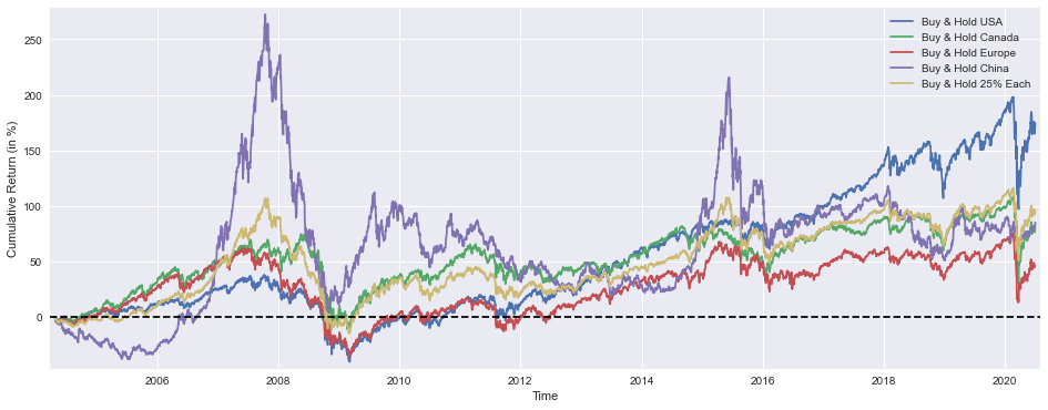
This block is entirely about producing a compact visual summary that compares the realized, cumulative performance paths of several buy-and-hold allocations so we can judge relative outcomes and diversification effects over time. First, a plotting canvas is sized to 16x6 inches to give ample horizontal space for a time series comparison and enough vertical room to see fine-grained differences — this helps when you want to inspect long backtests or see short-term divergences. Each cumulative-return series (BuyHold_SP, BuyHold_TSX, BuyHold_STOXX, BuyHold_SSE, BuyHold_25Each) is multiplied by 100 before plotting so the y-axis is expressed in percentage points; that conversion is deliberate because percent cumulative return is the most immediately interpretable unit for portfolio-level comparisons and avoids misreading small fractional numbers that are common when returns are left in decimal form.
The code plots each series on the same axes and assigns a clear label for each line; by plotting them together we can visually assess relative performance, timing of outperformance, and periods where diversification helps or fails. Importantly, the 25% each series is a buy-and-hold equal-weight initial allocation that will drift if not rebalanced — displaying it alongside single-market buy-and-hold lines highlights how simple equal-weight allocation behaves in the market mix over time versus concentrated bets. The dashed horizontal line at y=0 is a visual baseline for positive vs. negative cumulative return, making drawdowns and recovery points immediately obvious; because that line spans the axis via normalized xmin/xmax, it always appears across the plot regardless of the time range.
Minor plotting choices — small axis margins and a legend — are practical: margins prevent line endpoints or annotations from being clipped and give the eye a little breathing room, while the legend ties each trace to its market so you don’t need to infer which color corresponds to which region. Finally, calling show() renders the figure for inspection. From a quant asset-allocation perspective, this plot is a diagnostic tool: it helps you evaluate whether diversification into multiple markets achieved smoother growth or reduced drawdowns relative to single-market bets, whether the equal-weight approach materially changed risk/return trade-offs, and when regime shifts occurred that would motivate dynamic allocation or rebalancing rules in an active strategy.
SP1Y     = ICP[’SP500’]    /ICP[’SP500’].shift(252)   -1
TSX1Y    = ICP[’TSX’]      /ICP[’TSX’].shift(252)     -1
STOXX1Y  = ICP[’STOXX600’] /ICP[’STOXX600’].shift(252)-1
SSE1Y    = ICP[’SSE’]      /ICP[’SSE’].shift(252)     -1

Each251Y = SP1Y*(1/4) + TSX1Y*(1/4) +STOXX1Y*(1/4) + SSE1Y*(1/4)
This block takes price series for four equity indices, converts each into a one‑year arithmetic return, then collapses those returns into a single equal‑weighted signal that you can use as a simple allocation input. Concretely, ICP is expected to be a time‑indexed table of index prices; for each index the code computes current_price / price_252_days_ago − 1. Using .shift(252) encodes a 252‑trading‑day lookback (the common approximation of one trading year) so the output SP1Y, TSX1Y, STOXX1Y and SSE1Y are series of 1‑year percentage returns aligned to the same dates as the current prices.
Why do we do the division and subtraction instead of working with raw prices? Returns remove scale differences across indices and isolate relative performance over the chosen horizon, which is what matters for allocation and momentum decisions. Using an arithmetic return (p_t / p_{t−252} − 1) is straightforward to interpret as the percentage change over the past year; the alternative (log returns) would give additivity benefits but is less immediately interpretable for a one‑year lookback, so this code chooses simplicity and interpretability.
After computing the four one‑year returns, the code forms Each251Y as the simple average of the four series (each multiplied by 1/4). That average is effectively the return of an equally weighted portfolio of the four indices over the past year, and it serves as a neutral, low‑bias aggregation method: equal weighting reduces reliance on any single region, lowers estimation risk relative to picking a single best index, and gives you a baseline signal you can use for further allocation logic (e.g., tilt to regions that outperform this average, scale position sizes by this metric, or use it as a diversification anchor).
Practical caveats and operational details to watch for: .shift(252) assumes a daily, trading‑day frequency — if your DataFrame contains weekends, different holiday calendars, or irregular sampling you can get misalignment or extra NaNs; consider reindexing to a business‑day calendar or using .pct_change(252) (same math, clearer intent) and explicitly handling missing values. The first ~252 rows will be NaN because you lack a lagged price; downstream code must handle that. Also note the design choices: arithmetic returns are fine for a one‑period signal, but if you aggregate multiple periods or combine volatilities you may prefer log returns or volatility‑scaling; likewise, equal weighting is a sensible baseline but you may later replace it with risk‑parity, inverse volatility, or optimization weights depending on your allocation objective and transaction‑cost model. Finally, consider renaming Each251Y to something clearer (e.g., each_1y_equal_return) because the “251” in the name is potentially misleading given the 252‑day shift.
plt.figure(figsize=(16,6))
plt.plot(SP1Y*100,     label=’Rolling 1 Year Buy & Hold Return USA’)
plt.plot(TSX1Y*100,    label=’  “”  “”  Canada’)
plt.plot(STOXX1Y*100,  label=’  “”  “”  Europe’)
plt.plot(SSE1Y*100,    label=’  “”  “”  China’)
plt.plot(Each251Y*100, label=’  “”  “”  25% Each’)
plt.xlabel(’Time’)
plt.ylabel(’Returns (in %)’)
plt.margins(x=0.005,y=0.02)
plt.axhline(y=0, xmin=0, xmax=1, linestyle=’--’, color=’k’)
plt.legend()
plt.show()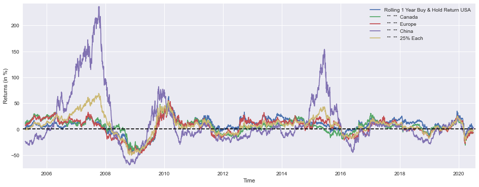
This block produces a single, wide time-series plot that compares one-year rolling buy-&-hold returns across four regional markets and an equal-weighted benchmark. Upstream, the arrays named SP1Y, TSX1Y, STOXX1Y, SSE1Y and Each251Y are expected to contain pre-computed rolling 1-year returns (typically computed with a ~251-trading-day window) for the US, Canada, Europe, China, and a 25%‑each portfolio respectively. Each series is multiplied by 100 so the y-axis displays percentage returns rather than decimals, which makes the chart immediately interpretable for portfolio-level conversations.
The plotting sequence draws each series on the same axes so you can read relative magnitude, timing, and sign of returns directly against one another. Displaying all series together is intentional: it reveals cross-market dynamics such as co-movements, lead-lag relationships, and periods where one region materially out- or under-performs the others. Those patterns are what you use in quant allocation work to judge diversification benefits, regime shifts, or candidate signals for tactical tilts.
Axis and visual choices are geared toward readability and actionable interpretation. A larger figure size provides room to see detail across a multi-year horizon; labeling the x-axis as Time and the y-axis as Returns (in %) makes units explicit; and multiplying by 100 aligns the plotted values to the percent label so there’s no mental conversion. The margins call prevents the first or last data points from being clipped and gives a small breathing room around the plotted lines, which avoids misleading overlap at the edges.
The horizontal dashed line at y=0 is a deliberate baseline: it makes it trivial to see when a one‑year return is positive or negative and to compare the depth of drawdowns across markets. The legend maps each line to its market so you can instantly identify which region caused a portfolio-level move. Taken together, these visual elements support rapid, visually-driven decisions — e.g., identifying when to rebalance away from a persistently weak region, testing equal-weight stability versus concentrated exposures, or calibrating tactical allocation triggers based on historical running returns.
In the context of asset allocation for quantitative trading, this chart is a diagnostic tool: it doesn’t dictate allocations but surfaces the historical behavior you’ll feed into rules or models (volatility-adjusted sizing, momentum filters, regime classification, etc.). Interpreting the plot can guide parameter choices (window lengths, rebalancing frequency), help validate hypotheses about diversification benefits of the 25%‑each portfolio, and provide empirical context for risk controls or tactical overlay strategies.
marr      = 0 #minimal acceptable rate of return (usually equal to the risk free rate)
SP1YS     = (SP1Y.mean()    -marr) /SP1Y.std()
TSX1YS    = (TSX1Y.mean()   -marr) /TSX1Y.std()
STOXX1YS  = (STOXX1Y.mean() -marr) /STOXX1Y.std()
SSE1YS    = (SSE1Y.mean()   -marr) /SSE1Y.std()
Each251YS = (Each251Y.mean()-marr) /Each251Y.std()

print(’SP500 1 Year Buy & Hold Sharpe Ratio =’,round(SP1YS,2))
print(’TSX      “” “” =’,round(TSX1YS   ,2))
print(’STOXX600 “” “” =’,round(STOXX1YS ,2))
print(’SSE      “” “” =’,round(SSE1YS   ,2))
print(’25% Each “” “” =’,round(Each251YS,2))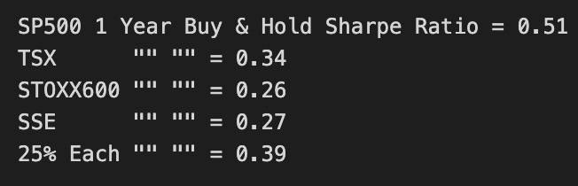
This block is computing a simple, one-line risk‑adjusted performance metric for several buy‑and‑hold strategies and an equally weighted portfolio, then printing them so you can compare strategies on the same scale. The metric is the classic Sharpe‑style ratio: for each return series (SP1Y, TSX1Y, STOXX1Y, SSE1Y, and the 25%‑each portfolio), it takes the sample mean return, subtracts a minimal acceptable return (marr), and divides by the sample standard deviation of returns. Because these are labeled “1Y” I’m assuming each series already represents one‑year returns (so no additional annualization is applied here); the result is therefore a one‑period excess‑return per unit of volatility number that is easy to compare across the assets and the equal‑weight portfolio.
Why we do each step: we set marr to a baseline return (commonly the risk‑free rate) so the numerator is excess return — we only reward returns above what we could get from a safe asset. Dividing by the standard deviation normalizes that excess return by the strategy’s volatility, producing a risk‑adjusted figure; higher values indicate more return per unit of variability and are therefore preferable for allocation decisions. Using mean and std of the historical series is a straightforward empirical estimate of expected excess return and risk; it’s fast to compute and interpretable, which makes it useful for quick screening of assets and simple portfolio comparisons.
How this fits into allocation decisions: these printed ratios let you rank assets and the 25%‑each portfolio by empirical risk‑adjusted performance, which is a common first pass when deciding where to allocate capital. If the equal‑weight portfolio’s ratio is materially higher than most single‑asset ratios, that’s evidence in favor of diversification benefits under whatever historical regime these returns encapsulate; conversely, a single asset with a much higher ratio flags it as a candidate for overweighting. Because the metric is scale‑invariant, it’s useful both for selecting candidate allocations and as an input to optimizer constraints or as a sanity check against more sophisticated models.
Caveats and practical notes: .mean() and .std() here are plain historical estimates — they implicitly assume i.i.d. returns and approximate normality, and pandas’ std uses ddof=0 by default (population std), while some Sharpe conventions use ddof=1 (sample std); you should pick the convention consistent with downstream analytics. Also consider serial correlation, tail risks, and non‑stationarity: this single metric is informative but incomplete. For production allocation decisions you may want to annualize returns consistently, compute a sample‑adjusted Sharpe, use return distributions that account for skew/kurtosis, or assess out‑of‑sample stability before committing capital. Finally, the printed round() calls are purely presentational — keep the raw numbers if you feed these into further calculations.
from scipy.optimize import minimize

def multi(x):
    a, b, c, d = x
    return a, b, c, d   #the “optimal” weights we wish to discover

def maximize_sharpe(x): #objective function
    weights = (SP1Y*multi(x)[0] + TSX1Y*multi(x)[1]
               + STOXX1Y*multi(x)[2] + SSE1Y*multi(x)[3])
    return -(weights.mean()/weights.std())

def constraint(x):      #since we’re not using leverage nor short positions
    return 1 - (multi(x)[0]+multi(x)[1]+multi(x)[2]+multi(x)[3])

cons = ({’type’:’ineq’,’fun’:constraint})
bnds = ((0,1),(0,1),(0,1),(0,1))
initial_guess = (1, 0, 0, 0)

# this algorithm (SLSQP) easly gets stuck on a local
# optimal solution, genetic algorithms usually yield better results
# so my inital guess is close to the global optimal solution

ms = minimize(maximize_sharpe, initial_guess, method=’SLSQP’,
              bounds=bnds, constraints=cons, options={’maxiter’: 10000})

msBuyHoldAll = (BuyHold_SP*ms.x[0] + BuyHold_TSX*ms.x[1]
                + BuyHold_STOXX*ms.x[2] + BuyHold_SSE*ms.x[3])

msBuyHold1yAll = (SP1Y*ms.x[0] + TSX1Y*ms.x[1]
                   + STOXX1Y*ms.x[2] + SSE1Y*ms.x[3])
This block is an optimizer that chooses non-negative allocation weights across four assets to maximize the portfolio Sharpe ratio computed from historical 1‑year return series. Conceptually, we treat SP1Y, TSX1Y, STOXX1Y and SSE1Y as the asset return time series used to estimate the portfolio’s expected return and volatility; the optimizer searches for scalar weights a…d that produce the best risk‑adjusted return under the portfolio constraints.
multi() is just a tiny adapter that unpacks the optimizer’s parameter vector into four named weight values (a, b, c, d). The code uses that unpacking repeatedly rather than indexing x directly; the practical effect is purely organizational — it makes the weight references in the objective and constraint a bit more readable.
maximize_sharpe() builds the portfolio return series by taking the linear combination of the four asset return series with the candidate weights. It then computes the sample mean and standard deviation of that portfolio return series and returns the negative Sharpe (-(mean/std)). The negative is required because scipy.optimize.minimize minimizes functions; by minimizing negative Sharpe we are equivalently maximizing Sharpe. Note the objective is formulated on historical returns, so it’s an in‑sample, sample‑mean/sample‑std Sharpe estimate — a simple, fast criterion but one that assumes stationarity and ignores higher moments, estimation error, serial correlation and transaction costs.
The constraint function enforces the “no leverage, no shorts” policy in a specific way: cons specifies an inequality 1 — sum(weights) >= 0, so the optimizer is allowed to choose weights that sum to anything ≤ 1. Combined with the per‑weight bounds bnds = ((0,1),(0,1),(0,1),(0,1)), each weight is constrained to [0,1] and the total invested capital cannot exceed 100% (the remainder is implicitly uninvested cash). If you wanted a fully invested portfolio, you would use an equality constraint sum(weights) == 1 instead; the current setup explicitly permits holding cash as a risk control or optimization outcome.
The minimize() call uses the SLSQP algorithm with the bounds and the inequality constraint and a high maxiter. SLSQP is a gradient‑based, constrained optimizer and therefore can quickly converge to a local optimum; that is why the code comments mention the risk of getting stuck and the reason for choosing a close initial_guess. In practice, when optimizing Sharpe over a small nonconvex space (especially with noisy return estimates), it’s common to either try multiple random starts or use global optimizers (genetic algorithms, simulated annealing) to reduce the chance of a poor local solution.
After optimization, ms.x holds the chosen weights. The code then forms two portfolio series: msBuyHoldAll combines the BuyHold_* series (presumably cumulative P&L or buy‑and‑hold return series for each asset) using the optimized weights to produce a portfolio buy‑and‑hold P&L, and msBuyHold1yAll re‑creates the weighted 1‑year return series used by the objective (the same weighted series whose mean/std produced the Sharpe). These two outputs let you both evaluate the optimized portfolio’s historical buy‑and‑hold performance and inspect the return stream that drove the optimization.
Finally, be mindful of the implicit assumptions and risks: using sample mean/std Sharpe is susceptible to estimation noise and look‑ahead bias, the inequality constraint allows cash exposure which may be desirable or not depending on your mandate, and the optimization ignores transaction costs and turnover. Practical enhancements include multiple starting points or global optimizers, shrinkage/regularization of expected returns, robust estimators for volatility, and explicit transaction‑cost or turnover penalties in the objective or constraints.
plt.figure(figsize=(16,6))
plt.plot(BuyHold_SP*100, label=’Buy & Hold S&P500’)
plt.plot(BuyHold_25Each*100, label=’ “” “” 25% of Each’)
plt.plot(msBuyHoldAll*100, label=’ “” “” Max Sharpe’)
plt.xlabel(’Time’)
plt.ylabel(’Cumulative Return (in %)’)
plt.margins(x=0.005,y=0.02)
plt.axhline(y=0, xmin=0, xmax=1, linestyle=’--’, color=’k’)
plt.legend()
plt.show()
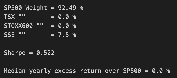
print(’SP500 Weight =’,round(ms.x[0]*100,2),’%’)
print(’TSX “” =’,round(ms.x[1]*100,2),’%’)
print(’STOXX600 “” =’,round(ms.x[2]*100,2),’%’)
print(’SSE “” =’,round(ms.x[3]*100,2),’%’)
print()
print(’Sharpe =’,round(msBuyHold1yAll.mean()/msBuyHold1yAll.std(),3))
print()
print(’Median yearly excess return over SP500 =’,round((msBuyHold1yAll.median()-SP1Y.median())*100,1),’%’)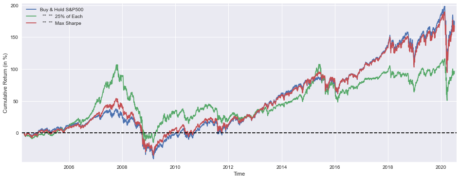
This block starts by creating a visual comparison of cumulative performance for three portfolio rules so you can quickly see how each allocation strategy compounds capital over time. The three series plotted are: a buy-and-hold S&P500 benchmark, an equally weighted “25% of each” portfolio, and the output from the optimizer labeled “Max Sharpe.” Each series is multiplied by 100 before plotting so the y-axis shows cumulative return in percentage points rather than fractional returns — that makes differences and magnitudes immediately interpretable for business stakeholders. Using cumulative return series preserves the compounding behavior of each strategy, which is essential when evaluating long-run capital growth instead of just period-by-period snapshots.
The plot setup includes small visual choices that matter for interpretation: the figure size gives a readable time-series width, margins are tightened so the curves and legend aren’t clipped at the edges, and a horizontal dashed line at y=0 provides a clear reference for when a strategy has produced positive versus negative cumulative returns. The legend and axis labels ensure each line can be matched back to its rule and that the metric is unambiguous (percent cumulative return). In short, the plot’s purpose is diagnostic — to reveal persistent outperformance, drawdown behavior, or timing differences between simple heuristics and the optimizer’s result.
After the visualization, the code prints the numeric portfolio weights found by the optimizer (ms.x), mapped to the four asset pools (S&P500, TSX, STOXX600, SSE). Displaying the rounded percentages makes the allocation readable and actionable: you immediately see which markets the optimizer leaned on for maximizing the chosen objective. This step connects the high-level performance plot back to the driver — the actual allocation vector that created the “Max Sharpe” curve.
Next, a Sharpe ratio is printed for the msBuyHold1yAll series using mean/std. The interpretation depends on what msBuyHold1yAll contains; given its name, it appears to be a distribution of one‑year buy-and-hold returns for the max‑Sharpe portfolio across rolling windows or sample draws, so taking the mean divided by the standard deviation produces a risk‑adjusted return metric on a one‑year basis. Reporting Sharpe helps compare strategies on a volatility-adjusted basis rather than raw returns alone, which is critical for allocation decisions where risk exposure matters as much as return.
Finally, the code computes the median yearly excess return of the max‑Sharpe portfolio over the S&P500 by taking the difference in medians between the two one‑year return series and expressing it in percentage points. Using the median instead of the mean provides a robust central tendency that is less sensitive to extreme outliers, so this metric gives a sense of typical annual outperformance versus the benchmark. Together, these printed diagnostics — weights, Sharpe, and median excess return — tie the visualization back into decision-making: they let you assess not only whether the optimizer historically outperformed but also by how much, how consistently, and which asset positions produced that result.
A couple of practical caveats to keep in mind when using these outputs for live allocation decisions: confirm whether the Sharpe computation is already on an annual basis or needs annualization, ensure the return series account for fees and transaction costs if you want deployable numbers, and validate the stability of optimizer weights across different look-back windows to avoid overfitting to a particular sample. These results are diagnostic inputs for portfolio construction — they tell a coherent story about historical performance and drivers, but you should combine them with risk‑management constraints and implementation considerations before committing capital.
def maximize_median_yearly_return(x): #different objective function
    weights = (SP1Y*multi(x)[0] + TSX1Y*multi(x)[1]
               + STOXX1Y*multi(x)[2] + SSE1Y*multi(x)[3])
    return -(float(weights.median()))

mm = minimize(maximize_median_yearly_return, initial_guess, method=’SLSQP’,
              bounds=bnds, constraints=cons, options={’maxiter’: 10000})

mmBuyHoldAll = (BuyHold_SP*mm.x[0] + BuyHold_TSX*mm.x[1]
                + BuyHold_STOXX*mm.x[2] + BuyHold_SSE*mm.x[3])

mmBuyHold1yAll = (SP1Y*mm.x[0] + TSX1Y*mm.x[1]
                   + STOXX1Y*mm.x[2] + SSE1Y*mm.x[3])
At a high level this block is performing a constrained numeric search for an asset-weight vector that maximizes the median of the portfolio’s annual returns, then building two portfolio-level time series from the optimized weights. The design choice to optimize the median (rather than, say, mean or Sharpe) indicates a robustness preference: the median captures the “typical” yearly outcome and down-weights extreme outliers, so the optimizer will favor allocations that produce consistently acceptable yearly returns rather than allocations that rely on rare big wins.
The function maximize_median_yearly_return encapsulates the objective. It takes an optimization candidate x, passes x through multi(x) to get per-asset multipliers (multi is a preprocessing/transform function in your pipeline — e.g., scaling, leverage, or other per-asset decision variables derived from x), and forms a portfolio yearly-return time series by summing each asset’s 1-year return series (SP1Y, TSX1Y, STOXX1Y, SSE1Y) multiplied by the corresponding multiplier coming out of multi(x). It then computes the median of that constructed yearly-return series and returns its negative. Returning the negative converts our maximization goal into the minimization problem expected by scipy.optimize.minimize: minimizing the negative median is equivalent to maximizing the median. Casting to float ensures a scalar objective for the optimizer.
The minimize call runs SLSQP with bounds and constraints provided (bnds, cons) and a generous maxiter. SLSQP is appropriate because you likely have linear constraints (sum-to-one, no-short constraints, box constraints) and possibly smooth nonlinearities introduced by multi(x). The optimizer searches over initial_guess and respects bnds/cons to produce mm.x, the final optimized decision vector. The large maxiter suggests the problem can be challenging to converge, which is common with objectives built from order-statistics like medians and when multi(x) applies nonlinear transforms.
After optimization you construct final portfolio-level series in two flavors. mmBuyHoldAll multiplies the optimized raw weights mm.x[i] against full-period buy-and-hold series for each asset (BuyHold_SP, BuyHold_TSX, etc.) and sums them — this yields a buy-and-hold net series for the optimized allocation across the entire history. mmBuyHold1yAll repeats the same operation but using the 1-year return series (SP1Y, TSX1Y, …) to reconstruct the yearly-return series implied by the optimized weights. In short, the optimizer used the median over the derived mmBuyHold1yAll-like series to pick weights, and you then recompute both the yearly-return illustration and the full buy-and-hold aggregate to analyze performance.
A few practical notes to keep in mind: medians are not everywhere differentiable, which can make numerical gradient-based solvers unstable or slow — this explains the high maxiter and is why you should verify convergence and test multiple starts. Also confirm multi(x) is deterministic and reasonably smooth (or understand its nondifferentiabilities), and make sure your constraints (e.g., sum-to-one, non-negativity) align with the intended economic interpretation of mm.x. Finally, validate results by comparing the median-based allocation to other objectives (mean, median-of-subperiods, tail metrics) to ensure the chosen objective produces the desired risk-return trade-off in live or out-of-sample data.
plt.figure(figsize=(16,6))
plt.plot(BuyHold_SP*100,     label=’Buy & Hold S&P500’)
plt.plot(BuyHold_25Each*100, label=’  “”  “”  25% of Each’)
plt.plot(mmBuyHoldAll*100,   label=’  “”  “”  Max 1Y Median’)
plt.xlabel(’Time’)
plt.ylabel(’Cumulative Return (in %)’)
plt.margins(x=0.005,y=0.02)
plt.axhline(y=0, xmin=0, xmax=1, linestyle=’--’, color=’k’)
plt.legend()
plt.show()

print(’SP500 Weight =’,round(mm.x[0]*100,2),’%’)
print(’TSX “”       =’,round(mm.x[1]*100,2),’%’)
print(’STOXX600 “”  =’,round(mm.x[2]*100,2),’%’)
print(’SSE “”       =’,round(mm.x[3]*100,2),’%’)
print()
print(’Sharpe =’,round(mmBuyHold1yAll.mean()/mmBuyHold1yAll.std(),3))
print()
print(’Median yearly excess return over SP500 =’,round((mmBuyHold1yAll.median()-SP1Y.median())*100,1),’%’)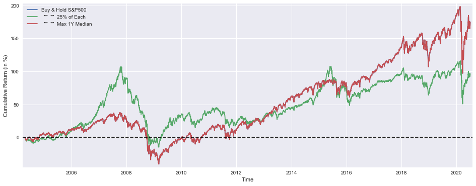
This block’s purpose is to visualize and summarize how three allocation strategies perform over time and to report the asset weights and a couple of summary performance metrics for the chosen optimized strategy. The plot section draws cumulative returns (converted to percent for readability) for: a pure S&P500 buy-and-hold, an equal-weighted portfolio (“25% of each”) across the four assets, and the strategy labeled “Max 1Y Median” (mmBuyHoldAll) which is the policy you derived from the optimization. Converting the series to percent (multiplying by 100) makes the y-axis intuitive; the x/y labels and legend make the series easy to compare; small x/y margins prevent clipping at the edges; and the dashed horizontal line at zero gives a clear visual reference for break-even performance.
Immediately after the plot, the code prints the optimized allocation vector mm.x, mapping each element to the specific asset: S&P500, TSX, STOXX600, and SSE. Those values are shown as percentages rounded to two decimals so you can quickly see how the optimizer apportioned capital across regions/markets. This is the business-level answer to “what did the optimizer choose?” — those weights are the actionable allocation you would implement or further stress-test.
The next printed metric is a simple Sharpe ratio computed as mean/std of mmBuyHold1yAll. Given the variable name, mmBuyHold1yAll appears to be the series of annual returns for the optimized (max-1y-median) buy-and-hold strategy, so mean/std here yields an annualized risk-adjusted return measure — note it is the basic form (no subtraction of a risk-free rate and no complex annualization adjustments beyond the assumption that the inputs are already yearly). This metric gives a compact sense of reward per unit of volatility for the selected strategy; higher is better.
Finally, the code reports the median yearly excess return of the optimized strategy over the S&P500: it takes the median of the mmBuyHold1yAll annual returns, subtracts the median of SP1Y (S&P annual returns), and converts to percentage. Using the median rather than the mean intentionally emphasizes robustness to outliers and aligns with the “Max 1Y Median” objective implied by the strategy name — it answers whether the optimizer improved the central tendency of annual performance relative to the S&P500 baseline.
A couple of practical caveats to keep in mind when interpreting these outputs: confirm that mmBuyHold1yAll and SP1Y are indeed annual return series (otherwise you must annualize mean/std appropriately), consider subtracting a risk-free rate for a conventional Sharpe, and remember medians summarize central tendency but do not reflect tail risk — so pair these summaries with drawdown and tail-risk checks before deploying the allocation in production.
YTD_SP     = ICP[’SP500’][-252:]    /float(ICP[’SP500’][-252])   -1
YTD_TSX    = ICP[’TSX’][-252:]      /float(ICP[’TSX’][-252])     -1
YTD_STOXX  = ICP[’STOXX600’][-252:] /float(ICP[’STOXX600’][-252])-1
YTD_SSE    = ICP[’SSE’][-252:]      /float(ICP[’SSE’][-252])     -1

YTD_25Each = YTD_SP*(1/4) + YTD_TSX*(1/4) + YTD_STOXX*(1/4) + YTD_SSE*(1/4)

YTD_max_sharpe = YTD_SP*ms.x[0] + YTD_TSX*ms.x[1] + YTD_STOXX*ms.x[2] + YTD_SSE*ms.x[3]
YTD_max_median = YTD_SP*mm.x[0] + YTD_TSX*mm.x[1] + YTD_STOXX*mm.x[2] + YTD_SSE*mm.x[3]
This block starts by converting each index price series into a one-year (≈252 trading days) trailing return series anchored to the price 252 days ago. For each index you take the last 252 observations and divide every value by the value at the start of that window, then subtract one. The result is a time series that expresses how much that index has appreciated (or depreciated) relative to its level one trading-year earlier; using 252 days makes the window a standard “trailing year” for equity/trading analysis.
Once you have four normalized return series (SP500, TSX, STOXX600, SSE), the code constructs three portfolio return series by taking weighted sums of those per-index series. YTD_25Each is the equal-weight benchmark: each index contributes 25% to the aggregate return series. This is useful as a simple, transparent baseline to compare against optimized allocations — it shows what a naïve equal-allocation would have delivered over the same trailing-year horizon.
The next two lines compute the realized trailing-year return series for two optimized allocations: YTD_max_sharpe uses the weight vector ms.x (the solution from the “max Sharpe” optimization) and YTD_max_median uses mm.x (the solution from a “median” or alternative optimizer). By multiplying each index’s normalized return series by the corresponding weight and summing, you obtain the portfolio-level cumulative return series implied by those static weights over the same period.
Important mechanics and interpretation notes: because the per-index series are normalized to the same starting-date baseline, summing them with fixed weights is equivalent to the performance of an initial capital allocation split by those weights and held without rebalancing over the window. If the optimizers’ weights were intended for a periodically rebalanced strategy (daily/weekly/quarterly), you should instead compute daily percentage returns (day-over-day) and apply the rebalancing logic to aggregate returns correctly. Also check that ms.x and mm.x are in the expected form (e.g., they sum to 1 if you expect fully invested, and their sign/constraints reflect allowed shorting); otherwise the summed series will reflect whatever absolute exposure or net exposure those weight vectors encode.
In short: the code converts prices into trailing-year return series, builds an equal-weight benchmark, and computes the realized trailing-year return series for two optimized weight sets. These resulting series let you compare ex-post performance and perform attribution or risk/Sharpe calculations, but be mindful of the rebalancing assumption and weight normalization when interpreting downstream metrics.
plt.figure(figsize=(15,6))
plt.plot(YTD_SP*100,         label=’YTD Buy & Hold S&P500’)
plt.plot(YTD_25Each*100,     label=’  “”  “”  25% of Each’)
plt.plot(YTD_max_sharpe*100, label=’  “”  “”  Max Sharpe’)
plt.plot(YTD_max_median*100, label=’  “”  “”  Max 1Y Median’)
plt.xlabel(’Time’)
plt.ylabel(’Cumulative Return (in %)’)
plt.margins(x=0.005,y=0.02)
plt.axhline(y=0, xmin=0, xmax=1, linestyle=’--’, color=’k’)
plt.legend()
plt.show()

print(’Buy & Hold S&P500 YTD Performance (at 1 July 2020) =’,round(float(YTD_SP[-1:]*100),1),’%’)
print(’ “” “” 25% of Each   “” “” =’,round(float(YTD_25Each[-1:]*100),1),’%’)
print(’ “” “” Max Sharpe    “” “” =’,round(float(YTD_max_sharpe[-1:]*100),1),’%’)
print(’ “” “” Max 1Y Median “” “” =’,round(float(YTD_max_median[-1:]*100),1),’%’)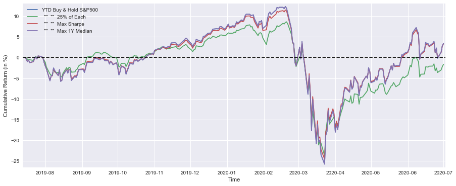
This block is a compact visualization + reporting step that turns the precomputed year-to-date (YTD) cumulative-return series for four allocation strategies into both a comparative chart and a short textual summary. Upstream you must have computed YTD_SP, YTD_25Each, YTD_max_sharpe and YTD_max_median as time-ordered series of cumulative returns (fractional, e.g., 0.05 for +5%) — the code’s first job is to scale those series into percent and plot them so you can visually compare path, timing and drawdowns across strategies.
Concretely, the plot call multiplies each YTD series by 100 to convert to percentage points and draws them on a single figure (figsize sets a wide aspect to emphasize time evolution). Plotting the cumulative-return paths — rather than daily returns — is intentional: we want to see long‑run compounding and the timing of gains and losses, which is most relevant when comparing allocation rules for a trading book. The axes labels clarify units, the margins call gives a little breathing room at the edges so lines and axes labels aren’t clipped, and the horizontal dashed line at y=0 provides an immediate breakeven reference so you can quickly see when each strategy was in positive versus negative territory. The legend ties line color to strategy so the viewer can map patterns back to allocation rules (Buy & Hold S&P500, an equal 25% each allocation, the Max Sharpe portfolio, and the Max 1Y Median rule).
After displaying the chart, the code prints a one‑line numeric summary for each series by taking the last value in each YTD array, scaling it to percent, converting to a scalar and rounding to one decimal place. That gives an exact numeric YTD return that complements the visual comparison — useful for tables, reports or automated checks. Note that the printed text uses a fixed date string (“at 1 July 2020”) as context; make sure that matches the actual last timestamp of your YTD series, otherwise the label will be misleading.
A couple of small practical notes: using [-1:] returns a one‑element slice which is then cast to float — this works but is slightly opaque; using [-1] (or .iloc[-1] for pandas Series) is clearer and avoids unnecessary array-to-scalar conversion. Also, when overlaying multiple series be mindful of line order and styling (colors, linestyles, alpha) because a dominant series can obscure others; you may want to set explicit styles or add grid/tight_layout for presentation-quality figures. Overall, this block’s purpose is to give you a quick, intuitive and numeric comparison of how different allocation rules have performed YTD so you can judge which rules delivered better return, lower drawdown, or preferable timing for the asset-allocation engine.
ICP[’SPRet’]    = ICP[’SP500’] /ICP[’SP500’].shift(1)-1
ICP[’SSERet’]   = ICP[’SSE’]   /ICP[’SSE’].shift(1)  -1

ICP[’Strat’] = ICP[’SPRet’] * 0.8 + ICP[’SSERet’] * 0.2

ICP[’Strat’][SP1Y.shift(1)  > -0.17] = ICP[’SSERet’]*0 + ICP[’SPRet’]*1
ICP[’Strat’][SSE1Y.shift(1) > 0.29]  = ICP[’SSERet’]*1 + ICP[’SPRet’]*0

DynAssAll    = ICP[’Strat’].cumsum()
DynAssAll1y  = ICP[’Strat’].rolling(window=252).sum()
DynAssAllytd = ICP[’Strat’][-252:].cumsum()
This block starts by turning the raw index levels in ICP (assumed to be daily prices or index levels for the S&P 500 and the SSE) into simple daily returns. That is the foundation: all subsequent allocation logic operates on contemporaneous percentage returns rather than price levels because returns are the natural quantity for portfolio P&L and risk calculations.
Next it constructs a baseline, blended strategy: Strat = 0.8 * S&P_return + 0.2 * SSE_return. The intent here is explicit — a persistent tactical tilt that favors the S&P (80%) while retaining a smaller exposure to the SSE (20%). Practically this encodes a long-biased, diversified baseline allocation where the S&P dominates the directional exposure but the SSE provides some additional return diversification or alpha source.
After establishing the baseline, the code applies simple regime rules that can override that blend. Each rule uses a one-day-lagged signal (shift(1)) — this is important because using the previous day’s indicator avoids look‑ahead bias: trading decisions are based only on information that would have been available at decision time, not on the same-day realized returns. The first rule says: if the prior-day SP1Y metric is greater than -0.17, force the strategy to 100% S&P that day (Strat = S&P_return). The second rule says: if the prior-day SSE1Y metric is greater than 0.29, force the strategy to 100% SSE that day. Conceptually these are simple momentum/drawdown filters: thresholds decide when to rotate fully into one market (or away from the other). Note the ordering and overwriting behavior: the SSE rule is applied after the SP rule, so if both boolean conditions hold the SSE assignment will overwrite the earlier SP assignment. Also, because the code assigns directly to a DataFrame slice, it can trigger pandas’ SettingWithCopy warnings — use .loc with boolean masks to make these overrides explicit and safe.
Finally the code produces aggregate performance series to evaluate the dynamic allocation. DynAssAll = Strat.cumsum() gives an arithmetic cumulative sum of daily strategy returns — useful as a quick running P&L but not the precise compounded return (for true wealth accumulation use (1 + returns).cumprod() — 1). DynAssAll1y = Strat.rolling(window=252).sum() computes the trailing-252-trading-day aggregate return (a standard 1-year lookback in equity markets), which is a simple way to track recent performance or momentum used elsewhere. DynAssAllytd = Strat[-252:].cumsum() is just the cumulative sum over the most recent 252 days (a snapshot of the last year’s arithmetic P&L).
A few practical cautions and improvements to consider: clarify what SP1Y and SSE1Y represent (1-year returns, trailing momentum, or something else) because the economic meaning of the thresholds depends entirely on that; choose thresholds based on backtests and make them configurable; replace cumsum with compounded return formulas if you need exact wealth trajectories; make the regime masks mutually exclusive or explicitly define precedence if simultaneous triggers are possible; use .loc with boolean masks to avoid pandas assignment pitfalls; and remember to include transaction costs and realistic rebalancing frequency when evaluating performance.
plt.figure(figsize=(15,6))
plt.plot(BuyHold_SP*100,     label=’Buy & Hold SP&500’)
plt.plot(mmBuyHoldAll*100,   label=’  “”  “”  Max 1Y Median’)
plt.plot(DynAssAll*100,      label=’Dynamic Asset Allocation’)
plt.xlabel(’Time’)
plt.ylabel(’Cumulative Return (in %)’)
plt.margins(x=0.005,y=0.02)
plt.axhline(y=0, xmin=0, xmax=1, linestyle=’--’, color=’k’)
plt.legend()
plt.show()

print(’Median yearly excess return over SP500 =’,round(float(DynAssAll1y.median()-SP1Y.median())*100,1),’%’)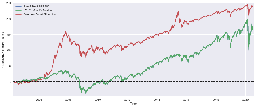
This block first creates a single, wide chart that directly compares cumulative performance over time for three strategies: the S&P 500 buy-and-hold, a simple static baseline derived from a 1‑year median heuristic (labelled “Max 1Y Median”), and your Dynamic Asset Allocation strategy. Each series is multiplied by 100 so the y‑axis reads cumulative return in percentage points, which makes visual comparisons and annotating thresholds easier for portfolio reporting. Plotting cumulative return (rather than period returns) emphasizes the compounded, path-dependent outcome investors care about — it shows how value accumulates over the whole sample rather than noisy month‑to‑month swings.
The code then adds small layout niceties that improve readability and interpretation: axis labels, a legend, a thin margin so the first and last points aren’t clipped, and a dashed horizontal zero line. The zero line is important because it makes it straightforward to see when a strategy is producing positive versus negative cumulative performance (i.e., whether it has beaten cash/broken even). The figure size is widened to give the three lines room to separate visually so differences in trajectory and drawdowns are easier to inspect.
After the visual comparison, the single printed metric gives a compact scalar summary: the median yearly excess return of the dynamic strategy over the S&P 500. Here DynAssAll1y and SP1Y are treated as time series of annual returns (or annualized rolling returns), and taking the median of each produces a robust central tendency that is less sensitive to outlier years than the mean. Subtracting SP1Y.median() from DynAssAll1y.median() yields the typical annual outperformance (positive or negative), multiplying by 100 converts it to percentage points, and rounding to one decimal place creates a concise, human-readable number for reports or quick decisions.
From a business and quant perspective the two outputs serve complementary purposes: the plotted cumulative paths let you inspect path dependence, drawdowns, and how the dynamic allocations behaved across market regimes, while the median yearly excess return provides a robust summary statistic that helps judge whether the dynamic allocation consistently adds value relative to the passive S&P baseline. Together they support both qualitative diagnosis (visual inspection of when and why the strategy diverged) and quantitative assessment (a summary performance delta you can use in backtest tables or optimization constraints).
plt.figure(figsize=(15,6))
plt.plot(YTD_SP*100,         label=’YTD Buy & Hold S&P500’)
plt.plot(YTD_max_median*100, label=’  “”  “”  Max 1Y Median’)
plt.plot(DynAssAllytd*100,   label=’Dynamic Asset Allocation’)
plt.xlabel(’Time’)
plt.ylabel(’Cumulative Return (in %)’)
plt.margins(x=0.005,y=0.02)
plt.axhline(y=0, xmin=0, xmax=1, linestyle=’--’, color=’k’)
plt.legend()
plt.show()

print(’Buy & Hold S&P500 YTD Performance (at 1 July 2020) =’,round(float(YTD_SP[-1:]*100),1),’%’)
print(’ “” “” Max 1Y Median “” “”  =’,round(float(YTD_max_median[-1:]*100),1),’%’)
print(’ Strategy YTD Performance   =’,round(float(DynAssAllytd[-1:]*100),1),’%’)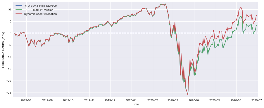
This block produces a concise visual and numeric summary that compares three cumulative-return series year-to-date so you can judge whether the Dynamic Asset Allocation strategy is outperforming simple benchmarks. The three arrays (YTD_SP, YTD_max_median, DynAssAllytd) are plotted on the same time axis as cumulative returns converted to percent (hence the *100). Converting to percent and plotting the cumulative series makes the relative performance over time immediately readable for a trader or PM — you’re looking at total growth trajectories rather than per-period noise.
Step by step, the code opens a wide figure (figsize for readability on a typical screen) and overlays the three cumulative-return lines in the order shown. Multiplying by 100 transforms decimal return factors into percentage points so axis labels and the visual slope are directly interpretable as percent change. The labels supplied to each plot identify the strategy and the two benchmarks (buy-and-hold S&P500 and a “Max 1Y Median” benchmark), which is critical when you’re scanning many backtests or dashboards. Margins are nudged slightly to avoid clipping at the plot edges; this is purely a presentation choice to keep start/end points visible. The dashed horizontal line at y=0 is an explicit performance baseline (breakeven) so positive and negative cumulative returns are unambiguous, and the legend makes it easy to map lines to strategies. Finally, plt.show() renders the figure.
After the visual, three print statements extract and report a single-number summary for each series — the YTD cumulative return as of the latest date (the comment/label indicates “at 1 July 2020” in your run). The code takes the last element of each series, converts it to percent and to a float, then rounds to one decimal place for compact reporting. Practically, this is the snapshot number you’d use in performance emails or monitoring logs. Note: the code uses a slice [-1:] which yields a one-element array and then casts that array to float; functionally that works, but using [-1] to grab the scalar is slightly clearer and avoids the intermediate one-element array.
In the context of asset allocation for quantitative trading, this plot + numeric summary serves two purposes: (1) a quick visual validation that the dynamic allocation policy is adding value relative to a plain buy-and-hold baseline and a benchmark heuristic, and (2) a simple checkpoint for regime-awareness — if the strategy diverges from benchmarks in a particular direction, you investigate allocation rules, risk exposures or signal freshness. Ensuring the series are time-aligned and that the x-axis uses proper datetime indices will keep the interpretation correct when you compare across multiple experiments or production runs.
Download source code using the button below:
