

Quant Trading: Mastering Mean Reversion and Pure Arbitrage in Python
A step-by-step guide to data ingestion, Z-score standardization, and fee-adjusted profitability modeling for quant traders.

Use the button at the end to download the source code!
To prepare for the technical implementation of these strategies, you should ensure your environment is configured with a robust suite of Python libraries designed for high-performance data manipulation and statistical inference. The backbone of this workflow relies on Pandas for time-series alignment and NumPy for vectorized numerical operations, which allow for the rapid calculation of spreads and arbitrage margins across large datasets. You will also need the Statsmodels library to perform the Augmented Dickey-Fuller and Engle-Granger tests required for cointegration analysis, alongside Matplotlib and Seaborn for visualizing the statistical thresholds of your signals. Finally, Yfinance is utilized to pull historical market data directly from Yahoo Finance, providing the raw inputs necessary to backtest the validity of your mean reversion assumptions.
In the modern financial landscape, the traditional intuition of a discretionary trader is being systematically enhanced by the mathematical rigor of algorithmic trading. This discipline allows for the identification of fleeting market inefficiencies by processing vast amounts of data at speeds and scales that far exceed human capacity. By automating the decision-making process, a quant trading system minimizes the psychological pitfalls of trading, such as hesitation or emotional attachment to a position, and instead focuses on the objective probability of price convergence. This article delves into the architecture of such systems, focusing specifically on how we can mathematically prove a relationship between two assets and how we can capture risk-free profit through cross-exchange discrepancies.
The following sections provide a deep dive into two of the most popular strategies in the algorithmic playbook: Mean Reversion and Pure Arbitrage. We begin by examining the statistical mechanics of pairs trading, where we look for “rubber band” relationships between stocks — identifying moments when the price ratio has stretched too far and is likely to snap back to its historical average. Following this, we shift our focus to the high-stakes world of arbitrage, detailing the logic required to monitor multiple exchanges simultaneously. You can expect to learn how to filter out market noise using Z-scores and how to implement a profitability gate that accounts for the reality of transaction costs, ensuring that every trade signal generated is economically viable after fees.
Mean Reversion (Pairs Trading)
- Long pair: long stock A and short stock B
- Short pair: short stock A and long stock B
- Identify pairs with a high historical correlation in price (typically > 0.8; for example, 0.9). If the two assets normally move together but begin to diverge — for instance, if their correlation falls to 0.5 — you can establish a long/short position on the pair expecting the relationship to revert toward its historical level.
- Selecting and timing trades to maximize the spread between the assets requires judgment and practical experience.
# Getting Data from 6 years back
# I will use the most recent 1 year to determine how well I would have done if I follow the efficient frontier.
# The market is open 252 times in a given year.
# I will get the adjusted close as my main data.

‘’‘========================================================================= UPDATE 10/27/2021 ================================
MAKE SURE pandas == 1.2 version.
Yahoo has changed their structure when it comes to querying data. I have made the adjustments to this entire notebook.
========================================================================= UPDATE 10/27/2021  ==================================
‘’‘
import pandas as pd
import pandas_datareader as pdr
from datetime import datetime
import yfinance as yf

def get_historical_Data(tickers):
    “”“This function returns a pd dataframe with all of the adjusted closing information”“”
    data = pd.DataFrame()
    names = list()
    for i in tickers:
        data = pd.concat([data, pd.DataFrame(yf.download(i, start=datetime(2020, 10, 27), end=datetime(2021, 10, 27)).iloc[:,4])], axis = 1)
        names.append(i)
    data.columns = names
    return data

ticks = [”DPZ”, “AAPL”, “GOOG”, “AMD”, “GME”, “SPY”, “NFLX”, “BA”, “WMT”,”TWTR”,”GS”,”XOM”,”NKE”,”FEYE”, “FB”,”BRK-B”, “MSFT”] #Name of company (Dominos pizza)
d = get_historical_Data(ticks)
print(d.shape)
# Most Recent Data
d.tail()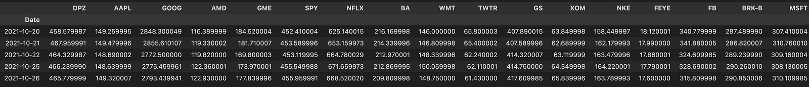
This block is the data-ingestion stage for a mean-reversion pairs-trading workflow: it pulls adjusted closing prices for a basket of tickers over an explicitly defined one-year window and returns a single DataFrame of aligned price series that downstream routines will use for cointegration tests, spread construction, z‑score calculation, and backtesting. Concretely, get_historical_Data iterates ticker-by-ticker, downloads Yahoo price history for the supplied start/end dates, extracts the Adjusted Close column (the column at position 4 in the returned table), and concatenates each series as a new column in a master DataFrame. After the loop it assigns the ticker symbols as column names and returns the aligned multi‑series DataFrame; d.tail() is then used to inspect the most recent rows.
Why we do these specific steps: adjusted close is the right price field for mean-reversion work because it accounts for corporate actions (splits, dividends) that would otherwise create artificial jumps in the price series and bias spread calculations and returns. Aligning all series into one DataFrame (pd.concat with axis=1) ensures dates line up so pairwise operations (differences, ratios, regressions) compare values from the same trading days; pandas will naturally align by the datetime index and produce NaNs where data is missing, which downstream code must handle. The chosen date window (start=2020–10–27, end=2021–10–27) gives roughly one year of daily observations (~252 trading days), which the header comments indicate is the intended backtest window used to evaluate performance along an efficient‑frontier/backtest axis.
A few implementation details and why they matter: extracting the Adjusted Close by positional index (.iloc[:,4]) works with the typical Yahoo column ordering but is brittle — referencing the ‘Adj Close’ column by name is safer and clearer. Downloading each ticker individually is simple and robust but less efficient than a single bulk yf.download(tickers, …), and it increases the chance that a single failed request produces a misaligned DataFrame or missing column. The notebook comment about pandas==1.2 and Yahoo API changes is a compatibility note: changes in underlying datareader/JSON structure have historically required specific pandas behaviors, so pinning versions prevented subtle parsing failures when this was authored.
Operational cautions tied to mean‑reversion logic: ensure you handle NaNs and differing trading calendars before calculating spreads or cointegration — drop or impute rows consistently so sample sizes are identical for pair tests. One year can be sufficient for short-term mean‑reversion signals, but cointegration and stable hedge ratios are generally more robust with longer histories, so validate that your lookback choice matches the statistical power you need. Also validate that ticker symbols match Yahoo’s expected format (e.g., special characters for class shares) to avoid silent download failures. Finally, consider hardening the function (bulk download, explicit ‘Adj Close’ access, try/except with logging, optional resampling or forward/backfill) so downstream mean‑reversion calculations get clean, reproducible input.
corr_matrix = d.corr()
corr_matrix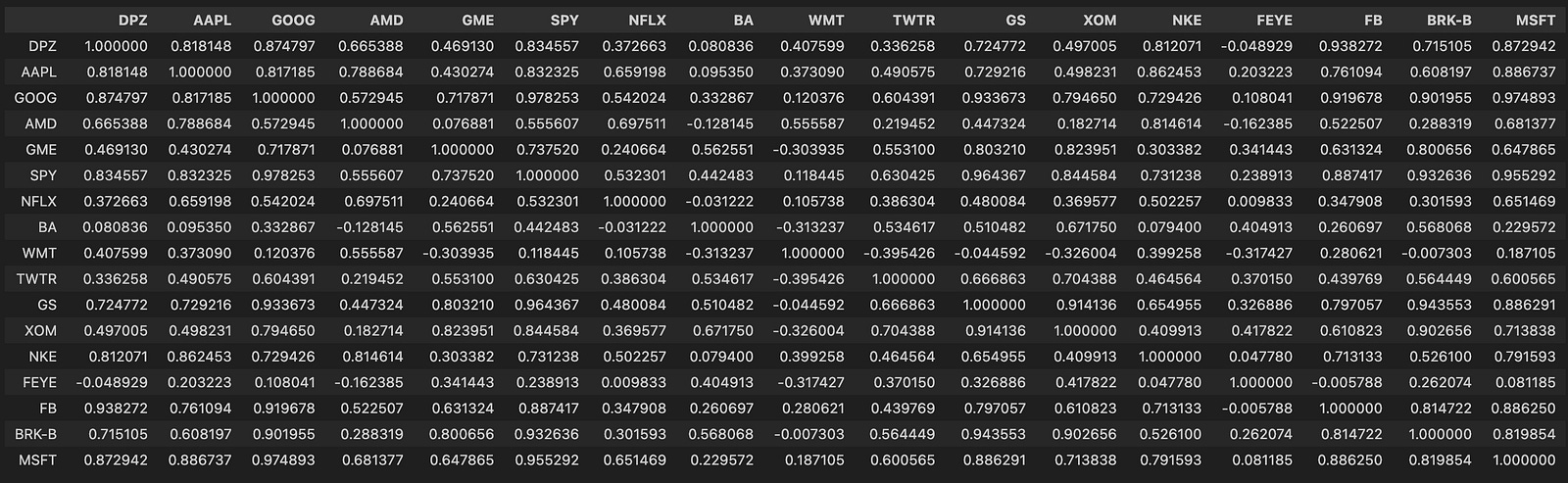
Here we take the DataFrame d (each column representing an asset time series — commonly prices or returns) and compute a pairwise correlation matrix with d.corr(), storing it in corr_matrix. The corr() call by default computes Pearson correlation between every pair of columns using pairwise-complete observations, so the result is a symmetric matrix with 1.0 on the diagonal and values in [-1, 1] elsewhere that quantify the linear co-movement between two series over the sample window.
Why we do this: in a mean-reversion pairs-trading pipeline the correlation matrix is a fast, first-pass filter to identify candidate pairs that historically move together. Pairs trading generally requires two assets with a stable relationship so that deviations (the “spread”) are likely to revert; high positive correlation is a practical signal that two series share a common component and might produce a mean-reverting spread. Because corr() measures linear association, it’s useful for quickly ruling out uncorrelated or strongly anti-correlated assets and for building clusters of similarly behaving instruments.
Important caveats and how this fits into the broader workflow: computing correlation on raw price levels can be misleading because common trends or non-stationarity inflate correlations, so in practice you should compute correlations on returns (typically log returns) or otherwise detrended series to avoid spurious relationships. Also, Pearson correlation detects linear relationships only; if you expect nonlinear coupling, consider Spearman/Kendall or other measures. Pandas’ pairwise-complete behavior means missing data can change pairwise sample sizes — check for unequal overlap and for tiny effective sample sizes that make correlation estimates unreliable.
Next steps after obtaining corr_matrix: use it to shortlist candidate pairs (e.g., thresholding or hierarchical clustering by distance derived from correlation), then apply more rigorous stationarity/cointegration tests (Engle–Granger or Johansen), estimate hedge ratios (OLS or dynamic methods), and validate spread stationarity (ADF test) before constructing trading signals based on z-scored spreads. Also be mindful that correlations are time-varying — use rolling-window correlations or regime detection and include statistical safeguards (sample-size checks, multiple-testing controls) to avoid overfitting.
# Let’s heatmap this matrix so that we can have a better sense of what is going on
import seaborn as sn
from matplotlib.pyplot import figure
figure(figsize=(8, 6), dpi=200)
sn.heatmap(corr_matrix, annot = True)
This code takes a precomputed correlation matrix of your asset series and renders it as a visual map so you can quickly spot relationships between instruments. Concretely, it creates a high-resolution plotting canvas and then asks Seaborn to draw a colored grid where each cell’s hue encodes the pairwise correlation and the numeric value is printed on top (annot=True). The visual encoding (color intensity and on-cell numbers) lets you see at a glance which pairs move together strongly, which move oppositely, and which show little linear association.
We do this because correlation is a fast, intuitive first-pass filter when hunting for mean-reverting candidate pairs. In pairs trading you typically want two instruments whose prices historically move together (high positive correlation) so that a stationary spread is plausible; the heatmap highlights clusters of highly correlated assets and obvious outliers that merit closer inspection. That said, correlation alone is only a proxy — high correlation makes cointegration and mean reversion more likely but does not prove stationarity — so the heatmap’s role is exploratory: it narrows the search space for subsequent statistical tests (e.g., cointegration tests, ADF on the spread) and hedge-ratio estimation.
The figure(figsize=(8, 6), dpi=200) call is purely presentational: it sets the physical dimensions and resolution so the matrix and the overlaid numeric annotations remain readable, especially when you have many symbols. If your matrix is large you’ll want a bigger figure or to mask redundant cells (upper triangle) or cluster/reorder the rows and columns to expose sector/group structure; conversely, for a small universe these settings keep the output compact and crisp. Finally, treat this heatmap as an input to a workflow: pick candidate pairs from dense/high-correlation blocks, compute spreads and hedge ratios, run cointegration and stationarity checks, and only then construct mean-reversion trading signals and risk controls.
import matplotlib.pyplot as plt
figure(figsize=(8, 6), dpi=200)
SPY = d[’SPY’] # S&P 500
BRK_A = d[’BRK-B’] # Berkshire Class A share
# HOWEVER, let’s check out the relationship between the stocks...
plt.plot(SPY, label = “S&P 500”)
plt.plot(BRK_A, label = “Berkshire Hathaway”)
plt.legend()
# oh... that’s why the correlation seem very high. The data are not ‘standardized.’
# Let’s look at a different one...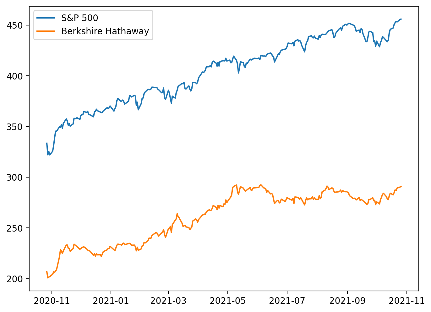
This snippet is an exploratory visualization step early in a pairs‑trading pipeline: it pulls two series from the dataset (the S&P 500 index proxy and a Berkshire Hathaway share), sets up the plotting canvas resolution, and overlays the two raw price series to inspect their relationship. The plotting call uses the series’ implicit index (usually timestamps) so you’re effectively viewing two time‑series on the same x axis and comparing their raw magnitudes and trends. The legend call just makes the lines identifiable. In short, the code is asking “do these two instruments move together?” by eyeballing their price paths.
The important decision behind this quick plot is to sanity‑check co‑movement before committing to statistical testing or trade signal construction. However, the in‑line comment correctly flags the key issue: these are raw, unstandardized prices, so apparent correlation can be dominated by scale and shared market trends rather than a stationary, mean‑reverting relationship. Plotting raw levels can make two series look highly correlated simply because both are drifting upward (or because one is part of the index), not because their spread is mean‑reverting. The figure size and dpi are set to make the visual clearer, but they do not affect the statistical relationship — only readability.
For mean‑reversion pairs trading we care about a stationary spread (a linear combination of the two prices that fluctuates around a constant mean), not raw co‑movement of levels. Practically, that means after this initial plot you should normalize or transform the series (e.g., log prices, returns, or z‑scores) and visually inspect the normalized paths; more importantly, estimate a hedge ratio (OLS regression of one price on the other) to form a spread and run a stationarity test (ADF, KPSS) on that spread. If the spread is stationary, you have the candidate mean‑reverting relationship; if not, the visual correlation in levels is misleading and the pair is unsuitable for classic pairs trading.
A couple of practical notes tied to the code and the domain: the comment labels BRK-B as Class A while the ticker suggests Class B — confirm you’re using the intended share class, because different classes can have different corporate actions and scaling. Also, pairing an individual stock with a broad index (like SPY) is usually not ideal for a pairs trade because the index exposure confounds common market moves; better candidates are two stocks within the same industry with similar economic drivers. The next steps after this plot are normalization, hedge ratio estimation, spread construction, stationarity testing, and only then designing entry/exit thresholds for a mean‑reversion strategy.
# Correlation of Nike and Apple ~ 0.89.
figure(figsize=(8, 6), dpi=200)
BRK_B = d[’BRK-B’]
MSFT = d[’MSFT’]
plt.plot(BRK_B, label = “BRK_B”)
plt.plot(MSFT, label = “MSFT”)
plt.title(’Historical Adjusted Closing Prices’)
plt.legend()
# More reasonable.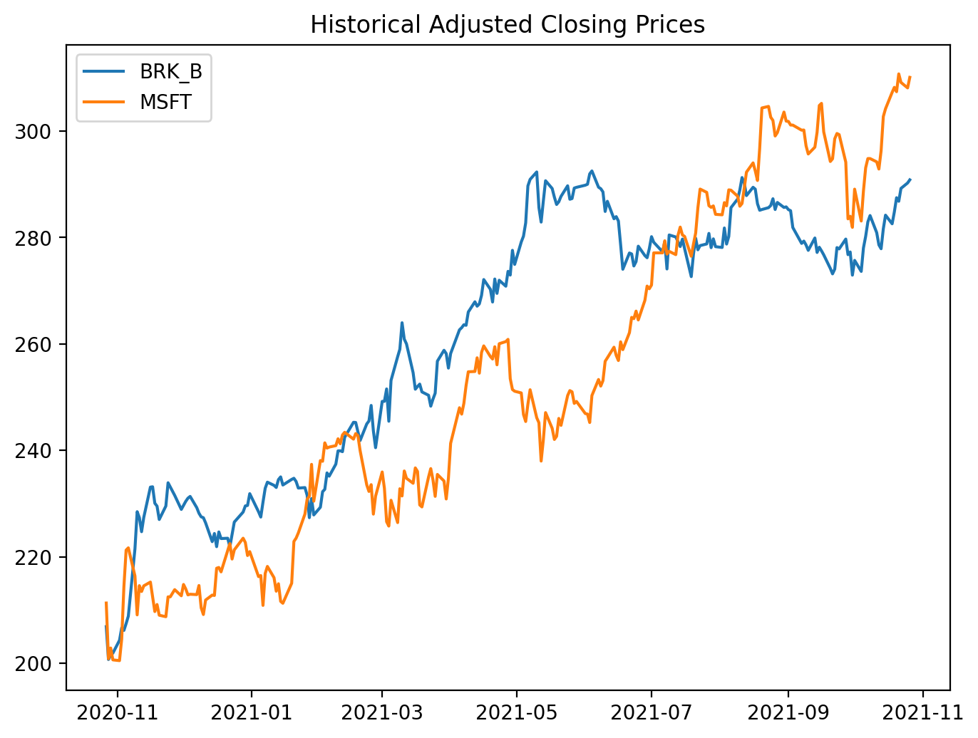
This small block is an exploratory plotting step in the pairs-trading workflow: its job is to give you a quick visual sanity check that two candidate instruments move together before you invest time in formal tests and a trading strategy. We start by opening a dedicated figure with a controllable size and DPI so the resulting plot is readable; then we pull the adjusted-close series for two tickers out of the DataFrame d. Using adjusted close is intentional — it folds in dividends and splits so the plotted series reflect the real economic price history that a trading strategy would have experienced. Plotting both series on the same axes lets you inspect co-movement, relative trends, and obvious structural breaks at a glance.
Why do this plot first? A high pairwise correlation or obvious comovement is necessary (but not sufficient) for a mean-reversion pairs trade: we want two assets that share a common stochastic component so that a stationary spread can exist. The visual check helps you spot problems that numeric summaries can miss: large, persistent divergence, different long-term trends, or sudden regime shifts that will invalidate a mean-reversion assumption. It also surfaces practical issues like different price scales — if one instrument trades at hundreds of dollars and the other at tens, overlapping raw-price lines can be misleading, so you’ll often transform to log-prices, normalize to z-scores, or compute a hedge-adjusted spread before deciding.
Operationally, this plot should be followed by the analytical steps that turn visual intuition into tradeable signals: estimate the hedge ratio (e.g., OLS regression of one price on the other), construct the spread x_t = p1_t − β p2_t (or use log-price differences), run a stationarity test (ADF) on the spread, and standardize it to a z-score to set entry/exit thresholds. Also ensure your series are aligned and cleaned (handle missing dates, corporate-action adjustments, and differing liquidity windows) because visual co-movement can be an artifact of misaligned data. In short, this code is the quick-look step that validates whether the pair merits deeper cointegration and mean-reversion analysis — the next steps will convert what you see here into a statistically justified trading rule.
# plot the spread
figure(figsize=(8, 6), dpi=200)
plt.plot(BRK_B - MSFT, label = ‘Spread (BRK-B - MSFT)’)
plt.legend()
plt.title(”Spread between BRK-B and MSFT”)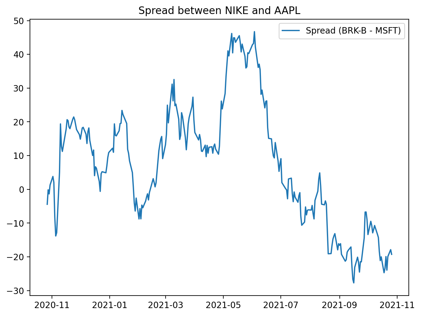
This block creates a focused visualization of the raw price difference between two tickers — BRK‑B and MSFT — to give an immediate, human-readable sense of whether their relationship behaves like a mean‑reverting spread. First the code establishes the plotting canvas with an explicit physical size and resolution (figure(figsize=(8,6), dpi=200)) so the chart is crisp and legible for inspection or inclusion in reports; that choice affects how much time‑series detail you can see and how it will render in different outputs. Next the spread is computed as BRK_B — MSFT and plotted; behind the scenes this subtraction is typically done on aligned time series (e.g., pandas Series indexed by date), so you should be aware that any misaligned dates produce NaNs and will need alignment or dropping before plotting. The plotted line is labeled and a legend is shown so the chart is self‑documenting, and a title clarifies that this is the spread between the two instruments.
Why visualize this simple difference? In mean‑reversion pairs trading we’re looking for a stationary, mean‑reverting relationship between two assets. A time plot of the spread is the fastest sanity check: it reveals whether the spread oscillates around a stable mean, whether it drifts, whether volatility changes over time, and whether there are obvious outliers or structural breaks that would invalidate a mean‑reversion assumption. That’s why a plain BRK_B — MSFT is useful as a first pass, but also why you should be cautious: subtracting raw prices implicitly assumes a hedge ratio of 1 and identical scale/units. If the two series have different price levels or different sensitivities, the raw spread can be misleading. In practice you’ll often replace this simple difference with a residual from a cointegration regression (i.e., spread = BRK_B — β·MSFT), and you’ll standardize that residual into a z‑score so entry/exit thresholds are meaningful. The plot shown here is therefore a diagnostic step — it helps you decide whether to proceed with formal cointegration testing, compute a statistically derived hedge ratio, normalize the spread, or reject the pair for trading because it does not exhibit stable mean‑reversion behavior.
# Check out the cointegration value: Null hyp. = no cointegration
import statsmodels.tsa.stattools as ts
result = ts.coint(BRK_B, MSFT)
This small block is performing the essential statistical check that underpins whether BRK_B and MSFT are a viable mean-reversion pair. Conceptually, for pairs trading we need a linear combination of the two price series whose distribution is stationary (i.e., the spread reverts to a constant mean). The statsmodels coint call implements the Engle–Granger two‑step cointegration test: it first fits an OLS regression between the two series to obtain the residual series (the putative spread or error term), and then runs a unit‑root test on those residuals to see if they are stationary. In effect you’re asking “is there a stable long‑run equilibrium relation between BRK_B and MSFT, or do their deviations wander off indefinitely?” — the null hypothesis of the test is that no cointegration exists (the residuals have a unit root / are non‑stationary).
The function returns a test statistic, a p‑value, and critical values for common significance levels. Interpretation is important and somewhat non‑intuitive: a large negative test statistic (more negative than the relevant critical value) or a small p‑value means you can reject the null of no cointegration — i.e., evidence that the two series are cointegrated and that the spread is mean‑reverting. Conversely, a test statistic not sufficiently negative (or a large p‑value) means you cannot assume a stationary spread and therefore the pair is unlikely to support a robust mean‑reversion trading strategy.
Practically, after this check you should (1) inspect the estimated hedge ratio from the regression used by the test and use it to construct the spread, (2) visually and statistically validate that the residuals are stationary (ADF on residuals, check autocorrelation and half‑life), and (3) be mindful of sample size, regime changes, and look‑ahead bias — cointegration can break down over time and is sensitive to structural breaks. If you need multivariate relationships or more robust inference across many assets, consider the Johansen test or rolling/stability checks rather than relying on a single static coint call.
# Cointegration test: A technique used to find a potential correlation in a time series (long term)
# Determines if the spread between the two assets are constant over time.
# Null Hypothesis: Spread between series are non-stationary.
# Uses the augmented Engle-Granger two-step cointegration test.
cointegration_t_statistic = result[0]
p_val = result[1]
critical_values_test_statistic_at_1_5_10 = result[2]
print(’We want the P val < 0.05 (meaning that cointegration exists)’)
print(’P value for the augmented Engle-Granger two-step cointegration test is’, p_val)
This block is taking the outputs of an augmented Engle–Granger cointegration test and turning them into a simple decision signal for whether a candidate pair qualifies for mean-reversion trading. Conceptually the Engle–Granger procedure is two steps: first you regress one asset on the other to estimate a long‑run equilibrium (the hedge ratio) and compute the residuals (the spread), then you run an augmented Dickey–Fuller (ADF) test on those residuals to see if they are stationary. The ADF result is packaged here as result[0] (the ADF test statistic applied to the residuals), result[1] (the p‑value for that test), and result[2] (the critical values at conventional levels such as 1%, 5%, 10%).
The decision logic encoded is focused on rejecting the null hypothesis that the spread is non‑stationary. Practically, you reject that null when the p‑value is below your significance threshold (commonly 0.05) or equivalently when the ADF test statistic is more negative than the 5% critical value. Rejecting the null means the residuals (the spread) are stationary — i.e., they revert to a mean over time. The print statements simply remind you of the threshold and display the computed p‑value; in a production pipeline you’d typically programmatically compare either the p‑value to your alpha or the test statistic to the critical value to accept/reject cointegration.
Why this matters for pairs trading: cointegration implies a long‑run equilibrium relationship between the two price series so that deviations (the spread) are mean‑reverting and therefore can be traded — you go long the underpriced leg and short the overpriced leg expecting the spread to converge. However, cointegration is necessary but not sufficient: you should validate the estimated hedge ratio, check residual diagnostics (autocorrelation, structural breaks), ensure sample size and look‑ahead bias are handled, and follow up with spread z‑scoring and robust backtesting before deploying live trades.
from statsmodels.tsa.stattools import adfuller
# Compute the ADF test for Berkshire Hathaway and Microsoft
# With all time series, you want to have stationary data otherwise our data will be very hard to predict.
# ADF for Berkshire Hathaway Class B
BRK_B_ADF = adfuller(BRK_B)
print(’P value for the Augmented Dickey-Fuller Test is’, BRK_B_ADF[1])
MSFT_ADF = adfuller(MSFT)
print(’P value for the Augmented Dickey-Fuller Test is’, MSFT_ADF[1])
Spread_ADF = adfuller(BRK_B - MSFT)
print(’P value for the Augmented Dickey-Fuller Test is’, Spread_ADF[1])
Ratio_ADF = adfuller(BRK_B / MSFT)
print(’P value for the Augmented Dickey-Fuller Test is’, Ratio_ADF[1])
# Spread looks fine. If you’d want even better results, consider taking the difference (order 1) of Berkshire and MSFT

# Results: can only claim stationary for the spread (since P value < 0.05). This suggests a constant mean over time.
# Therefore, the two series are cointegrated.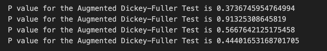
Goal-first: for a mean-reversion pairs-trading strategy we need a predictable, mean-reverting relationship between two asset prices — that typically means the combination of the two series we trade (spread, residuals, or ratio) is stationary. Stationarity matters because a stationary series has a constant mean and finite variance over time, so deviations from the mean are transient and you can design entry/exit rules around those deviations; non-stationary raw prices generally drift and do not “revert”, so they are poor candidates for mean-reversion trades.
Walkthrough of the code and decisions: the code runs the Augmented Dickey-Fuller (ADF) test on four series: each raw price series individually (BRK_B and MSFT), their difference (BRK_B — MSFT, the spread), and their ratio (BRK_B / MSFT). The ADF test’s null hypothesis is that the series has a unit root (non-stationary); a low p-value (commonly < 0.05) lets us reject that null and conclude stationarity. Practically, the code prints the p-value returned by adfuller (index 1 of the result tuple) for each series so you can see which of those candidate series are stationary. Testing the raw series first checks whether either price alone is already stationary (rare for price levels); testing the spread checks whether the difference is stationary, which is the classical sign of cointegration suitable for pairs trading; testing the ratio is an alternative approach when you expect a proportional relationship rather than an additive one.
Why this sequence: if both price series are non-stationary but their spread is stationary, that’s the definition of cointegration — a stable long-run relationship exists even though each price wanders independently. The comment and result interpretation in the code follow that logic: only the spread shows p < 0.05, so you can treat the spread as mean-reverting and justify designing a pairs-trading strategy around it (enter when spread is wide, exit when it reverts). The note about taking the first difference (order 1) refers to the common situation where a non-stationary series becomes stationary after differencing (it’s integrated of order 1); differencing is useful for modeling returns or for some preprocessing steps, but differencing removes long-run relationships so it’s not a substitute for testing cointegration when your objective is mean reversion of a spread.
Caveats and practical improvements: ADF outcomes depend on lag choice and whether you include a constant or trend term, so explicitly selecting lags or model specification can change the result. The more robust approach to declare cointegration is the Engle–Granger procedure: regress one series on the other, then run an ADF on the regression residuals (that controls for scale and slope), rather than blindly testing the raw difference or ratio. Consider using log-prices for multiplicative relationships, handling missing data/alignment carefully, and checking for structural breaks or heteroskedasticity that can invalidate the ADF. Finally, once you have a stationary spread, quantify its properties (mean, standard deviation, half-life of mean reversion) and design entry/exit thresholds or a z-score system — those are the operational pieces that turn the statistical finding of stationarity into a tradable mean-reversion strategy.
# Also, we can take a look at the price ratios between the two time series.
figure(figsize=(8, 6), dpi=200)
ratio = BRK_B / MSFT
plt.plot(ratio, label = ‘Price Ratio (BRK / MSFT))’)
plt.axhline(ratio.mean(), color=’red’)
plt.legend()
plt.title(”Price Ratio between BRK and MSFT”)
This small block is producing a quick visual diagnostic of the relationship between two securities — BRK_B and MSFT — by transforming their raw prices into a single “price ratio” series and showing its center tendency. The calculation ratio = BRK_B / MSFT takes the element‑wise division of the two price time series so each timestamp represents how many units of MSFT one unit of BRK_B is worth. We use a ratio (rather than a simple price difference) because when assets have different price scales and volatilities, a ratio often provides a more interpretable, scale‑invariant measure of their relative value; if the pair is cointegrated, that ratio should behave like a stationary series that mean‑reverts around an equilibrium.
After computing the ratio the code plots it and overlays a horizontal line at the empirical mean. Plotting the raw ratio lets you visually inspect whether the series oscillates around a stable mean (the key requirement for mean reversion strategies). The mean line serves as an explicit equilibrium reference: excursions above the mean suggest BRK_B is relatively expensive versus MSFT (potential short BRK_B / long MSFT), and excursions below suggest the opposite. The figure sizing, legend and title are purely for readability so you can quickly spot patterns, regimes, and outliers.
Practically, this visualization is the first step in constructing a pairs trade. If the ratio appears to revert around the mean, the next steps are to quantify that behavior (e.g., compute z‑scores = (ratio — mean)/std or rolling z‑scores, and define entry/exit thresholds), and to backtest trades triggered by those thresholds. The mean used here is the global mean; in many strategies you’ll prefer a rolling mean or detrending if the relationship drifts over time.
Finally, treat this as an exploratory tool rather than proof of tradability. A visually mean‑reverting ratio is necessary but not sufficient: you should run formal stationarity/cointegration tests, check for structural breaks, account for non‑synchronous trading and transaction costs, and consider whether a log ratio or normalized spread provides a more robust signal depending on the assets’ behavior.
# NOTE, here you can either use the spread OR the Price ratio approach. Anyways, let’s standardize the ratio so we can have a
# upper and lower bound to help evaluate our trends.. Let’s stick with the ratio data.
figure(figsize=(8, 6), dpi=200)
# Calculate the Zscores of each row.
df_zscore = (ratio - ratio.mean())/ratio.std()
plt.plot(df_zscore, label = “Z Scores”)
plt.axhline(df_zscore.mean(), color = ‘black’)
plt.axhline(1.0, color=’red’) # Setting the upper and lower bounds to be the z score of 1 and -1 (1/-1 standard deviation)
plt.axhline(1.25, color=’red’) # 95% of our data will lie between these bounds.
plt.axhline(-1.0, color=’green’) # 68% of our data will lie between these bounds.
plt.axhline(-1.25, color=’green’) # 95% of our data will lie between these bounds.
plt.legend(loc = ‘best’)
plt.title(’Z score of Ratio of Berkshire to MSFT’)
plt.show()
# For the most part, the range that exists outside of these ‘bands’ must come converge back to the mean. Thus, you can
# determine when you can go long or short the pair (BRK_B to MSFT).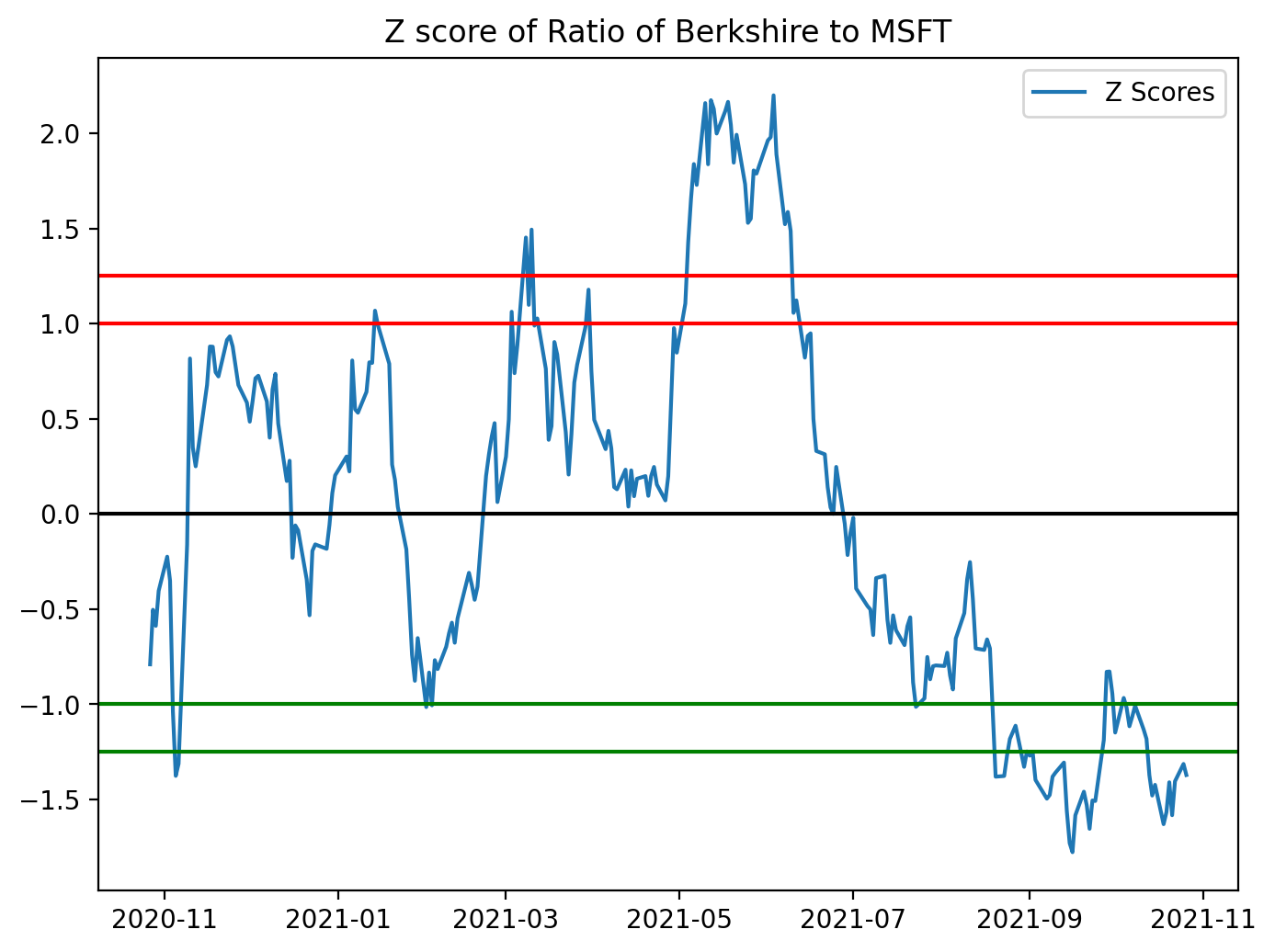
This block takes a precomputed price ratio (BRK_B / MSFT in your example) and standardizes it into z-scores so you can make scale-free, symmetric decisions for a mean-reversion pairs strategy. Concretely, the code computes z = (ratio — mean) / std using the sample mean and standard deviation of the ratio series, which converts the raw ratio into units of standard deviations away from its historical mean. Standardizing is important because the raw ratio has arbitrary scale and drift; by using z-scores you can apply fixed entry/exit thresholds that behave consistently across time and across different pairs.
After computing the z-score series the code plots it and draws horizontal reference lines: the mean (z = 0) and bands at ±1.0 and ±1.25. The visual purpose is to see when the ratio is unusually high or low relative to its historical dispersion. Practically, those bands are used as trading triggers: when the z-score exceeds the upper band you would typically short the pair (sell BRK_B and buy MSFT in proportion), betting the ratio will revert down toward zero; when the z-score drops below the lower band you would go long the pair (buy BRK_B and sell MSFT), betting it will revert upward. The exit rule is usually to close the trade when the z-score returns to the mean or to a narrower band near zero.
A couple of important methodological notes that affect why and how you should use this logic in a live strategy: the code uses the global mean and std, which is fine for a diagnostic chart but creates look-ahead if used for live signals — use rolling mean/std to compute realtime z-scores. Also, mean reversion only makes sense if the pair is cointegrated (the ratio is stationary), so you should validate that (e.g., Engle–Granger ADF test) before committing capital. The comments in the code about proportions inside the bands are slightly off: ±1σ contains ≈68% of data for a normal distribution, and ≈95% corresponds to ±1.96σ, so choose thresholds based on empirical distribution and your risk/edge expectations. Finally, remember to account for transaction costs, slippage, and position sizing/stop-loss rules — visual thresholds are a starting point, but robust signals require risk control and backtesting.
figure(figsize=(8, 6), dpi=200)
ratios_mavg5 = ratio.rolling(window=5, center=False).mean()
ratios_mavg20 = ratio.rolling(window=20, center=False).mean()
std_20 = ratio.rolling(window=20, center=False).std()
zscore_20_5 = (ratios_mavg5 - ratios_mavg20)/std_20
plt.plot(ratio.index, ratio.values)
plt.plot(ratios_mavg5.index, ratios_mavg5.values)
plt.plot(ratios_mavg20.index, ratios_mavg20.values)
plt.legend([’Ratio’, ‘5d Ratio MA’, ‘20d Ratio MA’])
plt.xlabel(’Date’)
plt.ylabel(’Ratio’)
plt.title(’Ratio between BRB-B and MSFT with 5 day and 20 day Moving Averages’)
plt.show()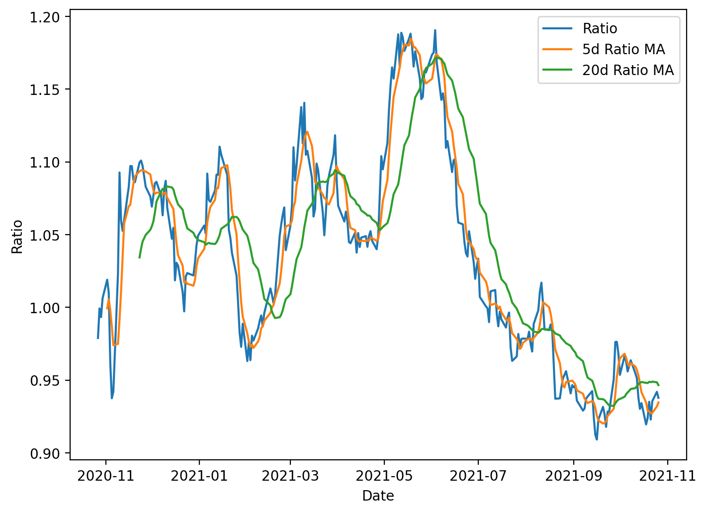
This block is preparing a simple visualization and a standardized signal used in mean-reversion pairs trading. Starting from a time series called ratio (the price ratio of the two instruments), the code computes two smoothed versions of that series: a 5-day rolling mean and a 20-day rolling mean. The 5-day average captures short-term deviations, while the 20-day average represents a longer-term equilibrium level; comparing them gives a sense of whether the ratio has moved away from its recent normal. Both moving averages use a causal rolling window (center=False) so each value only depends on current and past observations, avoiding look-ahead bias when these statistics are later used for live trading or backtesting.
Next, the code computes a 20-day rolling standard deviation of the ratio. This standard deviation is used to normalize the short-term deviation from the long-term mean. Specifically, the z-score is computed as (5-day MA − 20-day MA) / 20-day STD. Normalizing by the rolling standard deviation is important because it converts an absolute deviation into a scale-free measure: one unit of z-score represents one standard deviation of typical recent variability. That makes entry and exit thresholds comparable over time and across different pairs, preventing spurious signals when volatility changes.
Although the z-score is calculated here, the visible output is a plot showing the raw ratio and the two moving averages. Plotting the ratio alongside the short and long MAs helps you visually confirm the dynamics that the z-score will capture: how often and how far the short MA diverges from the long MA, whether those divergences tend to revert, and how volatile the ratio is. Peaks where the short MA sits well above the long MA correspond to positive z-scores (ratio relatively high); troughs correspond to negative z-scores. In practice you would threshold the z-score to generate trades (e.g., enter when |z| exceeds an entry threshold and exit when it crosses back toward zero).
A few practical considerations are implicit in this code: rolling operations introduce NaNs for the initial windows, so the early portion of the series will be undefined for the 5- and 20-day statistics and for the z-score; any downstream trading logic must handle or exclude those dates. Using the 20-day STD as denominator also requires attention to near-zero volatility periods — either by guarding against division-by-zero or by requiring a minimum volatility before signaling. Finally, using asymmetric windows (5 vs 20) is a design choice balancing sensitivity and noise; you might tune those window lengths and the corresponding z-score thresholds based on historical behavior of the pair and transaction-cost-aware backtests.
figure(figsize=(8, 6), dpi=200)
zscore_20_5.plot()
plt.axhline(0, color=’black’)
plt.axhline(1, color=’red’, linestyle=’--’)
plt.axhline(1.25, color=’red’, linestyle=’--’)
plt.axhline(-1, color=’green’, linestyle=’--’)
plt.axhline(-1.25, color=’green’, linestyle=’--’)
plt.legend([’Rolling Ratio z-score’, ‘Mean’, ‘+1’,’+1.25’,’-1’,’-1.25’])
plt.show()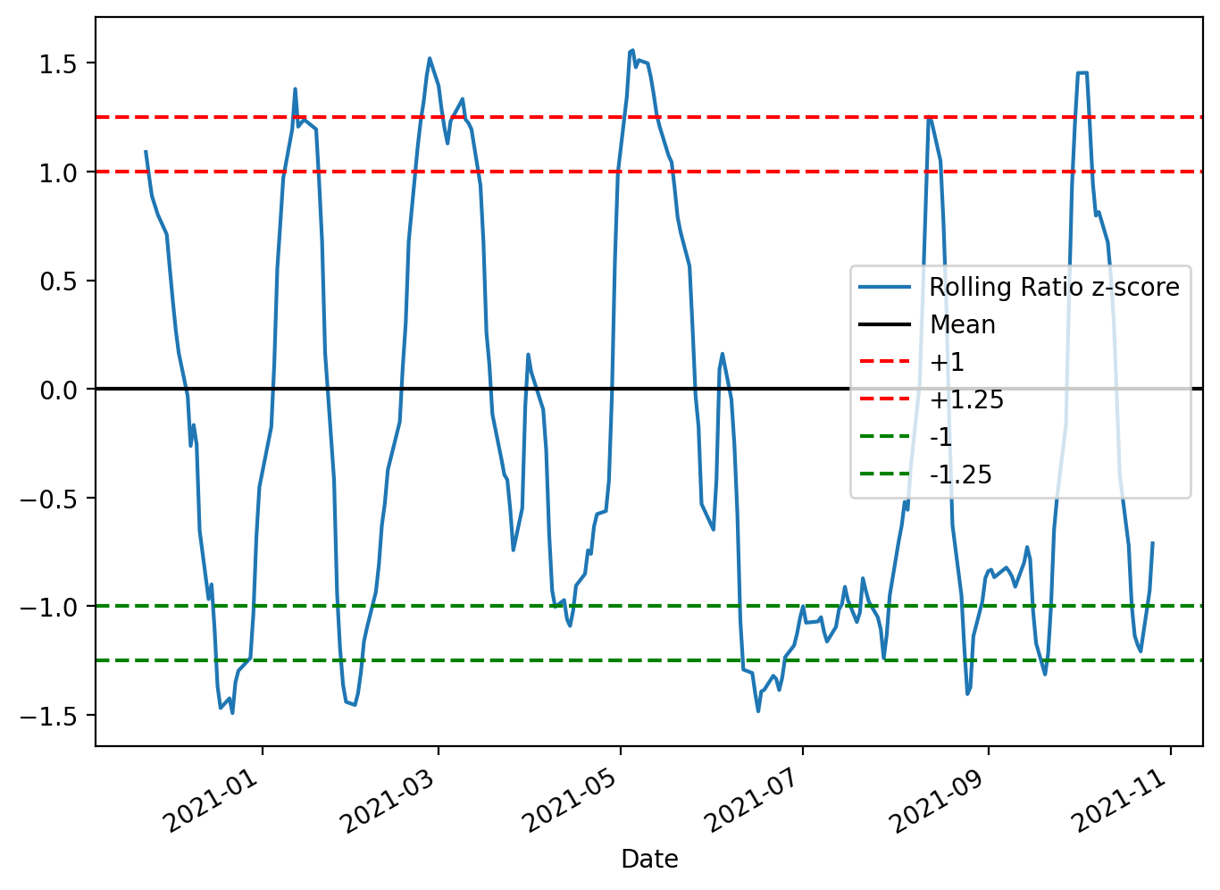
The code constructs a focused diagnostic plot of the rolling z-score used to drive the pairs-trading signals and draws the decision boundaries you use to open and close trades. First it allocates a reasonably sized, high-resolution figure so the time-series and horizontal thresholds are easy to read; that matters because you’ll visually inspect many charts when validating strategy behavior across different pairs and periods. Next it plots zscore_20_5, which is the standardized spread (ratio residual) produced by your rolling mean/standard-deviation calculation — standardizing the spread into a z-score is intentional so values are comparable across time and across different asset pairs regardless of scale or volatility.
The horizontal lines are the operational rules overlaid on the z-score. The black line at 0 marks the long-run mean to which the spread is expected to revert; crossing back through this line is typically the primary exit or profit-taking condition. The dashed red lines at +1 and +1.25 mark progressively stronger short-entry / unwind thresholds on the positive side: +1 is the conventional entry signal (spread one standard deviation away from the mean), and +1.25 is a stricter boundary you can use as either a confirmation, a tighter take-profit, or a stop/escape if the divergence strengthens further. The symmetrical green lines at -1 and -1.25 mirror those rules for entering and managing long positions when the spread is negatively skewed. Using two thresholds per side (entry and an outer threshold) gives you a simple way to encode both when to trade and how to react to continued divergence.
Finally, the legend maps colors to their meaning so the plot is interpretable at a glance, and plt.show() renders it for interactive inspection. In the context of mean-reversion pairs trading, this visualization is a lightweight but essential validation tool: it confirms that your z-score computation behaves sensibly, reveals regime shifts or structural breaks that may invalidate the strategy, and helps you tune the lookback windows and threshold levels (e.g., 1 vs 1.25) before automating trade entry/exit. Keep in mind these thresholds are heuristic and should be backtested with transaction costs and slippage; the plot itself is for human-in-the-loop calibration and debugging.
figure(figsize=(8, 6), dpi=200)
ratio.plot()
buy = ratio.copy()
sell = ratio.copy()
buy[zscore_20_5>-1] = 0
sell[zscore_20_5<1] = 0
buy.plot(color=’g’, linestyle=’None’, marker=’^’)
sell.plot(color=’r’, linestyle=’None’, marker=’^’)
x1, x2, y1, y2 = plt.axis()
plt.axis((x1, x2, ratio.min(), ratio.max()))
plt.legend([’Ratio’, ‘Buy Signal’, ‘Sell Signal’])
plt.title(’Relationship BRK to MSFT’)
plt.show()
This block produces a diagnostic chart that overlays entry signals for a mean-reversion pairs trade on the BRK/MSFT ratio. Conceptually the ratio is the spread we expect to mean-revert: when the ratio is far below its recent average we treat BRK as cheap relative to MSFT (so we would long the spread: long BRK / short MSFT), and when it is far above the average we treat BRK as rich (so we would short the spread). The zscore_20_5 series used here is a precomputed standardized distance from the rolling mean (a z‑score), and the code uses symmetric thresholds of ±1 as trigger levels for entry: z ≤ −1 is a buy (spread is low) and z ≥ +1 is a sell (spread is high). These thresholds are a balance between sensitivity and noise — wide enough to avoid reacting to small fluctuations but narrow enough to capture mean-reversion opportunities.
Operationally, the code first plots the continuous ratio line so you can see the underlying spread over time. It then creates two copies of the ratio called buy and sell and masks them so that only the values that correspond to trigger conditions remain. Specifically, buy[zscore_20_5 > -1] = 0 clears all points except where the z-score is ≤ −1, and sell[zscore_20_5 < 1] = 0 clears all points except where the z-score is ≥ +1. By leaving the original ratio value at signal dates and zeroing out other dates, these two series become sparse marker series that can be plotted on top of the ratio to indicate exact signal times.
For visualization the sparse series are drawn with no connecting line and with triangular markers (green for buy, red for sell) so the signals stand out against the continuous ratio plot. The code then captures the current axis limits and forces the vertical limits to the actual min and max of the ratio; the reason for that step is to avoid automatic autoscaling being pulled toward zero by the zeroed-out entries, which would visually compress the ratio line and make the signals harder to interpret. Finally it adds a legend and title so the chart clearly communicates that these are buy/sell entry signals for the BRK-to-MSFT relationship.
A couple of practical notes: using zeros to mask non-signals works here only because the axis is later re-limited to the ratio range; if your ratio can cross or include zero, those plotted zeros could create misleading markers or affect scaling. Safer is to use NaN for non-signal points so they are not plotted at all. Also be aware of the inclusive boundary behavior: as written, values exactly at −1 and +1 are retained (the masks keep z ≤ −1 for buy and z ≥ +1 for sell), so choose threshold comparisons deliberately to match your intended signal semantics. Overall, this plot is intended as a quick visual validation of where your strategy would enter mean-reversion trades relative to the historical spread.
Pure Arbitrage (Pure Arb) → Cross-Exchange Arbitrage
- Contingent on speed and the ability to detect market inefficiencies.
- Involves simultaneously buying and selling the same security across different markets to capture price differentials.
- Large market; viability depends on having the fastest execution and implementation algorithms. This activity contributes to greater market efficiency.
import pandas as pd
import numpy as np
Although this snippet only imports two libraries, those two choices drive almost every design and performance decision in the pure-arbitrage pipeline. In practice the data flows begin as raw market feeds — orderbook snapshots, time-and-sales ticks, or periodic REST snapshots from multiple exchanges — and the combination of pandas and NumPy determines how we ingest, align, clean, compute signals, and simulate fills. We typically bring each exchange’s stream into pandas DataFrames keyed by a DatetimeIndex because pandas gives us the expressive time-series operations we need: resampling to a common frequency, aligning different feeds with outer joins, forward-filling the last-known price, grouping by symbol, and applying rolling windows to measure persistence of spreads. Using a well-typed DataFrame makes it straightforward to enforce invariants (no negative prices, positive sizes, monotonic timestamps) early in the pipeline so downstream logic only sees clean inputs.
Once price and liquidity columns are aligned in pandas, we move the heavy numeric work into NumPy-backed arrays (or the underlying ndarray views of DataFrame columns) to keep computations vectorized and fast. Spread calculations, fee-adjusted arbitrage margins, log-returns, and per-tick P&L calculations are all implemented as elementwise operations or reductions on NumPy arrays so we avoid Python loops that would choke on high-frequency data. NumPy’s broadcasting and boolean-masking semantics let us efficiently compute masks of profitable opportunities (for example where best-bid on venue A minus best-ask on venue B exceeds fees and slippage), clip unrealistic values, and compute cumulative fill curves to estimate how much volume is actually executable against the posted depth.
There are important “why” and numerical-stability considerations that govern how we use these libraries. We prefer float64 dtypes to minimize rounding error when accumulating P&L or compounding returns, and we explicitly handle NaNs and infinities that arise from missing data or division-by-zero in return calculations. Pandas helps here by making time alignment and NaN propagation explicit (so you can decide forward-fill vs drop), and NumPy offers fast primitives (np.where, np.clip, masked arrays) to safely convert those into actionable signals. When calculating spreads and expected execution outcomes we normalize price levels (e.g., using returns or basis points) to keep thresholds exchange-agnostic and prevent scale-dependent bugs, and we compute rolling minima/maxima to ensure we don’t trigger on spurious single-tick arbitrage that won’t survive latency or fees.
Performance and resource management are practical drivers of these choices. For intraday or tick-scale raw data the combination of pandas for high-level time operations and NumPy for tight numeric kernels gives a good balance: pandas handles indexing, joins, and resampling; NumPy keeps the hot loops fast and memory-efficient. For extremely large data sets you’ll want to avoid repeated copies (use .values or to_numpy() when you must compute in NumPy, pre-allocate result arrays, and consider chunked processing or tools like Dask/Numba if pandas/NumPy become a bottleneck). Finally, from a correctness and simulation standpoint, this stack makes it straightforward to reason about fees, slippage, and fillability: compute gross spreads in NumPy, apply deterministic fee models and slippage curves, then simulate fills against orderbook depth stored or aggregated in pandas — the separation of responsibilities (pandas = time alignment and business logic, NumPy = fast numerics) keeps the pipeline auditable and performant for pure-arbitrage detection and backtesting.
gemini = pd.read_excel(’BTCPrices.xlsx’,sheet_name = ‘Gemini’, na_values=None) # You would replace these datasets with
# live streamed data.
reuters = pd.read_excel(’BTCPrices.xlsx’, sheet_name = ‘Reuters’) # Note that you can’t actually trade Crypto on Eikon Reuters.
# This is just pricing history data. (and an example.)
This block is the very first step in the arbitrage workflow: it ingests two separate price histories into memory so downstream logic can compare them and look for pure-arbitrage opportunities. The first line reads the “Gemini” sheet into a DataFrame named gemini; the comment signals that in a live system this row would be replaced by a direct market feed from Gemini rather than an Excel snapshot. The second line loads the “Reuters” sheet into reuters and the inline comment explicitly calls out that Reuters here is just a historical price source — Eikon/Reuters isn’t an exchange you can submit crypto orders to — so it’s useful only for price comparison/analysis, not for execution.
Why this matters: arbitrage requires very clean, comparable price inputs from the two venues you’re comparing, so the code deliberately keeps the two sources separate at ingest. Note that na_values=None means we aren’t adding any custom strings to the list of values treated as missing; we rely on pandas’ default missing-value behavior and don’t try to remap extra tokens at this stage. That’s a conscious choice during prototyping to avoid masking unexpected data formats; later cleaning steps should explicitly handle any domain-specific missing-value markers.
How the data should flow after this read: validate schema (ensure timestamps, price columns, side/bid/ask or last price exist), normalize column names and types (timestamps to a common timezone-aware dtype, currencies to a common unit), and align sampling frequency (resample or interpolate both feeds to the same time grid). For pure arbitrage you should prefer best bid and best ask (or full order-book snapshots) over last/trade prints, because arbitrage decisions depend on executable prices, not trade history. After alignment, compute the instantaneous spread = price_A — price_B (or using the appropriate bid/ask pairing), subtract transaction costs and taker/maker fees, and only surface cases where the net spread exceeds slippage + fees by a margin that justifies execution latency and risk.
Operational caveats tied to the business goal: Excel is fine for prototyping but not for real arbitrage — latency, update frequency, and data fidelity are critical. Replace these reads with streaming APIs, unify message formats, and put the feed into a low-latency store or message queue. Add automated validations (schema checks, rate-of-change sanity checks, sequence-number or timestamp continuity) to avoid false positives caused by stale or misaligned rows. Finally, account for execution realities — latency, order-book depth, and counterparty constraints — before treating any detected spread as a tradable, “pure” arbitrage opportunity.
Exchanges with APIs for finding arbitrage opportunities
The following exchanges provide APIs that can be used to discover arbitrage opportunities:
- Binance API
- Bittrex API
- Poloniex API
- Coinbase API
- Kraken API
- Bitfinex API
- Bitstamp API
- HitBTC API
- Gemini API
- KuCoin API
gemini = gemini.set_index(”Date (EST)”)
gemini
This single-step operation replaces the default integer index with the DataFrame column named “Date (EST)”, turning the timestamps into the primary axis for all subsequent DataFrame operations. Using set_index in this way (note: it returns a new DataFrame, which is why the result is reassigned to gemini) removes the original column by default and makes time-based indexing, slicing, and alignment natural and efficient. The immediate visible effect of calling gemini afterward is just to inspect and verify that the index is now the date column.
From the pure-arbitrage perspective this is a deliberate setup: treating timestamps as the index lets you align ticks from different exchanges by time, perform resampling to a common frequency, run rolling/windowed spread calculations, and use time-aware join/merge operations (e.g., merge_asof) to pair quotes that are causally comparable. Important practical points to watch for here are ensuring the index is actually a proper datetime dtype (not plain strings), sorting the index, and normalizing/standardizing timezones — “Date (EST)” suggests EST labeling, so you should either localize/convert to a canonical timezone (often UTC) to avoid misalignment or daylight-saving ambiguities. Also be mindful of duplicate timestamps: duplicate indices can break asof joins and aggregate operations, so deduplicate or aggregate ticks (first/last/mean) if your strategy requires unique timestamps.
reuters = reuters.set_index(”Time”)
reuters
This two-line fragment is establishing the DataFrame’s time dimension as the primary axis for all subsequent time-series operations and then showing the result. By doing reuters = reuters.set_index(“Time”) you replace the default integer index with the values from the “Time” column so timestamps become the DataFrame’s index; set_index returns a new DataFrame, and assigning it back explicitly rebinding the name avoids inplace side effects and common pandas assignment pitfalls. Making time the index is not just cosmetic — it changes how pandas interprets and operates on the rows: it enables efficient time-based slicing (e.g., reuters.loc[“2025–01–01”:”2025–01–02”]), resampling (resample/rolling), and specialized joins (merge_asof, asof joins) that are crucial when aligning quotes/trades across venues for pure-arbitrage detection.
From the pure-arbitrage perspective, treating timestamps as the index is essential because arbitrage decisions depend on near-simultaneous price differences. With the Time index you can align multiple instruments by timestamp, perform nearest-neighbor matches, compute spreads over precise windows, and run rolling computations or latency-aware joins that require a monotonic datetime index. That is also why you typically follow this pattern with additional checks — ensure “Time” is a true datetime dtype (pd.to_datetime) and that the index is sorted and, if needed, timezone-aware; many time-based pandas operations assume a monotonic DatetimeIndex and produce incorrect results or exceptions if the index is unsorted or contains mixed types.
The second line, reuters, simply displays the transformed DataFrame (in a REPL/notebook context). It’s a quick verification step to confirm the index change: you’ll see “Time” no longer as a column but as the left-hand index, and you can immediately validate dtype, sorting, and any duplicate timestamps. In practice, before relying on this index for arbitrage logic you should also handle duplicate timestamps (decide whether to aggregate, keep first/last, or disambiguate sub-second data), set an explicit timezone if needed, and sort the index to guarantee correct behavior for resampling, rolling windows, and asof-style joins that underpin latency-sensitive arbitrage checks.
figure(figsize=(8, 4), dpi=200)
gem_BTC = gemini[’Open’]
reu_BTC = reuters[’Open’]
plt.plot(gem_BTC, label = “Gemini BTC”)
plt.plot(reu_BTC, label = “Reuters BTC”)
plt.title(’BTC Opening Prices’)
plt.legend()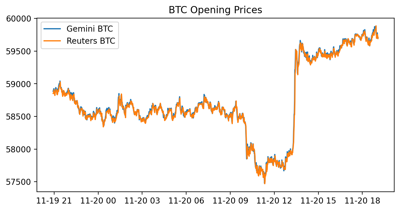
This block draws a side‑by‑side visual comparison of the opening BTC prices from two data sources — Gemini and Reuters — on a single high‑resolution figure so you can quickly spot relative differences that matter for pure arbitrage. It first prepares a plotting canvas with a wide, compact aspect ratio and elevated DPI to produce a crisp, report‑quality line chart; that’s a presentational choice to make small spreads and short‑duration divergences easier to see. Next it pulls the ‘Open’ series from each source (gemini[‘Open’] and reuters[‘Open’]) and overlays them on the same axes so both time series are directly comparable. Finally it annotates the chart with a title and a legend so you can immediately tell which line corresponds to which source.
Why this matters for pure arbitrage: plotting the raw opening prices is a quick diagnostic to reveal persistent offsets, lead/lag behaviour, or occasional spikes where one source deviates from the other — these are the candidate windows where an arbitrage strategy might be profitable. However, the code implicitly assumes the two series share the same time index, timezone, currency units and conceptual meaning of “Open” (indicative vs executable price). If those assumptions don’t hold you will see misleading offsets; therefore before relying on such plots you should align timestamps, normalize timezones, resample to a common frequency, and reconcile units or price definitions.
A few practical caveats and next steps tied to the pure‑arbitrage goal: plotting on the same axis is fine for an initial scan, but for strategy development you should also plot the spread (difference or ratio) and compute statistics (mean, standard deviation, z‑score) and transaction‑cost thresholds to decide actionable signals. Also confirm that Reuters’ prices are actually tradeable quotes (vs aggregated or delayed data), and account for latency, fees and slippage — visual divergence alone does not guarantee an executable arbitrage. In short, this chart is a visualization step to surface candidate mispricings, but rigorous alignment, normalization, and quantitative spread analysis must follow before any automated arbitrage decisions.
figure(figsize=(8, 4), dpi=400)
plt.plot(abs(gem_BTC - reu_BTC), label = “Spread |Gemini - Reuters|”)
plt.title(’Spread |Gemini - Reuters|’)
plt.legend()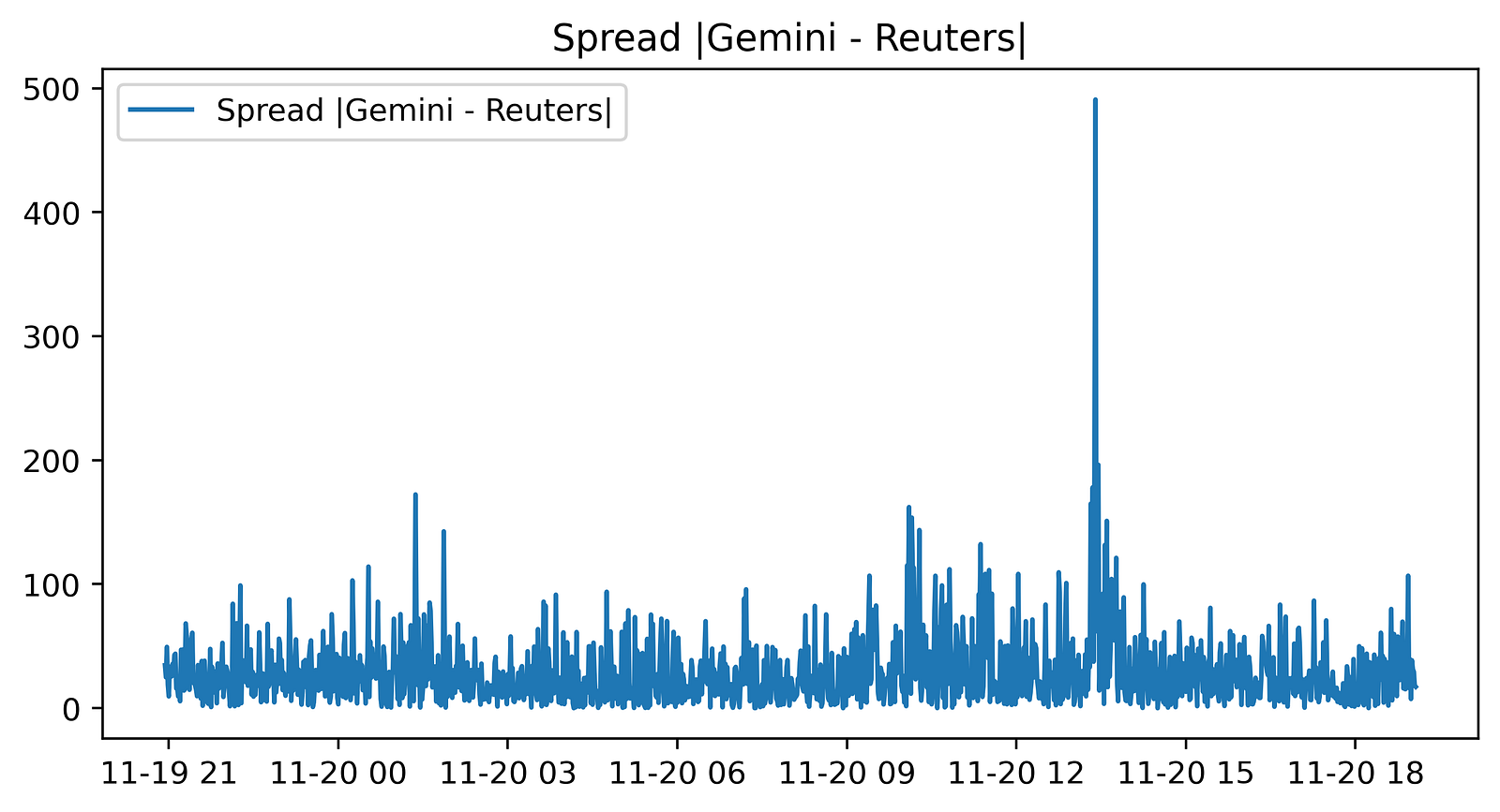
This small block is producing a visual diagnostic of the instantaneous price discrepancy between two BTC price feeds — Gemini and Reuters — with the explicit goal of surfacing pure-arbitrage opportunities. First, a new plotting canvas is created with an 8x4 inch aspect and a high resolution (dpi=400). Choosing a wide, short figure and high DPI is intentional: it makes the time-series easier to scan horizontally while ensuring the output is crisp for inspection or publication, which is useful when you later export screenshots to reports or automated dashboards.
The core computation shown to the plot is abs(gem_BTC — reu_BTC). Here the code takes the pointwise difference between the two series and then the absolute value. Taking the difference is the natural way to measure the spread between two market quotes; taking the absolute value converts that spread into a magnitude so the plot focuses on the size of divergence regardless of which venue is higher. This is helpful for monitoring when the sheer size of the discrepancy is large enough to overcome estimated transaction costs, latency effects, and execution risk — i.e., when a pure arbitrage trade might be profitable.
It’s important to note how the data must be aligned for this to be meaningful: gem_BTC and reu_BTC need to be sampled at matching timestamps or have been resampled/interpolated to a common index. If they are misaligned, the pointwise difference will reflect sampling artifacts and produce false signals. Also be aware that by using the absolute value we lose sign information, which tells you the direction of the arbitrage (which venue to buy on and which to sell on). If you intend to automatically trigger directional trades, you should plot or compute the signed spread elsewhere; the absolute spread is primarily for magnitude-based alerting.
Finally, the title and legend are small but deliberate usability choices: they label the plot so an operator immediately knows they’re looking at |Gemini — Reuters| spread and the legend ties the plotted line to that description when additional series are added later. For operational use you’ll typically combine this visualization with a threshold indicator (horizontal line at the estimated break-even spread), annotations for executed trades, and possibly a rolling mean or volatility band to filter transient noise before declaring a tradeable arbitrage.
# Sum of the entire spread?
sum(abs(gem_BTC - reu_BTC))# In a PERFECT environment. This does not include fees. If via BTC,
This single expression is computing a very crude, aggregate measure of how far two BTC price series diverge from each other over whatever index (time or price levels) gem_BTC and reu_BTC share. Element-wise, it takes the difference between the two series, applies absolute value so positive and negative deviations are treated identically, and then sums those magnitudes into one scalar. The “story” here is: you have two venues’ quoted BTC values, you measure the instantaneous deviation at each point, throw away directionality, and collapse everything into a single number that represents the total magnitude of mispricing across the sampled points.
Why someone might write this: it gives a quick, high-level sense of how much raw discrepancy exists between the two feeds — useful for exploratory monitoring or as a naive diagnostic that “these two sources are not identical.” But for pure arbitrage decision-making this calculation is purposely incomplete. Taking absolute values hides which venue is richer or poorer at each timestamp, and summing across time hides timing and persistence of opportunities; for trading you need direction (which side to buy and which to sell) and you need to know whether a given deviation exceeds trading costs. Also, using simple prices rather than executable quotes (bid/ask) and ignoring fees, latency, liquidity and slippage means the number can be misleading: a large summed spread can be composed of tiny, transient, or economically unexecutable deviations.
How to think about this in the context of pure arbitrage: replace absolute differences with directional checks that compare your executable buy price on one venue to your executable sell price on the other (e.g., ask on A < bid on B), convert differences to percentage or expected net profit after fees and slippage, and evaluate per-timestamp opportunities rather than an aggregate sum. If you truly are routing trades “via BTC” (i.e., using BTC as an intermediary in a multi-leg conversion), subtraction is not the correct model — you must compound conversion rates multiplicatively and incorporate taker/maker fees at each leg. Finally, ensure time alignment and data quality (synchronized timestamps, depth availability) before acting: otherwise the arithmetic sum of absolute mid-price differences will overstate actionable arbitrage.
# Buy Low in one exchange and sell high in the other exchange.
# Let’s combine the necessary columns together.
# 0.2% average between maker and taker.
comb_df = pd.concat([gem_BTC,
                     reu_BTC,
                     abs(gem_BTC - reu_BTC),
                     0.002 * (gem_BTC + reu_BTC)], axis = 1)
comb_df.columns = [”Gemini_Open”, “Reuters_Open”, “Absolute_Difference”, “Total_Tax”]
comb_df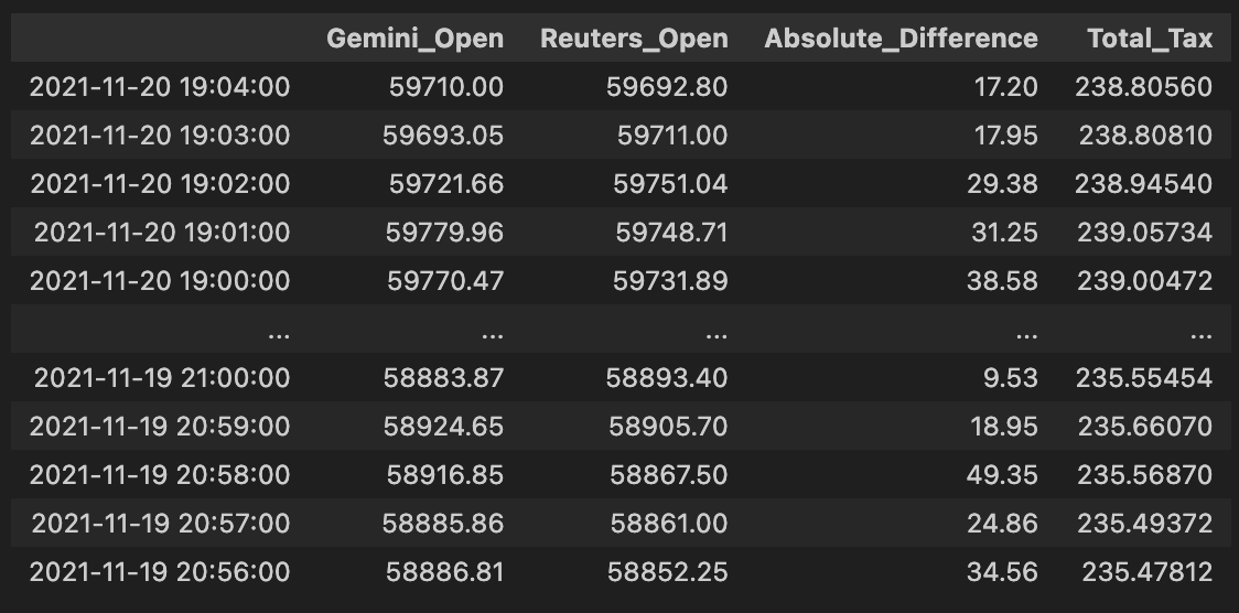
This block is preparing a single, easy-to-inspect table that directly supports the pure-arbitrage decision: it lines up the two exchanges’ BTC prices, computes the instantaneous spread between them, and computes the combined fees you’d pay if you executed a cross-exchange round trip (buy on one side, sell on the other). Concretely, the code takes the Gemini and Reuters price series and concatenates them column-wise so each row represents the same timestamp’s pair of prices; using column-wise concatenation ensures the two series are aligned by index (timestamps) so we’re comparing apples to apples when deciding whether a price gap exists at a given moment.
Next, it computes two derived columns. Absolute_Difference is the absolute value of the price gap between the exchanges — we use the absolute value because for pure arbitrage we care about the magnitude of the spread regardless of direction (either buy Gemini/sell Reuters or vice versa, depending on which is cheaper). Total_Tax is 0.002 * (gem + reu), where 0.002 is 0.2% expressed as a decimal; by multiplying that rate by the sum of the two prices you get the total fees paid on both legs of the trade (fee_on_buy + fee_on_sell = 0.002*gem + 0.002*reu). That models the practical constraint that a spread must exceed the combined fees before a trade is profitable.
Finally, the code renames the columns to clear, semantic labels (“Gemini_Open”, “Reuters_Open”, “Absolute_Difference”, “Total_Tax”) and returns comb_df as the consolidated DataFrame. The intended next step is straightforward: compare Absolute_Difference to Total_Tax and trigger an arbitrage when the spread exceeds the total fees by a comfortable margin (and also after accounting for slippage, latency, and execution constraints). A couple of practical notes: because concat aligns on the index, you must ensure both series share the same timestamps and have been cleaned (no unexpected NaNs or mismatched frequencies), and the fee model here is a simplification — you may later want to incorporate maker/taker differences, withdrawal/transfer costs, or size-dependent fee tiers for a more accurate profitability check.
# Check out which accounts in the corresponding exchanges need to be bought or sold.
v = pd.DataFrame(np.where(comb_df[”Gemini_Open”] > comb_df[”Reuters_Open”], 0,1))
v.index = comb_df.index
v.columns = [”BuyGemSellReuOrder”]
comb_df = pd.concat([comb_df, v], axis= 1)
comb_df # Exchange Signal = 0, Sell Gemini; Buy Reuters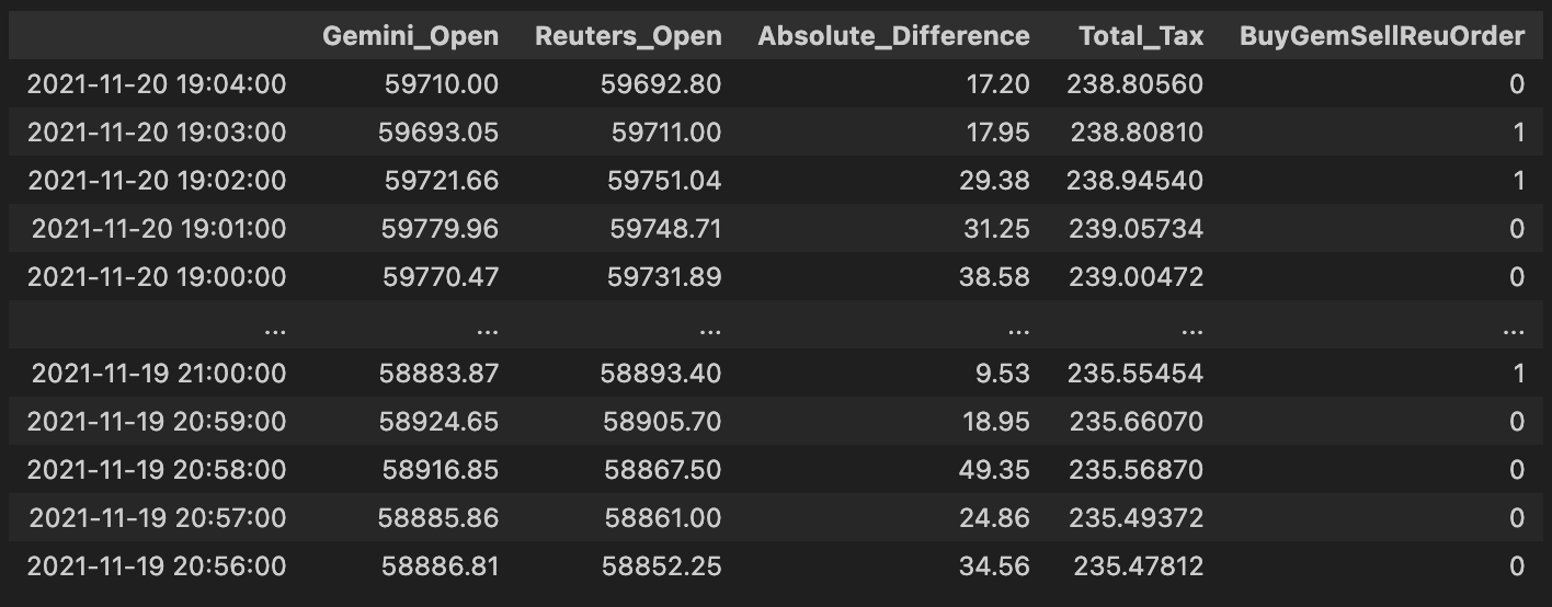
This block implements a simple, vectorized per-row trading signal used to drive pure arbitrage decisions between Gemini and Reuters for the same asset. Conceptually, for each timestamp (row) it asks a single question: which exchange currently quotes the higher open price? If Gemini’s open price is higher than Reuters’, the code emits a 0 for that row; otherwise it emits a 1. The intended business interpretation (according to the inline comment) is that when Gemini is more expensive you should sell on Gemini and buy on Reuters — i.e., take the short/offer side on the higher-priced venue and the long/bid side on the lower-priced venue to capture the spread.
From a technical perspective the implementation uses a vectorized comparison (np.where) instead of a Python loop so the decision is computed efficiently across the entire DataFrame. The result of that vectorized operation is wrapped into a one-column DataFrame so it can be given the same index as comb_df and a clear column name, and then concatenated back onto comb_df along the columns axis. This produces a persistent per-row integer signal (“BuyGemSellReuOrder”) that downstream systems can read to trigger order creation or further filtering. Using integers (0/1) rather than booleans often simplifies downstream arithmetic or mapping to order sizes and is a common pattern in trading pipelines.
A couple of important practical notes and rationale: first, the simple greater-than comparison is a deliberate minimal decision rule for pure arbitrage — sell the exchange with the higher price and buy the one with the lower price — because that’s the core arbitrage opportunity. However, in production you must also account for transaction costs, latency, minimum profitability thresholds, and orderbook liquidity; without a spread threshold this signal will generate many unprofitable or unexecutable trades. Second, watch the naming and NaN behavior: the column name (“BuyGemSellReuOrder”) appears to contradict the comment and the numeric encoding (0 = sell Gemini / buy Reuters). That mismatch can cause serious confusion downstream, so rename the column to reflect the actual semantics (e.g., “SellGem_BuyReu_Signal”) or invert the encoding. Also explicitly handle missing prices — comparisons with NaN will default to the else branch — so add NaN checks or masking if you want to avoid spurious signals when data is incomplete.
Finally, if you want to refine this block: consider using a numeric spread threshold (e.g., require Gemini_Open — Reuters_Open > fee_buffer), operate on top-of-book bid/ask rather than “Open” mid/prices, or generate a signed quantity (positive = buy Reuters/sell Gemini) to integrate directly into the order sizing logic. These adjustments preserve the same simple decision flow but make the signal more robust for live arbitrage execution.
# Execute Trade for profit?
# Check out which accounts in the corresponding exchanges need to be bought or sold.
order66 = pd.DataFrame(np.where(comb_df[”Absolute_Difference”] > comb_df[”Total_Tax”], 0,1))
order66.index = comb_df.index
order66.columns = [”Execute”]
comb_df = pd.concat([comb_df, order66], axis= 1)
comb_df # Exchange Signal = 0, Sell Gemini; Buy Reuters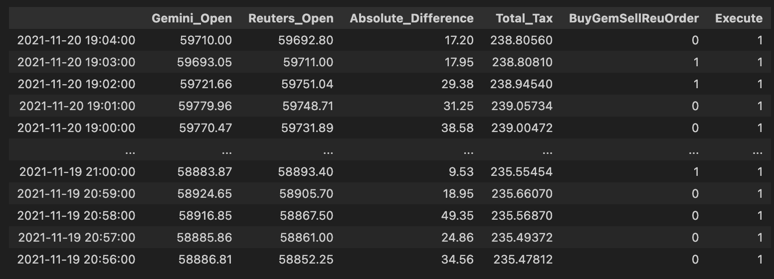
High level: this block decides, for each row (price pair) in comb_df, whether the observed spread is large enough to overcome all transaction costs and therefore should be executed as a pure-arbitrage trade. The core business rule is simple: only execute when the price difference across the two venues exceeds the combined taxes/fees; everything else should be skipped.
Step-by-step narrative of what the code does and why: first it computes a binary decision from the numerical comparison comb_df[“Absolute_Difference”] > comb_df[“Total_Tax”]. We use the absolute difference because an arbitrage opportunity can exist in either direction (one exchange cheaper than the other), and we only care about the magnitude of the spread relative to costs. The comparison > Total_Tax implements the profitability test: if the magnitude of the spread strictly exceeds the sum of relevant taxes/fees, the trade is (net) profitable and should be considered for execution. Note the use of strict greater-than: ties (spread == total tax) will not be executed.
np.where is used to convert that boolean test into numeric flags: when the test is true the code writes 0, otherwise 1. That choice effectively encodes “execute” as 0 and “don’t execute” as 1 (the inline comment later clarifies that a signal of 0 corresponds to the action “Sell Gemini; Buy Reuters” in the current signal mapping). The numeric 0/1 form is convenient for downstream consumers that expect an integer flag or for joining with other integer-coded signals, but it is important to be aware that 0 here means “go” (not the more usual True/1 convention).
After creating the 2-D result of np.where, the code wraps it in a DataFrame and explicitly aligns the index to comb_df.index and names the column “Execute” so the new column will merge cleanly back into comb_df. Finally, comb_df = pd.concat([…], axis=1) attaches the flag column to the master DataFrame so later steps can filter on the Execute flag together with any directional exchange signal. In this codebase the convention is: Exchange Signal = 0 triggers “Sell Gemini; Buy Reuters,” and the Execute column further gates that signal by profitability.
A few practical notes worth keeping in mind: using numeric 0/1 with inverted semantics (0 = execute) is easy to misread — consider using a boolean Execute flag or document the mapping clearly to avoid errors later. Also watch NaNs or non-numeric entries in Absolute_Difference or Total_Tax (they will propagate into the comparison and the resulting flag), and confirm that you want strict > rather than >= behavior. If you later need to know trade direction rather than just “execute vs skip,” preserve the signed spread or use the existing directional Exchange Signal column in combination with this Execute flag rather than relying solely on absolute magnitude.
np.unique(comb_df[”Execute”], return_counts = True) #LOL!
This single line is a quick audit: it asks NumPy to list the distinct values present in the comb_df[“Execute”] column and to return how many times each distinct value appears. Practically, that means you get two aligned arrays — one with each unique label the decision logic produced (for example True/False, “buy”/”sell”/”ignore”, or integer codes) and one with the corresponding counts — which lets you immediately see the distribution of execution decisions across the dataset.
Why we do this in a pure-arbitrage pipeline is diagnostic: before you push orders to the market you want confidence that your decision step is behaving sensibly. Seeing the counts tells you whether most rows are flagged for execution, whether no opportunities are being flagged (all False/None), or whether unexpected labels have crept in, any of which could indicate a bug in the arbitrage detection, data joins, or downstream filtering. Note that np.unique sorts the unique values and returns counts aligned by that sorted order, and that special values like NaN will appear as their own unique entry; so interpret the results accordingly.
For routine development use this as an exploratory check; for production monitoring you’ll want a more robust approach (Pandas’ value_counts with dropna=False is more idiomatic and preserves clearer labeling, or convert the two arrays to a mapping for logging/metrics). You can then act on the distribution — add assertions to catch regressions (e.g., unexpectedly zero executions), instrument counters for telemetry, or drill into the rows that produced surprising labels to trace the root cause in the arbitrage logic.
# Let’s get a tally on all the orders that would’ve been executed.
orders_fulfilled = comb_df.loc[comb_df[”Execute”] == 0]
orders_fulfilled
This block is extracting the subset of combined signals/orders that your system considers “executed” so you can tally what would have actually traded. Upstream you must have populated comb_df with potential arbitrage opportunities and set an Execute flag per row; here Execute == 0 is being treated as the sentinel meaning “this order would have been executed.” The .loc[…] slice simply creates a new DataFrame, orders_fulfilled, containing only those rows so the rest of the pipeline can focus exclusively on realized activity (counts, P&L, fee computation, slippage analysis, reconciliation with market fills, etc.).
Why we do this: Pure arbitrage requires that both sides (or all legs) of the opportunity are actually filled — you’re not interested in signals that were never executed. Isolating executed rows lets you precisely compute realized arbitrage profit, measure how often opportunities completed, and debug execution failures or partial fills. Using a numeric sentinel (0) may match a prior convention in the codebase (for example 0 = executed, 1 = not executed); make sure that convention is well-documented and consistent, because the meaning is critical to downstream metrics.
A few practical notes on how this fits into the larger flow and how to make it robust: this selection is vectorized and cheap, so it’s appropriate for periodic reporting or batch post-mortem analysis. Immediately after this step you’ll normally group by trade pair, timestamp window, or order id to aggregate realized quantities, fees, and net P&L per arbitrage event. Also consider edge cases — partial fills, fills reported after the decision window, or missing/NaN Execute values — and add explicit checks or assertions (or prefer an explicit boolean/enum field instead of a numeric sentinel) so the semantics aren’t accidentally reversed. Finally, if you plan to modify orders_fulfilled in place, use .copy() to avoid SettingWithCopy warnings and to keep comb_df intact for auditing.
total_profits = sum(orders_fulfilled[”Absolute_Difference”] - orders_fulfilled[”Total_Tax”])
total_profits # would’ve made aroun $255 in one day for only ONE coin on 2 exchanges (Remember that Reuters doesn’t trade crypto)
This line takes the executed-arbitrage ledger (orders_fulfilled) and converts the raw trade deltas into a single, realistic P&L figure by removing execution costs and aggregating across all filled trades. In this dataset, “Absolute_Difference” represents the price gap captured by each arbitrage roundtrip (the gross money made from buying on one venue and selling on the other), while “Total_Tax” represents the per-trade costs that reduce that gross (exchange fees, taker/maker charges, network or withdrawal fees, or any other transaction-level cost). The code subtracts the cost from the gross for each row to produce a net result per trade, and then sums those net results to yield the total realized profit for the set of fulfilled orders.
Why this is done: pure-arbitrage performance must be evaluated on net numbers, not gross price differences, because fees and taxes can easily turn an apparent opportunity into a loss. Summing the per-trade net profits gives you the day’s realized P&L for that coin across the two exchanges — the number you would actually have landed in your account after paying the execution costs. The operation is vectorized (subtract then sum), which is efficient and matches how we typically roll up P&L in production.
A few implementation notes and caveats to keep accuracy and auditability high: ensure both columns are in the same currency/units and that “Absolute_Difference” is truly monetary (not a percent) before subtraction; confirm that orders_fulfilled contains only actually executed fills (partial/failed fills must be handled separately); and be aware that using an absolute value loses directionality — that’s okay here because arbitrage is directional by execution, but you should still validate that buy/sell legs executed as intended and that negative net trades are caught. For better traceability, it’s usually clearer to materialize a net_profit column (Absolute_Difference — Total_Tax) and then aggregate, and to filter out or flag trades where net_profit <= 0, account for slippage/latency effects, and break down the P&L by coin or exchange when diagnosing strategy performance.
# Notice that I am not even including the volume. (Hence everything will be a multiple)
# Retrieving that specific row:
gemini[comb_df[”Gemini_Open”] == 59216.09] # 27.31 BTC!!! Probably explains that huge discrpency amongst the “exchanges”.
This short fragment is doing two related things: documenting an assumption and then inspecting a suspected outlier row that exposes why that assumption matters for the pure-arbitrage logic. The comment at the top — “not even including the volume. (Hence everything will be a multiple)” — is the key design note: the current pipeline is comparing raw price fields across exchanges without scaling or constraining those comparisons by available volume or order-book depth. In practice that means any price difference you compute is purely a price multiple, not an executable arbitrage opportunity. A large price on one exchange will show up as a large arbitrage signal even if there is zero or very little liquidity at that price, so you get false positives.
The second line is an investigative step: it selects the rows where the Gemini open price equals 59216.09 to inspect the corresponding Gemini record(s). The code is trying to confirm why the Gemini price produced a huge discrepancy by pulling the exact row that generated the spike. The inline note that follows — “27.31 BTC!!! Probably explains that huge discrepancy amongst the ‘exchanges’” — is the diagnosis: that row corresponds to a trade or book state with roughly 27.31 BTC at that price, which is large enough to push Gemini’s reported price away from the others and thus create an apparent arbitrage gap.
There are a few practical implications for the pure-arbitrage goal. First, equality checks on floating prices are brittle; use tolerant comparisons (e.g., isclose) or match on timestamps/indices to reliably locate the same event across frames. Second, masking comb_df[“Gemini_Open”] == value and applying that mask to gemini only makes sense if comb_df and gemini are aligned (same row order/index); otherwise you can select the wrong rows. Most importantly, you must incorporate volume/depth and execution constraints into the decision pipeline: a valid pure-arbitrage candidate requires sufficient liquidity on both legs and consideration of book impact, fees, and latency. In short, this snippet is a targeted diagnostic that reveals why raw price-differencing alone is unsafe for arbitrage detection and points to the need for volume/depth-aware filters, outlier handling, and stricter row alignment when investigating discrepancies.
# So, in a perfect world, if there were 27.31 bitcoins on the “Reuters” exchange and I had the capital to pull that arbitrage
# I would walk away with:
(27.313468/2) * total_profits
This tiny expression is estimating the cash you would actually walk away with if you could execute a pure arbitrage using the liquidity observed on the “Reuters” exchange. The numeric literal 27.313468 is the available bitcoin quantity at the relevant price level on Reuters (i.e., the depth you could consume there). total_profits is being treated as the profit you make per unit of bitcoin (or otherwise a unitized profit figure that needs to be scaled by executed volume). Multiplying a quantity by a per-unit profit is the straightforward way to convert a unit profit into a total realized P&L.
The division by two is the important business assumption in this line: it models the fact that an arbitrage requires a round-trip — a buy on one exchange and a sell on another — and that the single-sided quantity reported on Reuters alone does not guarantee matching counter-side liquidity. By taking 27.313468/2 the code is conservatively assuming you can only realize arbitrage on half of the reported Reuters quantity (either because you need equivalent liquidity on the opposite exchange, because capital must be split to fund both sides, or because you want to allow headroom for slippage and fees). In short, the /2 is a simplifying conservative constraint on executable volume, not a mathematical property of profit itself.
So the “story” of the calculation is: observe Reuters’ available BTC (27.313468) → impose a conservative cap on executable volume by halving it → multiply the resulting feasible volume by the per-unit profit number (total_profits) → produce an estimate of total cash profit if you could execute that arbitrage completely. This gives a quick, back-of-the-envelope view of how much you’d make if liquidity and capital were sufficient.
Two important practical notes tied to the Pure Arbitrage goal: first, make sure units line up — if total_profits is already aggregated across some volume, multiplying by quantity will be wrong; total_profits should be an explicit per-BTC (or per-lot) profit. Second, this is a simplification: in production you should prefer using the true executable volume as the min(available_on_exchange_A, available_on_exchange_B) and compute realized profit by walking the order book (accounting for slippage, taker/maker fees, transfer times, and fill probability) rather than assuming a flat 50% haircut. Those refinements turn this quick estimate into a reliable execution plan.
Use the button below to download the source code:
