

Quant Trading Unlocked: From Crisis-Alpha Hedging to Algorithmic Backtesting
A practical guide to analyzing the ETF universe and validating strategies with data-driven simulations.

Use the button at the end of this article to download the source code.
This project provides a comprehensive toolkit for analyzing Exchange Traded Funds (ETFs), discovering hedging strategies, and backtesting algorithmic trading models. It aims to bridge the gap between exploratory data analysis and rigorous strategy evaluation, allowing users to move from market intuition to verifiable performance metrics.
Functionality
1. Market Exploration & Analysis
The framework begins by exploring the vast universe of ETFs. It performs statistical analysis to understand key asset characteristics such as:
Distribution of Assets: Breaking down the market by sector, region, and asset class.
Cost & Yield Analysis: Evaluating expense ratios and dividend yields to identify efficient investment vehicles.
Liquidity & Size: Analyzing market capitalization and volume to ensure strategies can be executed efficiently.
2. Strategic Hedging (Crisis Alpha)
A core component of the project is identifying assets that perform well when the broader market fails.
Correlation Analysis: It analyzes historical data, specifically during market crashes (like the 2008 financial crisis), to find Bond ETFs that exhibit strong inverse correlation to major equity indices (like the S&P 500).
Flight-to-Safety: By isolating these “safe haven” assets, the project helps construct portfolios that are resilient to market shocks.
3. Strategy Backtesting & Simulation
The project supports two primary approaches to portfolio management:
Passive “Lazy” Portfolios:
Simulates classic diversification strategies (e.g., the Swensen Portfolio) that rely on fixed asset allocation and periodic rebalancing.
These are benchmarked against standard market indices to evaluate the benefits of simple diversification.
Active “Online” Portfolio Selection (OLPS):
Evaluates advanced machine learning algorithms that adaptively reallocate portfolio weights based on recent price trends.
Algorithms like Universal Portfolios, Exponential Gradient, and Mean Reversion are tested to see if they can consistently outperform the market without identifying specific “winning” stocks.
Methodology: How It Works
The workflow typically follows these steps:
Data Ingestion: The system fetches historical financial data (adjusted closing prices) from online providers for a defined set of tickers.
Preprocessing: Raw data is cleaned, aligned on a common timeline, and checked for missing values to ensure simulation accuracy.
Simulation Loop:
Initialization: The strategy defines its universe of assets and trading logic (e.g., “rebalance every month” or “optimize weights daily”).
Execution: An event-driven backtester steps through historical time, processing daily or minute-level data. It handles order generation, transaction costs, and portfolio tracking.
Analysis & Visualization:
The system calculates performance metrics: Sharpe Ratio (risk-adjusted return), Drawdowns (risk of loss), and Alpha/Beta (market relativity).
It generates visualizations comparing the strategy’s cumulative returns against a benchmark, making it easy to identify outperformance.
How to Run
Prerequisites: Ensure you have a Python environment set up with the necessary financial data science libraries (Pandas, Matplotlib, etc.) and a compatible backtesting engine (like Zipline or a dedicated OLPS library).
Execution: The system is designed to be interactive. You typically run the analysis in sequential stages:
Step 1: Run the exploratory analysis to understand the data and select your asset universe.
Step 2: Execute the hedging analysis to select defensive assets.
Step 3: Run the backtest simulations for your chosen strategies (Passive or Active).
Interpreting Results: Review the generated plots and statistical tables to determine if a strategy meets your risk/return requirements before considering live deployment.
This document compares state-of-the-art Online Portfolio Selection (OLPS) algorithms to evaluate whether they can improve a rebalanced passive strategy in practice. The survey “Online Portfolio Selection: A Survey” by Bin Li and Steven C. H. Hoi provides a comprehensive review of multi-period portfolio allocation algorithms. The same authors developed the OLPS Toolbox, but for this work we use Mojmir Vinkler’s implementation and extend his comparison to a more recent timeline using a set of ETFs to avoid survivorship bias (as suggested by Ernie Chan) and reduce idiosyncratic risk.
Vinkler’s thesis performs much of the groundwork and concludes that Universal Portfolios perform similarly to Constant Rebalanced Portfolios and tend to work better for an uncorrelated set of small, volatile stocks. Here, the goal is to determine whether any OLPS strategy is applicable to a portfolio of ETFs.
%matplotlib inline

import numpy as np
import pandas as pd
from pandas.io.data import DataReader
from datetime import datetime
import six
import universal as up
from universal import tools
from universal import algos
import logging
# we would like to see algos progress
logging.basicConfig(format=’%(asctime)s %(message)s’, level=logging.DEBUG)

import matplotlib as mpl
import matplotlib.pyplot as plt
mpl.rcParams[’figure.figsize’] = (16, 10) # increase the size of graphs
mpl.rcParams[’legend.fontsize’] = 12
mpl.rcParams[’lines.linewidth’] = 1
default_color_cycle = mpl.rcParams[’axes.color_cycle’] # save this as we will want it back later
This cell is purely environment and presentation setup for the experiments that follow; it doesn’t implement any trading logic itself but prepares the notebook so we can fetch price data, run the OLPS algorithms, and inspect their behavior clearly and reproducibly.
First, we enable inline plotting so that charts produced later appear directly in the notebook, which is important because we will be visually comparing performance traces and weight allocations for multiple algorithms. The core numerical and data-manipulation libraries (numpy, pandas) are loaded because the OLPS algorithms consume time-series price matrices and return vectorized portfolio updates and performance summaries; pandas’ DataReader is the intended mechanism here to pull historical ETF prices from online sources (so that raw market data flows into the experiment). A small compatibility helper (six) is present for cross-version support, and the universal package (aliased as up) plus its submodules tools and algos provide the OLPS implementations and helper functions (data preprocessing, transaction-cost handling, performance metrics) that we will use to run and evaluate each strategy.
We explicitly configure logging to DEBUG so we can observe algorithm progress messages as they run. OLPS algorithms are iterative and often emit diagnostic information at each step (rebalances, weight projections, exceptions); enabling debug-level logging helps us verify that updates are happening as expected and diagnose convergence or data issues while the algorithms process many time steps.
Finally, the matplotlib configuration is adjusted to prioritize readability for comparative plots: a larger figure size gives space for multiple time-series lines, increasing legend font size and line width improves clarity when many algorithms are plotted on the same axes, and the current color cycle is saved so we can restore or reuse the default palette later. These presentation choices make it easier to compare cumulative wealth curves and weight trajectories across a diversified set of ETFs, ensuring visual output is interpretable and consistent across runs. Overall, this block prepares the data pipeline, diagnostic visibility, and plotting aesthetics so that subsequent code can fetch ETF histories, run each OLPS algorithm from universal.algos, and produce clear side-by-side comparisons of their behavior and performance.
# note what versions we are on:
import sys
print(’Python: ‘+sys.version)
print(’Pandas: ‘+pd.__version__)
import pkg_resources
print(’universal-portfolios: ‘+pkg_resources.get_distribution(”universal-portfolios”).version)
This short block is an explicit environment-check that runs at the start of an experiment so you, and anyone reproducing the work, know exactly which runtime and library implementations produced the results. First it queries and prints the active Python interpreter string; that gives the major/minor version and the build metadata which can affect language features, numeric behavior and binary wheel compatibility. Next it prints pandas’ reported version via the DataFrame library’s own __version__ attribute — that matters because pandas’ API, grouping/rolling semantics, and dtype handling have changed across releases and can subtly alter backtest data preparation and aggregation results. Finally it asks pkg_resources for the installed version of the universal-portfolios package, the specific OLPS implementation library you’re using; that version determines the concrete algorithm implementations, defaults, and bug fixes that will directly affect the portfolio updates and final performance numbers.
Why do this at the top of the notebook/script? Small differences in any of these components can change outcomes, make a result non-reproducible, or produce cryptic errors when others run your code. Recording versions when you compare OLPS algorithms over a diversified ETF universe ensures you can attribute discrepancies to code, data, or environment, and it speeds debugging when upgrading packages or moving between machines/CI. It also makes experiment logs self-contained: a reviewer can recreate the same stack or know which package upgrades might explain observed changes in algorithm behavior.
A couple of practical notes to keep the check robust: printing versions early prevents you from relying on implicit assumptions later, and you may want to include additional environment metadata (OS/platform, numpy/scipy versions, and a full requirements lockfile or pip freeze) for complete reproducibility. If you prefer a more modern API on recent Python versions, importlib.metadata or pkg_resources exceptions can be used to handle missing distributions gracefully; otherwise, capturing the outputs into an experiment artifact is a simple, effective habit to maintain reliable comparisons across OLPS runs.
Loading data
We use market data from 2005–2012 (inclusive; eight years) for training and data from 2013–2014 (inclusive; two years) for testing. For now, we accept each algorithm’s default parameters and treat the two periods as independent. In future work, we will optimize parameters on the training set.
# load data from Yahoo
# Be careful if you cange the order or types of ETFs to also change the CRP weight %’s in the swensen_allocation
etfs = [’VTI’, ‘EFA’, ‘EEM’, ‘TLT’, ‘TIP’, ‘VNQ’]
# Swensen allocation from http://www.bogleheads.org/wiki/Lazy_portfolios#David_Swensen.27s_lazy_portfolio
# as later updated here : https://www.yalealumnimagazine.com/articles/2398/david-swensen-s-guide-to-sleeping-soundly
swensen_allocation = [0.3, 0.15, 0.1, 0.15, 0.15, 0.15]
benchmark = [’SPY’]
train_start = datetime(2005,1,1)
train_end   = datetime(2012,12,31)
test_start  = datetime(2013,1,1)
test_end    = datetime(2014,12,31)
train = DataReader(etfs, ‘yahoo’, start=train_start, end=train_end)[’Adj Close’]
test  = DataReader(etfs, ‘yahoo’, start=test_start, end=test_end)[’Adj Close’]
train_b = DataReader(benchmark, ‘yahoo’, start=train_start, end=train_end)[’Adj Close’]
test_b  = DataReader(benchmark, ‘yahoo’, start=test_start, end=test_end)[’Adj Close’]
This block defines the universe, the reference allocation, the benchmark, the temporal split for evaluation, and then pulls the historical price series that the online portfolio selection (OLPS) experiments will operate on. The ETF list is the asset universe: broad-market, international, emerging, long-term and inflation-protected bonds, and real estate (VTI, EFA, EEM, TLT, TIP, VNQ). Those tickers are intentionally chosen to create a diversified test bed so that OLPS algorithms are evaluated across different risk/return drivers (equities vs bonds, growth vs inflation protection, real estate), which is important because many OLPS rules behave differently depending on cross-asset correlations and volatility regimes.
Right after the ticker list you see swensen_allocation — a constant rebalanced portfolio (CRP) weight vector derived from David Swensen’s “lazy” allocation. We keep that here as a baseline deterministic strategy: it’s the buy-and-hold/periodically-rebalanced allocation you will compare your OLPS outputs to. The comment warns that if you change the ETF ordering or membership, you must update this weight vector accordingly — the positions in the list are positional and must align with the tickers so that each weight maps to the intended ETF. Using a known, practitioner-oriented allocation as a baseline gives you an interpretable benchmark that captures a sensible, diversified long-term allocation rather than an arbitrary equal-weight CRP.
The code then establishes train and test date ranges. The training window (2005–01–01 to 2012–12–31) and testing window (2013–01–01 to 2014–12–31) are separated so you can calibrate or tune algorithms on historical data and then evaluate out-of-sample performance in a later period. This temporal separation preserves causality and avoids look-ahead bias. Also, these ranges span distinct market regimes (including the 2008 crisis in training and a post-crisis period in testing), which is helpful to see how algorithms learned in one regime generalize to another.
Finally, the DataReader calls fetch adjusted close prices for both the ETF universe and the benchmark (SPY) for the respective train/test periods. Pulling “Adj Close” is deliberate: adjusted prices account for corporate actions like dividends and splits, so returns computed from these series reflect total return and are comparable across time. The resulting objects will be time-indexed tables (dates × tickers) that the OLPS framework consumes to compute daily returns, update portfolio weights, and evaluate wealth trajectories. Note you should check for and handle non-trading days or missing values and ensure the benchmark series and ETF series are aligned on the same calendar before running comparisons; consistent ordering and indexing are essential so CRP weights map to the correct columns and performance metrics are computed on aligned return vectors.
# plot normalized prices of the train set
ax1 = (train / train.iloc[0,:]).plot()
(train_b / train_b.iloc[0,:]).plot(ax=ax1)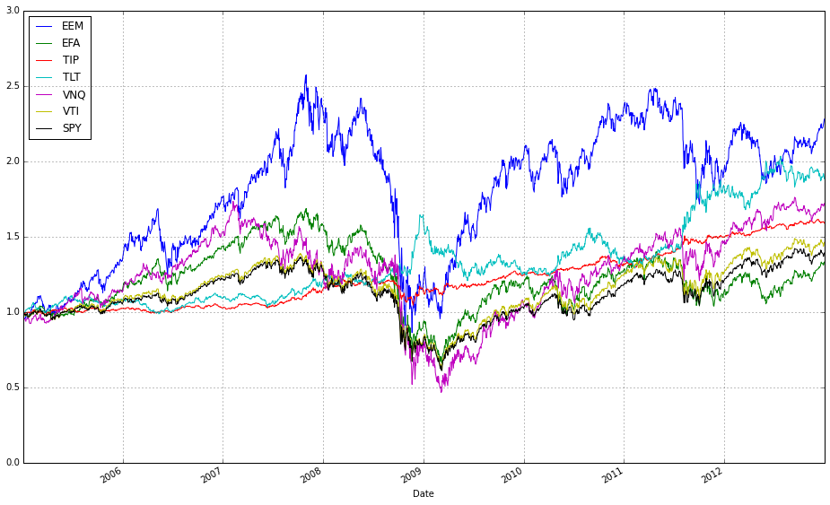
These two lines normalize each time series to a common starting point and then plot them on the same axes so you can visually compare relative returns over time. The expression train / train.iloc[0, :] takes the entire DataFrame of training prices and divides each column by its value at the first timestamp; this converts every instrument’s price series into a growth factor that starts at 1. Normalizing like this is important because ETFs have different absolute price levels and currencies — by forcing a common baseline you can compare proportional performance (how much each asset or strategy has multiplied) rather than raw price, which is what you care about when comparing online portfolio selection algorithms.
The plot call returns a Matplotlib Axes (ax1), and the second line overlays the normalized series from train_b on that same Axes by passing ax=ax1. That ensures both sets of series share the same x-axis (typically dates) and y-axis scaling so their trajectories are directly comparable. Note a few practical implications: pandas will align series by index when plotting, so mismatched dates can introduce NaNs or gaps; dividing by the first row assumes those first-row values are nonzero (otherwise you’ll get infinities); and NaNs in either DataFrame will propagate through the normalization. Overlaying in this way is a simple visual check of relative performance across diversified ETFs or alternative datasets/strategies before running more formal quantitative comparisons.
# plot normalized prices of the test set
ax2 = (test / test.iloc[0,:]).plot()
(test_b / test_b.iloc[0,:]).plot(ax=ax2)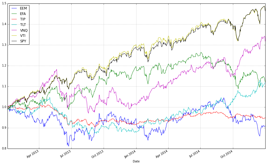
This pair of lines takes two multi-column price tables (test and test_b) and draws them on the same axes after converting each column into a relative growth series that starts at 1. Concretely, test / test.iloc[0,:] divides every column in the test DataFrame by that column’s first observed price (pandas aligns the first-row Series to each column), so each asset’s time series becomes “price relative to its initial price” — effectively the trajectory of one unit of capital invested at the first timestamp. That normalized DataFrame is plotted and the returned Matplotlib axes object is captured in ax2.
The second line repeats the same normalization for test_b, but passes ax=ax2 so the resulting curves are drawn on top of the previously created plot. Overlaying both normalized sets on a single axis forces them to share the same baseline and vertical scale, which makes it trivial to compare absolute growth factors across different ETFs or strategies regardless of their original price levels. In the context of comparing OLPS algorithms, this is exactly why we normalize: absolute prices differ across ETFs and would otherwise obscure which algorithm or ETF actually produced higher cumulative wealth; normalizing to the first observation converts raw prices into comparable cumulative-return-like series.
A couple of practical notes implicit in this code: because we divide by the first-row values, any zero or missing value at the first timestamp would cause division issues, so ensure the dataset has valid initial prices. Also, because .plot() uses the DataFrame index as the x-axis, you automatically get a time series view of performance, which is typically what you want when evaluating algorithmic wealth trajectories over a test period.
Comparing Algorithms
We train on market data spanning multiple years and evaluate out-of-sample over a shorter test period. To start, we use the default parameters for each algorithm and treat the training and testing intervals as two independent time periods. In future work, we will optimize the parameters on the training set.
#list all the algos
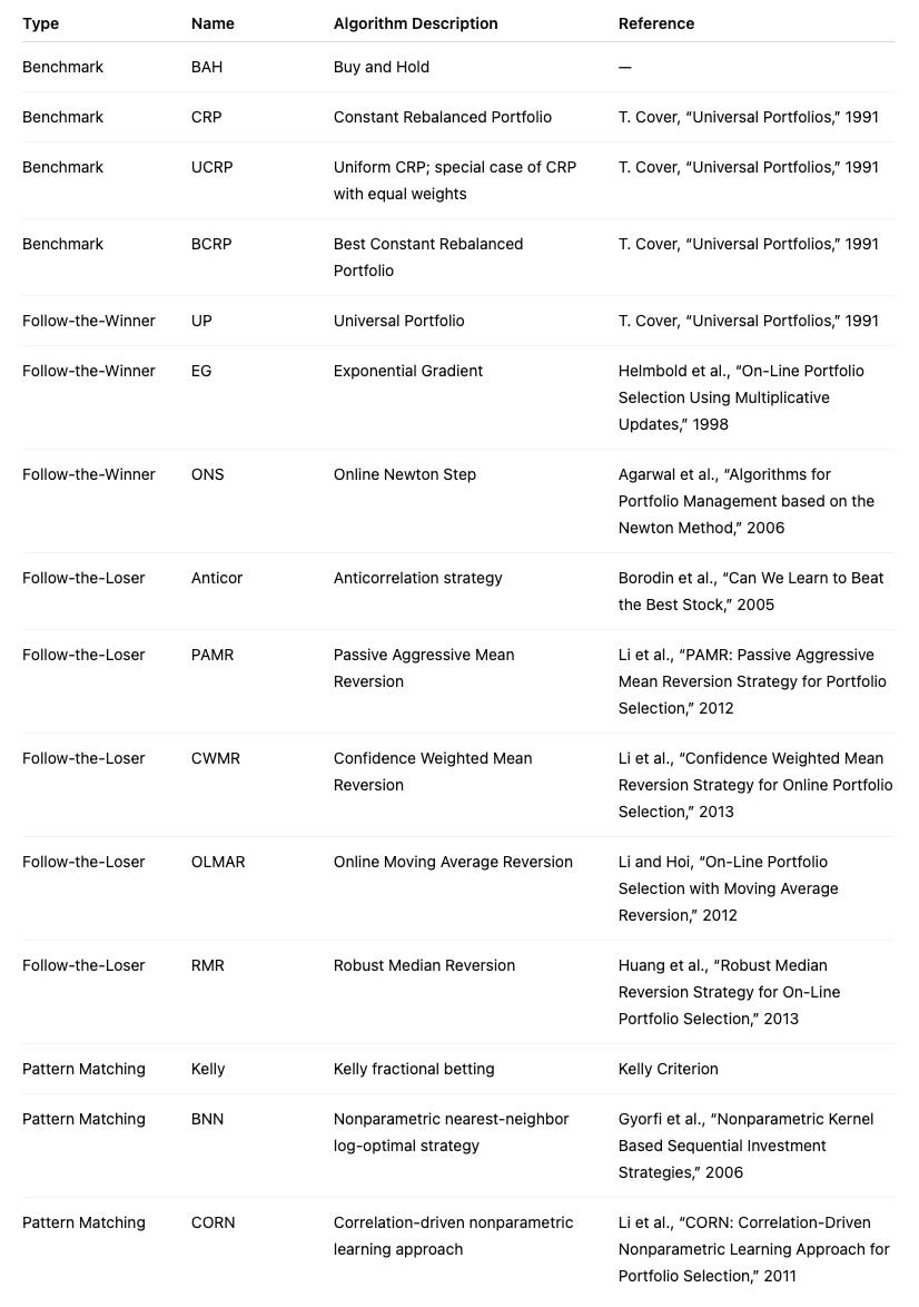
olps_algos = [
algos.Anticor(),
algos.BAH(),
algos.BCRP(),
algos.BNN(),
algos.CORN(),
algos.CRP(b=swensen_allocation), # Non Uniform CRP (the Swensen allocation)
algos.CWMR(),
algos.EG(),
algos.Kelly(),
algos.OLMAR(),
algos.ONS(),
algos.PAMR(),
algos.RMR(),
algos.UP()
]This small block constructs the set of online portfolio selection (OLPS) algorithm instances that the backtest will run against your ETF universe. Conceptually, each element in olps_algos is an instantiated strategy object that, given a price-relatives stream, will output a weight vector at each step; collecting their performance side-by-side is how we compare behavior across the diversified set of ETFs.
Start-to-finish, the list deliberately mixes several algorithmic families so the comparison covers a wide range of modeling assumptions and trading dynamics. The first two benchmarks — BAH (Buy-and-Hold) and BCRP (Best Constant Rebalanced Portfolio) — are critical anchors: BAH represents a passive, buy-and-hold policy for reference, while BCRP is the (in-sample) best fixed rebalanced portfolio and serves as a useful performance ceiling for constant-rebalanced strategies. CRP(b=swensen_allocation) is a non-uniform CRP initialized with a domain-specific strategic allocation (swensen_allocation); including it lets you see how a long-only strategic allocation (e.g., an institutional target mix) compares to adaptive OLPS methods and helps separate benefits from reallocation versus simply starting from a different weight vector.
The rest of the list intentionally spans common OLPS approaches so you can observe which assumptions work on ETFs. Multiplicative-update and first-order learners like EG (Exponentiated Gradient) and ONS (On-line Newton Step) adapt continuously to recent performance and tend to react quickly to trends; they are useful for momentum-like environments. Kelly-based approaches aim to maximize growth under an information-theoretic objective, which can produce aggressive position shifts when signals are strong. Algorithms that explicitly target mean-reversion or lead-lag effects — Anticor, PAMR, RMR, CWMR — try to exploit reversals or cross-asset correlations by transferring weight from recent winners to recent losers (or by robustly constraining that behavior), so they are included because ETFs frequently display sector rotation and relative mean reversion. Pattern- or memory-based methods such as CORN and BNN look for historical market states similar to the present and allocate according to those matched histories; they can capture recurring or seasonal ETF behavior that purely gradient methods miss. OLMAR (On-Line Moving Average Reversion) targets moving-average reversion/momentum at the portfolio level and often produces smoothed trades that can be robust to noise. UP (Universal Portfolio) aggregates across many CRPs and is asymptotically competitive with the best constant-rebalanced rule; it’s a useful “theoretical” baseline that is often computationally heavier but informative about long-run optimality.
Why this diversity matters: ETFs represent a mix of asset classes, sectors, and factor exposures, so there is no single generative model you can assume. By including mean-reversion, trend-following, pattern-matching, robust-statistics, second-order adaptive, and theoretical-universal strategies, you get coverage across the main hypotheses about how returns are generated. That variety helps you identify which structural behaviors (e.g., momentum, rotation, recurring patterns) drive performance in your ETF set rather than mistaking an algorithm’s inductive bias for a universally superior method.
A few practical implications to keep in mind while running the comparison: all of these objects will produce portfolio weight vectors that your backtester will convert into rebalancing trades, so turnover and transaction cost modeling will materially change relative rankings — algorithms that trade frequently (some mean-reversion or high-sensitivity methods) will suffer more under realistic costs. Also note that default hyperparameters may favor certain regimes; if you need a fair comparison, tune or at least sanity-check key knobs (e.g., aggressiveness/tolerance in PAMR, window sizes for CORN/OLMAR). Finally, the explicit CRP(b=swensen_allocation) case is an important control: it lets you answer whether adaptive rebalancing actually beats a carefully chosen static institutional allocation on this ETF universe.
# put all the algos in a dataframe
algo_names = [a.__class__.__name__ for a in olps_algos]
algo_data = [’algo’, ‘results’, ‘profit’, ‘sharpe’, ‘information’, ‘annualized_return’, ‘drawdown_period’,’winning_pct’]
metrics = algo_data[2:]
olps_train = pd.DataFrame(index=algo_names, columns=algo_data)
olps_train.algo = olps_algos
This block constructs a small table that ties each OLPS algorithm instance to its backtest outputs and a fixed set of performance metrics so we can compute, compare, and present results consistently across a diversified set of ETFs.
First, we derive a human-readable row index: algo_names = [a.__class__.__name__ for a in olps_algos]. Instead of using opaque ids or memory addresses, we use each instance’s class name so the DataFrame rows are labeled with meaningful algorithm names when we print, sort or plot results. That makes downstream comparison and reporting much easier.
Next, algo_data defines the schema for the table: the first two columns are ‘algo’ (to store the original instance) and ‘results’ (to store raw backtest outputs), followed by concrete performance fields (‘profit’, ‘sharpe’, ‘information’, ‘annualized_return’, ‘drawdown_period’, ‘winning_pct’) that we will compute from the results. Immediately after we take metrics = algo_data[2:], creating a slice that isolates just the numeric metric names; this is convenient when iterating to compute or format only the performance values, separating them from the object and raw-results columns.
We then instantiate a pandas DataFrame with olps_train = pd.DataFrame(index=algo_names, columns=algo_data). Creating the DataFrame with the algorithm names as the index commits to a stable, readable row structure up front, and reserving the columns makes it explicit which outputs will be produced. Note that the DataFrame will hold Python objects (dtype=object) for the ‘algo’ and ‘results’ columns — intentional, because we want to keep references to algorithm instances and to whatever complex result objects the backtester returns.
Finally, olps_train.algo = olps_algos assigns the list of algorithm instances into the ‘algo’ column so each row contains the corresponding instance that produced the results. This preserves object references so you can later call methods on an algorithm (e.g., re-run, inspect parameters) directly from the table. A couple of practical notes: the order of olps_algos must match algo_names (it does here because algo_names was derived from that list), and assigning a list into a DataFrame column requires matching lengths — otherwise pandas will raise an error. After this block, the intended flow is clear: run each algorithm’s backtest, store the returned object into ‘results’, compute the metric values (iterating over metrics) and populate those columns so the DataFrame becomes the canonical comparison table for ranking, plotting, or exporting the performance of the OLPS algorithms across the ETF universe.
At this point, we could train each algorithm to identify its optimal parameters.
# run all algos - this takes more than a minute
for name, alg in zip(olps_train.index, olps_train.algo):
    olps_train.ix[name,’results’] = alg.run(train)
This loop is the core step where each online portfolio selection (OLPS) algorithm in olps_train is executed on the training dataset and its output is attached back to the dataframe so we can compare algorithms side-by-side. olps_train is acting as a small registry: each row represents an algorithm (the index is the algorithm name) and the ‘algo’ column holds an algorithm object that implements a run(train) method. The loop zips the dataframe index with that column so you get the index label (name) paired with the corresponding algorithm object; for each pair it calls alg.run(train), which performs the algorithm’s backtest/fit on the supplied training series of ETF prices and returns a results payload (typically a performance object containing returns, risk metrics, weight time series, diagnostics, etc.). That returned payload is then written into the same registry under the ‘results’ cell for that named row, which preserves the association between algorithm metadata and its concrete results for later comparison and reporting.
Why this structure: running every algorithm on the same train set ensures a consistent basis for comparing performance across a diversified ETF universe. Storing results back into olps_train keeps metadata and outputs coupled so downstream steps (ranking, plotting, selection) can easily access both the algorithm object and its output. The code is sequential and synchronous: each alg.run is executed in order, which is deterministic and avoids concurrency issues that could arise if algorithms share global state, but it also explains the comment about runtime — these runs can be computationally expensive (simulating rebalanced portfolios, computing metrics, possibly performing inner optimization) so the whole loop can take a minute or more.
A few practical considerations to keep in mind: .ix is deprecated in modern pandas — prefer .loc[name, ‘results’] or .at[name, ‘results’] for a clear, stable assignment. Repeated DataFrame writes in a loop can be slower than collecting results in a list/dict and assigning the column in one operation; if performance matters, run all alg.run calls into a list and set olps_train[‘results’] = results_list afterwards. Add try/except around alg.run if you want the loop to continue when a single algorithm errors, and consider adding a progress indicator or parallelism (only if alg.run is thread/process safe and deterministic) to reduce wall-clock time. Finally, be mindful of memory: results objects can be large (time series of weights); if you only need summary metrics for comparison, store those instead or serialize the full objects to disk. Also ensure reproducibility for any stochastic algorithms by setting seeds inside alg.run before executing.
# Let’s make sure the fees are set to 0 at first
for k, r in olps_train.results.iteritems():
    r.fee = 0.0
This loop walks every result object produced by the training run and forces its fee attribute to zero. Practically, olps_train.results is a mapping of algorithm identifiers to their result containers; the code iterates through that mapping and mutates each result in place so any downstream performance calculations read a fee of 0.0. Because the change happens on the result objects themselves, it immediately affects later metrics, plots, or comparisons that use those results.
We do this to remove transaction costs as a confounding factor in initial experiments. Transaction fees (or slippage models) directly reduce realized returns and bias algorithm ranking toward approaches with lower turnover. By zeroing fees up front, you can observe the pure allocation and rebalancing behavior of each OLPS algorithm on the ETF universe — essentially measuring strategy efficacy in an idealized, frictionless market. This is useful for debugging, sanity-checking logic, and comparing core strategy differences (e.g., aggressive versus conservative rebalancing) before bringing in market frictions that complicate interpretation.
Be aware of the semantic implications: this is an in-place mutation of the stored result objects, so the original fee values (if any) are lost unless they were preserved elsewhere. If your experiment plan includes later runs with realistic fees, either restore the saved originals or recompute the results fresh with fees set appropriately. Also remember that fees interact strongly with turnover and rebalancing frequency, so a zero-fee comparison should be treated as a baseline — follow up with sensitivity testing across a range of realistic fee/slippage settings to assess robustness of the OLPS algorithms on the diversified ETF set.
# we need 14 colors for the plot
n_lines = 14
color_idx = np.linspace(0, 1, n_lines)
mpl.rcParams[’axes.color_cycle’]=[plt.cm.rainbow(i) for i in color_idx]
This small block’s job is to create a predictable set of distinct colors for plotting the many algorithm traces we’ll display when comparing OLPS strategies across a diversified ETF universe. We start by deciding how many distinct lines we need (n_lines = 14), then generate that many evenly spaced sampling points along the normalized colormap domain using np.linspace(0, 1, n_lines). Those sampling points are used to index a continuous colormap (plt.cm.rainbow), producing a list of RGBA tuples — one color per algorithm — so adjacent algorithms are assigned hues that are spread across the full spectrum rather than clustered in one region.
Assigning this list to mpl.rcParams[‘axes.color_cycle’] makes the color selection global for subsequent plotting calls: whenever matplotlib draws multiple lines in a single axes, it will cycle through this predefined list, which enforces consistent and repeatable color-to-algorithm mapping across plots and subplots. That consistency is important for our comparisons, because we want each OLPS algorithm to keep the same color across different ETF charts and figures so readers can quickly identify relative performance patterns.
Two practical notes about the choice and technique: sampling a continuous colormap evenly gives visual separation between many lines, but the rainbow colormap is not perceptually uniform and can be problematic for colorblind readers. Also, newer matplotlib versions deprecate the axes.color_cycle rcParam in favor of axes.prop_cycle (used together with cycler), so you may want to switch to a qualitative palette (for example ‘tab20’ or a seaborn color_palette) and set axes.prop_cycle = cycler(‘color’, […]) to achieve better accessibility and forward compatibility.
# plot as if we had no fees
# get the first result so we can grab the figure axes from the plot
ax = olps_train.results[0].plot(assets=False, weights=False, ucrp=True, portfolio_label=olps_train.index[0])
for k, r in olps_train.results.iteritems():
    if k == olps_train.results.keys()[0]: # skip the first item because we have it already
        continue
    r.plot(assets=False, weights=False, ucrp=False, portfolio_label=k, ax=ax[0])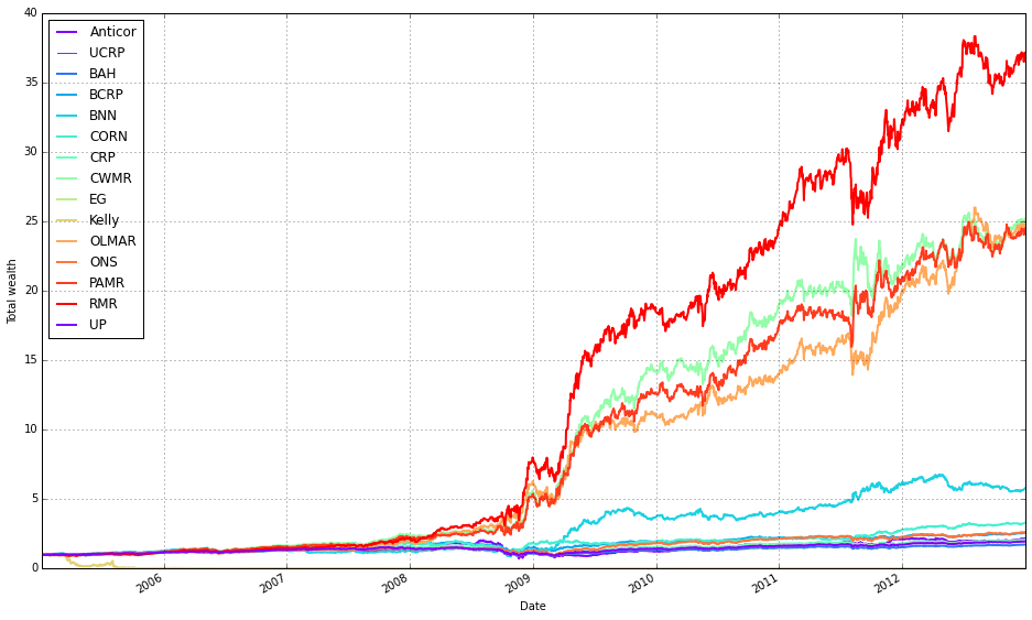
This block produces a single comparative plot of the portfolio-level performance curves for the OLPS experiments, treating the simulations as if there were no transaction fees so we see raw algorithm returns. The first plotted series is used as the anchor because the code needs an axes object from an initial plot call to draw all remaining curves onto the same figure (so they share the same axes, limits, and legend).
Concretely, the first plot call draws only the portfolio-level cumulative return for the first result entry and enables the ucrp trace (Uniform Constant Rebalanced Portfolio) so that the UCRP baseline appears on the figure. assets=False and weights=False deliberately suppress per-asset and weight-evolution subplots because the intent here is a clean, single-panel comparison of overall portfolio performance across algorithms; portfolio_label assigns a readable legend entry tied to that first result.
The loop then walks through every result in olps_train.results and skips the first element (because it was already plotted). For each subsequent result it calls r.plot again with assets=False and weights=False so we only plot portfolio returns, and ucrp=False to avoid re-plotting the same baseline. Passing ax=ax[0] overlays each algorithm’s portfolio curve onto the same axes instance returned by the first call; this ensures consistent scaling and direct visual comparability of the return trajectories and legend entries (portfolio_label=k gives each curve a distinct label).
A couple of implementation notes relevant to robustness: the pattern of grabbing the “first” element by comparing to olps_train.results.keys()[0] and using iteritems() suggests an ordered mapping (or an older pandas-style Series); depending on the runtime environment, keys() may not be indexable in modern Python dicts, so the code assumes a container type that preserves ordering or supports that indexing. Finally, because the plot is created “as if we had no fees,” these curves show frictionless performance — useful for a clean algorithmic comparison, but remember that high-turnover methods may perform materially worse once transaction costs are applied.
def olps_stats(df):
    for name, r in df.results.iteritems():
        df.ix[name,’profit’] = r.profit_factor
        df.ix[name,’sharpe’] = r.sharpe
        df.ix[name,’information’] = r.information
        df.ix[name,’annualized_return’] = r.annualized_return * 100
        df.ix[name,’drawdown_period’] = r.drawdown_period
        df.ix[name,’winning_pct’] = r.winning_pct * 100
    return df
This small function pulls per-algorithm performance objects out of a container on the input DataFrame and materializes a compact set of comparison metrics back into the DataFrame so the caller can easily rank and display OLPS algorithms across the ETF universe. Concretely, it iterates over df.results (a mapping from algorithm name → result object), and for each algorithm it writes six summary statistics into the DataFrame row keyed by that algorithm name: profit, sharpe, information, annualized_return, drawdown_period, and winning_pct. The loop is the story of the data: read the result object for an algorithm, extract the fields that matter for algorithm comparison, transform a couple of them into human-friendly units, and store them on the tabular summary.
Each field stored has an explicit intent. profit is assigned from r.profit_factor (a profitability metric such as gross profit divided by gross loss) to surface raw profit efficiency; sharpe is the risk‑adjusted return; information is the active-return metric versus a benchmark; drawdown_period captures the duration of the worst drawdown episode (a tail‑risk indicator); annualized_return is converted from a fractional value to a percentage by multiplying by 100 (we do this because stakeholders expect yearly returns in percent); winning_pct is likewise converted from a decimal fraction to a percentage for easier interpretation and display. These choices let us compare algorithms along dimensions of absolute profitability, risk‑adjusted performance, benchmark relevance, downside duration, and consistency — which are the practical axes for selecting an OLPS method on a diversified set of ETFs.
A couple of behavioral notes that matter when you use this function: it mutates df in place (it updates/creates cells on the passed DataFrame) and then returns the same DataFrame reference. The code assumes each result object r exposes the named attributes; if any attribute is missing you’ll get an attribute error. It also uses df.ix[…] for assignment; in modern pandas code you should prefer explicit label-based accessors like df.loc[name, col] or df.at[name, col] to avoid ambiguity and to be robust to pandas API changes. Finally, if you plan downstream numerical operations or plotting, you may want to coerce these columns to numeric types and handle missing values or outliers ahead of visualization.
In short: this function is the bridge between algorithmic run objects and the tabular comparison used to evaluate OLPS strategies on the ETF set — it extracts the metrics that matter, normalizes presentation for people (percentages), and writes the summary back into the DataFrame so you can sort, filter, and visualize algorithm performance.
olps_stats(olps_train)
olps_train[metrics].sort(’profit’, ascending=False)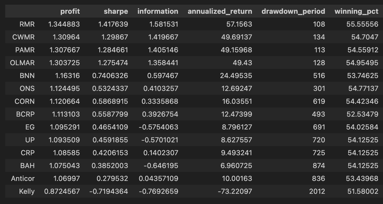
First, olps_stats(olps_train) is the analytics step that computes the performance metrics we need to compare OLPS algorithms across the ETF universe. Conceptually this function takes the raw olps_train results — typically a table of per-algorithm, per-period returns (and possibly per-ETF breakdowns) — and reduces them into the standard performance measures: cumulative profit, annualized return, volatility or Sharpe, max drawdown, turnover, transaction costs, and any other summary statistics you’ve defined. We run this before any ranking because these derived columns are what let us meaningfully compare different algorithms; without computing them you only have low-level returns that are hard to rank or filter on a common basis. Note that implementations vary: some olps_stats return a new summary table, others augment/mutate olps_train in-place — be explicit in your code about which behavior you rely on.
The second line, olps_train[metrics].sort(‘profit’, ascending=False), is the presentation/ranking step. Here you select only the columns listed in the metrics variable (so the output is a compact table of the performance fields you care about) and then sort the rows by the profit column in descending order. Sorting by profit places the highest cumulative-return algorithms at the top so you can quickly identify candidates for deeper inspection. This is a pragmatic first-pass filter: profit is intuitive and useful for shortlisting, but it is not sufficient by itself — you should always cross-check the top entries against risk-adjusted measures (Sharpe, drawdown), trading frictions (turnover, transaction counts), and look for signs of overfitting.
Small but important operational points tied to those two lines: ensure olps_stats has executed successfully and produced the profit column before sorting (otherwise the sort will fail or return unexpected results), and be aware of whether the .sort call returns a new view or mutates the object in-place so you don’t inadvertently lose ordering or overwrite data. Also consider NaN handling and ties when sorting (decide how to break ties or whether to drop incomplete rows). Finally, remember that ranking by a single metric is just the start of model comparison on a diversified ETF set — use this ranked table to drive downstream checks (per-ETF performance heterogeneity, time-series stability, and transaction burden) before promoting any algorithm.
# Let’s add fees of 0.1% per transaction (we pay $1 for every $1000 of stocks bought or sold).
for k, r in olps_train.results.iteritems():
    r.fee = 0.001
This loop walks through the set of algorithm results stored in olps_train.results and sets a transaction-cost parameter on each result object. Concretely, for every algorithm entry (k) and its corresponding result container (r), it assigns r.fee = 0.001, which encodes a 0.1% cost per transaction (equivalently $1 for every $1,000 traded). The code is intentionally mutating each result object in place so that downstream performance calculations will include this cost.
Why we do this: transaction fees materially change algorithm rankings when comparing online portfolio selection (OLPS) strategies, especially across a diversified basket of ETFs. Many OLPS algorithms rebalance frequently; without realistic fees you overestimate net returns and favor high-turnover methods. By applying the same proportional fee to every algorithm before computing wealth/return trajectories, we make the comparison fair and reflective of execution costs. The choice of 0.001 models a simple proportional commission; how it is applied (per side, per round-trip, or per trade) depends on the wealth-update logic elsewhere in the OLPS framework, but placing this attribute here ensures that fee-aware accounting is consistently used by that logic.
A couple of practical implications: because the assignment is done on the training results object, any evaluation, tuning, or selection done after this point will reflect net performance (post-fees). Also, mutating r directly means all consumers of these result objects will see the fee; if you needed fee-free metrics as well, you’d need to keep a separate copy. Finally, ensuring the same fee across algorithms isolates transaction-cost sensitivity as the variable of interest, rather than conflating it with differing cost assumptions.
# plot with fees
# get the first result so we can grab the figure axes from the plot
ax = olps_train.results[0].plot(assets=False, weights=False, ucrp=True, portfolio_label=olps_train.index[0])
for k, r in olps_train.results.iteritems():
    if k == olps_train.results.keys()[0]: # skip the first item because we have it already
        continue
    r.plot(assets=False, weights=False, ucrp=False, portfolio_label=k, ax=ax[0])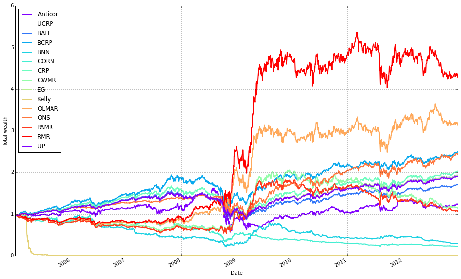
This block is building a single overlaid plot of portfolio performance for a set of OLPS runs so you can directly compare their after-fee results on the same axes. First it grabs the very first result from olps_train.results and calls its plot method with assets=False and weights=False so the plot call renders only the portfolio/wealth curve (we hide per-asset and weight subplots to keep the figure focused). The argument ucrp=True tells that first call to include the UCRP (uniform constant rebalanced portfolio) baseline on the same figure, and portfolio_label assigns a human-readable legend entry using that result’s key. The returned value from that first plot call contains the matplotlib axes object(s); the code saves that into ax so subsequent curves can reuse the same axes.
Next, the loop iterates every result in olps_train.results and skips the first entry because it’s already plotted. For each remaining result it calls r.plot again with the same assets/weights flags to produce only the portfolio curve, but with ucrp=False so we don’t draw the baseline repeatedly. It passes ax=ax[0] to force the new curve to be drawn on the same primary axes created earlier, ensuring all wealth trajectories are overlaid and share the same scale and legend. portfolio_label=k tags each curve with its algorithm name in the shared legend, making visual comparison straightforward.
Why this matters: overlaying the curves on a single axis is the most direct way to compare relative after-fee performance, drawdowns and divergence between algorithms across the diversified ETF universe. Including the UCRP baseline once provides a consistent, interpretable benchmark without cluttering the plot. Hiding asset/weight subplots reduces visual noise so you focus on the business question — how different OLPS strategies perform net of transaction costs — rather than on per-asset weights.
A couple of practical notes to keep the code robust: the approach depends on the specific structure returned by .plot (ax being indexable) and on how olps_train.results exposes its first key; if you port this between Python versions or different result objects, make sure to retrieve the first key/axes in a version-safe way and confirm the shape of ax before indexing ax[0].
Note how Kelly crashes immediately, while RMR and OLMAR rise to the top after a period of high volatility.
olps_stats(olps_train)
olps_train[metrics].sort(’profit’, ascending=False)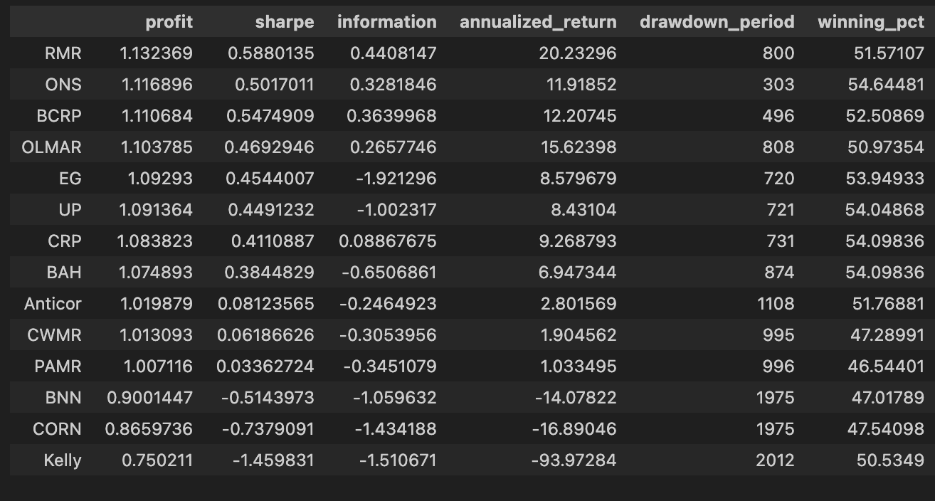
First, we call olps_stats(olps_train) to produce the performance summaries that we need to compare algorithms. In practice this function takes the raw training output for each OLPS variant — typically a time series of portfolio weights and per-period returns across the diversified ETF universe — and reduces it into a set of scalar metrics per algorithm. Those metrics normally include total profit (cumulative return), annualized return, annualized volatility, Sharpe ratio, maximum drawdown, turnover, and possibly metrics that account for transaction costs or leverage. The reason we run this aggregation step up front is that the raw time-series data is not directly comparable across algorithms: aggregating into a common set of statistics normalizes the different outputs so we can rank and reason about trade-offs (return vs. risk vs. trading friction) on a common footing.
The next line, olps_train[metrics].sort(‘profit’, ascending=False), selects the metric columns we care about and sorts the algorithms by the profit column in descending order. Functionally this is the leaderboard step: after olps_stats has computed each algorithm’s cumulative profit, we surface the highest absolute performers first so we can quickly see which OLPS strategies delivered the largest nominal gain on the training period. Sorting by profit is useful for an initial ranking because it highlights raw return performance, but it’s a deliberate, narrow choice — it does not account for risk, drawdown, or transaction costs. In the context of comparing OLPS algorithms for a diversified ETF set, this sorting is therefore an initial screening mechanism rather than a final decision rule.
A couple of practical notes that motivate why the two steps are separated: olps_stats should be run before any sorting or selection so that profit (and other derived metrics) exist and are calculated consistently (same time window, same cost assumptions, same rebalancing rules). Also, because we often want to inspect multiple metrics for the same ordering, we select olps_train[metrics] (the subset of columns) and then sort; that keeps the output compact and focused on comparators. Finally, remember that a single-column sort by profit can be misleading — after this quick ranking you should follow up by inspecting risk-adjusted measures (Sharpe, max drawdown) and operational metrics (turnover, estimated slippage/fees) to make a robust choice among OLPS candidates.
Run on the test set
Instructions for running on the test set.
# create the test set dataframe
olps_test  = pd.DataFrame(index=algo_names, columns=algo_data)
olps_test.algo  = olps_algos
This block is creating the empty results table that we’ll populate as we run each OLPS algorithm against the ETF universe, and it immediately attaches the algorithm implementations to their corresponding rows so later steps can execute them or reference metadata. First, pd.DataFrame(index=algo_names, columns=algo_data) constructs a table whose rows represent algorithms (indexed by algo_names) and whose columns represent the pieces of data or metrics we care about for comparison (algo_data — typically ETF tickers, per-ETF performance metrics, or summary statistics). Because we only supply axes, the cells start out as NaN; that is intentional: we’re reserving the two-dimensional layout so that when a backtest or evaluation runs we can fill in per-algorithm, per-ETF results in a consistent, tabular structure that makes cross-algorithm comparisons and aggregations straightforward.
The second line, olps_test.algo = olps_algos, attaches the actual algorithm objects (or references) to the table by creating a column named “algo” and populating it with olps_algos. Conceptually this ties each row label (an algorithm name) to the executable implementation we will use to generate the values for the other columns. If olps_algos is a list/array whose order matches algo_names, assignment will place each implementation on the corresponding row; if it’s a Series keyed by names, pandas will align by index — so explicit indexing is the safer choice to avoid accidental misalignment. Storing the algorithm objects in the DataFrame lets downstream code iterate rows, call .algo.run(…) or similar, and write results back into the same row, keeping names, implementations and outputs co-located.
A couple of practical notes: attribute-style assignment (olps_test.algo = …) is shorthand for olps_test[‘algo’] = …, but using the bracket form is slightly more robust (avoids subtle attribute collisions and is clearer to readers). Also be aware that putting algorithm objects into a DataFrame makes that column non-scalar and not directly CSV-friendly — if you need to persist identifiers rather than live objects, store a name or key instead and keep implementations in a separate mapping. Overall, this layout is chosen to support the primary goal — systematically running and comparing multiple OLPS algorithms across a diversified ETF set while keeping their implementations and results organized for easy analysis.
# run all algos
for name, alg in zip(olps_test.index, olps_test.algo):
    olps_test.ix[name,’results’] = alg.run(test)
olps_test in this context is acting as the registry of algorithms to evaluate: each row represents one OLPS algorithm (identified by the DataFrame index) and contains at least an ‘algo’ column that holds an algorithm object. The loop pairs each row label with its corresponding algorithm object using zip(olps_test.index, olps_test.algo), so the code processes every configured algorithm in turn and keeps the algorithm–row association explicit rather than relying on positional indexing.
For each algorithm, alg.run(test) is invoked. Conceptually this is the simulation/signal-generation call: the algorithm consumes the test dataset (the ETF price or return series for the evaluation period), iterates through time applying its portfolio update rules, and produces whatever result object the algorithm is designed to return — typically a time series of portfolio weights and/or P&L, plus whatever metrics or traces are needed for downstream comparison (cumulative returns, drawdowns, transaction costs, etc.). We run algorithms sequentially because these runs are stateful simulations that must execute their internal loop logic; they cannot be vectorized across algorithms in a simple way.
The result of each run is then stored back into the olps_test table under the ‘results’ column for the row keyed by the algorithm name: olps_test.ix[name,’results’] = alg.run(test). This keeps all outputs co-located with their configuration and metadata, which makes later aggregation, ranking, plotting, and reporting straightforward — you can iterate the DataFrame and pull each algorithm’s result object without needing a separate mapping structure. Using label-based assignment ensures the results map to the correct algorithm even if the DataFrame’s row order changes.
A few practical considerations behind this pattern: storing the full run output in the registry facilitates reproducible comparisons across a diversified set of ETFs because all run artifacts are retained with the algorithm definition; running each algorithm on the same immutable test input preserves comparability. Be aware that .ix is deprecated in recent pandas versions; prefer .loc[name, ‘results’] or .at[name, ‘results’] for label-based assignment. Also consider adding exception handling and timing around alg.run(test) if any algorithm can error or take disproportionately long — this keeps a long evaluation sweep robust and helps diagnose outliers. Finally, ensure alg.run does not mutate the shared test object (or pass a copy) so one algorithm’s internal side effects cannot contaminate another’s evaluation.
# Let’s make sure the fees are 0 at first
for k, r in olps_test.results.iteritems():
    r.fee = 0.0
This loop walks through the collection of experiment results held in olps_test.results and deliberately resets each result object’s fee attribute to 0.0. The immediate effect is to neutralize transaction or management costs stored on those result objects so that any downstream calculations (cumulative returns, turnover-adjusted performance, Sharpe-like metrics, etc.) reflect pure strategy behavior rather than being conflated with fee effects. Practically, this is an initial, deterministic normalization step: by zeroing fees up front you create a consistent baseline across all OLPS runs and ETF mixes, which makes it possible to compare algorithmic decisions (rebalancing frequency, weighting rules, response to market moves) on an even playing field.
Why we do this matters for interpretation. Fees can materially change performance rankings between algorithms because they penalize turnover and frequent trades; removing fees lets you assess the intrinsic quality of each OLPS policy without that confounding factor. This supports two common workflows: (1) establishing a fee-free benchmark to evaluate the pure signal and risk-return profile of each algorithm, and (2) later reintroducing realistic fee schedules to measure sensitivity and real-world robustness. A couple of operational notes: this mutates the existing result objects — so if you need to preserve original fee settings, make a copy before resetting — and ensure that no fees were already baked into precomputed metrics; otherwise you’ll need to recompute those metrics after the reset to avoid stale, inconsistent numbers.
# plot as if we had no fees
# get the first result so we can grab the figure axes from the plot
ax = olps_test.results[0].plot(assets=False, weights=False, ucrp=True, portfolio_label=olps_test.index[0])
for k, r in olps_test.results.iteritems():
    if k == olps_test.results.keys()[0]: # skip the first item because we have it already
        continue
    r.plot(assets=False, weights=False, ucrp=False, portfolio_label=k, ax=ax[0])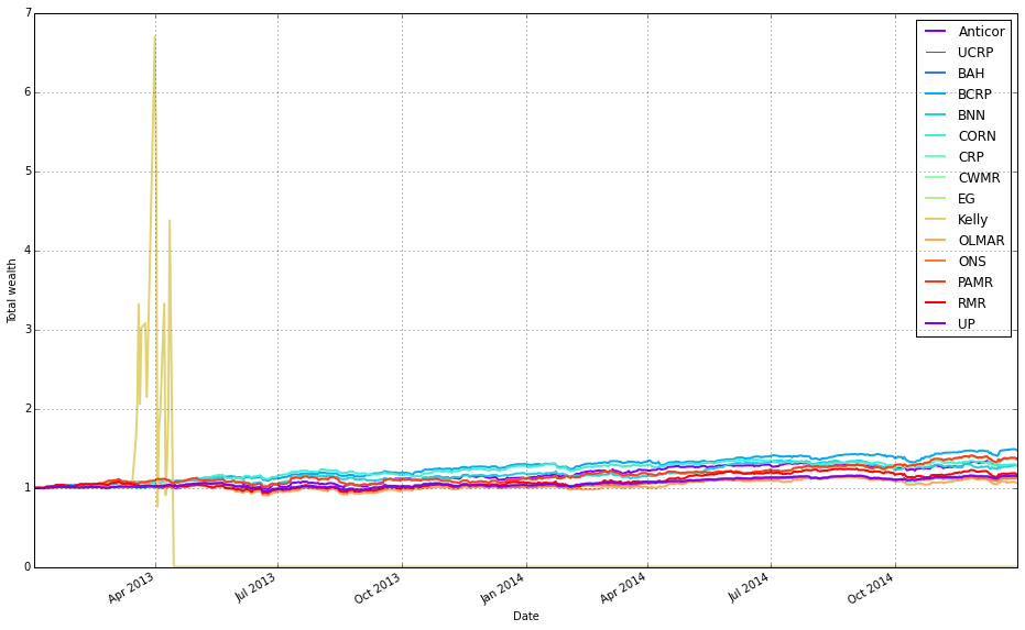
This block builds a single comparative return chart for the set of OLPS runs so you can visually compare their performance (here, deliberately ignoring transaction fees). The code starts by taking the first result object out of olps_test.results and calling its plot method to create the figure and capture the axes. That first call sets up the visual context and also requests the ucrp series (u niform constant rebalanced portfolio) as a baseline by passing ucrp=True; assets and weights are suppressed so the plot stays focused on portfolio-level returns. The portfolio_label for that first curve is taken from the test collection’s index so the baseline/first algorithm line is named appropriately in the legend.
After the initial figure is created, the loop walks the entire results collection and re-plots each subsequent result onto the same axes so all return series share a single chart. The loop explicitly skips the first entry (since it was drawn already) and calls r.plot with ucrp=False for the rest to avoid redrawing the baseline multiple times; assets and weights remain False for the same reason (we only want the portfolio-return curves). Passing ax=ax[0] attaches each new line to the same subplot returned by the initial call — the plot API returns an array-like of axes, and ax[0] is the primary axis you want to overlay.
Conceptually, the decisions here are about clarity and fair comparison: draw only portfolio-level cumulative returns (no per-asset or weight diagnostics) so the chart is directly comparable across algorithms, include the UCRP baseline only once so it’s a stable benchmark, and reuse the same axes so visual alignment, scales, and legend work consistently. This produces a clean, side-by-side visual comparison of different OLPS strategies applied to the diversified ETF set, allowing you to see relative performance without conflating it with fee effects or extra subplot noise.
Remove Kelly from the mix after it went wild and crashed
# plot as if we had no fees
# get the first result so we can grab the figure axes from the plot
ax = olps_test.results[0].plot(assets=False, weights=False, ucrp=True, portfolio_label=olps_test.index[0])
for k, r in olps_test.results.iteritems():
    if k == olps_test.results.keys()[0] or k == ‘Kelly’: # skip the first item because we have it already
        continue
    r.plot(assets=False, weights=False, ucrp=False, portfolio_label=k, ax=ax[0])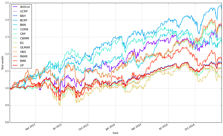
This block builds a single comparison plot of portfolio-level performance for a suite of OLPS algorithms (on diversified ETFs) while intentionally omitting trading fees so you can see each strategy’s raw, pre-cost behavior. It starts by plotting the first result in olps_test.results with assets=False and weights=False so the plot shows only the portfolio-level time series (no per-asset or weight visualizations). The first call also sets ucrp=True, which draws the uniform constant-rebalanced-portfolio baseline on that axis; capturing the returned axes in ax lets us reuse the same figure/axis for subsequent overlays so every algorithm is plotted on the same coordinate system for direct comparison.
Next, the code loops over every result in olps_test.results and overlays each algorithm’s portfolio series onto the existing axis. For each item it skips two cases: the first entry (because it was already plotted) and the ‘Kelly’ entry (explicitly excluded here — presumably to avoid re-plotting a curve that’s been handled differently or to reduce visual clutter; you should confirm the intent with whoever wrote the test). For every algorithm that is plotted in the loop it calls r.plot with assets=False and weights=False (again focusing on the portfolio curve), ucrp=False (so the UCRP baseline — already drawn by the first plot — is not redundantly re-rendered), and portfolio_label=k so each overlaid line appears with a clear legend entry. Passing ax=ax[0] ensures the overlay happens on the same primary axis returned by the initial plot call.
In short: the first result establishes the figure and draws the UCRP baseline; the loop overlays the remaining algorithms’ portfolio returns on that same axis (excluding duplicates and the explicitly omitted ‘Kelly’), producing a clean, directly comparable visualization of the algorithms’ pre-fee performance. Small robustness notes: capture the first key once (rather than re-indexing keys() repeatedly) or use next(iter(…)) for clarity, and double-check why ‘Kelly’ is skipped so the omission is intentional.
olps_stats(olps_test)
olps_test[metrics].sort(’profit’, ascending=False)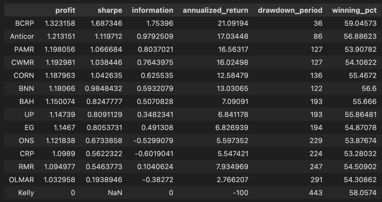
First we call olps_stats(olps_test). Conceptually this is the function that takes the raw per-algorithm test outputs (weights over time, per-period returns, trades/turnover, etc.) and reduces them to a compact set of performance metrics that make algorithms comparable. Practically it walks through each algorithm’s time series, computes cumulative profit/wealth and standard performance summaries (annualized return and volatility, Sharpe or other risk-adjusted ratios, maximum drawdown, total turnover and transaction cost-adjusted profit, win rate, maybe per-period statistics), and writes those summaries back into the olps_test structure (or returns a metrics table attached to it). We do this summarization because the raw time-series are hard to compare at a glance; the metrics make it possible to rank and filter algorithms on concrete criteria and to check that differences are not just noise but reflect meaningful tradeoffs (e.g., higher profit achieved at the cost of much higher drawdown or turnover).
Immediately after we select the metrics table from olps_test and sort it by the profit column in descending order. This step is the simple ranking step: place the highest cumulative profit algorithms at the top so you can quickly see which OLPS strategies produced the largest nominal gains on the ETF set. Two practical points to be aware of here: (1) sorting by raw profit is a useful first pass but can be misleading if you ignore risk and costs — high profit can be achieved with unacceptable volatility or drawdown, so follow-up inspection of Sharpe, drawdown and turnover is important; (2) depending on the data structure and environment, the sort call may return a new sorted view rather than mutating olps_test in place (so if you need to keep the sorted order programmatically, assign the result or use an in-place sort variant). In short: olps_stats creates the comparable performance summaries, and the subsequent sort ranks the algorithms by nominal profit so you can spot top performers quickly, after which you should validate those leaders on risk-adjusted and transaction-cost-aware metrics.
Focus: OLMAR
Rather than using the default settings, we will test several values of the `window` parameter to determine whether OLMAR’s performance can be improved.
# we need need fewer colors so let’s reset the colors_cycle
mpl.rcParams[’axes.color_cycle’]= default_color_cycle
This single line changes Matplotlib’s global color sequence so that every subsequent plot call on an axes will draw lines using the colors in default_color_cycle rather than whatever color sequence Matplotlib would otherwise use. In terms of the plotting “story,” we set this right before generating the visual comparisons of OLPS algorithms across ETFs so that each algorithm’s time series (cumulative returns, weights, etc.) is drawn from a controlled, smaller palette. The practical reason for doing this is readability and consistency: with a reduced, well-chosen color cycle you avoid visually noisy plots, ensure legends remain clear, and make it easier to map the same algorithm to the same color across multiple subplots or figures — all important when the goal is to compare many algorithms across a diversified set of ETFs.
Mechanically, Matplotlib consults rcParams as global styling state; setting the axes color cycle tells the axes to hand out colors from that list in order for each plotted line. That’s why we “reset” it here — we want deterministic, human-friendly colors for the comparisons rather than letting Matplotlib pick or continue an overly long or inconsistent sequence. Be aware this is a global change (it affects all subsequent plotting in the process), so if you need isolated style changes for a single figure it’s safer to use a context manager or set colors per plot explicitly.
One operational note: the key used here (axes.color_cycle) is the older API; in modern Matplotlib versions the canonical approach is to set axes.prop_cycle (using cycler) or to explicitly map algorithm names to colors. Using prop_cycle or an explicit mapping is more future-proof and lets you guarantee the same color assignment even when the number of algorithms exceeds the palette size. Overall, this line is about controlling visual encoding so that algorithm comparisons across ETFs are clear, consistent, and reproducible.
train_olmar = algos.OLMAR.run_combination(train, window=[3,5,10,15], eps=10)
train_olmar.plot()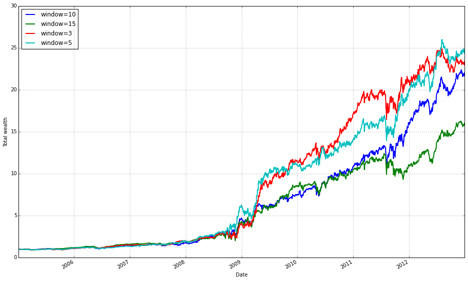
This block instantiates and runs a small ensemble of OLMAR (On-Line Moving Average Reversion) experts over your training data, then draws a diagnostic plot of the result. Under the hood run_combination creates separate OLMAR strategies for each moving-average window you supplied (here 3, 5, 10 and 15 periods). At each step in time every expert computes a short-term prediction by comparing a simple moving average (over its window) to the current prices: assets whose current price is below their moving average are treated as likely to revert upward, so those assets receive relatively more weight; assets above their moving average are treated as likely to fall and receive less weight. Each OLMAR expert then checks the expected portfolio return (the inner product of its current portfolio and its prediction vector) against the target threshold eps. If the expected return is already above eps the expert leaves its allocation unchanged; if it is below eps the expert performs the OLMAR update, which minimally perturbs the current allocation (via a quadratic projection onto the simplex) so that the expected return meets the threshold while preserving the budget and nonnegativity constraints. This update logic is what enforces mean-reversion trading while avoiding aggressive, unstable moves.
run_combination then aggregates the behavior of those experts into a single meta-portfolio over time. Rather than choosing one window a priori, the combination routine weights the experts (typically using their recent performance or another online weighting scheme) so the meta-portfolio emphasizes horizons that have been working recently and dampens those that have not. That ensemble step is the reason you pass multiple window lengths: different ETFs and market regimes revert on different time scales, so parallel experts across short and medium windows give robustness to the overall strategy and reduce the risk of committing to a single, misspecified horizon.
The eps hyperparameter controls the aggressiveness of each expert’s update: a larger eps forces the algorithm to demand a higher predicted return before it accepts the current allocation, which results in more frequent or larger corrections toward the mean-reversion target; a smaller eps makes the expert more tolerant and leads to gentler updates. In practical terms you tune eps and the window set to trade off responsiveness (capturing short-lived reversions) against stability (avoiding excessive turnover and overfitting).
Finally, train_olmar.plot() simply visualizes the outcome of the combined OLMAR run on your training set — typically cumulative wealth over time and, depending on the implementation, diagnostics like expert weights or turnover. You run this during the training phase to inspect how the ensemble performed across your diversified ETF universe, to verify that different windows contribute as expected, and to decide which OLPS variants or hyperparameters you want to carry forward into the comparative evaluation.
print(train_olmar.summary())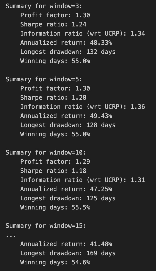
Calling print(train_olmar.summary()) hands control to the train_olmar object’s summary routine and emits a compact, human‑readable report of the OLMAR backtest you just ran. Under the hood the summary aggregates the time series that the backtest produced — per‑period portfolio returns, portfolio weight vectors, realized transaction costs and any benchmark returns — and reduces them to a set of standard performance and risk statistics (cumulative and annualized return, volatility, Sharpe or other risk‑adjusted ratios, maximum drawdown, turnover, and often gross vs net returns). It will also usually show the key algorithm hyperparameters that produced those results (for OLMAR, things like the moving‑average window and epsilon/target parameters), so you can link performance back to configuration choices.
Why we call this here: the summary is the quick diagnostic that lets us compare OLMAR’s behavior to other OLPS algorithms across the same diversified ETF universe. The summary’s annualized and cumulative metrics tell you whether the method produced excess return; volatility and Sharpe expose risk‑adjusted performance; max drawdown highlights tail risk and capital preservation; turnover and net returns reveal how much trading frictions and transaction costs erode theoretical gains. Because OLMAR is a mean‑reversion/moving‑average based strategy, high turnover or concentrated allocations in the summary can indicate that the algorithm is repeatedly switching bets to chase short‑term reversions, which will be costly in a universe of ETFs with nontrivial spreads and fees.
How those numbers are typically computed is important to keep in mind when you interpret the printout: per‑period portfolio returns come from dotting realized price relatives with the weight vectors, cumulative return compounds those per‑period returns, volatility is the standard deviation of period returns scaled to an annual basis, Sharpe uses an assumed risk‑free rate to convert that to a risk‑adjusted metric, and max drawdown is computed from the running peak of the equity curve. Turnover is derived from the L1 distance between successive weight vectors (often normalized) and combined with the per‑trade cost model to produce net returns. Because the summary consolidates all this into single numbers, it’s a deliberate trade‑off between quick comparability and loss of temporal detail.
Practical next steps after reading the summary: use it to rank OLMAR against other OLPS methods on the same ETFs, but don’t stop there — inspect the time‑series returns, weight trajectories, and drawdown periods to understand when and why OLMAR succeeded or failed. Verify the backtest assumptions embedded in the summary (frequency, transaction cost model, rebalancing rules, look‑ahead protection) and run sensitivity checks on OLMAR’s hyperparameters if the summary suggests either strong promise or unacceptable risk/turnover. The summary is your starting point for model comparison and hypothesis testing, not the final verdict.
train_olmar = algos.OLMAR.run_combination(train, window=5, eps=[3,5,10,15])
train_olmar.plot()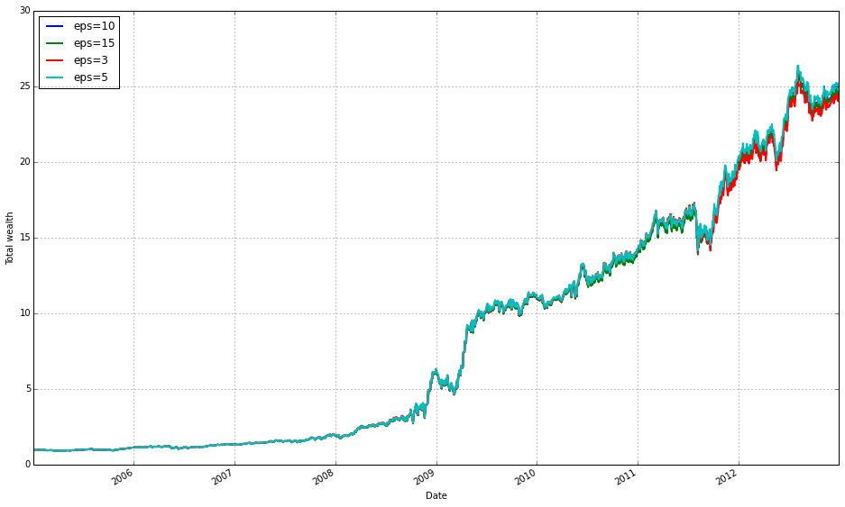
We’re running a small ensemble of OLMAR (On-Line Moving Average Reversion) strategies on the training set and then visualizing the resulting performance. When train_olmar = algos.OLMAR.run_combination(train, window=5, eps=[3,5,10,15]) executes, the library spins up several OLMAR instances — one per epsilon value — all using a 5-period moving average as their prediction engine. At each time step, each OLMAR variant computes a predicted price-relative vector from the last 5 observations (the moving-average forecast), evaluates the expected return of its current portfolio against that prediction, and decides whether to rebalance. The core decision inside each variant is governed by the constraint b · x_pred >= eps: if the current portfolio’s predicted return falls below the chosen eps threshold, OLMAR computes a corrective update (a projection step that respects the long-only simplex constraint) whose magnitude is proportional to how far the predicted return is from the threshold. This projection keeps weights non-negative and summing to one, preventing invalid or excessively leveraged portfolios.
The reason we run a combination of epsilons rather than a single OLMAR is robustness to the sensitivity of that hyperparameter. Epsilon controls aggressiveness: smaller values make the strategy more conservative (fewer or smaller adjustments), while larger values force bigger updates and higher turnover in pursuit of larger predicted gains. By running eps = [3,5,10,15] we span a range of mean-reversion intensities so the ensemble can capture different reversion speeds that might exist across the diversified ETF set or across market regimes. The ensemble aggregation implemented by run_combination blends the signals from these differently tuned OLMARs into one meta-portfolio, reducing the risk of relying on one mis-specified epsilon and smoothing parameter-selection noise.
Using window=5 is a deliberate business-level choice: it encodes a weekly mean-reversion horizon for ETFs (five daily observations) so the predictor reacts to short-term reversions while still smoothing daily noise. Practically, shorter windows increase responsiveness but can overfit noise; longer windows are smoother but slower to react. The combination of multiple epsilons with this window gives us a way to explore responsiveness vs. aggressiveness trade-offs without repeatedly re-running separate experiments.
Finally, train_olmar.plot() gives you an immediate visual check of what happened on the training period — typically an equity curve (cumulative wealth) and often supplementary diagnostics like per-strategy contributions or turnover depending on the plotting implementation. Use that plot to validate whether the ensemble produced stable, monotonic gains or if it exhibits large drawdowns or high turnover; those signs tell you whether to adjust eps/window, add transaction-cost modeling, or compare against other OLPS algorithms in the same experimental framework.
print(train_olmar.summary())
Here you’re asking the trained OLMAR run to produce a compact, human-readable report of its backtest and then emitting that report to the console. The train_olmar object holds the time-series output and internal state produced by running the OLMAR online-portfolio-selection routine over the ETF training window (wealth evolution, per-period portfolio vectors, realized returns, and any bookkeeping about trades and transaction costs). Calling its summary() method collapses those raw time-series into the key diagnostics you need to compare algorithms: overall cumulative (final) wealth, annualized or geometric mean return, volatility or standard deviation of returns, risk-adjusted ratios such as Sharpe (and sometimes Sortino), maximum drawdown and its timing, hit-rate or percentage of positive periods, and measures of activity like turnover and total transaction cost. The summary may also expose final or average portfolio weights so you can verify whether OLMAR produced a diversified allocation or concentrated bets.
We do this because raw returns curves are hard to compare across many algorithms and ETF universes; summary statistics distill performance into comparable signals and highlight trade-offs that matter operationally. For example, a high cumulative return with very high turnover signals that transaction costs or liquidity could erode out-of-sample performance on ETFs, whereas a modest return with low volatility and low drawdown might be preferable for a production allocation. The summary is also useful for debugging: extreme drawdowns, implausibly high final weights, or unexpectedly large turnover point to parameter issues (e.g., mean-reversion window, step-size) or data problems (lookahead, missing prices).
Finally, printing the summary is a quick, immediate step in the comparison workflow: you read these standardized metrics for OLMAR, then do the same for other OLPS algorithms and baselines (uniform buy-and-hold, market index). For reproducibility and deeper analysis, capture the summary output (or the underlying data) to files or structured logs so you can aggregate results, compute statistical significance, and inspect per-period behavior where the summary flags potential concerns.
We find that a window of 5 and eps of 5 are optimal over the training period; however, the default values (w=5, eps=10) were also acceptable for our purposes.
# OLMAR vs UCRP
best_olmar = train_olmar[1]
ax1 = best_olmar.plot(ucrp=True, bah=True, weights=False, assets=False, portfolio_label=’OLMAR’)
olps_train.loc[’CRP’].results.plot(ucrp=False, bah=False, weights=False, assets=False, ax=ax1[0], portfolio_label=’CRP’)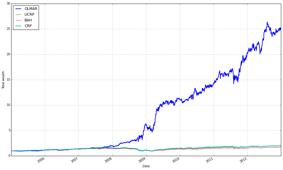
This snippet picks the best-trained instance of OLMAR and draws a focused performance comparison against a constant-rebalanced baseline. The first line, best_olmar = train_olmar[1], selects the second element of a collection of trained OLMAR runs (presumably the one identified as “best” by prior evaluation); conceptually we’re saying “take the representative OLMAR model we want to inspect.” Next we call its plotting helper with ucrp=True and bah=True so the plot will include the two common baselines used in online portfolio selection: UCRP (uniform constant rebalanced portfolio) and BAH (buy-and-hold). Those baseline traces are included here because they provide simple, interpretable reference points for whether the adaptive OLMAR strategy actually adds value over fixed allocation strategies on the ETF universe.
The call also sets weights=False and assets=False to suppress allocation and per-asset traces; that choice intentionally narrows the visualization to portfolio-level performance (cumulative wealth or returns) rather than the distracting detail of how weights evolve. The portfolio_label=’OLMAR’ argument gives the main trace a clear legend name. The plot method returns axes (ax1) and the code immediately uses ax1[0] when overlaying the CRP result, which means we’re plotting the CRP line onto the same subplot produced for OLMAR. Passing ax=ax1[0] ensures the CRP trace shares the same axes/scales so the comparison is a direct, visual one.
Finally, olps_train.loc[‘CRP’].results.plot(…, portfolio_label=’CRP’) pulls the stored CRP result from the training summary and draws it without repeating the ucrp or bah baselines (ucrp=False, bah=False) to avoid duplicate baseline lines in the legend. In short, the snippet builds a concise, apples‑to‑apples plot: the best OLMAR run versus a constant-rebalanced baseline (and optionally BAH/UCRP) with allocation details hidden so you can quickly judge whether OLMAR improves cumulative performance on the diversified ETF set. A small implementation note: the code assumes the plot method returns a sequence of axes and that ax1[0] is the correct target axis — if the plotting API ever changes to return a single axis object you’ll need to adjust that indexing.
OLMAR outperforms CRP on the training set
# let’s print the stats
print(best_olmar.summary())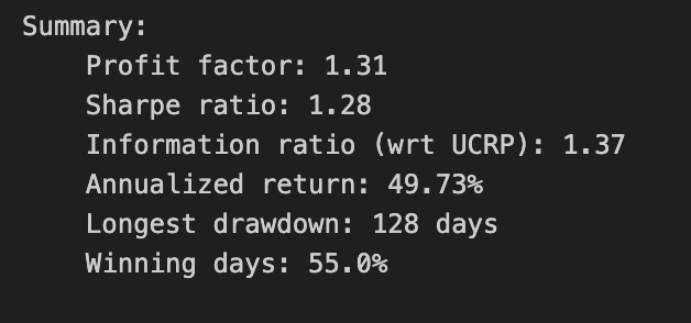
This single call prints a concise performance report for the OLMAR instance you’ve selected as “best_olmar.” Conceptually what happens is: the object gathers the stored backtest history (weights, portfolio wealth over time, per-period returns, and trade records), computes a set of aggregate statistics from those time series, and formats them for human review. We invoke it here because a textual summary is the quickest way to understand the algorithm’s realized behavior across the entire ETF universe we tested.
Why we do this: OLPS algorithms are about more than raw endpoint return — they trade off return, risk, and turnover in different ways. The summary aggregates the key metrics you need to judge that tradeoff. Expect it to report cumulative/total return and annualized return (so you can compare growth scaled to a common time horizon), volatility and annualized standard deviation (to see variability of returns), and at least one risk-adjusted measure such as Sharpe ratio (to compare returns per unit volatility). It should also include drawdown statistics (maximum drawdown and possibly drawdown duration) so you can assess downside risk, and turnover or number-of-trades information so you can judge how frequently the strategy rebalances and therefore how sensitive it will be to transaction costs. Many implementations also show final wealth, average return per period, and maybe a simple hit-rate or win/loss count; if the backtest applied transaction costs, the summary will reflect net performance.
How to use and interpret the output in our ETF-comparison context: use cumulative/annualized returns to rank raw performance across algorithms, but don’t stop there — prefer risk-adjusted metrics (Sharpe, Sortino if present) when deciding which algorithm is “better” because ETFs are diversified and volatility differences are meaningful. Watch max drawdown to understand tail risk: an algorithm with higher returns but a much larger drawdown may be unsuitable for our client constraints. Critically, inspect turnover alongside returns: OLPS methods often generate frequent rebalances to exploit short-term patterns, which can inflate simulated returns but get eaten by realistic trading costs. If the summary shows very high turnover, you should re-evaluate with transaction-cost assumptions or look for parameter settings that reduce trading frequency. Finally, if the summary looks anomalous (e.g., extremely high Sharpe with low turnover), check that the backtest history was populated correctly — summary typically computes metrics from stored time series, so you need a completed run and aligned pricing data for it to be trustworthy.
Recommended next steps after reading the summary: compare these statistics side-by-side with other algorithms’ summaries, prioritize risk-adjusted metrics and realistic net returns (post-cost), and if an algorithm looks attractive, drill down into time-series artifacts — weight paths, per-period returns, drawdown episodes, and trade logs — to ensure the apparent performance isn’t driven by a short lucky window or data-misalignment. This printed summary is the fast, first-pass diagnostic that informs which OLPS implementations deserve that deeper inspection on our diversified ETF set.
How Individual ETFs Contribute to Portfolio Equity
best_olmar.plot_decomposition(legend=True, logy=True)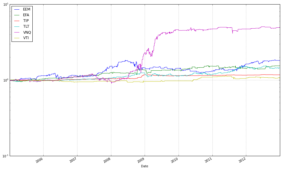
This single call is a visualization step that turns the internal history kept by the OLMAR instance into an interpretable, component-level story of how the algorithm produced its returns across the ETF universe. Internally, best_olmar already has time-series for the portfolio weights it chose at each rebalancing, the asset price or return series it observed, and the resulting portfolio returns (and often turnover/transaction-cost adjustments). plot_decomposition pulls those histories, computes each asset’s period-by-period contribution (typically weight × asset return or the incremental change in portfolio wealth attributable to that asset), and aggregates those contributions over time so you can see both the instantaneous and cumulative drivers of performance.
The function then renders that aggregation as a decomposition plot — usually a stacked-area or line chart — where each component corresponds to an ETF (and sometimes separate series for transaction costs or cash). Setting legend=True simply turns on the labels for those components so you can identify which ETFs are doing the heavy lifting. logy=True changes the y-axis to a logarithmic scale; in practice this converts multiplicative growth into something closer to additive trends, which makes proportional differences and long-run compounding more visually meaningful and prevents a single large absolute winner from visually dwarfing smaller but still important contributors.
From the perspective of comparing OLPS algorithms on a diversified set of ETFs, this plot is crucial: it lets you attribute outperformance (or drawdowns) to particular ETFs, spot concentration or unintended risk exposures, and verify that the algorithm’s mean-reversion signals are actually driving returns rather than, say, lucky bets or excessive turnover. One practical caveat: a log y-axis requires strictly positive plotted values (cumulative wealth/contribution must be >0), so ensure any negative contributions or zeros are handled (e.g., plotted separately or offset) before interpreting the log-scaled view.
Highlight the magnitude of the largest contributing ETF by removing the logarithmic scale and viewing its values directly.
best_olmar.plot_decomposition(legend=True, logy=False)
This single call tells the visualization layer to take the backtest state captured in best_olmar and produce a diagnostic, multi-part plot that breaks the aggregate performance down into interpretable pieces. Internally the method pulls the time series that the OLMAR run produced — typically the portfolio value (wealth) over time, the sequence of portfolio weight vectors, and the per-period returns — and converts those into component-level traces: per-asset contribution-to-return (usually weight_t × asset return_t+1 or an equivalent contribution formula that respects the backtest’s transaction-cost model), a cumulative-wealth curve, and a weight/time panel showing how exposure to each ETF evolved. The legend=True flag simply turns on the labels so you can identify which trace corresponds to which ETF or component, while logy=False forces a linear y-axis (so you see absolute magnitudes and additive contributions directly rather than viewing multiplicative growth on a log scale).
Why we do this: the decomposition exposes the “why” behind the scalar performance numbers. Instead of just a total return, you get which ETFs produced gains or losses, how much of the portfolio’s movement was driven by allocation drift versus tactical rebalancing, and whether turnover or transaction costs (if accounted for in the backtest) materially eroded returns. Choosing a linear y-axis (logy=False) makes it easier to read stacked or additive contribution plots and to compare absolute contribution sizes — useful when you want to understand risk concentration or identify individual losers — whereas switching to log scale would be better if you need to visualize multiplicative growth over many orders of magnitude. Turning the legend on is a practical choice for comparing many ETFs so you can map colors to tickers.
How to use the output when comparing OLPS algorithms on a diversified ETF set: run the same decomposition for each algorithm and compare the shape and drivers of performance rather than just end wealth. Look for persistent concentration (one ETF dominating contributions), frequent large weight swings (high turnover), and recurring negative contributions (systematic exposure to losers). Those patterns tell you whether an algorithm’s superior cumulative return came from sustained, diversified alpha or from a few lucky positions and high turnover — exactly the distinctions you need when evaluating online portfolio selection strategies on ETF universes.
VNQ (Real Estate) became the primary driver following the 2008 market crash.
Portfolio allocations
best_olmar.plot(weights=True, assets=True, ucrp=False, logy=True, portfolio_label=’OLMAR’)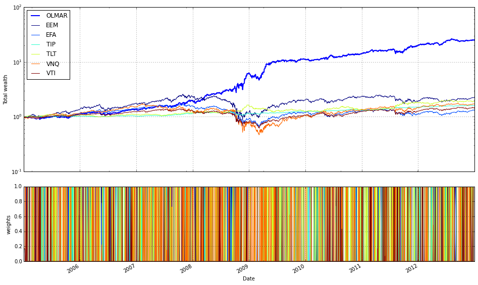
This single plotting call is the final visualization step that ties the backtest results for the selected OLPS (Online Portfolio Selection) run — best_olmar — back to the project goal of comparing OLPS algorithms on a diversified ETF basket. When you ask for weights=True and assets=True the plot routine generates two complementary views and synchronizes them on the same time axis: a time series of the portfolio’s allocation vector (how capital is distributed across the ETFs at each rebalancing) and the price/performance traces for the individual assets. Showing the allocations is important because OLPS algorithms are allocation-driven; you want to see whether OLMAR actually diversified, concentrated, or reacted to specific asset moves over time, and whether those allocation changes align with subsequent asset returns.
Turning off ucrp (ucrp=False) removes the Uniform Constant Rebalanced Portfolio baseline from the chart. We do this when the immediate goal is to inspect the algorithm’s behavior and the underlying assets without the visual clutter of a canonical baseline. If you instead want to compare absolute performance against that baseline you would set ucrp=True; here, hiding it emphasizes the algorithm’s allocation dynamics and asset interactions rather than a single benchmark line.
Using logy=True plots the performance axis on a logarithmic scale, which is a deliberate choice because portfolio wealth compounds multiplicatively. A log scale makes proportional changes visually uniform over time and separates multiplicative growth from additive noise, so you can better compare growth rates and spot regime changes even when wealth magnitudes diverge. Note the practical implication: log plotting assumes positive values for the series (wealth and asset prices); if any series contains zeros or negatives you’ll need to handle those before plotting.
Finally, portfolio_label=’OLMAR’ simply controls the legend/text label for the portfolio trace so the chart explicitly names this run. Together, these options produce a focused, interpretable visualization: synchronized asset performance and allocation evolution on a multiplicative scale, labeled for clarity, and without the standard CRP baseline to keep attention on how OLMAR behaved across the diversified ETF set. This plot is useful for diagnosing whether the algorithm’s decisions map sensibly to asset moves and for qualitatively assessing diversification behavior before moving on to numeric performance comparisons.
VNQ is the primary driver of wealth (log scale)
To validate the strategy, exclude the single most profitable holding and compare the resulting total wealth.
# find the name of the most profitable asset
most_profitable = best_olmar.equity_decomposed.iloc[-1].argmax()

# rerun algorithm on data without it
result_without = algos.OLMAR().run(train.drop([most_profitable], 1))

# and print results
print(result_without.summary())
result_without.plot(weights=False, assets=False, bah=True, ucrp=True, logy=True, portfolio_label=’OLMAR-VNQ’)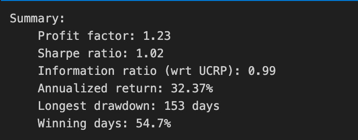
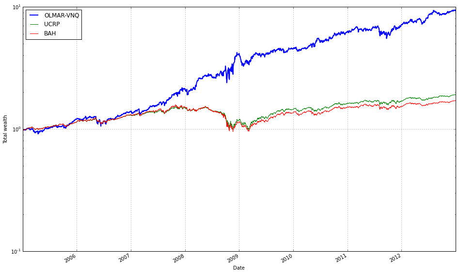
First we identify the single asset that contributed most to the final portfolio performance. best_olmar.equity_decomposed is a time series breakdown of the portfolio’s equity by asset, so taking its last row (iloc[-1]) gives each asset’s end-of-period contribution and argmax picks the asset with the largest contribution. The motivation here is to isolate the top contributor so we can test how dependent the algorithm’s success is on that one ETF rather than on broad diversification.
Next we rerun the OLMAR algorithm on the same training dataset but with that asset removed. Dropping the column ensures the algorithm cannot allocate to that ETF at all, so the resulting run reflects OLMAR’s behavior on the reduced universe. This is a simple sensitivity / robustness check: if overall performance collapses, it suggests the original result relied heavily on that single ETF; if performance remains similar, it indicates more genuine diversification and that OLMAR’s signals generalize across the remaining ETFs.
Finally we print the textual summary and produce a focused plot. The summary provides the standard performance metrics (cumulative return, drawdown, risk/return statistics) so you can quantify the impact of removing the asset. The plot options intentionally hide weight and per-asset series and instead show the portfolio curve against baselines (buy-and-hold and uniform CRP) on a log scale — this makes multiplicative performance differences and relative growth rates easier to compare visually. The portfolio_label is set to indicate this is the variant with that asset removed, so you can clearly distinguish it in comparisons.
Overall, this block is a quick diagnostic step in our OLPS evaluation: we locate the largest single-driver of returns, remove it, and then compare numeric and visual outcomes to judge whether OLMAR’s performance was driven by a single ETF or by robust, diversified behavior across the ETF set.
result_without.plot_decomposition(legend=True, logy=False)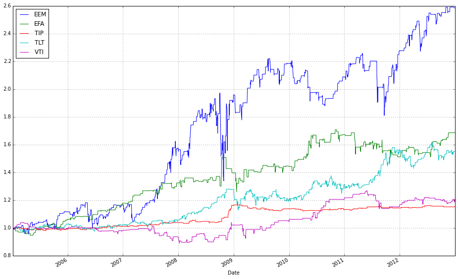
result_without is the backtest result object produced by your OLPS experiment, and plot_decomposition is a visualization helper that breaks the portfolio-level performance down into the contributions from each underlying ETF over time. When you call result_without.plot_decomposition(…) the code takes the per-period portfolio weights and the asset returns and computes per-asset portfolio returns (essentially weight_i * return_i for each asset each period), then aggregates those per-period contributions into a running series that, when stacked, reproduces the total portfolio wealth path. The plotting routine typically uses those series to draw a stacked-area (or stacked-line) chart so you can see which ETFs added or subtracted value at each point in time and how their cumulative contributions sum to the overall performance.
You passed legend=True to ensure the plot includes labels for every component, which is important for attribution: the legend lets you map each colored band back to the ETF that produced it so you can tell which securities the algorithm relied on. You set logy=False to request a linear y-axis; this is deliberate because a decomposition plot is usually showing additive contributions (including negatives), and a log scale cannot represent zero or negative contributions and tends to obscure small additive effects. Use linear scale here to preserve the additive interpretation and to make small but persistent contributors (or small losses) visually apparent. If instead you wanted to emphasize multiplicative growth (the compounded wealth curve), a log y-axis of the total wealth curve would be more appropriate, but it would not display negative or offsetting per-asset contributions meaningfully.
In the context of comparing OLPS algorithms on a diversified set of ETFs, this decomposition plot is a diagnostic tool: it reveals which ETFs and which allocation decisions drive outperformance or underperformance, shows whether returns are concentrated in a few names (weak diversification), and helps identify periods where rebalancing or regime shifts changed the contribution mix. Be mindful that what you’re seeing reflects the assumptions of the backtest (e.g., whether transaction costs, slippage, or cash holdings were included); those factors can materially change per-asset contributions, so use the decomposition alongside aggregated metrics (cumulative return, volatility, turnover) to form conclusions about each algorithm’s behavior.
Apply a 0.1% fee per transaction (we pay $1 for every $1,000 of stock bought or sold).
best_olmar.fee = 0.001
print(best_olmar.summary())
best_olmar.plot(weights=False, assets=False, bah=True, ucrp=True, logy=True, portfolio_label=’OLMAR’)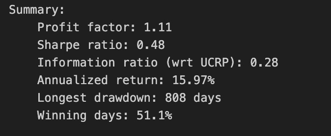
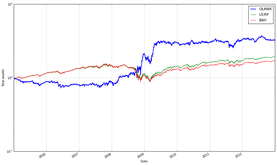
The first line sets a transaction-cost parameter on the OLMAR strategy: best_olmar.fee = 0.001 models a 0.1% round-trip trading cost and ensures subsequent performance calculations account for realistic frictions. We do this because OLMAR and other online portfolio selection (OLPS) algorithms typically rebalance frequently; without a fee model their gross returns can look misleadingly attractive. Explicitly assigning the fee before reporting or plotting forces the backtester to subtract trading costs from realized returns and to include turnover-driven penalties in metrics like net cumulative return, annualized return, and realized volatility.
The print(best_olmar.summary()) call generates and dumps a compact performance report for the configured strategy. That summary is where you inspect the quantitative consequences of the chosen fee: cumulative/net return, annualized return, volatility, Sharpe-like ratios, maximum drawdown, total turnover and number of trades, and total fees paid. We print it here to get an at-a-glance diagnosis of how sensitive OLMAR’s performance is to transaction costs, because high turnover strategies often show a pronounced drop in net performance once fees are applied. Reviewing the summary before visualizing also helps decide which views or comparisons to emphasize in the plot.
The plotting call focuses the visualization on net-wealth trajectories and benchmark comparisons rather than allocation paths. By passing weights=False and assets=False you suppress the weight-evolution and per-asset price panels so the figure remains concentrated on portfolio value. Including bah=True (buy-and-hold) and ucrp=True (uniform constant-rebalanced portfolio) overlays two simple, well-known baselines: a passive buy-and-hold of the ETF basket and an equally weighted CRP, which let you see whether OLMAR’s active rebalancing adds value after costs. Using logy=True sets a logarithmic y-axis, which is important when comparing multiplicative growth over long horizons or when curves diverge: the log scale linearizes exponential growth rates and makes relative compound returns easier to compare visually. Finally, portfolio_label=’OLMAR’ ensures the plotted curve for this strategy is clearly identified in the legend.
Taken together, these three lines produce a fee-aware numeric and visual comparison that answers the central question of our experiment: does OLMAR’s rebalancing heuristic outperform simple benchmarks on a diversified set of ETFs once realistic transaction costs are included? If the summary shows high turnover and large fee drag, and the plotted net-wealth curve falls behind bah or ucrp on the log scale, that suggests the algorithm’s short-term signals aren’t robust enough to overcome execution costs; conversely, an advantage after fees indicates economically meaningful alpha. One practical note: confirm whether the plotting routine applies the same fee model to the benchmarks — if not, apply fees consistently across all comparators to avoid misleading conclusions.
Results
Performance deteriorates: the Sharpe ratio falls below the market’s approximate 0.5, and annualized returns are reduced by roughly half due to fees. Intensive trading causes OLMAR to underperform for the first four years, until it captures volatility in 2008 and finally surpasses UCRP.
OLMAR During the Test Period
test_olmar = algos.OLMAR(window=5, eps=5).run(test)
#print(train_olmar.summary())
test_olmar.plot(ucrp=True, bah=True, weights=False, assets=False, portfolio_label=’OLMAR’)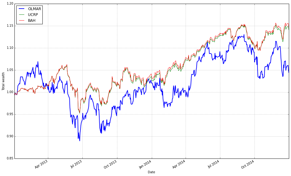
This small block initializes and runs the OLMAR online portfolio algorithm over your test dataset, then plots its cumulative performance against common baselines so you can directly compare its behavior on the ETF universe.
When you call algos.OLMAR(window=5, eps=5).run(test) the library instantiates an OLMAR strategy with a 5-period moving average and an aggressiveness threshold eps=5, and then executes it sequentially over the rows in test (each row is a market observation, e.g., daily ETF prices or price relatives). Internally, at each time step OLMAR computes a short-term moving average of recent prices (the “window”) and forms a predicted price-relative vector by comparing that moving average to the current prices; this predicted vector encodes the algorithm’s belief about which assets will revert toward their recent averages. It then evaluates the expected return of the current portfolio against that prediction. If the expected return is below the eps threshold, the algorithm performs a passive–aggressive style correction: it computes the smallest change to the current weight vector that would raise the expected return to eps, then projects the resulting weights back onto the simplex (non‑negative, sum to one). That projection enforces the long-only, fully invested constraint used in the OLPS framework. The step-by-step run therefore updates weights, tracks realized returns, and accumulates performance statistics (wealth trajectory, transaction effects if modeled) across the test period.
The chosen hyperparameters control the strategy’s behavior: window=5 makes OLMAR sensitive to very recent mean-reversion signals (short memory, more reactive), while eps=5 sets a relatively high target expected return so the algorithm will rebalance more forcefully when predictions are weak. In practice on a diversified ETF set, a small window can exploit short-term mean-reversion across correlated instruments, but it also increases turnover; a large eps increases aggressiveness and potential transaction costs or scheme instability, so you should tune them relative to your rebalance frequency and cost assumptions.
Finally, test_olmar.plot(ucrp=True, bah=True, weights=False, assets=False, portfolio_label=’OLMAR’) visualizes the cumulative wealth of the OLMAR strategy and overlays two benchmarks: ucrp (uniform constant rebalanced portfolio) and bah (buy-and-hold). Showing these baselines is deliberate — they are simple, widely used references for OLPS evaluation and let you see whether OLMAR’s adaptive rebalancing adds value versus passive diversification. The flags weights=False and assets=False suppress the per-asset weight trajectories and individual asset plots, keeping the chart focused on portfolio-level performance; portfolio_label names the OLMAR series in the legend. If you need numeric summaries you can un-comment the summary() call to inspect cumulative return, Sharpe-ish metrics, turnover, etc., which helps quantify the trade-offs (return vs. turnover) introduced by the chosen window/eps settings when comparing algorithms across your ETF universe.
Including Fees
test_olmar.fee = 0.001
print(test_olmar.summary())
test_olmar.plot(weights=False, assets=False, bah=True, ucrp=True, logy=True, portfolio_label=’OLMAR’)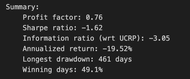
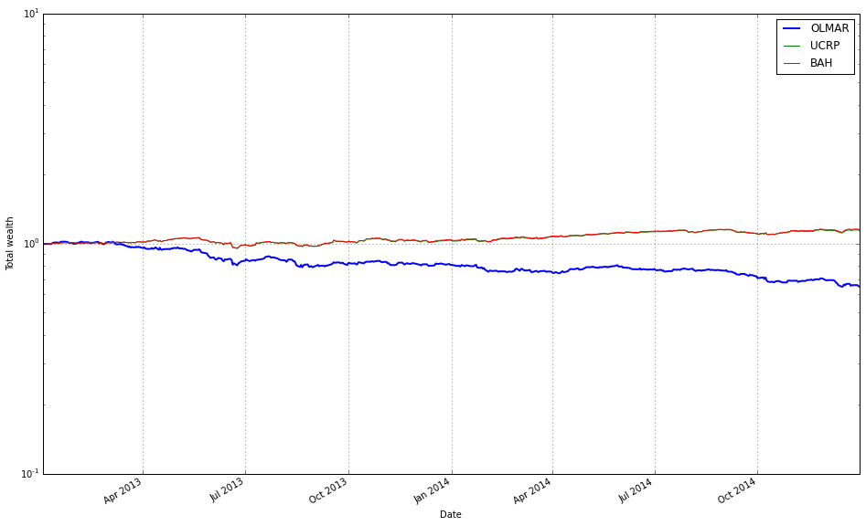
First we assign test_olmar.fee = 0.001 to tell the backtesting object to charge a 0.1% transaction cost on trades. This is not a cosmetic label — it changes how wealth trajectories and performance metrics are computed because every rebalancing action will be penalized by that proportion. We do this to simulate realistic ETF trading costs and to expose whether OLMAR’s trading pattern (often frequent rebalances driven by mean-reversion signals) survives realistic frictions; high turnover strategies can look good in frictionless simulations but suffer once fees are applied.
Next, print(test_olmar.summary()) requests a concise performance report that is computed with the current fee setting in place. The summary aggregates the post-fee results into the usual diagnostics: cumulative/annualized return, volatility, Sharpe-like ratios, maximum drawdown, and turnover or transaction counts (depending on the framework). Because we set the fee before calling summary, the numbers reflect net performance after trading costs, so the summary helps you judge both absolute performance and cost-sensitivity — for example, whether a strong gross return relied on excessive trading that fees erode.
Finally, test_olmar.plot(weights=False, assets=False, bah=True, ucrp=True, logy=True, portfolio_label=’OLMAR’) draws a clean comparative performance chart focused on portfolio wealth paths. By turning weights=False and assets=False you deliberately suppress the detailed subplots for evolving asset weights and individual asset price/return series so the figure stays focused. Setting bah=True and ucrp=True overlays two standard baselines — Buy-and-Hold (BAH) and the Uniform Constant Rebalanced Portfolio (UCRP) — so you can visually compare OLMAR’s net-growth trajectory against a passive ETF buy-and-hold and a naive equal-weight rebalancer. Using logy=True switches the y-axis to logarithmic scale, which is important when comparing multiplicative growth over long horizons because it makes relative growth rates linear and compresses wide variations for clearer visual comparison. The portfolio_label argument names the OLMAR curve in the legend so it’s easy to identify which line corresponds to the algorithm under test.
Taken together, these three lines configure realistic trading friction, produce a quantitative summary that accounts for that friction, and generate a focused comparative plot. That sequence — set fee, recompute metrics, and visualize against BAH/UCRP on a log scale — is aimed squarely at answering the core question of whether OLMAR’s algorithmic rebalancing delivers robust, net-of-cost outperformance on a diversified ETF universe.
OLMAR — Starting in 2010
The 2008–2009 recession was unique. Repeat the analysis beginning in 2010, using 2010–2013 (inclusive) as the training set and 2014 as the test set.
# set train and test time periods
train_start_2010= datetime(2010,1,1)
train_end_2010 = datetime(2013,12,31)
test_start_2010 = datetime(2014,1,1)
test_end_2010 = datetime(2014,12,31)
This small block declares the two contiguous, non-overlapping time windows that the experiment will use: a training period from 2010–01–01 through 2013–12–31, and a test (out-of-sample) period covering calendar year 2014. In the narrative of the backtest, historical price and feature series are first sliced using the training window so that the OLPS algorithms can derive their initial weight choices, estimate any required statistics (means, variances, covariances, transaction-cost parameters, regularization hyperparameters, etc.), and — if applicable — be tuned or warmed up on past behavior. Once the training window has been consumed, the test window is then used exclusively to simulate forward performance (rebalancing, applying trading rules, measuring returns, drawdowns and turnover) so that those results reflect genuine out-of-sample behavior.
The key reason for separating the windows this way is to avoid look-ahead bias and data leakage: nothing from the test year should influence model configuration or parameter selection during training. Choosing four calendar years for training and a single year for testing is a pragmatic balance for ETF experiments — the longer training span provides more observations to stabilize estimates (helpful for covariance or shrinkage-based components of OLPS methods), while the single-year holdout isolates performance in a distinct market regime. Using explicit datetime bounds (rather than row counts) makes slicing straightforward and robust to missing days and holidays typical in ETF price series.
A couple of practical implications to keep in mind: downstream code needs to respect inclusive/exclusive semantics when slicing (these datetime objects typically mark the first and last day to include), and you must ensure the data source actually contains entries for those dates. Also consider whether a single fixed split is sufficient: for a thorough comparison you may later want rolling or expanding-window evaluations to capture sensitivity to regime changes and to reduce variance in comparative performance metrics.
# load data from Yahoo
train_2010 = DataReader(etfs, ‘yahoo’, start=train_start_2010, end=train_end_2010)[’Adj Close’]
test_2010  = DataReader(etfs, ‘yahoo’, start=test_start_2010,  end=test_end_2010)[’Adj Close’]
These two lines fetch the historical price series you’ll use to compare the OLPS algorithms, splitting the universe into a training window and an out‑of‑sample test window. DataReader(etfs, ‘yahoo’, start, end) pulls the full set of fields Yahoo provides for every ticker in etfs, and selecting [‘Adj Close’] reduces that to the single time series we care about: adjusted closing prices. We use adjusted close specifically because it reflects corporate actions (splits, dividends, etc.), so realized returns computed from these series will be economically meaningful and comparable over long horizons — otherwise dividends or splits would produce spurious jumps in raw close prices and distort any performance comparison.
The train/test split is intentional to prevent look‑ahead bias and to support any configuration or warm‑start work needed before evaluation. The training window (train_start_2010..train_end_2010) gives you a historical sample you can use to tune hyperparameters, select or drop ETFs, or initialize algorithm state; the test window (test_start_2010..test_end_2010) is reserved for the true out‑of‑sample simulation where you assess algorithm robustness and final performance. Because OLPS methods are often online, the “training” phase may be lightweight (e.g., used only for hyperparameter selection or to compute an initial covariance/average), but the split still enforces a clean separation between model selection and evaluation.
Practically, after these calls you should verify that both DataFrames share the same ticker columns and are aligned on business dates. Common pitfalls to watch for: missing data or delistings that produce NaNs, differing start dates across tickers, and market holidays/timezone effects. Decide on a consistent strategy (drop tickers with excessive gaps, forward/backfill where justified, or restrict to the intersection of available dates) before computing returns. The typical next step is to convert these adjusted prices into periodic returns (percent or log returns), which feed directly into the OLPS algorithms for rebalancing and performance comparison. Taken together, these lines establish the canonical, corporate‑action‑adjusted price history that underpins any fair comparison of portfolio selection algorithms over your diversified ETF set.
# plot normalized prices of these stocks
(train_2010 / train_2010.iloc[0,:]).plot()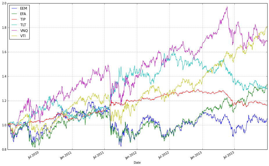
This one-liner takes the raw price matrix for 2010 (train_2010), converts each instrument’s series into a common baseline, and then renders those baseline-adjusted series so you can visually compare performance across ETFs. Concretely, train_2010.iloc[0,:] extracts the prices at the initial timestamp and pandas broadcasts that row across the entire DataFrame when you divide; the result is a set of relative price trajectories price_t / price_0 (each column starts at 1 and subsequent values show the factor change from the start). Calling .plot() on that normalized DataFrame produces an overlaid line chart (time on the x-axis, relative price factor on the y-axis), with one line per ETF and an automatic legend. We normalize because absolute prices across ETFs are on different scales — plotting raw prices would obscure true comparative performance and make it hard to see relative appreciation, volatility, or domination by a single asset. Using price_t / price_0 gives an intuitive cumulative-return-style view (values >1 mean appreciation, <1 mean depreciation) which is exactly what you want when evaluating and debugging Online Portfolio Selection strategies: it helps you visually assess diversification opportunities, correlation structure, and whether any single asset would dominate a naive strategy. Two practical caveats: ensure the first-row prices contain no zeros (to avoid division-by-zero) and be aware that any missing data will propagate NaNs into the normalized series; depending on downstream needs you might want to handle those cases before plotting.
# plot normalized prices of these stocks
(test_2010 / test_2010.iloc[0,:]).plot()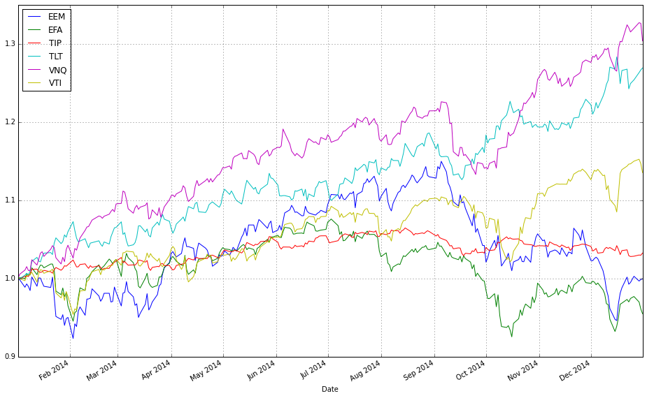
This one-liner is a small visualization-prep step that takes the raw price table for the 2010 test period and rescales every ETF so that each series starts at 1, then draws a multi-line plot. Concretely, test_2010.iloc[0,:] extracts the first day’s prices as a Series keyed by ETF ticker; dividing the full DataFrame by that Series leverages pandas’ column-wise broadcasting so each column is divided by its own initial price. The result is a DataFrame of normalized price trajectories where every instrument’s value at the first timestamp equals 1, and subsequent values reflect cumulative return relative to that start point. Finally, .plot() renders those trajectories on the same axes (time on the x-axis, normalized price on the y-axis), producing an immediate visual comparison.
We normalize here to remove scale differences between ETFs so the plot emphasizes relative performance and shape rather than raw dollar levels. This is important for comparing OLPS algorithms because those algorithms react to percentage moves and cross-asset relationships, not absolute price magnitudes; showing every series from a common baseline makes it easy to see which ETFs out- or under-perform, how volatile they are, and whether they move together (which informs diversification benefits). Note that this operation preserves multiplicative returns exactly (so a value of 1.2 means a 20% gain since the start), and is intended for interpretative visualization — if you need log-returns or cumulative returns computed differently (e.g., accounting for dividends or missing data handling), do that separately before plotting.
train_olmar_2010 = algos.OLMAR().run(train_2010)
train_crp_2010 = algos.CRP(b=swensen_allocation).run(train_2010)
ax1 = train_olmar_2010.plot(assets=True, weights=False, ucrp=True, bah=True, portfolio_label=’OLMAR’)
train_crp_2010.plot(ucrp=False, bah=False, weights=False, assets=False, ax=ax1[0], portfolio_label=’CRP’)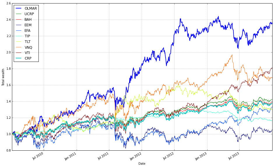
This block runs two online portfolio strategies on the same training price series for 2010 and then plots them together so you can directly compare their performance and benchmarks. First, train_olmar_2010 = algos.OLMAR().run(train_2010) executes the OLMAR algorithm over the training window. Running the algorithm (rather than just instantiating it) produces the time-series results the plotting function needs: cumulative wealth, per-period portfolio weights, transaction history and any internal diagnostics the framework stores. OLMAR is an online mean-reversion strategy that updates weights each period based on recent moving-average behavior; we run it here to see how an active, prediction-driven approach behaves on the ETF universe in 2010.
Next, train_crp_2010 = algos.CRP(b=swensen_allocation).run(train_2010) runs a constant-rebalanced portfolio (CRP) using swensen_allocation as the fixed target weight vector. Passing b=swensen_allocation enforces a passive benchmark that continuously rebalances back to that diversified allocation (Swensen-style asset mix) rather than equal weights. Using the same train_2010 input makes the comparison apples-to-apples: both algorithms see identical price history and transaction opportunities so differences reflect strategy logic, not data differences.
For visualization, the first plot call creates the primary axes and draws several contextual benchmarks: train_olmar_2010.plot(assets=True, weights=False, ucrp=True, bah=True, portfolio_label=’OLMAR’). Here assets=True plots the underlying asset traces (useful for visually linking strategy moves to asset behavior), ucrp=True adds the uniform-CRP benchmark, and bah=True adds a buy-and-hold curve. weights=False intentionally hides the dynamic weight heatmap to keep the figure focused on performance lines. Labeling the series as ‘OLMAR’ ensures the legend is clear. Crucially, this call returns one or more axes objects (ax1) that are used to layer additional plots on the same figure.
The second plot overlays the CRP result onto the same primary axis: train_crp_2010.plot(ucrp=False, bah=False, weights=False, assets=False, ax=ax1[0], portfolio_label=’CRP’). By disabling ucrp, bah, assets and weights we avoid redrawing duplicate context and reduce visual clutter; we only want CRP’s portfolio performance line added to the existing axes. Passing ax=ax1[0] directs the library to draw on the already-created performance subplot so you get a single, direct comparison of cumulative returns (and any shared benchmarks) between OLMAR and the Swensen-weighted CRP. In short, the code computes both strategies on identical data, highlights relevant benchmarks for context, and overlays the results to make the performance trade-offs between an active mean-reversion strategy and a passive diversified allocation immediately visible.
print(train_olmar_2010.summary())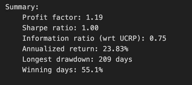
This single call asks the backtest/strategy object produced by training OLMAR on the 2010 ETF universe to produce its human-readable performance report. At this point the object already contains the time series of portfolio weights, the wealth curve, trade history and any applied transaction-cost model from the backtest run; summary() aggregates that raw data into a compact set of risk and performance diagnostics so you can evaluate the run without inspecting every trade or the full timeseries.
Under the hood summary() typically computes a handful of derived statistics from the wealth curve and trade log: cumulative return (final wealth / initial wealth − 1), the annualized return (geometric mean growth rate obtained by compounding the per-period returns and scaling to an annual basis), annualized volatility (sample standard deviation of period returns scaled by the square root of the number of periods per year), a risk-adjusted ratio such as the Sharpe (mean excess return divided by annualized volatility), maximum drawdown (largest peak-to-trough decline in the wealth curve), and trading statistics such as turnover and number of rebalances. It derives turnover and trade volume from the absolute changes in portfolio weights between rebalancings (which is why rebalancing frequency and the chosen transaction-cost model materially affect these numbers). Be aware that exact formulas (e.g., whether Sharpe uses sample vs. population stdev, or how turnover is normalized) are implementation-specific, so check the library docs if you need exact definitions.
We call summary() here because we want a concise, comparable snapshot to judge how OLMAR behaved on the diversified ETF set: whether it achieved meaningful outperformance, how volatile that performance was, and whether it did so at a cost of excessive trading or deep drawdowns. Those outputs are the primary inputs to the decision of whether OLMAR’s parameterization and rebalancing cadence are practically useful — for example, a high-looking cumulative return loses practical value if turnover is huge (transaction costs will erode it) or if maximum drawdown is unacceptable for our risk budget.
Finally, use this printed summary as the first-level gate before formal algorithm comparisons. If the summary shows suspicious artifacts (unusually low volatility, unrealistically high returns, or zero turnover), investigate for lookahead/survivorship bias, incorrect frequency assumptions (daily vs. trading days per year), or a mismatch in transaction-cost settings. Once the summary metrics look sane, you can proceed to side-by-side comparisons across algorithms using the same metrics, run sensitivity tests (costs, rebalance frequency), or export the underlying wealth and trades for deeper diagnostics.
train_olmar_2010.plot_decomposition(legend=True, logy=True)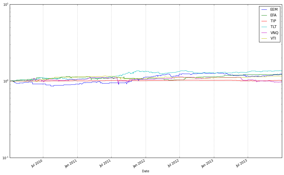
This call generates a performance-attribution plot for the OLMAR model instance represented by train_olmar_2010 — its job is to break the overall wealth curve into component contributions from each ETF (and any other accounted-for components, like cash or transaction-cost drag) and render that breakdown so you can see not just how much total return the algorithm produced, but where that return actually came from over time. Internally the method uses the model’s per-period portfolio weights together with the observed price relatives to compute each asset’s incremental contribution in every period (conceptually weight * period return or the equivalent incremental multiplicative factor), then accumulates those period-by-period contributions into a time series per asset that sums/multiplies back to the algorithm’s aggregate wealth path. The plotted result is therefore an attribution of compound performance rather than a simple list of feature importances.
Setting legend=True ensures the plot labels each component so you can identify which ETF maps to which curve or area in the visualization — essential when comparing multiple algorithms or diagnosing which funds dominate performance. Using logy=True switches the vertical scale to logarithmic, which is deliberate: portfolio returns compound multiplicatively, so a log y-axis turns exponential growth into an approximately linear trend and makes proportional differences and relative contributions across long horizons easier to compare. This reduces visual domination by a few large swings and helps reveal steady multiplicative effects (e.g., consistent small positive contributions across many assets) that would be hard to read on a linear scale.
Interpret the output as attribution, not causation: the decomposition will show which ETFs drove realized wealth under OLMAR’s weights and rebalancing rules, which helps validate diversification claims, spot concentration or overfitting to single ETFs, and identify periods where transaction costs or rebalancing frequency materially affected returns. A couple of practical caveats: log scale cannot represent zero or negative cumulative values directly, so if you see gaps or masking the code may be dropping or offsetting non-positive values — check how the plotting routine handles that before comparing across algorithms. Also ensure you compare decompositions on the same time window and with the same cost assumptions so the visual comparisons are apples-to-apples.
This is a respectable outcome: a Sharpe ratio of 1, with no single ETF dominating the portfolio. Now let’s examine how it fares in 2014.
test_olmar_2010 = algos.OLMAR().run(test_2010)
test_crp_2010 = algos.CRP(b=swensen_allocation).run(test_2010)
ax1 = test_olmar_2010.plot(assets=True, weights=False, ucrp=True, bah=True, portfolio_label=’OLMAR’)
test_crp_2010.plot(ucrp=False, bah=False, weights=False, assets=False, ax=ax1[0], portfolio_label=’CRP’)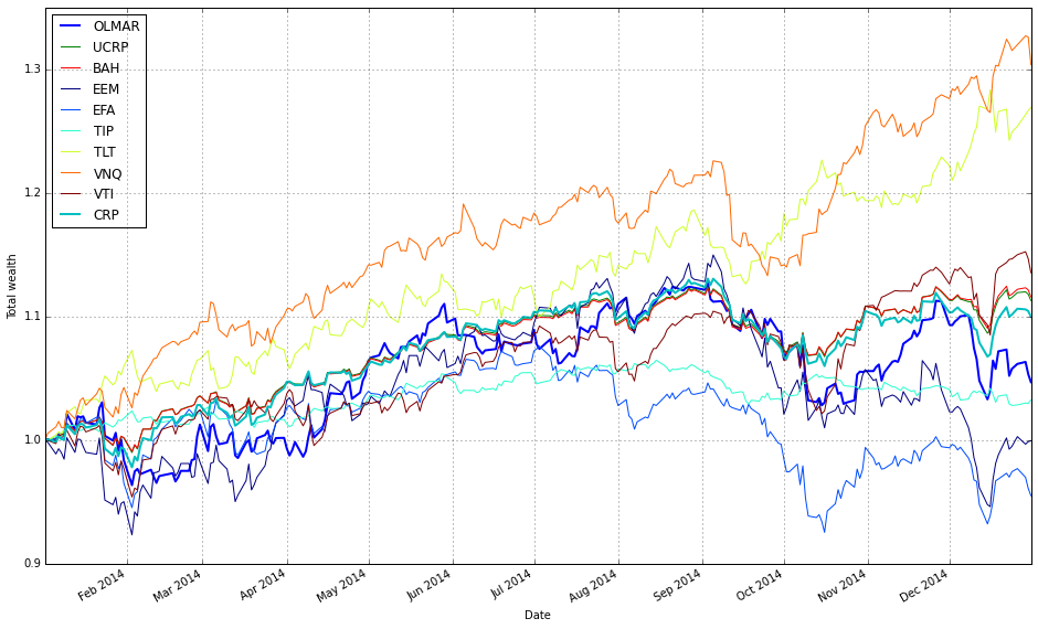
This block runs two backtests on the same 2010 ETF test data and then overlays their performance on a single plot so you can directly compare an adaptive OLPS strategy against a fixed, diversified benchmark.
First, test_olmar_2010 = algos.OLMAR().run(test_2010) executes the OLMAR algorithm over the test_2010 price series. OLMAR (On-Line Moving Average Reversion) is an online, mean-reversion-driven portfolio selection method: at each time step it computes a short-term moving-average prediction of prices and shifts weights toward assets that the model expects to revert upward. Calling run(…) walks the price series sequentially, updating the model’s weights online and accumulating the resulting wealth trajectory and auxiliary results (asset trajectories, weight histories, reference baselines, etc.). We use OLMAR here because it adapts to short-term mean-reversion signals across the diversified ETF set and therefore provides a dynamic, signal-driven comparator to static allocations.
Next, test_crp_2010 = algos.CRP(b=swensen_allocation).run(test_2010) runs a Constant Rebalanced Portfolio with b set to swensen_allocation. CRP enforces the same target weights every period by rebalancing back to b; with swensen_allocation those target weights represent a diversified Swensen-like allocation. This produces a stable benchmark that captures the performance of disciplined, periodic rebalancing across the same ETF universe and serves as a non-adaptive baseline against which OLMAR’s adaptivity can be judged.
The two plot calls then compose the visual comparison. The first call (test_olmar_2010.plot(…)) draws OLMAR’s results and asks explicitly for assets=True, ucrp=True and bah=True. Showing assets=True overlays individual ETF trajectories so you can see which instruments drive OLMAR’s returns; ucrp=True and bah=True add two standard baselines — uniform CRP and buy-and-hold — to contextualize performance relative to simple benchmarks. We set weights=False here because weight trajectories would be a different diagnostic (and would typically require a separate subplot); for this comparison we care primarily about return paths.
The second plot call adds CRP’s curve onto the same main axis (ax=ax1[0]) but suppresses redundant elements (ucrp=False, bah=False, weights=False, assets=False) so it only draws CRP’s portfolio wealth line and a legend entry labeled ‘CRP’. Passing ax=ax1[0] ensures both OLMAR and CRP are rendered on the same coordinate system for direct visual comparison; the selective False flags prevent duplicating asset lines or baseline plots and keep the figure focused on the two portfolio trajectories plus the reference baselines already drawn for OLMAR.
In short: the code runs an adaptive, online mean-reversion strategy (OLMAR) and a fixed, rebalanced benchmark (CRP with Swensen weights) on the same ETF dataset, then produces a single, uncluttered chart that shows asset-level activity (to explain drivers), standard baselines, and the two portfolio wealth curves so you can evaluate how adaptivity vs. a diversified static allocation performed over the 2010 test period.
print(test_olmar_2010.summary())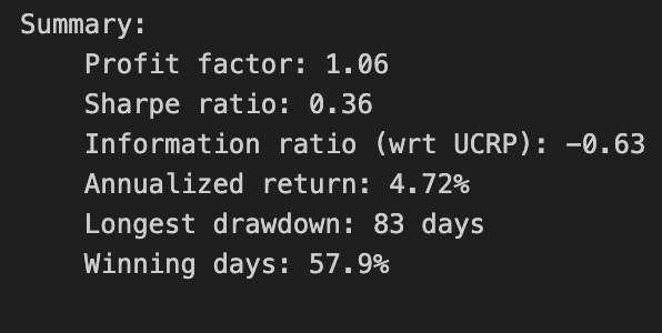
When you call print(test_olmar_2010.summary()), you are asking the backtest object to produce a human-readable synthesis of the algorithm’s historical performance over the ETF universe and then send that text to stdout. Internally the summary method pulls together the time series that the backtest has been tracking — period-by-period portfolio weights, the underlying ETF price/return series, recorded trades and transaction costs, and any cash or benchmark series — and reduces those raw signals into a set of standard performance statistics and diagnostic tables. The print() around it simply forces the formatted summary string to appear in your console, which is useful when you want an immediate, at-a-glance assessment without opening charts or raw logs.
The core computation begins by converting the stored weight history and asset returns into a portfolio return series: for each period, the method multiplies the realized returns of each ETF by the portfolio weights that were active for that period, subtracts realized transaction costs where applicable, and accumulates wealth to produce the cumulative return curve. From that return series it computes time-normalized metrics (annualized return and volatility), risk measures (maximum drawdown and drawdown duration), and risk-adjusted ratios such as the Sharpe (and sometimes Sortino or Calmar) using standard conventions for annualization and risk-free rate handling. It also typically reports simple counts and ratios derived from the trade log — turnover, number of rebalances, average trade size — because those speak directly to the feasibility of deploying the strategy on liquid ETFs and to how transaction costs erode theoretical performance.
Why this aggregation matters for our goal of comparing OLPS algorithms on a diversified ETF set: the summary distills whether the algorithm produced attractive risk-adjusted returns after realistic frictions, and it surfaces the behavioral drivers behind those numbers. For example, a high cumulative return with extreme drawdowns suggests that the strategy captured episodic opportunities but failed to manage downside risk; conversely, modest returns with low volatility and low turnover indicate a more conservative, implementable strategy. Because OLMAR (the 2010 moving-average reversion algorithm) rebalances frequently to exploit short-term mean reversion, the summary’s turnover and transaction-cost-adjusted returns are particularly diagnostic — they show whether the theoretical signal survives realistic execution costs on ETFs.
The method also often includes comparative or diagnostic elements that aid interpretation: a benchmark comparison (e.g., equal-weighted or buy-and-hold ETF portfolio), a brief table of monthly or yearly returns to detect regime dependence, and possibly a sample of the final or average weights to check whether the algorithm concentrated or diversified. These outputs tell you not just how much the strategy made, but how it made it — whether performance came from persistent overweighting of particular sectors, frequent small trades across many ETFs, or a handful of large bets that happened to work out.
If you need to go deeper after reading the printed summary, the next steps are to inspect the raw components that feed it: the portfolio weight time series to see rebalancing cadence, the trade log to validate turnover and cost computations, and the return series to examine path dependency and tail events. Those deeper artifacts let you diagnose whether differences between OLPS algorithms come from signal quality, risk control, or implementation friction — which is precisely the distinction we want to make when comparing OLMAR against other online portfolio selection methods on a diversified ETF universe.
We’re examining a different time period, and the Sharpe ratio now falls below 0.5 while OLMAR fails to outperform BAH. This is concerning.
test_olmar_2010.plot_decomposition(legend=True, logy=True)
This single plotting call is the visualization step that turns the backtest object’s internal time series into an interpretable decomposition of performance. The test_olmar_2010 object already contains the OLMAR algorithm’s historical portfolio weights, per-asset returns, cumulative wealth trajectory, and any bookkeeping such as turnover or transaction-cost-adjusted returns; plot_decomposition takes those series and breaks the aggregate portfolio outcome into meaningful components (for example: individual ETF contributions, weight evolution, and cumulative wealth) and lays them out so you can see how each piece drove overall performance over time. Conceptually, the method computes how much each asset contributed to portfolio growth at each time step (usually by combining asset returns with contemporaneous weights), aggregates that into a cumulative contribution curve, and pairs that with diagnostic panels (weights, turnover, etc.) so you can link behaviour (rebalancing, concentration) to results.
You asked for OLMAR-on-ETFs context: this view is critical because OLMAR’s predictions and rebalancing rules produce time-varying, often concentrated portfolios; the decomposition exposes whether the algorithm’s gains came from consistent small contributions across many ETFs (true diversification) or from a few outsized winners. That in turn tells you whether OLMAR’s moving-average signals and reallocation frequency are producing robust diversification or simply chasing volatile winners. If you see a few assets dominating the contribution panel, it suggests you may need stronger regularization or a different rebalancing cadence to achieve the diversified objective.
The passed options control two key presentation choices you should be intentional about. legend=True forces a legend so each colour/line in the decomposition is explicitly mapped to an ETF or component — essential when comparing across many ETFs so you can trace which security corresponds to which contribution curve. logy=True plots the vertical axis on a logarithmic scale, which is helpful because portfolio growth is multiplicative: log scaling turns multiplicative growth into approximately additive increments and makes percentage changes visually comparable across different base levels. Use log scale when you want to compare relative growth rates and detect persistent exponential trends; be aware, though, that log scaling compresses large absolute differences and can obscure short-lived spikes, so interpret magnitudes accordingly.
In short, this call is the diagnostic visualization that translates raw backtest outputs into a narrative of where OLMAR’s returns came from and how its allocation dynamics behaved. That narrative is exactly what you need when comparing multiple OLPS algorithms on the same ETF universe: it complements scalar metrics (CAGR, Sharpe, drawdown) by revealing the per-asset and temporal mechanics behind those metrics, guiding model adjustments (regularization, rebalancing, transaction-cost handling) to achieve the intended diversified exposure.
Comparison of SPY and TLT Portfolios
To simplify, consider applying OLMAR to a portfolio composed of SPY and TLT. Compare this portfolio to a rebalanced 70/30 SPY–TLT allocation.
# load data from Yahoo
spy_tlt_data = DataReader([’SPY’, ‘TLT’], ‘yahoo’, start=datetime(2010,1,1))[’Adj Close’]

# plot normalized prices of these stocks
(spy_tlt_data / spy_tlt_data.iloc[0,:]).plot()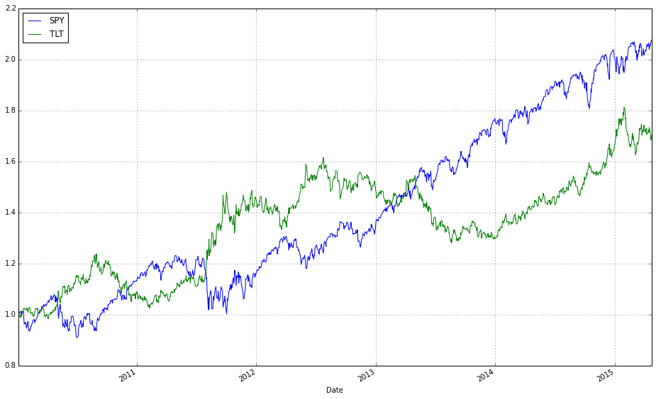
This snippet pulls historical adjusted prices for two representative ETFs — SPY (equities) and TLT (long-duration Treasuries) — and produces a simple, directly comparable chart of their cumulative performance from the chosen start date. The code requests the “Adj Close” series so that the prices account for dividends and stock splits; using adjusted close is important because OLPS algorithms operate on realized returns and we want prices that reflect total investor value rather than raw, split-affected quotes. Choosing SPY and TLT is intentional for a diversification study: SPY gives broad equity exposure while TLT is long-term sovereign debt, so their joint behavior highlights how an OLPS strategy might exploit cross-asset risk/return differences.
Mechanically, the DataReader call returns a time-indexed table keyed by ticker with the adjusted close column extracted; the DataFrame has dates as the index and columns for SPY and TLT. The normalization step divides each column by its first available value (iloc[0,:]), broadcasting that first-row vector across the entire DataFrame. That operation rescales both series to start at 1.0, which does not change any period-to-period returns but makes cumulative performance visually comparable irrespective of each ETF’s absolute price scale — this is why we normalize rather than plotting raw prices.
Plotting the normalized series shows the relative growth of a unit investment in each ETF over time, making it easy to see drawdowns, trend differences, and regime changes that matter for OLPS evaluation. For example, you can visually inspect whether one asset consistently dominates, whether there are periods of negative correlation (helpful for diversification), and where rebalancing might have added value. Before feeding this data into OLPS algorithms you’ll typically convert to price relatives (p_t / p_{t-1}) or returns, handle any missing dates/NaNs (drop or impute), and ensure the index/frequency aligns across assets; the current normalization/plot is a quick data-quality and exploratory step to confirm the series behave as expected.
spy_tlt_olmar_2010 = algos.OLMAR().run(spy_tlt_data)
spy_tlt_olmar_2010.plot(assets=True, weights=True, ucrp=True, bah=True, portfolio_label=’OLMAR’)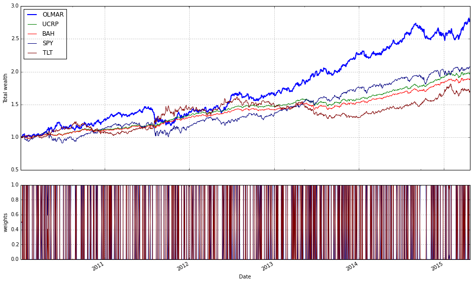
This two-line block runs the OLMAR online portfolio algorithm on the SPY/TLT dataset for the 2010 experiment and then produces a diagnostic plot that helps you judge its behavior against simple baselines. When you call algos.OLMAR().run(spy_tlt_data) the framework constructs an instance of the On-Line Moving Average Reversion (OLMAR) strategy and feeds it the price/relative-series in spy_tlt_data one time step at a time. OLMAR is designed to exploit mean-reversion signals: at each step it computes a moving-average-based prediction of future relative prices, derives a predicted return vector from the ratio of predicted-to-current prices, and shifts the current portfolio in the direction of assets whose predicted relative returns exceed the cross-asset average. The update is constrained — the algorithm projects the candidate weights back onto the probability simplex (nonnegative weights summing to one) and scales the adjustment (via a learning/threshold parameter) so the portfolio does not over-react to noisy predictions. The run invocation executes those sequential updates, records the evolving weight vector, portfolio wealth, and per-period results (and will incorporate whatever backtester-level options are enabled, such as transaction-cost handling or window/parameter defaults), returning an object that contains the time series you’ll want to inspect.
The subsequent plot call visualizes several diagnostics you need to evaluate OLMAR’s practical performance. assets=True overlays the underlying asset traces so you can see how the ETF price paths drive the signals; weights=True shows the algorithm’s weight history so you can see how aggressively and how often it rebalances and whether it concentrates or stays diversified; ucrp=True and bah=True add two essential baselines — the Uniform Constant Rebalanced Portfolio (equal weights rebalanced each period) and Buy-And-Hold — which let you judge whether OLMAR’s active rebalancing actually delivers excess returns after accounting for turnover and risk. The portfolio_label argument simply names the plotted strategy in the legend. Together these plots make it straightforward to answer the practical questions that matter for comparing OLPS methods on a diversified ETF set: is OLMAR capturing mean reversion between SPY and TLT, how volatile and frequent are its reallocations, and does its wealth curve meaningfully outperform simple rebalanced or buy-and-hold benchmarks once trading behavior and concentration are considered.
spy_tlt_olmar_2010.plot_decomposition(legend=True, logy=True)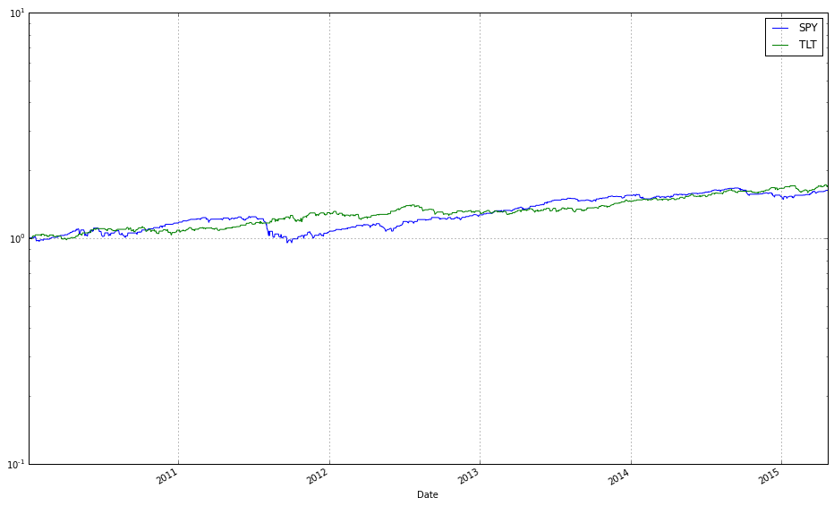
The call spy_tlt_olmar_2010.plot_decomposition(legend=True, logy=True) is a visualization step that turns the backtest internals of the OLPS run on SPY and TLT into an attribution-style plot so you can understand not just how much the strategy made, but how it made it. The spy_tlt_olmar_2010 object encapsulates the time series the backtest produced — timestamps, the algorithm’s portfolio weights at each rebalance, the underlying asset returns, and any recorded transaction costs/turnover — and plot_decomposition walks through those pieces and presents them as component contributions to cumulative performance. Concretely, the method computes per-period contributions by combining the weight the algorithm held in each ETF with that ETF’s return for the period (and adjusts for costs if the backtest tracks them), accumulates those contributions through time (either by compounding the per-period portfolio return or by summing log-returns if the implementation uses additive log decomposition), and renders the result so you can see how much of the total wealth curve came from SPY versus TLT (and possibly from costs or cash). Passing legend=True simply draws labels for each component so you can identify which area/line corresponds to which ETF or cost item; passing logy=True displays the vertical axis on a logarithmic scale, which is helpful because portfolio growth is multiplicative — the log scale makes relative growth rates comparable over time and prevents later exponential gains from visually overwhelming early contributions. Use this plot when comparing OLPS algorithms on a diversified ETF set because it exposes allocation behavior (e.g., whether the algorithm rotated between risk-on SPY and risk-off TLT), reveals which asset actually drove returns, and highlights the effect of rebalancing and transaction costs — all critical diagnostics when judging how different OLPS rules behave on the same universe. Note the usual caveats: negative or zero cumulative contributions and intra-period weight changes may be handled differently by different implementations, and logarithmic axes cannot meaningfully display negative values, so check how the library treats losses or short positions when interpreting the chart.
spy_tlt_2010 = algos.CRP(b=[0.7, 0.3]).run(spy_tlt_data)

ax1 = spy_tlt_olmar_2010.plot(assets=False, weights=False, ucrp=True, bah=True, portfolio_label=’OLMAR’)
spy_tlt_2010.plot(assets=False, weights=False, ucrp=False, bah=False, portfolio_label=’CRP’, ax=ax1[0])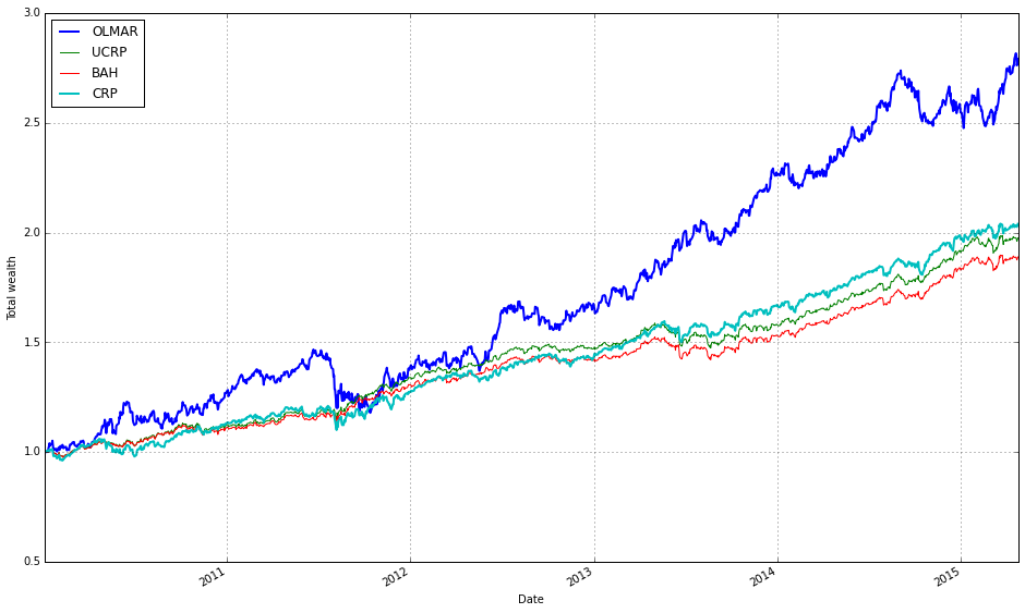
First, we create and execute a Constant Rebalanced Portfolio (CRP) backtest by instantiating algos.CRP with b=[0.7, 0.3] and running it on spy_tlt_data. The vector b is the target allocation the CRP enforces each rebalancing period (70% to the first ETF, 30% to the second). Running the algorithm produces a backtest/result object (spy_tlt_2010) that contains the time series of portfolio wealth, transaction-aware rebalancing behavior, and any stored weight history — in short, the data needed to evaluate and plot how a static, frequently rebalanced allocation would have performed on the same historical ETF data.
Next, we draw the main visual comparison. We start by plotting the precomputed OLMAR run (spy_tlt_olmar_2010) with a focus on portfolio-level performance: assets=False and weights=False hide per-asset price/weight subplots so the figure concentrates on cumulative wealth. The flags ucrp=True and bah=True add two standard baselines — uniform CRP (UCRP) and buy-and-hold (BAH) — alongside OLMAR, because those baselines provide essential context when judging whether an online algorithm like OLMAR is actually improving returns or robustness. The call returns axes (ax1), and we set portfolio_label=’OLMAR’ so the legend names that curve clearly.
Finally, we overlay the CRP result onto the same primary axis by plotting spy_tlt_2010 with ucrp and bah turned off (we don’t want duplicate baseline lines) and passing ax=ax1[0] to target the same cumulative-wealth axis returned by the first plot. Setting portfolio_label=’CRP’ ensures the legend distinguishes the static CRP curve from OLMAR and the baselines. In short, the code builds a clear, uncluttered comparison of cumulative wealth trajectories: OLMAR versus a static rebalanced strategy (CRP) plus the usual baselines, which lets you visually assess whether the online learning portfolio (OLMAR) outperforms or behaves differently from simple, interpretable alternatives on the diversified ETF pair.
OLMAR — Market Sectors Comparison
Algorithm behavior across market sectors:
- XLY — Consumer Discretionary SPDR Fund
- XLF — Financial SPDR Fund
- XLK — Technology SPDR Fund
- XLE — Energy SPDR Fund
- XLV — Health Care SPDR Fund
- XLI — Industrial SPDR Fund
- XLP — Consumer Staples SPDR Fund
- XLB — Materials SPDR Fund
- XLU — Utilities SPDR Fund
sectors = [’XLY’,’XLF’,’XLK’,’XLE’,’XLV’,’XLI’,’XLP’,’XLB’,’XLU’]
train_sectors = DataReader(sectors, ‘yahoo’, start=train_start_2010, end=train_end_2010)[’Adj Close’]
test_sectors  = DataReader(sectors, ‘yahoo’, start=test_start_2010,  end=test_end_2010)[’Adj Close’]
These two lines pull historical adjusted closing prices for a basket of nine sector ETFs and split them into the training and testing windows you previously defined. Conceptually the code is doing three things in sequence: (1) selecting a fixed universe of tickers that gives broad sector exposure, (2) querying a market data provider (Yahoo) for the requested time ranges, and (3) taking the Adjusted Close series because that series reflects the total economic return to a long-only holder (it incorporates splits and dividends). Using the Adjusted Close is crucial for portfolio algorithms: if we used raw close prices, corporate actions would produce artificial jumps that would distort return and rebalancing calculations and therefore any OLPS performance comparisons.
From a modelling perspective the train/test split is deliberate: train_sectors will be used to fit or calibrate algorithm parameters and to observe in-sample behaviour, while test_sectors is reserved for out-of-sample evaluation so you can compare generalization and robustness across OLPS strategies. Because both DataReader calls use the exact same ticker list, the resulting DataFrames will have identical column order and names, which simplifies downstream code that computes daily price relatives (p_t / p_{t-1}), log or simple returns, and performs portfolio rebalancing. Ensuring identical columns and consistent indexing is important because most OLPS implementations assume a rectangular price matrix with no column misalignment.
There are practical data hygiene considerations implied by this snippet. Market data from different date ranges can have different sets of trading days (holidays, ticker IPOs/closures), so you should verify that the two DataFrames have compatible indices before converting to returns: check for NaNs, align on a common business-day index, and decide whether to forward-fill, drop, or backfill missing entries depending on your backtest assumptions. Also confirm the date variables (train_start_2010, train_end_2010, etc.) are intended and consistent (timezone-naive datetimes are usually easiest). If you plan to compute price relatives for OLPS, the typical next step is creating X_t = p_t / p_{t-1} across the aligned index.
Finally, keep in mind operational reliability: pandas_datareader’s Yahoo interface can be flaky; if you are running experiments repeatedly, cache the fetched CSVs or use a more stable client. Once you have clean, aligned Adjusted Close matrices for train and test, you can feed them into the OLPS algorithms to generate portfolio weights, simulate rebalancing, and compare performance metrics (cumulative return, volatility, turnover, and drawdowns) across the diversified sector universe.
# plot normalized prices of these stocks
(train_sectors / train_sectors.iloc[0,:]).plot()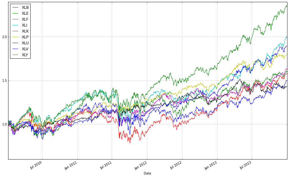
train_sectors is a time-indexed DataFrame where each column is the historical price series for one ETF/sector. The expression train_sectors / train_sectors.iloc[0, :] divides every column by its value at the first timestamp (iloc[0, :]) — in other words, it scales every series so that its value at the start date becomes 1. This is a simple multiplicative normalization: it does not change day-to-day returns or relative ratios between assets, it only removes the arbitrary nominal price scale so that the series become directly comparable on the same axis.
Calling .plot() on that normalized DataFrame hands the result to pandas/matplotlib, which draws one line per ETF with the DataFrame’s index (dates) on the x-axis. The visual output therefore shows each asset’s growth factor since the start date (an “indexed to 1” price path), making differences in cumulative performance, volatility and drawdowns immediately visible without being biased by one ETF having a much higher absolute price than another.
Why this matters for comparing OLPS algorithms on a diversified set of ETFs: OLPS and other portfolio algorithms operate on relative returns and on the evolution of wealth across rebalancings, not on raw nominal prices. Normalizing all series to the same starting point makes it easy to visually inspect which assets provided the biggest cumulative upside or downside and to judge correlation and diversification patterns that inform algorithm behavior. It’s a quick diagnostic to validate data (co-movement, missing values) and to communicate results to stakeholders.
A couple of practical caveats: if any column’s first observation is zero you’ll get a division-by-zero; if there are NaNs at the start you may want to use the first valid observation (first_valid_index) or fill/mask appropriately. For some use cases you might prefer plotting cumulative returns computed from percentage returns (cumulative product) instead, but for plain price series anchored at t0 this division is a compact and correct way to produce directly comparable indexed price plots.
# plot normalized prices of these stocks
(test_sectors / test_sectors.iloc[0,:]).plot()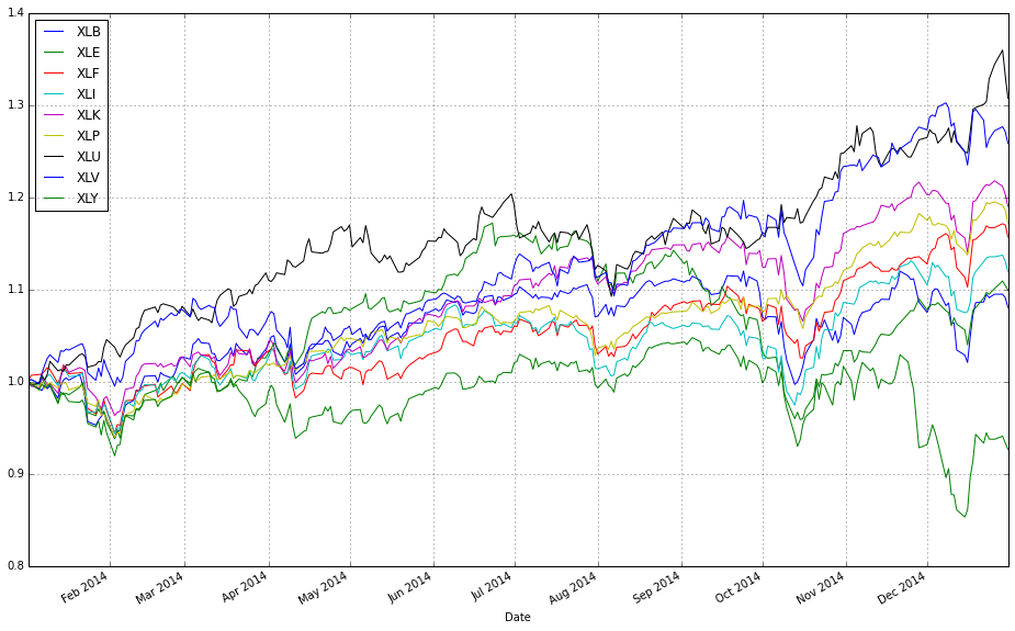
This line creates a set of comparable time series by re-basing each ETF’s price path to a common starting point and then plots them so you can visually compare their relative performance. Concretely, test_sectors is a DataFrame of price series (rows = dates, columns = ETFs). test_sectors.iloc[0, :] selects the first row — the initial price for each ETF — and dividing the entire DataFrame by that row leverages pandas’ column-wise broadcasting to produce a new DataFrame where every column is scaled so its value at the first timestamp equals 1. Calling .plot() then renders those scaled series on the same axes.
We do this because raw ETF prices live on very different scales (e.g., one ETF may be priced at $20 while another is $200), which would make direct visual comparison misleading. Normalizing to a common base preserves the shape of each series (the relative ups and downs) while removing absolute price level differences, so you can immediately see which instruments grew faster, which were more volatile, and how correlated their moves were. That visual context is essential when comparing OLPS algorithms, because it gives you the passive-asset baselines against which algorithmic portfolio wealth trajectories should be judged.
From a data-flow perspective, the operation is vectorized and efficient: pandas handles the elementwise division across all dates for each column at once, producing a same-shaped DataFrame of normalized values. This is a quick exploratory step prior to overlaying algorithm results (portfolio wealth curves) or computing metrics like cumulative returns, drawdowns, or diversification benefits; it helps diagnose whether an algorithm’s out- or under-performance is driven by a handful of assets or broad market moves.
A few practical caveats: if the first row contains NaNs or zeros you’ll get NaNs or infinities in the normalized output, so prefer the first valid observation or otherwise clean missing/zero values before dividing. Also remember that this normalization only rescales prices — it doesn’t account for dividends, splits, or fees unless your input prices are already adjusted — and it doesn’t replace more formal return calculations (e.g., cumulative product of 1+period returns) if you need exact cumulative return series. Optionally, you can scale to 100 instead of 1 for presentation, or plot on a log scale when comparing long horizons with large multiplicative differences.
train_olmar_sectors = algos.OLMAR().run(train_sectors)
train_olmar_sectors.plot(assets=True, weights=False, ucrp=True, bah=True, portfolio_label=’OLMAR’)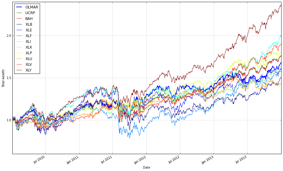
First, we instantiate and execute the OLMAR algorithm over the training set (train_sectors). The run(…) call drives an online, period-by-period loop: at each step OLMAR computes a smoothed prediction of next-period price relatives using a moving average of recent prices, converts that prediction into an expected return vector, and then updates the portfolio by solving a simple convex subproblem that stays close to the previous portfolio while guaranteeing a minimum expected return (this is the algorithm’s way of enforcing mean‑reversion bets without making excessively large or noisy trades). The update includes projection back onto the simplex so weights remain nonnegative and sum to one, and the routine records resulting wealth and performance metrics as it advances through the train_sectors time series. Running OLMAR on sector ETFs is purposeful: sector-level ETFs are relatively diversified but exhibit cross-sectional mean‑reversion and rotation behavior, which OLMAR is designed to exploit via its moving‑average prediction and conservative corrective step.
Second, the plot(…) call visualizes the results in a way that emphasizes relative performance against simple baselines. assets=True overlays the individual asset (ETF) trajectories so you can see how each sector contributed and whether OLMAR captured reversion between them. weights=False suppresses a weight‑time‑series panel because the immediate focus here is wealth/performance comparison rather than inspecting the detailed rebalancing path. ucrp=True and bah=True add two standard baselines: the Uniform Constant Rebalanced Portfolio (equal weights rebalanced every period) and Buy‑and‑Hold (initial allocation left unchanged), which are included to contextualize whether OLMAR is adding value beyond naive diversification and a passive buy‑and‑hold strategy. Finally, portfolio_label=’OLMAR’ just sets the legend label so the algorithm’s curve is clearly identified on the plot. Together, these two lines run the algorithm over the sector ETF training data and produce a comparative visualization that helps you judge whether OLMAR’s mean‑reversion updates improve cumulative returns relative to simple diversification baselines.
train_olmar_sectors.plot(assets=False, weights=False, ucrp=True, bah=True, portfolio_label=’OLMAR’)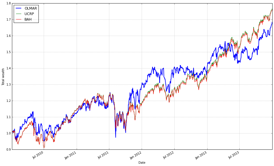
This single call renders the performance comparison you need for evaluating OLMAR on the sector ETF universe, using only the portfolio-level equity curves you care about. Internally the plot method takes the backtest results that train_olmar_sectors has already produced (time series of portfolio value/cumulative returns) and draws those trajectories on a common time axis so you can directly compare growth, volatility and drawdowns. By setting assets=False and weights=False you intentionally suppress two types of lower-level detail — individual asset price/return series and the evolving allocation vector — keeping the chart focused on portfolio outcomes rather than the underlying data or allocation dynamics. That makes it easier to read whether the algorithm actually produces better risk/return than simple baselines without visual clutter.
Turning ucrp=True and bah=True overlays two standard benchmarks: the Uniform Constant Rebalanced Portfolio (1/N rebalanced to equal weights) and a Buy-and-Hold strategy. Including UC-RP is important because it’s a robust baseline for diversification and rebalancing benefit — if OLMAR can’t outperform 1/N after costs and over the same period, its practical value is questionable. Including Buy-and-Hold gives the “no rebalancing” baseline, which helps you judge whether active rebalancing paid off relative to simply holding the initial allocation through the sample. The plotting routine aligns and (implicitly) normalizes these curves so you see relative growth from the same starting point, which is necessary to interpret cumulative performance rather than raw prices.
Finally, portfolio_label=’OLMAR’ ensures the plotted OLMAR curve is clearly identified in the legend and any annotations, which is helpful when you later add more algorithms to the same figure. If you later want to investigate why OLMAR behaved a certain way (e.g., rapid gains, sudden drawdown, or high turnover), you would re-run the plot with weights=True and/or assets=True to reveal the allocation path and asset contributions; but for a quick, high-level comparison against UC‑RP and BA‑H this call gives a concise, easily interpretable visual summary of how well OLMAR capitalized on mean-reversion or sector rotations across the ETF set.
test_olmar_sectors = algos.OLMAR().run(test_sectors)
test_olmar_sectors.plot(assets=True, weights=False, ucrp=True, bah=True, portfolio_label=’OLMAR’)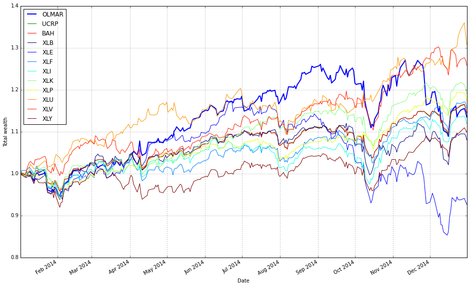
The first line executes the OLMAR algorithm against your sector ETF price series. Behind the call, the algorithm consumes the time-ordered price matrix in test_sectors and steps through it sequentially: at each time step it observes the latest prices, computes a moving-average–based target (the “expected” price under a mean-reversion hypothesis), projects that target onto the simplex to produce a valid weight vector, and then rebalances the portfolio accordingly. The .run(…) method handles the sequential update loop, applies the projection and rebalancing rules, and records the evolving portfolio wealth, trades, and (optionally) weight history so you can inspect performance and decisions after the backtest. The motivation for using OLMAR here is explicit: it attempts to capture short- to medium-term mean reversion across the diversified set of ETFs rather than following trends, which is useful when sectors frequently revert to a cross-sectional average.
The plotting call that follows is configured to emphasize performance comparison rather than internal mechanics. assets=True overlays the individual ETF price/normalized-returns series on the same chart so you can visually relate the portfolio outcome to the underlying asset behavior (this makes it easier to see whether performance is driven by one or two sectors or by a broad cross-section). weights=False intentionally hides the weight evolution to avoid clutter; if you are debugging position concentration or churn you would enable the weight plot, but for a high-level comparison it’s often more informative to focus on return paths. ucrp=True and bah=True add two simple baselines — the uniform constant-rebalanced portfolio and a buy-and-hold strategy — so you immediately see whether OLMAR is adding value relative to a naive equal-weight rebalancing policy and a passive buy-and-hold: including these baselines is critical for interpreting whether OLMAR’s mean-reversion bets are actually improving risk‑adjusted returns versus simple alternatives.
Finally, note some practical implications for your sector-ETF comparison. Because OLMAR rebalances frequently to exploit mean-reversion, results shown by this code are the algorithm’s gross performance on the provided price series; transaction costs, slippage, and execution constraints can materially change the live outcome, so include those in subsequent runs if you want production-realistic comparisons. Also consider tuning OLMAR’s hyperparameters or examining the hidden weight history when you observe outsized outperformance or underperformance: heavy concentration into a few sectors or repeated churning are common failure modes when applied to correlated ETF universes. Overall, this two-line snippet runs the OLMAR backtest over your diversified sector set and produces a comparison plot that helps you judge whether its mean-reversion strategy meaningfully outperforms simple baselines.
Comparison of All OLPS Algorithms by Market Sector
#list all the algos
olps_algos_sectors = [
algos.Anticor(),
algos.BAH(),
algos.BCRP(),
algos.BNN(),
algos.CORN(),
algos.CRP(),  # removed weights, and thus equivalent to UCRP
algos.CWMR(),
algos.EG(),
algos.Kelly(),
algos.OLMAR(),
algos.ONS(),
algos.PAMR(),
algos.RMR(),
algos.UP()
]
This small block is the registry of OLPS strategies we will run against the ETF universe; by instantiating each algorithm here we create the stateful objects that the backtester will feed price-relative vectors to, and that will emit portfolio weight vectors and update internal state as the market unfolds. In other words, this list is the “who gets to trade” list: each element is a ready-to-use algorithm instance that will see the same streaming market data and be compared on the same performance and risk metrics.
I grouped the set to cover the major methodological families so we can evaluate how different modeling assumptions behave across diversified sectors. The set includes simple baselines (UP and BAH): UP (uniform portfolio) is the naive equal-weight benchmark and BAH (buy-and-hold) is the passive benchmark; we keep these to measure how much active algorithms actually add. BCRP is the ex-post Best Constant Rebalanced Portfolio (an oracle-style benchmark that assumes knowledge of the whole series and therefore provides an upper bound for constant-rebalanced strategies). The CRP entry is noted as “removed weights, and thus equivalent to UCRP” — that means we didn’t pass a fixed target weight vector to CRP, so it defaults to the uniform-CRP behavior; including it ensures we have the canonical constant-rebalance variant implemented as a baseline.
Other algorithms are chosen to reflect different online portfolio philosophies. Anticor and CORN are correlation- and pattern-based methods that try to exploit lead–lag and repeating patterns across assets; these can pick up inter-sector relationships (e.g., capital rotating from one sector ETF to another). PAMR, OLMAR and RMR represent mean-reversion or moving-average based strategies that assume short-term reversals or deviations from a moving average will correct; these are useful to test against sector ETFs where mean-reversion is common after sector-specific shocks. EG (Exponentiated Gradient) and Kelly are multiplicative-update and growth-optimal approaches respectively: EG uses a learning-rate-driven multiplicative update that favors recent winners, while Kelly targets long-run log-growth; these capture momentum/exploitation behaviors. CWMR and ONS are risk-aware / second-order methods that adaptively adjust concentration and take covariance/variance information into account (ONS uses an online Newton-style update), which is important when ETFs have different volatilities and you want algorithms that scale positions to risk. BNN is included as a learning/predictor-driven variant (a representative of methods that use a predictive mechanism rather than purely deterministic update rules). Finally, UP (uniform portfolio) is the simplest hedge and helps sanity-check results.
Operationally, the reason we build this list up-front rather than recreating instances later is to preserve per-algorithm internal state (cumulative wealth, previous weights, any internal covariance estimates, moving averages, etc.) consistently during the backtest run. It also makes it straightforward to run the same algorithms across many sector combinations and to collect comparable diagnostics. The diversity of methods ensures that the comparison is informative: some algorithms will outperform when momentum dominates, others when mean-reversion or cross-asset correlation structure is the exploitable signal, and the risk-aware ones will behave differently when volatility regimes differ by sector. If you want to change behavior (e.g., tune learning rates, add/removing algorithms, or avoid expensive second-order methods), do it here — these instances are the single place that controls which strategies the experiment executes.
olps_sectors_train = pd.DataFrame(index=algo_names, columns=algo_data)
olps_sectors_train.algo = olps_algos_sectors
These two lines set up the primary in-memory structure you’ll use to collect and later compare training results for the set of OLPS algorithms across the chosen ETF groups. The first line constructs an empty DataFrame whose rows are indexed by algo_names and whose columns are algo_data. Concretely, that means each row represents one algorithm (so you can easily compute and present per-algorithm summaries and comparisons) and each column represents one measurement/dataset/ETF grouping you’re going to record for that algorithm during the training phase. Starting with a shaped table of NaNs is deliberate: it gives you a clean, tabular container you can fill programmatically (vectorized operations, groupby/agg, plotting and summary statistics all work naturally when results are in this rectangular form).
The second line attaches the actual algorithm objects (olps_algos_sectors) to the DataFrame by writing them into a custom attribute named algo. The practical reason for doing this is to keep the numeric outputs and the algorithm implementations logically paired — when you look at the training table you also have a direct reference to the algorithm instances you used to produce those numbers, which is handy for rerunning, introspecting weights, or reproducing results. Two important operational notes flow from that decision: first, ensure the ordering/alignment between algo_names and olps_algos_sectors is correct — if the sequence of algorithm objects doesn’t match the index order, your association will be wrong; if you need explicit binding, keep a mapping (name -> object) or construct a Series with the same index to make the relationship explicit. Second, attaching arbitrary attributes directly to a pandas DataFrame is convenient but brittle: attributes can be lost or ignored during some DataFrame operations (copies, certain serializations). If you need a more robust association, prefer df.attrs (pandas’ metadata dict), an external dict mapping names to objects, or store the algorithm objects in a separate structure keyed by algo_names.
Overall, this pattern cleanly separates numeric results (the DataFrame) from algorithm implementations (the attached objects) while keeping them discoverable together, which supports the goal of comparing OLPS algorithms across a diversified set of ETFs and makes downstream comparison, plotting, and re-execution workflows simpler. Consider renaming the attribute (e.g., algos or algo_objs) for clarity and verify alignment to avoid subtle mismatches when filling the DataFrame.
# run all algos - this takes more than a minute
for name, alg in zip(olps_sectors_train.index, olps_sectors_train.algo):
    olps_sectors_train.ix[name,’results’] = alg.run(train_sectors)
This loop is the execution phase of the experiment: for every OLPS algorithm listed in olps_sectors_train, we run that algorithm on the training data (train_sectors) and record the output so we can compare algorithms later. The DataFrame olps_sectors_train serves as the registry of algorithms to evaluate — its index holds a human-readable name for each algorithm and its algo column holds an object that implements a run(…) method. By zipping the DataFrame index with the algo column we iterate in lockstep through names and algorithm objects: for each pair, we call alg.run(train_sectors) and store whatever that method returns in the results field for that row. In other words, the dataflow is: algorithm descriptor → alg.run on the entire training price series → results stored back in the same DataFrame row for downstream analysis.
Why we do it this way: each OLPS algorithm encapsulates its own update rules and returns a standardized result object (typically an equity curve, per-period returns, final metrics, and often the time series of portfolio weights). Running alg.run(train_sectors) applies the algorithm’s online-update logic across the full time series of the diversified ETF training set so we observe how it would have allocated capital at each time step and how that translates into cumulative performance. Storing the returned object inside olps_sectors_train[‘results’] keeps inputs, algorithms, and outputs co-located, which simplifies later steps like ranking algorithms, producing summary tables, plotting equity curves, or computing pairwise statistics.
Note on runtime and side effects: the comment about “more than a minute” is important — many OLPS implementations iterate over each time step in the training series and perform nontrivial calculations (rebalancing, normalization, projection onto the simplex, learning-rate updates, transaction-cost adjustments, etc.), so each alg.run can be computationally expensive. Also be aware that alg.run may mutate internal state on the algorithm object; since we call it in-place and then reuse that same object reference only to store the results, that’s usually fine for a single-run experiment but would matter if you intended to run the same algorithm multiple times with different parameters or datasets without re-instantiation.
Finally, from an experimental-design perspective this sequential run-and-store pattern makes downstream comparison straightforward: the DataFrame becomes a single canonical place to access each algorithm’s performance on the same diversified ETF universe, ensuring apples-to-apples comparisons when you compute comparative metrics or generate visualizations. If runtime becomes an issue, the only functional requirement here is that each alg.run gets called with the same train_sectors and its return value is captured — that makes the loop easy to parallelize or adapt to caching without changing the experiment semantics.
# we need 14 colors for the plot
n_lines = 14
color_idx = np.linspace(0, 1, n_lines)
mpl.rcParams[’axes.color_cycle’]=[plt.cm.rainbow(i) for i in color_idx]
This short block prepares a deterministic set of distinct colors so that when we draw the performance lines for the 14 OLPS algorithms (or 14 ETF series) each line will get a visually separate color without having to pass colors into every plot call. First we declare how many distinct lines we expect (n_lines = 14). Next we generate evenly spaced scalar positions between 0 and 1 (color_idx = np.linspace(0, 1, n_lines)) — these normalized values are what matplotlib colormaps consume as inputs, so spacing them evenly gives us colors that are well distributed across the chosen colormap. Finally we map those normalized positions through the rainbow colormap to produce an explicit list of RGBA colors and assign that list to the global matplotlib rcParams color cycle; that makes every subsequent line plot automatically pick the next color from this prepared palette.
The reason for this pattern is practical: when comparing many algorithms on the same axes, you want stable, reproducible, and visually distinct colors so viewers can track each algorithm across multiple plots. Generating colors from a single colormap with evenly spaced inputs guarantees consistency (the same index always maps to the same color) and avoids the accidental reuse or clustering of similar hues you can get from ad-hoc color choices. Setting the colors via rcParams centralizes styling so individual plotting calls stay simple and all plots in the session follow the same palette.
A couple of operational notes: colormap inputs must be normalized floats (hence linspace from 0 to 1), and assigning the list to the axes color cycle makes it a global setting for subsequent axes. Also be aware that ‘rainbow’ can be visually misleading for some readers because it is not perceptually uniform; if accurate perception or colorblind-friendliness matters, prefer a qualitative colormap like tab10/tab20 or a perceptually-uniform map like viridis, and in newer matplotlib versions set the cycle via axes.prop_cycle (e.g., mpl.rcParams[‘axes.prop_cycle’] = cycler(‘color’, color_list)).
# plot as if we had no fees
# get the first result so we can grab the figure axes from the plot
olps_df = olps_sectors_train
ax = olps_df.results[0].plot(assets=False, weights=False, ucrp=True, portfolio_label=olps_df.index[0])
for k, r in olps_df.results.iteritems():
    if k == olps_df.results.keys()[0]: # skip the first item because we have it already
        continue
    r.plot(assets=False, weights=False, ucrp=False, portfolio_label=k, ax=ax[0])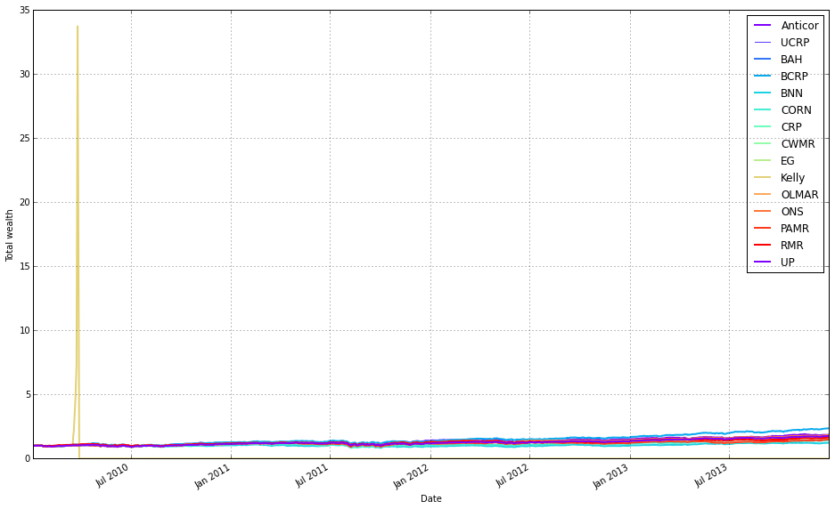
This block’s goal is to produce a single, clean comparison plot of portfolio performance for a set of OLPS algorithms applied to sector ETFs, intentionally shown “as if we had no fees” so you can compare raw algorithmic behavior without transaction-cost noise.
We start by selecting the dataset (olps_sectors_train) that contains the results objects for each algorithm. The code grabs the first result object and calls its plot method to create the figure and axes; this serves two purposes: it draws the initial series on a fresh figure and returns the axes handle that we will reuse to overlay the other algorithms. When calling plot on the first result we pass assets=False and weights=False to avoid plotting per-asset timeseries or weight heatmaps (we want a concise portfolio-level comparison), and ucrp=True so the uniform constant-rebalanced portfolio (UCRP) baseline is drawn once alongside the first algorithm — including the baseline only once keeps the legend readable and avoids repeating the same reference line for every algorithm.
Next, the loop iterates through every result in olps_df.results. For each pair (k, r) it checks whether the key k matches the first key (the one already plotted) and continues if so; this prevents plotting the first series twice. For every other result it calls r.plot with the same suppression of asset and weight panels, but with ucrp=False so the baseline is not re-plotted, and supplies ax=ax[0] so the plotting routine draws on the primary axis returned by the initial call. The portfolio_label argument is set to the index/key for each result so each line is labeled consistently in the legend.
Key practical points: using the first result to obtain the axes avoids creating multiple figures and ensures all lines are overlaid on a single plot; keeping assets and weights False keeps the output focused on portfolio performance; plotting the UCRP baseline only once keeps the legend uncluttered; and passing ax explicitly guarantees the subsequent plots target the same subplot (the plot call returns an axes container, so the code uses ax[0] to reference the main axis). One minor fragility to be aware of is the use of results.keys()[0] to identify the first key — depending on the container type and pandas version, a more robust approach would be next(iter(olps_df.results)) or olps_df.results.index[0]. Overall, this block produces an overlaid, fee-free visualization that makes relative performance among OLPS algorithms and against a UCRP baseline easy to inspect.
# Kelly went wild, so let’s remove it
# get the first result so we can grab the figure axes from the plot
olps_df = olps_sectors_train
ax = olps_df.results[0].plot(assets=False, weights=False, ucrp=True, portfolio_label=olps_df.index[0])
for k, r in olps_df.results.iteritems():
    if k == olps_df.results.keys()[0] or k == ‘Kelly’ : # skip the first item because we have it already
        continue
    r.plot(assets=False, weights=False, ucrp=False, portfolio_label=k, ax=ax[0])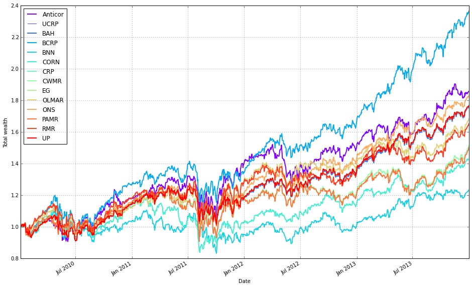
This block is building a single comparative performance plot for a set of OLPS algorithms applied to the ETF sector training set. olps_sectors_train is expected to contain a collection of backtest/result objects (accessible via olps_df.results) where each result knows how to draw its own diagnostic plots. The overall intent is to produce one clean chart that compares cumulative portfolio performance across algorithms while omitting per-asset traces and the Kelly strategy, which the comment indicates behaves as an outlier here.
To start, the code plots the first result and captures the returned axes so subsequent plots can be drawn on the same figure. For that initial call it disables per-asset and weight visualizations (assets=False, weights=False) because the goal is a high-level comparison of portfolio returns, not a crowded multi-line view of all ETF weights or asset-level returns. It enables ucrp=True for the first plot to show the uniform constant rebalanced portfolio baseline once; including the baseline on the first draw is a convenient way to get that reference line without re-drawing it for every algorithm.
Next, the loop iterates through every stored result and conditionally skips two cases: the very first result (since it has already been drawn) and any result keyed as ‘Kelly’ (explicitly excluded because it produces extreme behavior that would distort the comparative visualization). For each remaining result the code calls that result’s plot method with the same reduced-verbosity options (no assets or weights) and with ucrp=False so the baseline is not redundantly re-plotted. It passes portfolio_label=k so each algorithm’s line is labeled in the legend, and it passes the previously captured ax[0] so every result is drawn onto the exact same axes/plot, ensuring consistent scaling and direct visual comparison.
In short, the data flows from a collection of per-algorithm result objects into one unified performance plot: pick a baseline render to obtain axes, then overlay each algorithm’s portfolio return line (except Kelly and the already-plotted first) onto those axes. The choices to suppress asset/weight traces and to plot the UCRP baseline only once are deliberate to keep the chart focused on cross-algorithm cumulative performance across the diversified ETF set.
olps_stats(olps_sectors_train)
olps_sectors_train[metrics].sort(’profit’, ascending=False)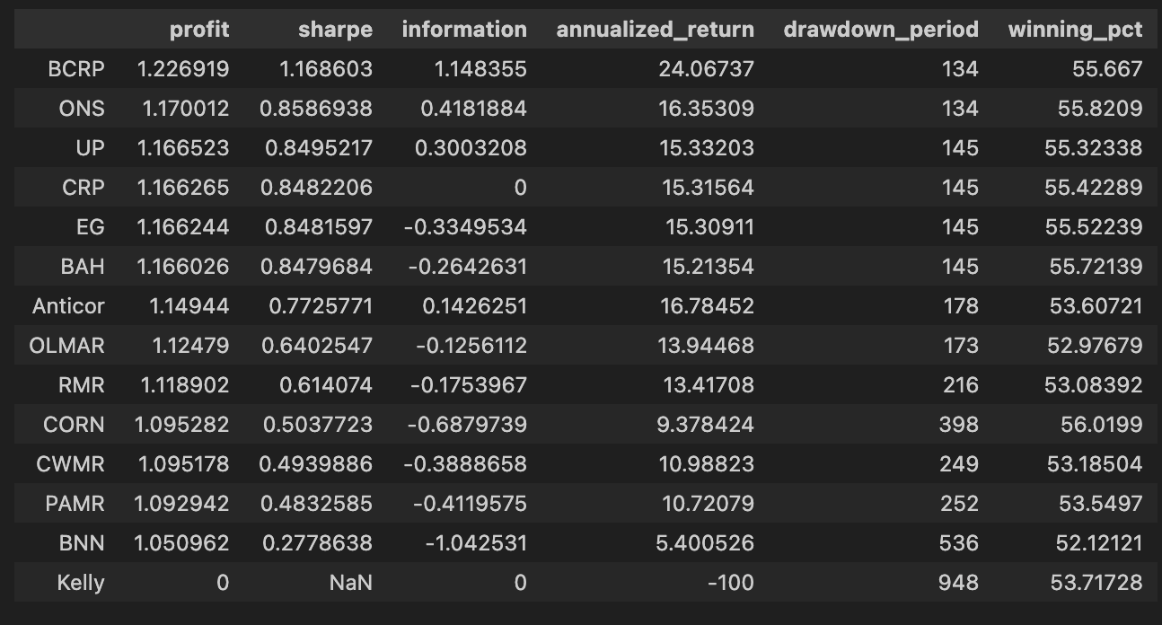
The first line, olps_stats(olps_sectors_train), is the step where raw backtest traces for each OLPS algorithm are turned into comparable performance summaries. Practically, this function computes the standard set of performance metrics you need to judge algorithms across the sector ETFs — cumulative profit/return, annualized return, volatility, Sharpe (or other risk-adjusted) ratios, maximum drawdown, turnover and transaction-cost-adjusted returns, etc. It’s called here before any tabulation or ranking because those downstream operations expect those aggregated columns to exist; depending on the implementation, olps_stats either mutates olps_sectors_train in place (attaching the new metric columns) or returns an augmented object, but the intent is the same: normalize and summarize each algorithm’s time series into a fixed set of comparators so different strategies and ETF mixes can be evaluated on the same footing.
The second line slices that augmented table to the subset of columns you care about (metrics) and then orders the rows by profit in descending order. Selecting metrics reduces noise and focuses the view on the performance dimensions you want to inspect; sorting by profit (final cumulative return) gives you a quick ranking of which OLPS variants produced the largest endpoint wealth on the training set. That ordering is useful as a first-pass filter to identify top candidates, but it’s important to remember why we computed the other columns: profit alone ignores risk, drawdown and turnover. After you identify high-profit algorithms, you should look at volatility, Sharpe, max drawdown and turnover to make risk-adjusted selections and to detect strategies that achieved profit through excessive leverage or churning. Also be mindful whether the sort is in-place or returns a new frame in your data library — if you intend to preserve the original ordering, assign the sorted result to a new variable.
# create the test set dataframe
olps_sectors_test  = pd.DataFrame(index=algo_names, columns=algo_data)
olps_sectors_test.algo  = olps_algos_sectors
We start by building a rectangular container for the test set: olps_sectors_test = pd.DataFrame(index=algo_names, columns=algo_data). Conceptually this creates an empty table whose rows represent the different OLPS algorithms you want to compare (algo_names) and whose columns are the data fields or metrics you intend to collect (algo_data). At this point every cell is NaN — the DataFrame is just a structured placeholder that enforces a consistent index (algorithm identity) and a fixed set of columns for later population, which simplifies downstream aggregation and comparison across algorithms and ETF sectors.
The next line, olps_sectors_test.algo = olps_algos_sectors, populates one of those fields by creating (or replacing) a column named “algo” with the contents of olps_algos_sectors. pandas allows attribute-style column access, so this is equivalent to olps_sectors_test[‘algo’] = olps_algos_sectors. The assignment will align values to the DataFrame rows: if olps_algos_sectors is a Series with the same index it will align by label; if it is a list or array it will be assigned positionally. Practically, olps_algos_sectors should contain either algorithm instances, identifiers, or configuration objects for each row so that each DataFrame row not only holds numeric results later on but also a reference to the algorithm instance to run or inspect.
Why this structure matters: by storing the algorithm objects next to their resulting metrics in a single DataFrame, subsequent processing becomes straightforward — you can iterate rows to execute a backtest for each algorithm, vectorize metric computations, sort and rank algorithms, or join with ETF-level results for diversified-sector comparisons. A couple of operational notes: using attribute-style column assignment is convenient but less explicit than olps_sectors_test[‘algo’]; if “algo” already appears in algo_data this assignment will overwrite that column, and if olps_algos_sectors is not aligned to the DataFrame index you may get unintended ordering. Ensuring consistent indexing or using a labeled Series will make the data flow robust and predictable when you run the OLPS comparisons across the ETF sectors.
# run all algos
for name, alg in zip(olps_sectors_test.index, olps_sectors_test.algo):
    olps_sectors_test.ix[name,’results’] = alg.run(test_sectors)
This loop is the piece of code that actually executes each OLPS algorithm against the same test dataset and records its output so we can compare them. olps_sectors_test is acting as the registry: its index holds the algorithm names and its ‘algo’ column holds algorithm objects (already configured for the experiment). For each entry we pull the name and the corresponding algorithm object and call alg.run(test_sectors). The test_sectors object — the time series/price matrix representing the diversified ETF universe — is passed intact to every algorithm so each one is evaluated on identical inputs; this is essential to make the later comparisons meaningful.
When alg.run(test_sectors) is invoked, the algorithm performs its backtest (portfolio construction, rebalancing, transaction cost handling, etc.) using the supplied market data and returns whatever result representation the algorithm implements (commonly an equity curve, performance metrics, trades, or a small report object). The code stores that returned value into the olps_sectors_test DataFrame under the ‘results’ column at the row keyed by name. By collecting results into the same DataFrame keyed by algorithm name, subsequent code can iterate that structure to compute summary statistics, produce plots, or rank algorithms across common performance criteria.
A few behavioral and reproducibility details are worth noting. Running algorithms sequentially ensures that resource usage is bounded and that each run is isolated in time; however, it also means total wall-clock time is the sum of all runs. More important for correctness, alg.run should be treated as a pure operation with respect to the input data: it must not mutate test_sectors in-place, or you risk polluting later runs and invalidating the comparison. If any algorithm mutates inputs or depends on randomness, make sure to pass a copy of the data (or re-seed/lock RNGs) so each algorithm sees the same starting conditions.
Finally, there are practical implementation cautions and possible improvements. The code uses DataFrame.ix to assign results; .ix is ambiguous/deprecated in recent pandas and .loc/.at would be clearer and safer. Also ensure that each alg.run returns a consistent, well-documented result type (so downstream aggregations don’t need ad-hoc conditionals). If you need faster experiment turnaround, this pattern can be parallelized, but only after addressing isolation (copies, RNG seeds) and resource contention (CPU/memory). Overall, this block is the controlled executor that channels the same diversified ETF test data through every OLPS algorithm and collects their outputs into a single structured place for direct comparison.
# plot as if we had no fees
# get the first result so we can grab the figure axes from the plot
olps_df = olps_sectors_test
ax = olps_df.results[0].plot(assets=False, weights=False, ucrp=True, portfolio_label=olps_df.index[0])
for k, r in olps_df.results.iteritems():
    if k == olps_df.results.keys()[0] : #or k == ‘Kelly’: # skip the first item because we have it already
        continue
    r.plot(assets=False, weights=False, ucrp=False, portfolio_label=k, ax=ax[0])
This block’s goal is to produce a single comparative performance plot of several OLPS strategies on the ETF universe while intentionally ignoring trading fees, so you can visually compare raw strategy returns on the same axes. It starts by taking the stored collection of backtest results (olps_sectors_test) and plotting the first element to create the figure and capture the axes object. The first call purposely suppresses secondary plots (assets and weights) and enables the uniform constant-rebalanced portfolio (ucrp=True) so the CRP baseline appears on the plot; capturing the axes from this first plot gives you a consistent target to draw all other curves onto. Next, the code iterates the remaining results and, for each one that is not the initial result, calls its plot method with the same axes (ax[0]) so each strategy’s cumulative-return line is overlaid on that first figure. For these subsequent plots the ucrp baseline is turned off to avoid drawing the same CRP line repeatedly, and again assets/weights are suppressed; portfolio_label is used to name each curve in the legend. The skip of the first item prevents double-plotting the initial result. In short, the flow is: create a single figure with the first result (including the CRP baseline), then overlay every other strategy’s performance on that same axes so you get a direct, uncluttered comparison of strategy returns as if there were no transaction costs.
A couple of practical notes: the code assumes the plot method returns a sequence of axes and that the cumulative-performance axes is at index 0, which is why subsequent plots target ax[0]; make this explicit or guard against different layouts. Also the way the first key is identified and skipped is a bit brittle — using an explicit first_key = next(iter(olps_df.results)) or .iloc[0] style access is clearer and safer. Finally, suppressing asset/weight subplots and plotting the CRP only once are deliberate choices to emphasize cross-strategy return comparison rather than per-asset exposures or repeated baseline lines.
# drop Kelly !
# get the first result so we can grab the figure axes from the plot
olps_df = olps_sectors_test
ax = olps_df.results[0].plot(assets=False, weights=False, ucrp=True, portfolio_label=olps_df.index[0])
for k, r in olps_df.results.iteritems():
    if k == olps_df.results.keys()[0] or k == ‘Kelly’: # skip the first item because we have it already
        continue
    r.plot(assets=False, weights=False, ucrp=False, portfolio_label=k, ax=ax[0])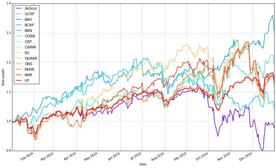
We start by pointing the code at the results object that contains the OLPS backtest outputs for our sector/ETF set (olps_df = olps_sectors_test). That container exposes a collection (olps_df.results) whose individual elements are backtest/result objects for each algorithm. The very first result is plotted by itself to create the figure and capture the matplotlib axes object; this initial call turns on only the portfolio-level plot (assets=False, weights=False) and also enables the uniform CRP (ucrp=True). Enabling the UCRP baseline on the first call ensures the benchmark is added once to the figure so we can visually compare each algorithm against the simple buy-and-hold uniform portfolio.
After the first plot creates the axes, the loop walks the remaining result objects and overlays each algorithm’s portfolio curve on the same axes. The loop unpacks each (key, result) pair via iteritems(); it explicitly skips the first entry because it has already been drawn, and it skips the Kelly algorithm (hard-coded) because we do not want to include it in this comparison — typically this is done when one algorithm is unstable, not applicable to the current experiment, or would distort the visual comparison. For each included algorithm we again request only the portfolio-level trace (assets=False, weights=False) and we turn off the UCRP baseline (ucrp=False) to avoid drawing duplicate benchmark lines. We also pass portfolio_label so each overlaid line is labeled in the legend.
A couple of practical details matter here: the initial plot call returns an axes container (hence ax[0] is used) and that same axes object is passed into subsequent plot calls so all lines are drawn onto the same subplot. The net result is a single, uncluttered comparison plot that focuses on cumulative portfolio performance across the diversified ETF universe, with each OLPS algorithm drawn against the single UCRP benchmark. This design choice — suppressing asset/weight subplots and drawing the benchmark only once — keeps the figure focused on the high-level question: which OLPS algorithm produces the best portfolio growth on this ETF set.
