


Statistical Arbitrage with Turkish Banks: A Deep Dive into Pairs Trading
Statistical Arbitrage with Turkish Banks: A Deep Dive into Pairs Trading
Exploring the Synchronized Movements of Garanti Bankasi and Akbank Through Advanced Data Analysis

Pairs trading, a sophisticated statistical arbitrage technique, capitalizes on the price movements of two correlated stocks. In this in-depth exploration, we focus on two major Turkish banks: Garanti Bankasi (GARAN) and Akbank (AKBNK). Utilizing historical data covering 2000 trading days, we delve into the dynamics of these stocks, aiming to exploit their synchronized price movements for arbitrage opportunities. By bypassing the initial selection process, our analysis directly assesses the extent of their correlated behavior. Employing Python for data manipulation and analysis, we examine daily stock prices, calculate log returns, and explore their correlation and cointegration. This approach enables us to evaluate the potential of GARAN and AKBNK as a viable pair for trading, leveraging statistical techniques to uncover opportunities for generating arbitrage gains.
Download the source code from the link in comment section.
Pairs trading is a renowned and widely used statistical arbitrage approach. It involves identifying two stocks that exhibit a tendency to move in sync. The core of this strategy is to trade the differential by taking a long position in one stock and a short position in the other when their price paths show significant deviation.
Although choosing the appropriate pair is crucial for the success of this strategy, we will bypass the selection process in this discussion. Instead, our focus will be on outlining the procedures to assess whether a specific pair of stocks demonstrates synchronized movement and to evaluate potential trading opportunities for generating statistical arbitrage gains.
Selection of Pairs
The two prominent Turkish banks, Garanti Bankasi (GARAN) and Akbank (AKBNK), operating in the financial sector, have been chosen for analysis. The provided Excel file contains the daily stock prices of these two banks, covering the past 2000 trading days.
import pandas as pd #Python package for interacting with files and obtaining data frames
import numpy as np #For algebric operations
import matplotlib.pyplot as plt #Visualization tool
This code imports three different Python packages, namely pandas, numpy, and matplotlib.pyplot. By using the as keyword, it assigns shorthand names for these packages, making it easier to use and reference them later in the code. The first package, pandas, is used for interacting with files and obtaining data frames. This means that with pandas, we can load, read, write, and manipulate data files in different formats, such as CSV, Excel, and SQL databases. The data frames in pandas are powerful and allow us to perform various operations on the data. The second package, numpy, is used for algebraic operations. It contains powerful mathematical and scientific functions for working with multidimensional arrays, matrices, and mathematical calculations. Numpy is commonly used for data analysis and machine learning applications. The third package, matplotlib.pyplot, is used for data visualization. It provides functions and tools to create different types of graphs and charts to visually represent the data in a meaningful way. This package is often used in data analysis and data science to gain insights and communicate results effectively. Overall, this code enables us to use these powerful Python packages to perform various tasks like loading and manipulating data, performing mathematical operations, and creating visualizations. This can be useful for data analysis, machine learning, and other data-related tasks.
df = pd.read_excel\
("C:/Users/turan/Documents/0001 - FINANCIAL ENGINEERING/523 investment and portfolio/hw 4/FE 523 Homework 4 Data.xlsx")
This Python code uses the library pandas, which is used for data analysis and manipulation. The command read_excel is used to read an Excel file. In this case, the file path to the Excel file is specified as C:/Users/turan/Documents/0001 — FINANCIAL ENGINEERING/523 investment and portfolio/hw 4/FE 523 Homework 4 Data.xlsx. This means that the code will look for and open the Excel file located in that specific file path. Once the Excel file is open, it will be stored as a pandas DataFrame object, which can then be manipulated and analyzed using various methods and functions available in the pandas library. This code is useful for working with large datasets and performing data analysis tasks in Python.
The initial and final five entries of our dataset are displayed as follows:
df = df.set_index(df.Date)
df = df[["GARAN", "AKBNK"]]
display(df.head(), df.tail())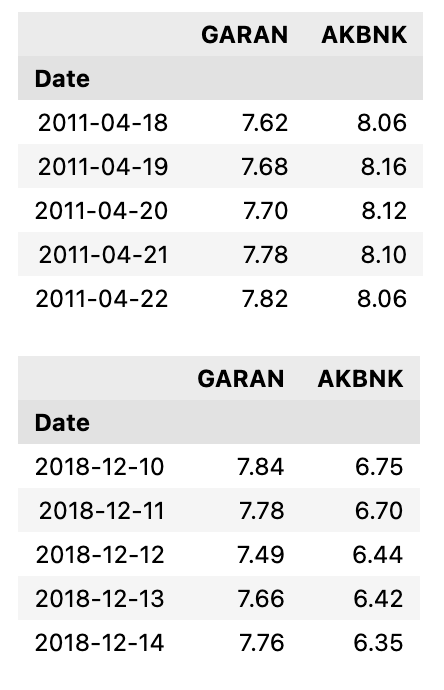
This Python code utilizes the Pandas library to manipulate a dataframe called df. The first line sets the index of the dataframe to be the Date column. This means that the dates in the dataframe will now be used as row labels instead of the default numerical index. The second line creates a new dataframe by selecting only the GARAN and AKBNK columns from the original dataframe. Finally, the last line displays the first and last five rows of the new dataframe using the head and tail functions. This allows the user to easily view the data and make any necessary adjustments before further analysis.
We can inspect our data by visualizing it
df.plot(figsize=(16,5))
plt.show()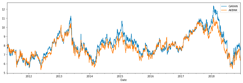
This code uses the matplotlib library to plot a graph of the data stored in the dataframe df. This dataframe is plotted with a specified figure size of 16x5, meaning the graph will have a width of 16 units and a height of 5 units. The plt.show command tells the code to display the graph once it has been plotted. This allows the user to view the data graphically and make any necessary observations or analyses. Overall, the code is a convenient way to visualize and interpret data stored in a dataframe using the matplotlib library in Python.
From merely observing our data, we can draw preliminary conclusions that our stocks might be suitable for pair trading. They appear to move in tandem frequently, presenting opportunities for statistical arbitrage due to occasional divergences at certain points in time.
Calculation of Daily Log Returns for Calibration Periods
Determine and document the correlation between returns. Does this pair exhibit a tendency to move in unison? Assess whether the correlations fluctuate over time through your observation across three cycles. Evaluate if correlation is an effective metric to track their concurrent movements.
df["LogGaran"] = np.log(df["GARAN"] / df["GARAN"].shift(1))
df["LogAk"] = np.log(df["AKBNK"] / df["AKBNK"].shift(1))
This code creates two new columns in the dataframe called LogGaran and LogAk. The first column, LogGaran, calculates the natural logarithm of the ratio between the values of GARAN in the current row and the previous row. This ratio represents the change in the value of GARAN over time. The second column, LogAk, does the same calculation but for the AKBNK column. It takes the values in the current row and divides them by the values in the previous row, then calculates the natural logarithm of that ratio. These new columns provide a way to measure the changes in the stock values for two companies, GARAN and AKBNK, over time by examining the log of the relative changes in their value. By comparing the values in these columns, we can see which stock experienced greater changes over time and make further analysis based on that information.
Visualization of __Daily Logarithmic Returns__
df[['LogGaran', 'LogAk']].dropna().plot(figsize=(16,5))
plt.show()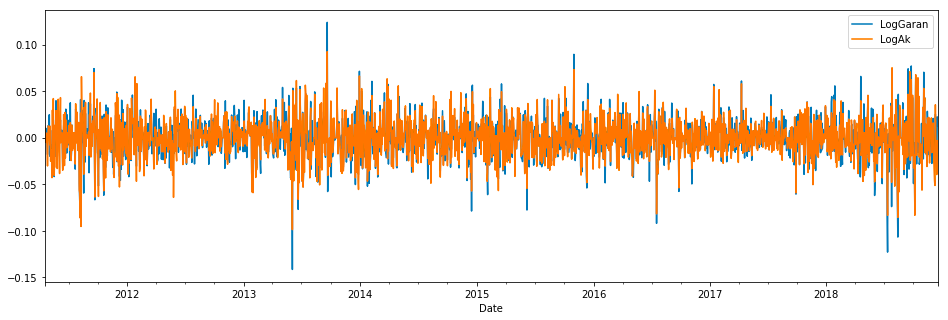
The code is specifically working with a data frame df and selecting two columns from that data frame: LogGaran and LogAk. It then uses the dropna function to remove any missing or null values from these columns. Once the data is cleaned, the code uses the plot function to create a visual representation of the data. The figsize parameter specifies the size of the plot, and the 16,5 values indicate the width and height of the plot respectively. The plt.show function is called to display the created plot.
print("Correlation coefficient of two returns are calculated as, \n"\
      ,df[["LogGaran","LogAk"]].corr(method='pearson', min_periods=1))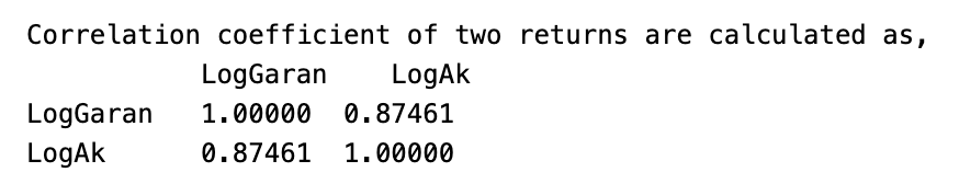
This code prints the correlation coefficient calculated between two return values, specifically LogGaran and LogAk. The \n\ ensures that the correlation coefficient is printed on a new line. The correlation coefficient is calculated using the corr function from the Pandas library, with the method set to pearson and the minimum number of periods required to compute the correlation set to 1. This value measures the strength and direction of the linear relationship between the two return values, with a higher value indicating a stronger relationship. This code can be helpful in determining the relationship between two return values and predicting future returns.
print('---'*15)
print("Correlation for first 1000 days \n"\
      , df.loc[:'2015-02-12',["LogGaran", "LogAk"]].corr(method='pearson', min_periods=1))
print('---'*15)
print("Correlation for first 1500 days \n"\
      , df.loc[:'2017-01-17',["LogGaran", "LogAk"]].corr(method='pearson', min_periods=1))
print('---'*15)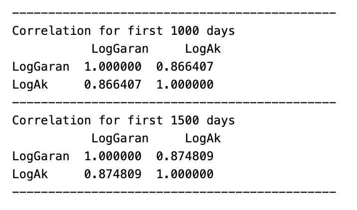
This code is performing correlation analysis on two columns, LogGaran and LogAk, in a dataframe called df. The code is first printing a line of dashes multiple times in order to create a visual break before printing the results, which makes it easy to distinguish between the correlations for the first 1000 and 1500 days. The next two lines are performing the correlation analysis using the .corr function and specifying the method as pearson, which indicates that the correlation coefficient is calculated using the Pearson correlation method. The min_periods=1 parameter ensures that the analysis is conducted only on valid data points, rather than including null values. Finally, the .loc[] function is used to specify the date ranges the first 1000 days and the first 1500 days and the two columns that are being compared. The results of the analysis are then printed, giving the correlation coefficient between the two columns for each specified date range.
print("\033[91m"+"Scatter Matrix of Logarithmic Returns"+'\033[0m')
pd.plotting.scatter_matrix(df[["LogGaran", "LogAk"]].dropna(), figsize=(16, 5))
plt.show()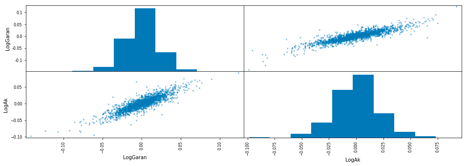
This code first prints a title for the scatter plot, specifying that it is a scatter matrix of logarithmic returns. Then, it creates a scatter plot using the matplotlib library, which contains two plots: one for the logarithmic returns of Garan data and one for the logarithmic returns of Ak data. The code uses the Pandas library to select these specific columns from a larger dataset and drops any rows with missing values. Finally, it specifies the size of the figure to be displayed and shows the plot. Overall, this code is used to visualize the relationship and distribution between the logarithmic returns of two different datasets.
moving_correlation500 = df['LogGaran'].dropna().rolling(500).corr(df['LogAk'].dropna())
moving_correlation250 = df['LogGaran'].dropna().rolling(250).corr(df['LogAk'].dropna())
First, it drops any missing values in the LogGaran column using the dropna method. Then, it uses the rolling method to calculate the correlation over a specified window size of 500 for the remaining values in the LogGaran and LogAk columns. The result is stored in the variable moving_correlation500. The same process is repeated with a window size of 250 and the result is stored in the variable moving_correlation250. This code is useful for analyzing the relationship between two variables over time, and the varying window sizes allow for different trend patterns to be observed.
plt.figure(figsize=(16,5))
plt.title("Moving Correlation With 500 Data Points of Returns")
plt.plot(moving_correlation500, 'r', label='500 Time Periods')
plt.plot(moving_correlation250, 'b', label='250 Time Periods')
plt.legend(loc='upper left')
plt.show()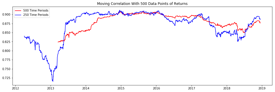
This code creates a figure with a size of 16 by 5 inches and sets the title to Moving Correlation With 500 Data Points of Returns. Then, it plots the values of the variables moving_correlation500 and moving_correlation250 on the figure, with a red line for the first and a blue line for the second.