

Utilizing Python to Decode Complex Stock Market Dynamics
Harnessing Python and yfinance for Informed Investment Strategies. Let’s delve into the process of analyzing and visualizing stock data.

In the complex realm of financial markets, the ability to analyze and visualize stock data effectively is crucial for making informed investment decisions. This article introduces essential techniques using Python, featuring libraries such as yfinance for data retrieval, pandas for data manipulation, NumPy for numerical analysis, and Matplotlib for creating insightful visualizations.
Download source code from link at the end of this article.
We’ll guide you through acquiring historical stock data from Yahoo Finance, manipulating it with pandas, and applying NumPy for computations. We will then show you how to effectively visualize trends and patterns using Matplotlib, helping you to uncover valuable insights from the data. This approach integrates powerful tools to provide a thorough understanding of market dynamics and supports strategic investment planning.
import yfinance as yf
import numpy as np
import pandas as pd
import matplotlib as mlp
import matplotlib.pyplot as plt
mlp.style.use('seaborn-darkgrid')
The following script imports essential libraries for analyzing and visualizing financial data. Here’s a breakdown:
1. yfinance: The yfinance library is utilized to retrieve historical market data for in-depth analysis. It offers a dependable method to procure historical stock price data from Yahoo Finance.
2. numpy: Renowned for numerical computations in Python, numpy serves various mathematical functions and excels in managing arrays and matrices.
3. pandas: This robust tool for data manipulation, built upon numpy, facilitates efficient tabular data handling and is widely embraced for data analysis tasks.
4. matplotlib: A pivotal plotting library enabling the creation of static, animated, and interactive visual representations in Python. It stands as a foundational tool for crafting data visualizations, boasting high configurability.
5. matplotlib.pyplot: This module within Matplotlib furnishes a MATLAB-like platform for producing plots, catering to an array of visual representations like line plots, histograms, and scatter plots.
6. mpl.style.use(‘seaborn-darkgrid’): By executing this line, the plot style in Matplotlib is configured to ‘seaborn-darkgrid’. Matplotlib boasts numerous pre-set styles to customize plot appearance, with ‘seaborn-darkgrid’ offering a dark backdrop with gridlines, enhancing visualization clarity.
Leveraging this code, we can retrieve financial data, manipulate it using Pandas, and craft enticing plots using Matplotlib to scrutinize data trends and patterns. The ‘seaborn-darkgrid’ style enhances the visual appeal of the plots, aiding in easier interpretation.
When analyzing stock market data, you will typically come across various key details for each stock, including the date, opening price, daily high and low prices, closing price, trading volume, and adjusted close. The adjusted close factorizes the closing price to account for events like stock splits and dividends.
tickers = ['AAPL','SPY','MSFT']
info = yf.Tickers(' '.join(tickers))
history = pd.DataFrame(info.history(period='10y'))
Firstly, it establishes a list called ‘tickers’ encompassing the stock symbols for Apple (AAPL), S&P 500 ETF (SPY), and Microsoft (MSFT).
Next, it merges these stock symbols into a single string separated by spaces using the ‘ ‘.join(tickers) method.
Subsequently, the concatenated string is utilized as an argument in the yf.Tickers() function to generate a Tickers object containing data for these stocks.
Following this, the history() method is invoked on this object to extract historical stock prices data for a specified duration (in this case, 10 years).
Lastly, the collected historical stock price data is structured into a DataFrame by leveraging pd.DataFrame().
This code proves essential for retrieving historical stock price information for numerous stocks simultaneously through the yfinance library. By employing this code, we can efficiently access and evaluate past stock prices for the selected tickers across the designated timeframe, enabling us to conduct diverse analyses, visualizations, and computations on the data.
history.columns = ['_'.join(tup) for tup in history.columns.values]
history.head()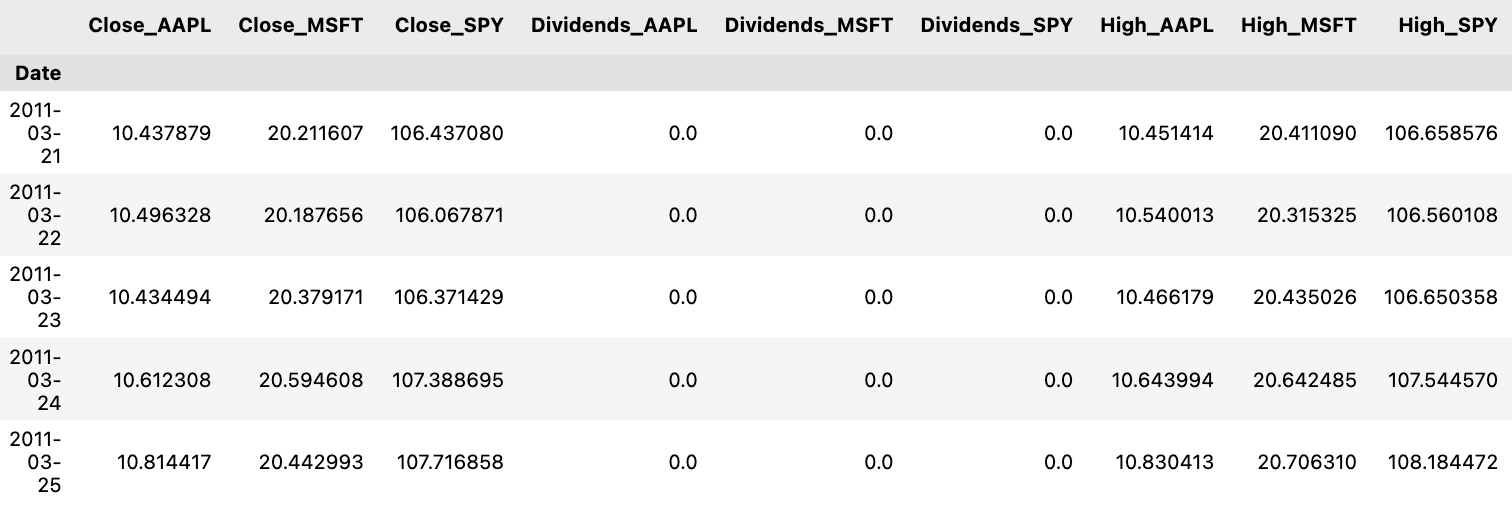
Let me break down the process for you:
Firstly, by utilizing `history.columns.values`, an array containing the existing column names of the DataFrame is retrieved.
Subsequently, a list comprehension is utilized to cycle through each column name and merge each name with an underscore using the `join` method with `’_’.join(tup)`.
Finally, the updated list of column names is then reassigned to the DataFrame’s `columns` attribute, successfully altering the column names.
This snippet of code proves to be advantageous when there is a need to establish a uniform format or structure for column names. It also aids in enhancing the readability of the column names and facilitates their utilization in forthcoming data examination or manipulation tasks.
history.columns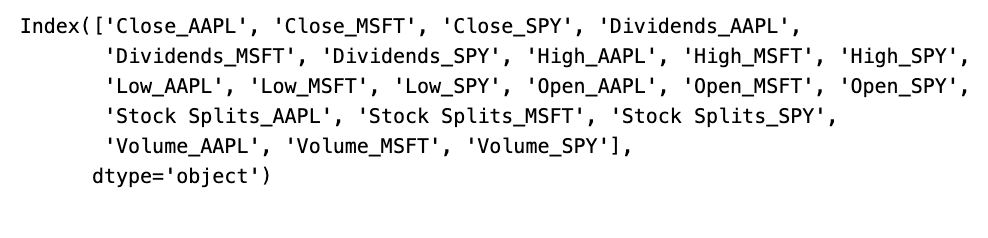
This snippet of code is designed to fetch the column labels, also known as names, from a historical data object or a dataframe. These labels essentially serve as the headers or identifiers for the dataset, aiding in the interpretation and examination of the data. Employing this code allows us to grasp the data’s layout, retrieve particular columns, execute modifications, or carry out analyses specific to the columns provided. Such a function is pivotal in the realm of data analysis and manipulation for comprehending the characteristics encapsulated within the dataset.
Data Normalization and Visualization
Ensuring data normalization is crucial to make fair comparisons between stocks. The process involves using the initial observation values as a reference point for normalization:

colors = ['coral', 'darkslateblue', 'mediumseagreen']
ax1 = plt.subplot(1,2,1)

(history[['Close_AAPL','Close_SPY','Close_MSFT']]/history.loc[history.index.min(),['Close_AAPL','Close_SPY','Close_MSFT']])\
.plot(ax=ax1,figsize=(20,5),color= colors)
ax2 = plt.subplot(1,2,2)
history[['Volume_AAPL','Volume_SPY','Volume_MSFT']].rolling(30).mean().plot(kind='area',ax=ax2,figsize=(20,5),alpha=1,color=colors)
plt.suptitle('Historical Data For SPY Index, Apple and Microsoft Stocks');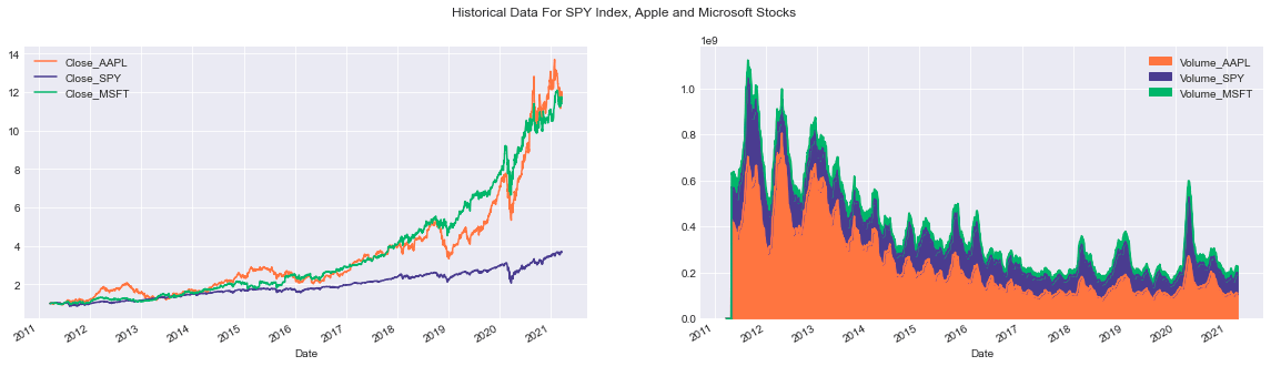
Below is a breakdown of the code’s functionalities:
Firstly, the subplot function is applied to craft a figure containing two side-by-side subplots. In the initial subplot (ax1), the adjusted closing prices of the three entities (Close_AAPL, Close_SPY, Close_MSFT) are standardized by dividing each closing value by the initial closing price in the dataset. The normalized information is then visually represented using distinct colors assigned to each entity.
Moving on to the second subplot (ax2), the code calculates the rolling average of trading volumes for the three entities (Volume_AAPL, Volume_SPY, Volume_MSFT) using a 30-day window. This aggregate data is exhibited as an area chart where the transparency (controlled by the alpha parameter) ensures visibility of all three volumes even if they overlap. Each entity is distinguished by a unique color.
To enhance coherence, a common title is incorporated across the entire visualization using suptitle, providing an overarching description of the showcased data.
This script plays a vital role in presenting historical financial data in a lucid and compact manner. The utilization of colors aids in discerning among the datasets for individual entities. By utilizing the subplot function, a comparative analysis of multiple datasets is facilitated, while the rolling function assists in smoothing the data, minimizing noise often inherent in raw volume datasets. Overall, the code snippet generates a visual depiction of historical data, simplifying the identification of trends, patterns, and correlations between the analyzed entities.
It’s worth noting that stocks aren’t traded every day on the New York Stock Exchange or any other market out there. Typically, there are about 252 trading days in a year.
import yfinance as yf
import numpy as np
import pandas as pd
import matplotlib as mlp
import matplotlib.pyplot as plt
mlp.style.use('seaborn-darkgrid')


def prepare_data(tickers=['SPY','AAPL','GOOG','MSFT'],period='5y'):
    columns_interest = [column+'_'+ticker for ticker in tickers]
    ax = df[columns_interest].plot(kind=kind,title=title,**kwargs)
    plt.xlabel(xlabel)
    plt.ylabel(ylabel)
    return ax


class FinancialData(object):
        tickers = self.tickers
        period = self.period
        if len(tickers)>1:
            try:
                df_information = yf.Tickers(' '.join(tickers))
                df = pd.DataFrame(df_information.history(period=period))
                df.columns = ['_'.join(tup) for tup in df.columns.values]
                self.df = df
                return df
            except:
                base_info = yf.Ticker(tickers[0])
                base_df = pd.DataFrame(base_info.history(period=period))
                base_df.columns = [col+'_'+tickers[0] for col in base_df.columns.values]

                for ticker in tickers[1:]:
                    temp_info = yf.Ticker(ticker)
                    temp_df = pd.DataFrame(temp_info.history(period=period))
                    temp_df.columns = [col+'_'+ticker for col in temp_df.columns.values]
                    base_df = base_df.join(temp_df,how='outer')
                self.df = df
                return base_df

        else:
            info = yf.Ticker(tickers[0])
            df = pd.DataFrame(info.history(period=period))
            df.columns = [column+'_'+tickers[0] for column in df.columns]
            self.df = df
            return df

    def plot_data(self,column = 'Close',kind='line',
                  title='Historical Close Price Data',ylabel='Close Prices',
                  xlabel='Date',**kwargs):
        return self.tickers
    def add_ticker(self,ticker):
The code snippet presented here introduces a class called FinancialData, which contains functions that leverage the Yahoo Finance API (yfinance) to process financial data and display it using matplotlib.
The prepare_data function, for instance, retrieves historical stock price data from Yahoo Finance for the specified stock tickers and time period, and then proceeds to plot this data employing matplotlib.
In more detail:
- The prepare_data function acquires historical stock price information for the designated tickers and generates a corresponding plot.
- The FinancialData class starts by receiving a list of stock tickers and a time frame, initializing a DataFrame with historical price records for the tickers passed.
- The plot_data function empowers users to plot a specific financial data column, offering customization options such as title, labels, and plot style.
- Lastly, the add_ticker method permits the inclusion of additional tickers to the existing list within the FinancialData object.
This code snippet merges yfinance for data retrieval, pandas for data management within a DataFrame, and matplotlib for data visualization. By encapsulating the data fetching and plotting process, it streamlines the analysis of data across multiple stocks all at once, fostering an easier user experience.
Creating Random Numerical Values
np.random.random((3,3))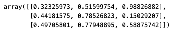
The code script crafts a 3x3 array containing random values falling within the range of 0 to 1. Leveraging the random functionality from the NumPy library, the assortment of these chance-based figures is achieved.
Random values play a pivotal role in a myriad of domains such as simulations, statistical computations, machine learning protocols, and a plethora of scenarios necessitating uncertainty or irregularity. Enabling the creation of random values, this script empowers exploratory pursuits and assessments within diverse disciplines.
Generate a set of random integers.
print(np.random.randint(10))  # a single integer in [0,10)
print(np.random.randint(0,10)) # the same, but with [low, high) explicit
print(np.random.randint(0,10,size=5)) # 5 rnadom integers as a 1D array
print(np.random.randint(0,10,size=(2,3))) # 2x3 array of random integers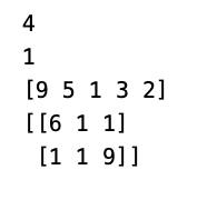
In this segment of code, NumPy’s random module is employed to create random integers. Let’s delve into the details of each line:
1. By executing print(np.random.randint(10)), a random integer within the range [0, 10) is produced and displayed on the console.
2. Similarly, print(np.random.randint(0, 10)) serves the same purpose as the first line but sets the boundaries explicitly for the range [low, high), resulting in the generation of a random integer within [0, 10).
3. Through print(np.random.randint(0, 10, size=5), 5 random integers within the scope of [0, 10) are generated and retained in a 1D NumPy array comprising 5 elements.
4. print(np.random.randint(0, 10, size=(2, 3)) constructs a 2x3 array containing random integers within [0, 10). The size parameter dictates the dimensions of the resulting array.
This code snippet is harnessed for creating random integers within specified ranges for various purposes like experimentation, simulations, testing, or any scenario necessitating randomness. The np.random.randint function offers a practical method for generating random integers with specific ranges and shapes.
array_test = np.random.randint(0,100,size=(3,2,5))
print('Shape of the array',array_test.shape)
print('Number of dimensions of the array',array_test.ndim)
print('Number of elements in the array',array_test.size)
print('Data type of elements in the array',array_test.dtype)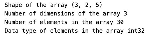
Utilizing the NumPy library, this script generates a 3D array filled with random integers ranging from 0 to 100. Here’s a breakdown of what the code accomplishes:
1. It initializes an array named array_test with a shape of (3, 2, 5), denoting three dimensions with respective sizes of 3, 2, and 5.
2. The code displays the array’s shape by accessing array_test.shape, revealing the sizes of each dimension.
3. It reveals the array’s number of dimensions through array_test.ndim, indicating the total count of dimensions present.
4. The total elements in the array are showcased via array_test.size, calculating the multiplication of all dimension sizes.
5. The data type of the array’s elements is disclosed using array_test.dtype, showcasing the stored values’ type, such as int64.
This code serves the purpose of comprehending the structure and attributes of the NumPy array generated. It aids in troubleshooting, validating the array’s dimensions, and confirming the data types within. Having insight into these characteristics proves vital for effectively executing operations and computations on the array.
Working with Arrays
array = np.random.randint(0,10,(5,10))
print('Array:\n',array)
print('\nThe sum of all elements inside the array:\n',array.sum())
print('\nThe sum by rows:',array.sum(axis=0))
print('\nThe sum by columns:\n',array.sum(axis=1))
print('\nMaximum value per row:\n',array.max(axis=0))
print('\nMinimum value:\n',array.min())
print('\nMean value:\n',array.mean())
The code below carries out several operations on a NumPy array for diverse functionalities. Here’s a breakdown of its functionalities:
1. It creates a 2D NumPy array containing random integers from 0 to 10 and structured as a (5, 10) matrix.
2. Displays the array on the console.
3. Computes and showcases the total sum of all items in the array.
4. Computes and showcases the sum of items for each column in the array.
5. Computes and showcases the sum of items for each row in the array.
6. Identifies and displays the highest value in each column.
7. Identifies and showcases the lowest value across the entire array.
8. Computes and displays the average value of all elements in the array.
This code illustrates NumPy’s efficiency in executing fundamental mathematical tasks on multi-dimensional arrays, eliminating the need for manual looping. It streamlines data manipulation and examination, making it highly suitable for scientific computing, data analysis, and machine learning undertakings.
Finding the peak value is a crucial aspect when analyzing data or conducting mathematical operations.
array.argmax(axis=1)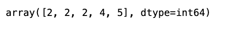
In Python’s numpy library, the argmax() function is employed to fetch the indices corresponding to the highest value within a specific axis. By setting axis=1, it signifies that the computation is to be performed across the rows of the array.
This snippet comes in handy when maneuvering through a 2D array and the goal is to pinpoint the position of the maximum value within each row. It furnishes an array that enlists the indices pointing to the maximum values within every row of the original array.
Measuring Time in Python for Operations
import time
def manual_mean(array):
    s = 0
    for i in range(0,array.shape[0]):
        for j in range(0,array.shape[1]):
            s += array[i,j]
    return s/array.size
Here we have a function named manual_mean created to calculate the mean of a 2D array in a manual way. It involves iterating through each element of the array via nested loops, computing the total sum of all elements, and then dividing this sum by the total count of elements to obtain the mean.
This function leverages the shape attribute of the array to ascertain the array’s dimensions, such as the number of rows and columns. A variable ‘s’ is employed to accumulate the sum of all elements in the array. Ultimately, the mean is derived by dividing the total sum (s) by the total count of elements in the array (array.size).
This code proves beneficial when there’s a necessity to determine the mean of a 2D array without resorting to pre-existing functions like NumPy’s np.mean(). It elucidates the fundamental principles behind mean computation, serving as a valuable resource for educational insights or cases where using external libraries may not be viable.
array = np.random.random((1000,1000))
t1 = time.time()
print(manual_mean(array))
t2 = time.time()
print('The time this operation took with doble for loop is: {}'.format(t2-t1))
The given script initializes a NumPy array of 1000x1000 dimensions containing random values generated by np.random.random. Next, it computes the mean of all elements in the array using a custom function called manual_mean.
It is likely that the manual_mean function employs nested loops to traverse each element in the array, computing the sum of all elements. Finally, this sum is divided by the total number of elements in the array to derive the mean value.
By measuring the time taken for this computation, one can evaluate the efficiency disparity between the manual approach and NumPy’s in-built functions. Such a comparative analysis serves to gauge the performance enhancements offered by NumPy’s optimized array operations.
t1 = time.time()
print(array.mean())
t2 = time.time()
print('The time this operation took with Numpy function is: {}'.format(t2-t1))
This code snippet employs the NumPy library to determine the average of an array while tracking the duration of this process.
To illustrate the process:
1. We initiate time measurement with time.time() just before commencing the average calculation.
2. The NumPy library’s mean() function is utilized to compute the array’s mean.
3. Subsequently, time.time() is employed once more to mark the current time post mean calculation.
4. The difference between the two time stamps is computed to determine the duration of the NumPy mean calculation.
5. Finally, this computed time gap is displayed in the console.
Monitoring the runtime of code operations is pivotal for gaining insights into our code’s performance metrics. It aids in streamlining code for enhanced efficiency and can pinpoint potential performance bottlenecks within the codebase. By timing the mean calculation, we can validate the efficiency of NumPy’s optimized functions, which often outperform pure Python implementations significantly in terms of speed.
array = np.random.random((3,3,3))
print(array)
array[0,0,0]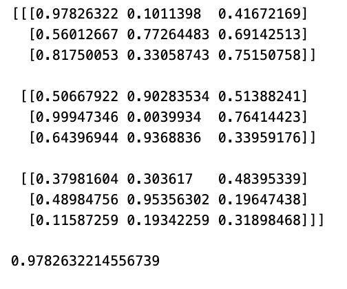
Firstly, it constructs a 3x3x3 NumPy array populated with random values ranging from 0 to 1 using the function np.random.random((3,3,3)).
Subsequently, it exhibits the resultant 3x3x3 array on the screen by executing print(array).
Lastly, it retrieves the value situated at the position [0,0,0] within the array by referencing array[0,0,0].
This code serves to illustrate the process of generating multi-dimensional arrays in NumPy, filling them with random information, and pinpointing specific elements in the array through indexing. Mastering the manipulation of multi-dimensional arrays is pivotal for a multitude of tasks revolving around scientific computing, data analysis, and machine learning within the realm of data science.
array = np.random.randint(0,9,(4,4))
print(array)
print(array[0:4:2,0:4:2])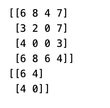
The following script leverages NumPy to create a 4x4 array containing random integers ranging from 0 to 9, courtesy of the np.random.randint() function. It proceeds to display both the complete array and a subsection obtained through array slicing.
To slice the array, the code utilizes the notation array[0:4:2, 0:4:2]. Slicing follows the pattern [start:stop:step], with ‘start’ denoting the beginning index (inclusive), ‘stop’ referring to the end index (exclusive), and ‘step’ indicating the increment size.
In this instance, 0:4:2 initiates from index 0, progresses to index 4 in intervals of 2. Consequently, this slice command cherry-picks every alternate row and column from the original array, culminating in a fresh 2x2 sub-array.
Slicing in NumPy stands out as a potent attribute simplifying efficient manipulation of array subsets sans the necessity to duplicate data. This strategic approach aids in curbing redundant memory usage and heightens code execution proficiency, especially crucial for handling extensive datasets.
In the upcoming session, we will delve into a practical method for calculating a range of statistics on a dataset, including but not limited to the mean, median, rolling mean, rolling standard deviation, and more.
More precisely, you will calculate:
- Bollinger bands: a technique for measuring the extent to which stock prices have strayed from a certain typical value.
- Daily returns: the fluctuations in stock prices from one day to the next.
tickers = ['SPY','AAPL','BTC-USD','ETH-USD']
df = prepare_data(tickers)
df.head()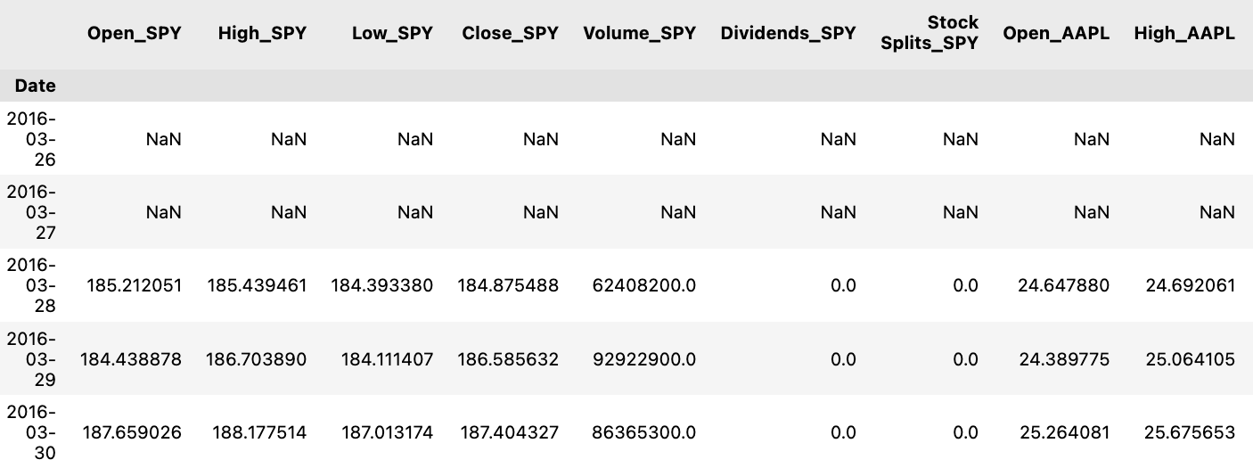
It appears that this piece of code is getting data ready for a specified list of tickers, which represent various financial assets. The preparation is done through a function named prepare_data, presumably fetching historical price details for each of these tickers. These details are then structured into a data format, such as a DataFrame, and stored in the variable df.
By running df.head(), you can peek at the initial rows of the organized data.
Utilizing this code is crucial for obtaining and organizing historical price information of numerous financial assets, crucial for tasks like analysis, visualization, or modeling. Well-prepared historical price data plays a vital role in making well-informed investment choices, carrying out financial assessments, and conducting thorough quantitative investigations.
plot_data(df,tickers,figsize=(10,5),secondary_y=['Close_BTC-USD','Close_ETH-USD'])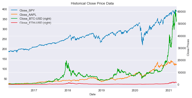
This script assists in generating plots of data extracted from a DataFrame named df corresponding to the specified tickers. The function generates a plot with a user-defined figsize, defaulting to (10, 5). It also configures the y-axis to place the selected columns in the secondary_y list on a secondary axis. This feature enhances visualization by accommodating columns with disparate scales, aiding in comprehensive comparisons.
The primary objective of utilizing this function is to visually analyze multiple datasets concurrently and juxtapose their trends effectively. By assigning specific columns to the secondary axis, it becomes more manageable to decipher relationships, identify trends, or detect patterns that might be less discernible when utilizing a uniform scale. Ultimately, this function facilitates extracting insights from the data and enables data-driven decision-making through the detailed visual interpretation of the datasets.
df[['Close_'+ticker for ticker in tickers]].agg([min,max,'mean','median','std'])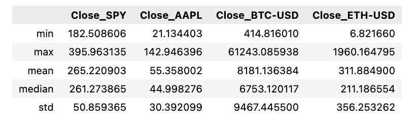
The script performs computations on diverse statistical measures like minimum, maximum, average, median, and standard deviation for the closing prices of several stock tickers stored in a DataFrame. This is accomplished by consolidating information from specific columns (‘Close_’ + ticker for ticker in tickers) within the DataFrame.
Employing this script is crucial for promptly outlining data regarding various stock tickers and extracting essential statistics concerning their closing prices. Such analysis aids in drawing comparisons, recognizing trends, and facilitating well-grounded decisions pertaining to stock market activities.
Analyses on the Go
spy = prepare_data(['SPY'])
ax = plot_data(spy,['SPY'],figsize=(10,5),label='SPY Close')
spy['Close_SPY'].rolling(20).mean().plot(ax=ax,label='Rolling Mean'
                                         ,color='crimson')
(spy['Close_SPY'].rolling(20).mean()+2*spy['Close_SPY'].rolling(20).std())\
    .plot(linestyle='--',color='maroon',linewidth=1,ax=ax,label='Bollinger Bands')
(spy['Close_SPY'].rolling(20).mean()-2*spy['Close_SPY'].rolling(20).std())\
    .plot(linestyle='--',color='maroon',linewidth=1,ax=ax,label='')
ax.set_xlabel('Date')
ax.legend(loc='upper left');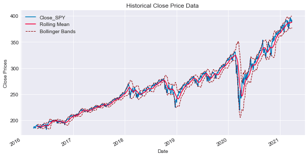
Below is an overview of the steps involved in processing and displaying financial data for the SPY stock, which mirrors the S&P 500 ETF:
Firstly, the function prepare_data([‘SPY’]) is executed, aiming to retrieve and organize financial data related to the ‘SPY’ stock, possibly derived from a financial API or a dataset. The gathered data is typically structured and saved in the spy variable, likely in the form of a DataFrame.
Subsequently, the plot_data(spy, [‘SPY’], figsize=(10,5), label=’SPY Close’) function is called to exhibit the financial data stored in the spy variable. This plot showcases the closing prices of the ‘SPY’ stock on the y-axis alongside the corresponding dates on the x-axis. The dimensions of the plot are specified using the figsize parameter, while a descriptive label is attached through the label parameter.
Next, utilizing the spy[‘Close_SPY’].rolling(20).mean().plot(ax=ax, label=’Rolling Mean’, color=’crimson’) expression, the plot visualizes the rolling mean of the ‘SPY’ stock’s closing prices across a 20-day timeframe. This calculation is illustrated on the plot with the label “Rolling Mean” and a distinctive crimson color.
Furthermore, Bollinger Bands are depicted on the same plot. These bands act as volatility indicators situated above and below a moving average, deviating by two standard deviations from a simple moving average, typically a 20-day moving average. This representation aids in identifying potential overbought or oversold conditions within the stock.
The final steps involve configuring the display characteristics of the Bollinger Bands. One line corresponds to the upper band (moving average + 2 standard deviations), and the other to the lower band (moving average — 2 standard deviations). These lines are depicted with a dashed style and a maroon color to differentiate them effectively.
To further enhance the visualization, ax.set_xlabel(‘Date’) is incorporated to label the x-axis of the plot as ‘Date’, and ax.legend(loc=’upper left’) is utilized to insert a legend on the plot, positioned at the upper-left corner. This legend serves to identify the various elements displayed, such as the ‘Rolling Mean’ and ‘Bollinger Bands’.
The primary objective of this code is to visually represent the price activity of the ‘SPY’ stock, emphasizing its rolling mean and Bollinger Bands. This visual aid facilitates the assessment of price trends, movements, and potential trading signals by leveraging technical analysis.
Many traders consider the rolling mean of a series as the actual fundamental price of the asset. Therefore, when the genuine price surpasses the rolling average, it may signal a potential buying or selling opportunity. To assess the optimal timing for making a move, it is advisable to leverage the rolling standard deviation.
Bollinger Bands are essentially derived by adding 2 standard deviations ($2\sigma$) to the rolling mean to set the upper band, while the lower band is established by subtracting 2 sigmas from the rolling mean.
Daily Returns
In financial analysis, daily returns serve as a crucial statistic to gauge the daily price fluctuations. They are calculated using the formula:

ax = spy['Close_SPY'].pct_change().plot(color='gray',figsize=(10,5))
mean= spy['Close_SPY'].pct_change().mean()
ax.axhline(mean,color='maroon')
ax.text('2017-01',0.050,'$\mu$ = {}'.format(round(mean,3)),fontsize=15)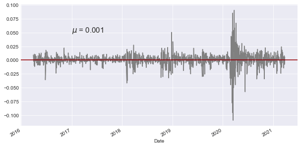
The following script focuses on analyzing financial data involving the SPY (SPDR S&P 500 ETF Trust) stock. Here’s a breakdown of its functionality:
Initially, it computes the percentage shift in the closing price of the SPY stock by leveraging the pct_change() method in pandas, facilitating the calculation of percentage shifts between consecutive elements.
Next, it generates a line plot of the percentage shift values using the plot() function, with the graph showcased in a grey hue and sized at 10x5 dimensions.
Subsequently, the code determines the average of the percentage shift data by utilizing the mean() function within pandas.
It proceeds by incorporating a maroon-colored horizontal line onto the plot at the y-coordinate equivalent to the mean value derived earlier.
Furthermore, a text annotation is included on the plot at the specified x and y coordinates (‘2017–01’, 0.050), exhibiting the mean value computed earlier in LaTeX format with the symbol μ. The mean value is rounded off to three decimal places and exhibited with a font size of 15.
This script serves the purpose of illustrating the percentage shifts in the closing price of the SPY stock while emphasizing the mean value on the graph. The horizontal line at the mean simplifies the visual comprehension of how the data points stray from the average. The accompanying text annotation distinctly showcases the calculated mean on the plot, aiding in the analysis of stock price movements and their correlation with the average price fluctuations.
Analyzing Cumulative Returns
Another crucial aspect to consider is cumulative returns, which involve assessing returns concerning a specific reference point.
(spy['Close_SPY']/spy['Close_SPY'].iloc[0]*100-100).plot()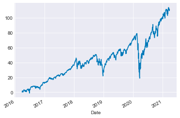
The following script computes the percentage variance of the ‘Close_SPY’ column within the ‘spy’ DataFrame compared to its initial value in the first row. The outcome is then adjusted by a factor of 100 and reduced by 100 through multiplication and subtraction. Ultimately, the data is presented graphically as a line chart.
